🔥 Would you like to save this?
The all-white kitchen looked incredible the day the photographer showed up. Six weeks later it told a different story. Every trend on this list earned its popularity honestly — they photograph like a dream, rack up Pinterest saves, and make magazine spreads look expensive. Then you move in. The crumbs show. The dust piles up. Sunlight pours in and so does the neighbor’s view, straight into your living room. We rounded up the ones that betray you daily, with the honest downside nobody mentions until the install is done and the money is spent.
28. All-White Kitchens That Show Every Last Crumb
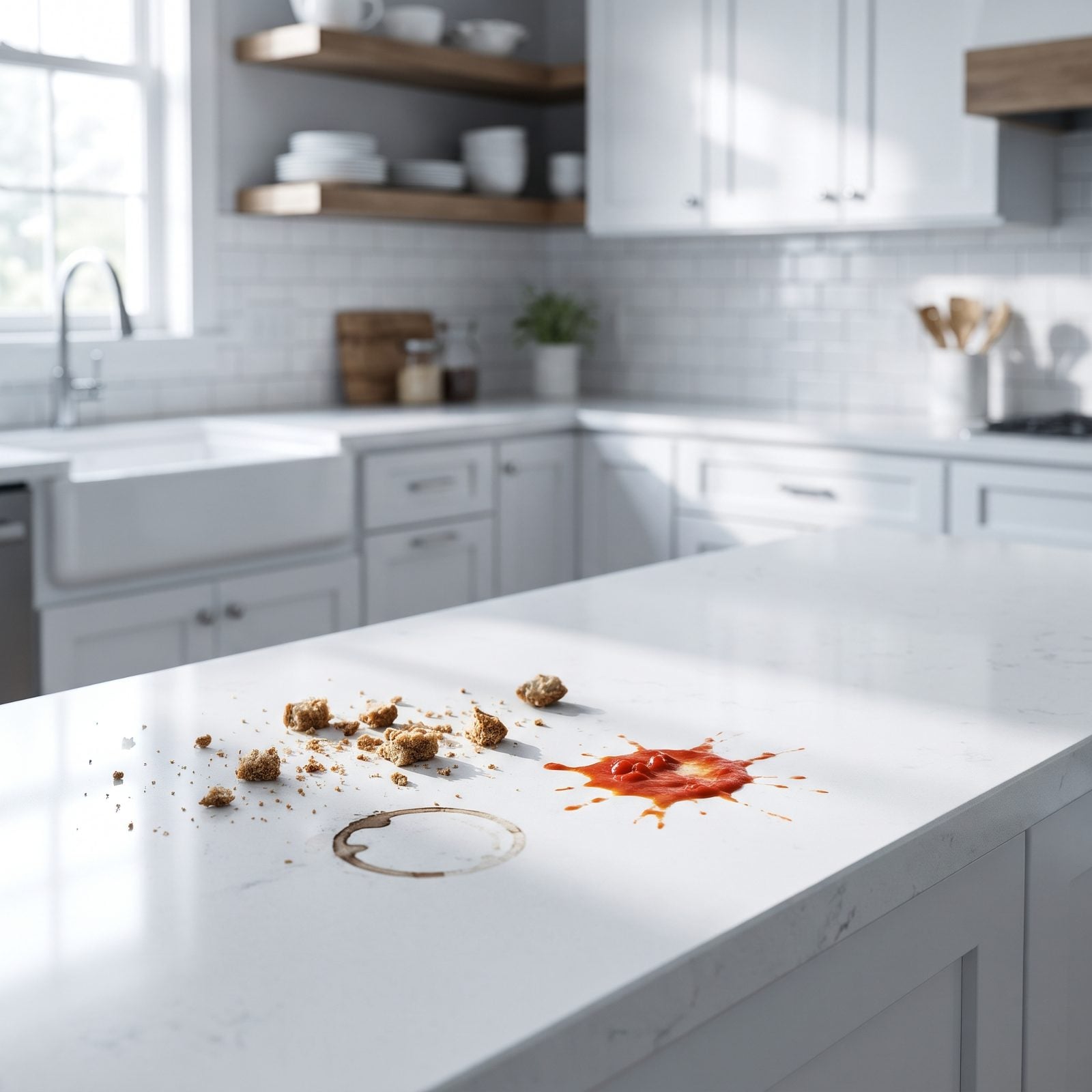
White reads clean in a photo. In practice it’s a confession booth, and every crumb, coffee ring, and splash of tomato sauce announces itself the second it lands. You end up wiping counters three times a day because the alternative is staring at your own mess.
In order to come up with the very specific design ideas, we create most designs with the assistance of state-of-the-art AI interior design software. Also, assume links that take you off the site are affiliate links such as links to Amazon. this means we may earn a commission if you buy something.
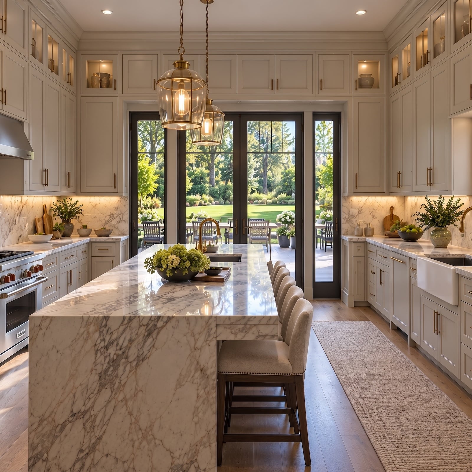
The pale oak floor and brass cabinet pulls here do the real work, keeping the room from feeling like a hospital. But the grout between that white subway tile will go grey, and no photo warns you about that.
27. Open Shelving That Becomes a Grease Magnet
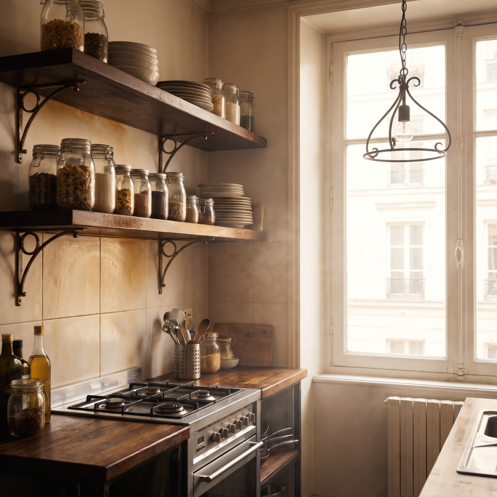
Open shelving looks like a Parisian bakery when it’s freshly styled. Then you cook on the stove three feet away and physics takes over.
Grease travels. It lands on the undersides of your plates and the tops of your jars, bonds with dust, and turns into a film you have to scrub off. Whatever lives up there, you use often enough to keep clean — or it becomes a dust trap. Nobody tells you that part.
26. Glossy Black Cabinets, a.k.a. the Fingerprint Gallery
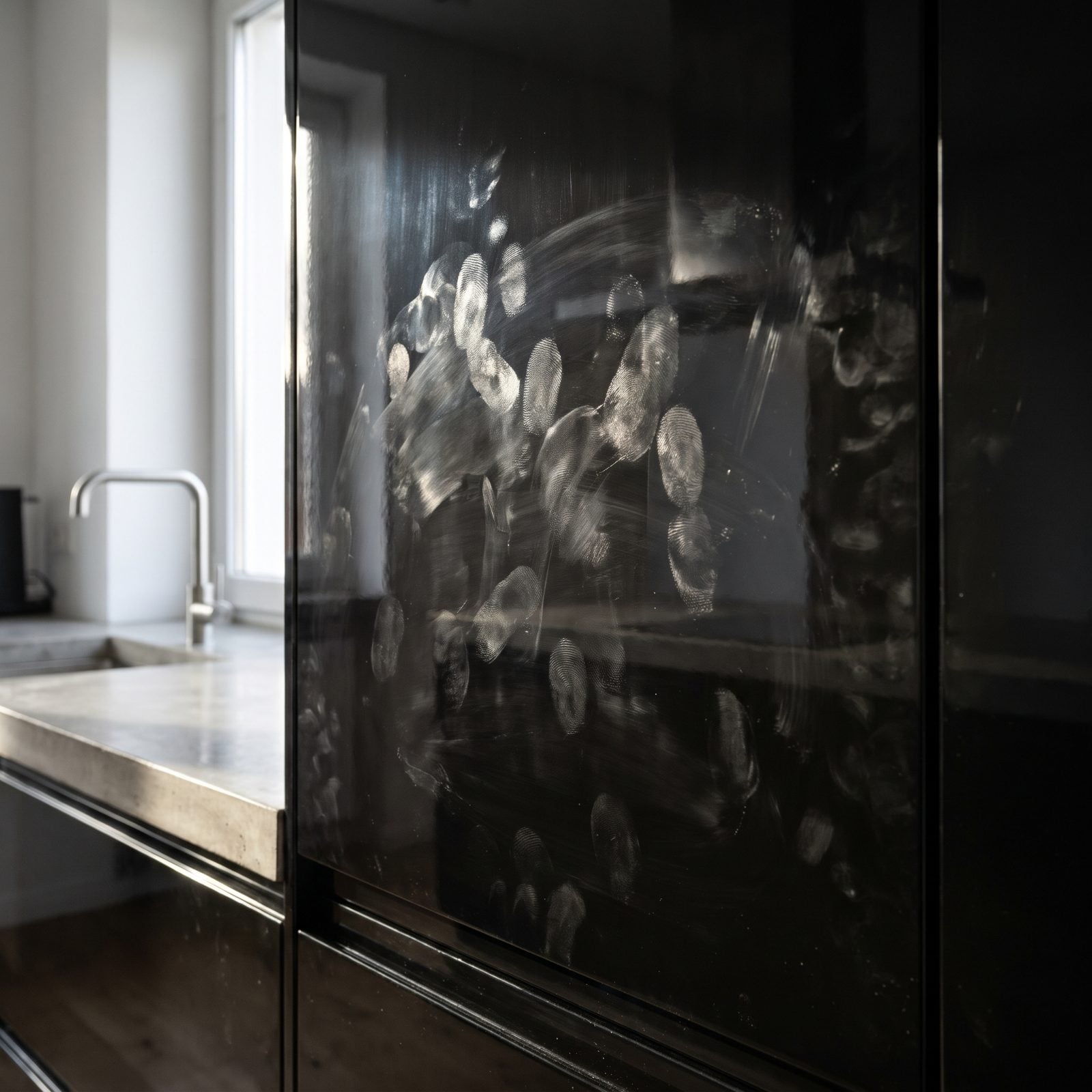
Gloss black is dramatic. It also records the fingerprint of everyone who walks past.
Every touch leaves a greasy little ghost on the surface, and against black lacquer those smudges read like graffiti. You’ll keep a microfiber cloth within arm’s reach and use it hourly. Love the look? Go matte black instead — it hides touches, holds its drama, and spares you the constant polishing.
This same commitment to deep color works far better with a forgiving finish. A dark kitchen design can anchor a whole room when the finish forgives you.
25. Marble Countertops That Stain If You Look at Them Wrong
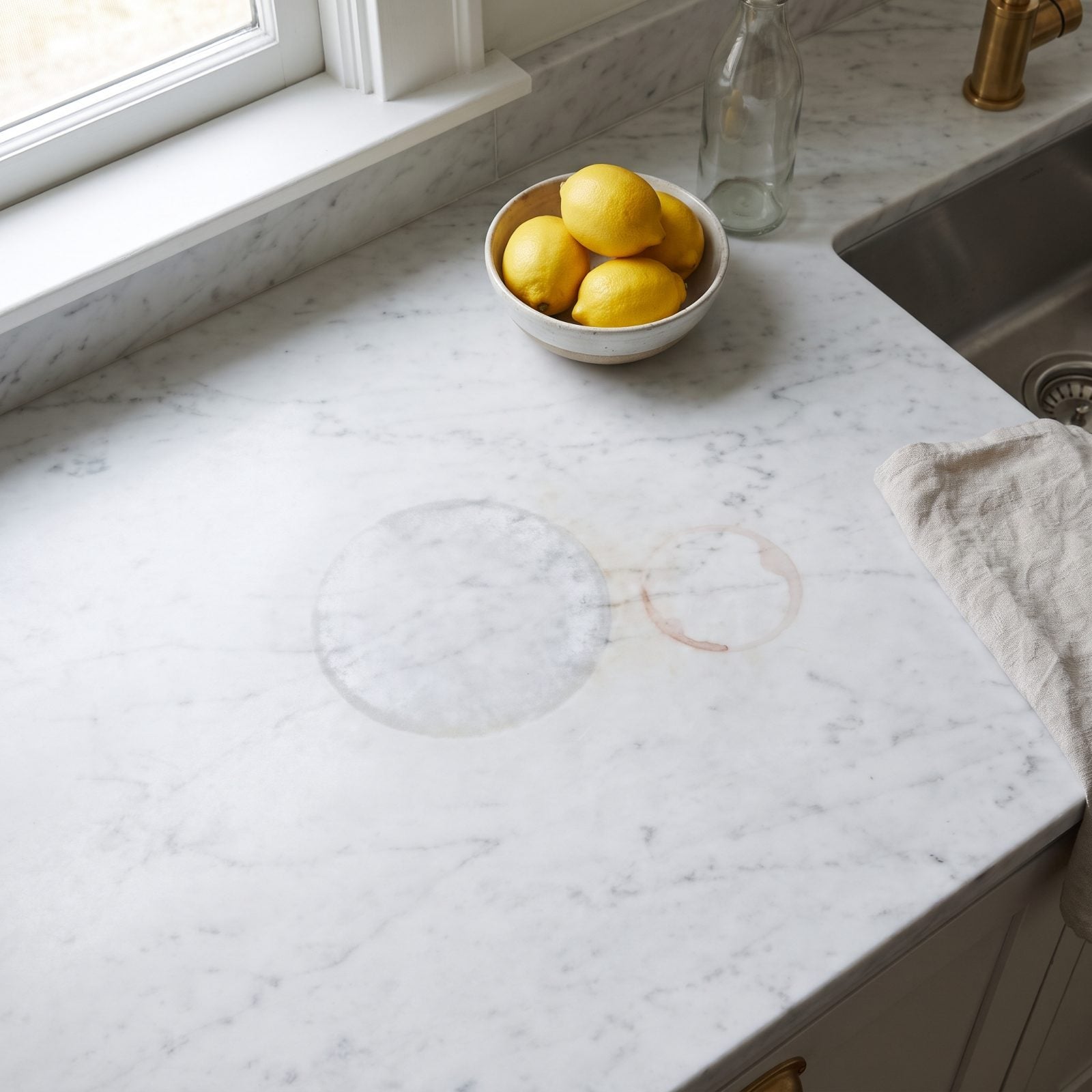
Marble is soft, porous, and reactive. Everything you love to eat and drink is slightly acidic, and acid etches marble into a dull matte spot no amount of wiping brings back.
Lemon juice. Red wine. A sweating glass. Coffee left overnight. Each one leaves a mark, and you can seal it and still lose the fight. Those stoneware bowls and the white cabinets make the counter sing, but the marble will earn its patina whether you want it to or not.
24. Floor-to-Ceiling Windows With Nowhere to Hide
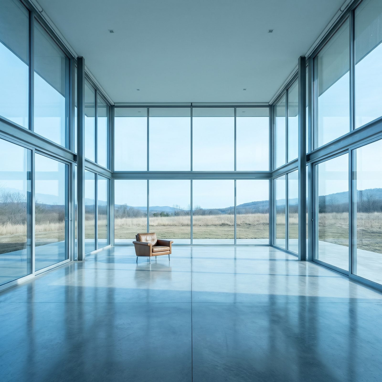
Glass walls photograph like freedom — light everywhere, the outdoors pulled inside, the room doubling in size.
Then dusk falls and you realize everyone can see in. You’re lit up like an aquarium while the street goes dark. And that much glass means heat gain in summer, cold leak in winter, and a cleaning schedule that never ends. The water spots and low smudges show up fast at kid or pet height.
23. Fiddle Leaf Figs That Give Up Within a Week
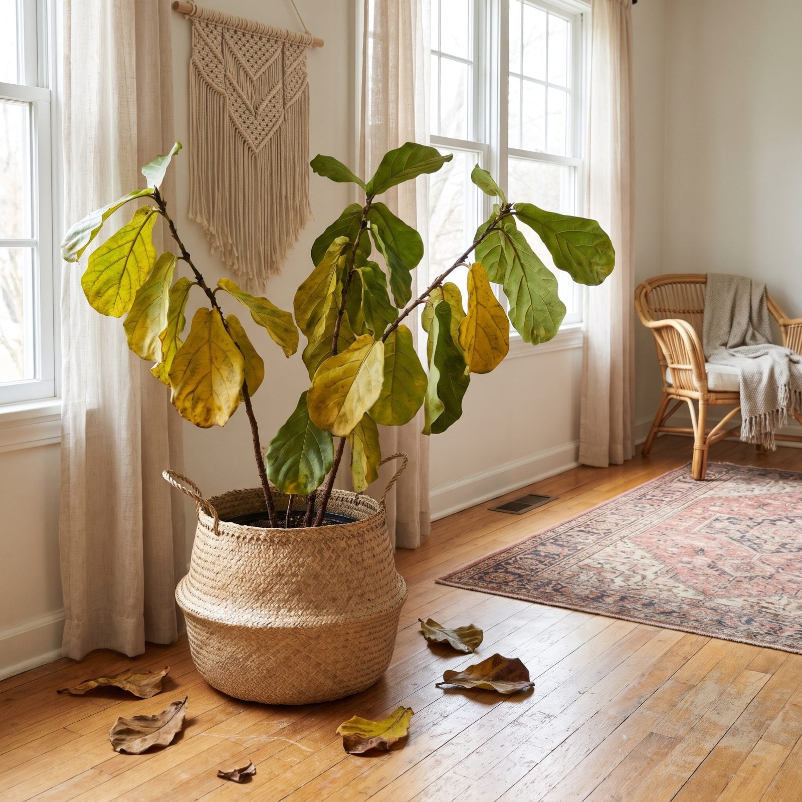
The fiddle leaf fig is the houseplant that launched a thousand living rooms. Sculptural leaves, tree-like height, instant designer credibility.
It’s also a diva. Move it two feet and it drops leaves in protest. Overwater and the leaves brown; underwater and they drop; cold draft from a door and you get more drops. We’ve killed more than we’d like to admit. Want the sculptural tree look without the funeral? A rubber plant or a bird of paradise forgives nearly everything.
22. Barn Doors That Block Neither Sound Nor Light
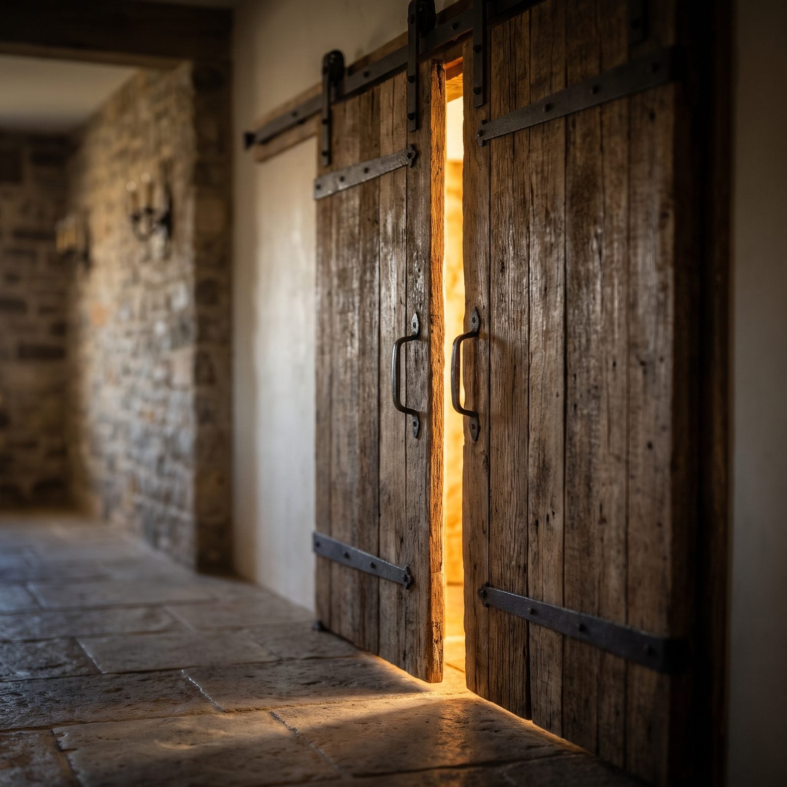
Barn doors look like rustic charm on a rail. They slide instead of swing, which saves floor space, and the hardware is genuinely handsome.
But a barn door hangs over the opening — it doesn’t seal it. Light leaks around every edge, sound passes straight through, and the track collects dust in a way you’ll notice every time the light hits it right. For a laundry closet, fine. For a bathroom or a bedroom, you’ll miss a real door the first time you want quiet.
They can still work magic in the right spot. Give a big hallway design one and it becomes the room’s centerpiece rather than a privacy problem.
21. Open-Concept Layouts With No Volume Control
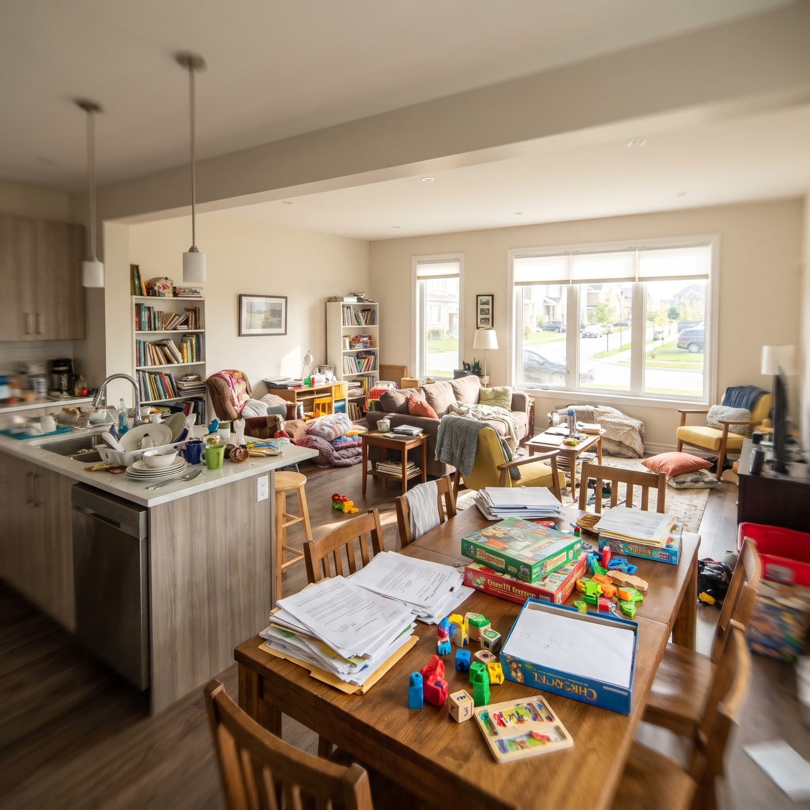
Open concept sells the dream of togetherness. One big connected space, sightlines everywhere, the cook never cut off from the party.
It also means the TV, the dishwasher, the blender, the kids, and the dinner conversation all share one acoustic room. Hard floors and tall ceilings bounce sound until the whole floor hums, and cooking smells travel everywhere too. Nobody gets a quiet corner. You can soften it with rugs, upholstery, and acoustic panels, but you can’t wall off noise that has no wall.
Open concept gives you one room to live in and zero rooms to hide in.
20. White Sofas in a House Full of Kids or Pets
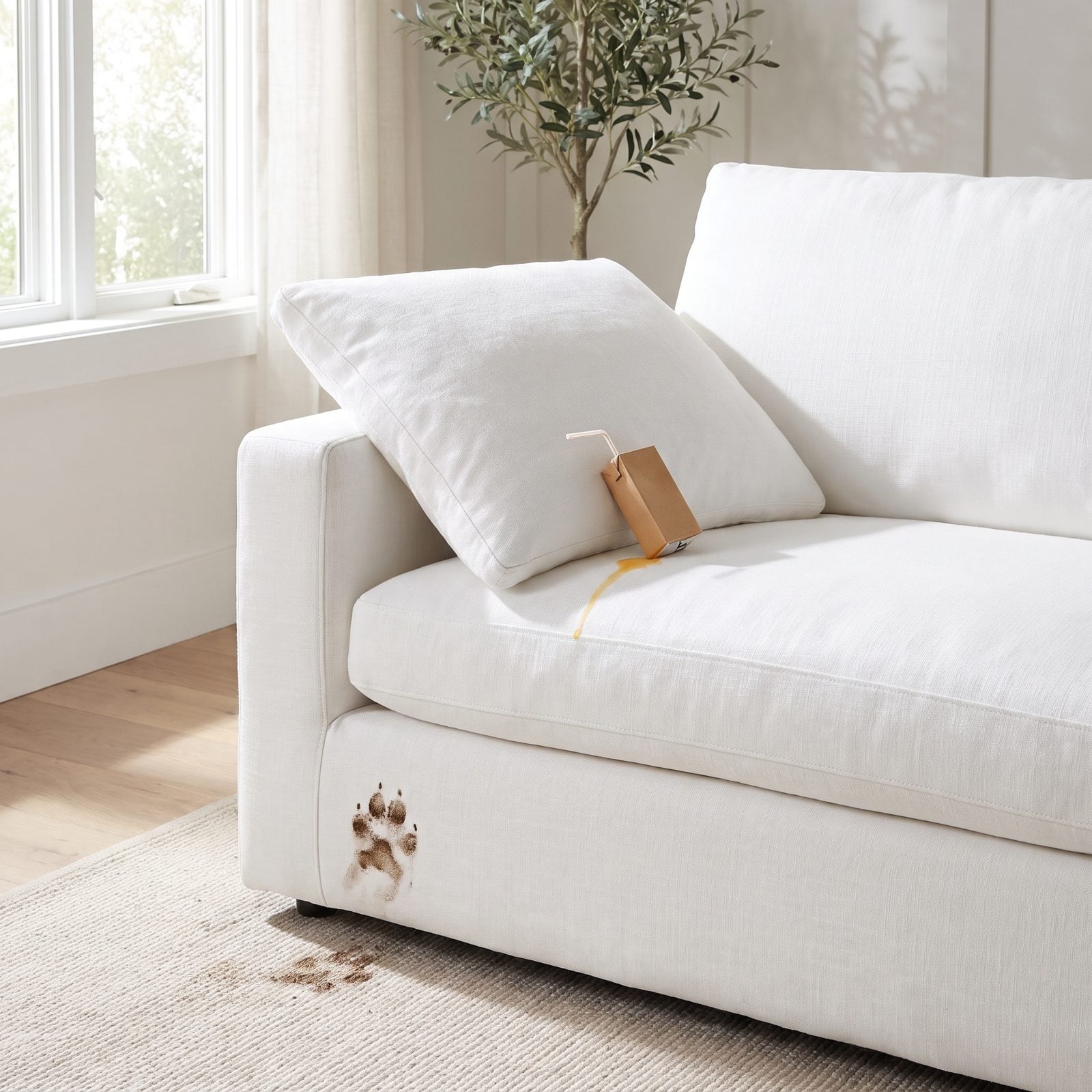
A white sofa is an act of faith. In a quiet home it’s the calmest anchor in the room. Add a toddler with a juice box or a dog that claims the cushions and it becomes a running scoreboard of your worst afternoons.
Want the look and the life? Buy washable slipcovers in performance fabric. The linen one here looks right, but notice the juice spill on the cushion and the muddy paw print on the base — that’s week two, not year two. That white throw pillow is the smart move: cheap to swap, easy to clean.
19. Freestanding Soaking Tubs and the Dust Trap Behind Them
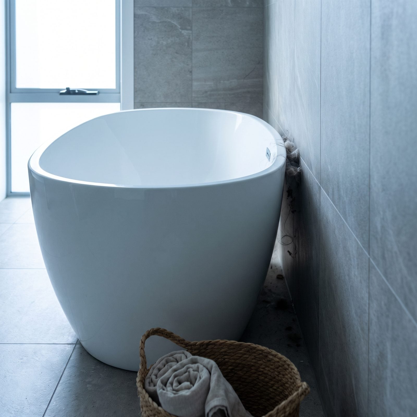
The freestanding tub is the hero shot of every renovated bathroom. Sculptural, sitting proud in the middle of the floor, a matte black filler arcing over it.
Nobody photographs the gap behind it. That dead zone between tub and wall collects dust, hair, and splashed water, and it’s just wide enough to be unreachable without a contortion act. Cleaning around the curved base means crouching and reaching. The matte black tub filler looks the part, but it spots with every hard-water splash.
Got room? Leave real clearance on all sides. If you don’t, a built-in tub with a surround you can actually wipe down will save you a weekly yoga session.
18. Concrete Countertops That Crack and Stain
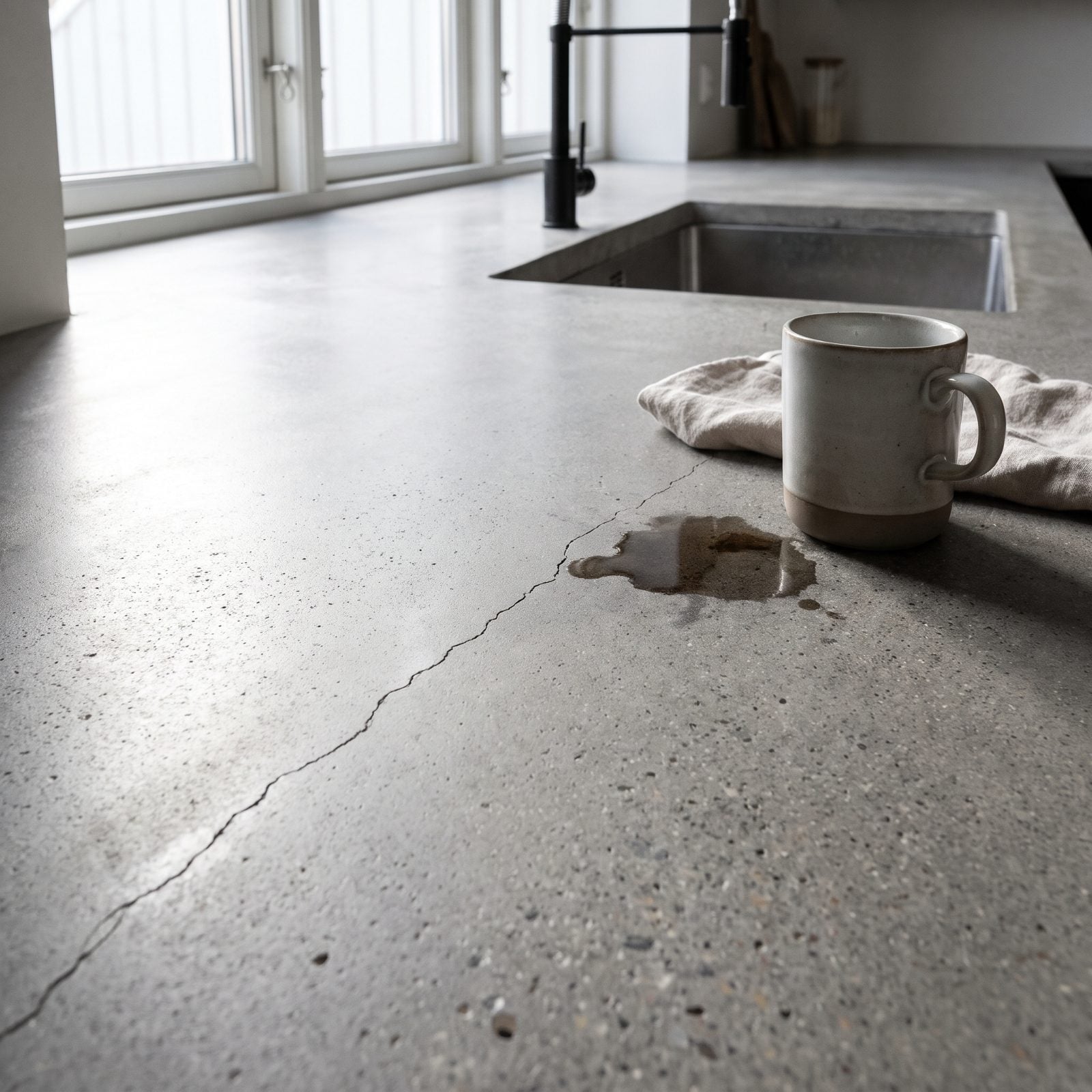
Concrete reads as honest and quietly expensive in a photo. The texture catches light like worn stone, and the edges look hand-poured because they are.
Then you live with it. Concrete is porous, so red wine, olive oil, and that one unforgiving lemon all leave a mark. Sealing helps — and then it needs redoing, and most people forget until there’s a ring the shape of last Tuesday’s coffee.
And it cracks. Nothing catastrophic, just a hairline that wanders across the surface because the stuff keeps moving as it cures. Some call that patina. Others call it a countertop that aged faster than they did.
17. Exposed Brick That Sheds Dust Endlessly
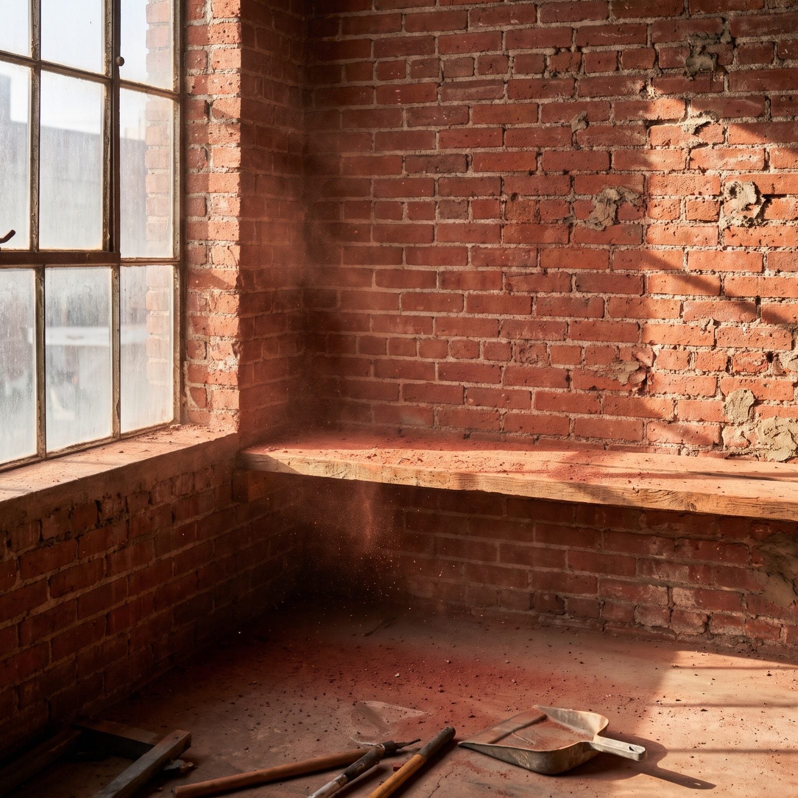
Exposed brick is the shortcut to character. One wall and suddenly the room has a backstory.
What the photos never show: brick sheds. All day, quietly, a fine rust-colored grit settles along the baseboard and onto anything parked underneath. You vacuum it Monday and it’s back Thursday. Sealing the wall cuts the mess down but dulls the raw look that made you want brick in the first place, so you get the texture or the clean floor. Rarely both.
16. Industrial Pendant Lights That Leave Rooms Too Dim
🔥 Would you like to save this?
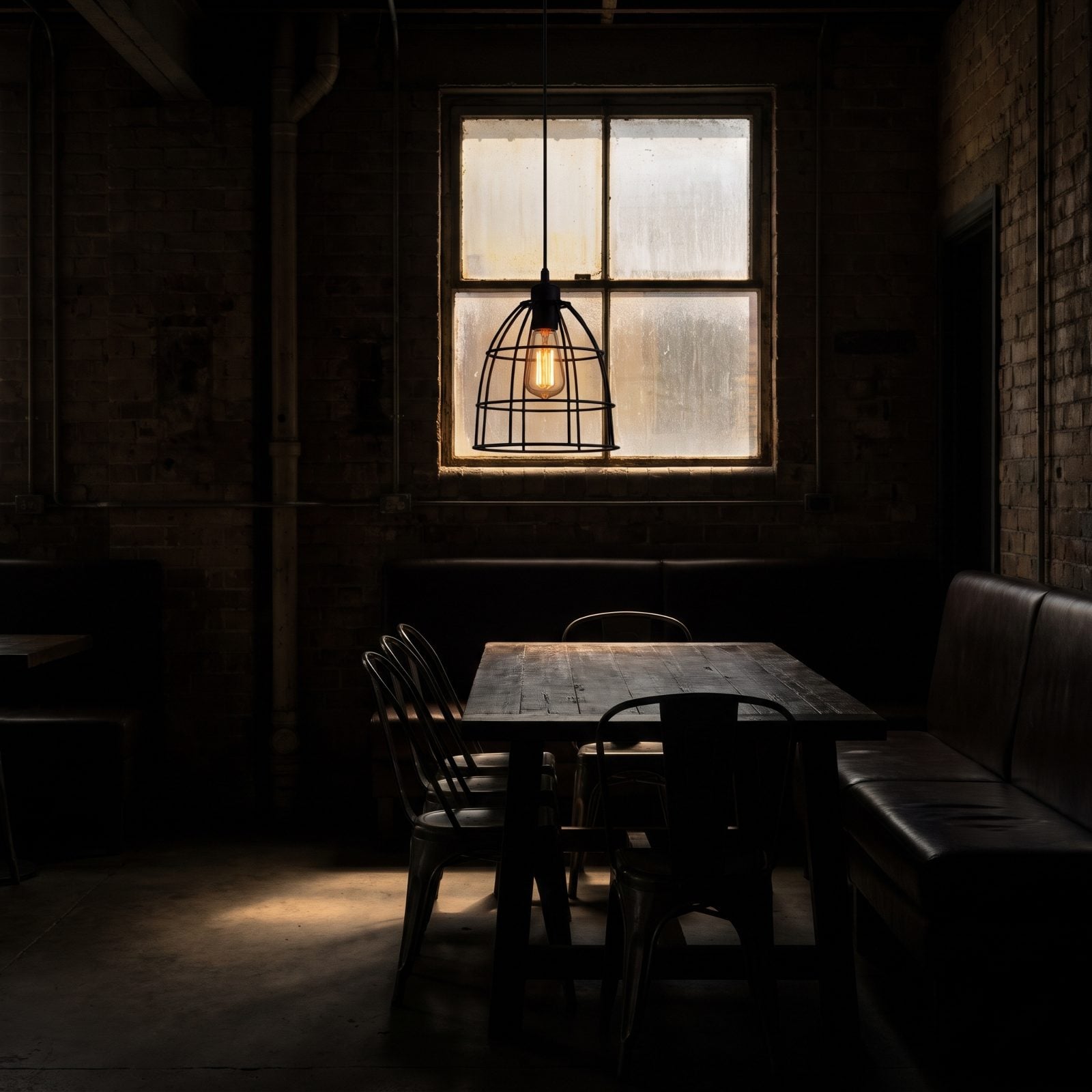
Those black cage pendants with the exposed filament bulbs photograph like a hip downtown bar. Moody, warm, deeply Instagrammable.
Live under them and you’ll find yourself squinting. Industrial fixtures aim light down in a tight pool, and a single low-wattage Edison bulb puts out about the glow of a scented candle. One pendant over a dining table looks great and lights a dinner plate, maybe. The rest of the room disappears into dusk.
A beautiful light that doesn’t light anything is just jewelry for the ceiling.
We fell for this one hard. Layer in table lamps and keep a couple of these as accents instead, and you get the look without eating dinner by feel. A warm black industrial pendant light belongs over an island, not as your only source.
15. Shiplap Walls That Trap Dust in Every Groove
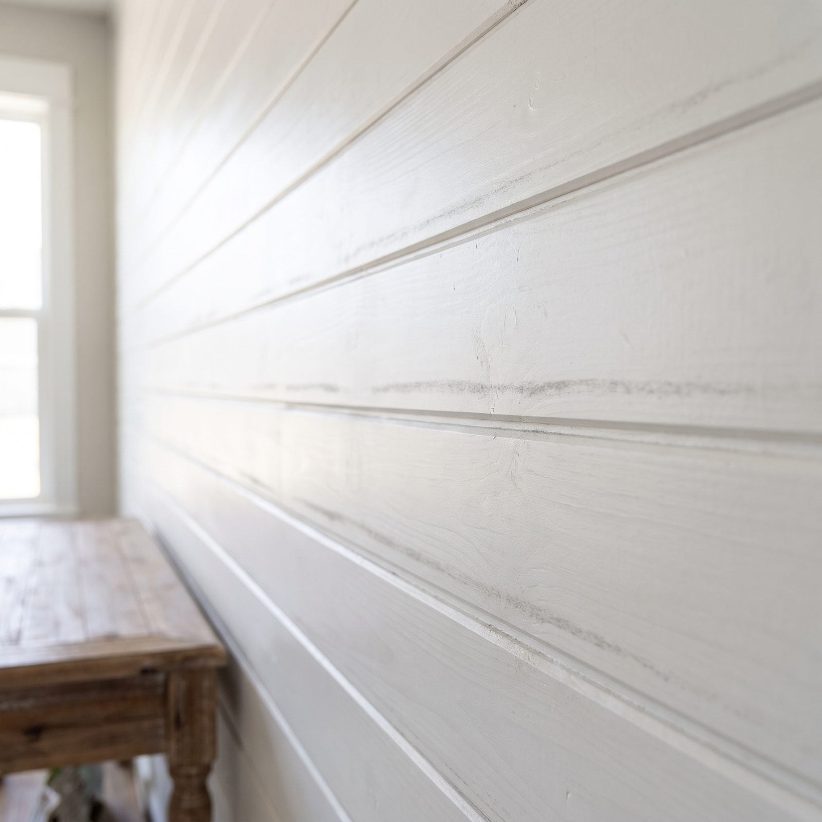
Shiplap went from fishing-shack siding to the most requested wall in America, and the grooves are the whole appeal. They catch light and cast those tidy horizontal shadows.
They catch everything else too. Every groove is a little shelf for dust, and there are dozens per wall. A regular wall you wipe. Shiplap? You run a dry brush or a vacuum attachment along it board by board if you want it to stay crisp, and most people don’t, so most shiplap walls wear a soft grey line across every seam by month three.
14. Floating Vanities With No Hidden Storage
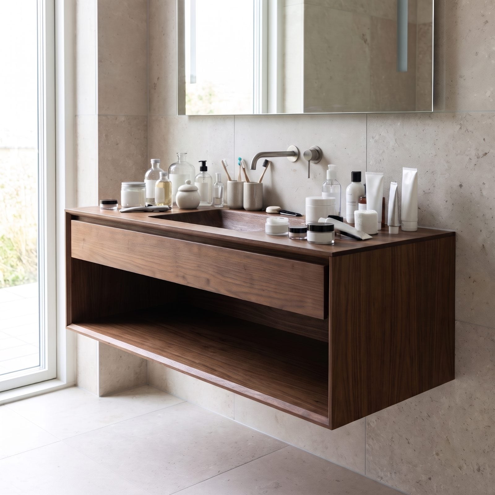
A floating vanity is a trick of the eye. The gap underneath makes the floor read continuous, the bathroom reads bigger, and the whole thing looks pricier than it is.
Then you try to put your stuff somewhere. That deep, sleek box that looks so clean has no real organization inside it — one huge full-width drawer where everything sinks into a jumble, plus a lot of empty air underneath you can’t use for anything but a basket you’ll trip over. Your hair dryer, your backups, and the eleven bottles you actually reach for every morning end up living on the counter, which quietly undoes the clean look you paid for.
13. Dark, Moody Paint Colors That Make Rooms Feel Cave-Like
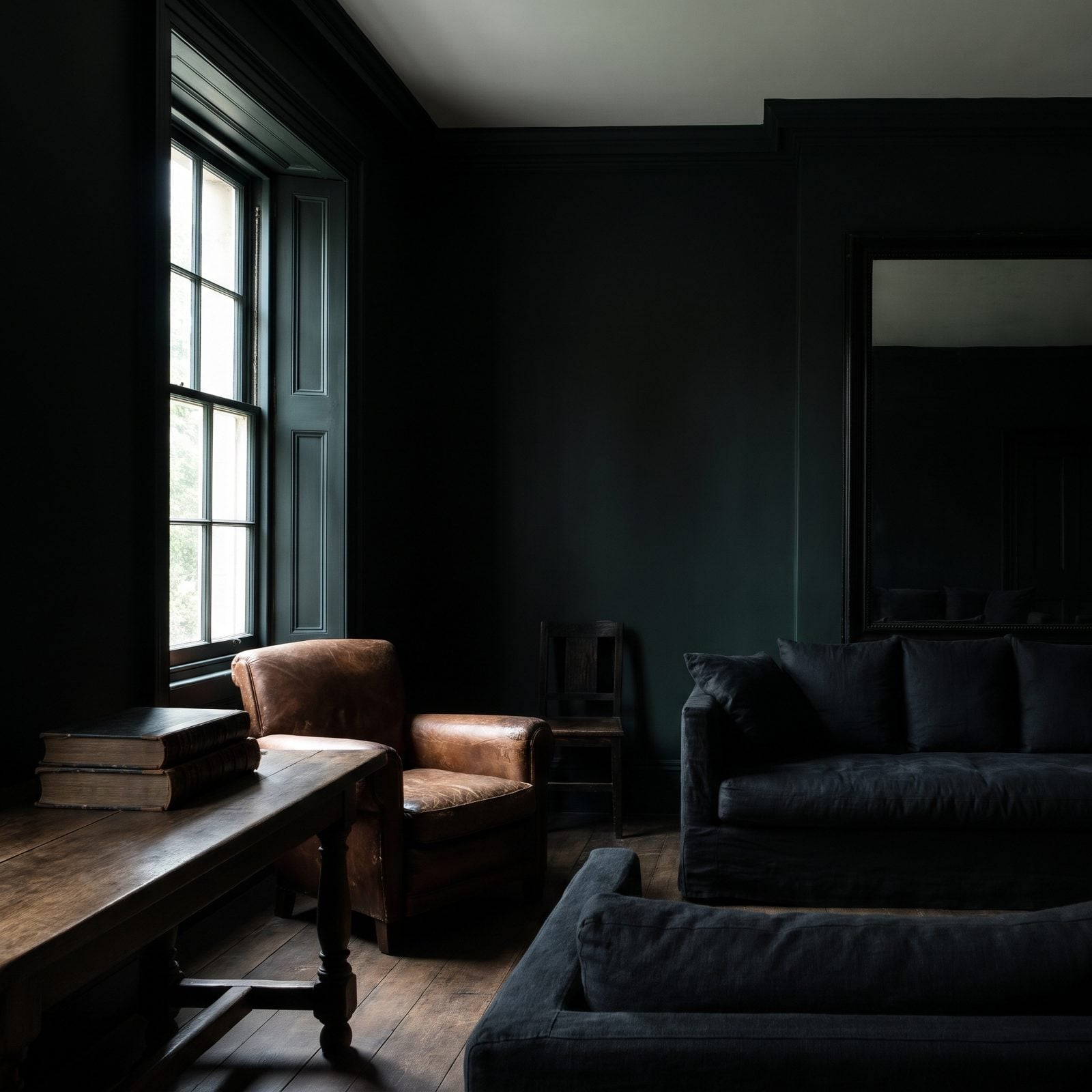
Deep inky walls look incredible in a photo. The light pools, the furniture pops, the whole room feels like a members-only club.
In daylight, though, a dark room eats light instead of bouncing it. Paint a small north-facing space charcoal and you’ve built yourself a cave that needs lamps on at noon. Dark colors also broadcast every fingerprint and scuff near the switches, and matte dark finishes are murder to touch up. We love a moody room. We just learned to save it for a space with real light, or one you only use after dark. Want proof it can be done right? Study a dark kitchen design that balances the depth with plenty of task lighting.
12. High-Gloss Lacquered Furniture That Scratches Instantly
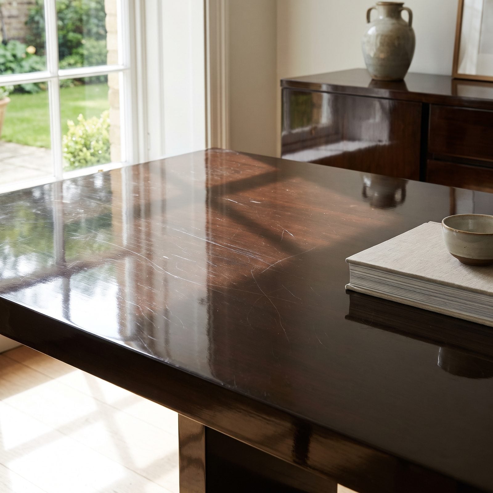
High-gloss lacquer is pure drama. That mirror finish doubles the light in a room and makes a cheap shape look like a gallery piece.
It also records every single thing that touches it. Fingerprints bloom the moment you open a drawer. Set a key down wrong and you’ve got a scratch you’ll see forever, because gloss shows damage the way a black car shows dust. The swirl marks from well-meaning wiping are the worst part — there’s no hiding on a surface designed to reflect everything right back at you.
11. Terrazzo Floors That Are Cold and Unforgiving Underfoot
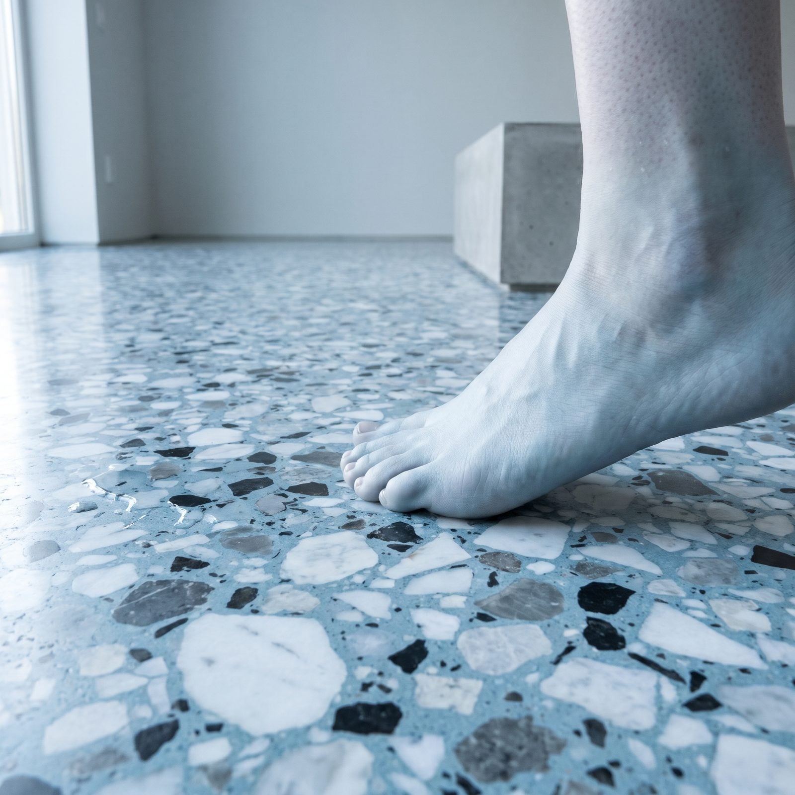
Terrazzo is having a long moment, and you can see why. All those little chips of marble and glass catch the light like confetti frozen in stone.
What a photo can’t tell you is how it feels at 6am in February. Terrazzo is essentially polished rock — cold, hard, and loud. Drop a glass and it shatters into a thousand pieces. Stand on it to cook dinner and your lower back files a formal complaint. Underfloor heating and a good runner rug fix most of that, but then you’ve spent extra to soften the exact thing you chose for its hardness.
10. Statement Wallpaper That You Tire of Fast
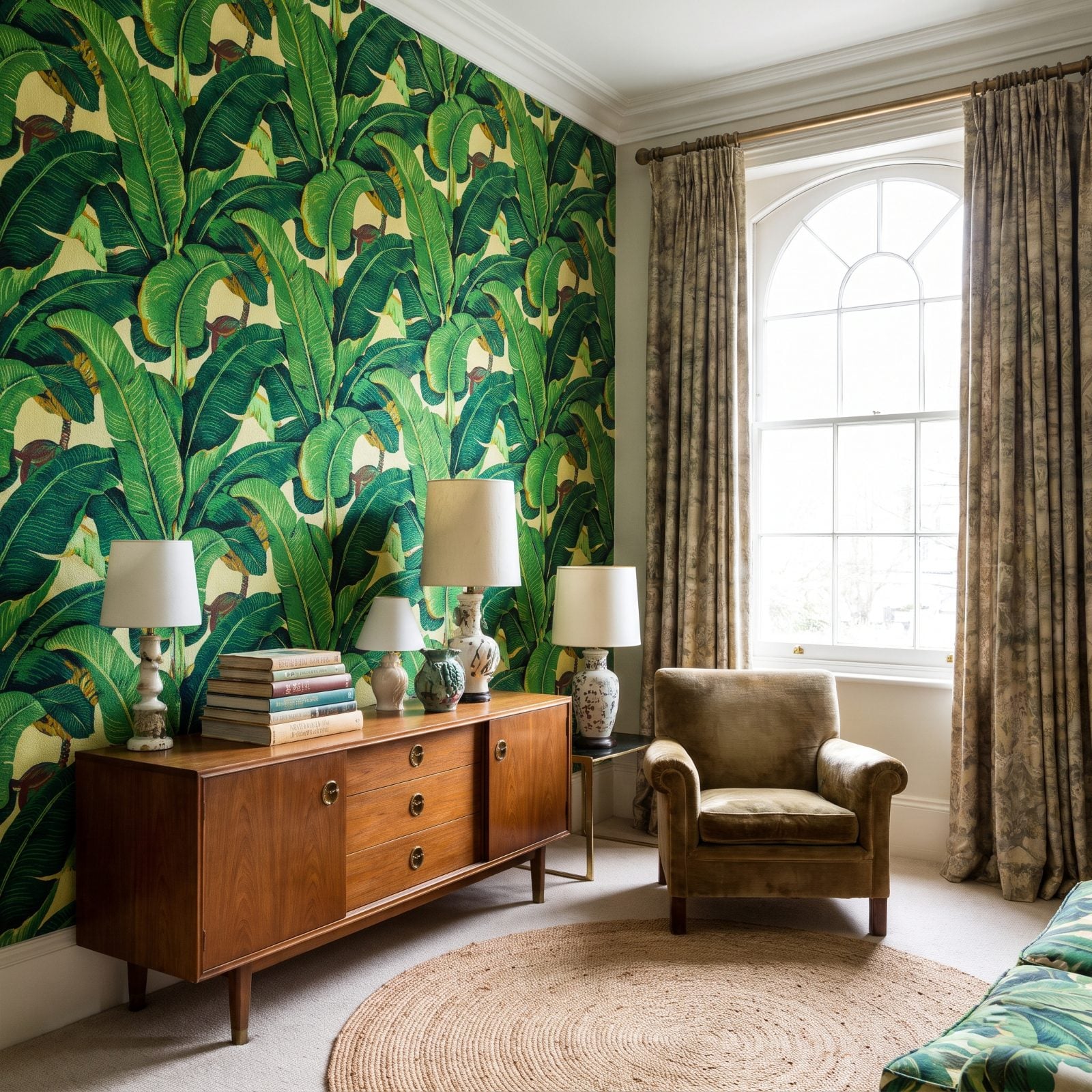
Big, graphic wallpaper is a whole personality on a roll. Banana leaves, oversized florals, something peacock-adjacent — and the room has instant point of view.
The catch with a strong opinion is that you have to keep agreeing with it. That maximalist print you adored in spring starts shouting at you by autumn, and you can’t just repaint over it in an afternoon. Removing wallpaper is a whole weekend of steam, scraping, and muttering. So if you crave the pattern, confine it to a powder room or a single feature wall where you can bail without regret.
9. Minimalist Kitchens With Nowhere to Put Anything
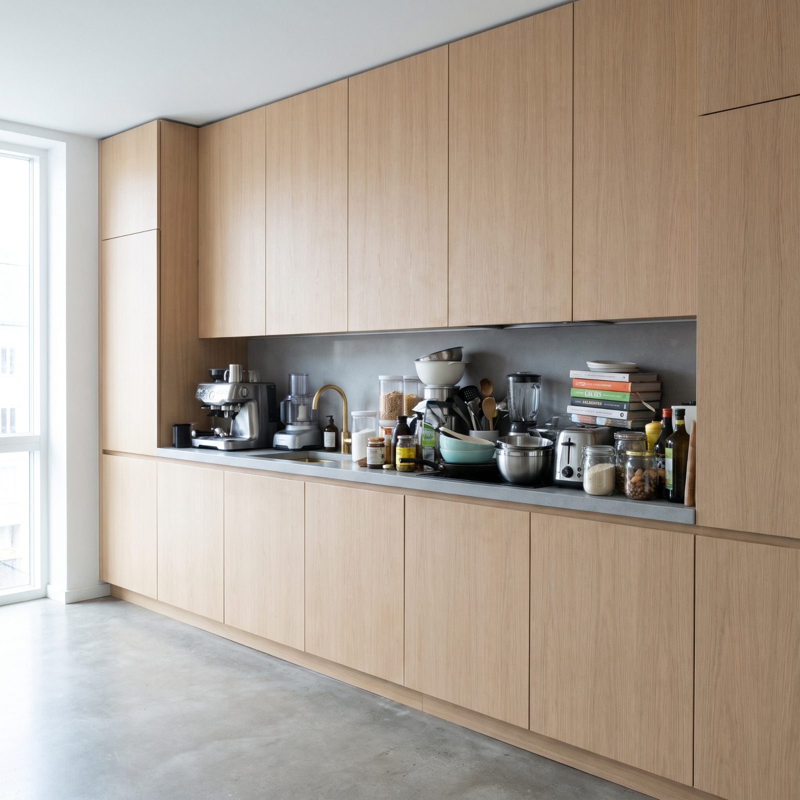
The handleless, hardware-free minimalist kitchen is the cleanest look going. No pulls, no clutter, just planes of color and a surface you could land a plane on.
Empty counters photograph like a dream. Then real life shows up with a coffee machine, a knife block, a toaster, and the mail. Minimalist kitchens look so bare in photos because everything got crammed into fewer, deeper cabinets — the kind where the pan you need lives behind four you don’t. Something always migrates onto the counter, and the serene look collapses under a kettle and a stack of envelopes.
The fix isn’t more minimalism. It’s being honest about how much you actually own before you design the storage, not after.
8. Rattan and Wicker Furniture That Sags and Creaks
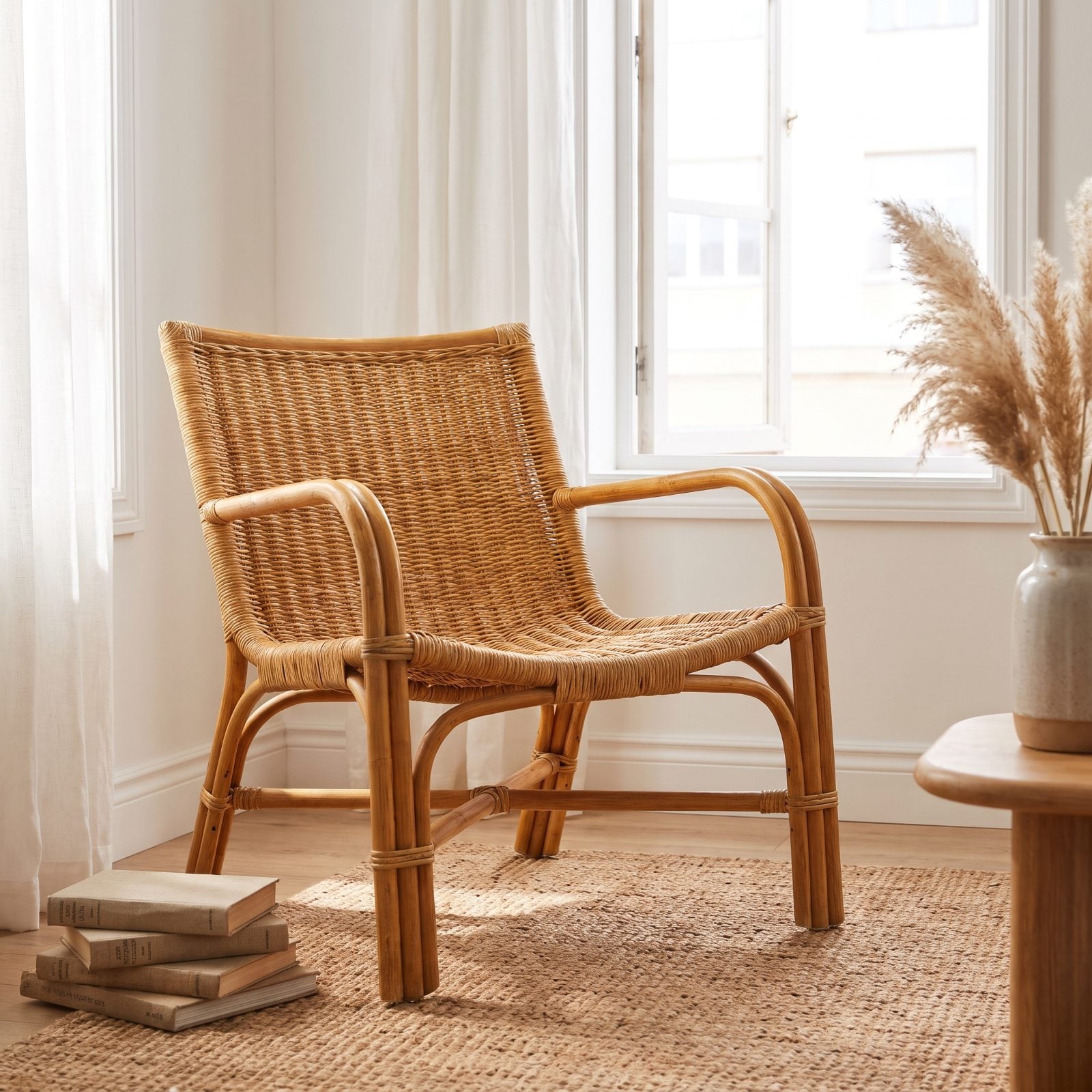
Rattan looks like a vacation — light, breezy, that woven honey color that reads coastal in every photo. The catch is the weave, which stretches. Sit in the same spot for a year and the seat develops a sag your lower back learns to hate.
And the creak. Every rattan chair eventually announces you to the room. There’s a reason so many cottage makeovers keep a few floor cushions nearby for when the weave finally quits.
7. Vessel Sinks That Splash Water Everywhere
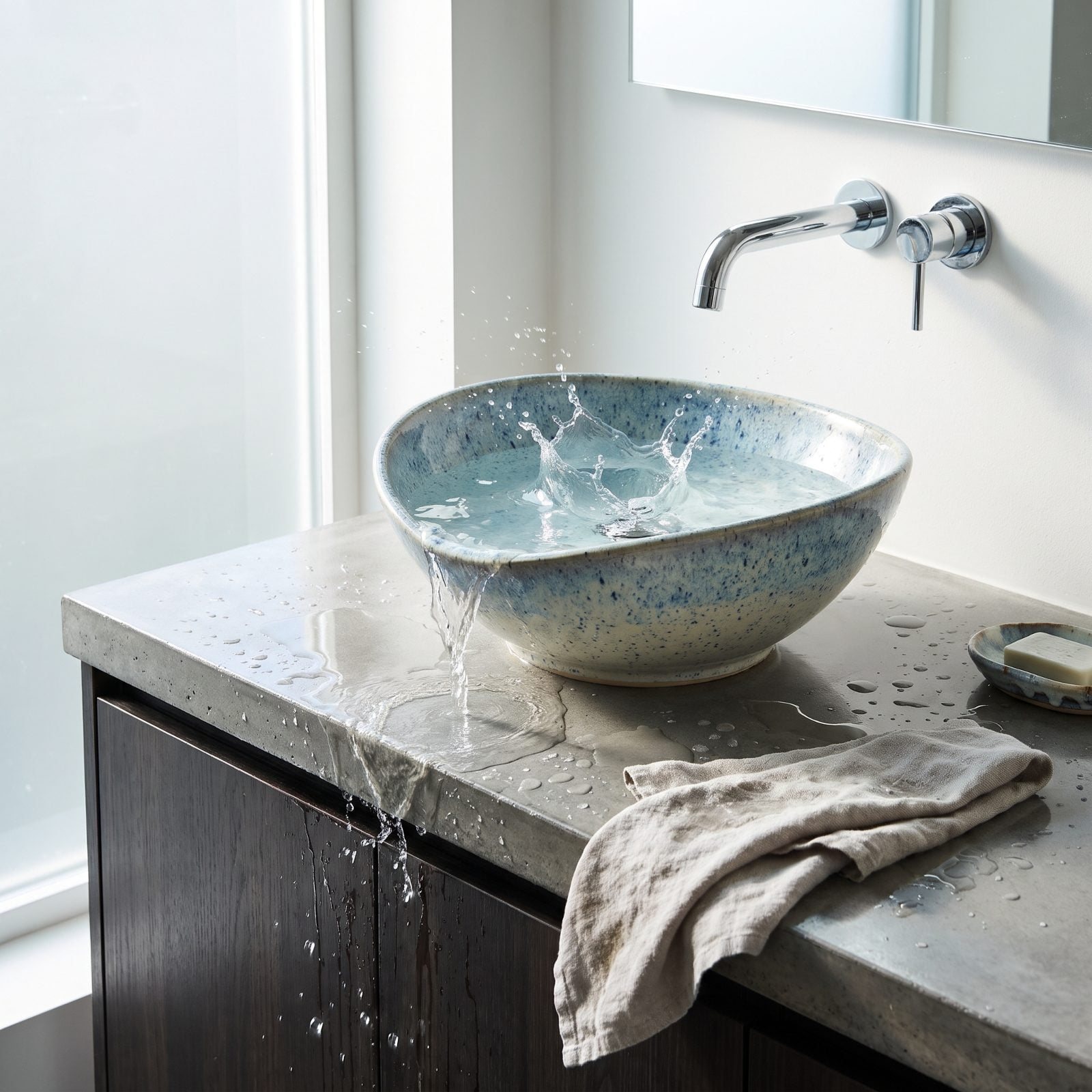
That bowl perched on the counter is sculptural, and it turns a plain sink into an object worth photographing. Designers love the height, the shadow it throws, the way it sits there like a piece of pottery on display.
Then you actually use it. Water sloshes around the shallow bowl and leaps right back out — onto the counter, the floor, your sleeves. And because the rim sits high above the counter, every drip off your hands lands outside the bowl, so the puddle is real. You wipe that counter three times a day or you watch the wood swell. Plenty of owners learn this the hard way and simply accept that the paper towel lives on the vanity now.
A walnut floating vanity under one of these needs a good sealant and a short temper about droplets.
6. Glass Shower Walls That Need Constant Squeegeeing
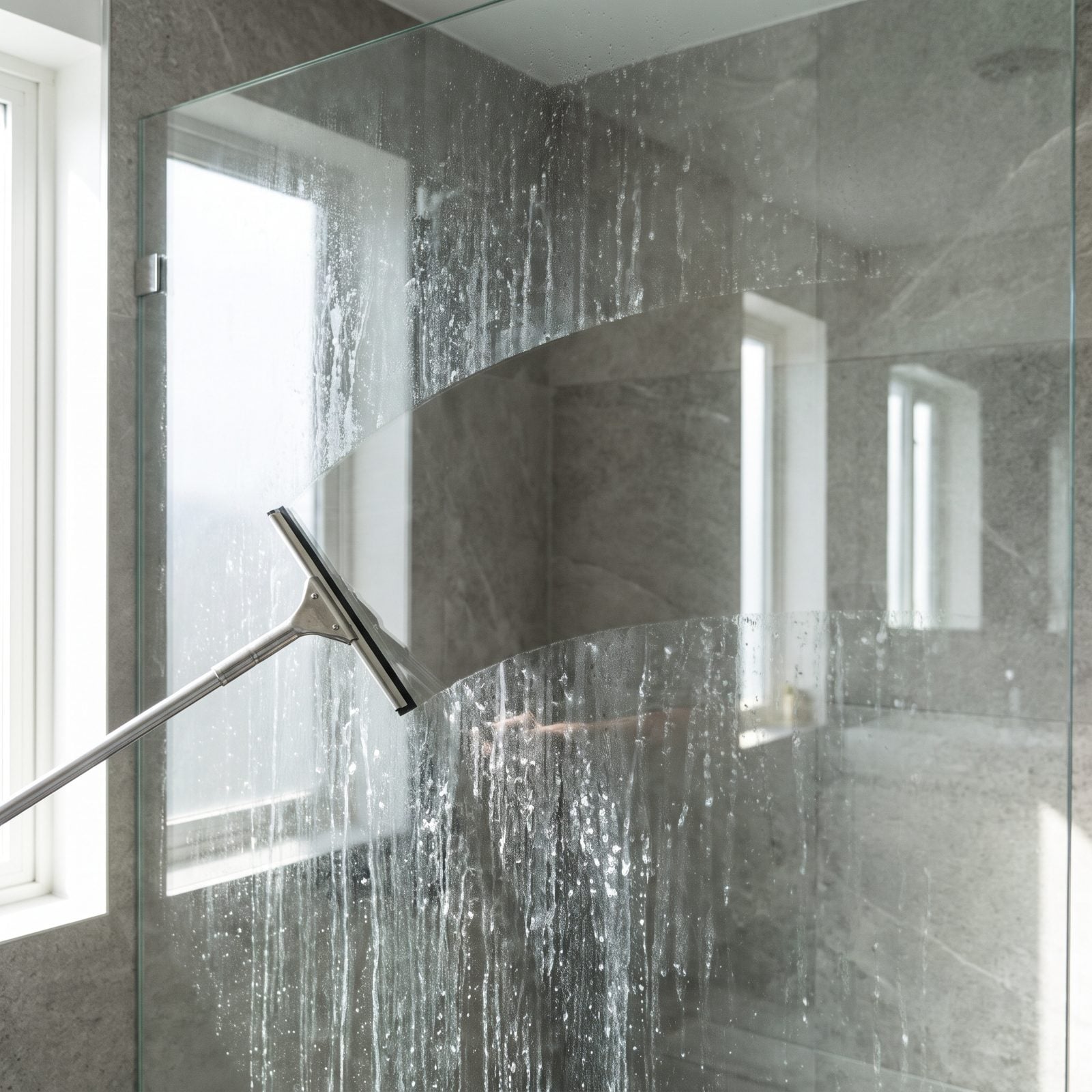
Frameless glass is the move for a reason. No chrome frame chopping up the room, no curtain sucking inward at your ankles — just a clean sheet of glass that makes the whole bathroom feel bigger.
Nobody tells you it’s a part-time job. Hard water leaves spots the second it dries, soap scum films the lower panels, and skip the squeegee for a week and the glass goes cloudy in a way that photographs as neglect. That squeegee hanging on the hook in every shower photo isn’t styling. It’s a confession.
5. Wall-to-Wall White Carpet That Stains Forever
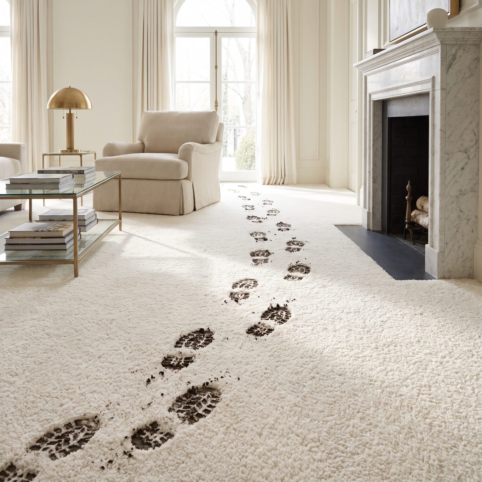
White carpet in a photo reads as pure luxury. It says no kids, no mud, no real life happening here — the light bounces off it and the whole room goes soft and bright.
Live on it for a month and the truth shows up. Red wine finds it. So does coffee, olive oil, the bottom of a shoe you swore you took off. Even clean feet wear a grey path through the busy lanes within a year. White carpet doesn’t forgive. It records.
4. Sunken Living Rooms That Are a Tripping Hazard
🔥 Would you like to save this?
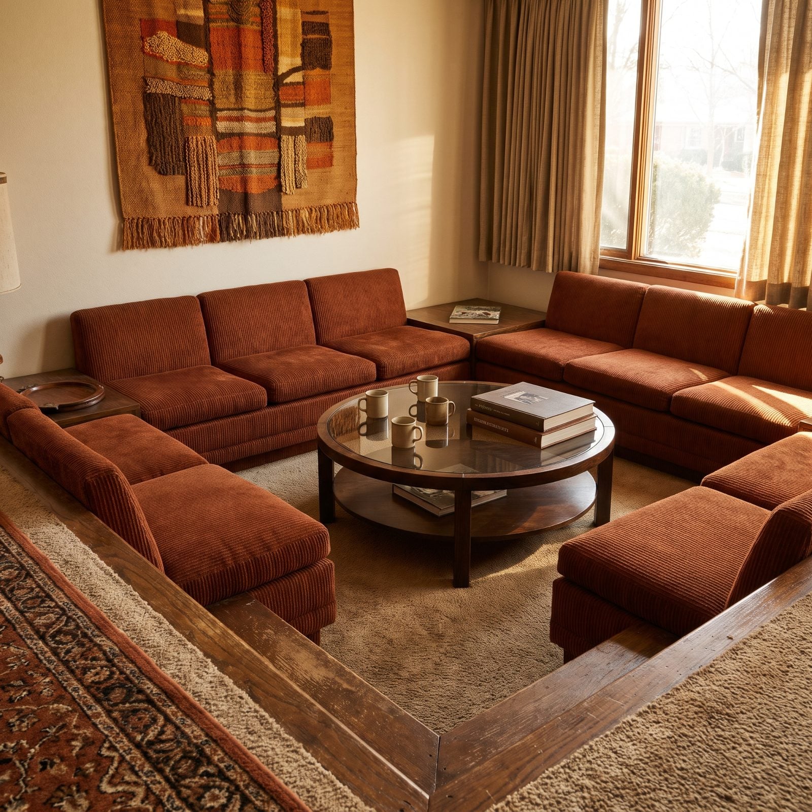
The conversation pit is back, and it’s easy to see why. Drop the seating two steps below the floor and the room suddenly wraps around you. You’re held, cocooned, below the noise. It’s one of the oldest comfort tricks going.
It’s also a step you forget exists. In the dark, at a party, carrying two drinks — every sunken room eventually catches somebody’s ankle. The level change that reads as drama in a magazine is the thing you narrate to guests: “watch the step.” You’ll say it a hundred times. For a layered colorful basement design a sunken feature makes more sense, somewhere falls are less likely.
3. Backless Floating Stairs That Feel Terrifying Daily
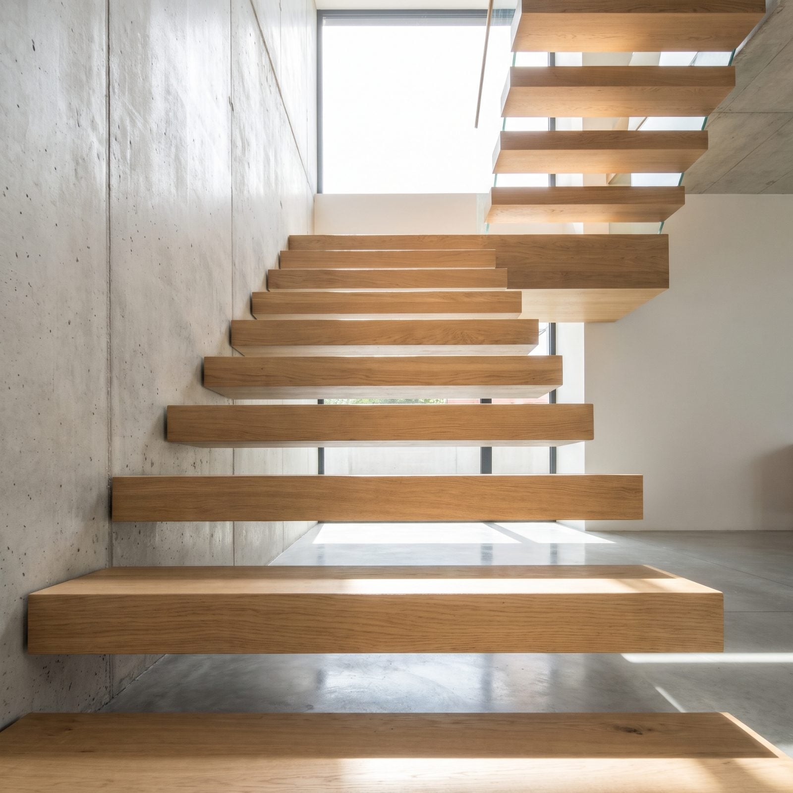
Floating stairs show off. The treads hover, the light passes straight through, and the whole thing looks like it’s defying gravity on purpose. In photos, they’re the first thing your eye lands on.
On them is a different story. Open risers mean you can see the drop under every step, and your body never fully trusts it. Socks on oak treads with nothing behind them. A toddler, a tipsy guest, a dog that doesn’t understand physics. You grip the rail harder than you’ll admit. Beautiful going up, honest going down.
They make more visual sense in a double-height big hallway design where the drama has room to breathe and foot traffic stays lighter.
2. Velvet Upholstery That Crushes and Shows Every Mark
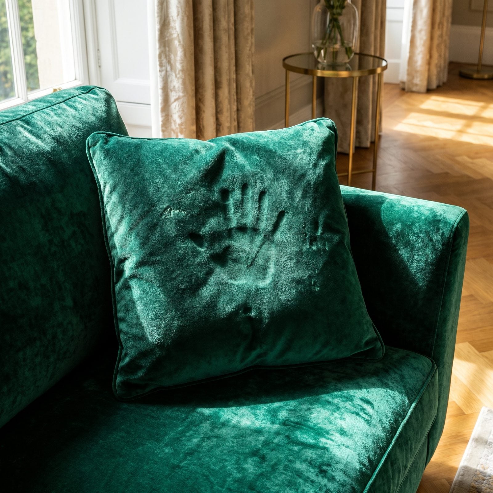
Velvet is the most photogenic fabric there is. The pile catches light, deepens the color, and gives a sofa that look of money without trying. An emerald velvet sofa in good light stops people mid-sentence.
The pile that makes it gorgeous is also its whole problem. Sit on it and you leave a crush mark. Brush it the wrong way and the color shifts. Set a glass down carelessly and the water ring stays. It records every body that’s touched it, like fresh snow after a crowd walks through. We love the stuff and we’ll still warn you it’s high maintenance, because it is.
1. Light Oak Floors That Scratch and Show Every Scuff
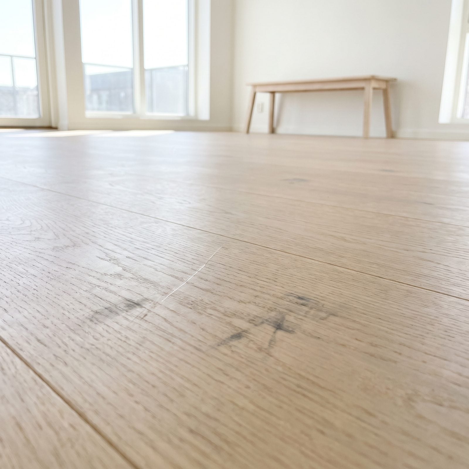
Pale oak is everywhere right now, and it’s easy to see why. The blonde tone keeps a room bright, makes ceilings feel taller, and reads calm in any light. Very Scandinavian.
Here’s the part the moodboard leaves out. Light floors show everything. A dragged chair leaves a scratch you’ll spot from the doorway, grit under a shoe scuffs the matte finish, and every spill and tracked-in smudge shows up in a way a mid-tone floor would hide. Every chip of character sits right there on the surface, lit up by the same bright windows that sold you on it.