🔥 Would you like to save this?
Somebody ripped out a perfectly good clawfoot tub in 1998 to make room for a beige fiberglass shower insert. That person is now paying a premium to put one back. Trends move in circles, and the features your grandparents took for granted are the same ones designers fight over today. Open floor plans had their moment and overstayed it. Now the pendulum swings back toward rooms with purpose, walls with pattern, and details that do more than exist. Here are the old-school features worth stealing back.
28. The Formal Dining Room Comes Back From the Dead
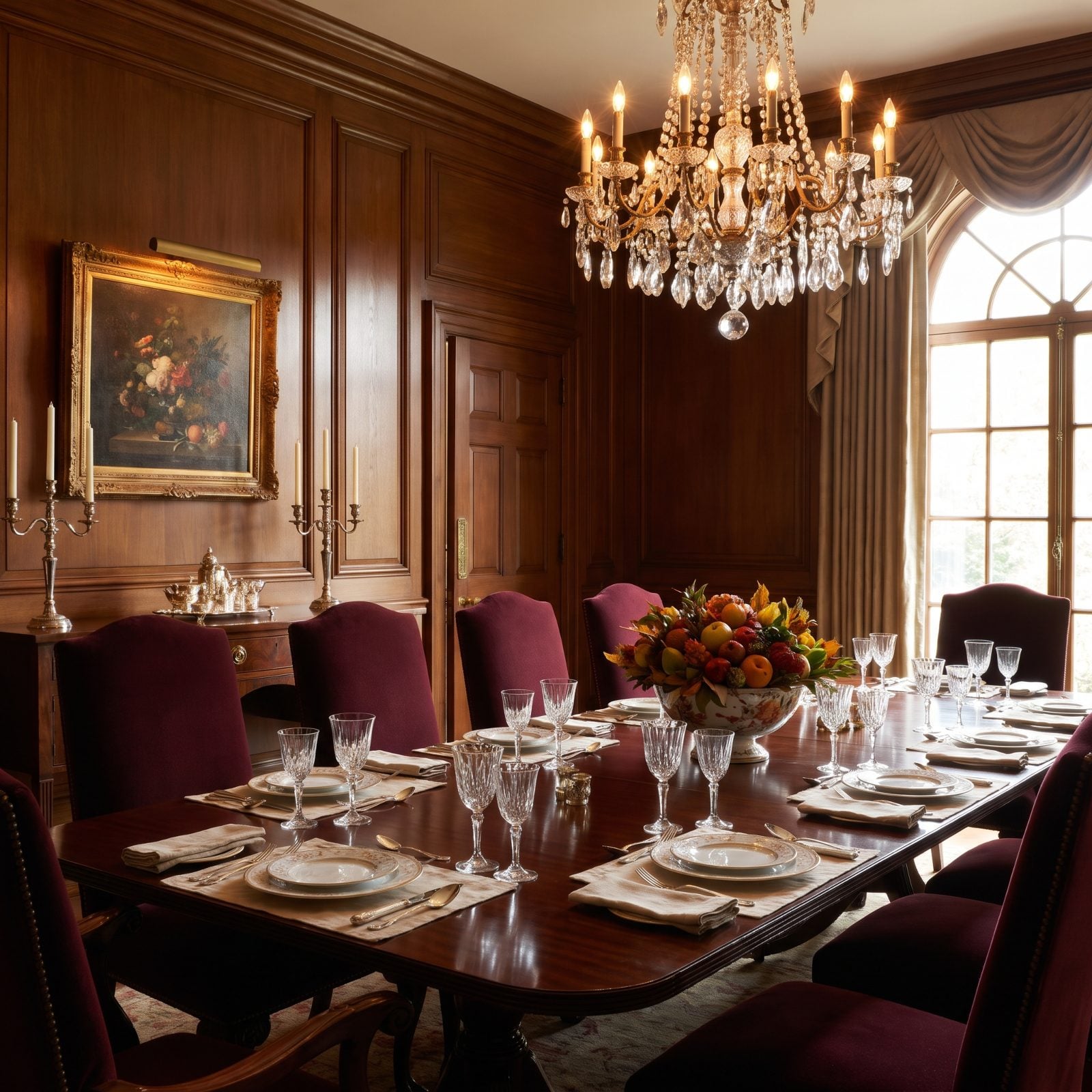
Open-plan living promised togetherness and delivered a dining table that doubles as a laptop graveyard. The formal dining room is back because people figured out that a room with one job does that job better.
In order to come up with the very specific design ideas, we create most designs with the assistance of state-of-the-art AI interior design software. Also, assume links that take you off the site are affiliate links such as links to Amazon. this means we may earn a commission if you buy something.
Here the burgundy velvet dining chairs and dark wood-paneled walls pull the whole room toward warmth, while the sparkle of the crystal chandelier keeps it from tipping into stuffy. It reads as a place you sit for three hours, not twenty minutes.
27. Walk-In Pantries With Shelves That Go All the Way Up
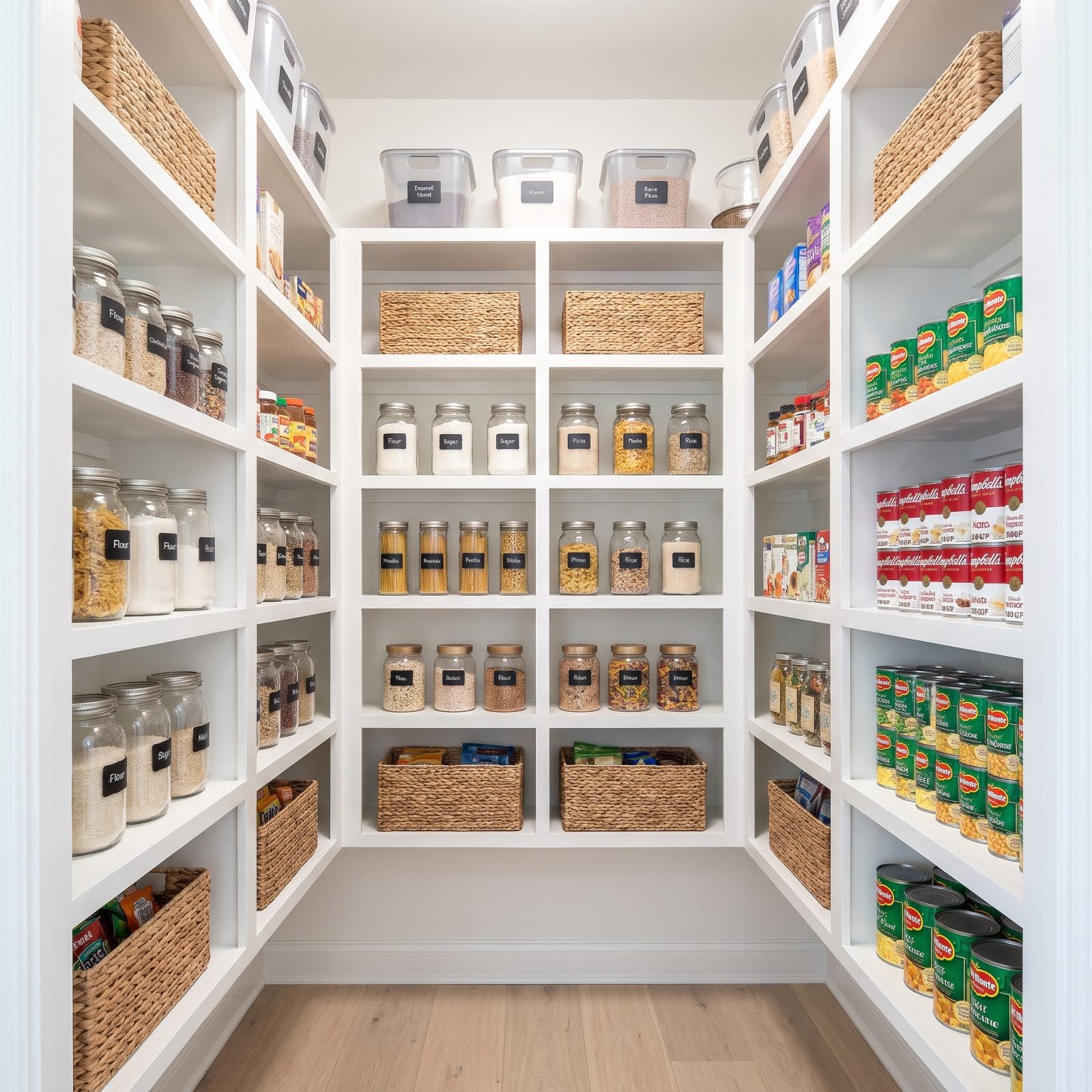
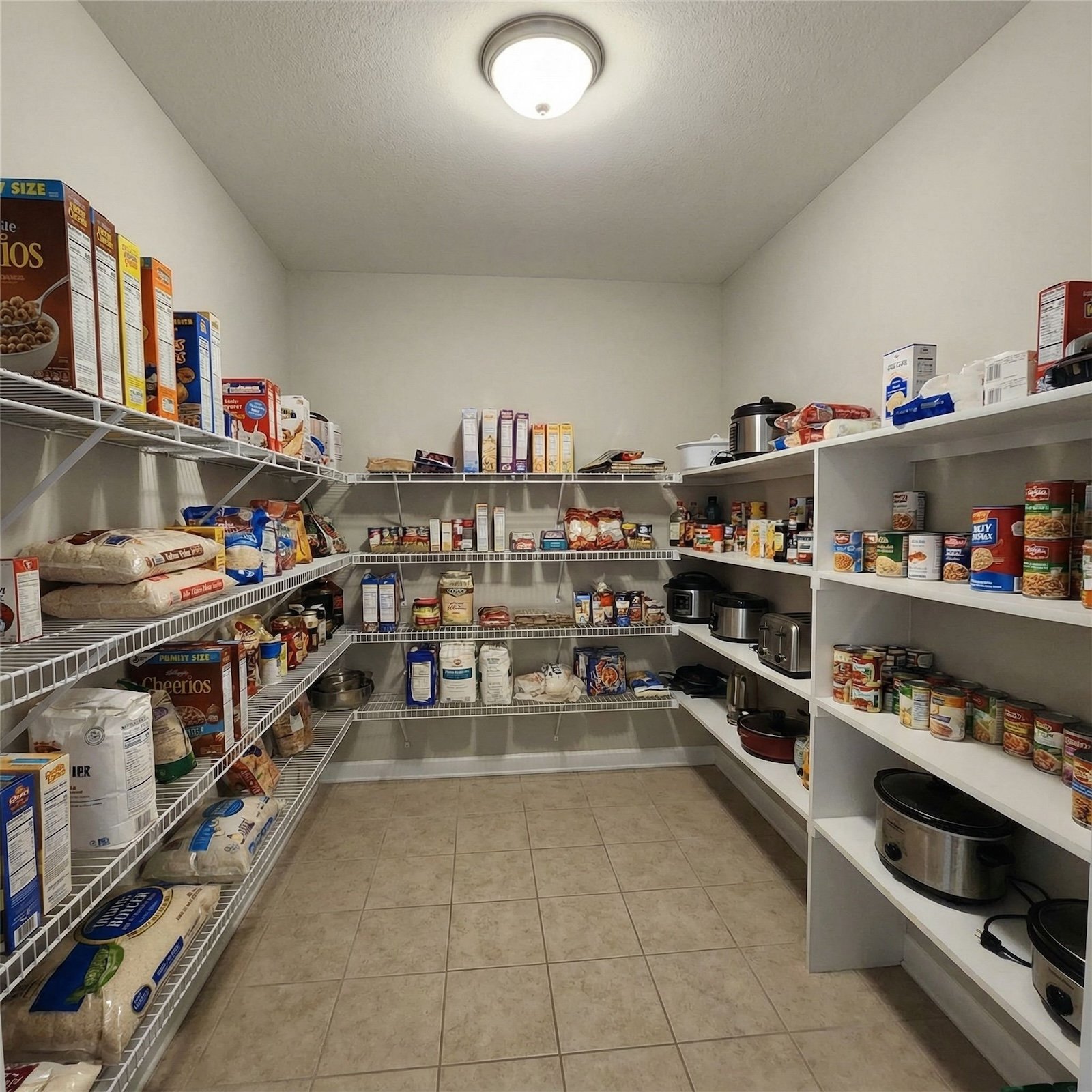
That cramped cabinet of mismatched cereal boxes was never going to cut it. The walk-in pantry returned because kitchens got too pretty to clutter, and everything had to go somewhere.
What makes this one sing is the vertical commitment. Shelves run straight to the ceiling, so nothing hides and everything earns its square inch. The white open shelving turns stored food into something you actually want to look at.
26. Butler’s Pantries, No Butler Required
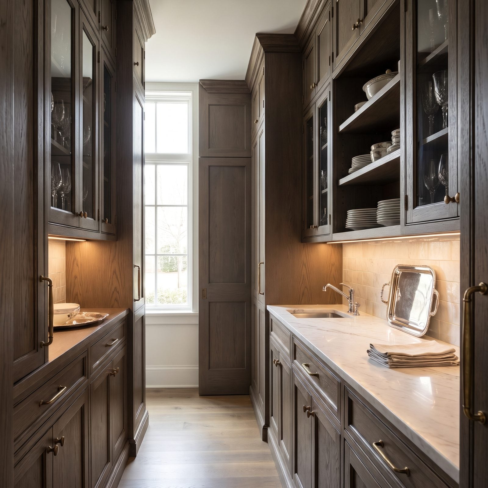
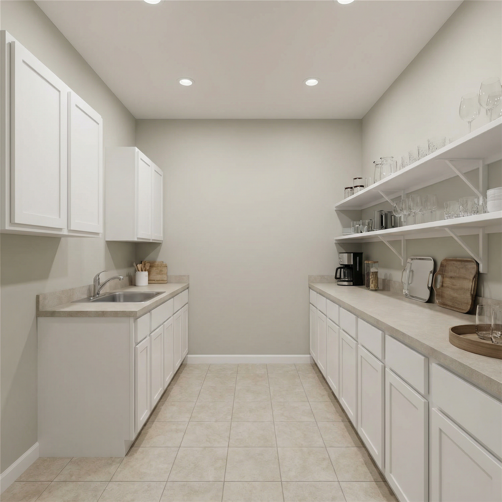
A butler’s pantry is the staging zone nobody admits they want until they host one dinner party and realize the dirty pots don’t have to sit in front of guests.
The gray-brown stained oak cabinets and glass-front uppers here do double duty, storing the good glassware while showing it off. That little polished nickel bar sink faucet means you prep, pour, and clean without ever crossing into the main kitchen.
25. Breakfast Nooks Built Right Into the Corner
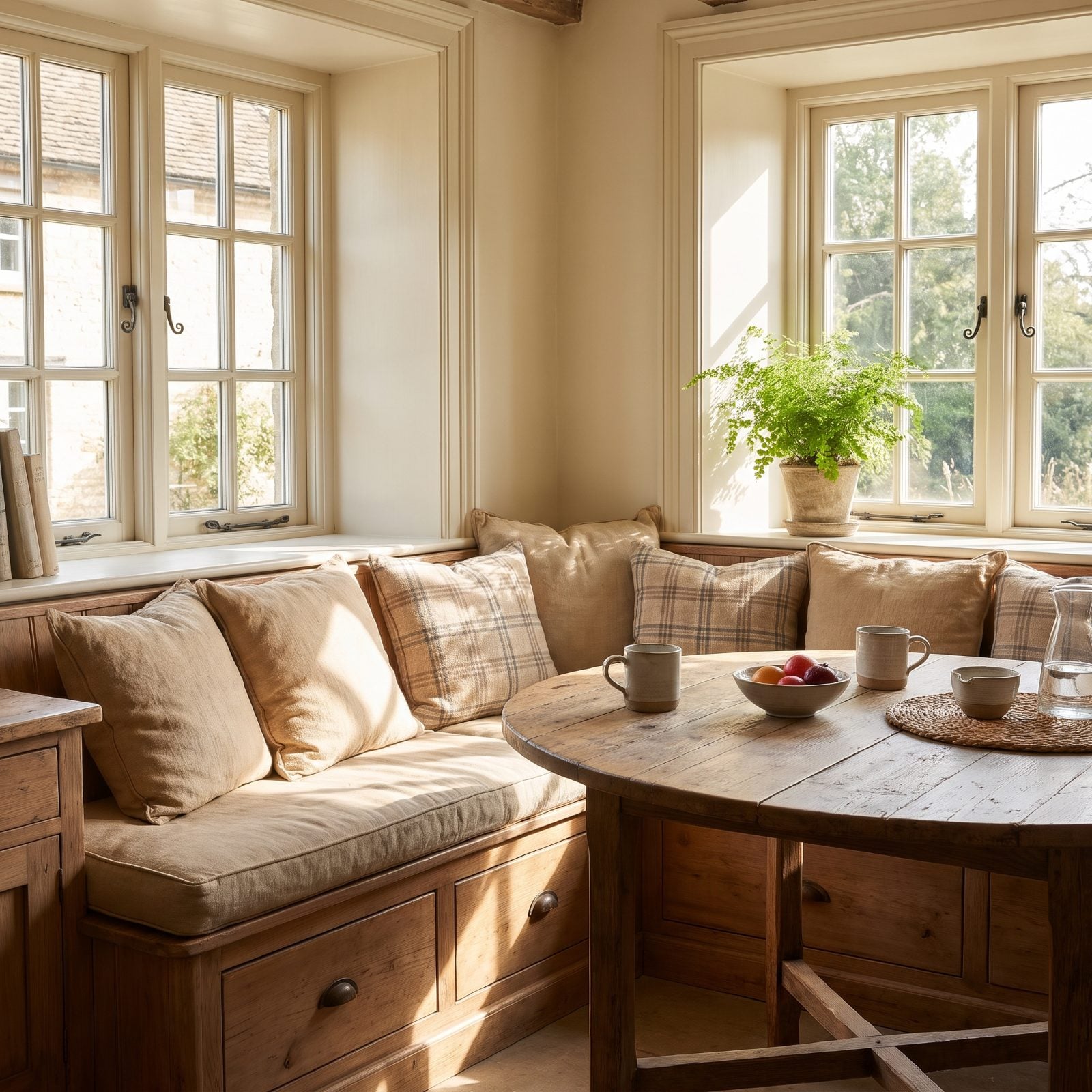
The built-in banquette is the smartest seat in the house. It wedges into a corner, seats more people than chairs ever could, and hides winter blankets under the cushions.
The oatmeal linen banquette wrapping this corner catches the morning light and holds it, which is exactly why everyone gravitates here before the coffee’s even done.
24. The Clawfoot Tub Nobody Should Have Torn Out
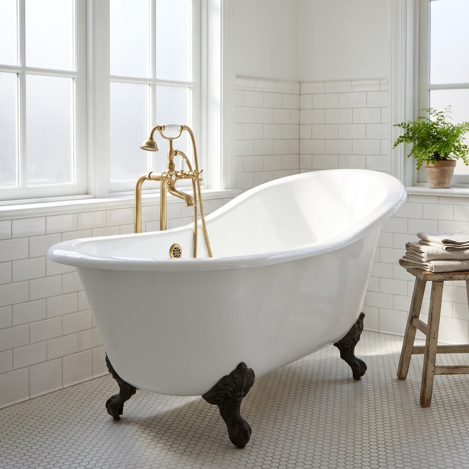
Somewhere a contractor is still apologizing for ripping these out in favor of builder-grade shower stalls.
A clawfoot tub anchors a bathroom the way a fireplace anchors a living room. This one earns its spot by standing against the tiled wall beside the window, catching light on its glossy cast iron, with a brass floor tub filler that reads like jewelry. The white hexagon mosaic floor with soft gray grout keeps the whole thing from feeling precious.
A tub you can actually sink into is a small daily luxury that no walk-in shower will ever replicate.
23. Bold-Pattern Wallpaper Returns With a Vengeance
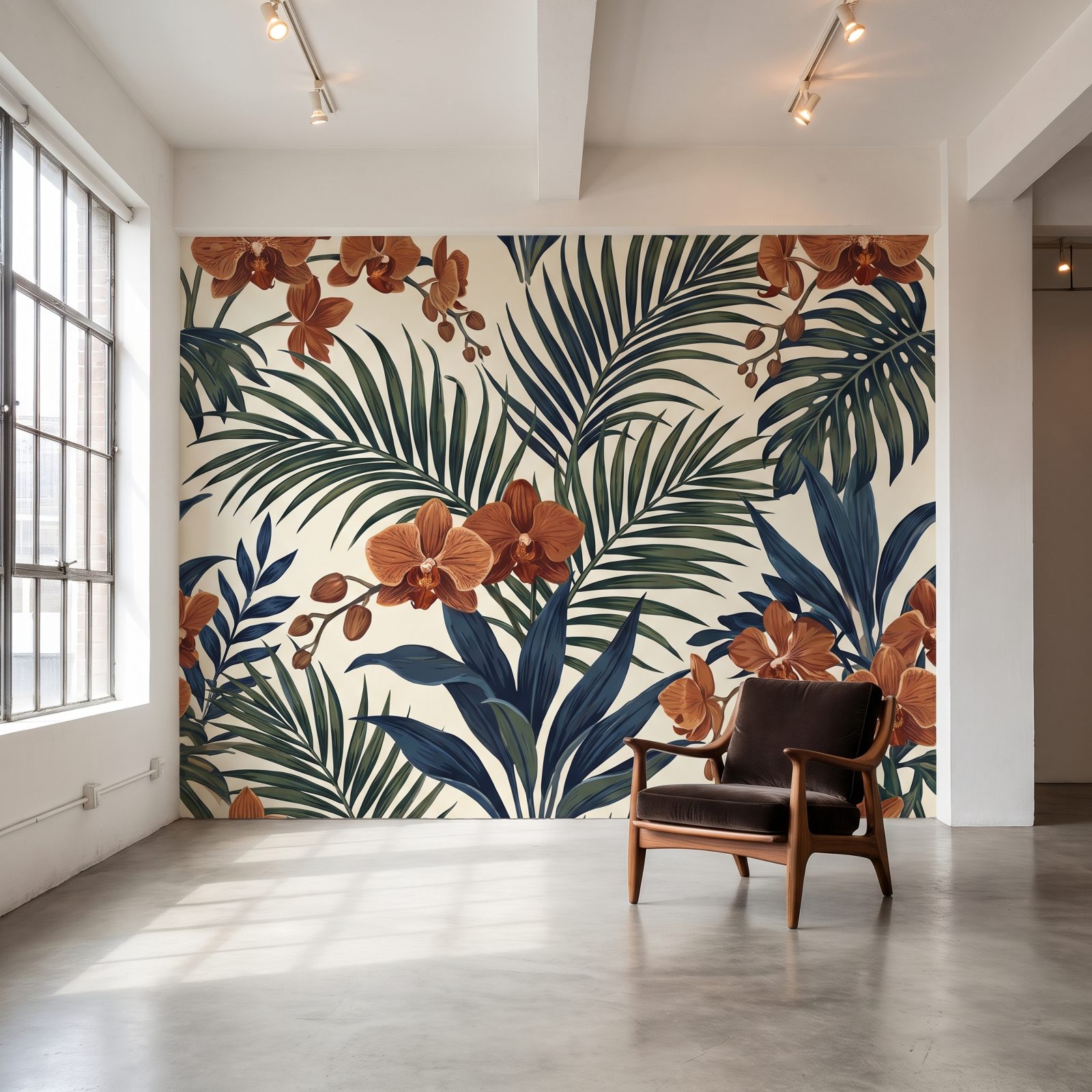
Wallpaper got blamed for a decade of regrettable floral kitchens, then quietly came back smarter. Scale and location are everything.
A single feature wall is the perfect gamble. It’s one surface, the rest of the room stays calm, and a botanical wallpaper like this one turns an entire high-ceilinged wall into the most talked-about spot in the house. The light cream background makes the wooden armchair and its dark velvet cushions practically glow.
22. Wet Bars and Home Cocktail Stations, Reborn
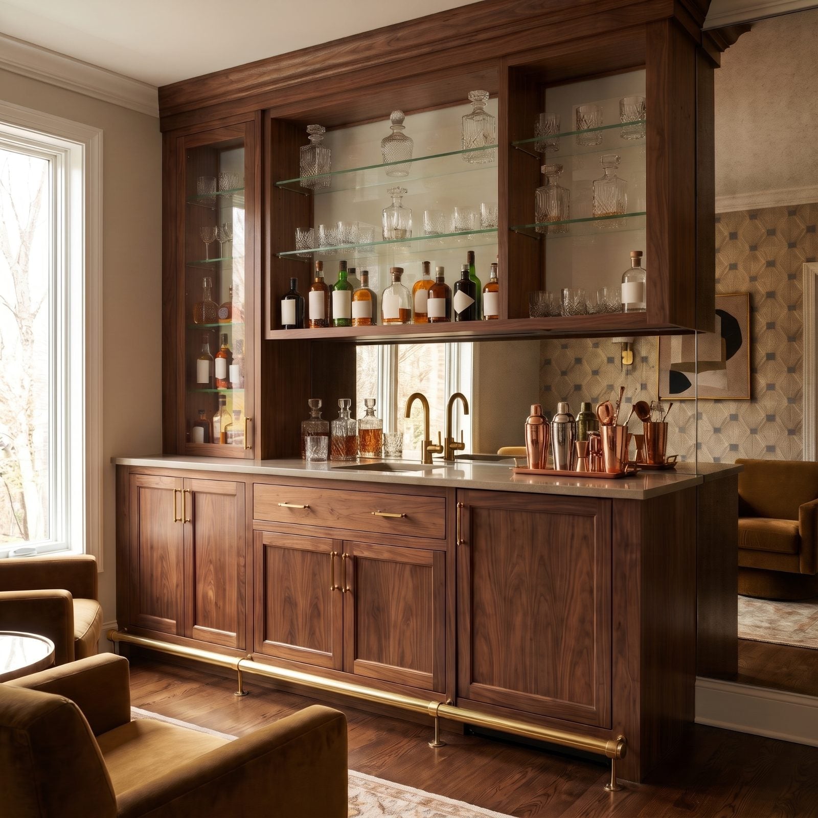
The wet bar went out with shag carpet and came back the second people got tired of balancing cocktail shakers on the kitchen counter.
This walnut home bar packs real function into a small niche. The mirrored backsplash doubles the bottle count visually, and the backlit glass shelves turn glassware into display. Walnut cabinetry grounds all that shine so it feels current, not disco.
21. Window Seats That Hide a Season’s Worth of Storage
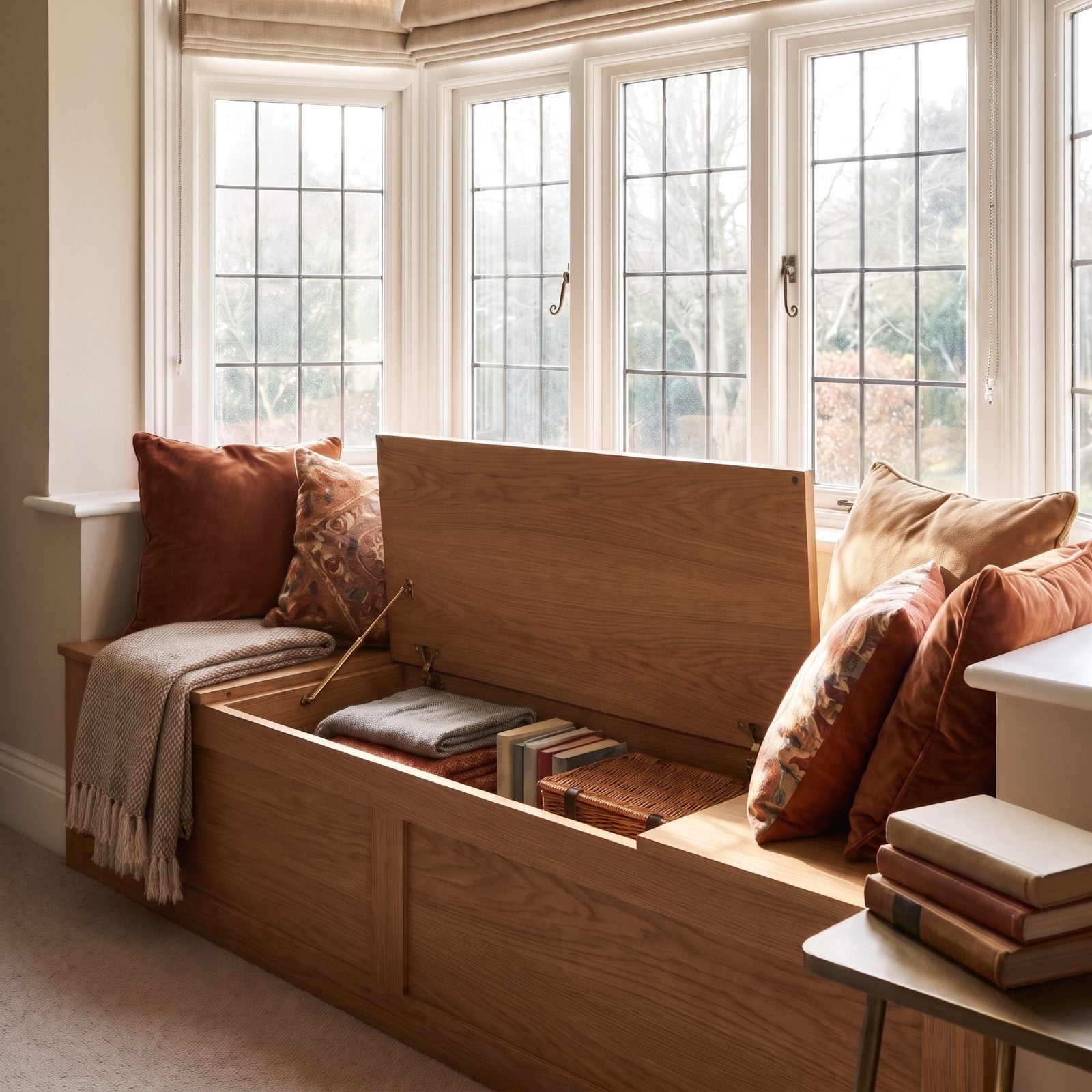
A window seat is the rare feature that’s pure charm and ruthless practicality at once. Lift the lid and a whole bay of storage swallows your blankets, board games, and the stuff you don’t know where else to put.
The velvet and patterned throw pillows piled on the bare wood bench, plus a little side table stacked with books, turn the bay into a reading corner that catches afternoon sun. Prospect and refuge at work: you’re tucked in, but you can see the whole room.
20. Pocket Doors That Vanish Into the Wall
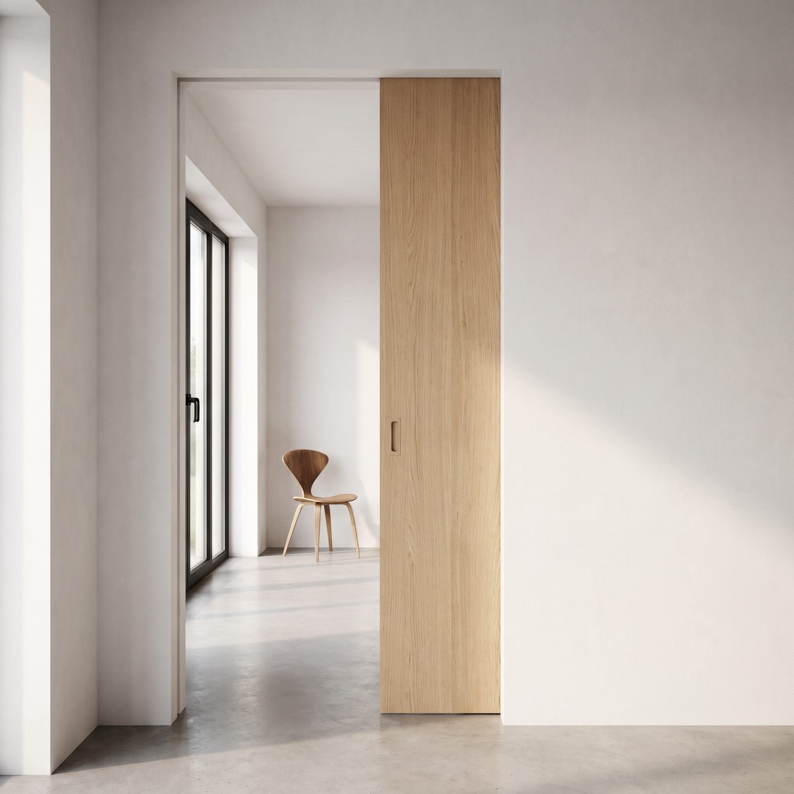
Swinging doors eat square footage and slam in the wind. Pocket doors slide clean into the wall and disappear, which is why they’re the quiet hero of small-space design.
What makes this one work is the smooth oak slab and the recessed wooden finger pull. Open, the rooms flow as one. Shut, you get a private study. One door, two floor plans.
19. Ceiling Medallions That Give Your Light Fixture a Stage
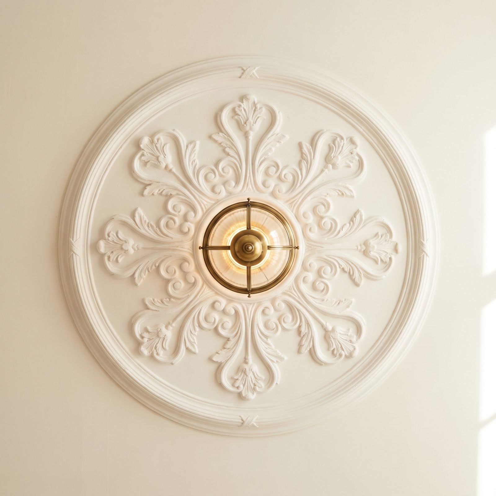
For years people plastered over ceiling medallions to chase a clean modern look, then noticed the ceiling felt like a blank afterthought.
A medallion gives your light fixture a frame. The acanthus-leaf plaster here casts soft relief shadows in daylight and makes a simple brass caged flush mount feel deliberate instead of stuck on. Cheapest upgrade on this list, honestly, and the one people clock last but love most. Look up more often.
18. Screened-In Sleeping Porches: The Original Fresh-Air Bedroom
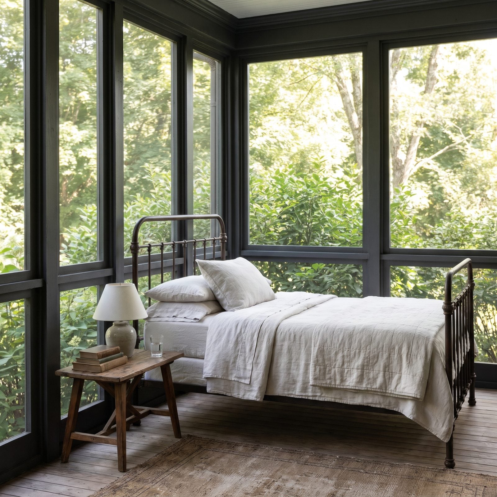
Our grandparents weren’t running air conditioning. They dragged mattresses out to the porch and slept to the sound of crickets, and we brought the whole idea back. The version with modern screen tech beats the original, honestly.
Restraint is what makes this one work. The charcoal screen frames keep the view sharp instead of fussy, and the wrought-iron bed has open, spindled rails on its arched headboard and footboard, so the eye runs straight through to the trees. There’s a reason it calms you down. Prospect and refuge — you’re protected, but you can still see out across the yard, and some old part of your brain exhales.
17. Checkerboard Tile Floors Walked Right Back In
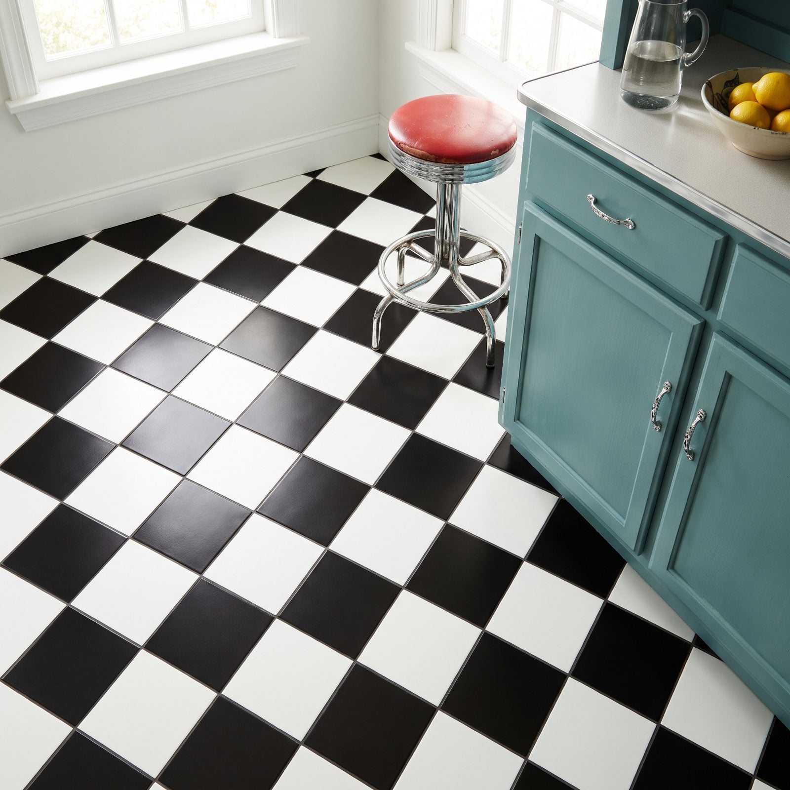
Checkerboard floors never fully died. They just got shoved into diner clichés for a decade or two. Now they’re everywhere again, and the honed matte finish is doing most of the heavy lifting.
Gloss black-and-white reads cheap and loud. Matte reads expensive and calm. Lay it on the diagonal and a small kitchen corner suddenly feels twice as wide. A teal cabinet and a bowl of lemons add colour, and a red-and-chrome diner stool leans right into the pattern’s retro roots — proof that a little diner nostalgia works when you own it on purpose.
16. Fluted and Reeded Cabinet Fronts Get Their Second Act
🔥 Would you like to save this?
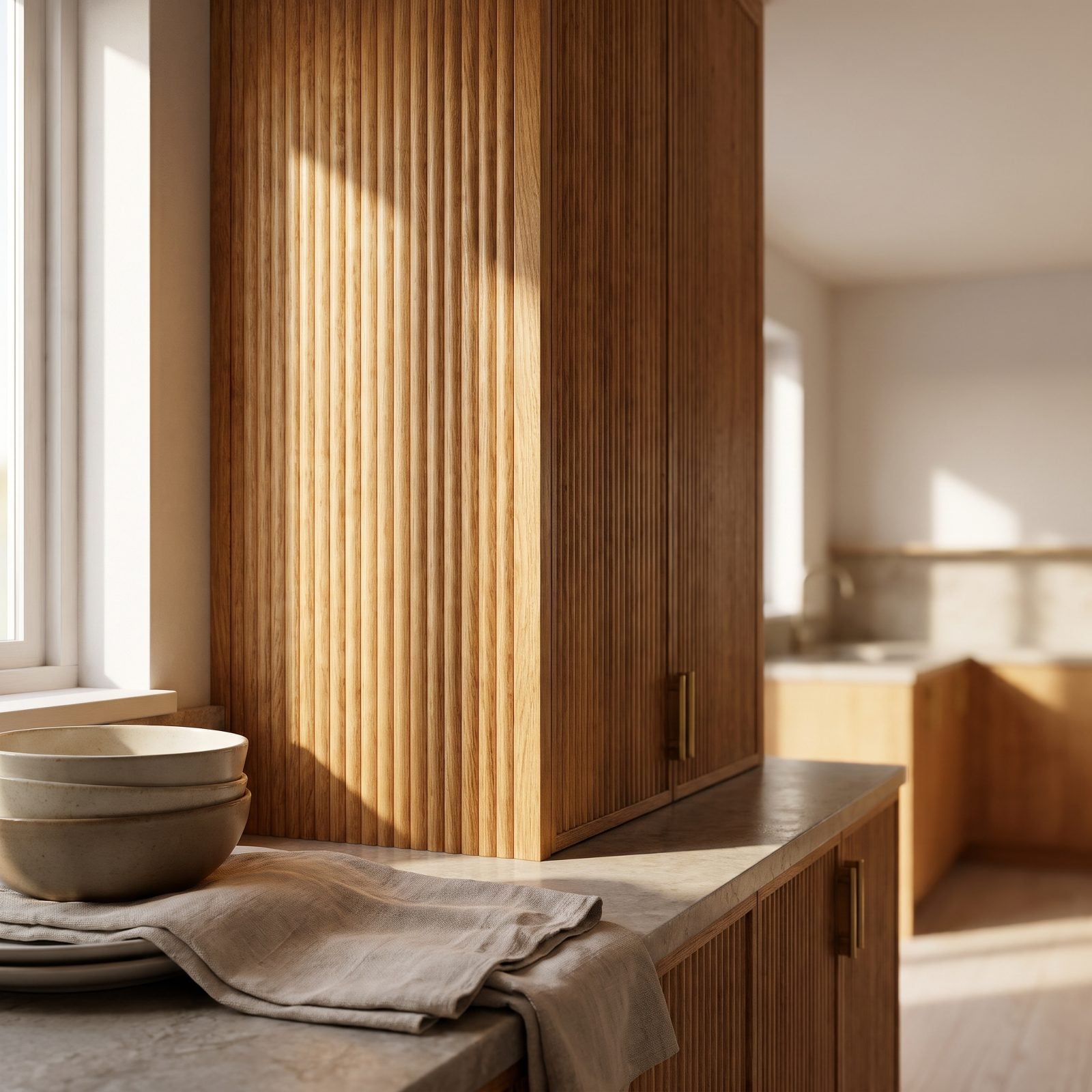
That vertical ribbing on cabinet fronts? Pure 1970s. It vanished under flat slab doors for years, and plenty of us rolled our eyes when it came back.
Then it showed up in warm white oak and won us over. Fluting catches light in little vertical strokes, so a dead-flat cabinet run suddenly has depth and shadow. Carry it onto the island, repeat it on the panel-front dishwasher, and the whole kitchen picks up a rhythm. The brass bridge faucet and honed marble do the dressing-up.
15. Conversation Pits Climb Back Down Into Living Rooms
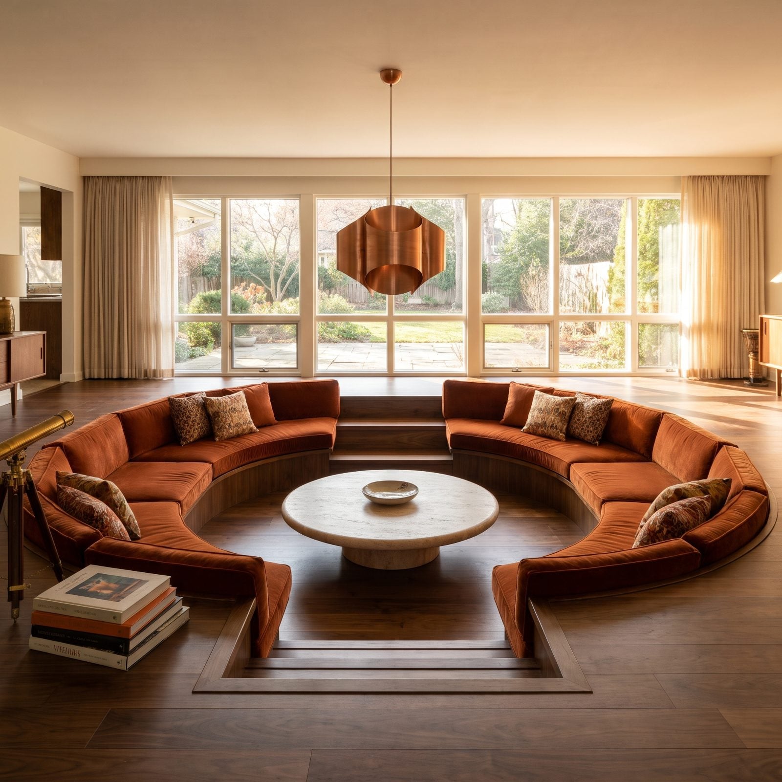
The sunken living room is the boldest thing on this list, and that’s exactly its charm.
Drop the seating a few steps below the floor and something strange happens: people actually talk. No one’s perched on the arm of a chair angled at the television. Everybody faces in, knees close, eyes level. It’s one of the most social moves a floor plan can make, and we abandoned it over tripping hazards and resale fears. The modern version wraps a rust velvet sectional sofa around a travertine coffee table and keeps the palette warm. Got the square footage and the nerve? Steal this one. More sunken-seating ideas live in our modern living room design roundup.
14. Dutch Doors Swing Open to the Backyard Again
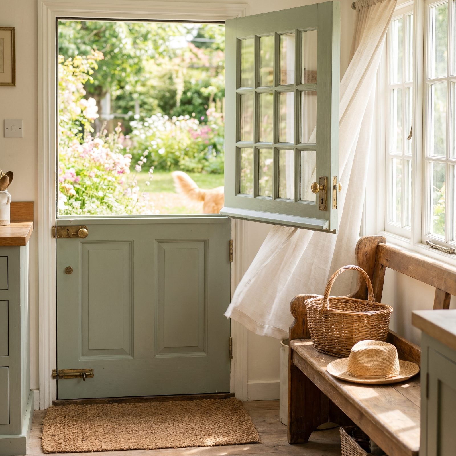
Open the top, keep the bottom shut, and you’ve solved a dozen everyday headaches at once. Breeze in, mud out.
Dutch doors came over with Dutch settlers who wanted air without letting livestock wander the kitchen. The sage green Dutch door works now for softer reasons — light, a connection to the garden, a little ledge for a coffee cup. The unlacquered brass hardware will age, and that’s the point. Shiny hardware on a cottage door always looks like it’s trying too hard.
13. Brass Fixtures and Hardware Shed the Shiny and Came Back Warm
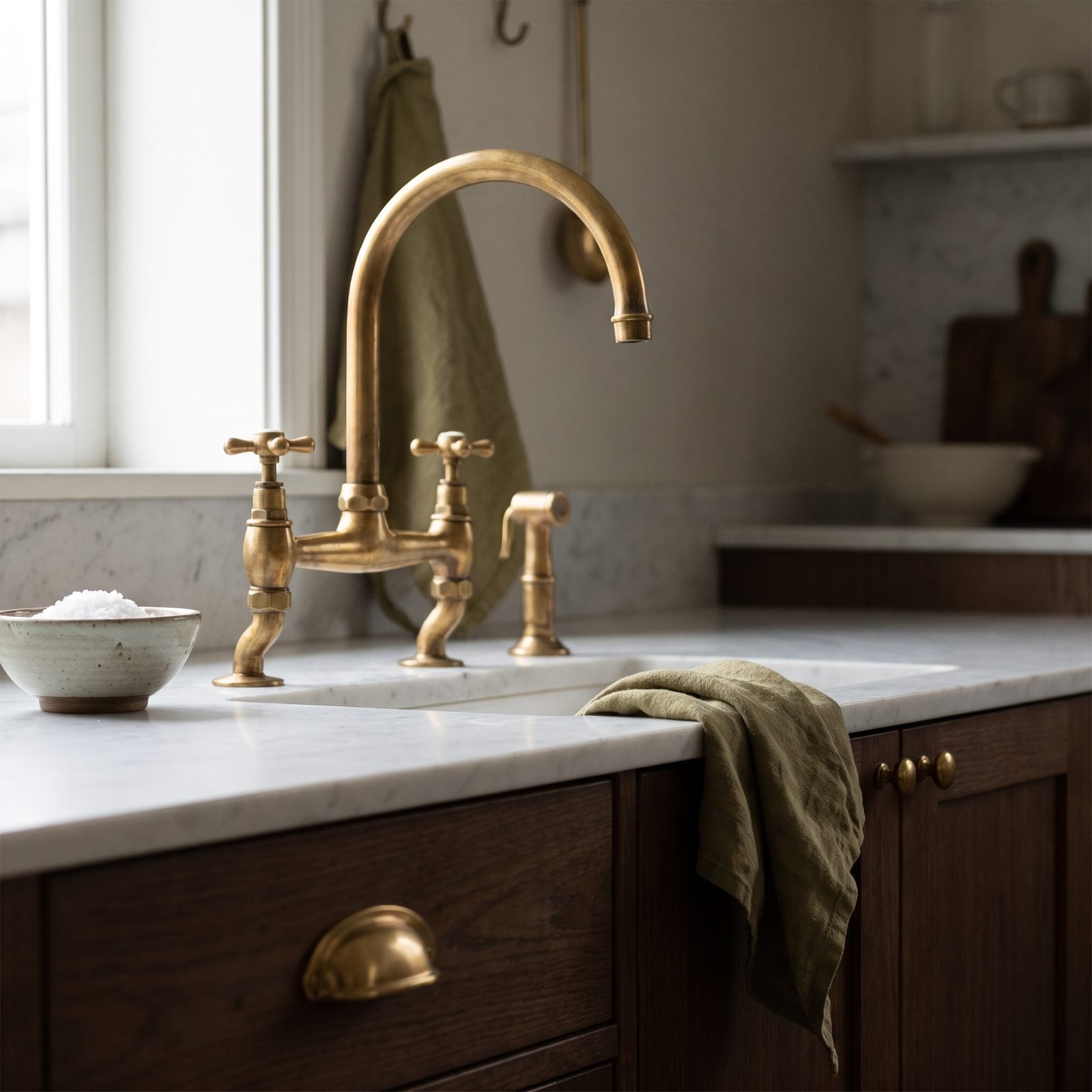
Brass got chased out of homes by brushed nickel and chrome somewhere around the late nineties, and everything went cold and silver and safe for a long while.
The brass that came back isn’t the same brass. The eighties version was polished to a mirror and lacquered to a plastic sheen. Today’s is unlacquered and left to live. It darkens where hands touch it, keeps its glow where they don’t, and in a few years every piece quietly records how the house actually gets used. Against rustic oak cabinetry and terracotta and cream tiles, warm brass is the one metal that feels like it belongs to a person instead of a showroom.
12. Arched Doorways and Openings Soften the Boxy House
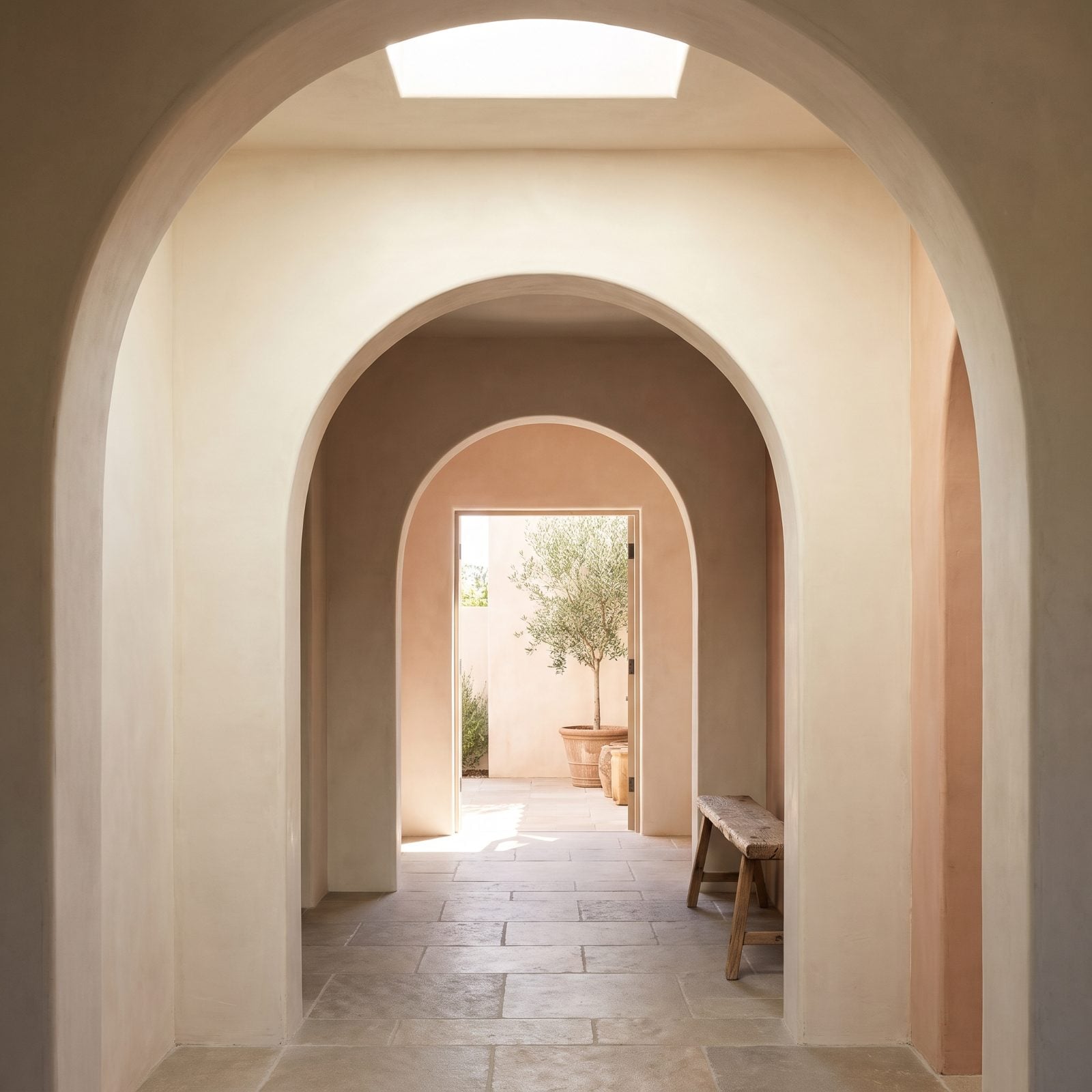
A square doorway says here’s the edge. An arch says keep going.
Builders went flat and rectangular for decades because right angles are cheaper and faster to frame, and then everyone got tired of living in boxes. Arched openings pull the eye upward and forward, and when you line two or three up down a hallway you get a gentle rhythm that makes a modest house feel generous. Done in limewash plaster with no trim, the curve looks carved rather than tacked on.
11. Transom Windows Borrow Light the Old-Fashioned Way
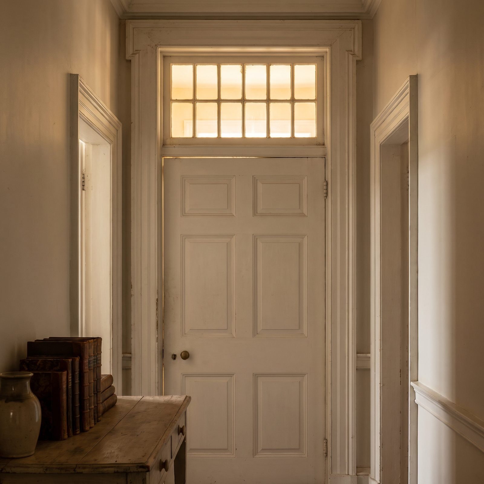
Before anyone had electric light to burn all day, transoms moved daylight from the bright room into the dark one. Pure function. They pivoted open to vent heat, too.
We lost them when central air and ceiling cans made them feel unnecessary. Bringing them back is part looks, part smarts. A dark interior hallway with no windows will always feel like a tunnel until you let a bit of borrowed light through. Frame them in slim black steel, use reeded glass for privacy, and the door stops being a wall.
10. Built-In Bookcases Flanking the Fireplace, Reinstated
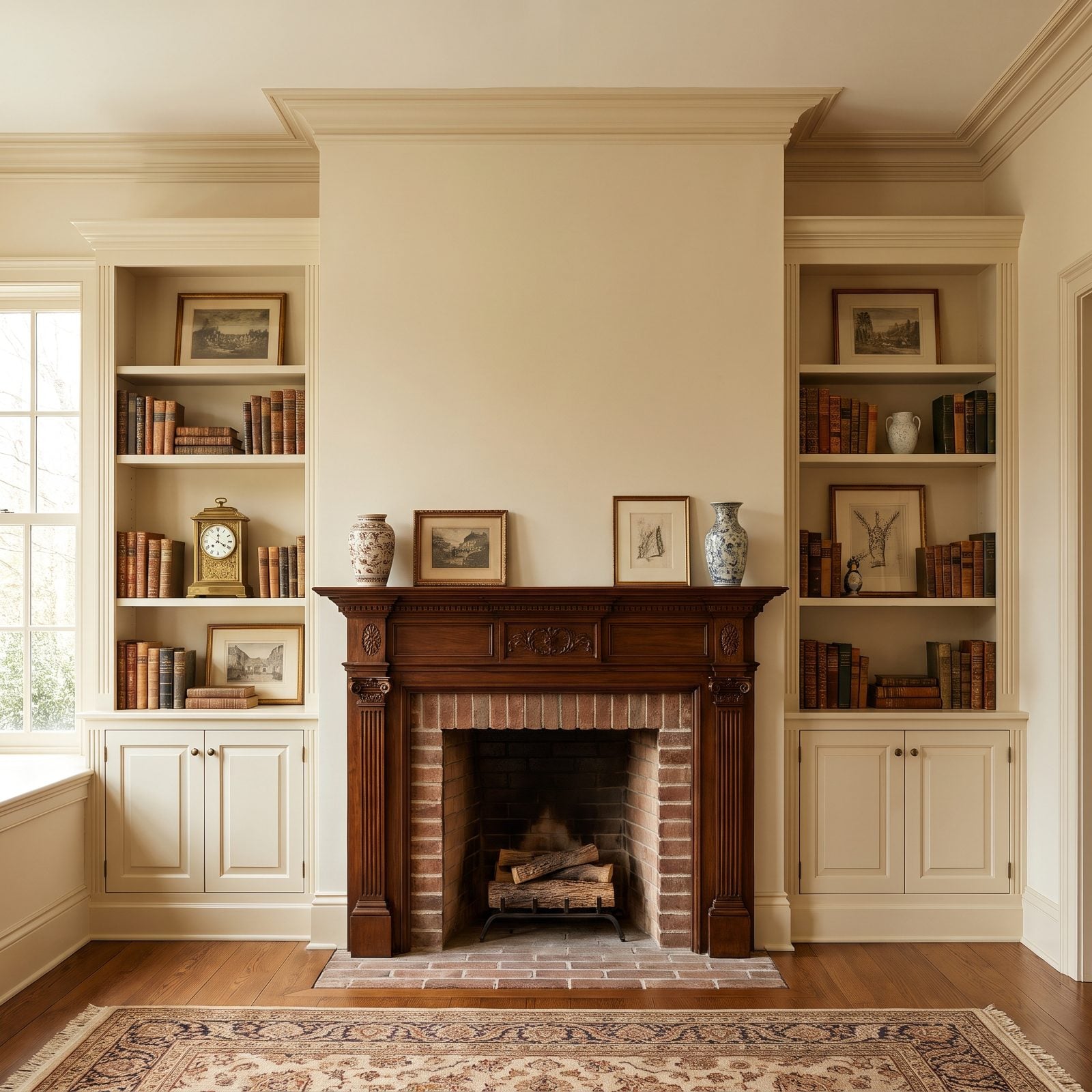
Open-concept living threw out the walls, and the built-in bookcase went with them. Big mistake.
Symmetry is the oldest trick in the room-design book, and a fireplace with a tall bookcase on each side is symmetry at its most satisfying. Your eye settles. The fire anchors the center, the shelves balance the sides, and suddenly the whole room has a focal point instead of a floating television nobody knows where to put. Paint them a deep green so the spines pop, add a pair of brass library sconces, and you’ve built the coziest corner in the house.
9. Beadboard Wainscoting Comes Up From the Cottage
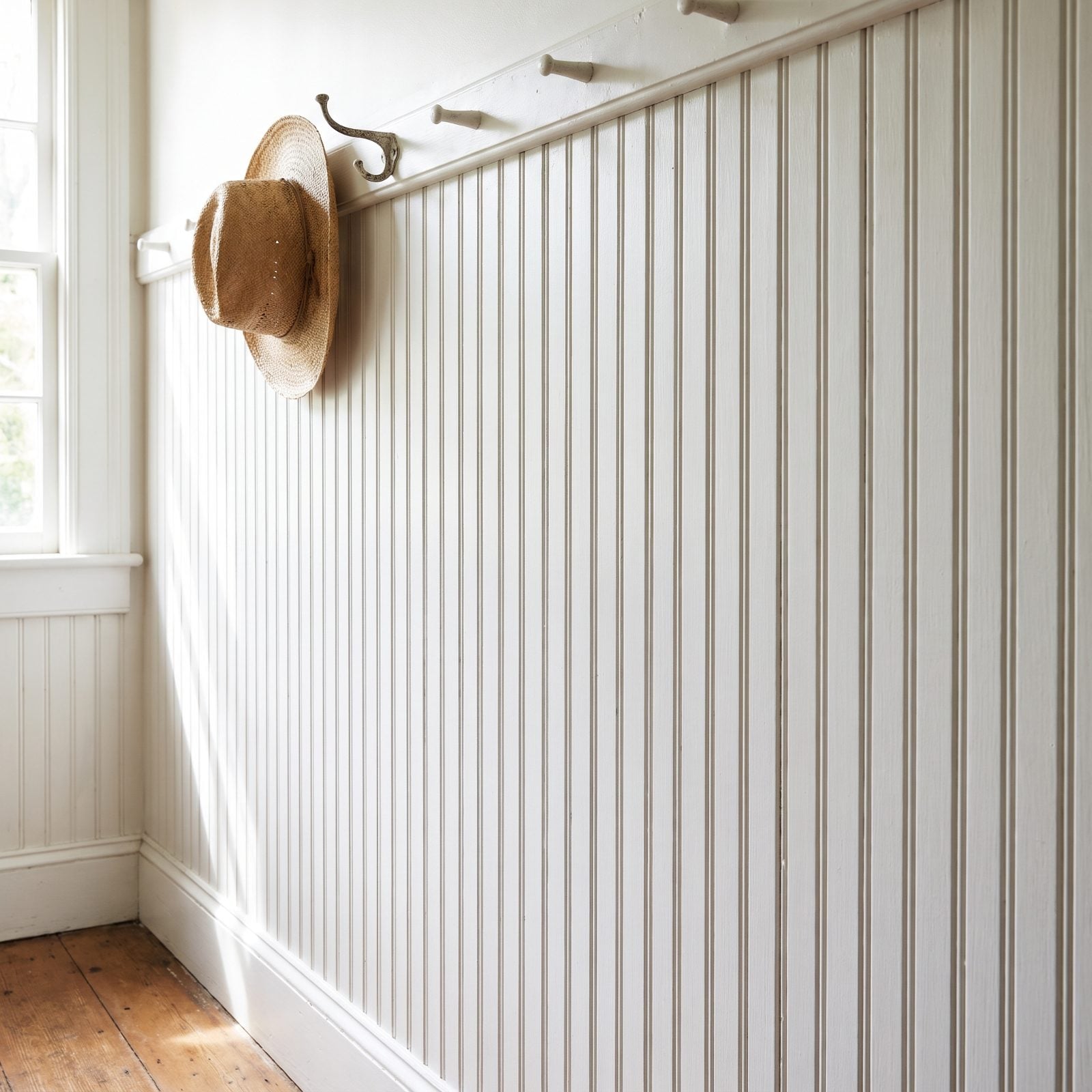
Beadboard spent years stuck in grandma’s beach cottage, slightly damp and painted the wrong white. It deserved better.
The grooved vertical paneling runs up the lower third of a wall, caps off at a chair rail, and pulls double duty: it protects the plaster from bags and boots while those thin vertical lines quietly stretch the ceiling taller. Paint it a muted blue-grey instead of white and the cottage cliché evaporates. Pair it with hexagon cement tile and black iron hooks for a mudroom that earns its keep.
8. Milk Paint and the Return of Muted Vintage Color
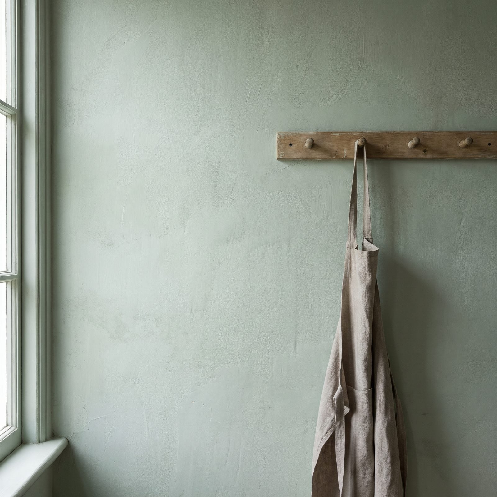
Glossy walls had a long run, and milk paint quietly ended it. That powdery, slightly chalky finish on the sage green wall absorbs light instead of bouncing it back, so the room reads soft rather than flat.
The sage here isn’t the sharp avocado of a 1970s kitchen. It’s been pulled back, dusted down, made to sit quietly next to weathered pale wood and natural linen. If color on walls scares you, milk paint is the gentle way in, because it never shouts.
7. The Cozy Reading Alcove Nobody Should Have Torn Out
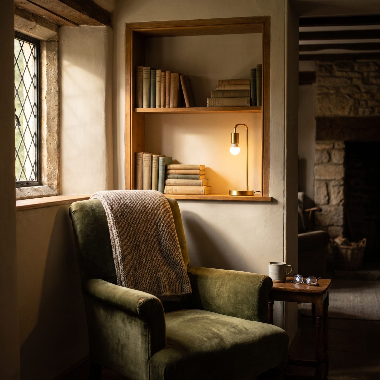
Builders spent decades knocking these out to chase open floor plans. Turns out people wanted a corner to disappear into.
What makes this one work is the enclosure. The chair tucks against a plain wall beside the window, a built-in shelf niche sits just above it, and a single bare-bulb brass desk lamp on the shelf gives you exactly enough light for a book and nothing more. Prospect and refuge, the designers call it: you can see out the window, but your back is covered. Oldest comfort there is.
6. Terracotta and Encaustic Floor Tiles Making a Comeback
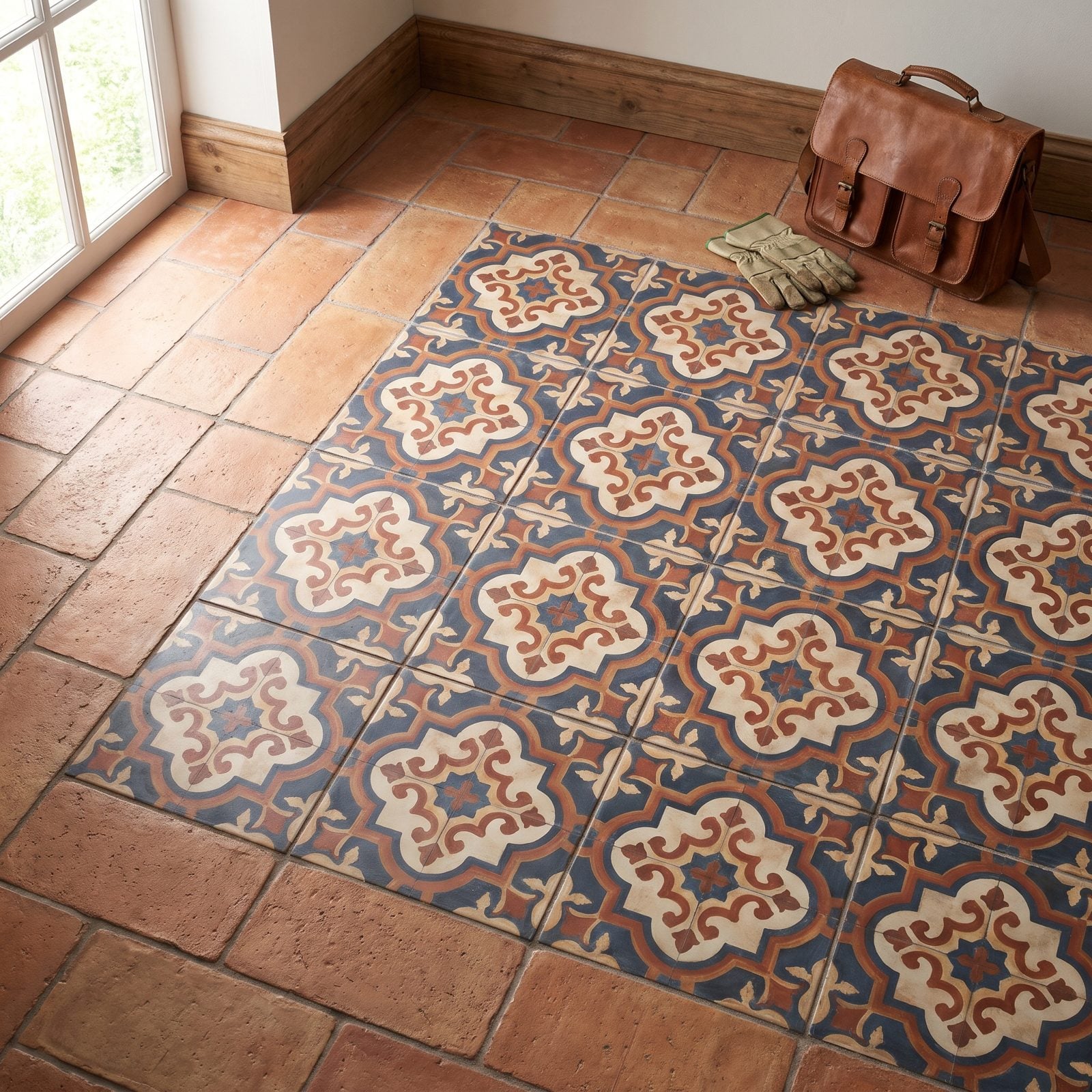
Clay underfoot never really left Spain or Morocco. The rest of us just forgot about it for a while and buried everything under grey porcelain that looked like concrete pretending to be nothing.
The smart move here is the patterned encaustic center with a plain terracotta border. All-over pattern reads busy and tires the eye. So let the geometry hold the middle, frame it in clay, and give your eye somewhere to rest. That slight color shift in the terracotta? The point, not a flaw. Factory-perfect tile looks dead next to it.
5. The Old Phone Nook, Now Earning Its Keep as a Charging Station
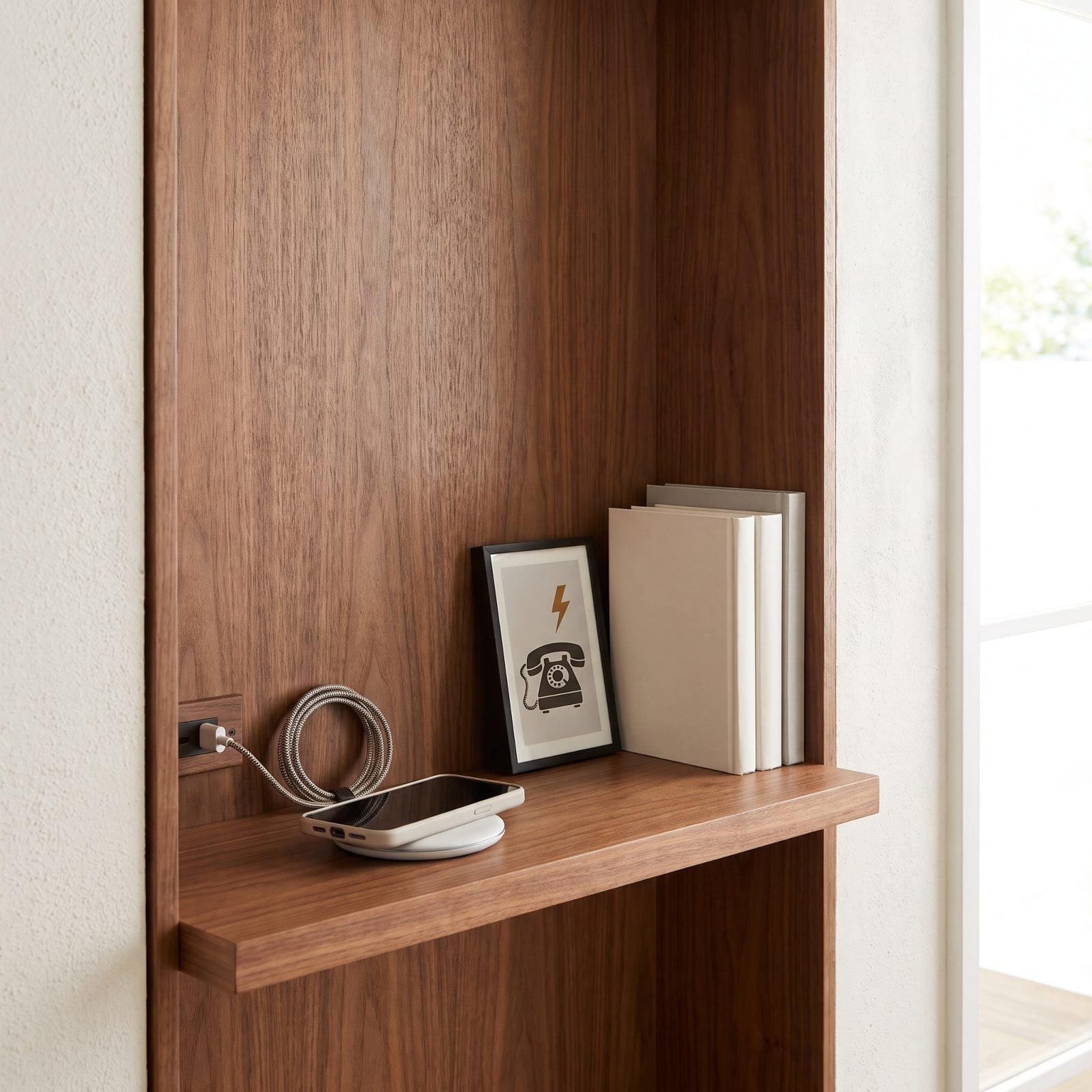
Mid-century houses built a little shelf into the hallway wall for the landline. The phone left. The nook stayed, awkward and useless, until someone realized it was exactly the right size for the thing every household fights over: where to park and charge devices.
Line the inside in warm walnut against a creamy plaster wall and suddenly the niche looks intentional instead of leftover. A white wireless charging pad, a USB port set into the walnut, a braided cable running from the wall to the pad. The bones were always there. They just needed a new job.
4. Laundry Chutes: The Between-Floors Trick Worth Bringing Back
🔥 Would you like to save this?
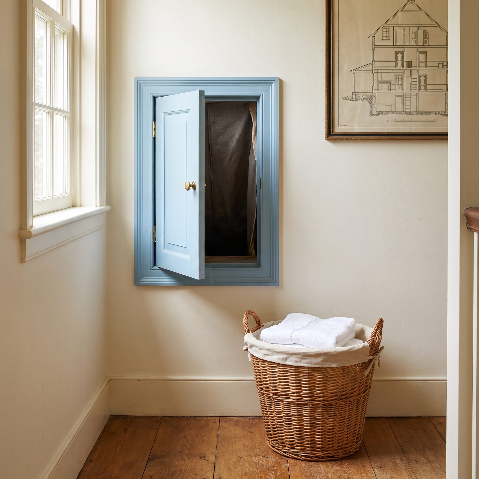
Anyone who has hauled a full hamper down two flights of stairs gets the appeal instantly.
Old homes dropped dirty clothes straight from the bedroom floor to the basement through a chute in the wall. Builders phased them out over fire-code worries and shrinking footprints. Now they’re back, with proper fire-rated enclosures and a rectangular pale-blue painted wooden panel door set into the wall that makes the whole thing read like a built-in cupboard. The brass knob against pale blue raised panelling keeps a purely functional feature from looking utilitarian. And honestly? It’s quietly satisfying every time you use it.
3. Freestanding Furniture-Style Kitchen Islands
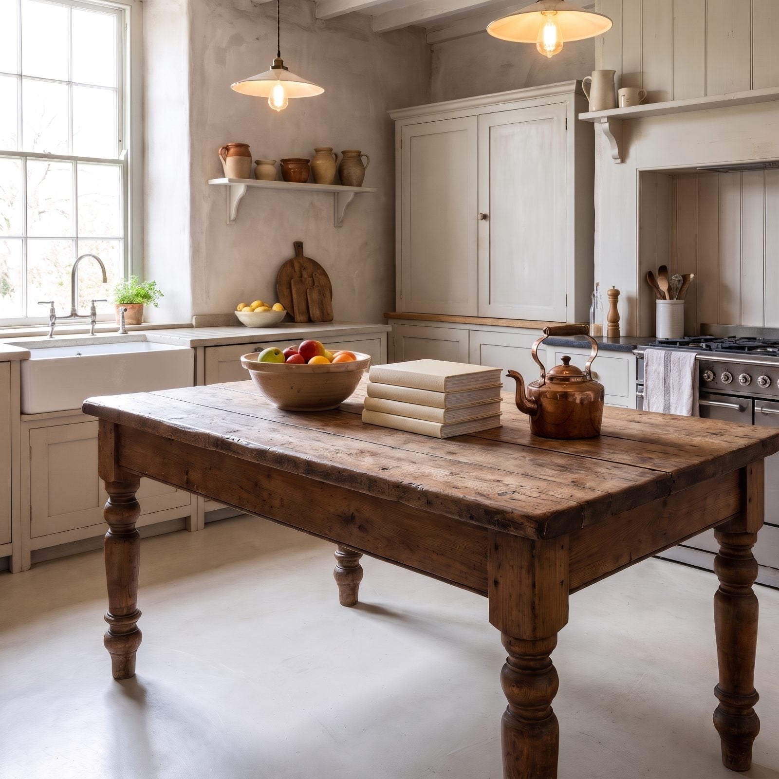
Before kitchens became walls of matching cabinetry, the island was a worktable. A piece of furniture you could walk all the way around.
This one brings that back as a rustic farmhouse table in distressed pine, with turned legs and open space underneath instead of boxed-in cabinets. It breathes. The closed built-in cupboards behind it do the storage work, with a small wall shelf of stoneware jugs and crocks above, while a bare sash window and painted cabinetry keep the perimeter quiet so nothing competes with the table.
The copper kettle and worn pine top keep it from looking too precious. A full built-in run can feel like a showroom. A standalone table feels like somebody actually cooks here. If this table speaks to you, there’s a whole gallery of modern living room design ideas worth a look for carrying the same furniture-first logic into the rest of the house.
2. Stained Glass Accent Windows, Reworked for Modern Light
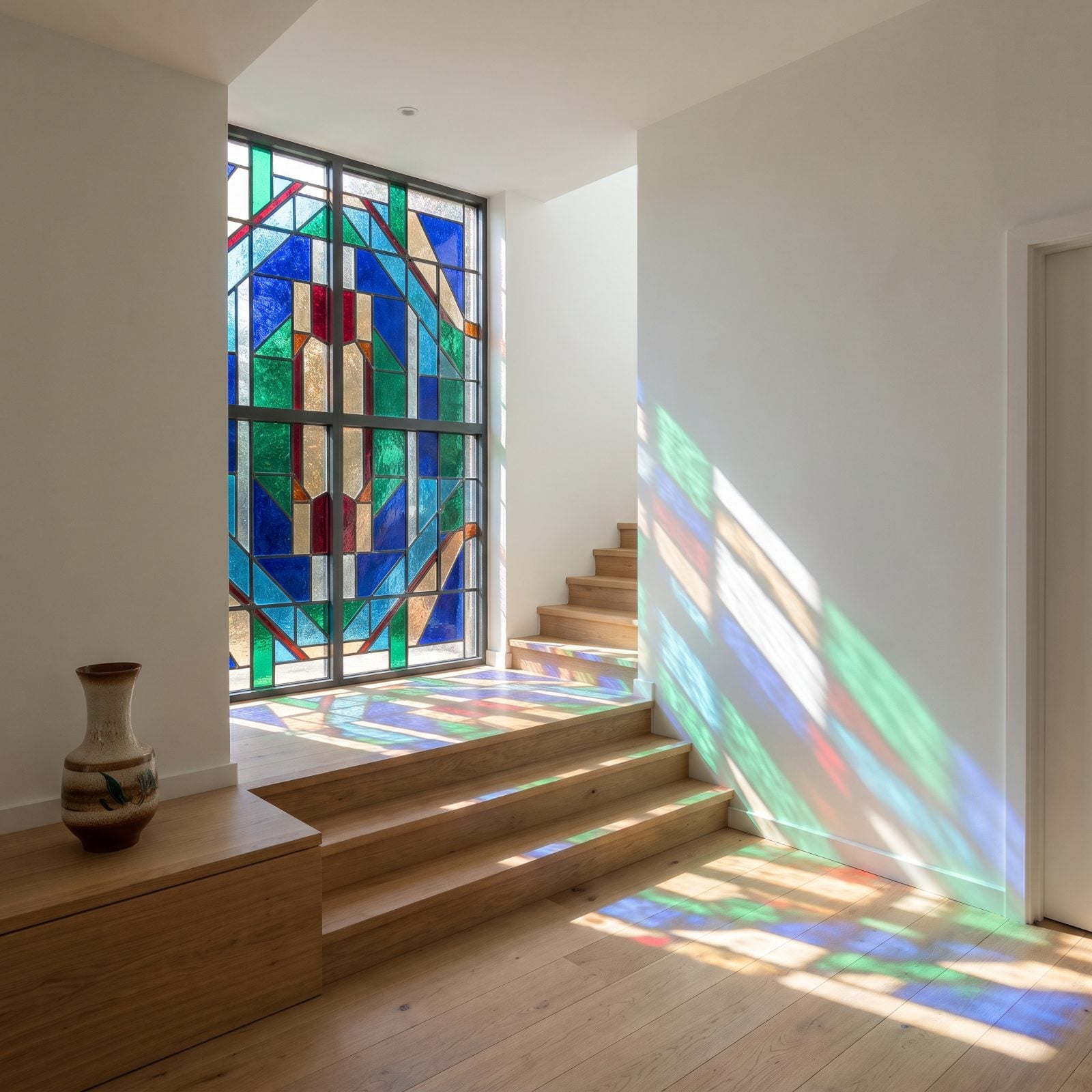
That amber patch of light the window throws across the stairs each morning is the whole reason to keep stained glass around.
Old versions could get heavy and dark. This one uses a restrained geometric pattern and plenty of clear textured glass, so it reads as jewelry rather than blackout. A single accent window up in a stairwell gives you shifting colored light through the day without committing the whole house to it.
1. The Vintage Farmhouse Sink That Refuses to Go Away
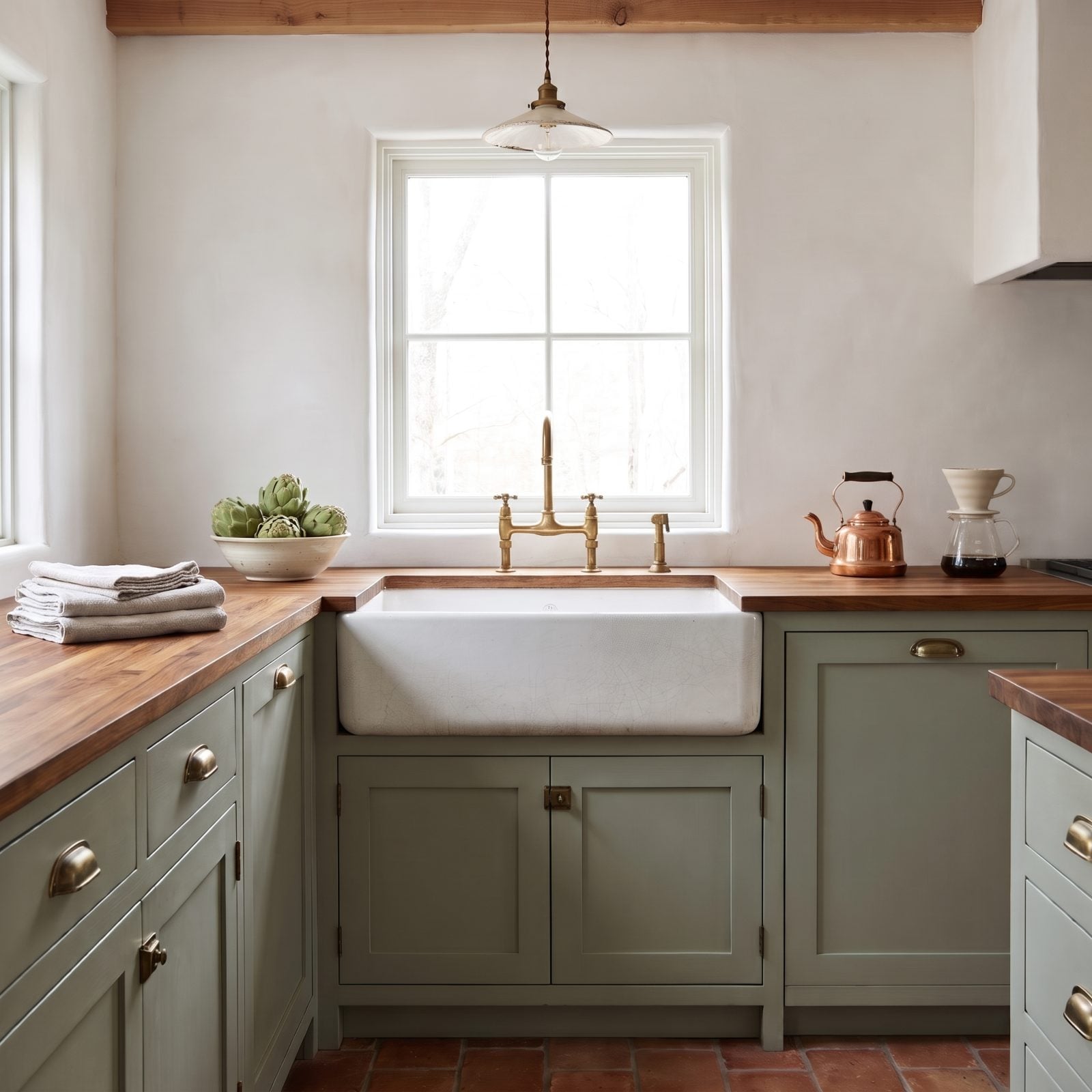
Plenty of us wrote the farmhouse sink off as a passing fad. It’s outlasted most kitchen trends that came and went.
The appeal is honest. That exposed apron front sits proud of the cabinets, the fireclay basin runs deep enough to hide a roasting pan, and the unlacquered brass bridge faucet picks up a living patina you couldn’t fake if you tried. Sage green cabinets with brass cup pulls, a butcher-block counter, a bowl of artichokes, folded linen towels, a copper kettle and a pour-over setup doing their quiet work. Nobody wants to modernize the sink, because it was already right. Keep the brass unlacquered and let it age.