
🔥 Would you like to save this?
Gray did not disappear. It was convicted by association. For a decade, cool blue-gray spread across walls, cabinets, floors, sofas, and entire open-plan houses until some interiors looked as though the saturation slider had been dragged halfway to zero. Then the pendulum swung, the obituaries arrived, and beige showed up early to measure the curtains.
In order to come up with the very specific design ideas, we create most designs with the assistance of state-of-the-art AI interior design software. Also, assume links that take you off the site are affiliate links such as links to Amazon. this means we may earn a commission if you buy something.
That funeral missed half the family. Gray in limewash, slate, limestone, wool, charcoal millwork, blue-gray plaster, mushroom cabinetry, concrete, veined marble, and old paneling never behaved like the flip-house paint that exhausted everybody. These 35 rooms make that distinction visible. Some are smoky, some warm, some mineral, some almost blue. What keeps them alive is not the label on the paint chip but what gray is allowed to become once texture, light, wood, stone, metal, and shadow get involved.
Nobody needs to paint the whole house gray again. The better argument is smaller and more interesting: one overused recipe can die without taking an entire color family with it. Builder gray deserved the backlash. Gray with depth, character, and better company never received the memo.
35. Warm Greige Living Room: What Survived the Great Gray Backlash
Two colors of the year. On December 10, 2020, Pantone announced a split decision it had made only once before in two decades. One winner was Illuminating, a bright yellow. The other was Ultimate Gray.
Ultimate Gray is useful here for one reason: it freezes a moment when gray was still being framed as reassuring and durable. Not long afterward, warmer neutrals took over the trend conversation. That shift says more about fashion cycles than it does about whether gray suddenly stopped working in a room.
Sherwin-Williams Agreeable Gray, SW 7029, is a useful example of why the category never disappeared cleanly. It sits in the gray-beige middle, warmer and more forgiving than the icy grays associated with the flip-house years. Call it greige if you like; the important part is the brown warmth underneath.
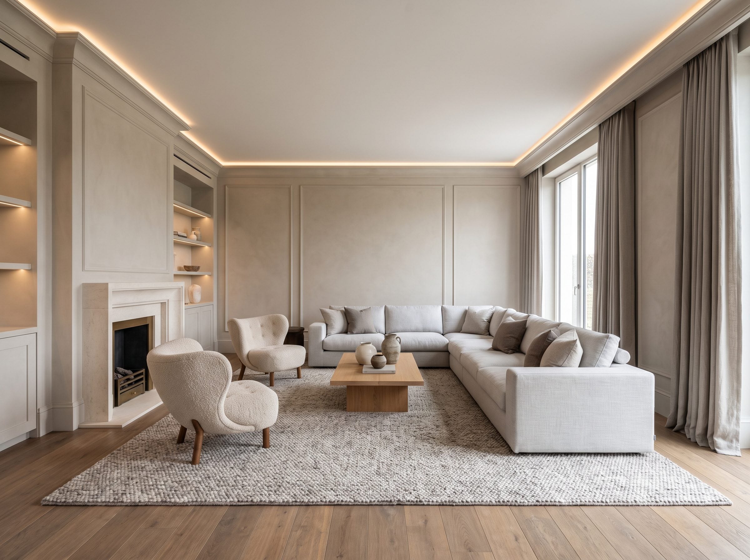
Look at the room above, and you’ll see why. You’ve got greige plaster walls, a pale-gray linen sectional, oatmeal chairs with real shape to them, and medium-oak floors that drag the whole scheme toward honey instead of a parking garage. The metal is bronze, not chrome. The fireplace is honed limestone, not sharp slate. It is unmistakably gray — and still looks like a room you’d sink into on a Sunday and lose track of the afternoon.
What wore thin was one narrow recipe: cool gray stacked on more cool gray, repeated so relentlessly that the color became shorthand for a certain kind of flip. Warm gray never produces quite the same effect because it already carries some of the beige and brown now being sold as the cure. The pale-gray linen sectional and oatmeal lounge chairs here would’ve been branded dated by the same voices quietly choosing them for their own homes. The same restraint sits comfortably in a modern living room too.
34. Dove-Gray Bedroom: Cashmere on the Wall, Not Concrete
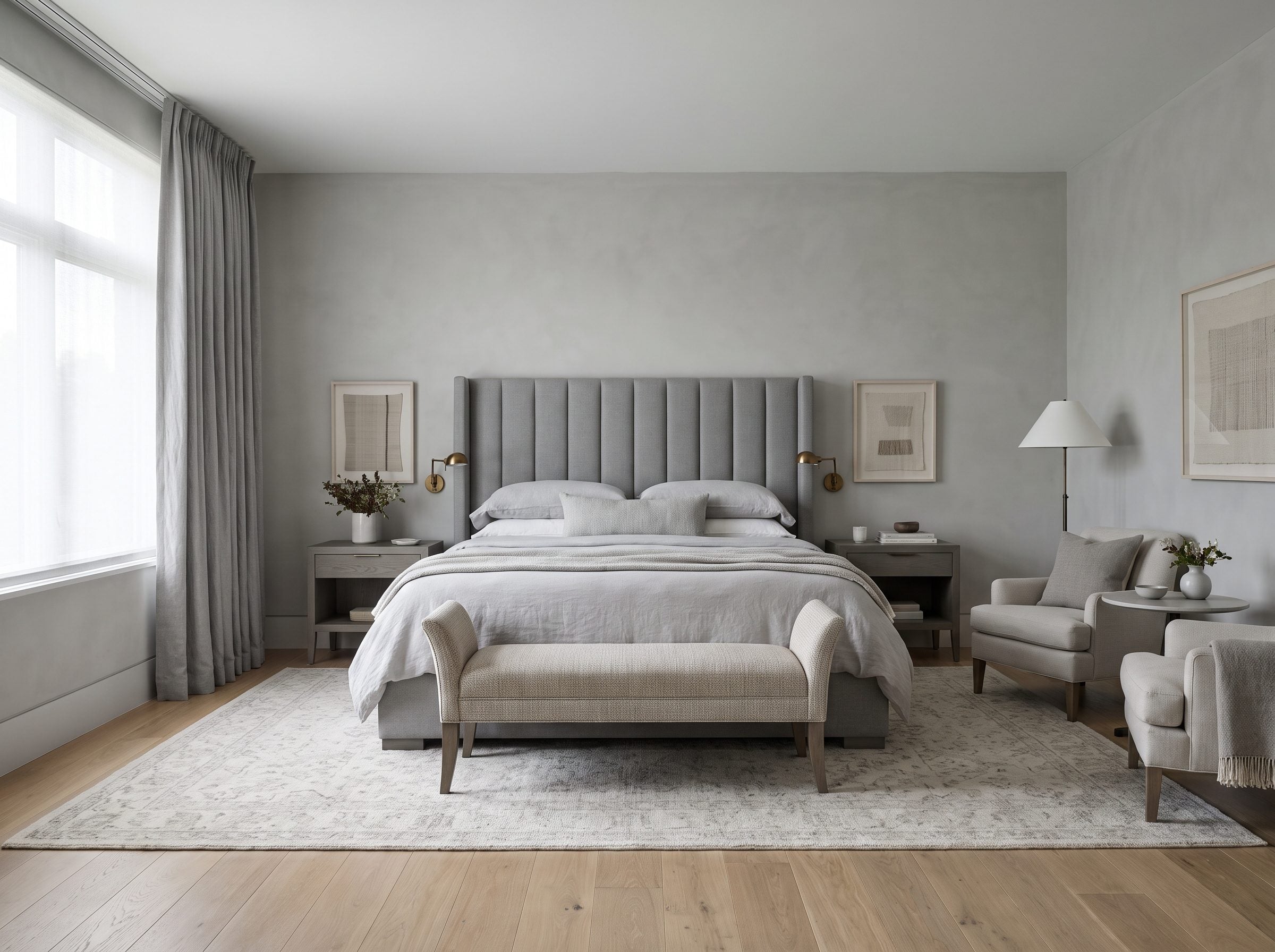
Take the gray everyone swears is finished, then take the gray in this room, and hold them side by side. They share a name and nothing else. The tired one was a matte gray on a hallway roller, one note deep, painted next to oak floors it never once acknowledged. This is dove gray in limewash, and limewash refuses to lie flat on a wall.
It bonds through carbonation and settles into cloudy tonal drift, so a single bucket of “gray” breaks into a dozen shifting values the second morning light rakes across it. Same color chip. Entirely different creature.
The warmth in here is not coming from the wall color alone. It comes from every material the gray touches. White oak underfoot, an ivory-gray wool rug with real pile you’d sink a bare foot into, channel-tufted upholstery catching a soft shadow in each groove, and antique-brass reading lights throwing amber against cool plaster. Warm against cool in one frame is the oldest move in decorating, and it has never once gone out of fashion.
The useful distinction is not old versus new. It is flat versus layered, and cool-on-cool versus cool balanced by warmth. A dove-gray wall in limewash belongs to the second camp before the furniture even arrives.
Cool gray beside warm oak and beige carpet is what looks dated. The gray on its own was never guilty.
Fix the company gray keeps and dove gray becomes exactly what it is here — tactile, restful, and far removed from the flat hallway gray people grew tired of.
33. Warm-Gray Kitchen: The Cabinets Everyone Swears Are Dead but Nobody Rips Out
Ask a designer what killed gray kitchens, and they’ll all point at the same corpse: the cold ones. Blue-undertoned builder-grade cabinets that drained the color out of a room until a photo of it looked shot in black and white. That’s the gray people got sick of, and honestly, fair.
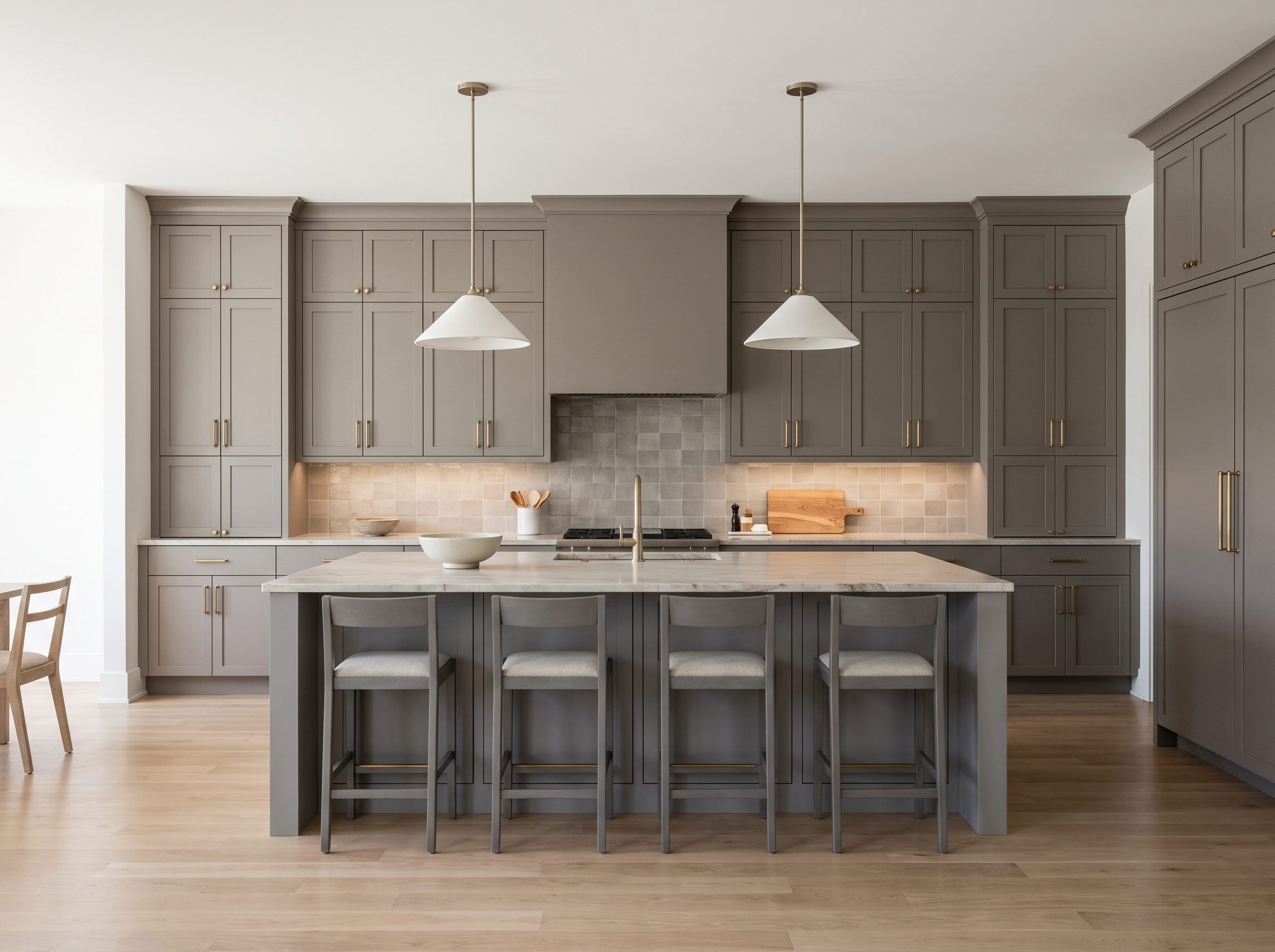
The useful evidence is already in the room. Warm-gray cabinetry still works when the surrounding materials stop treating it like a cold monochrome exercise.
Why? This kitchen. Look at the cabinets, and there’s a brown bone buried in the gray, the greige and dove tones realtors still call safe money. They sit against white-oak floors and creamy quartzite, not the icy chrome-and-white pairing that made 2015 kitchens read like a dentist’s waiting room. Aged-brass pulls throw warmth back into the whole thing. And the handmade backsplash tile carries that faint unevenness — the flaw that kills the mass-produced flatness people actually rejected.
Cold gray got tired. Warm gray got a raise.
Before repainting a gray kitchen, separate the cabinet color from everything surrounding it. Cool hardware, blue-white light, and icy counters can make a serviceable gray feel far colder than the doors actually are.
Warm gray with oak and brass and the cabinet color stops carrying the whole burden. Sometimes the cheapest renovation is realizing the cabinets were never the expensive problem.
32. Gray and Walnut Dining Room: Why the ‘Cold Gray’ Verdict Was Rigged From the Start
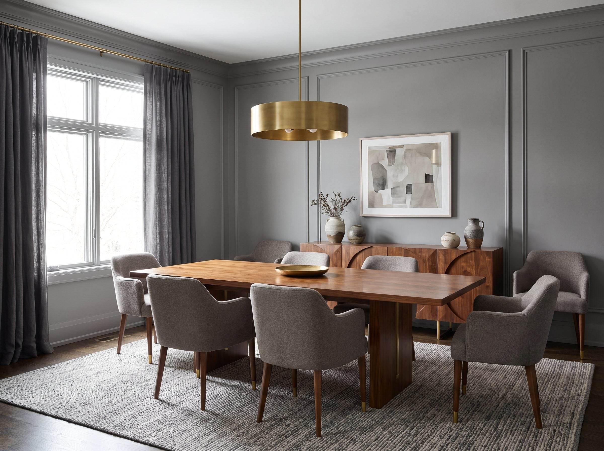
Gray earns its cold reputation fastest when it is surrounded by more of the same temperature. Gray walls, gray sofa, gray-washed planks, a 5000K bulb overhead flattening the whole thing into a parking garage, and then they asked you if gray felt warm. It’s like handing someone plain rice and asking if food is bland.
Walk a walnut table into that same room and watch what happens. The gray stops being the subject and becomes the wall a good painting hangs on.
Walnut is not a flat brown. Its grain can carry red, chocolate, amber, and even violet notes, which is why it changes a gray room before a single brush touches the wall. The wood brings the warmth; the gray suddenly has something worth framing.
Then the grain changes the balance. Walnut carries red, brown, and sometimes violet notes that feel warmer beside a neutral gray. Nothing on the walls changed. The contrast around them did.
Lighting closes the case. Picture it: medium-gray walls, panel molding, a walnut table and sideboard, warm-gray chairs, a couple of handmade ceramics slightly off-center because nobody actually lives in a symmetrical room. That isn’t builder gray from a decade ago. That’s a dining room that feels current, because the gray finally has something to hold onto. The paint was never the villain. The staging was.
31. Slate-Gray Spa Bathroom: The Gray a Paint Company Can Retire, but a Roman Fort Couldn’t
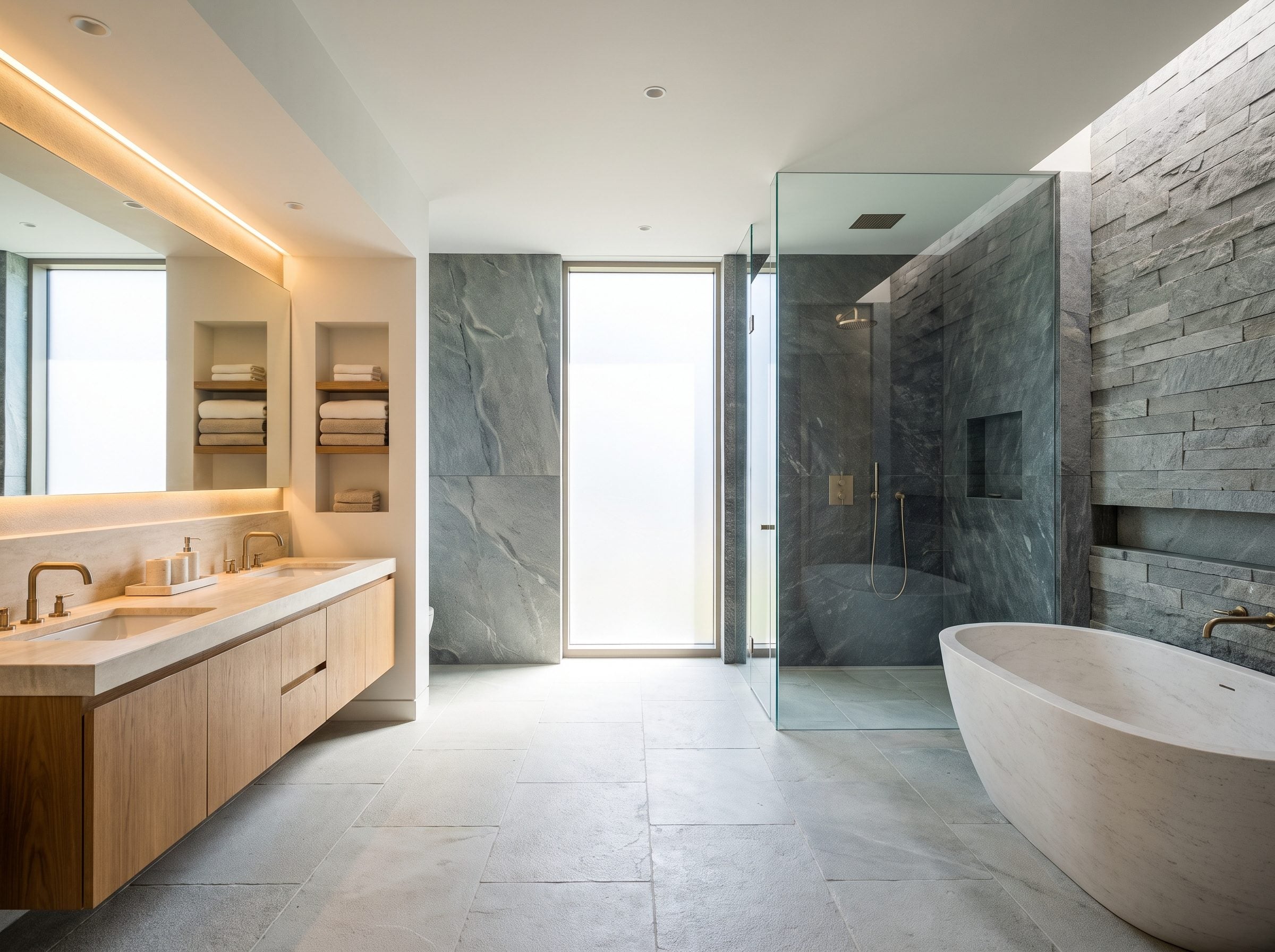
Ask which gray. Flat paint and cleaved slate may share a color word, but they do completely different things with light, texture, and age.
The slate on this shower wall is the second kind. It started as fine mud settling on an ancient sea floor, then spent a few hundred million years getting squeezed and cooked into rock. Many Welsh slate deposits are hundreds of millions of years old, and slate has been used as a building material for centuries. Nobody choosing it for a roof or floor was working from a seasonal color forecast.
And there’s the crack in the whole argument. A trend counts in seasons; slate counts in eras.
Paint can become associated with a particular era because the same finish gets repeated everywhere. Stone is harder to pin to one moment because its variation comes from the material itself. Look close at that charcoal, and you won’t find one value. You’ll find a hundred, mineral bands shifting every time the light crosses them. The paint aisle can’t fake that, and it quits trying right about the time it christens next year’s greige.
Notice what actually warms the room. A floating warm-oak double vanity, brushed-brass fixtures, a pale stone floor catching daylight off the privacy window. Gray stone plus oak is a familiar spa pairing for a reason: one brings mineral coolness, the other brings grain and warmth.
So when someone says gray is over, they mean the can. The quarry outlasted the Roman Empire. It’ll outlast this trend cycle without noticing it happened.
30. Tonal Gray Living Room: The All-Gray Room That Actually Works (and Why Yours Didn’t)
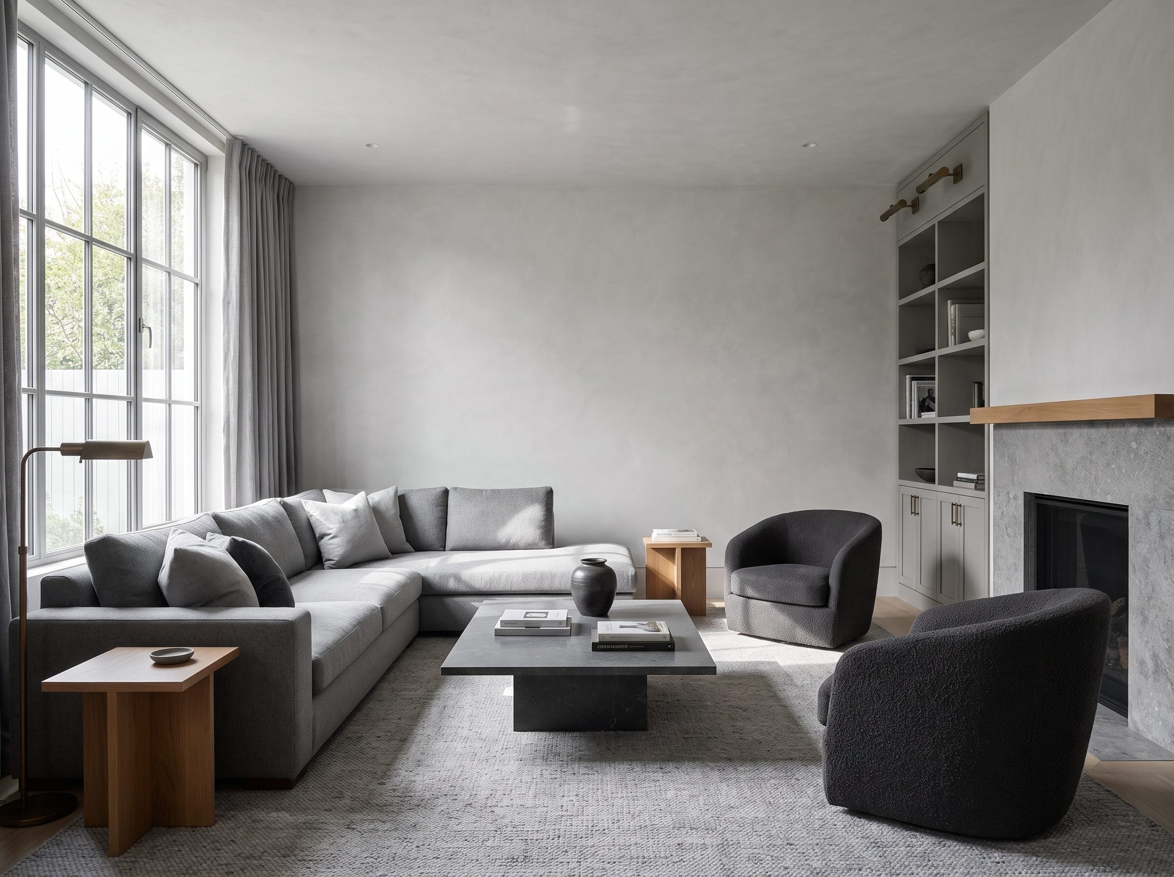
Two all-gray rooms can share a palette and have almost nothing else in common. One feels upholstered in fog. The other has enough variation in value, sheen, texture, and shadow to keep changing as you move through it.
A one-note gray room dies where a layered one keeps breathing. That difference matters far more than the name on the swatch.
Remember the rooms you actually hated around 2015? A single cool gray on the walls, a three-piece sofa suite in the exact matching gray, bought together and delivered together, gray laminate clicking underfoot, every surface throwing back the identical wavelength. Nothing interrupts the sameness. That’s the room they buried, and they were right to.
Designers who build tonally already knew the escape hatch, and it has nothing to do with quitting the color. Fontan Architecture puts it plainly: depth in a limited palette comes from moving value, saturation, and texture around, not from throwing in a different hue.
So you assign each gray a job. Pale mineral plaster on the walls, the kind that swallows light. A medium wool sectional that traps shadow in the weave, charcoal bouclé chairs that snag a highlight on every loop, a silver-gray hand-knotted rug, a graphite stone table, gray linen curtains that go to smoke by noon. Then one warm-oak stool and a little aged brass, so the whole thing doesn’t flatten into a showroom floor.
Matchy is what kills an all-gray room; tonal is its opposite. Every bit of this lives on natural light raking across those finishes. Flat light, flat room. Real window, and six near-identical grays start arguing with each other in the best way.
29. Gray and Oak Bedroom: Why the Supposed Replacement Was Already in the Same Family
Pull up a fan deck and find Benjamin Moore’s enduringly popular Pale Oak. Read descriptions of the color, and you’ll hit the phrase warm gray undertones before you finish the paragraph. So the color named after the wood that supposedly rescued you from gray is, by its maker’s own admission, a gray.
Raw white oak can lean pale, ashy, or softly golden depending on the board and finish. Centennial Woods groups white oak and driftwood with cooler gray, taupe, and ashy-brown families, which helps explain why oak sits so comfortably beside gray without creating a hard color break.
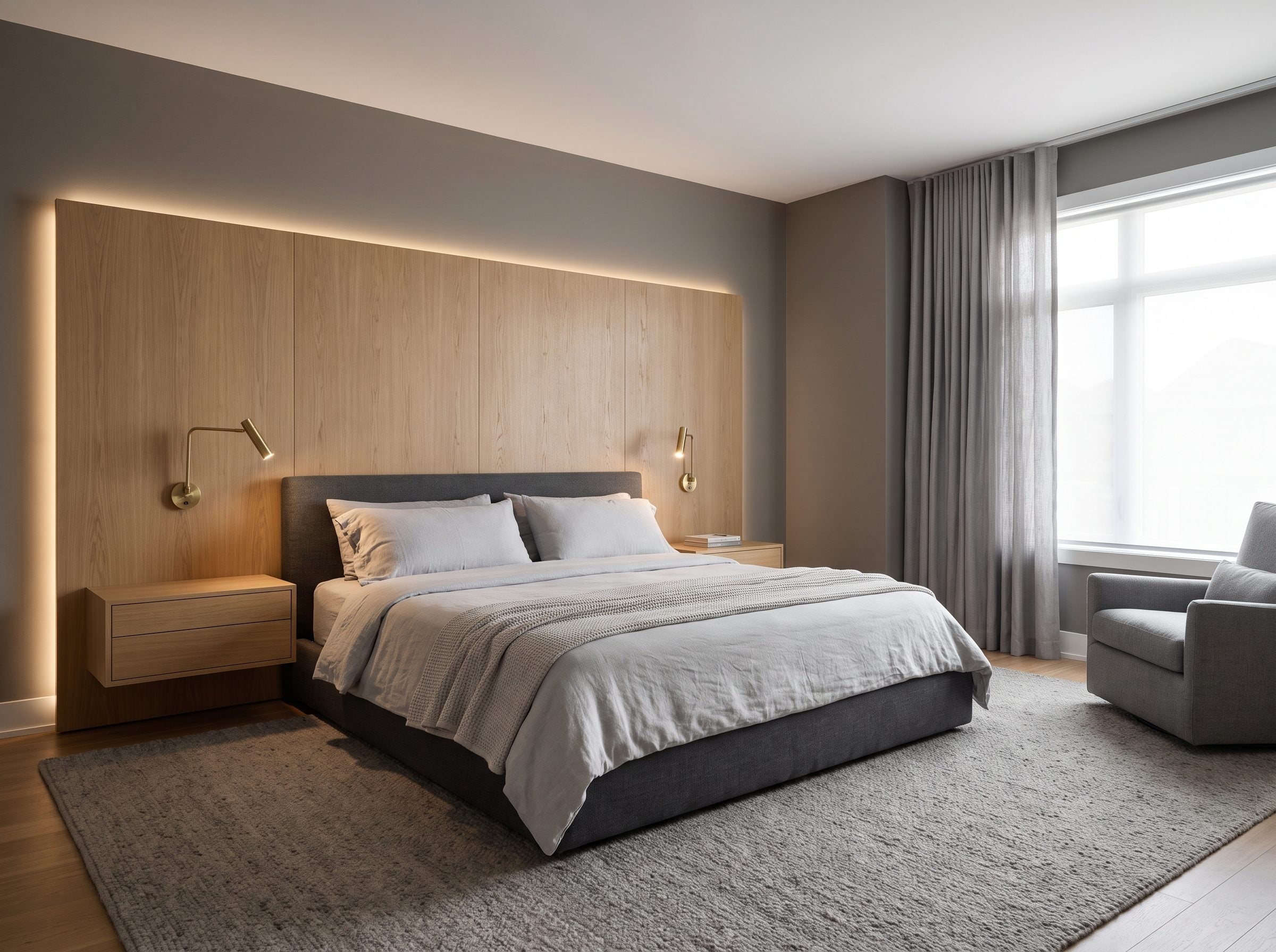
Which is why this bedroom holds up. Medium warm-gray walls, a charcoal velvet bed, and a floor-to-ceiling oak headboard aren’t two enemies negotiating a ceasefire — the oak’s grain sinks into the mineral gray like both came out of the same quarry. The actual warmth arrives from somewhere else: the brass reading sconces, throwing a gold that neither the gray nor the oak owns on its own.
The ledges built into the headboard hold a book and a glass of water, and they’ll never look dated, because a shelf can’t go out of style. Then there’s the wool carpet, the part no photograph gets: the give under a bare foot, the hush, that faint coolness it hangs onto well into July.
28. Graphite Kitchen: When Dark Gray Changes the Entire Job
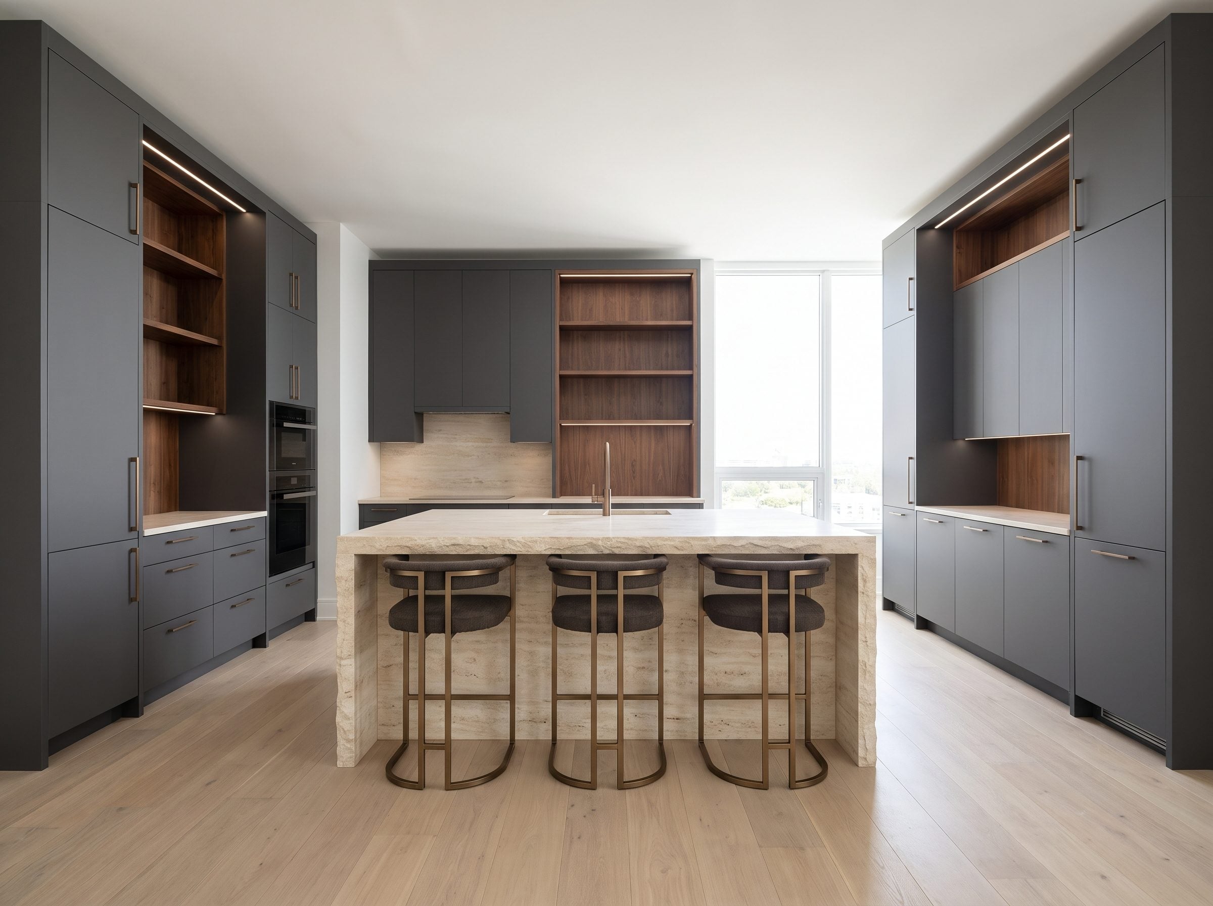
Graphite and anthracite never picked up quite the same baggage as pale builder gray, even though both live inside the broader gray family. The deeper value changes the job completely: instead of filling the room with neutrality, the cabinetry behaves almost like shadow.
That’s the trick the forecasters never explain. The gray they buried was one specific thing: flat-front greige boxes sprayed onto builder specs by the ten-thousand across the back half of the last decade. That gray did wear out its welcome. Deep matte graphite belongs to a different conversation entirely.
Here it doesn’t act like paint. It acts like shade. Run matte graphite down the wall in full daylight, and it steps back and disappears, which is exactly the point. That recession lets the creamy waterfall stone push forward, and the walnut warm up in the gap. You’re not looking at cabinets anymore. You’re looking at depth.
Watch what’s carrying the room. Tall storage walls behave more like architecture than a row of cupboards. Bronze hardware stays out of the way. Pale oak underfoot keeps the temperature from dropping. Paint all of that white and the stone loses the thing it was leaning against — the whole composition goes flat, and you’ll feel it before you can name it.
Deep charcoal cabinetry remained part of contemporary kitchen palettes even as pale gray lost favor. Calling it graphite or anthracite also separates it from the washed-out open-concept gray that dominated the previous decade.
The important change is not the marketing name. It is depth. Graphite behaves like shadow, while the pale builder grays people tired of were asked to behave like atmosphere, background, cabinetry, flooring, and furniture all at once. Same color family; completely different assignment.
27. Gray Home Office: The Room a Corporate Person Runs Away To
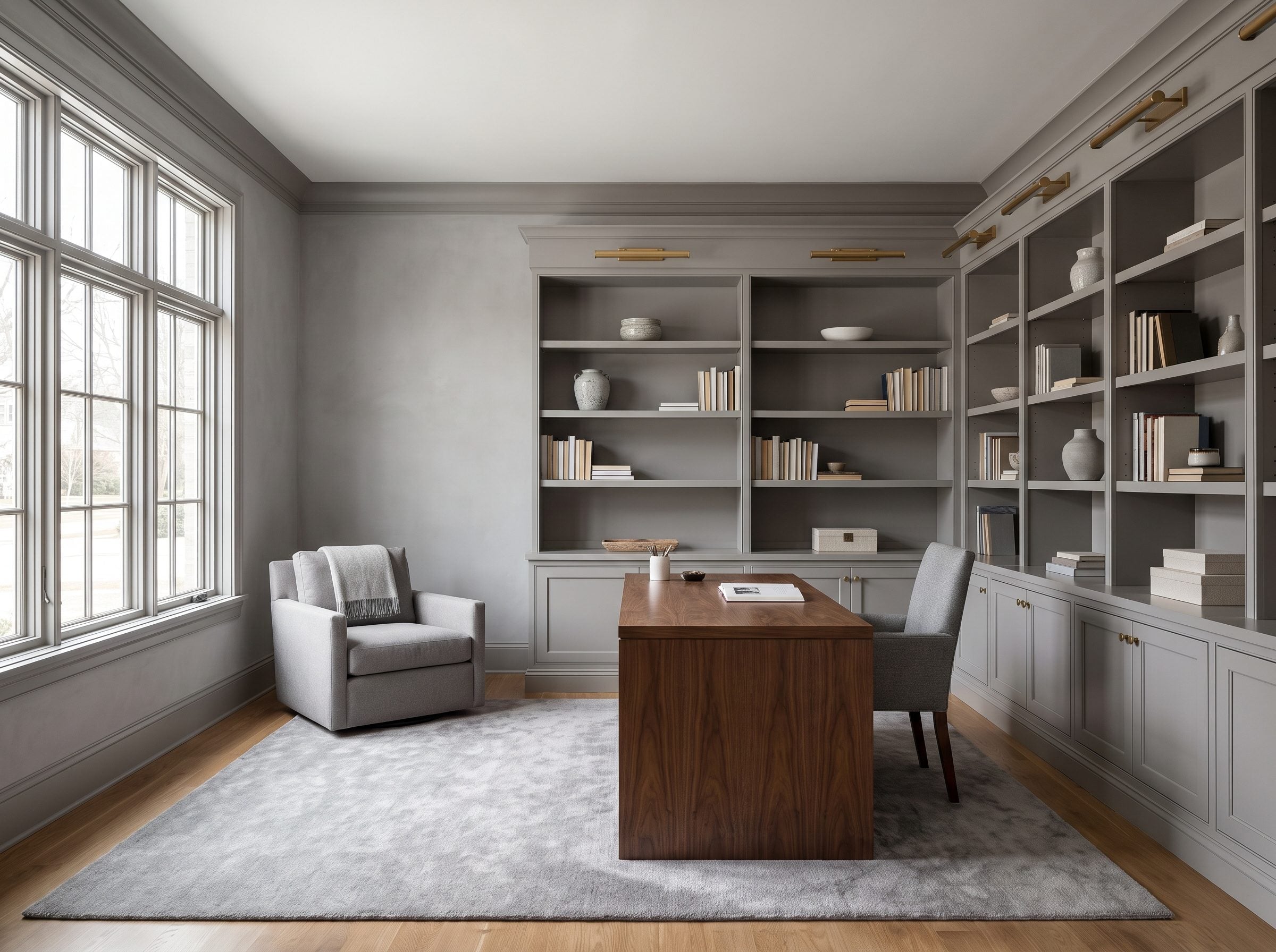
Gray office, and someone will eventually say cubicle. This room answers before the argument gets going: a walnut desk, brass picture lights, books, wool, and oak have almost nothing in common with fluorescent commercial carpet.
Look at the room. A walnut desk anchoring the middle, gray plaster climbing the walls, brass picture lights raking down over a wall of spines — nothing in it whispers commercial. It’s the opposite of that open-plan floor a person clocks out of at five.
Why doesn’t it feel like a waiting room? Comes down to which gray got used. Not a flat builder swatch. Something with real depth, like Farrow & Ball’s Purbeck Stone, a mid-gray reviewers describe as sliding between stony greige and a whisper of lavender depending on the hour. A nuanced gray is never one fixed impression — it can run warm at breakfast and cooler by late afternoon.
Farrow & Ball pulled that name from a real place: the limestone of the Isle of Purbeck, sitting on Dorset’s Jurassic Coast for a very long time. Nobody names a color that carefully to make an office feel like a DMV.
What keeps the room alive is the pile-up of warm materials against the cool one. Oak underfoot, walnut on the desk, brass overhead. A gray upholstered desk chair and a wool rug soft enough to work barefoot on. The gray steps back so every warm tone in the room gets louder.
26. Cream and Gray Living Room: The Gray You Painted Wasn’t the Problem, the White Next to It Was
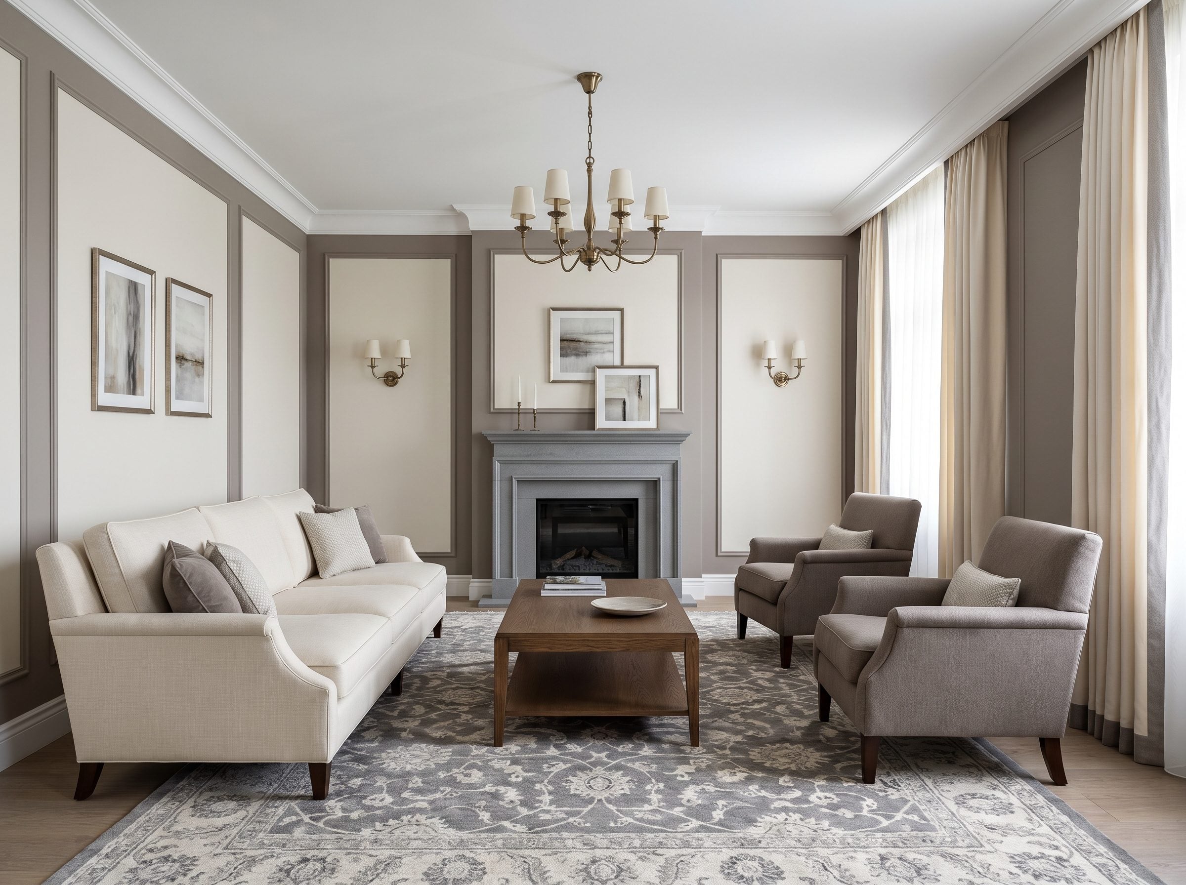
The easiest way to rescue a gray room is often sitting three inches away from the wall: the trim color. Pair a warm mushroom-gray with a stark blue-white and the wall suddenly looks colder, flatter, and more rental-adjacent than it did on the chip.
Look hard at the room above, and the culprit walks right out into the open. It was never the gray. It was the blue-white trim somebody stuck next to it. Mushroom-gray walls against a cold, builder-flip white can look like a rental waiting for its listing photos. So change one thing. Warm that white into a creamy off-white and the same gray relaxes, suddenly looking like you chose it on purpose.
Everything in this room pulls in that direction. The cream sofa softens the whole shell, and the warm-gray armchairs echo the wall tone rather than picking a fight with it. A gray stone fireplace and a dark oak coffee table drop in some weight. Then the aged-brass lighting brushes a thin coat of gold over anything that might have drifted cool.
You never had a gray problem. You had a white problem sitting three inches away from it.
This same fix rescues nearly every gray room people gave up on. Leave the walls. Rewarm the trim, and the color you were told to trash starts looking like a decision.
25. Blue-Gray Bedroom: The ‘Gray’ That’s Actually Blue Hiding in the Fan Deck
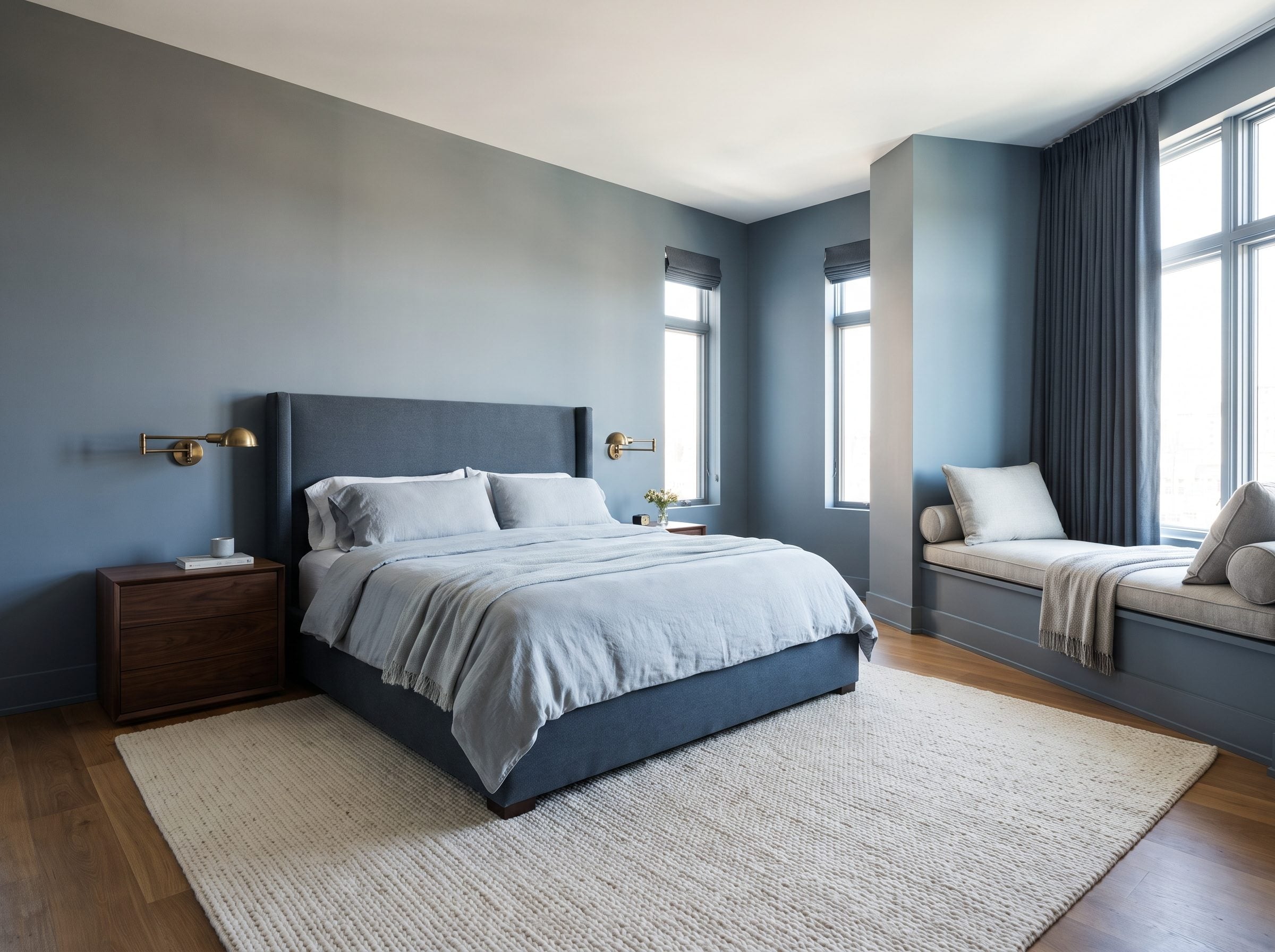
Walk into a paint store, pull the chip labeled gray, hold it to a north window, and watch it turn faintly blue in your hand. That’s not a defect. It’s the trick nobody selling you a repaint bothers to explain: a truly neutral gray barely exists on a wall. Every one leans somewhere, and the direction it leans decides everything.
Blue-gray tips one way, greige the other. So when someone announces they hate gray, they rarely mean it. What they hate is one bad swatch in one bad light, and they’ve sentenced a whole family for the sins of a single chip.
The gray everyone learned to dread has a name and a birthplace, and it wasn’t your childhood bedroom. It’s battleship gray, and it reads dead because deadness was the point. Navies adopted gray camouflage schemes in the early 20th century because low-visibility tones could reduce contrast against sea, haze, and sky. Battleship gray was designed to be unobtrusive, which is a very different job from making a bedroom feel inviting. A color engineered to be noticed as little as physically possible. Put that on a headboard wall and, of course, it says nothing back to you.
Blue-gray does the reverse. It’s low-chroma, so its little dose of blue gets fed or starved by whatever light hits it. Morning light through a cool window and it can look almost baby blue. Late afternoon, warm light cancels the blue and hauls it back toward honest gray. Same paint. Two rooms.
This is exactly what the gray-is-over crowd sails right past. Warm the cool tone with a window seat and a nubby rug and you haven’t revived a color that died in 2018. You’ve painted one most people never honestly tried.
Tape a large sample to the wall and live with it through morning, afternoon, and artificial light before you commit. Blue-gray is especially sensitive to context; a chip that looks stony in the store can turn visibly bluer once it meets cool daylight.
24. Concrete-Gray Loft: When Gray Is the Building, Not a Paint Chip
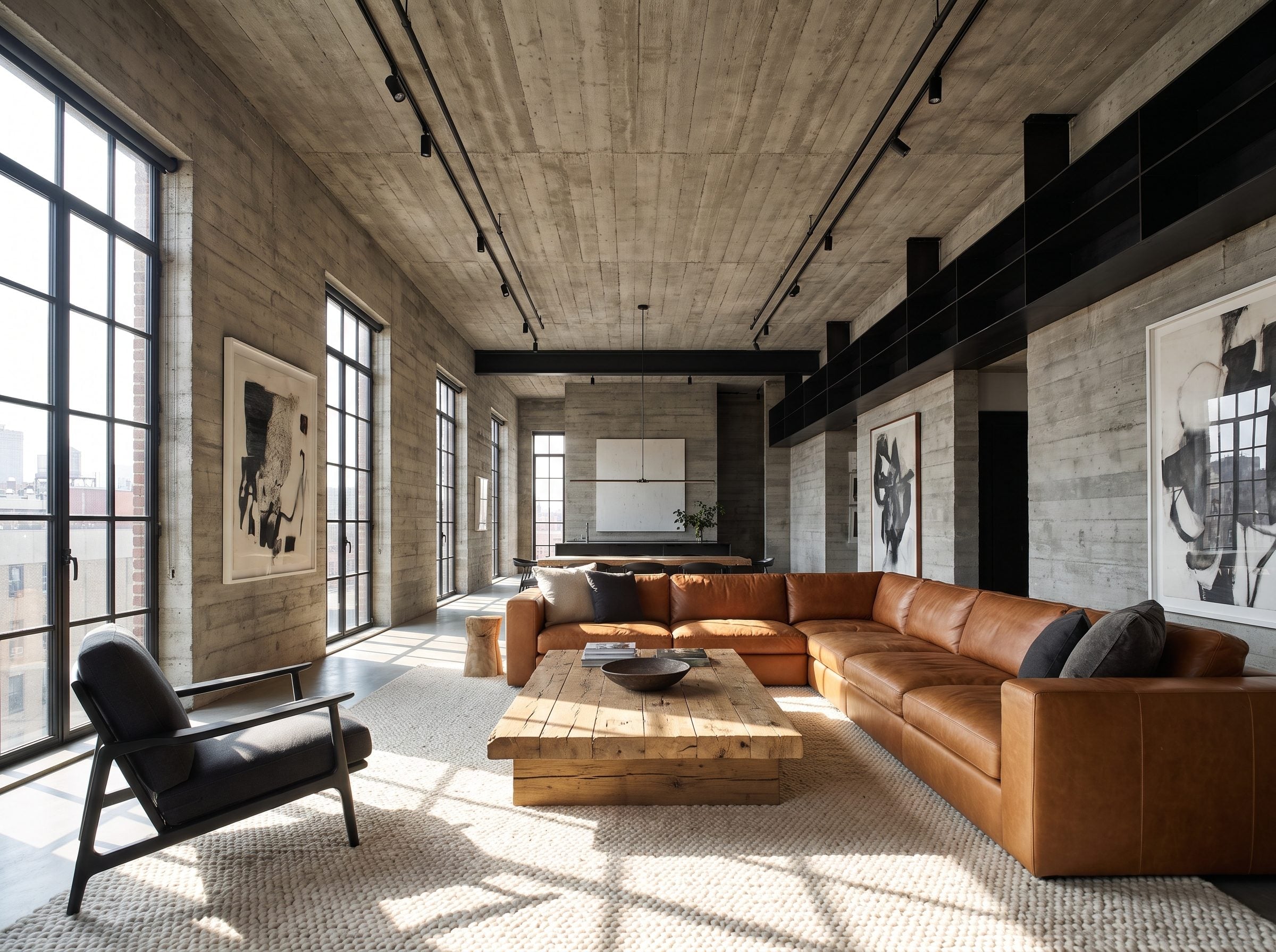
Tadao Ando made exposed concrete one of the signatures of contemporary architecture, and no color forecaster gets much say over it. His concrete doesn’t get a season. In July 2018 a duplex penthouse inside his 152 Elizabeth Street building sold for $29.95 million with the walls left bare — seams showing, tie-bolt holes and all. Sponsor units there averaged roughly $3,656 a square foot, among the steepest lower Manhattan has ever recorded. Nobody at that closing table whispered that the walls looked dated.
Concrete changes the argument completely. Paint trends run on a calendar; structure does not. Gray poured into the structure of a building can’t — it isn’t a decorating choice; it’s the thing holding the ceiling up. You don’t retire the walls.
The loft in this photo works on the same logic. Concrete stays raw, and every warm object in the room gets set against it deliberately: a cognac leather sofa, a slab reclaimed-oak coffee table, an ivory wool rug thick enough to lose a set of keys in. The gray isn’t fighting the warmth. It’s the backdrop that lets the warmth register at all — pull the concrete out and the cognac leather goes flat.
So when a catalog announces gray died in 2019, notice who skipped the memo. An architect with a Pritzker and buyers writing eight-figure checks for walls the color of wet stone. His gray was never the problem. Yours probably wasn’t either.
23. Green-Gray Living Room: A Paint Color That Changes With the Hour
🔥 Would you like to save this?
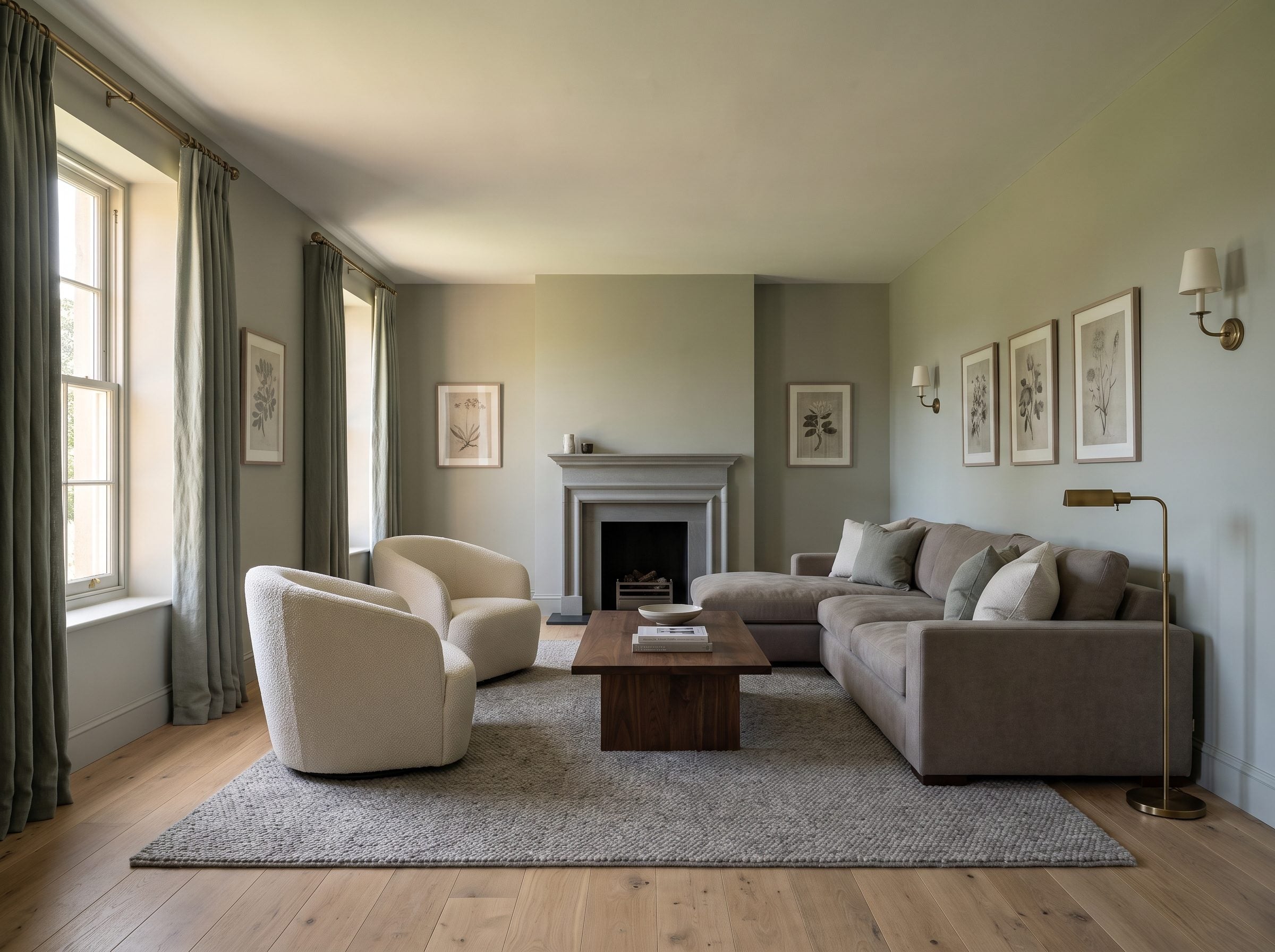
Paint a wall sage-inflected green-gray and it spends the whole day pretending to be different colors. Cool and stony under north light at breakfast. By four, when the western sun rolls in, it goes soft and almost olive. Same can, same square of drywall, and you didn’t lift a finger.
Changing light can make the same near-neutral paint appear cooler, warmer, greener, or grayer over the course of a day. A related color-science term is metamerism, which specifically describes two colors that match under one light source but stop matching under another. The wall here is simpler: one color, several different appearances as the illumination changes.
A green-gray wall is four rooms in one, and the sun charges you nothing for the other three.
So a saturated coral does one thing all day. It sits there being coral. Your green-gray earns its keep from dawn to dusk. Build the layered version and let it work: warm-gray sofa, cream boucle chairs you actually sink into, a walnut coffee table with some heft, oak floors, and gray-green linen drapes that whisper the undertone rather than shout it. A gray limestone fireplace holds the cool end down while aged-brass lighting warms it back up. One botanical print, maybe two. That’s your green quota spent. Please don’t hang eucalyptus in every corner — the undertone is the point, not a decorating theme.
A green-gray earns its interest from the room around it: orientation, weather, daylight, wood, stone, and fabric. No seasonal repaint can reproduce what the sun is already doing for free.
22. Mushroom-Gray Kitchen: The ‘New’ Color That’s Just Gray Wearing a Sweater
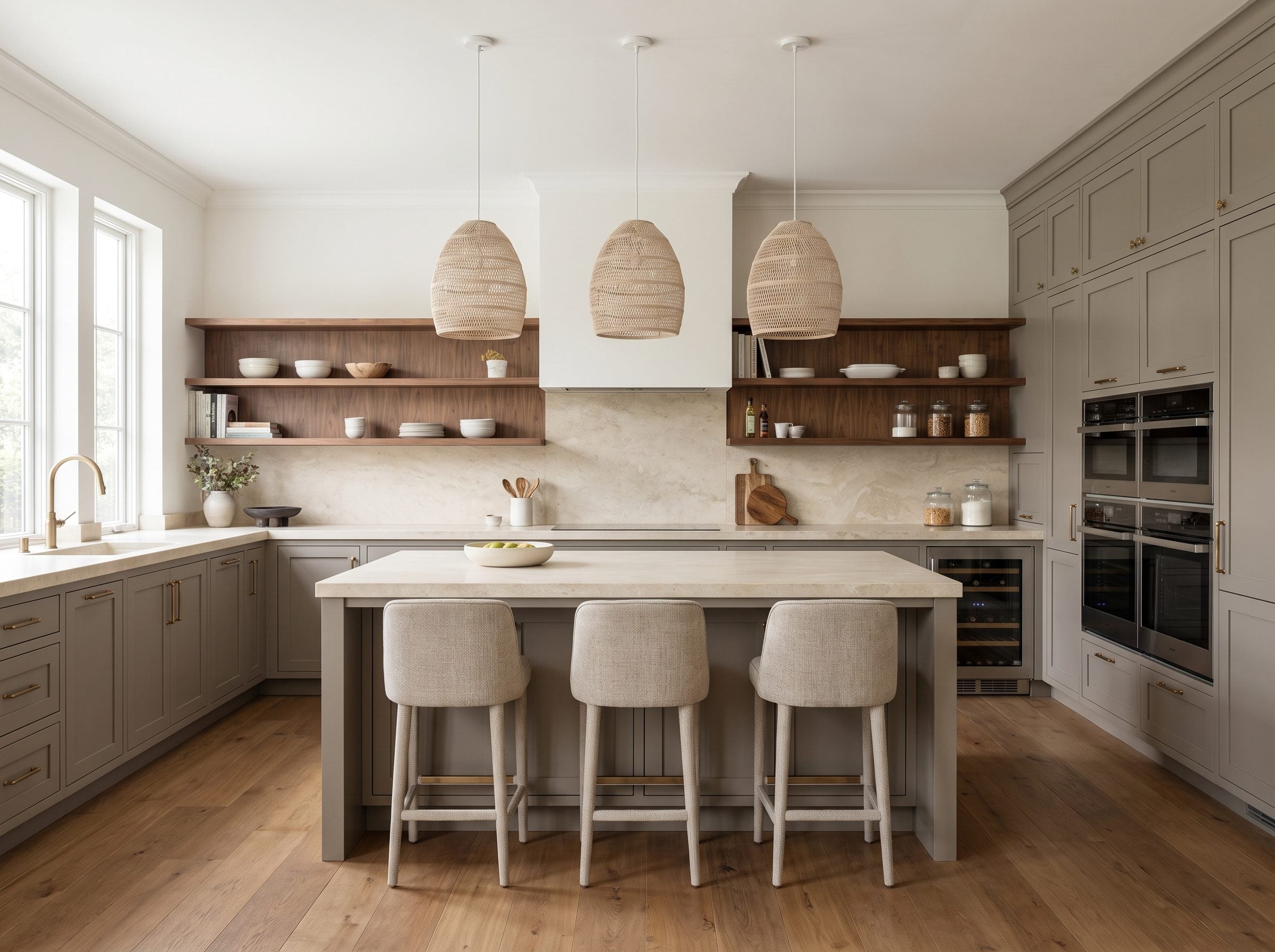
Mushroom, greige, and taupe overlap with gray, beige, and brown in different proportions. None is simply gray with a new label, but they all demonstrate the same move: reduce the blue, add earthy warmth, and the neutral immediately feels softer.
Run the names and the pattern gets loud. Benjamin Moore Pashmina. Sherwin-Williams Shiitake. Farrow & Ball Jitney, which designers describe as greige by day and taupe by night, changing its mind with the sun. A gray that reads warmer as the light shifts, in other words. Nobody ever told you to walk away from gray — they told you to buy a friendlier one and spend a weekend rolling it on.
This kitchen is the receipt. Brown-based cabinets, creamy stone counters, walnut open shelving, oak underfoot, and aged-brass pulls tossing off a little glint. Walk in, and your gut says gray. It just dropped the blue undertone that made a 2015 kitchen feel like a waiting room with an aquarium in the corner.
What actually curdled was cool gray stacked on cool gray, all those silvery undertones bouncing off each other until the whole room went cold. Warm the recipe up a notch and gray keeps earning its keep. Nobody held a funeral. Somebody nudged the thermostat and charged you for a new color.
21. Gray Stone Fireplace Living Room: Geology Has No Trend Cycle
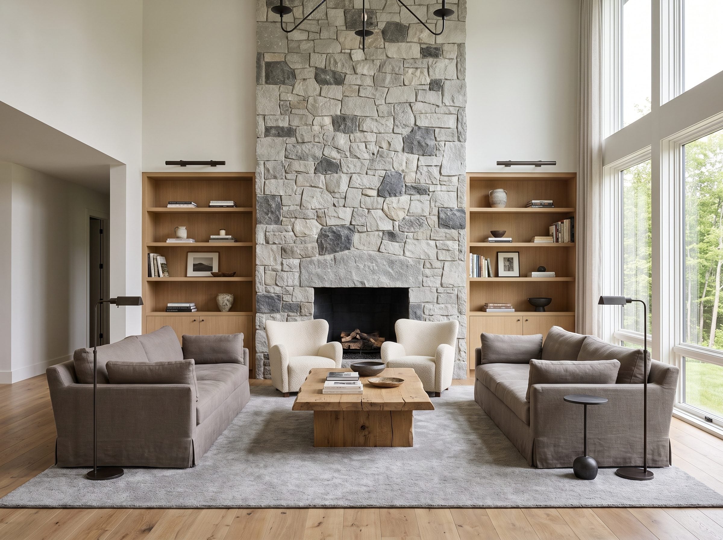
A rock doesn’t read the design blogs. It doesn’t care what Pantone announced in December. It just sits there being gray for a hundred million years while no forecaster gets a vote.
Look at the fireplace. Floor-to-ceiling irregular limestone, pale near the hearth, charcoal down in the deep mortar lines, and every shade between. Nobody pulled that palette off a fan deck. Water, pressure, and an obscenely long wait did the choosing.
Sit with this for a second. The Portland limestone on St Paul’s Cathedral formed in a shallow Jurassic sea and has been quarried since Roman times. Christopher Wren used Portland stone extensively in rebuilding London after the Great Fire because it was a proven, workable building stone available in large quantities. That’s a gray with a resume older than most countries.
The warm-gray linen sofas and cream boucle chairs in here aren’t competing with the fireplace. They take their cue from it. Build a room off a natural gray material and the softer grays around it stop looking like a decision — they start looking inevitable. Oak coffee table, wide-plank floors, a thick wool rug, and the whole thing settles into place.
Fieldstone makes the same broader point with less ceremony: naturally gray materials arrive with mineral variation and weathering that no flat swatch can imitate.
Treating every gray as a paint-chip trend misses half the subject. In stone, gray is geology before it is decorating.
20. Charcoal Library: The Gray That Makes Millwork Look Like It Cost Twice as Much
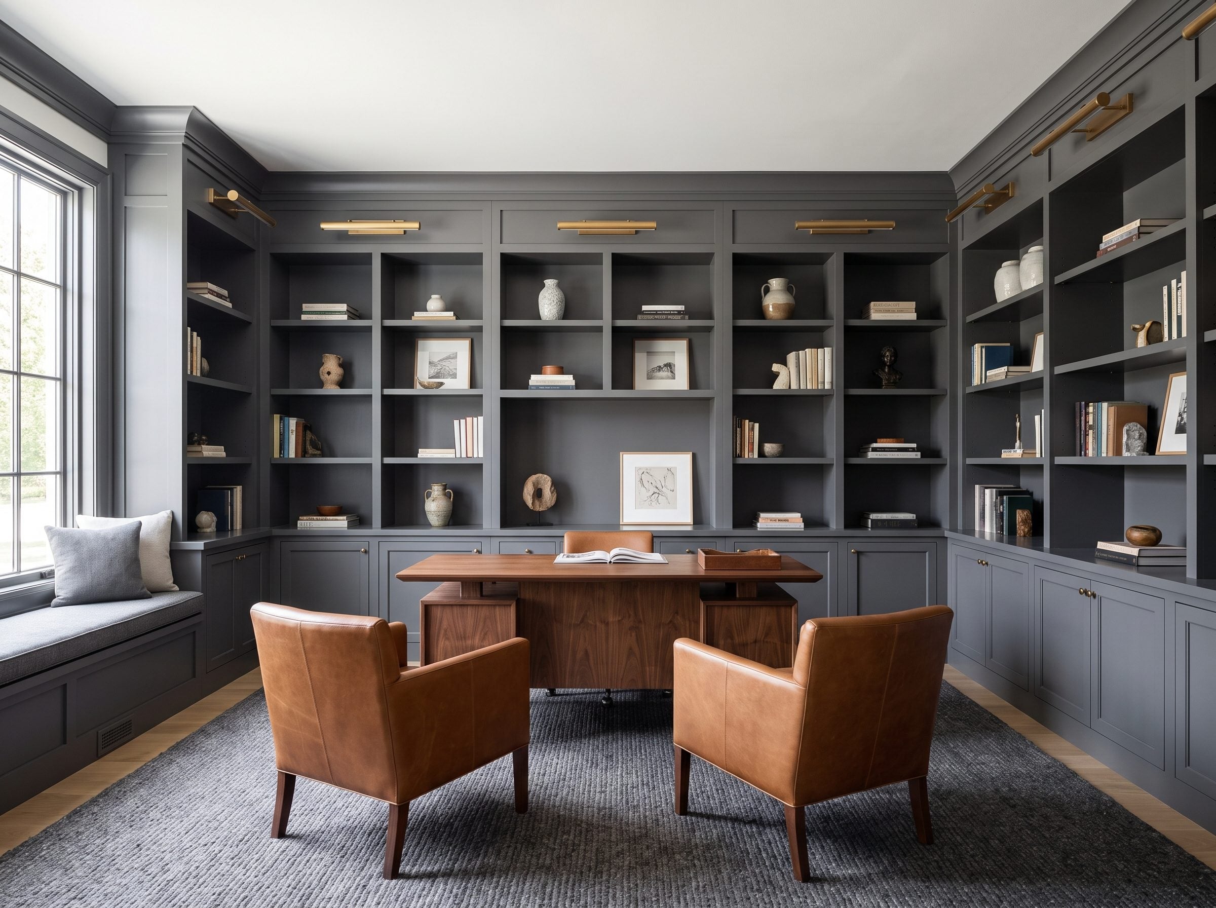
Here’s a test you can run on any bookcase. Paint it the same white as the wall behind it, step back, and try to find where the shelf ends and the wall begins. You can’t — the thing dissolves. Now imagine that same case in deep charcoal. Every horizontal edge throws a shadow, every vertical stile reads as a crisp line, and suddenly a stack of MDF shelving looks like it was built by someone who charges by the hour.
That shadow-play is the real reason deep charcoal works so well on built-ins. It emphasizes the bones of the room instead of asking the shelving to disappear into the wall.
Farrow & Ball’s Railings is described by the brand as more blue than black, a soft dark with real depth instead of flat harshness. Designer Kathy Kuo calls it darker than charcoal but short of true black, and she names the study and the office as the rooms it was made for. The larger point is simpler: very dark gray is still useful because it behaves differently from the pale builder grays that dominated the previous decade.
In this library, it carries the whole wall. Built-ins run floor to ceiling — closed cabinetry low, open niches up top, each shelf lip lit by brass picture lights. A walnut writing table holds the center, two cognac chairs turn toward it, and a graphite wool rug sinks the floor into something you’d hate to walk across in wet boots.
Wood, brass, leather — all warm, all glowing against the cool. The charcoal isn’t performing. It holds the light so everything else can shine.
You’ve probably got a hall of apologetic white shelves right now, vanishing into the wall as if they’d rather not be seen. Paint them charcoal. The room grows a backbone overnight.
19. Dove-Gray Nursery: A Neutral Backdrop That Leaves the Color to Everything Else
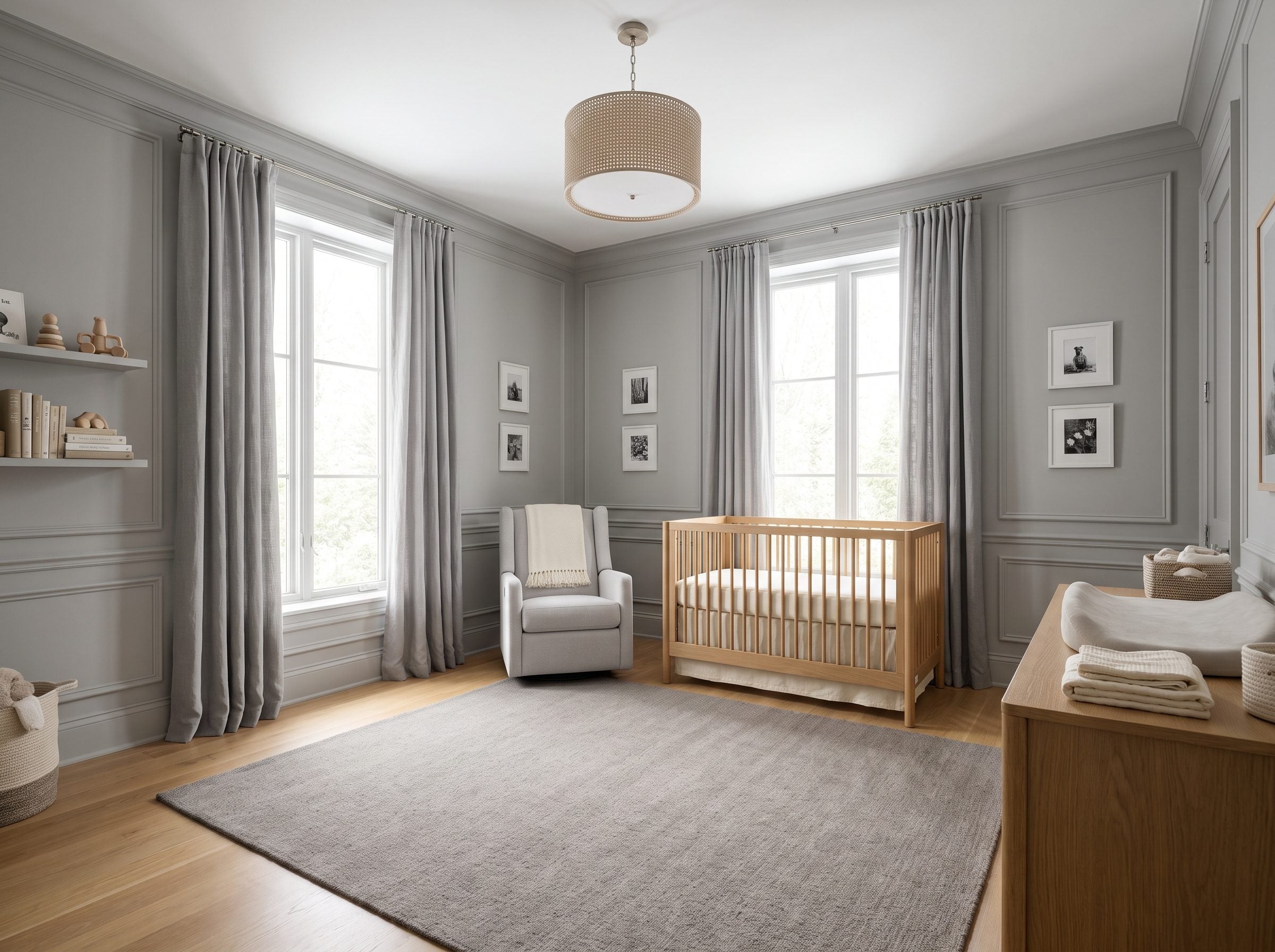
Newborn vision is still developing, and babies respond strongly to contrast, faces, movement, and simple visual cues long before they care about whether the walls are sage, terracotta, or dove gray. That makes the nursery a good place to stop treating wall color as the main event.
Warm dove-gray gives the crib, books, toys, blankets, artwork, and eventually the child’s own drawings room to become the changing color story. Oak and cream keep the shell soft without pretending a particular neutral has magical developmental powers.
Pick a gray with warmth underneath it, greige over blue-slate, so afternoon light doesn’t tip it clinical. Anchor it with a natural-oak crib and a pale-gray upholstered glider, then let a warm-gray wool rug take the chill off the floor. And the color your kid will actually remember? It shows up later, in the picture books, the toys, the crayon drawings taped crooked to the wall. Not in a can you were talked into buying twice.
18. Gray Marble Bathroom: The Gray That Had a Career Long Before the Paint Chip
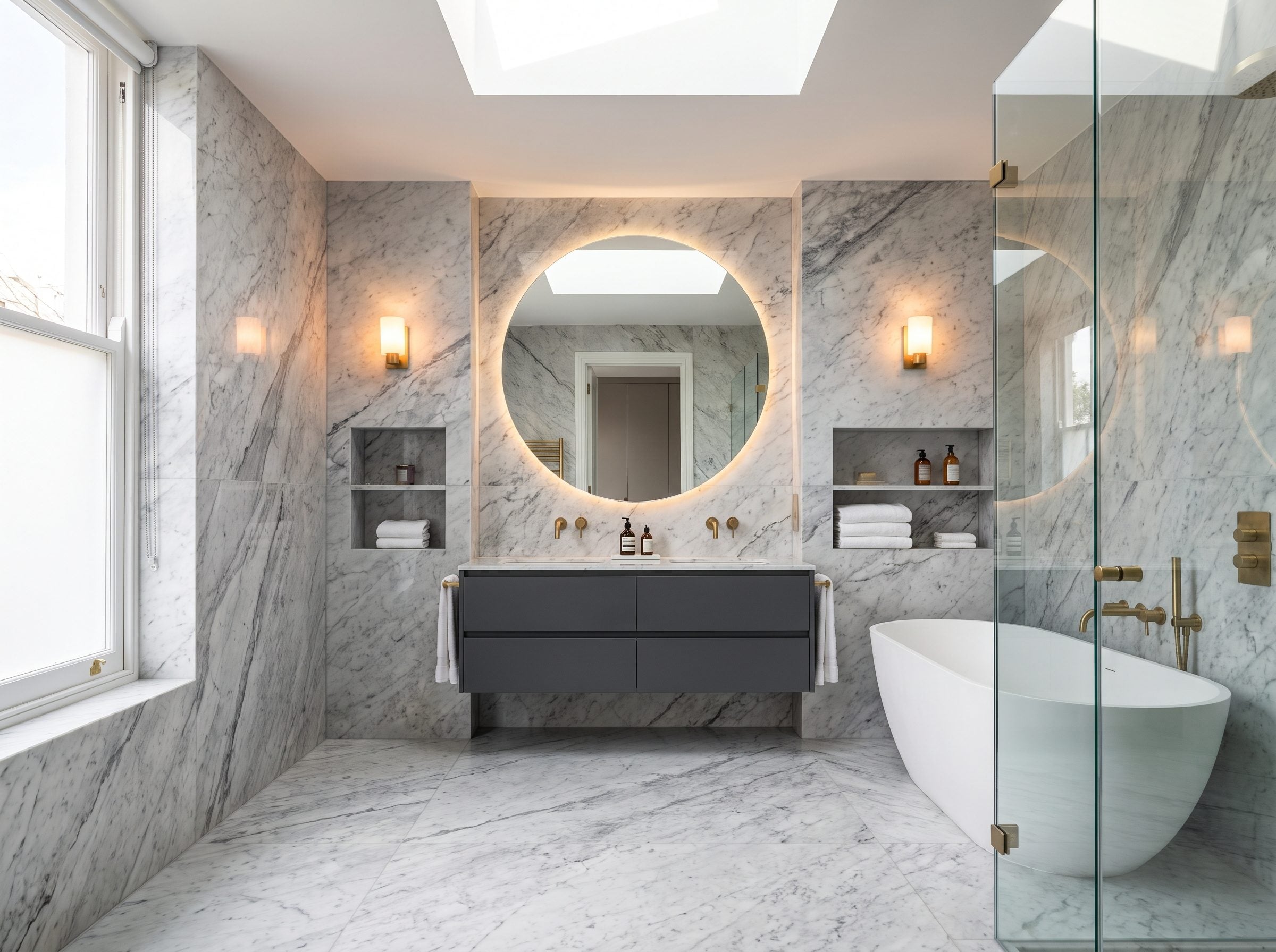
Bardiglio is a gray Italian marble known for smoky blue-gray color and pale veining. Used in architecture and decorative stonework for centuries, it makes a useful distinction between gray as flat pigment and gray as a veined material with depth built in.
So what does a color forecaster mean when they announce gray is dead? They mean the flat builder-grade gray on a ceramic sample board, the one stacked in bulk down the big-box tile aisle. Not this. They cannot mean this in the same way. A quarried material with veining, mineral shifts, and natural variation does not behave like a flat builder-grade tile.
The real divide is not expensive gray versus cheap gray. It is material richness versus visual flatness. A veined stone gives the eye information that a uniform ceramic surface simply does not.
Which is why the room feels tactile instead of clinical. Set a charcoal floating vanity against it, hang a white freestanding tub in the light, then finish with brushed-brass fixtures — the brass does the warming, catching daylight off the stone as it does in a navy powder room. Cold gray is a lighting failure and a material failure. Never a color failure.
This bathroom will look right in 2050. The ceramic sample board will not.
17. Warm-Gray Mudroom: The Room That Proves Gray Was Never a Style Choice, It Was a Maintenance Decision
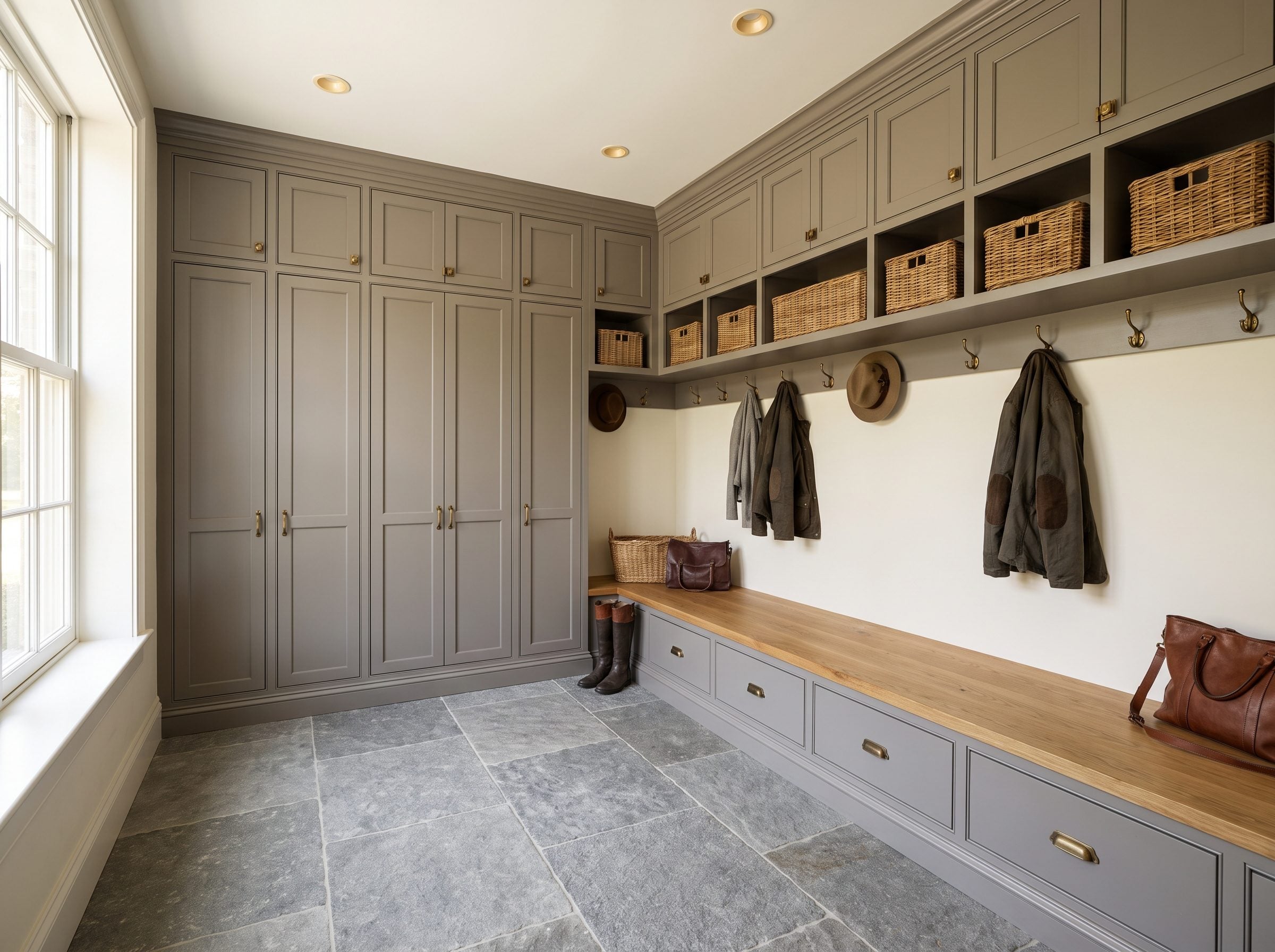
A mudroom is where color theory meets road salt. Whatever the trend cycle is doing, this room still has wet boots, backpacks, dog paws, grit, and a bench that gets kicked every day.
Nowhere does that contradiction fall apart faster than a mudroom. Think about what actually happens in here. Wet boots dropped by the door in March, road salt tracked across the threshold, a backpack flung at the bench, and the dog’s paws hitting the floor before anyone gets to the towel.
Warm-gray cabinetry is forgiving in that environment. Compared with very pale paint, a midtone surface can make everyday scuffs, dust, and grit less conspicuous between cleanings while still keeping the room bright enough to feel orderly.
Study how this one is put together. Floor-to-ceiling cabinetry in a soft warm gray, a locker bay for each person, closed overhead storage so the whole wall reads calm from the doorway. The oak benchtop warms things up right where your hands land. Aged-brass hooks and a couple of woven seagrass baskets carry in the warmth the all-cool-gray years forgot existed.
A mudroom doesn’t need a color that trends. It needs a color that hides mud.
The floor is gray natural stone. Honestly, the smartest thing you can put in a room that opens straight to the weather — grout stays forgiving, grit vanishes into the variation, and you sweep less while the whole thing looks worse-for-wear less often.
This is gray doing a job rather than making a statement. In a hardworking room, that may be the better test of whether a color has staying power.
16. Six Grays, Six Surfaces: The Bedroom That Kills the ‘Gray Is Flat’ Argument by Touch
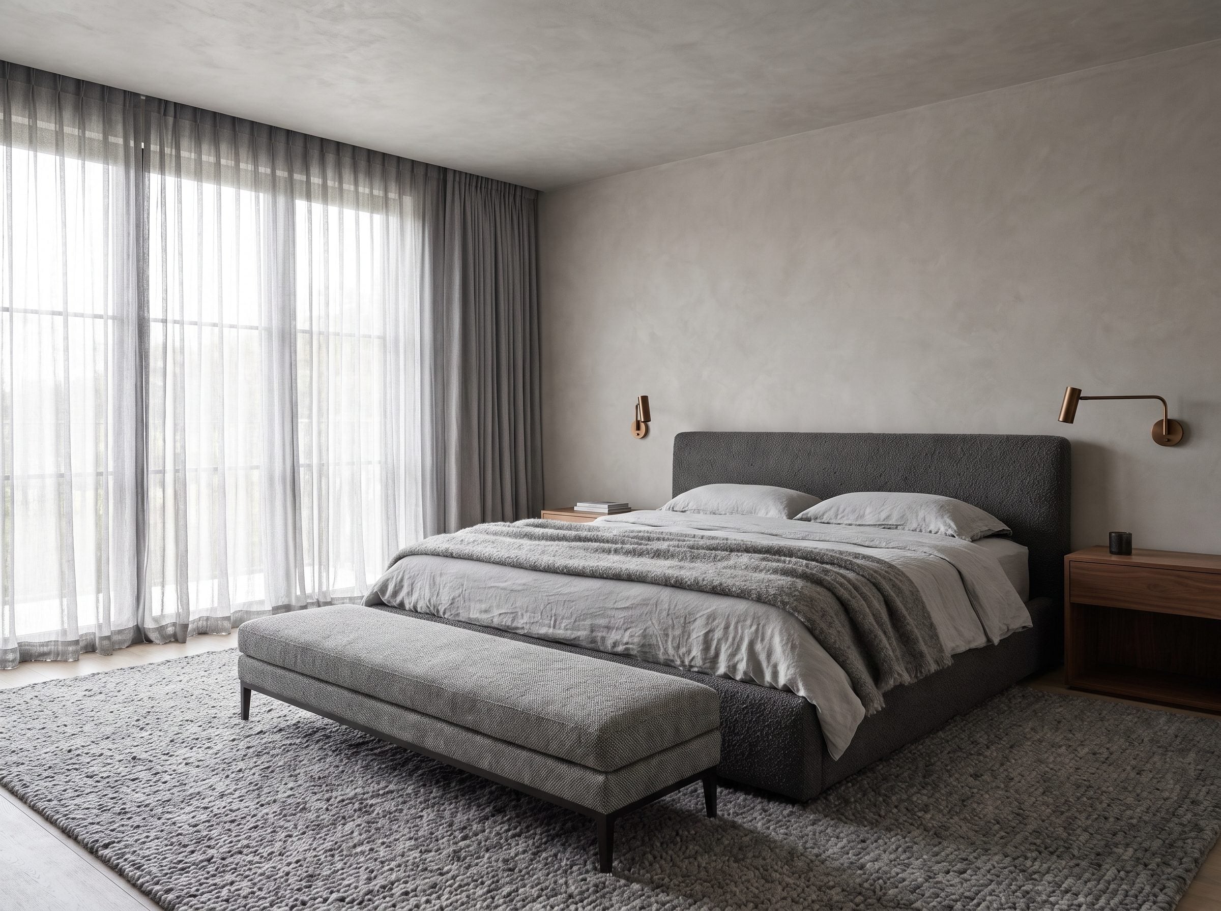
Run your hand across this room instead of your eyes and the whole “gray is dead” thing collapses. Plaster catches under your fingers, bouclé pushes back, and the linen goes cool and slack when you touch it. You cannot photograph that. Which is exactly why paint-chip people never bring it up.
The flat gray room is not flat because every object shares a hue. It is flat because every surface behaves the same way: similar value, similar sheen, similar texture, similar response to light. Repetition without material contrast is what turns monochrome into mush.
So this bedroom does the opposite, and it does it on purpose. Warm plaster on the walls holds a soft shadow when sidelight rakes across it. The charcoal bouclé headboard reads near-black in its dents and silver up on the loops, and the pale linen bedding turns almost see-through where the window hits it. There’s a thick wool rug parked dead center of the tonal range, matte and quiet, holding the whole thing down. Nothing repeats. Your eye keeps drifting because there’s always another surface up to something.
The walnut nightstands and bronze lamps aren’t a rescue mission. They’re just a bit of warmth so the room doesn’t tip into cold and clinical. Two small warm notes carry a lot.
You build a room like this once. Hand-troweled plaster, real wool, a bouclé bed frame — and then you’re done. It doesn’t age out because it was never chasing a trend in the first place; it was chasing material. The lasting quality comes from material variation rather than novelty. Once texture is carrying the room, the wall color has far less pressure to perform.
15. Gray and Walnut Kitchen: The Palette Trend Reports Buried While Buyers Kept Paying For It
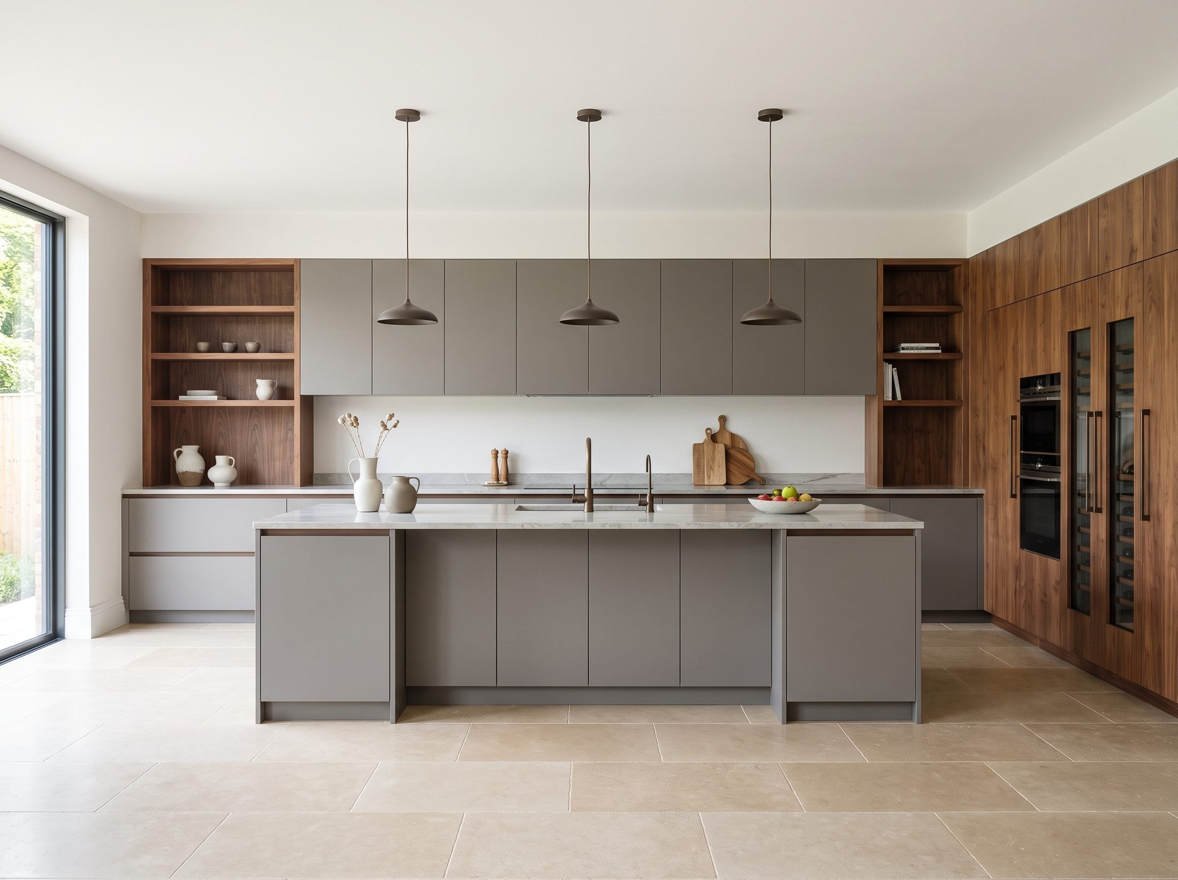
This kitchen does not need a resale statistic to make its case. Warm gray and walnut divide the room into two distinct material zones, and each is stronger because the other exists.
This kitchen shows what those obituaries got wrong. Gray never failed you. The flat, lonely blue-gray of 2015 did — the kind that sat on every cabinet with nothing warm to argue with it. Pair it right, and it stops looking like a builder default.
Watch how cleanly the room divides the work. Matte warm-gray runs the working perimeter and wraps the island. Walnut takes one wall and the run holding the appliances, pulling honey and red into a room that would otherwise feel cold. Neither finish alternates cabinet by cabinet like a checkerboard. Each has one clear job, and that discipline is exactly why the thing holds together instead of turning into a mood-board casualty.
Bronze pulls on the drawers finish the argument. A bronze cabinet pull catching light against pale gray-veined quartzite, pale limestone underfoot keeping the floor from going heavy — small moves, but they matter. The palette designers keep calling dead is standing right here, current and warm, doing exactly what it was supposed to do the first time.
The lesson is not that gray needs rescuing. It is that a neutral becomes more convincing when another material gives it contrast, grain, and temperature.
14. Architectural Gray Entry Hall: The Reason Gray Never Belonged in the Paint Aisle to Begin With
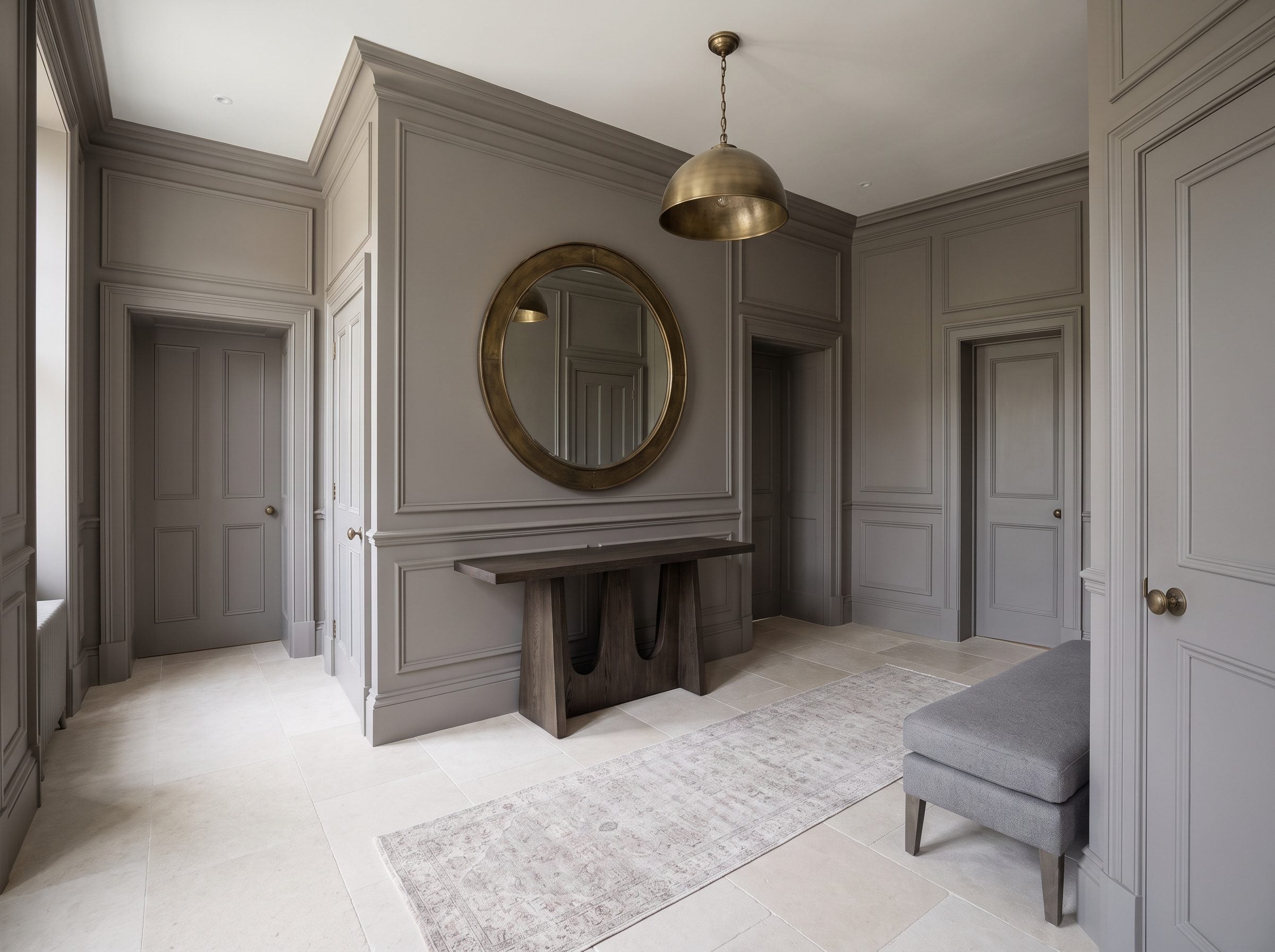
Walk into a hall painted a single warm-gray — walls, panel molding, interior doors all the same tone — and your eye does something odd. It quits hunting for color and starts tracing lines instead: the depth of a door casing, the height of a baseboard, the way a wall panel settles inside its frame. None of it registered before because the paint had been chopping the wall into pieces.
Gray works especially well here because it stops acting like an accent and becomes the stage the architecture sits on. The oversized arch mirror throws light back off the pale limestone, a dark-oak console reads like something carved rather than shopped, and an aged-brass pendant turns into a piece of jewelry — all because nothing around it is shouting.
Paint this same hall a deep clay and the wall panels dissolve into the color. You just hid the exact detail you paid a carpenter to build.
Painting trim, doors, and walls in one closely related value reduces the contrast seams that normally break a wall into parts. With fewer color boundaries, panel depth, casing profiles, and proportions become more noticeable.
Keep the console spare. A gray runner, a gray upholstered bench, and very little else. The millwork already provides the detail; piling small objects on top only competes with the thing the room does best.
Gray isn’t dead. It just moved from feature to foundation, which is where it always did its best work anyway.
13. Gray and Brass Bathroom: The Metal Your Grandmother Trusted Before the Hospital Did
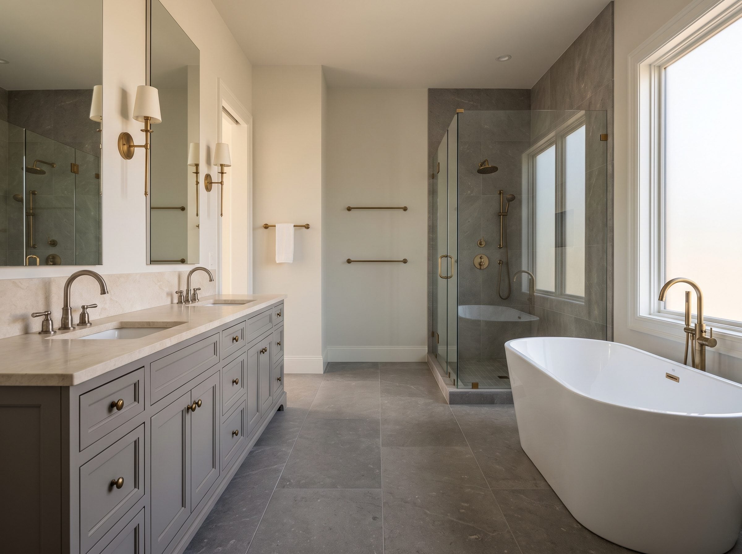
Aged brass warms this gray bathroom visually, and copper-rich alloys have another interesting property: exposed copper surfaces can reduce viable microbes under controlled conditions. That does not make an ordinary faucet self-cleaning, especially if the finish is lacquered or coated, but the material science is real.
Research on copper and copper-alloy surfaces has shown antimicrobial activity against a range of organisms, and some copper alloys have EPA registrations for antimicrobial claims. Those findings apply to specific exposed materials and test conditions; they do not replace normal cleaning.
So look at how the room splits its weight. The gray limestone floor, the gray stone shower walls, the painted double vanity: that’s the load-bearing foundation, and it carries most of the visual weight. Up top sit the aged-brass faucets, the sconces, the drawer pulls, catching the morning light off that creamy countertop and warming the whole room a few degrees.
Gray can feel cold when everything around it reinforces the same temperature. The fix isn’t a new fall palette. It’s warm metal against cool stone, a contrast so old it predates every trend forecast ever printed. Gray stays quiet and constant while the brass does the flattering, and neither one waits for permission from a color-of-the-year announcement.
12. Gray and Terracotta Living Room: The Color They Sold You as ‘New’ Was Fired in Clay 5,000 Years Ago
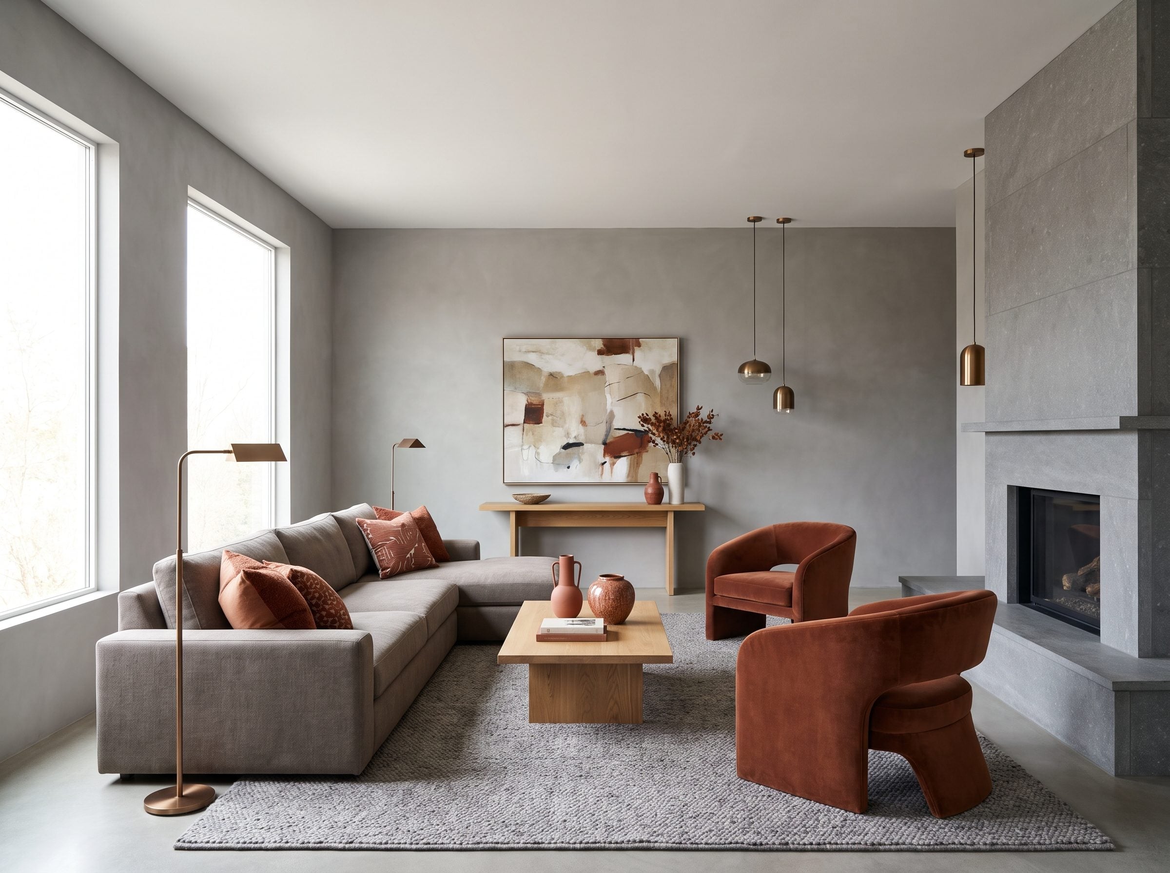
Terracotta gets sold as though it just walked off a runway. It did not. Fired clay has carried warm iron-rich reds and oranges for thousands of years, long after humans had already been decorating with ochres and other pigments. Calling terracotta the color that finally defeated gray is still rather like announcing pottery as a daring new technology.
Look at what this room actually does. Mineral-gray plaster on the walls, a warm-gray sofa, a gray stone fireplace, a gray wool rug, and you keep that at roughly two-thirds of the visible room. Then two rust lounge chairs walk in, a stack of clay ceramics, one piece of art with terracotta bleeding through it. The gray doesn’t lose. It suddenly looks deliberate instead of accidental.
Gray isn’t the color you commit to. It’s the wall you hang the color on.
The historical joke gets better. Pantone named Peach Fuzz its 2024 color of the year, calling it a “velvety, gentle peach whose all-embracing spirit enriches mind, body and soul.” Strip the poetry and it says: buy new cushions. Same clay tone your grandmother lived with, dressed up and put back on the shelf on a schedule.
Restraint is what keeps the terracotta sharp rather than thematic. Bronze lighting and oak tables carry warmth across the room so the cool and the warm stop fighting. A pair of rust terracotta lounge chairs, a few terracotta ceramic vases, a gray wool rug underneath. Push past a third of the room into orange and you’ve built a 1987 rec room by accident. Gray runs the show here. It doesn’t lose to anything.
11. Gray and Slate-Blue Sitting Room: The Pairing That Reads as One Color Until You Look Twice
🔥 Would you like to save this?
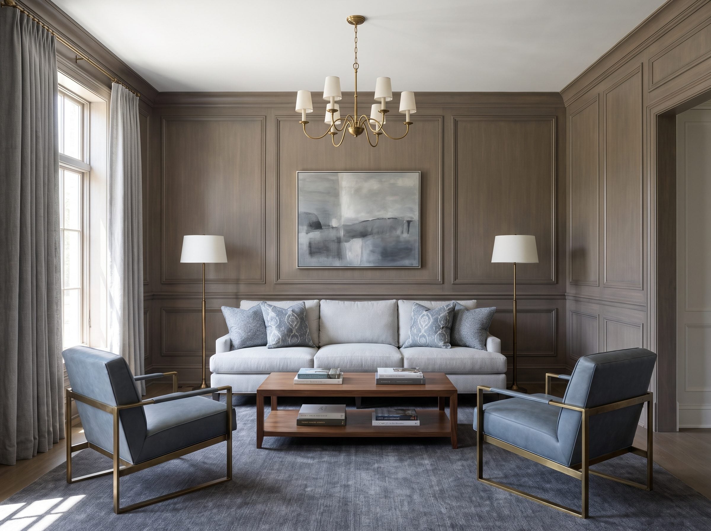
Walk into this room fast and you might swear it was all gray. Slow down and the slate-blue armchairs separate from the warm-gray paneling like a word you did not notice was there. The connection is value and low saturation, not a literal position beside gray on the color wheel — gray is neutral.
Low-contrast schemes work because no single hue has to fight for attention. The differences arrive slowly instead of shouting across the room. The blue-gray patterned textiles echo the armchairs, the charcoal rug grounds the whole thing, and everything sits within a few steps of the same tone. Calm by construction, not by luck.
Here’s where people lose their nerve.
A restrained room like this can look unfinished to anyone accustomed to a mandatory accent color. Someone stands in a nearly-done sitting room, decides the blue is “too quiet,” and drops in a mustard pillow or a coral throw to prove the room has a personality. Eighteen months later, that accent is the thing they hate. The restraint was the personality. They painted over it.
Keep the blue lower in saturation than feels comfortable. That discomfort is the room working.
The rescue here isn’t the blue — it’s the warmth. Walnut tables, antique-brass lighting, a bit of aged metal to keep the cool tones from tipping toward hospital. Blue sits across from orange on the wheel, which is exactly why warm brass flatters it instead of clashing. Pull the brass and walnut out and the same gray goes gray in the bad sense.
This is the gray they told you to rip out sitting beside a slate blue now being sold as fresher. Different hue, nearly the same restraint. The room never needed a dramatic replacement color in the first place.
10. Gray Paneled Bedroom: Give the Color Some Architecture
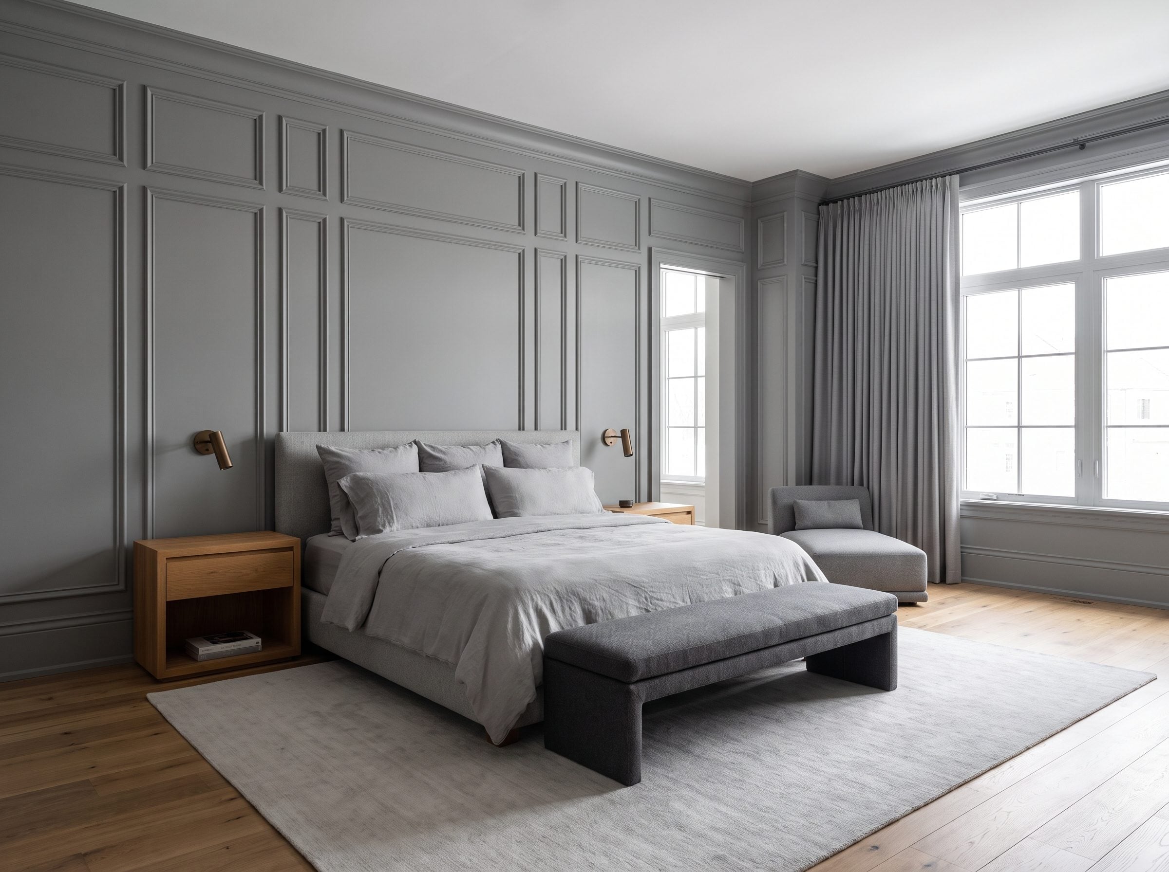
A flat medium-gray wall can look strongly tied to a particular decorating era when there is little else happening on the surface. Cut that same wall into framed panels, cap it with trim, and the gray suddenly has another job: revealing depth and shadow until the finish feels tied to the architecture rather than pasted over it.
Look closely. The panels aren’t a wallpaper trick or a lone accent — they’re built, molded, and the trim runs around the room so structure arrives before color does. Directional light does the rest, dropping shadow lines along every panel edge. That’s gray pulling its weight instead of waiting around to be scraped off.
Paneling began as both protection and architectural finish, then survived centuries of changing taste because the geometry could be repainted, refinished, or reinterpreted without disappearing.
So the answer to “gray is over” was never to rip the gray out. Give it bones, then warm it. The oak nightstands and wide-plank floor pull the cool tone back toward something you’d actually sleep in, and the bronze sconces add a small catch of light at the head of the bed — that last bit matters more than people expect.
Paint colors come and go more easily than millwork. Once a wall has real depth, the finish can change later without sacrificing the architecture underneath.
9. Gray With Black Accents: The Small Dose of Contrast That Gives the Room a Spine
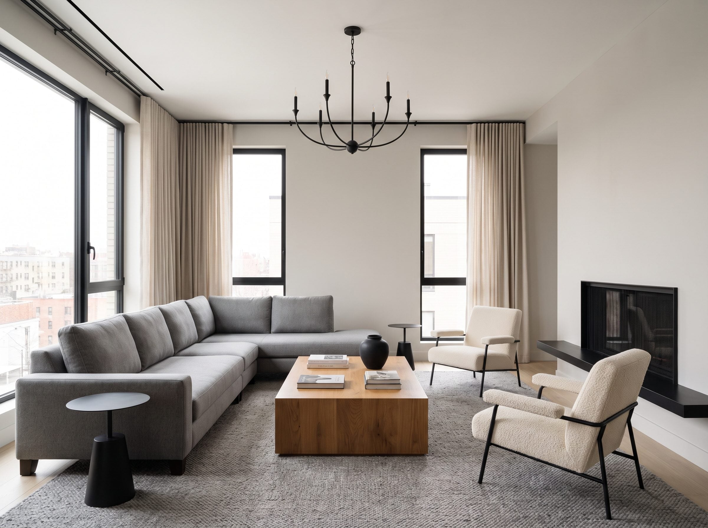
Watch someone paint a room gray, hate it, and blame the gray. Sometimes the problem is simpler: every value sits in the middle, with no dark edge to sharpen the composition. A small dose of black can give all those soft grays a skeleton without turning the room into a black-and-gray theme.
Black can supply the missing edge, but it works best here as punctuation rather than a takeover. A few repeated dark lines are enough to sharpen the room without turning the gray-black pairing into the entire subject.
So where does the black go? Thin window frames, a pendant with some sculpture to it, a matte base under an occasional table, maybe a slim line of detail on the fireplace surround. Those points do the work of eyeliner. They define the edges without hijacking the composition.
Pile black onto the fireplace, shelving, lamps, rug, and furniture all at once and the contrast stops being punctuation. It becomes the room.
Warmth is the other half of the equation, and it’s the part people skip. A warm-oak coffee table and a pair of cream boucle chairs keep the black-and-gray from tipping cold. Linen curtains help too. The oak stops everything from feeling like a photograph of a room rather than a room you’d actually sit in.
The people declaring gray finished are describing spaces that never had this contrast to begin with. Fix that one thing and you save the repaint. The same rescue works on a great room that’s gone flat, whatever color it happens to be.
8. Gray Sunroom: Let the Garden Have the Loudest Color
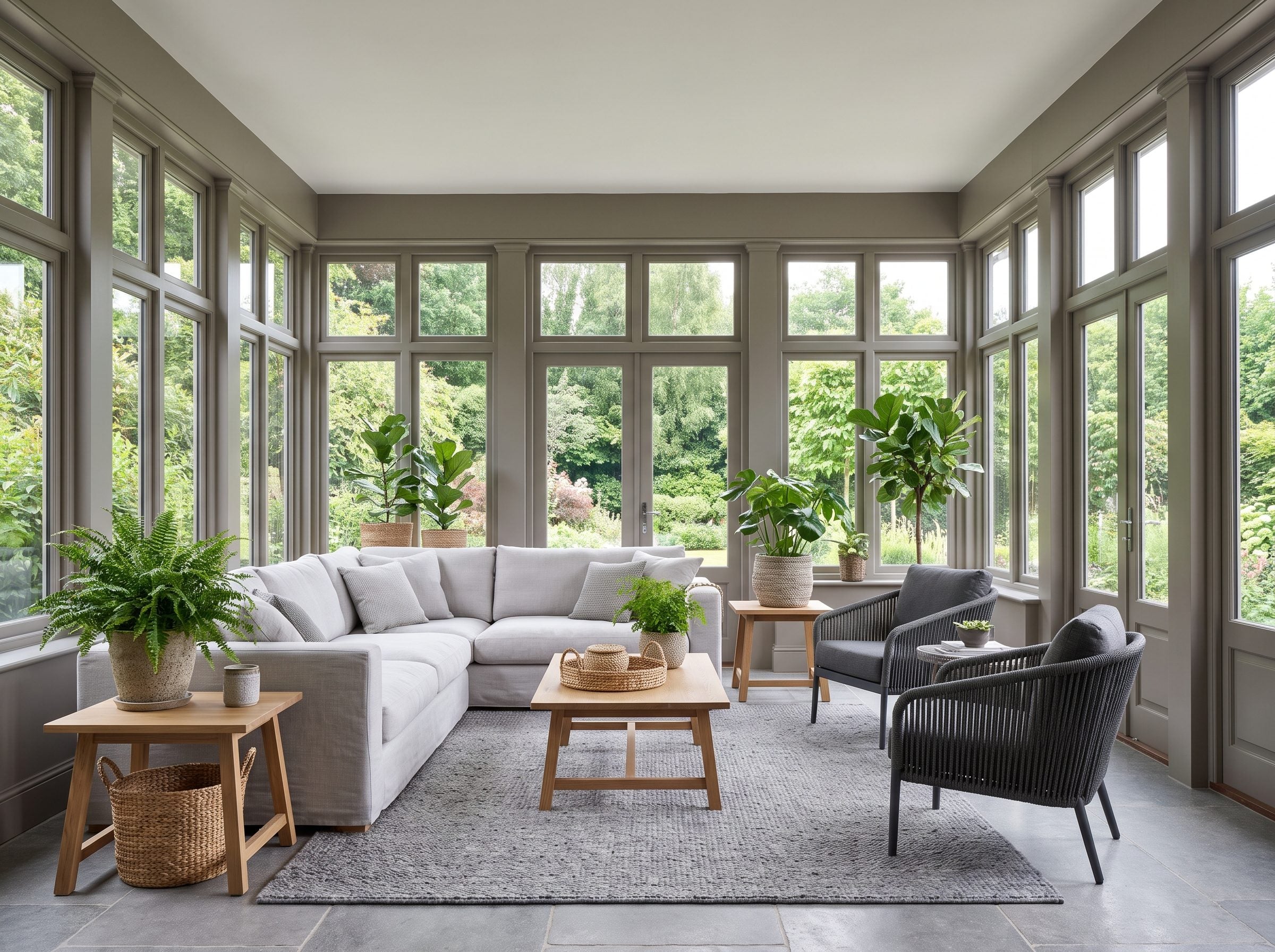
A sunroom gives wall color unusual competition because the view changes by the hour and by the season. Every other room in your house sits in front of drywall. This one sits in front of a maple that repaints itself from March to November, and no paint chip on earth is going to out-shout an actual tree in full leaf.
So you don’t try. A pale-gray linen sofa in front of that glass wall steps back and lets the green run the show, and the leaves, not the cushions, become the obvious focal point. The room reads as calm because your attention has somewhere better to go.
Muted stone tones can make foliage look more saturated simply because the wall is not competing with it. No color-wheel contortion is required: gray is neutral, and the garden already supplies enough hue for both of them. Paint that same wall a confident terracotta and now you’ve got two loud colors arguing through a pane of glass, and neither one wins.
Your window is already the accent wall. It’s green, it changes with the weather, and you didn’t pay for it twice.
Keeping it a living room instead of a greenhouse comes down to hard materials. Charcoal woven chairs, a gray stone floor, oak side tables with real grain. A nubby gray rug and a couple of natural-fiber baskets give the flatter grays some texture to lean on. Get that mix right and the exact gray that felt lifeless in a windowless hallway suddenly looks like a decision.
Sometimes the missing color in a sunroom is not paint at all. The view, a large plant, wood, and woven texture can do more than another gallon on the wall.
7. Transitional Gray Kitchen: The Gray That Never Read as Modern Because It Was Never Trying To
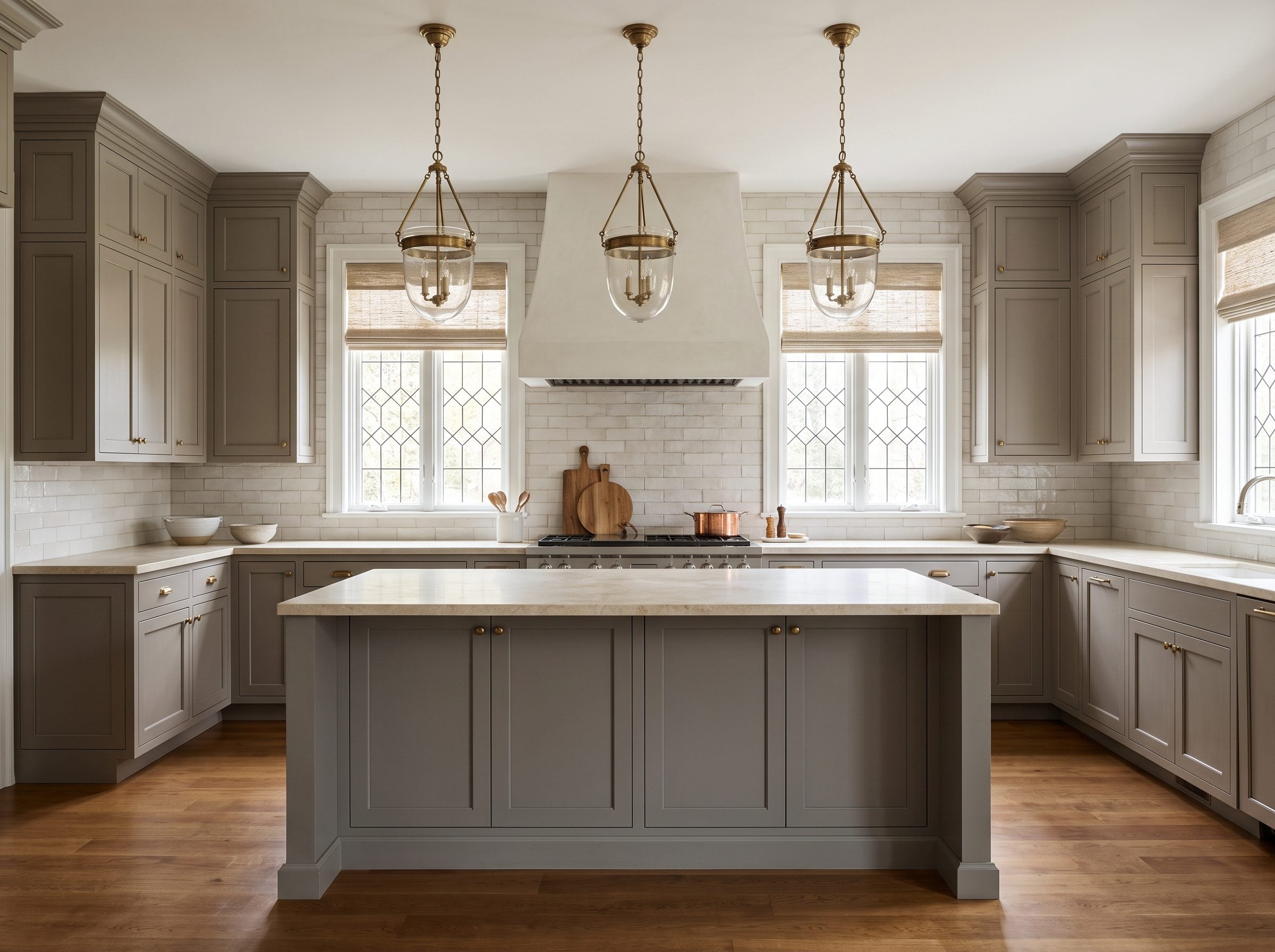
The argument that gray is cold falls apart the second you notice gray doesn’t hold one temperature. There’s the crisp version that sits under fluorescent office light, and there’s the warm, brown-leaning one that behaves like putty. Blue-based Blackened and Dimpse on one side, taupe-toned Charleston Gray and Mole’s Breath on the other. Same three-letter word doing two opposite jobs.
This kitchen picks the warm side and never once flirts with minimalism. Inset shaker fronts in a greige with a brown pull to it, cream stone counters with veining that actually moves, off-white backsplash tile made by hand so the glaze pools and catches morning light unevenly. Medium-oak floors with grain you can read from across the room. Nothing here whispers 2016.
Designers call this transitional: traditional cabinet forms stripped of some ornament and paired with cleaner contemporary lines. Shaker bones from tradition, straight lines from contemporary, warm gray sitting between them, holding hands with both. Gray wasn’t the statement — it was the glue.
Here’s what gives it away as settled rather than fashionable: the metal. Aged brass on the pulls, not chrome. Warm hardware against warm cabinets looks settled rather than freshly trend-matched. Do the opposite — cool builder gray with polished nickel — and you rebuild the exact flip everyone’s quietly ripping out today. The color held up fine. The temperature is what got sold to you wrong.
6. The Gray Ceiling: Why You Keep Painting the ‘Fifth Wall’ the Color of Nothing
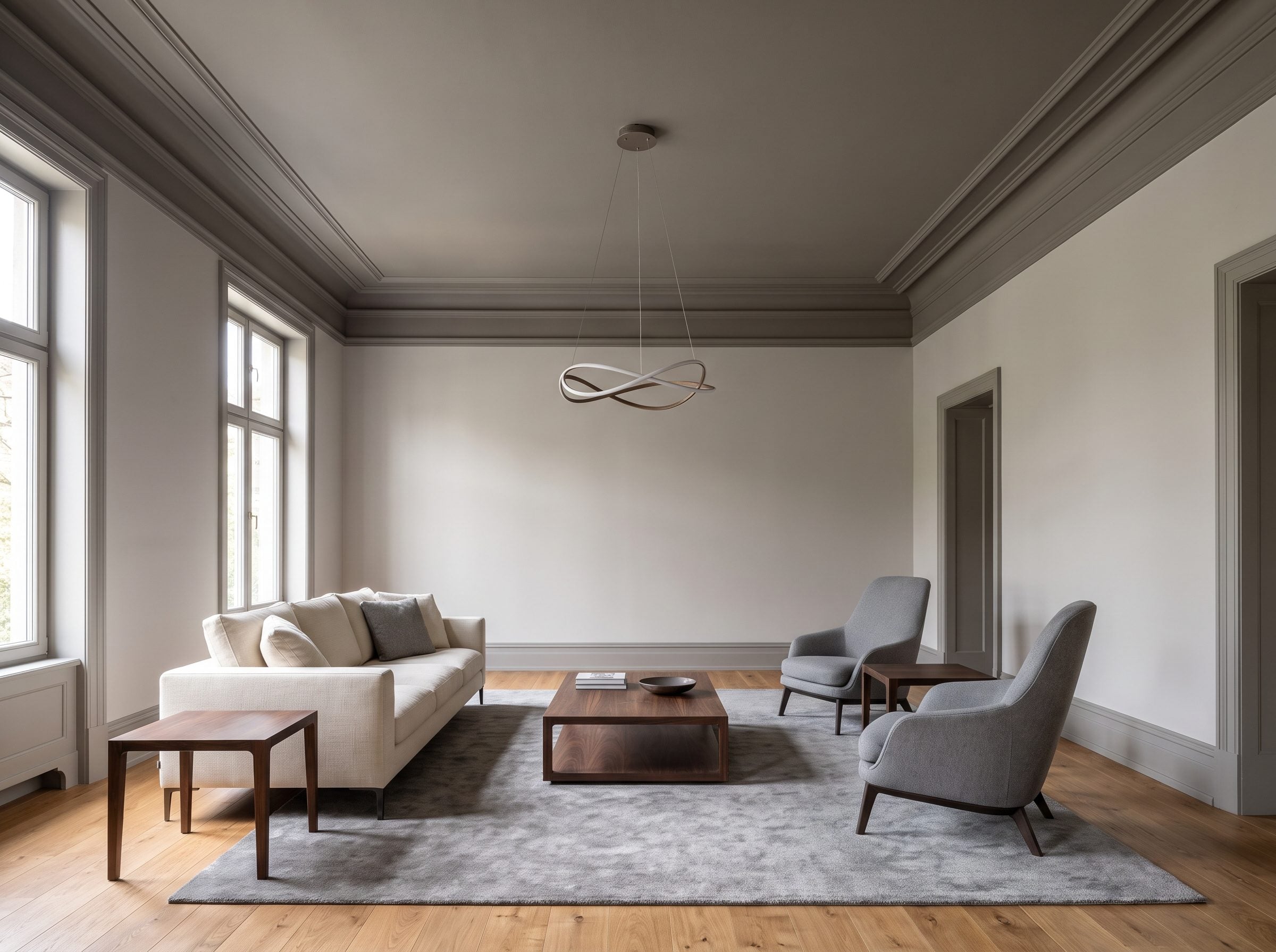
Count the surfaces in a room. Four walls, a floor, and one overhead plane most people paint the color of a hospital corridor and never think about again. That last one has a name in the trade now. Designers call it the “fifth wall,” and in 1stDibs’ 2024 survey a good chunk of them flagged it as the surface worth coloring that year.
White ceilings became conventional for many reasons, and high reflectance is one of the practical ones: a pale overhead plane returns more light into a room and keeps the ceiling visually unobtrusive. Convention eventually became habit, which is why so many otherwise considered rooms stop abruptly at the crown molding.
Modern lighting gives you more freedom to question that habit. White is still useful; it is simply no longer compulsory.
Which is why gray works up there. Paint the ceiling a medium warm gray, keep the walls two or three shades lighter, carry that same gray onto the crown molding, and suddenly the overhead plane reads as something someone chose instead of a blank the builder left behind. Low-nerve version of the trick. Charcoal takes guts. Eggplant takes a stiff drink. A warm gray reading slightly deeper than pale walls just looks like a person bothered to consider all six planes instead of quitting at four.
The oak floor grounds the room and the cream sofa holds the middle bright, but the gray overhead does the one thing white physically cannot — it drops the sky a few inches. A big room stops feeling like an empty box. It starts feeling like it’s holding you.
White is still the safest ceiling default for a reason. The surprise is that it is not the only one. Once the room has enough light, a gray ceiling can make the overhead plane feel considered instead of merely completed.
5. Traditional Gray Living Room: Before Builder Gray, There Was Stone, Putty, and Pearl
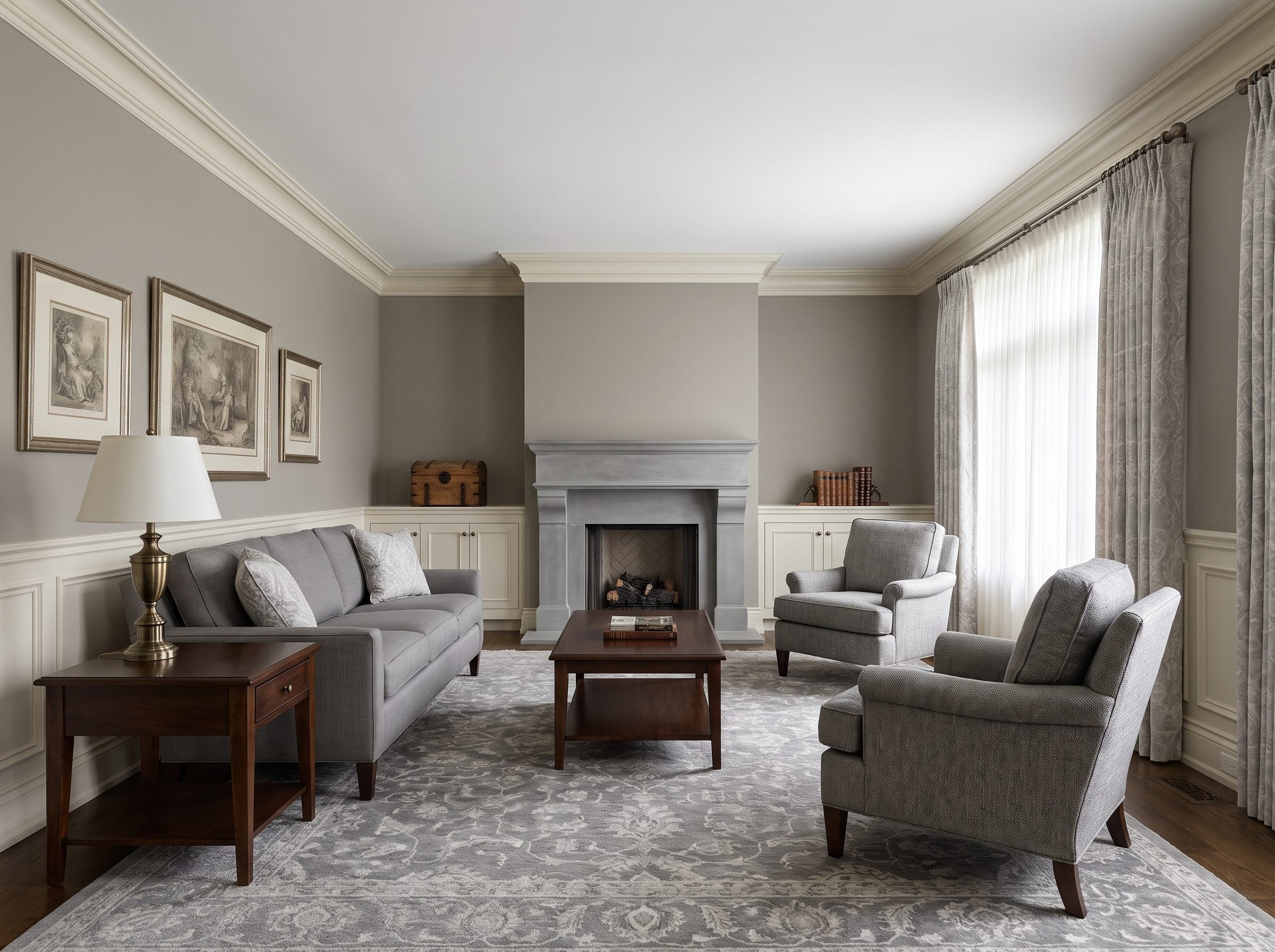
Before gray became a builder default, stone, putty, pearl, and gray-green tones already had long lives in European interiors. Historic rooms used them alongside plasterwork, timber, stone fireplaces, textiles, and candlelight — a very different context from an open-plan flip.
So the idea that gray belongs exclusively to the 2010s collapses the second you look backward. Muted stone, putty, pearl, and gray-green tones were furnishing rooms long before a fixer-upper show ever put cool gray on a laminate cabinet.
This room is proof of the older lineage. Warm-gray walls, white-gray millwork with real shadow lines, and a limestone fireplace that reads as cut stone instead of painted MDF pretending to be more than it is. None of it is trying to look like a 2014 open-concept flip.
Depth is what rescues it, and depth is exactly what most people skip. Flat gray on every surface? That’s the thing everyone got tired of, and fair enough. But stack three or four grays at different temperatures against dark walnut and antique-brass lamps, and it stops being a color. It starts feeling like a room that’s been quietly settling into itself for years.
The gray patterned wool rug is the part worth protecting. Pattern separates a traditional gray room from a rental waiting on its next tenant. One has a point of view; the other is holding its breath.
That same walnut, brass and restrained trim would carry a burgundy great room without blinking. That is the useful distinction here: the bones carry the room, and gray simply belongs to them.
4. Dark Gray Powder Room: The 20-Square-Foot Gamble Where Graphite Pays Off Fastest
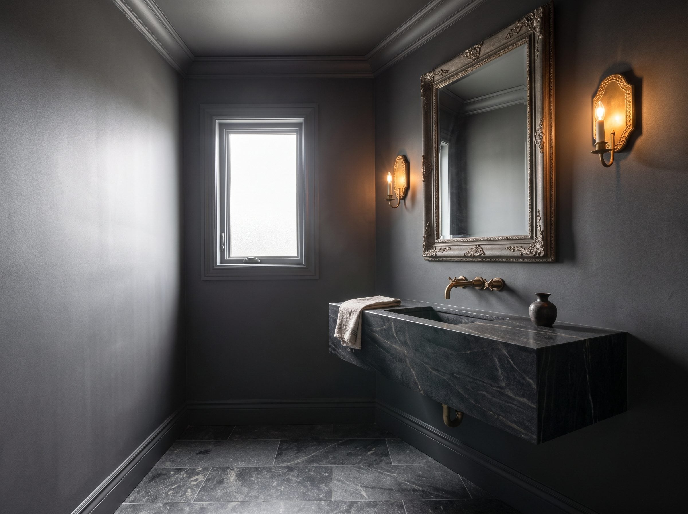
Nobody spends real time in a powder room. Thirty seconds, maybe a minute. That’s exactly why it can take the boldest gray in your house without anyone complaining they have to live in it.
Run the numbers before you buy into the gray-is-dead sermon. The footprint is what makes it work. Graphite in a space this small is loud results for pocket-change materials.
Color drenching may be fashionable again, but the principle behind it is older than the current trend. So take graphite all the way up — walls, ceiling, trim, the door. No white break anywhere to chop the room into corners. It closes around you like an envelope somebody sealed.
The finish is where cheap dark rooms fall apart. Add a whisper of plaster texture and graphite catches light in a dozen versions of itself.
Then cut it with warm metal. Float a veined stone vanity off the wall so the floor runs unbroken underneath. Mount an aged-brass wall faucet and a pair of brass sconces at eye level. Brass on graphite carries the room. One stone tray, one hand towel, and you’re done. The color is the decoration.
Test it at scale before you paint. A two-inch chip cannot show what graphite will do across four walls and a ceiling. Use a large sample board or a room visualization if it helps, then check the real color in the actual light before opening every tin.
3. Color-Drenched Gray, Ceiling and All: What Happens When the Room Actually Commits
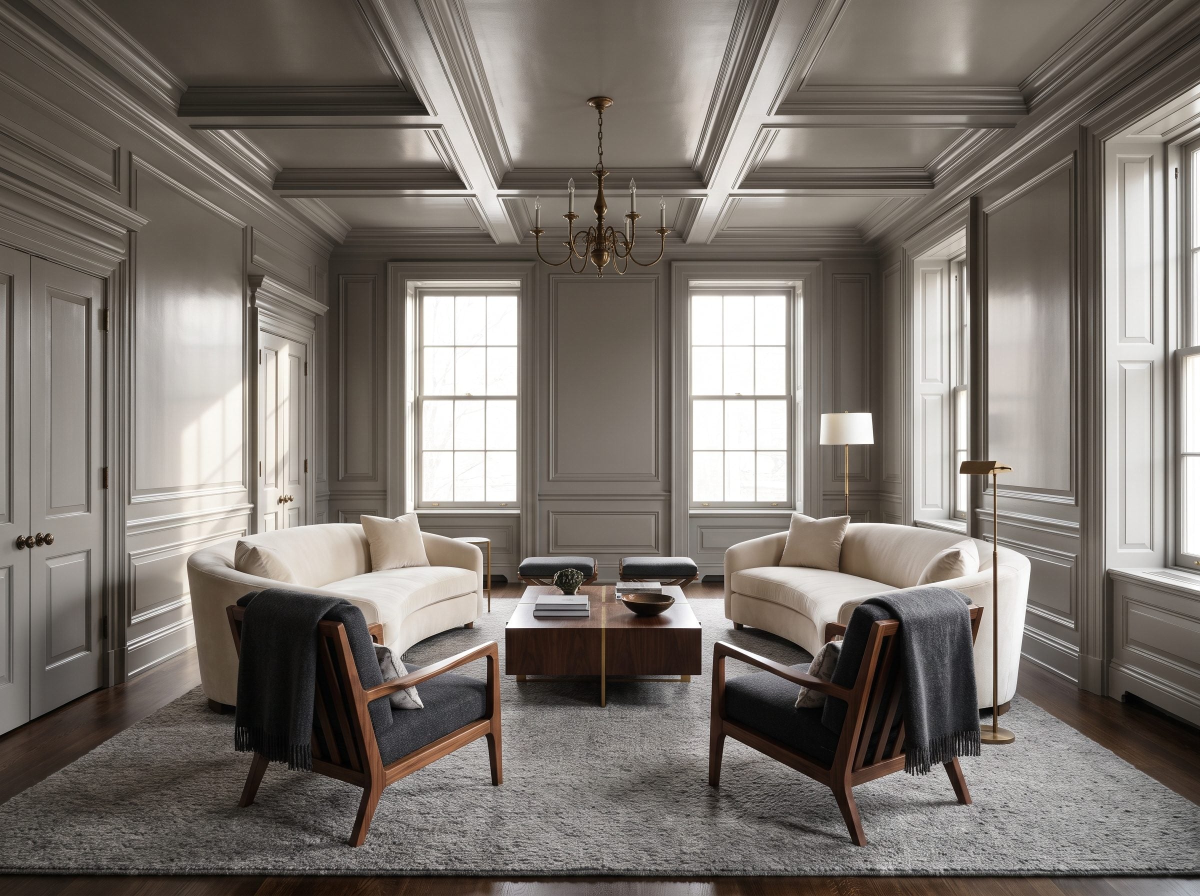
Gray looks most dated when it is used timidly: three walls in one safe midtone, bright white everywhere else, and no relationship between the paint and the architecture. This room takes the opposite route.
Color drenching is often presented as a fresh move, but the principle is older than the phrase: carry one hue across walls and woodwork so the architecture is unified instead of outlined in white. Gray happens to be very good at it because shadows still register clearly inside the same color family.
This room ignores the memo entirely. One warm mid-gray coats the walls, the crown molding, the baseboards, the doors, the window casings and the ceiling — the color-drenching move Farrow & Ball turned into a household phrase. The sheen shifts just enough between flat walls and satin trim to keep shadows honest. Daylight from the tall windows does the rest, catching every profile in the millwork so nothing goes flat.
The room recedes into a single tone, and the cream sofa, the walnut console and the antique-brass lamp step forward like they were lit for it.
Wrap the whole shell and gray stops feeling like leftover wall paint. It becomes architectural atmosphere: one hue, several sheens, dozens of shadows. That is a much richer proposition than asking whether a single swatch is currently fashionable.
2. Charcoal Living Room: The ‘Dead’ Gray Decorators Charge a Premium to Install
🔥 Would you like to save this?
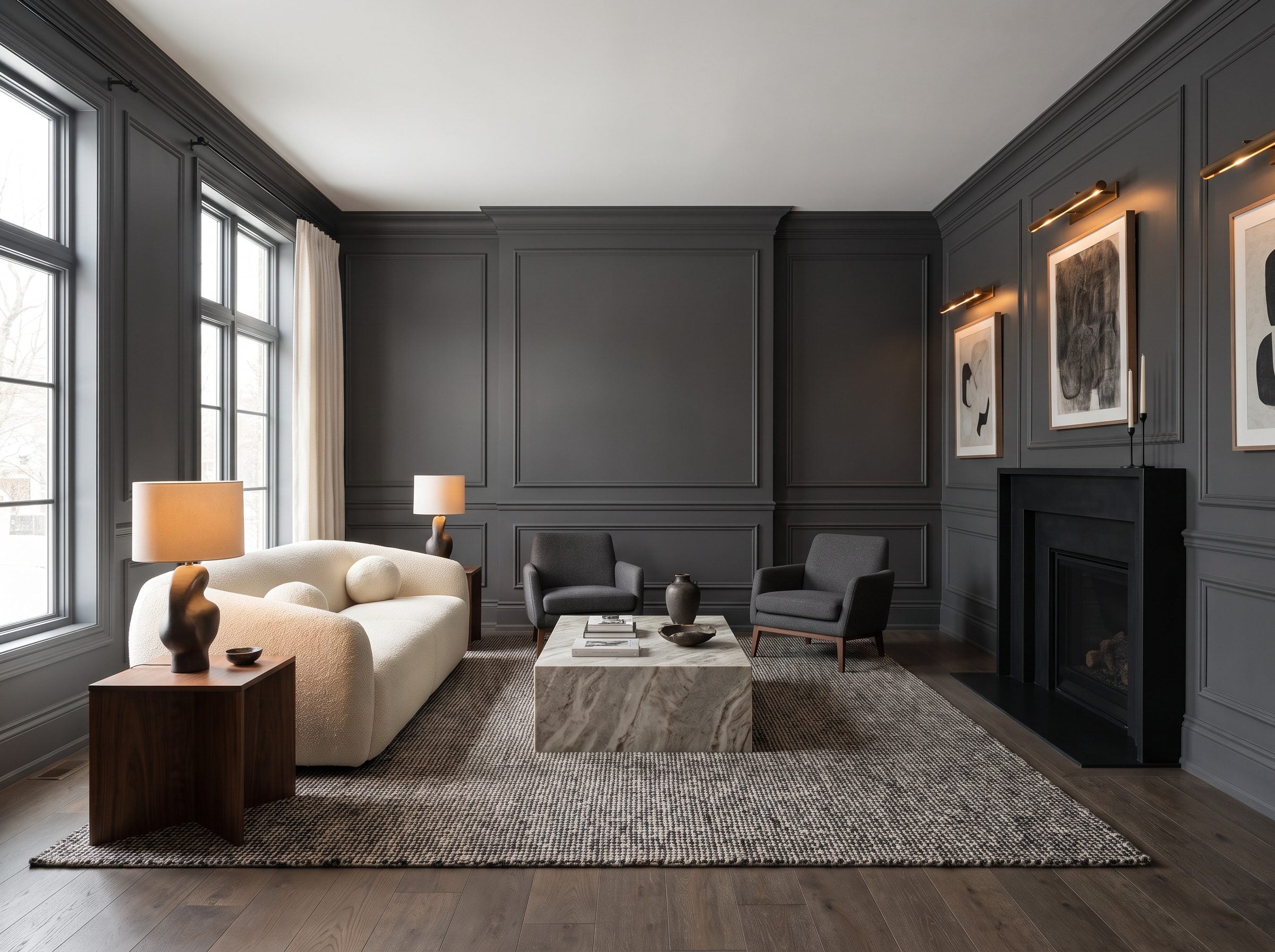
Farrow & Ball’s Railings is a deep blue-black charcoal named after traditional ironwork — exactly the kind of dark gray that never belonged to the pale builder-gray conversation in the first place.
Railings has an LRV around 8, placing it firmly in very-dark territory. Source That means the room needs enough light, texture, and contrast for the architecture to remain visible rather than disappearing into one dark plane.
This is the other end of gray entirely. What wore out its welcome was pale, flat gray used everywhere by default. Deep charcoal works when it is treated as a material decision, not a neutral fallback.
The gray they told you to retire is the gray they’re quietly billing you extra to install.
Look at what gives this room its expensive finish, and notice it isn’t the removal of gray. It’s the creamy bouclé sofa lifting off the dark backdrop, the veined stone table, the bronze picture lights raking across the applied molding so the charcoal shows its texture instead of going matte and dead. Pair Railings with cream and real wood, layer the surfaces, and the depth feels luxurious.
The family resemblance to greige matters less than the execution. Depth, molding, stone, bronze, cream, and walnut give the color enough contrast to feel intentional rather than generic.
1. The Final Room: Gray With Nothing Left to Prove
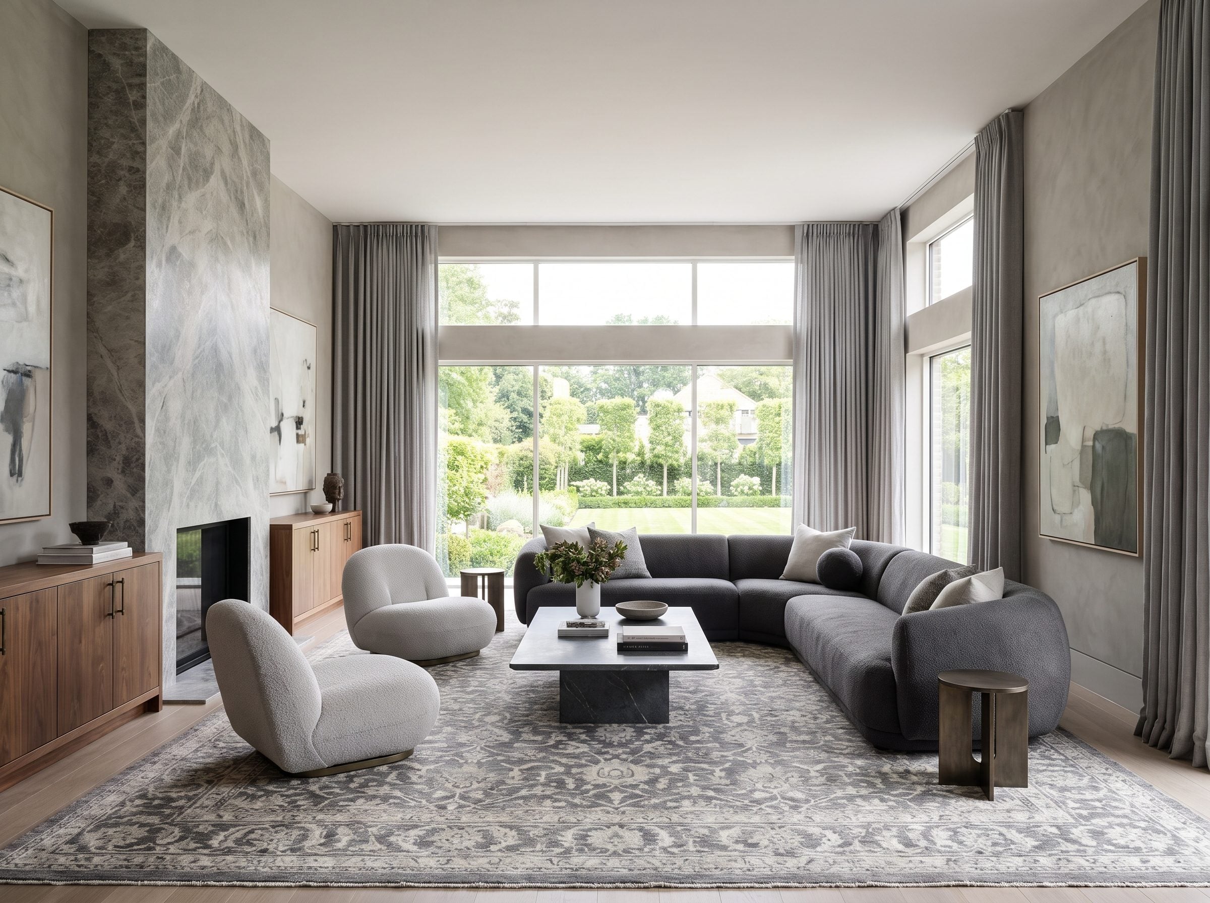
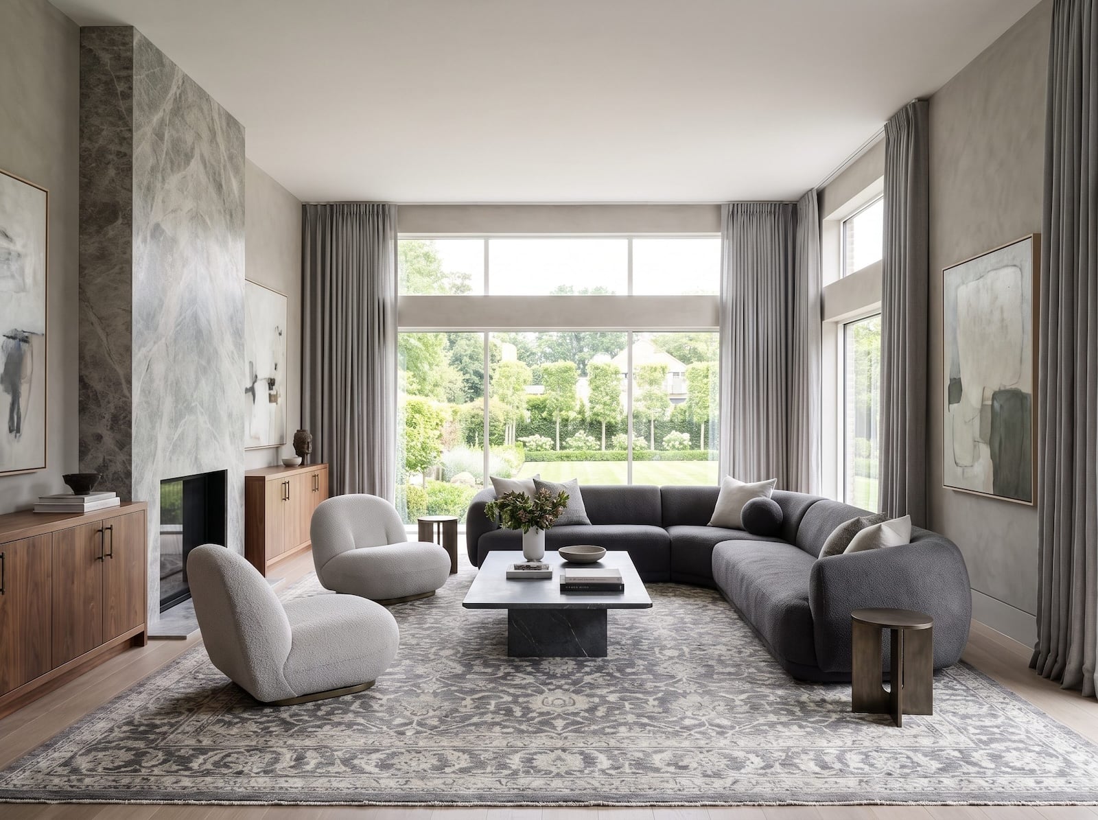
Nothing gray has been removed from this room. Not the walls, the sofa, the rug, the stone, or the floor-length curtains. It is the same color family that spent the last few years being pronounced finished, and there is nothing apologetic about the result.
Follow the room from wall to floor and back again. The walls are limewashed plaster, not paint, so the warm undertone shifts as afternoon light crawls across them. Floor to ceiling, the fireplace runs in gray-veined stone with real grain and real weight. A charcoal sectional sits on a hand-knotted gray-and-ivory rug, flanked by pale-gray bouclé chairs. Count the grays if you want. Six, maybe seven — and every one carries a different undertone and a different texture, which is why the room never flattens into one sheet of putty.
Here is what the 2010s got wrong, all in one place. Cool-gray laminate that photographed blue, matching five-piece sets bought in a single delivery, chrome legs, flat light, identical finishes — that combination turned a useful neutral into a visual cliché. The color took the blame for the sameness.
Put this room next to a 2013 builder great room in your memory. Identical color story, different planet. Walnut instead of orange oak. Aged bronze instead of chrome. Plaster instead of vinyl wrap, and materials with actual mass behind them.
Gray never went anywhere. Cheap went somewhere, and cheap was always headed there no matter what color it happened to be wearing that year.












