🔥 Would you like to save this?
Beige wasn’t the crime scene. Indecision was. The original room had square footage, daylight, furniture and absolutely no interest in making itself memorable. Every surface whispered. Every chair behaved. Even the television looked bored.
In order to come up with the very specific design ideas, we create most designs with the assistance of state-of-the-art AI interior design software. Also, assume links that take you off the site are affiliate links such as links to Amazon. this means we may earn a commission if you buy something.
French Country gets interesting when a room stops looking as though everything arrived on the same truck. Dark wood against faded plaster. Linen beside iron. A chandelier with unreasonable confidence hanging over a rug that looks older than the mortgage. Something refined next to something scarred, softened or slightly eccentric. We gave the same anonymous beige room to AI and kept pushing until the transformations stopped looking like redecorating and started looking like entirely different lives.
These 27 versions go everywhere from paint-and-furniture changes to stone walls, checkerboard floors, garden doors, paneled libraries and rooms that appear to have misplaced several centuries. Some ideas are realistic enough to steal tomorrow. Others are architectural fantasy with useful pieces hidden inside. Either way, the fun is watching the same beige box repeatedly lose its nerve.
Before you choose how to pay for your remodel, see what home equity lenders are offering today.
27. Arched Garden Doors Turned the Living Room Into the Approach to Somewhere Grand
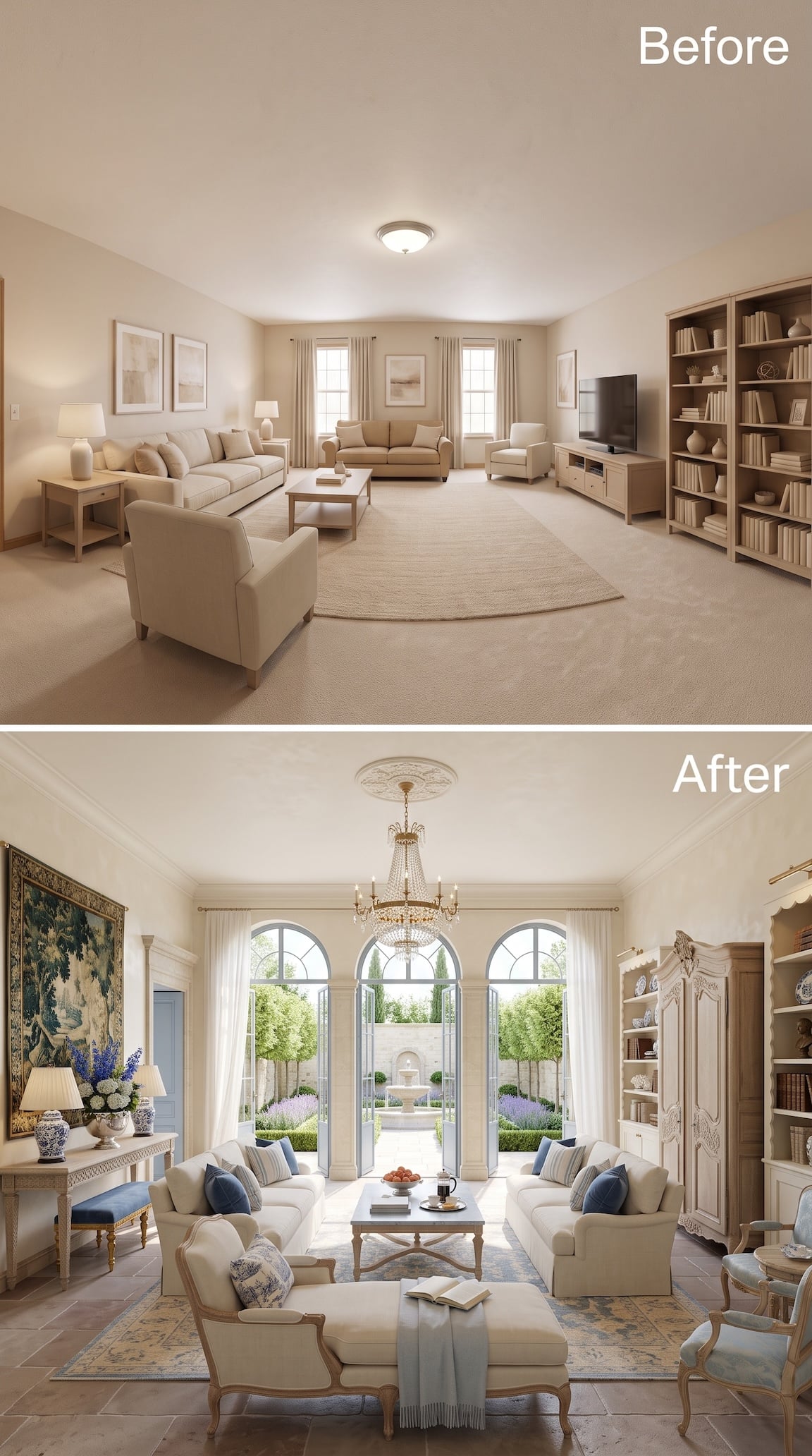
The furniture isn’t what transforms this room first. The far wall is. Three tall arched openings replace the modest windows and turn the garden into part of the composition, complete with a fountain dead center in the sightline.
Inside, the room goes deliberately old-world: blue-and-cream upholstery, carved furniture, terracotta-toned flooring, a crystal chandelier and an enormous tapestry occupying nearly an entire wall. None of those pieces would be timid alone. Together they make timidity irrelevant.
This is French Country leaning toward manor house rather than farmhouse, and the scale supports it. The original room suddenly looks as though it was waiting for the doors to open.
26. Teal Built-Ins and Leather Chairs Gave Beige Some Backbone
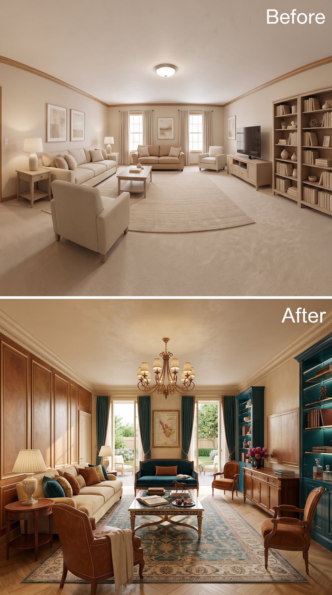
The most convincing move here is not the chandelier or even the deep teal settee. It is the decision to divide the room between rich wood paneling on one side and saturated teal cabinetry on the other. Suddenly the long rectangular space has tension instead of endless beige continuity.
Rust leather chairs pick up the warmth of the wood, while the teal sofa and matching drapery pull the cooler side of the room inward. The patterned rug bridges both camps with rust, cream and blue-green underfoot, so nothing feels like a separate color experiment.
This is French Country with a library streak: polished wood, saturated paint, old-looking upholstery and just enough formality to make the original flush-mount ceiling light seem almost personally insulting.
25. Mint, Lavender, and One Patterned Chair Made Beige Feel Very Far Away
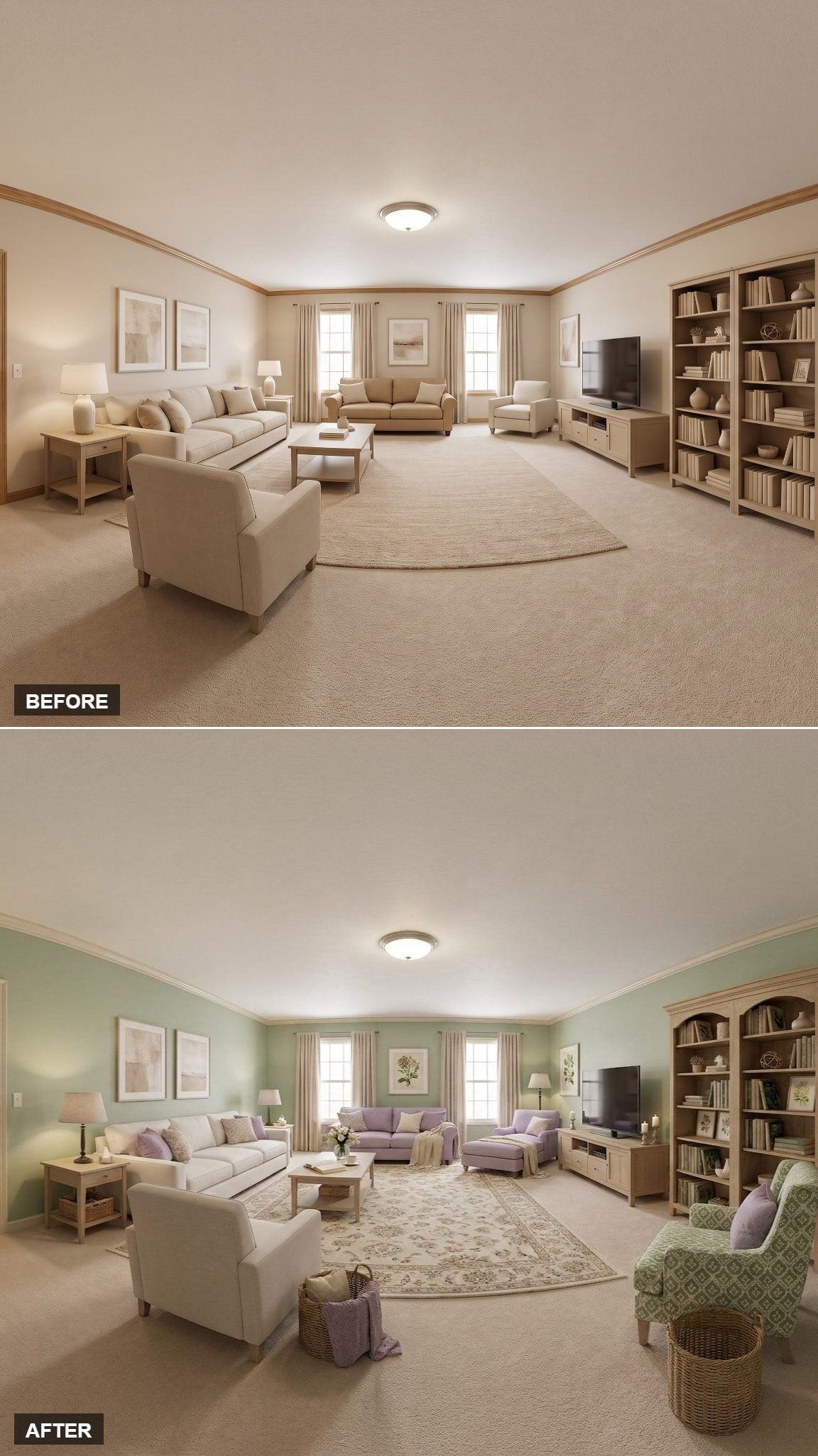
This one succeeds by refusing the usual dusty-blue script. Pale mint moves across the walls, lavender appears in the pillows, and the existing wood suddenly looks richer because it has a cooler backdrop to push against.
The patterned green-and-ivory armchair in the foreground keeps the room from dissolving into soft pastels. That one interruption is important. Without it, the palette risks becoming sweet; with it, the whole thing has just enough grit.
24. One Stone Wall and a Rust Sofa Took the Room Somewhere Much Older
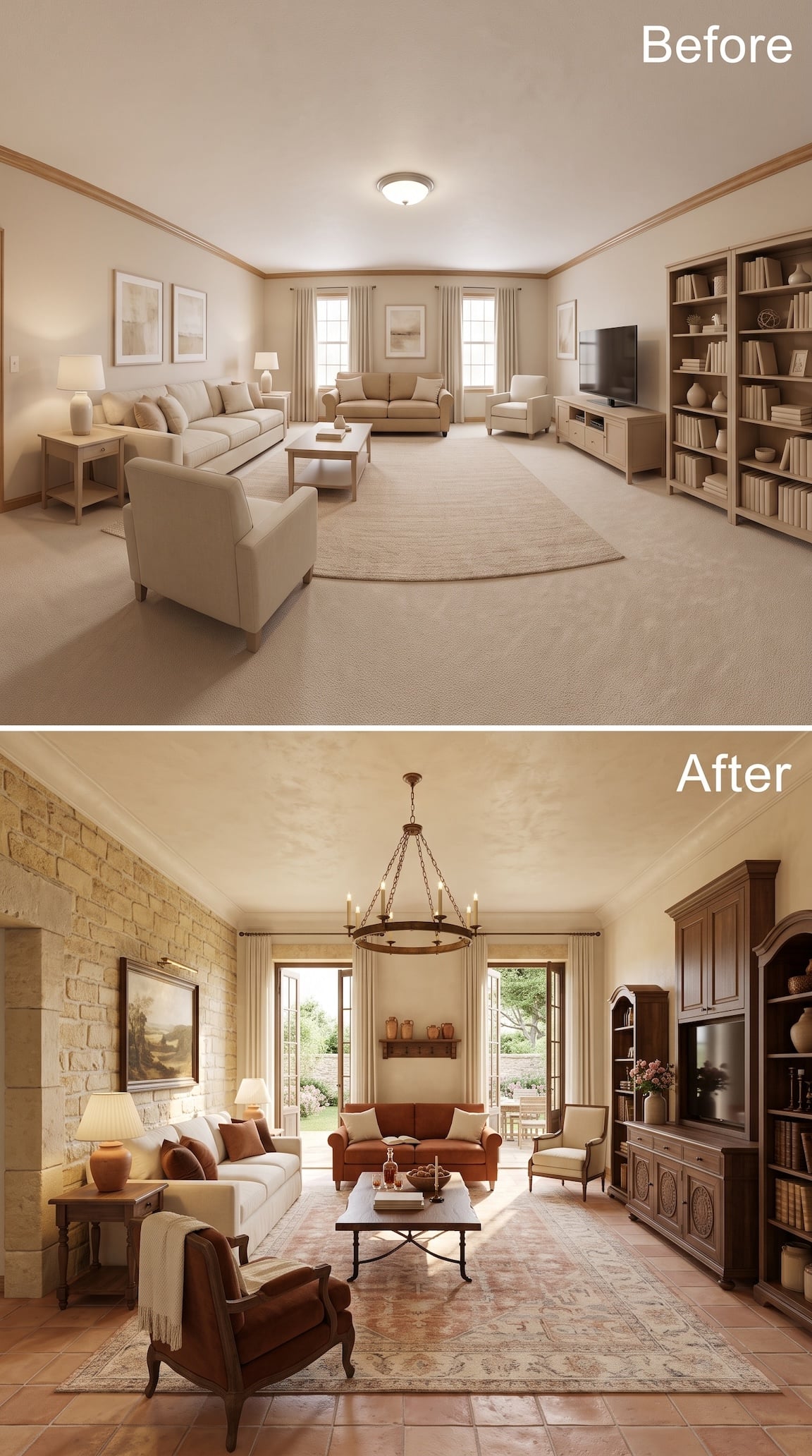
The left wall does almost all the announcing here. Rough pale stone replaces painted drywall, terracotta flooring runs underneath it, and suddenly the room has the sort of material weight no basket or botanical print can fake.
A rust-colored sofa carries that earthy palette into the center, while the dark carved media cabinetry on the right keeps the television from looking like it wandered in from a different century. The open garden doors help enormously: hard surfaces inside, green softness outside.
This is one of the clearest examples of the difference between adding French Country accessories and actually changing the bones of the room.
23. Pink Walls, Blue Velvet, Whitewashed Floors — This One Actually Took a Risk
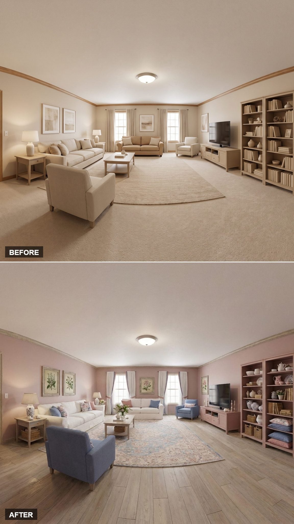
The whitewashed floor changes the temperature first. Once the beige carpet disappears, blush walls and blue velvet chairs have room to look crisp rather than sugary.
The pink shelving on the right joins the architecture instead of behaving like another freestanding brown object, while botanical prints push the palette back toward something older and less polished. The wood grain and faded florals keep all that pink and blue from becoming precious.
Pink walls and blue chairs are not timid choices. That is exactly why the room finally stops feeling timid.
22. Ceiling Beams, a Fireplace, and Pale Sage Turned Quiet Into Luxurious
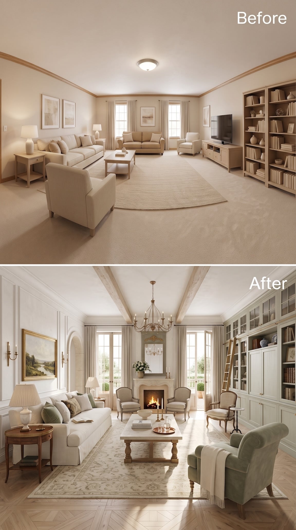
No loud color move here. Instead, the room gets architecture: pale timber beams overhead, paneled walls, tall built-in cabinetry and a carved fireplace placed squarely between the windows. Suddenly the entire far wall has hierarchy.
The palette stays restrained — cream upholstery, washed wood, one pale sage chair — which lets the millwork carry the transformation. A herringbone wood floor replaces the wall-to-wall carpet and gives all those pale finishes enough grain and movement to keep them from disappearing into one another.
Sometimes the bold move is not brighter color. It’s giving a blank room enough structure that subtle color can finally matter.
21. Steel Blue Walls and Striped Chairs Finally Gave the Sprawl a Center
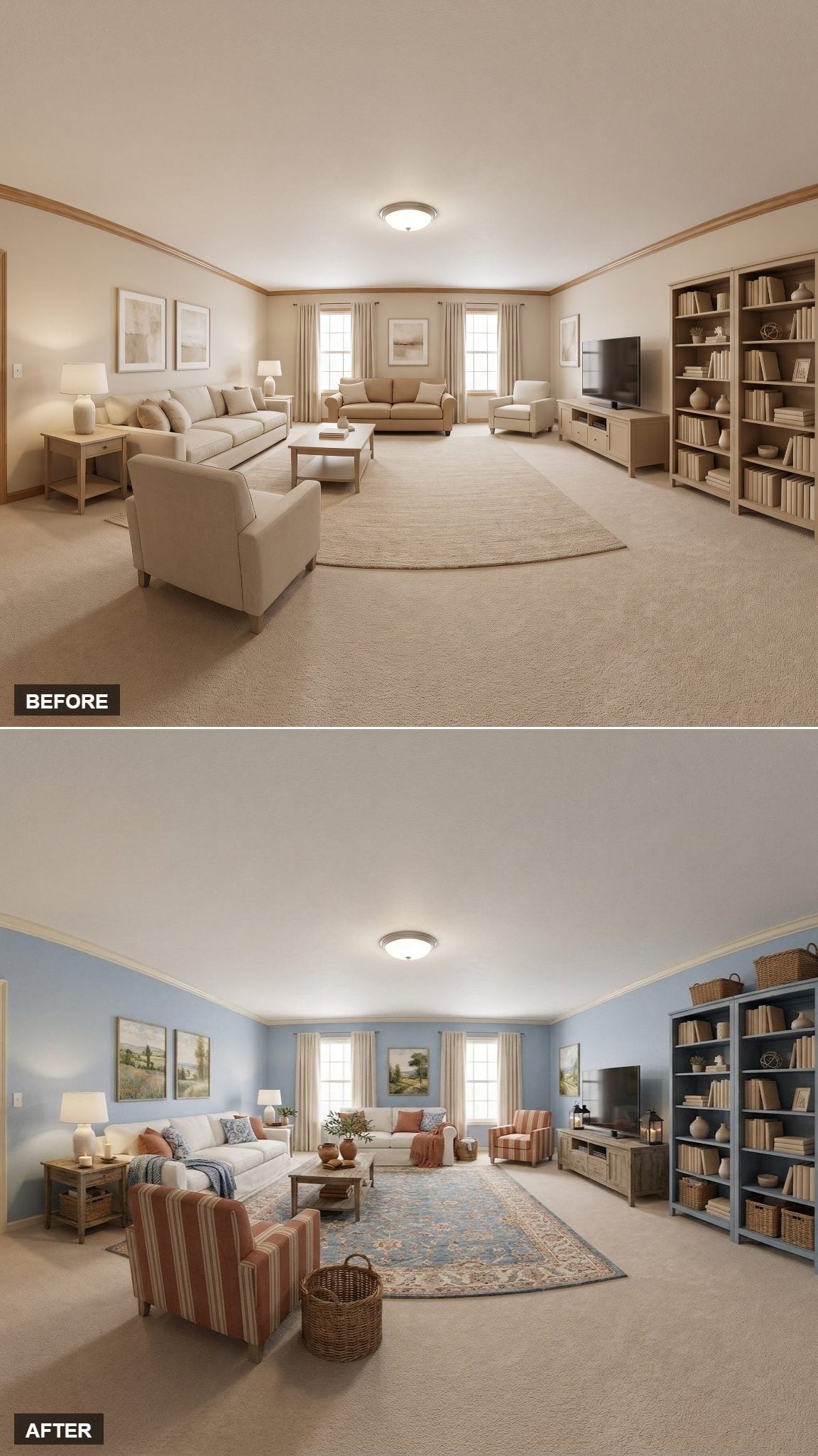
The steel blue walls change the scale of the room before anything else gets a vote. Against them, coral-and-cream striped armchairs stop looking like isolated furniture and start defining an actual conversation area. The floral rug catches both colors without turning the arrangement into a matching exercise.
Painting the tall shelving the same blue is the quieter move. Instead of a separate brown mass parked beside the television, the cases recede into the wall composition and let the striped chairs carry more of the visual weight.
Worth Stealing: Matching shelving to the wall is one way — not the only way — to quiet a large entertainment wall. Use it when the cabinetry is dominating the room and you want the furniture and textiles to come forward instead.
20. Trellis Walls, Citrus Trees, and Cane Chairs Took French Country Into the Garden
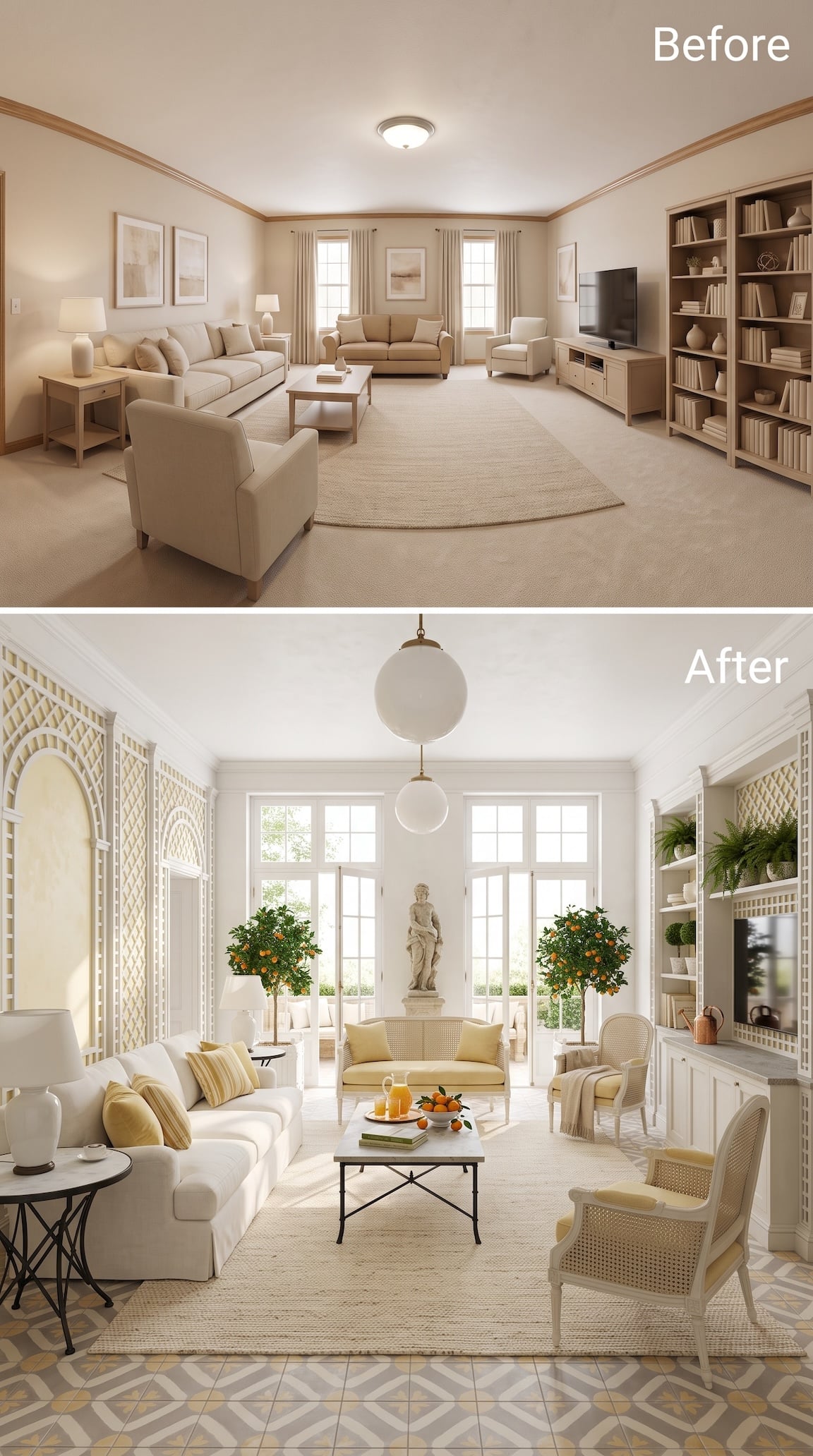
This one veers toward an orangery, which is exactly why it earns a place here. White latticework climbs the walls, potted citrus trees flank the French doors and cane-backed chairs bring the garden vocabulary straight into the seating area.
The yellow cushions are small but important. Without them, the cream room might become antiseptic. With them — and with the orange fruit doing its own accidental accessorizing — the room gets warmth without needing another heavy wood piece.
The patterned tile border underfoot seals the shift. What began as a carpeted living room now feels halfway between a salon and a garden room.
19. Olive Walls Let the Dark Wood Do the Talking
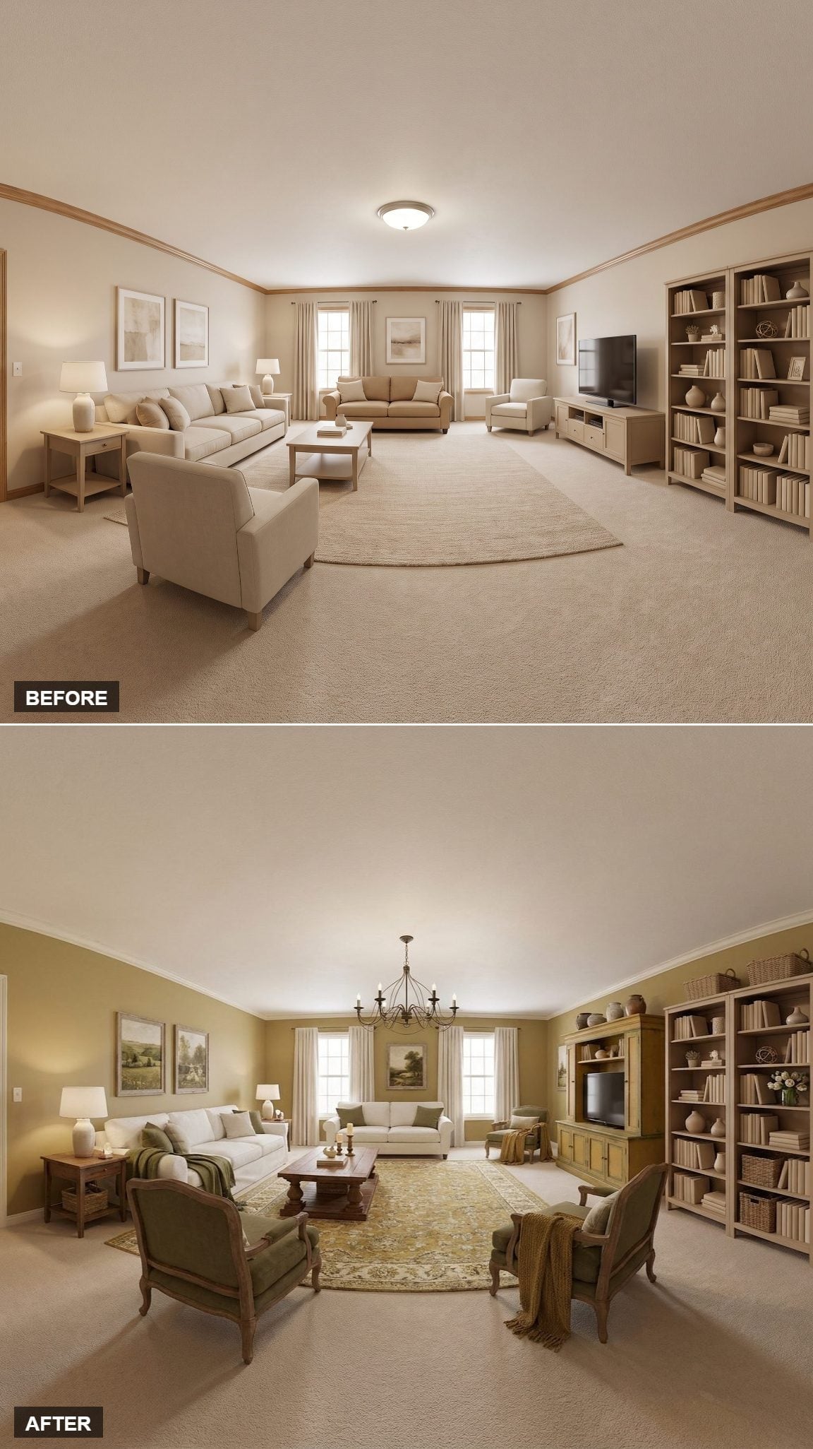
Warm olive is doing less decorative work here than you might think. Its real job is making the darker furniture feel inevitable. A pedestal coffee table, carved hunter-green armchairs and an iron chandelier suddenly belong to the same room instead of looking like objects collected on separate shopping trips.
The faded botanical rug helps, but this transformation works because the materials have weight. Dark wood. Worn-looking pattern. Iron overhead. Some AI rooms feel assembled from a search result. This one understands the value of a little age.
18. Warm Yellow Walls and Blue Spindle Chairs Wake the Whole Room Up
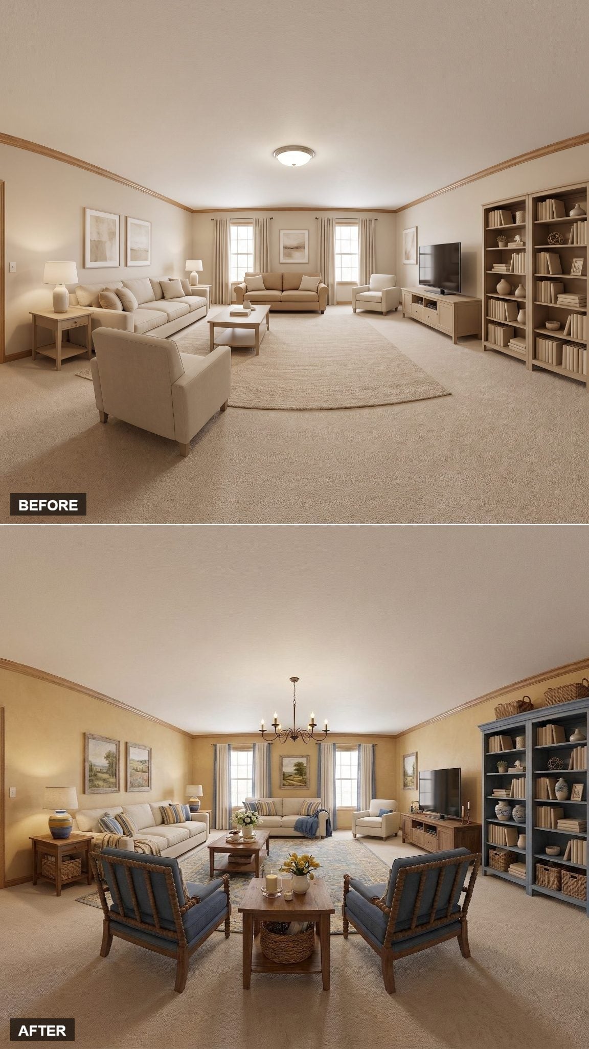
Golden yellow walls give the room something the original beige never managed: actual warmth. The slate-blue chair frames push against that warmth just enough to keep the palette from going sleepy.
Painting the bookcase blue repeats the darker note on the opposite side of the room, while woven baskets, tulips and striped pillows keep everything loose. The turned frames and exposed wood fit comfortably into rustic European and farmhouse traditions without pretending the chair silhouette belongs exclusively to French Country.
Material Matters: Turned wood, woven fibers and simple upholstery do more here than another layer of pattern would. When the furniture frame already has personality, the fabric can afford to calm down.
17. Lilac Plaster, Black Windows, and One Dark Sofa Changed the Entire Temperature
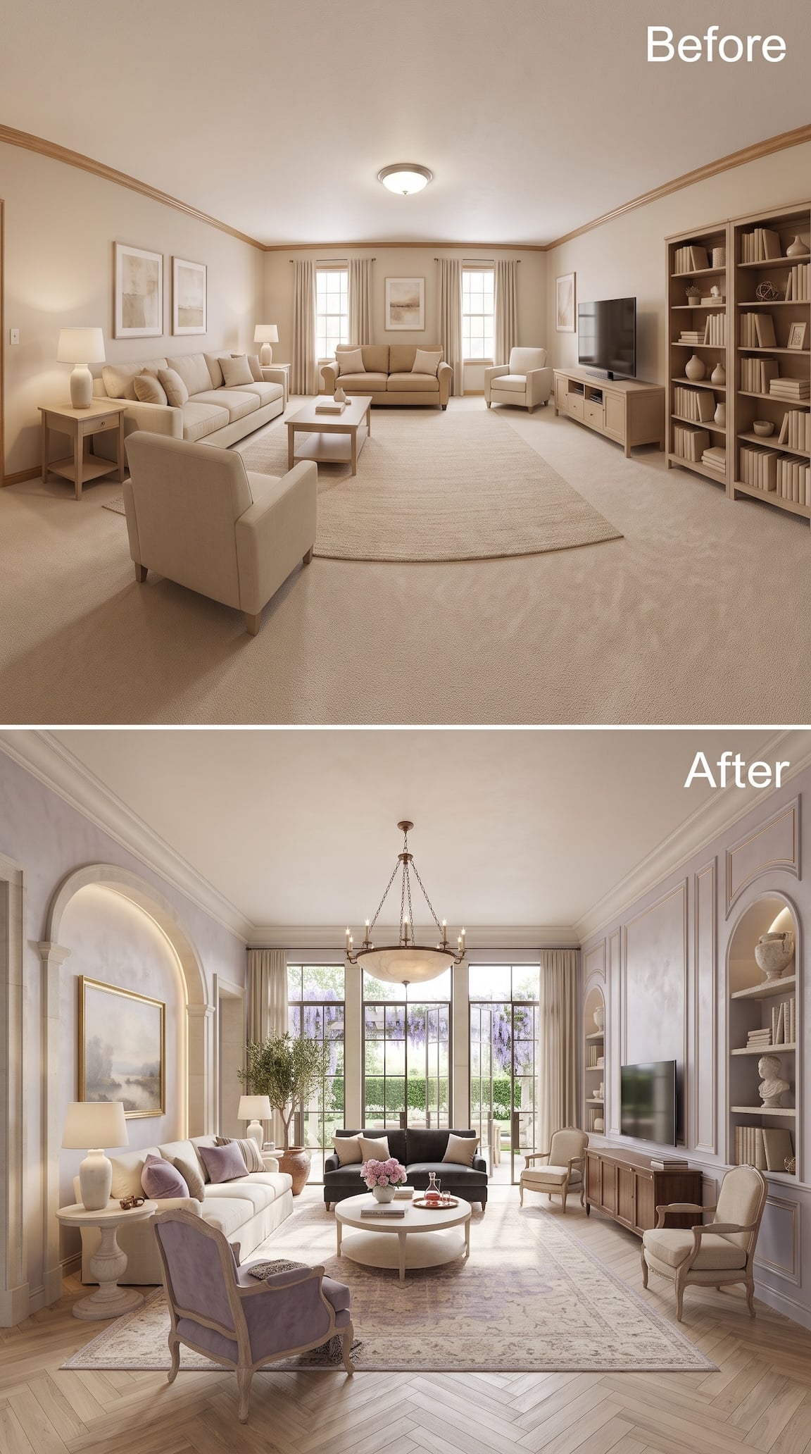
This is a much more architectural use of lavender than simply painting four walls purple. The finish is chalky and pale, while black-framed doors and windows slice through it with enough contrast to keep the room from floating away.
An illuminated arch on the left and matching arched niches around the television introduce curves into what had been a very rectangular shell. Then the furniture refuses to match: cream sofa, lavender chair, charcoal loveseat, weathered wood console.
That mixture is why the room works. The color is romantic. The black metal keeps it from becoming sentimental.
16. Dusty Blue and Terracotta Pulled the Furniture Back Into One Conversation
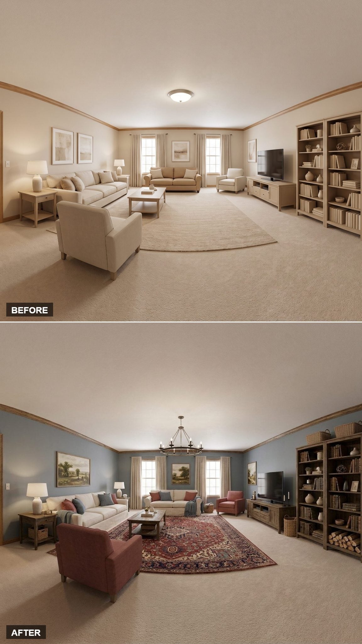
Dusty blue-gray walls cool the room down, then terracotta chairs immediately hand the warmth back. That push-pull is more interesting than another perfectly coordinated palette.
The large Persian-style rug redraws the room. It reaches far enough beneath the furniture to turn a collection of pieces into one seating zone, while burgundy and navy connect the warm chairs to the cool walls. The wrought-iron chandelier finishes the vertical axis without having to become the star.
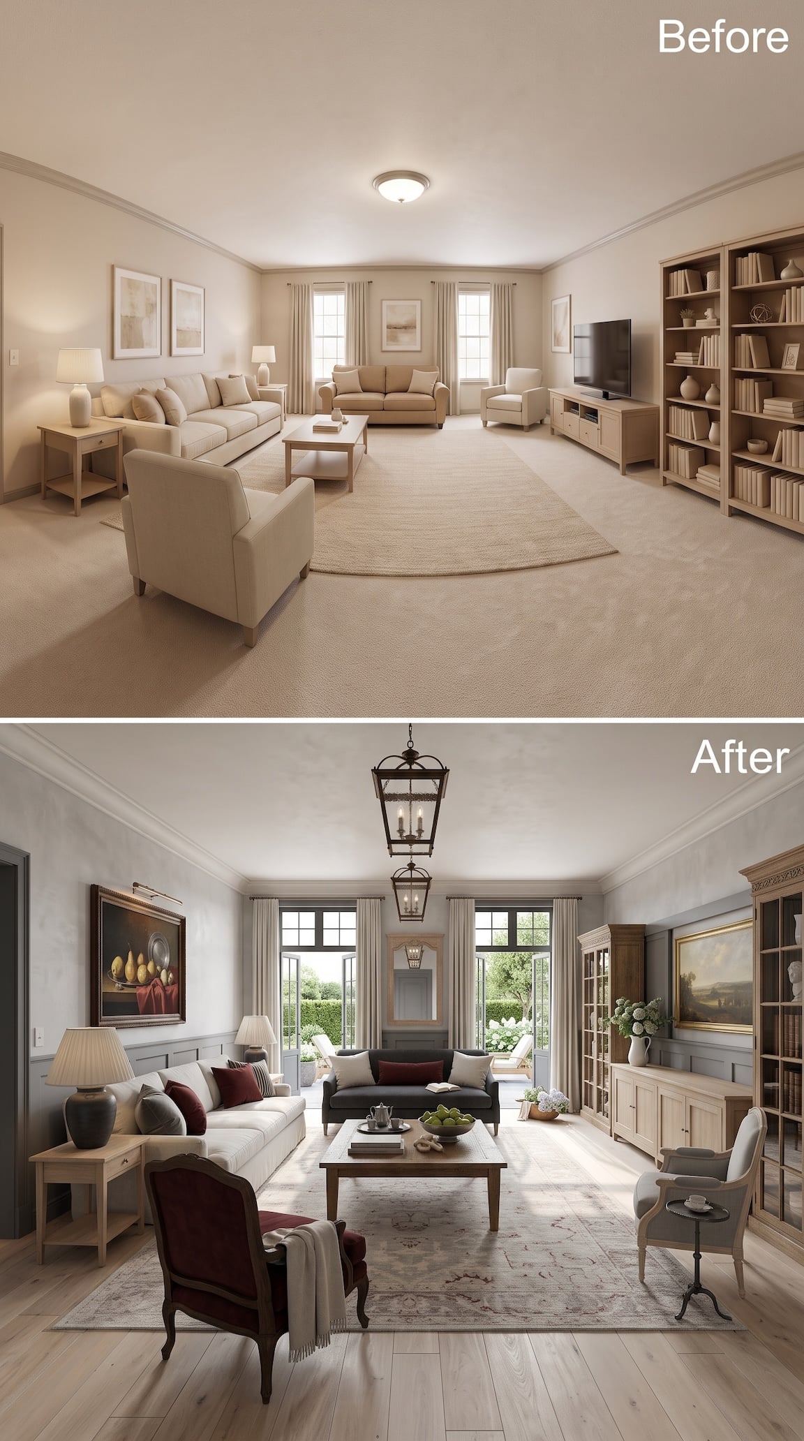
15. Gray Paneling and Burgundy Upholstery Gave the Room a More Serious Side
🔥 Would you like to save this?
Not every French-inspired room has to be pale, floral and sun-drenched. Here the walls drop into a sophisticated gray, the sofa goes charcoal, and burgundy chairs provide the only really saturated color in the seating group.
The two large lantern fixtures overhead are a smart counterpoint to the more delicate furniture. So is the pale plank floor. Without those lighter surfaces, the burgundy and gray could become clubby. Instead, the room lands somewhere between an old country-house sitting room and a particularly good library.
14. A Grand Piano Turned the Living Room Into a Room With Plans for the Evening
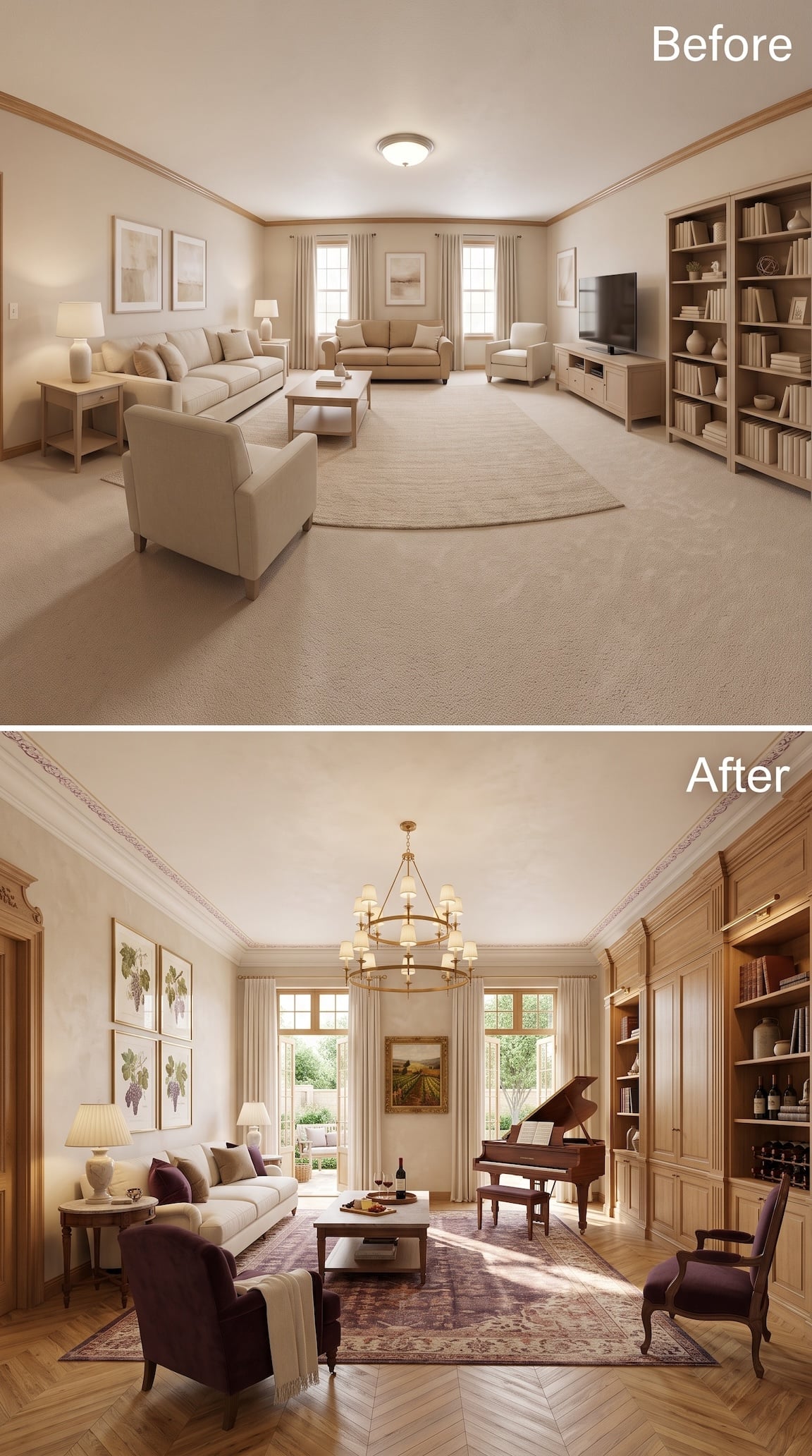
The piano changes the story before it changes the style. Suddenly the room has a reason to exist after dinner. Around it, tall paneled cabinetry absorbs books, display pieces and even wine storage, making the right wall feel more like fitted architecture than shelving.
Deep plum chairs and a large faded-purple rug take the palette somewhere moodier than the other versions, while the pale sofa and botanical prints keep the room from becoming heavy. Overhead, the tiered chandelier is unapologetically grand.
The best detail may be the simplest one: the room now suggests somebody does something here besides watch television.
13. Lavender and Sage Turned the Room Quiet Without Sending It to Sleep
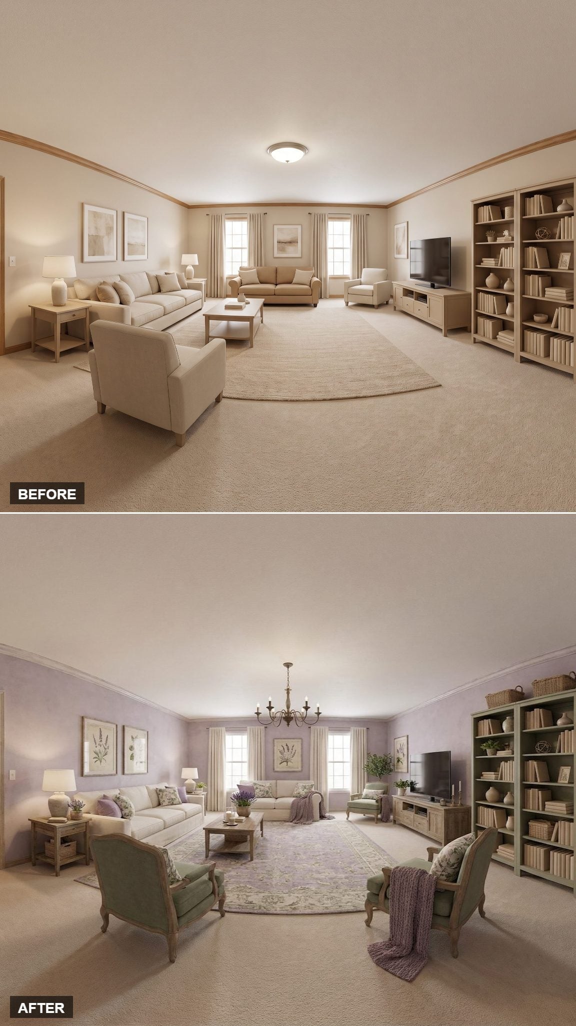
Pale lavender behaves almost like a neutral here until the sage chairs arrive and prove otherwise. Both colors are muted enough to live together without fighting, while botanical prints reinforce the garden reference without resorting to literal floral wallpaper.
The iron candle-style fixture brings a darker line into the upper half of the room, and plum throws keep the upholstery connected to the wall color. The lesson isn’t that lavender and sage belong together by some rigid color-wheel rule. It’s that similar softness and saturation can make very different hues feel related.
12. Periwinkle and Mustard Took the Safe Option Off the Table
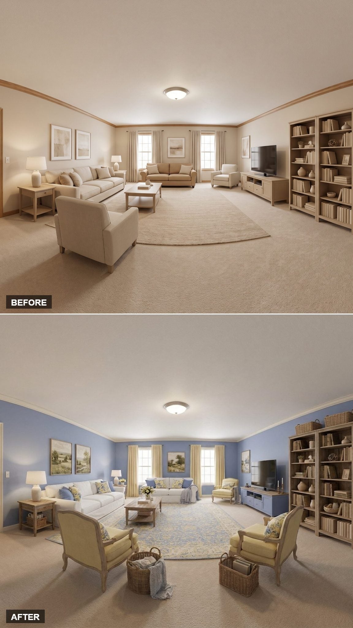
Soft periwinkle covers every wall, but the yellow-gold armchairs are what keep the room from drifting cold. Cream molding and natural wood bookcases provide enough neutral material that the color pairing can be bolder than the original room ever dared.
Floral pillows, wicker baskets and a small vase of yellow flowers repeat the palette in smaller doses. It feels French-inspired without requiring every surface to audition for a château.
11. Checkerboard Floors and Dusty Rose Furniture Turned the Volume Way Up
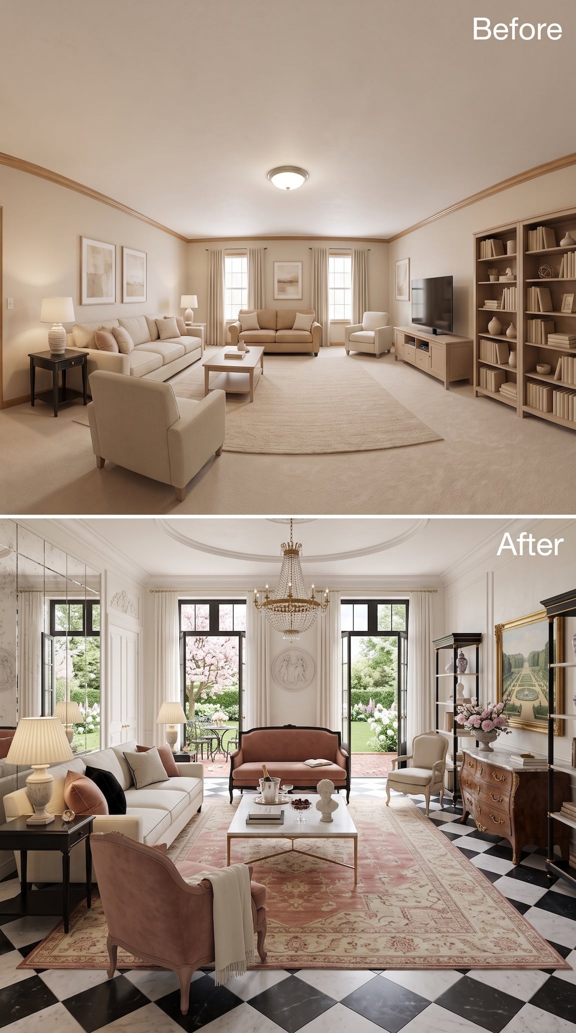
There is nothing shy about this one. A black-and-white checkerboard floor runs straight through the room, dusty rose upholstery sits on top of it, and black display cabinets rise at either end like punctuation marks.
The crystal chandelier and curved antique-style chest pull the room toward a more formal French register, while the large faded pink rug softens the geometry of the floor. Those two patterns should be a lot. Somehow the generous scale keeps them from tripping over each other.
This is not farmhouse French Country. It’s the version that owns silver, knows where the good glasses are and sees no reason to apologize for either.
10. Blush Walls Made the Existing Wood Look Better, Not Older
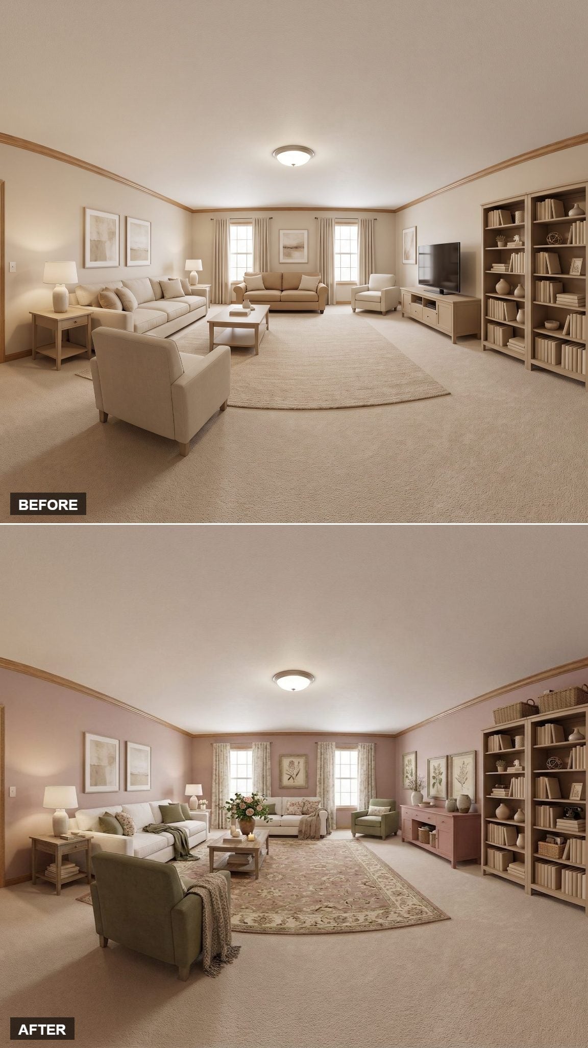
The natural wood bookcases could easily have looked dated against another warm neutral. Against soft rose, they deepen and become part of the palette. Sage upholstery then gives the room a cooler counterweight without breaking the softness.
The floral rug is traditional enough to push the room toward French Country, while the pink media console repeats the wall tone at furniture height. Nothing here is individually loud. The transformation comes from giving the existing wood a better color to live beside.
Sometimes the old wood isn’t the problem. The beige sitting behind it is.
9. Mauve Walls Needed That Ginger-Toned Table
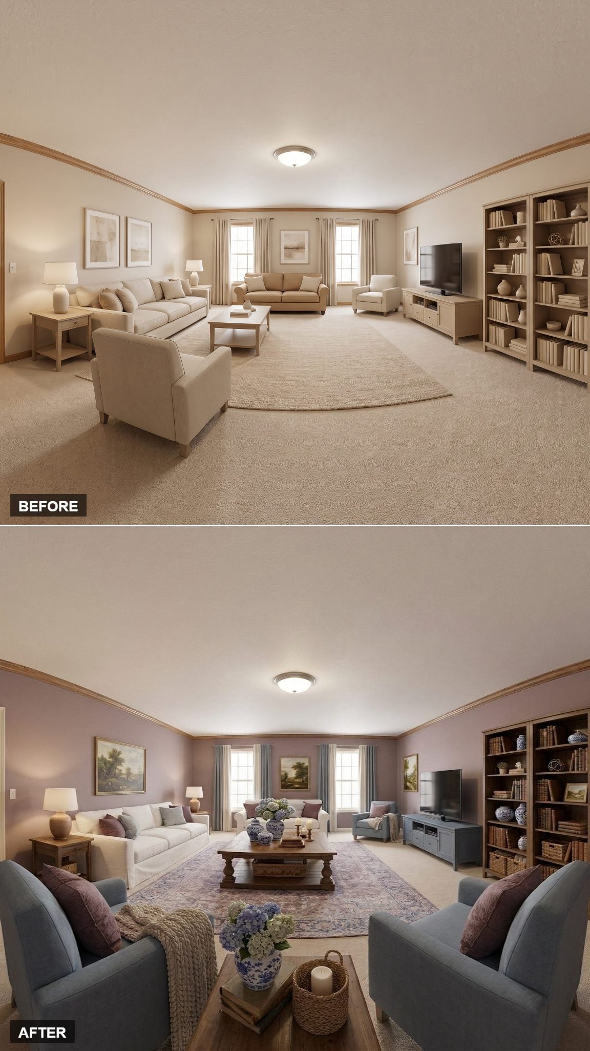
Dusty mauve walls could easily have pushed the room too pink. Slate-blue chairs and a white slipcovered sofa prevent that, but the ginger-toned coffee table is what makes the palette feel settled rather than delicate.
Blue-and-white ceramic jars introduce a chinoiserie note with a long history in European interiors and sit comfortably beside French-inspired furnishings. Hydrangeas loosen the formality, while the slate-painted TV cabinet keeps the dark rectangle of the screen from dominating the entire wall.
8. The Coral Entertainment Center Is the Move Nobody Plays Safe Enough to Try
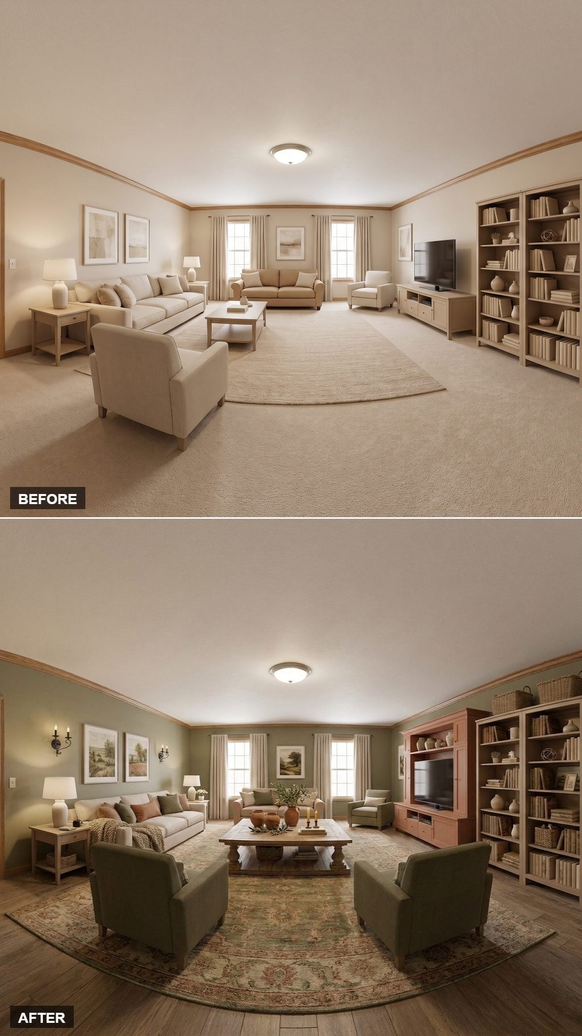
Sage walls are familiar territory. Painting the entertainment center coral is where this version stops behaving. On paper, the two colors should fight. Their muted tones — plus a floral rug carrying both families — keep the argument surprisingly civilized.
Most people treat the TV cabinet as something to disguise in white, black or wood. Here the cabinet becomes the color event instead. The screen is still there, but for once it isn’t automatically the most visually aggressive object on the wall.
The Gamble: Painting a large cabinet a contrasting color works best when the rest of the palette gives it somewhere to belong. The rug earns its keep here by carrying both green and warm reddish tones.
7. Burnished Orange and Gray-Blue Turned the Beige Room Into Something Tailored
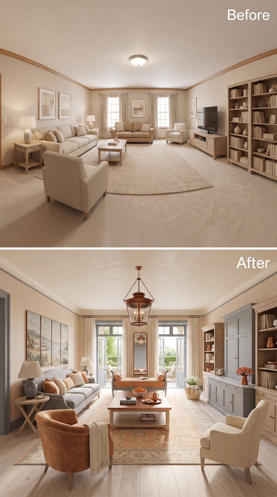
This transformation doesn’t need a dramatic wall color because the contrast is built into the furniture. A burnished-orange barrel chair and long upholstered bench bring warmth forward, while gray-blue cabinetry and trim cool the perimeter and give the room a much sharper outline.
The oversized lantern fixture is the unexpected ingredient. It is rustic enough to keep the room from becoming too polished, but its scale makes the ceiling feel intentional rather than simply illuminated. A faded peach-and-blue rug ties the warm upholstery to the cooler millwork without matching either one exactly.
The result feels cleaner and more tailored than most of the gallery, but still comfortably French-inspired. Less farmhouse clutter, more country house with very good editing.
6. Sage and Dusty Rose Found the Middle Ground
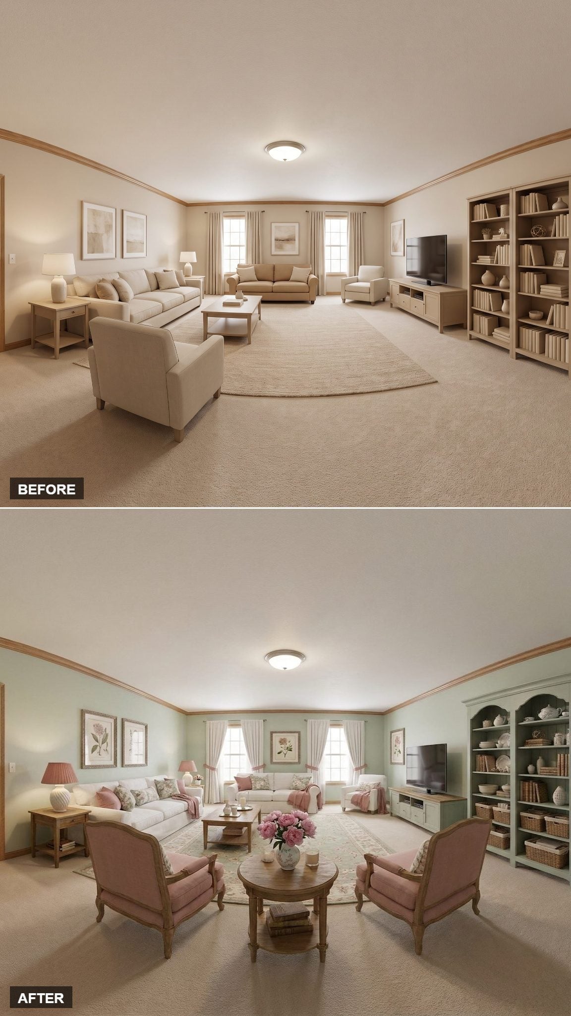
Sage takes the beige edge off the architecture, while dusty rose chairs add enough warmth to keep the room from turning botanical-theme green. The deeper hunter finish on the bookcase gives the right side of the composition more weight without demanding attention.
The tiny details do more than usual here: pink peonies on the round table, woven baskets tucked low, pale botanical prints and restrained floral pillows. None is important alone. Together they make the room look collected rather than decorated in one afternoon.
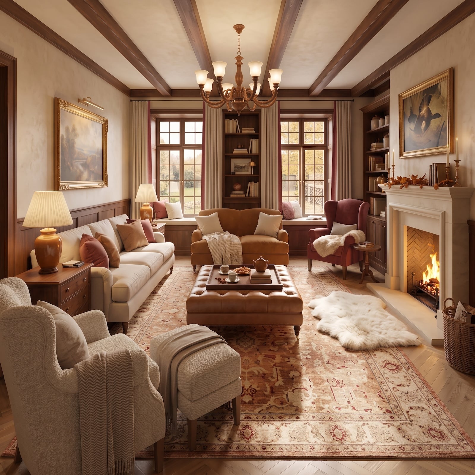
5. A Fireplace, Dark Beams, and Caramel Leather Made the Room Feel Built for November
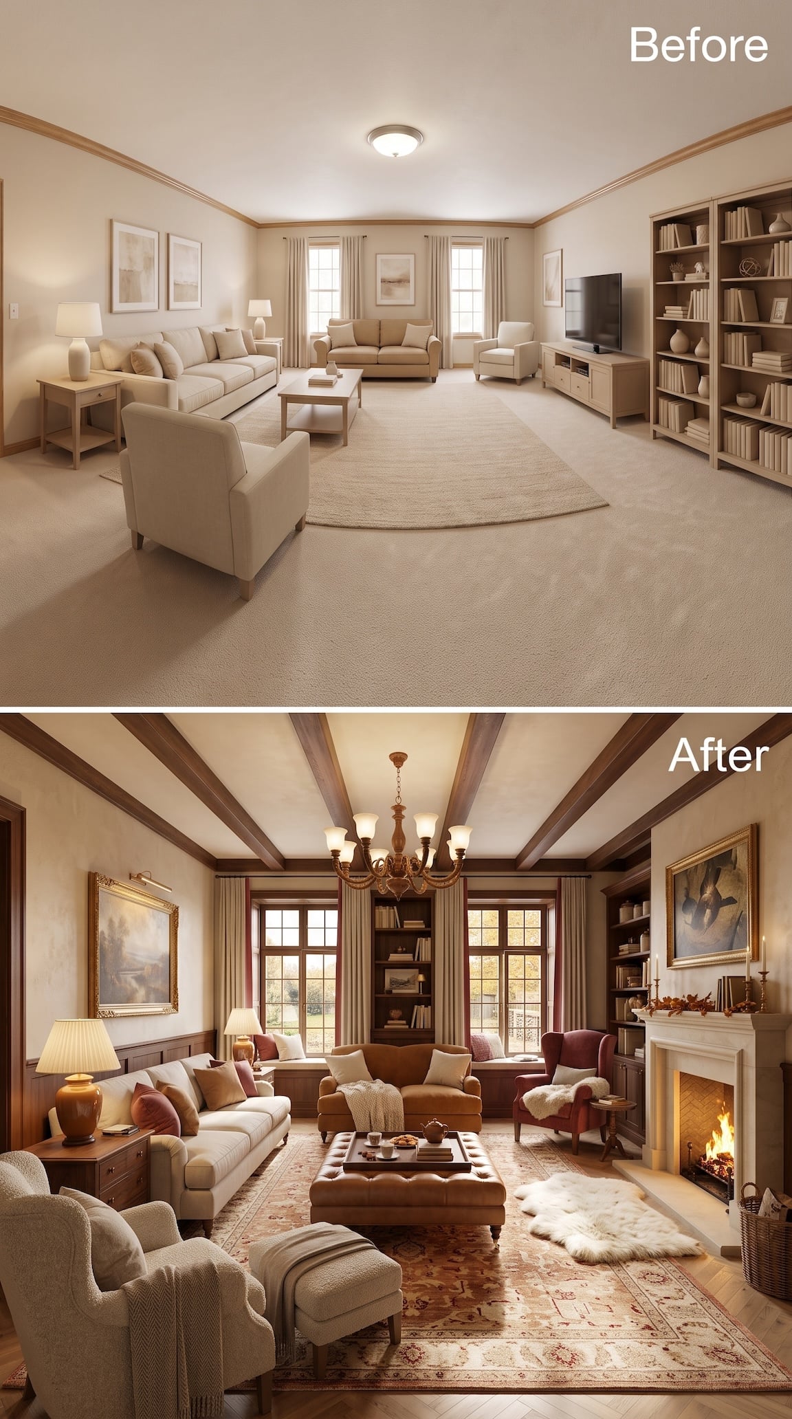
This one goes straight for warmth. Dark ceiling beams redraw the proportions overhead, wood paneling wraps the lower walls, and a proper fireplace replaces the anonymous blankness on the right. By the time the caramel sofa and tufted leather ottoman arrive, beige has been reduced to a supporting role.
The rust-red armchair keeps the brown palette from becoming monotonous, while a cream bouclé chair and pale sofa supply enough softness to balance all that timber and leather. Underneath, the faded red rug makes the entire seating area feel settled before the fire even gets involved.
It is one of the coziest transformations in the set because almost every material looks better with age: leather, wood, wool, brass, stone. The room doesn’t merely look warmer. It looks prepared for weather.
4. A Scenic Mural and Deep Green Furniture Made Beige Look Like a Rough Draft
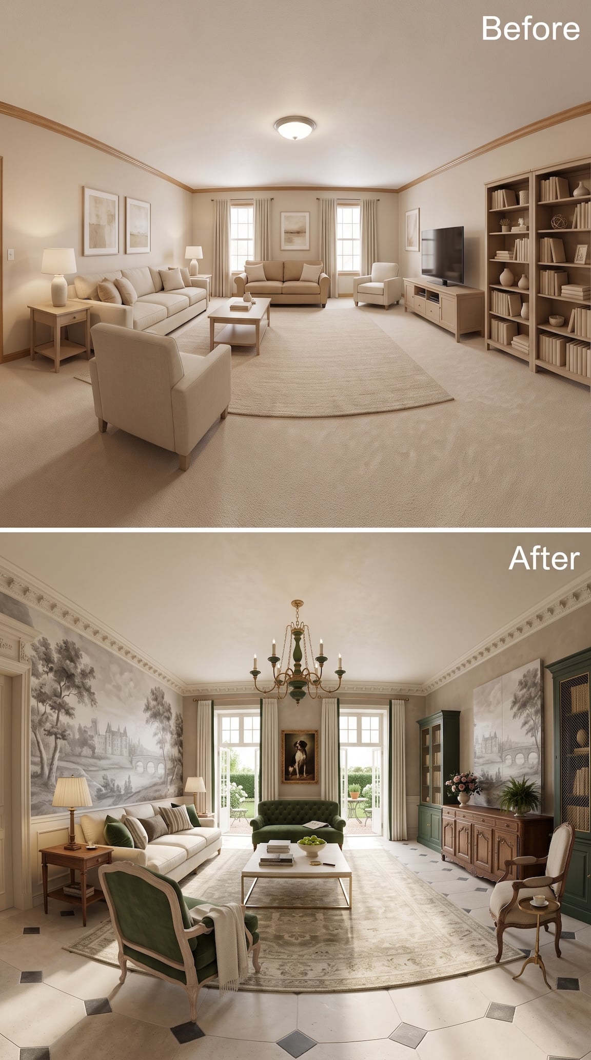
This one doesn’t politely transition away from beige. It replaces the entire vocabulary. A sprawling monochrome landscape mural takes over the walls while deep green upholstery and matching cabinetry give all that pale scenery something solid to push against.
The surprise is how little bright color the room actually needs. Green velvet, warm wood and a few dusty-pink flowers are enough because the mural supplies pattern at architectural scale. Even the chandelier participates, dropping a dark green note into the middle of an otherwise pale ceiling.
The result feels less decorated than composed. The original room had objects. This one has a point of view.
3. A Blush Sofa Against Steel Blue Shouldn’t Work This Well
🔥 Would you like to save this?
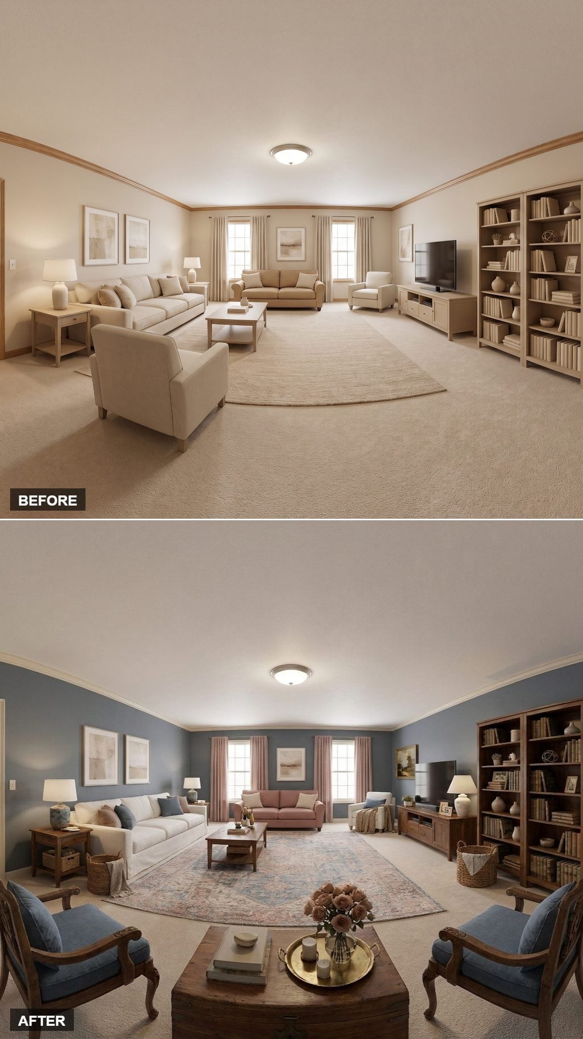
The room is almost entirely built around one unlikely pairing: steel blue walls and a blush sofa. Without the walnut bookcase and tables, the combination might float away. Dark wood gives both colors a visual foundation.
A floral rug carries pink and blue across the floor without reproducing either one exactly. The room feels coordinated because the colors recur imperfectly, not because every object arrived from the same collection.
2. A Green Cabinet Stole the Room From the Windows
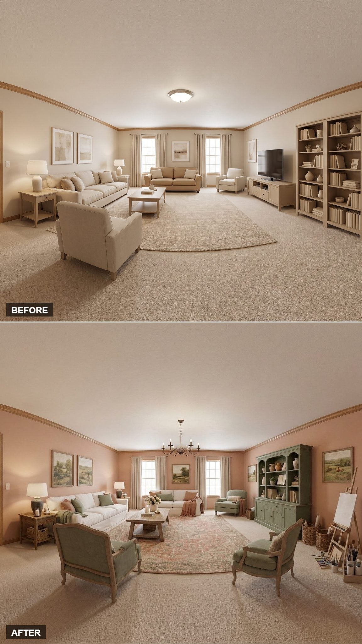
Warm blush walls are pleasant, but that sage-to-olive cabinet on the right is the reason the room has somewhere else to look besides the windows. Its depth of color gives a previously weak wall real presence.
The linen-wrapped chairs, rustic coffee table and faded floral rug pull the room back toward something softer and older. Then the easel appears in the corner and does something AI interiors often forget to do: suggest an activity that has nothing to do with arranging furniture.
1. Half-Timbered Walls and Brick Floors Gave Beige a Very Short Funeral
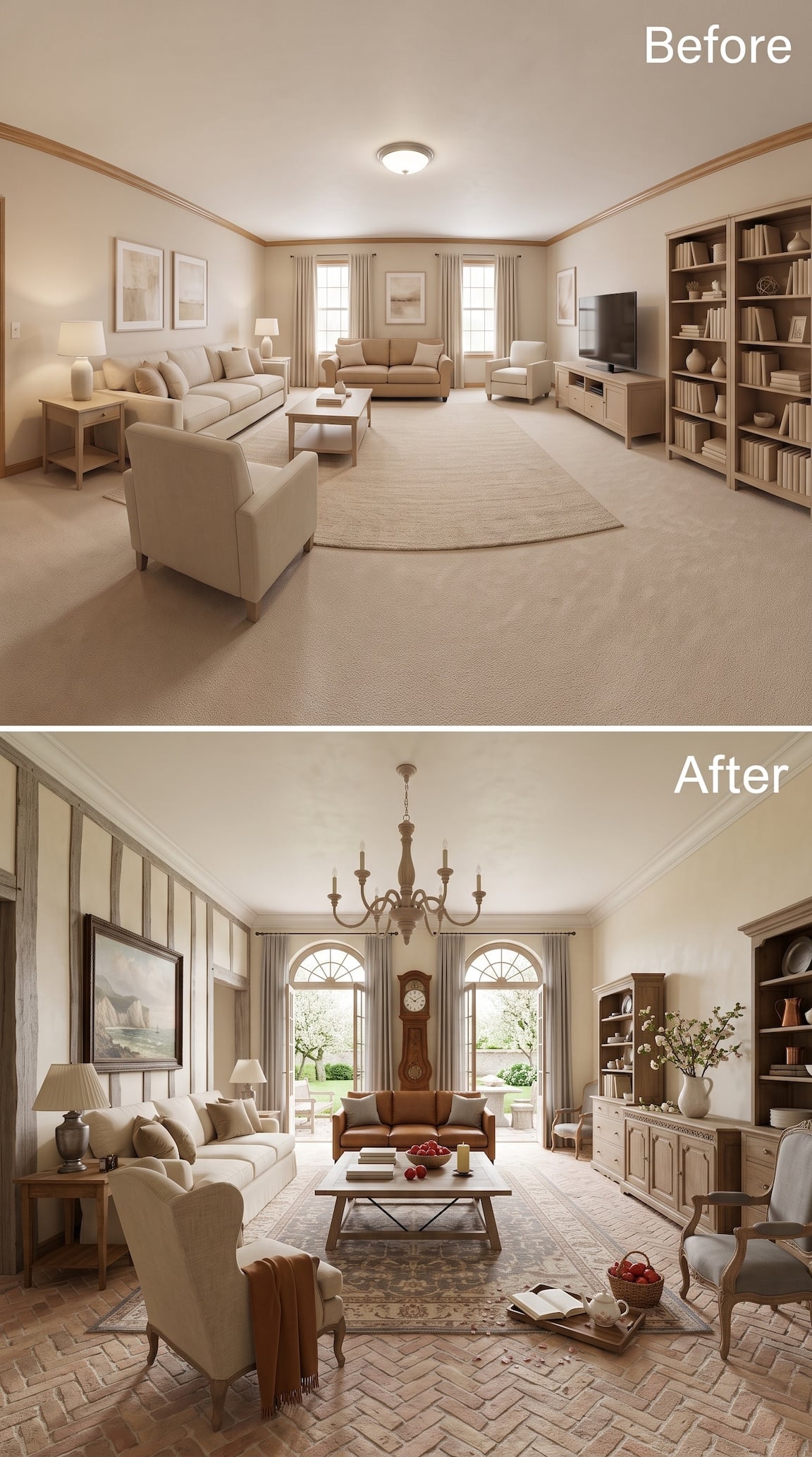
The transformation gets almost theatrical here: exposed timber framing climbs the left wall, pale brick runs underfoot in a herringbone pattern, and a tall clock takes command of the center wall between two arched windows.
The rust sofa is exactly the right color for all that brown architecture. It belongs to the brick, the timber and the dark metal coffee-table base without disappearing into any of them. Cream upholstery on the other pieces prevents the whole room from turning sepia.
This one is less “add French Country” and more “apparently the house has been hiding several centuries from us.”