🔥 Would you like to save this?
A bathroom can be technically big enough and still spend its square footage terribly. A door claims the only useful patch of floor. A vanity stops short of one wall while crowding another. A shower door swings into the traffic lane. A toilet partition rises all the way to the ceiling when four feet of privacy would have done the job. Suddenly the renovation conversation turns to demolition, even though the room may already contain every inch it needs.
That is where layout gets interesting. Bathroom planning is not simply a contest for more floor area; it is a negotiation between clearance, projection, circulation, plumbing, storage and sightlines. A few inches removed from the wrong place can matter more than several feet added somewhere nobody actually needs them.
In order to come up with the very specific design ideas, we create most designs with the assistance of state-of-the-art AI interior design software. Also, assume links that take you off the site are affiliate links such as links to Amazon. this means we may earn a commission if you buy something.
The 36 bathrooms here attack that problem from almost every direction. Doors slide instead of swing. Vanities run deliberately into corners and all the way to walls. Two faucets share one long basin. Glass moves sideways. Storage climbs upward or retreats into recesses. A half-height partition gives the toilet privacy without building another room inside the room. Some changes are architectural; others barely disturb the footprint at all.
None of this argues that a bathroom wall should never move. Sometimes it absolutely should. The better question is whether the wall is really causing the problem—or merely taking the blame for everything arranged badly in front of it.
36. They Moved the Door Before They Even Considered Moving the Wall
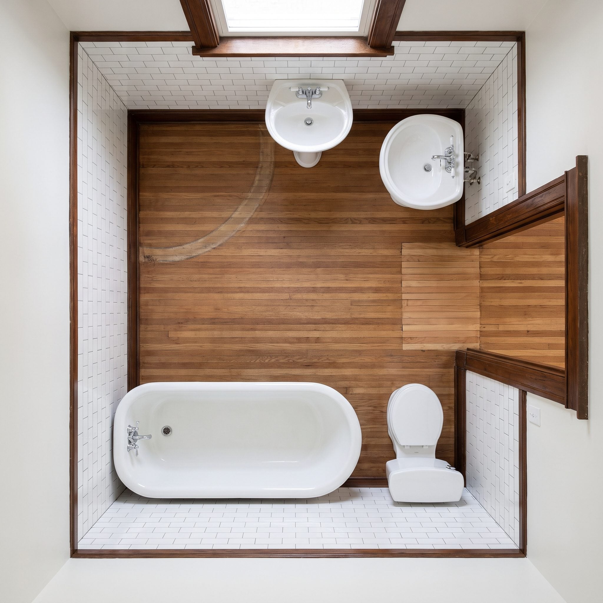
A bathroom door can consume an astonishing amount of usable floor without occupying any floor itself. Its swing determines where cabinetry can begin, whether two fixtures can comfortably coexist and how the room behaves at the moment of entry.
Here, shifting the opening toward the corner lets the door swing flatter against the wall and clears a more direct path toward the vanity. The white oak vanity can occupy useful wall space without fighting the entry. Relocating an opening still involves framing and may affect wiring or other services, but that is a very different proposition from assuming an entire wall has to move.
35. They Replaced the Boxed-In Shower With Frameless Glass
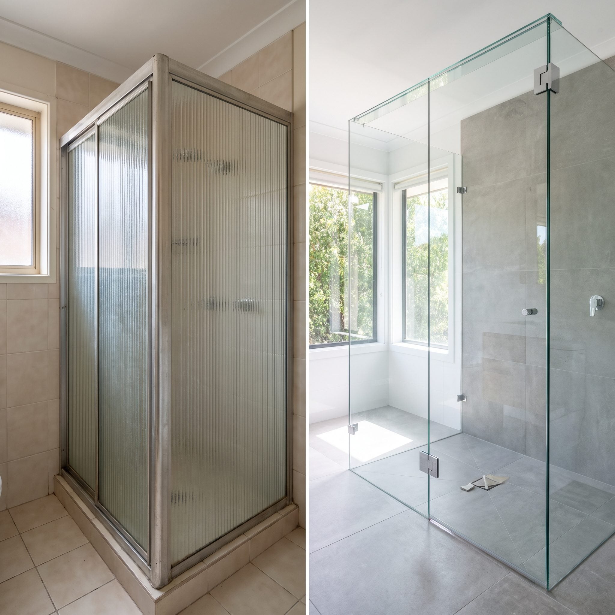
The shower occupies physical space either way. The difference is how emphatically its enclosure announces that space.
Clear frameless glass allows the white vertical tile, floor and back wall to remain visible from outside the shower, so the enclosure separates wet from dry without becoming another opaque volume in the room. Against all that white, the black rainfall shower head supplies the graphic punctuation instead of a bulky frame.
34. Two Faucets, One Long Basin—Who Said a Double Vanity Needs Two Sinks?
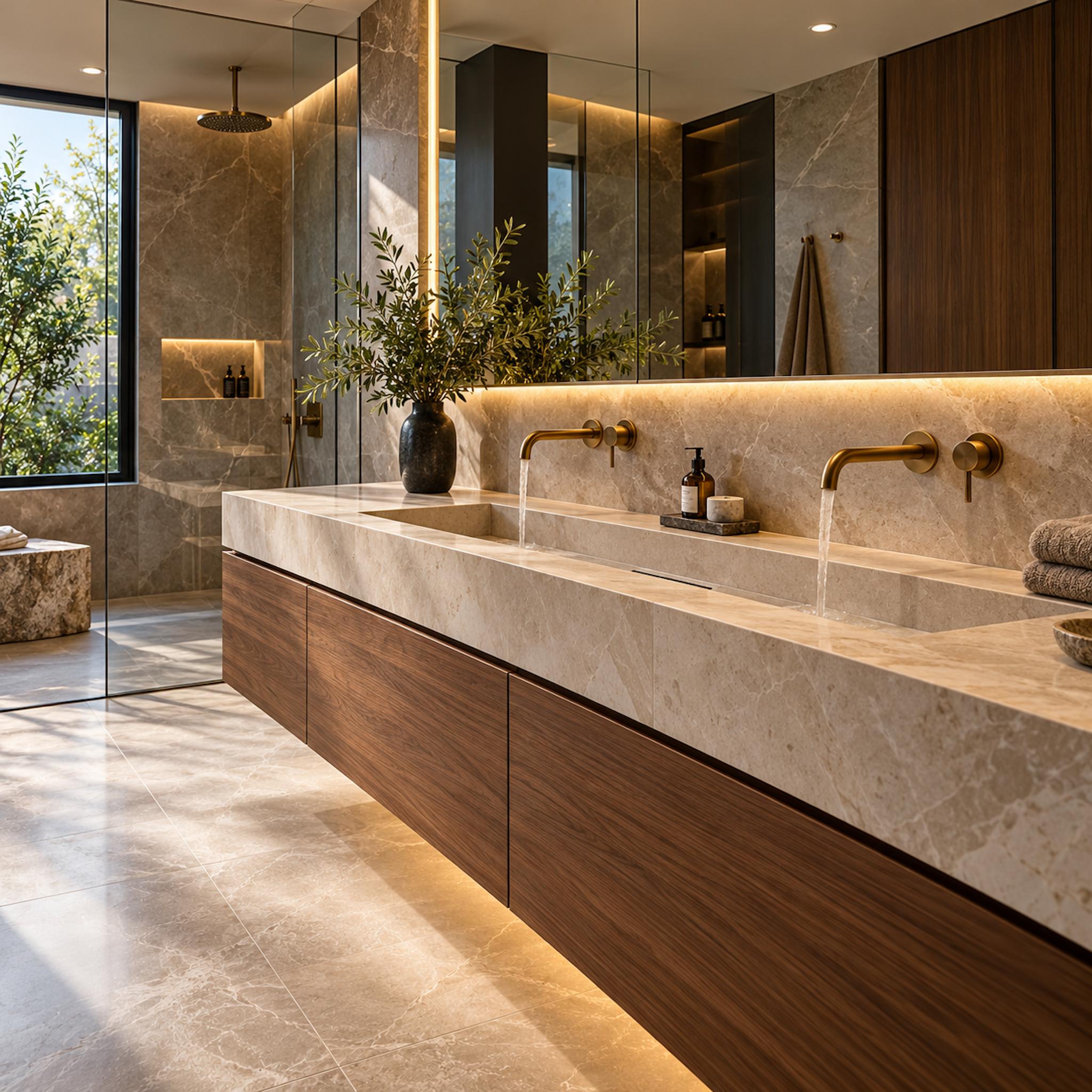
Two washing positions do not automatically require two separate basins. This long stone trough stretches across the vanity as one continuous sink, with a pair of wall-mounted faucets establishing two distinct places to use it.
That changes the geometry of the familiar double vanity. Instead of interrupting the countertop with two individual bowls and two sets of surrounding edges, one elongated basin becomes part of the architecture of the counter itself. The floating walnut cabinetry keeps the lower elevation quiet, while the long mirror reinforces the horizontal sweep. Two faucets still say two users. The vanity no longer has to say it twice.
33. They Replaced the Oversized Vanity With One That Actually Fit the Room
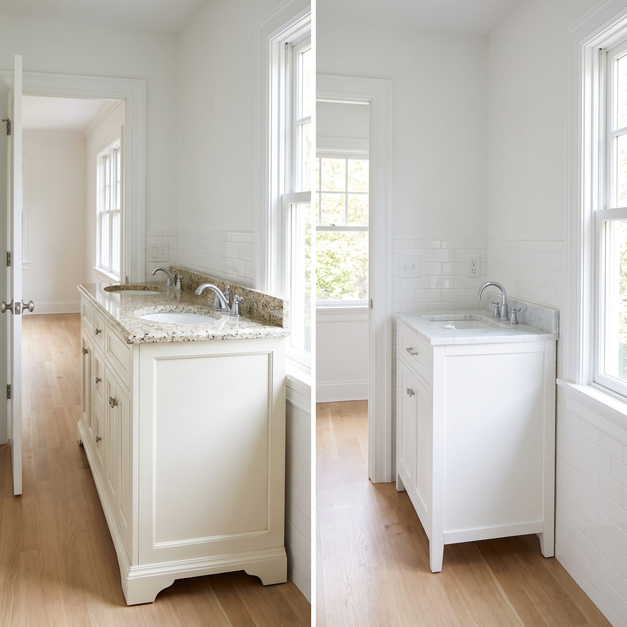
A vanity can offer generous storage and still be badly proportioned for the room around it. In a compact bathroom, those extra inches of cabinet width can collide with the door zone, tighten toilet clearance and turn the central aisle into a squeeze.
The smaller white shaker vanity leaves more negative space around the fixtures while still giving the sink enough visual weight. Sage walls, pale stone and brass-toned hardware then have room to register. The useful lesson isn’t that smaller is always better. It is that cabinetry should be sized to the circulation it leaves behind.
32. They Changed the Toilet’s Orientation Instead of Assuming the Room Was Too Small
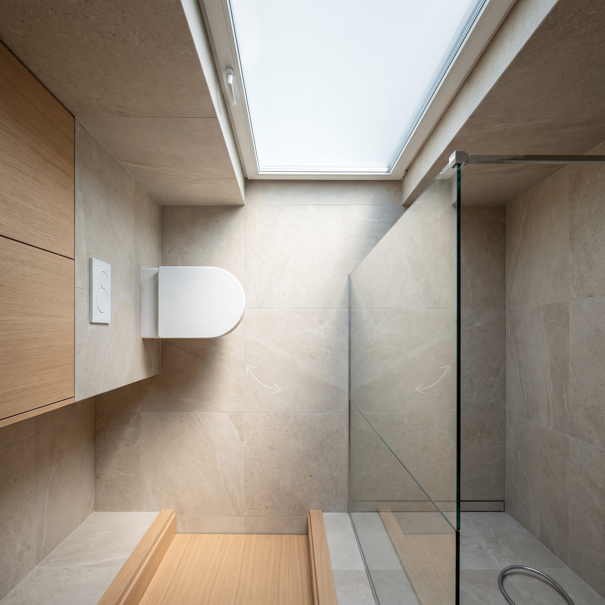
Fixture orientation can matter almost as much as fixture size. A toilet projecting into the wrong part of a compact floor plan can interfere with the entry, narrow the passage beside the vanity or leave useful wall space stranded behind it.
Turning the toilet changes that geometry and creates a clearer circulation route through this layout. Such a change is not automatically simple—the waste connection, flange location and required clearances all have to work with the new position—but the design principle is worth testing before adding square footage: sometimes the fixture is simply facing the wrong way.
31. They Took Storage Vertical Instead of Making the Bathroom Wider
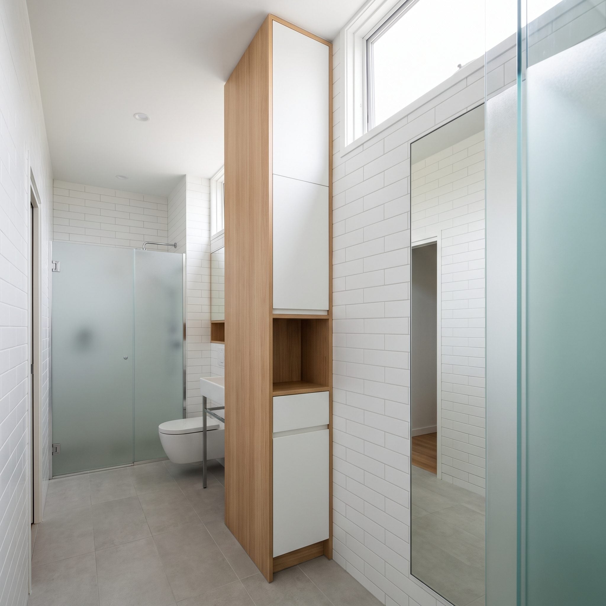
Small bathrooms frequently run out of storage long before they run out of wall. The overlooked territory is overhead.
A tall cabinet and stacked open shelving exploit that vertical dimension without pushing farther into the walking area. Everyday items can remain within easy reach while less frequently used supplies migrate upward. The strong vertical line also emphasizes the room’s height instead of adding another low, wide object to an already crowded floor plan.
30. They Chose a Compact Soaking Tub and Gave the Floor Some Breathing Room
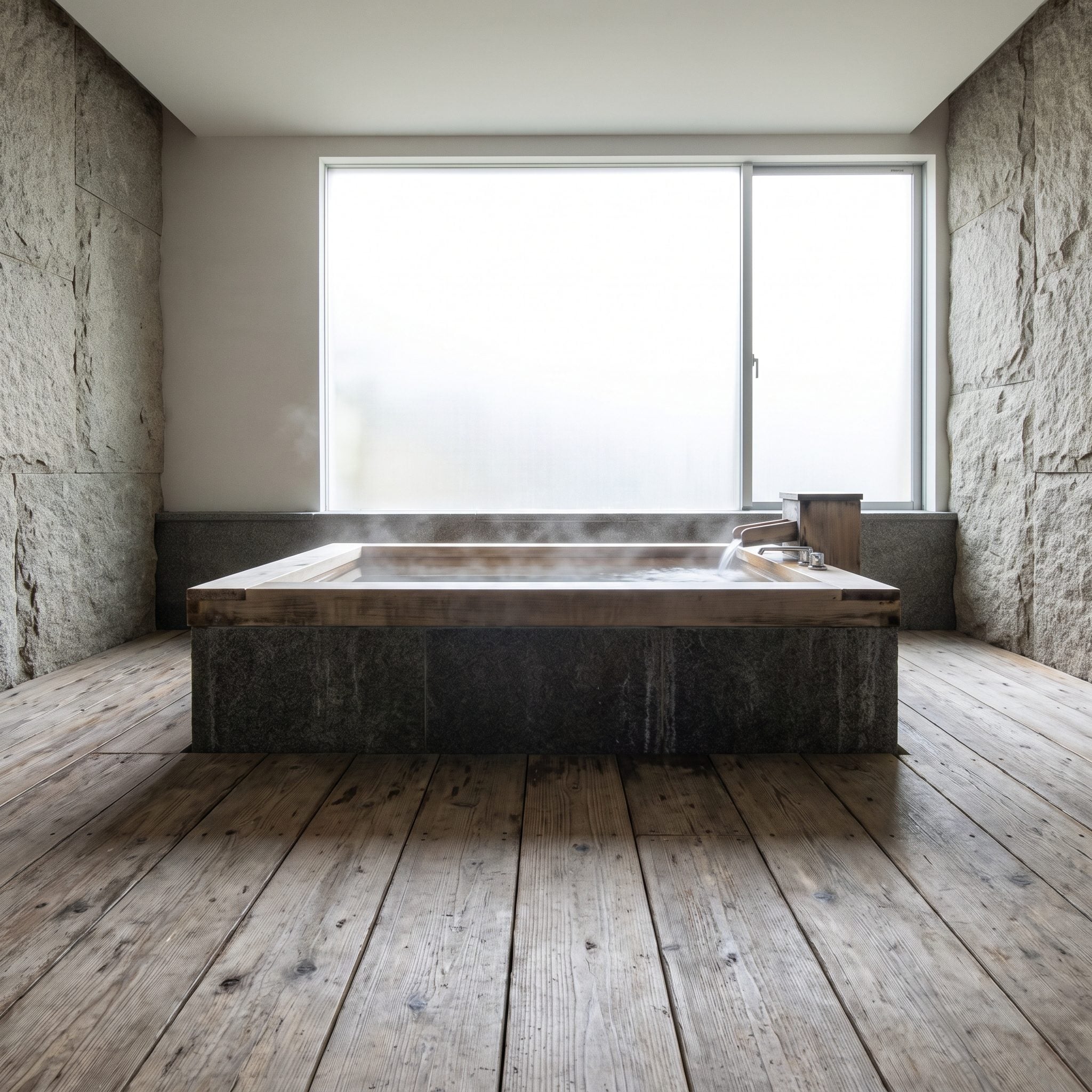
A conventional bathtub gets its bathing volume largely through length. A compact deep soaking tub changes the proportions, trading some of that horizontal reach for greater depth and a more upright bathing position.
That altered geometry matters in a tight room. Here the tub settles into the corner without stretching across an entire wall, leaving visibly more open floor around it. The brushed brass fixtures against warm plaster provide the decorative detail while the tub itself remains deliberately simple.
29. They Recessed the Medicine Cabinet Instead of Adding Another Object to the Room
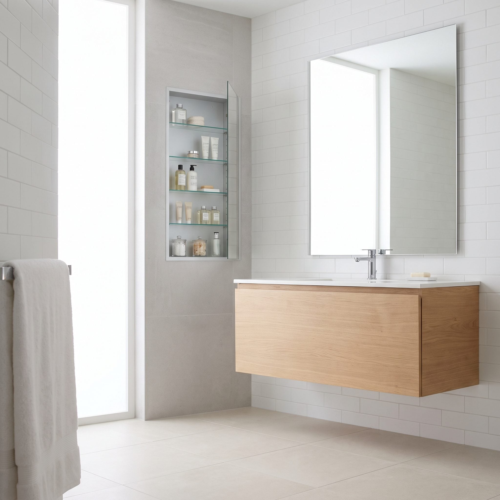
Storage does not always need to project into the room. A recessed medicine cabinet borrows depth from a suitable wall cavity, allowing useful shelving to sit largely within the plane of the wall rather than in front of it.
Here the mirror and cabinet read as part of one clean elevation, flanked by slim brass sconces. The installation depends on what is actually inside the wall—framing, plumbing, wiring and blocking all matter—but where conditions allow it, recessing storage can preserve precious clearance around the sink.
28. They Stopped the Privacy Wall at Half Height—and Kept the Rest of the Bathroom Open
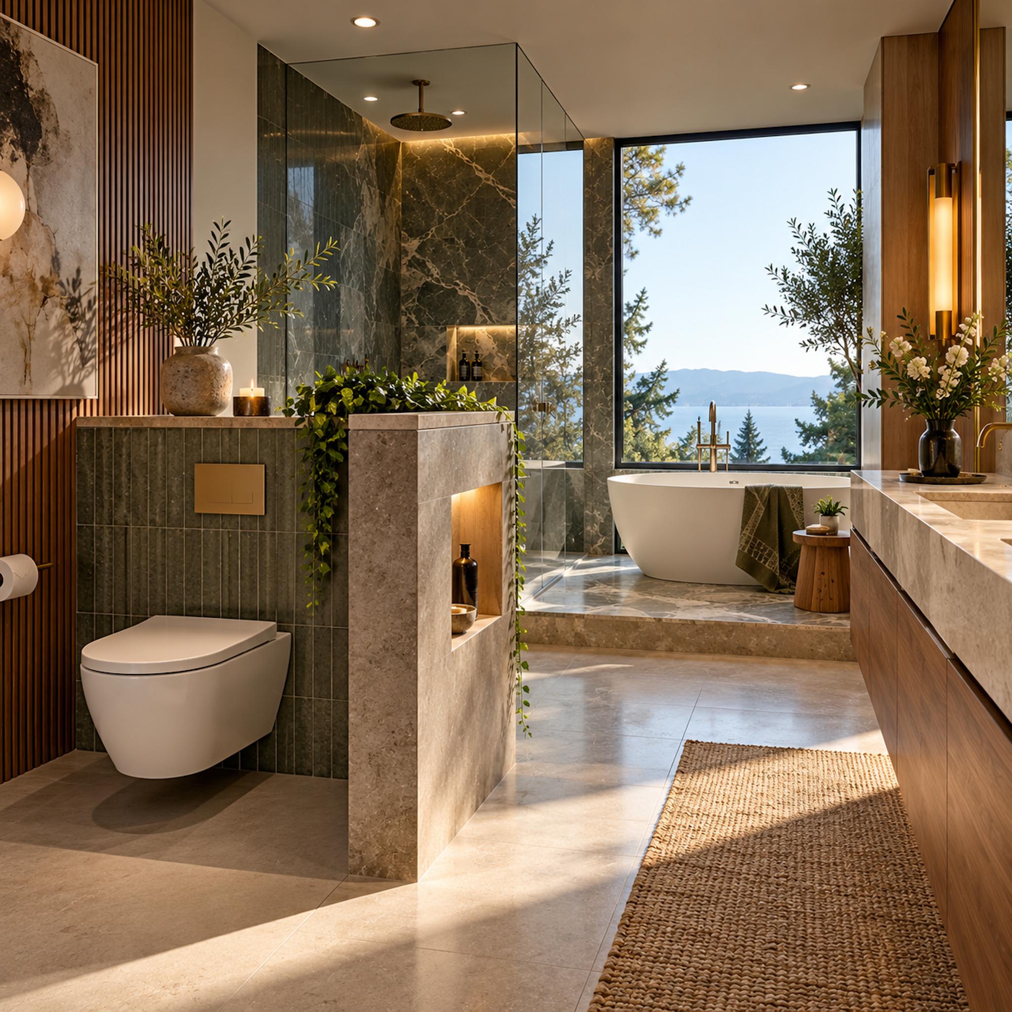
Privacy does not always require a partition that runs from floor to ceiling. Here a half-height wall screens the wall-hung toilet from the principal bathing area while leaving daylight, long views and the upper volume of the room uninterrupted.
The partition works harder than a simple screen. Its stone cap becomes a display ledge, an illuminated niche adds storage on the opposite face, and the low wall helps define the toilet zone without turning it into a separate little room. Beyond it, the tub, shower and large window remain visually connected. The architecture draws a boundary, then deliberately stops before the boundary becomes a box.
27. They Put the Shower at the End of a Long, Narrow Bathroom
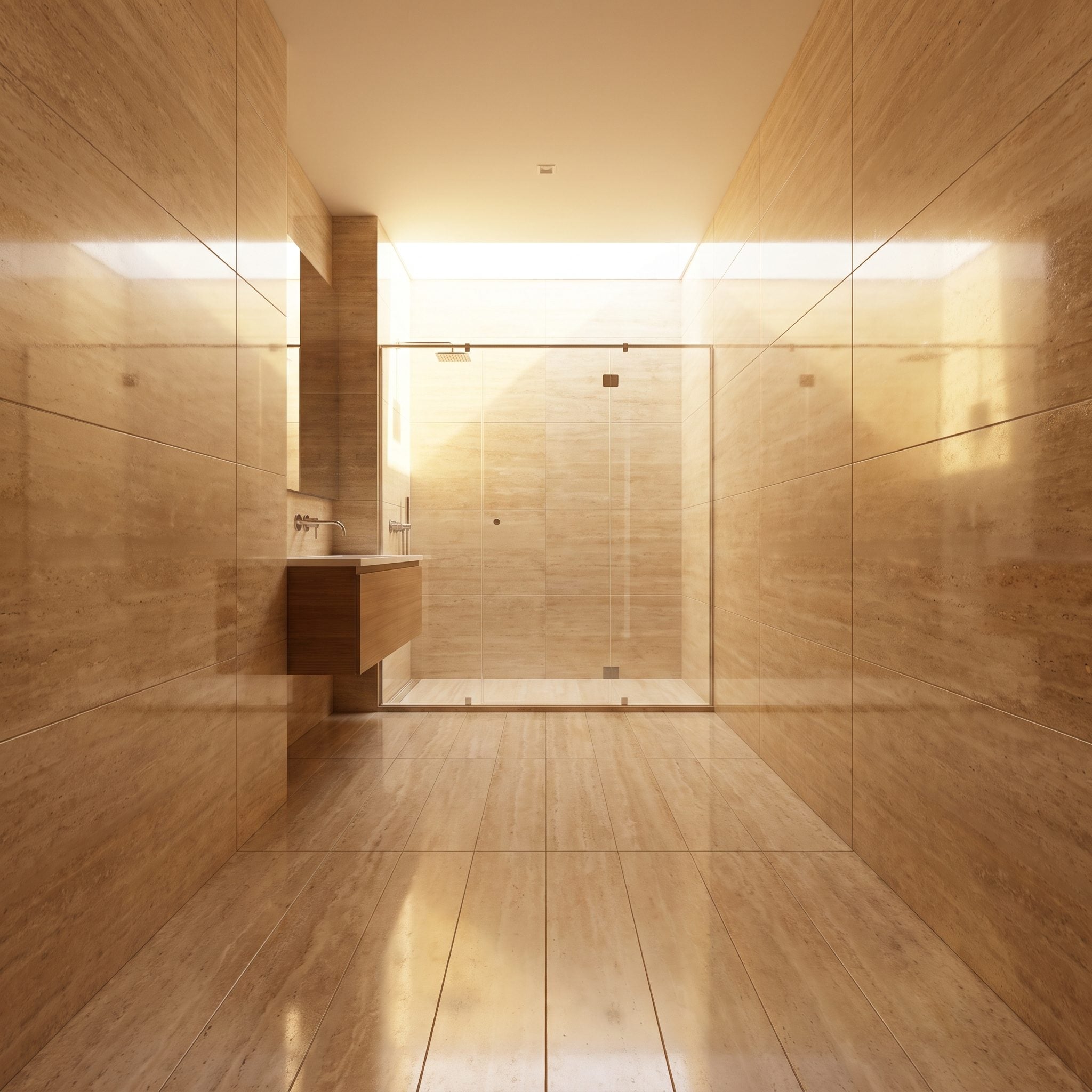
A long, narrow bathroom already has a strong axis. Fighting that shape with fixtures projecting from every side only makes the proportions more awkward.
Running the shower across the full width at the far end turns the room’s narrowness into an organizing device. The glass preserves the long sightline, while the botanical tile and window give that sightline a clear destination. What might have felt like a corridor becomes a deliberate procession from entry to wet zone.
26. They Switched From a Double Vanity to One Generous Sink
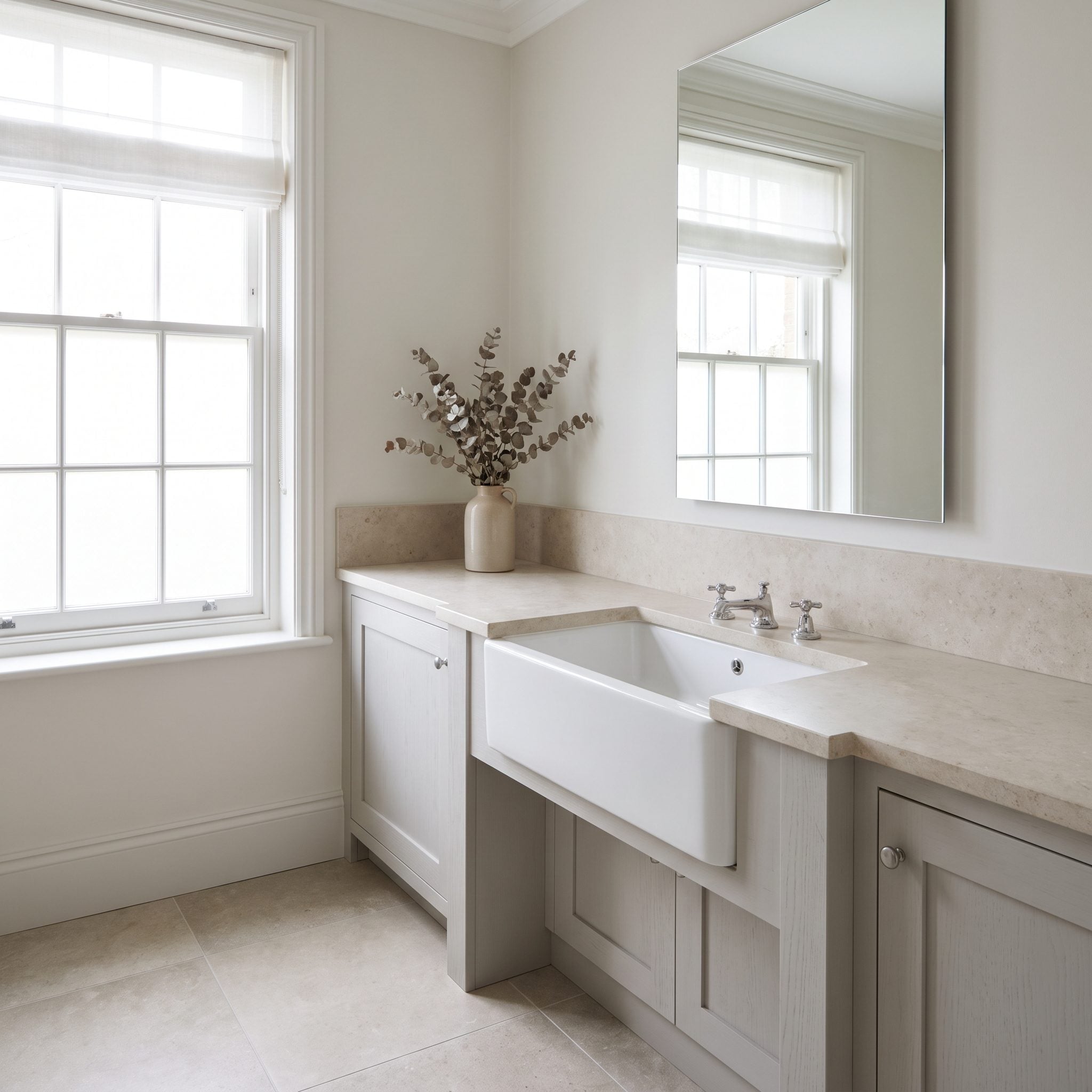
Two sinks are useful when two people genuinely need them at the same time. In a compact bathroom, however, the second basin also consumes counter area, under-sink storage and flexibility in how the vanity can be configured.
One generous basin changes that equation. This single sink vanity leaves broad landing space on either side, making the counter itself more useful instead of dividing most of its width between bowls. Luxury in a small bathroom can be as simple as having somewhere to put things down.
25. They Used a Wall-Hung Toilet Where Every Inch Mattered
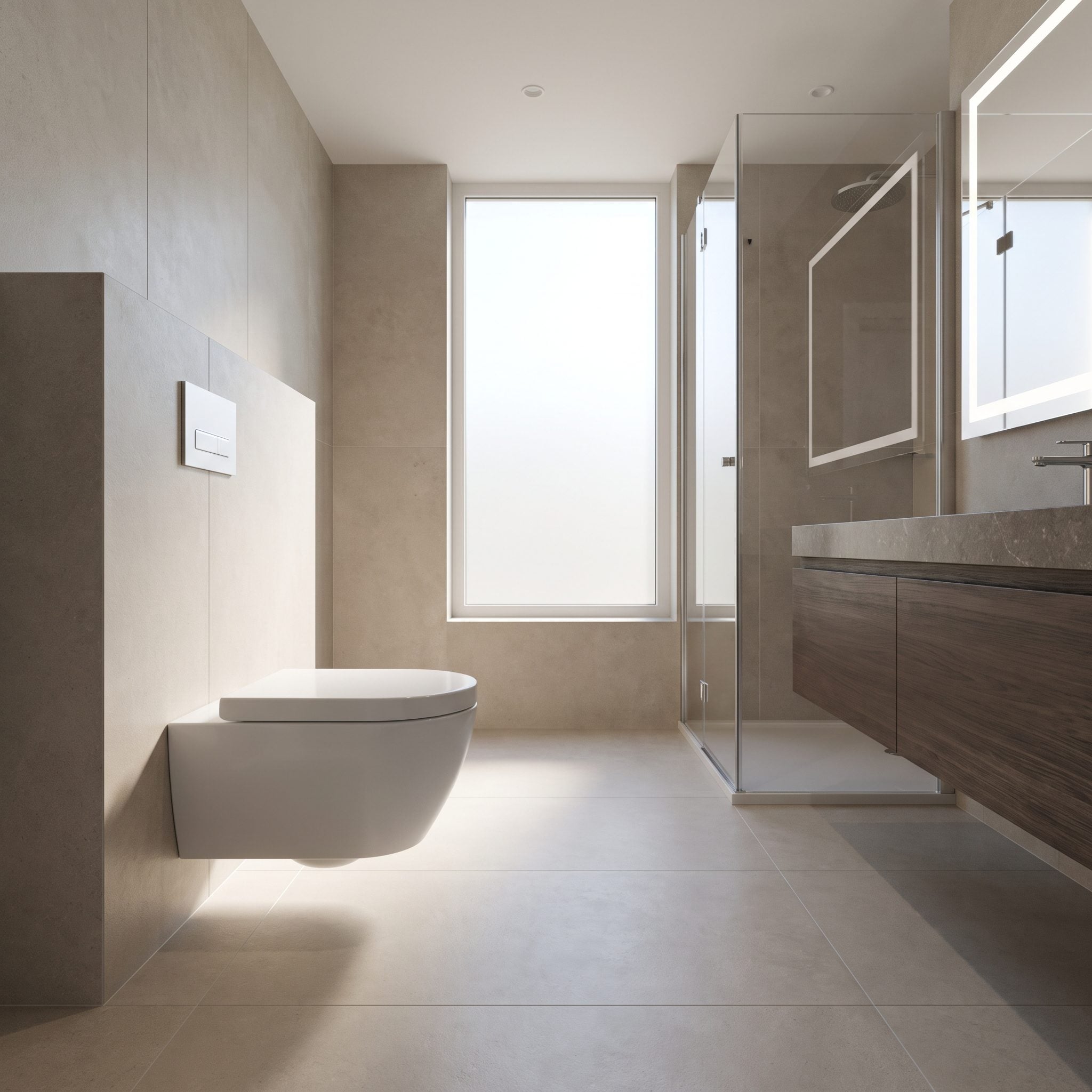
A wall-hung toilet changes two things at once. The bowl lifts clear of the floor, and the tank moves into a concealed carrier system within or behind the wall assembly. That can produce a cleaner footprint than a conventional floor-mounted toilet with an exposed tank.
The continuous charcoal tile beneath the bowl makes the installation feel especially crisp, and cleaning around the fixture becomes simpler. Installation height can also be selected when the carrier is fitted, giving the fixture a degree of flexibility that a standard toilet does not offer.
24. They Put the Vanity Into the Recess Instead of Pretending the Recess Wasn’t There
🔥 Would you like to save this?
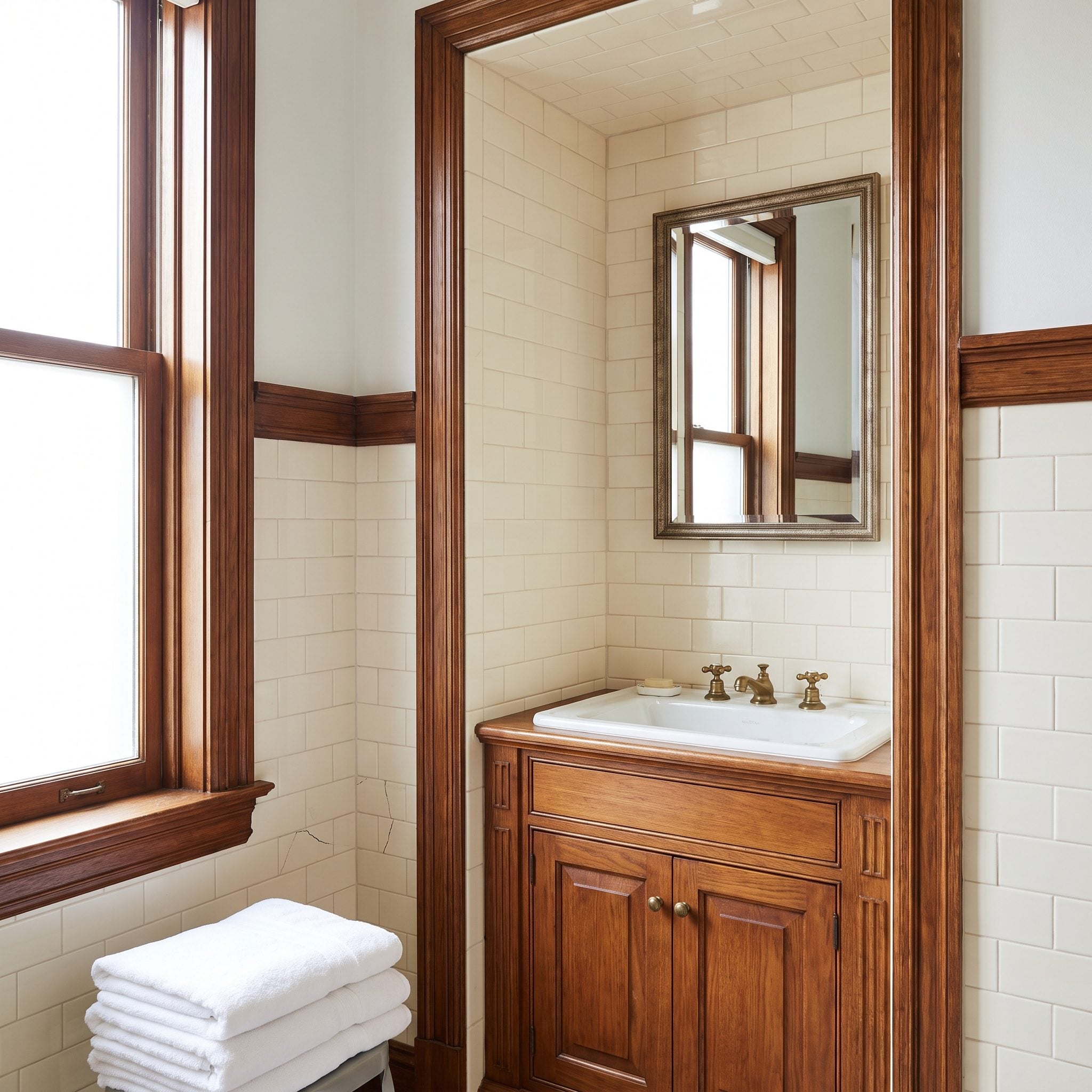
An irregular recess is only wasted space when the furniture ignores it. A fitted vanity can turn that interruption in the wall line into the place where the room’s largest piece of cabinetry naturally belongs.
The cabinet sits within the alcove rather than projecting fully into the main floor area, while the mirror at the back gives the recess visual depth. This is where made-to-measure millwork earns its keep: not by adding decoration, but by converting awkward geometry into useful storage and washing space.
23. They Used a Curbless Shower to Let the Floor Keep Going
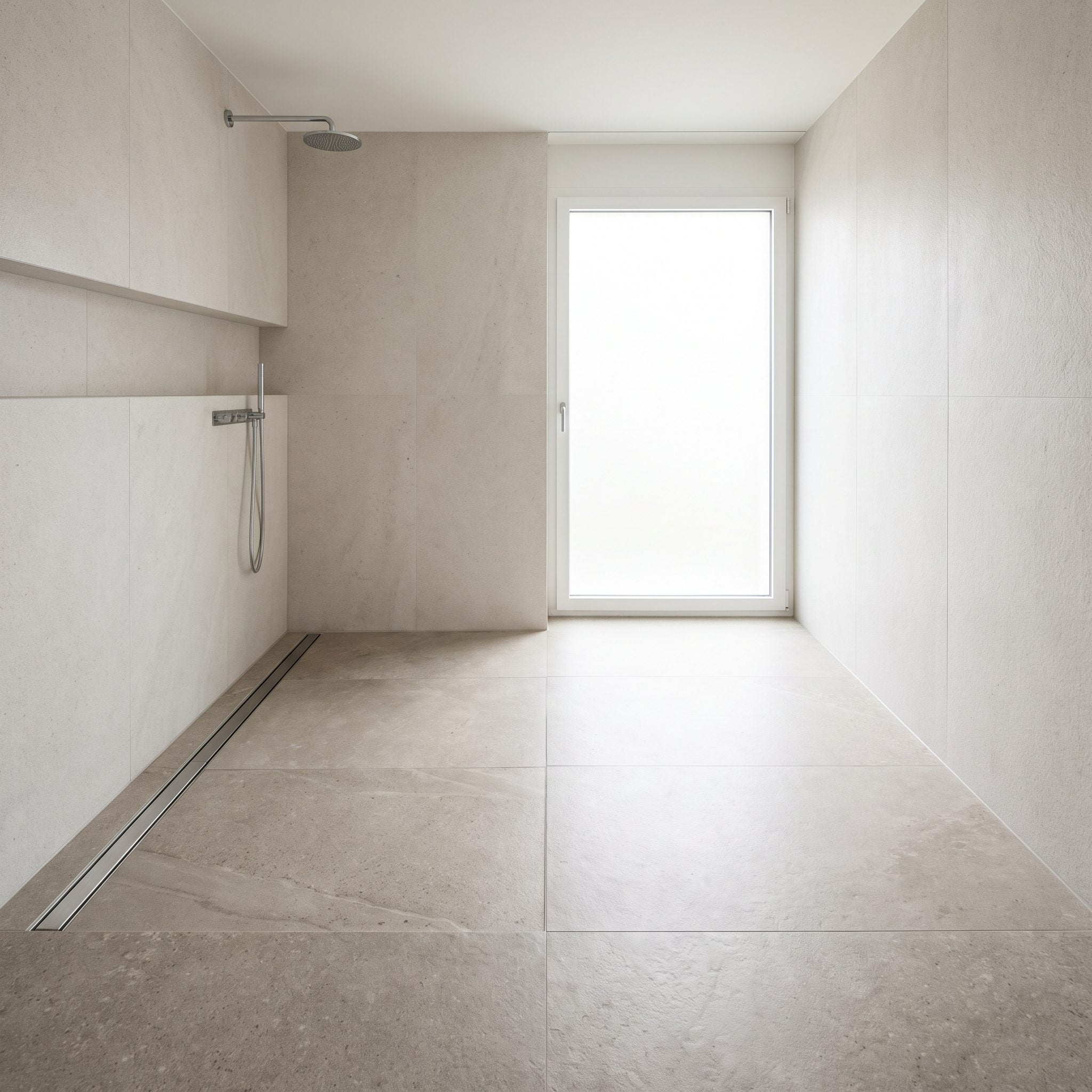
A shower curb may be small, but it draws a definite boundary across the floor. Remove the raised threshold and the tile can continue into the shower as one uninterrupted surface.
That continuity is especially effective here because the grout pattern carries straight through to the linear drain. A curbless shower can also support more accessible planning, although successful installations depend on proper slope, waterproofing, drainage, clearances and suitable floor surfaces—not simply the absence of a curb.
22. They Replaced the Bulky Linen Closet With Shallower Built-In Storage
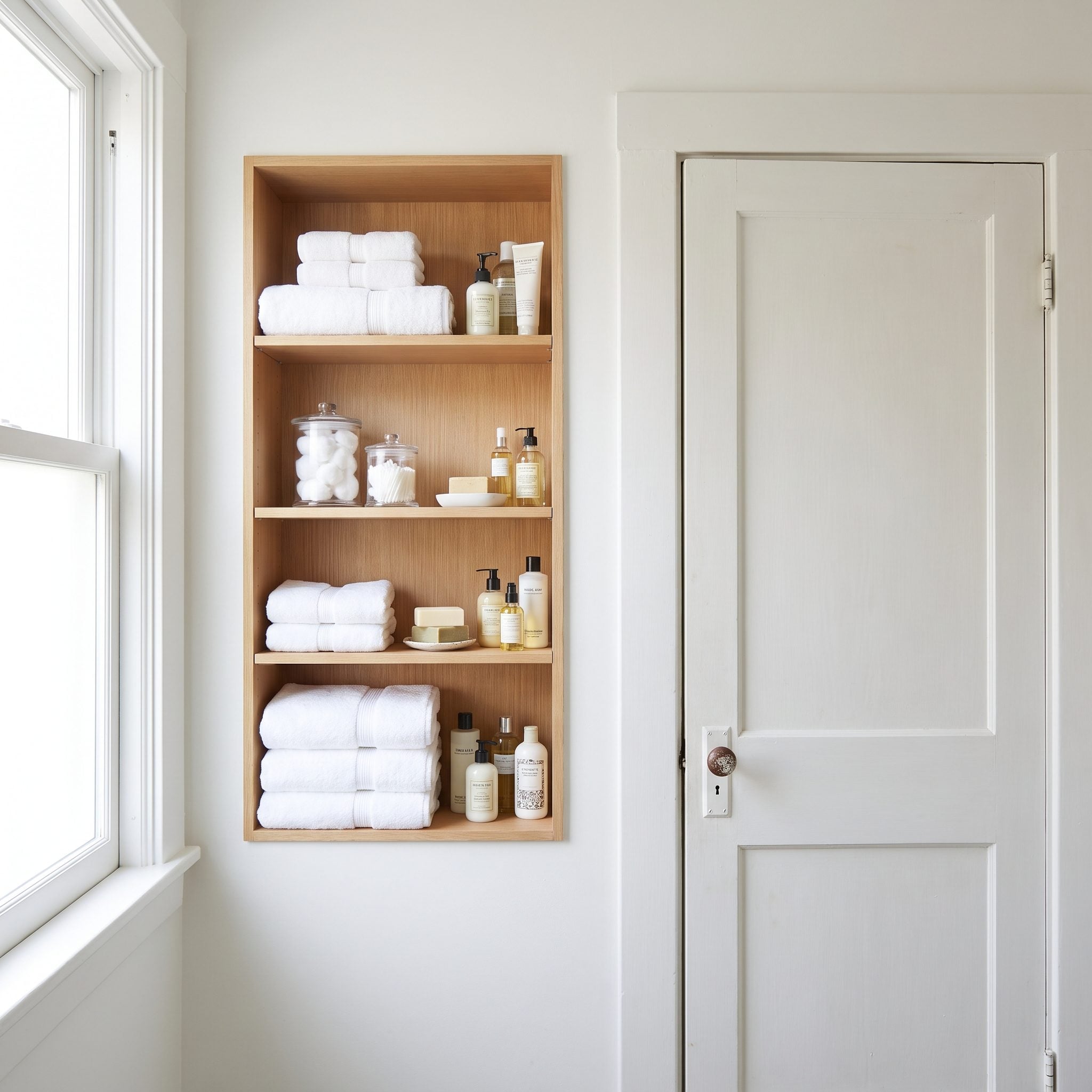
Deep storage is useful for bulky objects. Towels, toiletries and baskets often need considerably less depth, which makes a conventional deep closet an expensive piece of floor area when circulation is already tight.
A shallower built-in column keeps storage close to the wall and makes the contents easier to see at a glance. Where framing and services permit, recessing part of the cabinet can reduce its projection further. The important calculation is not simply how much storage exists, but how efficiently each inch of depth is being used.
21. They Made the Shower Door Slide Sideways Instead of Swinging Into the Room
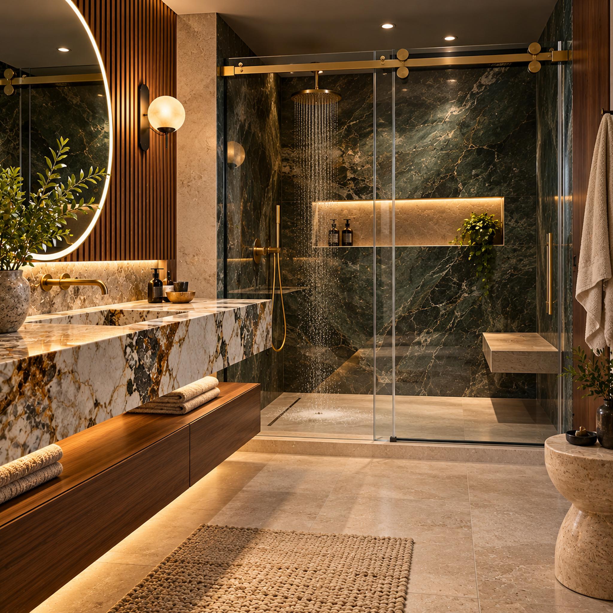
A glass shower door may look visually weightless, but its swing still needs somewhere to go. In a tight layout, that invisible arc can collide with a vanity, towel rail, entry door or the person trying to step out of the shower.
This enclosure sends the glass sideways instead. The sliding panel travels along a brass-toned overhead track, keeping the floor immediately outside the shower free of door-swing geometry while still providing a full enclosure. Dark green stone makes the shower a destination rather than something trying to disappear, proving that space-conscious planning does not have to look timid.
20. They Kept the Tub but Put the Shower Beside It
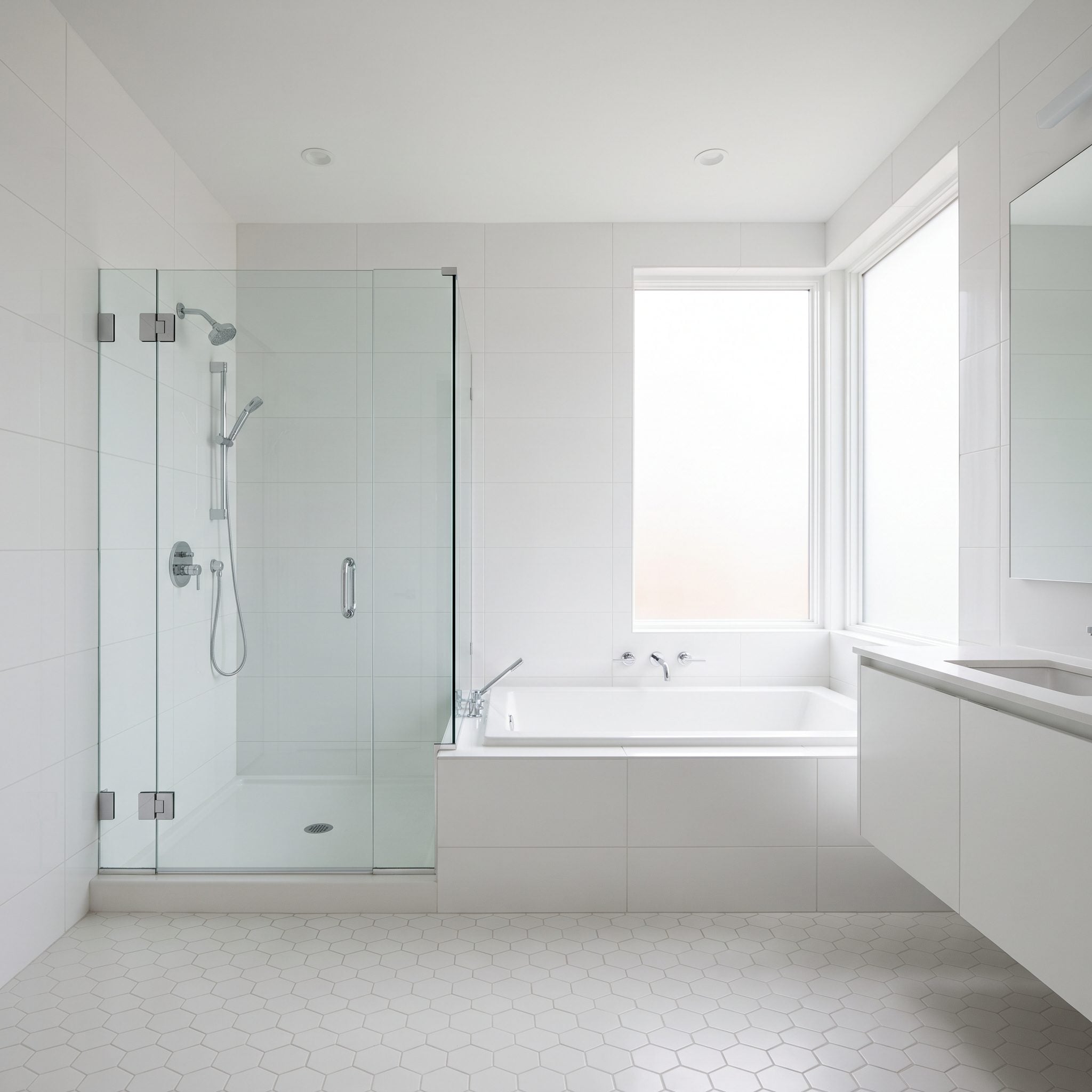
Keeping both a tub and separate shower does not necessarily require scattering them around the room. Put them side by side along the same tiled elevation and the two fixtures begin to read as one coordinated wet-side composition.
The frameless divider preserves the distinction between bathing and showering without introducing an opaque partition. More importantly, the arrangement concentrates two large fixtures along one edge of the room, leaving the remaining floor plan easier to organize.
The useful question isn’t always tub or shower. Sometimes it’s whether both can occupy the same architectural zone.
19. They Fixed the Lighting Before Blaming the Square Footage
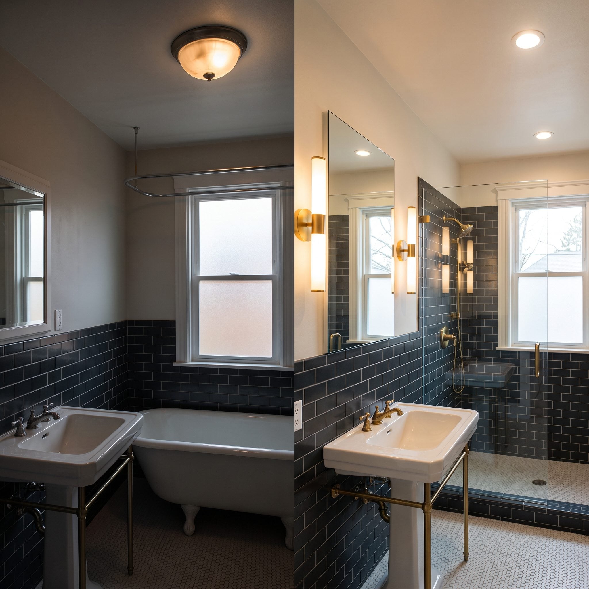
Poor lighting can flatten the vanity, lose corners in shadow and make the boundaries of a compact bathroom harder to read. None of that changes the dimensions, but it can make an already small room feel visually heavy.
Layered illumination gives the architecture more definition. Sconces address the mirror zone while recessed ceiling lights distribute illumination through the rest of the room, allowing walls, floor and corners to register more evenly. Before changing the floor plan, make sure the floor plan can actually be seen.
18. They Used the Awkward Corner for the Shower Instead of Fighting It
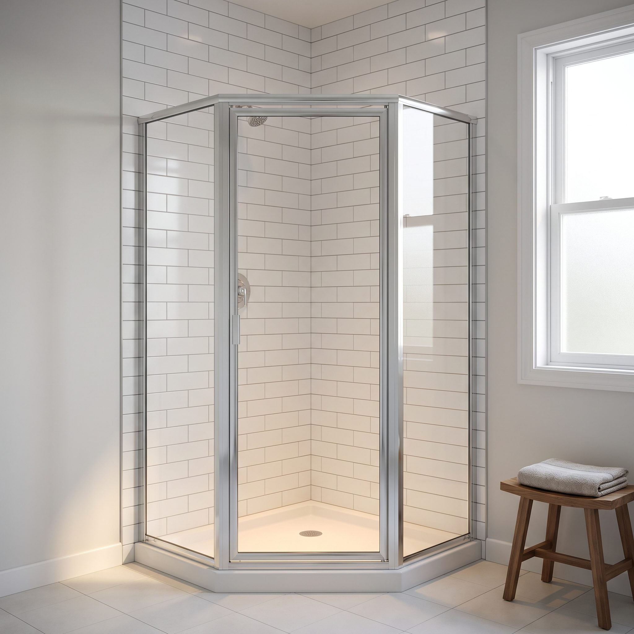
Corners become problematic when rectangular fixtures insist on pretending they aren’t there. A neo-angle shower does the opposite, clipping the outer corner so the enclosure occupies the edge of the plan without projecting as aggressively into the central aisle.
Two frameless glass panels meet at the angle, leaving more open floor around the vanity and circulation route. Brass-toned fixtures and terracotta tile give the enclosure enough character that the geometry feels intentional rather than merely space-saving.
17. They Used a Floating Vanity and Let the Floor Run Underneath
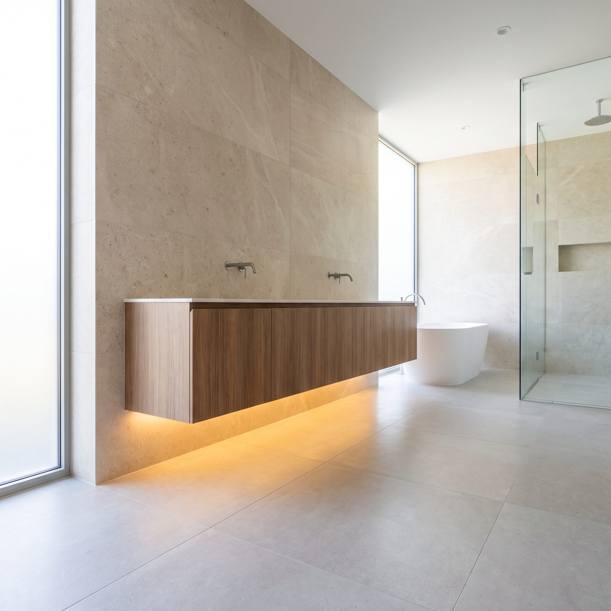
A floating vanity doesn’t create more square footage. What it changes is how much of the floor remains visible.
The floating oak vanity leaves the porcelain floor exposed from front edge to back wall, reducing the amount of cabinetry sitting directly on the ground. The open lower zone can also accommodate baskets or folded towels without turning the entire vanity into a solid block.
16. They Kept the Plumbing on One Wall and Let the Rest of the Room Breathe
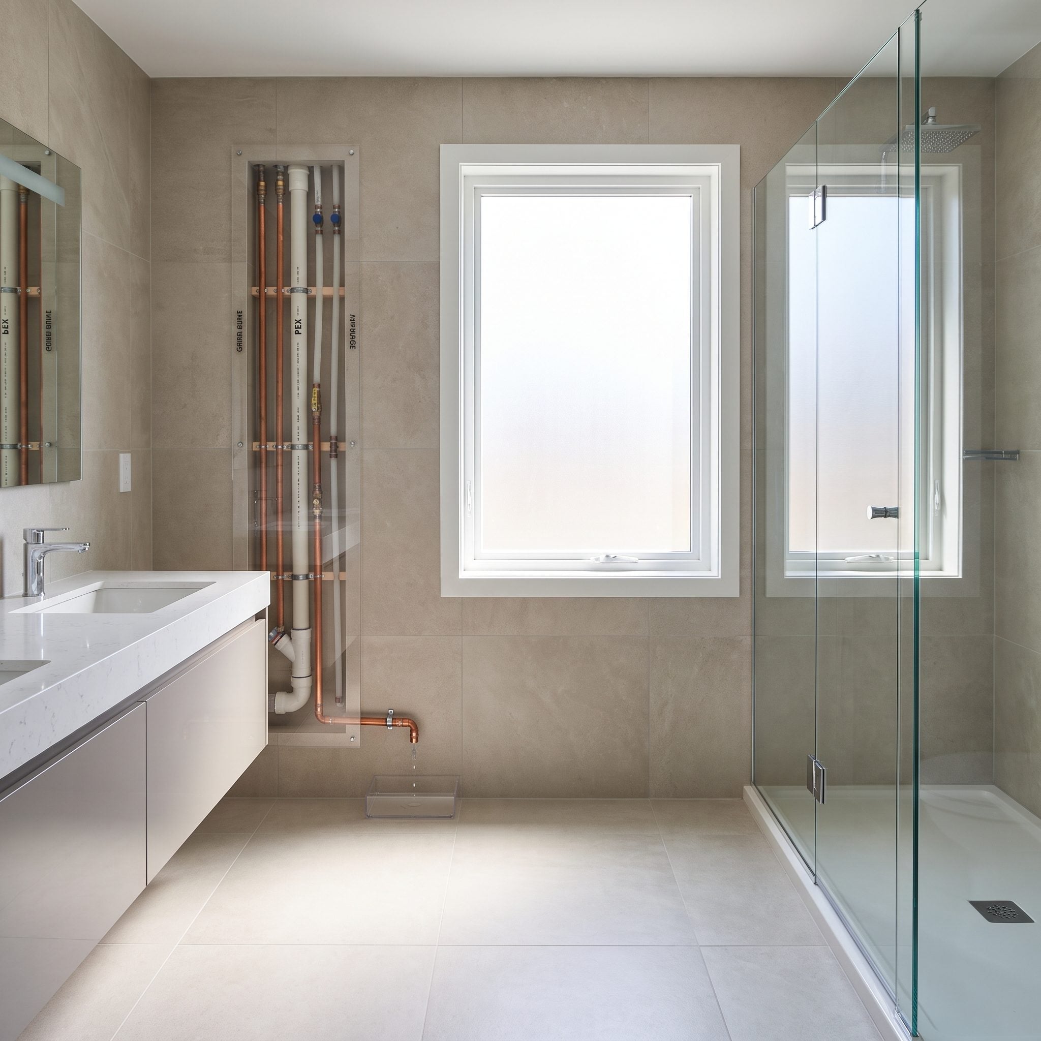
Plumbing can quietly dictate a bathroom long before tile or cabinetry enters the discussion. Where the plan allows it, grouping fixtures along a shared wet wall can simplify supply and waste routing and reduce the number of walls carrying services.
The spatial payoff is visible here. One side handles the plumbing-heavy work while the other remains comparatively open, giving the bench and bare floor room to register. It is not a universal prescription, but when fixture locations cooperate, concentration can be cleaner than scattering.
15. They Replaced the Giant Corner Tub Without Enlarging the Bathroom
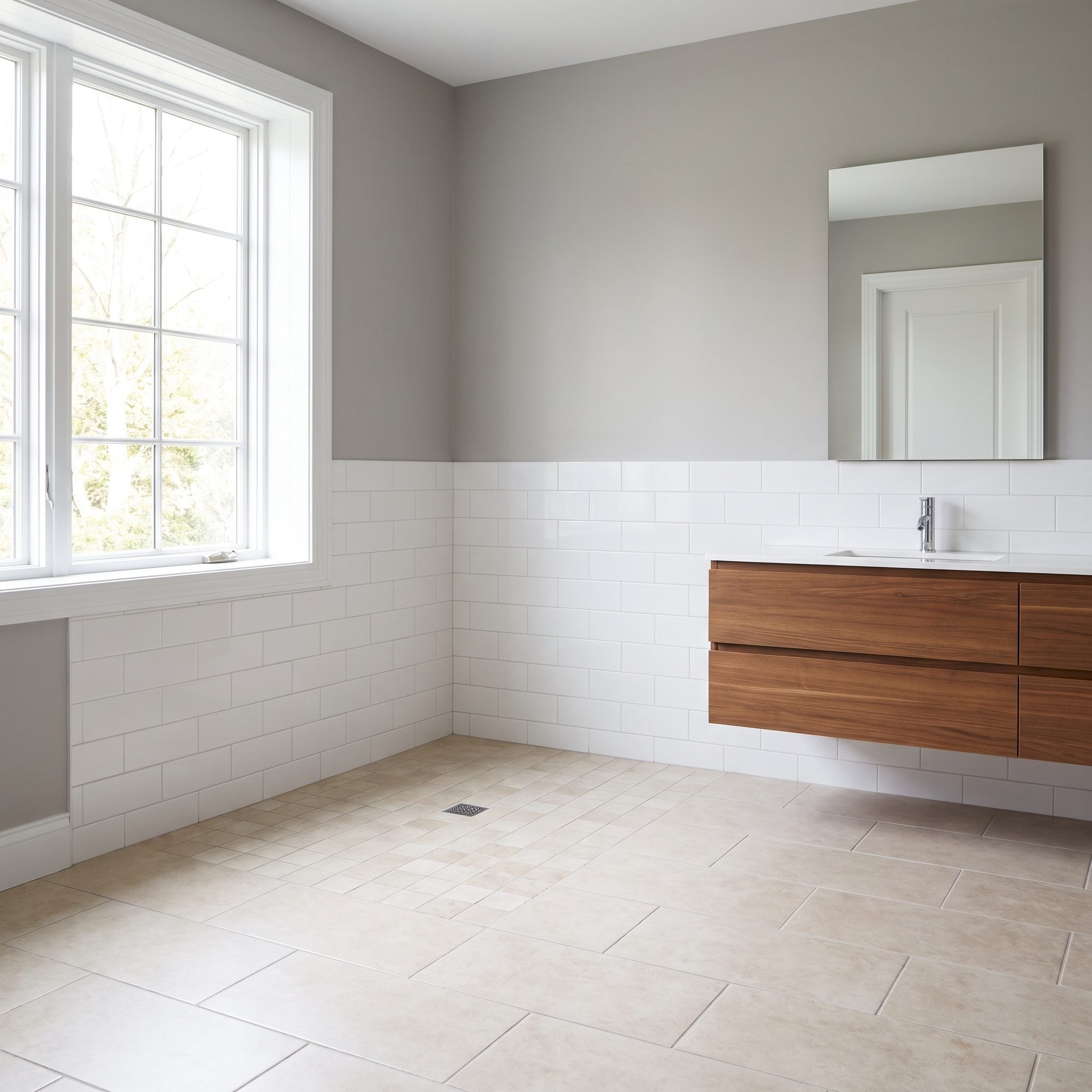
A large corner tub can dominate a bathroom because its diagonal footprint reaches into two directions at once. When that geometry is no longer useful, replacing it with a rectangular tub aligned to one wall can return the plan to a simpler set of lines.
The advantage here is less about claiming a universal amount of saved space than about recovering a more usable shape around the fixture. Plumbing requirements still have to be resolved for the new tub, but the room no longer organizes itself around a large diagonal object.
14. They Let the Vanity Turn the Corner Instead of Forcing It Into a Straight Line
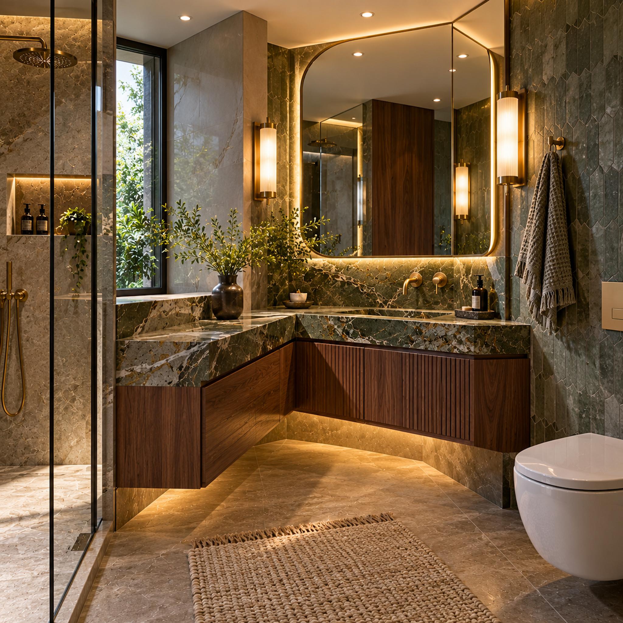
Symmetry would have been the easy answer here. It also would have ignored the room.
Instead, the vanity bends around the corner, using an L-shaped stone counter and floating dark-wood cabinetry to turn two adjoining walls into one continuous washing and storage zone. The basin occupies the longer run while the shorter return becomes useful counter space rather than an awkward leftover corner.
The asymmetry is what makes the composition feel deliberate. A huge illuminated mirror follows the main elevation, the stone wraps around the turn, and open floor remains beneath the floating cabinetry. Instead of centering a standard vanity and accepting useless strips of space at either side, the millwork follows the architecture it actually has.
13. They Used the Space Above the Toilet Instead of Asking the Floor for More
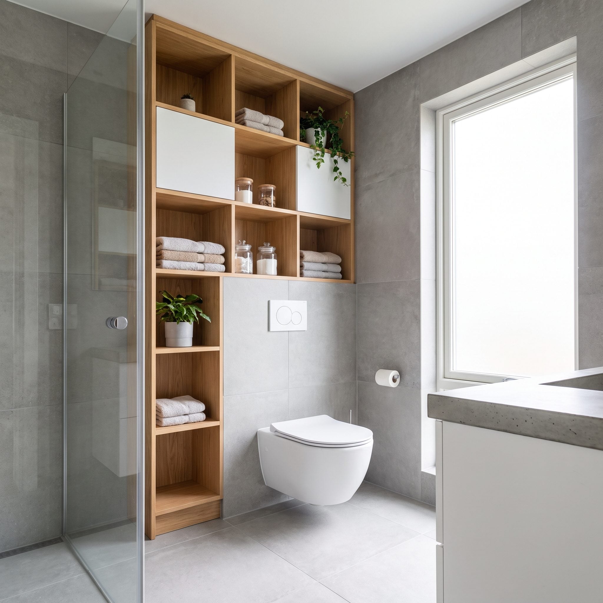
The wall above a toilet is one of the few storage locations that can add capacity without taking another bite out of the walking area.
Three floating shelves turn that blank vertical zone into towel and accessory storage while keeping the floor completely untouched. The stacked arrangement also gives the wall a deliberate vertical composition rather than leaving the toilet stranded beneath a large patch of nothing.
12. They Turned the Tub and Shower Into One Shared Wet Zone
🔥 Would you like to save this?
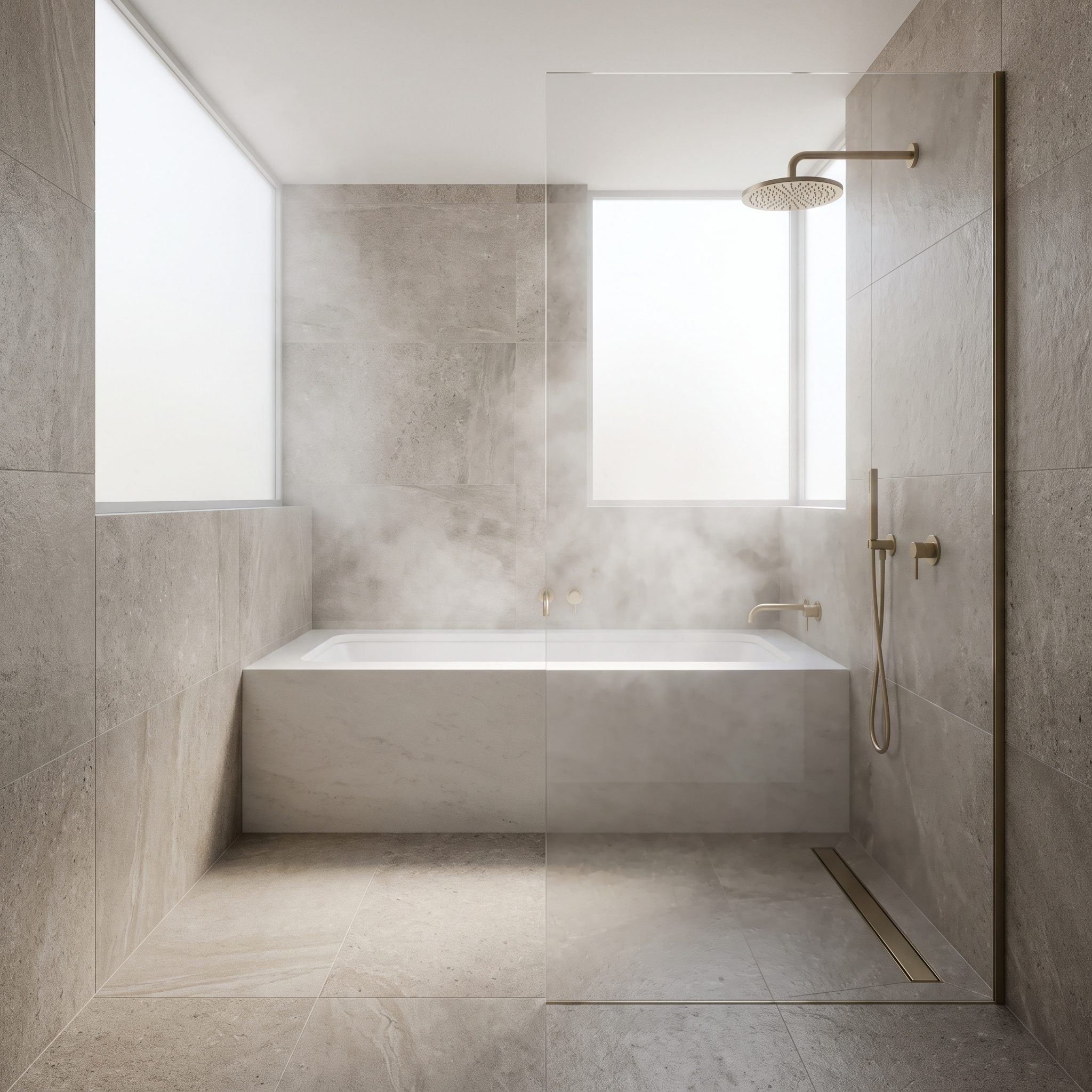
Putting the tub and shower beside each other is one strategy. Bringing both fixtures inside the same waterproofed zone takes the consolidation considerably further.
Tile runs continuously around the bathing area, one glass boundary contains the wet zone, and the remaining bathroom stays comparatively open. Instead of treating tub and shower as two large objects each demanding its own territory, the architecture gives them one shared address. The apparent simplicity depends on careful waterproofing, drainage, splash control and fixture spacing underneath.
11. They Chose a More Compact Toilet to Improve Circulation
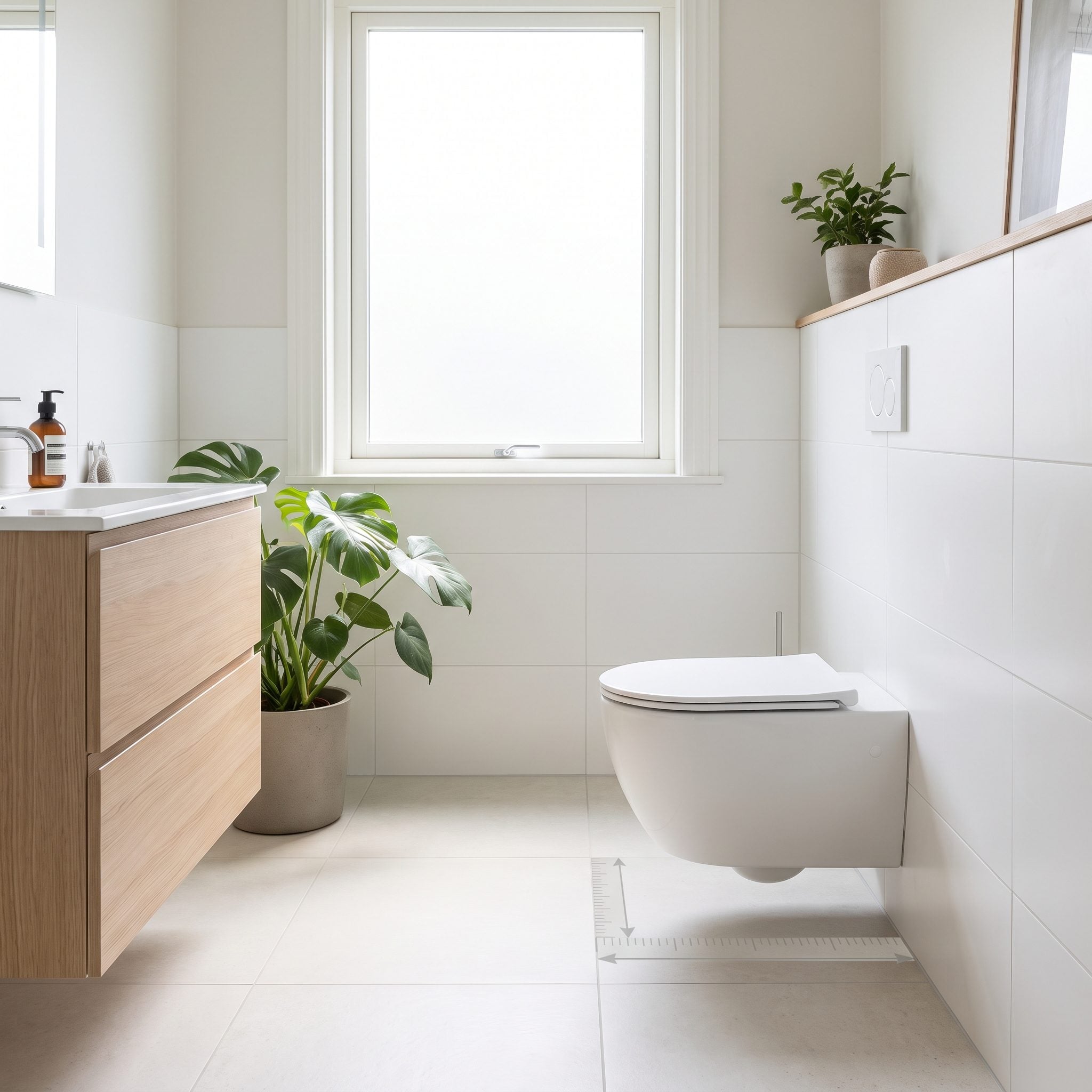
Toilets vary in how far they project from the wall, and a few inches can matter when the circulation route passes directly in front of the bowl.
The short-projection model here leaves more of that narrow passage available without requiring the room to advertise the change. That’s part of the appeal: the fixture still reads as a conventional toilet, while the floor around it becomes easier to navigate. In compact planning, invisible inches can be the most valuable ones.
10. They Used One Fixed Glass Panel Instead of Building a Full Shower Enclosure
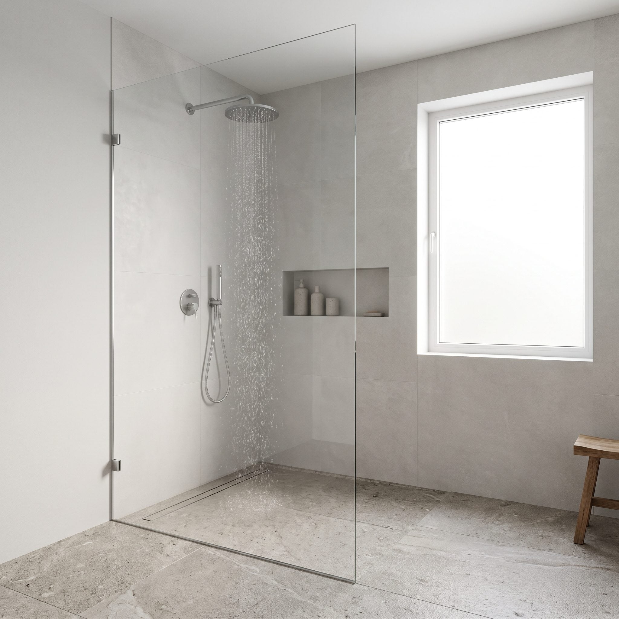
A shower doesn’t always need a hinged door, track and full enclosure. Where dimensions and spray patterns permit, one fixed glass panel can define the wet area while leaving the entry open.
The result is particularly useful in a tight plan because there is no shower-door swing competing with the bathroom door, vanity or walking route. The herringbone tile continues visibly behind the glass, while brass-toned fixtures give the shower definition without requiring a heavy frame around it.
9. They Stopped Putting Storage in the Main Walking Path
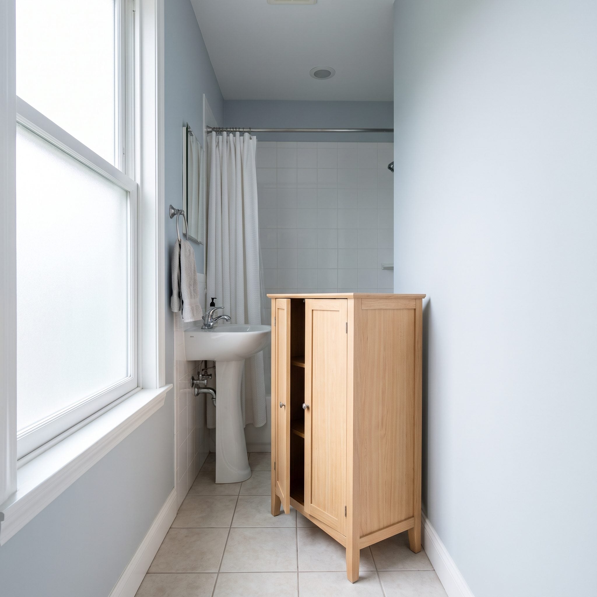
Storage capacity is only useful if the cabinet isn’t making the room harder to use. A tall unit projecting into the primary route can turn perfectly adequate square footage into an obstacle course.
Here the linen cabinet retreats to the perimeter, keeping the center of the bathroom comparatively clear. Dusty sage cabinetry and brass-toned hardware give the storage presence without demanding that it become the room’s focal point. Storage can go shallower or climb higher; sometimes the most important decision is simply getting it out of the traffic lane.
8. They Installed a Pocket Door and Deleted the Swing Zone
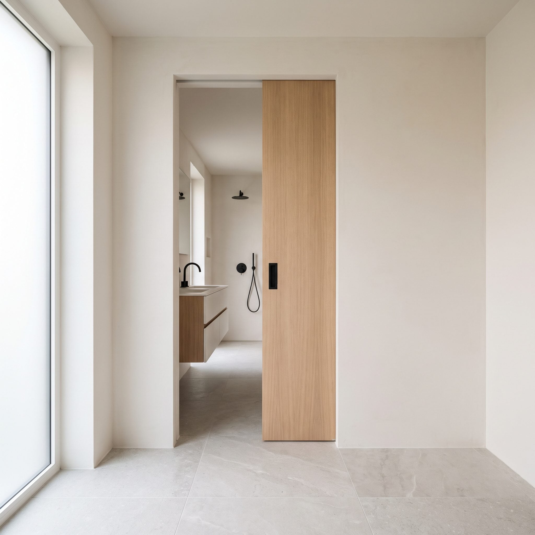
A pocket door changes the entry geometry completely. Instead of reserving a quarter-circle of floor for a swinging slab, the door slides into a framed pocket and leaves both sides of the opening available.
That can be transformative in a bathroom where the vanity, toilet and entry are competing for the same few feet. Installation does require opening and rebuilding part of the wall, and the pocket area has to accommodate the frame without conflicting with structure, plumbing or electrical services. The room isn’t becoming larger. One persistent piece of circulation geometry is simply being removed.
7. They Put the Fixtures in Sequence Instead of Making the Room a Slalom Course
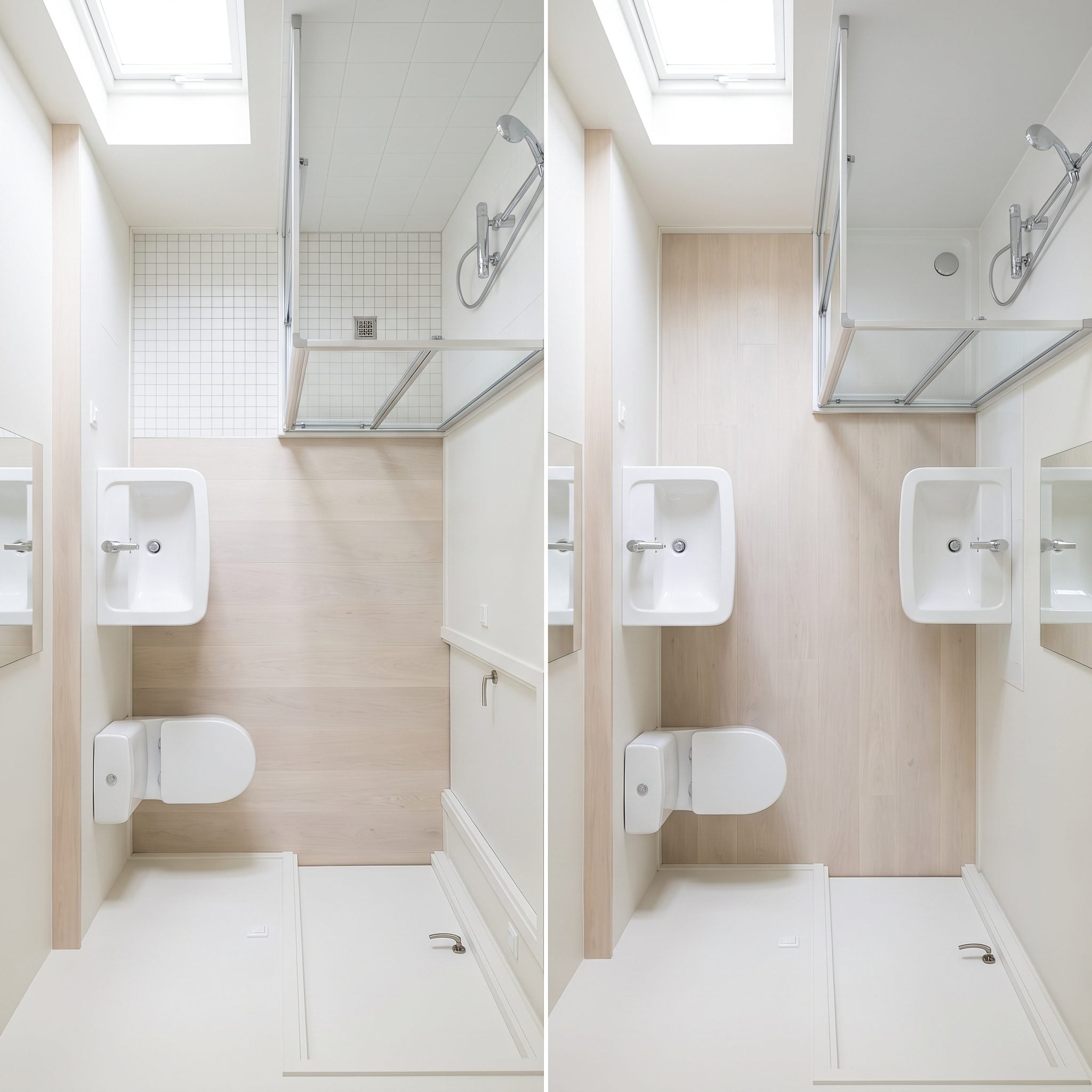
A sink on one side, toilet on another and shower pushed into the opposite corner can leave the body zigzagging through a room that wasn’t generous to begin with.
Here the vanity, toilet and shower form a readable sequence along one side, leaving the opposing edge comparatively free. The idea is less about plumbing economy than circulation: the fixtures stop competing for the center, and the route through the room stops behaving like an obstacle course.
6. They Ran the Vanity Wall to Wall and Quit Wasting the Strips at Either End
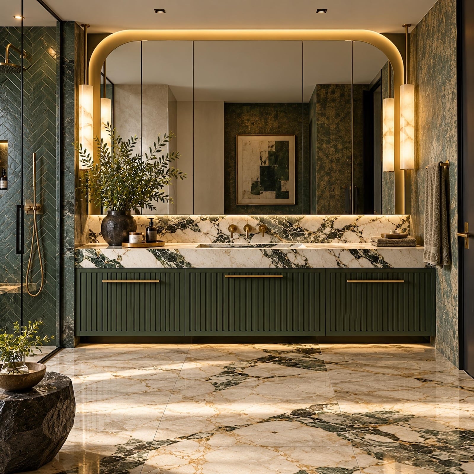
Centering a vanity can look orderly while quietly creating two narrow leftovers that are too small to do much of anything. This room takes the opposite approach: cabinetry and counter stretch decisively from wall to wall, turning the entire elevation into useful storage, washing space and counter.
The move feels especially strong because the vanity is treated as architecture rather than freestanding furniture. Deep green ribbed fronts establish a continuous base, dramatic pale stone runs across the top and backsplash, and the oversized mirror claims almost the entire wall above. There are no apologetic filler strips pretending to be breathing room.
This is not about making every vanity as large as possible. It is about recognizing when the wall itself should determine the cabinetry. If the room has already committed that elevation to the sink, using the whole width can be more coherent—and more useful—than centering a smaller box within it.
5. They Reversed the Door Swing and Gave the Interior Floor Back
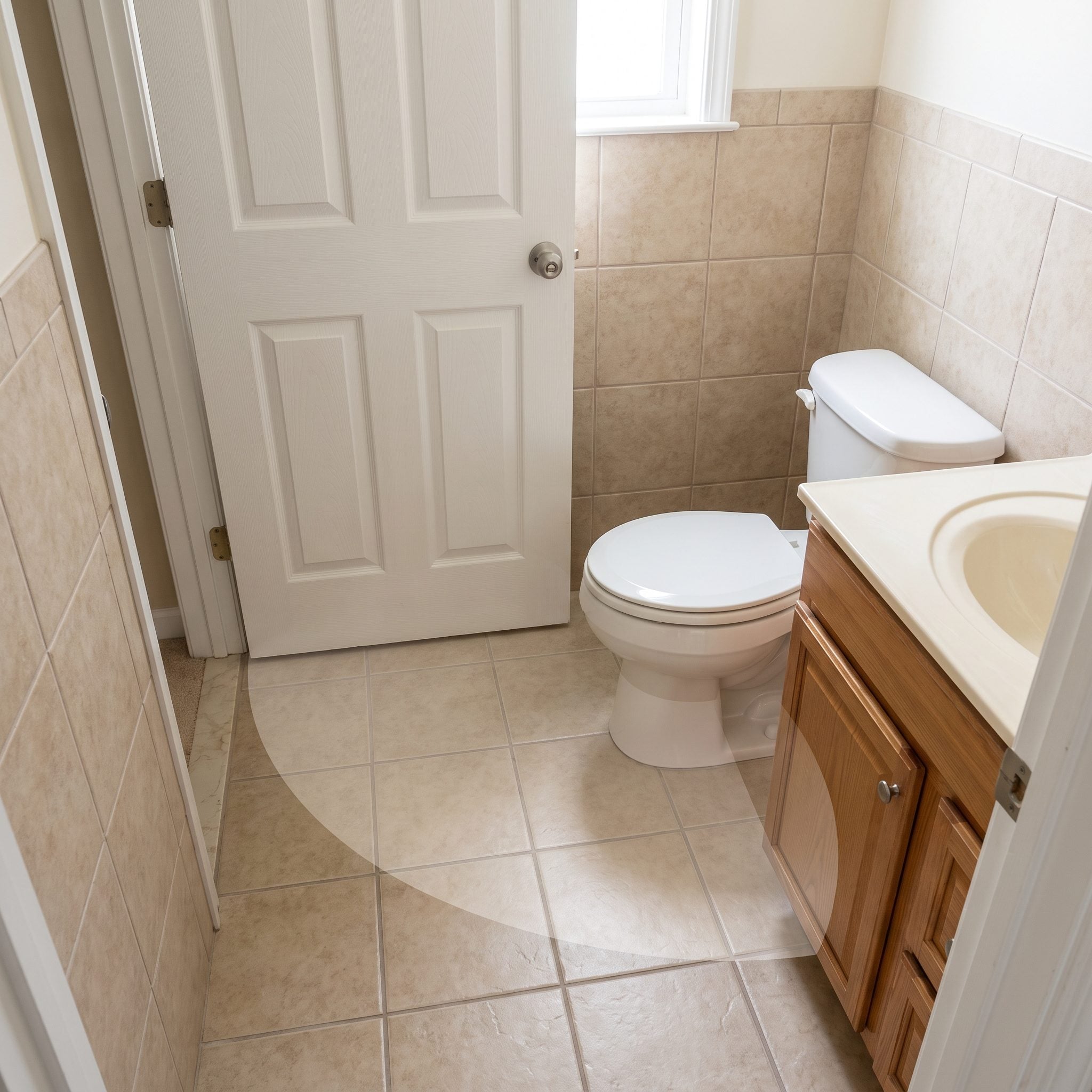
An inward-swinging door reserves a curved piece of bathroom floor every time it opens. In a generous room that may be irrelevant. In a tight one, the arc can determine whether cabinetry fits comfortably or whether two people can move around each other.
Reversing the swing moves that conflict outside the bathroom and allows the navy vanity to occupy the interior more comfortably. The change is not appropriate everywhere: hallway clearance, local requirements, existing jamb construction and adjacent circulation all need consideration. But the door is worth questioning before the wall is.
4. They Expanded the Shower Into Space an Unused Tub Had Been Occupying
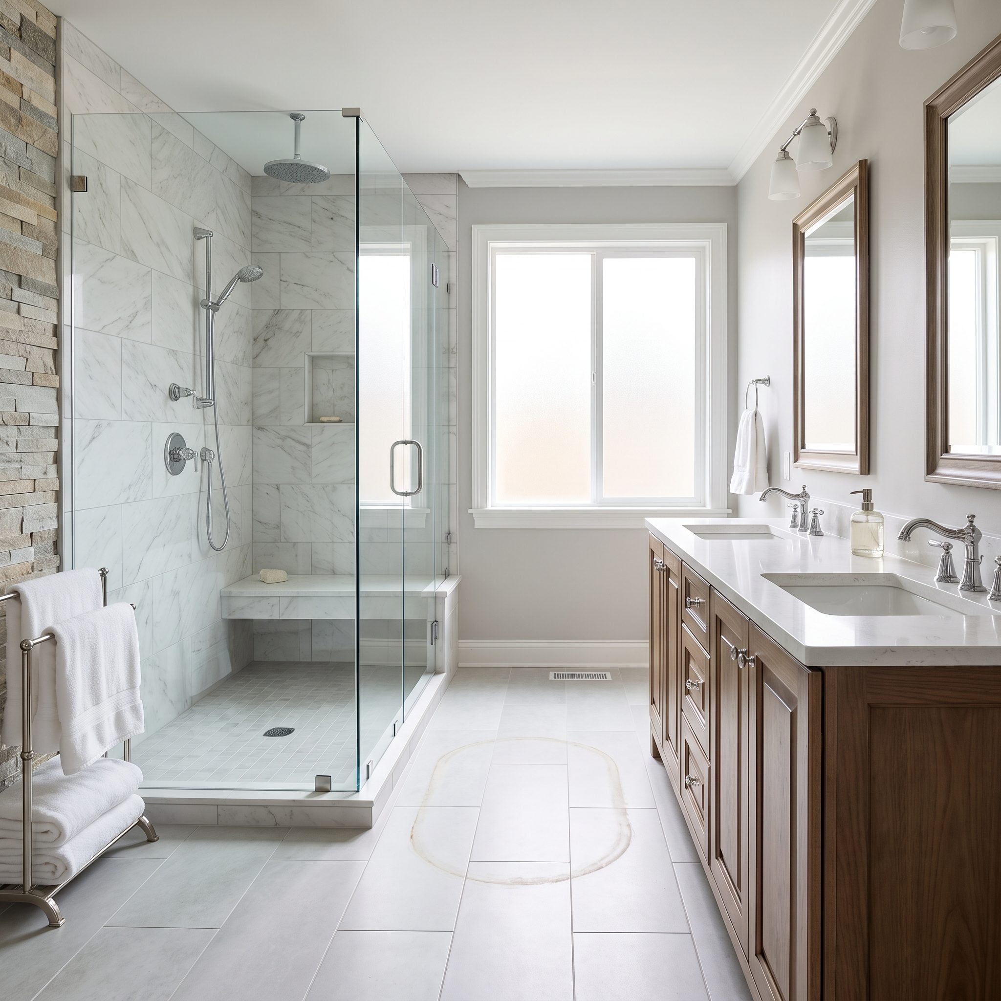
For a household that genuinely doesn’t use the bathtub, preserving one can mean dedicating a large part of the room to a function nobody needs.
Letting the shower take over that run of wall creates space for a bench and a more generous enclosure without enlarging the bathroom itself. A wood vanity and chrome-toned fixtures keep the remaining elements straightforward. This is not an argument against tubs; it is an argument against giving prime floor area to a fixture that doesn’t match how the bathroom is used.
3. They Used Mirrors and Continuous Finishes to Stop Chopping the Room Into Pieces
🔥 Would you like to save this?
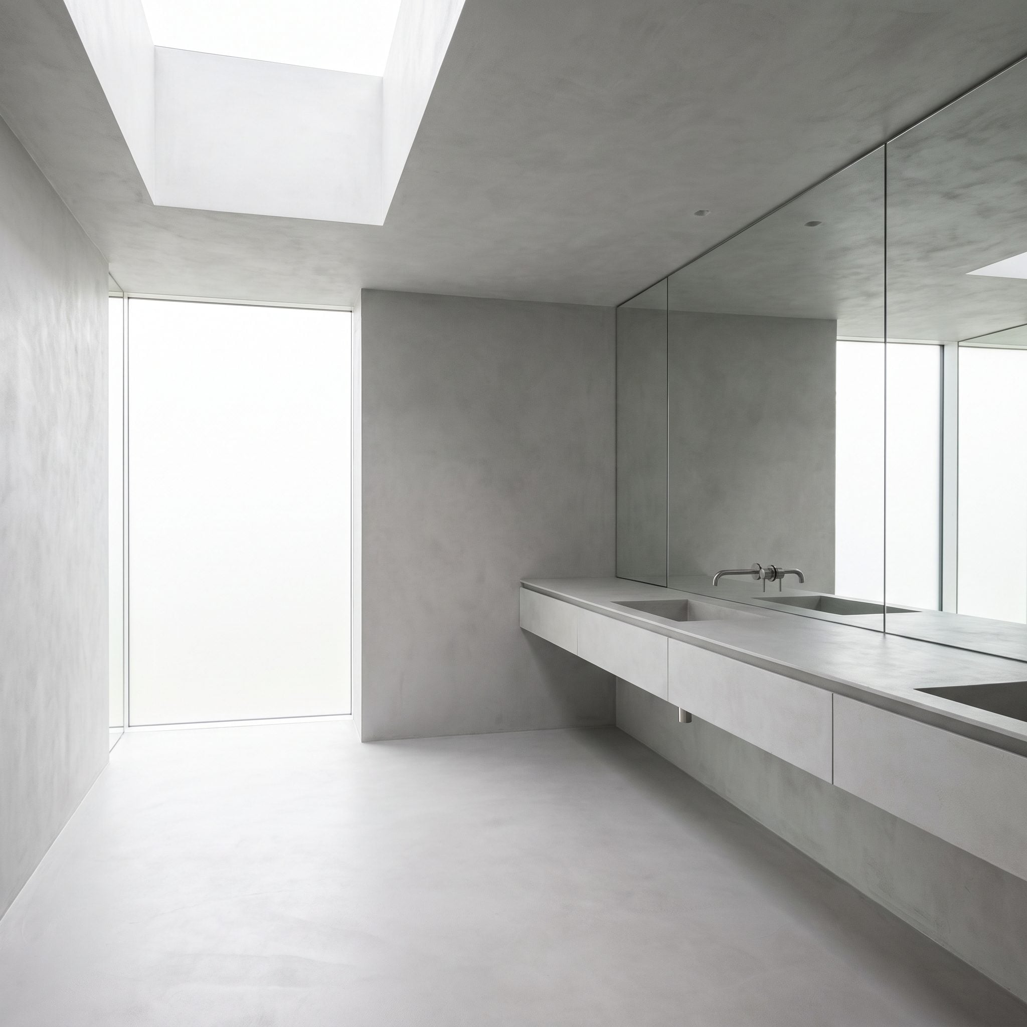
Small rooms can support pattern and contrast, but every material transition creates another boundary for the composition to manage. Here the strategy goes deliberately quiet.
Taupe tile runs across broad surfaces with few interruptions, while a full-width frameless mirror expands the visual field above the floating wood vanity and redistributes light from the window. Nothing has been added to the footprint. The room simply presents fewer competing fragments at once.
2. They Let One Floor Finish Run Straight Through the Glass
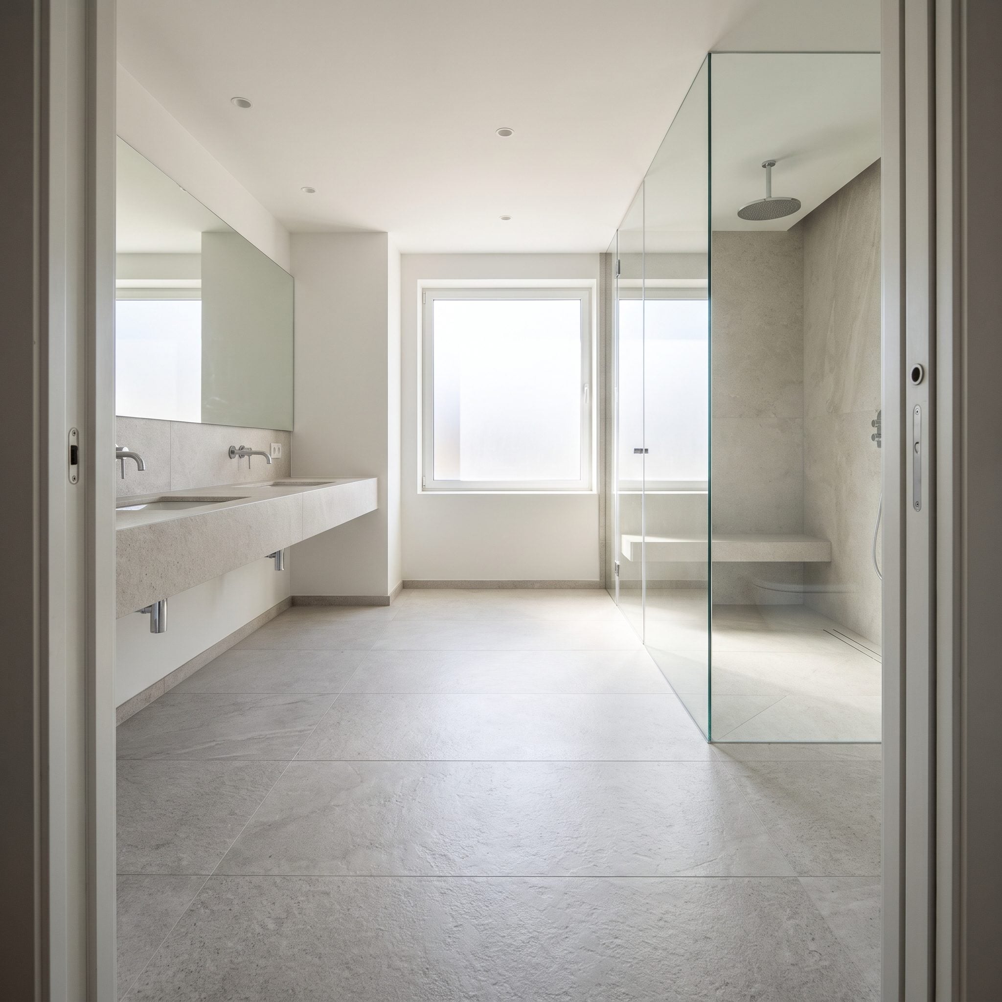
Removing the curb is one move. Making the shower floor visually disappear into the rest of the bathroom takes the idea further.
The same gray stone-look tile runs through the glass boundary without introducing a new pattern at the shower entrance. That lets the floor register as one plane extending to the back wall rather than a main floor followed by a separate shower floor. Clear glass preserves the view across both.
1. They Mocked Up the New Layout Before Giving the Sledgehammer a Vote
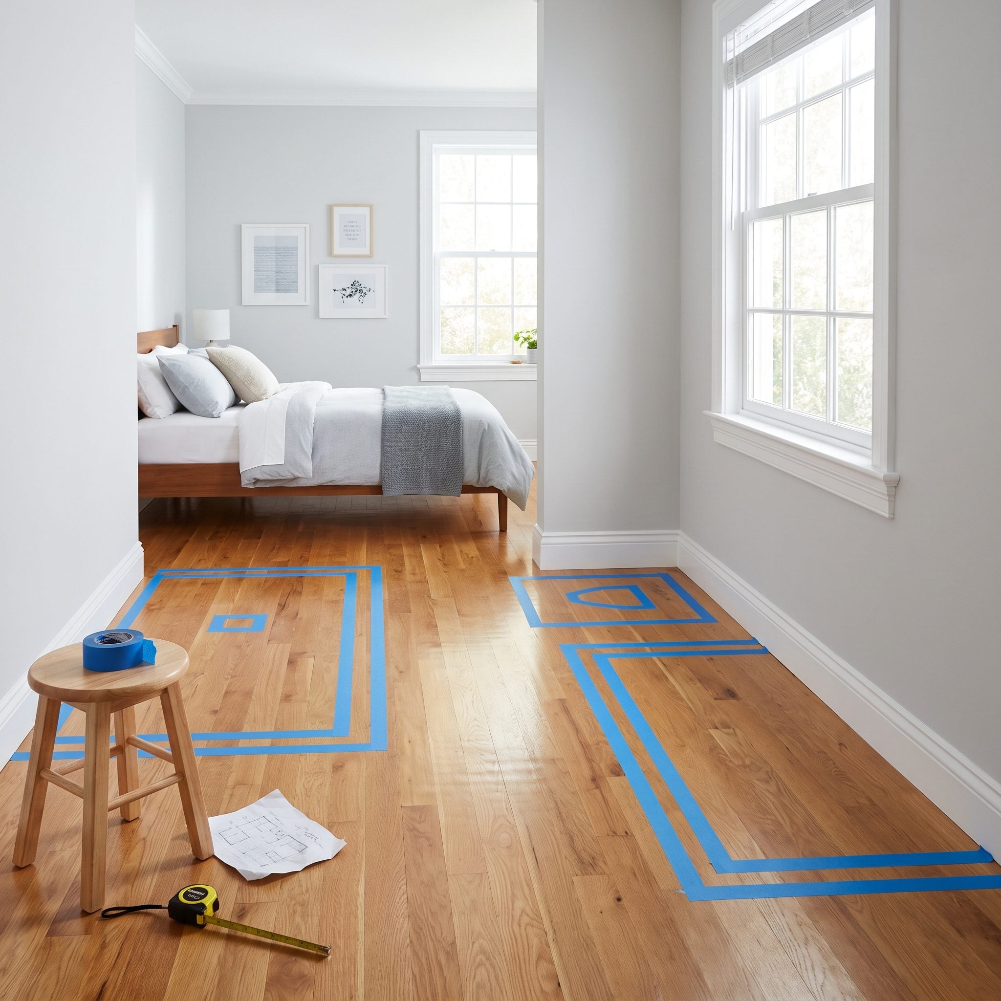
This may be the least glamorous design move in the gallery and the one worth doing before almost all the others. Full-scale painter’s tape can mark the proposed footprint of a tub, vanity, shower, cabinet, partition or door swing directly on the existing floor.
Then the measurements stop being abstract. Walk the route. Stand at the sink. Open the imaginary door. Step out of the proposed shower. Reach toward the place a towel would hang. A dimension that looks perfectly reasonable on paper can feel very different when a body has to move around it.
That is the thread running through all 36 layouts. A wall is obvious, expensive and wonderfully satisfying to blame. But square footage is only one part of the equation. A room can gain usable space by changing a swing, a projection, a fixture orientation, a storage depth, a glass panel or the shape of a vanity long before the demolition gets dramatic.
Sometimes the wall really does need to go. The point is to make it prove its guilt first.