🔥 Would you like to save this?
The accent wall has had a very long run. One wall gets the plum, forest green or inky navy while the other three stand around in sensible neutrals, apparently there to supervise. These 34 rooms ask a more interesting question: what happens when the bold idea doesn’t stop at the corner?
Sometimes the answer is color drenching—walls, trim, doors, cabinetry and ceiling pulled into one saturated field. Elsewhere, limewash rolls uninterrupted overhead, walnut wraps the room like millwork architecture, or warm plaster moves across arches and fireplaces without picking a favorite wall. The effect isn’t simply “more color.” Edges soften, architectural details change rank and furniture suddenly has a completely different job to do.
In order to come up with the very specific design ideas, we create most designs with the assistance of state-of-the-art AI interior design software. Also, assume links that take you off the site are affiliate links such as links to Amazon. this means we may earn a commission if you buy something.
Dark rooms become enveloping rather than chopped into contrasting planes. Pale rooms prove commitment doesn’t require drama. Kitchens let cabinetry merge with architecture; libraries allow books to become the pattern; tiny powder rooms quit apologizing for being tiny. Even wood grain can do what an accent wall usually tries to do, only with considerably more depth.
So forget the lonely rectangle of statement paint for a moment. From forest green and burgundy to peach, clay, walnut and barely-there cream, these rooms show what happens when the whole envelope gets involved.
34. Deep Forest Green Living Room, Walls, Trim, Doors, and Ceiling All Commit
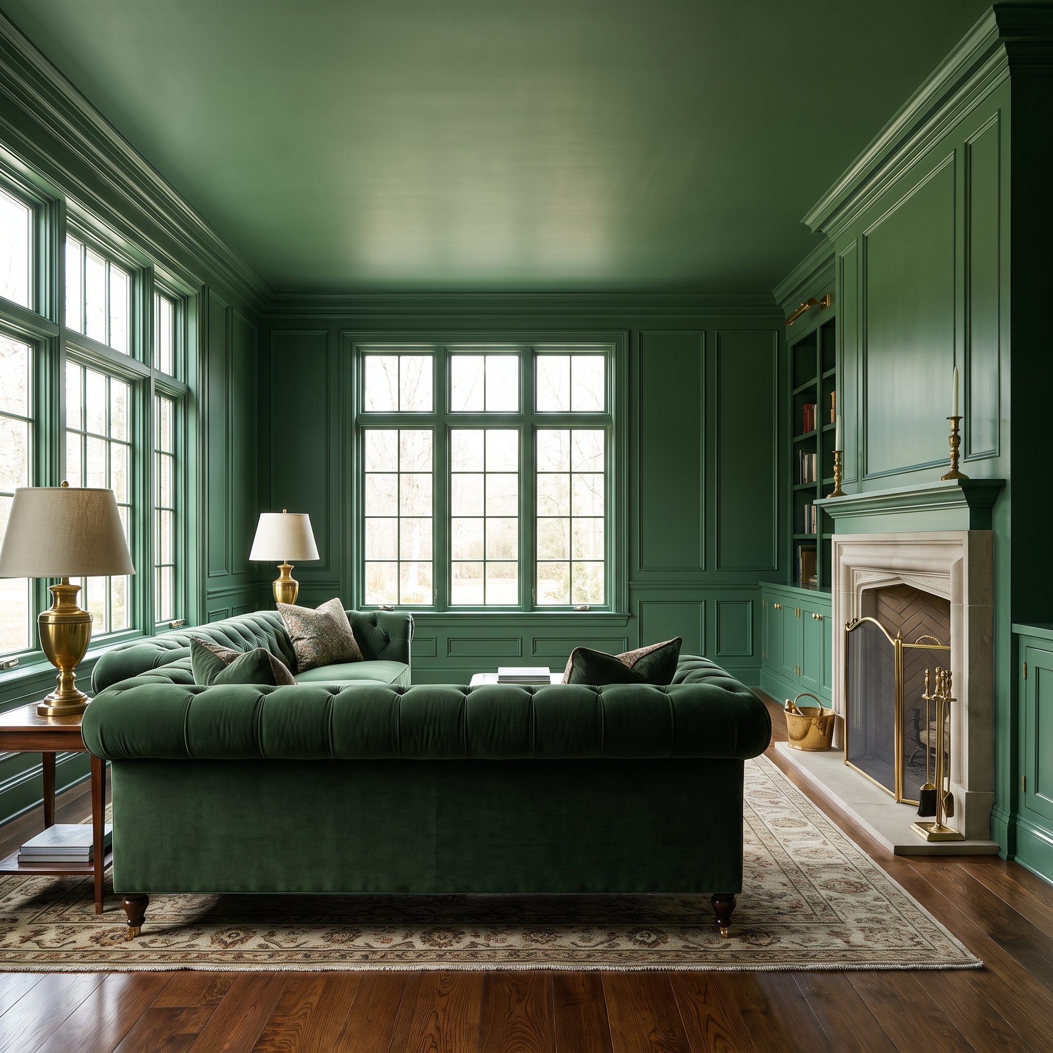
One forest green wall would have made the sofa wall the event. Taking the color across the walls, crown molding, door and ceiling changes the hierarchy completely. No surface is volunteering to be the feature because the room itself has become the feature.
That leaves the caramel leather sofa and brass arc floor lamp to supply the contrast. Caramel warms the green; brass catches the light; neither has to compete with white trim outlining every opening.
33. Rust Dining Room, Walls and Woodwork Wrap the Table in Warmth
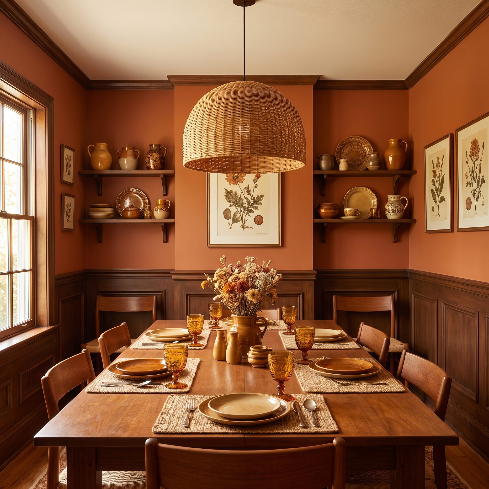
Rust can look tentative when it’s isolated on a single surface. Across walls, wainscoting and trim, it stops behaving like an accent and becomes the room’s temperature. Even on a gray day, the palette carries some of the warmth of late-afternoon light.
The oak table and rattan pendant light stay natural against the saturated backdrop. That’s the useful lesson in this dining room: an earthy wall color doesn’t necessarily need another competing hue. Grain, weave and warm wood supply plenty of variation.
32. Dusty Blue Bedroom, Door and Moldings Disappear Into the Same Soft Blue
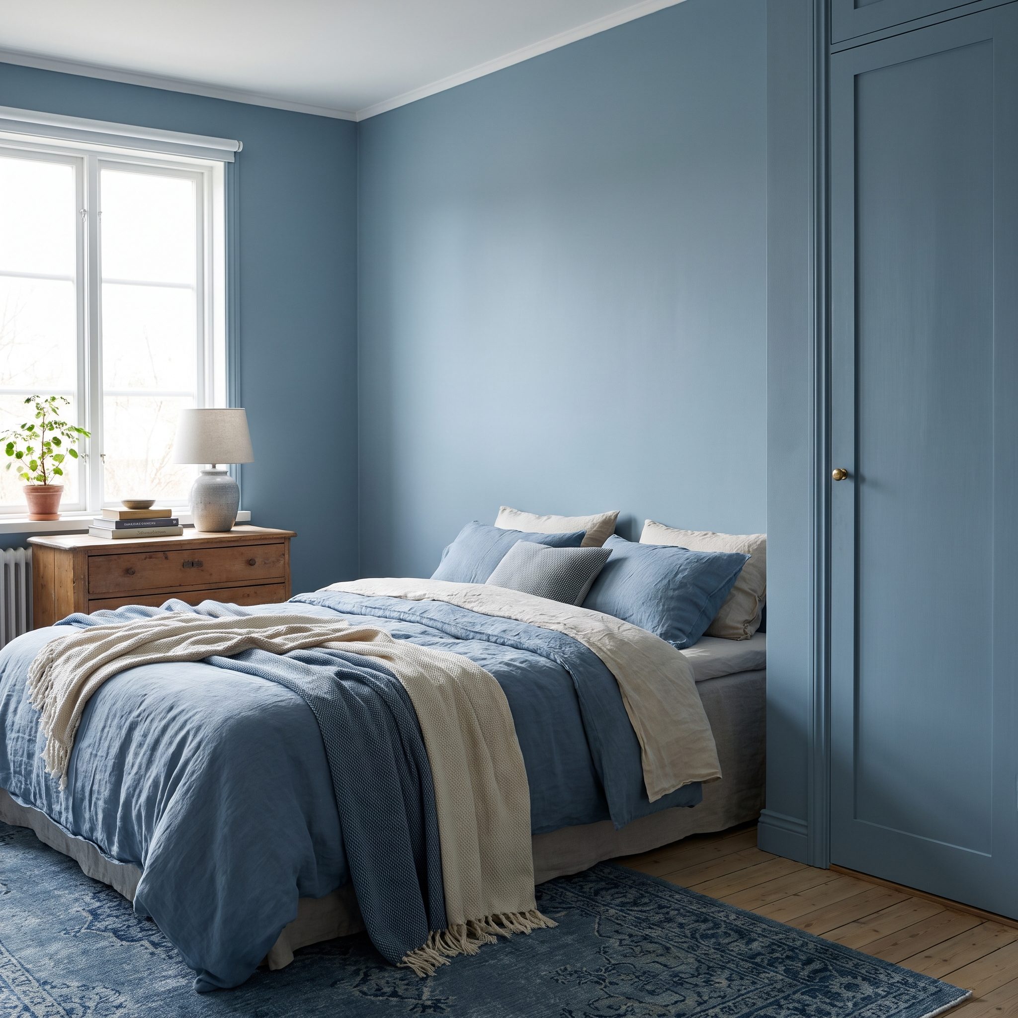
Watch the door. Paint it dusty blue along with the walls and moldings and it stops behaving like a large contrasting rectangle. The opening remains, but the architecture becomes quieter around it.
That gives the oatmeal linen headboard more presence without making the bed scream for attention. Dusty blue also occupies a useful middle ground: softer than navy, more substantial than an icy pastel and muted enough to take over an entire room without becoming sugary.
31. Natural Wood Home Office, Walls, Built-Ins, and Ceiling Trade the Feature Wall for Grain
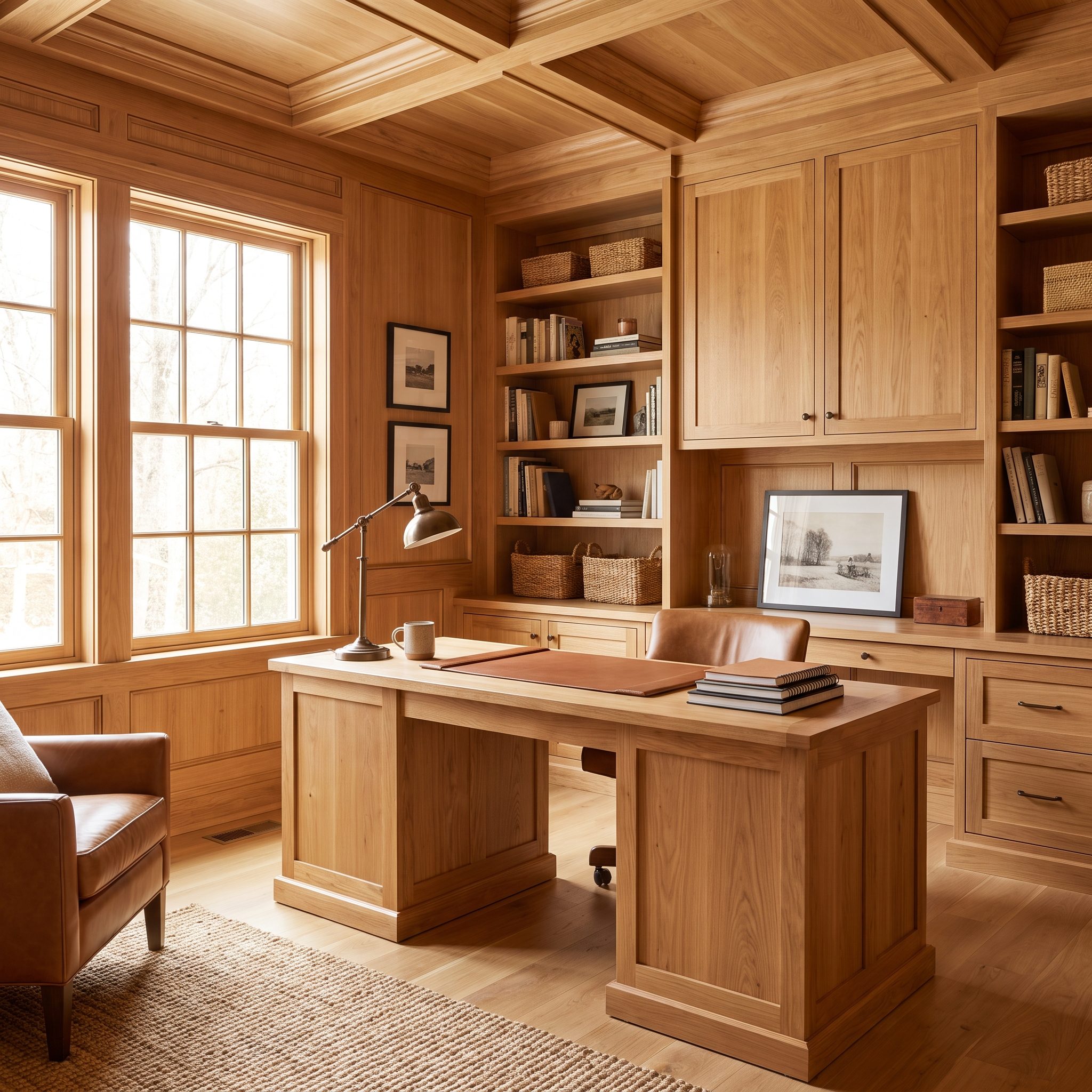
Paint isn’t the only way to make the whole room commit. White oak climbs the walls, crosses the built-in desk and shelving and continues over the ceiling, replacing a conventional feature wall with uninterrupted grain.
The payoff is texture rather than contrast. Light moves across the timber differently on every plane, so the room changes without introducing another color. The walnut desk chair deepens the wood palette while the brass task lamp gives all that matte grain one precise glint.
30. Burgundy Dining Room, Deep Red Continues Across Walls, Trim, and Ceiling
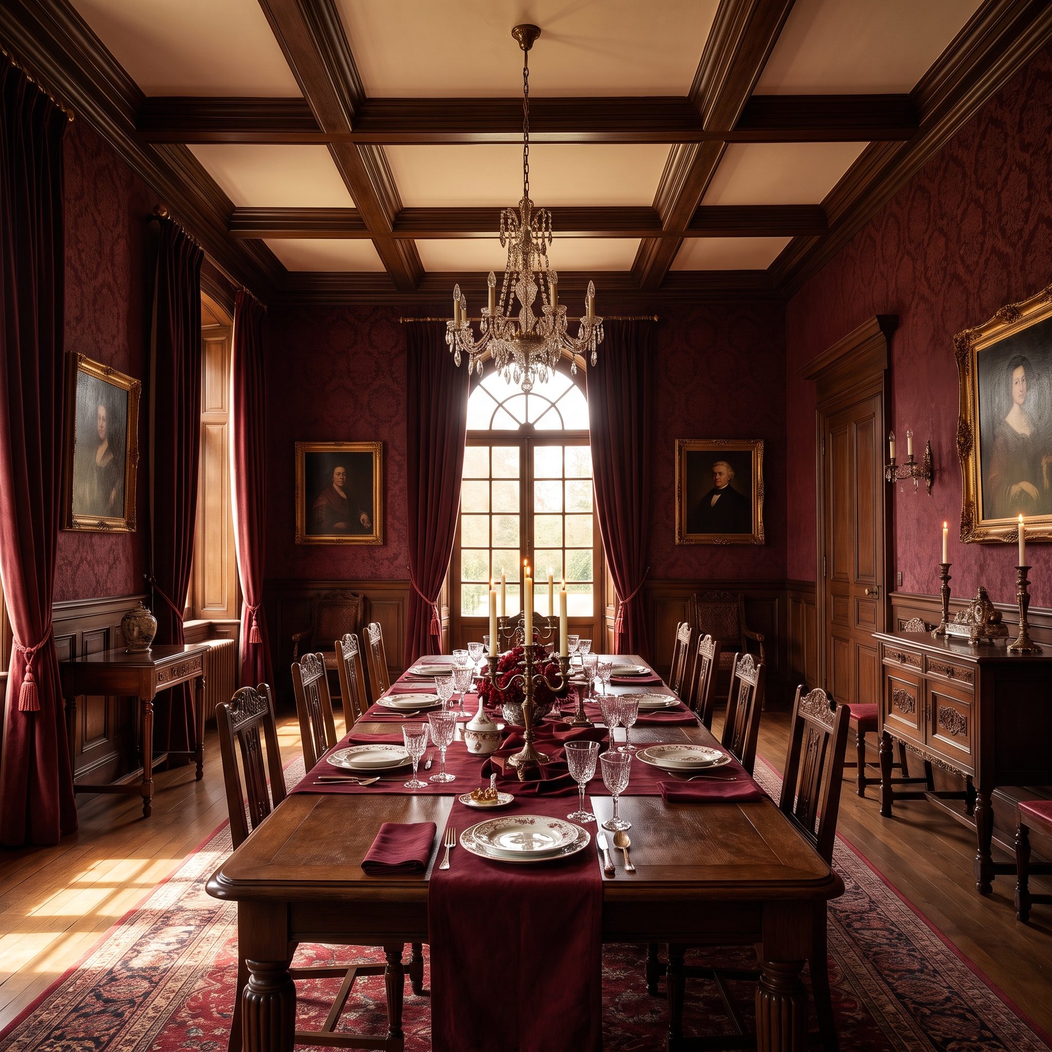
Burgundy on the ceiling sounds formidable until the room reaches evening. Then the logic clicks. Dining rooms live beautifully under low artificial light, and deep red gives that light a rich surface to work against.
White trim would divide the room into a series of outlines. Burgundy everywhere lets the brass chandelier and cognac leather chairs take over the foreground. The walnut table glows against the red, and even the bowl of pomegranates looks as though somebody planned its entrance.
A dining room is one of the few rooms you experience mostly after dark. Paint it for the light it will actually live in.
29. Warm Cream Living Room, Tonal Variations Replace the Usual Stark White Outlines
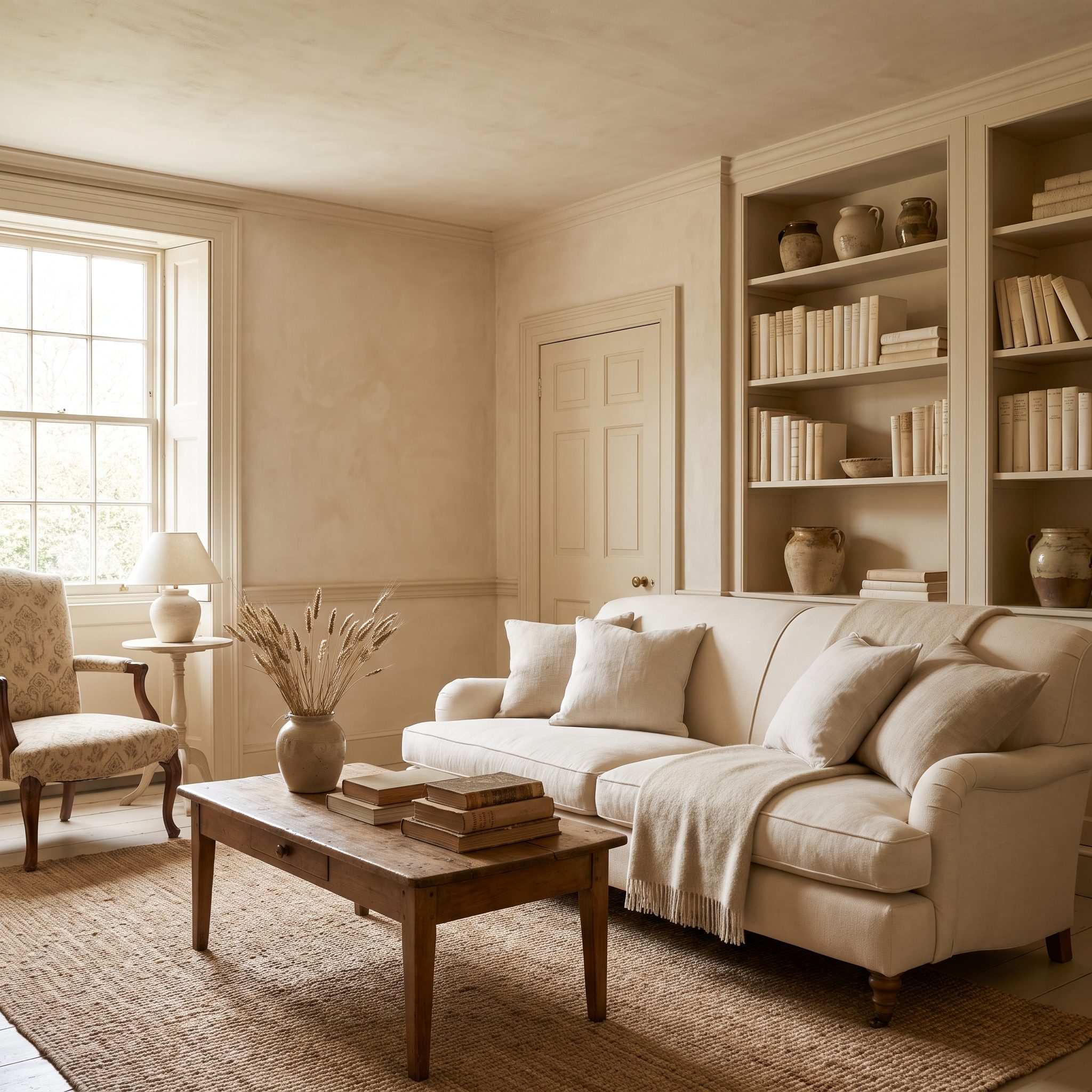
Nothing snaps back to stark white here. Walls, trim, ceiling and door stay within the same warm cream family, stepped apart just enough to preserve depth without drawing hard lines around every piece of architecture.
The camel linen sofa and rust kilim consequently carry more visual weight. A brass floor lamp and warm wood finish the job. Quiet walls don’t mean an anonymous room; sometimes they simply clear the stage.
28. Deep Teal Powder Room, A Tiny Room Goes All-In Instead of Pretending to Be Bigger
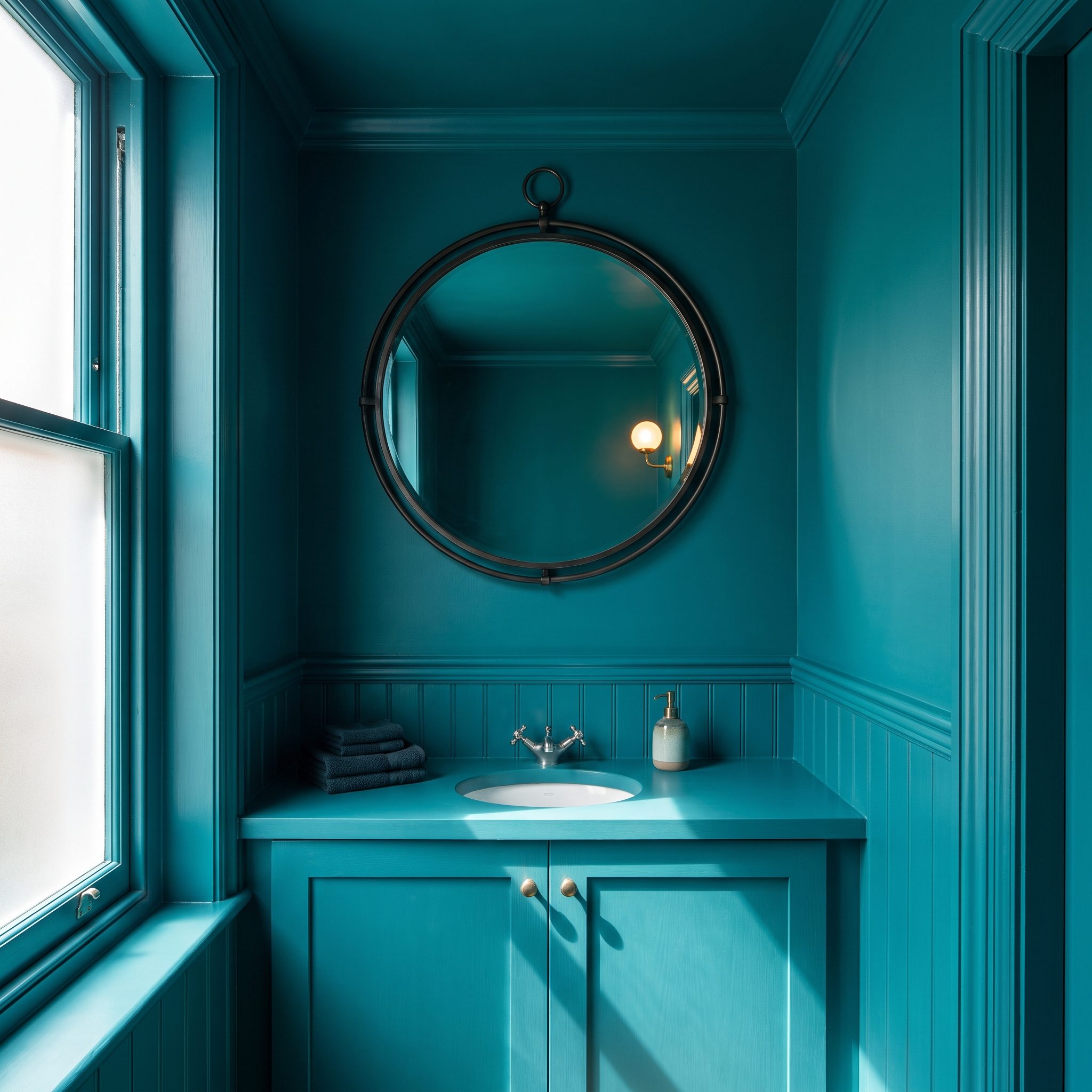
A powder room doesn’t need to impersonate a larger room. This one accepts the small footprint and turns concentration into an advantage: glossy teal rises all the way to the ceiling, giving a few square feet far more presence than timid pale paint ever could.
The lacquered surface catches highlights while brass fixtures and a marble vanity interrupt the teal with harder, brighter materials. Smallness becomes intimacy. That’s a much more interesting ambition than trying to make the walls perform a disappearing act.
27. Tonal Limewash Bedroom, Walls and Ceiling Flow Together Through Texture Instead of Contrast
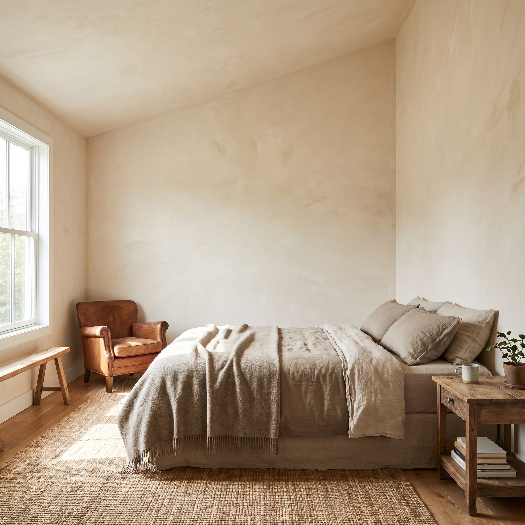
Same tone, completely different effect. This clay-taupe limewash continues from wall to ceiling, but the cloudy movement of the mineral finish keeps the uninterrupted palette from looking remotely flat.
Morning light does most of the decorating. It catches the irregular surface, deepening one area and washing out another, while the oatmeal linen bed and ceramic table lamps settle naturally into the muted scheme.
26. Olive Green Kitchen, Cabinetry and Architecture Become Part of the Same Palette
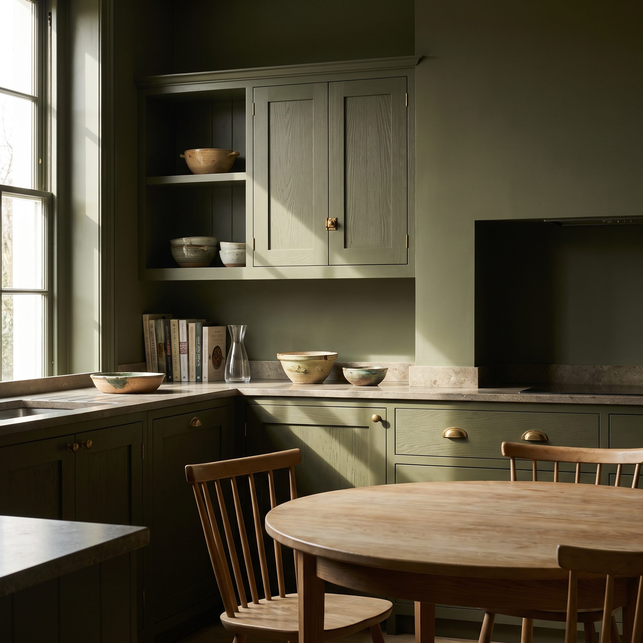
Most kitchens make a clear distinction between colored cabinetry and neutral architecture. This one erases it. Olive climbs from the cabinets onto walls, trim and range hood until joinery and room begin speaking the same language.
Cream quartz becomes the brightest horizontal plane, brass hardware punctuates the green and stainless appliances stay comparatively quiet. The rattan pendant lights introduce texture overhead. Olive handles brass and natural oak particularly well because all three carry warmth without matching one another.
25. Plum Library, Shelves, Trim, Doors, and Walls Become One Envelope
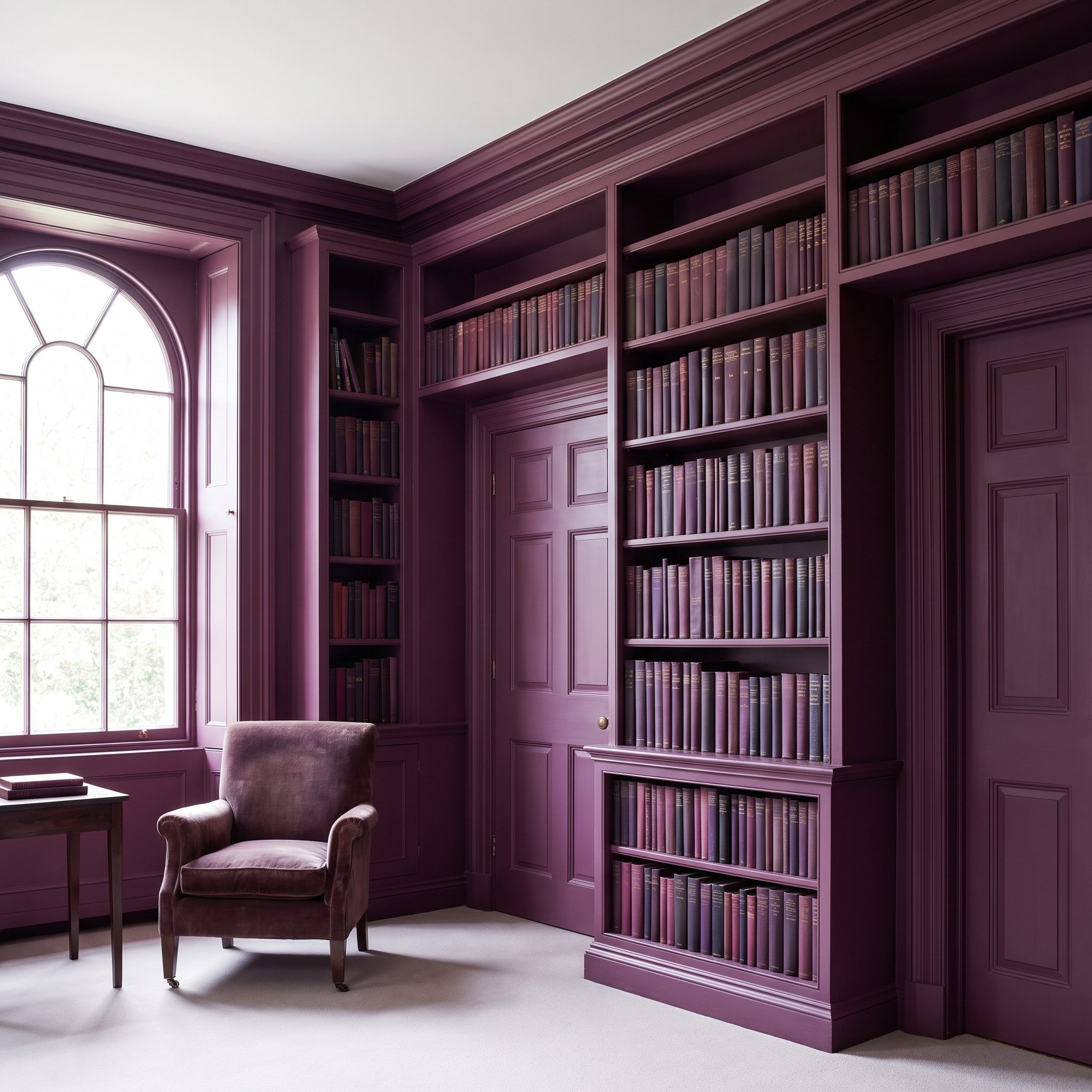
Paint built-in shelves white and the room becomes a grid. Paint them plum with the walls and the shelving recedes just enough for the books to take over as pattern.
That’s the clever move here. Architecture supplies the deep monochrome field; book spines provide hundreds of small interruptions. Even the aubergine velvet armchair stays close enough to the wall color that the reading nook feels carved into the palette rather than placed in front of it.
24. Warm Greige Family Room, Subtle Drenching Pulls an Open Everyday Space Together
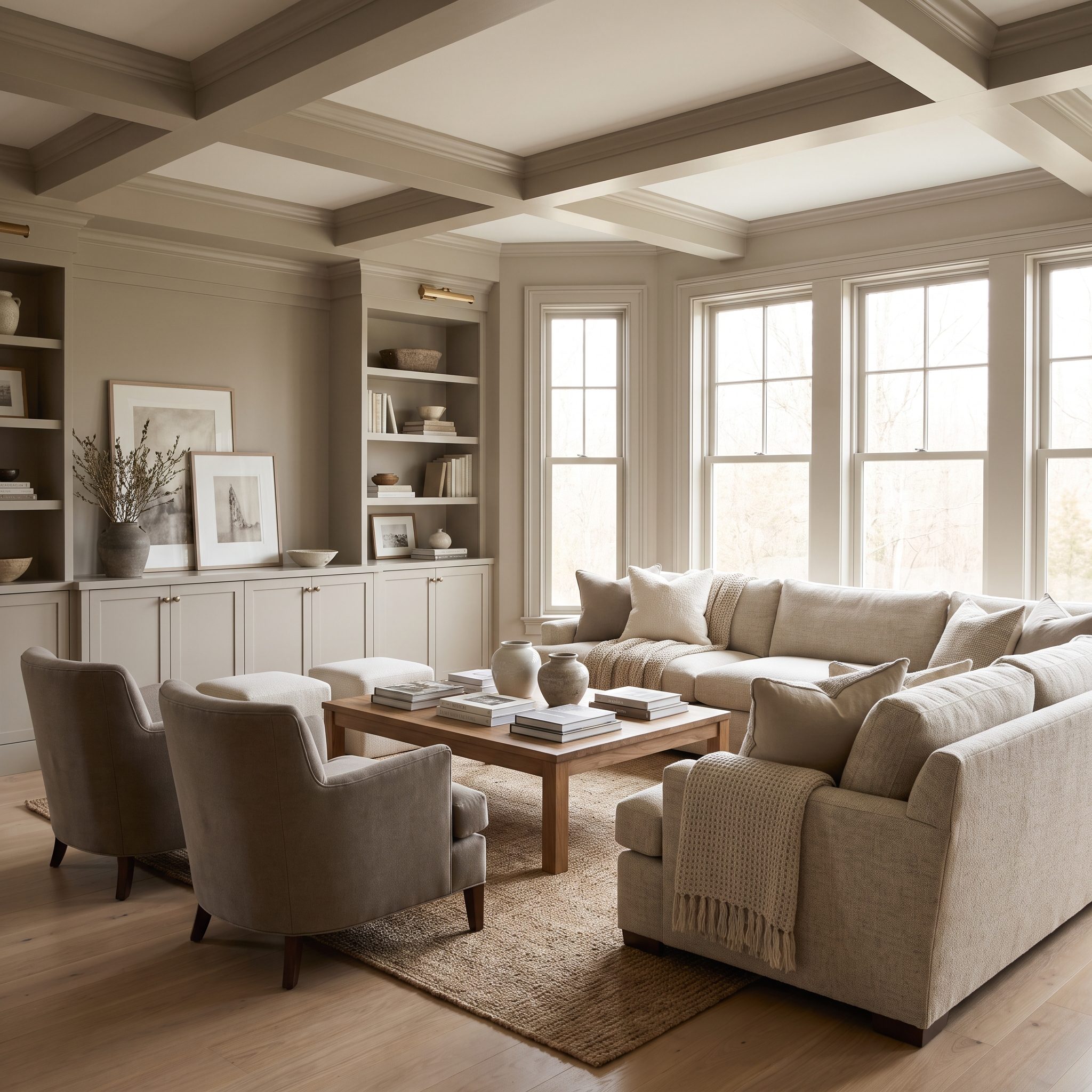
Open family rooms can make a lone accent wall look stranded. Sightlines keep moving toward the kitchen, hallway or dining zone while the feature color abruptly stops at an arbitrary corner.
Warm greige takes the opposite route. The continuous neutral treatment gives the larger space a calmer architectural background, allowing the oatmeal linen sectional and walnut console to establish the foreground. It’s restrained, but not unfinished—the difference comes from continuity.
23. Deep Aubergine Bedroom, Full Saturation Turns a Difficult Color Velvety
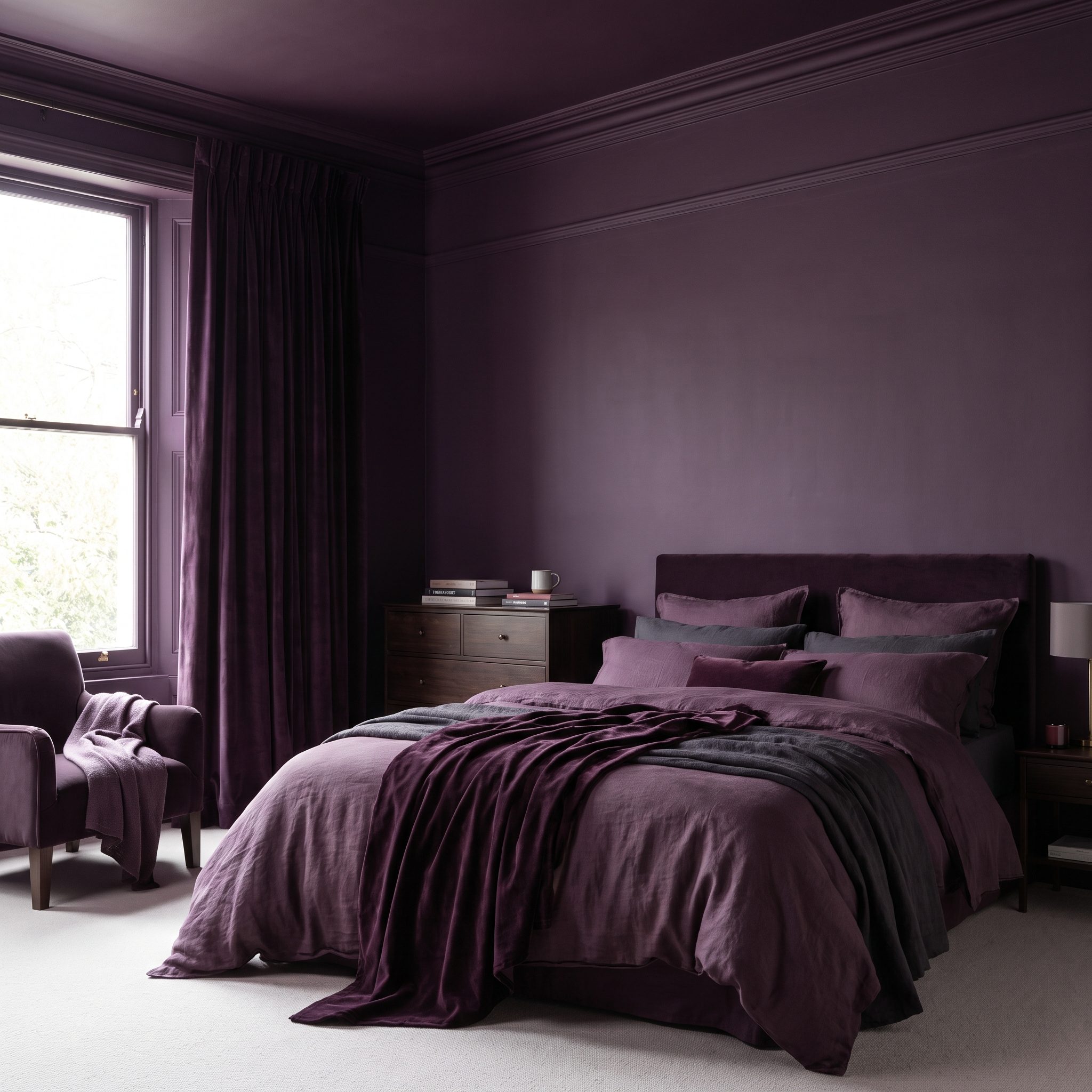
Aubergine gets interesting when there is enough of it for light to reveal its complexity. Across walls, trim and ceiling, the color moves from almost brown in shadow to plum where light catches it, giving the room far more range than a single painted panel could show.
Bedding layered through plum and warm gray keeps the bed connected to the architecture, while brass lamps and a plum mohair throw introduce glint and softness. The room isn’t relying on contrast for drama. The color itself is doing the work.
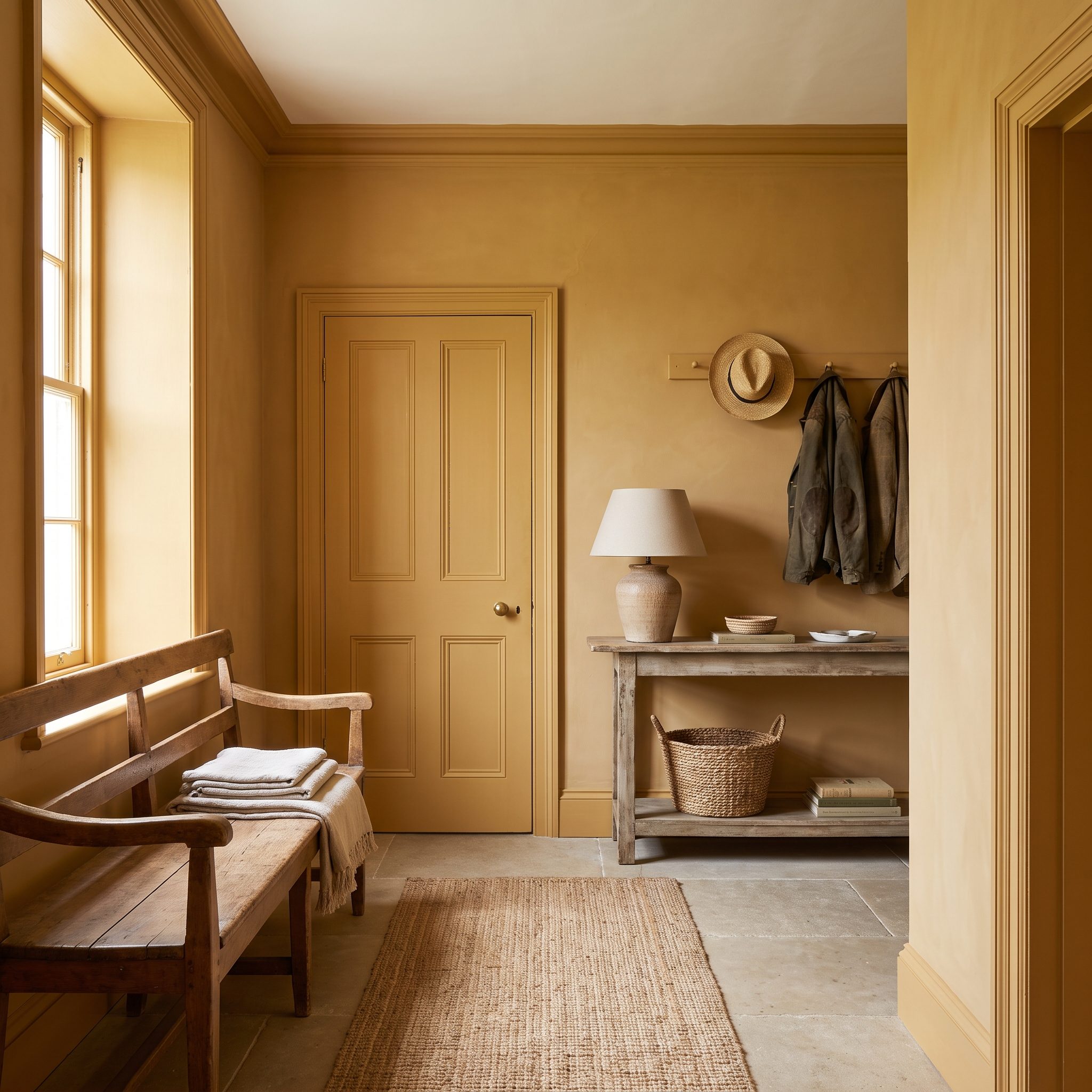
22. Ochre Entryway, Doors, Trim, and Paneling Trade White Outlines for Shadow
🔥 Would you like to save this?
Paint the walls ochre and leave the door, baseboards, crown and wainscoting white and every architectural element gets traced like a diagram. Carry the ochre across the lot and something more sophisticated happens: panel molding becomes shadow and relief rather than outline.
The oak console table and rattan round mirror push the palette warmer still. For an entryway, that’s quite a first sentence.
21. Walnut-Toned Library Lets Millwork Wrap the Room Instead of Stopping at One Bookcase Wall
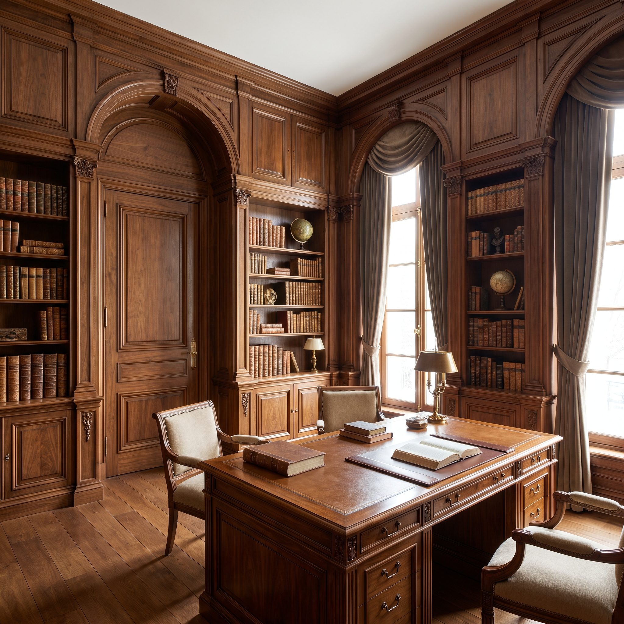
The walnut doesn’t stop at the bookcases. It climbs over the door, wraps the window reveals and keeps moving until millwork stops reading as furniture attached to a room and starts reading as the room itself.
A green leather armchair and brass library lamp are enough to break the grain without weakening it. The richness comes from material continuity, not from asking one wall to perform harder than the other three.
20. Inky Navy Bedroom Turns One Continuous Color Into a Cocoon
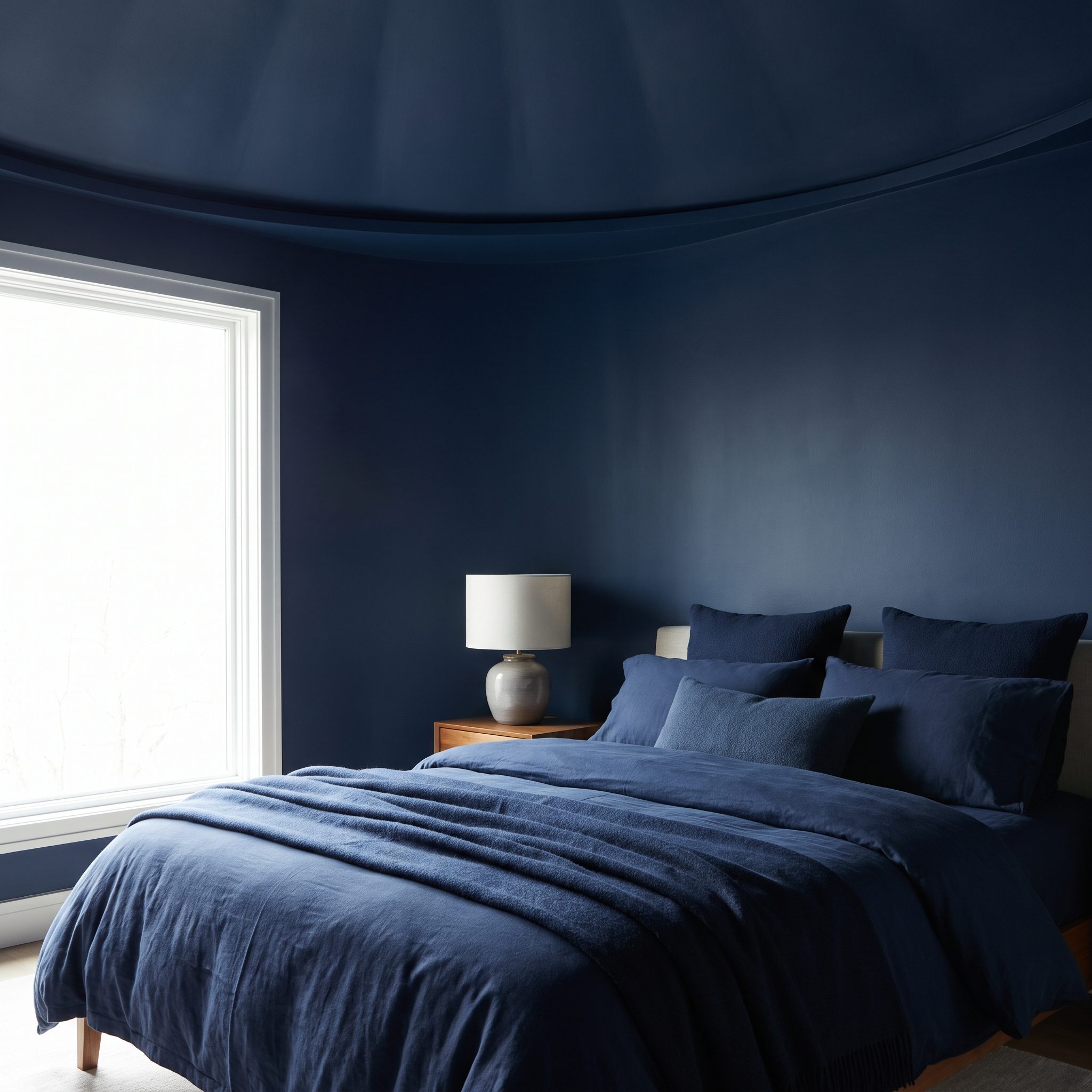
Navy on four walls is dramatic. Navy overhead changes the architecture. With the ceiling joining the walls, the bright horizontal cap disappears and the room becomes a much more continuous dark envelope.
That makes the cream linen headboard and brass table lamps look almost illuminated against the background. The window supplies the broad patch of daylight; everything else stays deep, controlled and quiet. This is color being used to shape the room, not merely decorate its surfaces.
19. Terracotta Sitting Room, An Earthy Palette Makes the Whole Envelope the Feature
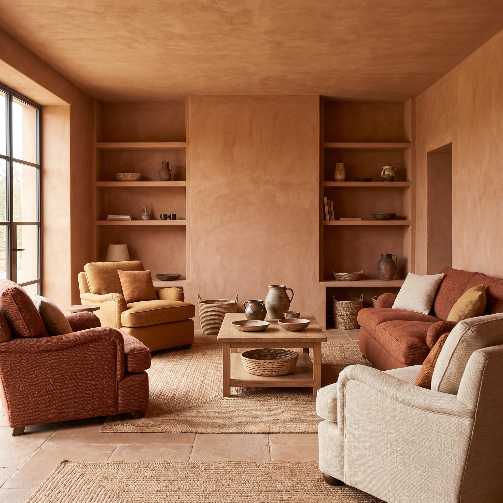
Terracotta already carries enormous personality, so isolating it on one wall can make the color look almost decorative. Across walls, ceiling and trim, the clay tone becomes atmosphere instead.
The flat-weave rust rug and tan leather armchair stay close to the same earthy register without disappearing into it. Instead of a sharp focal point, the room gets layers—clay, rust, tan, weave and leather—all pulling in roughly the same direction.
18. Mushroom Home Office, Walls, Built-Ins, and Trim Merge Into One Quiet Backdrop
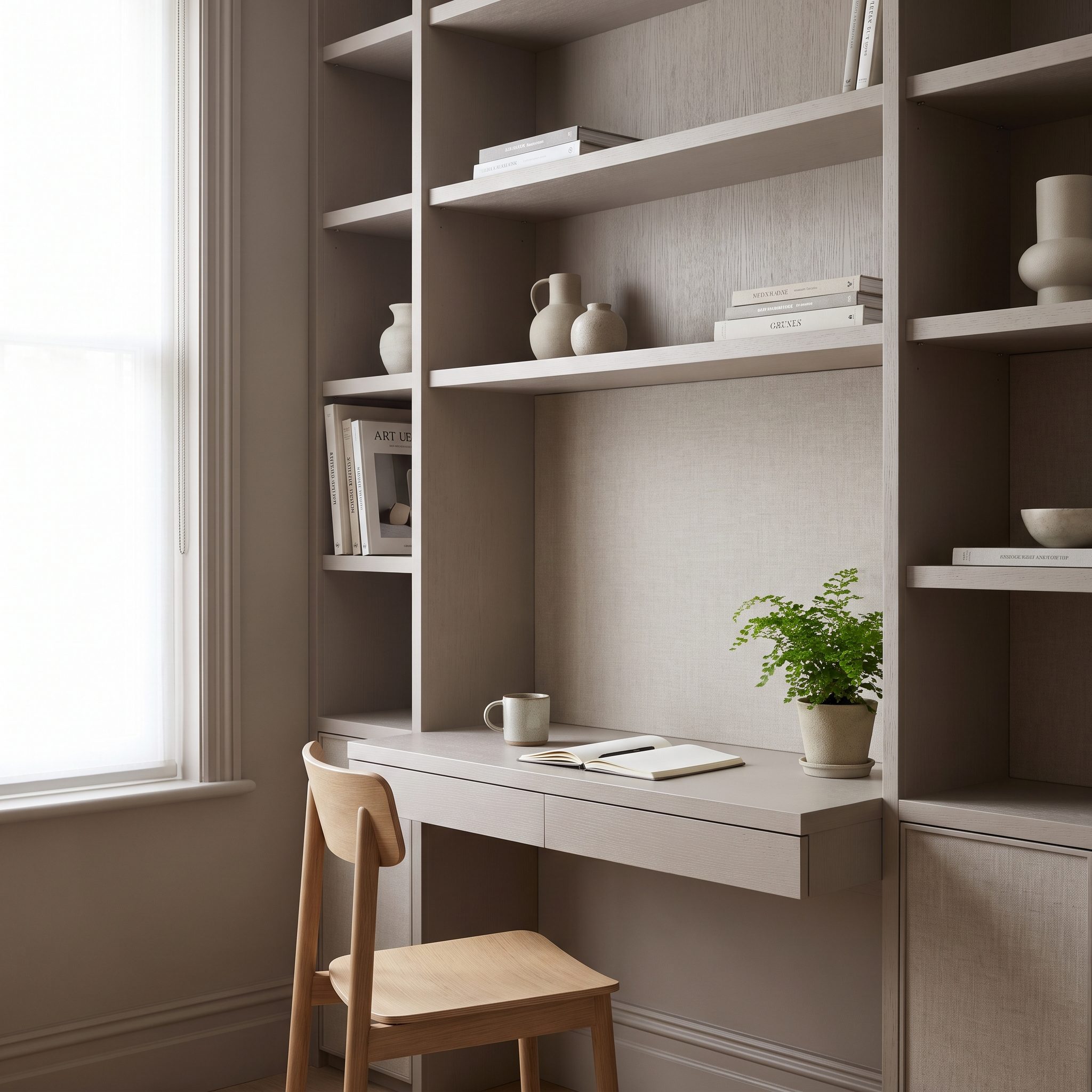
An office gives color drenching a practical job. Paint the built-ins, walls and trim the same mushroom tone and the shelves stop competing with the desk as separate blocks of architecture.
The cognac leather office chair and brass desk lamp provide the deliberate contrast. Books, screens and work materials already bring plenty of small-scale visual information; the room itself doesn’t need to join the argument.
17. Clay-Toned Kitchen, Walls, Cabinetry, and Trim Work as One Earthy Composition
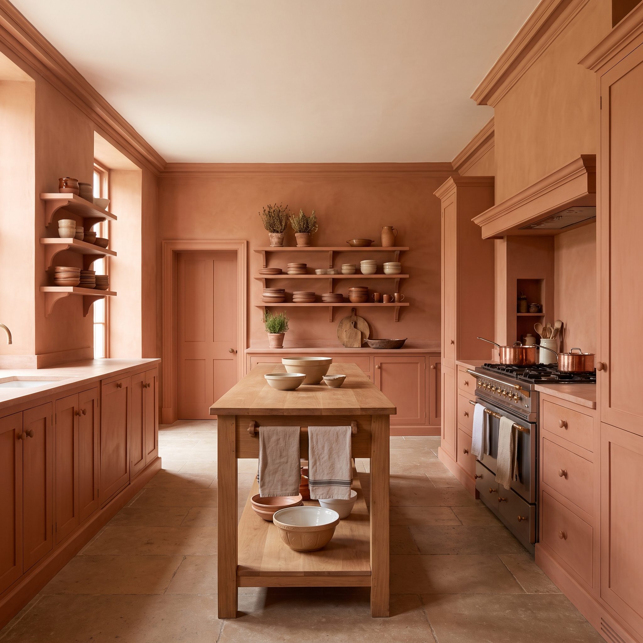
This kitchen doesn’t ask the cabinets, walls and hood to advertise themselves separately. One warm clay tone pulls them into a single composition, interrupted mainly by cream quartz and brass.
The paneled dishwasher disappears into the cabinet run and the hood reads as a solid architectural mass rather than another appliance. Brass pendant lights over the island provide just enough jewelry. Nothing else needs to audition.
16. Soft Sage Nursery, Gentle Color Wraps the Room Without Demanding Attention
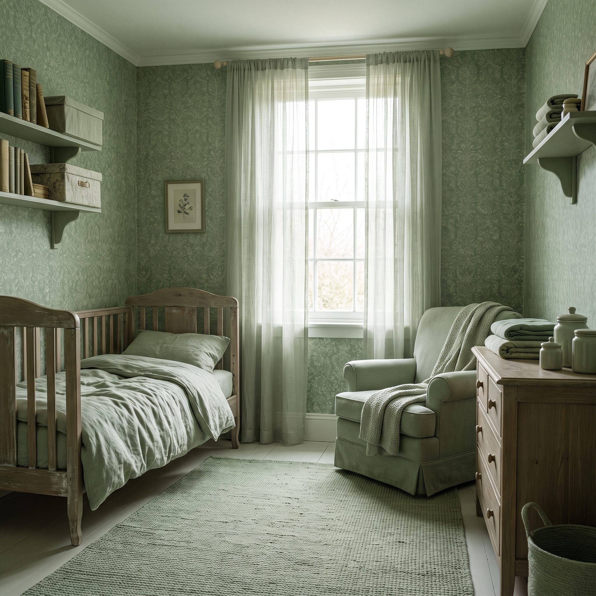
A nursery doesn’t need a mural, striped feature wall and three competing focal points to have character. Soft sage takes a quieter route, continuing around the room so no single wall dominates the composition.
The sage glider joins the wall color while the oak crib introduces warmth and grain. The result feels gentle without becoming anonymous—proof that a restrained palette can still have a very clear point of view.
15. Deep Blue Paneled Den, Paneling, Trim, Doors, and Ceiling Become One Continuous Surface
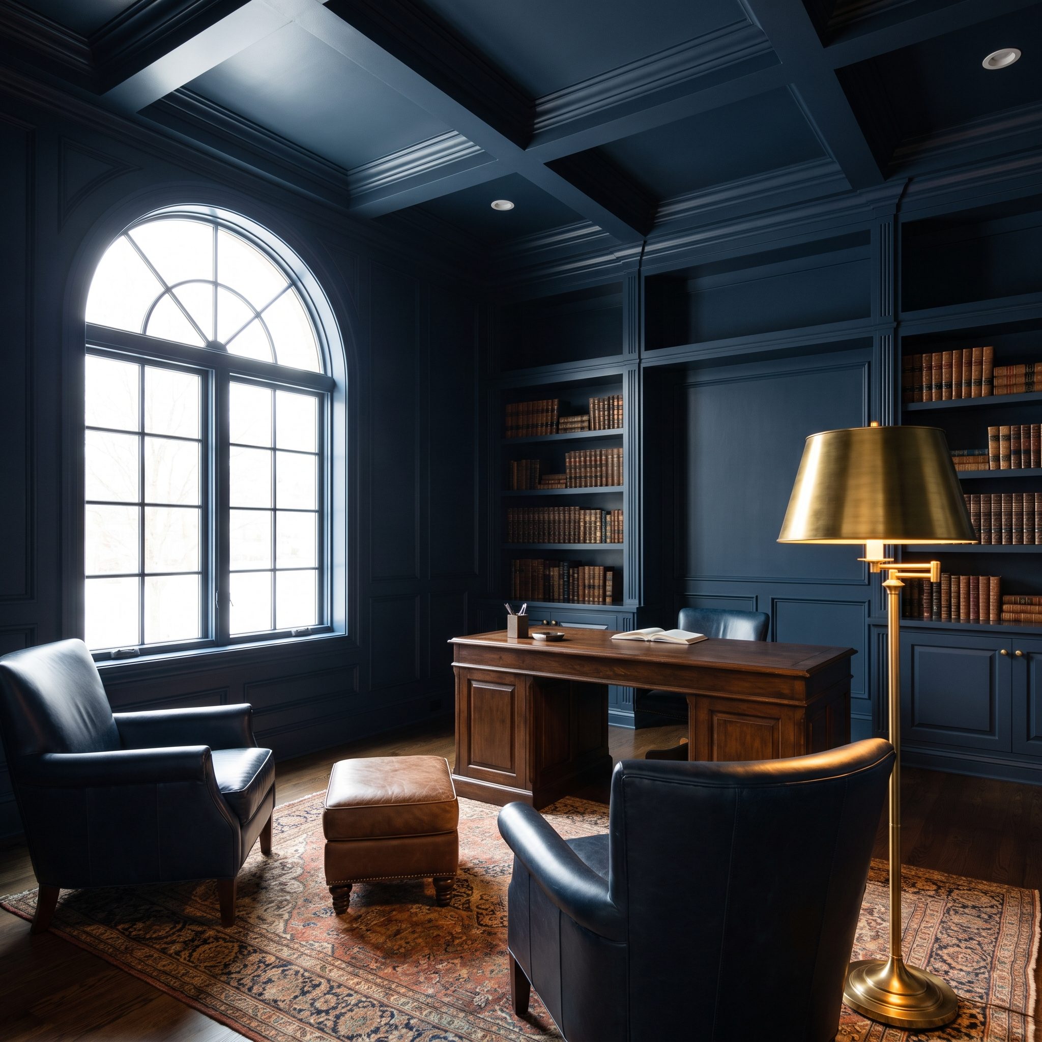
Raised paneling already gives a wall plenty to say. Painting every recess and rail navy, then carrying the same color onto doors, trim and ceiling, lets relief rather than contrasting paint describe all that craftsmanship.
The blue velvet sofa nearly joins the architecture, while the tan Chesterfield breaks away from it. One room, two completely different ways for furniture to behave against the same saturated background.
14. Warm Taupe Living Room Proves Color Drenching Doesn’t Have to Go Dark
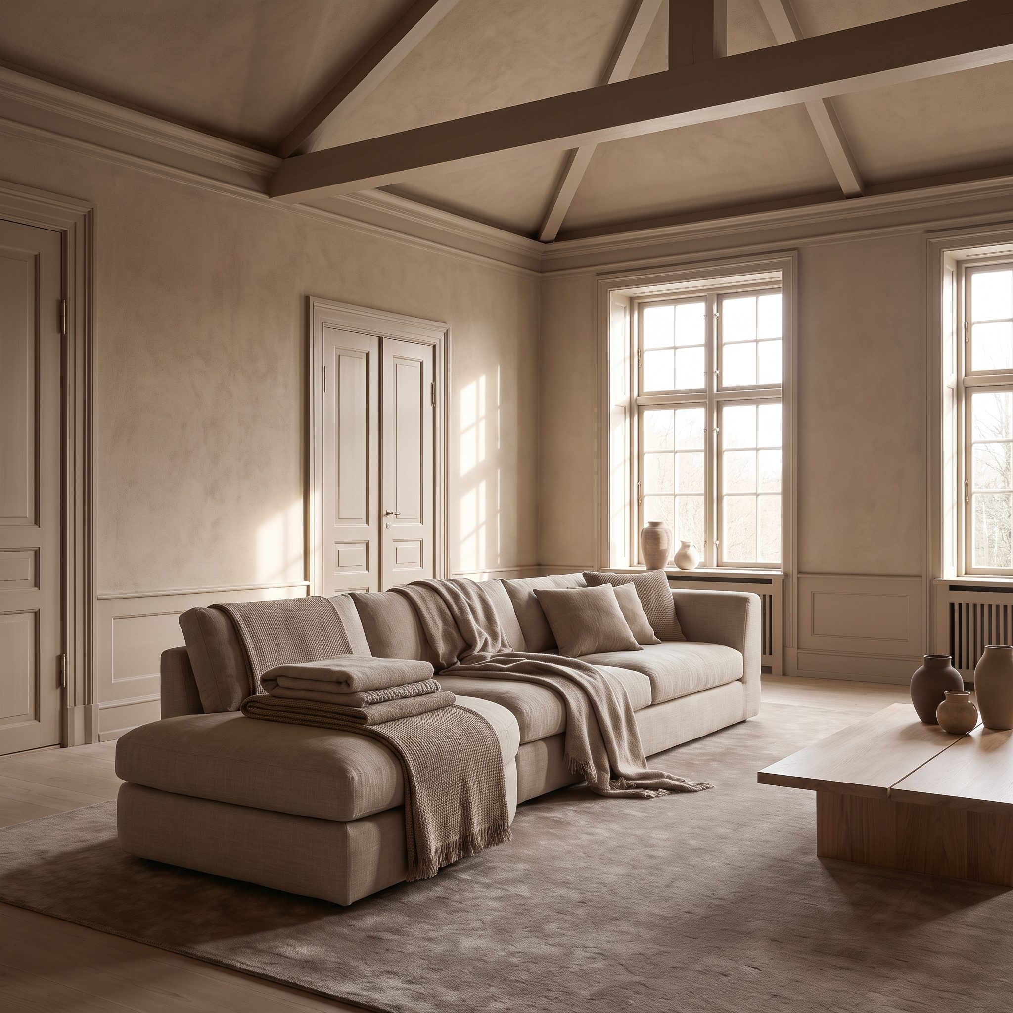
Color drenching gets most of its attention in navy, green and burgundy, but warm taupe shows what happens when the technique loses the theatrics and keeps the continuity.
The mushroom linen sofa sits a little deeper than the walls, while pillows shift the palette again by another small degree. Travertine brings mineral texture; the olive tree contributes the only strong organic color. Nothing shouts, yet nothing feels unfinished.
13. Wine-Red Reading Room, Bookcases and Ceiling Complete the Cocoon
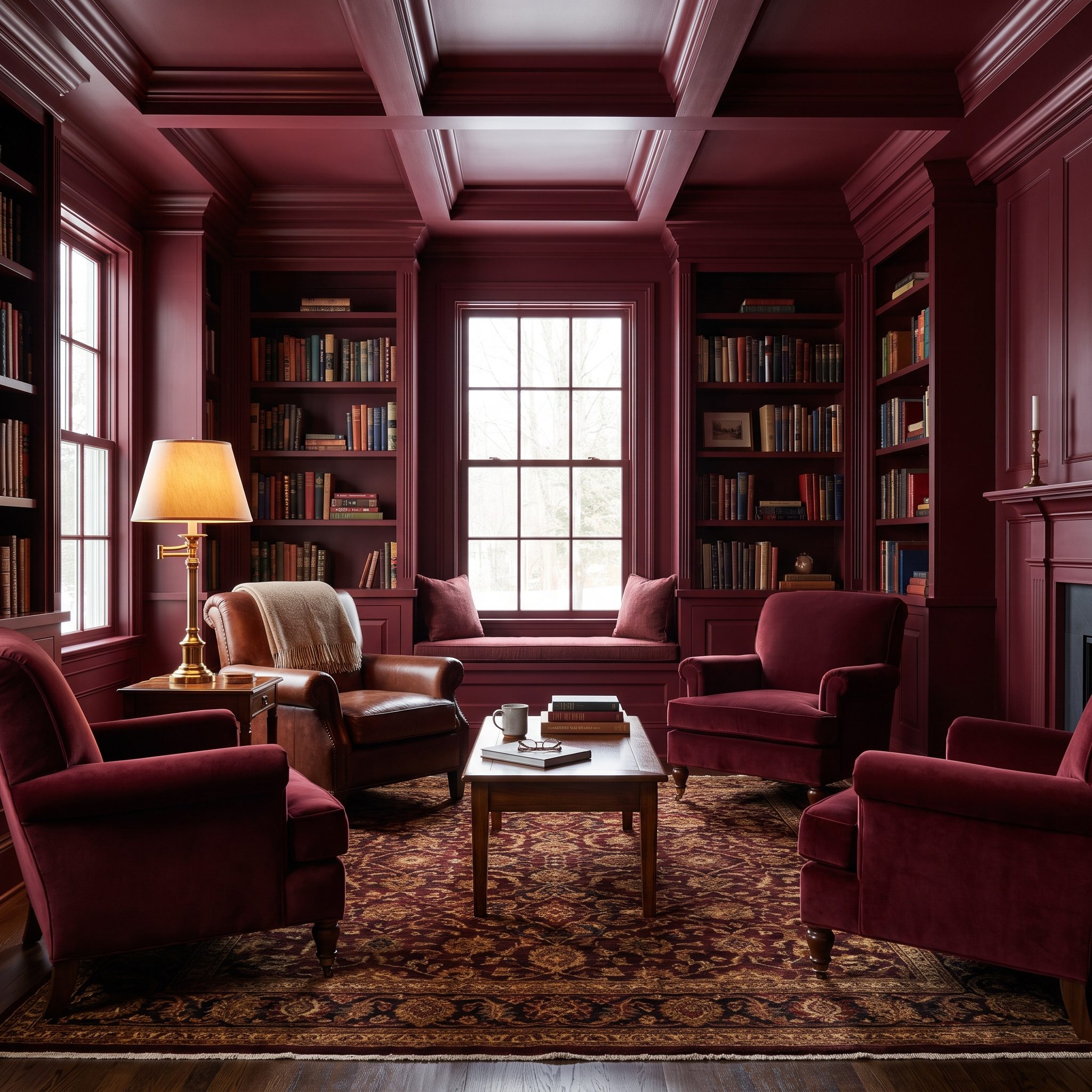
Wine red climbs the bookcases, crosses the trim and keeps going overhead. That’s what gives this reading room its completeness: there is no pale ceiling hovering above the darker architecture like an escape hatch.
A cognac leather chair and brass lamp warm into the red rather than cutting sharply across it. The shelves provide rhythm, the books supply pattern and the ceiling closes the composition. For a room built around sitting still with a book, that’s exactly enough action.
A white ceiling over a dark room can feel like an unfinished sentence. This one finishes it.
12. Wood-Wrapped Bedroom Gives the Headboard Wall No Special Treatment at All
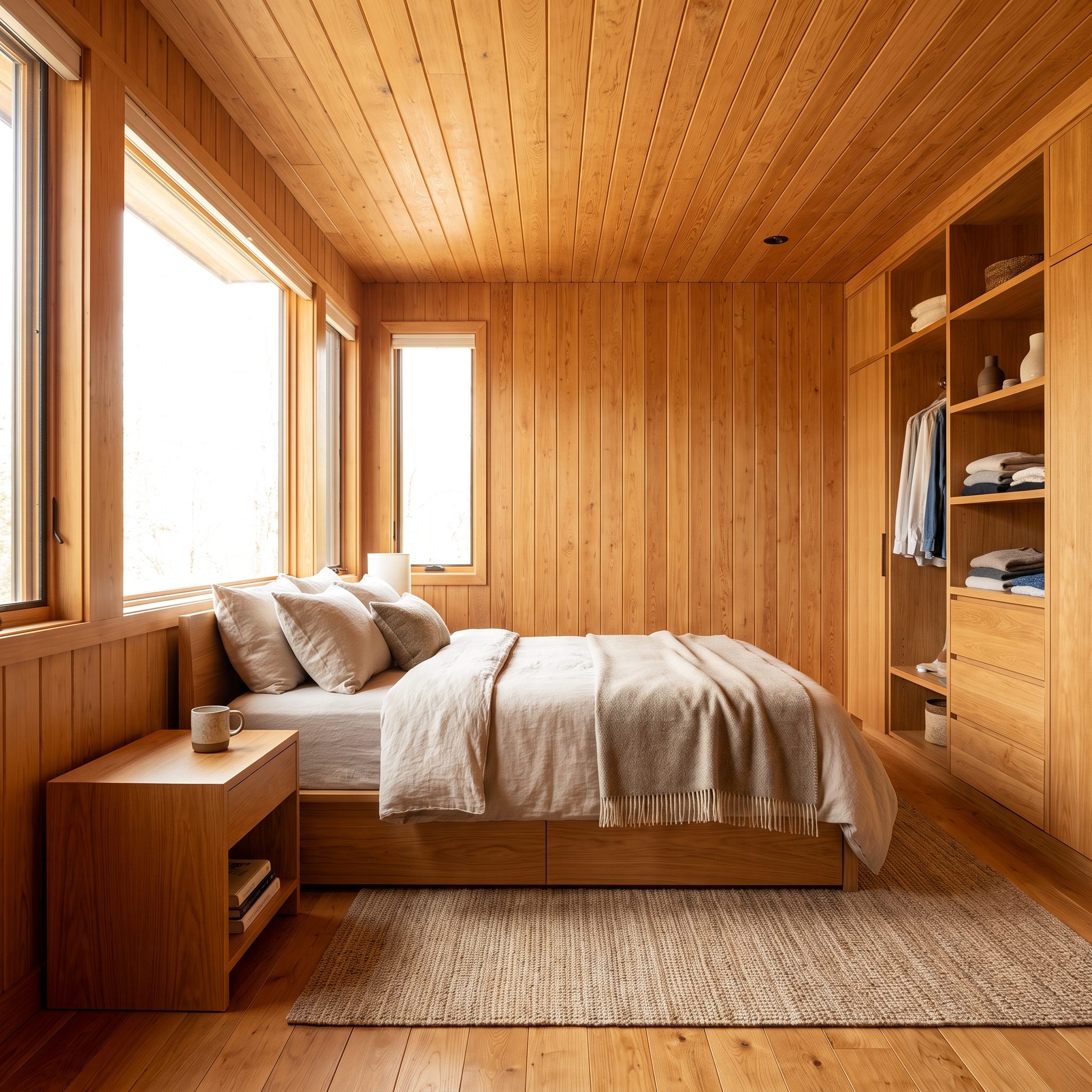
Bedrooms have spent years treating the headboard wall as the obvious place for drama. This one gives it no special treatment because honey-toned wood already wraps every wall and continues across the ceiling.
That changes the bed’s role. It doesn’t need a contrasting backdrop to feel anchored; the low platform and linen bedding sit inside a complete material envelope. Grain changes direction, shadows collect at joints and the wood itself supplies enough movement to make a separate feature surface redundant.
11. Soft Peach Dressing Room, A Light Palette Proves Full-Room Color Can Still Feel Airy
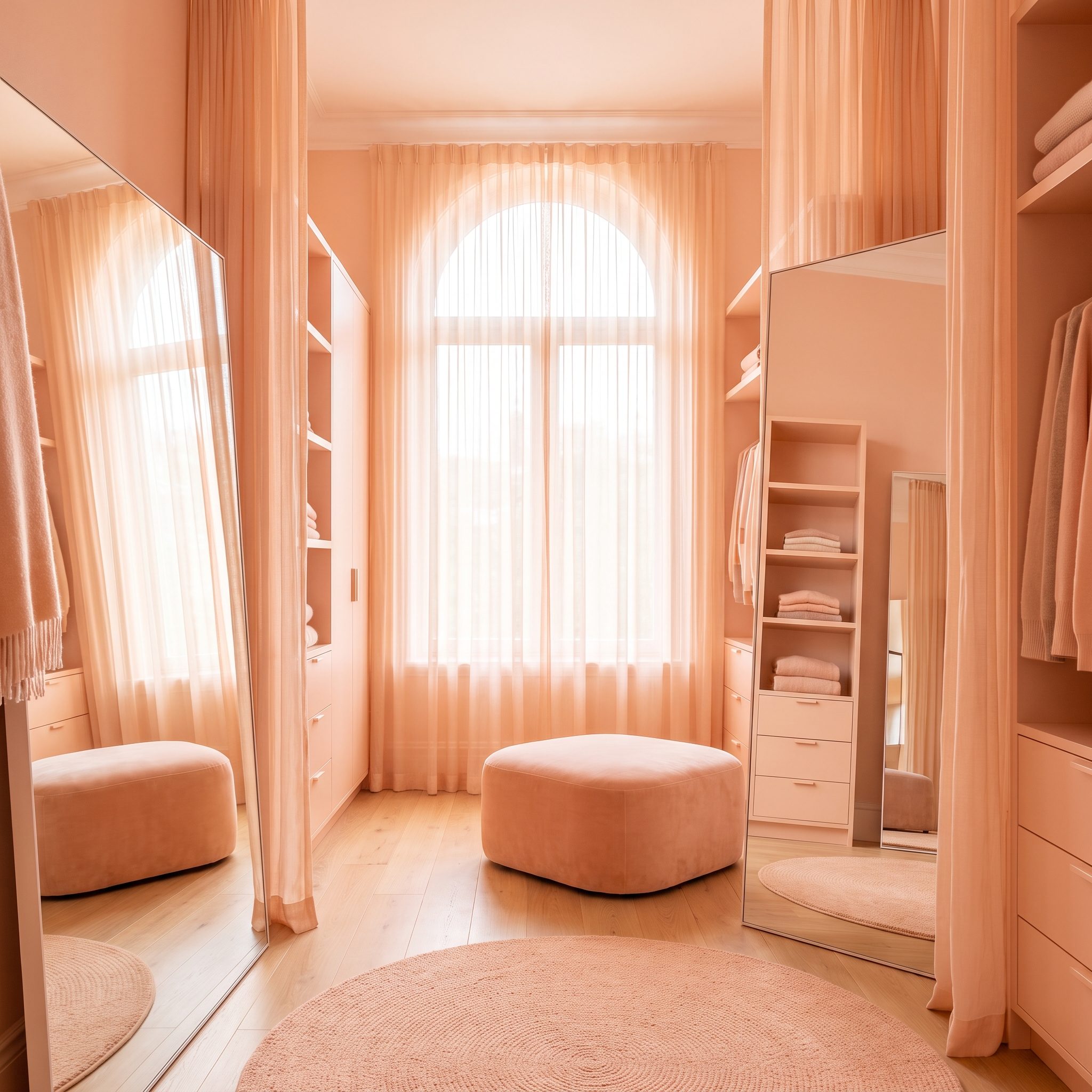
Peach makes a useful counterargument to the gallery’s darker rooms. Full-room color doesn’t have to turn theatrical. Walls, ceiling, trim and wardrobe doors share the same blush-apricot family, but the high value of the color keeps daylight bouncing through the room.
A cream bouclé bench barely interrupts the palette while the gilt mirror and crystal pendant sharpen it with small flashes of reflection. The room commits just as completely as the darker examples. Same commitment, entirely different volume.
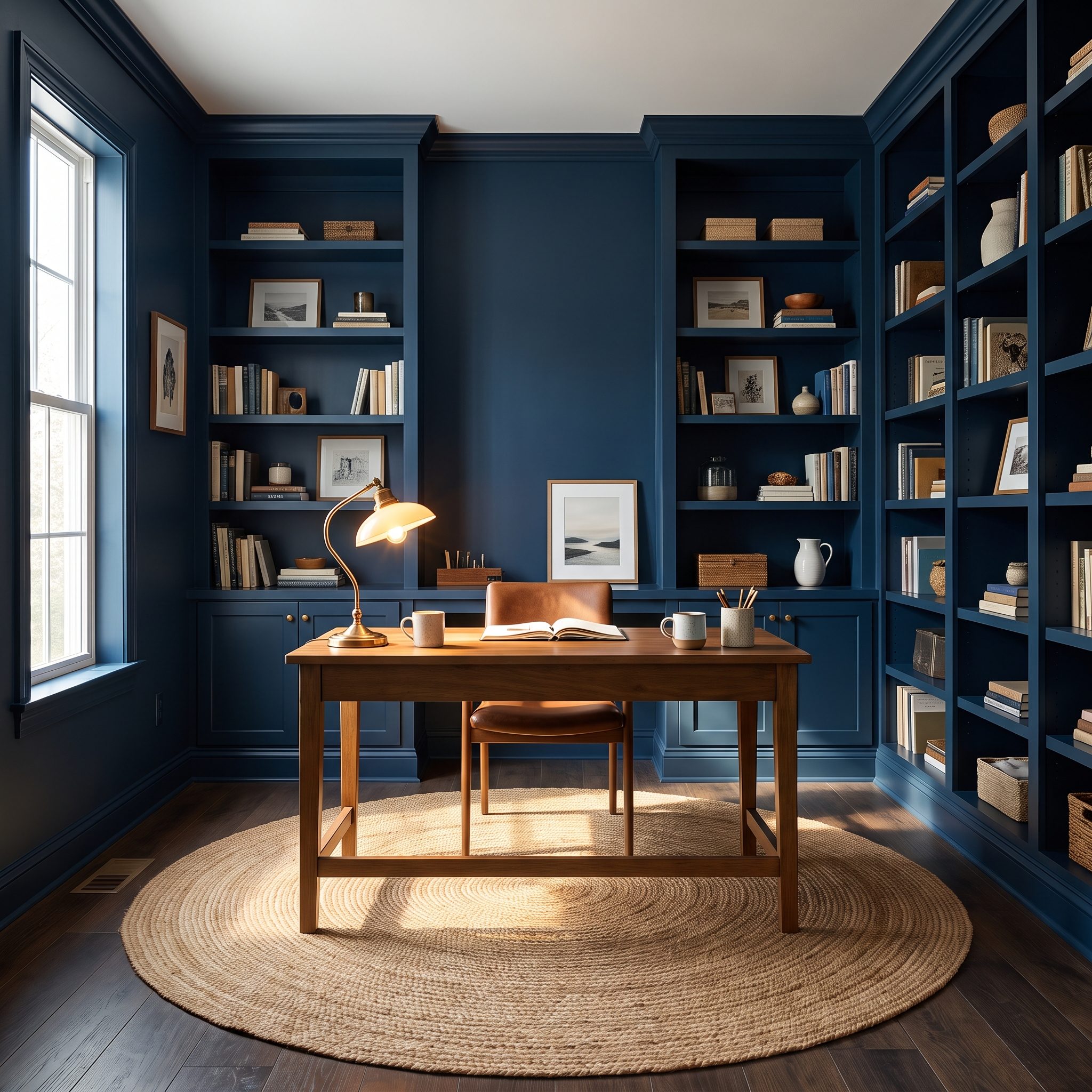
10. Midnight Blue Home Office Makes the Built-Ins Part of the Architecture
🔥 Would you like to save this?
White bookcases against a midnight wall would turn the shelving into a row of bright boxes. Painting the built-ins blue changes the reading completely. The shelves become recesses within the architecture rather than furniture attached after the fact.
A walnut desk warms the center while a green velvet chair nudges the palette sideways without breaking it.
9. Chocolate Brown Bedroom Lets the Ceiling Join the Walls Instead of Floating Above Them
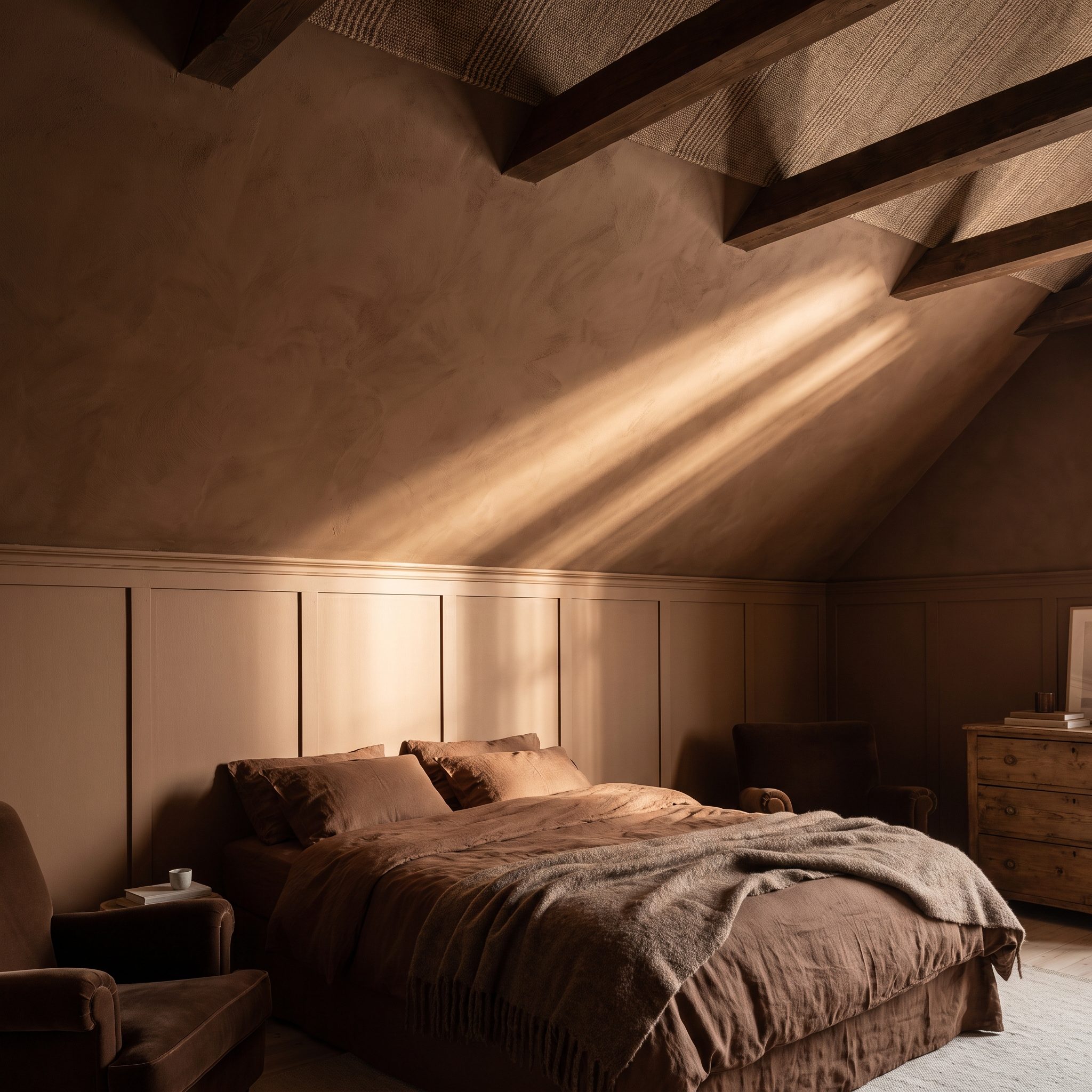
Chocolate brown has enough weight on its own; the interesting move is taking it overhead. With the ceiling joining the walls, the usual bright boundary at the top disappears and the bedroom becomes a more continuous volume.
Cream bouclé and walnut are almost tailor-made for the palette. The cream bouclé bed gives the brown a soft, pale counterpoint while warm timber keeps the contrast from turning stark.
8. Warm Plaster Living Room Wraps Arches, Fireplace, and Walls in One Mineral Finish
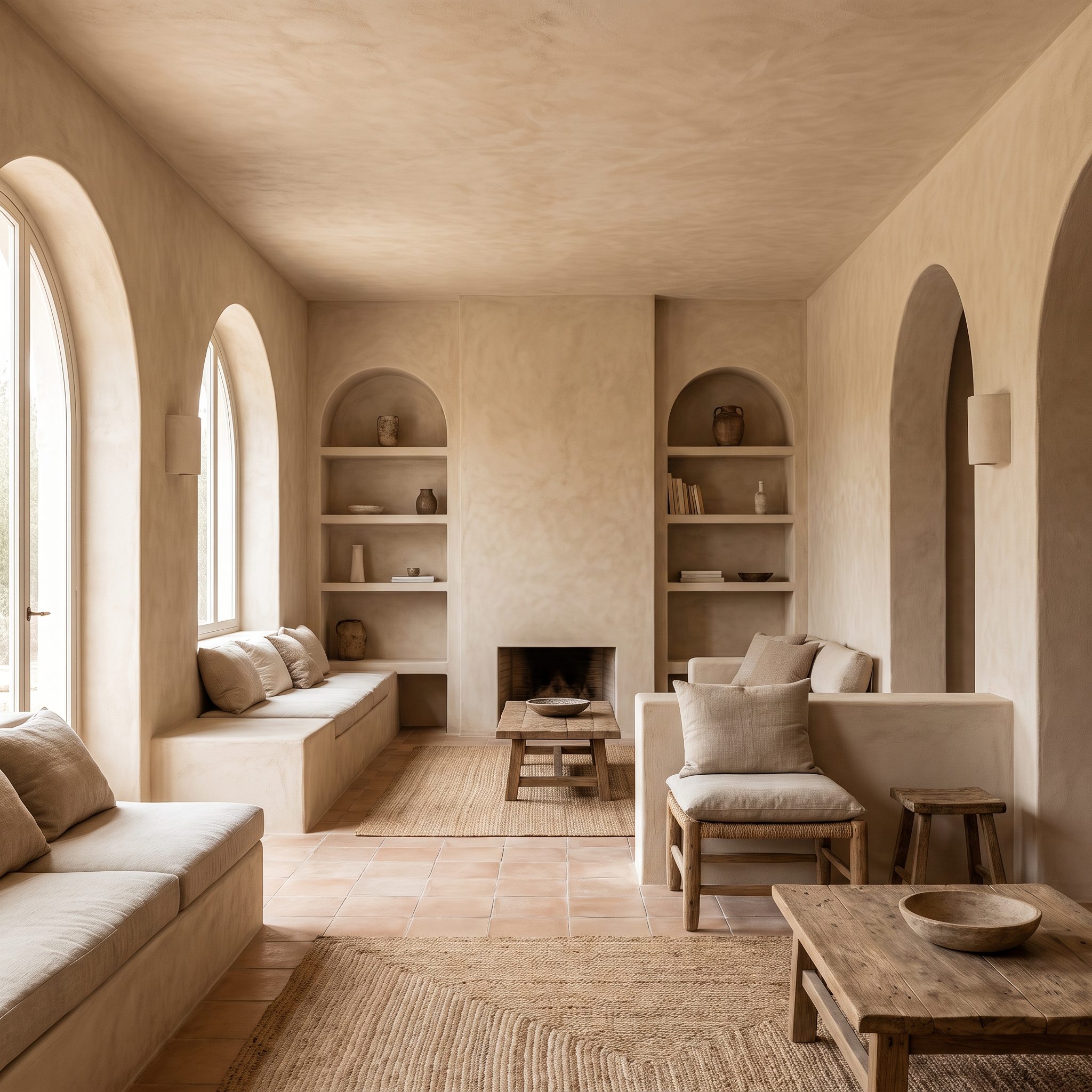
Warm plaster has no interest in picking a hero wall. It moves across the room, around the arch, into the niche and over the fireplace until the architecture reads almost as a single sculpted mass.
The hand-worked surface provides the variation that another paint color normally would. A travertine coffee table echoes the mineral quality in a harder form, while linen upholstery keeps the foreground soft. Nothing needs to shout because every material has texture doing the talking.
7. Charcoal Media Room, Dark Walls and Ceiling Make the Screen Recede
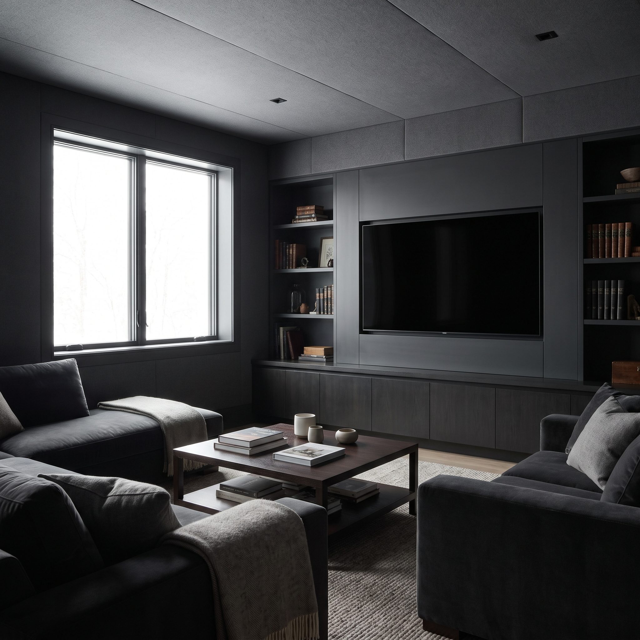
A black television on a bright white wall announces itself even when it’s switched off. Surround the screen with charcoal and that hard rectangle loses much of its visual dominance.
The dark ceiling continues the effect overhead, while the navy velvet sectional adds color without breaking the low-key palette. Brass sconces provide small points of light. Here the dark treatment isn’t merely atmospheric; it gives the room’s largest piece of technology somewhere to disappear.
6. Olive-and-Moss Living Room Builds Depth With Several Greens and No Designated Accent
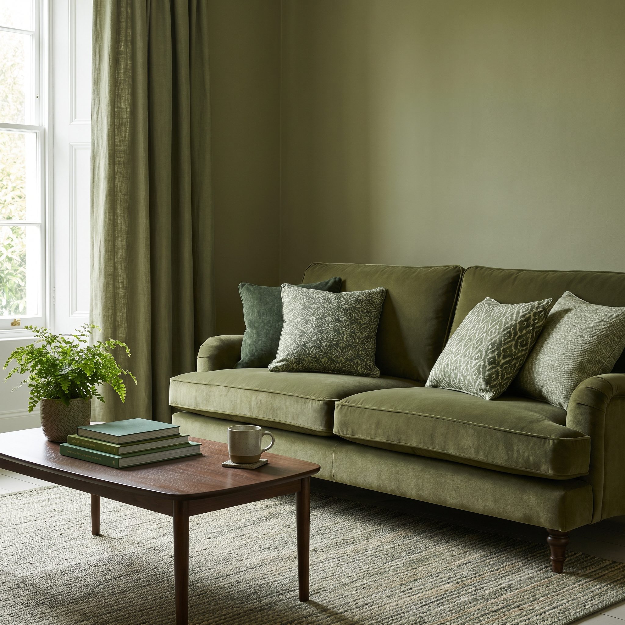
Count the greens. Olive on the walls, moss on the sofa, celadon in the curtains, deep forest in the pillows. None is required to carry the entire room because depth comes from the intervals between them.
A moss green velvet sofa against olive walls demonstrates the point beautifully. Similar colors don’t automatically disappear into one another. Change the value, texture and finish and they begin to layer.
5. Clay-and-Rust Bedroom Replaces One-Wall Contrast With an Entire Earth-Tone Spectrum
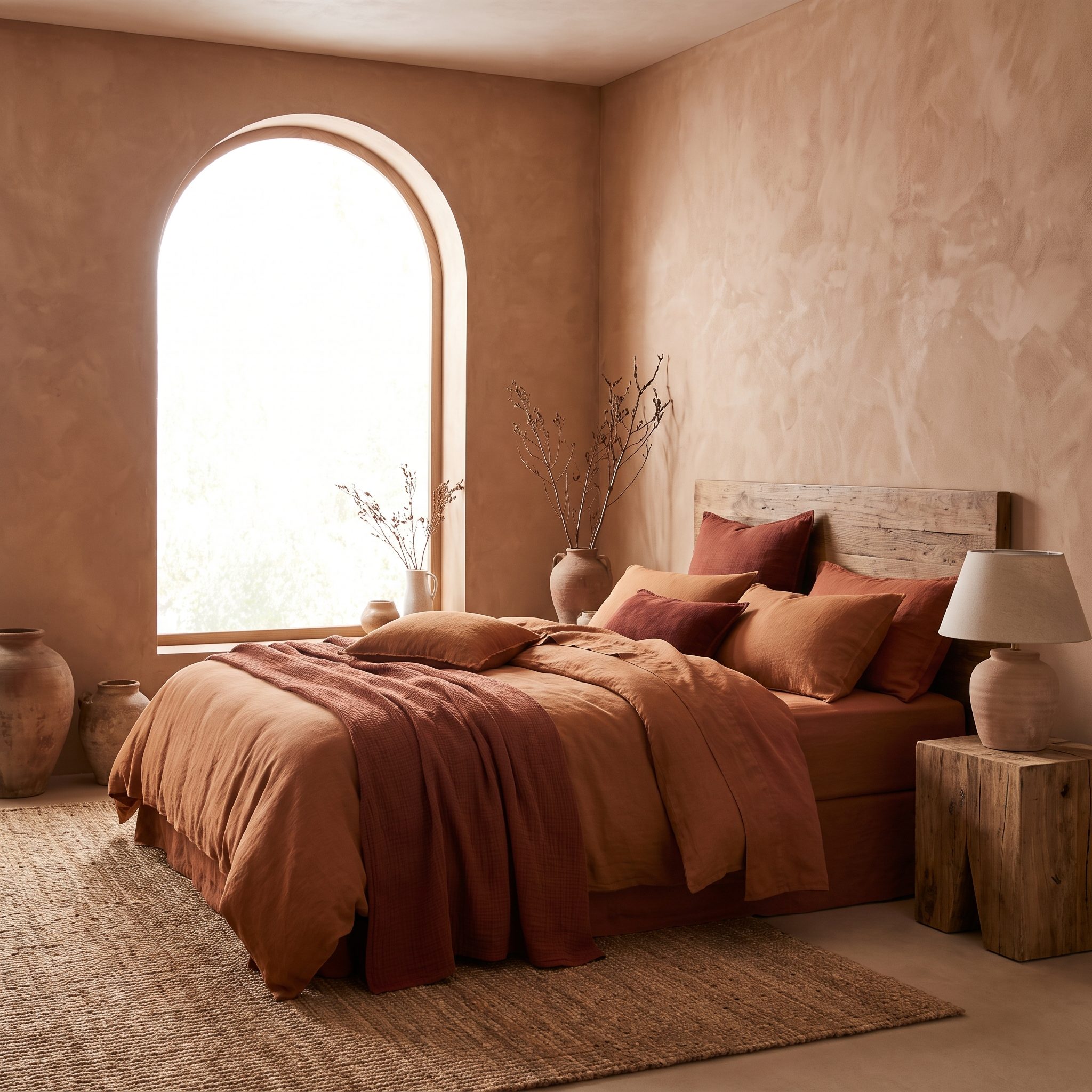
Clay covers the walls, rust moves onto the bedding, ochre appears in the pillows and terracotta flickers through the plaster texture. No single surface gets saddled with being “the bold one.” The entire room operates inside one warm spectrum.
A rust linen bedding set and rattan pendant light add another layer of texture without changing direction. For more of the same grounded palette, the earthy bedroom inspiration gallery pushes warm-tone layering even further.
4. Deep Green Mudroom Turns a Utility Space Into One of the Best Rooms Off the Hall
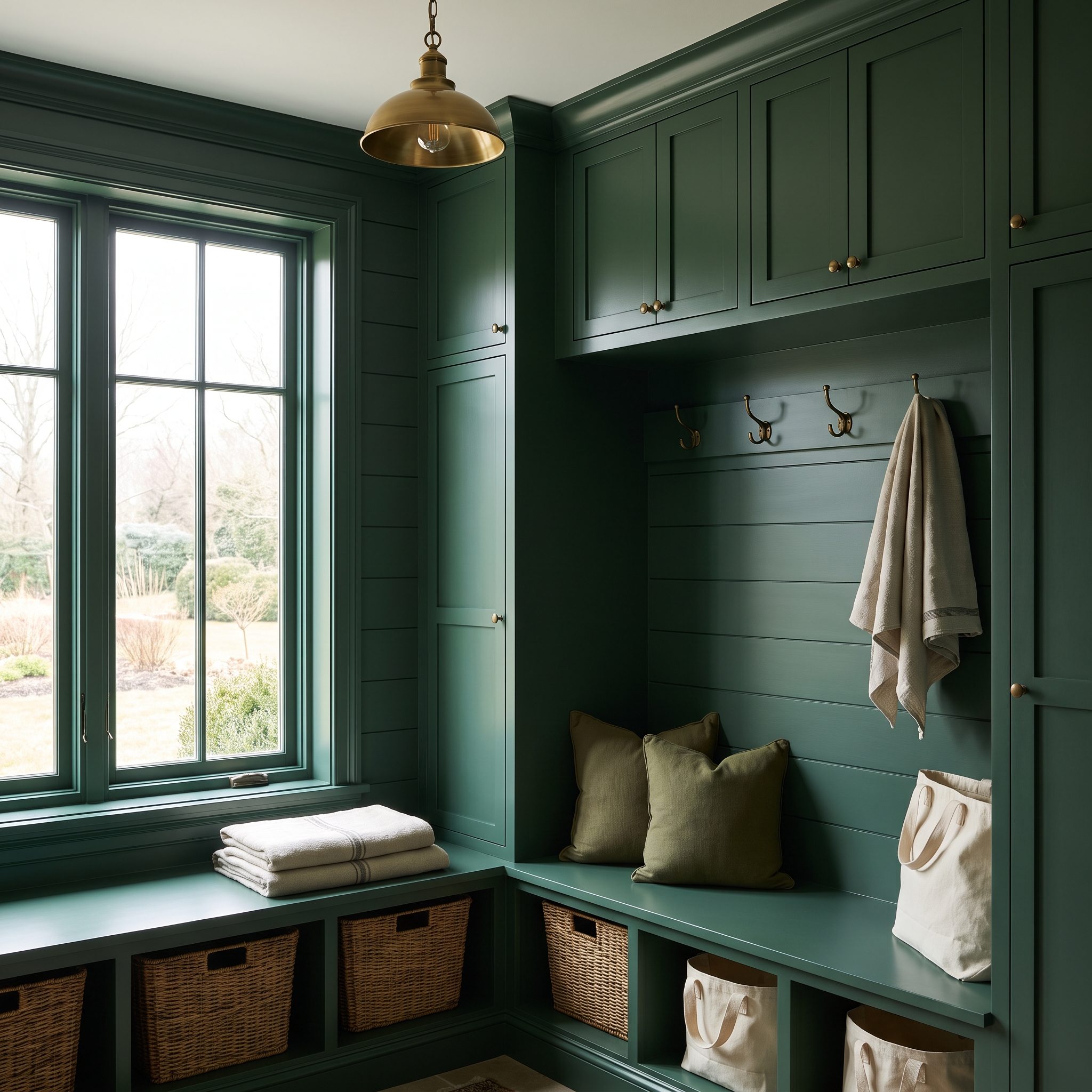
The mudroom is where ambition usually dies. A bench, some hooks, white walls, job done. This one gives the utility zone the same design attention as a living room, carrying forest green across cabinetry, door, walls and trim.
Brass hooks finally have something dark enough to glow against, while the checkerboard floor supplies the graphic contrast the walls deliberately avoid. The room still handles coats and shoes. It simply refuses to look like the place design forgot.
3. Blue-Gray Bathroom, Vanity, Trim, Door, and Walls Stay Within One Moody Family
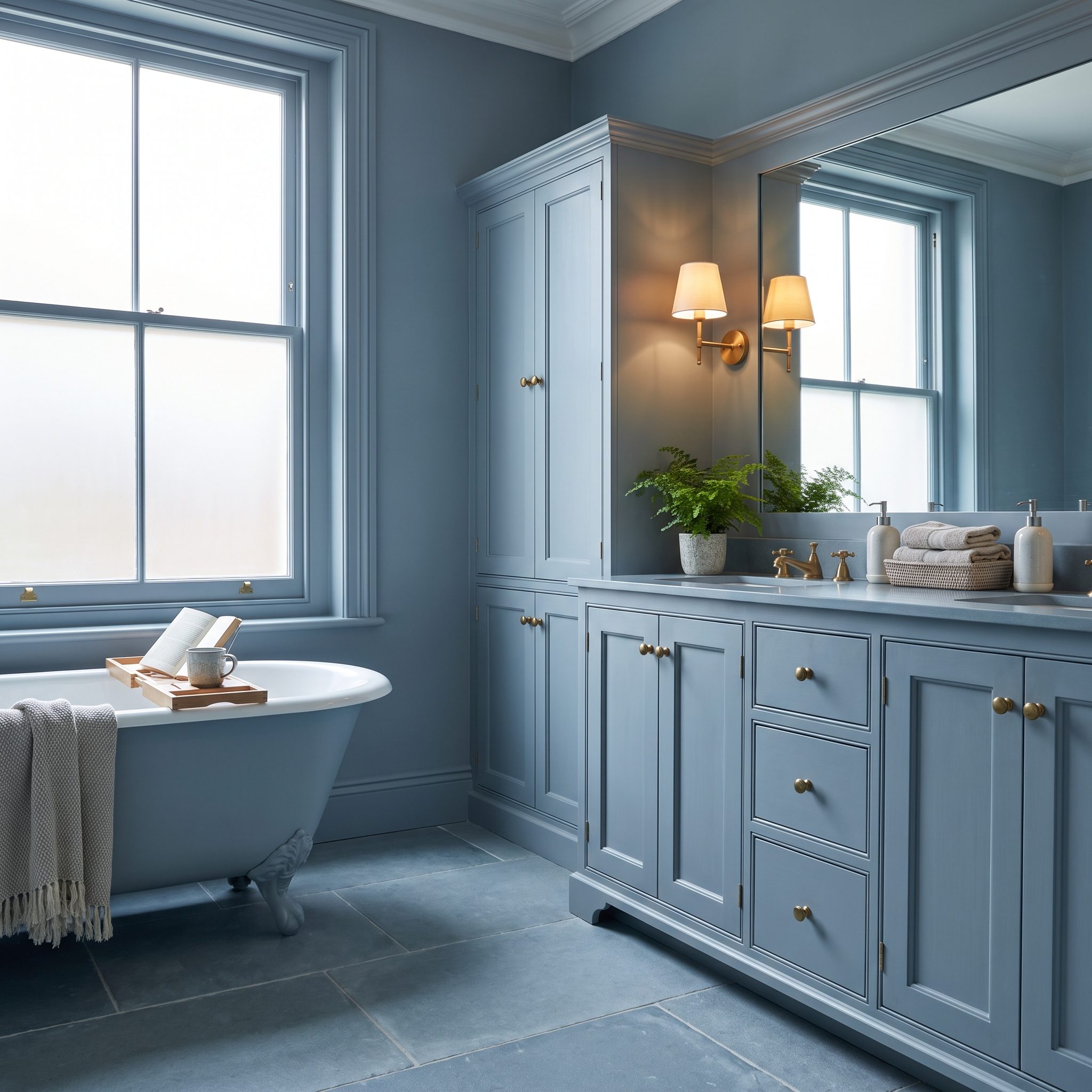
Instead of treating the vanity as the single colored object in an otherwise white bathroom, this room lets blue-gray migrate across the walls, trim, door and shaker cabinetry.
That continuity makes the white marble counter conspicuously crisp and gives the round brass mirror the presence of jewelry. The room doesn’t need to pretend it has more square footage than it does. A controlled palette and a few sharply contrasting materials give this blue bathroom enough architecture to stand on its own.
2. Muted Mauve Bedroom Lets Bedding Finish What the Painted Envelope Starts
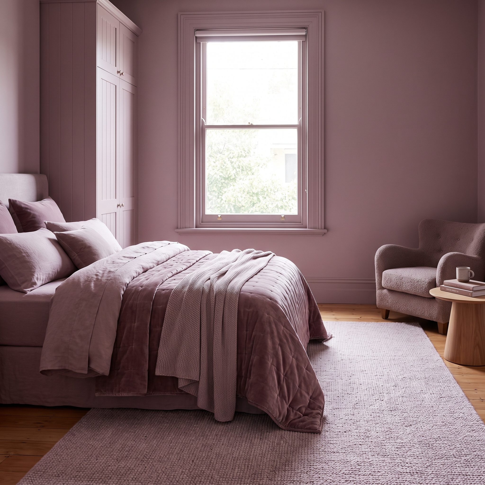
The smart move isn’t merely putting mauve on every architectural surface. It’s refusing to stop the palette when the paint ends. Walls, trim and ceiling establish the field; bedding continues it through blush, dusty rose and plum.
One cream pillow gives the eye a small pause, while the mauve linen bed keeps the largest piece of furniture connected to the walls. The result is tonal without becoming one-note.
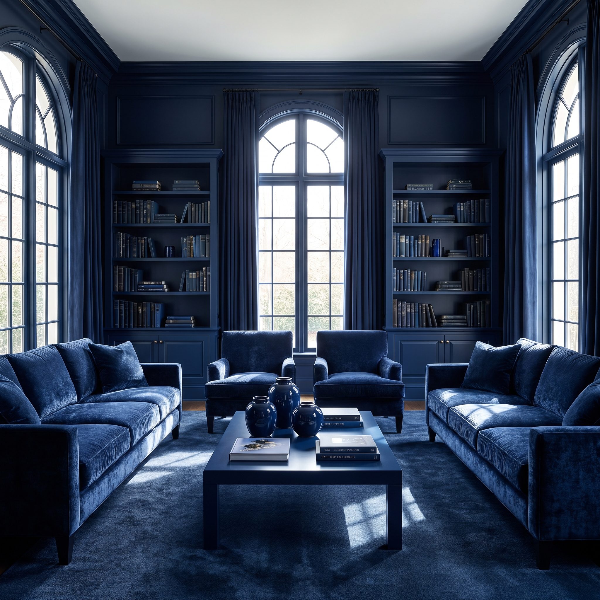
1. Navy-on-Navy Living Room Proves the Whole Room Can Commit Without Every Surface Matching
🔥 Would you like to save this?
After 33 rooms of commitment, this one makes the useful final distinction: whole-room thinking doesn’t require every square inch to match. Navy takes the walls, trim, built-ins and velvet sofa, creating such a dominant field that the room reads as monochromatic even with a pale ceiling overhead.
What keeps all that blue alive is relief. Brass hardware and a brass floor lamp catch the light, cream and camel pillows interrupt the upholstery, and a pale rug plus walnut coffee table give the foreground warmth.
That’s the larger lesson running through the gallery. Commitment isn’t about obeying a rule that says every surface must receive identical paint. It’s about letting one coherent idea govern the entire room. Sometimes that’s forest green from baseboard to ceiling. Sometimes it’s walnut everywhere the eye lands. Sometimes it’s plaster, limewash or a family of related tones. The accent wall asks one surface to carry the idea. These rooms spread the work around.
An accent wall asks one wall to carry the whole room. Commit to the room and no single surface has to.