🔥 Would you like to save this?
A ceiling peppered with recessed cans can make a living room technically bright and visually dead. Light hits the rug, misses the faces, washes the furniture into sameness, and somehow leaves the walls looking flatter than they did before. Add more cans and the room often gets brighter without getting any better.
The rooms that come alive after dark usually work differently. Light appears beside a chair, behind a plant, across a painting, under a shelf, along a wall, or somewhere just above eye level. Shadows are allowed to survive. Pools of brightness give the room places to look, places to sit, and places to disappear into.
In order to come up with the very specific design ideas, we create most designs with the assistance of state-of-the-art AI interior design software. Also, assume links that take you off the site are affiliate links such as links to Amazon. this means we may earn a commission if you buy something.
These 31 living rooms treat lighting as part of the architecture rather than a grid imposed on the ceiling. Some barely use overhead light at all. Others keep the recessed cans but demote them to supporting players. Table lamps, sconces, picture lights, pendants, uplights, warm bulbs, dimmers, and concealed LEDs take over the interesting work.
Before another hole gets cut into the drywall, look at what happens when the light starts following the room instead of the ceiling plan.
31. They Added Table Lamps When the Room Actually Needed Light Beside the Sofa
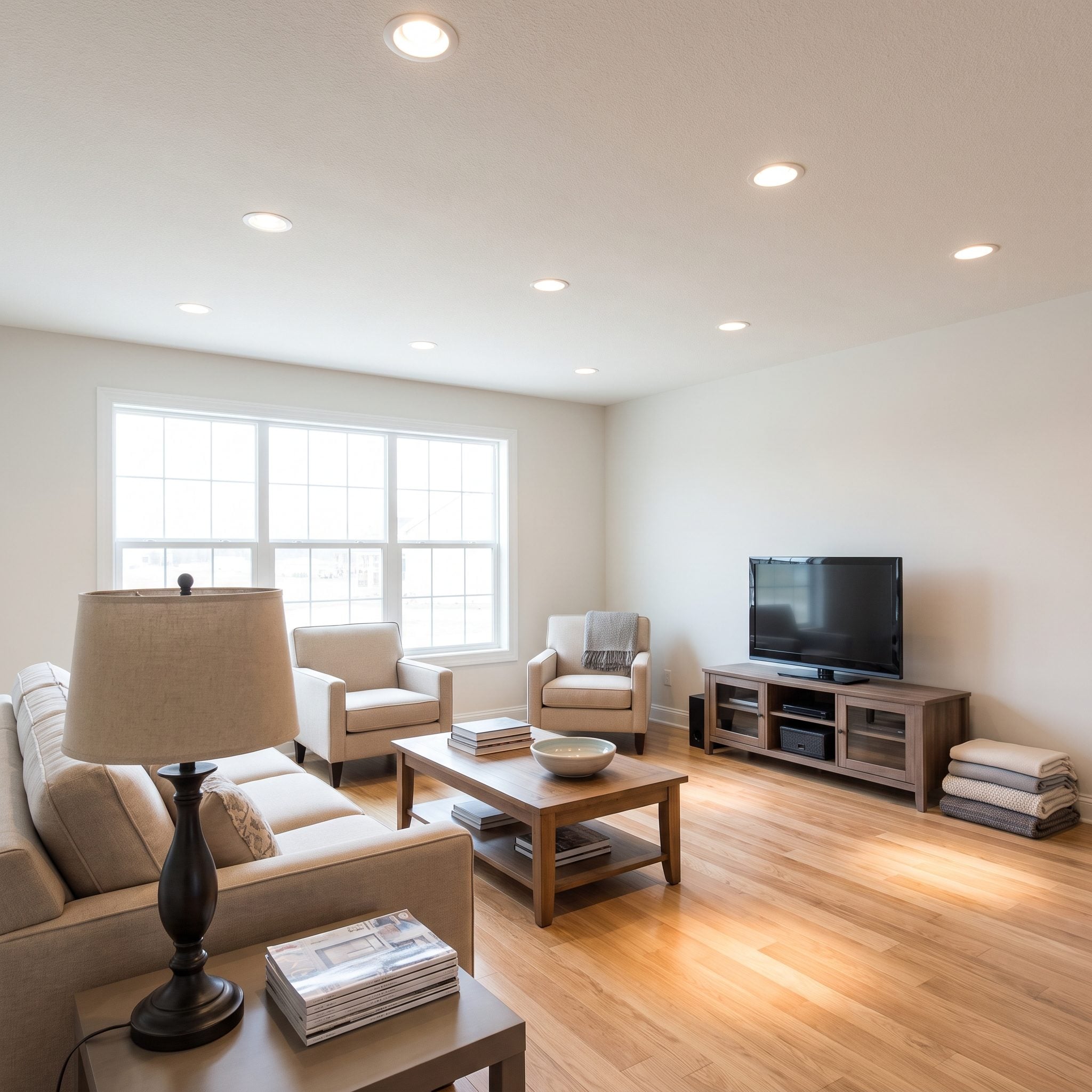
Eight cans in the ceiling and the sofa can still look like a cave. Downlights are useful for general illumination, but they do not automatically put flattering or useful light where people actually sit.
A pair of table lamps changes the geometry immediately. Place them close to the seating with the shades around seated eye level, and light begins spreading horizontally across faces, upholstery, books, and nearby walls rather than simply dropping onto the floor from above.
Why It Works: Lighting close to the seating fills the middle of the room that overhead fixtures often miss. The room gains another layer rather than simply another dose of brightness.
30. They Used Window Light During the Day Instead of Designing the Room as if It Were Always Night
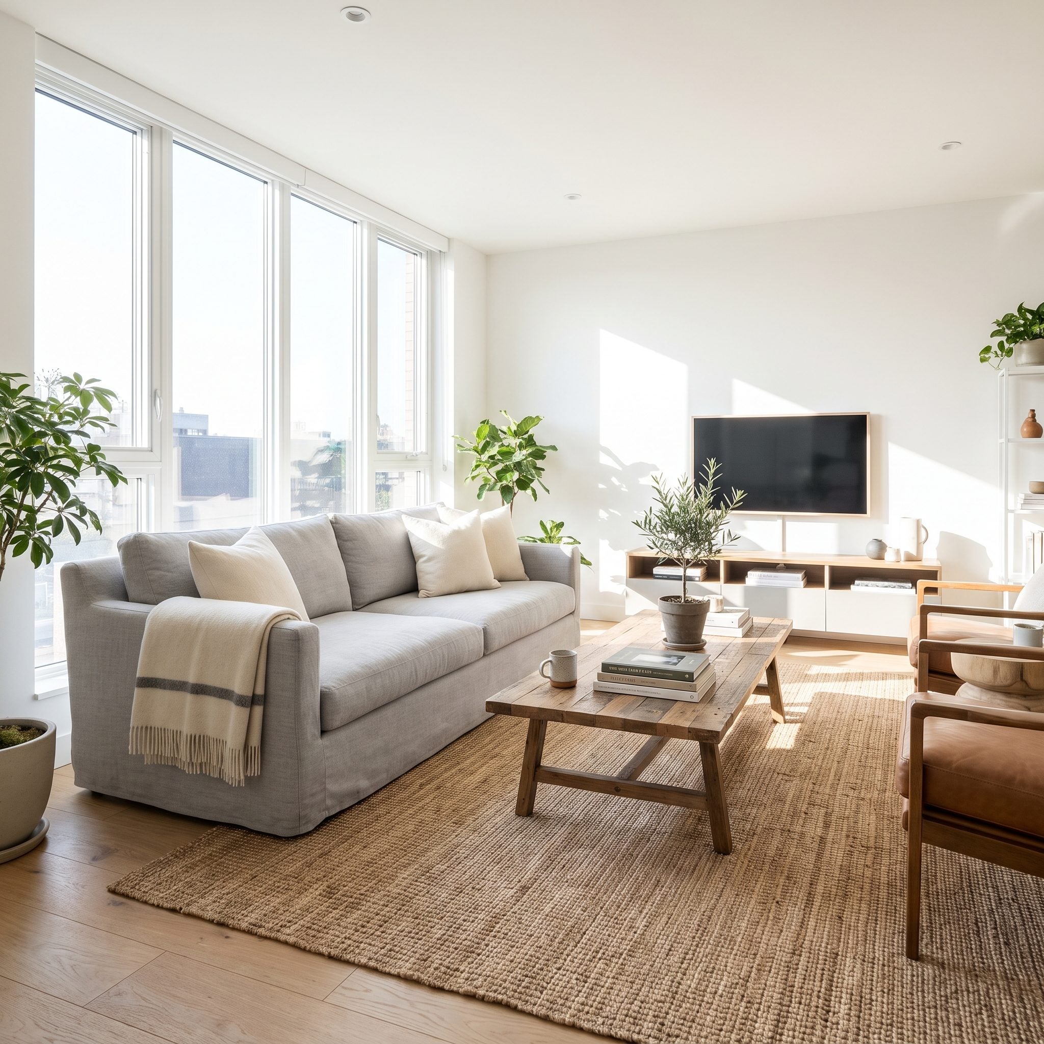
A lighting plan can become strangely obsessed with nighttime. Fixtures get positioned, switches multiplied, and ceilings perforated before anyone checks what the windows are already doing for free.
This room starts with daylight instead. Tall windows stay unobstructed, the linen curtains pull wide, and the artificial lighting waits until it is needed. The sage velvet sofa changes character as the light moves, while the travertine table catches the sun rather than fighting it.
Try This: Spend a day with the artificial lights off and note where daylight is strong, where it fades first, and which corners never receive enough. Add electric light to the gaps instead of pretending the windows do not exist.
29. They Added Sconces Instead of Cutting More Holes Into the Ceiling
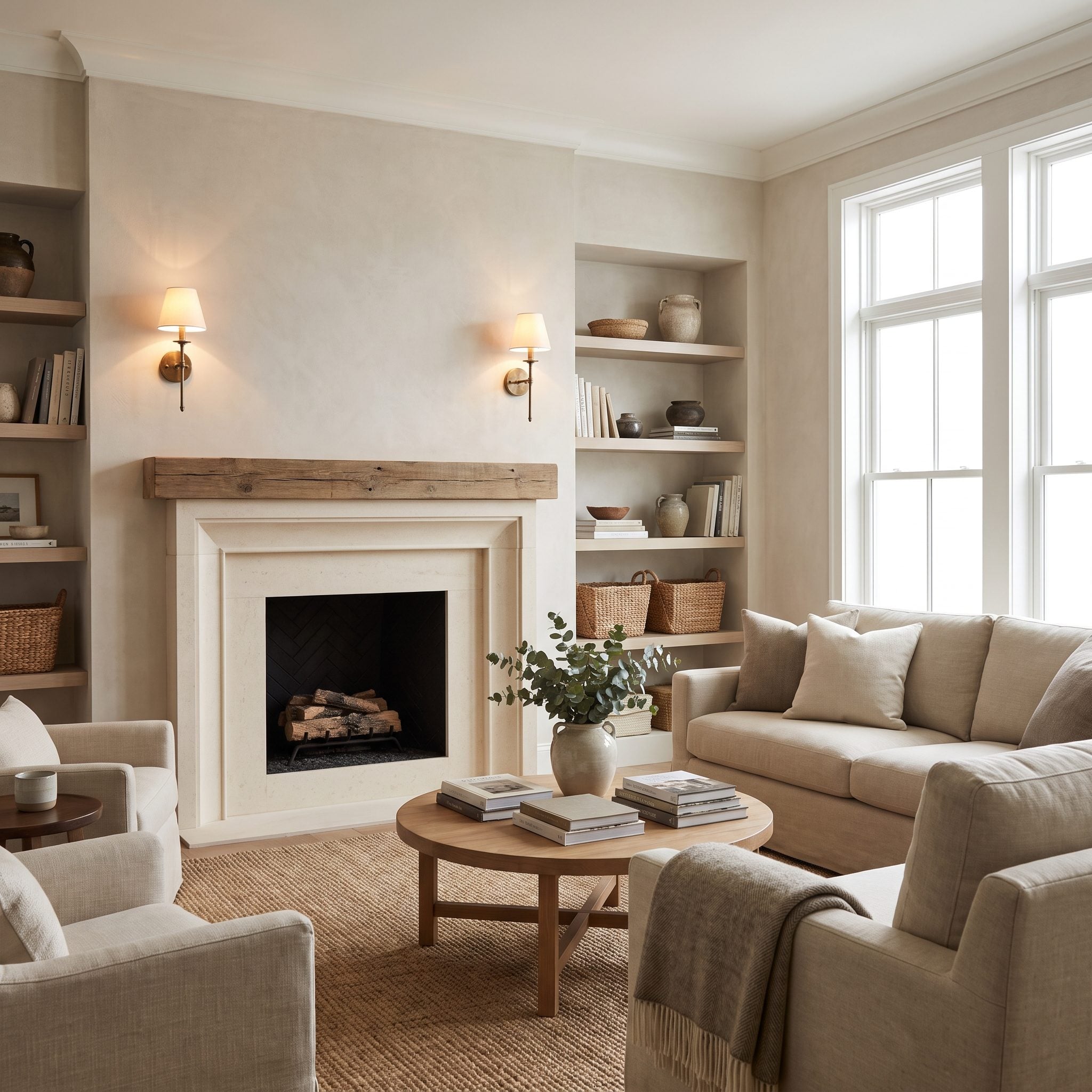
Sconces beside a fireplace do something recessed cans cannot: they illuminate the vertical surfaces that define the room. The wall itself begins to glow, which can make the entire space feel more luminous without flooding the floor.
These plaster sconces flank the limewashed fireplace and send soft light both outward and upward. Mounting height depends on the fixture and room, but roughly 60 to 66 inches from the floor is a common starting range for decorative living-room sconces before adjusting for sightlines and proportions.
History Corner: Wall-mounted light predates electric ceiling grids by centuries. Candles and early gas fixtures commonly lived on vertical surfaces because that put useful illumination closer to faces and furnishings.
28. They Put a Reading Lamp Exactly Where Someone Actually Reads
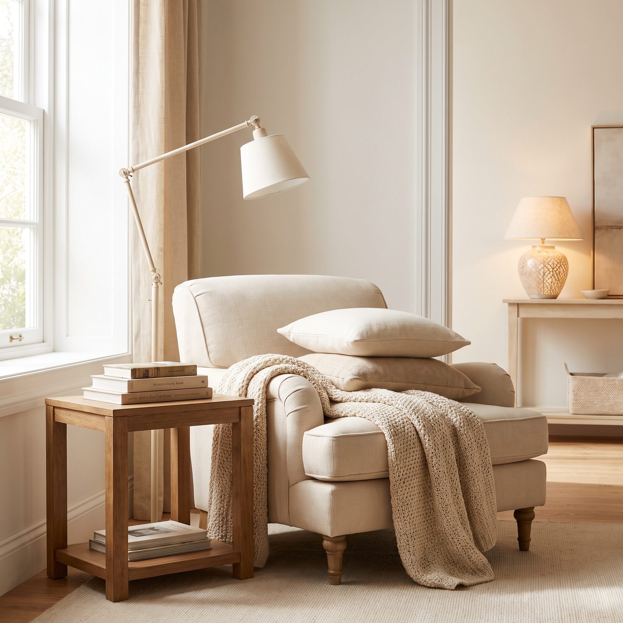
Plenty of living rooms technically contain a reading lamp while leaving the reader in shadow. A fixture across the room or a downlight several feet away does little good when your own head and shoulders sit between the light and the page.
This brass task lamp solves the problem directly. Its adjustable head reaches over the chair’s shoulder and sends the beam toward the book. Positioning the source slightly behind and to one side keeps it useful without putting a bright bulb directly in the reader’s line of sight.
27. They Used Cove Lighting to Make the Ceiling Feel Softer and Higher
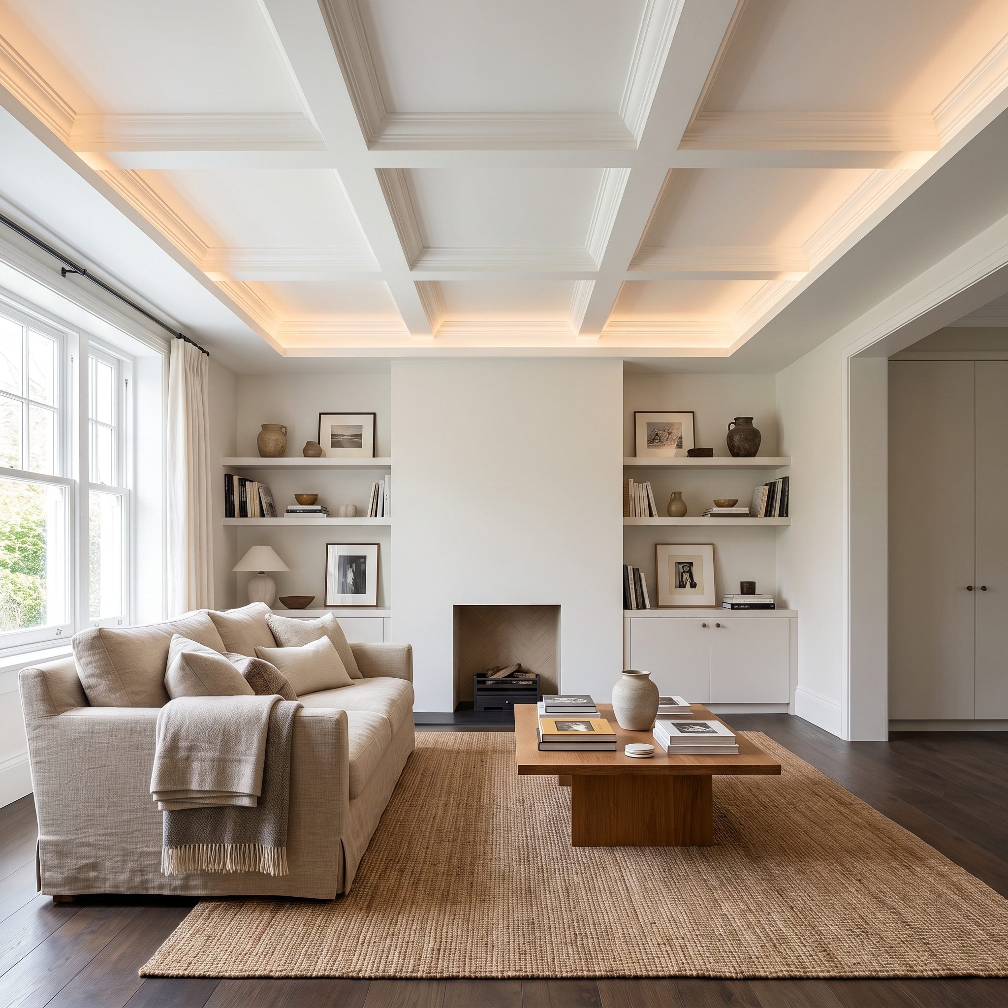
Cove lighting removes the visible fixture and lets the ceiling itself carry the glow. Instead of bright points punching downward, light spreads around the perimeter and reflects back into the room.
The sand sectional and travertine table sit beneath an illuminated ceiling edge with a comparatively quiet center. That separation between glowing perimeter and clean ceiling plane can make the upper part of the room feel lighter and less compressed.
26. They Lit the Conversation Area Instead of the Empty Walkways
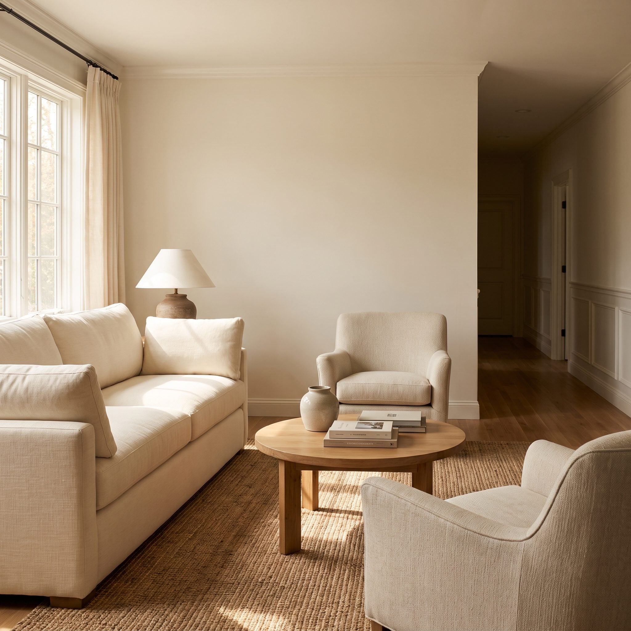
Builders often distribute light according to circulation. This room distributes it according to where people actually stop. The sofa, coffee table, and armchairs sit inside the brightest part of the room while the outer paths remain comparatively subdued.
That darker perimeter is not unfinished space. It acts as a visual boundary around the seating cluster, strengthening the sense that the furniture forms a room within the larger room.
Why It Works: Concentrating light around the furniture gives the seating group a clear visual center. Keeping peripheral circulation softer prevents every square foot from competing equally for attention.
25. They Added Picture Lights That Made the Walls Come Alive After Dark
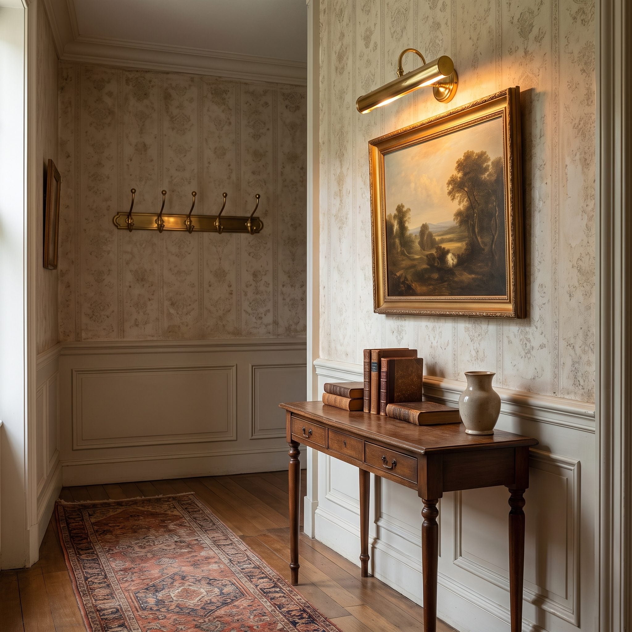
Picture lights once seemed inseparable from museums and traditional hallways. Put one over a strong piece of art in a contemporary living room, though, and the appeal becomes obvious. The fixture gives the wall a focal point without asking the whole room to get brighter.
This slim brass picture light throws a controlled wash across the painting and catches the sage wall around its edges. Hardwired versions offer the cleanest installation, but well-designed rechargeable fixtures can also work where new wiring is impractical.
24. They Added a Decorative Flush Mount Instead of Another Recessed Can
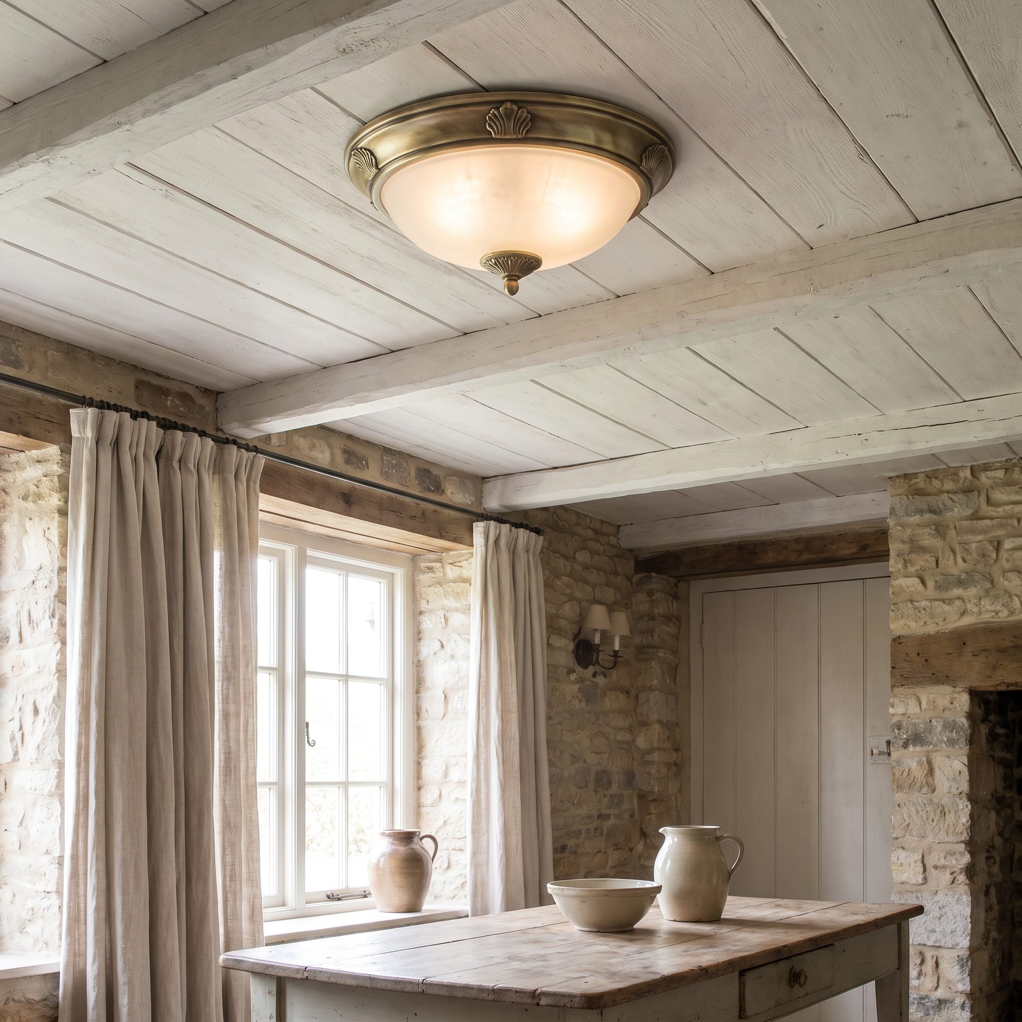
Low ceilings often send everyone running toward recessed cans, as though anything visible overhead will immediately consume the room. A low-profile fixture can do the opposite by turning an otherwise blank ceiling into part of the design.
This ribbed-glass brass flush mount sits close to the ceiling while still introducing texture and warm metal overhead. The glass diffuses the bulb, and the fixture provides one deliberate focal point instead of another anonymous hole in the drywall.
Try This: In a low-clearance room, look for a genuinely shallow flush mount with diffused or textured glass. The key is keeping headroom while still giving the ceiling some visual presence.
23. They Used Uplighting to Rescue a Dark Corner Without Creating Glare
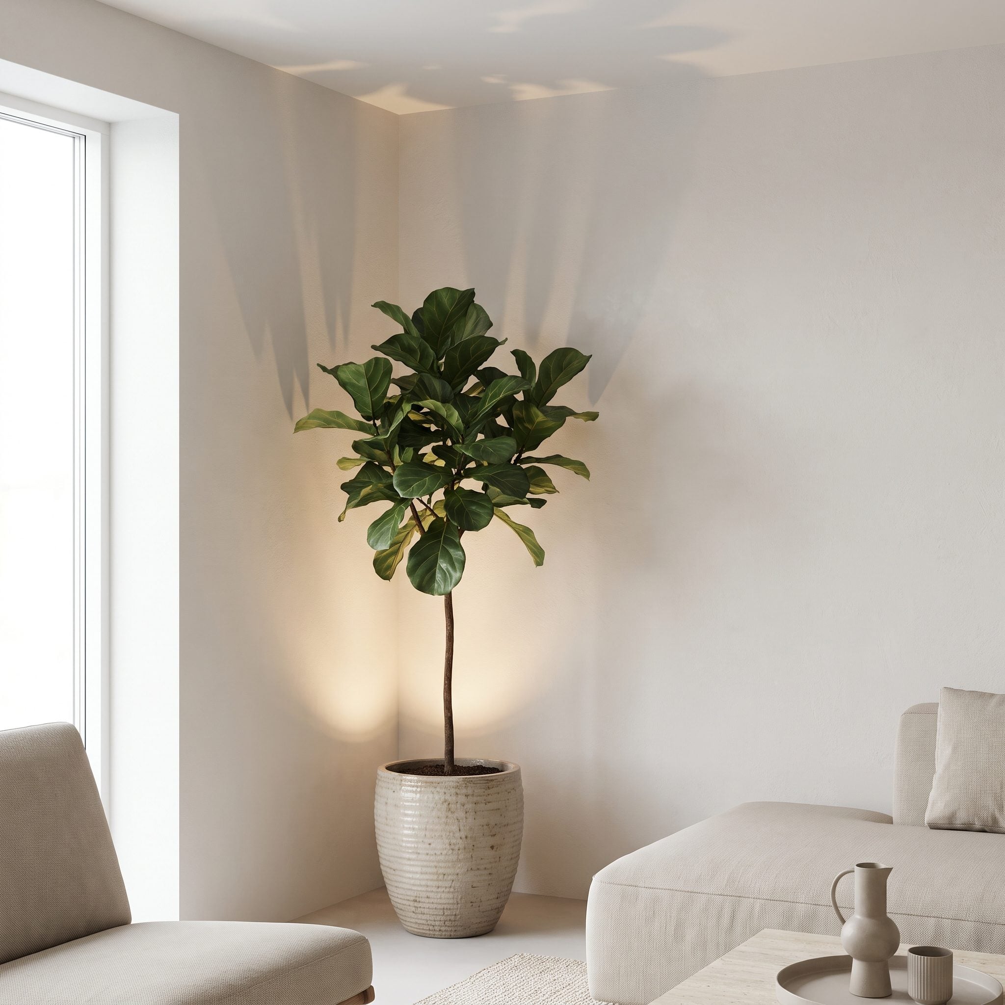
Every living room seems to have a corner that overhead lights skim past. Rather than adding another ceiling fixture, this one hides a small uplight on the floor behind a terracotta pot.
The fixture disappears while the effect does not. Light rises through the leaves, throws shifting shadows onto the wall and ceiling, and gives an otherwise forgotten corner a completely different depth after dark.
Design Detail: Uplighting a tall plant lets the foliage break up the beam before it reaches the wall. The resulting shadow pattern is often far more interesting than illuminating the corner evenly.
22. They Used a Chandelier to Give the Seating Area a Center
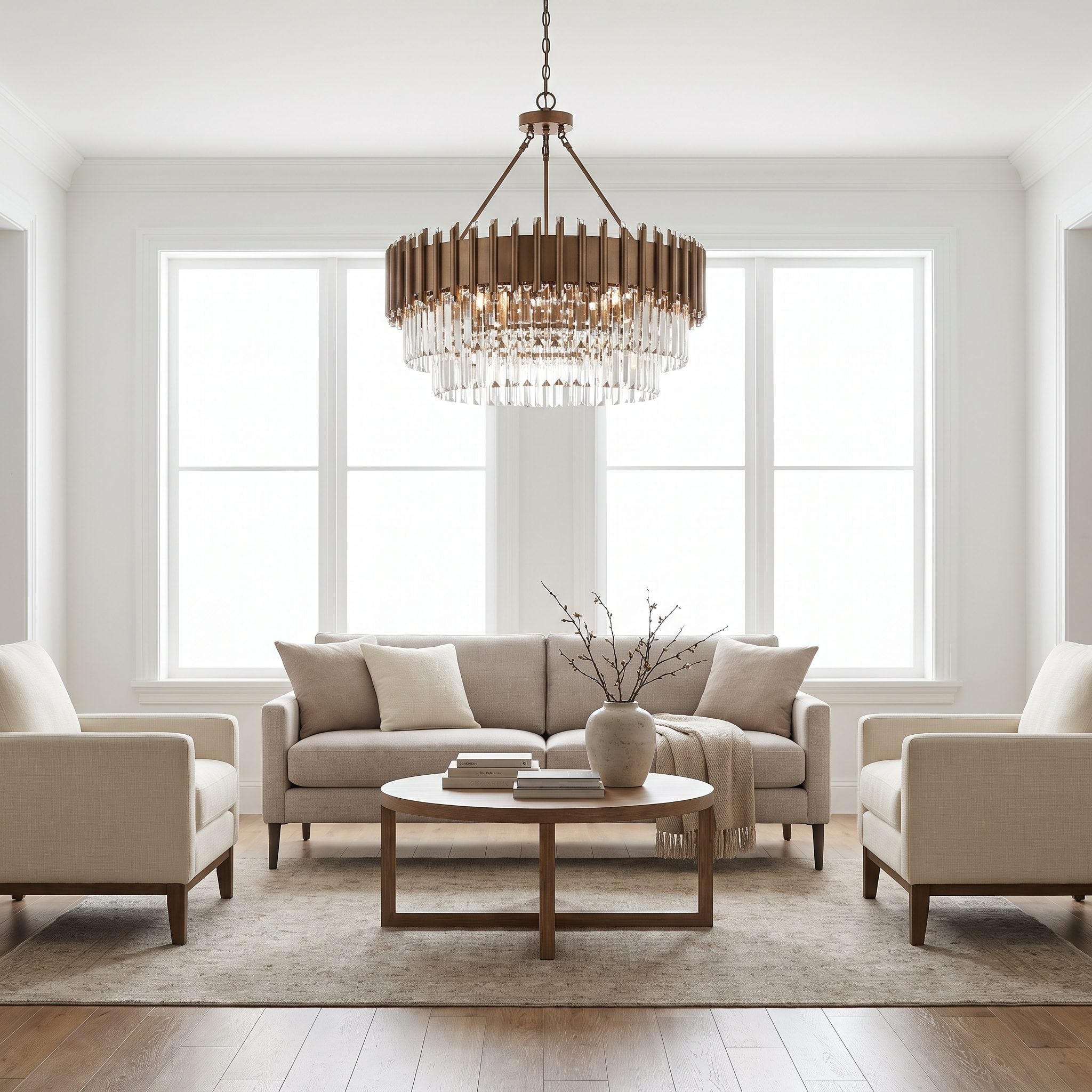
A large seating group can feel strangely unmoored when nothing marks its center. The brass chandelier here solves that without relying on a grid of small downlights.
The fixture is centered on the rug and conversation area rather than simply on the dimensions of the room. Over furniture, a chandelier can hang lower than it safely could over a walkway, so placement and clearance should follow the furniture plan as much as the ceiling plan.
Pro Tip: Center a decorative fixture on the composition it belongs to — rug, table, or seating group — rather than automatically centering it on the room itself.
21. They Used Plug-In Sconces When New Wiring Wasn’t Worth the Trouble
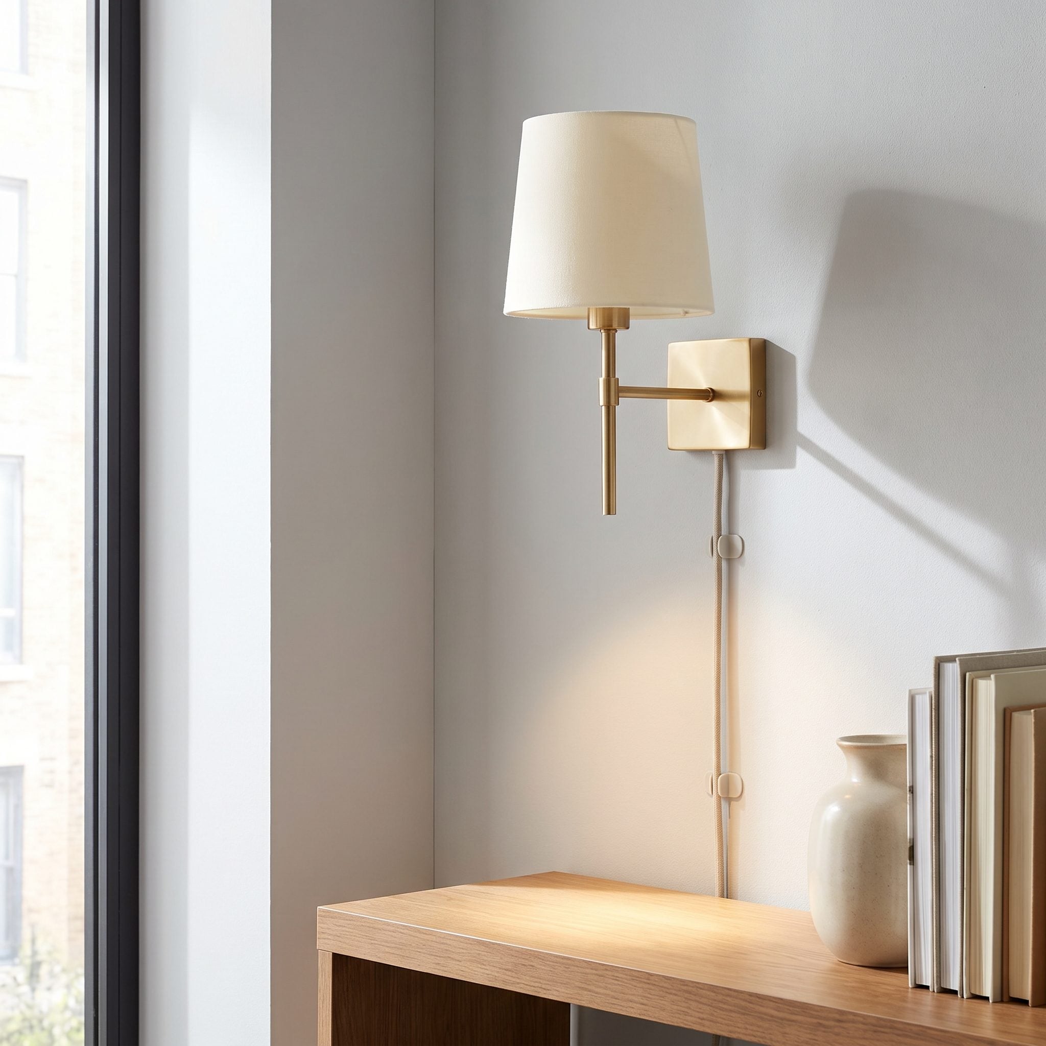
Hardwired sconces are elegant, but getting power into the wall can turn a small lighting idea into a much larger project. Plug-in versions preserve most of the visual effect without opening the drywall.
Here brass plug-in sconces flank the built-ins, with the cords routed neatly along the shelving so they recede rather than becoming part of the composition. The walls gain another lighting layer without pretending every upgrade needs to be permanent.
20. They Changed the Bulb Temperature Before Adding More Fixtures
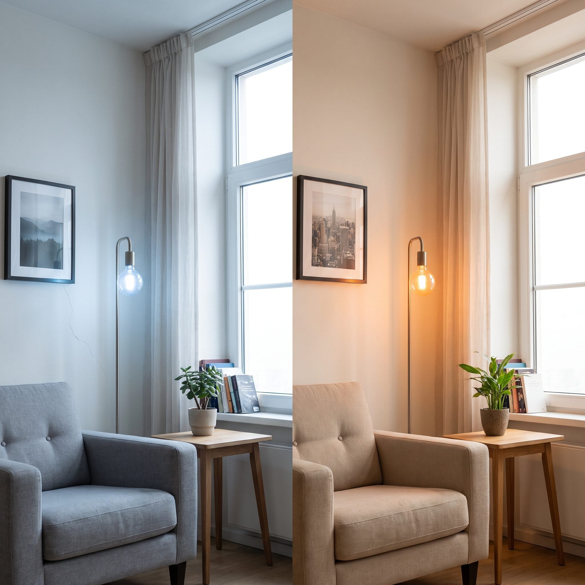
A room can have enough light and still feel wrong because the color temperature fights everything inside it. Cool white bulbs can make warm woods, terracotta, and tan upholstery look considerably flatter than they do under warmer light.
In this tan family room, warmer bulbs let the rust sofa and terracotta walls regain their depth without adding another fixture. Same lamps, different light, dramatically different atmosphere.
By the Numbers: Around 2700K gives a distinctly warm residential glow, while 3000K is somewhat crisper. Higher color temperatures can be useful in other settings, but many living rooms feel most comfortable somewhere in that warmer range.
19. They Hid Indirect Lighting Above the Millwork and Let the Ceiling Glow
🔥 Would you like to save this?
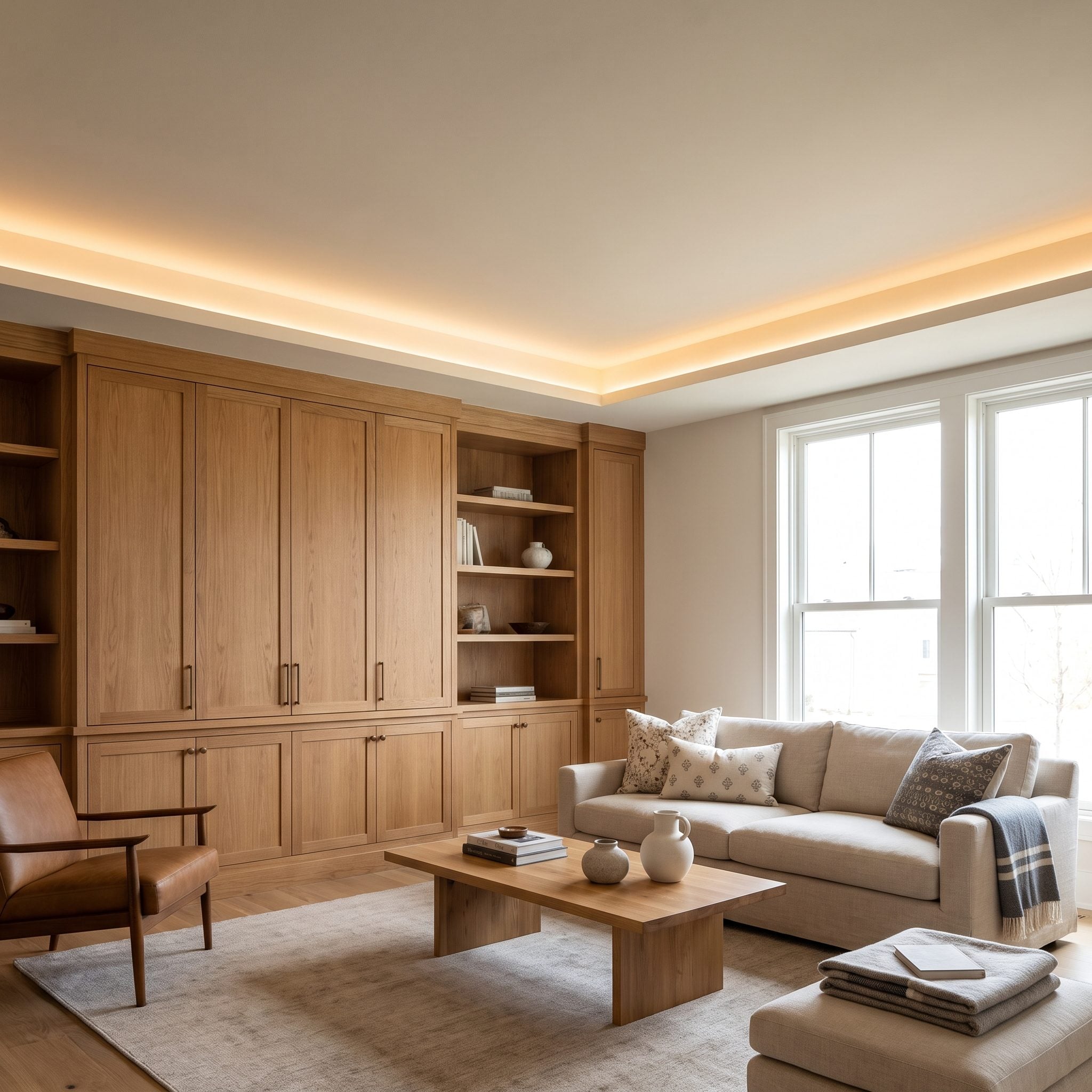
The most noticeable thing about the lighting here is that there is almost nothing to look at. A concealed LED source sits above the oak millwork and sends light toward the ceiling rather than directly into the room.
The ceiling becomes a broad reflector, spreading soft fill back downward without exposed bulbs or another decorative object competing for attention. Proper channels, drivers, ventilation, access, and dimming all need to be considered, but visually the result can be remarkably quiet.
Sometimes the most sophisticated fixture is the one that disappears completely.
18. They Stopped Lighting the Coffee Table and Started Lighting the People Around It
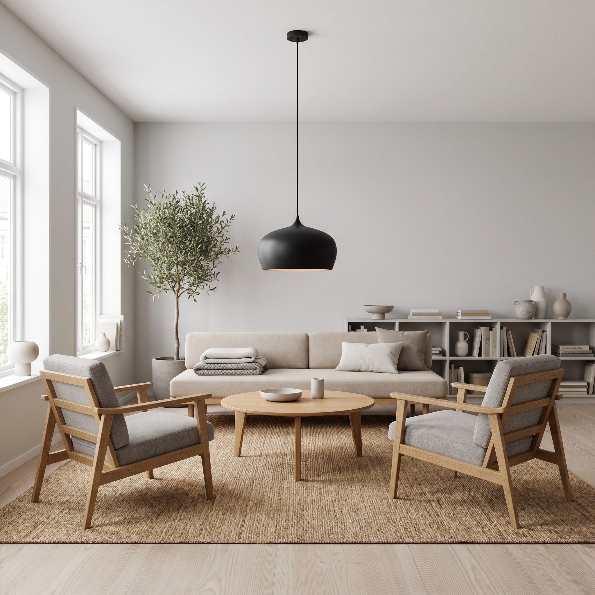
A pendant can look beautiful over a coffee table and still solve the wrong problem. Concentrate all the light on the tabletop and everyone sitting around it may remain comparatively dark.
The better move is to supplement or replace that narrow pool with light aimed toward the seating. Lamps beside the sofa or a floor lamp behind a chair spread illumination across faces and upholstery instead of making the coffee table the brightest object in the conversation.
17. They Added Lighting Inside Built-Ins Instead of Another Ceiling Fixture
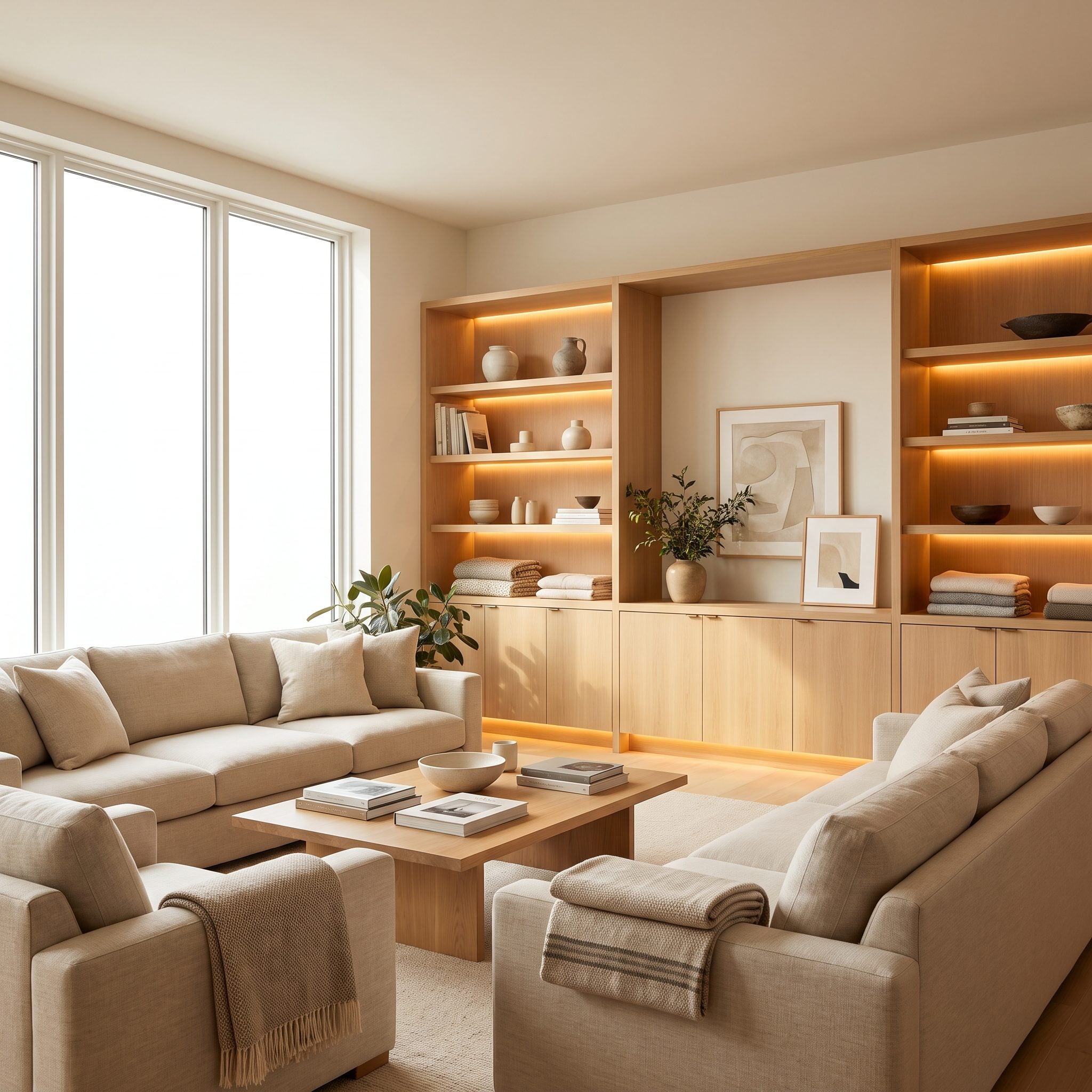
Stop asking the ceiling to illuminate objects that already have architecture wrapped around them. Built-ins offer their own places to hide light exactly where it will be seen.
Small warm puck lights illuminate the display niches here, catching the ceramics and brass clock while leaving the surrounding millwork quieter. Light inside the cabinetry makes each recess look deeper and gives displayed objects a much clearer presence after dark.
16. They Used Several Small Light Sources Instead of One Extremely Bright One
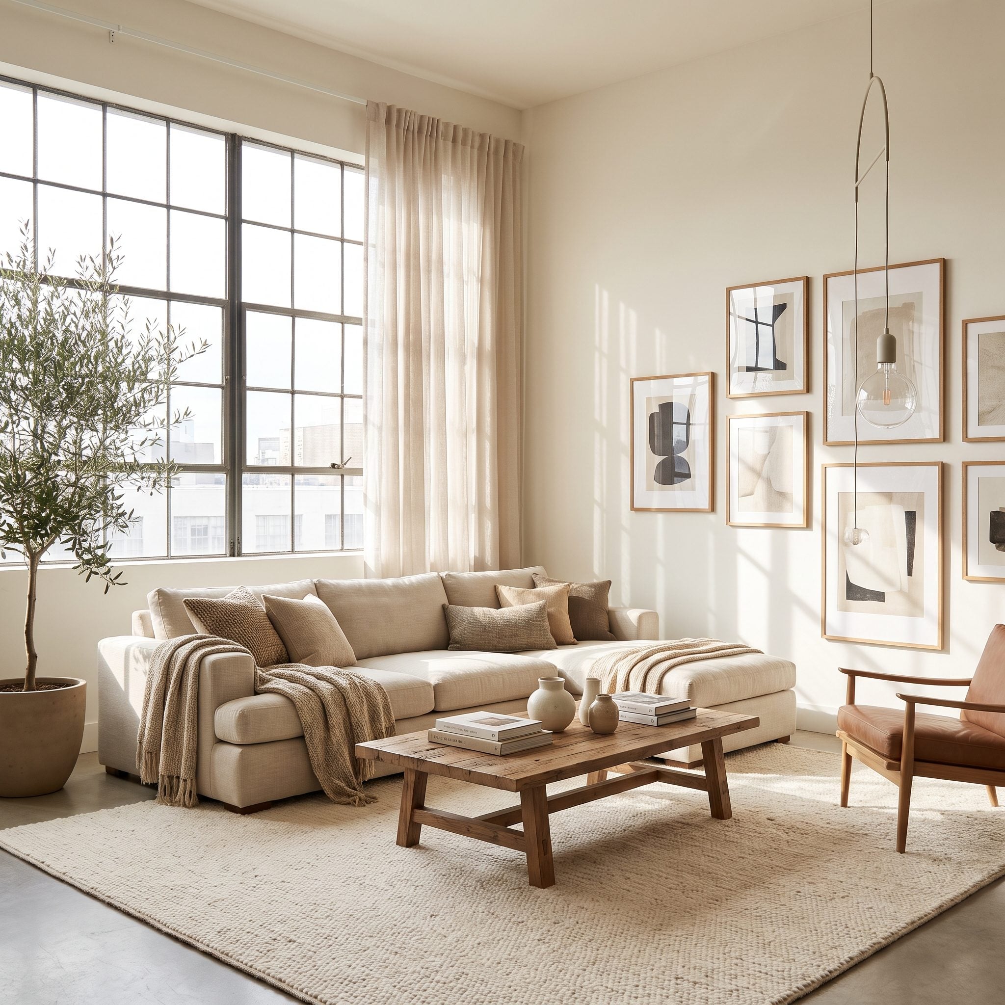
One oversized source creates one dominant direction of light. Shadows repeat themselves, surfaces flatten, and the room can feel more exposed than layered.
This room scatters illumination across several smaller sources at different heights. One catches the seating, another reaches a corner, another brightens the wall. No single lamp carries the entire space, and the overlaps between them create the depth that a single blast of overhead light struggles to produce.
More useful light does not always mean more wattage. Sometimes it means more places for the light to come from.
15. They Washed the Walls With Light Instead of Blasting the Floor From Above
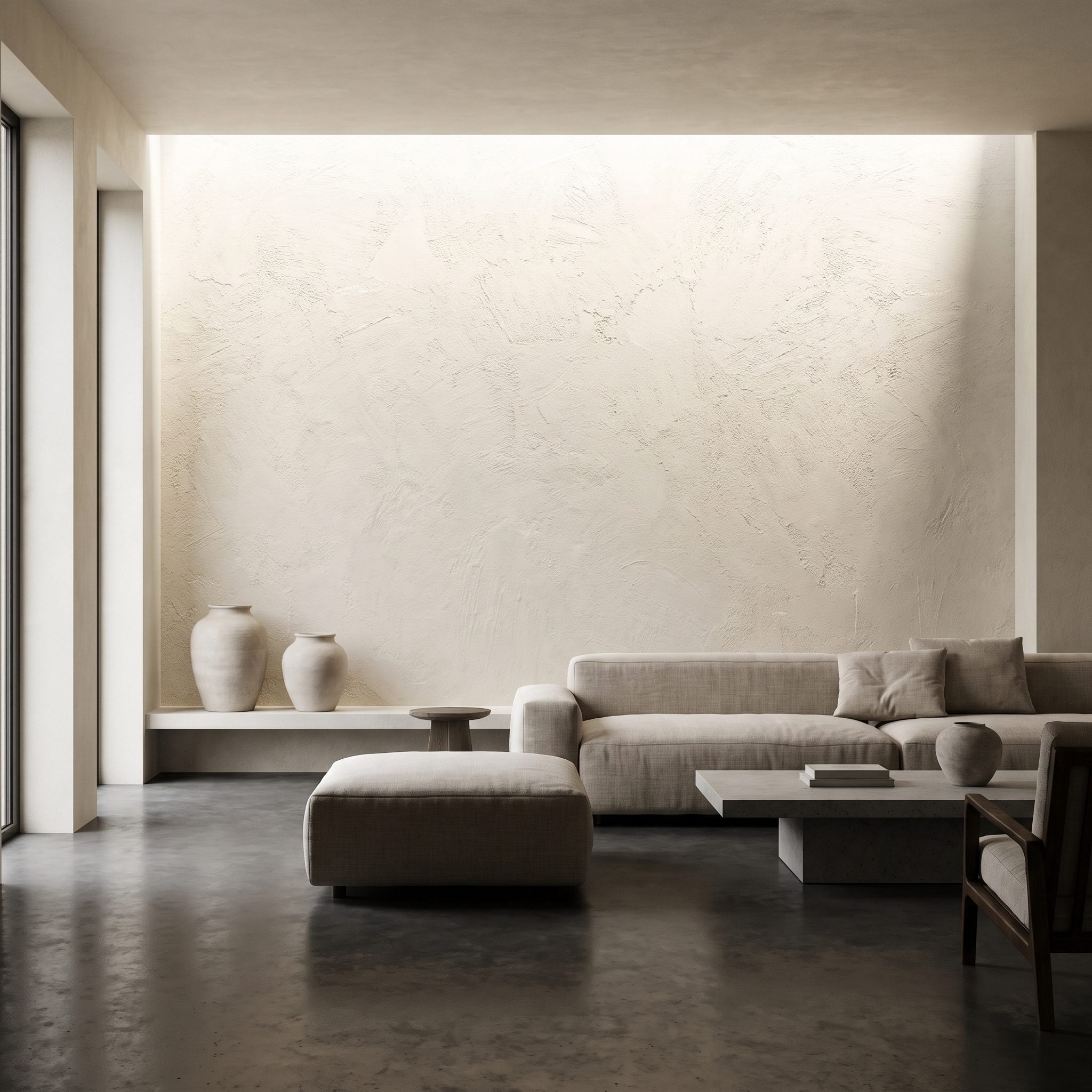
A bright floor does not necessarily make a room feel bright. Vertical surfaces occupy far more of the field of view, so illuminating a wall can transform the apparent brightness of the entire space.
This concealed source creates a broad wash down the plaster and pulls the large canvas into the composition at the same time. Wall washing aims for even illumination across the surface; wall grazing is different, placing the source much closer to emphasize texture. Fixture spacing depends on the optics, ceiling height, and effect rather than one universal measurement.
Light the surfaces you actually see, not just the floor beneath them.
14. They Let the Fireplace Become the Visual Center After Dark
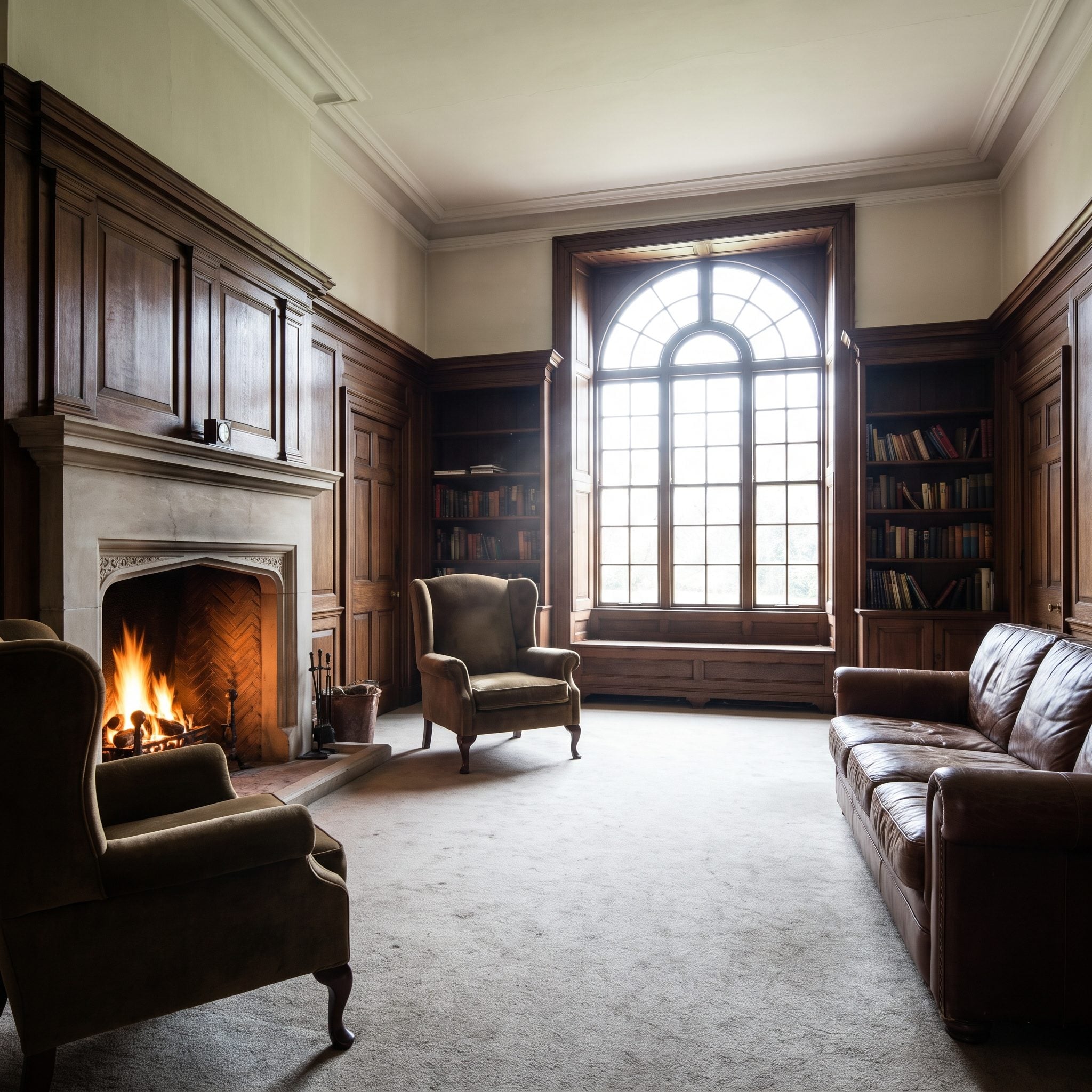
A fireplace already provides movement, color, and a concentrated source of warm light. Flood the room with overheads and much of that drama disappears.
This room does the opposite. Two low ceramic lamps flank the surround, the fire remains the brightest point, and a sheepskin throw catches the edge of the glow. Instead of competing with the hearth, the rest of the lighting frames it.
Why It Works: The moving fire provides a natural focal point while the lamps prevent the surrounding room from disappearing completely. Bright center, softer edges, very little competition.
13. They Highlighted the Artwork Instead of Lighting Every Square Foot Equally
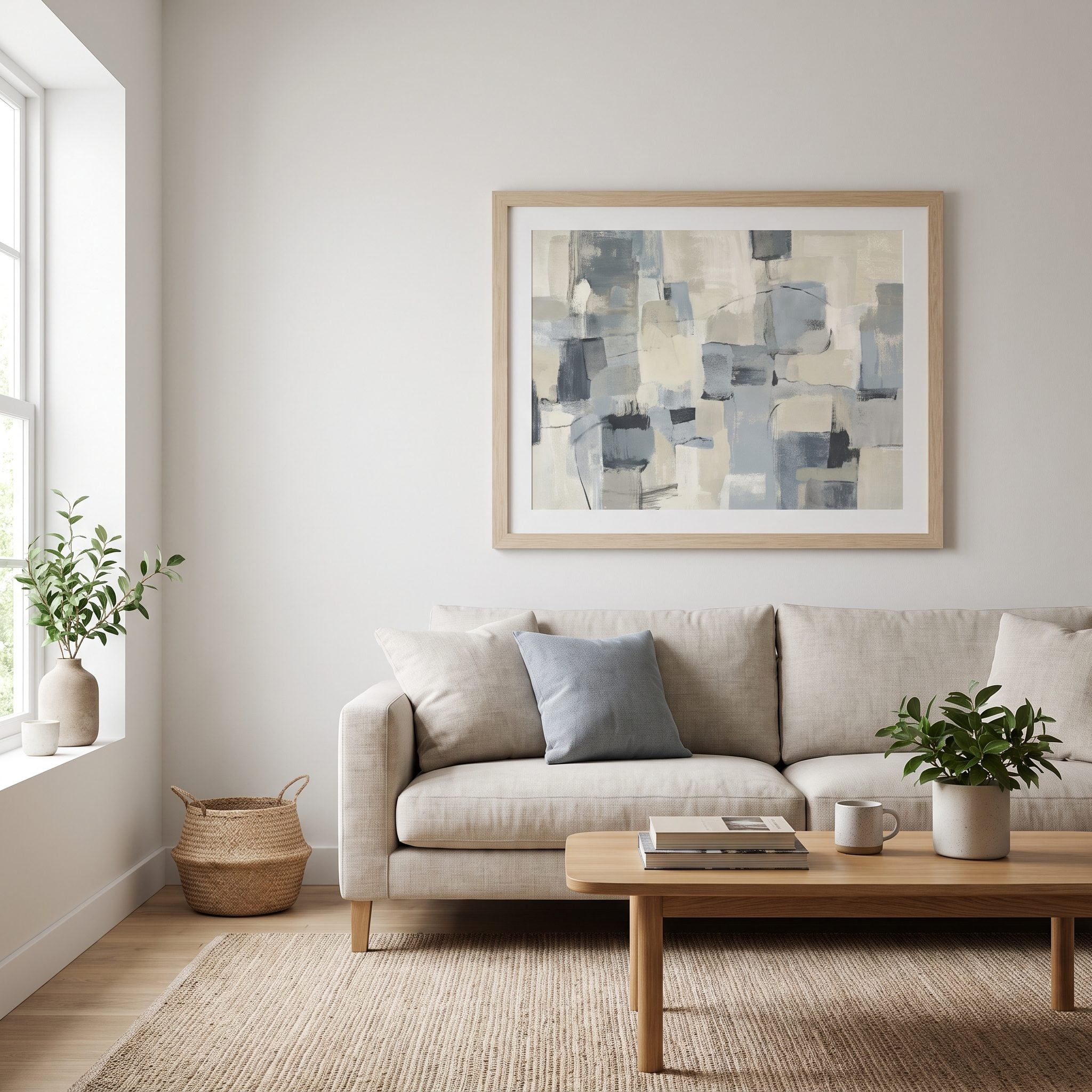
Even illumination can make a room look strangely flat because every surface competes at roughly the same intensity. Accent lighting creates hierarchy instead.
Here a focused beam pulls attention toward the terracotta canvas while the oatmeal linen sofa and surrounding corners stay softer. The art becomes the destination because the lighting gives it a clear advantage over everything around it.
Why It Works: Contrast establishes a focal point. When one surface is intentionally brighter than its surroundings, the room gains visual hierarchy instead of uniform exposure.
12. They Put Lamps on Both Ends of the Sofa Instead of Lighting the Room From One Spot
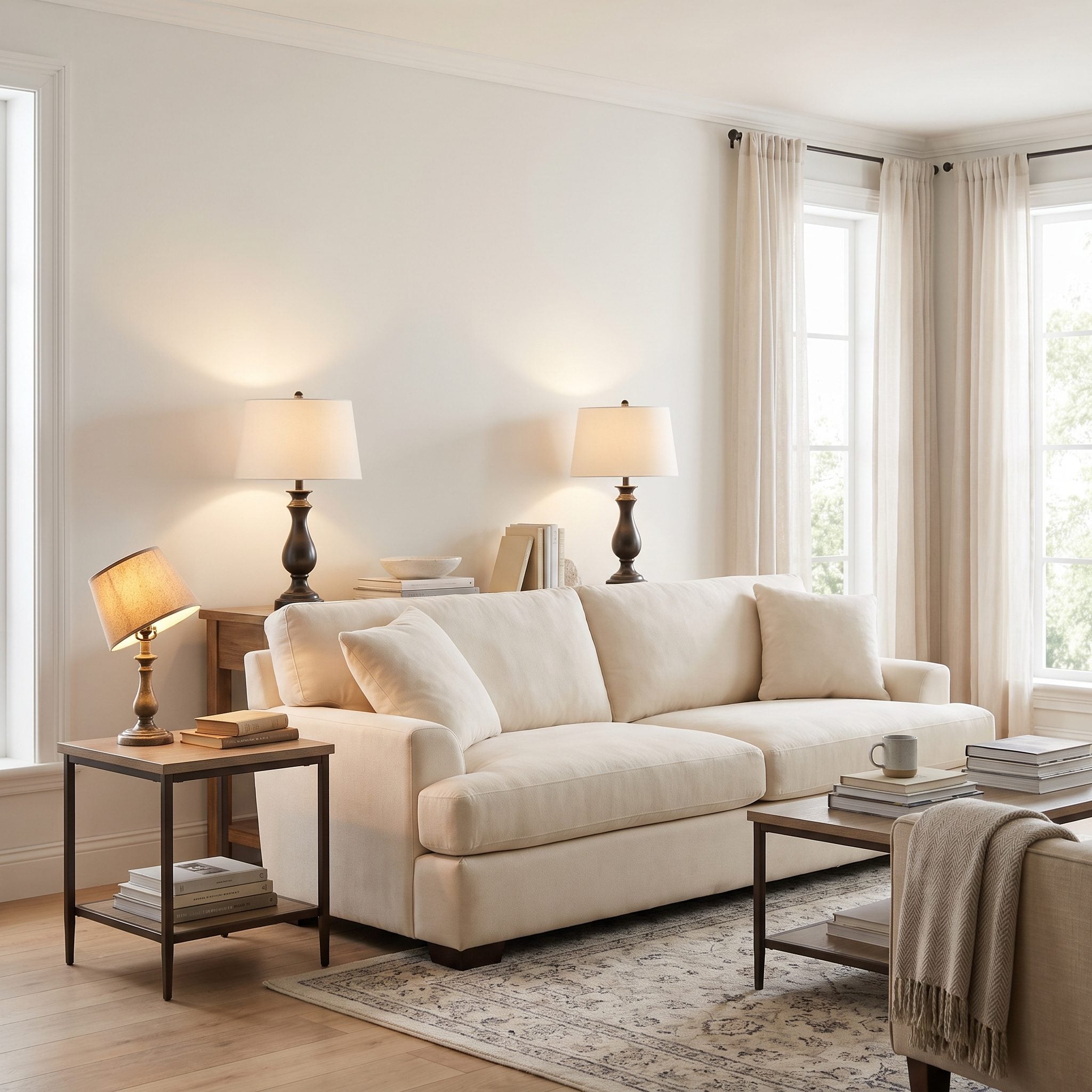
One table lamp can leave a long sofa visually lopsided after dark. One end glows while the other disappears, especially when there is little ambient light elsewhere in the room.
Matching ceramic table lamps at both ends establish a calmer rhythm and spread light across more of the seating. The lamps do not need to match the furniture. Matching each other is enough to make the pair feel intentional.
11. They Created Separate Lighting Zones Instead of One Switch for the Whole Room
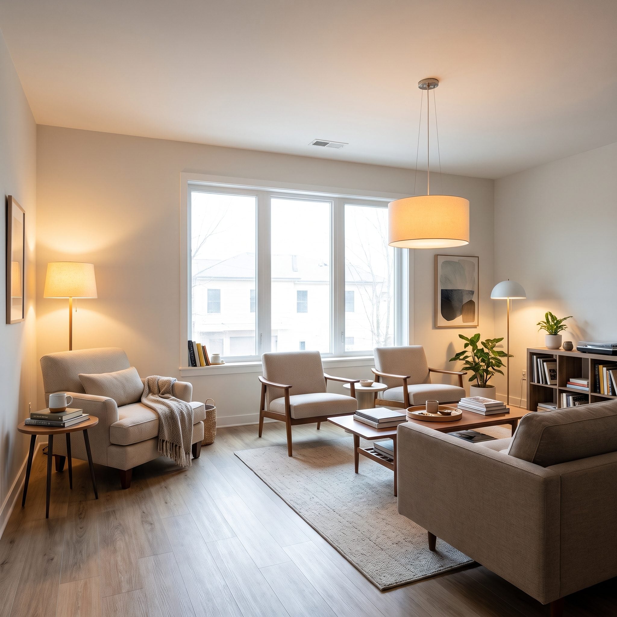
One switch assumes the whole living room is doing the same thing at the same time. Most living rooms are not. Someone reads in one corner while someone else watches television, works at a console, or talks across the sofa.
This room divides those activities into separate lighting zones. The reading corner can be bright while the seating area stays low, and the console can glow without waking the entire room. Light begins following use rather than square footage.
10. They Chose One Statement Pendant Where a Grid of Downlights Would Have Felt Commercial
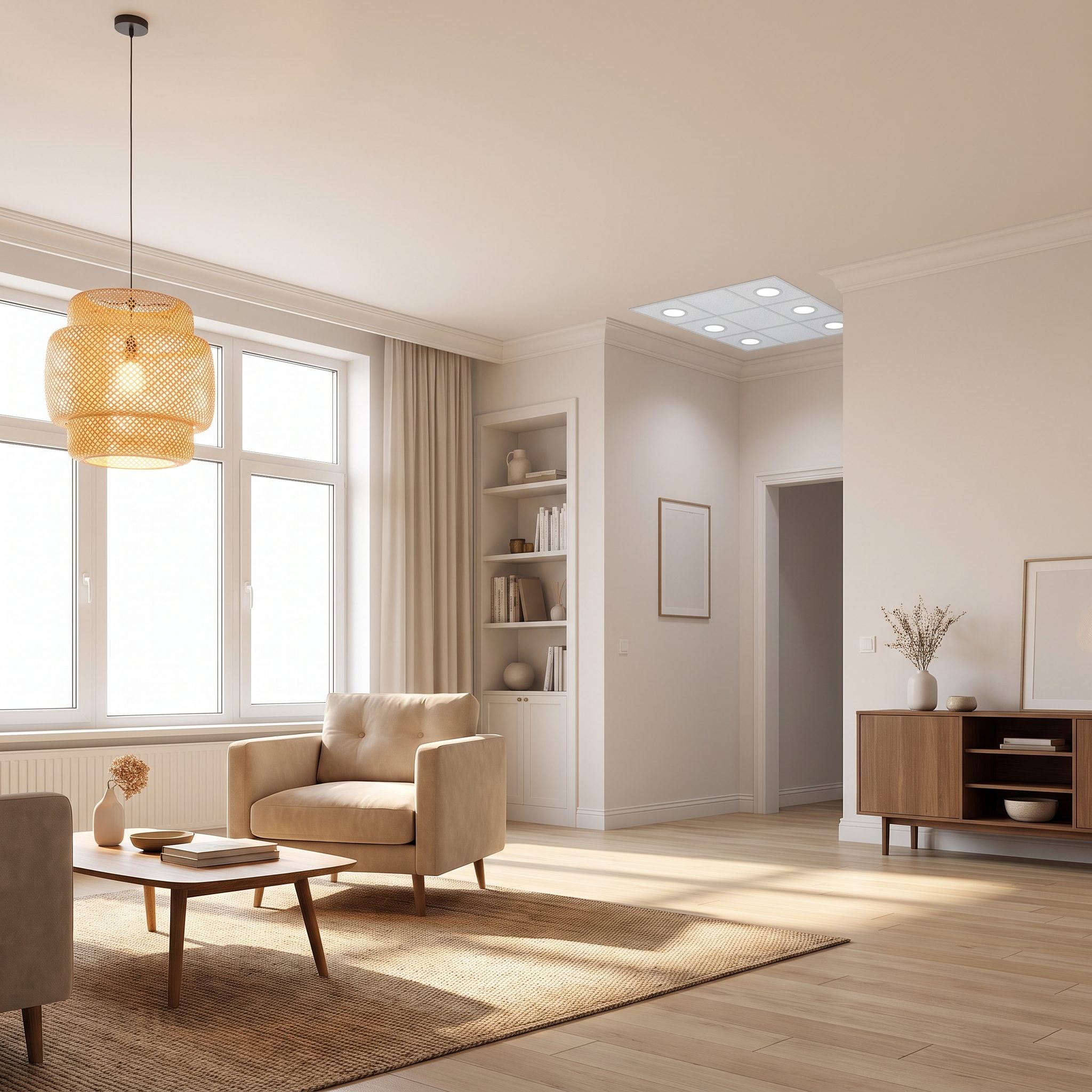
Picture the same ceiling peppered with evenly spaced cans. The illumination might be perfectly adequate, but the ceiling would contribute almost nothing to the character of the room.
Instead, one sculptural rattan pendant claims the space above the seating. Its woven shade introduces texture, its scale anchors the furniture below, and the clean ceiling around it gives the fixture room to matter.
9. They Fixed Harsh Glare Instead of Assuming the Room Needed More Lumens
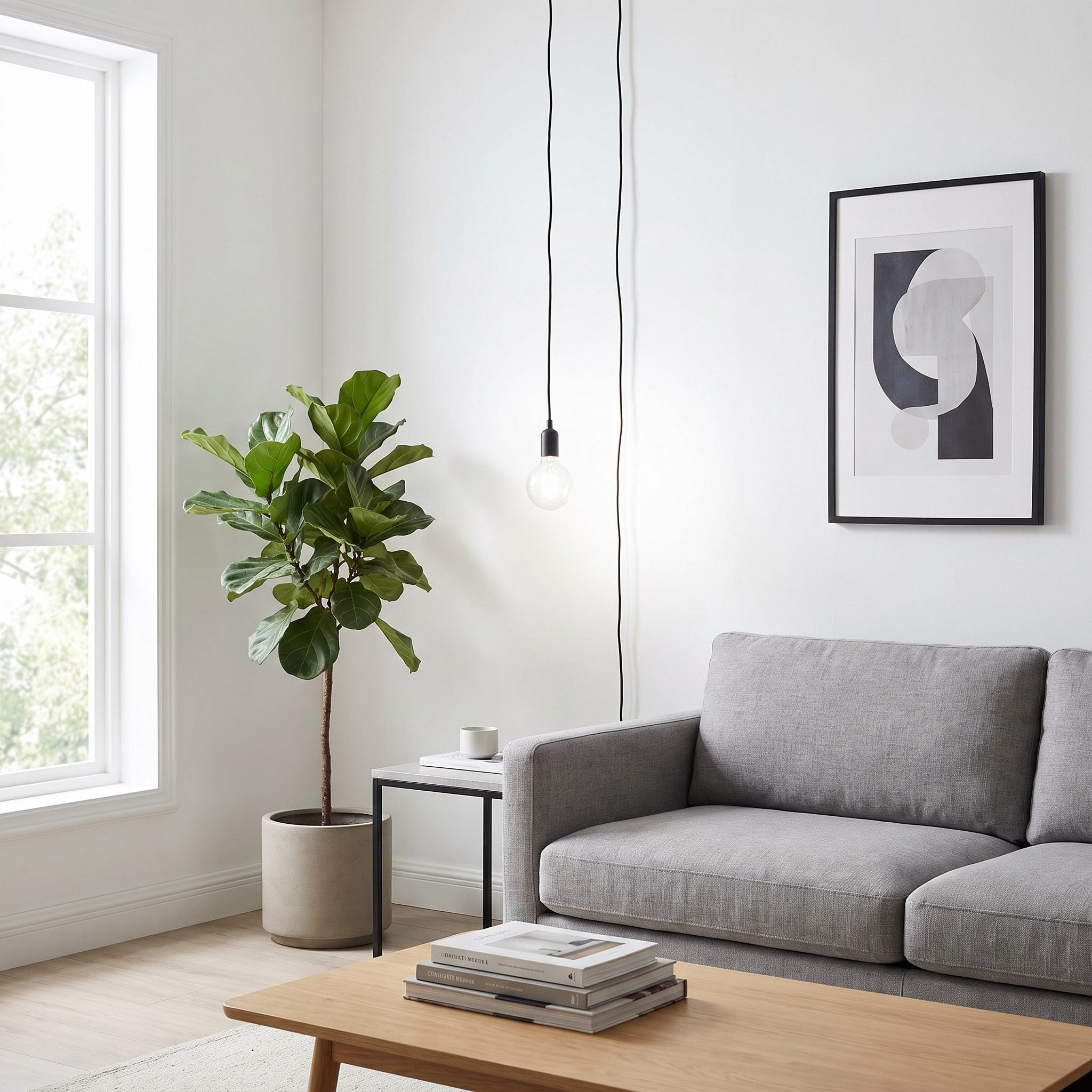
A room can contain plenty of light and still feel uncomfortable because the source itself is too visible. Bare bulbs, clear globes, and poorly aimed fixtures create glare that makes the eyes work harder even when illumination levels are high.
The solution here was not another fixture. A denser woven shade and fabric diffuser soften the sources already in the room. Once the bright points stop dominating the view, the existing illumination becomes far easier to live with.
8. They Lit the Bookcases and Let Them Become Part of the Evening Atmosphere
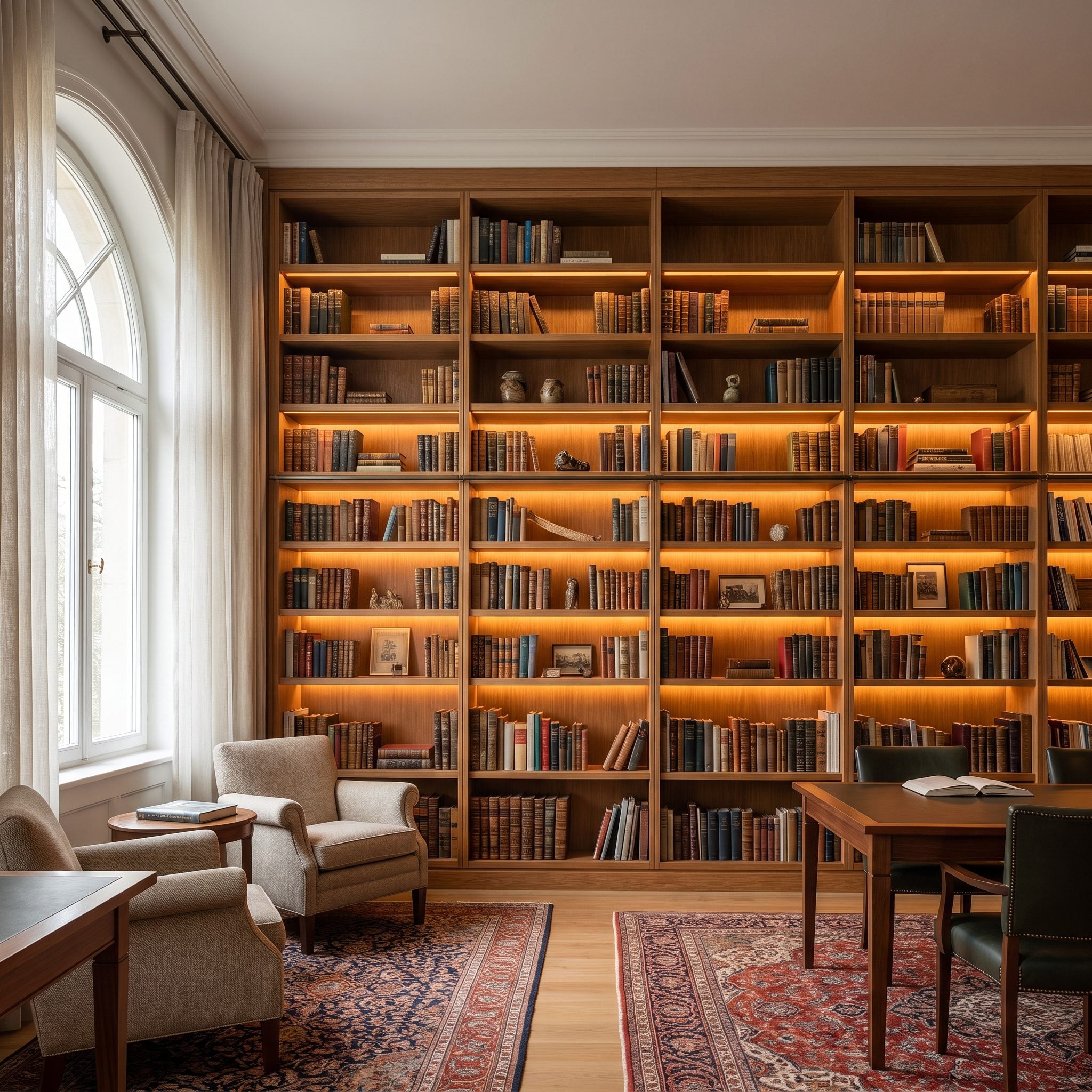
A wall of books can dominate a room in daylight and virtually disappear after sunset. Concealed shelf lighting keeps that architecture participating after dark.
Warm LED strips tucked beneath the shelf edges graze the spines, catch the white oak grain, and leave pockets of shadow between objects. The effect is considerably richer than flattening the entire bookcase with one ceiling source.
Style Tip: Hide the LEDs behind a shelf lip or channel so the eye sees the glow rather than individual diodes. Dimming the strips keeps the bookcase atmospheric rather than turning it into a display case.
7. They Positioned Light Around the Furniture Plan Instead of the Ceiling Grid
🔥 Would you like to save this?
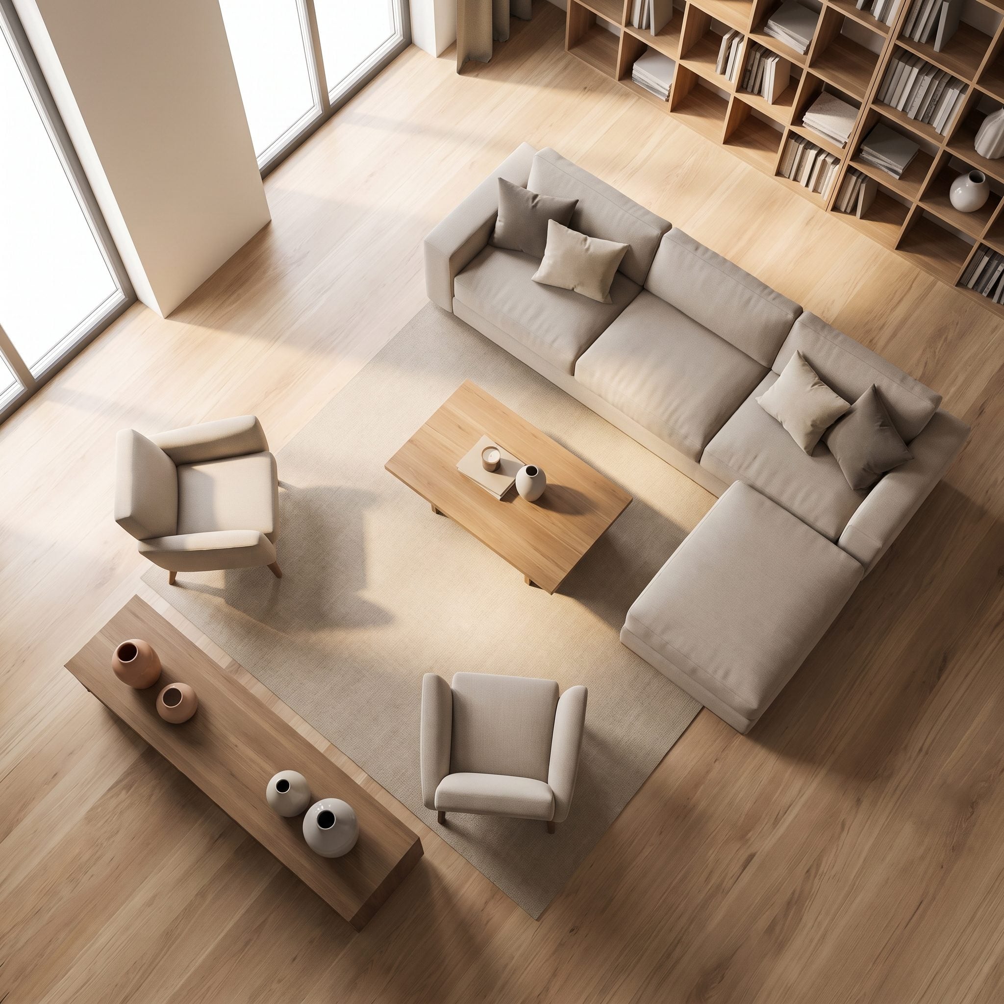
Recessed layouts are often drawn as neat ceiling diagrams: evenly spaced, perfectly symmetrical, and remarkably uninterested in where anyone will actually sit.
This room reverses the process. The floor lamp belongs to the reading chair. The table lamp belongs to the sofa. Each source has a job tied to the furniture below it, and the ceiling is allowed to remain comparatively quiet.
Light the activities first. The geometry can follow.
6. They Stopped Mixing Warm and Cool Bulbs in the Same Living Room
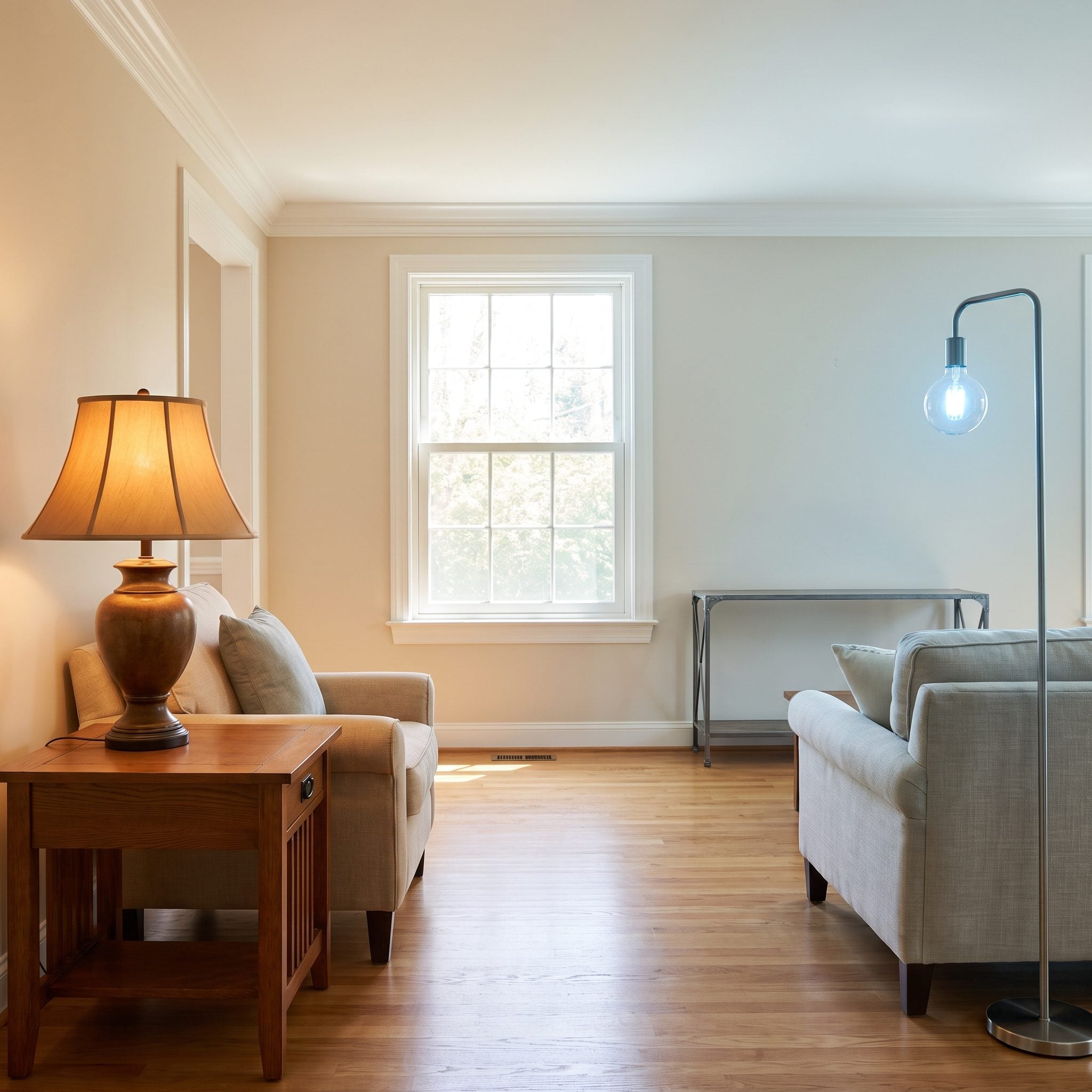
One lamp glows amber while another fires off a bluish white and suddenly the room looks assembled from two different evenings. Mixed color temperatures can make finishes that should relate to each other look oddly disconnected.
Matching the lamps to one consistent warm range lets the sage walls and wood tones settle back into the same composition. Buying bulbs with the same Kelvin rating is a useful starting point, although tint and color rendering can still vary between manufacturers.
Editor’s Note: When replacing several bulbs at once, buying the same model and specification is the easiest way to keep the color consistent across the room.
5. They Used Floor Lamps to Bring Light Down to the Seating
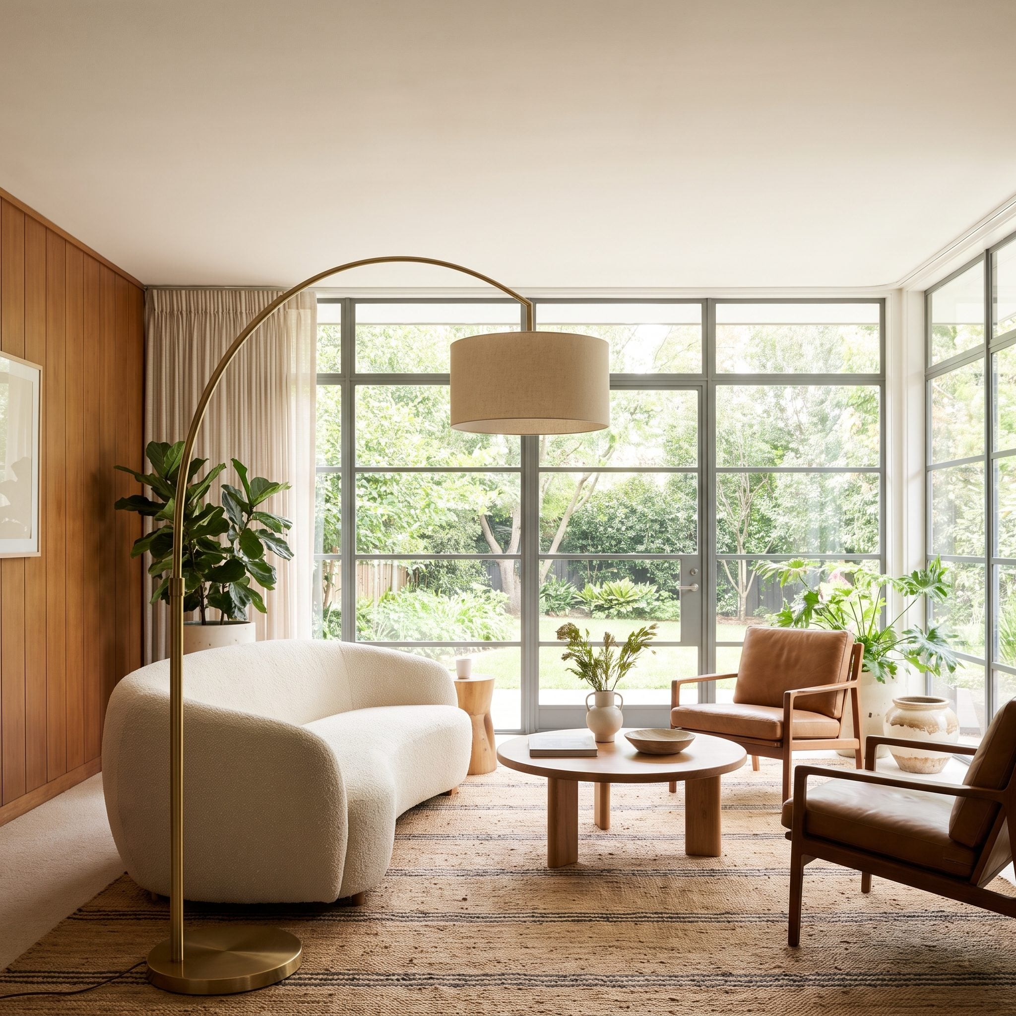
A brass arc floor lamp reaching over the sofa puts light where the seating actually happens instead of asking the ceiling to cover everything from nine feet away.
This modern great room uses two floor lamps around a green velvet sofa and camel leather chair. The illumination arrives from the sides, the corners retain some shadow, and the ceiling does not need to carry the entire plan.
4. They Put Every Lighting Layer on a Dimmer

A room with every fixture locked at full output has only one personality. The modern great room here can move from brighter afternoon use to a much softer evening setting because its layers are independently dimmable.
Dimming also makes stronger fixtures more useful. A lamp or recessed light that feels aggressive at full power may become exactly the background fill the room needs when turned down. For hardwired fixtures, use compatible dimmers and bulbs or integrated LEDs rated for dimming.
Try This: After sunset, turn the main overhead source down or off and build the room back up with lamps and sconces. The difference reveals which fixtures are actually contributing and which are merely adding output.
3. They Used Accent Lighting to Give a Small Living Room More Depth
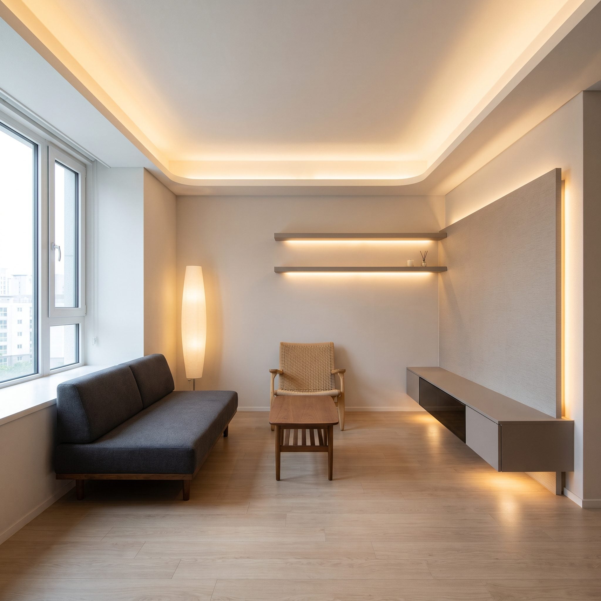
Small rooms are especially unforgiving of flat illumination. When every wall receives the same amount of light, the boundaries become immediately obvious and the room can feel more boxlike than it needs to.
This one spreads attention across several depths: a brass picture light on the far wall, a low pleated table lamp closer to the seating, and an uplight tucked behind the olive tree. The separate pools give the eye more than one plane to register.
Why It Works: Lighting foreground, middle distance, and background differently creates visible layers. In a compact room, those layers can matter more than simply increasing overall brightness.
2. They Kept the Recessed Lights but Stopped Asking Them to Do Everything
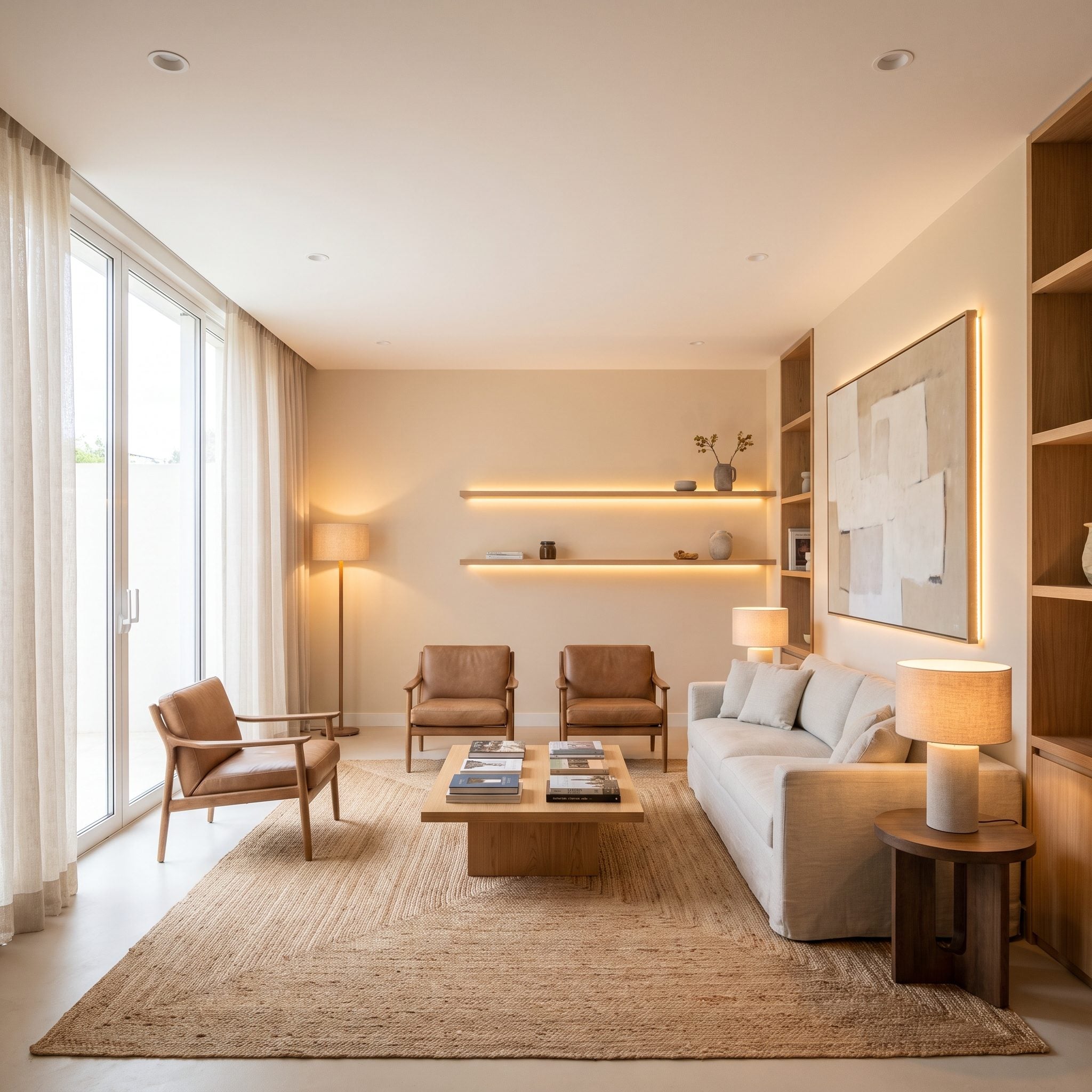
Nobody needs to rip perfectly functional recessed lights out of the ceiling simply because lamps and sconces make better company after dark. The quieter solution is to give every source a more appropriate job.
Turn the cans down until they become background fill, then let the warmer layers take over: a brass arc floor lamp over the cognac leather, a linen table lamp on the console, and a picture light grazing the abstract. The recessed fixtures fill whatever shadows remain.
The mistake was never the recessed light itself. It was asking one tool to do five tools’ work.
Pro Tip: If existing recessed fixtures are dimmable, experiment with substantially lower output before changing the layout. The useful level depends on the fixtures and room, but they often work better as support than as the dominant source.
1. They Designed the Evening Mood First and Chose the Fixtures Second
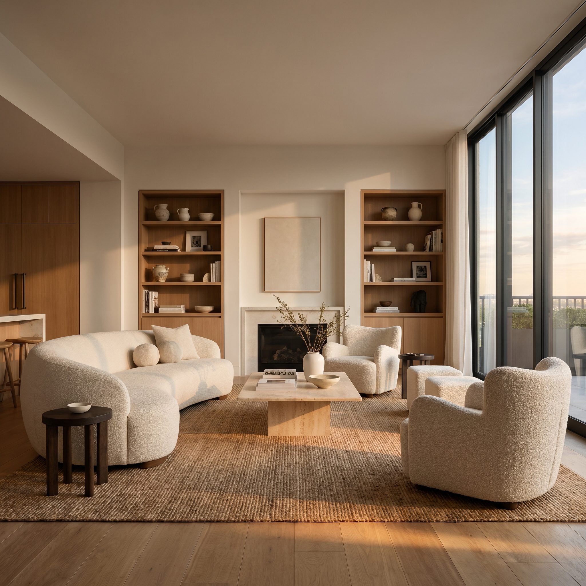
Most lighting mistakes happen in the opposite order: buy fixtures first, install them everywhere, then hope some atmosphere appears when the switches go on.
This room starts with the desired evening instead. Low. Warm. Close to the seating. A floor lamp sits beside the green sofa, two table lamps bring light down around the chairs, a small sconce wakes up the shelves, and the ceiling is allowed to recede.
That is the difference between installing fixtures and designing light. One begins with available holes in the ceiling. The other begins with what the room should look and feel like when daylight disappears.
Design Starting Point: Layering several sources at different heights is a reliable way to build flexibility into a living room. Overhead, mid-level, and low light can each handle a different job instead of forcing one fixture to handle them all.