🔥 Would you like to save this?
A badly placed tree shrinks a room faster than cheap furniture ever could. The fix isn’t a smaller tree or fewer ornaments — it’s scale, placement, and light working together instead of fighting each other. We pulled ten rooms where the tree reads as luxury rather than clutter. Every one comes down to the same handful of decisions: how much ceiling you leave open, which wall the tree answers to, and whether the light falls where it should. Get those right and a nine-foot tree feels generous. Get them wrong and a six-foot tree crowds you out of your own living room.
32. The Tree Sized to Leave Breathing Room at the Ceiling
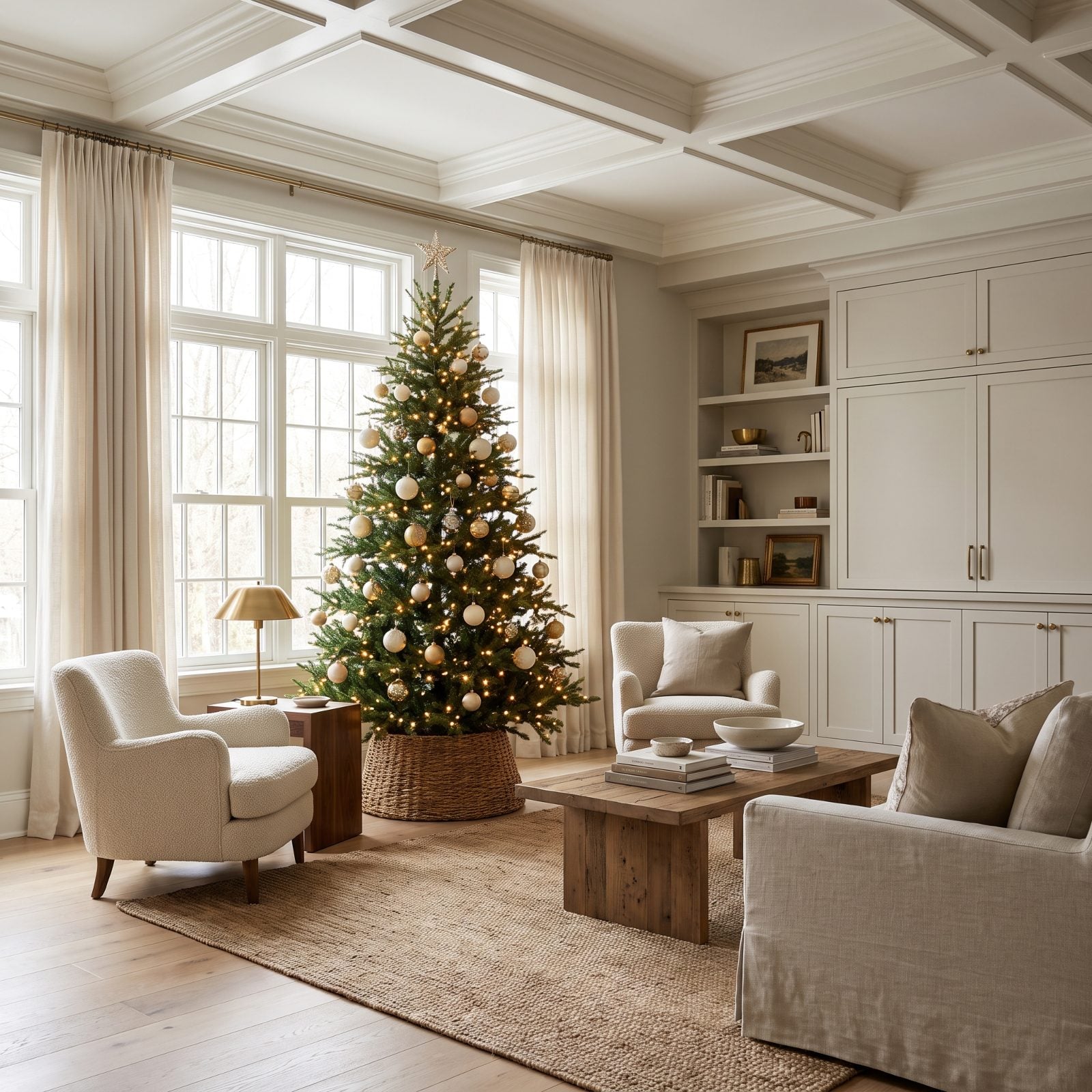
The gap above the topper is the whole trick. Jam a tree up against the ceiling and the room reads low, boxed in, out of air. Leave a foot and a half to two feet of open space above the star, though, and suddenly the ceiling looks taller than it is.
In order to come up with the very specific design ideas, we create most designs with the assistance of state-of-the-art AI interior design software. Also, assume links that take you off the site are affiliate links such as links to Amazon. this means we may earn a commission if you buy something.
Your eye reads that negative space as height — the same reason a short bookshelf makes a wall feel grander than a built-in running floor to ceiling. Room to breathe at the top does more for the sense of space than anything you hang on the branches.
31. The Tree Whose Width Matches the Wall Section Behind It
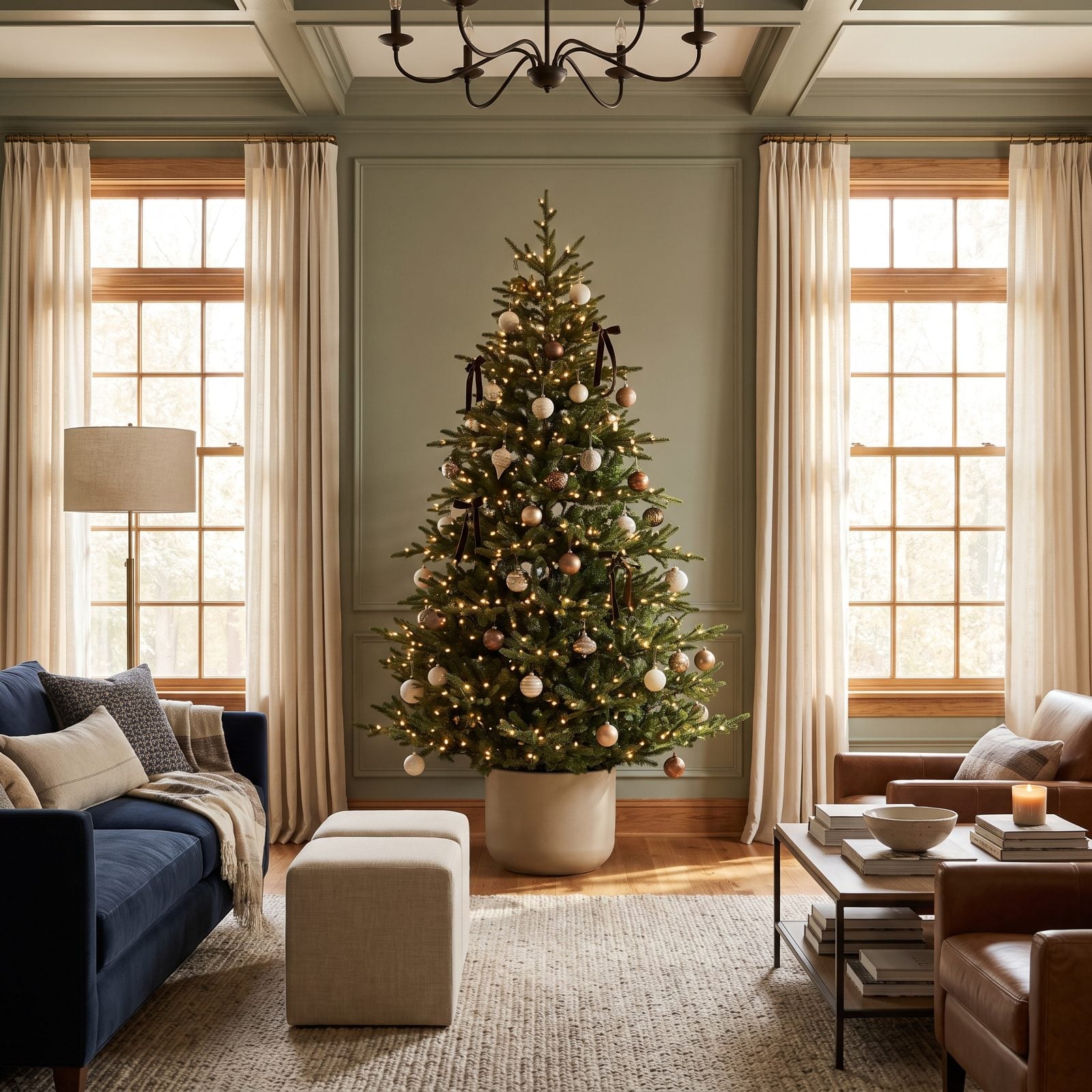
A tree sized to the wall behind it looks like it was always meant to be there. Too wide and it crowds the windows. Too narrow and it’s stranded — a lonely cone floating on a wall that dwarfs it.
Here the tree fills the panel between two windows almost exactly, and that alignment tells your eye the arrangement is intentional. Intentional always reads as expensive. The navy velvet sofa grounds it without competing.
30. The Slim Tree That Matches a Narrow Floor Plan
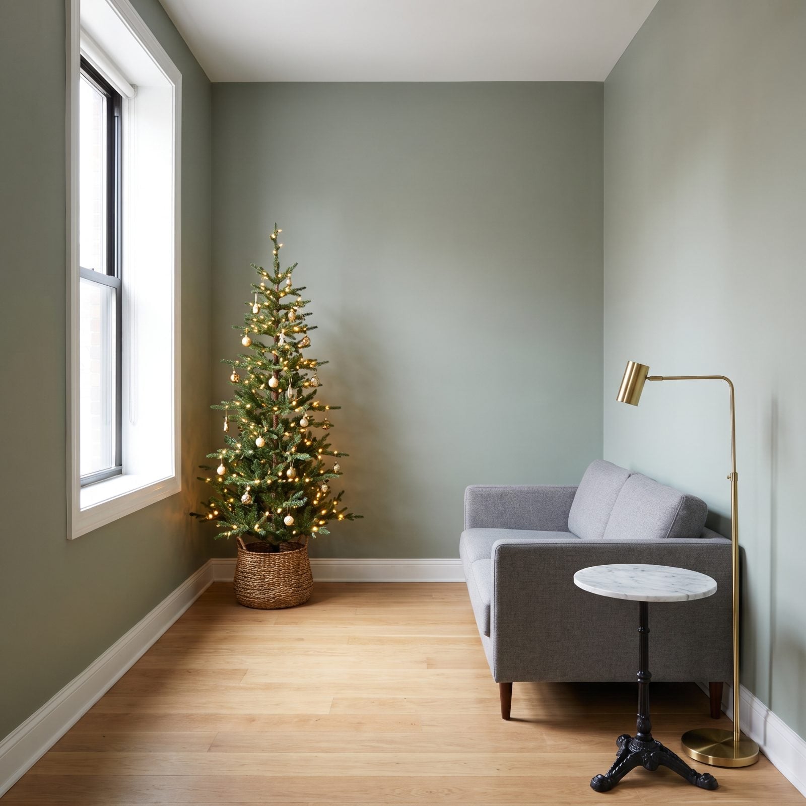
Narrow rooms don’t need less tree. They need a different silhouette. A slim pencil tree gives you full height without stealing the floor you actually walk on.
I’ve watched people wedge a standard full tree into a galley-width living room and then shuffle sideways past it for a month straight. A slim profile keeps the path clear. You get the whole vertical presence and still make it to the couch.
29. The High-Ceiling Tree With the Correct Visual Weight
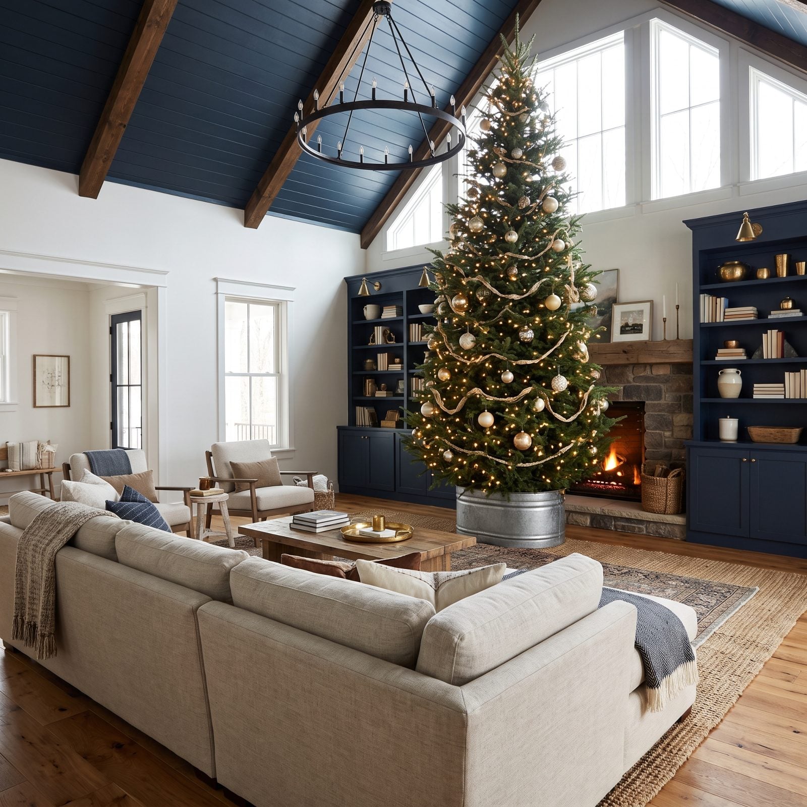
Put a modest tree in a double-height room and it looks like a houseplant that wandered in. Volume this big demands a tree with real mass to answer it.
Scale everything up together: taller tree, bigger ornaments, a planter with heft. A nine-foot full tree hung with large gold baubles holds its own under the vault, while small ornaments on a tree this size would simply vanish from across the room.
The wrought-iron chandelier and the stone fireplace give the tree company at its own weight class, so nothing feels dwarfed.
28. The Tree Elevated in a Decorative Planter
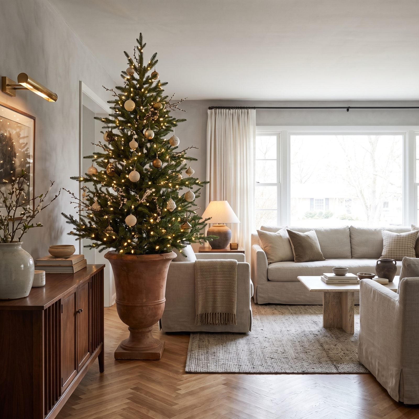
Lifting a tree into a tall urn does two things at once. You gain height without buying a bigger tree, and you hide the ugliest part of any tree — that plastic stand — inside something worth looking at.
A raised base also reads as deliberate. Florists elevate arrangements on pedestals for a reason. Height off the ground signals occasion, and a tree on a brass urn planter feels staged in the best sense.
27. The Tree Placed on the Long Wall of a Narrow Room
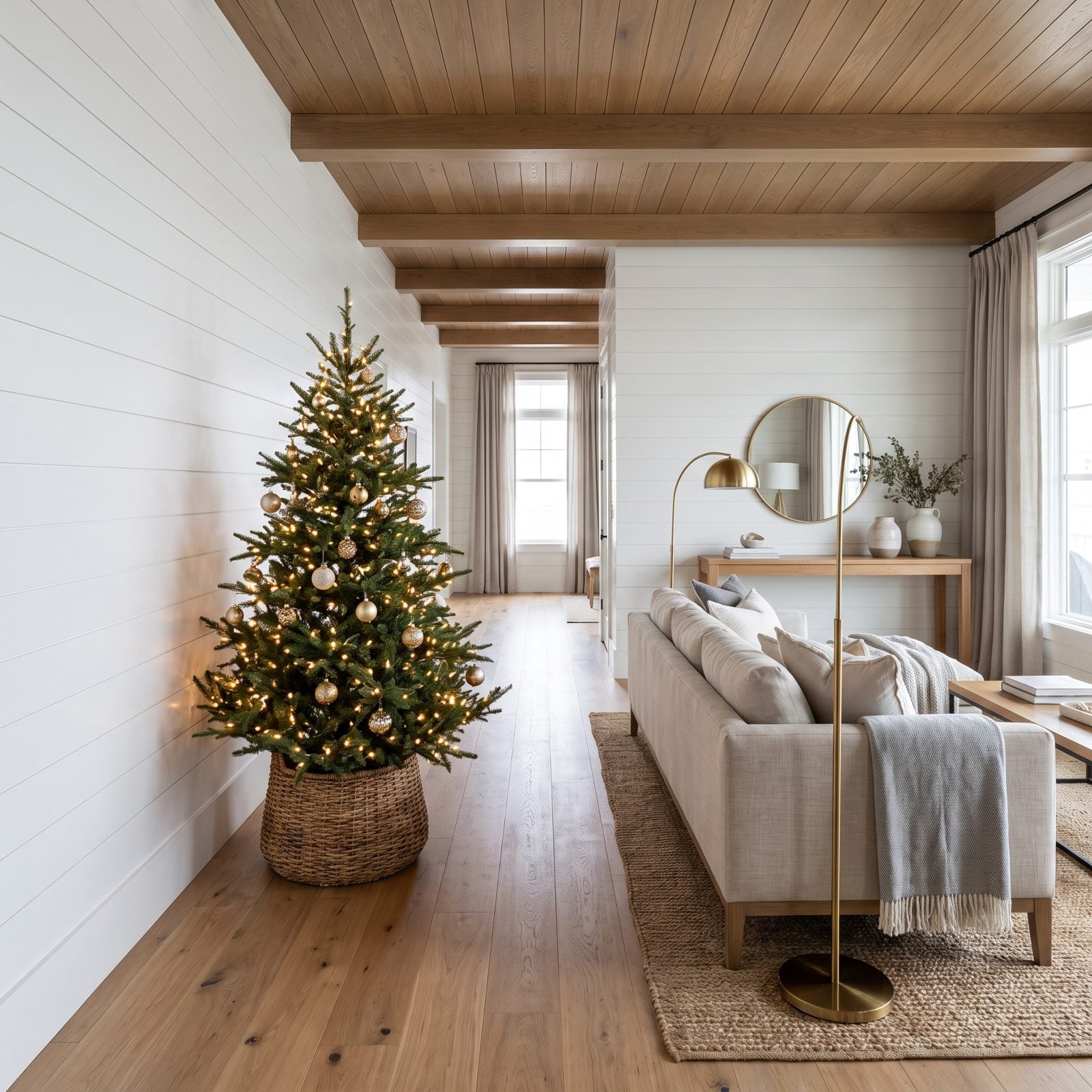
In a long room, the short end wall feels like the obvious spot for a tree. It’s usually the wrong one.
Park the tree on the long wall instead and the room reads wider, because your eye crosses the short dimension and lands on something generous. It keeps the natural walking corridor open end to end, too. A tree jammed at the far short wall turns a narrow room into a bowling alley with a cone at the end of it.
26. The Tree Centered on the Room’s Strongest Architectural Axis
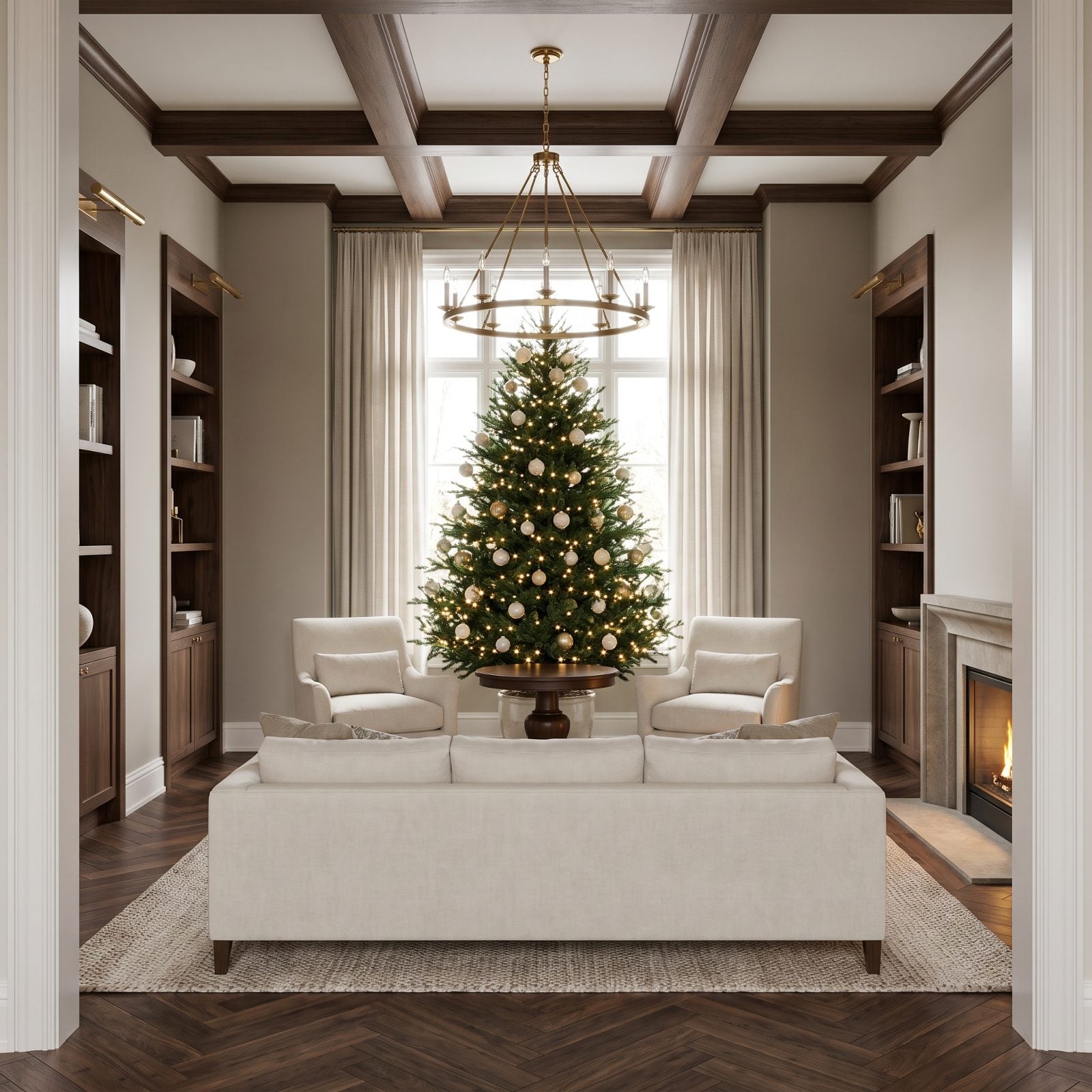
Every room has one line your eye wants to travel — the sightline from the doorway, the axis the architecture already draws. Put the tree on it.
Centered on that line, flanked by matching armchairs with a chandelier aligned above, the tree becomes the destination the room was built to lead to. Symmetry reads as grandeur because the brain processes it with almost no effort, so a space arranged this way feels calm and composed the second you walk in.
25. The Tree Aligned With the Fireplace Rather Than Competing With It
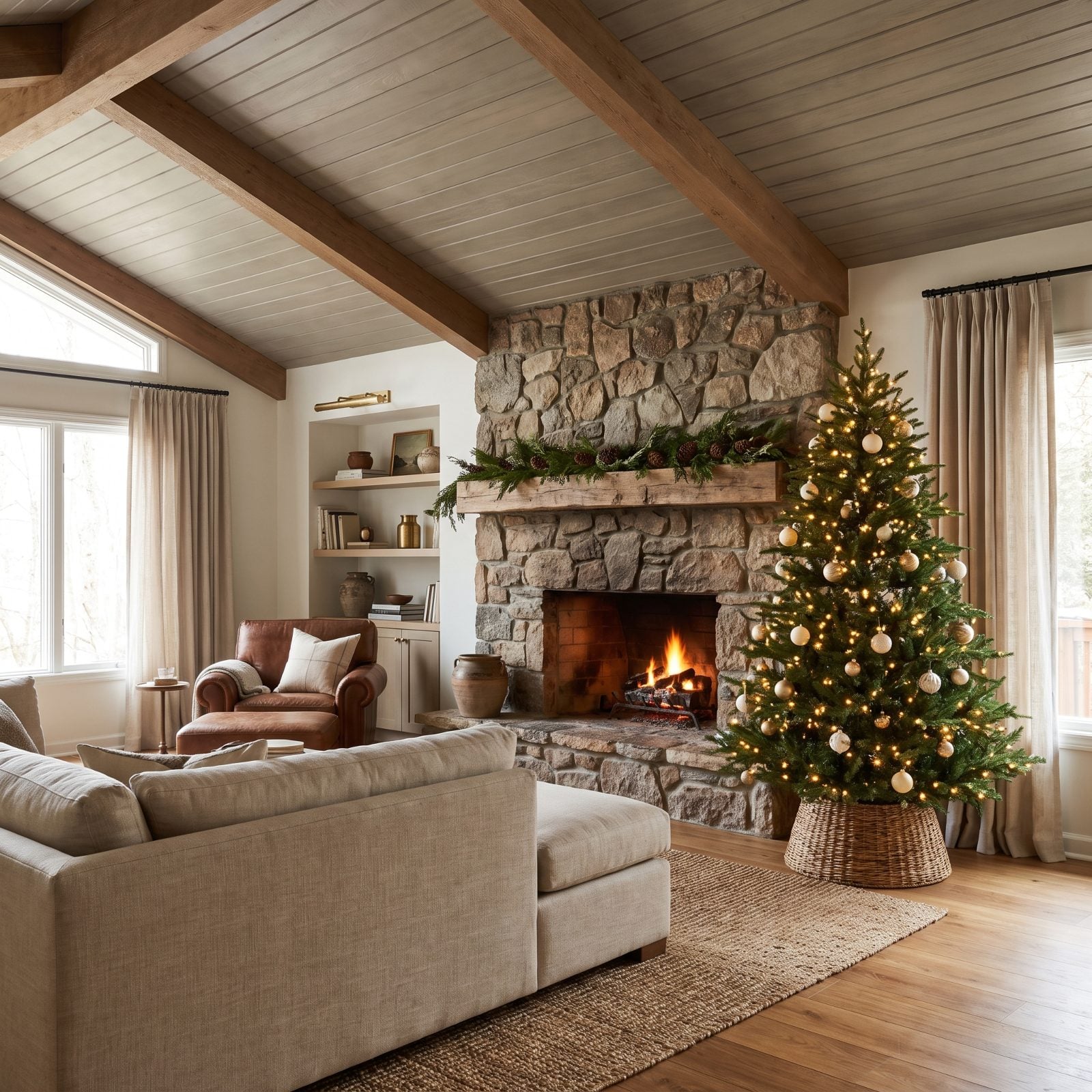
A fireplace is already a focal point. Plant a tree dead center in front of it and you’ve got two heavyweights throwing elbows for the same attention.
So offset the tree beside the hearth, mantel garland kept simple so it doesn’t shout back. Now the two anchors share the wall instead of fighting over it. Pair the hearth with a leather club chair and the whole corner settles into one coherent scene.
24. The Asymmetrical Tree That Suits an Off-Center Alcove
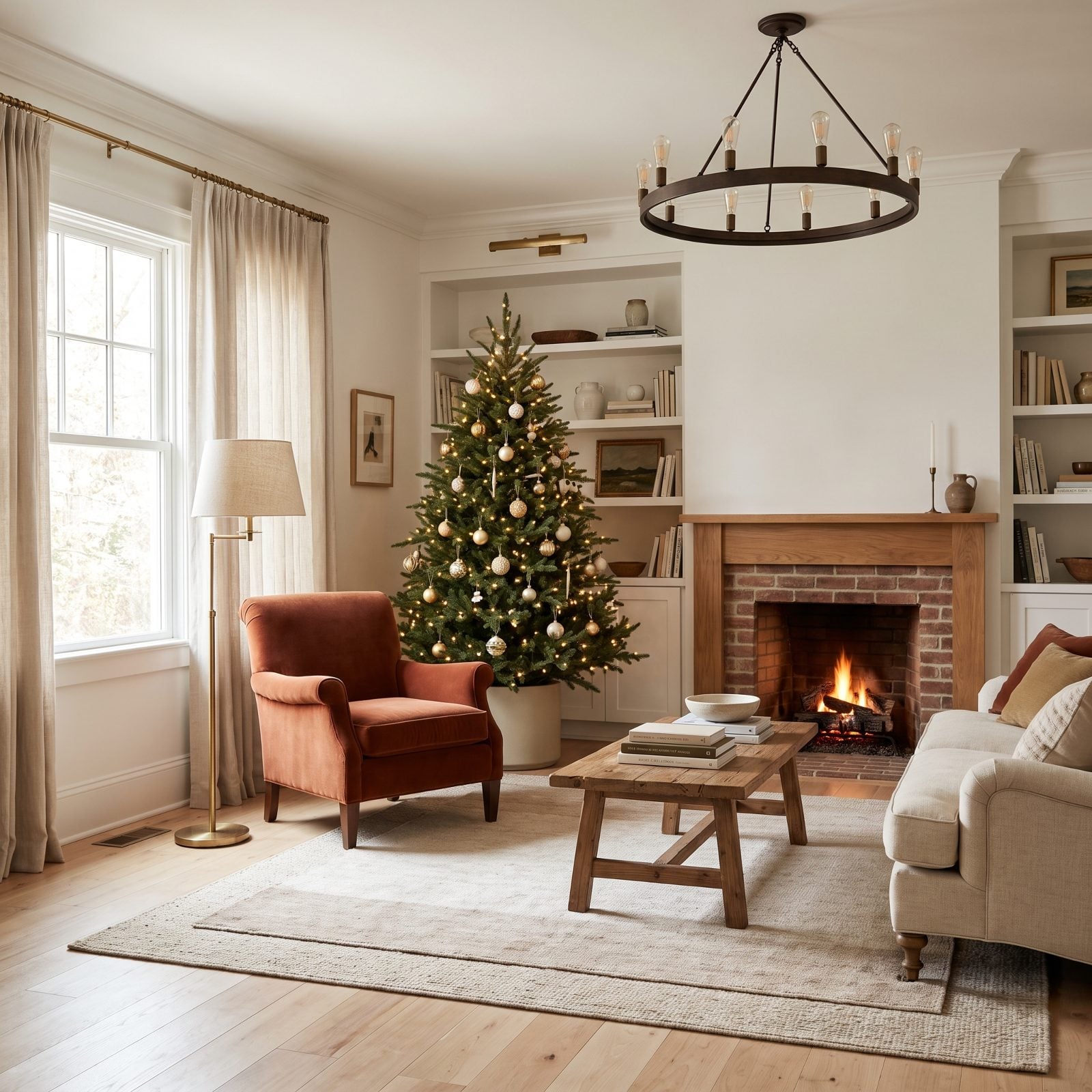
Not every room has a tidy center to aim for. And forcing symmetry on a space that doesn’t have it looks worse than leaning into the quirk.
An off-center alcove next to built-ins is the ideal home for a lopsided arrangement. Nestle the tree into the recess and let the rust velvet armchair balance it from across the room. The weight evens out even though nothing matches — the kind of relaxed composition that makes a room feel lived-in rather than staged.
23. The Tree Placed Beyond the Main Seating Group
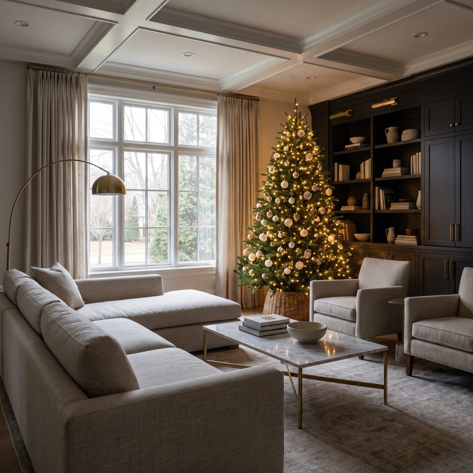
Push the tree past the seating and it stops being furniture you navigate around. It becomes the view you look at.
Set near the far window and lit warm, it glows behind the conversation group like scenery. The seating stays uncluttered, nobody knocks an ornament loose reaching for the remote, and the tree does its best work as a backdrop. Depth is the real luxury here — a room you can see all the way across always feels larger than one you have to pick your way through.
22. The Tree Positioned Where It Does Not Narrow the Walkway
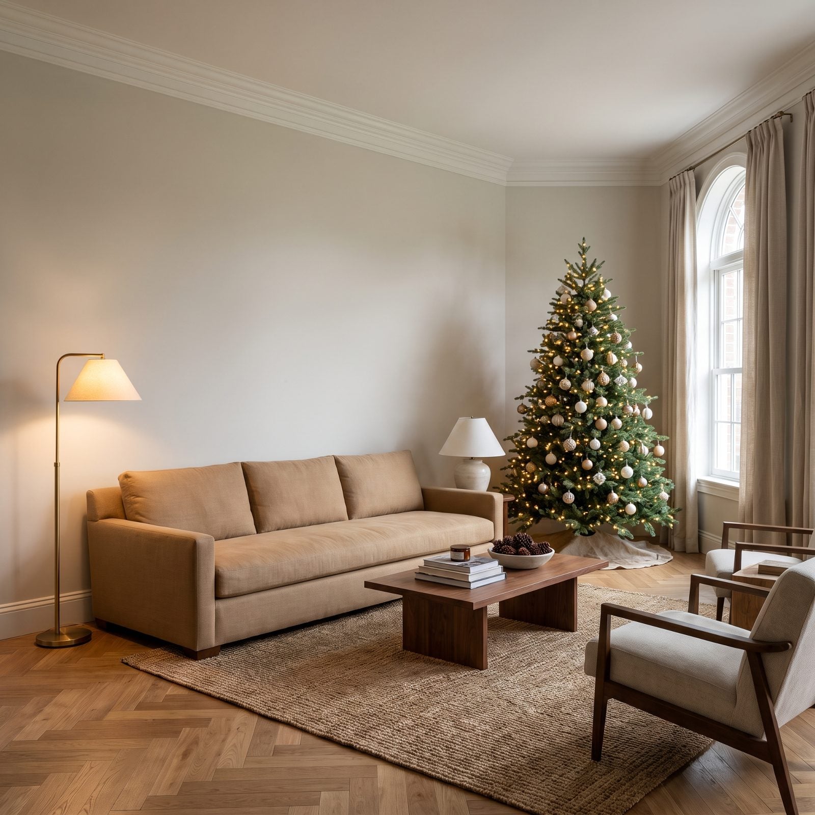
Walk into most rooms in December and you’re doing a sideways shuffle past a tree that staked out the middle of the floor. This one didn’t. It sits in the corner the window already gave it, and the path from the sofa to the hallway stays wide open.
That clear foreground is the whole trick. When your eye can travel across open floor before it hits the tree, the room reads as roomy. Clog the walkway and even a big space turns into a closet with a tree jammed in it.
21. The Tree That Does Not Block the Window’s Full Width
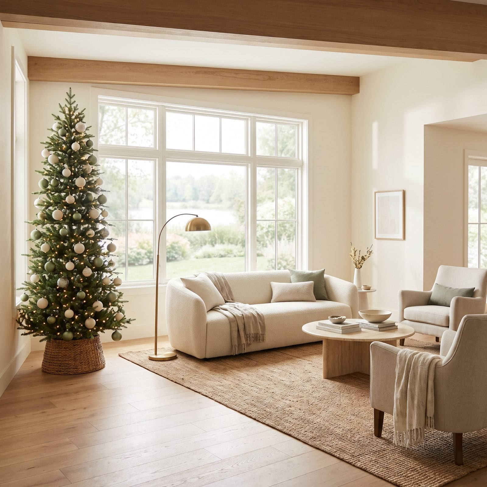
A tree planted dead-center in front of the window is the fastest way to shrink a room. Light is your most generous decorating tool, and covering the window throws it away.
Push the tree to one edge instead. The glass keeps feeding daylight in, the view still reads as depth, and the tree gets backlit into something almost sculptural. You keep the light, you keep the space, and you get a prettier tree out of the bargain.
20. The Tree Reflected in a Mirror to Add Apparent Depth
🔥 Would you like to save this?
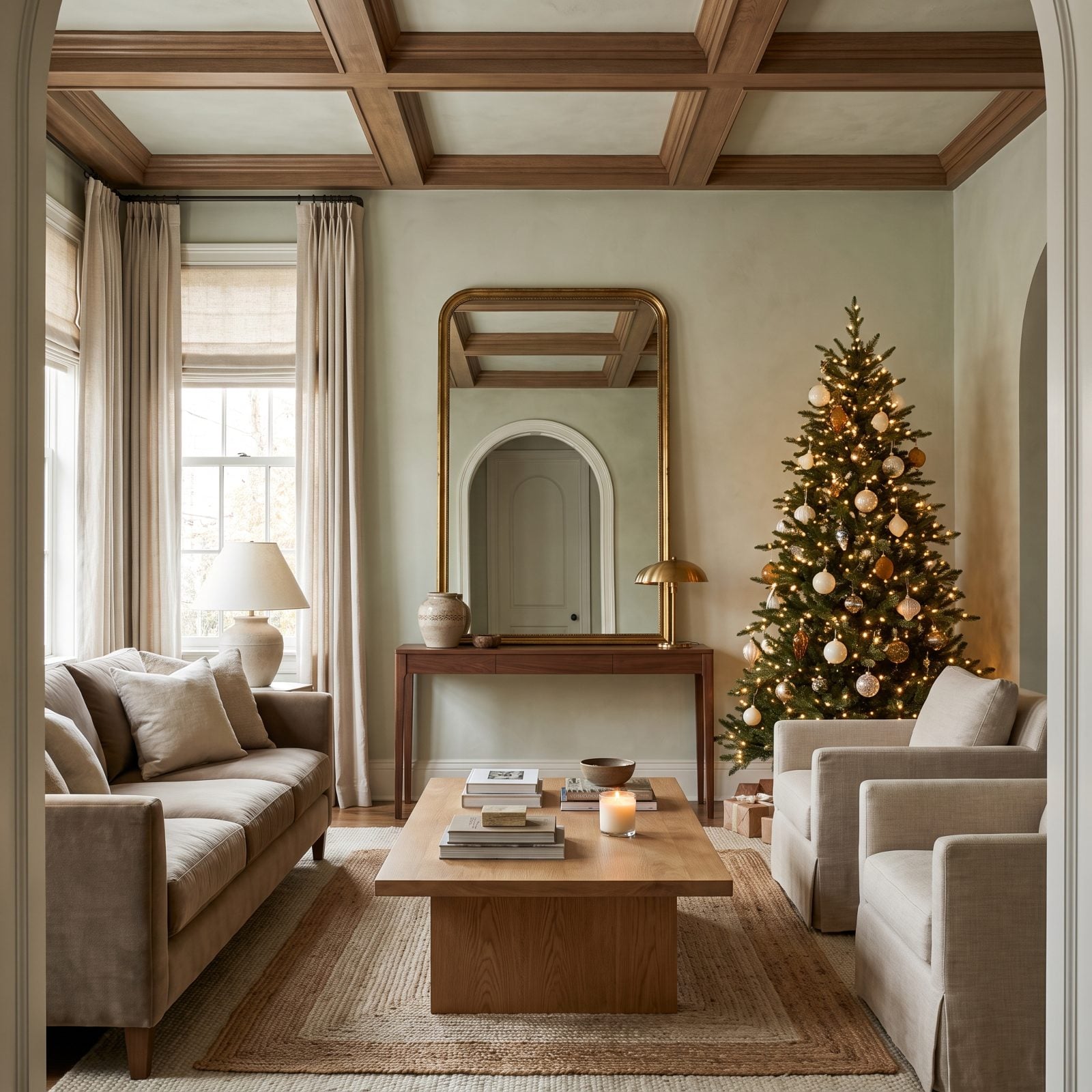
That tall antique brass mirror leaning against the wall is pulling double duty. It catches the tree, the lamplight, and a slice of the doorway, and suddenly the room has twice the depth it owns on paper.
Angle the glass so it reflects the tree and a light source rather than a blank wall. The twinkle multiplies, the floor seems to run further back, and a modest tree starts carrying a much larger space.
19. The Tree Seen Fully From the Room’s Entrance
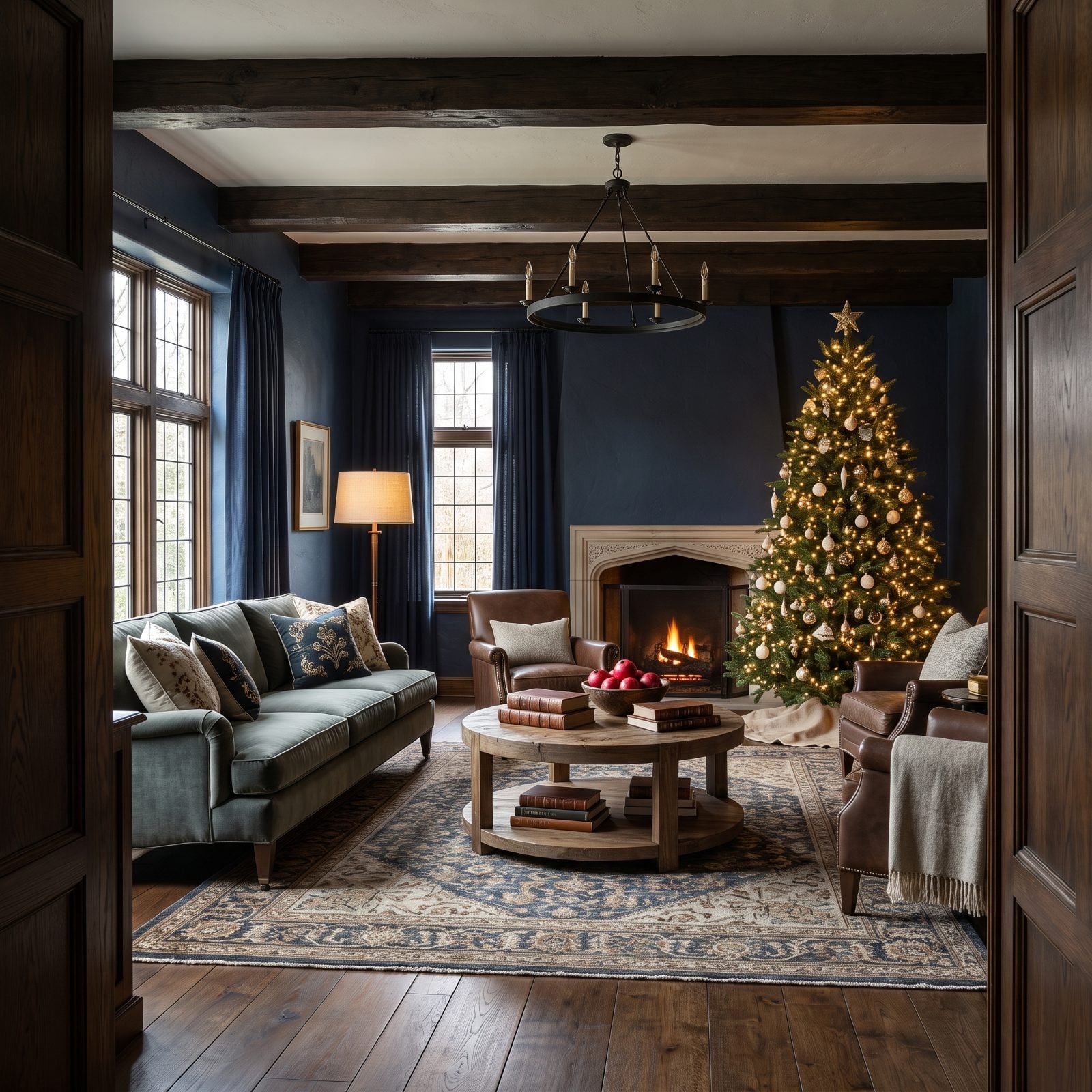
The best tree position is the one that greets you whole the second you step through the door. No craning, no half-hidden topper behind a sofa. Just the full triangle, floor to tip, in a single glance.
Here the sofa sits to the side and the tree claims the far wall, so the view from the entrance runs clean across the room and lands on it. A space that reveals itself completely from the doorway always feels larger, and more deliberate, than one that makes you hunt for the focal point.
18. The Tree Framed by Full-Length Curtains
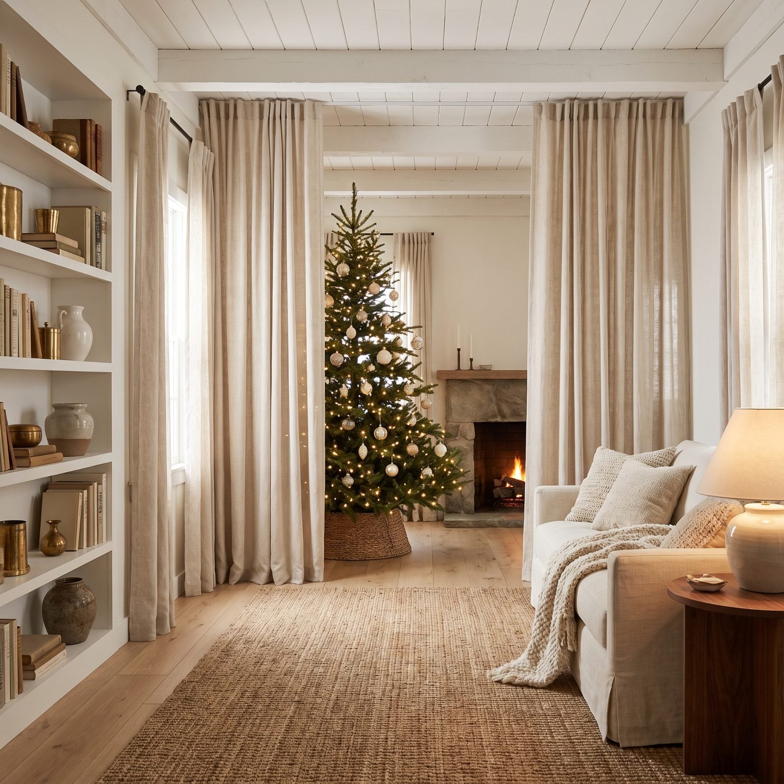
Hang the oatmeal linen curtains from just below the ceiling, let them pool at the floor, and set the tree between them. Those two tall panels work like parentheses, framing the tree and dragging your eye straight up to the ceiling line.
Vertical emphasis makes a room feel taller, and a taller-feeling room never feels cramped. Bonus: the linen softens the window light into a diffused glow that flatters every ornament.
17. The Tree Set Against Quiet Millwork Rather Than Busy Shelves
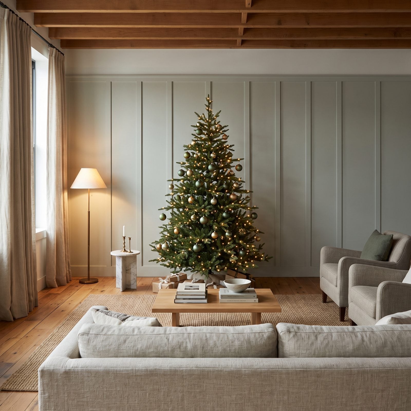
Set a decorated tree in front of packed open shelving and the two fight over every inch of your attention. Nobody wins. Put that same tree against calm sage-gray paneling and it finally gets to breathe.
A quiet backdrop gives the tree clean air behind it, so its shape and lights land without competition. Got a busy shelf wall? Consider this your nudge to let the smooth wall host the tree instead. The same logic carries well past the holidays, since even a eclectic bonus room works best when its statement piece has a restrained backdrop.
16. The Dark Green Tree Silhouetted Against Pale Walls
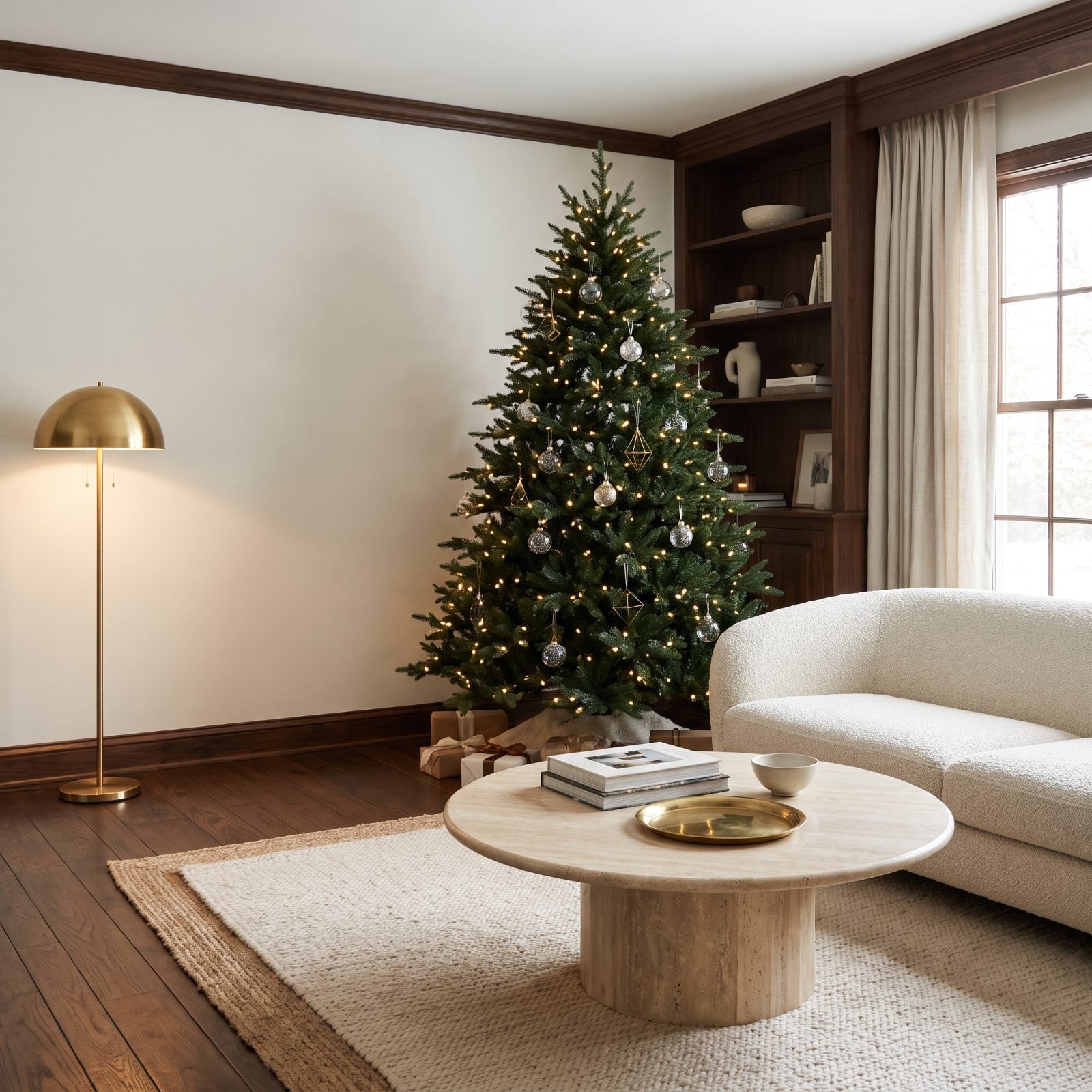
Contrast carries this one. A deep forest-green tree against pale warm-white walls turns the whole thing into a clean silhouette, every branch edge sharp and legible.
When the background recedes and the tree reads as one strong shape, you need far less ornament to land the effect. Restraint looks expensive. A cluttered tree on a busy wall never will.
15. The Sparse Natural Tree That Preserves Negative Space
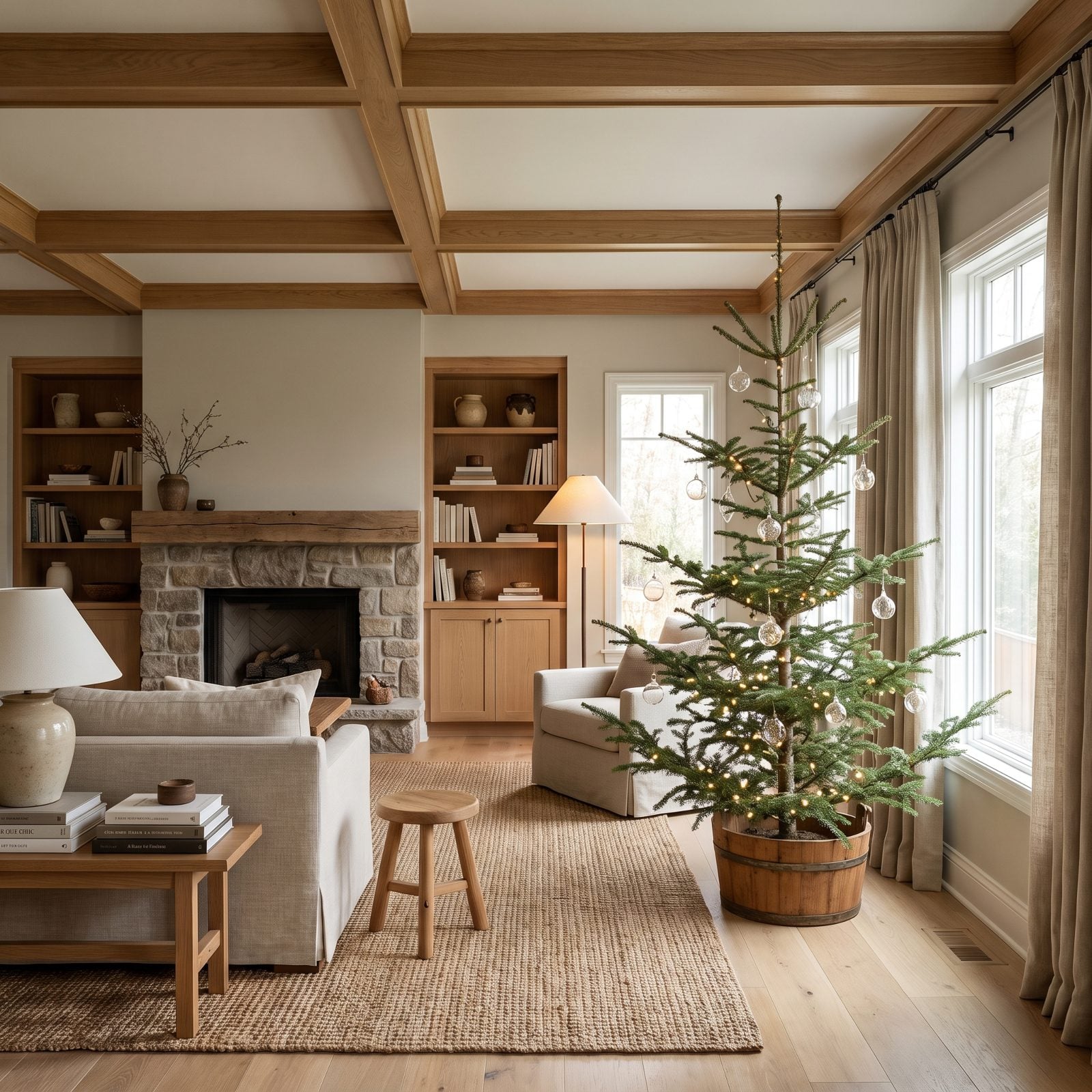
You can see straight through this tree, and that’s exactly the idea. The gaps between branches let the pale wall show, so the tree occupies the corner without swallowing it.
A dense, over-flocked tree behaves like a visual wall, while a sparse natural one keeps the room’s air intact. Less tree, more room, and honestly a smarter look. I’ll take an airy fir with six good ornaments over a loaded showroom tree every single time.
14. The Tree With a Bare Lower Trunk That Exposes More Floor
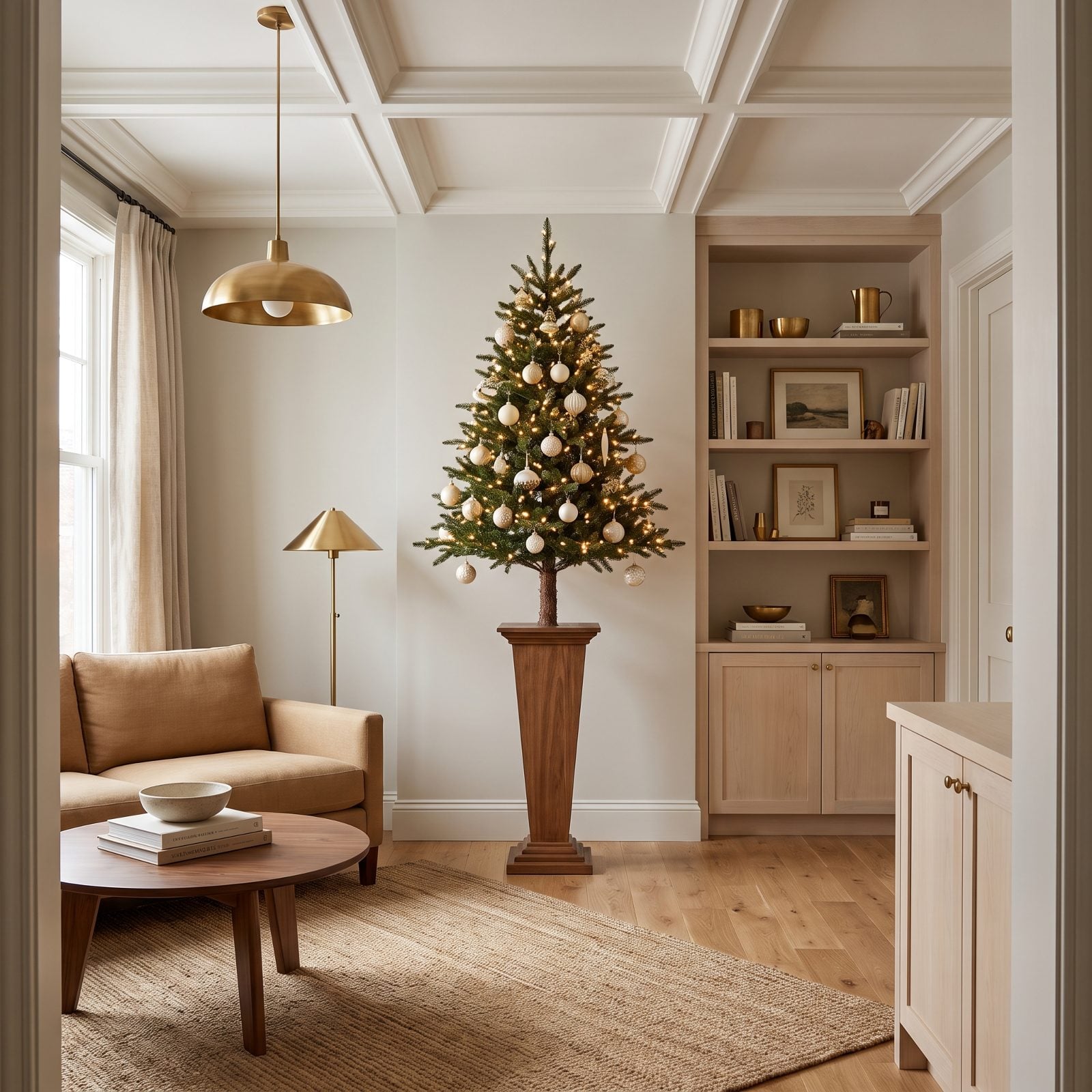
Raise the tree on a sculptural ceramic urn, leave the lower trunk bare, and you expose a slice of floor most trees hide under a fat skirt. More visible floor reads as more room, full stop.
That exposed trunk also gives the tree a leggy, intentional posture, closer to a potted specimen than a holiday blob. Pair it with a camel linen sofa and the corner feels composed rather than crammed.
13. The Tree With Its Back Branches Lightly Pruned
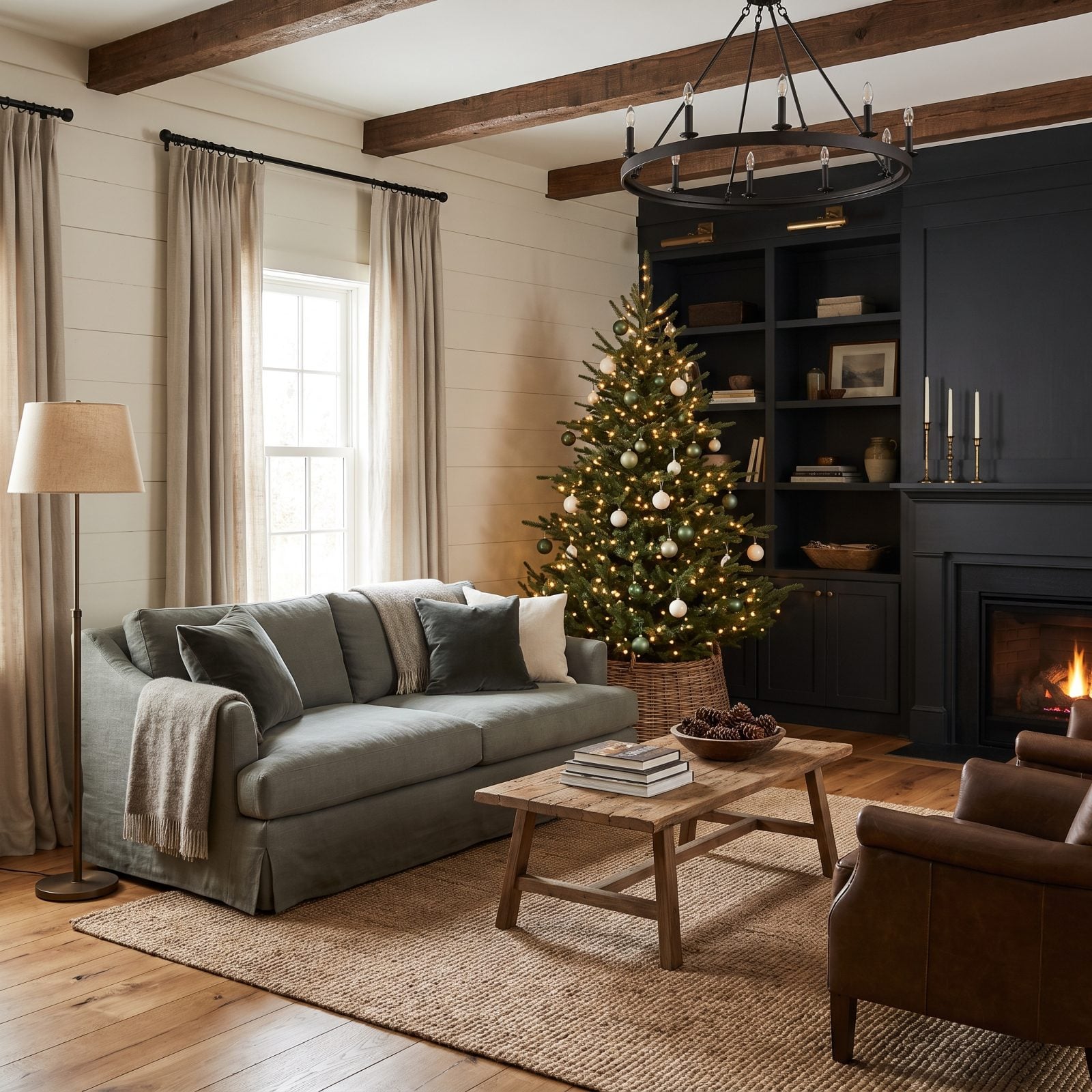
Here’s a trick nobody talks about. Lightly prune the back branches so the tree sits flush against the wall, and you lose nothing from the front while gaining six inches of floor you didn’t have before.
In a tight room those inches change everything. The tree tucks shallow against the plaster, the walkway in front opens up, and the full face still reads as generous. A little quiet editing, and the corner stops feeling crowded.
12. The Unflocked Tree Chosen for a Compact Interior
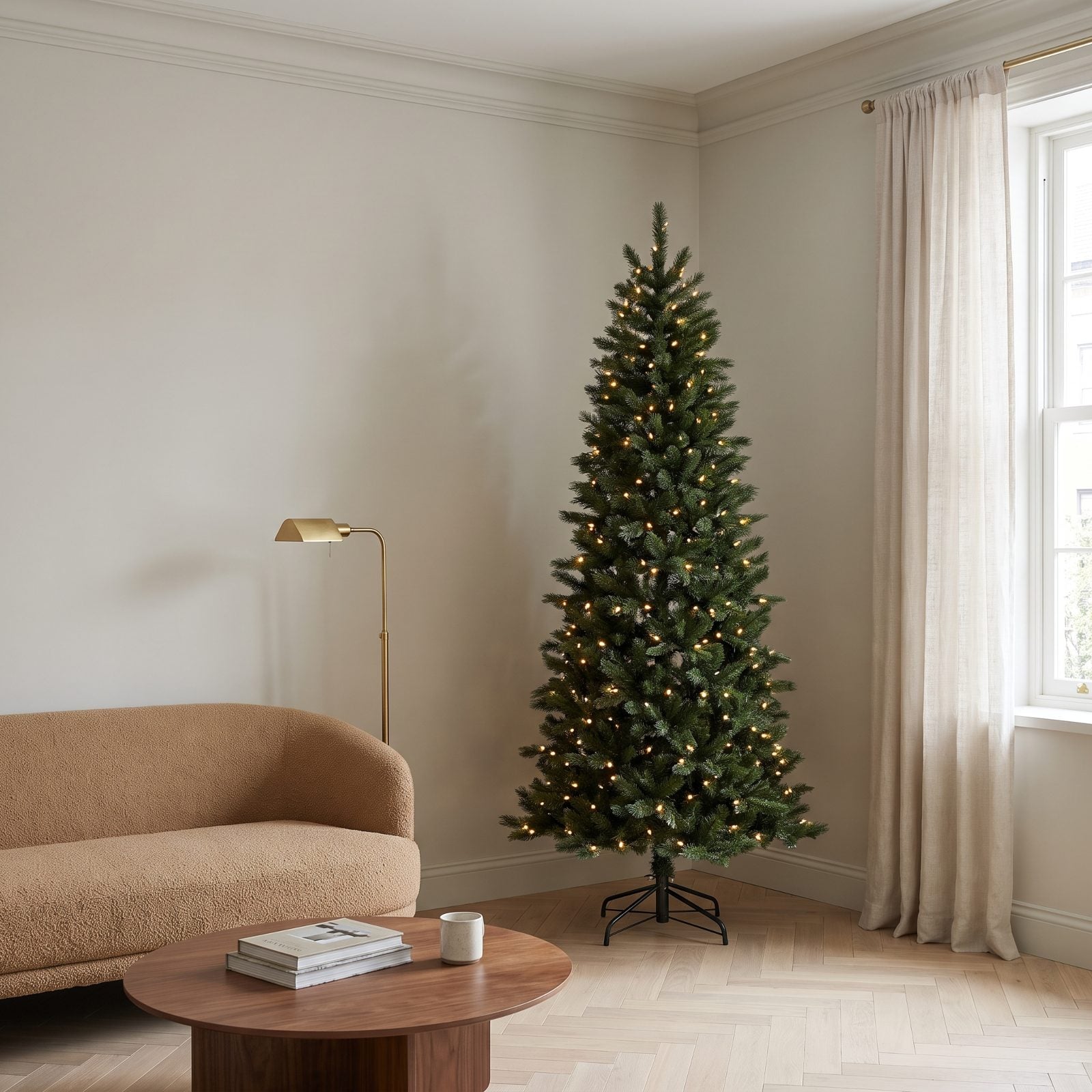
Skip the flocking in a small room. That faux-snow coating adds visual bulk and reads heavy against tight square footage. A clean, unflocked green tree keeps the silhouette slim and lets the camel boucle sofa and walnut table stay in conversation with it instead of competing.
The pencil-pine shape earns its place here because the narrow footprint gives you full height with string lights buried deep in the branches, so you get all the glow and none of the girth.
11. The Tree Decorated in Proportion to Its Branch Density
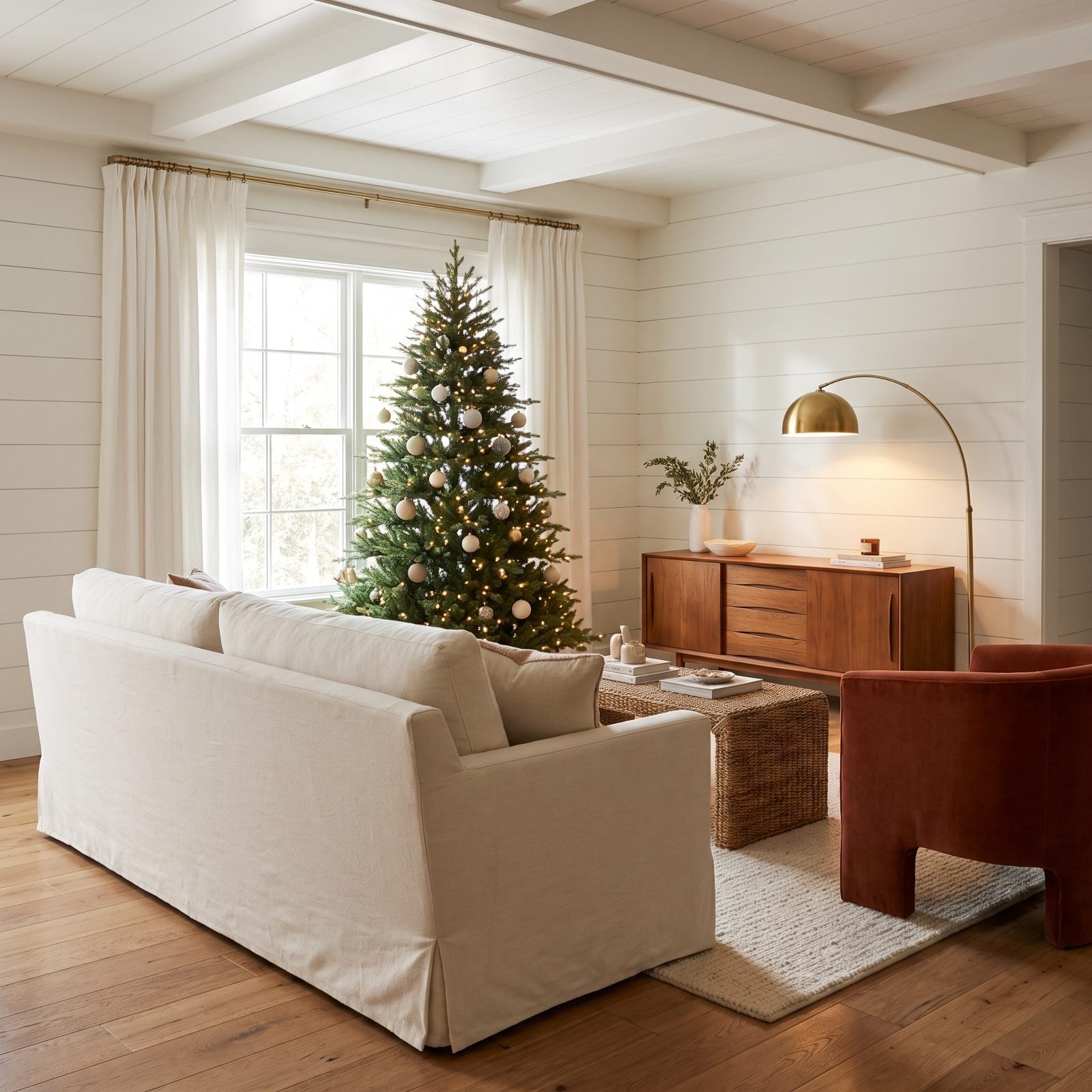
A sparse tree can carry just as many ornaments as a dense one. The trick is reading the branches first. Here the decorations sit in the gaps the branches actually leave, so nothing crowds and nothing floats in empty air.
Proportion is the whole game. Match ornament spacing to branch density and the tree looks considered; ignore it and you get clumps in some spots and bald patches in others. The rust velvet armchair and teak sideboard anchor the warm palette the gold ornaments echo.
10. The Tree With Fewer, Better-Scaled Decorations
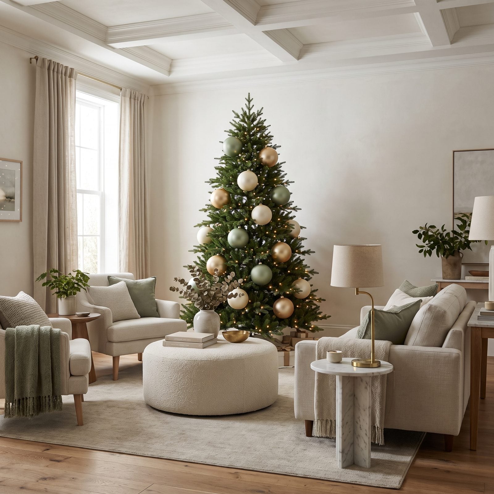
Twelve big ornaments beat fifty tiny ones. Scale up and strip down. A handful of grapefruit-sized matte sage and gold pieces reads as deliberate styling, while a swarm of small baubles just looks busy and shrinks the room around it.
9. The Restrained Ornament Palette That Lets the Room Breathe
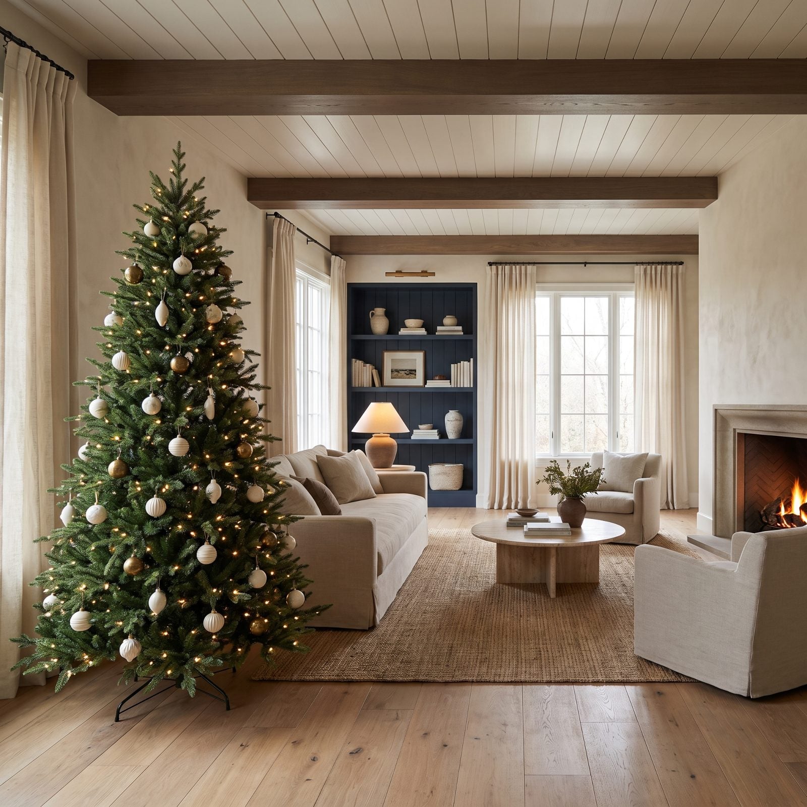
Pick two ornament colors and quit. Cream and antique brass against green is all this tree needs, and that discipline keeps the room feeling open instead of frantic.
Every extra color you add is another thing the eye has to sort. A restrained palette on the tree lets the linen sofa and travertine table stay part of the picture rather than getting shouted over.
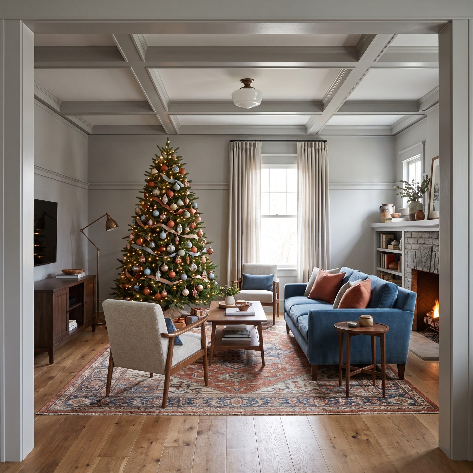
8. The Tree Styled to Echo the Room’s Existing Colors
🔥 Would you like to save this?
The best trees don’t introduce a new color scheme. They borrow the room’s. This one pulls terracotta and soft blue straight from the sofa and pillows, so it looks like it belongs rather than visiting.
Matching the tree to the room is the fastest way to make a space feel bigger. When the tree and the blue velvet sofa share a palette, the eye stops cataloging separate objects and reads one unified room. Want to push the warm-earth mood further? A terracotta dining room next door keeps the story going.
7. The One-Color Tree Mixing Matte and Glossy Ornaments
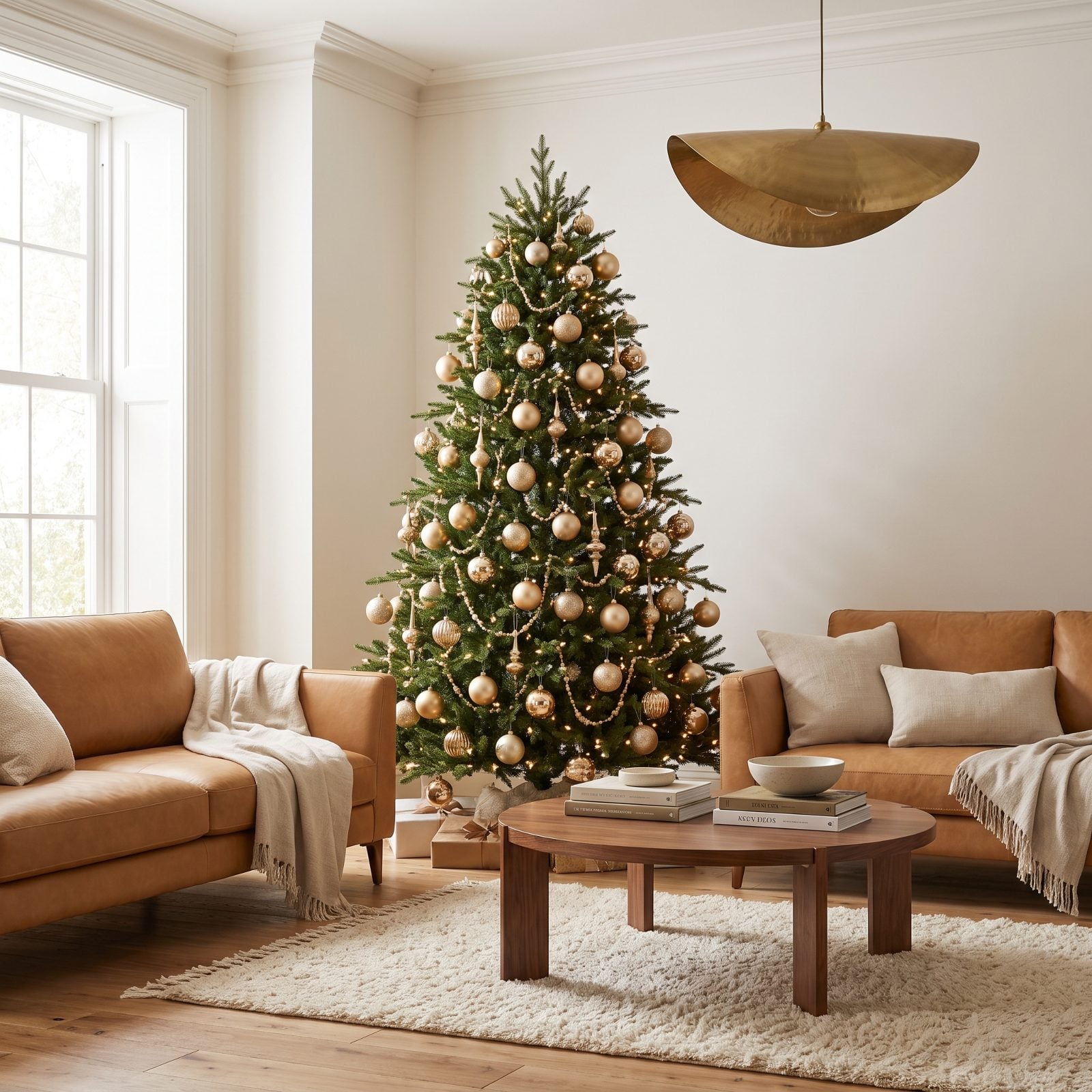
One color, two finishes. That’s the quiet luxury move. A tree in all champagne gold could fall flat, so half the ornaments go matte and half go glossy, and suddenly there’s depth without a single extra hue.
The glossy pieces catch the lights, the matte ones absorb them, and you get dimension that reads as money well spent. Add a camel leather sofa and a brass pendant and the whole room pulls together on texture alone.
6. The Tree That Repeats the Room’s Brass Finishes
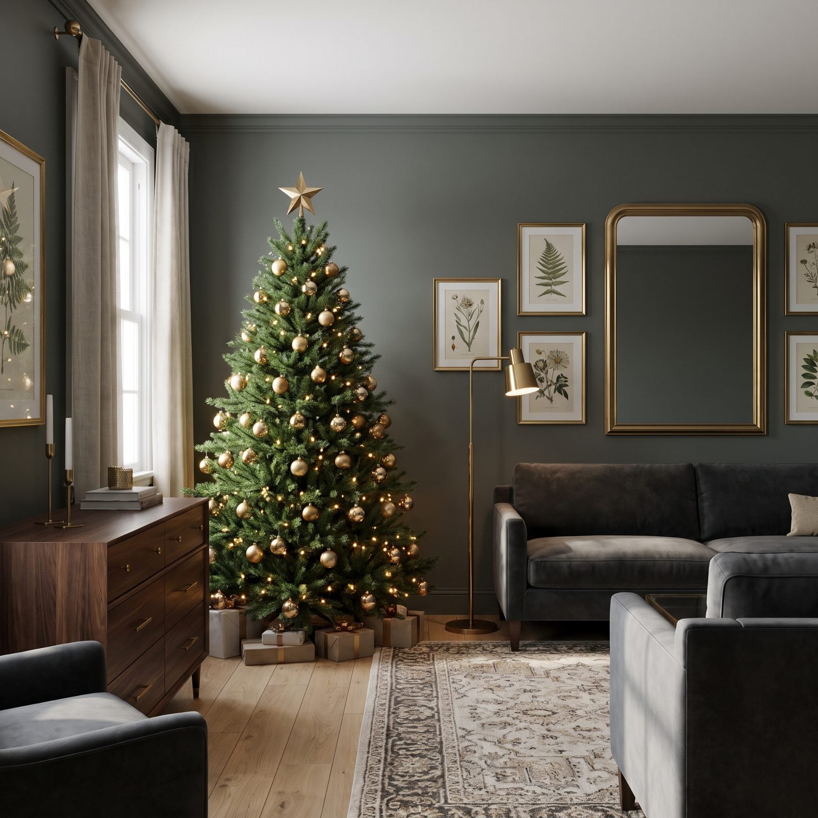
Look at the brass already in your room before you decorate. The lamp, the pulls, the mirror frame. Echo those finishes on the tree and the metal starts to feel like a decision instead of an accident.
Here the brass ornaments rhyme with the brass floor lamp and the frames, so your eye travels the room collecting the same glint over and over. Repetition is what makes a space feel curated, and it costs nothing but attention.
5. The Graduated Ornament Scale, Large Low and Small Near the Crown
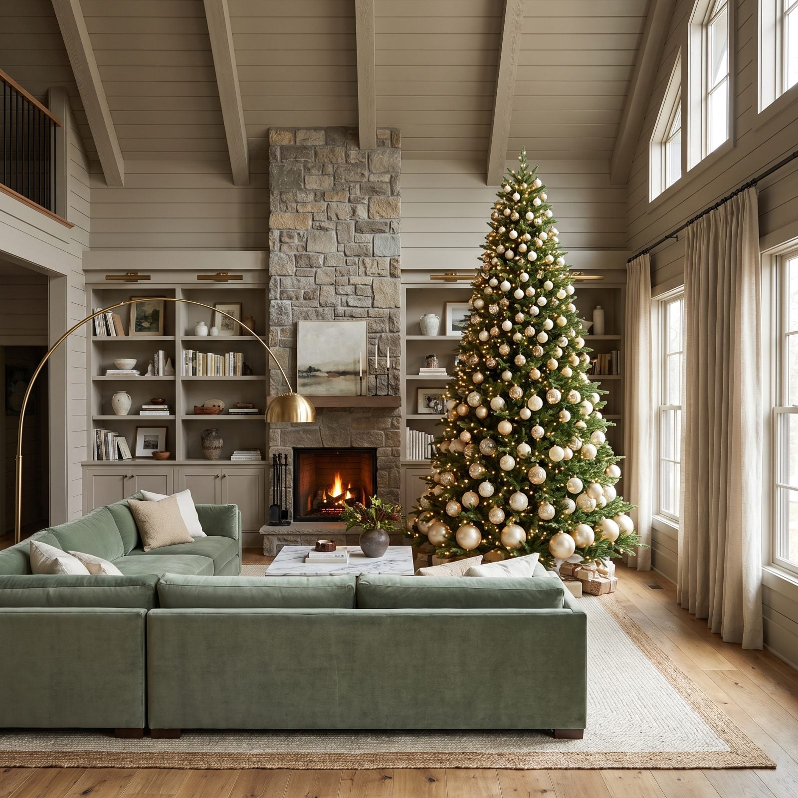
Big ornaments at the bottom, small ones at the top. This single rule fixes more lopsided trees than any other, because the graduation follows the tree’s natural taper and the whole shape reads cleaner and taller.
In a room with a tall ceiling and a sage green sofa, that upward pull makes the whole space feel loftier than it is.
4. The Tree With Ornament Clusters Instead of Scattered Trinkets
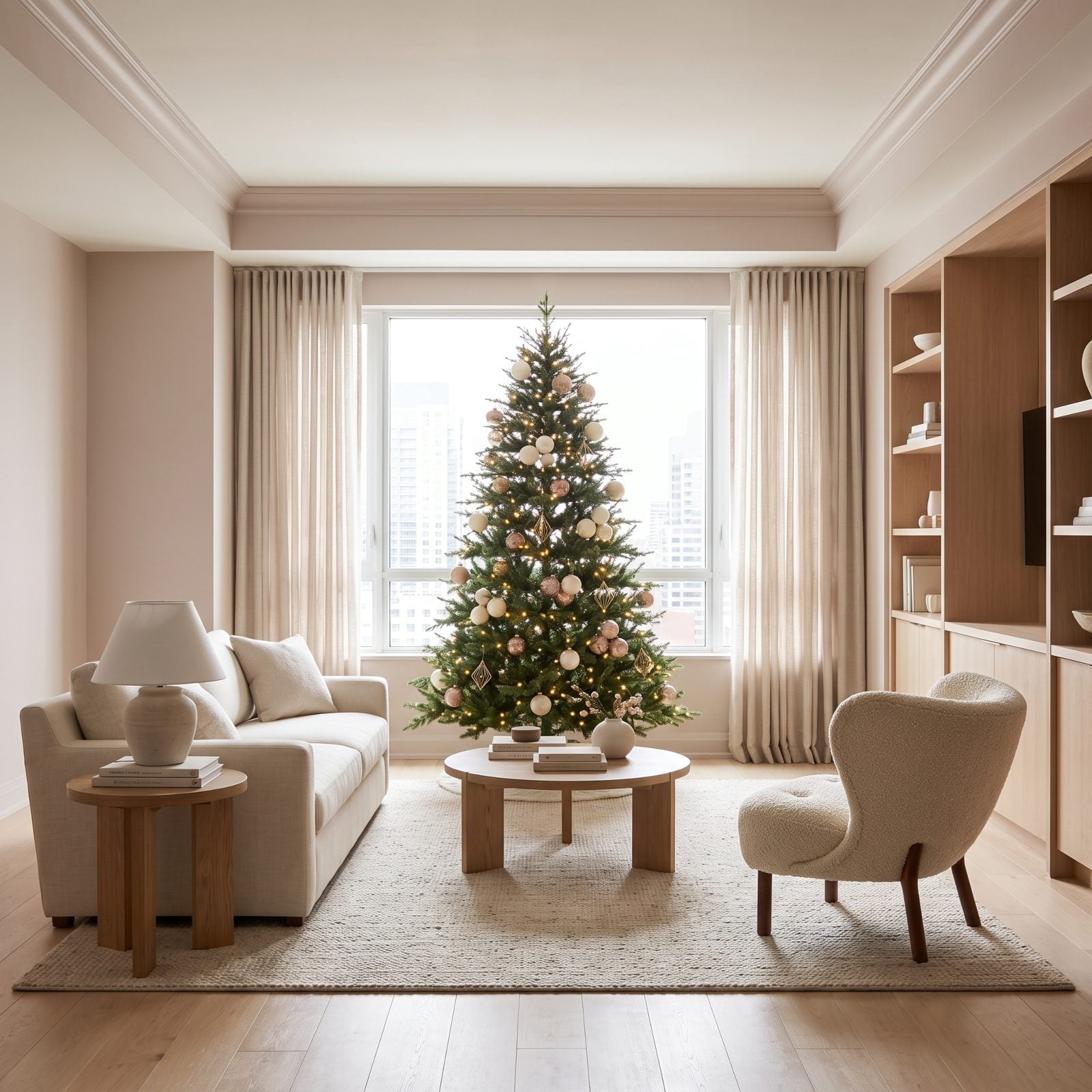
Stop spacing every ornament an equal inch apart. Cluster them. Groups of three and five with real negative space between them feel styled, the way a florist bunches blooms instead of lining them up like soldiers.
The gaps do as much work as the ornaments. Clustering leaves the branches visible between groups, which keeps the tree light and gives a boucle accent chair and linen sofa the restraint they deserve.
3. The Oversized Ribbon Used in Long Vertical Lines
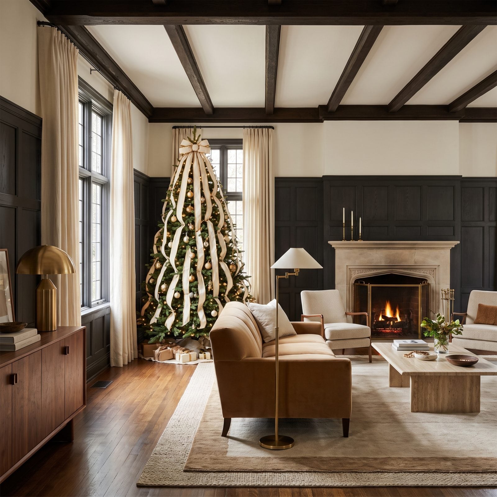
Ribbon tucked in horizontal loops widens a tree and eats your floor space. Run it vertically instead. Long cream velvet cascades from crown to base pull the eye straight up and make an eight-foot tree feel even taller.
Vertical lines have stretched rooms since forever, and they work on trees too. The ribbon adds richness without adding width, which matters when a camel velvet sofa and walnut console already fill the space.
2. The Tree Crowned With a Narrow Architectural Topper
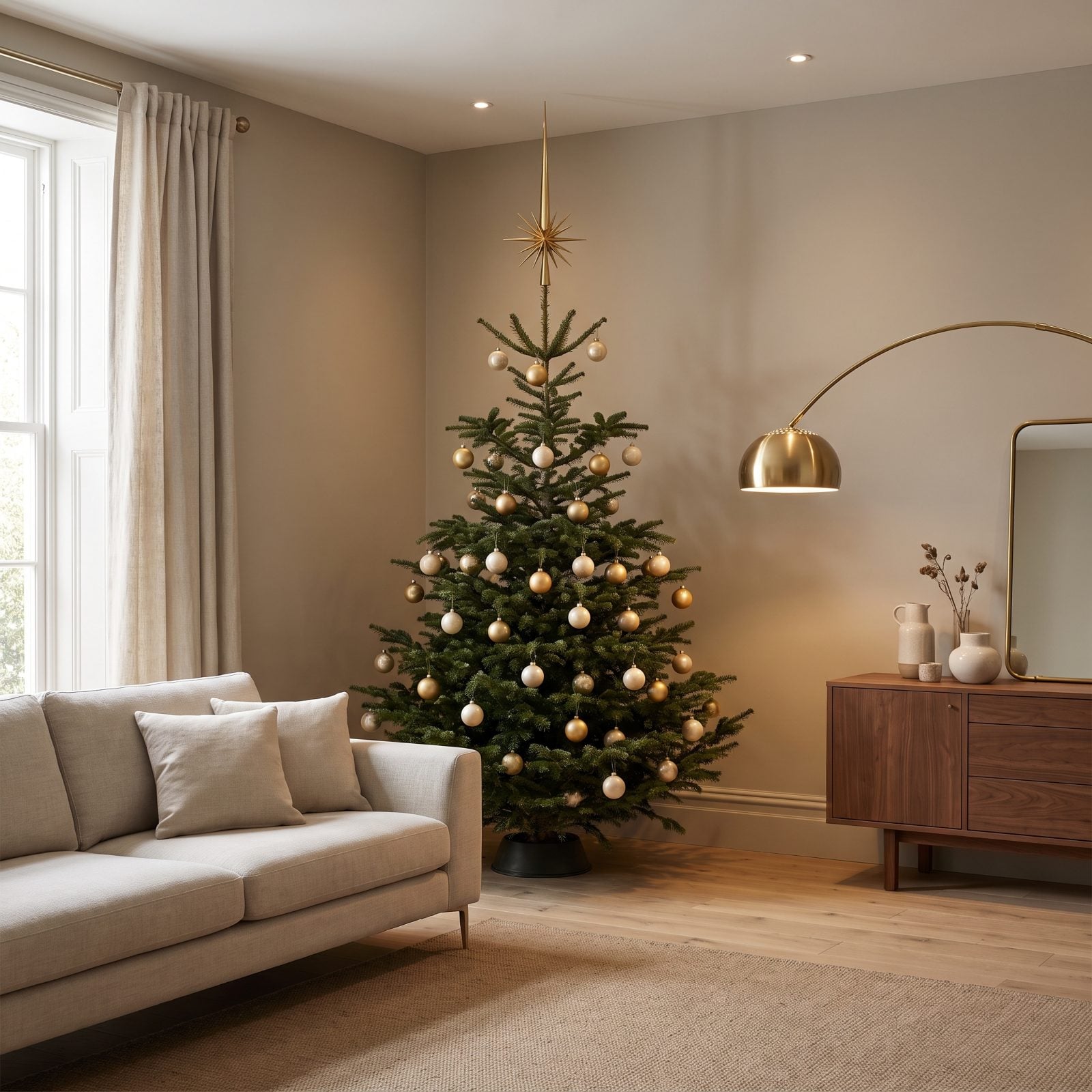
Most people reach for a fat bow or a sprawling star, then wonder why the ceiling suddenly feels like it dropped a foot. A narrow spire does the opposite. That slim brass starburst topper pulls your eye straight up the vertical line instead of stopping it dead at the tip of the tree.
Clearance is everything here. Leave a hand’s width between topper and ceiling and the whole room reads taller. Space the ornaments out, put a walnut sideboard nearby, and the tree stops elbowing the room for attention and starts flattering it.
1. The Warm Micro-Lights Layered Deep Inside the Branches
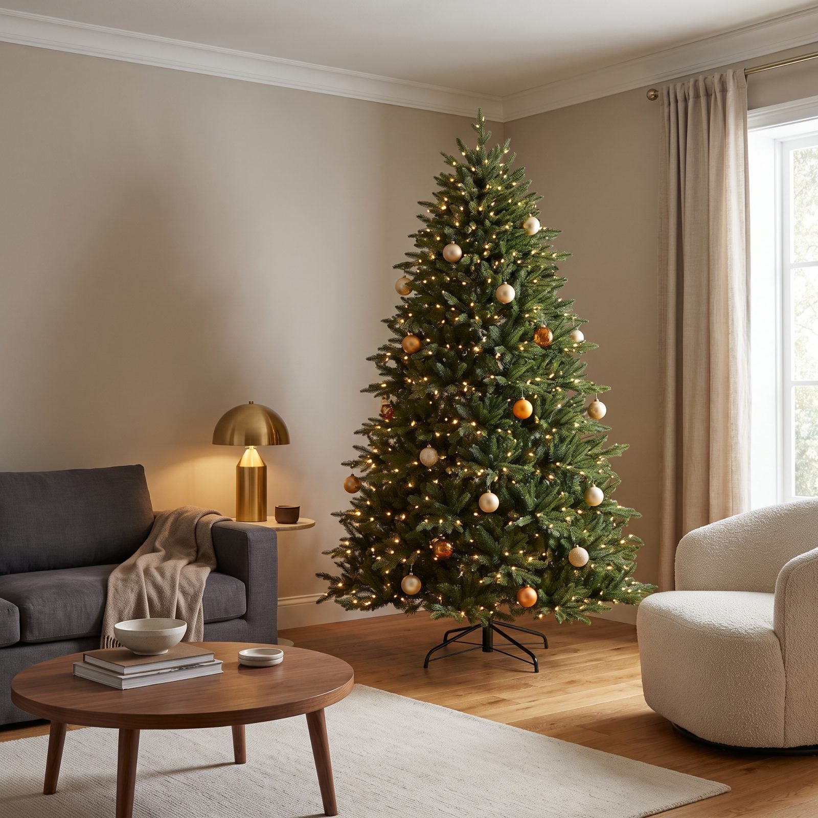
Lights wrapped only on the outside make a tree look like a cage. The glow sits flat on the surface, and the second the sun drops the whole thing goes paper-thin.
So push the warm white micro-lights deep toward the trunk, string a second set behind the first, and the branches start to glow from inside. Suddenly there’s depth. The foliage reads in layers, shadows fall where they should, and the tree looks lit by something rather than merely wearing a string of bulbs.
Warm white over cool white. Always. I will die on this hill. Cool white turns pine the color of a hospital hallway, while warm white keeps the needles green and the whole room honeyed. Put a brass table lamp on low nearby so the tree isn’t the lone light fighting the dark.