
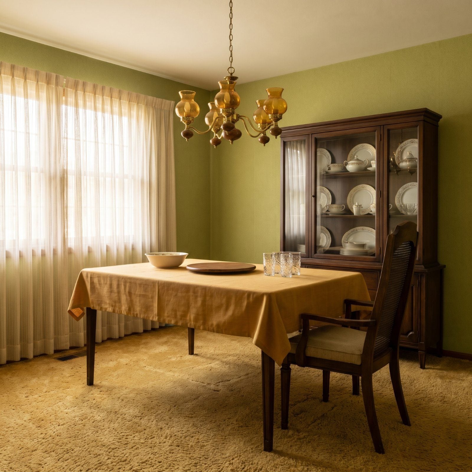
The plastic slipcover crinkled when you sat down, there to protect the good chairs for a Christmas dinner eleven months away. Half the house was off-limits most of the year, kept clean for company who rarely came. Dining rooms in 1975 were shrines to occasions. Ours today are where homework, laptops, and Tuesday takeout all land at once. These before-and-afters show how the room where we eat quietly rewrote the way a whole house works.
35. The Room With a Door vs. The Open-Plan Eating Area
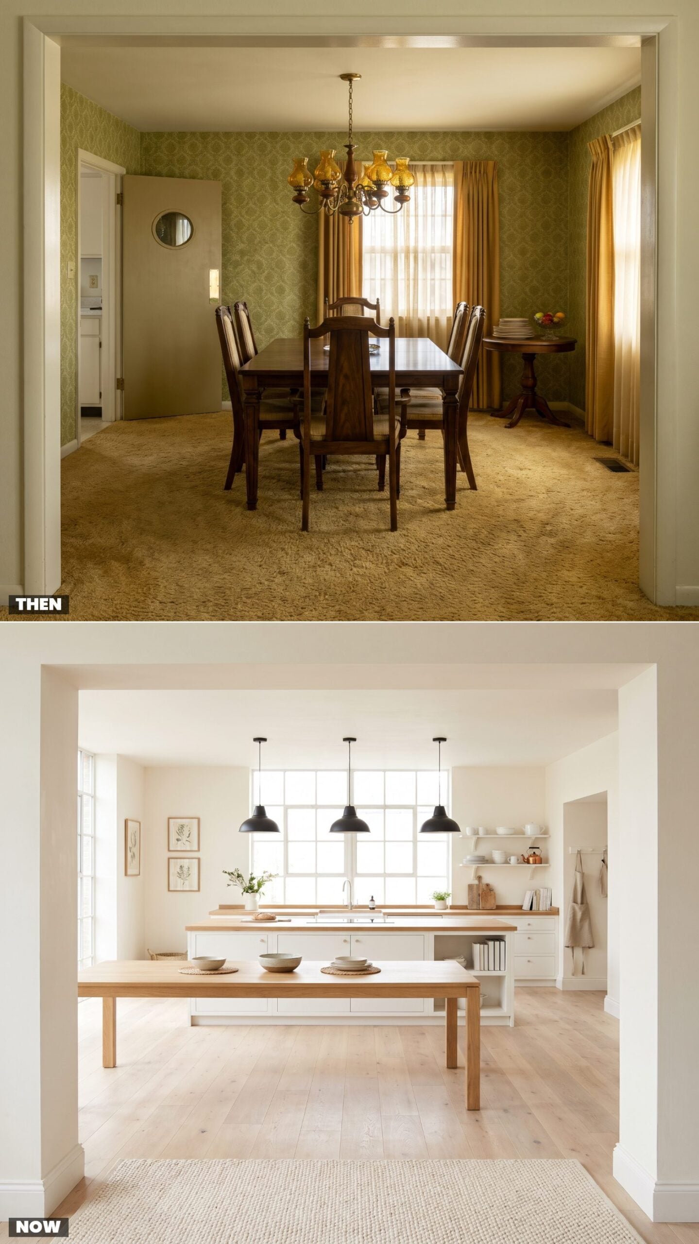
The 1975 dining room had a door, and that door had a job: keeping the smell of the roast and the clatter of the kitchen somewhere else. Eating was a destination you walked to. The wall between cook and guest was literal.
In order to come up with the very specific design ideas, we create most designs with the assistance of state-of-the-art AI interior design software. Also, assume links that take you off the site are affiliate links such as links to Amazon. this means we may earn a commission if you buy something.
Now the wall is gone. The table sits a few steps from the island, and whoever’s cooking joins the conversation instead of getting exiled from it. The shift is social before it’s spatial. We stopped wanting to be alone with the stew.
If you’re opening up a wall yourself, keep one visual anchor on each side so the great room renovation reads as two zones rather than one echoing hall.
34. The Matching Suite vs. Furniture You Collected
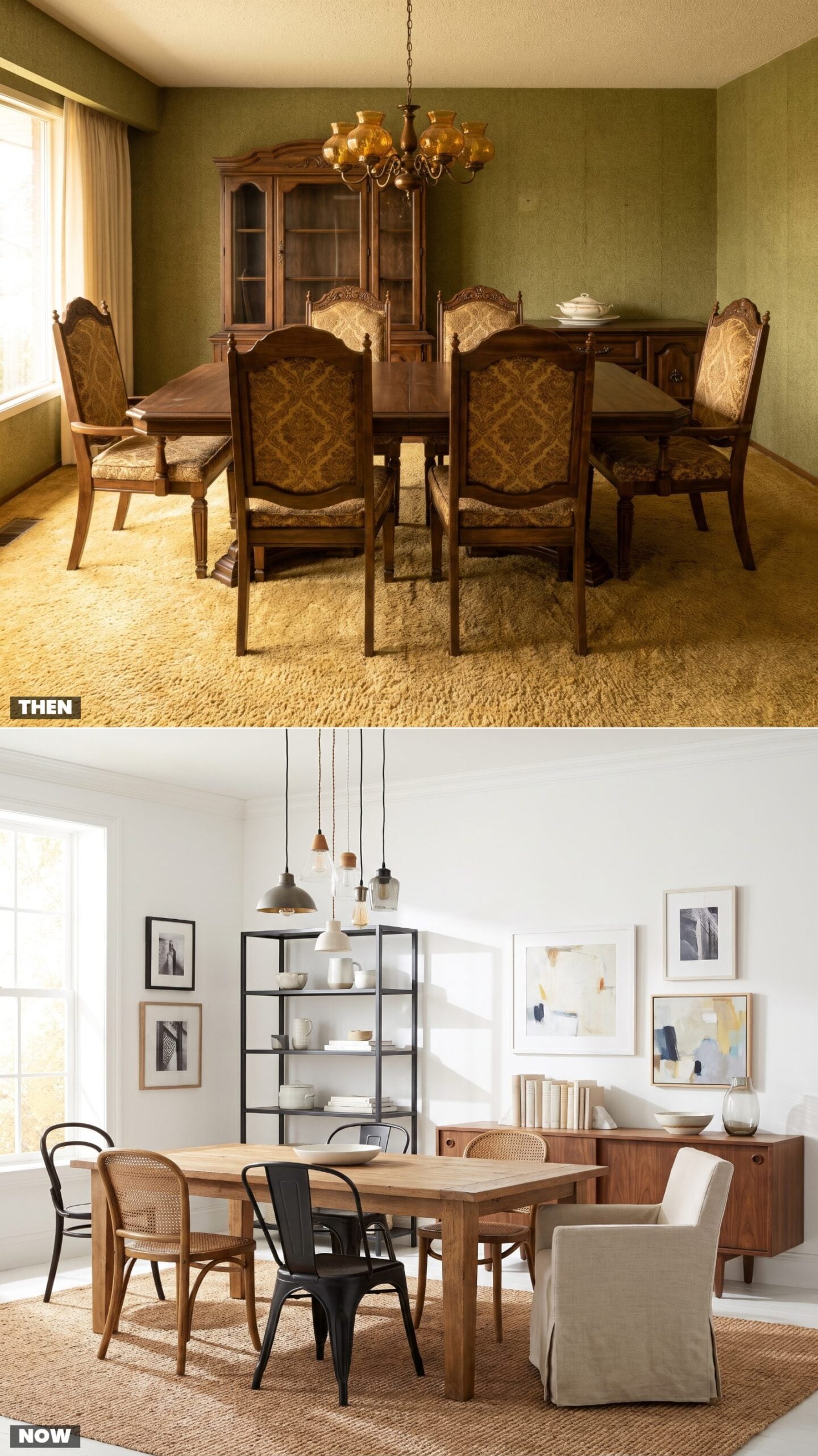
You bought the whole thing at once. Table, six chairs, buffet, hutch, all the same stain, all off the same showroom floor, delivered in one truck. Matching was the status signal. Mismatched meant you couldn’t afford the set.
Now that matched suite reads like a hotel lobby, and the collected look wins. A vintage sideboard beside a modern table, four chairs that found each other over years. It says a person lives here with taste, not a catalog number.
Want to mix without chaos? Let the chairs vary but keep them close in height and seat depth so the table still feels like one table. A vintage bentwood chair beside a linen dining chair works because the proportions agree even when the styles don’t.
As an interior designer puts it, “Gone are the days where you buy the whole kit and caboodle from the same furniture line.”
33. The Big Rectangular Table vs. The Round One That Saves the Room
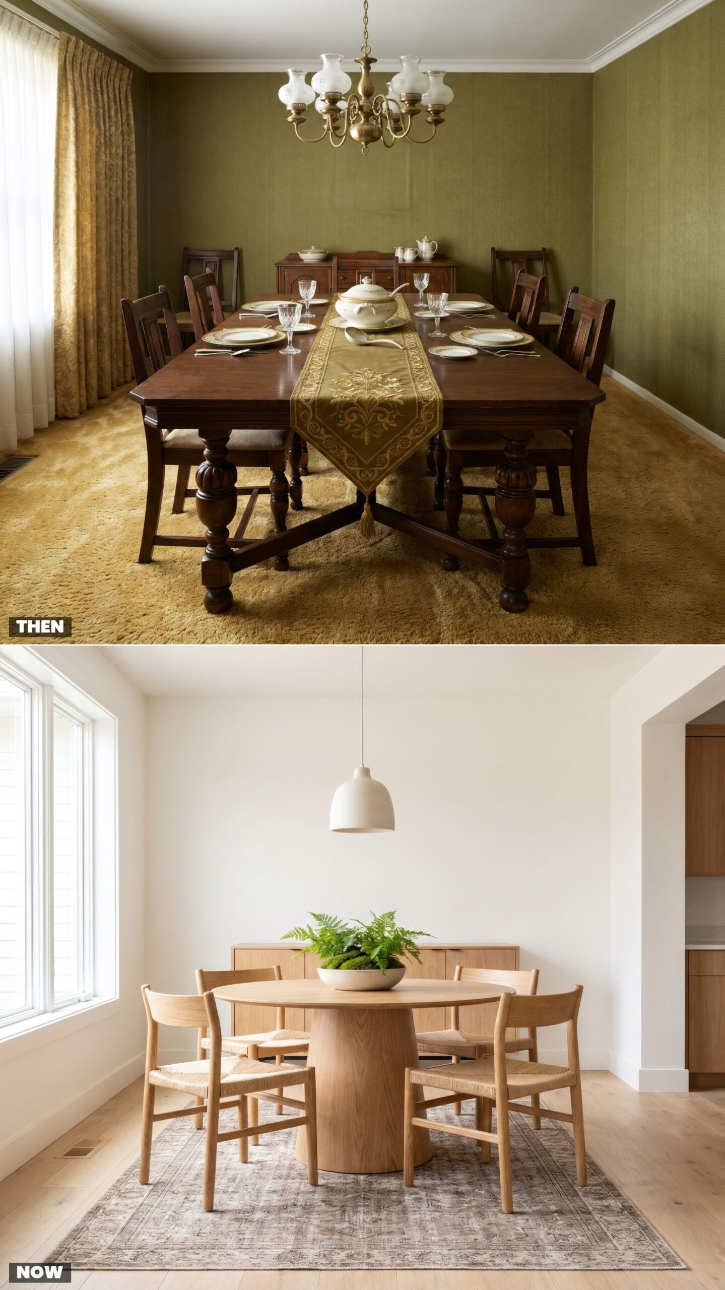
The 1975 table was a monument. Long, heavy, extended with leaves for a crowd that gathered twice a year, parked dead center the other 363 days where it swallowed every inch of floor.
Round tables quietly took over because they do more with less. No corners jabbing your hip, no head-of-table hierarchy, and everyone can actually see everyone. A round pedestal base clears the floor so chairs tuck fully under.
Explaining why round tables suit tight dining rooms, a furniture expert says “Their lack of corners provides a spatial efficiency that fits snugly into smaller or uniquely shaped rooms”
32. The Host and Hostess Armchairs vs. Everyone Gets the Same Seat
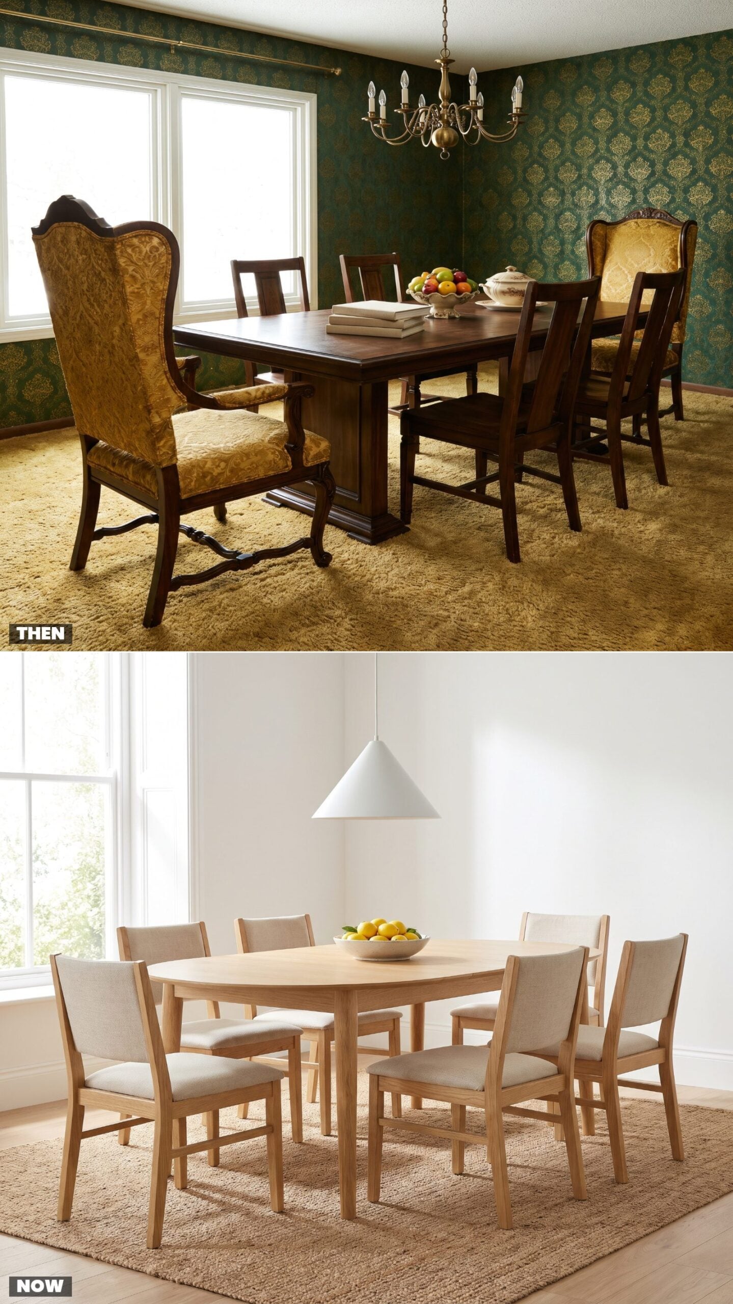
Every 1975 suite came with two bigger chairs. Arms, taller backs, more stuffing. They went at the ends for the host and the hostess, and sitting in one if you weren’t the parent was a minor act of rebellion. The furniture enforced the pecking order.
Modern sets dropped the thrones. Six identical chairs, no head of the table, no seat of power. A small change that says something larger about who runs the meal now, which is to say nobody and everybody.
31. Wipe-Clean Vinyl vs. Performance Fabric That Looks Like Linen
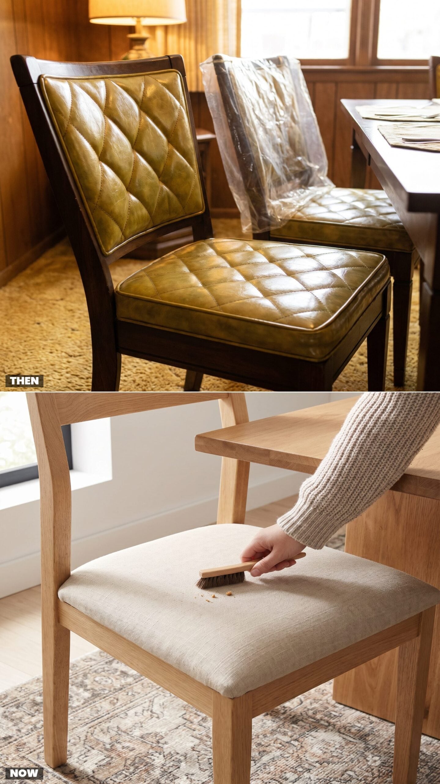
Vinyl seats were the answer to kids with grape juice. Wipeable, indestructible, and stuck to the back of your thighs every summer. Plastic slipcovers doubled down on the same instinct: protect the upholstery at the cost of ever enjoying it.
Performance fabric solved that same problem without announcing itself. It looks and feels like linen or wool, yet spills bead up and wipe away. You get the softness you actually want and the durability you need, no slipcover required.
30. The China Cabinet, Full vs. Nearly Empty
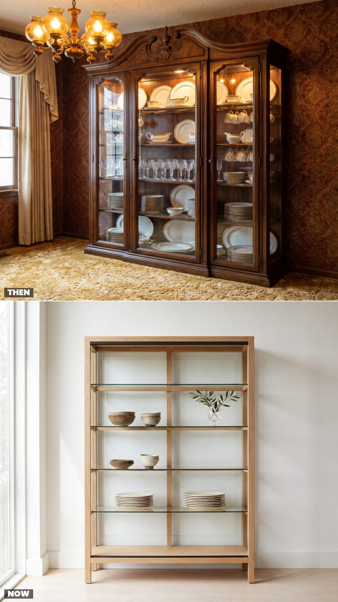
The china cabinet was a trophy case. Wedding china you used once a year, crystal you dusted more than you drank from, teacups hanging in rows nobody dared touch. Owning it mattered more than using it.
The modern version shows less and means it. A few handmade bowls, everyday plates you actually eat off, a vase, and deliberate empty space. We inherited the good china and quietly decided we’d rather see breathing room than a wall of stuff we’re afraid to break.
Speaking at an estate sale, an estate appraiser who sold fine china for decades says “There’s still a demand for it, but it’s not to the same level it once was, where every young girl at the age of 13 chose her china pattern”
29. The Tea Cart vs. The Bar Cart
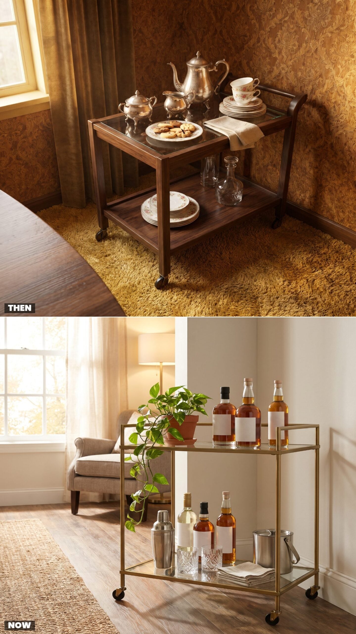
Mid-afternoon called for the tea cart. You wheeled it out, poured from a silver pot, passed cookies on a plate, and the whole thing had a ceremony to it. Hospitality moved on wheels.
The cart stayed, the contents changed. Now it’s brass and glass, loaded with bottles, a shaker, a trailing plant, parked where it can hold a cocktail hour. Same object, same urge to entertain, completely rewritten agenda.
Keep the bottom shelf half-styled and half-functional, bitters and a bar spoon within reach, so the cart earns its spot instead of just posing in the corner.
28. The Telephone Table vs. The Charging Drawer
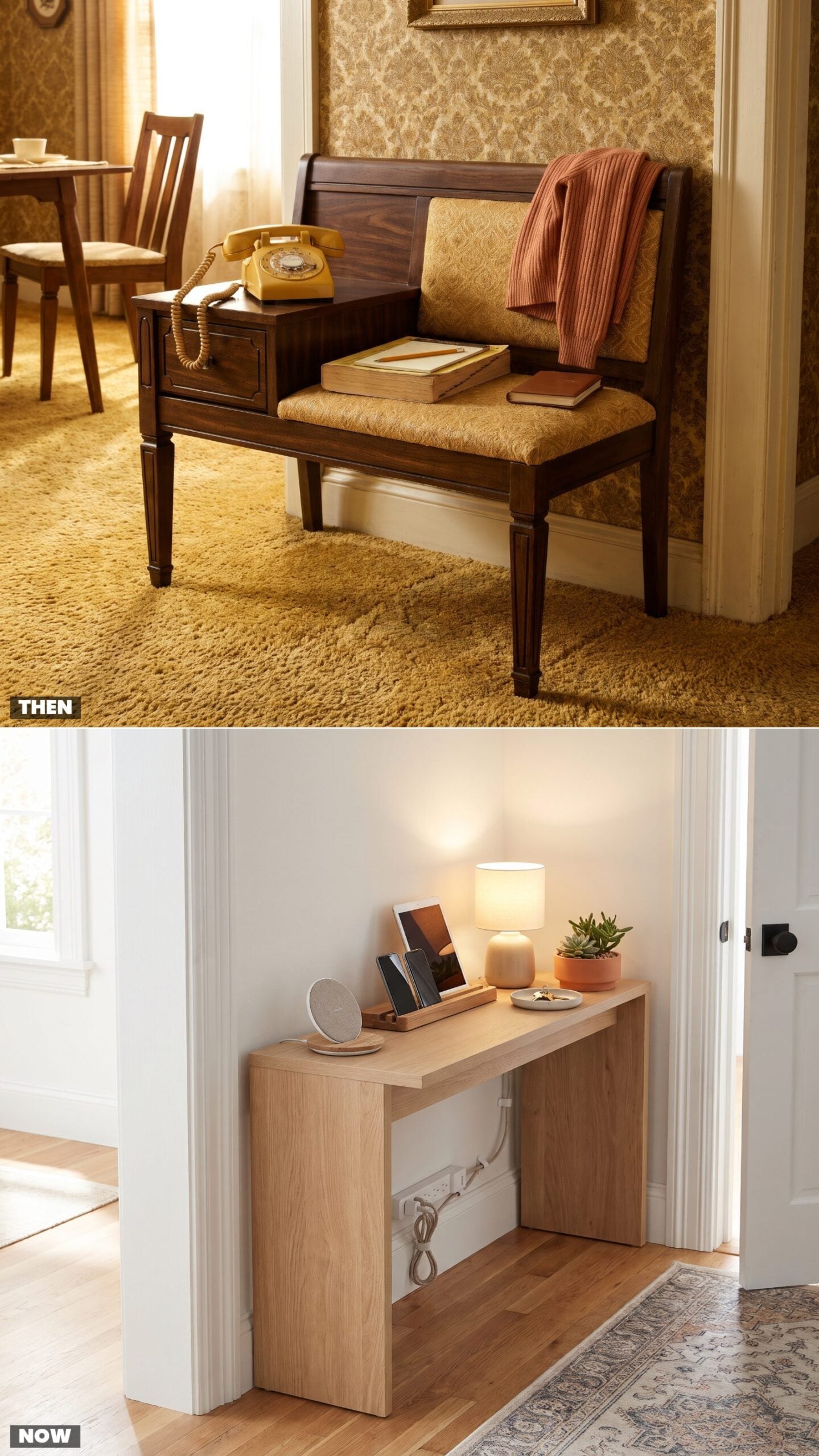
Furniture used to be built around the phone. The gossip bench had a seat, a shelf for the directory, and a spot for the heavy rotary handset, because a call tethered you to one wall by a coiled cord. You sat down to talk.
Then the phone untethered and the furniture followed. Now the same little table by the door holds a charging pad, a catchall dish, and a tangle of cables we pretend is organized. The device still anchors a piece of furniture. It just moves with us now.
27. Wall-to-Wall Shag vs. The Washable Rug You Can Actually Clean
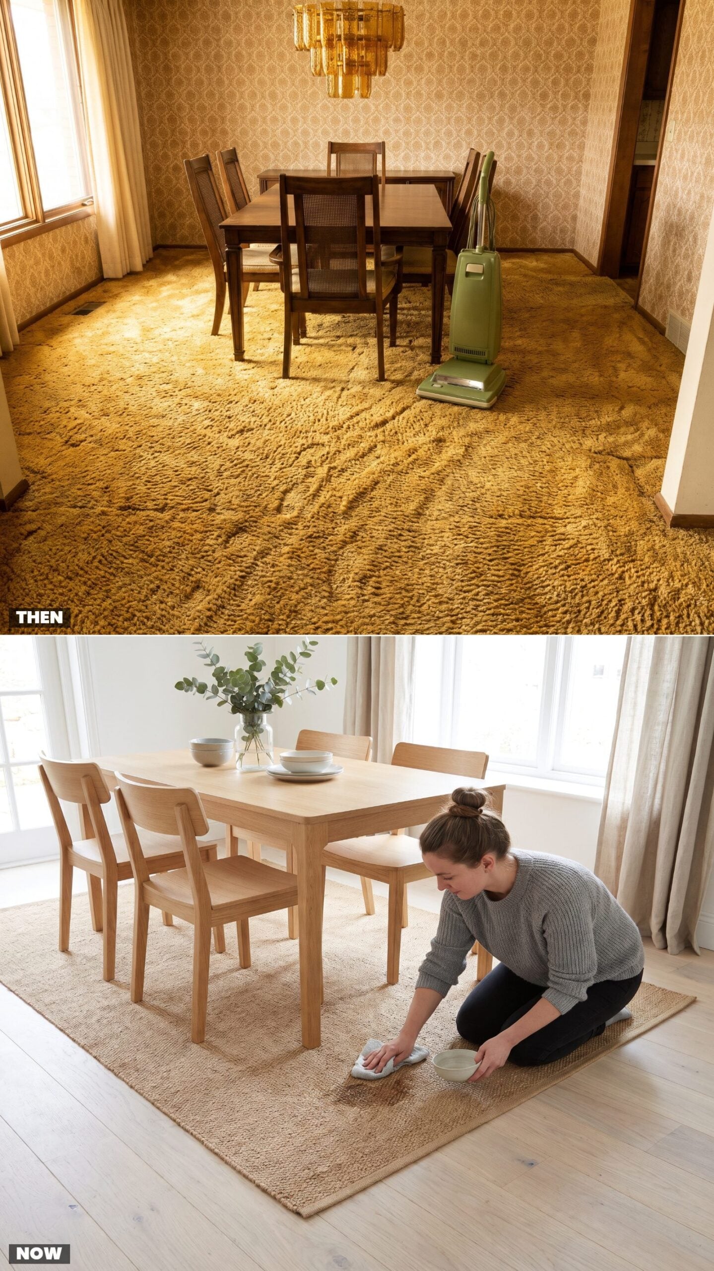
Wall-to-wall shag went everywhere, including under the dining table, which was a strange place to put something that trapped dropped peas and red wine forever. Every spill turned permanent. You vacuumed the carpet the way you’d mow a lawn.
Hard floors came back and the rug became removable. A flat-weave washable area rug defines the dining zone, then goes in the machine when a toddler does what toddlers do. We stopped committing our floors to one accident at a time.
26. Patterned Linoleum Gives Way to Wide-Plank Wood
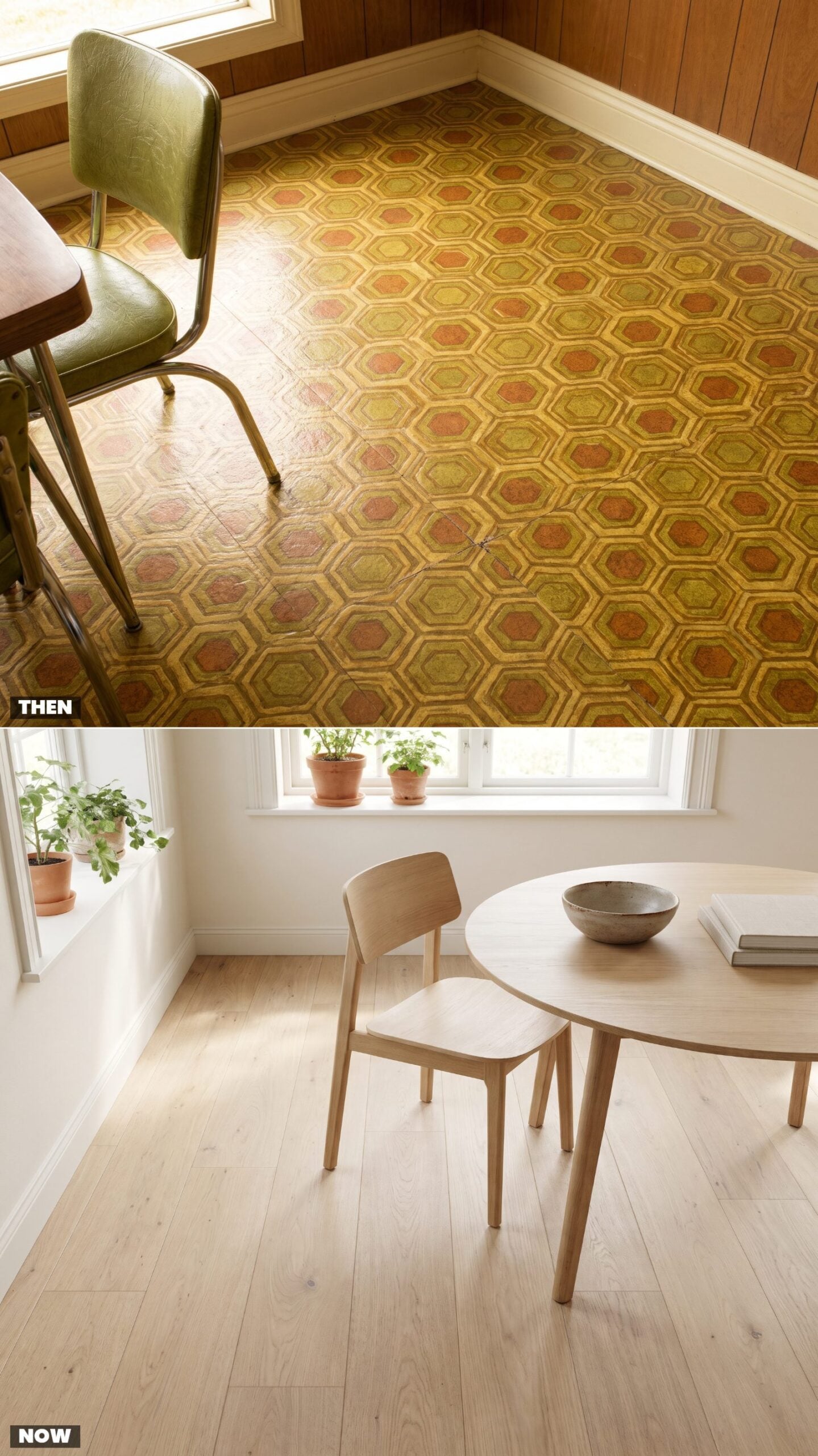
Linoleum in 1975 was practical and loud. Those interlocking gold-and-avocado hexagons hid crumbs and spills, which was their whole job, but the pattern fought the room for attention and usually won. By year five the seams were curling near the walls.
Now the floor shuts up and lets the wood talk. Wide white oak planks run long toward the light, matte and warm underfoot, and the quiet is deliberate. A calmer floor reads as a calmer room — most of why open-plan spaces lean on it.
25. From Wood-Paneled Walls to Warm White
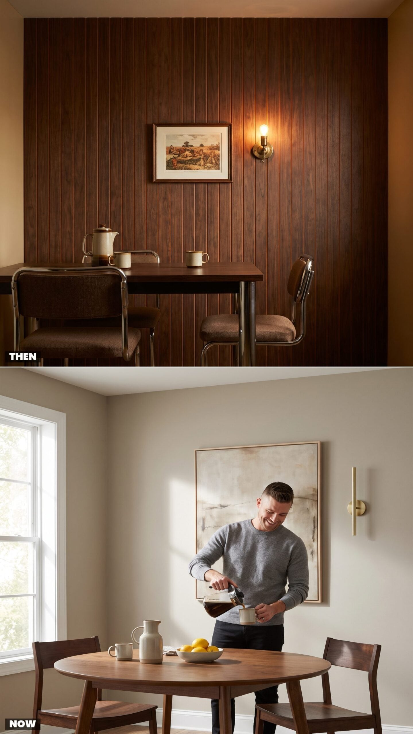
Dark paneling did something strange to a 1975 dining room. It wrapped you in a den-like hush that felt cozy at dinner and cave-like by Sunday afternoon. Grain everywhere, light nowhere.
Warm white flipped the logic. A soft greige-white reflects whatever daylight you’ve got and lets the room breathe, which is why it became the default backdrop for everything from a great room renovation down to a modest dining nook.
24. Flocked Wallpaper Traded for Peel-and-Stick Murals
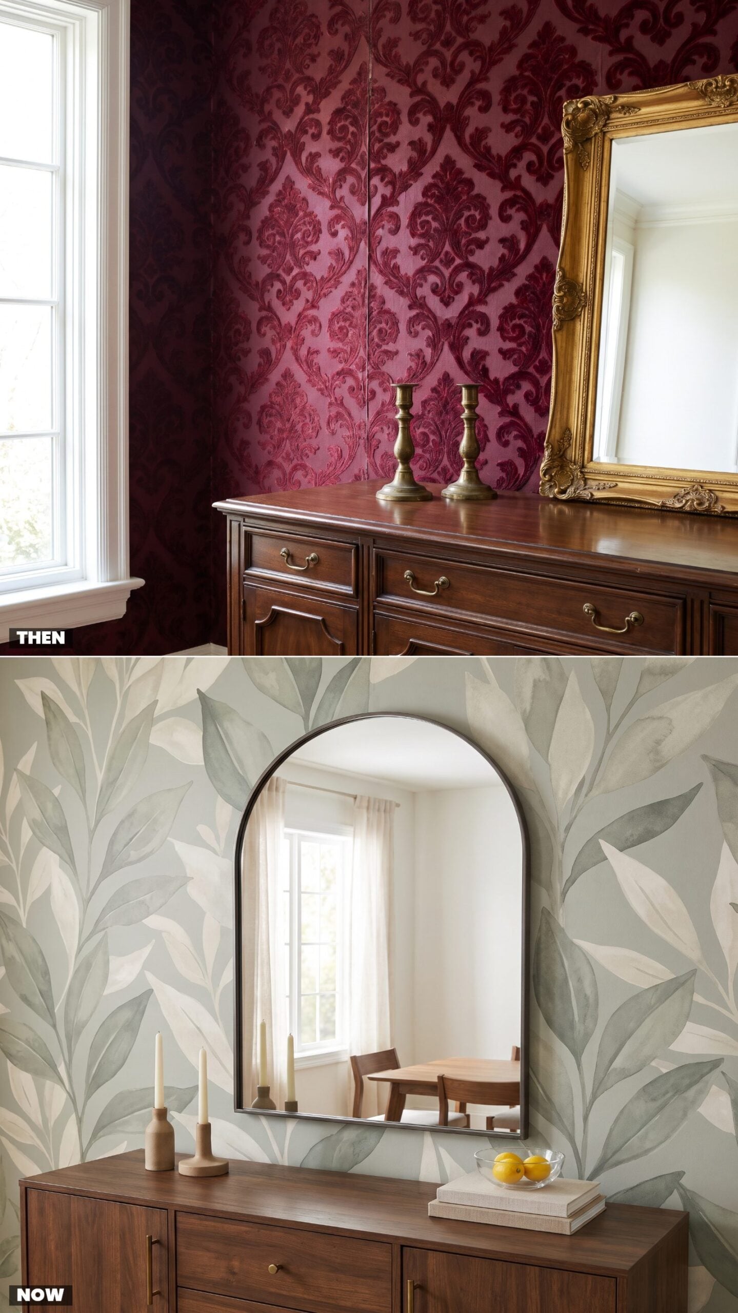
Flocked wallpaper was the flex of the moment. Run your hand across that burgundy damask and you felt velvet scrollwork, dense and a little decadent, the kind of wall that announced the dining room was for company.
Peel-and-stick murals carry the same ambition with none of the commitment. An oversized botanical in muted sage goes up in an afternoon and comes down before a security deposit is at risk. The drama just moved from texture to scale.
23. Avocado and Harvest Gold Cool Into Sage and Terracotta
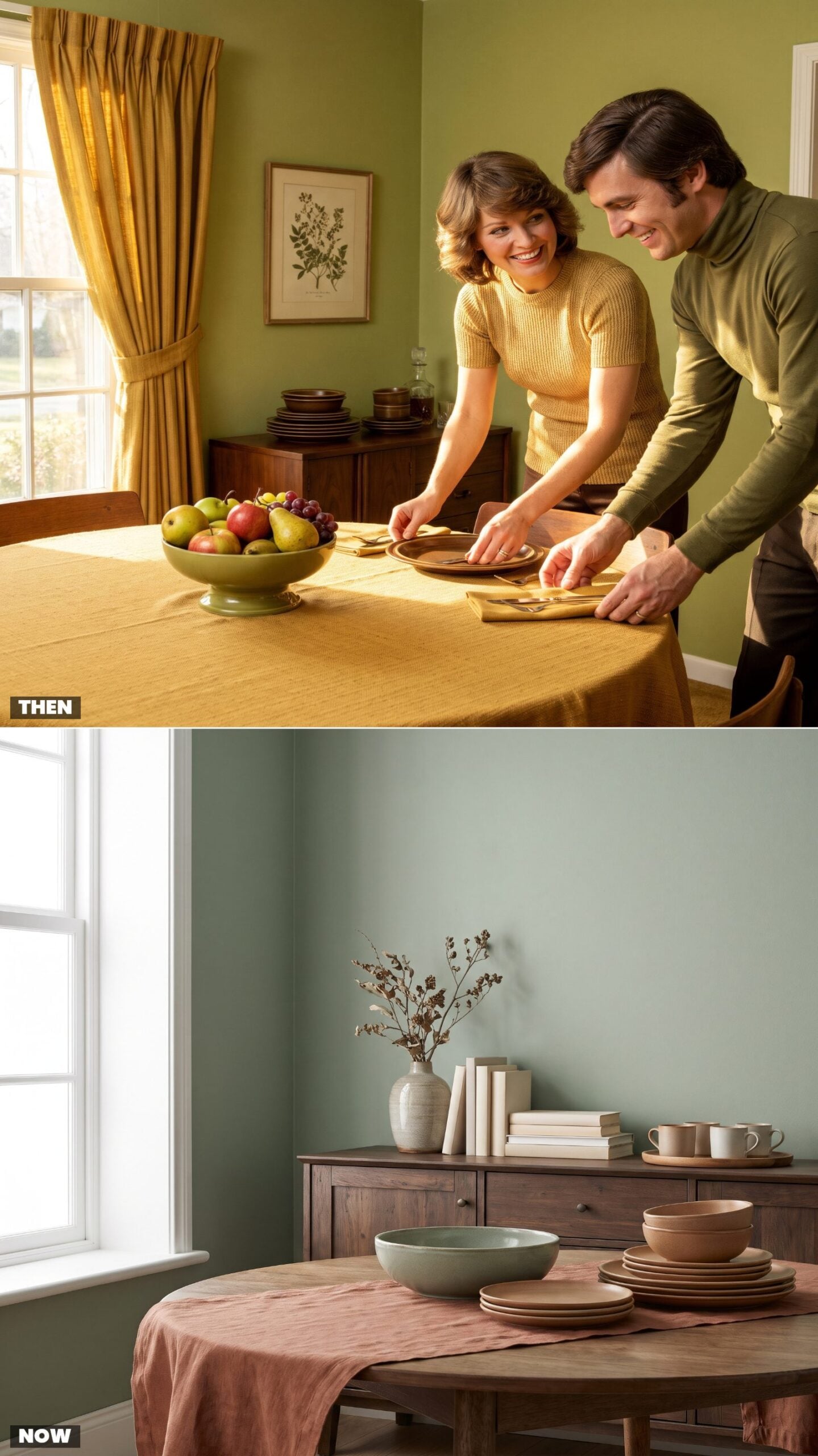
Avocado green and harvest gold weren’t accents in 1975. They were the whole deal, saturated and everywhere — drapes, fruit bowl, tablecloth. The scheme ran hot and loud.
The modern read keeps the earthy DNA and dials the brightness way down. Muted sage and terracotta come from the same warm-greens-and-golds family, just filtered through fifty years of wanting a room that doesn’t holler at you over dinner.
22. Dark-Stained Trim Lightens to Natural Wood
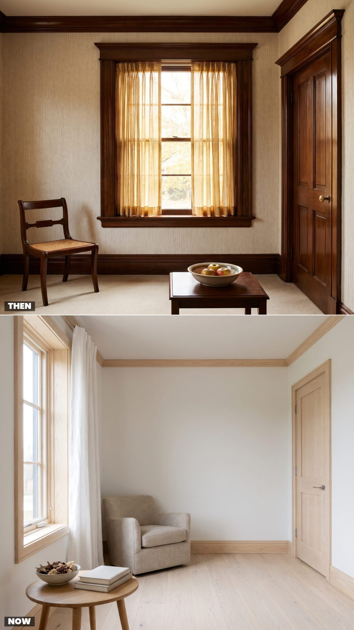
Dark-stained trim framed every window and door like a picture you weren’t allowed to touch. Glossy walnut everywhere, heavy profiles, the kind of casing that read as serious and made the room feel smaller than it was.
Natural wood does the opposite job. Pale ash in a clear matte finish and a slimmer profile lets the frame recede, so the window becomes the view and not the moulding. Light wood also forgives dust in a way high-gloss dark never managed.
21. Chair Rails and Two-Tone Walls, Now Color-Drenched Top to Bottom
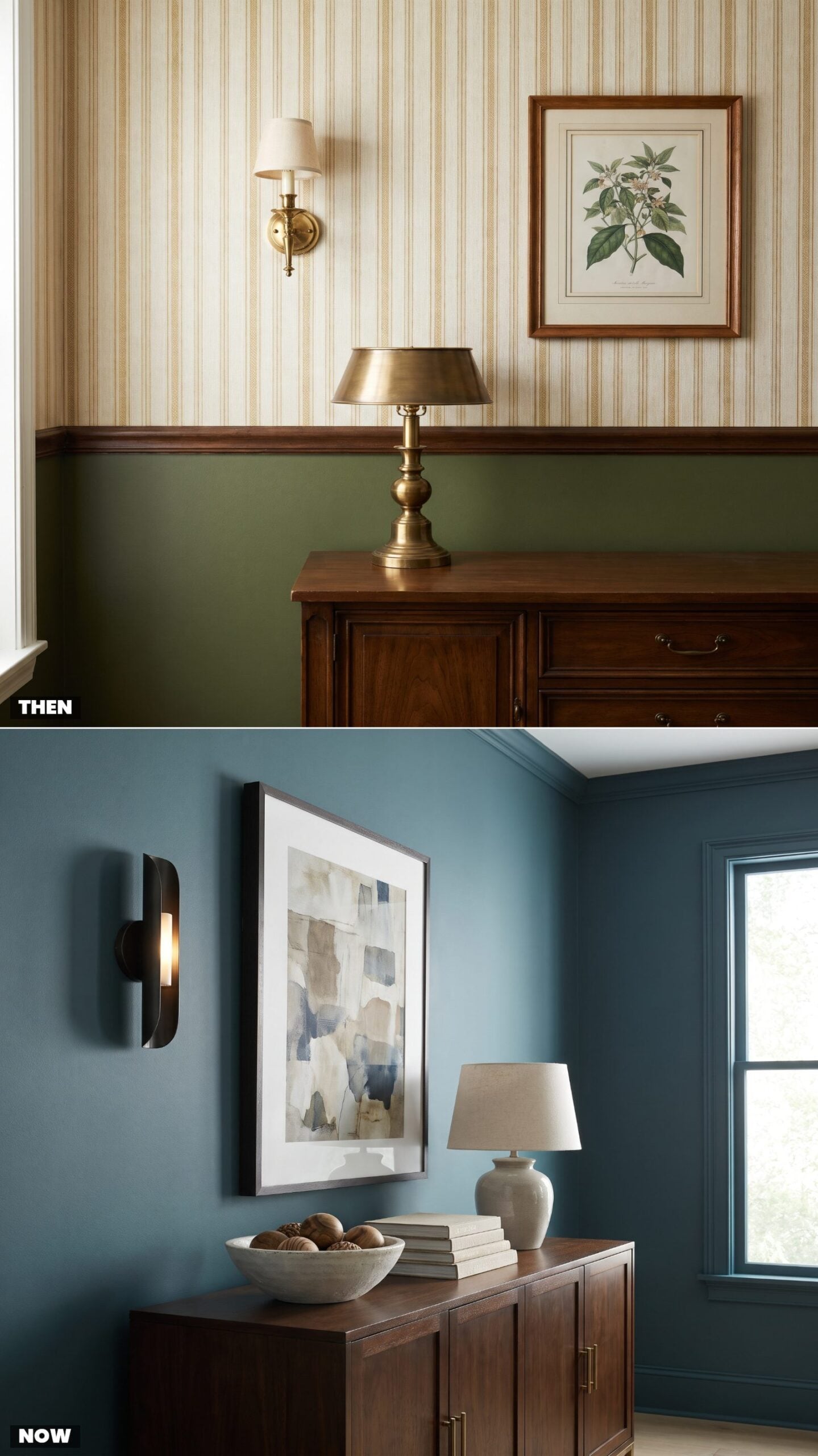
The chair rail split the room in half on purpose. Patterned paper up top, flat paint below, a tidy horizontal line that looked formal and, honestly, chopped the wall into two shorter walls.
Color drenching erased that line. One deep shade runs from baseboard across the trim to the ceiling, and the room suddenly reads taller because your eye has nothing to stop on. Bolder move, less fuss. You pick one color and commit.
A single color head to toe makes a small dining room feel like it was always meant to be that size.
Making the case for color drenching, one interior designer argues “That white trim also cuts off the eye and is extra information to process, taking away from the more interesting details of the room.”
20. Decorative Ceiling Beams Thin Down to Wood Slats
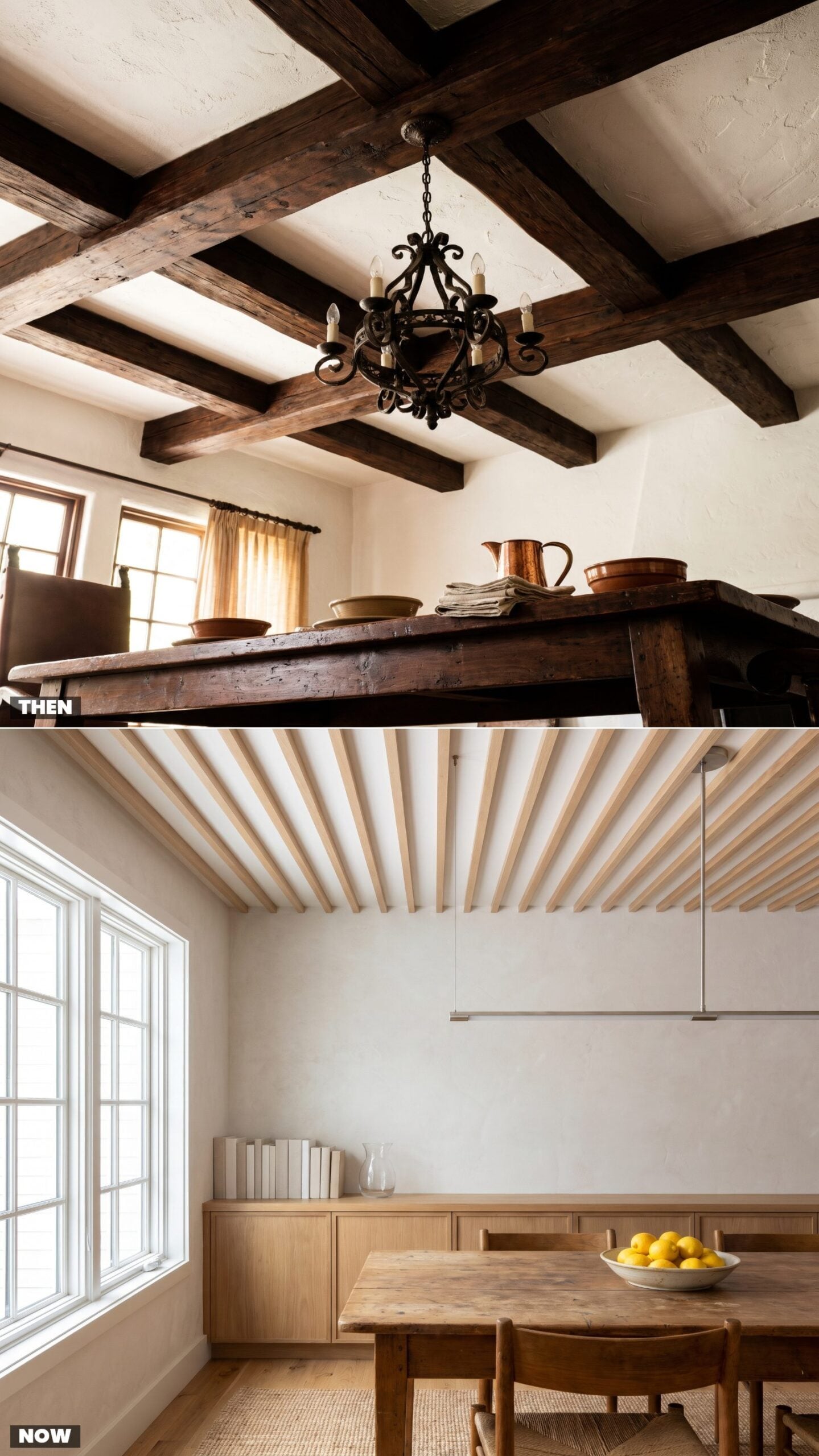
Those dark box beams were pure romance in 1975, a nod to Spanish-colonial drama overhead with a wrought-iron fixture swinging between them. They also pressed the ceiling down and ate every bit of light that tried to bounce.
Slim wood slats keep the idea and throw out the weight. Pale oak at a tight even rhythm adds interest without shadow, which is exactly what you want in a room that now doubles for working and homework and whatever else a dining table has to swallow these days.
19. Popcorn Ceilings Smooth Into a Statement Overhead
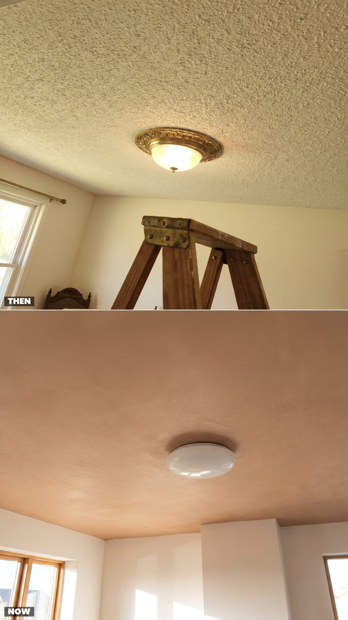
Popcorn texture was everywhere and nobody loved it, exactly. It hid imperfections, deadened sound, and over a decade went faintly yellow while collecting cobwebs in its bumps that no broom could reach. We’ve scraped a ceiling like this. Would not recommend the dust cloud.
The smooth ceiling went from afterthought to feature. A clean plaster finish in a soft clay tone turns the whole overhead into a quiet color move — the fifth wall people finally started decorating on purpose.
Describing spray-on popcorn texture, a home inspection firm notes it was “Popular from the 1950s to the 1980s because it was an easy way for builders to hide imperfections.”
18. One Brass Faux-Candle Chandelier Becomes Layered Light
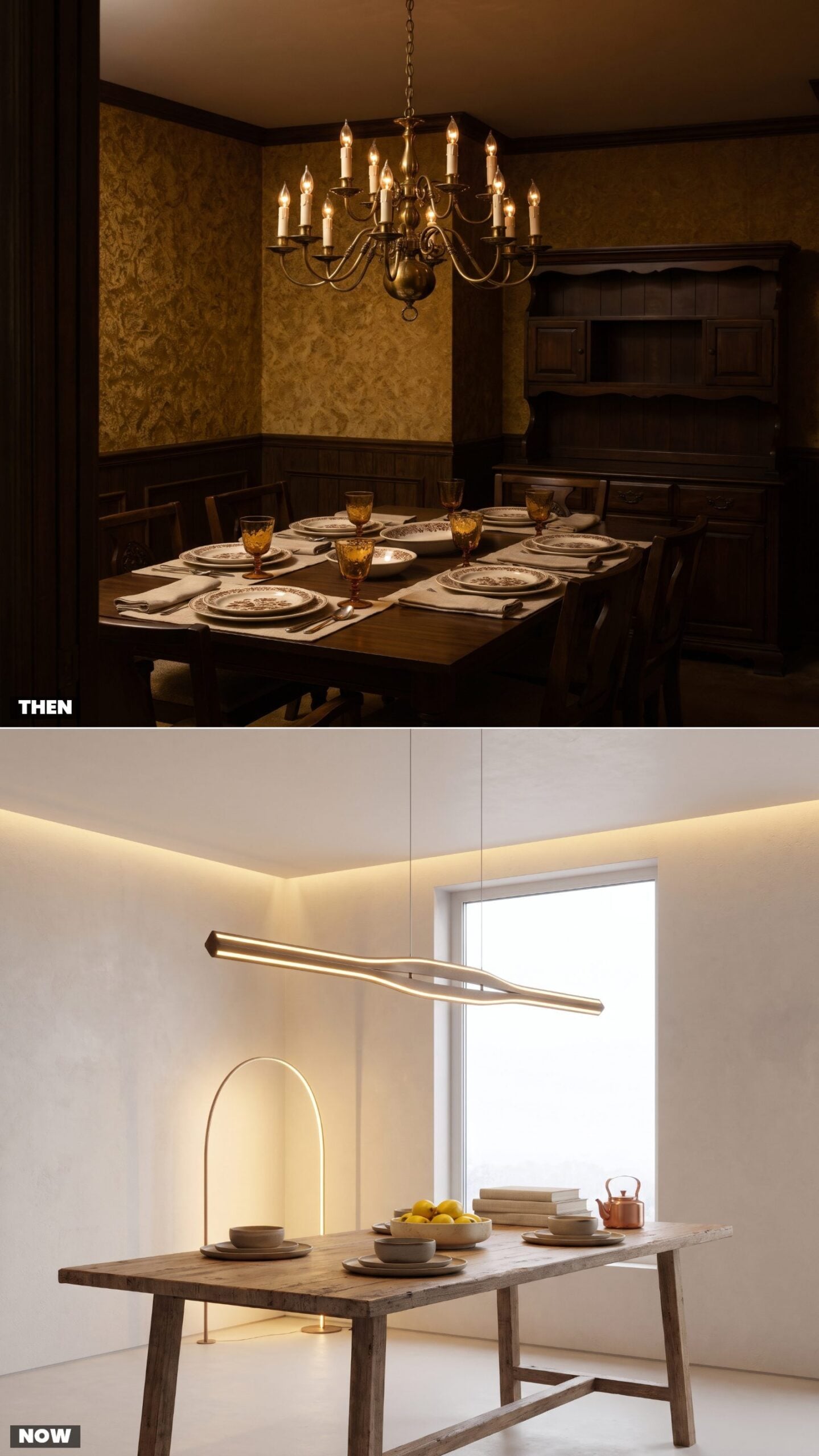
In 1975 the dining room usually had exactly one light: a brass chandelier dressed up with faux-candle sleeves and flame bulbs, hung dead center and left to do everything. It lit the table and gave up on the corners.
Now the light comes in layers. A sculptural pendant over the table, a floor lamp in the corner, a little warm wall-wash, each on its own dimmer so the room can shift from homework-bright to dinner-soft in seconds. The ceiling fixture stopped having to carry the whole night by itself.
17. Floral Curtains With Valances Give Way to Full-Length Linen
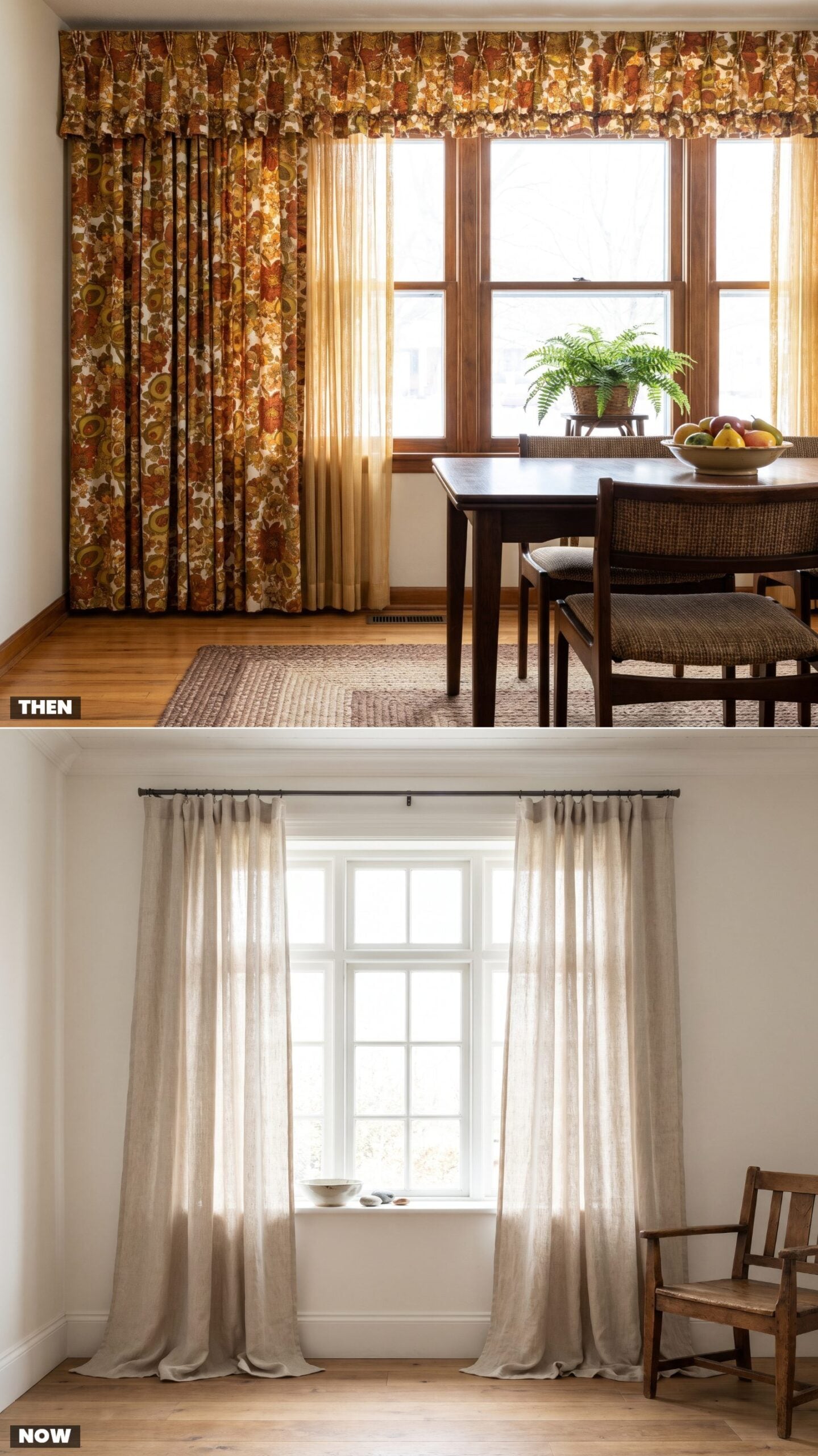
Floral curtains with a matching ruffled valance were the finishing touch that pulled the whole 1975 scheme together, usually in the same rust-and-avocado bouquet as everything else. The valance hid the hardware and stopped the window short of the sill.
Full-length linen does the reverse. Hung high and dropped to the floor in a plain oatmeal weave, the drapes stretch the window taller and let light move through the fabric instead of blocking it. No pattern, no ruffle, just a soft vertical line.
16. Lace Tablecloths vs. Bare Wood Tabletops
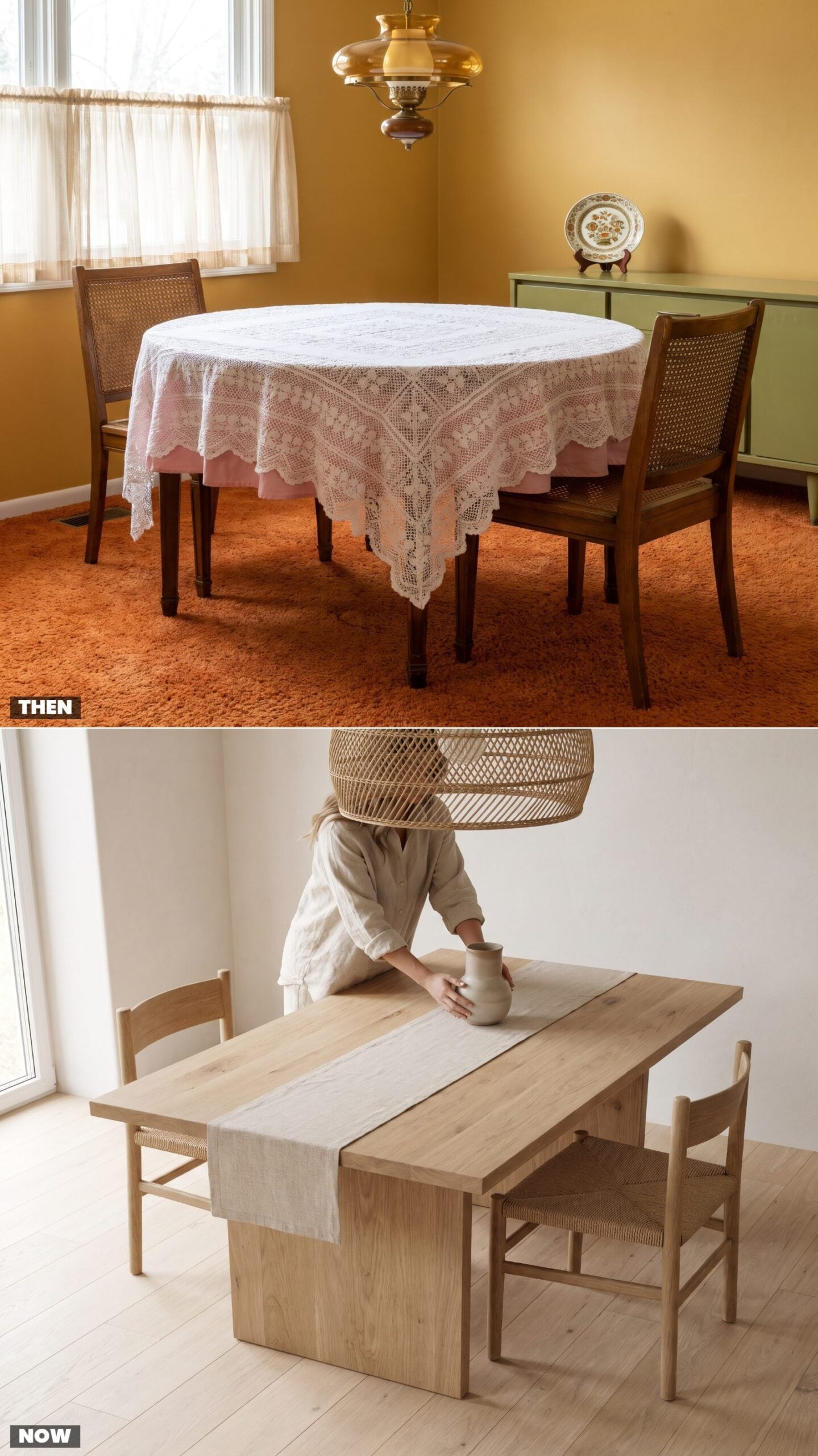
In 1975, the table was never naked. A lace tablecloth meant you cared, that the good room was ready for company, that Grandmother’s handwork had a reason to exist. It also meant hand-washing, starching, and a small panic every time someone reached for the gravy.
Now the wood itself is the point. A bare white-oak top with its grain showing says the material cost enough to stand on its own. We leave it uncovered because we want to see it, and because nobody has time to launder lace anymore.
15. Silver Candelabras vs. Sculptural Ceramic Candleholders
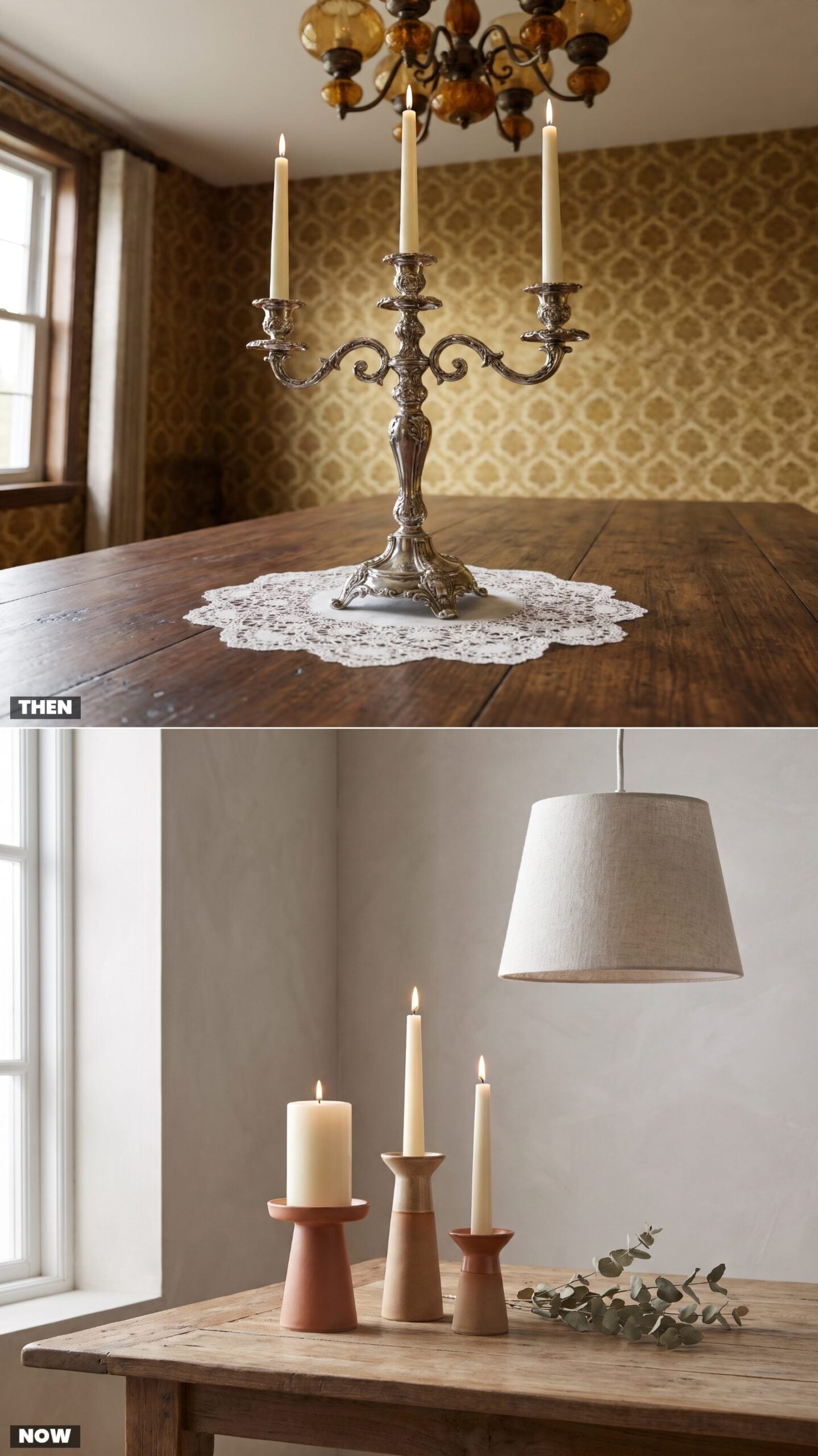
The silver candelabra was a flex. It came out for Thanksgiving, got polished with a pink paste that smelled like ammonia, and spent the rest of the year wrapped in felt so it wouldn’t tarnish. Heavy, formal, a little intimidating.
The modern version weighs almost nothing and asks for nothing in return. Three mismatched ceramic holders in sandy glazes, each thrown a little lopsided on purpose. That wobble is the whole appeal. We want the thing to look like a human made it, not a factory in Sheffield.
14. Artificial Flower Centerpieces vs. Loose Seasonal Branches
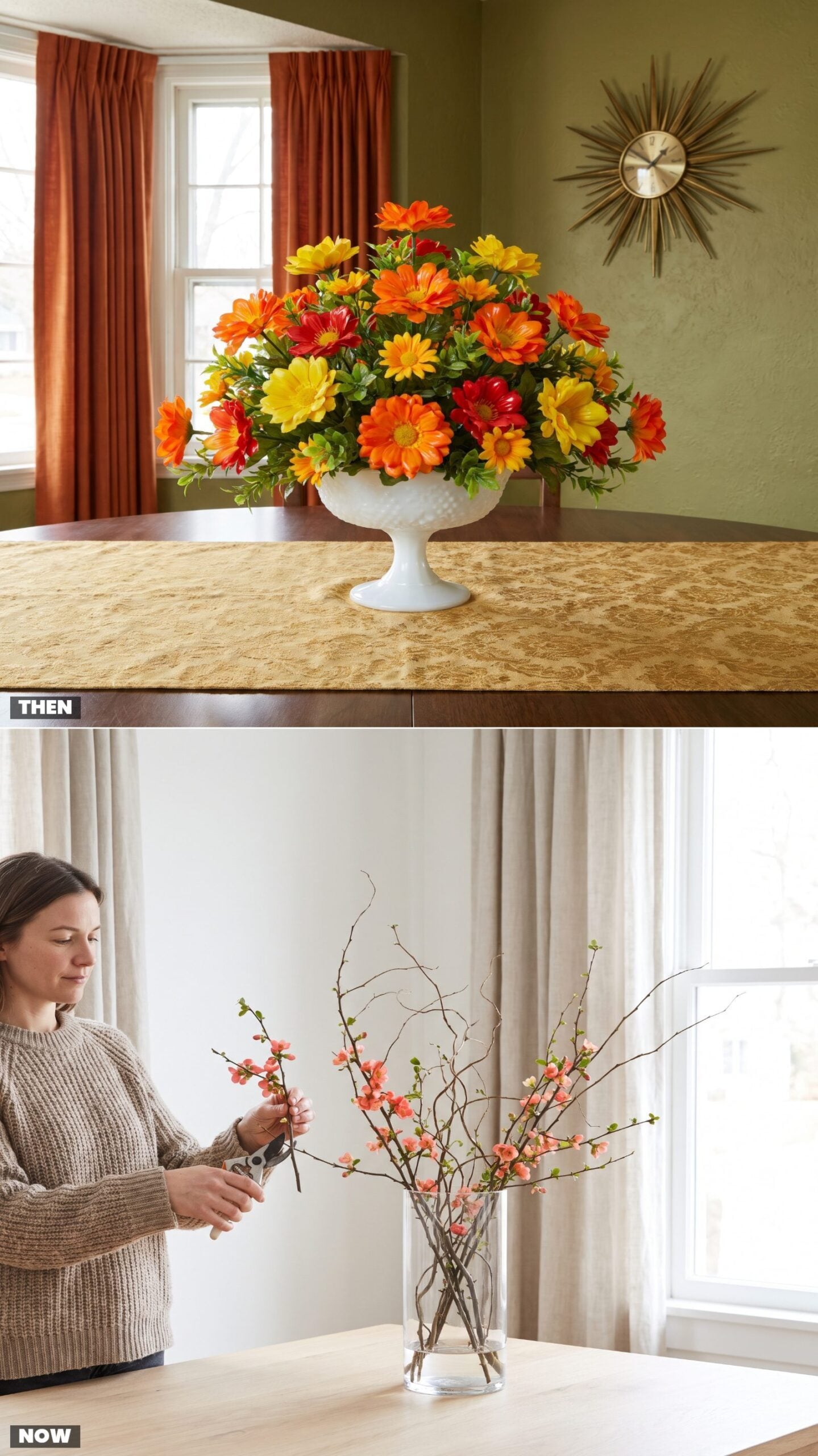
Plastic flowers made sense in 1975. They never wilted, never dropped pollen on the damask, and came in colors nature never attempted. A good silk arrangement in a milk-glass compote could sit on the table for a decade, dusted twice a year, eternally in bloom.
We swapped permanence for honesty. A few branches of flowering quince in a plain glass cylinder, half of them bare, will be dead in two weeks. That’s the point. The arrangement marks the season, then changes. We find the fake ones faintly depressing now, which is a strange thing to feel about a plastic tulip.
13. Cut-Glass Goblets vs. Stemless Recycled-Glass Tumblers
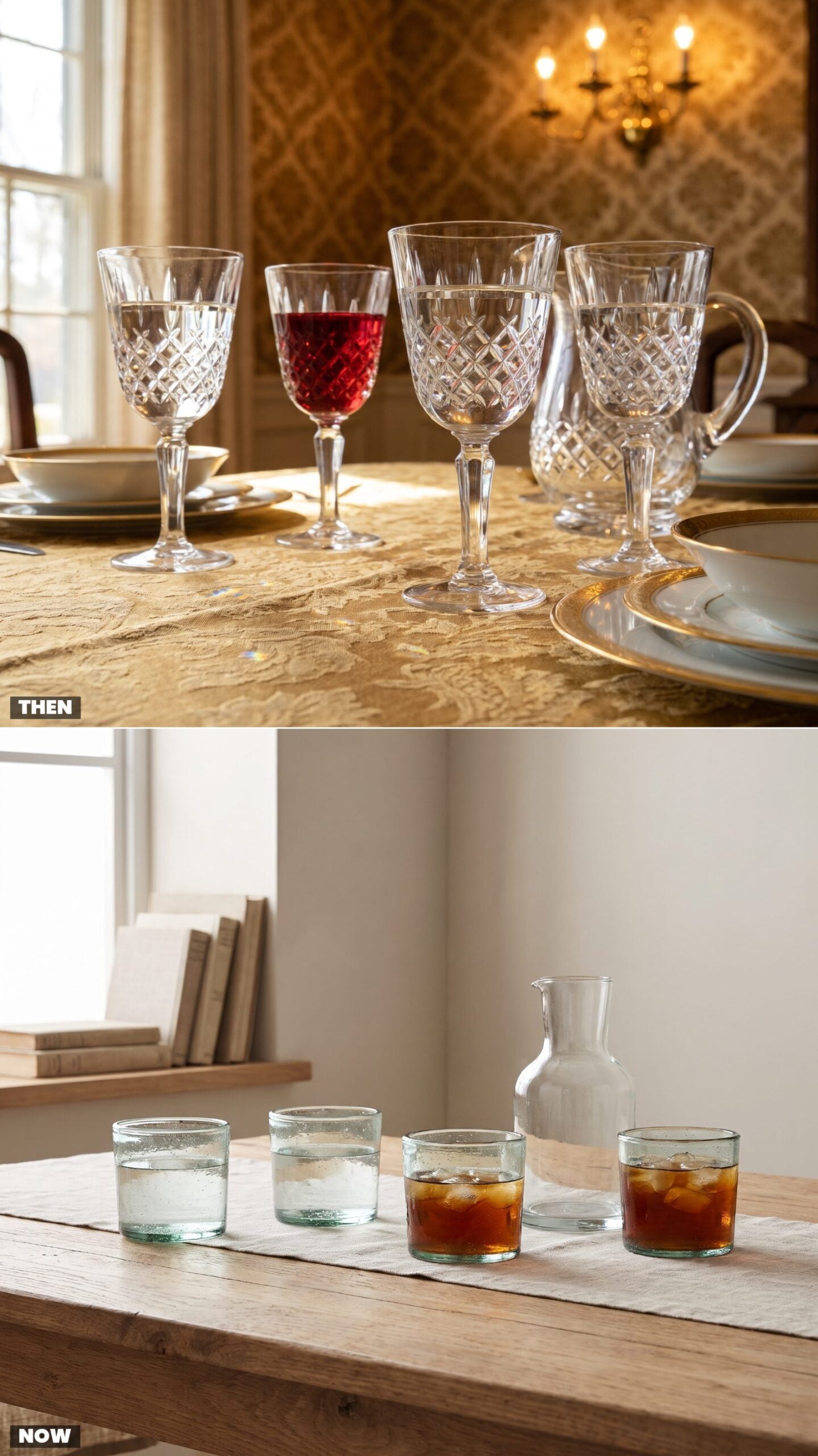
Cut crystal was built to perform. Hold a diamond-cut goblet to the window and it threw light across the whole table, which was exactly the idea. It was also top-heavy, prone to tipping, and lived in the china cabinet between appearances.
The stemless recycled tumbler is the opposite animal. A little cloudy, flecked with tiny trapped bubbles, slightly green from the melted-down bottles it came from. It goes from water to wine to orange juice without apology and survives a drop onto a wood floor. We stopped wanting our glasses to sparkle and started wanting them to live with us.
12. Serving Dinner From the Table vs. Self-Serve Kitchen Islands
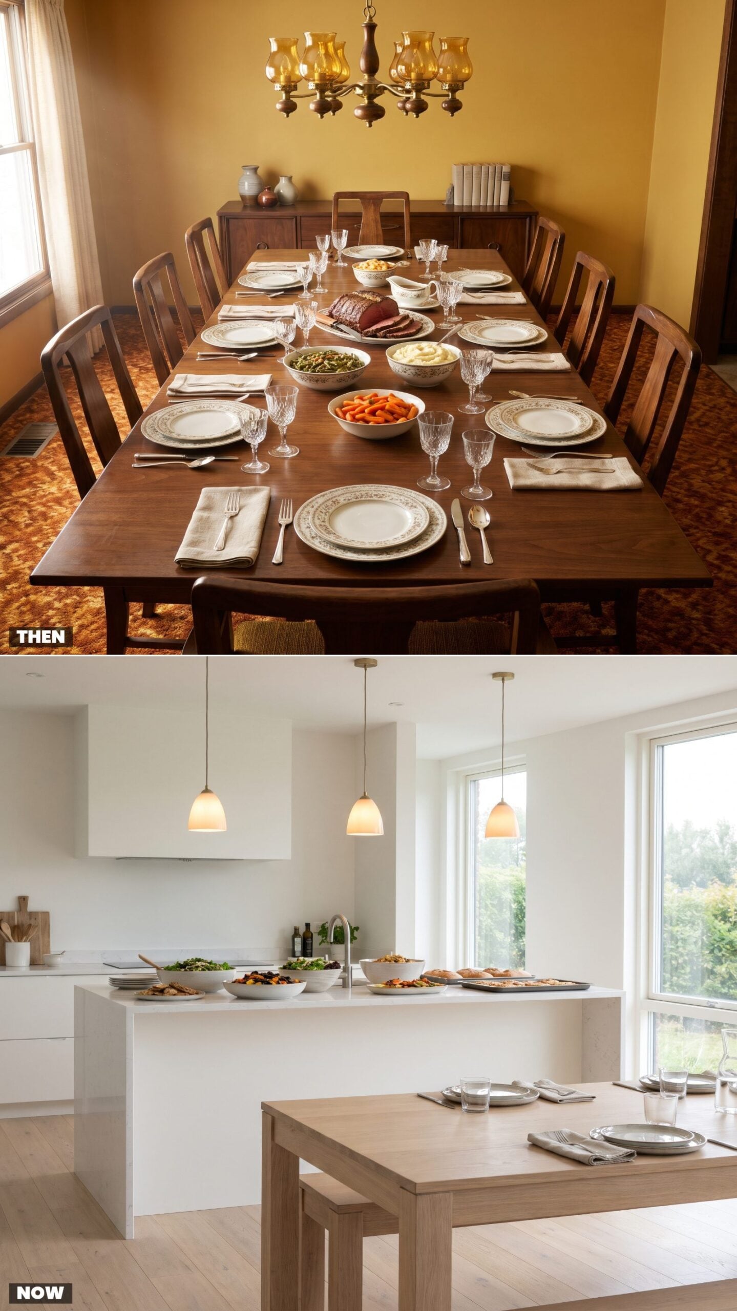
Dinner used to flow in one direction: from the head of the table outward. Someone carved, someone served, dishes went hand to hand, and you asked before you reached. The whole choreography said this is a shared meal with a host, and the host was in charge of the roast.
The kitchen island killed that choreography, and most people are fine with it. Everyone grabs a plate, loads it at the counter, and finds a seat wherever. Faster, looser, and it reflects an open floor plan where the kitchen and the dining space became the same room. See how a great room renovation tends to put the island at the social center of the whole house.
11. Family-Style Casseroles vs. Individually Plated Meals
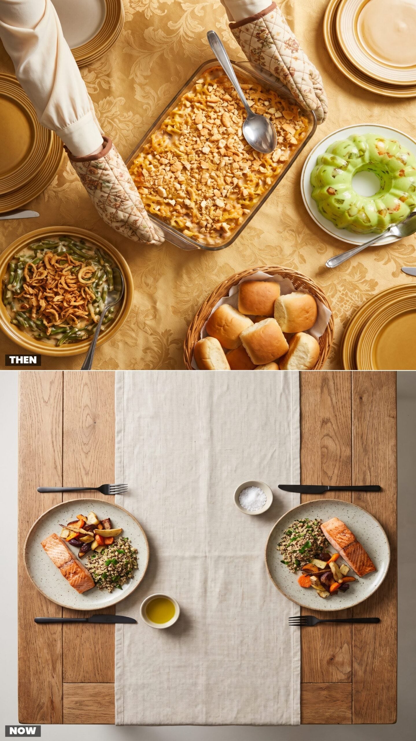
The casserole was efficiency in a dish. One Pyrex of tuna-noodle, one green bean with fried onions, a Jell-O ring for color, and dinner fed six with two hands’ worth of work. You dished yourself, you passed the spoon, nobody fussed over how it looked.
Now the plate gets composed before it ever leaves the kitchen. Salmon placed, vegetables fanned, grain tucked underneath, each serving its own small arrangement. Why plate individually? Partly because everyone eats differently now, half the table avoiding something, and partly because we got used to food that looks styled. The casserole fed a family. The plated meal performs for one.
10. Sunday Roasts vs. Weeknight Takeout Spreads
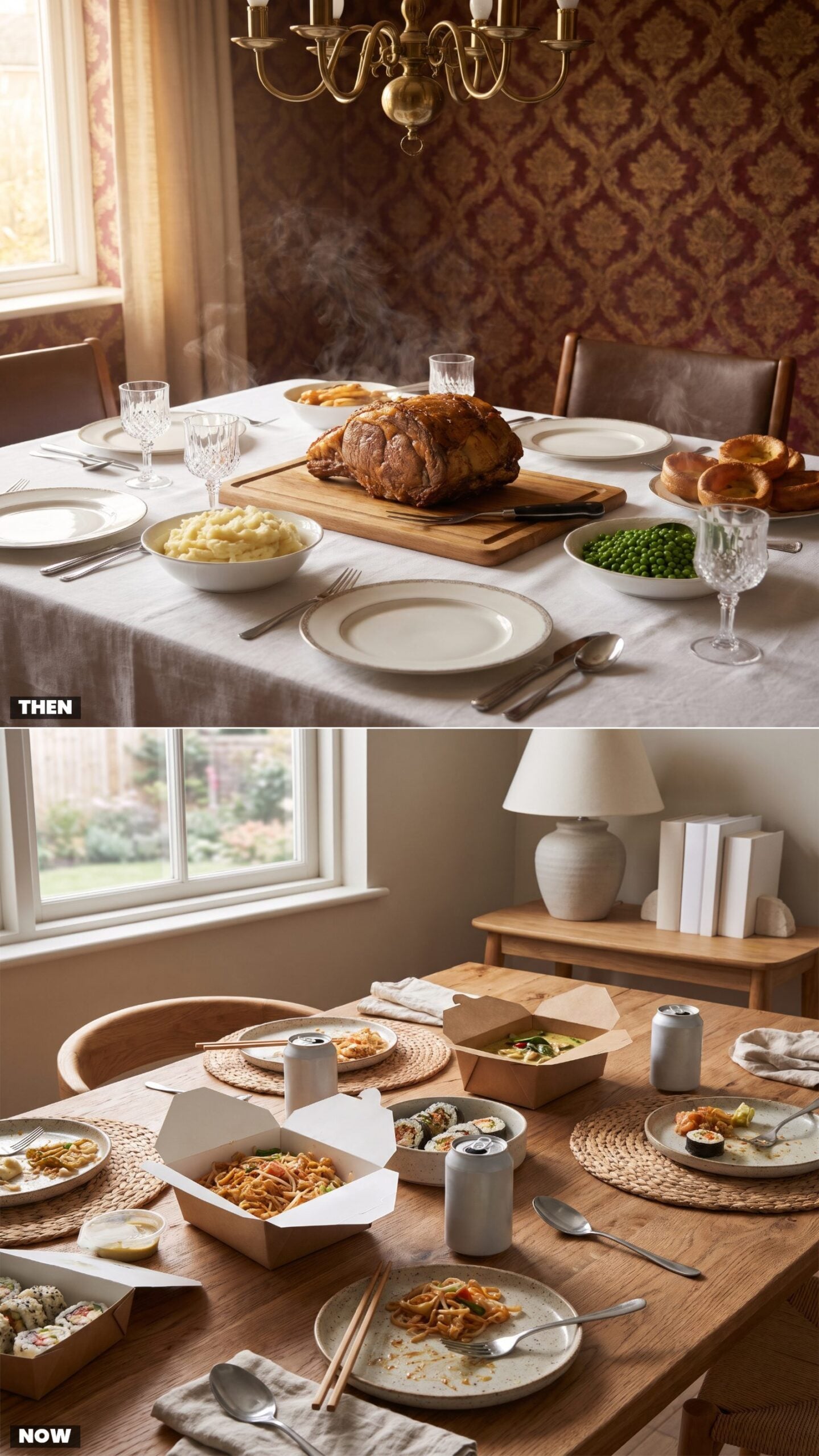
Sunday dinner had weight. The roast went in before church, the house filled with the smell of it by noon, and the whole afternoon arranged itself around one carved joint of beef and a table of sides. It took hours, and it was supposed to.
Tuesday night looks nothing like that now. Takeout containers open across a bare table, chopsticks, sparkling water, Thai and sushi from two different places because everyone wanted something else. Less ceremony, more choice, and a kitchen nobody had to heat up. Something was lost when the roast left and something was gained, and most weeks the trade feels fair.
9. Fondue Parties vs. Build-Your-Own Dinner Bars
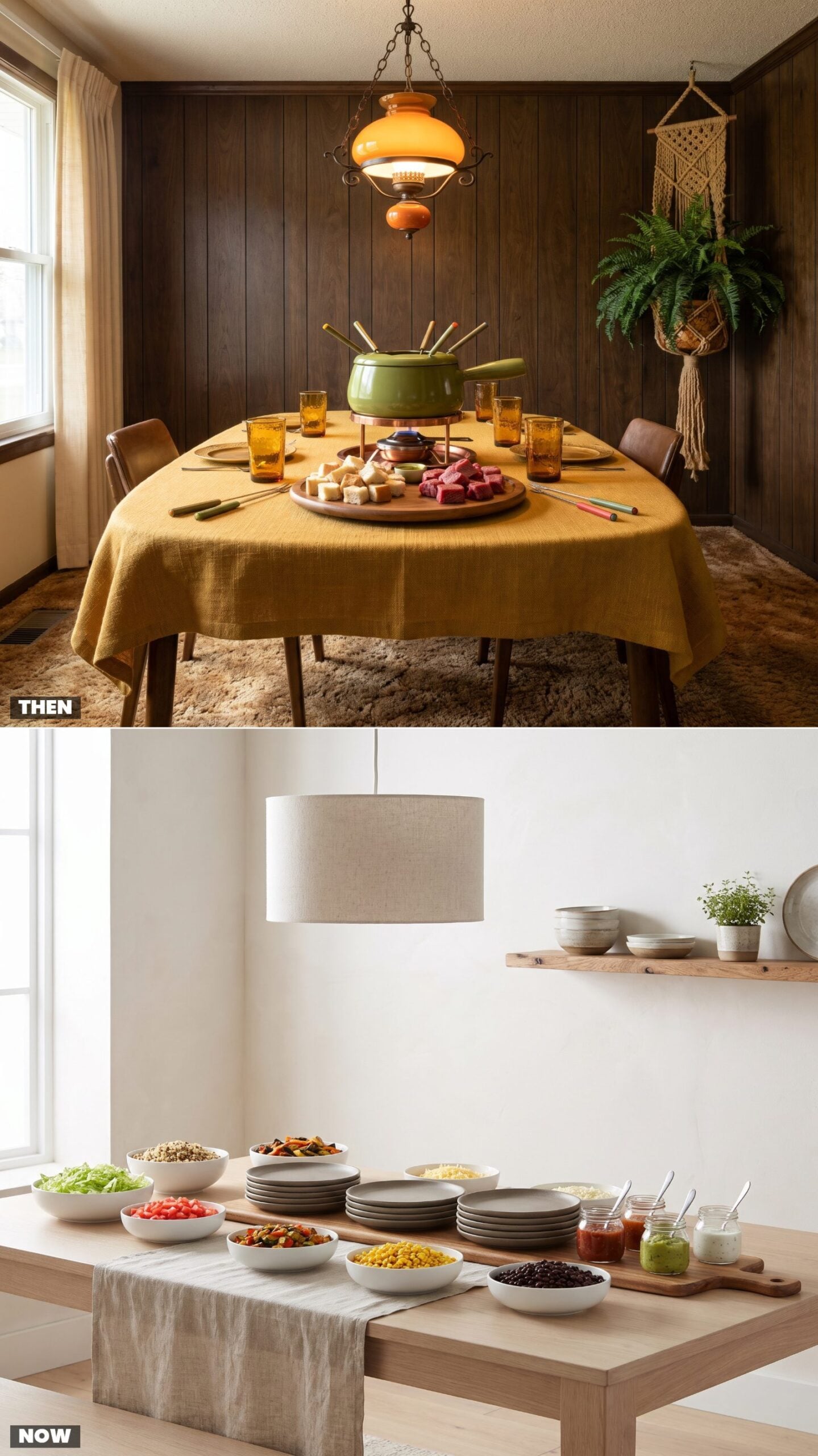
The fondue pot was the whole personality of a 1975 dinner party. One communal cauldron of cheese, a ring of color-tipped forks, and the unspoken rule that dropping your bread meant you owed someone a kiss or a song. Slow on purpose, and theatrical too. Dinner lasted hours because the food made you wait.
The modern version keeps the communal pull and ditches the single bubbling pot. A build-your-own bar hands everyone control, tacos one night and grain bowls the next, dietary needs quietly handled without anyone announcing them. Same social glue, less fussing over who double-dipped.
8. Cocktail Hour at the Sideboard vs. Home Wine and Coffee Stations
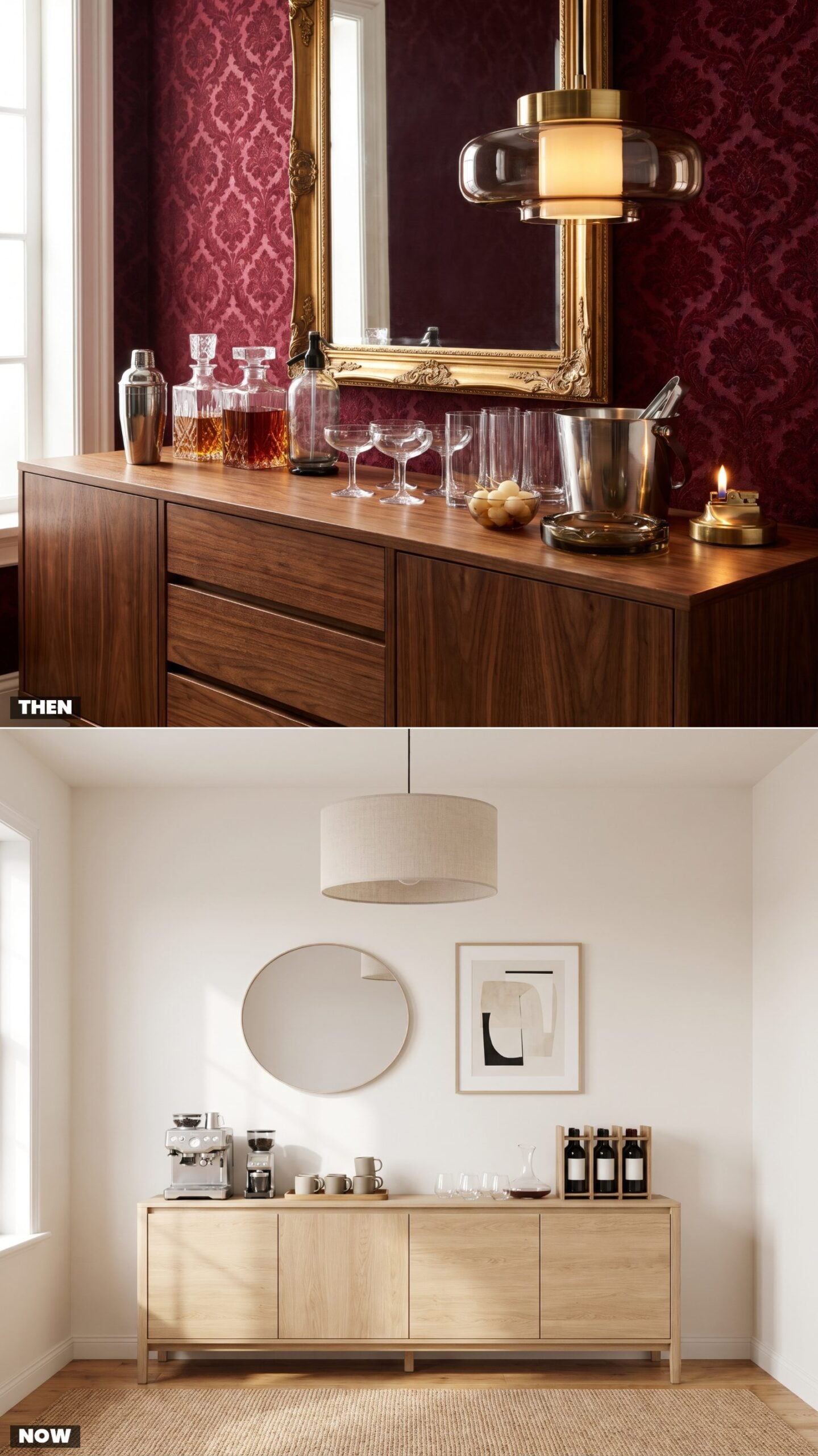
The 1975 sideboard was a small theater. Shaker, siphon, decanters catching lamplight, the host performing a Manhattan while guests watched like it was a magic act. Cocktail hour got its own slot, bolted onto the front of dinner, heavy on the hard stuff and heavier on ceremony.
Now the same furniture holds a compact espresso machine and a short row of wine. The ritual survived; the proof came down. People trade one nightcap for a flat white, and the station earns its keep morning and evening instead of one hour before the roast.
7. No Screens at Dinner vs. Tablets Used for Homework and Recipes
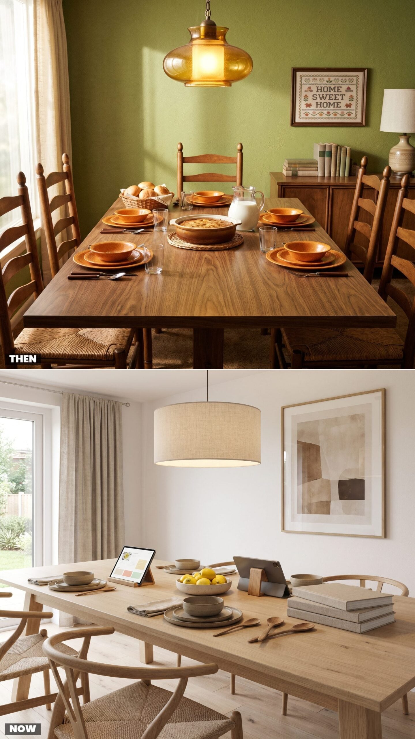
In 1975 the screen problem solved itself. The television lived in another room and nobody was dragging it to the table. Dinner was talking, or the specific silence of a family that had run out of things to say. Either way, no glowing rectangle in the mix.
Now a tablet props against the fruit bowl with a recipe, and another helps a kid through long division between bites. The purists will clutch at this. We half agree with them, and we still keep a recipe open while we cook, so we won’t throw stones.
6. Card Tables Added for Children vs. Integrated Kid-Friendly Seating
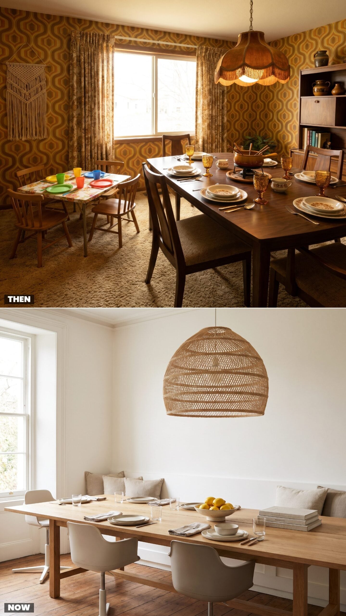
The kids’ table was an institution and a demotion rolled into one. Grandma’s good china stayed with the adults while the children got the wobbling folding card table in the corner, paper napkins, plastic cups, close enough to hear the grown-up jokes they weren’t supposed to understand.
Modern tables mostly erase that border. A long bench, a booster or two, a washable surface, and everyone sits together. The design shift tracks a parenting shift: children moved from a side event to part of the conversation.
5. Separate Breakfast Nooks vs. All-Day Dining Zones
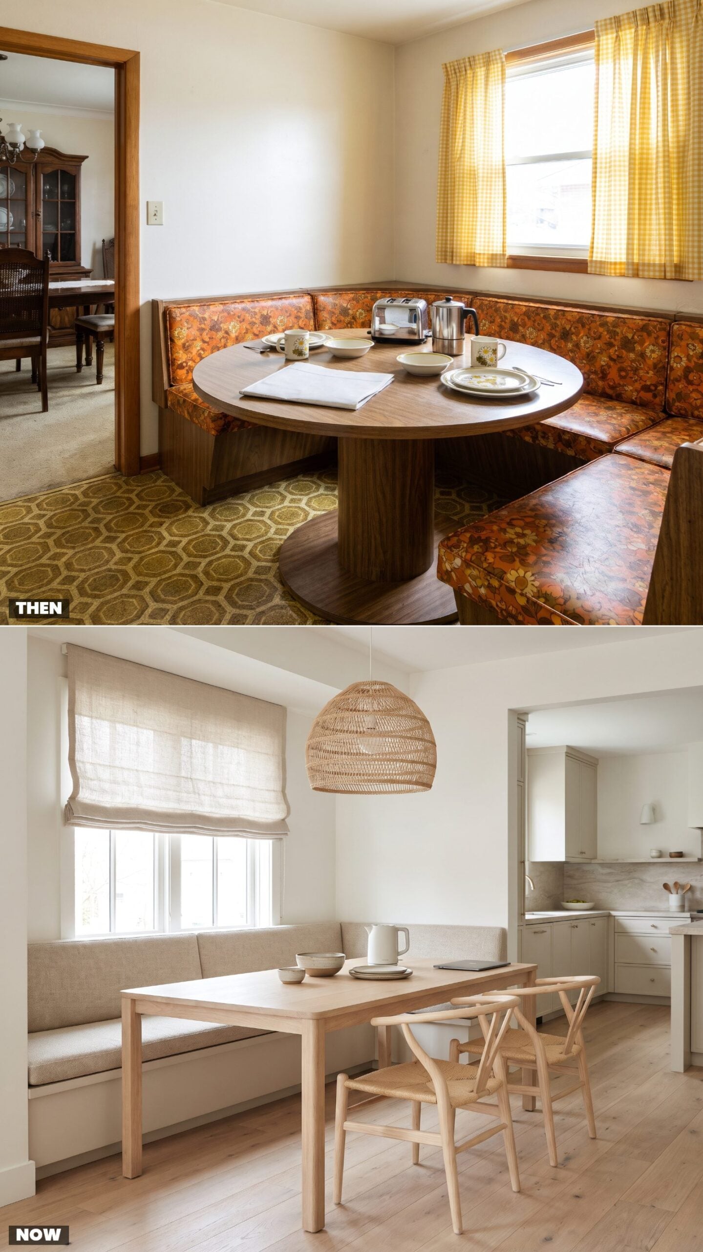
Houses used to run two dining programs. The formal room for company, and the little vinyl-booth nook off the kitchen for cereal and the morning paper. One wore its Sunday clothes; the other did the actual living.
Then the wall between them came down, literally and otherwise. One open zone now handles coffee at seven, laptop work at two, dinner at seven again. The nook won. It just absorbed the formal room’s territory on the way out.
4. Decorative Plate Walls vs. Curated Gallery Walls
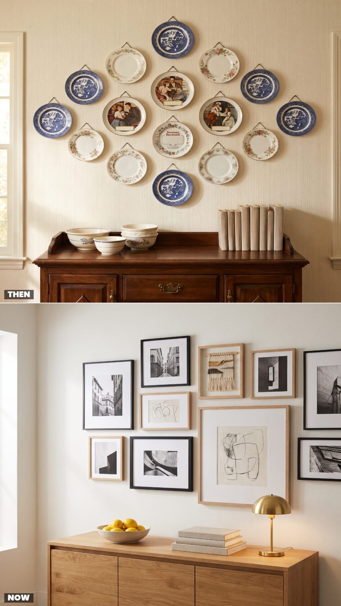
Plate walls were the original gallery wall, just edible-adjacent. Rows of commemorative china and willow-pattern dishes hung on little wire clips, the blue-and-white ones especially, each plate a souvenir of a place visited or a holiday survived. Nobody ate off them. That was never the point.
The instinct lives on; the medium changed. Framed prints, a couple of real photographs, one odd textile. A gallery wall tells the same story, hanging art instead of dishware. Same wall, same impulse to cover it with who you are. For the layered, collected look done with restraint, these grandmillennial living room ideas show how to toe the line without tipping into clutter.
3. Grandfather Clocks vs. Minimal Wall Clocks
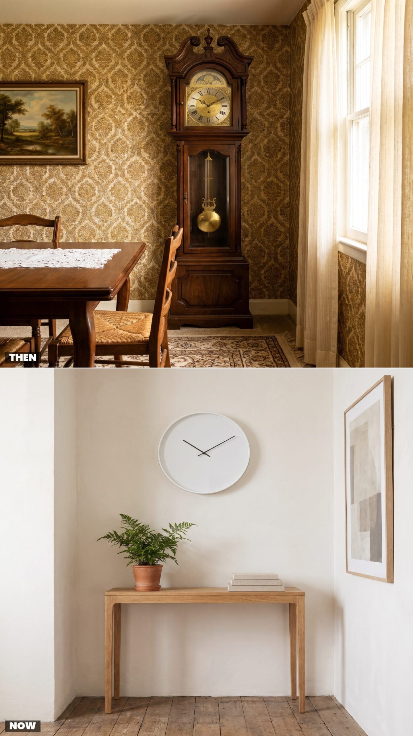
The grandfather clock was the loudest quiet object in the house. Seven feet of walnut, a brass pendulum you could set a heartbeat to, and a chime that reminded the whole dining room what hour it was whether you asked or not. Furniture, heirloom, and timekeeper all at once, and somebody had to wind it with a key every week.
Now a thin-handed disc hangs on the wall and keeps perfect time without a single swing or chime. Lighter, cheaper, and honestly a little soulless. We miss the tick. We do not miss the winding.
2. From Macramé Plant Hangers to Indoor Trees in Architectural Planters
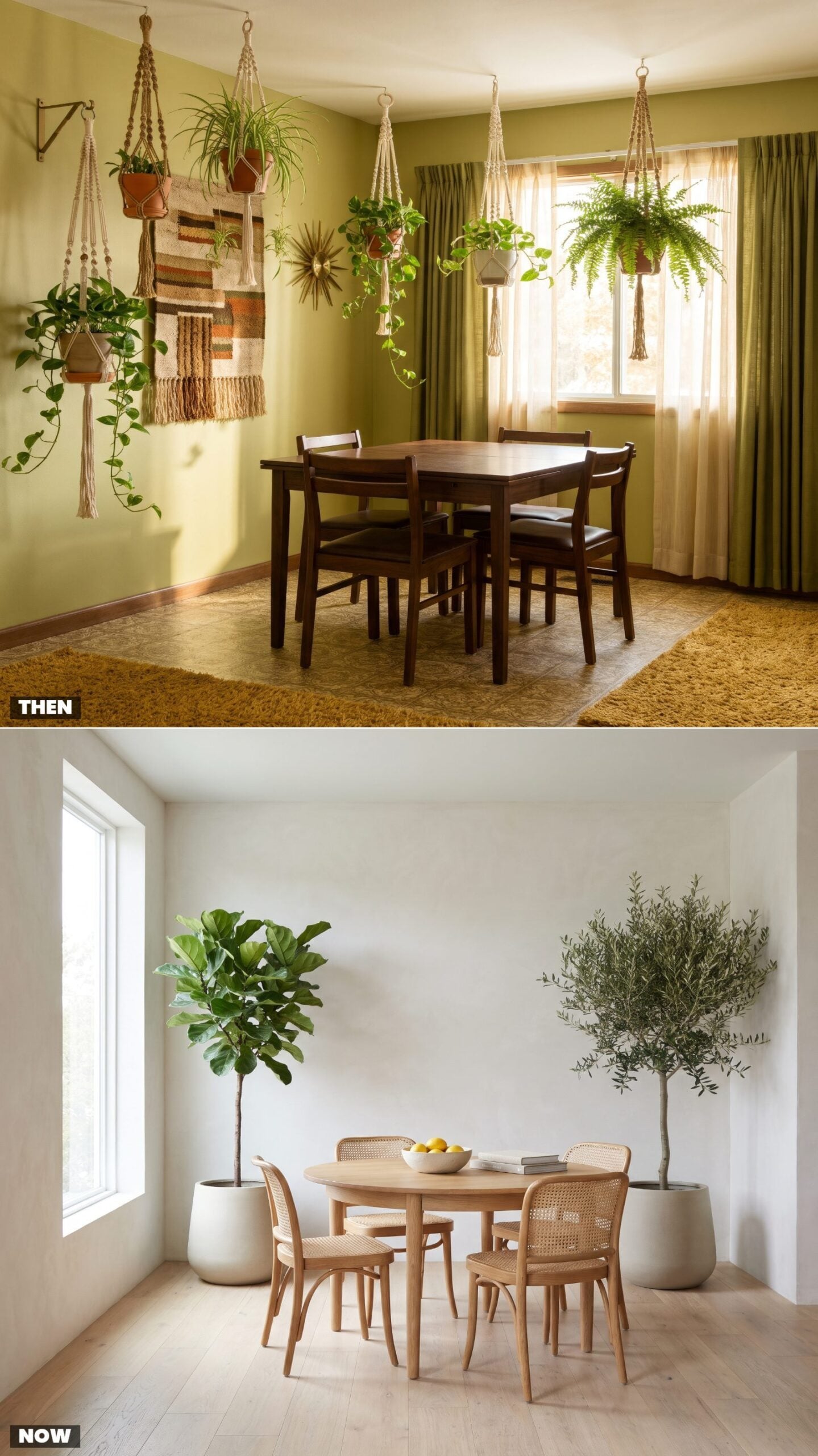
In 1975 the plants came to you, suspended at eye level in knotted jute, dripping vines over the dinner conversation. Macramé hangers were everywhere because floor space was precious and ceiling space cost nothing. A spider plant in a terracotta pot said you were paying attention, that the house had a pulse.
Now the greenery has dropped to the ground and grown up. A fiddle-leaf fig or an olive tree in a wide ceramic planter does the same job with more gravity, reading as furniture rather than a craft project. One living thing, chosen on purpose, instead of six dangling overhead. Same biophilic calm, cleaner sightlines.
1. Ashtrays on the Table, Phone Baskets by the Door
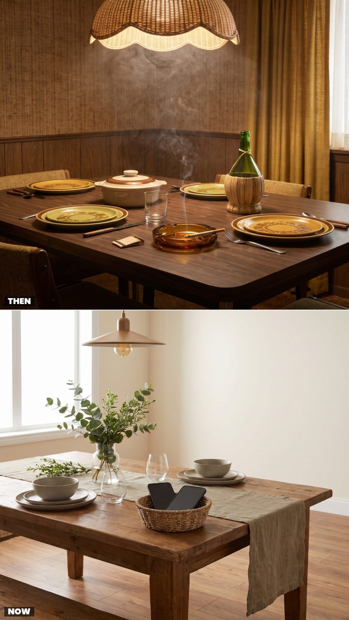
The 1975 table had an ashtray the way it had salt and pepper — amber glass, heavy enough to double as a weapon, parked dead center with a book of matches. Smoking at dinner wasn’t rebellious. It was just dinner, and the haze drifting up toward the swag lamp was part of an atmosphere nobody thought to question.
The modern centerpiece is a small basket, and what goes in it is phones, face-down, on mute. Same instinct, opposite target. Back then the table collected the thing that kept your hands busy; now it collects the thing that steals your attention. Dinner is once again the point — a funny thing to have to reintroduce.
The table used to hold the distraction out. Now it locks the distraction up.