🔥 Would you like to save this?
Wallpaper used to enter the bathroom like a nervous guest: one polite accent wall, nowhere near the shower, preferably in a pattern quiet enough to deny it was there. These rooms have no interest in being that careful. Botanicals climb ceilings. Toile meets checkerboard. Chinoiserie gets lacquer, marble and a chandelier. Even the smallest powder rooms are being asked to carry patterns big enough for a drawing room.
In order to come up with the very specific design ideas, we create most designs with the assistance of state-of-the-art AI interior design software. Also, assume links that take you off the site are affiliate links such as links to Amazon. this means we may earn a commission if you buy something.
The real question is not whether a bathroom can handle pattern. The interesting part is what has to happen around it once the walls start talking. A giant floral needs something blunt and architectural beneath it. A tight stripe can use a curved ceiling to exaggerate its rhythm. Dark wallcovering needs light and material contrast to keep the room from collapsing inward. Marble, wood, brass, beadboard and painted trim stop being supporting details and become the pieces that keep the pattern under control.
Moisture still matters, of course. A steamy primary bath asks more of a wallcovering than a powder room ever will, and walls exposed directly to water are a different proposition from the dry surface behind a vanity. The visual lesson here is not to ignore practical limits. Once the right wallcovering is used in the right location, bathrooms can carry considerably more pattern than the old white-tile rulebook suggested.
The 32 spaces ahead push that argument in almost every direction: misty murals, oversized peonies, ticking stripes, woodland prints, woven textures, Art Deco fans, toile, tropical leaves and florals that refuse to stop when they reach the ceiling. Some whisper. Several absolutely refuse. None treat the wall as background.
32. Charcoal Woven Wallpaper Turns Cove Lighting Into Architecture
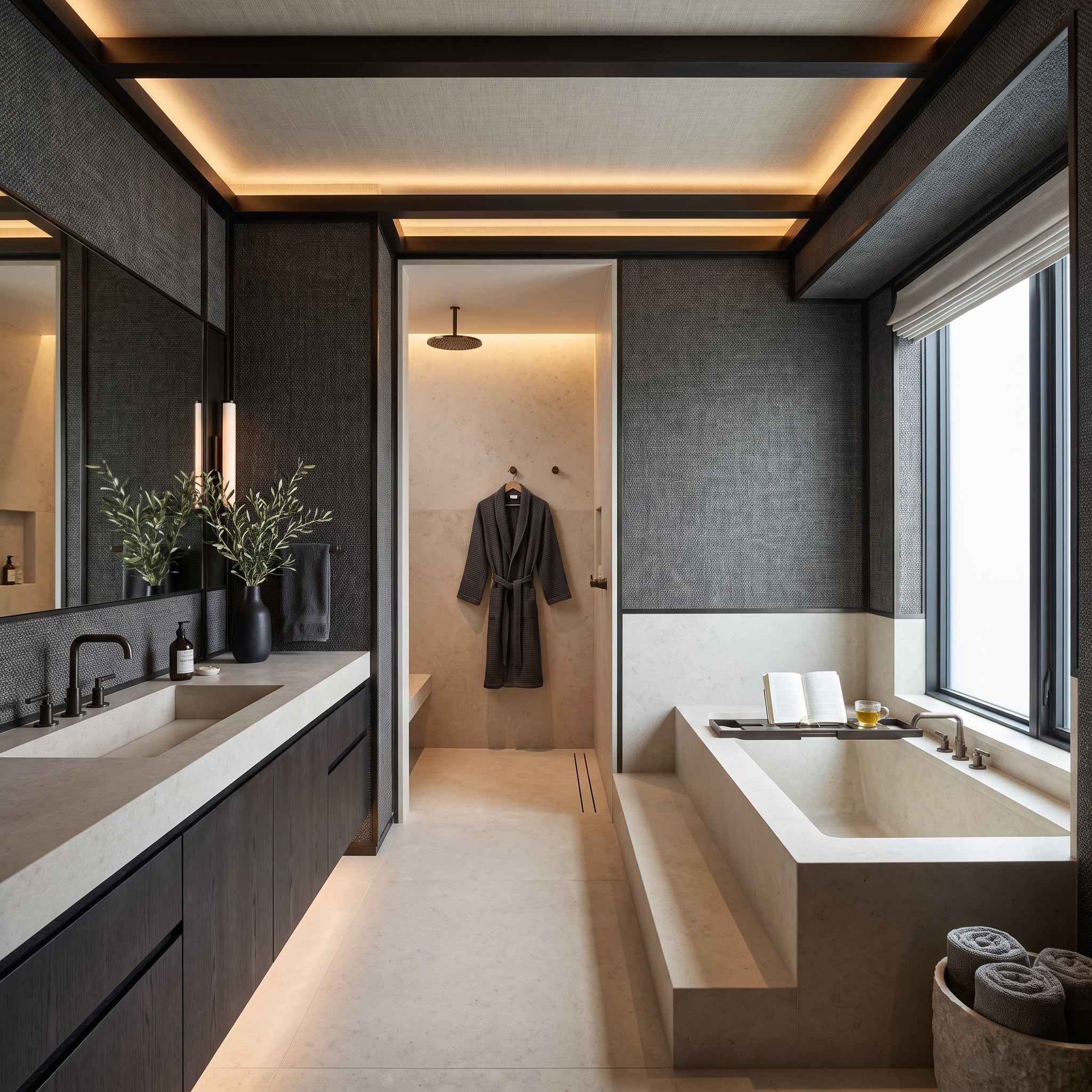
Charcoal woven-look wallpaper runs across the walls and into the ceiling coffers, replacing the usual bright-bath formula with depth and shadow. Texture matters more than obvious motif here: the surface catches light unevenly, so the walls shift as illumination moves across them.
Lighting Detail: Cove lighting hides the source and washes adjacent ceilings or walls indirectly. That can soften contrast and emphasize textured surfaces, although energy use depends on the fixtures, output and layout rather than the cove configuration itself.
31. Watercolor Walls Meet a Chandelier Made of Glass Bubbles
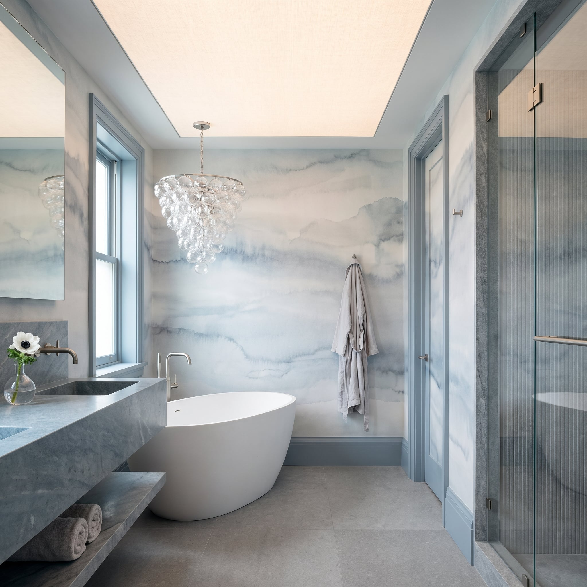
Blue-gray washes move across the wall like pigment left to dry in broad strokes, making the wallpaper feel closer to a mural than a conventional repeat. Beneath it, the freestanding tub stays intentionally plain while a vertical cluster of clear glass spheres drops from above like suspended bubbles.
Dusty blue trim is the quiet discipline underneath the spectacle. Door frames, baseboards and casings repeat a tone already present in the wallcovering, while the blue-gray marble slab at the vanity gives the painterly walls a solid mineral counterpart.
- Repeating a dominant wallpaper color on architectural trim reduces abrupt visual breaks.
- Clear glass lighting adds sparkle without introducing another strong color.
- Fluted shower glass can echo vertical movement without literally repeating the wall pattern.
30. Art Deco Fans, Chevron Marble, and Just Enough Gold
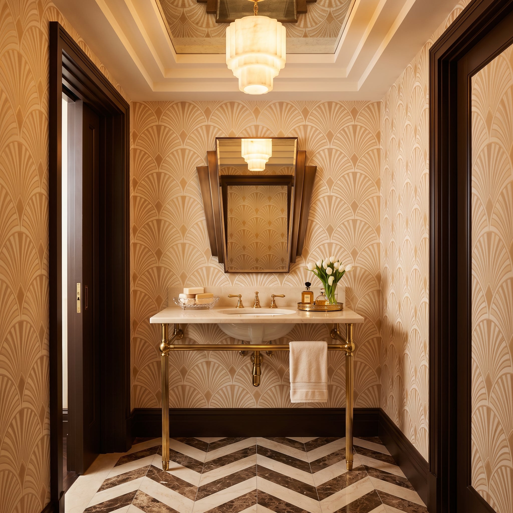
Warm cream-and-amber fan motifs cover the walls while dark-and-light chevron marble takes over the floor. Those two geometries could easily compete, but one is curved and repetitive while the other is sharp and directional, so each operates at a different tempo.
A tiered frosted-glass chandelier brings in unmistakable Art Deco vocabulary without turning the room into a period set. Brass legs, faucet hardware and mirror details pick up warmer notes already embedded in the wallpaper.
Design History: Art Deco flourished most strongly during the 1920s and 1930s, with geometric repetition, luxurious materials and metallic finishes among its defining signatures. Fan, sunburst and shell-like motifs became especially recognizable across furniture, textiles, metalwork and architectural decoration.
29. Eucalyptus Wallpaper Finds Its Match in Mint Terrazzo
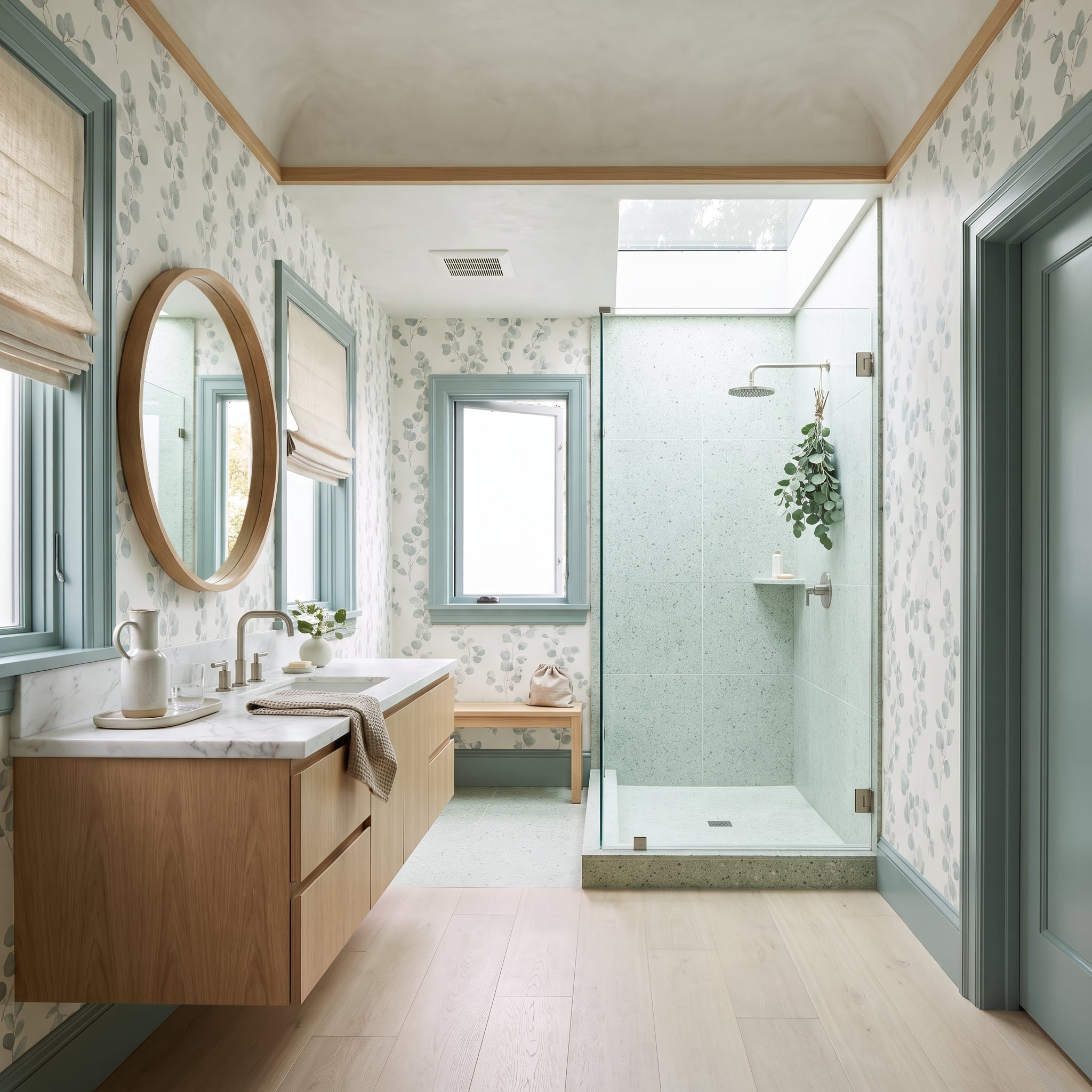
Scattered eucalyptus leaves in pale gray soften the walls without turning them into one giant focal point, while mint-speckled terrazzo inside the glass shower picks up the same cool botanical note in a completely different material.
Oak at the vanity adds warmth and the round wood-framed mirror breaks the room’s straight lines. Natural light arriving from both a window and a skylight keeps the pale greens and grays from flattening into one washed-out field.
28. Black Trim Gives Toile de Jouy a Completely Different Temperament
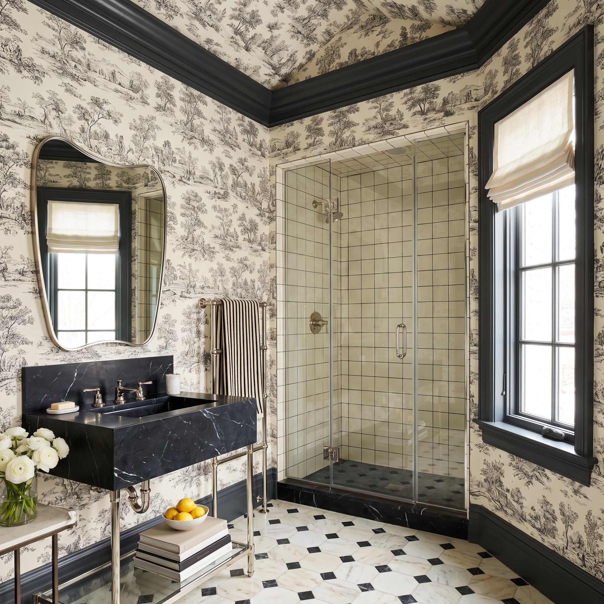
Toile de Jouy across both walls and ceiling could drift toward sweetness. Black crown molding, black window trim and a dark marble console stop that immediately, giving the pale narrative print a hard architectural frame.
The black marble console carries enough visual weight to stand against the wallpaper, while black-and-white diamond floor tile repeats the contrast at a larger scale. Polished nickel keeps the plumbing fixtures bright without introducing another warm metal.
27. Wildflower Linework Beneath a Slatted Wood Ceiling
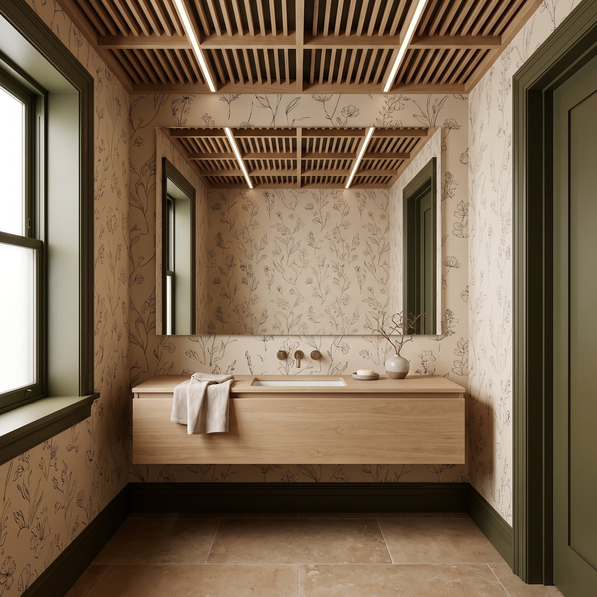
Fine wildflower linework on a warm cream ground keeps the walls delicate while a slatted wood ceiling introduces stronger rhythm overhead. Integrated lighting between the slats exaggerates that structure and casts a warmer wash over the oak vanity below.
In the Details: The offset wall-mount faucet leaves more usable counter space around the sink. Olive trim at the door and window introduces a stronger botanical note than the wallpaper itself, keeping the cream-and-oak palette from becoming overly beige.
26. Chinoiserie, Teal Lacquer, and a Bathroom Borrowing From a Salon
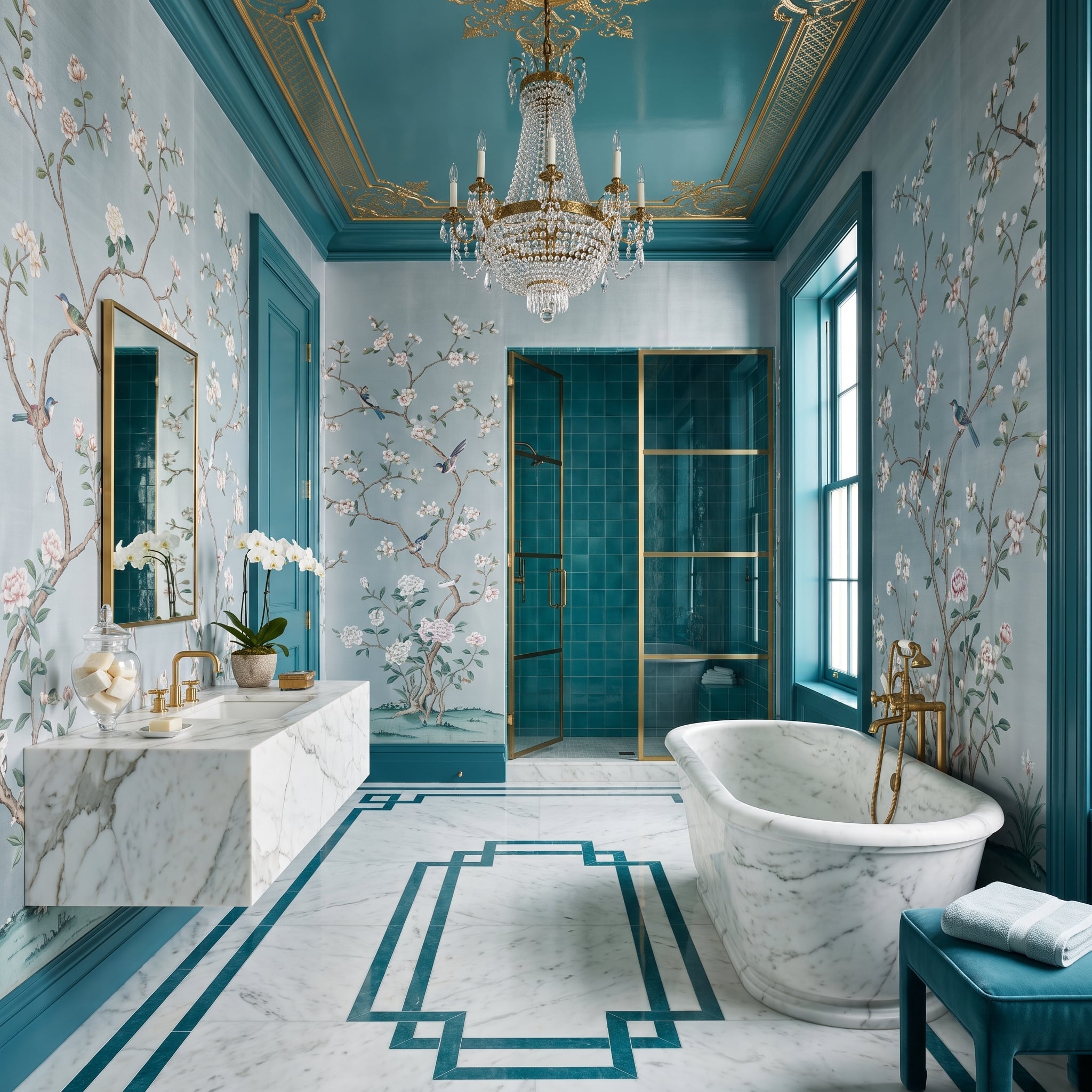
Branches, blossoms and birds travel vertically across pale blue chinoiserie panels, but the walls are only half the story. A teal lacquer ceiling with gold molding turns the room overhead into a saturated canopy while a marble tub supplies a quiet, pale mass below.
The crystal chandelier belongs because the room is already operating at decorative full volume. Rather than competing with the wallpaper, it adds another reflective surface above the restrained stone floor and tub.
Why It Works: The vertical branches encourage the eye to move upward, while the matching teal ceiling continues the color story rather than cutting it off at the crown. A teal inlay at floor level brings that color back down, creating a clear top-to-bottom connection.
25. Ticking Stripes Climb a Vaulted Ceiling Above a Copper Tub
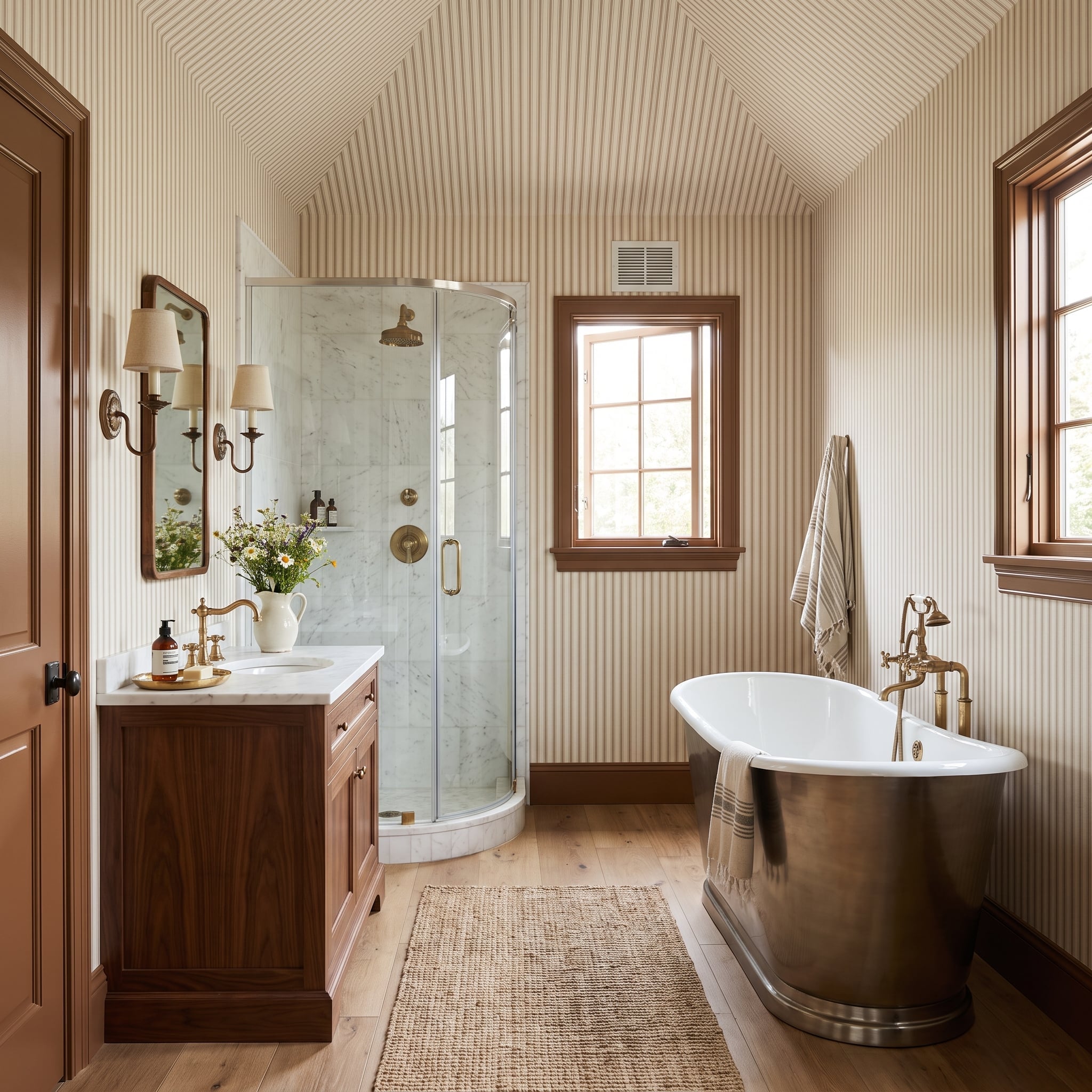
Narrow ticking stripes continue from the walls onto the vaulted ceiling, using the slope to stretch the pattern rather than interrupt it. A dark copper-finished tub introduces a broad curved mass beneath all those narrow vertical lines.
Walnut at the vanity keeps the metal from feeling isolated, while brass fixtures add smaller warm highlights around the room. The contrast is primarily one of scale: tiny repeat above, one substantial object below.
Ceiling Strategy: Narrow stripes can follow a vaulted or curved ceiling particularly cleanly because their direction remains easy to read as the plane changes. They are not the only pattern that works overhead, but their geometry makes the transition unusually legible.
24. Navy Peonies Fill the Coffers Instead of Stopping at the Crown
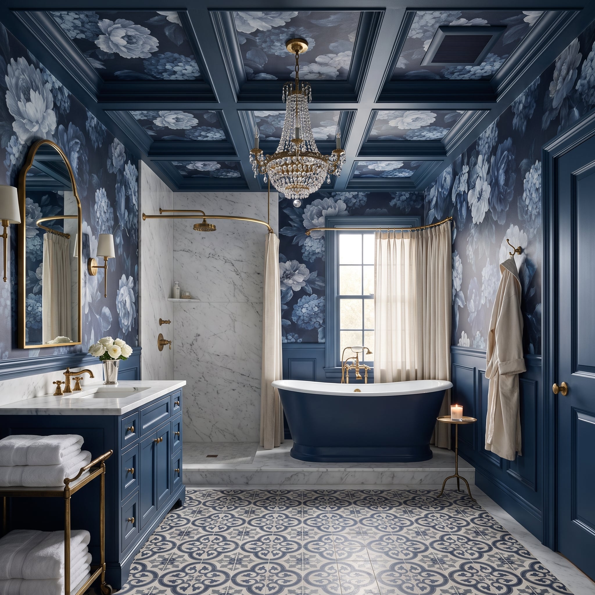
Navy-and-white peonies do not stop when they reach the ceiling. Each coffer receives the pattern, turning what might have been a plain architectural grid into a continuation of the walls.
That grid is important: the coffers keep the floral from becoming one uninterrupted overhead field. Brass at the vanity and shower rod introduces warmth against the blue-and-white scheme, while the crystal chandelier adds sparkle without another competing hue.
23. Black-and-White Geometry Gives Walnut Nowhere to Hide
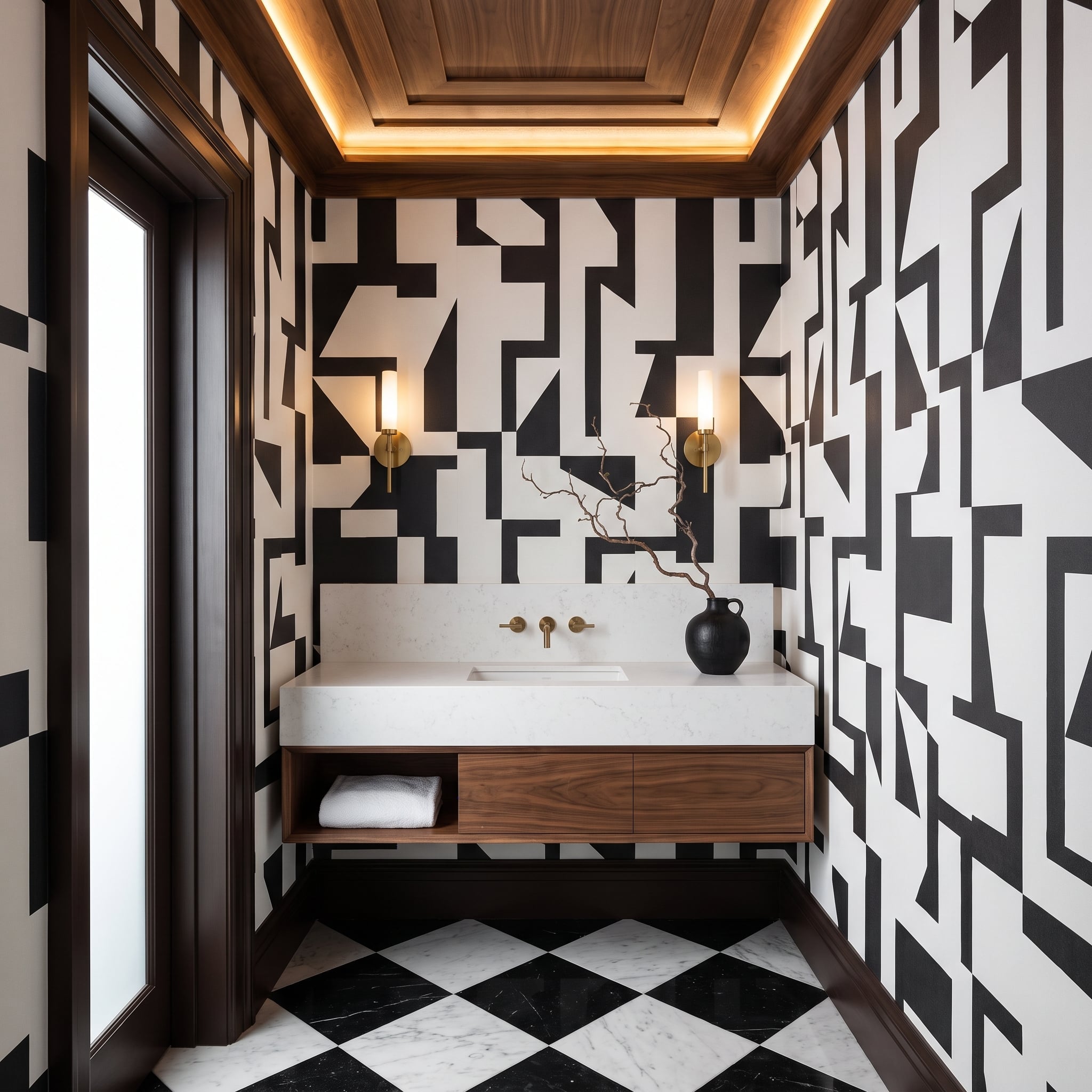
Black-and-white geometric wallpaper wraps all four walls without a pause, establishing such a hard graphic rhythm that the walnut vanity becomes the room’s warmest and softest element by comparison.
A marble slab countertop adds another pale surface, while wall-mounted brass fixtures introduce just enough glow to keep the room from settling into pure black, white and brown. Everything else stays materially simple so the pattern can remain uncompromised.
22. Woodland Wallpaper Meets a Stone Fireplace in the Bathroom
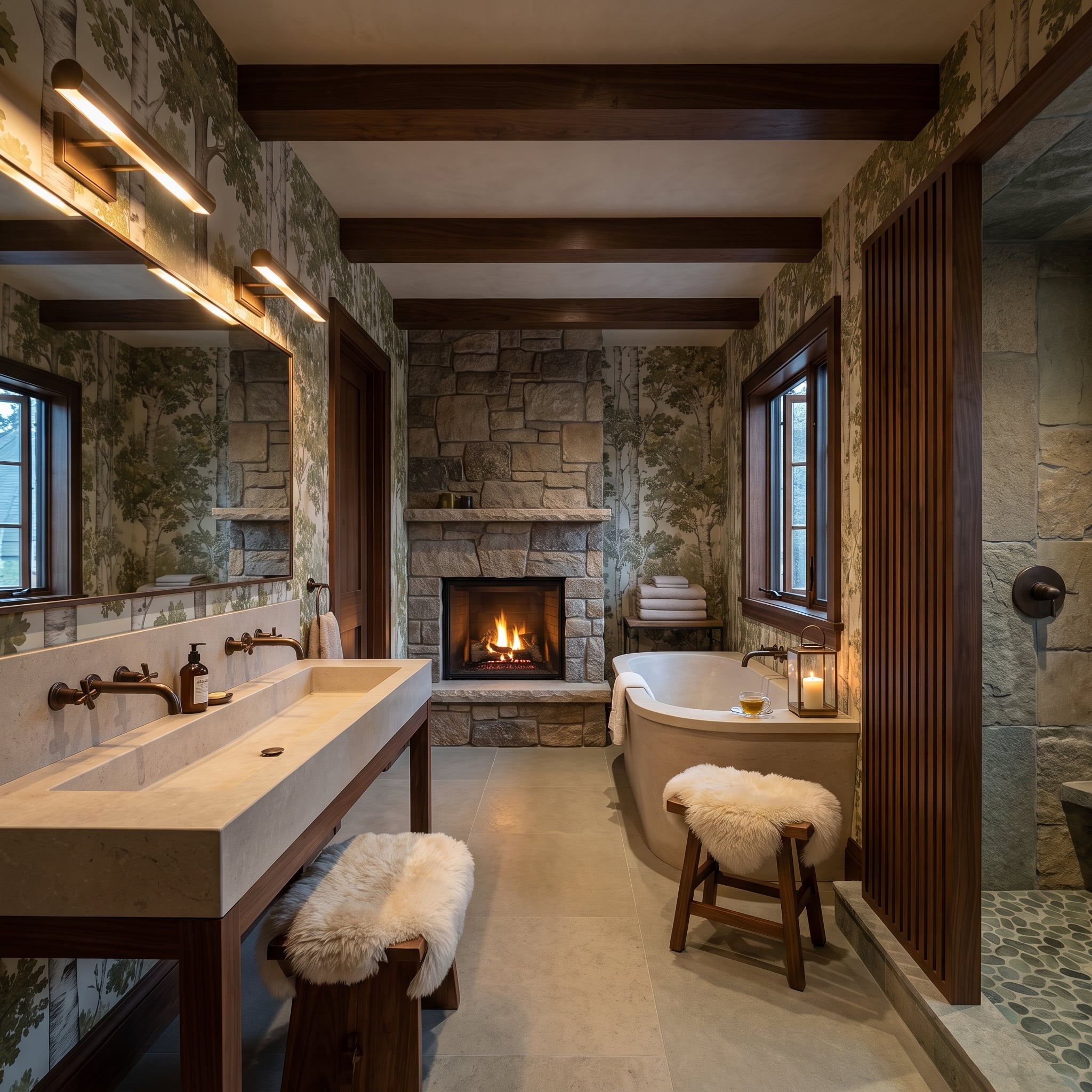
There is a fireplace in this bathroom, and the walls still manage to compete for attention.
Muted woodland wallpaper picks up the greens and grays already present in the fieldstone fireplace surround. Exposed ceiling beams and walnut trim bring dark linear structure into a room otherwise dominated by irregular natural shapes.
A long limestone trough sink continues the stone story at the vanity, while sheepskin-covered stools soften the harder materials around them. Pebble tile at the shower floor adds another texture without introducing a new color family.
21. Olive Wainscoting Turns Chinoiserie Into Architecture
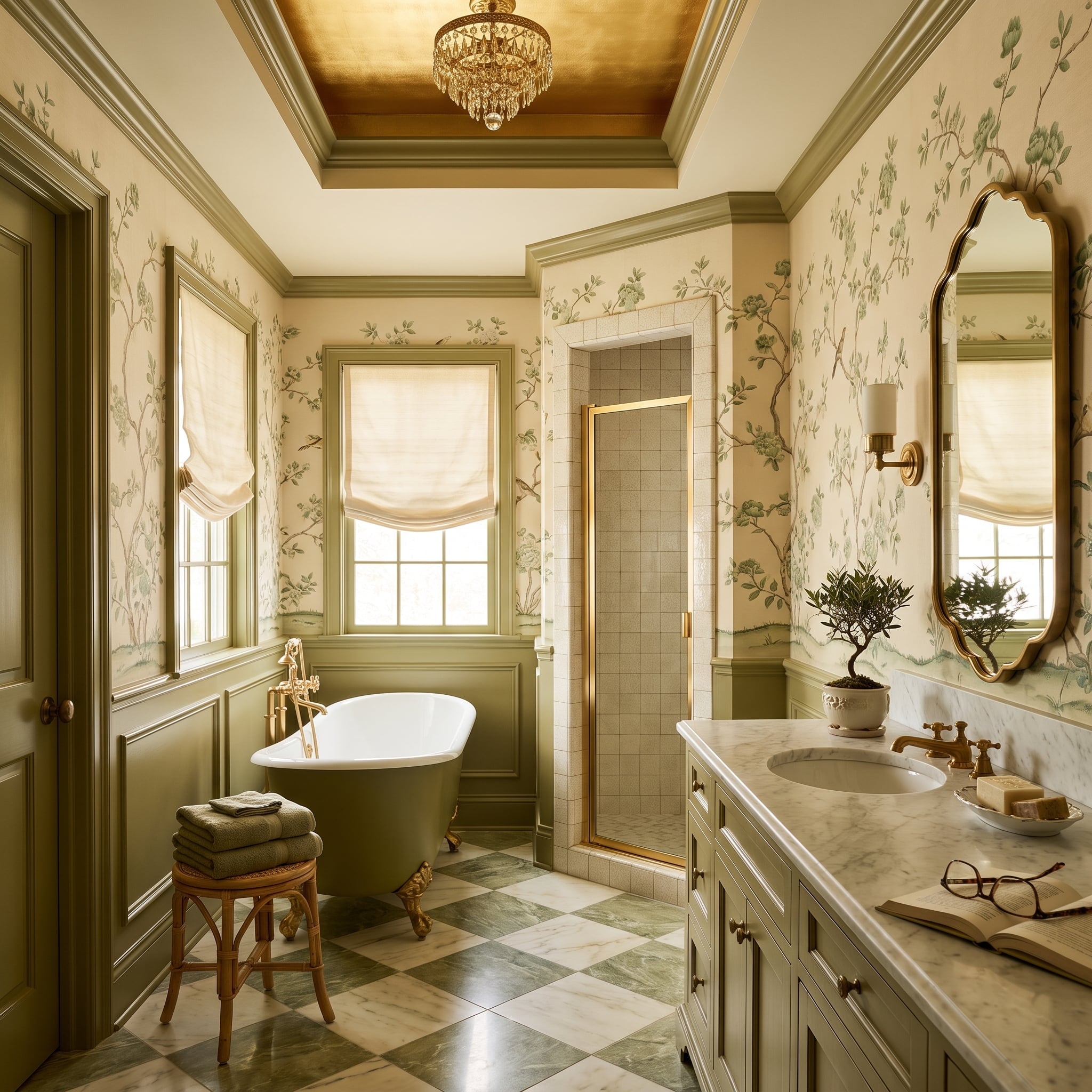
Sage-green wainscoting wraps the room, and the clawfoot tub picks up nearly the same olive tone on its exterior. That connection gives both pieces architectural weight before the chinoiserie wallpaper even enters the picture.
Above the molding, the print can be delicate because the lower half is so clearly defined. A marble checkerboard floor brings larger geometry below, preventing the florals from dominating every plane.
Color Move: Carrying the wainscoting color onto a freestanding tub visually connects a large fixture to the architecture around it. The tub becomes part of the established palette rather than a separate object sitting inside it.
20. Brushstroke Wallpaper Meets the Strange Glow of Backlit Onyx
🔥 Would you like to save this?
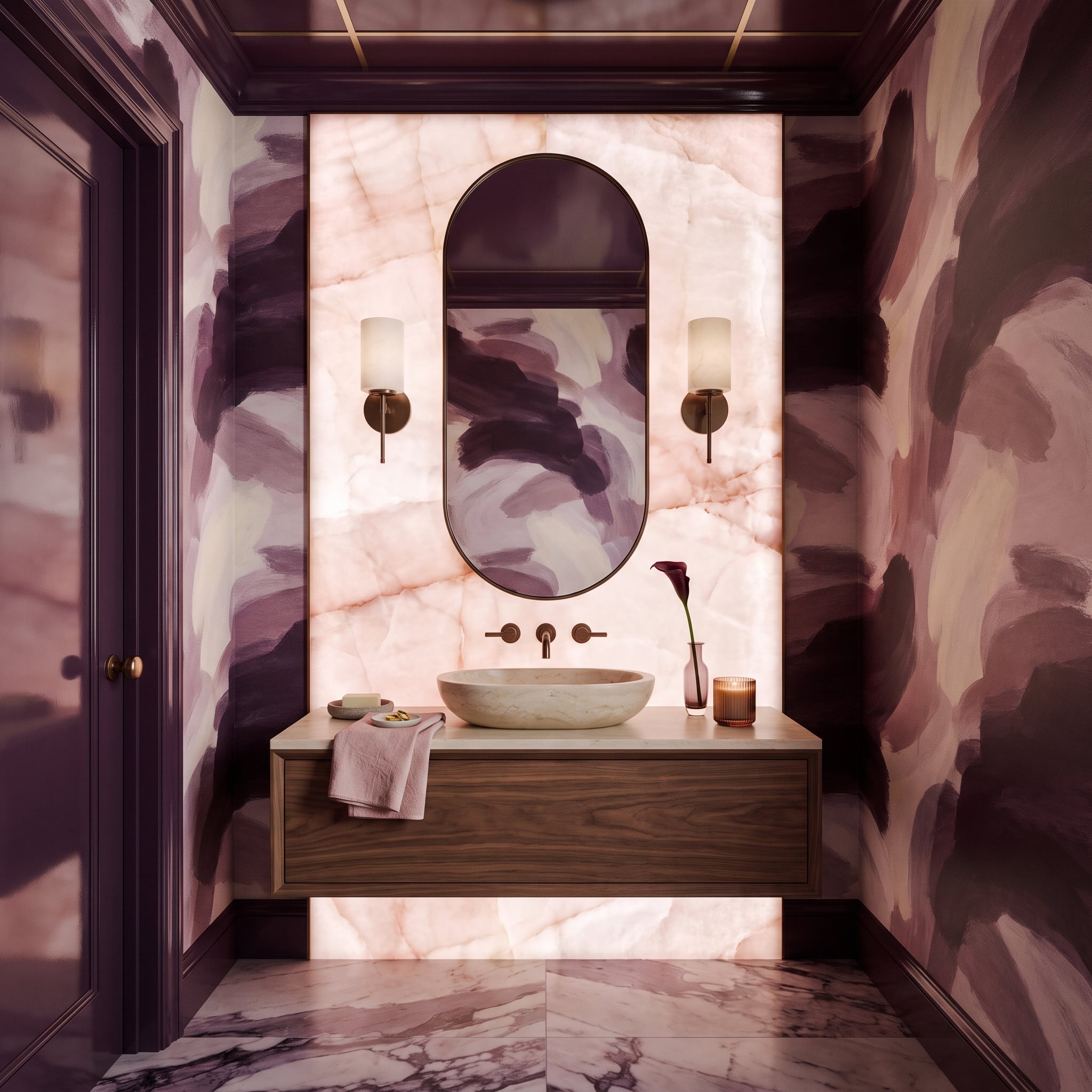
Plum and blush brushstrokes sweep loosely across the walls, closer to an oversized canvas than a conventional repeat. Behind the vanity, backlit onyx introduces a completely different kind of pattern: mineral veining revealed by light from behind.
A matte travertine vessel sink and walnut vanity calm the reflective surfaces. Oil-rubbed bronze faucets keep the countertop visually clean, while the single plum vase picks up a color already established in the wallpaper rather than inventing another accent.
Worth Knowing: Some onyx is translucent enough to be backlit. LED panels behind the slab can reveal veining and color that appear much subtler under ordinary front lighting, allowing the stone to function as both surface and luminous feature.
19. Burgundy Beadboard Gives Tiny Florals a Much Tougher Edge
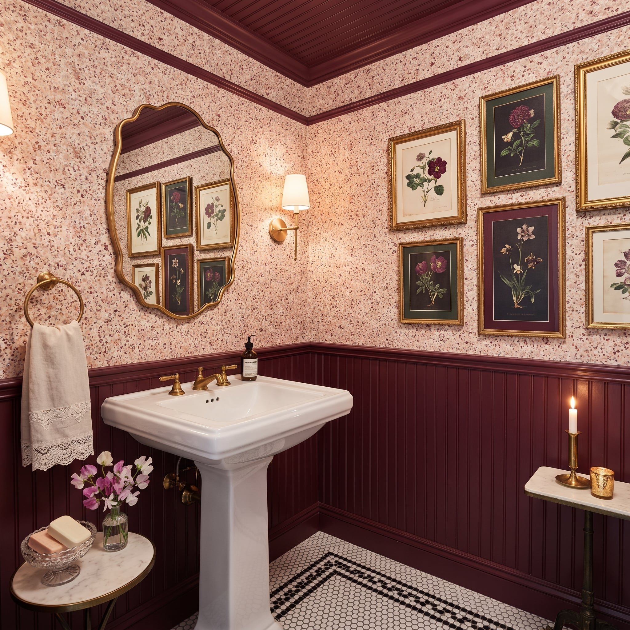
Burgundy runs this room from the floor line upward.
Dark cranberry beadboard occupies the lower walls, meeting a small floral print at a crisp chair rail. The pedestal sink keeps the floor open enough for the black-and-white hex tile to register as a separate pattern rather than visual static.
Botanical artwork with dark green mats takes the floral idea to a larger scale. Instead of matching the wallpaper exactly, the framed prints echo its subject matter while changing proportion and color density.
18. Sage Swirls Under a Shoji-Style Luminous Ceiling
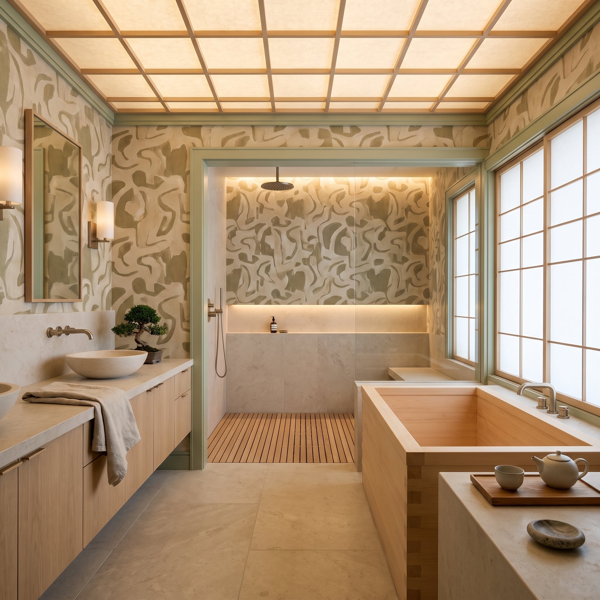
Swirling sage-and-cream wallpaper gives every wall soft movement, while the wood soaking tub introduces one substantial natural form in the middle of it. The palette stays deliberately narrow, allowing pattern and material to carry more weight than color contrast.
Overhead, backlit shoji-style panels diffuse illumination across the room rather than concentrating it at one fixture. The bonsai on the vanity adds a compact organic silhouette that relates to the wall pattern without duplicating it.
17. Toile Meets Checkerboard and Neither Pattern Backs Down
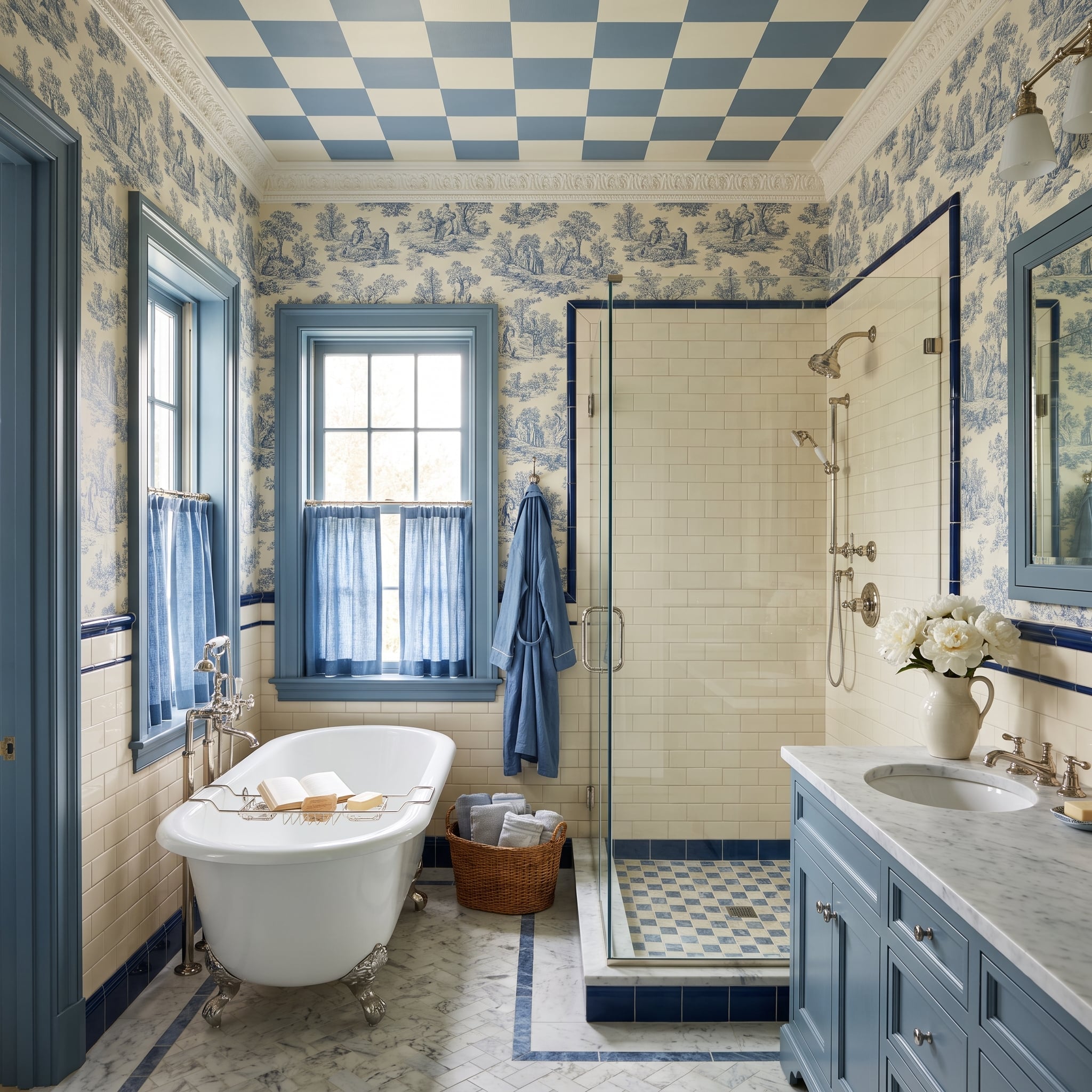
Blue-and-cream toile de Jouy covers the walls above the wainscot, while the ceiling switches to a painted checkerboard in the same two-color family. The patterns are completely different, but the restricted palette keeps the room from splitting into separate ideas.
A smaller checkerboard at floor level changes scale again. Between those two geometries, the clawfoot tub and blue vanity provide broad blocks of color where the eye can rest.
Design History: Toile de Jouy takes its name from Jouy-en-Josas, France, where the Oberkampf manufactory became famous for printed cotton textiles in the late 18th century. The pastoral narrative style later migrated readily into wallpaper and other decorative surfaces.
16. Slate Blue Turns the Ceiling, Trim and Vanity Into One Continuous Frame
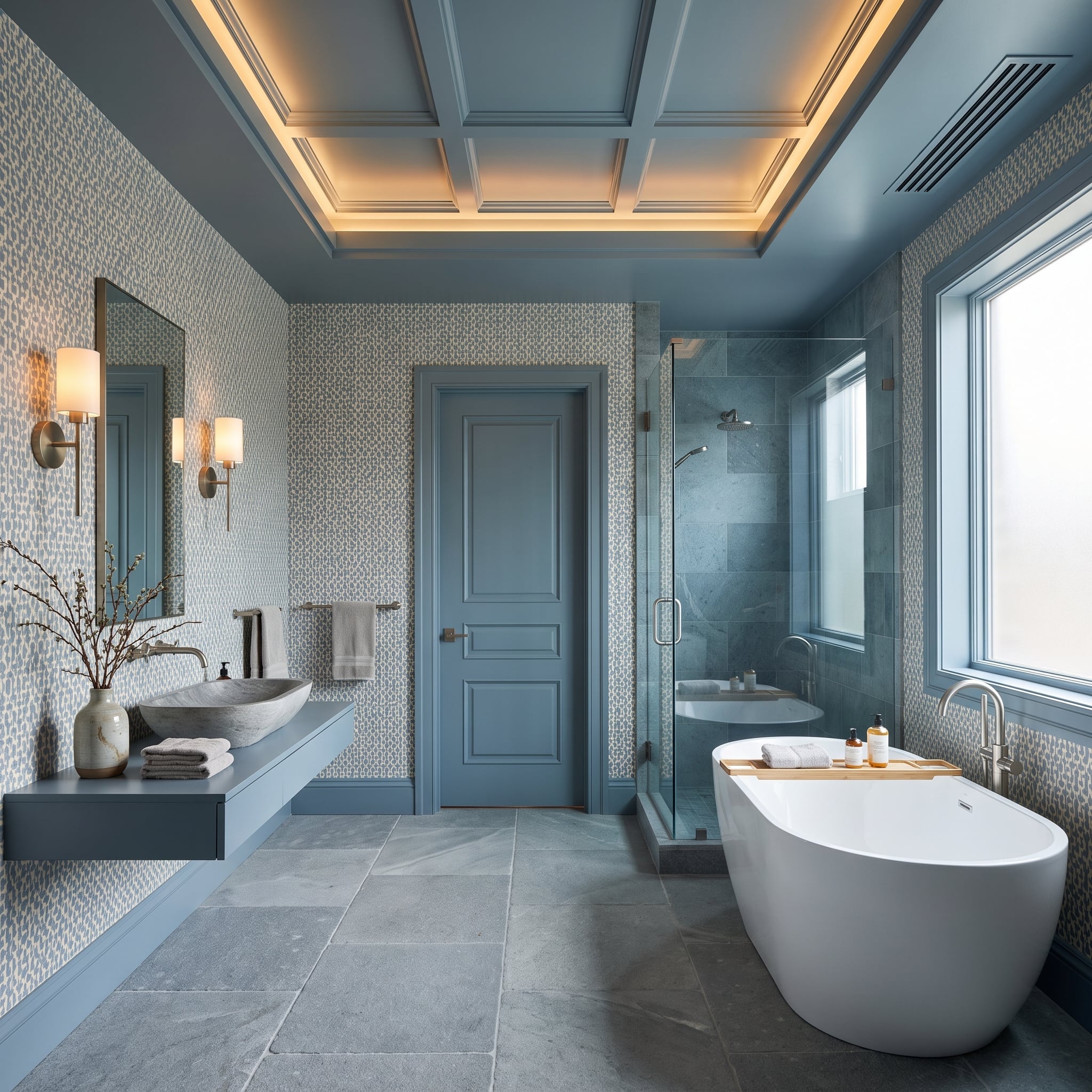
Slate blue covers the coffered ceiling, door trim and floating vanity base, creating a strong painted framework around a small-scale gray-and-white geometric wallpaper.
The wallpaper supplies repetition without becoming the loudest element. A dark counter and stone vessel sink add weight around the center of the room, while the freestanding tub stays pale enough to prevent all that blue from becoming visually dense.
Color Strategy: Carrying one hue across trim, cabinetry and ceiling reduces the number of separate colors competing for attention. The result feels calmer because those architectural elements are visually related.
15. Copper, Sage and Floral Wallpaper Keep the Warmth in Check
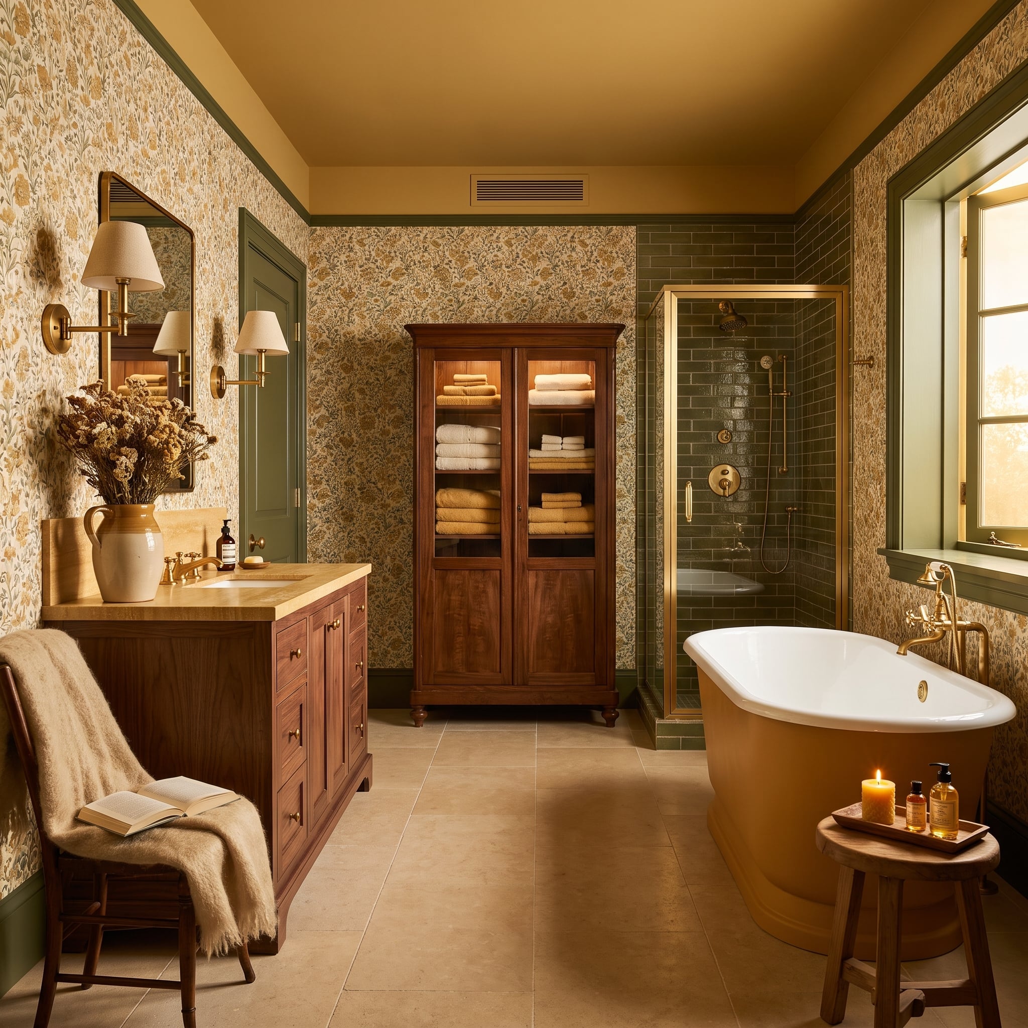
Cream-and-gold botanical wallpaper fills the walls, while sage trim at crown height draws a clear boundary before the eye reaches the mustard ceiling. The copper tub adds the strongest warm reflection in the room, especially where natural light catches its surface.
Walnut cabinetry and a linen-colored stone countertop keep the vanity side quieter. Every strong warm note is answered by one muted green or neutral surface nearby.
Color Story: Mustard on the ceiling intensifies colors already present in the wallpaper and copper. Sage trim creates a cooler break between those warmer planes, preventing the room from becoming one continuous wash of yellow and brown.
14. Warm Geometry, Rough Travertine and Pendants Hung Like Jewelry
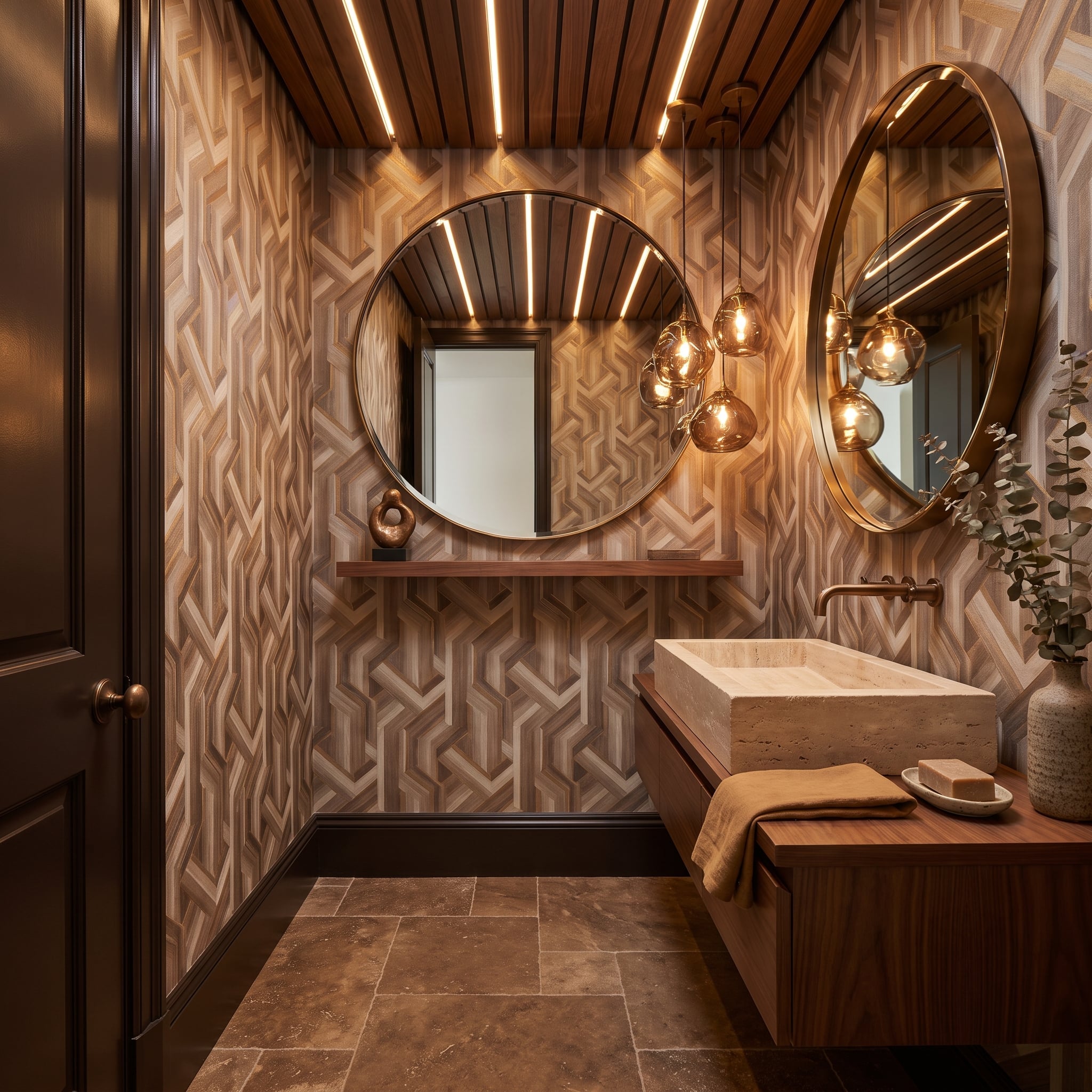
Taupe-and-cream geometric wallpaper covers the powder room in a repeat so fine it almost resembles woven fabric. Against that precision, the travertine vessel sink brings an irregular natural edge to the walnut vanity.
Three smoked-glass pendants hang at staggered heights, creating vertical movement between the mirrors without requiring another wall decoration. Exact pattern meets rough stone; the long horizontal vanity meets descending glass.
13. Burgundy Damask Meets Bookmatched Marble at Full Volume
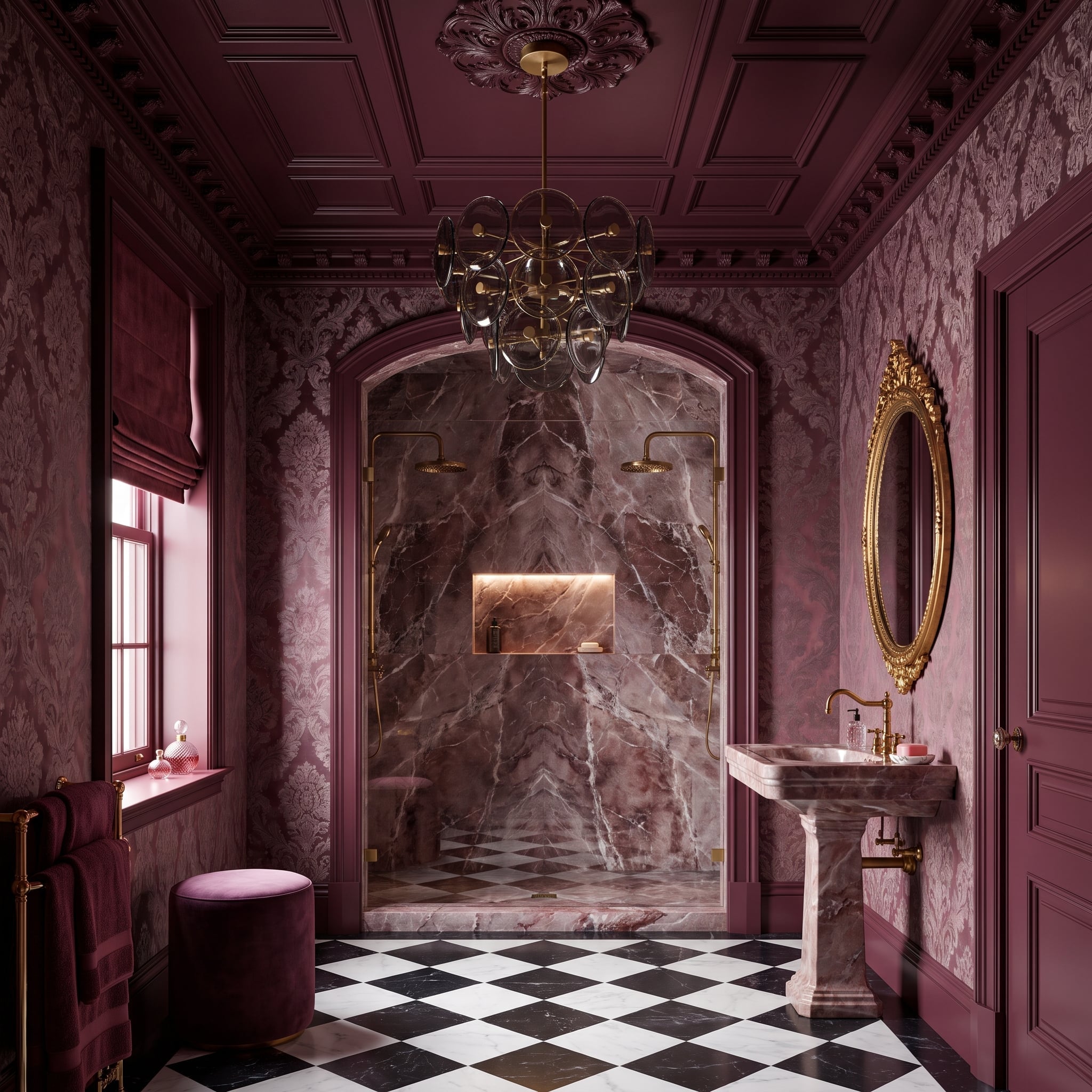
Deep burgundy damask covers both the walls and coffered ceiling, creating a dark decorative envelope before the marble even enters the conversation. Bookmatching gives the stone a strong central symmetry, which is exactly what the looser damask repeat needs beside it.
Gold fixtures add warmth, while the black-and-white checker floor introduces the hardest geometry in the room. Three assertive patterns occupy three different planes — damask around the room, mirrored veining at the focal wall, checkerboard below — so none has to perform the same job.
12. A Bay Window Bench Makes This Botanical Bathroom Work Harder
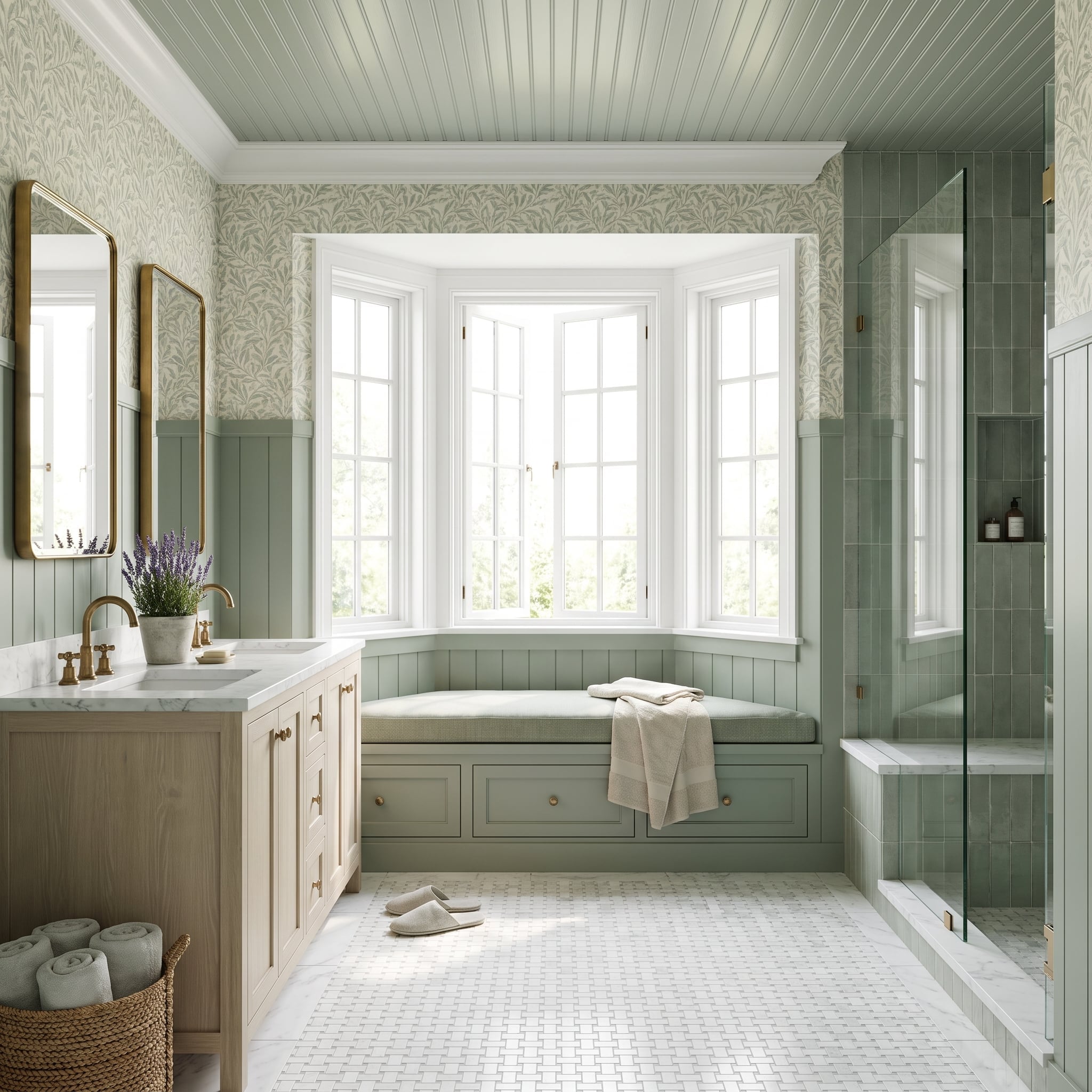
Pale botanical wallpaper covers the upper walls in cream and sage, quiet enough to register almost as texture from across the room. Vertical beadboard beneath it picks up the same green and continues onto the built-in bay-window bench.
Storage drawers make the bench more than scenery. A light oak vanity introduces a warmer wood tone, while the beadboard ceiling carries the painted architecture overhead instead of adding another print.
Quick Fix: Painting a beadboard ceiling in the same color as the wainscoting can connect the architecture without adding another material. The wallpaper remains the patterned layer between those two solid surfaces.
11. Abstract Mural Wallpaper Lets Walnut Do the Calming
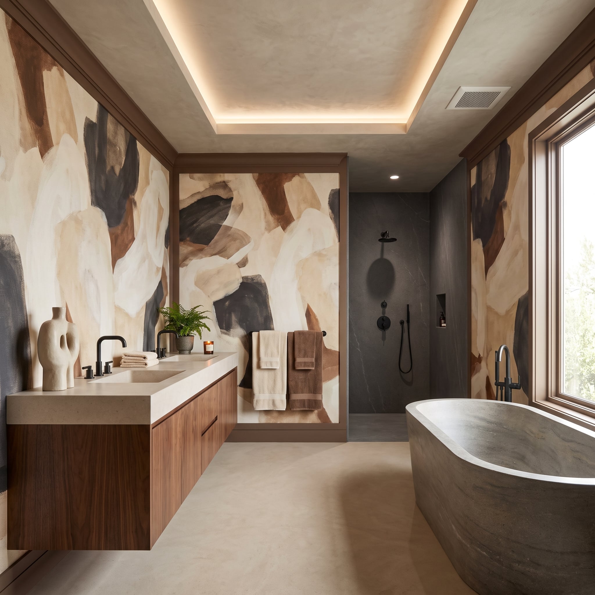
Loose brushwork in cream, charcoal and raw umber runs floor to ceiling, giving the walls movement without a conventional repeating motif. A floating walnut vanity supplies the broad, warm surface the mural needs beside it.
The concrete countertop keeps the palette from becoming too soft, while the pale stone tub gives the eye one large, uninterrupted form. Instead of matching the wallpaper, the room borrows individual colors from it and redistributes them through solid materials.
Style Tip: Abstract wallpaper becomes easier to integrate when another material picks up one of its quieter tones. Here, walnut connects with the rust-brown strokes without duplicating the mural itself.
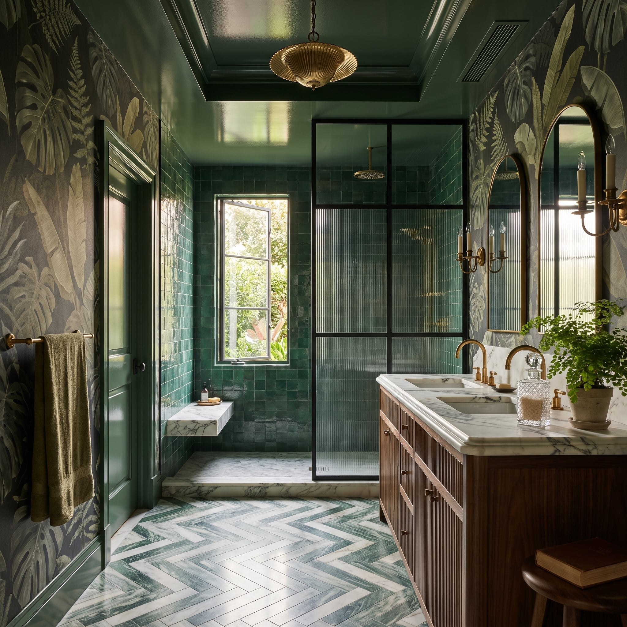
10. Jungle Wallpaper, Chevron Marble, and a Shower That Can Handle the Competition
Oversized tropical leaves cover every wall and meet a lacquered forest-green ceiling, leaving almost no quiet painted surface anywhere in the room. The surprise is the floor: instead of retreating into something plain, chevron marble introduces another strong pattern in a completely different material.
Reeded walnut cabinetry gives the center of the room a warm, linear texture, while unlacquered brass adds restrained metallic highlights. Transparent shower glass avoids putting another visual barrier between all those competing surfaces.
9. Sage Trellis Climbs the Ceiling Without Losing the Room’s Shape
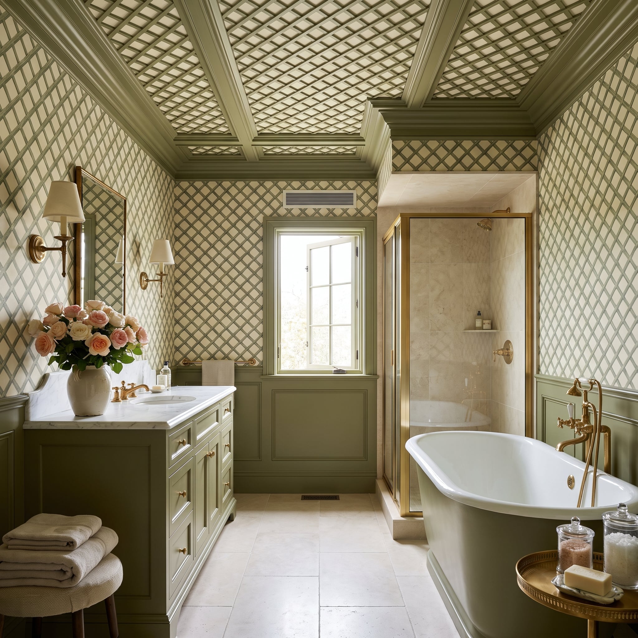
Sage paint covers the vanity and wainscoting before the trellis wallpaper takes over above and continues onto the ceiling. The room is highly patterned without becoming visually fragmented because almost everything remains within one green family.
Brass at the tub and vanity adds a warmer metallic note, while marble supplies the pale neutral surface the room needs between all that green.
Why the Molding Matters
The molding creates a visible pause where wall becomes ceiling. That interruption lets the diamond repeat continue overhead without erasing the architecture; the pattern crosses the boundary, but the boundary still exists.
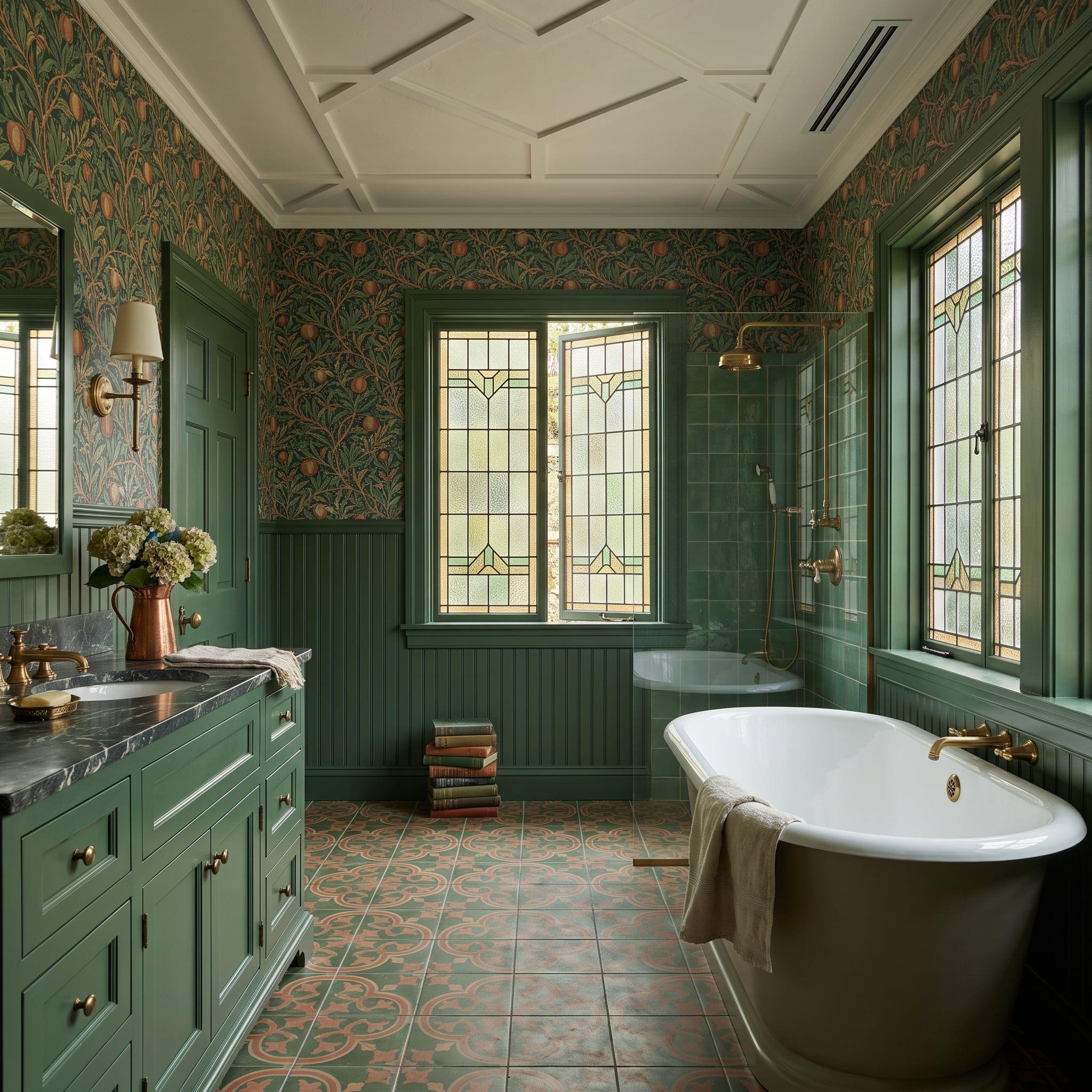
8. Arts and Crafts Wallpaper, Stained Glass and Forest Green Go All In
🔥 Would you like to save this?
William Morris-style wallpaper in forest green and terracotta covers the upper walls while beadboard below carries the green in a solid architectural band. Patterned cement tile adds coral and sage at floor level, yet the palette stays controlled enough that the room never splinters into competing schemes.
Stained-glass windows add color through transmitted light rather than another printed surface. Brass hardware warms the tub area, while darker wood and green paneling give the room enough weight to carry florals, tile and colored glass at once.
Style Math: Wallpaper and beadboard work especially well when they share a dominant color. The lower wall then behaves like a solid extension of the print, leaving room for stained glass and patterned flooring to add their own detail.
7. Terracotta Botanicals Stop Exactly Where the Beadboard Begins
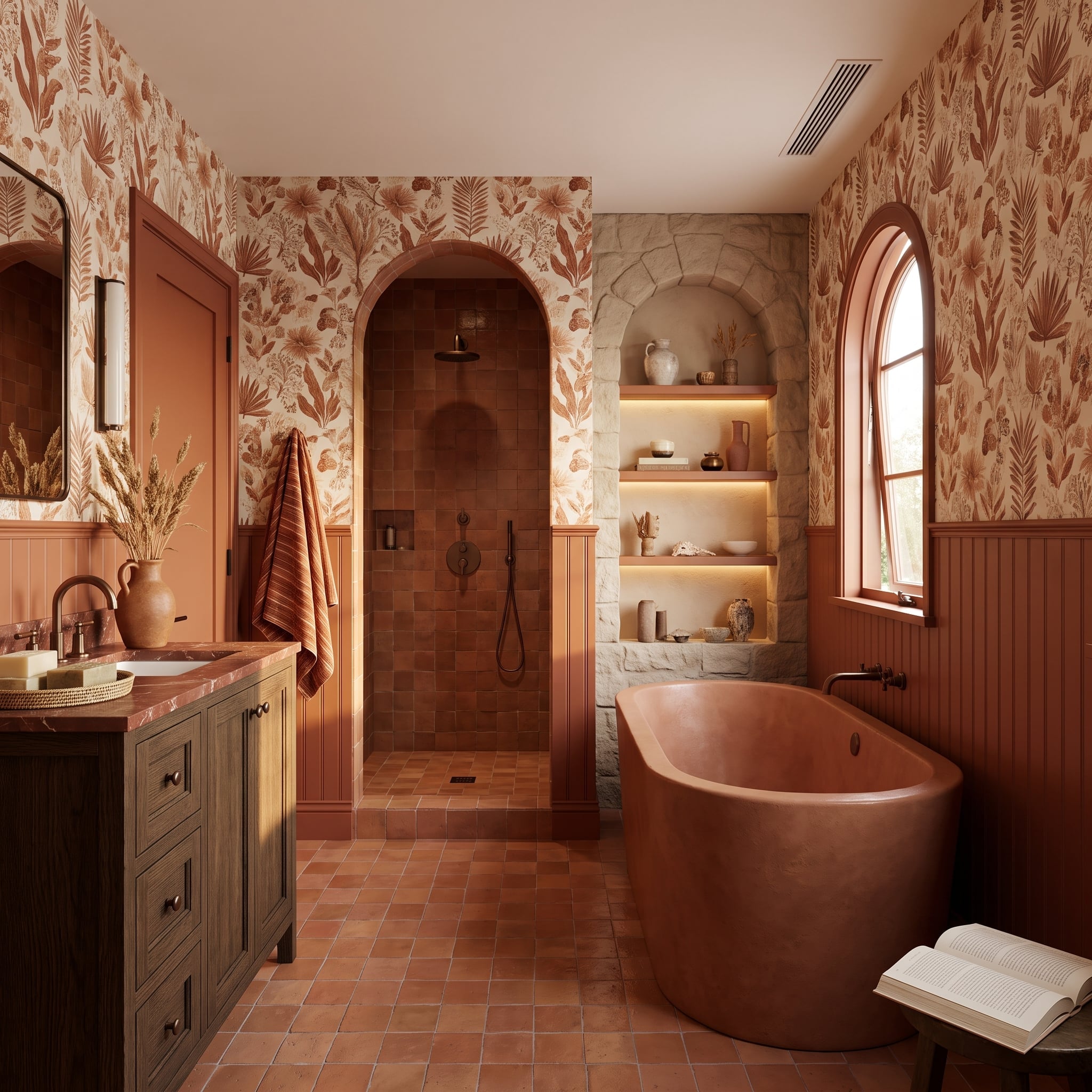
Rust-colored botanical wallpaper occupies the upper walls while terracotta beadboard takes over below, giving the eye a hard architectural break before the pattern can become relentless. A deeper-toned concrete tub pushes the palette farther without introducing another color family.
The arched stone shower opening changes the geometry entirely. Curves interrupt the vertical beadboard and repeated foliage, while recessed niches bring shadow and depth into an otherwise warm, matte room.
- Underlit niches create depth without adding another decorative pattern.
- Keeping wallpaper and beadboard within the same warm family makes the transition feel layered rather than chopped in half.
- An arched shower opening softens the grid created by paneling, tile and cabinetry.
6. Woven Wallcovering Meets Dark Walnut and Rattan Overhead
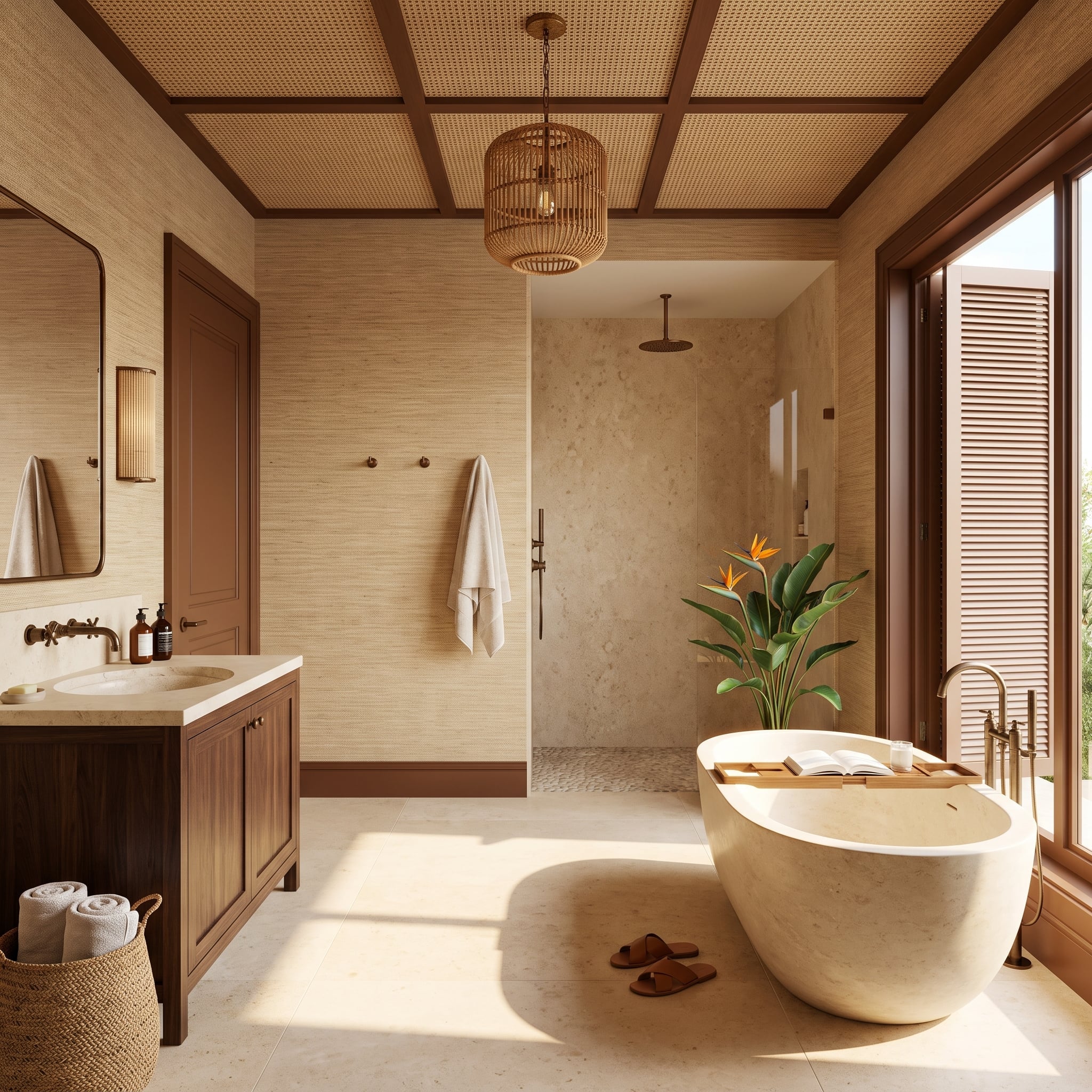
Woven wallcovering creates a continuous tactile field around the room, while dark walnut beams divide the ceiling into a strong coffered grid. A rattan pendant enlarges the woven idea overhead instead of introducing a completely unrelated finish.
The pale stone tub keeps the center visually calm, and a bird of paradise adds the only truly irregular silhouette. In a high-humidity bathroom, a moisture-tolerant woven-look wallcovering can deliver this texture without the vulnerability of untreated natural grasscloth near wet areas.
Try This: A woven pendant can loosen up a room dominated by polished stone and dark millwork. The useful contrast is textural: rough fiber against smooth stone, not casual versus formal.
5. Botanical Wallpaper Meets a Backlit Onyx Ceiling
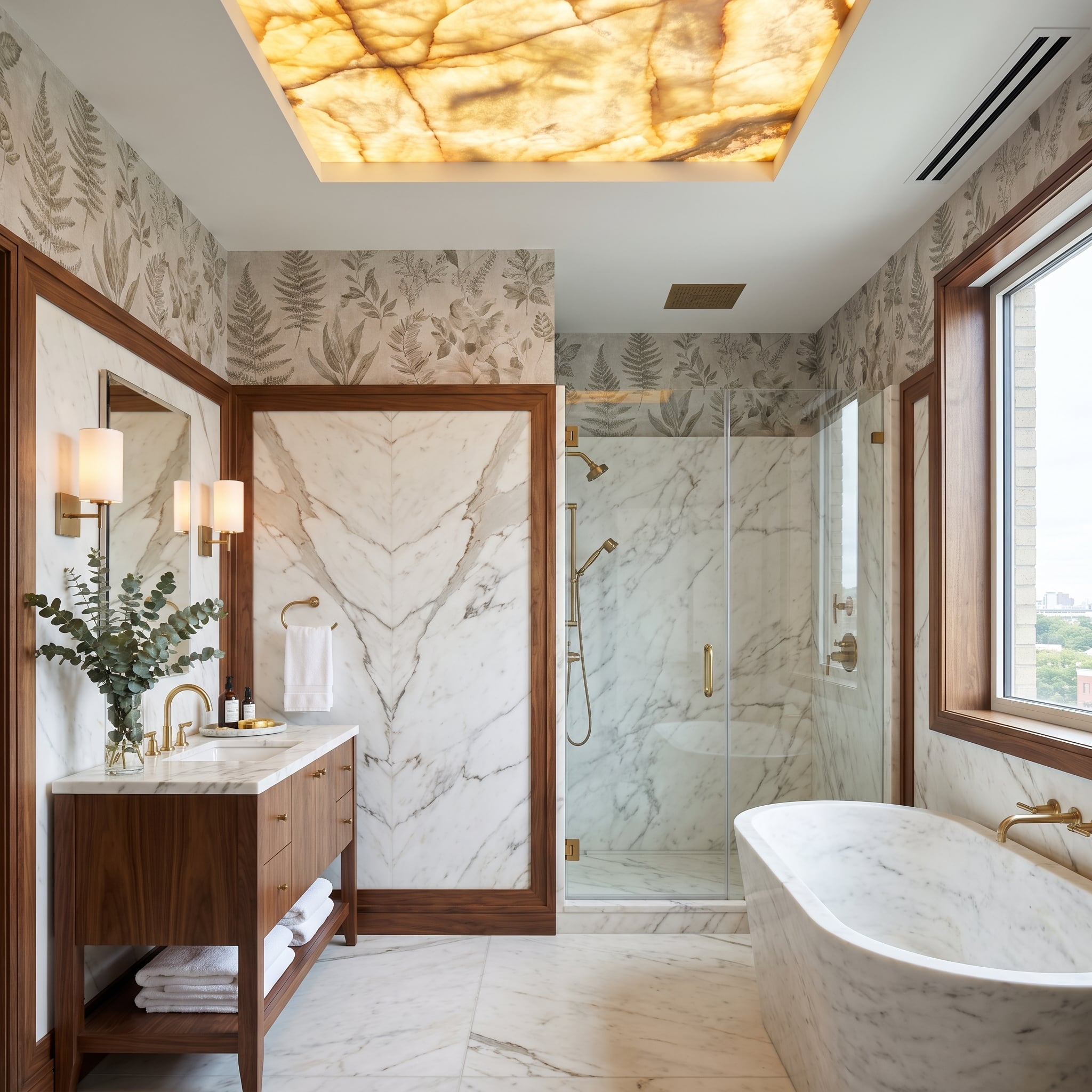
Soft gray-and-cream botanical wallpaper gives the upper walls movement, but the ceiling changes the scale of the room completely. A backlit onyx panel turns stone into illumination, while the bookmatched marble behind the vanity introduces a second, more disciplined pattern below.
Walnut cabinetry prevents all that pale stone from drifting into showroom territory. Wallpaper supplies repetition, marble supplies symmetry, wood supplies weight, and the luminous ceiling gets the final word.
4. Navy Ticking Stripes Turn a Barrel Ceiling Into the Main Event
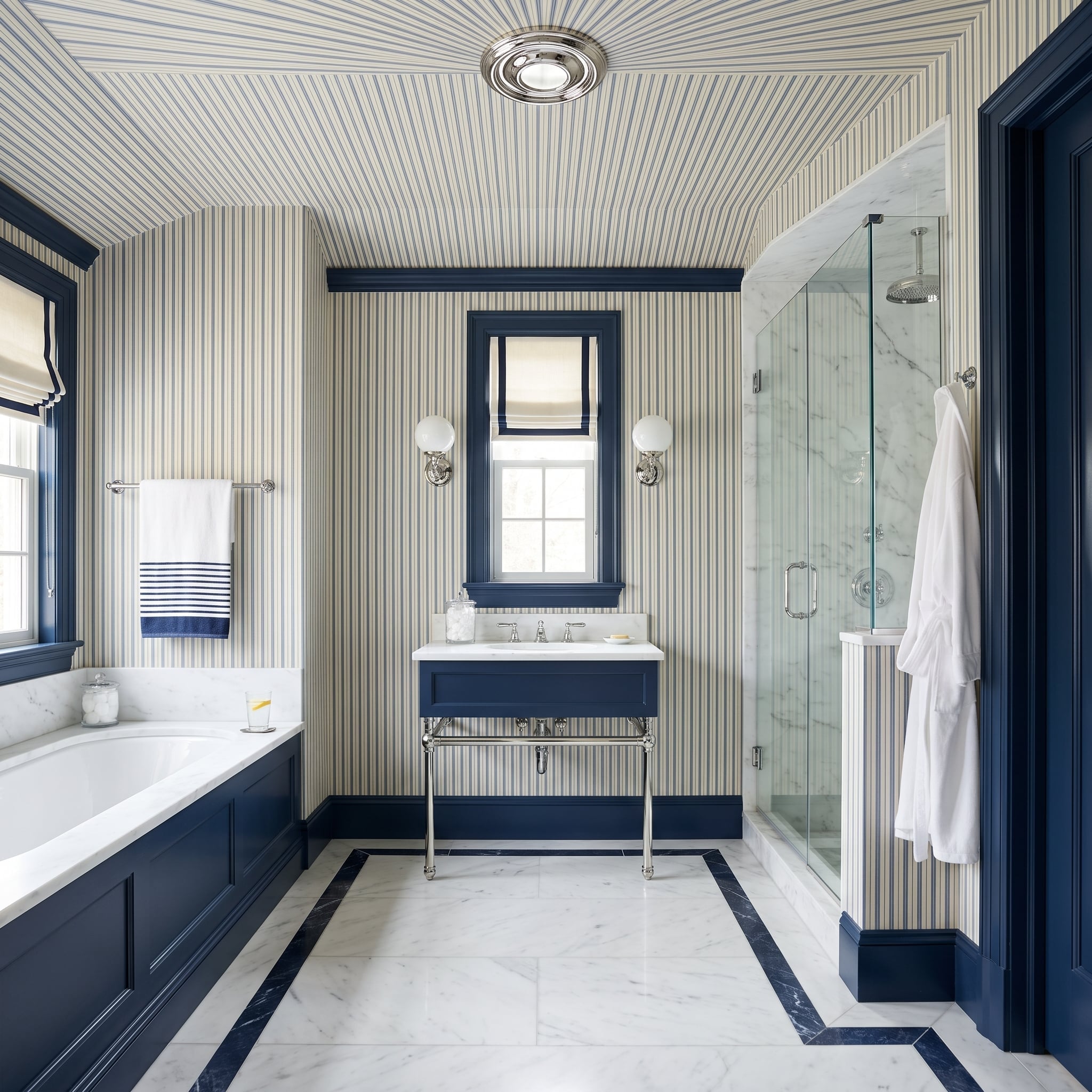
Cream-and-navy ticking stripes follow the walls straight into a barrel ceiling, making the curve visible through repetition. Instead of hiding the unusual ceiling geometry, the wallpaper effectively diagrams it.
White marble flooring with a dark border brings navy back at floor level, while a matching console vanity and mirror frame strengthen the color story. Polished nickel globe sconces add brightness without warming the palette.
Pattern Detail: A narrow stripe remains easy to follow as it bends around a curved ceiling. Larger prints can work too, but they change more dramatically across the curve, while ticking maintains a particularly crisp directional rhythm.
3. A Misty Mountain Mural Makes the Powder Room Forget Its Walls
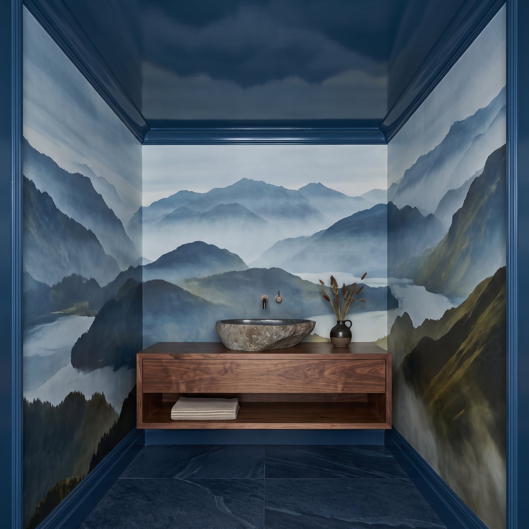
A panoramic mountain mural turns four short walls into one continuous landscape. Layered ridgelines dissolve into fog, valleys fall away in the distance, and the usual edges of the powder room become much less obvious because the image refuses to stop at a conventional frame.
A walnut vanity and river-stone vessel sink keep the fantasy tied to physical materials. The brushed-bronze wall faucet sits slightly off-center, dark slate tile supplies a firm floor, and the glossy navy ceiling reflects enough light to keep the upper half from feeling closed in.
2. Blue Florals Climb the Ceiling While Copper Holds the Floor
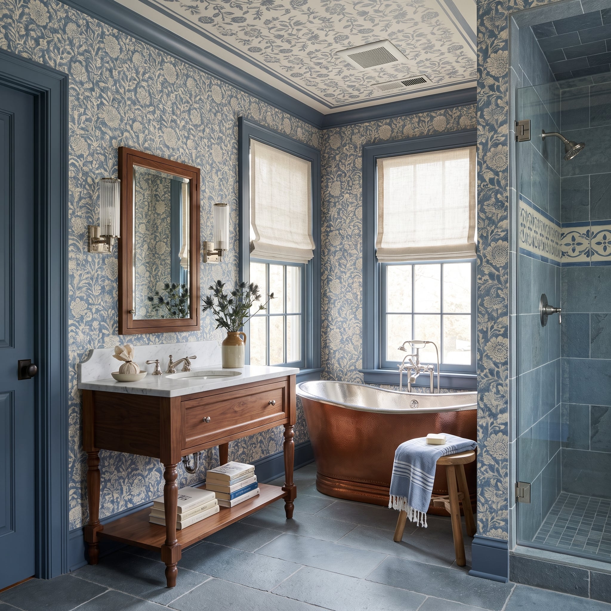
Blue-and-cream floral wallpaper travels from the walls onto the ceiling, where a painted border gives the pattern a clear perimeter. That border matters because the print otherwise has no natural stopping point overhead.
A hammered copper tub introduces a major temperature shift against slate flooring and blue trim. Walnut at the vanity bridges the cool and warm sides of the room without trying to match either one exactly.
Why the Ceiling Wrap Works
The floral repeat is dense and relatively even, so there is no single horizontal image that becomes awkward when the surface turns overhead. The painted perimeter then re-establishes the ceiling as a defined plane rather than an accidental continuation of the walls.
1. Giant Peonies Take Over a Powder Room and Leave Almost Nothing Quiet
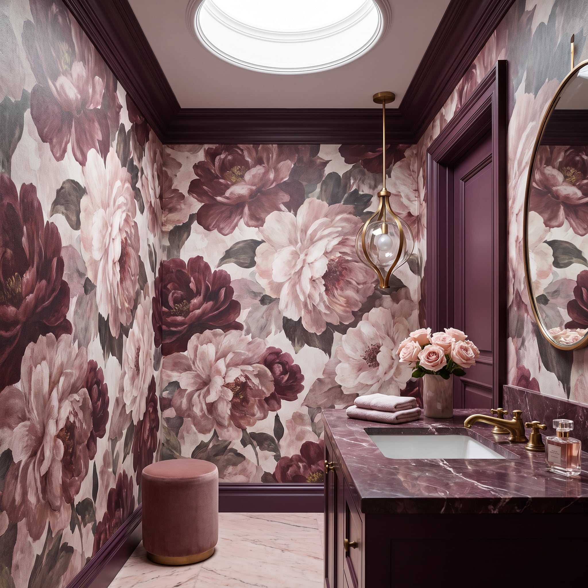
Deep burgundy peonies spread across blush-and-cream walls at a scale that would overwhelm a timid scheme. Here, the print is allowed to become the room rather than an accent inside it.
Purple-veined marble introduces a harder, mineral version of the same color story at the vanity. Brass fixtures and a dusty-rose ottoman add warmth without competing with the flowers, while the simple oval mirror avoids putting another elaborate outline against an already complicated background.
Scale Note: Large patterns can be especially effective in powder rooms because there is little wall area for the repeat to become monotonous. Allowing an oversized motif to disappear beyond corners can make the room feel more immersive than shrinking the print to fit neatly inside it.