
Somewhere between choosing the marble and approving the brass, a bathroom can lose sight of the person who has to use it. The stone is spectacular. The lighting deserves its own opening night. The towel is six feet away, the mirror reflects half a face, and the bathtub has a gap behind it that no human hand can reach.
In order to come up with the very specific design ideas, we create most designs with the assistance of state-of-the-art AI interior design software. Also, assume links that take you off the site are affiliate links such as links to Amazon. this means we may earn a commission if you buy something.
Bathroom design is a ruthless test of priorities. A shower needs more than a magnificent rain head; its controls must be reachable before the water starts. A freestanding tub needs space around it, not simply enough floor to accommodate its footprint. A wall of glass can make a room look twice its size while giving privacy roughly the same consideration as a shop window. And polished marble, however beautiful, deserves a serious conversation about wet feet.
The clever decisions are often measured in inches: the width of a mirror, the reach to a towel, the clearance beside a toilet, the distance between a shower control and its spray. Across these 37 bathrooms, expensive materials meet the practical demands of proportion, lighting, circulation, storage, and maintenance. The real luxury isn’t how much stone fits into a room. It’s how little inconvenience survives the design.
37. Green Marble Can Have the Whole Room. The Mirror Still Needs Proper Lighting.
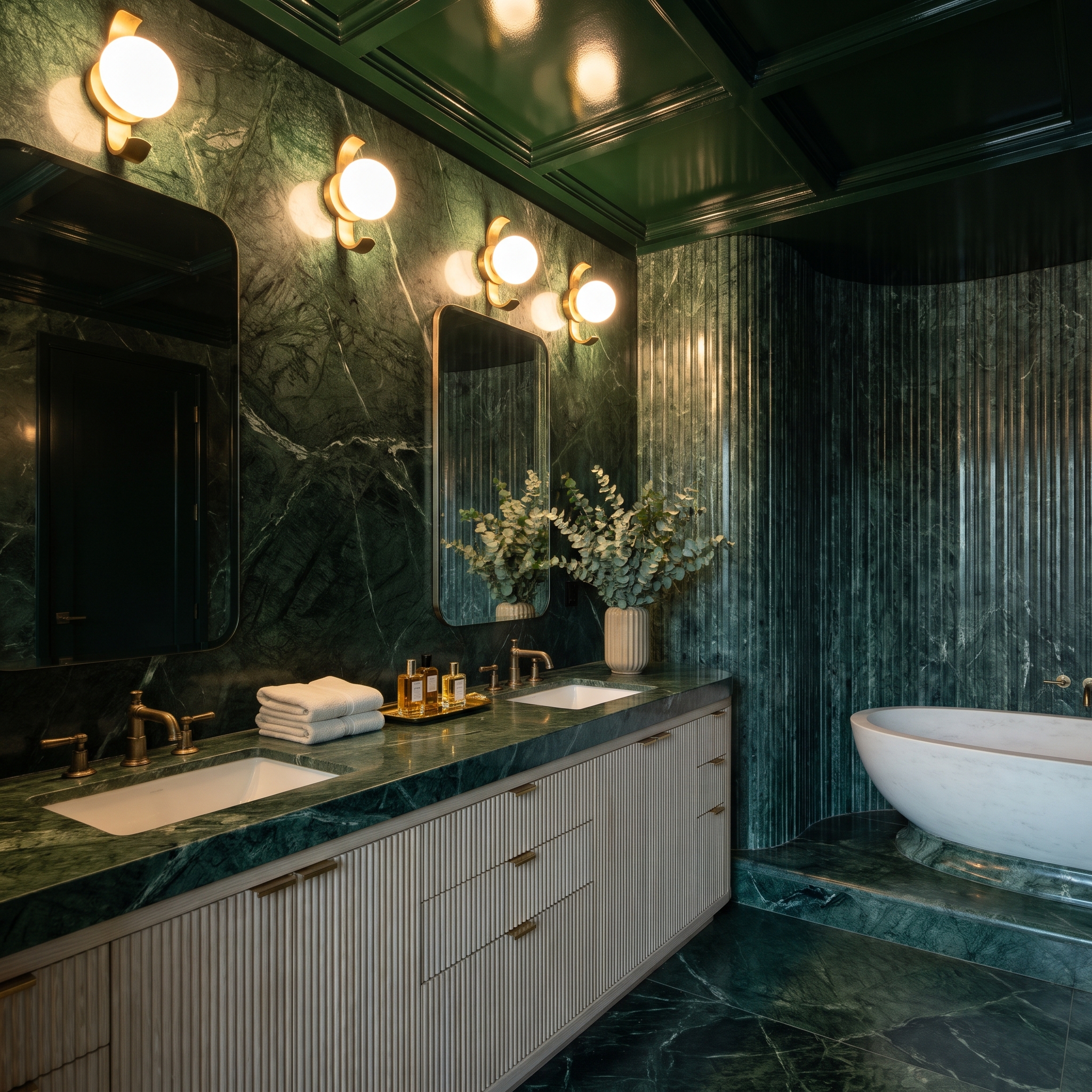
Deep green marble covers the walls, floor, and countertop, creating the saturated intensity of a jewel box. Fluted white cabinetry breaks up the stone, while brass globe sconces introduce warmth beside the mirror. The vanity provides the contrast that prevents the green from swallowing every surface.
Those sconces are doing more useful work than another slab of marble ever could. Light positioned near face level helps reduce the shadows associated with overhead-only fixtures. A bathroom can afford to be extravagant with stone, but the mirror still needs to show the person standing in front of it.
36. The Shower Lost Its Door. Did Anyone Check Where the Water Goes?
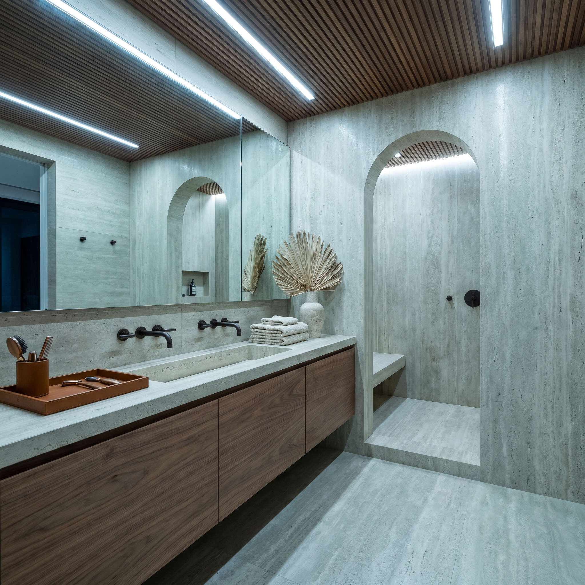
Concrete-toned walls form a substantial architectural shell, interrupted by a broad arched shower entrance and a floating walnut vanity. A slatted timber ceiling warms the composition, its concealed lighting drawing attention to the grain without cluttering the room with fixtures.
The arch gives the shower an impressive entrance. It also removes the glass door that would ordinarily help contain the spray. Shower depth, head direction, floor slope, and drainage now have to do the work. The opening may look effortless, but keeping the water inside requires considerably more thought than drawing a handsome curve.
35. Crimson on the Ceiling, Marble on the Walls — Somebody Had to Know When to Stop
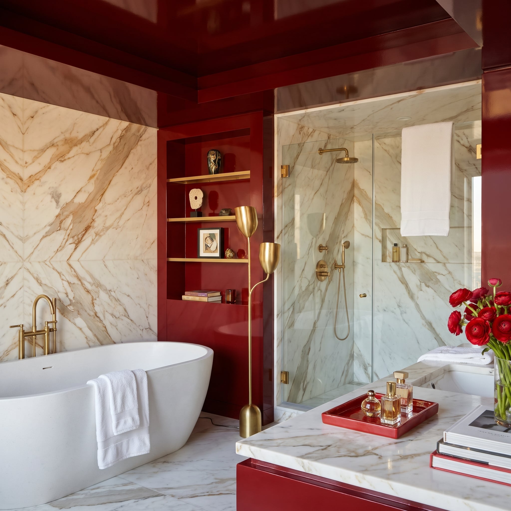
Crimson lacquer commands the ceiling and built-in shelving, while mirrored marble veining introduces another powerful pattern below. Brass fixtures connect the two through a consistent warm finish. Nothing here is remotely shy.
The red stays largely overhead, leaving the marble to establish its own pattern across the walls. That division gives two assertive materials room to operate without turning every surface into a competing attraction. The brass supplies continuity, and the simpler fixtures keep the room from acquiring a third leading actor. Maximalism works best when somebody knows which extravagance gets the last word.
34. The Best Shower Control Is the One You Can Reach Before Getting Wet
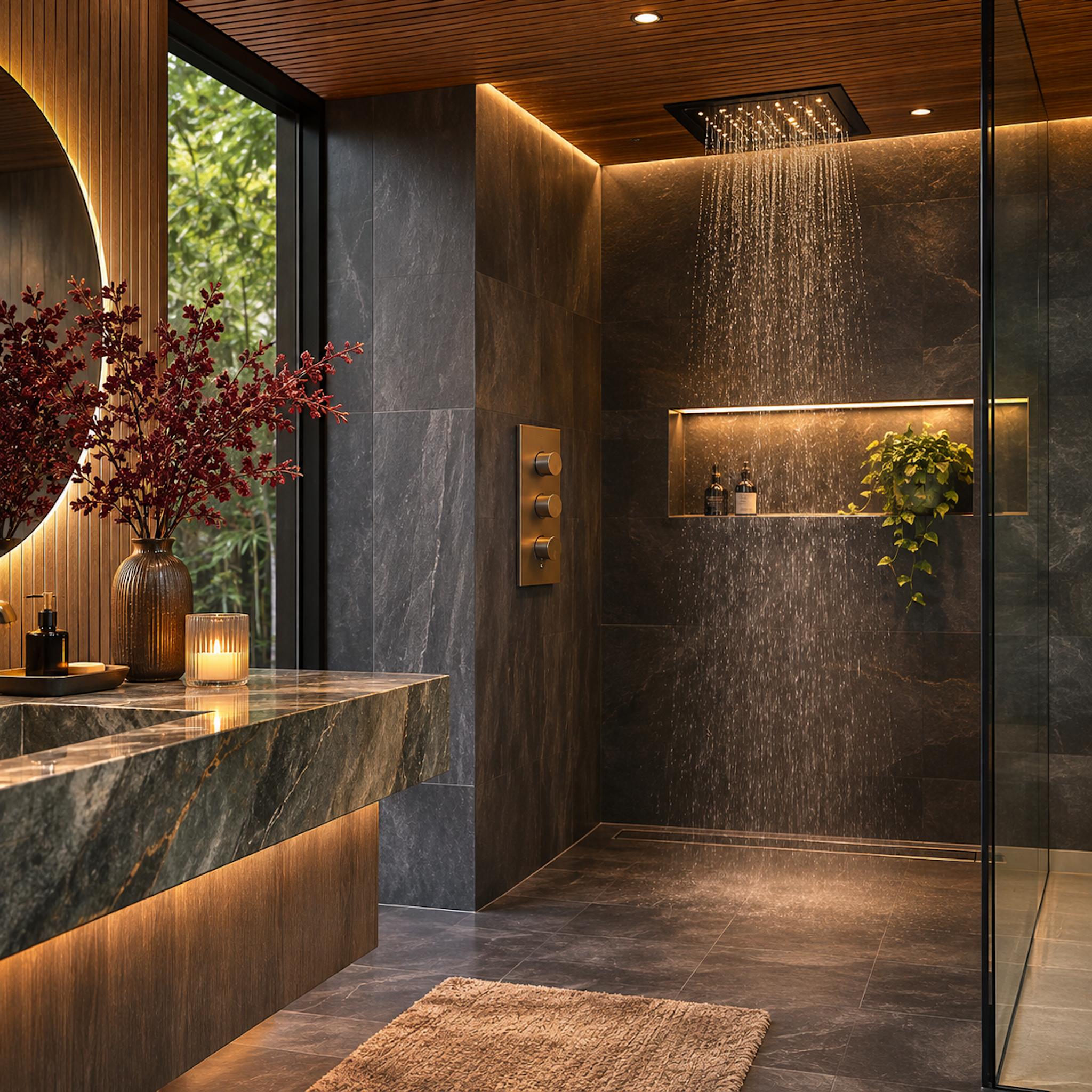
Charcoal stone surrounds a generous walk-in shower beneath a warm timber ceiling. A broad rain head occupies the center, while concealed lighting defines a recessed niche. The adjoining vanity continues the dark stone and wood palette.
The controls sit on the side wall, outside the direct path of the rain head. With convenient access from the entrance, that arrangement allows the water to be adjusted before anyone steps beneath it. A small detail, perhaps, until the morning somebody discovers the alternative. Six shower settings mean remarkably little if the first one is an involuntary cold rinse.
33. A Skylight Can Flood a Bathroom With Light. It Can Also Ruin the Mirror.
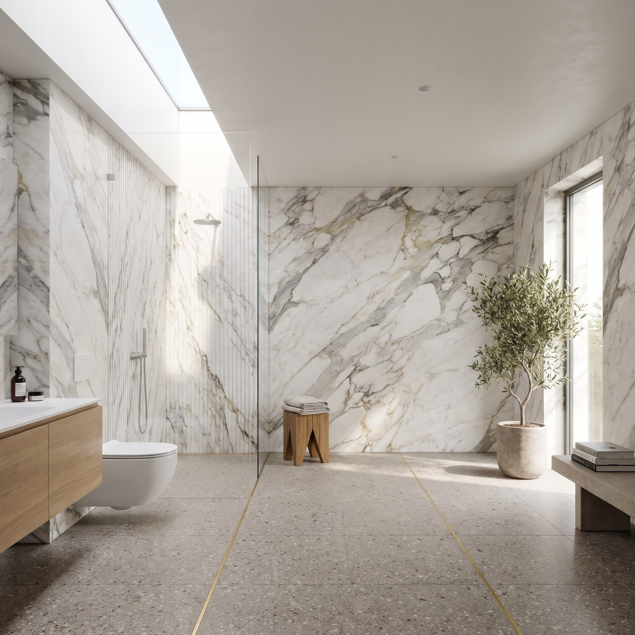
Calacatta Gold marble carries sweeping veins of amber and gray, while a long skylight sends daylight across the stone. The opening gives the ceiling a strong architectural feature without adding another decorative material.
Daylight looks wonderful on marble. On a mirror, direct sunlight can create glare or uneven illumination, depending on the skylight’s orientation and the hour. The solution begins with the relationship between the glazing and vanity, followed by suitable shading or complementary lighting where needed. The sun is an excellent decorator, but an unreliable makeup artist.
32. Pink Marble, Rose Gold, and Not a Contrasting Thought in Sight
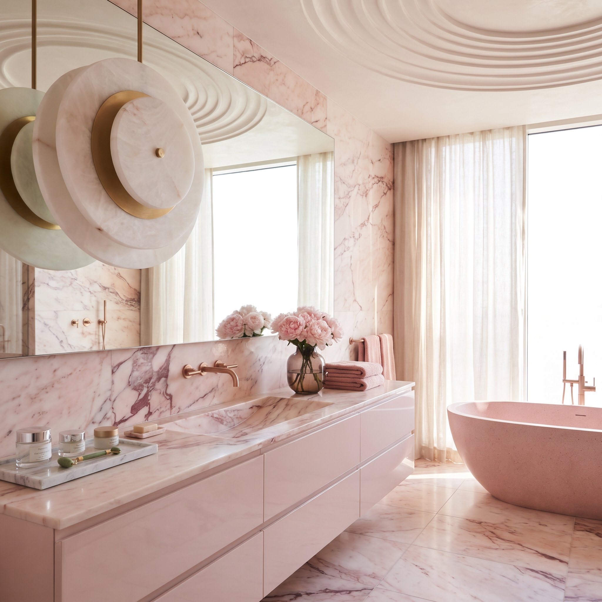
Blush marble and rose gold occupy closely related territory, with the stone’s veining supplying subtle variation. A freestanding tub and floating vanity introduce sculptural forms, but the palette remains firmly committed to its rosy complexion.
The shadow beneath the cabinetry becomes unusually important. Without that darker interruption, the pale surfaces could merge into one continuous wash of pink. Matching finishes create cohesion; differences in texture, depth, and silhouette give the eye something to distinguish. A perfectly coordinated bathroom still needs a little disagreement.
31. The Wall Has Waves. The Bathtub Has Curves. Who Gets the Spotlight?
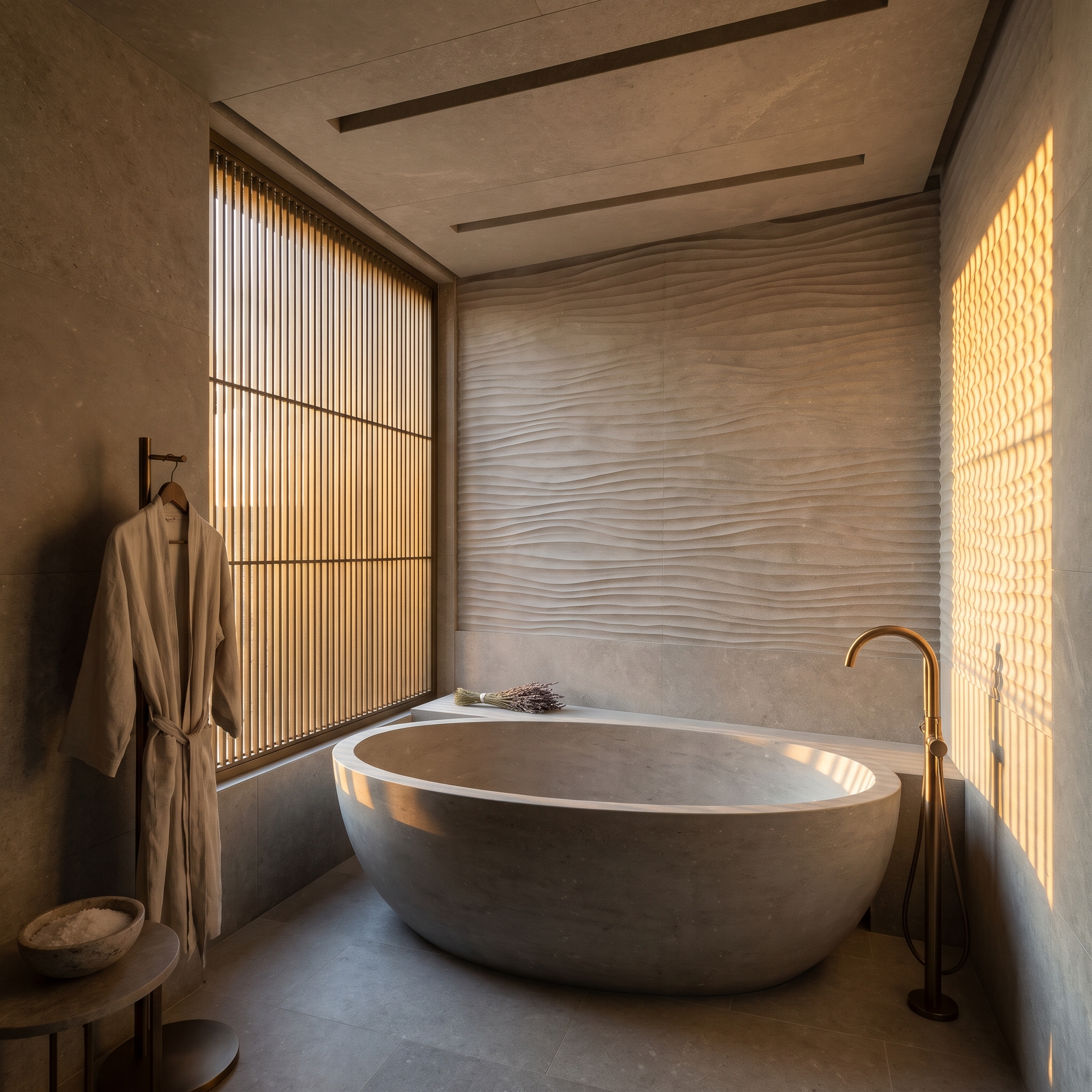
Warm light travels across wave-pattern tile, turning each ridge into a sequence of highlights and shadows. A freestanding stone bathtub occupies the foreground, its curved profile interrupted by the clean vertical line of a brass floor-mounted faucet.
The wall is effectively another sculpture. Grazing light exaggerates its relief, while softer illumination would make the same surface considerably calmer. The bathtub already has a commanding silhouette, so the wall lighting determines how much competition it receives. Three-dimensional tile isn’t a finished design choice until somebody decides how to illuminate it.
30. A Fireplace Beside the Bathtub Sounds Wonderful. Placement Is Everything.
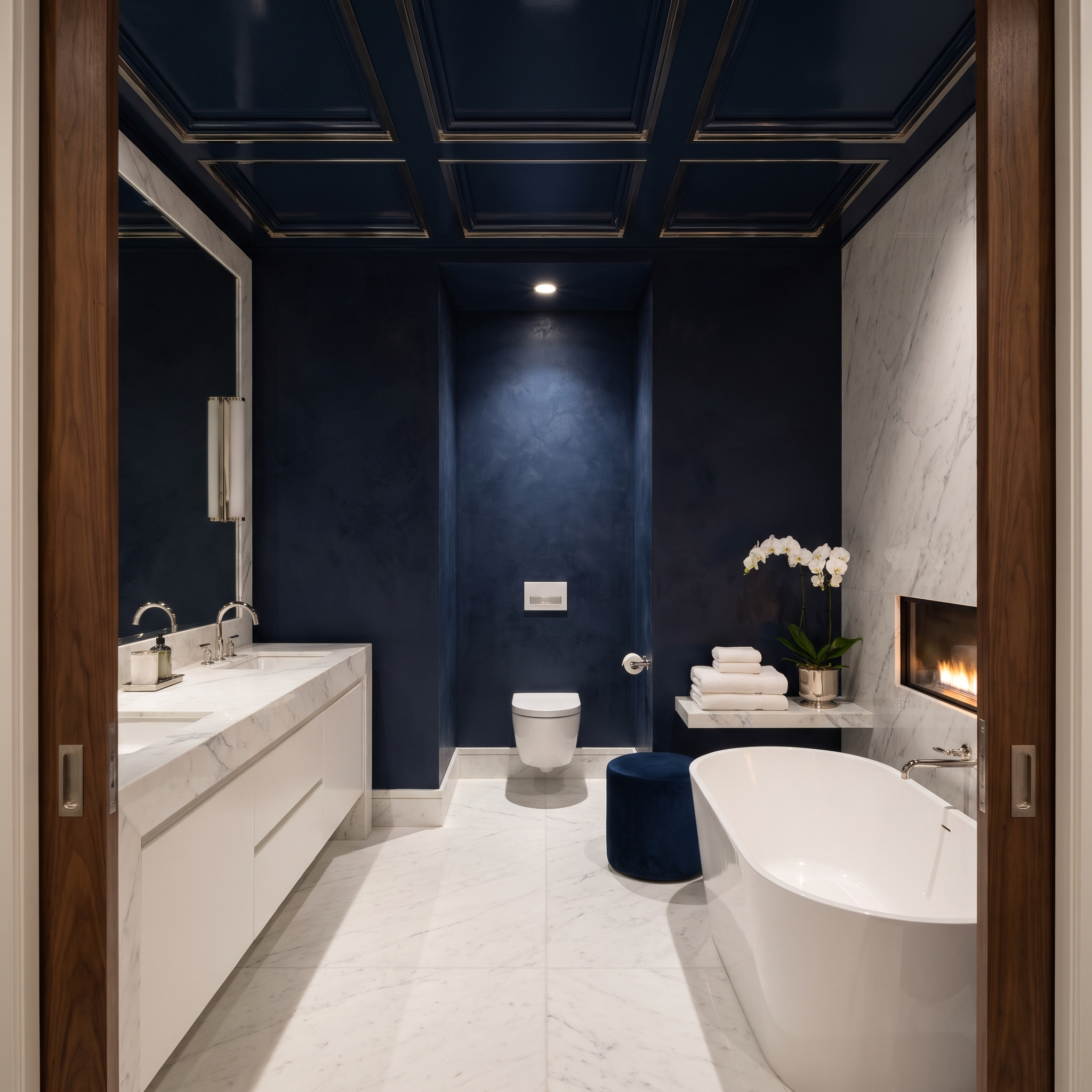
Deep navy plaster extends across the walls and coffered ceiling, where brass trim emphasizes the overhead grid. White marble flooring supplies a striking contrast. A freestanding bathtub occupies the space beside a recessed fireplace.
The fireplace gives the bathing area a focal point at seated height, balancing the elaborate ceiling above. Its position also demands more than a pleasing composition: the appliance must be suitable for bathroom installation, with appropriate clearances and protection from water exposure. A fire beside the bath is a splendid idea. Electricity, moisture, and careless placement are a less appealing combination.
29. A Marble Vanity This Wide Deserves More Than a Sliver of Mirror
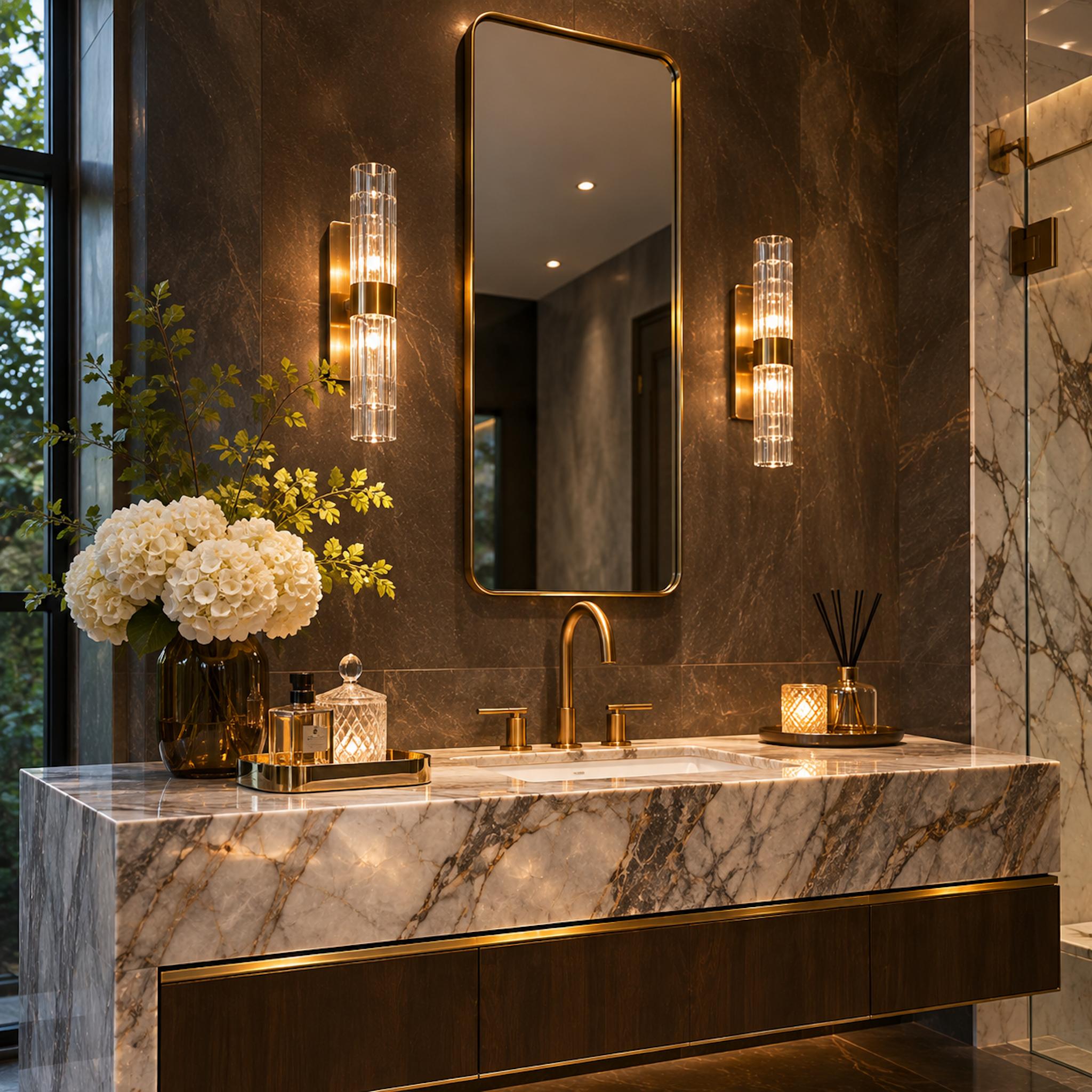
A monumental marble vanity stretches across the foreground, its white and charcoal veining reinforced by dark walnut cabinetry and brass detailing. Crystal sconces flank a narrow, gold-framed mirror. Flowers, glass accessories, and polished fittings complete the composition.
The mirror occupies surprisingly little of the wall above such a substantial vanity. Its tall proportions are elegant, but the usable reflective area is restricted. Width, mounting height, and alignment should respond to the sink and the people using it. The marble has been given plenty of room to show off. The person at the basin deserves at least as much consideration.
28. The Best Bathroom Storage Doesn’t Need a Piece of Furniture
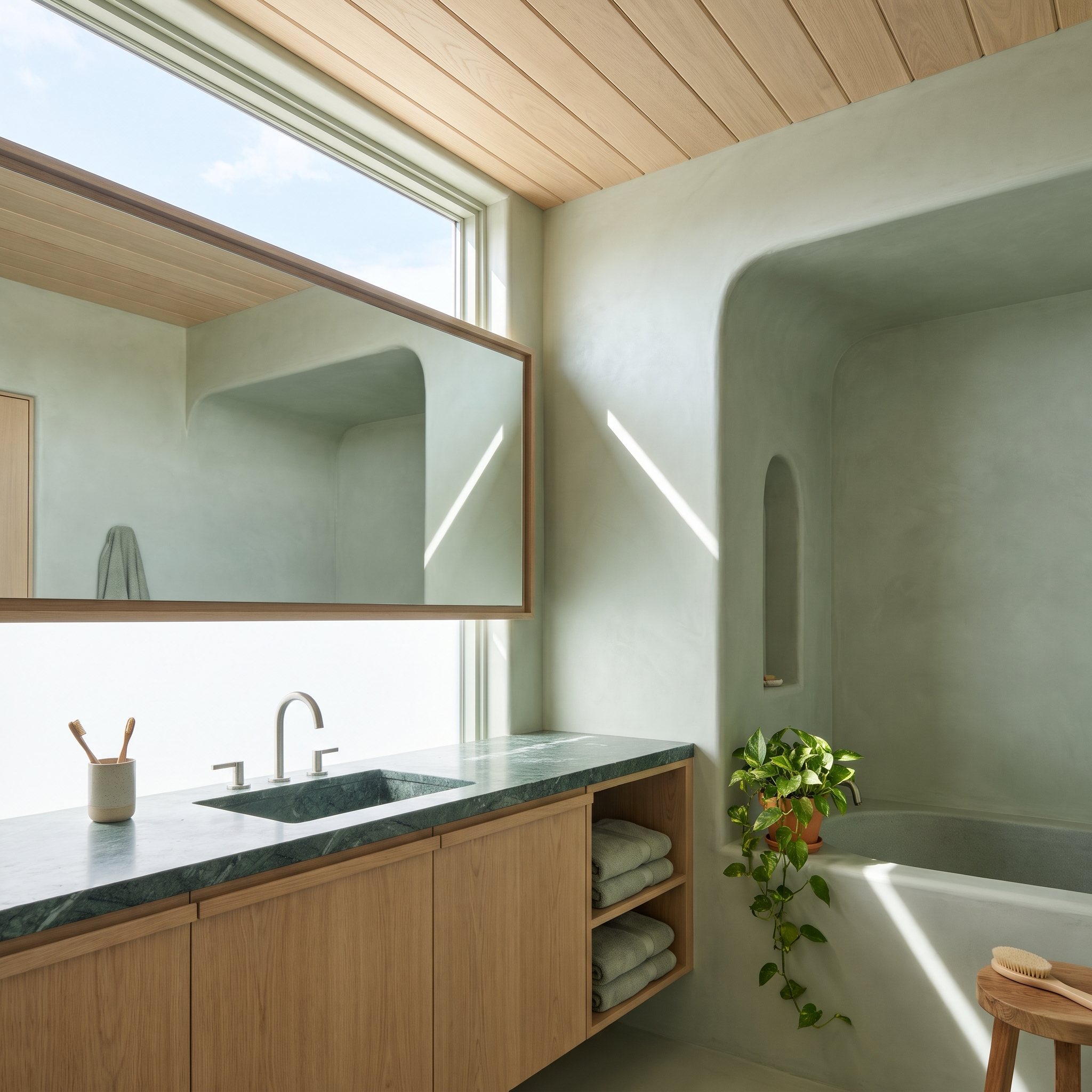
Sage plaster wraps the bathing area and an arched wall niche, while green marble adds movement at the countertop. Oak cabinetry supplies warmth, and folded towels occupy the vanity’s open shelves.
The niche makes the wall perform a second job without projecting into the room. Its arched opening relates to the surrounding architecture, while the recess provides a place for smaller essentials. Depth and shelf spacing determine whether it stores anything useful. An attractive hole in the wall is still an attractive hole unless somebody measures what needs to fit inside.
27. The Floor Is Doing All the Moving. The Walls Know Better.
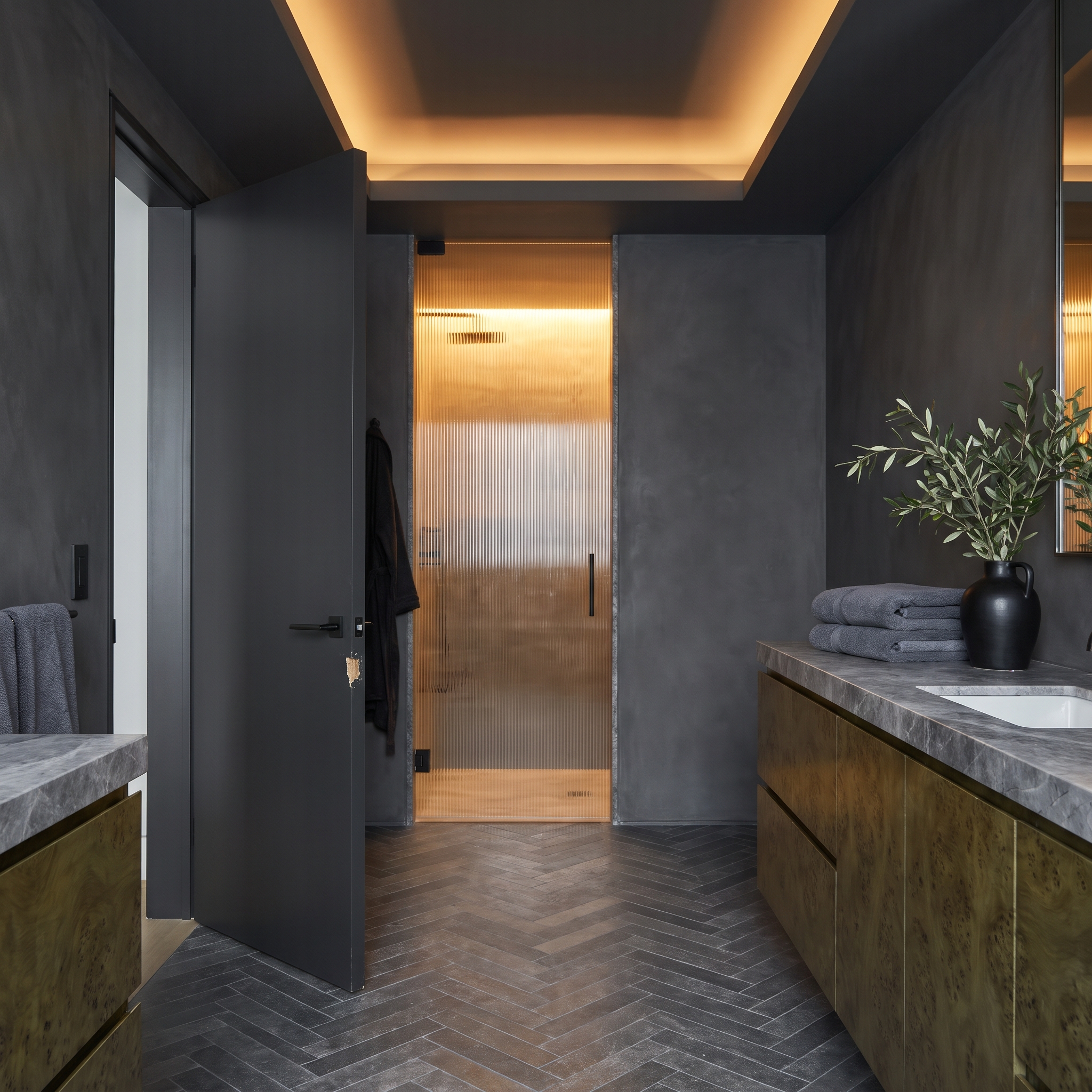
Charcoal walls and brass-faced cabinetry establish a dark, metallic palette. Cove lighting traces the ceiling recess, while herringbone slate sends diagonal lines across the floor.
The pattern supplies movement without another color. Its tightly repeated geometry contrasts with the broader, quieter wall surfaces and the strong horizontal lines of the cabinetry. Add another assertive pattern overhead and the room could become visually restless. Here, the floor gets the attention because the walls decline to compete.
26. The Onyx Gets the Lighting, the Drama, and the Applause. The Sinks Get Second Billing.
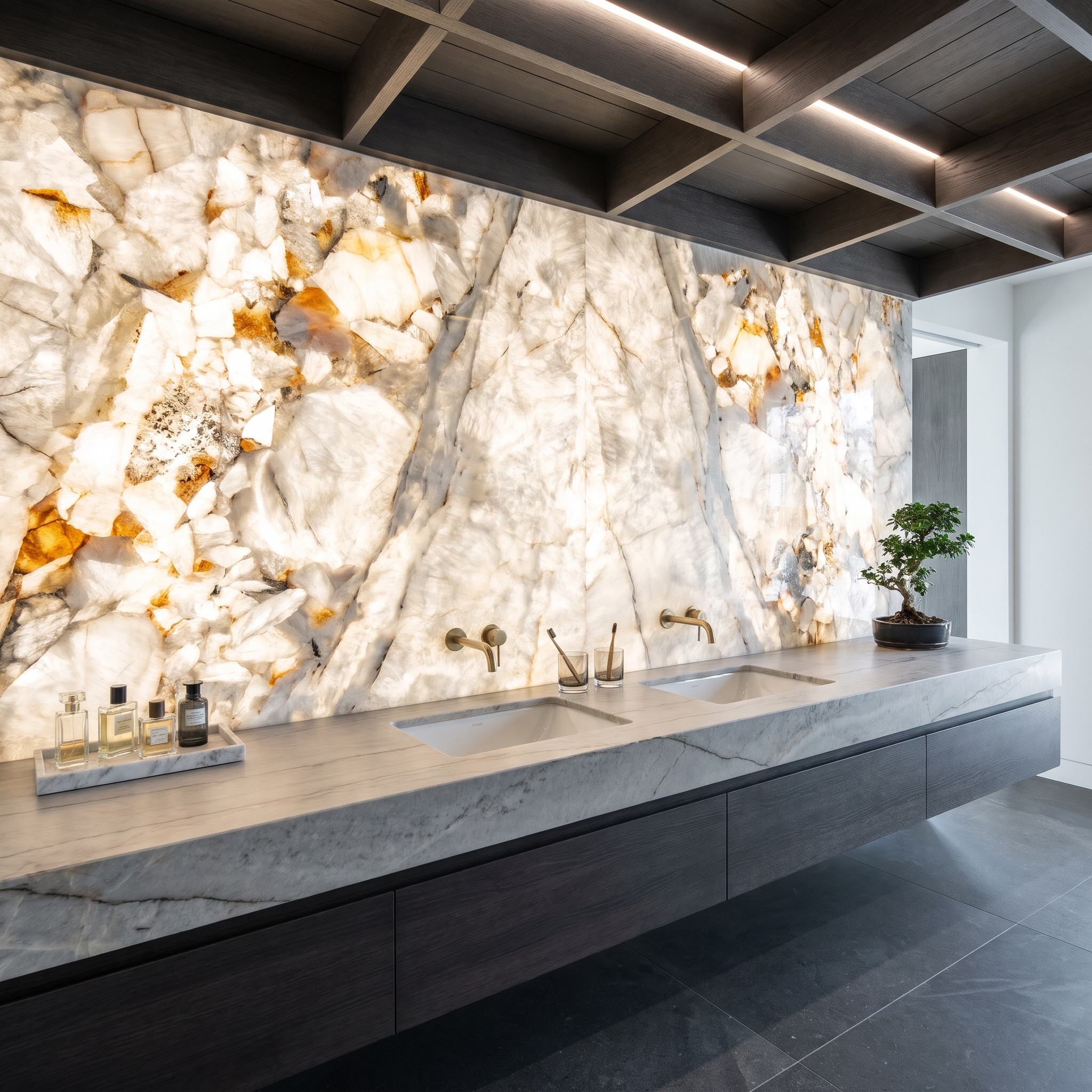
White and amber onyx glows behind a double vanity, revealing translucent veins and irregular pockets in the stone. Wall-mounted brass faucets keep the countertop orderly, while a bonsai introduces a small organic accent.
The illuminated wall dominates so completely that the two basins become supporting characters. Backlighting reveals the onyx’s extraordinary translucency, while the pale sinks and restrained fittings offer little competition. The stone is spectacular, certainly. The question is whether a vanity should surrender quite so much attention to the wall behind it.
25. Glass Walls, Pale Marble, No Visual Boundaries — Where Does the Shower End?
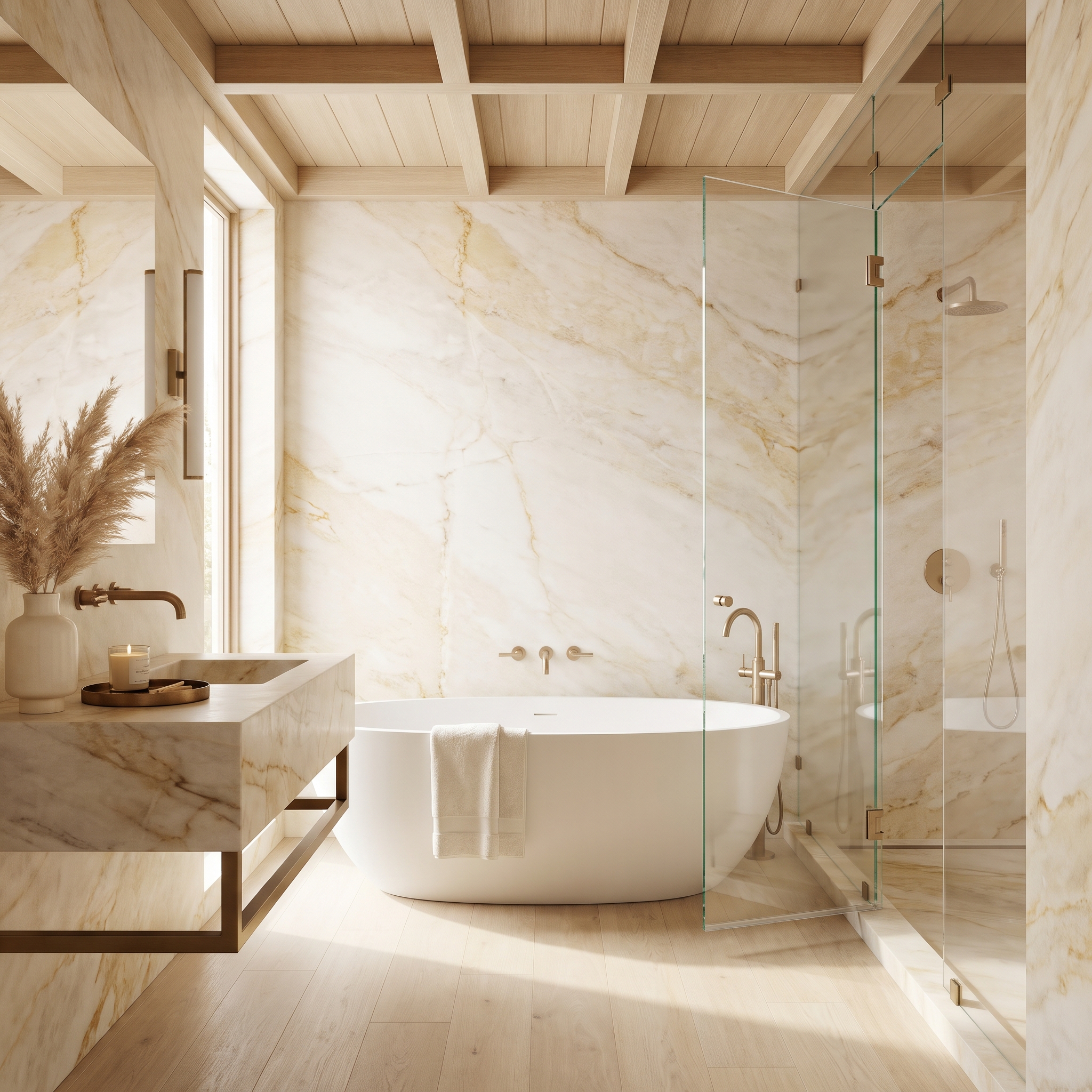
Cream marble and pale oak establish a quiet palette, with the timber grain warming the ceiling. A transparent shower enclosure preserves the continuous appearance of the stone, while a freestanding tub introduces a simple sculptural form.
The glass separates wet and dry areas physically while barely interrupting them visually. That openness makes the room feel expansive, but the shower still needs clear functional boundaries through its floor detailing, drainage, and enclosure layout. Minimalism can erase visual clutter. It cannot erase the difference between a wet floor and a dry one.
24. The Vessel Sink Looks Magnificent. How High Is the Rim?
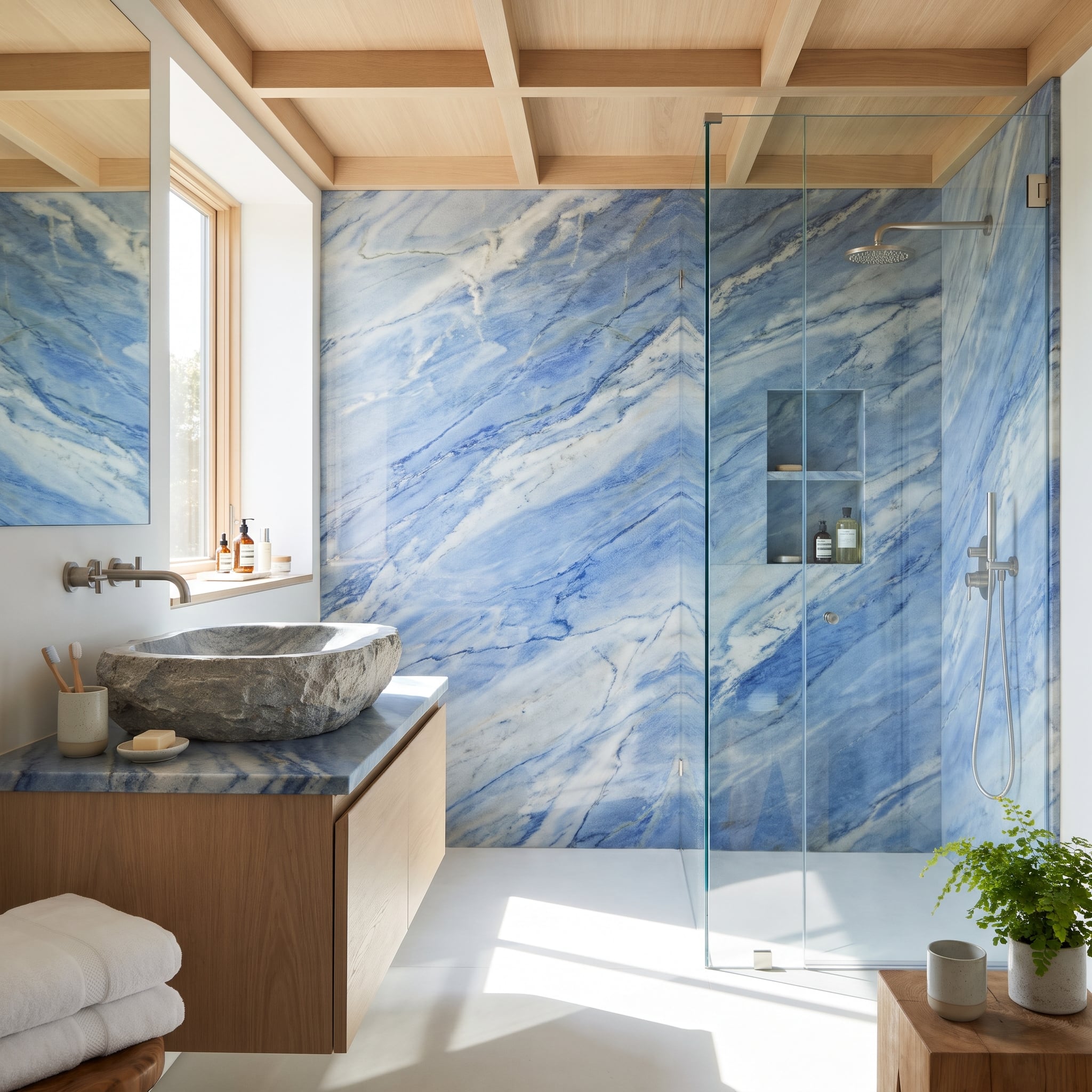
Blue marble dominates the walls, while a sculptural stone vessel sink carries the material onto the vanity. The raised basin stands above the counter, giving an ordinary fixture the presence of a carved object.
That elevation changes the working height. A vessel sink needs a countertop low enough to accommodate the bowl, with a faucet positioned to deliver water comfortably into it. Counter space around the basin matters too. The most beautiful sink in the room becomes considerably less impressive when using it requires raised shoulders and awkward elbows.
23. The Glass Shower Has No Secrets. Neither Does the Bedroom.
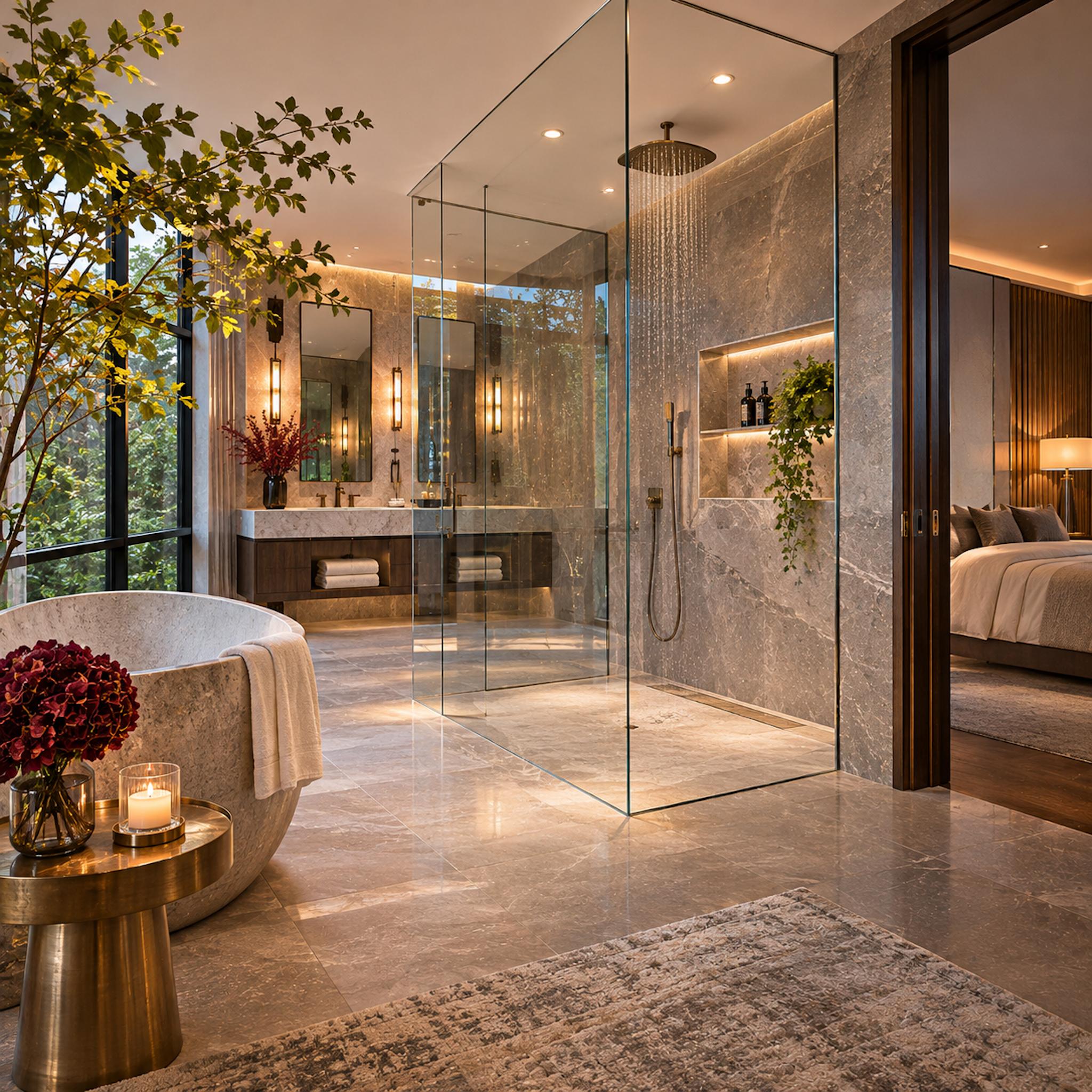
A large glass shower occupies the center of an expansive bathroom, framed by warm gray stone, floor-to-ceiling glazing, and concealed lighting. A sculptural bathtub sits in the foreground, while the double vanity and adjoining bedroom remain visible through the transparent enclosure.
The openness is impressive. So is the uninterrupted sightline from the bedroom directly into the shower. For a private suite, that arrangement may be intentional; for others, fluted glass, a partial screen, or a different orientation would offer more discretion. Transparency can make a room feel larger, but it also makes the shower part of every adjoining room’s view. Privacy belongs in the floor plan, not on a wish list after installation.
22. The Marble Has Veins. The Ceiling Has Waves. The Vanity Has Had Enough.
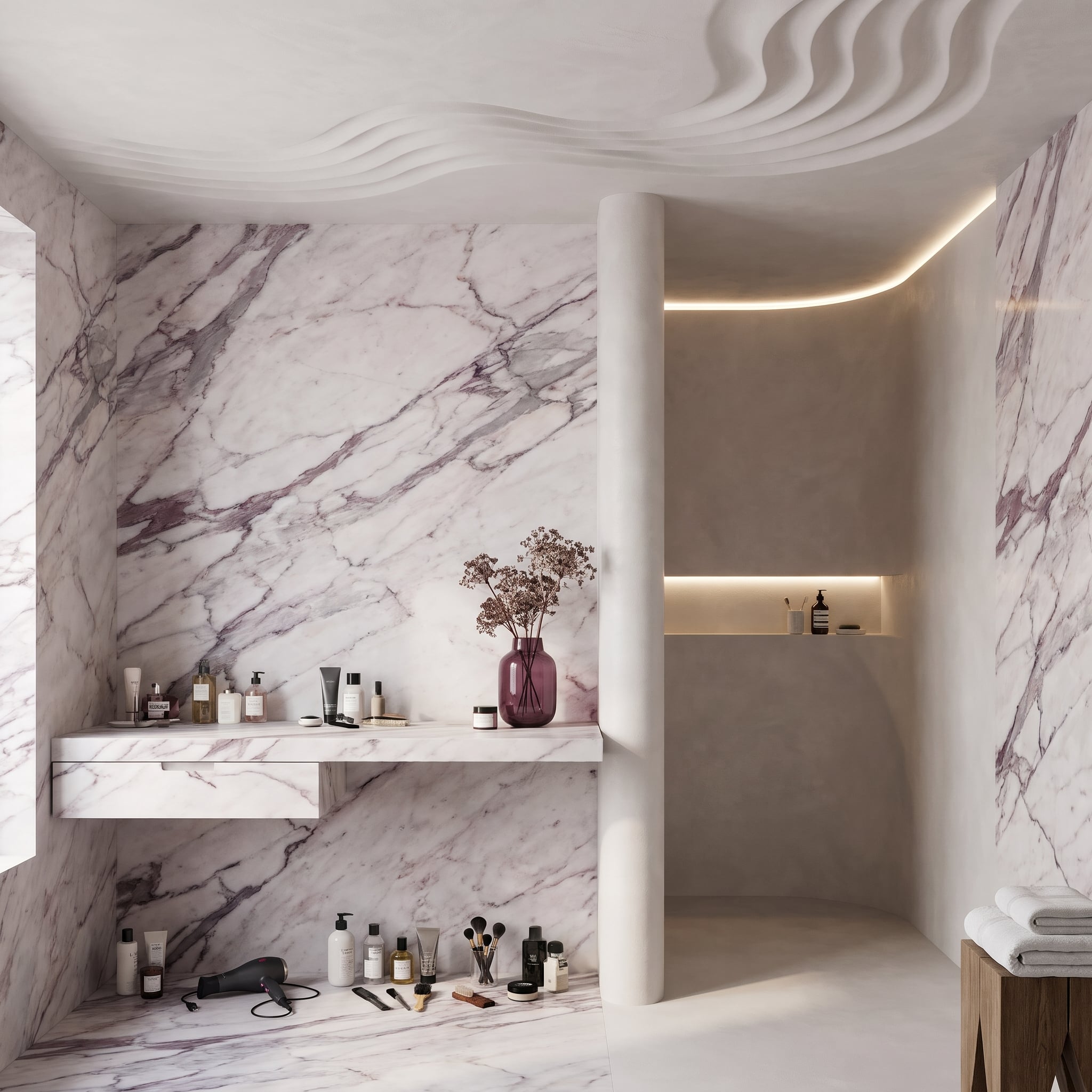
Purple and gray veins wander across the marble walls, while a sculpted wave ceiling introduces another pattern overhead. The floating vanity shelf keeps the lower part of the room comparatively spare.
The ceiling follows a regular rhythm; the marble does whatever geology had in mind. Their different scales help distinguish the patterns, but strong lighting across every ridge and vein would intensify the competition. The plain horizontal vanity shelf gives the eye a brief rest. In a room this busy, a straight line can be a small act of mercy.
21. Two Rain Heads, Six Jets, and One Very Important Plumbing Question
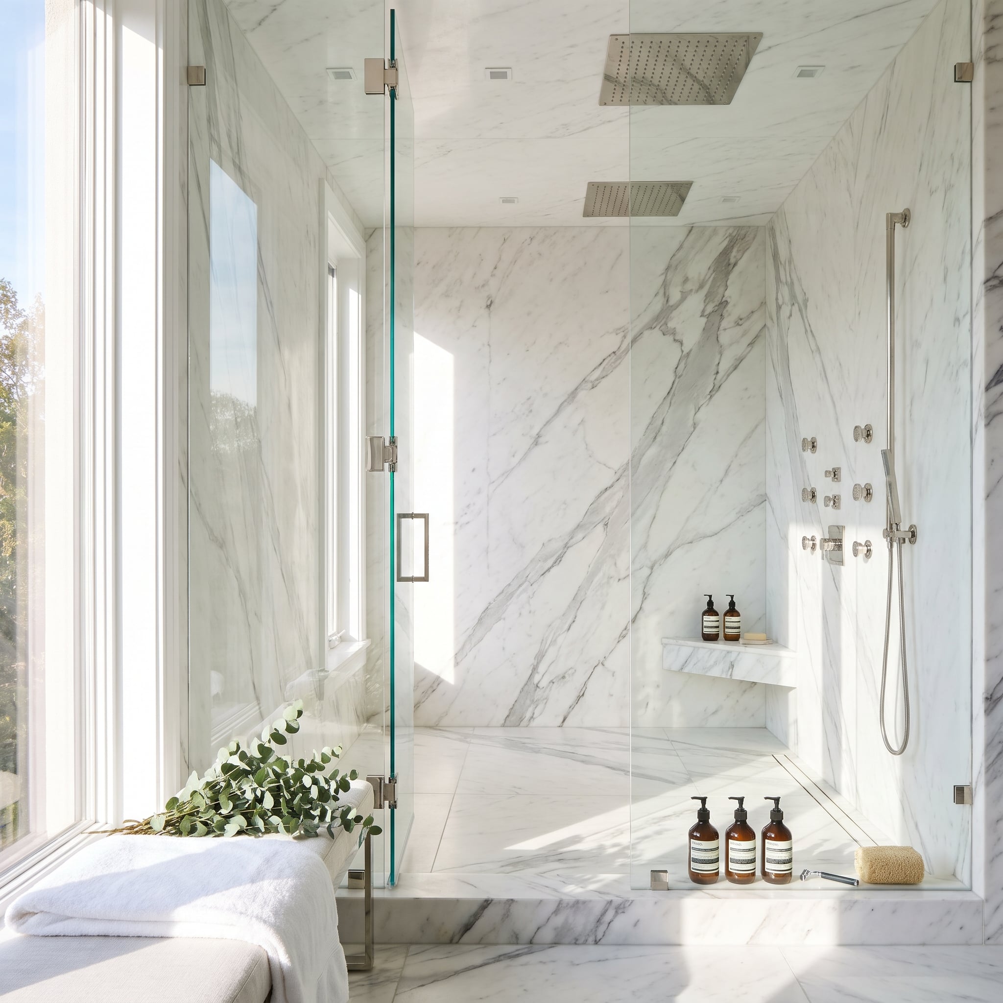
Calacatta marble covers the shower walls, floor, and ceiling. Twin rain heads and an array of body jets turn the enclosure into a substantial plumbing installation, while an integrated bench provides seating and a place for bathing essentials.
All those outlets are impressive until somebody tries to run them together. Adequate water supply, pressure, hot-water capacity, controls, and drainage determine what the system can actually deliver. A shower with six ways to get wet still needs enough water to make any of them worthwhile. The most important specifications are hiding behind the marble.
20. One Arch, One Carved Basin — Why Repeat a Good Idea Until It Stops Being Good?
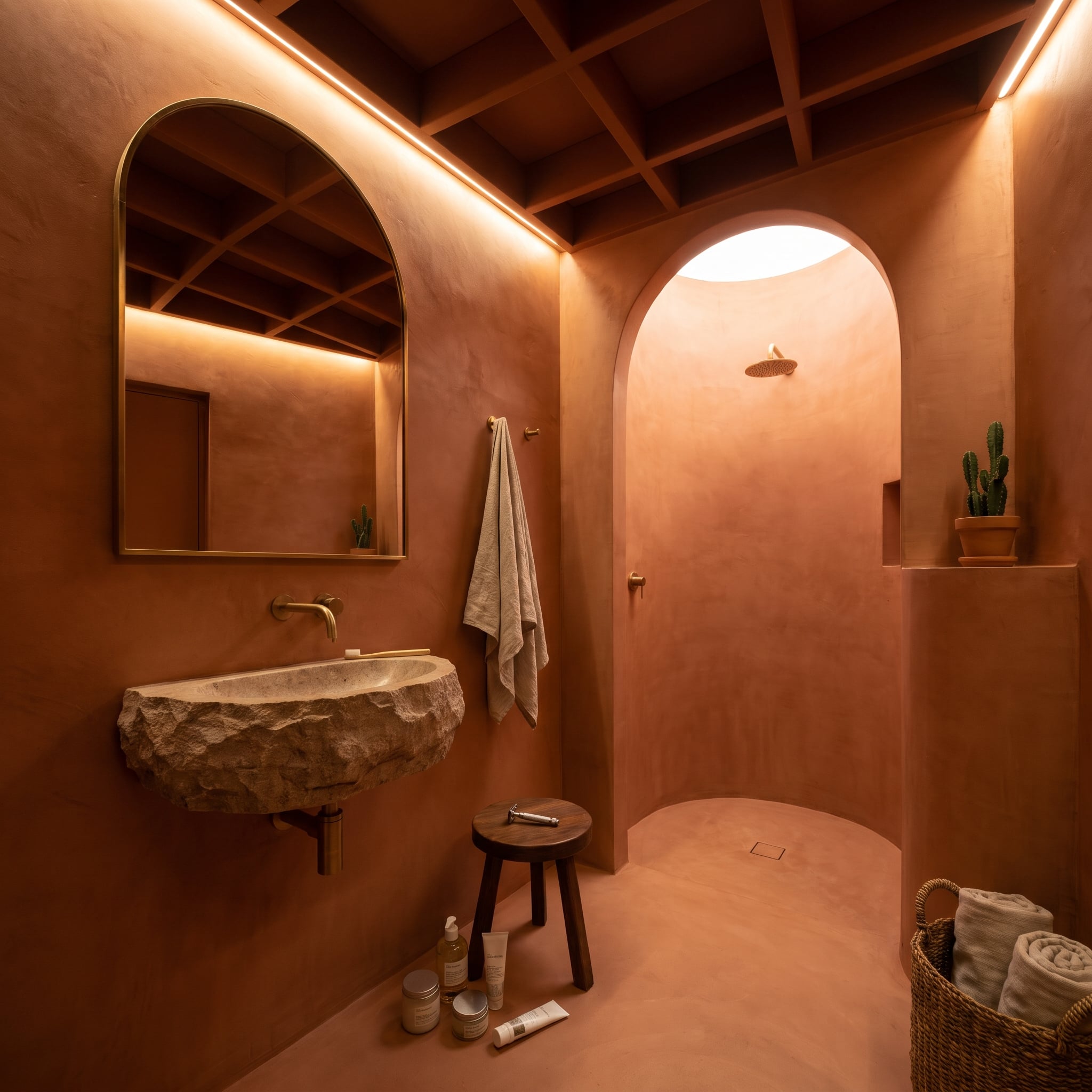
Terracotta-toned plaster gives the room warmth, while a carved stone basin introduces a heavier, more substantial form. The arched shower entrance interrupts the straightforward wall geometry without adding another material or decorative border.
The tall arch and rounded basin share a softness, but their proportions are entirely different. One creates an architectural opening; the other concentrates weight at the vanity. That difference makes the pairing more interesting than a room filled with identical curves. The strongest motif is often the one that knows when to leave the other surfaces alone.
19. The Towel Ladder Looks Wonderful. Can You Reach It From the Shower?
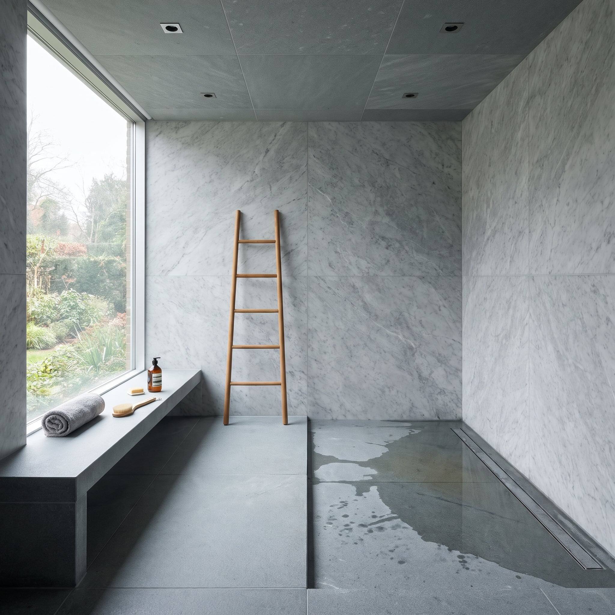
Carrara marble extends across the shower walls, with a linear drain preserving the floor’s clean appearance. A teak ladder introduces warmth and gives folded towels an attractive place against the pale stone.
The ladder’s usefulness depends on its distance from the shower exit and whether it remains stable on the floor. A towel that looks magnificent from across the room is considerably less useful when somebody needs it immediately after bathing. Storage has to work from the position of the person using it, not simply from the camera’s angle.
18. The Toilet Got the Leftover Corner. The Onyx Got the Spotlight.
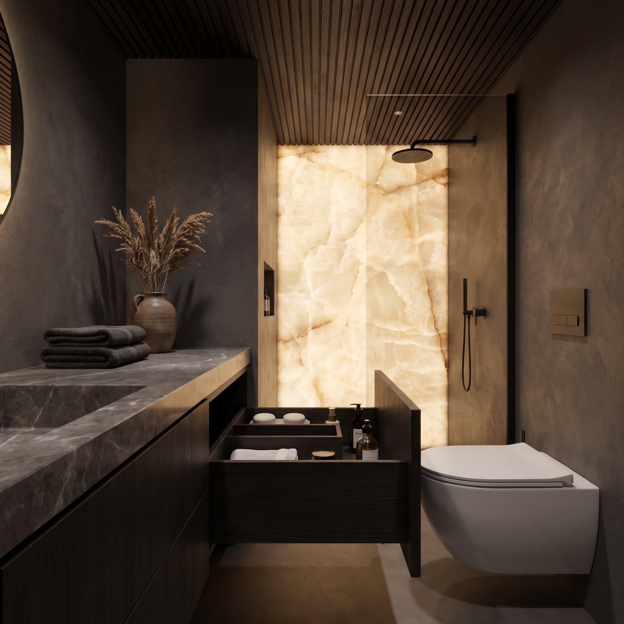
Charcoal plaster, a slatted timber ceiling, and a glowing onyx shower wall create an atmospheric interior. A wall-hung toilet occupies the narrow space beside the shower, separated from the vanity by a dark partition. Pull-out storage extends into the same circulation area.
The onyx gets a spectacular illuminated wall. The toilet gets a corner between two vertical surfaces, with the open drawer demonstrating how quickly the available space can shrink. Wall-hung fixtures reduce visual bulk, but they don’t eliminate the need for comfortable side clearances and unobstructed access. Apparently, the materials budget was more generous than the floor plan.
17. Three Textures, One Pale Palette — Why the Glass Is Doing More Than You Think
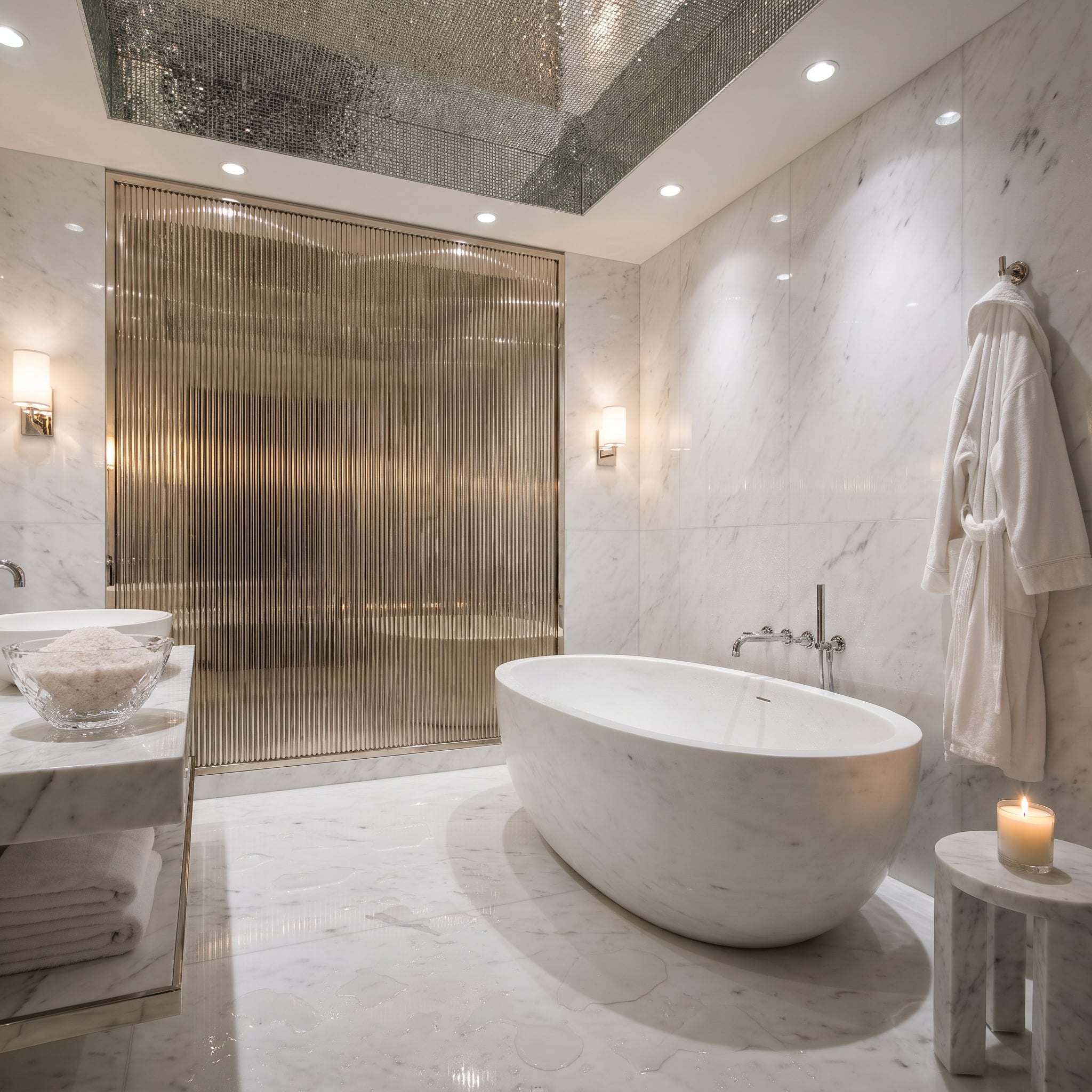
White Carrara marble covers the principal surfaces, with a matching bathtub reinforcing the pale palette. Fluted glass introduces narrow vertical ribs, while the mosaic ceiling supplies a finer repeating pattern. Champagne-toned metal frames the partition.
The fluted glass provides visual screening without closing off the shower. Its ribbed surface also adds texture without another color, although the grooves can demand more attention during cleaning, particularly where mineral deposits accumulate. The partition is doing three jobs at once: separating water, softening sightlines, and supplying decoration. That’s considerably more useful than a purely ornamental flourish.
16. The Bathtub Is Magnificent. Getting Around It Is Another Matter.
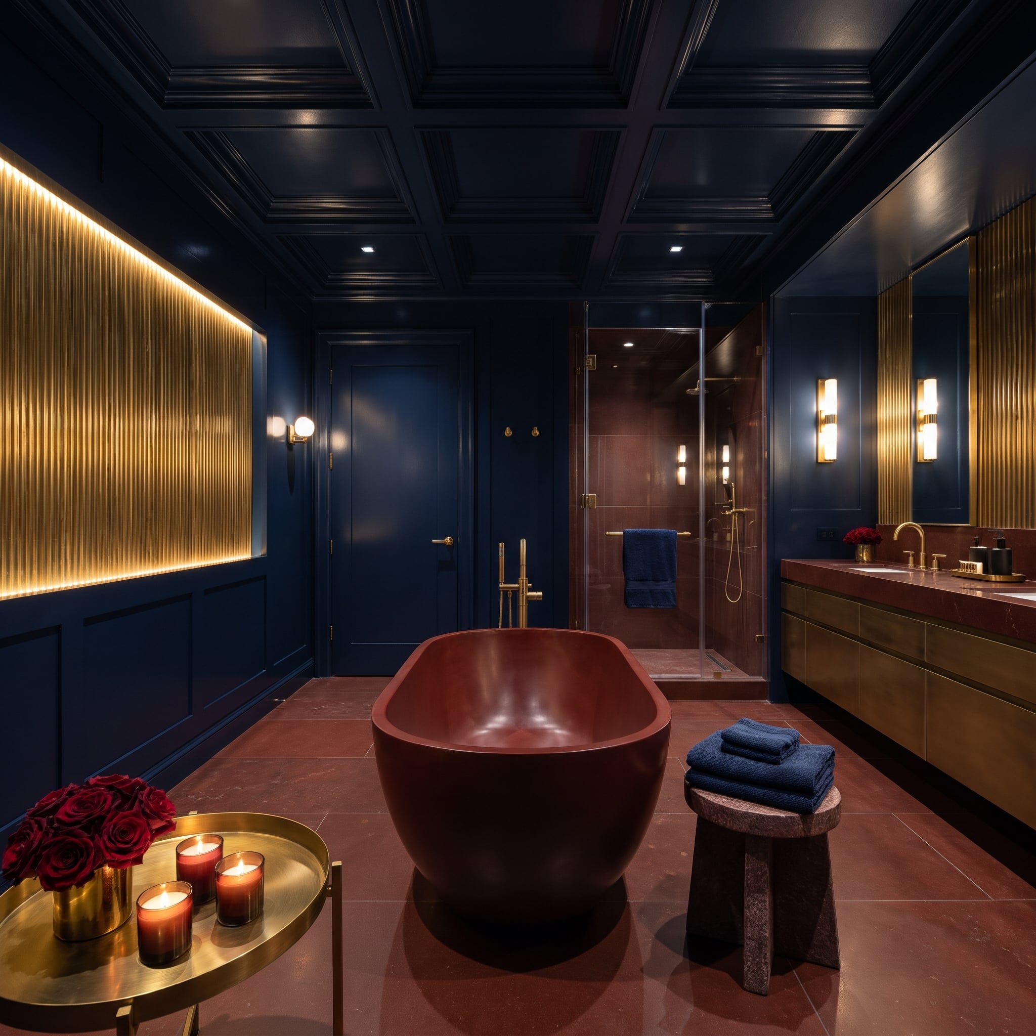
Deep navy paneling surrounds a substantial burgundy stone bathtub, while fluted brass surfaces introduce vertical texture. A small stone stool adds another sculptural element beside the bath.
The tub’s imposing form makes the surrounding floor space particularly important. Its rim projects beyond the bathing area, and the stool occupies additional room beside it. Entry, cleaning, and movement all depend on adequate clearance around both objects. A magnificent bathtub deserves enough space to be admired without requiring everyone to navigate it sideways.
15. Beautiful Mosaic, Terrible Grout — The Detail That Can Undo an Entire Wall
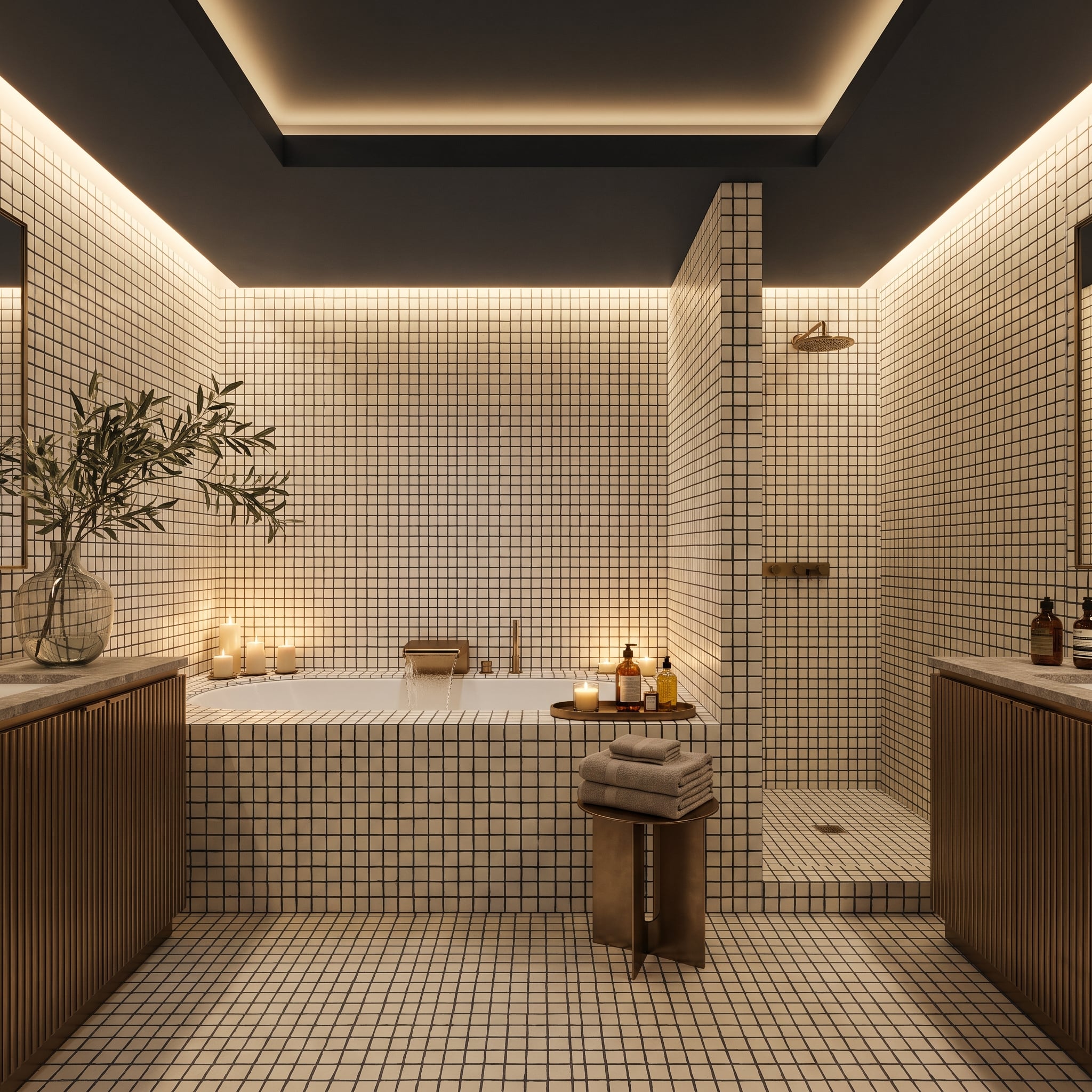
Cream mosaic covers the walls in a fine, repeated texture. Concealed cove lighting softens the ceiling edges, while brass fixtures introduce a warm metallic accent.
With small-format tile, grout becomes a major part of what the eye sees. Joint width, alignment, and color can make the surface read as a delicate texture or a busy grid. Grazing light reveals irregularities that flat illumination might conceal. A beautiful mosaic installed with careless joints is rather like a tailored suit with crooked seams: the expensive material only makes the mistake more obvious.
14. Travertine by Day, Walnut After Dark — Did Anyone Test the Lighting Twice?
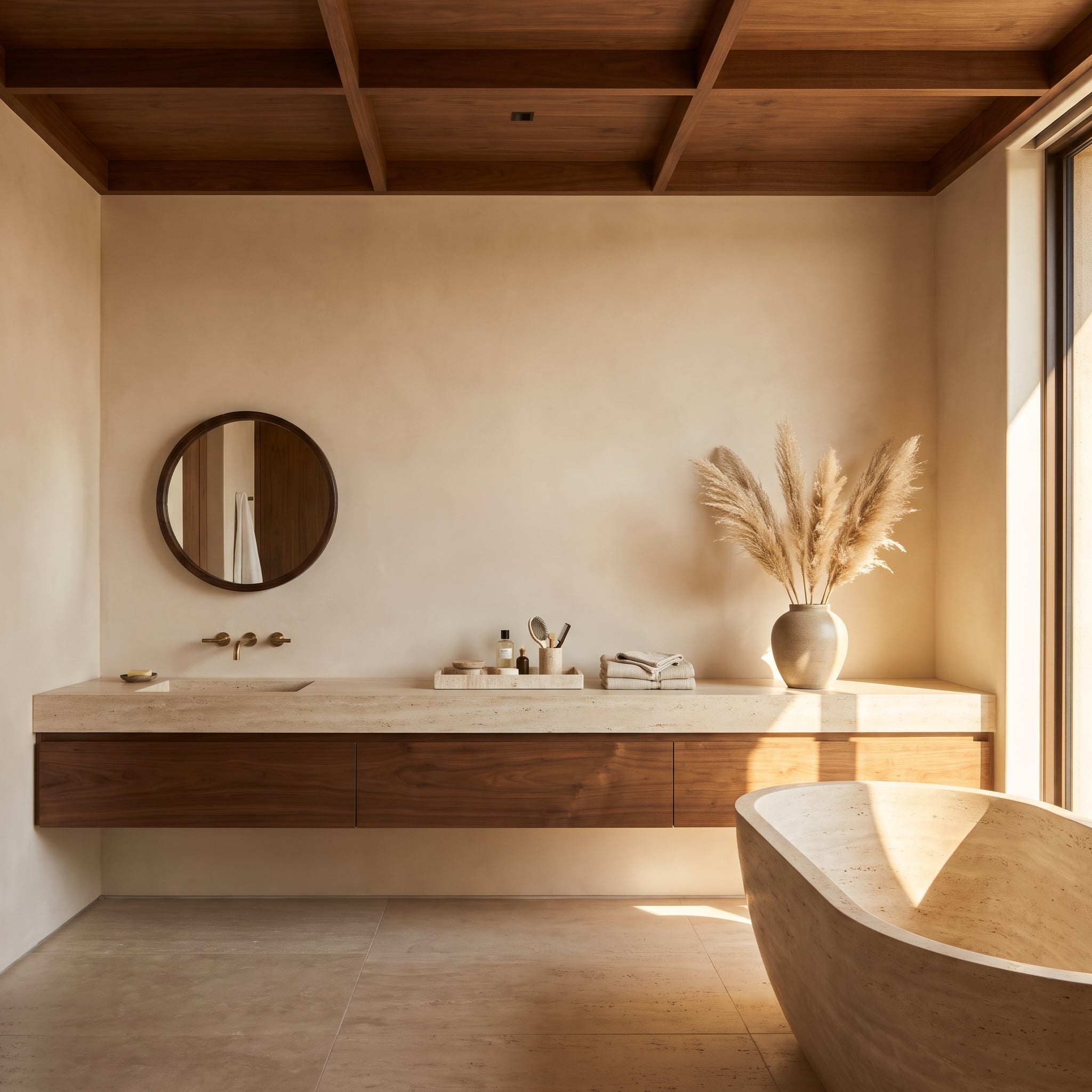
Afternoon light moves across a travertine countertop, emphasizing its subtle color variations. Walnut cabinetry and a coffered timber ceiling introduce stronger grain, while brass fittings reinforce the warm palette.
Travertine and walnut respond differently as the light changes. The stone’s pale surface can appear warmer or cooler depending on illumination, while the timber shifts from golden brown toward deeper tones. Artificial lighting needs to preserve the relationship after dark without turning the travertine yellow or flattening the wood grain. A material palette chosen in sunshine deserves a second inspection after sunset.
13. Red Lacquer, Brass, and Black-and-White Hexagons — Somebody Had to Set the Rules
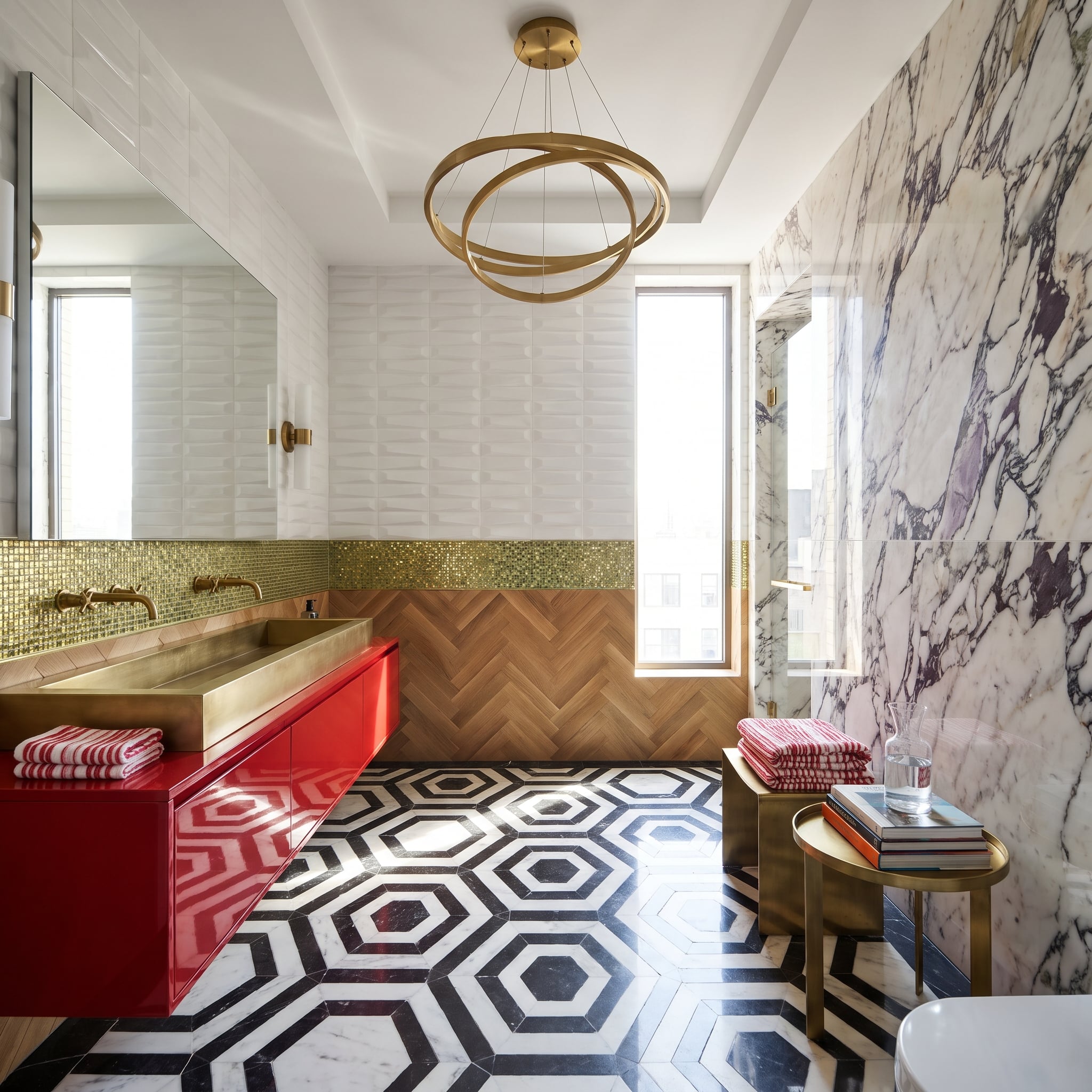
A red lacquer vanity supports a brass basin, while black-and-white hexagonal tile introduces a graphic pattern beneath the warm metallic fittings. Sharp contrast, glossy color, and polished metal all compete for attention.
The hexagons provide the discipline. Their repeated geometry establishes a regular rhythm beneath the more expressive cabinetry, while brass connects the warmer elements. Another unrelated pattern would risk turning the composition into a shouting match. The room gets away with its exuberance because the floor maintains some order.
12. Recessed Storage — The Most Useful Inches Are Sometimes Inside the Wall
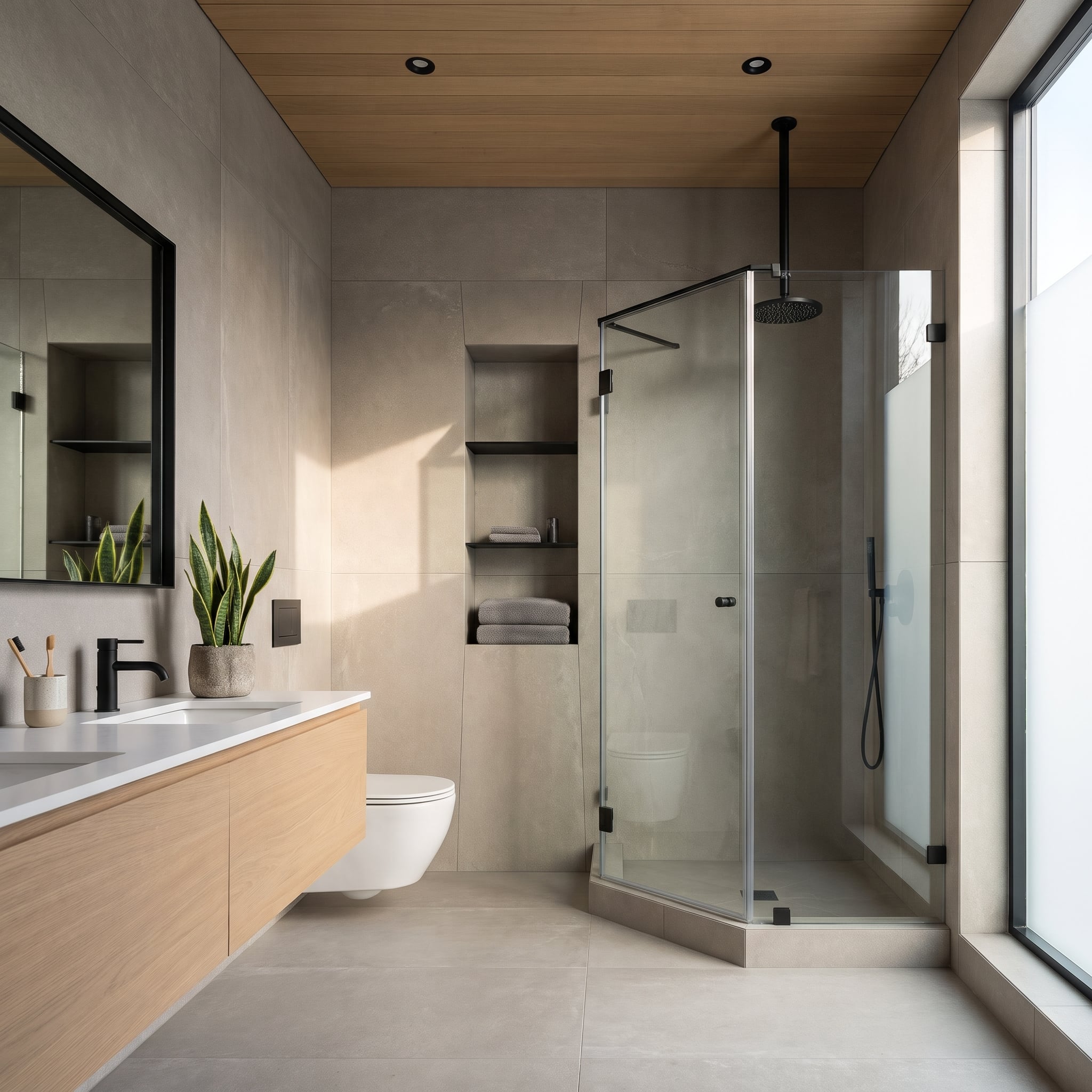
Large-format concrete-look tile establishes broad gray surfaces, while a floating oak vanity introduces warmth. Matte black fittings sharpen the contrast, and recessed wall niches accommodate folded towels without projecting into the room.
Those niches preserve circulation space and keep the wall visually clean. Their usefulness depends on having enough depth and height for the intended contents, with construction that allows the recesses to be properly detailed. A shelf can always be added later. A well-integrated wall recess needs to be considered before the wall is finished.
11. The Marble Is Wild. The Ceiling Is Strict. That’s Why They Work.
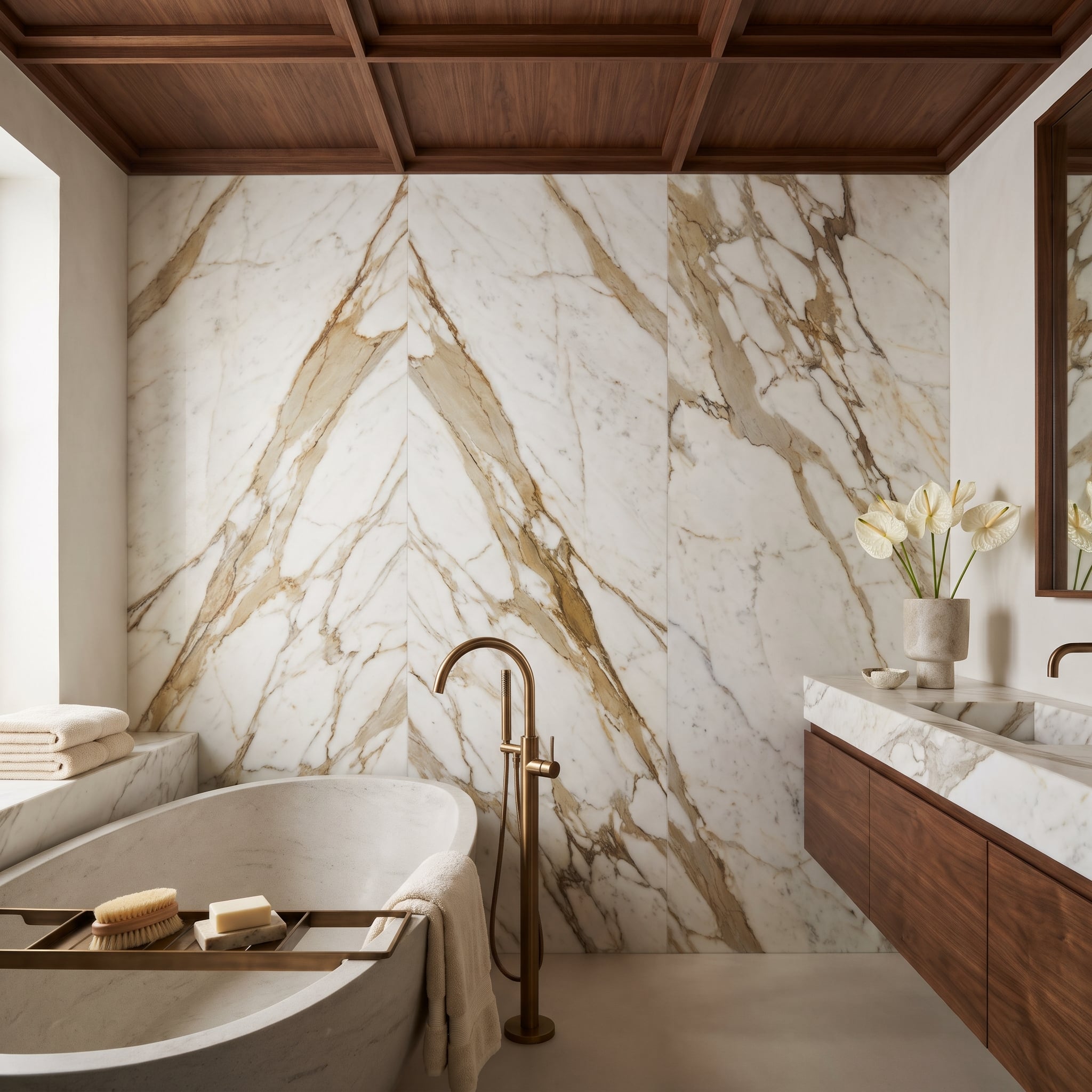
Gold and amber veins sweep across the Calacatta Gold wall, mirrored around a central seam. Above, a walnut coffered ceiling establishes a regular grid. The marble follows unpredictable lines; the timber insists on order.
Book-matching turns adjacent slabs into a mirrored composition, making the seam an intentional part of the design. The ceiling supplies a disciplined counterweight because its geometry stays consistent. Two strong patterns coexist because they speak different visual languages. The marble improvises. The walnut keeps time.
10. A Bathtub, a Book, a Glass of Wine — Why Is Everything on the Floor?
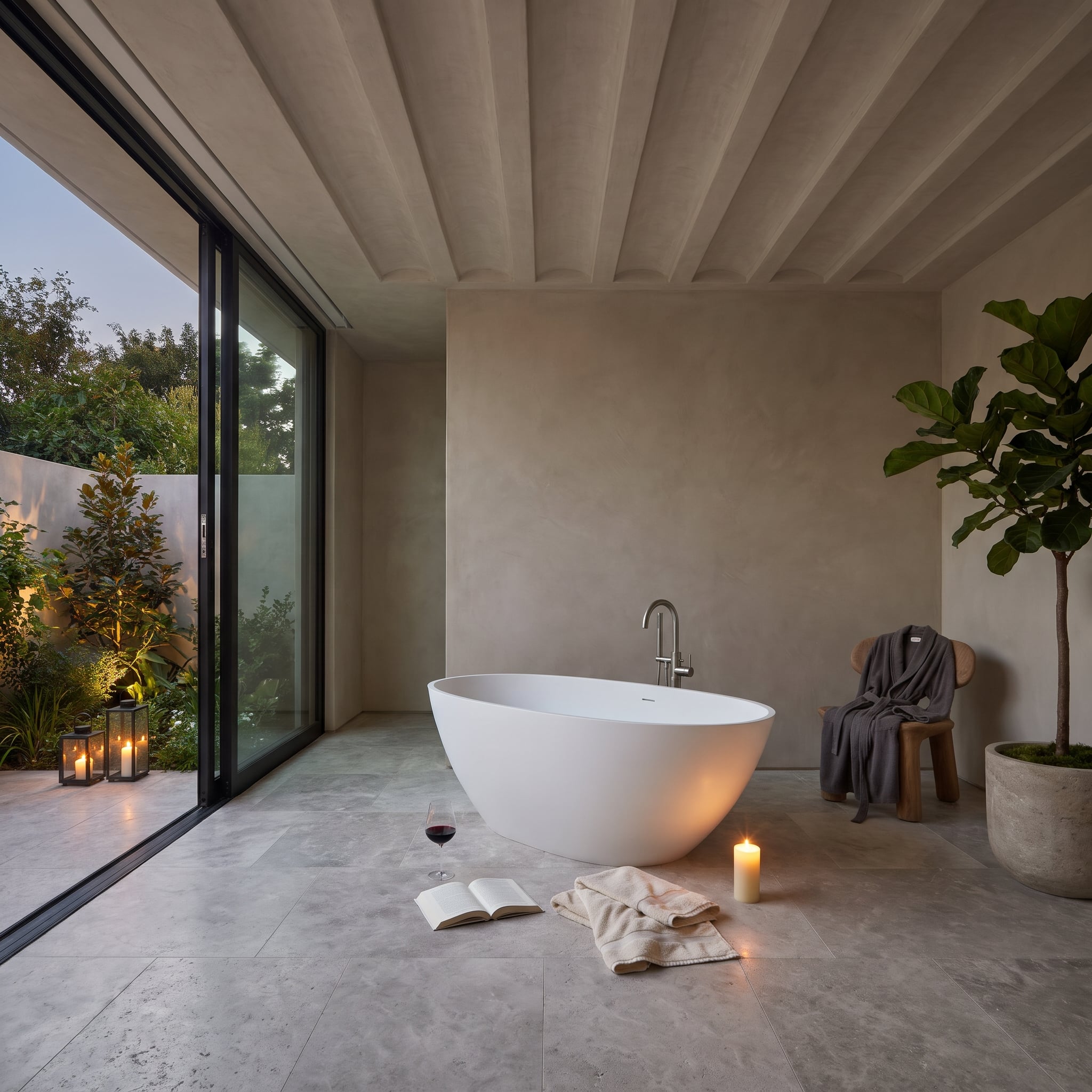
Warm greige plaster, a ribbed ceiling, and sliding glass doors create a restrained architectural setting. The freestanding bathtub sits beside candles, a book, a glass of wine, and a folded towel.
Every accessory has found its way to the floor. The bathtub enjoys generous space and an elegant silhouette, but there’s no obvious ledge for the things somebody might actually use while bathing. A small waterproof table or discreet built-in shelf could solve the problem without disturbing the composition. The book deserves better than the tiles, and the wine certainly does.
9. Black Marble, Crystal Decanters, and Vanity Lights That Miss the Point
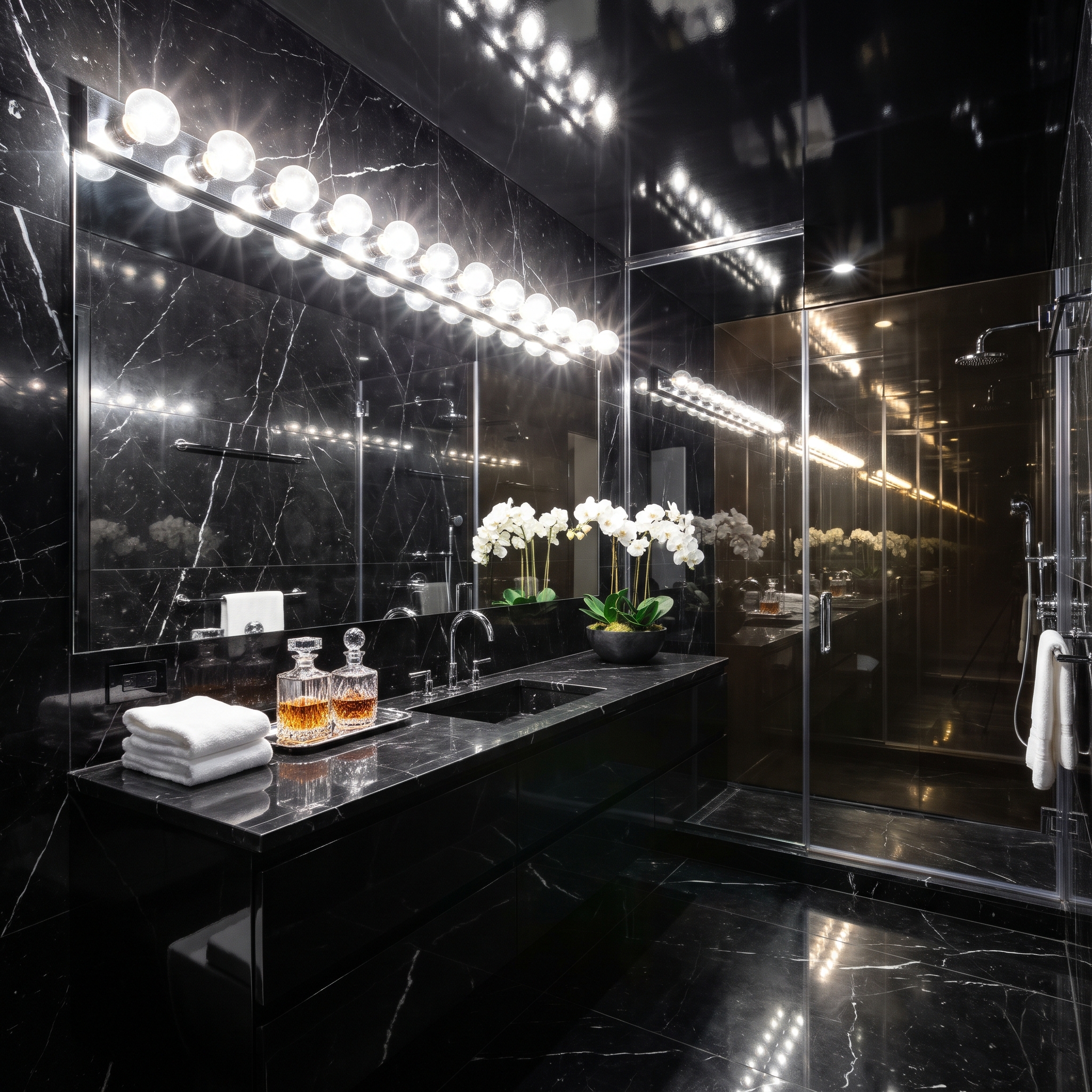
Black marble with bold white veining gives the bathroom its theatrical character. Crystal decanters, polished fittings, and folded towels bring order to the countertop. Above the mirror, exposed globe bulbs provide the principal vanity lighting.
Overhead-only illumination can cast shadows beneath the eyes, nose, and chin, regardless of how spectacular the surrounding marble appears. Side-mounted fixtures or properly designed integrated mirror lighting can deliver a more even result. A bathroom shouldn’t require theatrical lighting to perform the very ordinary task of showing somebody’s face.
8. The Wall Niche Earns Its Keep. The Cedar Ceiling Supplies the Character.
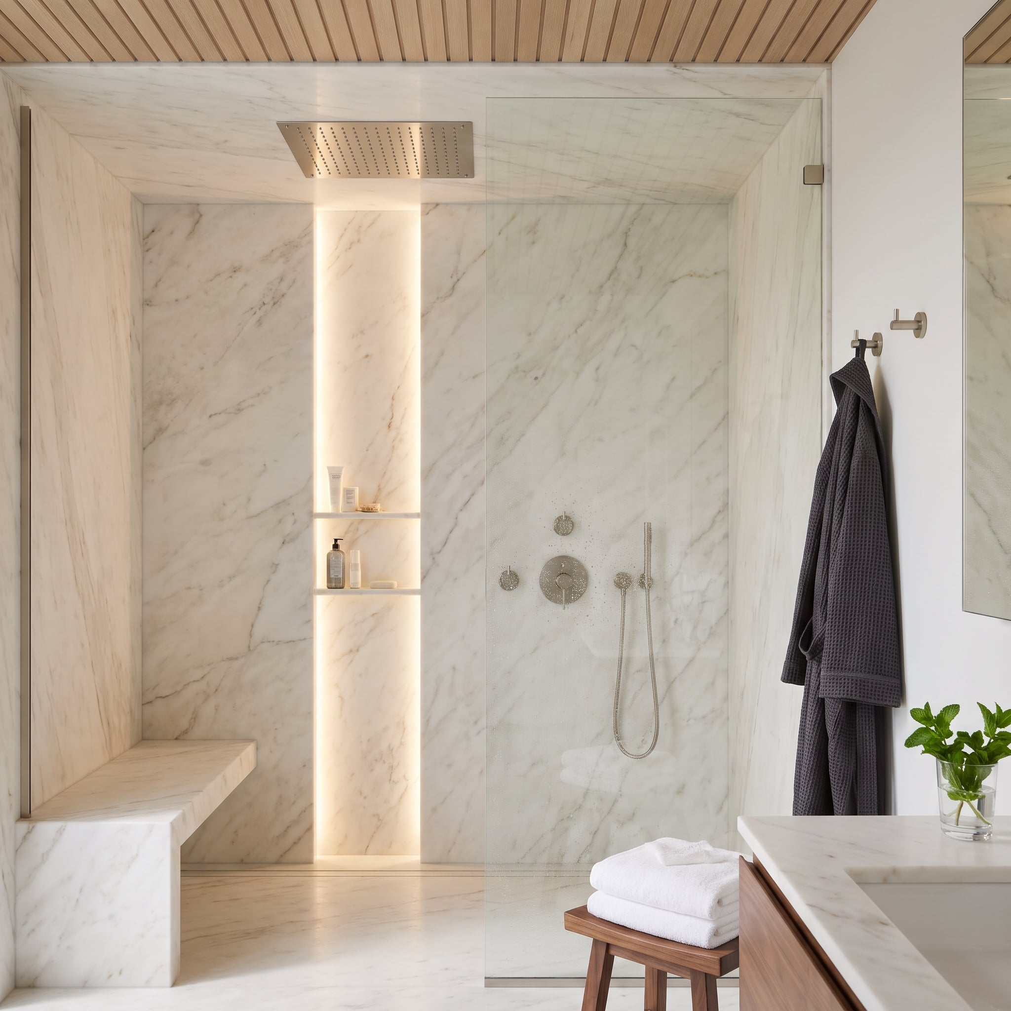
Marble covers the walls, while a cedar slat ceiling introduces warmth and a finer horizontal texture. Brushed nickel fixtures maintain the restrained palette. A tall illuminated niche interrupts the stone with a narrow vertical opening.
The niche provides storage without projecting into the room, and concealed lighting makes its contents easier to see. Its vertical proportions contrast with the cedar slats overhead, adding another layer of geometry without another material. The wall performs a practical job while the ceiling provides the decoration. A sensible division of labor.
7. Dark Tile Can Swallow a Shower. This Window Changes the Equation.
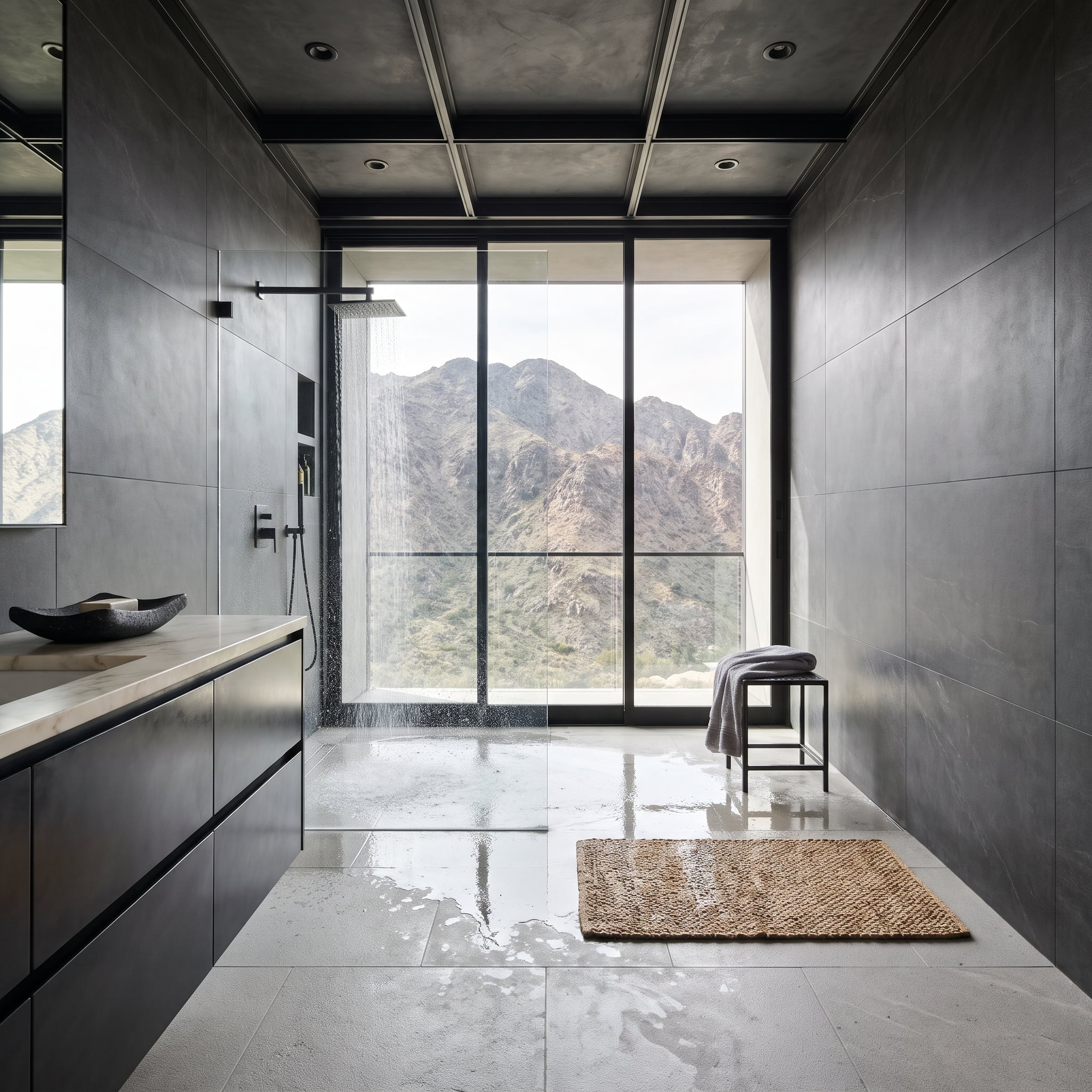
Charcoal porcelain covers the walls and ceiling, creating an almost continuous dark enclosure. A broad steel-framed window interrupts the stone, while the matte black rain head and restrained fittings avoid competing with the opening.
The window breaks the enclosure’s visual weight and introduces daylight where the dark tile would otherwise absorb much of it. Its proportions and position become the organizing feature of the shower. The glazing and surrounding details need to suit a wet environment, but the architectural lesson is immediate: one carefully placed opening can accomplish more than another decorative finish.
6. The Bathtub Looks Like Sculpture. Cleaning Behind It Is Another Art.
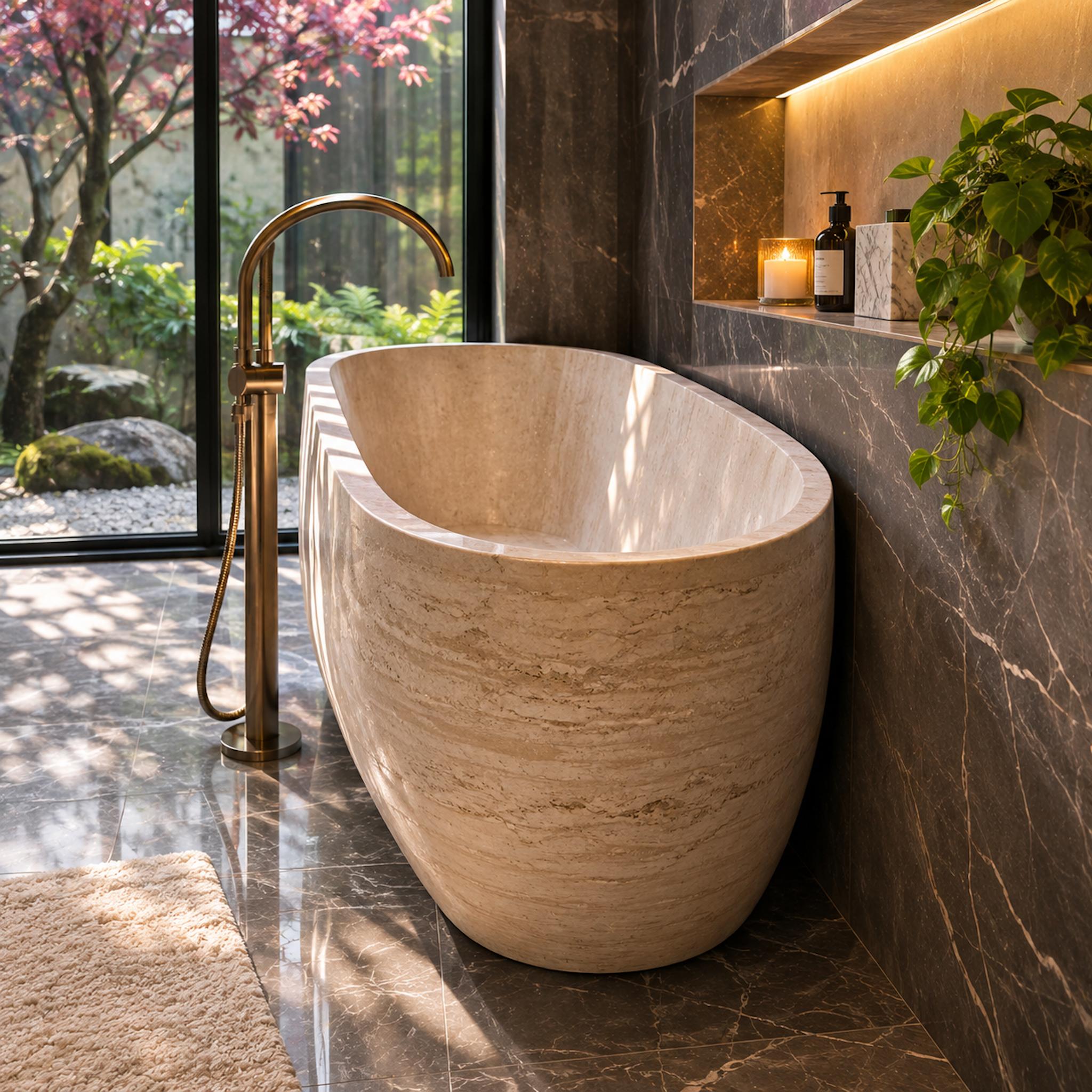
A pale stone bathtub sits beside a dark marble wall, with a broad garden window bringing natural light across the floor. A brass floor-mounted filler introduces a slender metallic accent, while an illuminated recess holds toiletries and greenery.
The tub’s curved exterior nearly meets the wall, creating a narrow space that may be difficult to reach with ordinary cleaning tools. Dust, moisture, and residue have a way of finding precisely these awkward gaps. Freestanding tubs need practical cleaning clearance or a properly detailed installation against the wall. Beautiful curves lose some of their charm when the mop cannot follow them.
5. Teak Slats in a Wet Shower — The Detail Behind the Spa Illusion
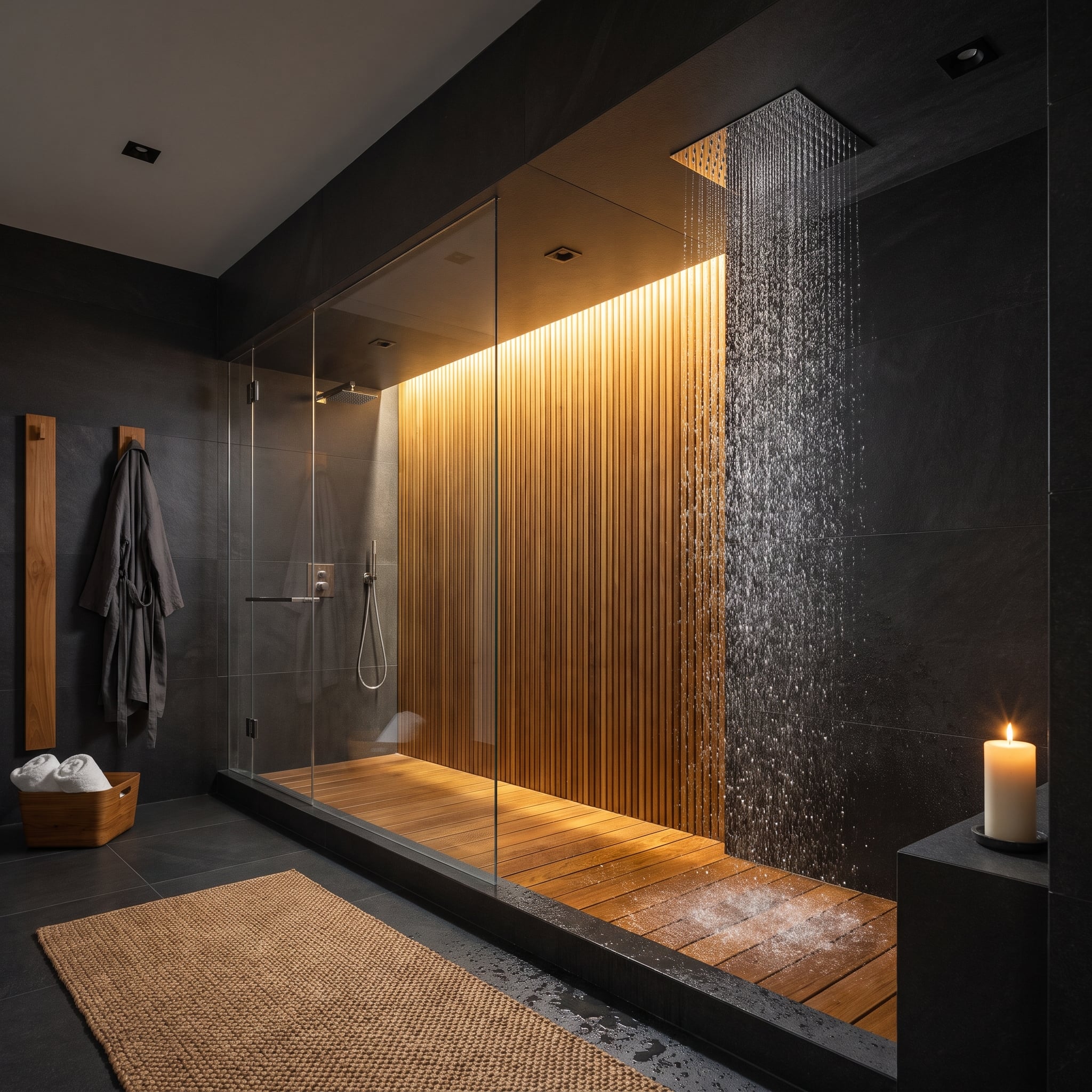
A broad rain head sends water against a backdrop of dark slate and vertical teak slats. Concealed amber lighting reveals the timber’s texture, giving the enclosure warmth against its darker stone surfaces.
Grazing light exaggerates the narrow shadows between the slats, making the wall appear deeper and more textured. The installation behind that effect is less glamorous: timber, concealed lighting, waterproofing, and drainage must all be detailed for repeated moisture exposure. The spa atmosphere is visible. The work that keeps it looking like a spa is hidden behind the wood.
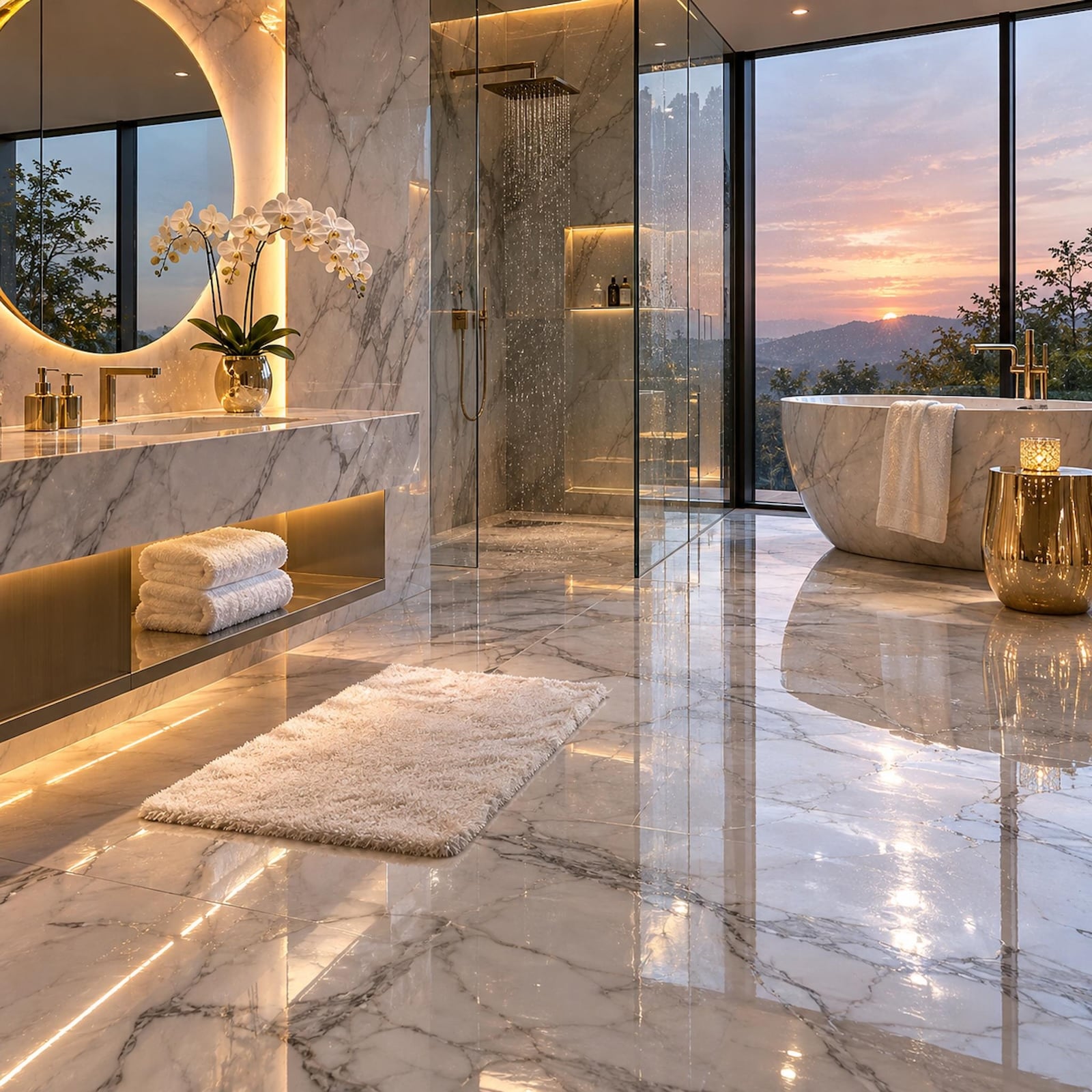
4. The Marble Floor Looks Like a Mirror. That’s Exactly the Problem.
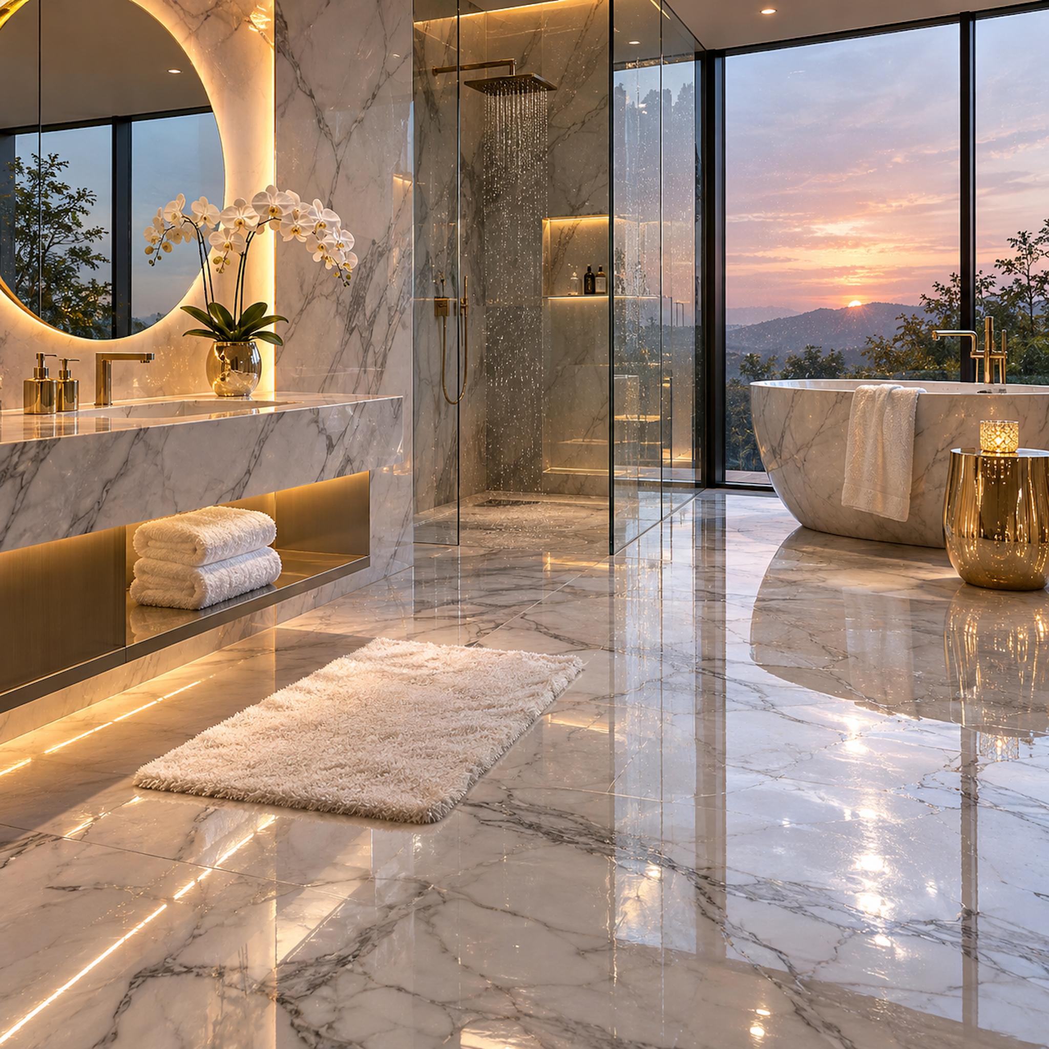
White marble stretches across an expansive bathroom, reflecting the illuminated vanity, glass shower, and sunset beyond the windows. A freestanding stone bathtub reinforces the pale palette, while brass details and concealed lighting complete the polished composition.
That mirror-like finish deserves scrutiny. Polished stone can become slippery when wet, particularly along the route between the shower, tub, and vanity. A photograph cannot establish a floor’s slip-resistance rating, but wet-area flooring should be selected for its tested performance as well as its appearance. Marble may be magnificent. Gravity remains unimpressed.
3. The Shower Bench Disappears Into the Marble. The Drainage Can’t.
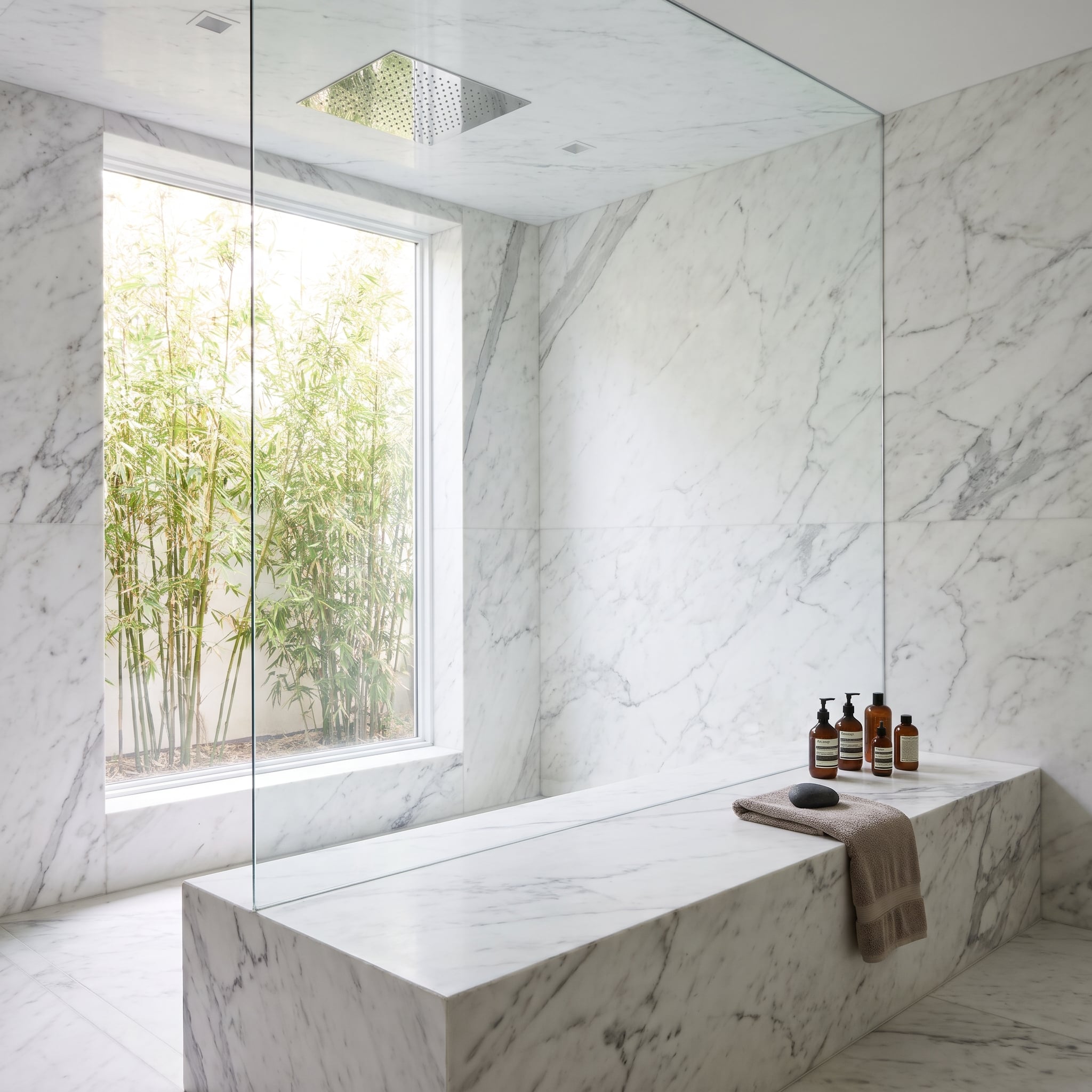
Statuary marble covers the shower walls and ceiling, while an integrated bench continues the same stone finish. A flush-mounted rain head preserves the clean overhead surface, and a window introduces daylight and greenery beyond the enclosure.
The bench appears carved from the surrounding architecture, with its matching finish minimizing the visual interruption. Its horizontal surface still needs appropriate slope and waterproofing so water doesn’t collect where someone sits. The cleaner the design looks, the more carefully the hidden construction has to work. Seamless marble is a visual achievement; reliable drainage is the practical one.
2. Indigo Zellige Is Supposed to Be Irregular. The Installation Isn’t.
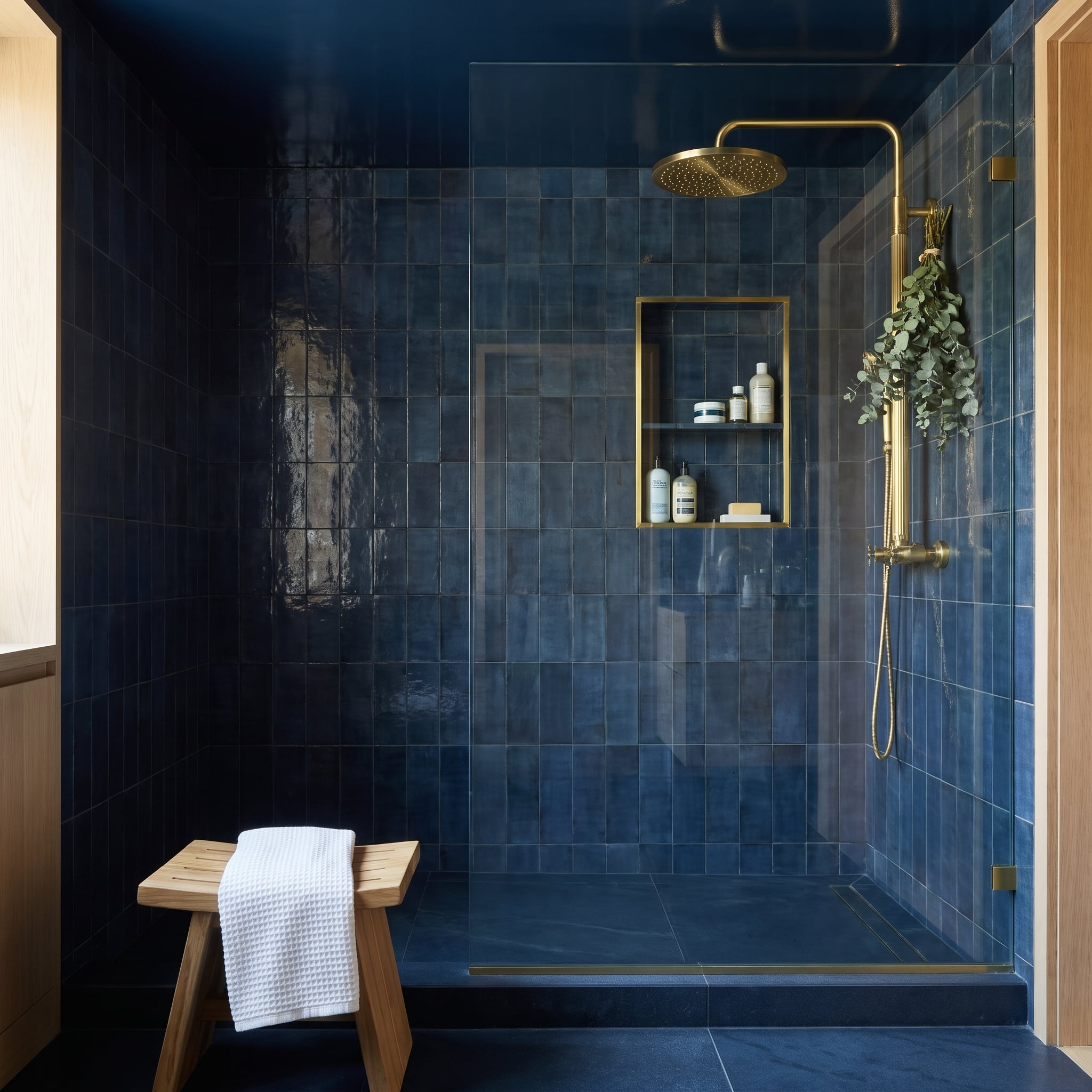
Deep indigo zellige covers the shower walls and floor, with variations in glaze giving the surface a richly irregular character. Brass fittings and niche trim provide crisp lines against the shifting blue, while eucalyptus and teak introduce natural accents.
The handmade character of zellige doesn’t excuse careless setting. Tile cuts, corner transitions, and niche placement become particularly noticeable against such a saturated surface. The brass trim establishes a clean boundary around the recess, allowing the surrounding tile to remain expressive. Irregularity is the attraction. Sloppy detailing is an entirely different matter.
1. Calacatta Viola, Glowing Onyx, and a Black Bathtub — Who Gets the Last Word?
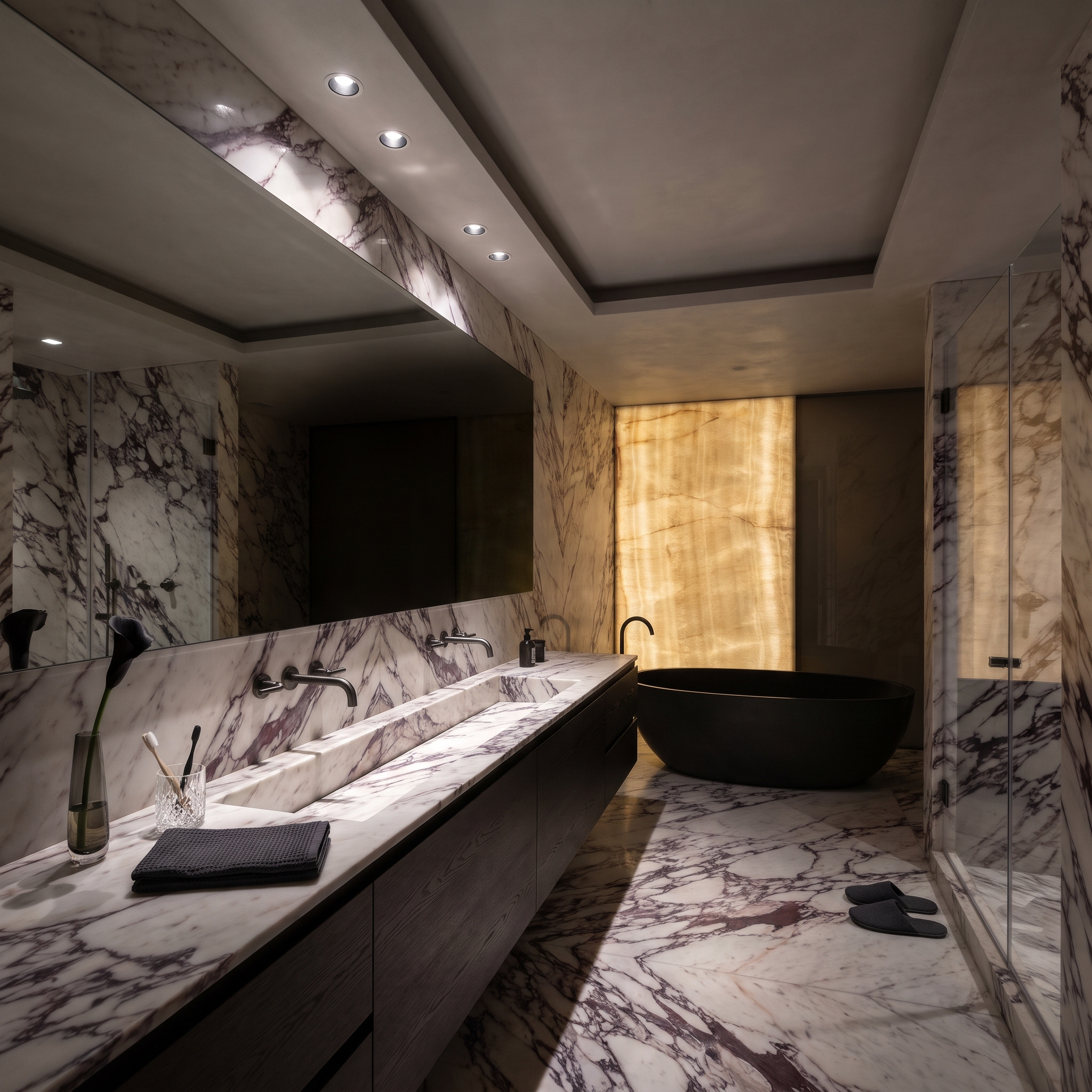
Calacatta Viola marble floods the room with burgundy veining. A backlit onyx panel introduces an amber glow, while a matte black freestanding bathtub cuts a stark silhouette against the illuminated stone. Three assertive elements occupy the same bathroom, each capable of commanding the room independently.
The black tub prevents the composition from becoming a contest between two spectacular stones. Its solid, unpatterned surface interrupts the restless marble and glowing onyx, giving the eye somewhere to settle. The most expensive-looking surfaces supply the spectacle. The simplest one holds the room together. Sometimes the smartest move in a bathroom full of showstoppers is knowing which surface should keep quiet.