🔥 Would you like to save this?
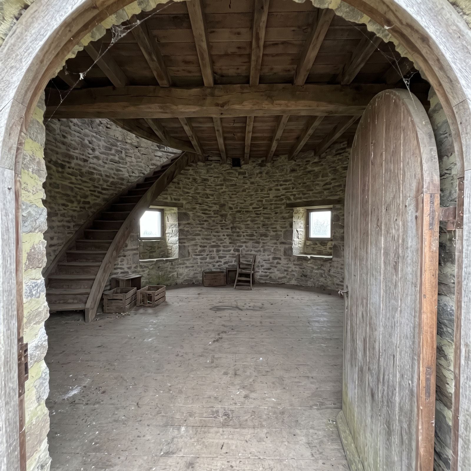
A windmill is architecture designed around a machine, not a family. That distinction becomes brutally obvious the moment you try to turn one into a home. The walls curve because grain once had to move through the center. Floors stack vertically because height mattered more than convenience. Masonry thick enough to outlive generations leaves precious little room for ducts, cabinets, plumbing runs, or the neat ninety-degree assumptions that make conventional interiors easy.
In order to come up with the very specific design ideas, we create most designs with the assistance of state-of-the-art AI interior design software. Also, assume links that take you off the site are affiliate links such as links to Amazon. this means we may earn a commission if you buy something.
Which is exactly why this wreck is such a good design problem. These 34 AI-generated concepts take the same abandoned stone shell and push it through radically different programs — kitchen, bath, bedroom, library, cinema, studio, bar, office, dining room, and several gloriously unreasonable living rooms. Some respect the tower’s geometry. Others overwhelm it with wallpaper, marble, velvet, or brass. A few would send a structural engineer reaching for a very large notebook. The fun is not pretending all 34 should be built. It’s watching one stubborn circular building expose just how much of interior design depends on deciding whether to fight the architecture or finally listen to it.
34. Warm Plaster and Candlelight Give the Ruin Its First Believable Second Life
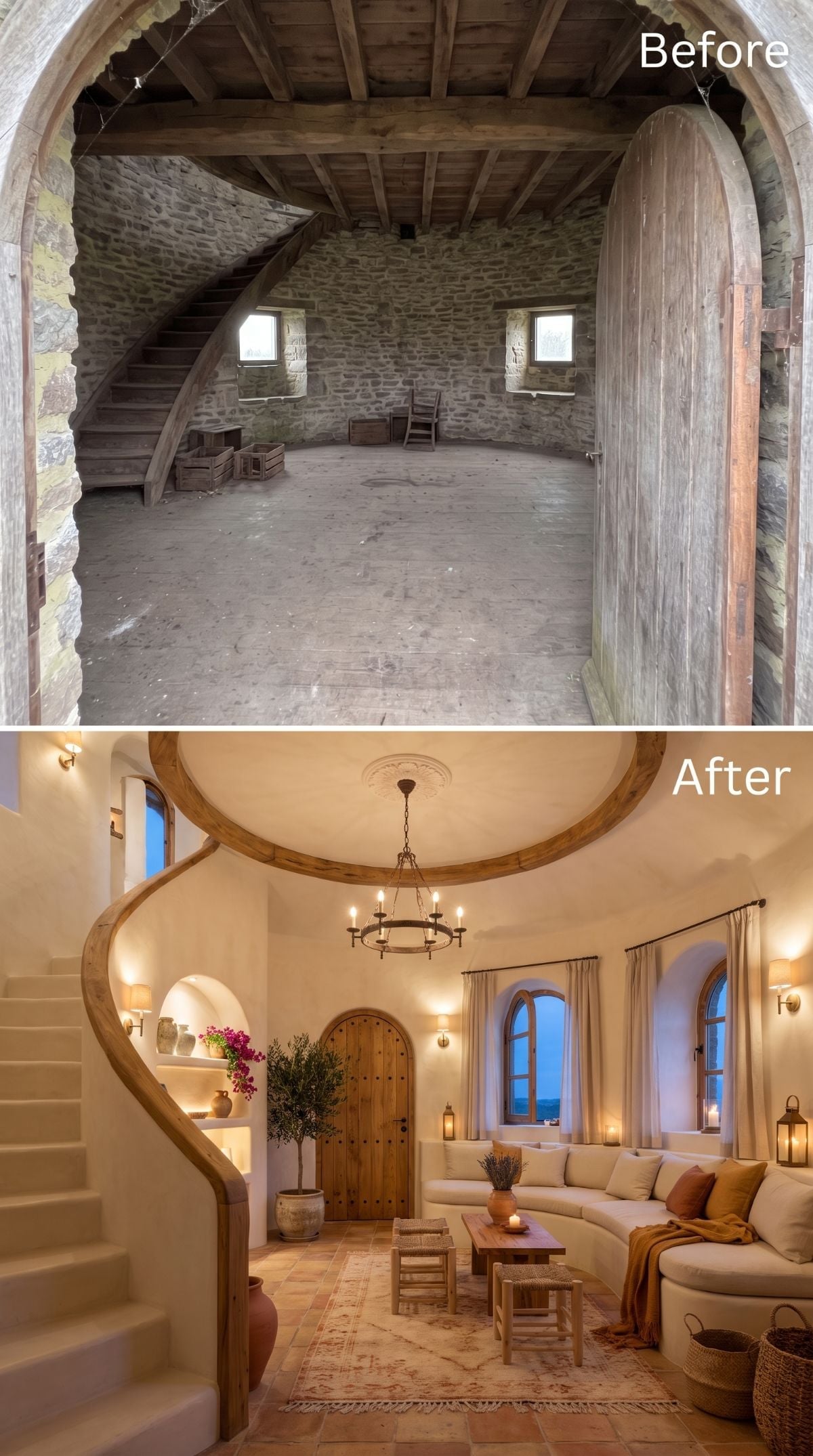
This first concept doesn’t try to turn the windmill into something exotic. It simply makes the existing geometry habitable. Smooth cream plaster follows the circular wall rather than flattening it, while a rebuilt spiral stair hugs the perimeter with a sinuous wood handrail. The oval ceiling detail above reinforces the room’s curves instead of introducing another hard-edged shape.
Arched windows frame blue evening light behind linen curtains, and an iron chandelier with exposed candle-style bulbs introduces just enough age without tipping into faux-medieval territory. As a first move, it’s smart: establish that the tower itself can carry a room before piling a theme on top of it.
33. The Curved Walls Finally Meet a Kitchen Willing to Curve With Them
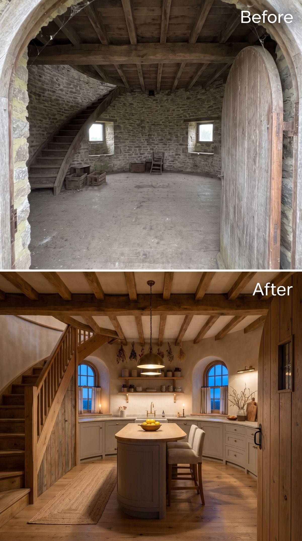
This may be the most architecturally honest concept in the gallery. Muted sage-gray cabinetry bends with the perimeter instead of pretending the room has straight walls, while an oval island occupies the center without jamming corners into circulation paths that don’t exist.
Exposed beams remain part of the ceiling expression, with warm plaster between them, and the arched openings are treated as assets rather than inconveniences. The cost implication is obvious — curved cabinetry and counters are custom work — but so is the spatial payoff. In an aggressively round room, rectangular kitchen planning can create expensive dead space just as quickly as it saves money.
Ask Yourself: Before forcing standard cabinetry into an irregular shell, identify which geometry is actually controlling circulation. Custom curves cost more, but a conventional layout surrounded by unusable wedges can be its own expensive mistake.
32. Art Deco Curves Turn the Tower Into a Jewel-Box Lounge
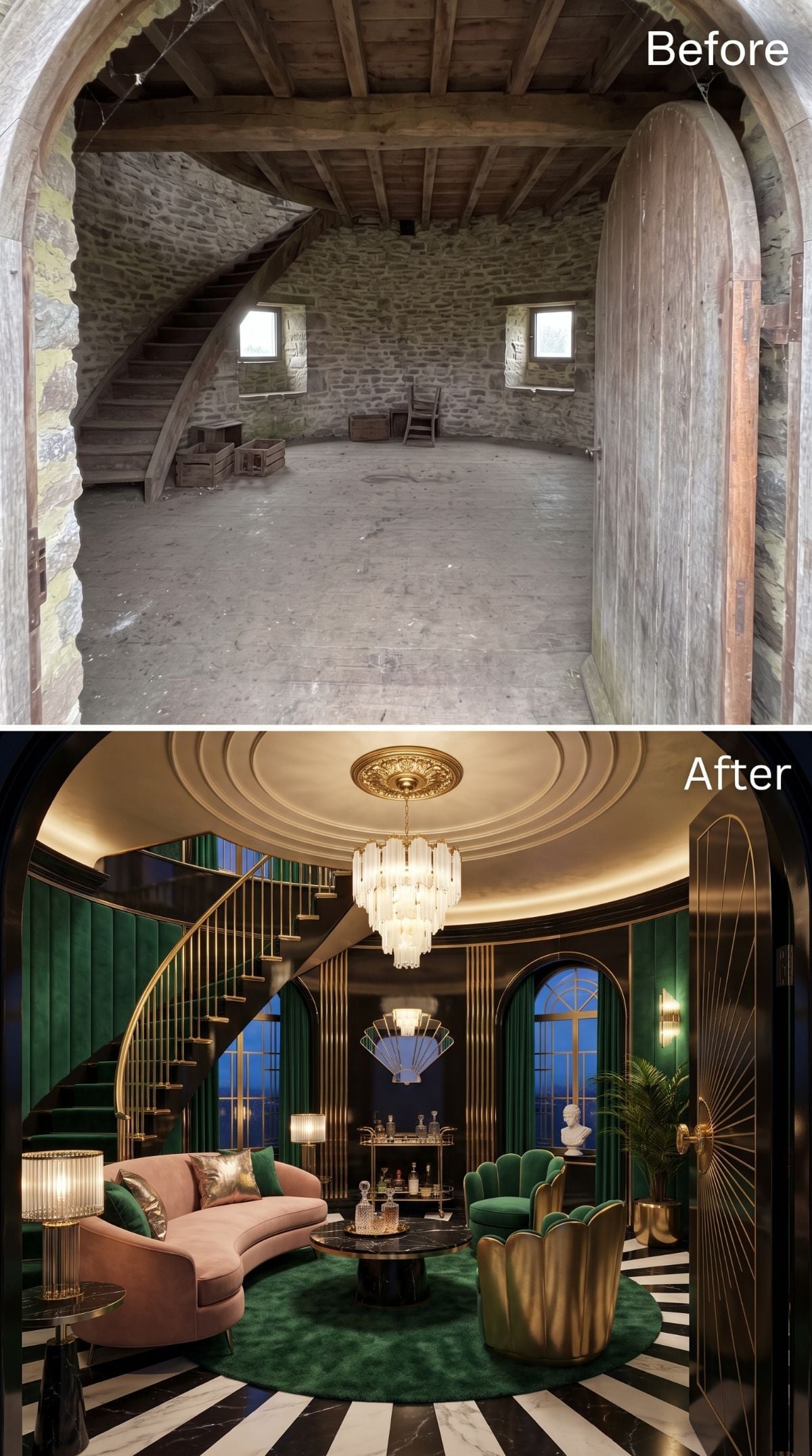
Art Deco may be one of the easiest style languages to make friends with a cylindrical room because it already knows what to do with curves. The rendering wraps the walls in gold-trimmed paneling, hangs emerald velvet at the windows, and sets a curved pink sofa against a scalloped green chair without allowing any one piece to become the novelty.
Black-and-white marble below gives all that softness a harder graphic base. Even the tiered chandelier makes sense here: the architecture is already theatrical enough to support something overhead that refuses to disappear.
31. A Japanese Soaking Room Finds Calm Inside the Round Stone Shell
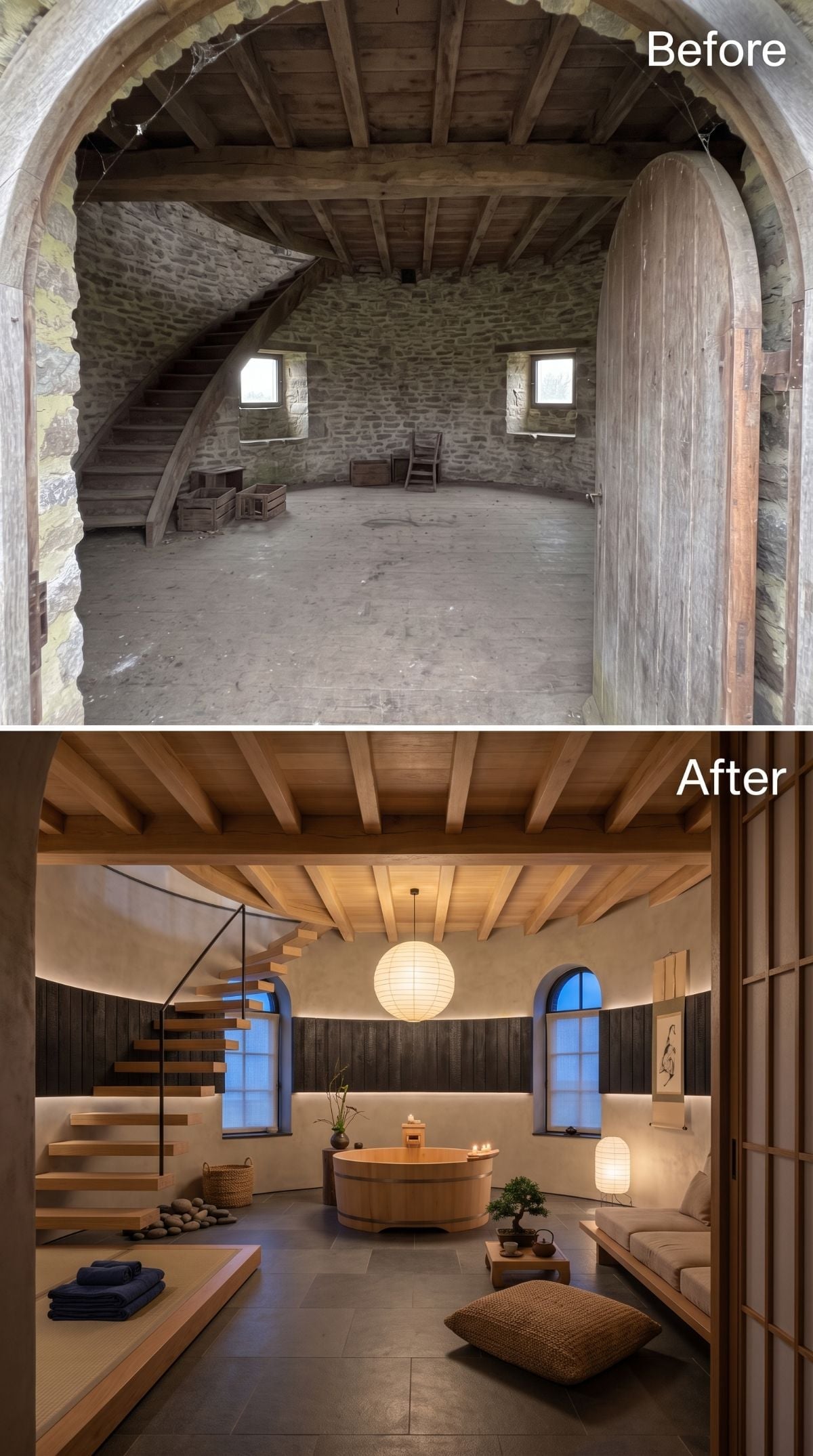
The next concept heads in the opposite direction. Tadelakt-style plaster, dark charred-wood paneling, a cedar ofuro-style tub, and one paper lantern reduce the room to surface, shadow, and proportion.
Floating oak treads trace the wall without visually closing off the stair, while low platform seating keeps the furniture below the window line. A bonsai, one hanging scroll, and undyed linen are enough. The tower’s odd proportions become less noticeable because nothing in the room is trying to correct them.
30. Alpine Chalet Warmth Makes the Old Stone Feel Built for Winter
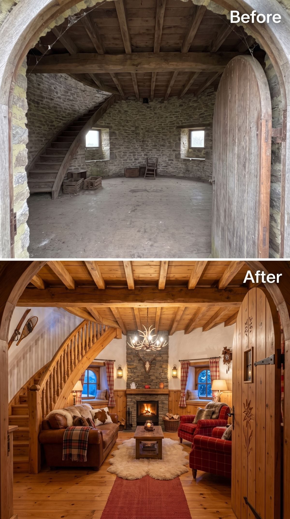
The chalet concept treats mass as an advantage. Pine-board wainscoting, a tall stacked-stone fireplace, tobacco leather, plaid wool, and sheepskin give the circular shell the kind of visual density a thin-walled contemporary room would struggle to carry.
The exposed beams and arched doorway remain visible in the rendering rather than disappearing behind a total stylistic makeover. Even the antler chandelier survives because the room is substantial enough to absorb it. Put that fixture over eight-foot drywall and things get dicey fast.
Scale Matters: A large rustic fixture needs architectural volume around it. Here the tall ceiling, timber, stone, and oversized fireplace give the chandelier enough company that it reads as part of the room rather than a prop suspended inside it.
29. A Sage Green Home Office Gives One Windmill Floor an Actual Job
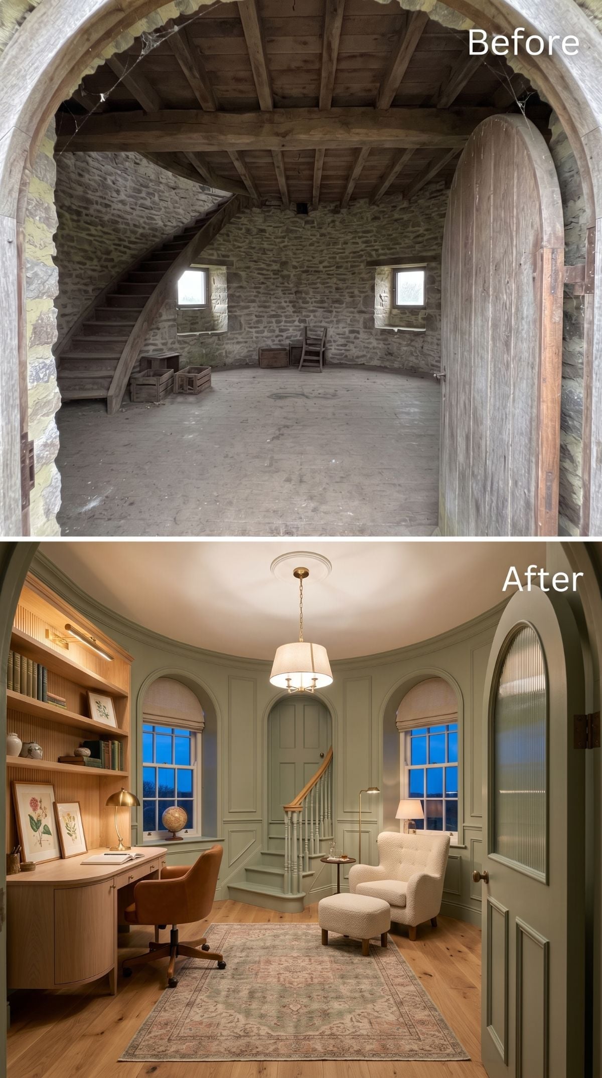
This is where the exercise becomes more useful than decorative. Sage millwork follows the curved wall into a built-in desk, giving one floor a clear function instead of merely furnishing another circular sitting room. Oak flooring, brass hardware, and arched paneling keep the work zone warm without turning it corporate.
A bouclé chair and ottoman make use of the remaining curve as a reading corner, while a drum pendant handles general light and the task lamp does the actual desk work. That’s the kind of hierarchy real rooms need: one fixture doesn’t have to solve every problem.
Color Note: Curved walls catch light at continuously changing angles, so paint can look noticeably different around the same room. Large test areas matter more here than a tiny swatch taped beside the door.
28. Moroccan Riad References Bring Color, Low Seating, and Lantern Light
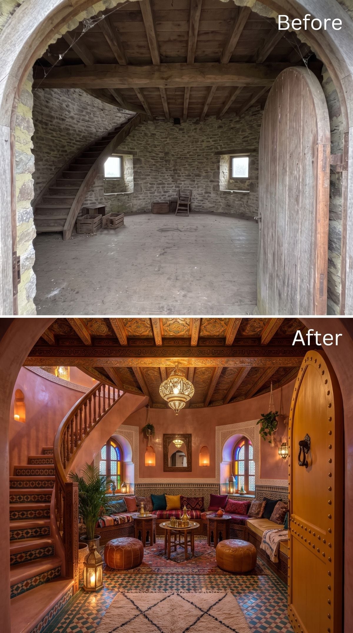
Warm terracotta plaster transforms the stone shell without erasing its weight. Low banquettes line the perimeter, jewel-toned textiles sit against patterned tile, and a hammered brass lantern drops into the center where a conventional furniture layout would struggle to establish one.
The concept borrows freely from Moroccan interiors — tadelakt-like walls, zellige-inspired tile, majlis-style low seating, carved plaster, heavy timber doors — without pretending the windmill has somehow acquired a different history.
Why the Arched Door Matters
The studded timber door works because the existing opening already has architectural authority. Instead of adding another decorative focal point, the rendering lets the threshold become one. In a room this rich, knowing where not to add another pattern is half the design.
27. A Jungle Bathroom Turns the Circular Floor Into a Greenhouse With a Tub
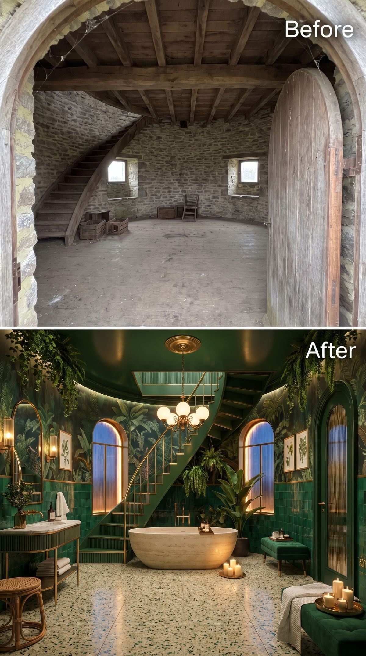
Deep botanical wallpaper wraps the curved wall continuously, which is exactly where a pattern like this gets interesting. There are no conventional corners to stop it, so the foliage behaves almost like scenery surrounding the tub.
Terrazzo holds the floor visually quiet while a stone-resin bath occupies the center beneath a brass chandelier. Plumbing a tub in the middle of a centuries-old tower would be another conversation entirely, but as a spatial idea, central placement finally makes the circle feel deliberate.
26. Walnut, Orange, and Brass Drop a 1960s Living Room Into Medieval Stone
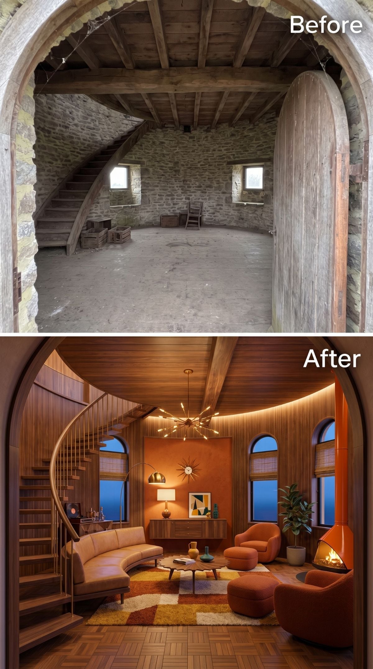
A curved cream sofa, walnut paneling, Sputnik chandelier, orange cone fireplace, and shag rug turn this into a concentrated hit of late-Midcentury exuberance. The strange part is how naturally the period fits the tower.
The reason is geometry. Midcentury furniture was never afraid of circles, ovals, radiating fixtures, or sculptural hearths. The rendering doesn’t have to disguise the windmill’s footprint because the furniture already knows how to live without a straight wall behind every piece.
History Corner: Traditional tower mills often relied on very substantial masonry near the base. That mass can moderate indoor temperature swings, but thermal mass and insulation are not interchangeable. Any real conversion would still need a building-specific approach to heat loss, ventilation, moisture, and condensation.
25. Ivory Plaster and a Lantern Create a Garden-Room Foyer
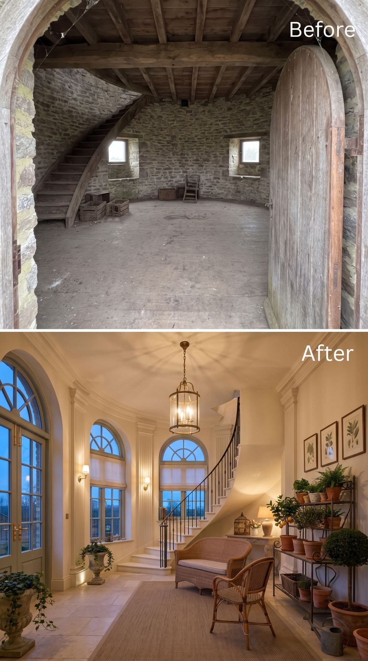
Smooth ivory plaster quiets the shell enough for the staircase to become the dominant line. Wrought iron follows the wall upward, while a brass lantern occupies the vertical center without competing with the railings.
Rattan chairs, terracotta pots, and botanical prints keep the concept somewhere between foyer and garden room. That informality matters. Without it, the lantern and ironwork could easily push the space toward hotel lobby.
Try This: In a stair hall, pendant height is governed by sightlines and clearance before atmosphere. A large lantern can occupy plenty of visual space without hanging low enough to interfere with circulation.
24. A Pottery Studio Makes the Old Agricultural Shell Useful Again
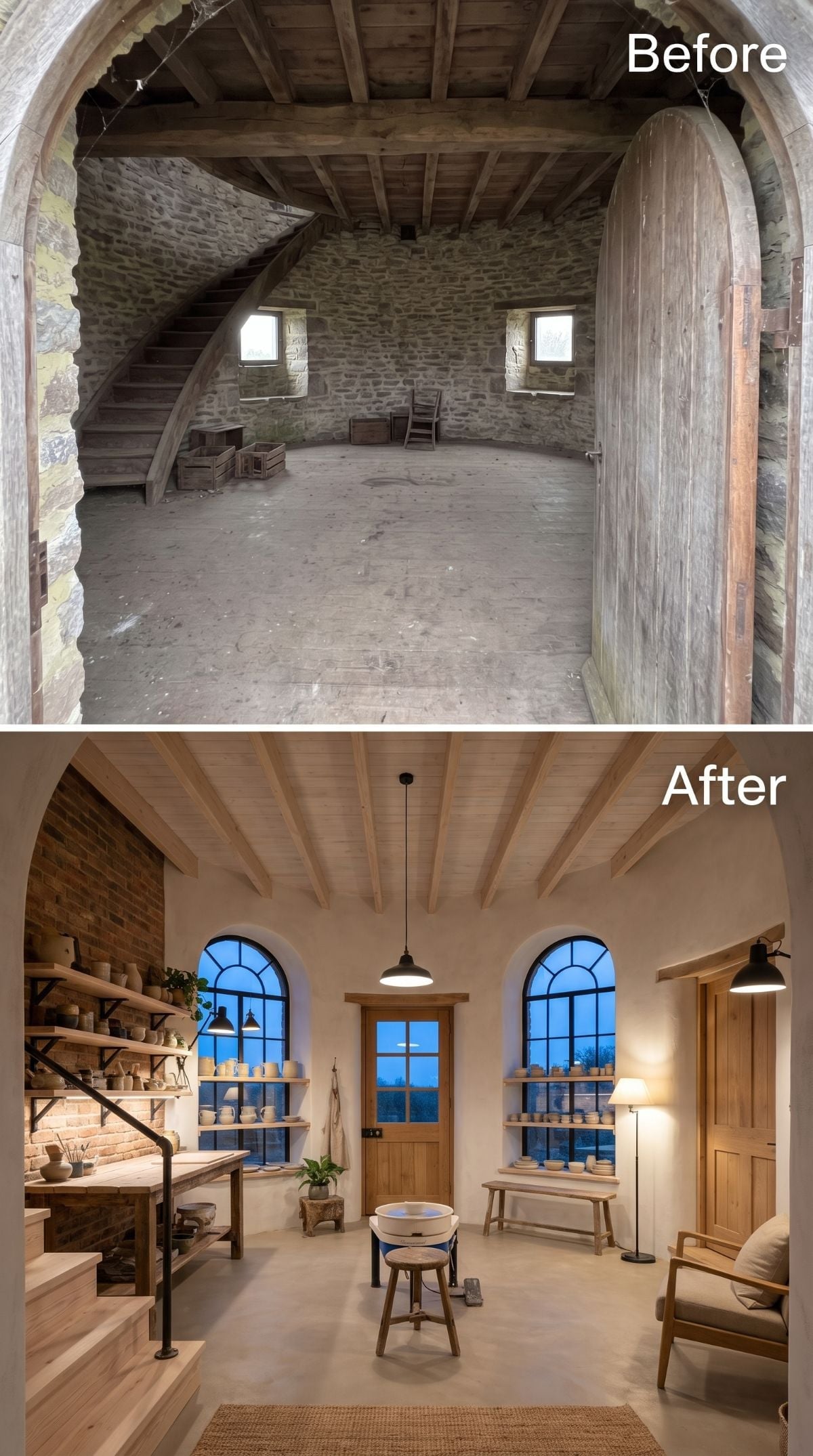
Warm white plaster, exposed timber, open shelves, and a potter’s wheel give this floor a reason to exist beyond being photogenic. The circular footprint actually helps: work can happen in the middle while storage follows the wall.
The rendering is romantic, of course. A real ceramics studio would be far less interested in perfectly arranged bowls and far more interested in washable floors, clay dust, sinks, ventilation, kiln clearances, electrical service, and somewhere to put forty pieces that are all somehow still too wet to move.
Studio Reality: The design idea is convincing because the open center suits a wheel and the perimeter suits storage. Whether it works in reality would come down to services, ventilation, cleanable surfaces, and kiln planning rather than the shelves.
23. The Bourbon Library Makes the Windmill Feel Like a Private Distillery
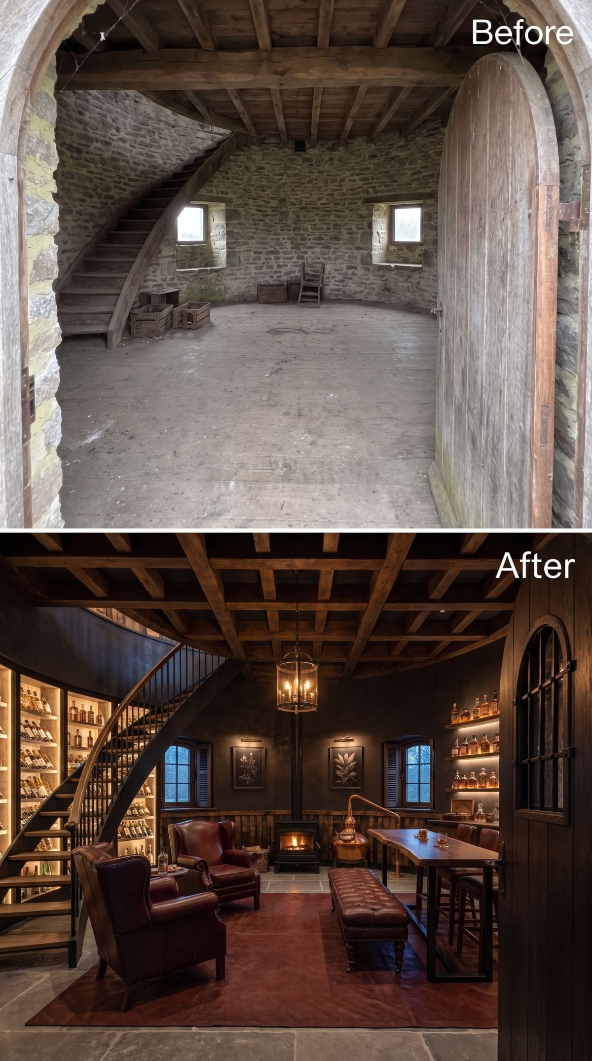
Backlit bottle shelves follow the curved wall while darkened beams lower the visual temperature overhead. Oxblood club chairs sit on crimson under amber light, and a cast-iron stove fills the wall between two small-paned windows.
There is nothing subtle about the mood, but the stone earns its keep here. In a brand-new room, this much bourbon-club styling could feel manufactured. Against irregular masonry, it looks as though the tower had been waiting several centuries for somebody to bring the decanters.
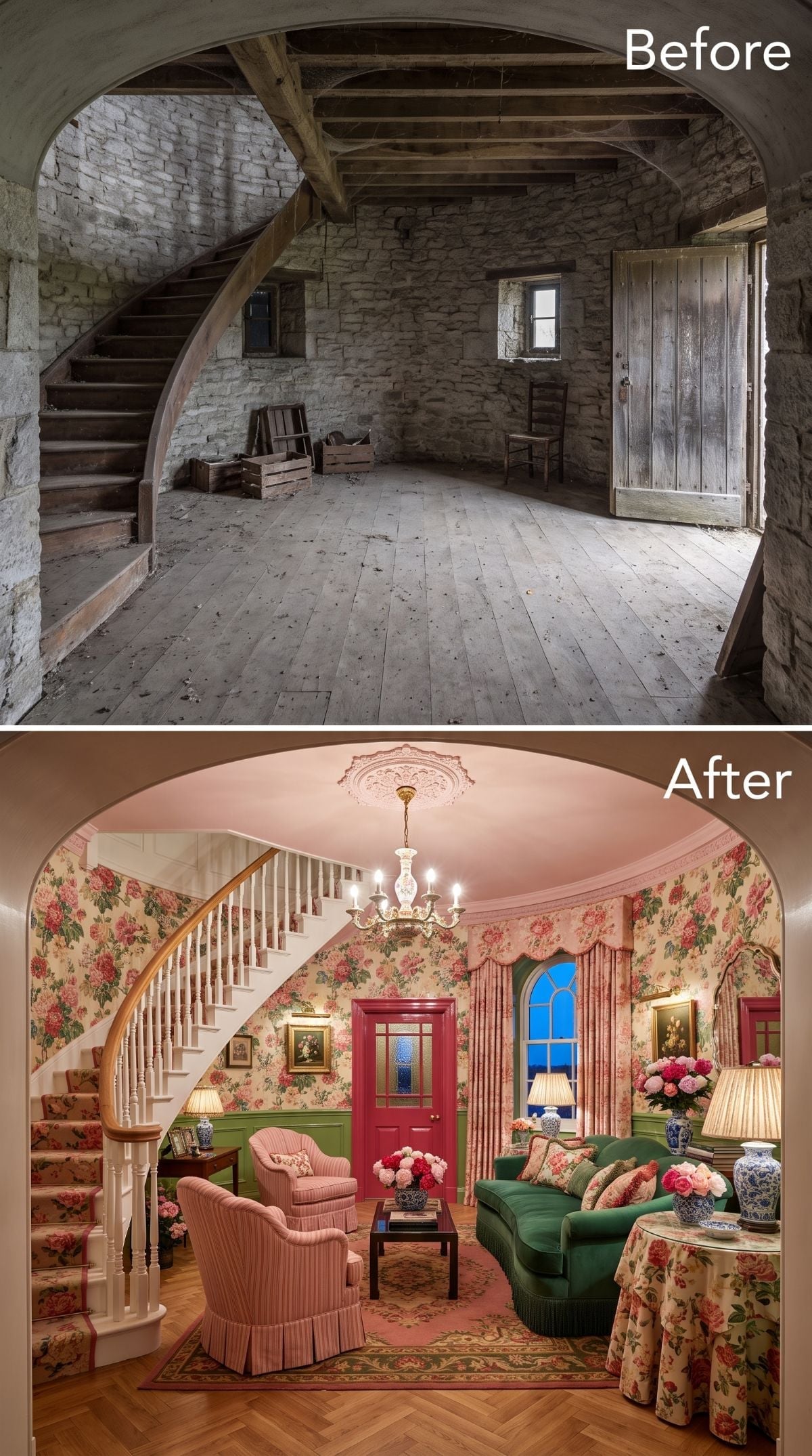
22. Chintz, a Pink Door, and Green Velvet Refuse to Play Safe
🔥 Would you like to save this?
Nobody puts chintz in a windmill, and yet here we are.
Rose-and-peony wallpaper runs around the curved wall while hunter-green velvet and pink upholstery pile more color into the middle. A white stair, floral runner, blue-and-white ceramic lamps, and herringbone floor should be too much company for one room. Somehow the stone geometry keeps everyone seated.
The ceiling may be the slyest move: blush paint and an ornate medallion give the chandelier a background rather than letting it float alone above all that pattern. The room crosses the line into excess early and then, with admirable nerve, keeps walking.
21. A Velvet Home Cinema Makes the Windmill’s Darkness an Advantage
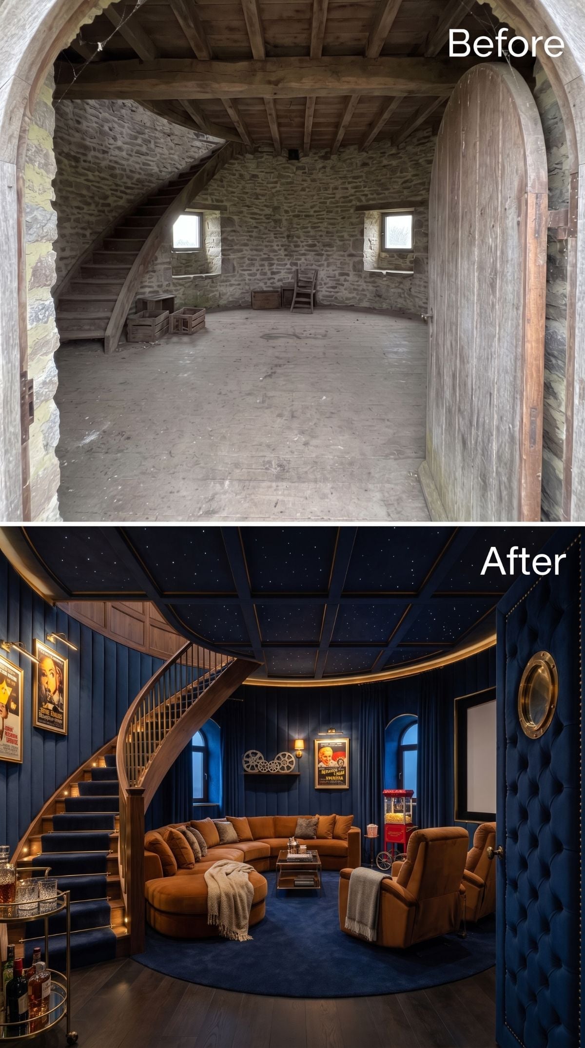
Midnight velvet finally gives the tower permission to be dark. Tufted wall panels, a curved cognac sectional, gold trim, and a star-field ceiling turn the awkward enclosure into a feature instead of something lighting has to fight.
The staircase becomes part of the theater too, with brass railings and navy runners carrying the palette upward. A popcorn machine and vintage posters could easily be corny; here the room is already theatrical enough to absorb the joke.
Editor’s Note: Star-field ceilings often use fiber-optic systems because tiny points of light can be scattered irregularly across a dark surface. If the ceiling is already open during construction, routing those systems before finish work is considerably easier than trying to retrofit them later.
20. English Cottage Warmth Moves Into the Stone Without Smothering It
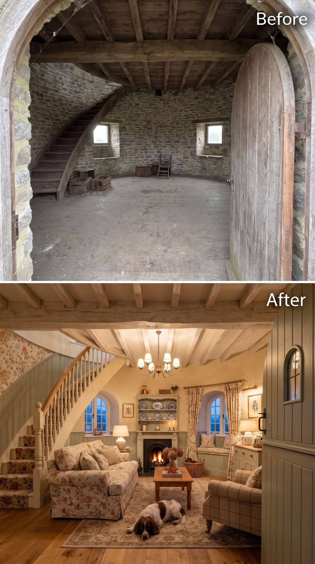
Floral linen, warm timber, a fireplace, Persian-style rug, and softly painted joinery transform the shell without needing a spectacular gesture. Even the dog contributes more than another decorative cushion probably would.
The rendering keeps the stair tight to the wall and lets patterned fabric collect around the windows rather than across every surface. Cottage style works best here when it behaves as furnishing rather than costume.
Worth Knowing: Historic masonry needs compatible finishes. Lime-based plasters are often useful because they remain relatively vapor-permeable, but the appropriate wall build-up depends on the masonry, exposure, salts, moisture sources, and climate. Old stone is not the place for one-size-fits-all detailing.
19. Leather, Steel, and Blackened Beams Give the Ruin an Industrial Spine
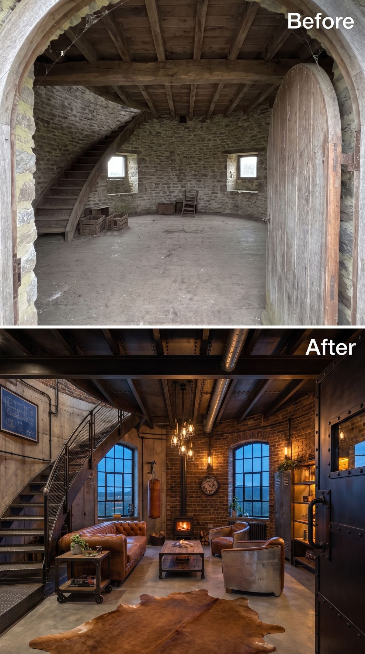
Cognac Chesterfields, blackened beams, steel railings, cage pendants, concrete, cowhide, and a riveted vault-like door send the concept directly into industrial territory. The punching bag in the corner appears to have arrived from another argument and stayed.
What keeps the room from becoming generic loft cosplay is the curved shell. Industrial design usually depends on long straight spans and factory grids; here all that steel has to negotiate with a tower. The friction is more interesting than perfect stylistic purity would have been.
Pro Tip: White deposits on old masonry often indicate salts moving with moisture. A clear sealer is not automatically the cure; the moisture path needs to be understood first so the wall is not simply trapped behind a new problem.
18. Scandinavian Calm Moves Into the Windmill’s Upper Chamber
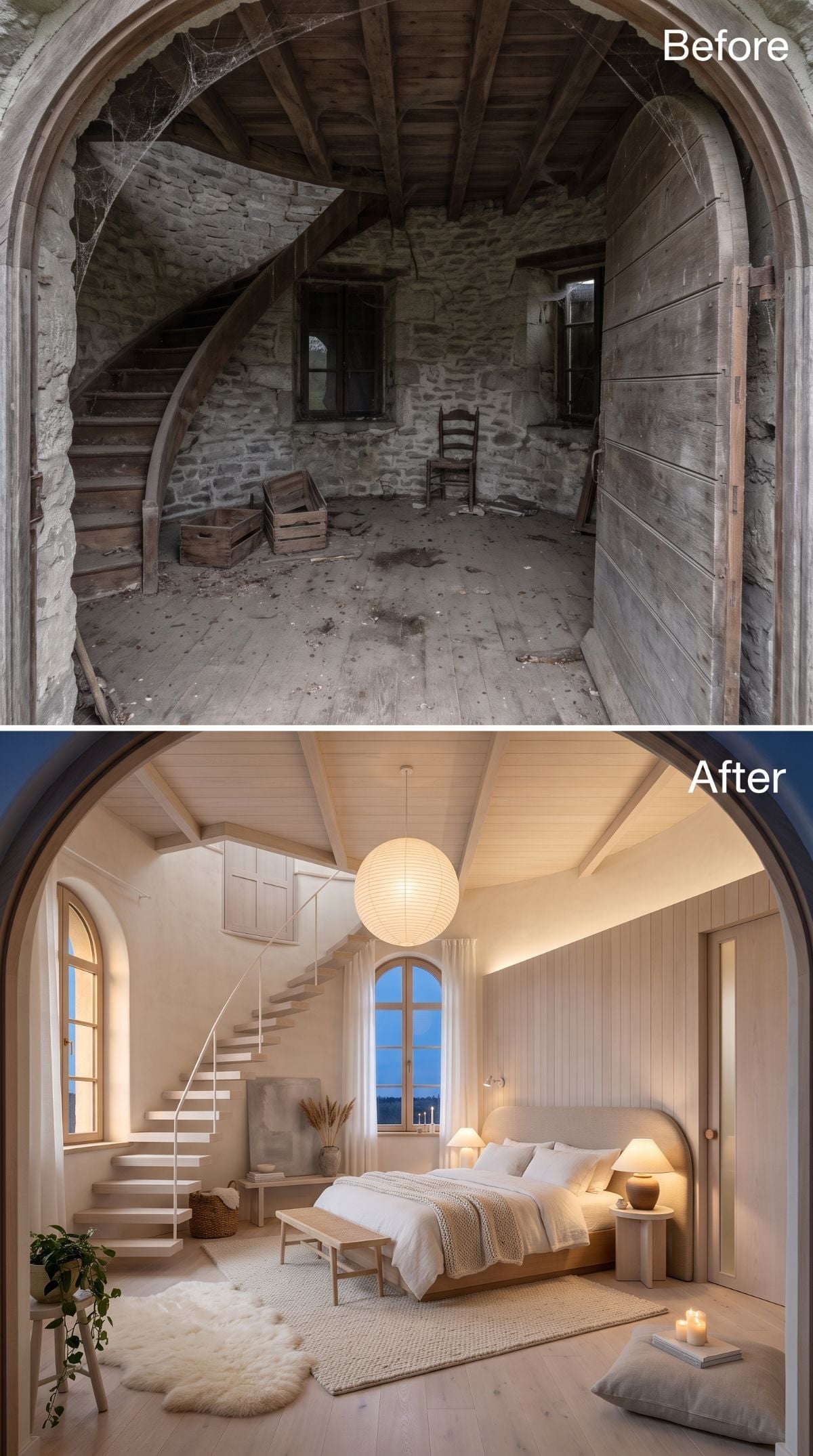
Pale oak, whitewashed boards, cable railings, linen, and one enormous paper lantern give the upper chamber almost no decorative noise. That’s precisely why the room can tolerate the strange footprint.
The bed sits low, allowing the vertical volume to remain visible above it rather than filling the tower with tall furniture. Chunky knit and raw linen give the neutral palette enough surface variation to keep all that pale material from collapsing into beige fog.
17. A Victorian Billiard Room Turns the Tower Into a Private Club
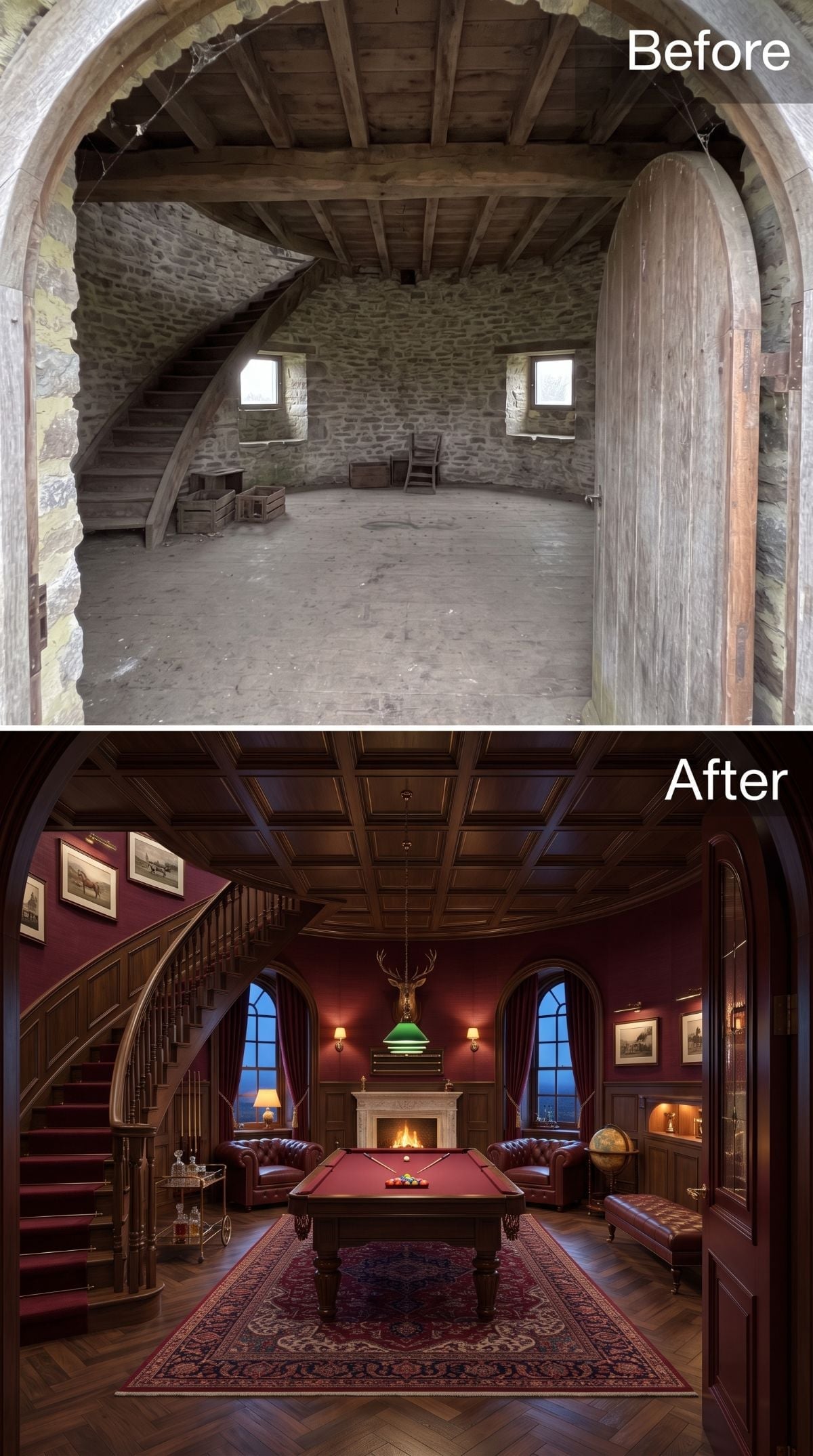
Burgundy walls and dark walnut coffers make the crimson billiard table feel less like furniture and more like the center of an entire composition. Oxblood Chesterfields, equestrian prints, a marble fireplace, globe, Persian rug, and bar cart happily pile on the club-room references.
The circular shell gives the table breathing room. A rectangular billiard room often ends up organized almost mechanically around clearances; here the curved perimeter lets secondary furniture sit outside that central rectangle without producing obvious leftover corners.
Material Matters: Traditional cue tables are strongly associated with green cloth, but modern billiard fabric comes in many colors. Crimson works here because the table joins an existing burgundy-and-walnut palette instead of becoming one isolated patch of color.
16. Tuscan Farmhouse Warmth Finds the Right Shape for a Round Dining Room
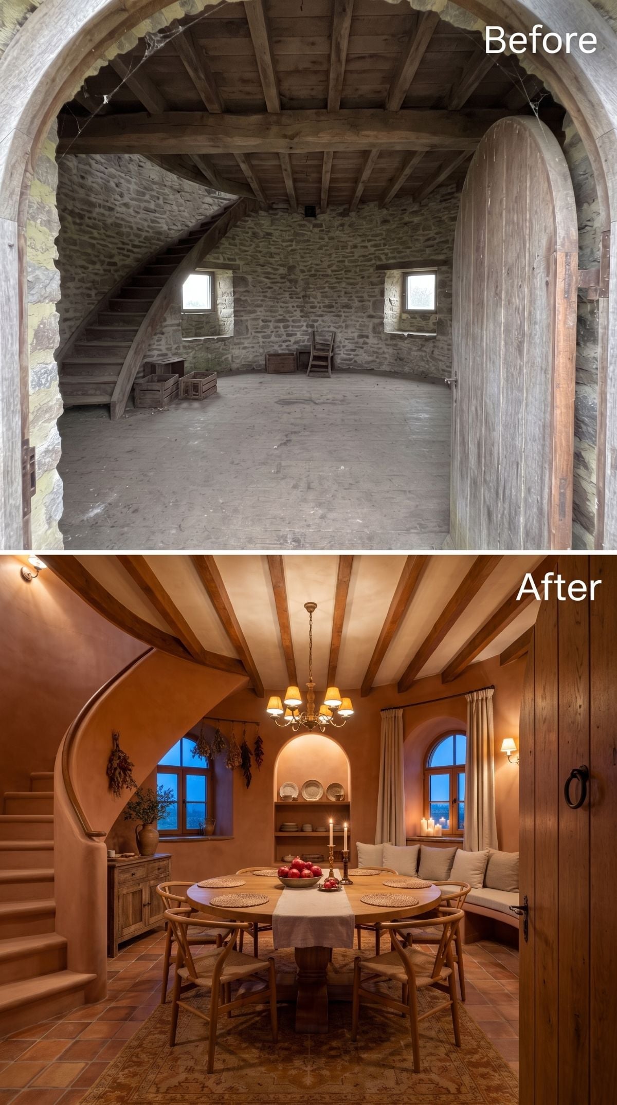
Terracotta floor tile, ochre plaster, natural beams, and a built-in arched niche give this version enough texture before a single chair arrives. The round dining table is the decision that makes everything click.
A rectangular table would establish its own geometry and force the room to negotiate around it. The circle simply sits inside the larger circle, leaving circulation more even around the perimeter. Wishbone chairs help because their open backs don’t create a heavy visual fence around the table.
Did You Know: Hans J. Wegner designed the Wishbone Chair in 1949. Its open frame is especially useful when several chairs are grouped closely, while terracotta supplies the opposite quality below: visual mass, warmth, and a surface that can develop character with use.
15. Wabi-Sabi Restraint Lets the Curved Walls Do Most of the Talking
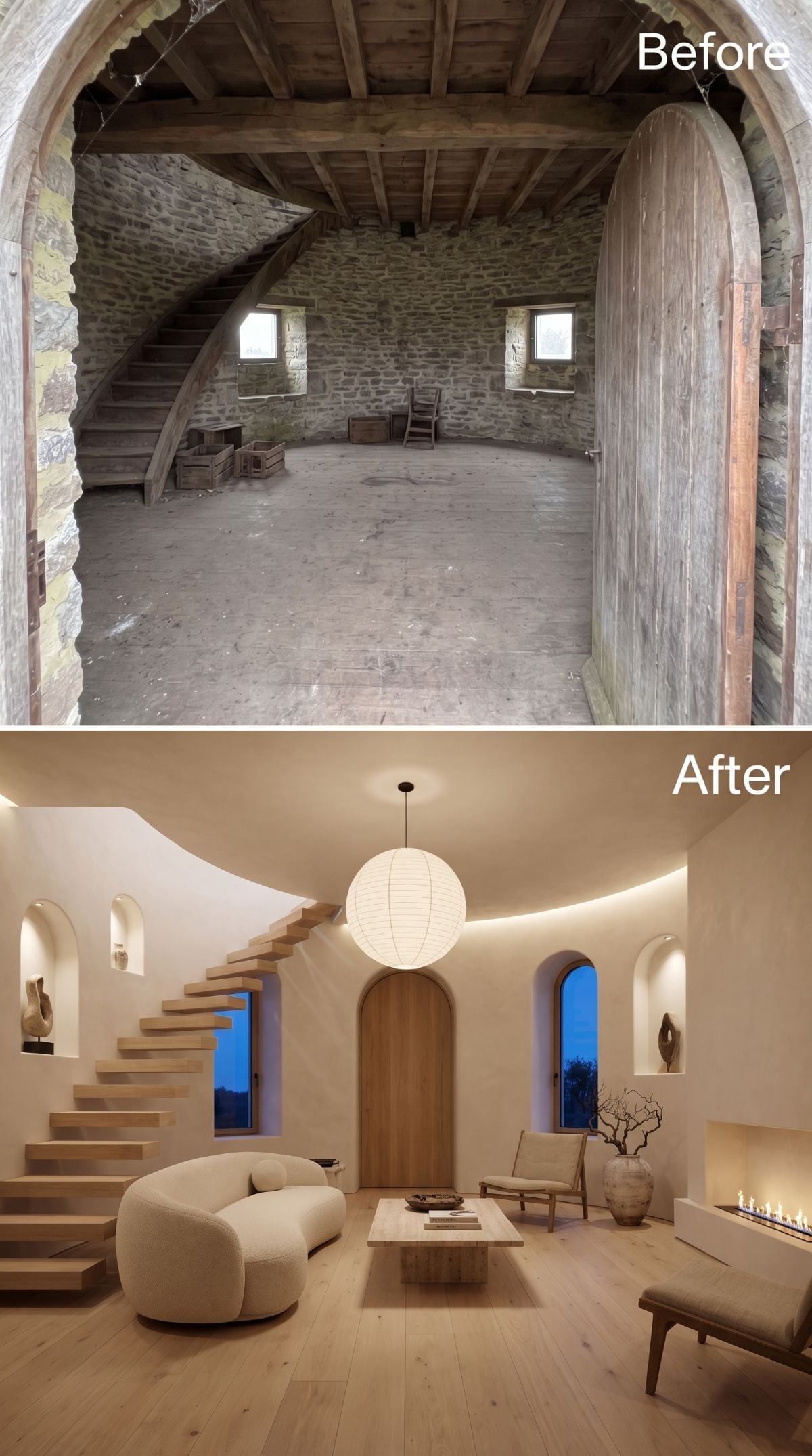
Warm plaster softens the shell without making it look perfectly machined. Floating oak treads trace the wall while curved niches and a rounded bouclé sectional eliminate almost every unnecessary straight line.
An Isamu Noguchi-style rice-paper globe drops into the tall volume and visually lowers the center of gravity. One large soft object overhead does more here than a grid of recessed spots ever could.
Why the Floating Stair Matters
A stair with this appearance would require concealed engineered support — often steel or reinforced framing within the wall or stair structure. In irregular historic masonry, that would be a serious structural exercise. Visually, though, the logic is impeccable: open treads preserve the room’s diameter instead of building an opaque wall through it.
14. Black Fluting and Brass Turn the Ruin Into a Contemporary Whisky Bar
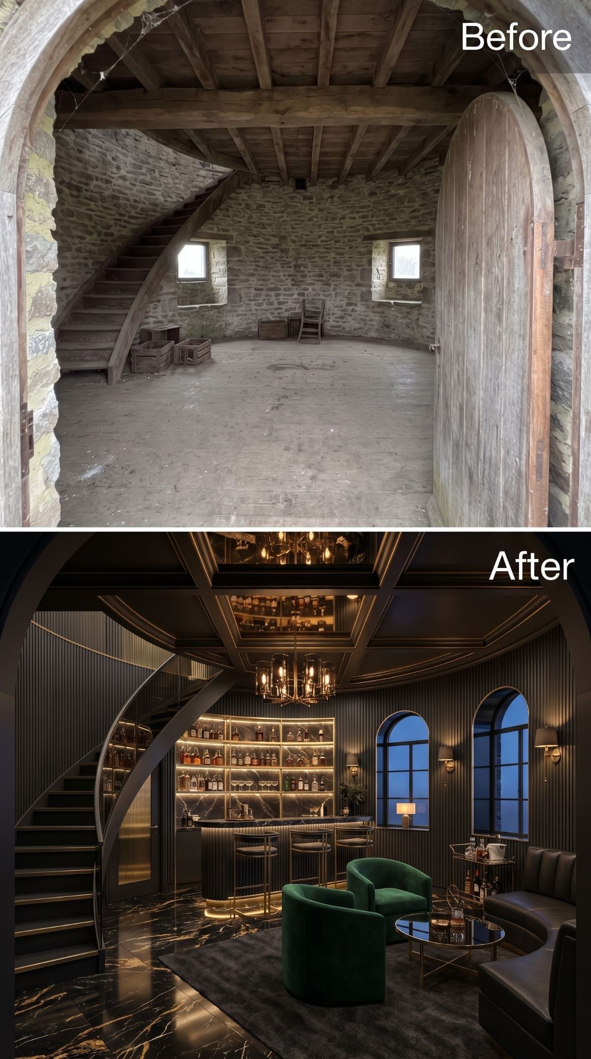
Unlike the bourbon library earlier, this concept has no interest in old-world restraint. Black fluted panels, brass trim, emerald velvet, marble with gold veining, and glowing bottle shelves turn the tower into a polished contemporary bar.
The dark spiral stair continues upward to a mezzanine-like display level, using the tower’s verticality rather than treating it as a nuisance. It’s a remarkable amount of architecture devoted to the possibility of one Scotch. That seems fair.
Budget Note: LED strip makes illuminated shelving more accessible, but the polished version still needs channels, diffusion, drivers, wiring, and maintenance access. The inexpensive part is often the light source, not the finished detail surrounding it.
13. French Romantic Grandeur Makes the Ruin Look Almost Too Polite
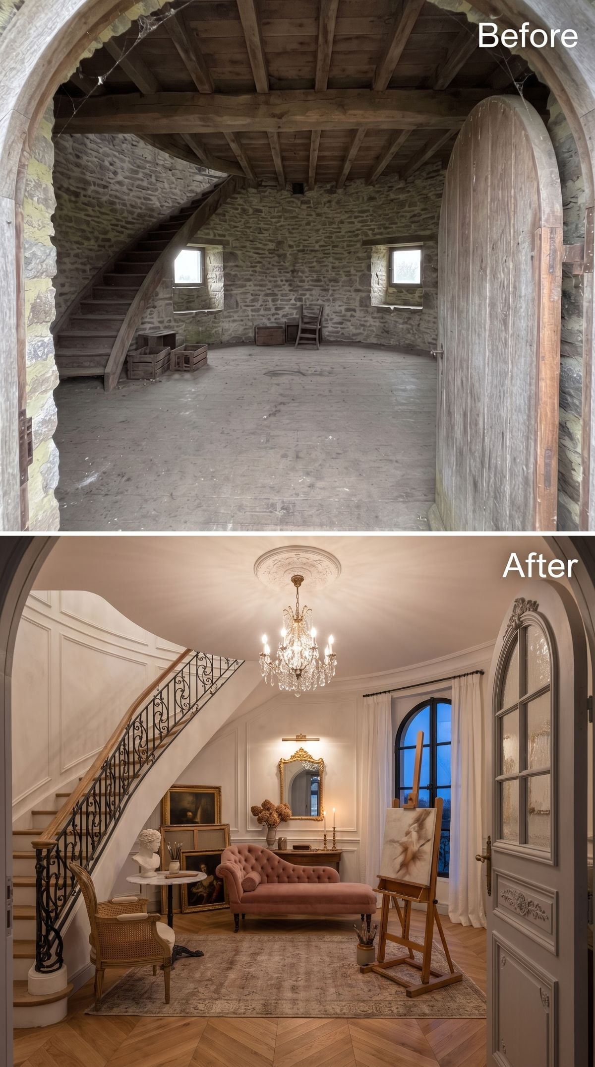
Bare stone and rough timber meet blush velvet, parquet, ironwork, and a chandelier dripping with crystal.
The rendering wraps the curved opening in plaster molding and lets it remain the largest architectural gesture. A tufted chaise occupies the curve rather than fighting it, while wrought iron at the stair adds enough darkness to prevent the palette from dissolving into pink-on-cream sweetness.
A crystal candelabra chandelier and ceiling medallion push the fantasy further, but the black-framed arched window and artist’s easel keep one foot on the ground. Barely.
12. Calacatta Marble Turns a Round Windmill Floor Into a Ceremonial Bath
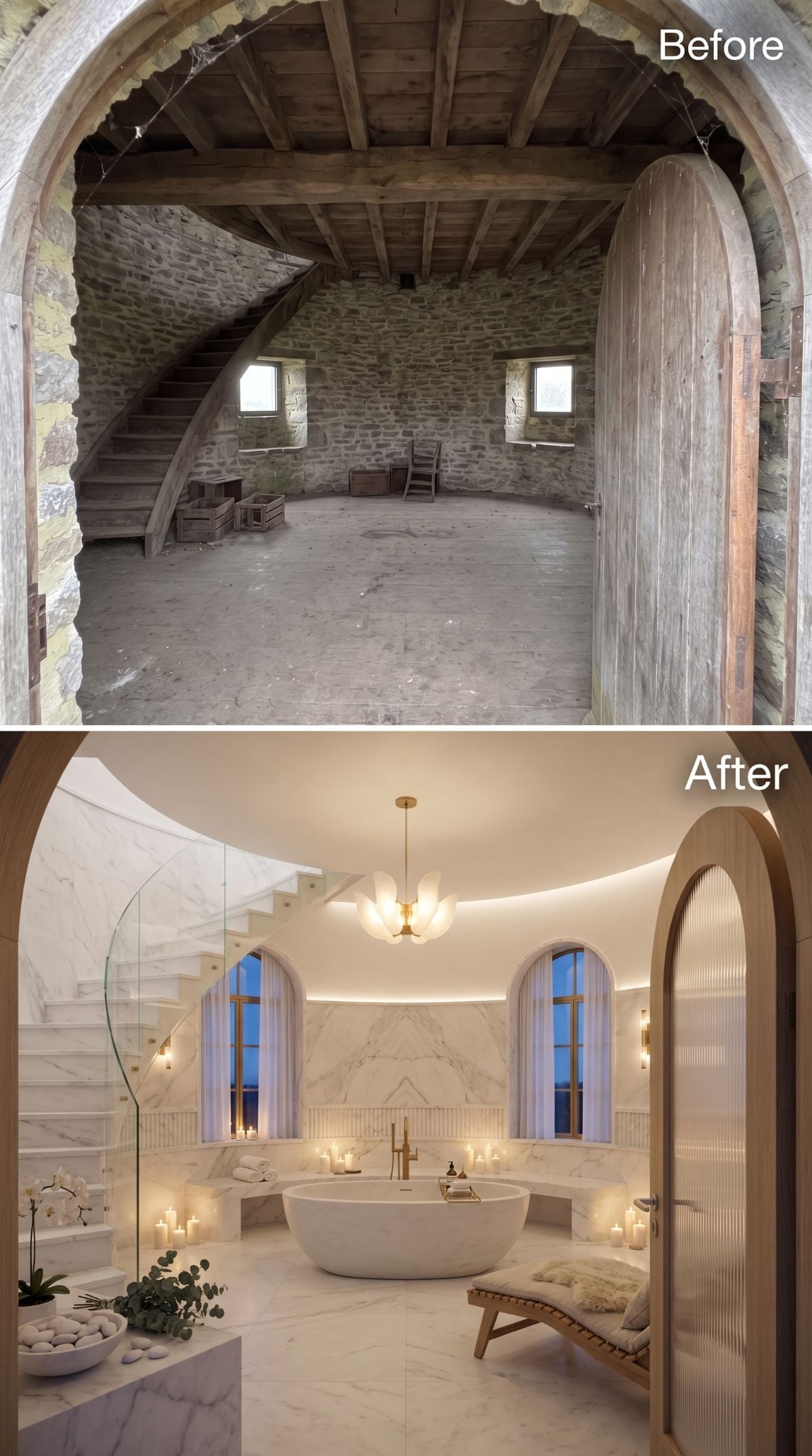
An oval tub sits dead center inside a circular room clad almost completely in white veined marble. That sounds like architectural overkill until the geometry starts making the case for it.
The tub echoes the footprint instead of lining up obediently against one wall. Brass fixtures warm the stone, a multi-globe chandelier spreads light overhead, and fluted glass gives the arched door privacy without closing it visually. Extravagant, yes. Random, no.
11. Dark Academia Turns Every Curved Wall Into Bookshelf Territory
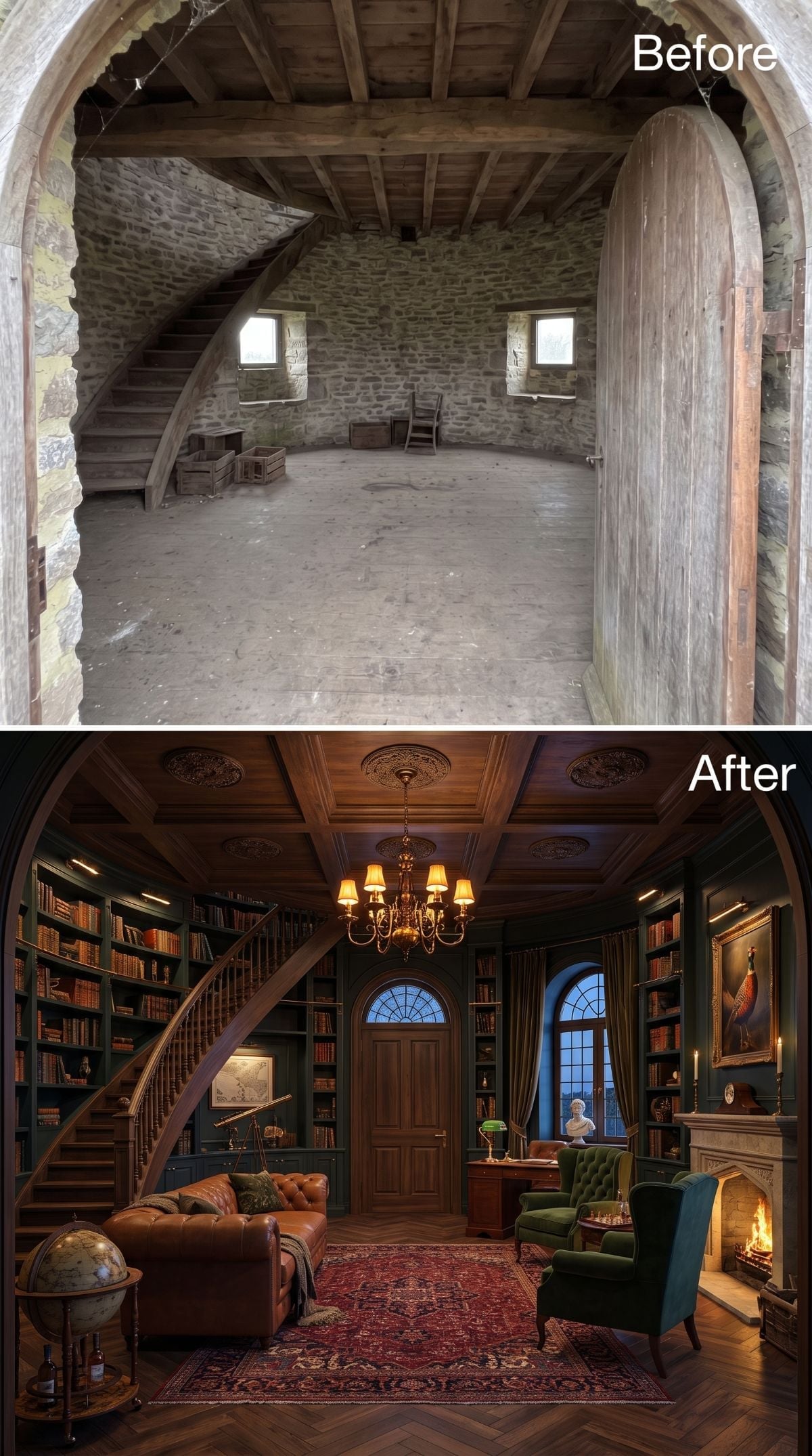
Forest-green shelving wraps the perimeter while the stair continues through it, turning circulation and storage into one composition. Brass lighting, leather, velvet, and a Persian rug establish the mood without requiring fake architectural history.
The smartest part is not the styling. It’s accepting the curved wall as shelf space. Custom joinery is expensive, but a circular library has something a rectangular one doesn’t: books can genuinely surround you.
- Test dark paint and wood under both daylight and the actual bulbs you intend to use
- Built-ins near stairs need to respect structural, guard, and access requirements before the cabinetry gets ambitious
- Breaking the green with stained timber overhead prevents the room from becoming one continuous dark band
10. Coastal Blues and Bleached Beams Make the Stone Feel Almost Seaside
🔥 Would you like to save this?
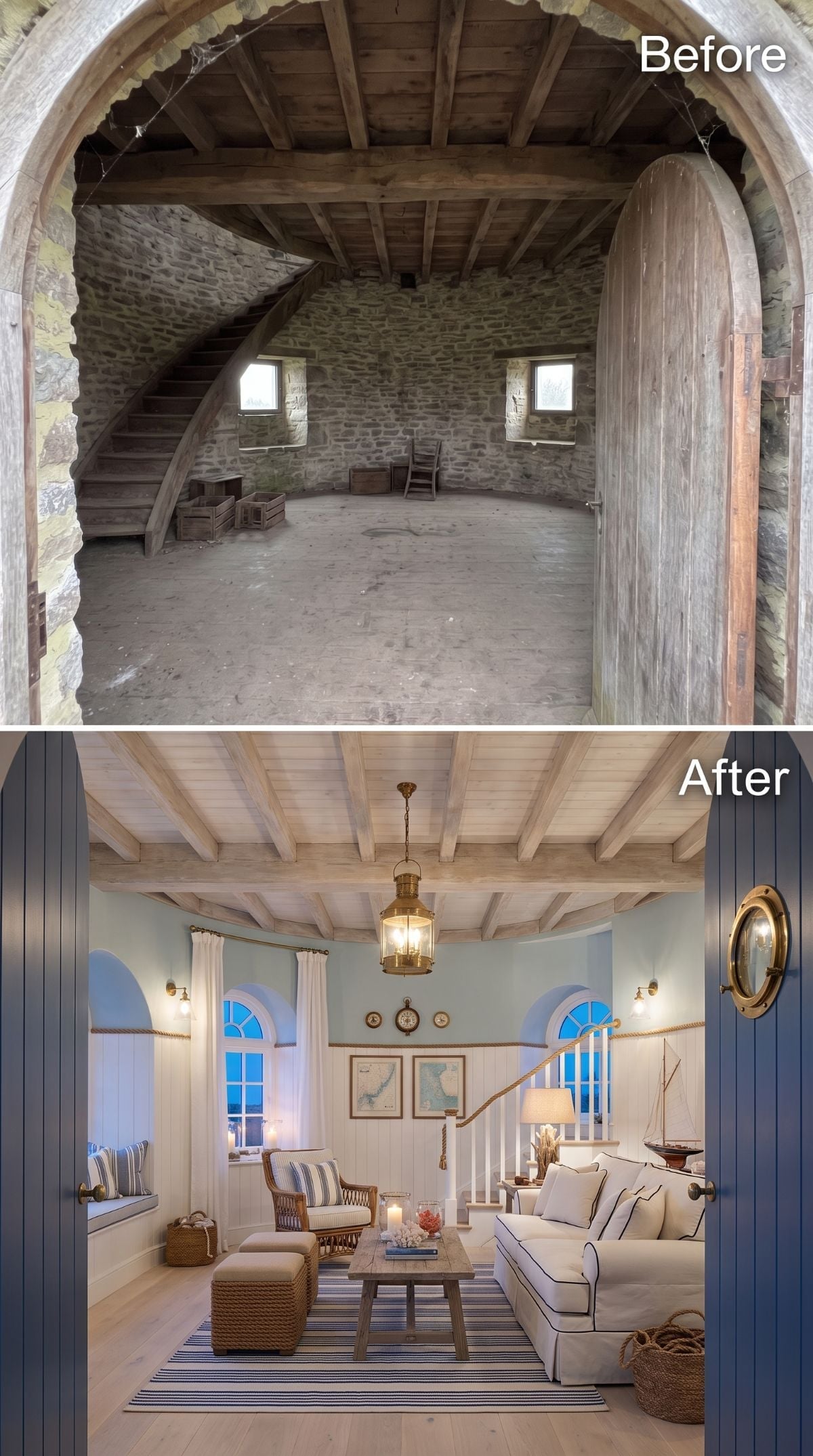
Pale blue walls and lightened beams pull the tower in the opposite direction from all those dark libraries. Navy tongue-and-groove panels, a rope-wrapped rail, striped rug, and brass ship’s lantern establish the nautical reference without needing an anchor nailed to the wall.
The rendering benefits from restraint in the large surfaces. Most of the theme arrives through smaller details, while the pale shell does the more important work of opening the room visually.
Common Mistake: Opaque paint and a translucent wash behave very differently on old timber. A solid coat hides grain and knots; a wash can lighten the beam while leaving its texture visible. Always test old wood first — it rarely absorbs finish uniformly.
9. A Victorian Card Room Goes Full Teal, Mahogany, and Amber Light
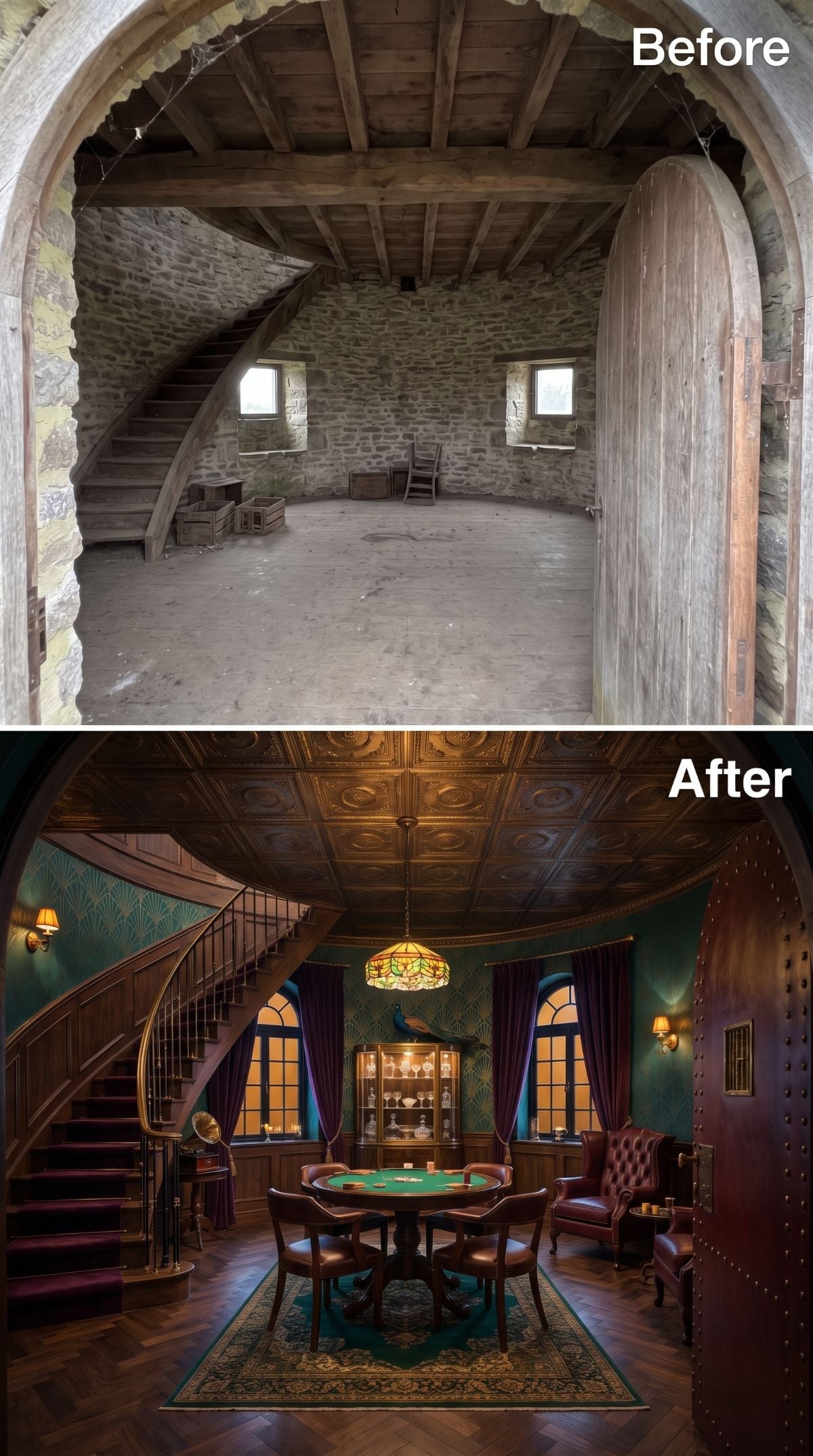
Teal patterned walls, a Tiffany-style pendant, green baize, dark mahogany, and velvet drapes create another private-club room, but this one is brighter and more eccentric than the billiard concept.
The card table occupies the center naturally, and the spiral stair reads almost like part of the furniture because its dark finish joins the room’s woodwork. The rendering claims the place has been hosting questionable wagers since 1897. The windmill has no comment.
Style Tip: Green baize is historically familiar on card and gaming tables, while teal walls and purple drapes make the surrounding palette less literal. Strong daylight can fade dyed textiles over time, so UV exposure is worth considering in any real version.
8. A Crystal Chandelier Gives the Upper-Level Bedroom Unexpected Grandeur
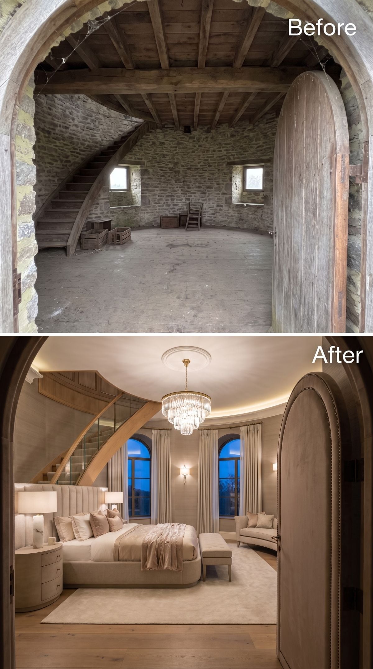
Warm putty plaster and a channeled headboard make the sleeping area feel deliberately soft against the tower’s hard geometry. A tiered crystal chandelier takes advantage of the vertical space instead of leaving the ceiling as empty volume above the bed.
Furniture placement is the more interesting problem. Beds want straight walls. Windmills are famously uncooperative on this point. The concept uses the broadest wall section for the headboard and lets the curve remain visible around it rather than hiding the entire perimeter behind millwork.
7. Southwest Ochre, Tile, and Fire Turn the Tower Toward the Desert
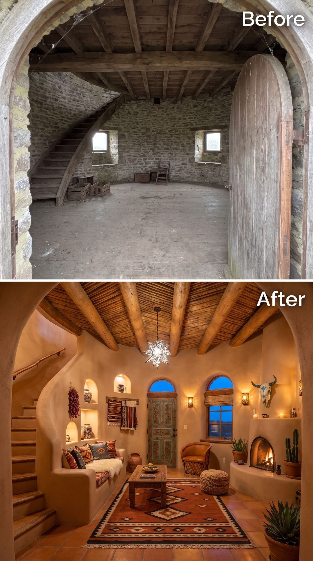
Ochre plaster, Saltillo-style tile, exposed vigas, woven geometric textiles, lit niches, and a kiva-inspired fireplace reinterpret the tower through a Southwest vocabulary without needing every inch covered in pattern.
The circular architecture actually helps. Rounded niches and a sculptural fireplace feel more natural here than they would pressed into a square drywall room. The rendering is borrowing a regional language, but the underlying geometry gives it somewhere plausible to live.
- Warm plaster lets timber, tile, and stone sit inside one earthy temperature range
- Rounded niches make useful visual companions for a curved perimeter
- Pattern stays concentrated in tile and textiles instead of taking over every surface
6. Wraparound Oak Shelving Makes the Curved Wall a Library’s Best Feature
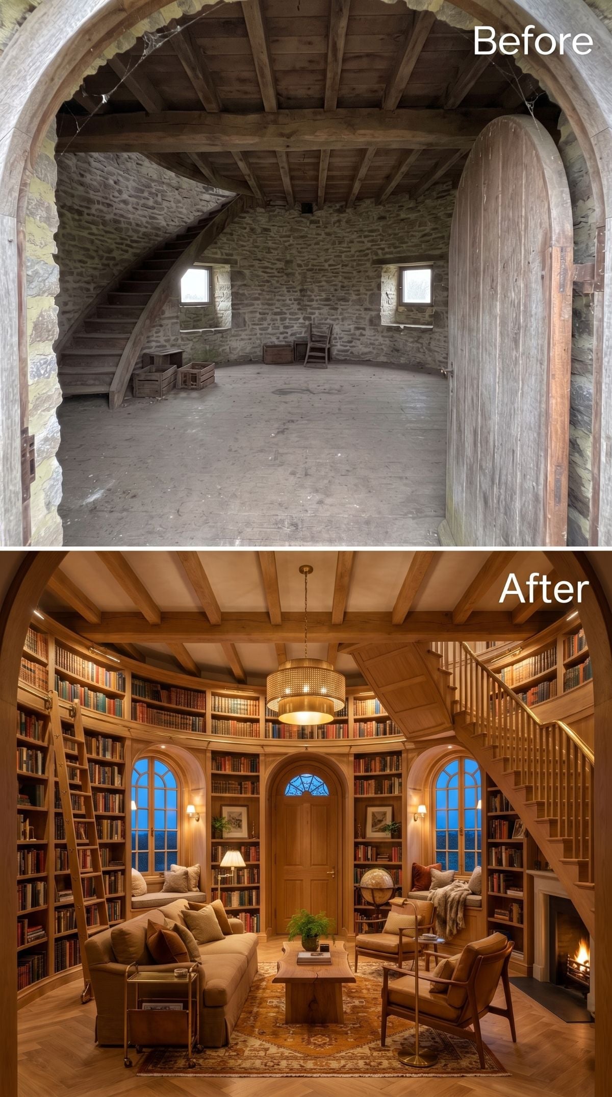
This library is less theatrical than the dark-academia version and more interested in carpentry. Warm oak shelving follows the perimeter continuously, while a rolling ladder makes the upper storage genuinely usable rather than decorative.
The smartest detail is under the stair. In strange conversions, leftover geometry becomes dead space quickly. Filling that wedge with books turns one of the tower’s awkwardest intersections into the reason the room feels custom.
5. Chinoiserie Wallpaper Takes the Windmill Somewhere Completely Unexpected
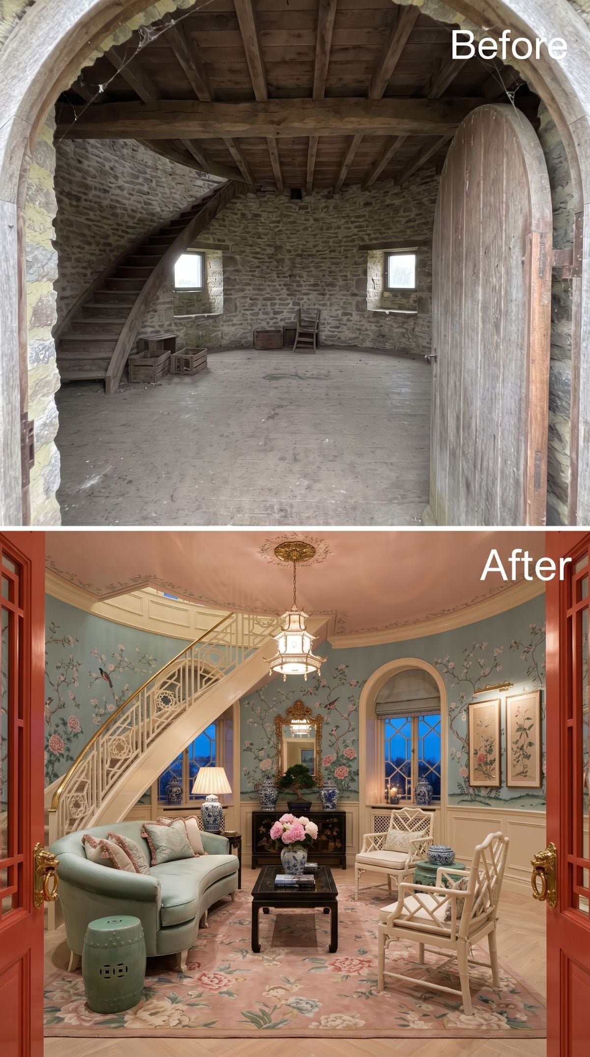
Sage-and-blush chinoiserie, celadon upholstery, blue-and-white ceramics, black lacquer, gold fretwork, and a floral rug create one of the most improbable pairings in the set.
What saves it is the architecture’s refusal to become background. The arched opening and curved stair remain strong enough to hold their own against the pattern. If the walls had been flattened into generic drywall, half the tension would disappear.
Designer’s Secret: Wallpaper on historic masonry is a moisture-management problem before it is a decorating decision. Plaster, lining materials, ventilation, adhesive, and wall condition all need to work with the building rather than simply sealing the stone behind a decorative surface.
4. French Doors and Citrus Trees Turn the Entry Into a Conservatory
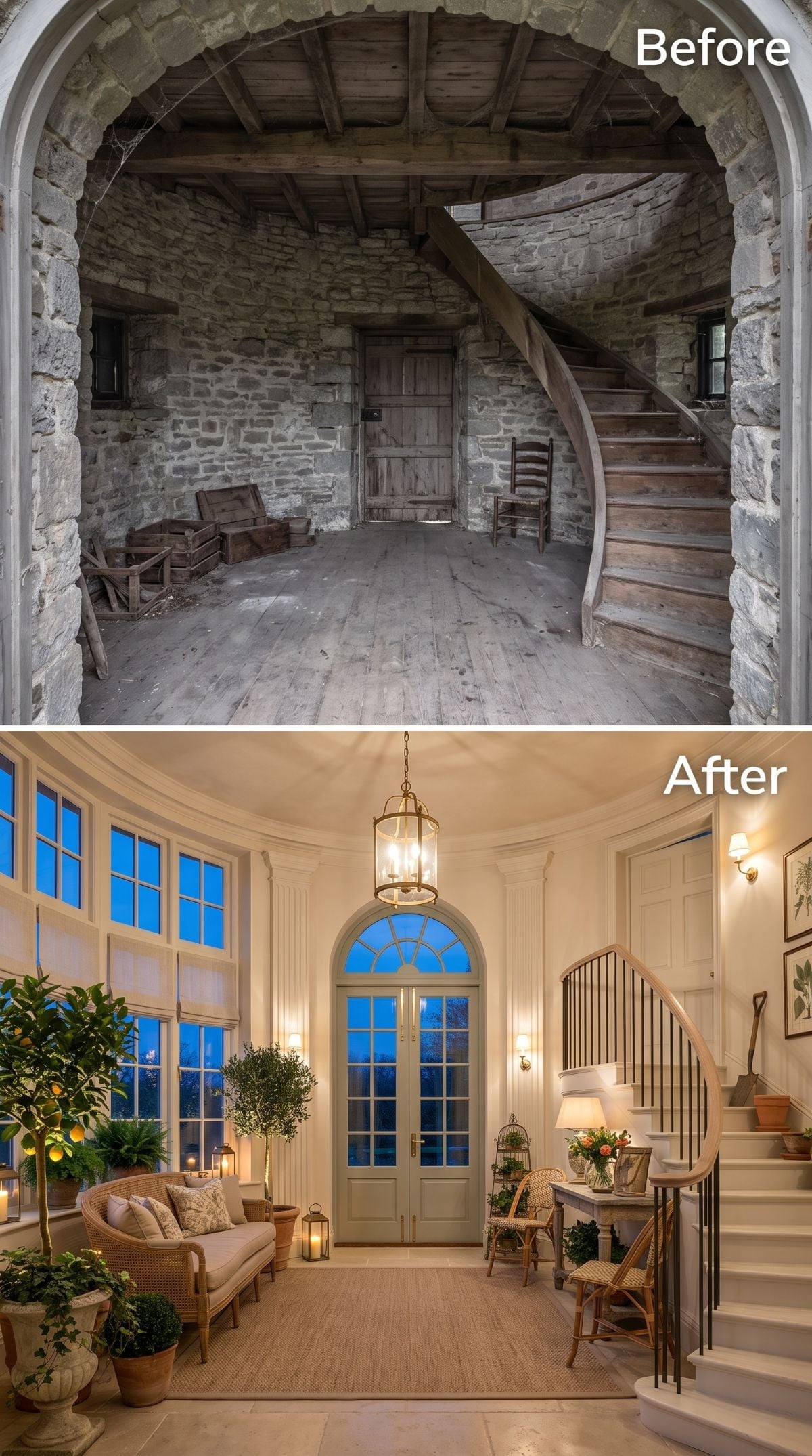
Cream plaster, French doors, fanlight glazing, white-painted stairwork, wrought iron, rattan, and citrus trees make this the lighter cousin of the earlier garden-room foyer.
The biggest difference is transparency. Glazing pulls the eye beyond the stone shell, so the entry stops reading like the center of a tower and starts behaving almost like a conservatory. That’s a useful reminder that adaptive reuse isn’t only about what goes inside old walls. Sometimes the transformation comes from creating a better relationship through them.
3. Peacock Wallpaper and Gold Railings Take the Tower to Full Color
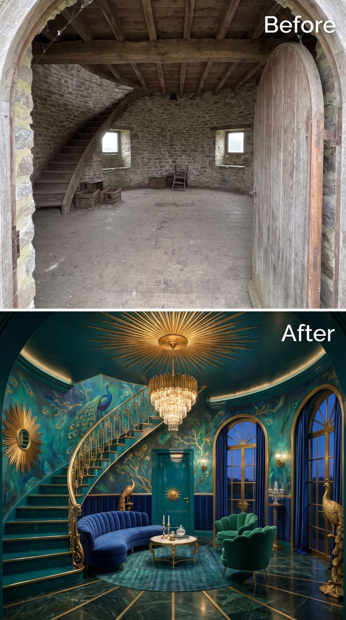
Teal takes over the curved wall while a peacock mural climbs beside the stair and gold balustrades spiral upward beneath crystal. There is no neutral zone left to retreat to.
That’s exactly why this belongs near the end. By now the tower has survived Scandinavian restraint, cottage florals, dark libraries, marble baths, and industrial steel. It can handle one concept that treats the entire vertical surface as a decorative canvas and appears actively offended by beige.
2. White Plaster and Wrought Iron Turn the Stair Into the Main Event
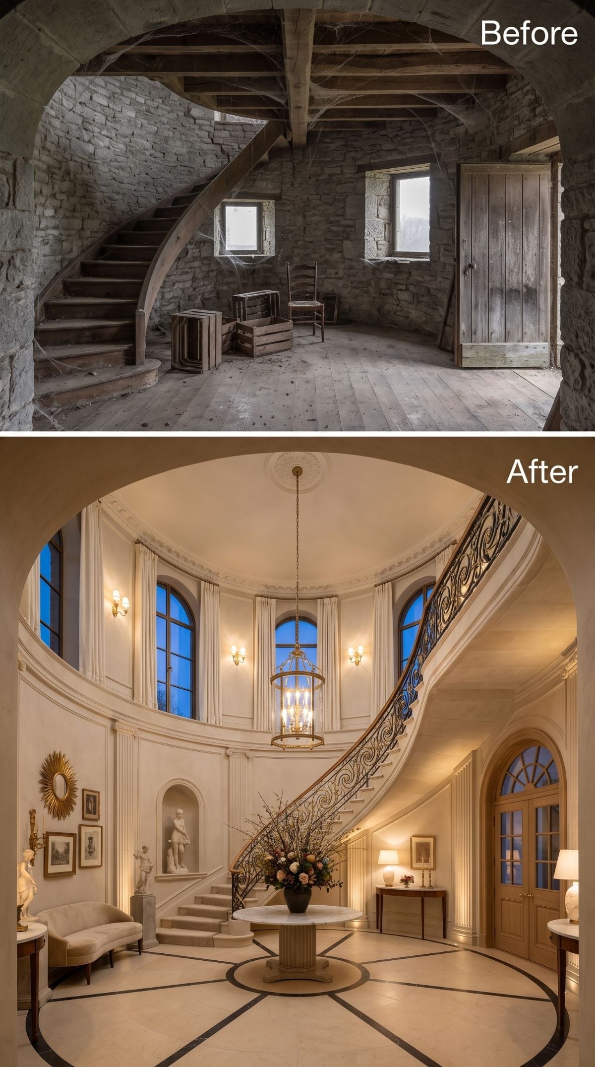
This concept stops pretending the stair is merely circulation. Ornate iron climbs through a tall white-plaster void while statuary niches, a ceiling medallion, and a lantern build an entire room around the act of moving vertically.
That makes unusual sense in a tower. The staircase is going to consume a meaningful percentage of every floor whether anyone likes it or not. Turning that unavoidable object into the architecture is more convincing than apologizing for it with a narrow railing and hoping nobody notices.
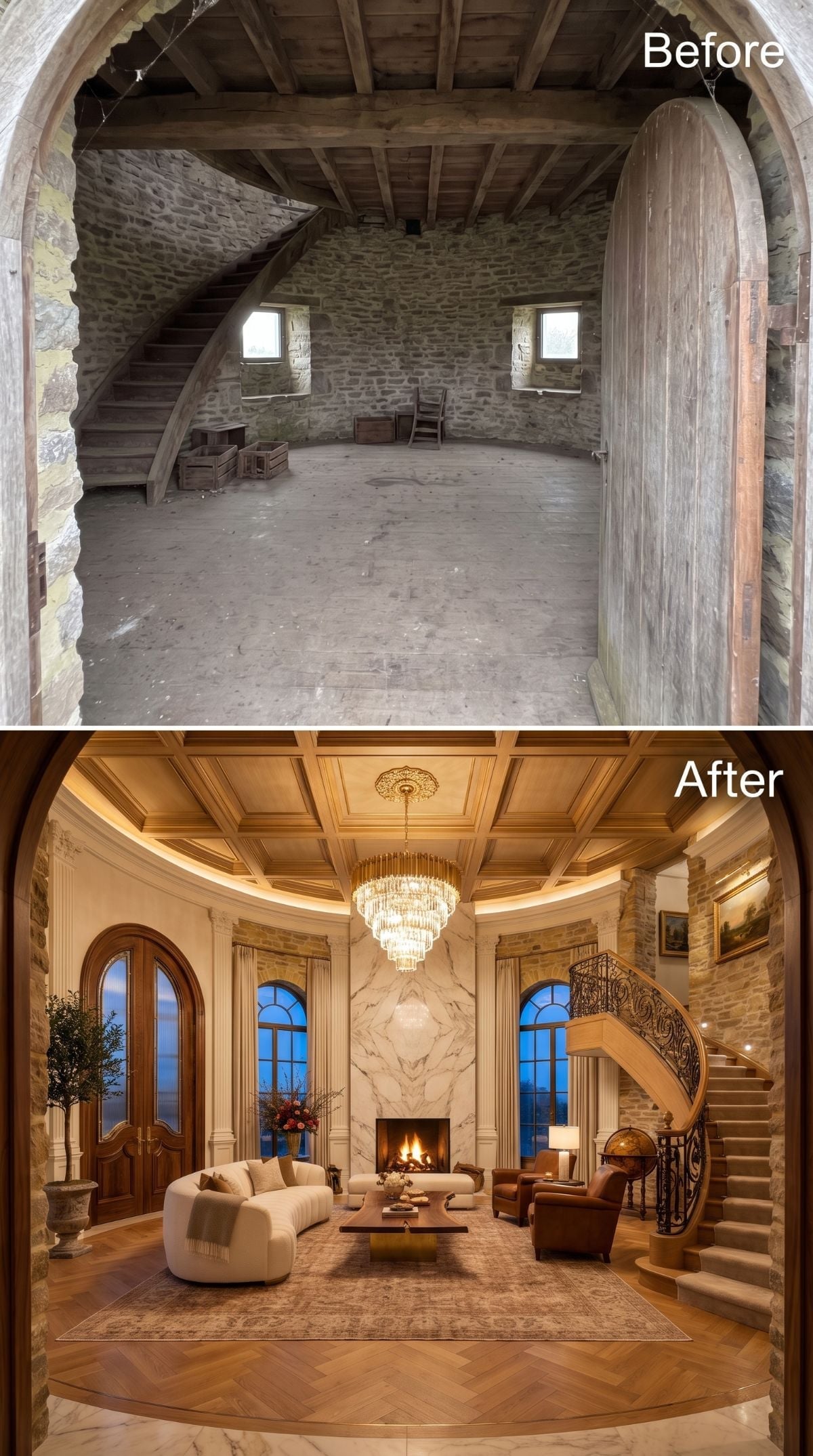
1. Stone, Crystal, and Marble Finish the Gallery Without Losing the Windmill
🔥 Would you like to save this?
The final concept lands where the exercise probably should: back at the stone. Instead of plastering away the tower’s identity, the rendering keeps rough masonry visible around a formal room with parquet, coffered timber, iron stairwork, a curved ivory sofa, crystal chandelier, and heavily veined marble fireplace.
Luxury arrives, but the windmill still wins the argument. The stone remains the perimeter, the stair still announces the vertical plan, and the room’s best surfaces are the ones that acknowledge what was already difficult about the building. After 34 wildly different answers, that’s the most persuasive design lesson here: adaptive reuse gets interesting when the new interior stops asking old architecture to apologize for itself.