
🔥 Would you like to save this?
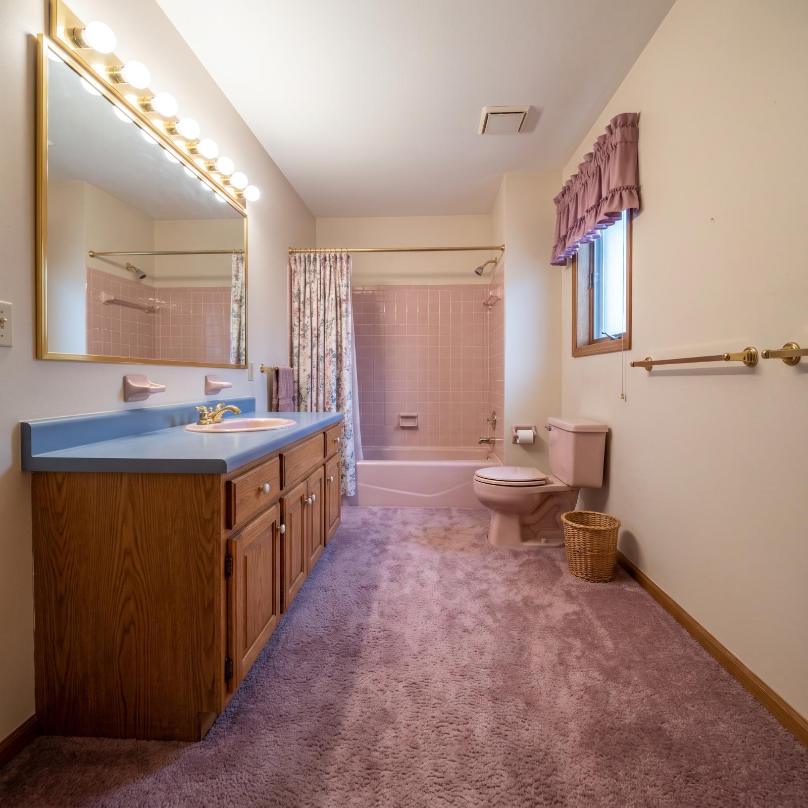
Bathroom design in the 1980s had a strange confidence about it. Rooms were often large enough to suggest luxury but assembled from materials that fought one another for attention: glossy brass, oversized mirrors, theatrical bulb strips, bulky vanities, tub decks, patterned surfaces, and enough beige to flatten all of it into one continuous mood. The problem was rarely a lack of ambition. It was that almost every element seemed to be speaking at the same volume.
In order to come up with the very specific design ideas, we create most designs with the assistance of state-of-the-art AI interior design software. Also, assume links that take you off the site are affiliate links such as links to Amazon. this means we may earn a commission if you buy something.
Carpet was part of that equation, and in a wet room it was one of the less defensible decisions. But replacing it with tile is only the beginning. What really changes these bathrooms is the redistribution of visual weight: floating vanities that expose more floor, stone carried from one plane to another, darker cabinetry used as punctuation rather than mass, lighting that shapes the room instead of glaring down from above, and color introduced with enough conviction to feel architectural rather than decorative.
These 25 AI before-and-after concepts take the same dated 1980s starting point in wildly different directions. Some strip the room back to oak, limestone tones, and quiet texture. Others lean into plum, teal, toile, graphic tile, dusty rose, or one stubborn pink fixture that refuses to disappear quietly. The interesting part is not deciding which bathroom is “best.” It is watching how completely a room can change once the materials stop competing and start working as a composition.
25. Warm Oak and Travertine Turn the Old Bathroom Into a Proper Retreat
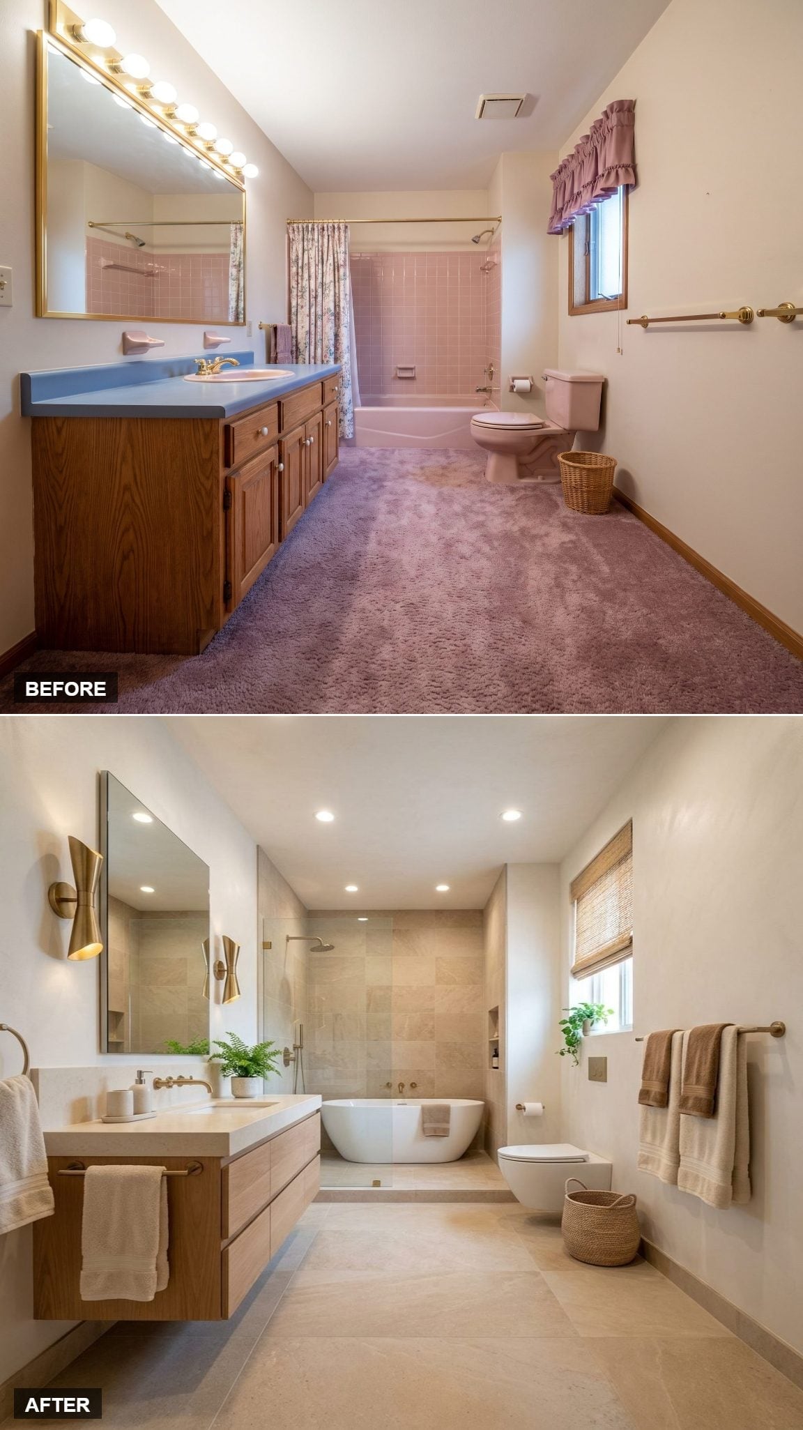
Floating oak cabinetry stretches across the vanity wall beneath a large frameless mirror, while brushed brass wall-mounted faucets add warmth without pushing the room back toward its 1980s origins.
The bigger move happens at the far end. A freestanding tub and walk-in shower share a broad wet zone wrapped in large-format travertine-look tile. Woven shades and a natural-fiber basket keep the stone-and-oak combination from becoming hotel-lobby perfect.
24. Emerald Cabinetry Meets Tile With Absolutely No Indoor Voice
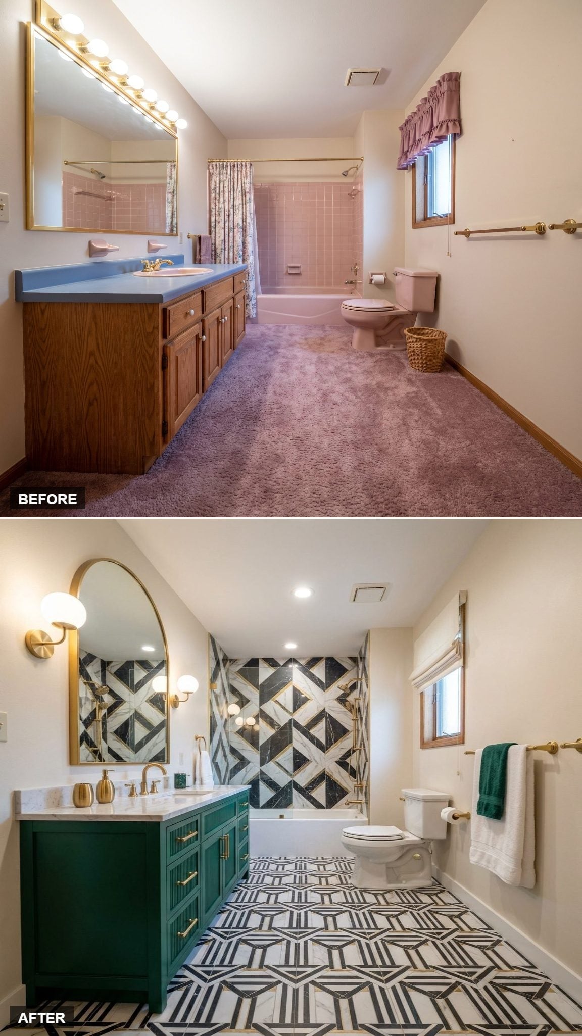
Black-and-white geometric tile races across the floor and up the shower wall in one unapologetic move. The pattern is large enough to feel graphic rather than fussy, and the emerald vanity is saturated enough not to disappear beside it.
Fluted drawer fronts, brass pulls, a marble countertop, an arched gold-framed mirror, and globe sconces bring softer curves into a room otherwise dominated by hard angles. Subtle this is not.
23. Limewash, Ribbed Tile, and a Raised Tub Show How Quiet Can Still Have Texture
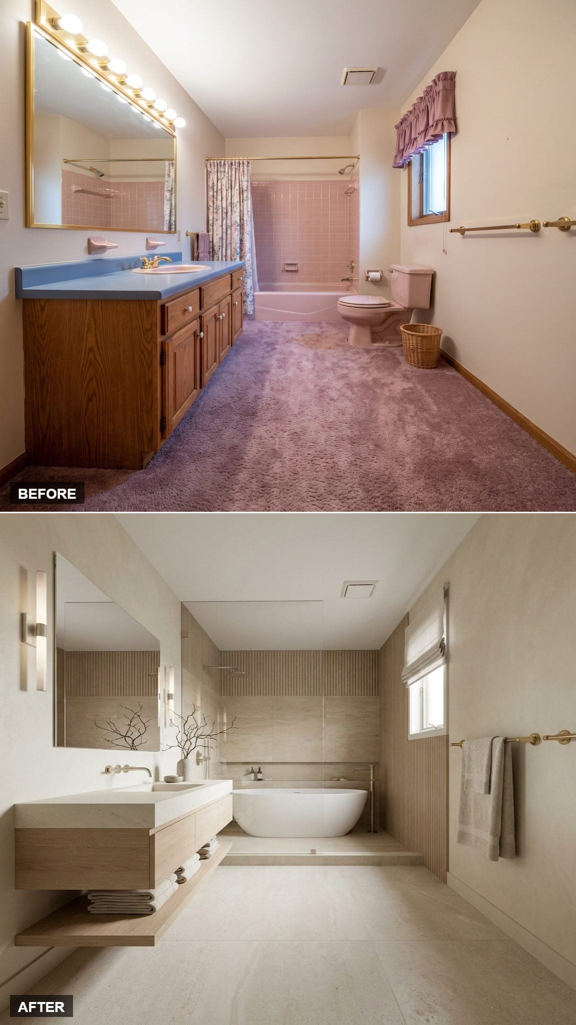
After the geometric fireworks, this room drops the volume. Matte limewash-style walls create a soft backdrop for a floating oak vanity and an integrated concrete-look basin.
The raised soaking tub is the real reason to linger. Ribbed tile columns frame it on both sides, adding shadow and texture without introducing another color. Brass appears only in small doses, which keeps the room warm rather than shiny.
Why It Works: A neutral palette does not have to mean flat surfaces. Ribbing, limewash texture, wood grain, and matte stone can create depth through shadow and touch instead of pattern.
22. Blue Toile and Patterned Floors Refuse the Beige-Bathroom Truce
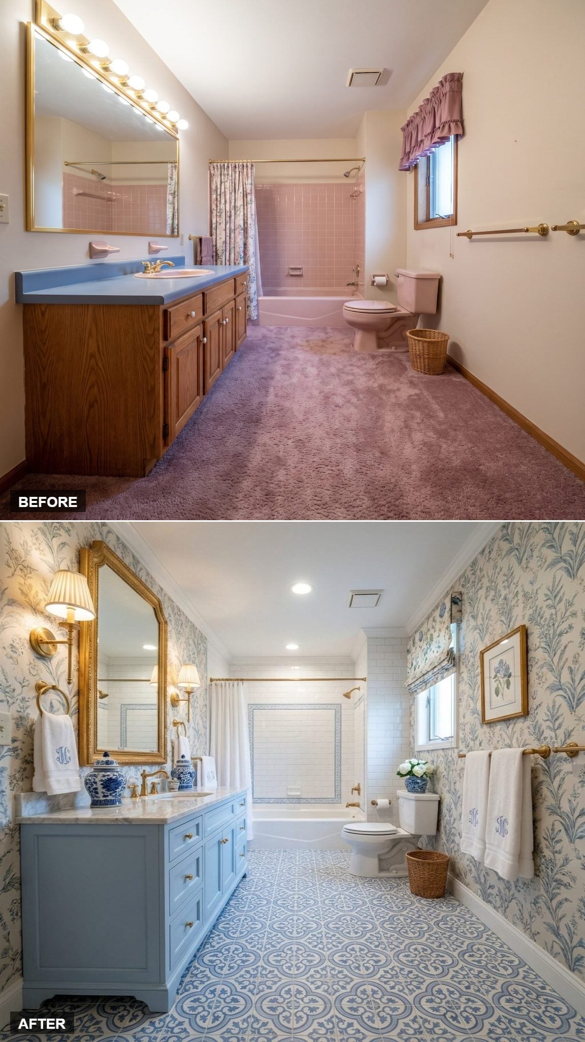
Blue-and-white patterned floor tile establishes the palette before the vanity even gets a vote. Powder-blue cabinetry picks up the same family without matching it exactly, while brass hardware adds just enough warmth to stop the room from going icy.
Then the toile arrives. Botanical wallpaper covers the walls, but the white subway-tile tub surround gives all that pattern a clean interruption. This is not a cautious design concept. That is why it works.
21. A Navy Vanity and Clawfoot Tub Bring Back the Past Without Rebuilding 1986
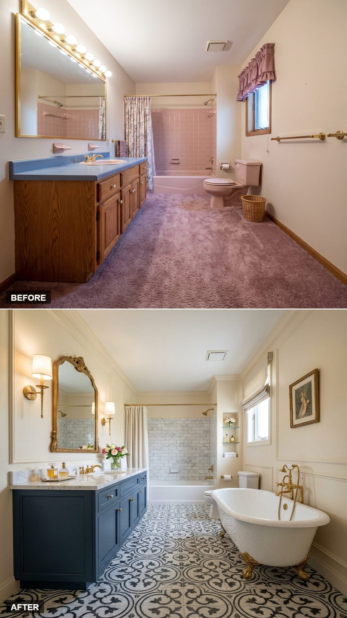
This concept goes traditional without becoming nostalgic about the carpet. Navy cabinetry, brass hardware, marble, and an ornate gilded mirror establish a much older visual language.
The patterned black-and-white floor carries most of the ornament, while a clawfoot tub on brass feet gives the far end of the room a strong silhouette. White marble subway tile around the shower keeps the walls from joining the competition.
20. Plum Cabinetry and Retro Geometry Make the 1980s Reference Worth Keeping
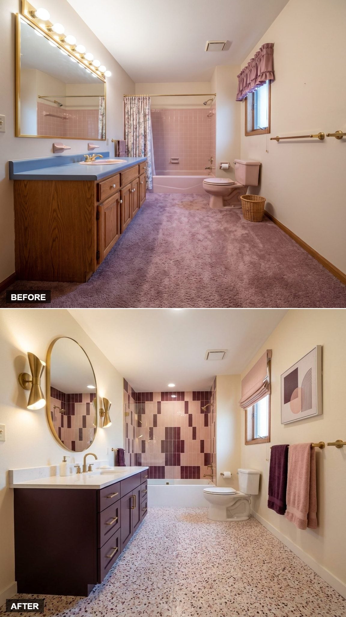
Deep plum cabinetry with brass pulls gives this bathroom a color that feels related to the original era without simply reproducing it.
Blush and eggplant tile forms a geometric pattern around the tub and shower, while a speckled terrazzo-style floor introduces a second pattern at a much smaller scale. White quartz through the vanity keeps the center of the room bright enough to prevent all that color from closing in.
Material Note: Terrazzo and terrazzo-look surfaces can be durable choices for bathrooms when the product, substrate, installation, and sealing are appropriate for wet conditions. The visual advantage is just as useful: small chips of color can connect several finishes without introducing another large-scale pattern.
19. Teal Zellige and Terra Cotta Make Glossy and Earthy Share a Room
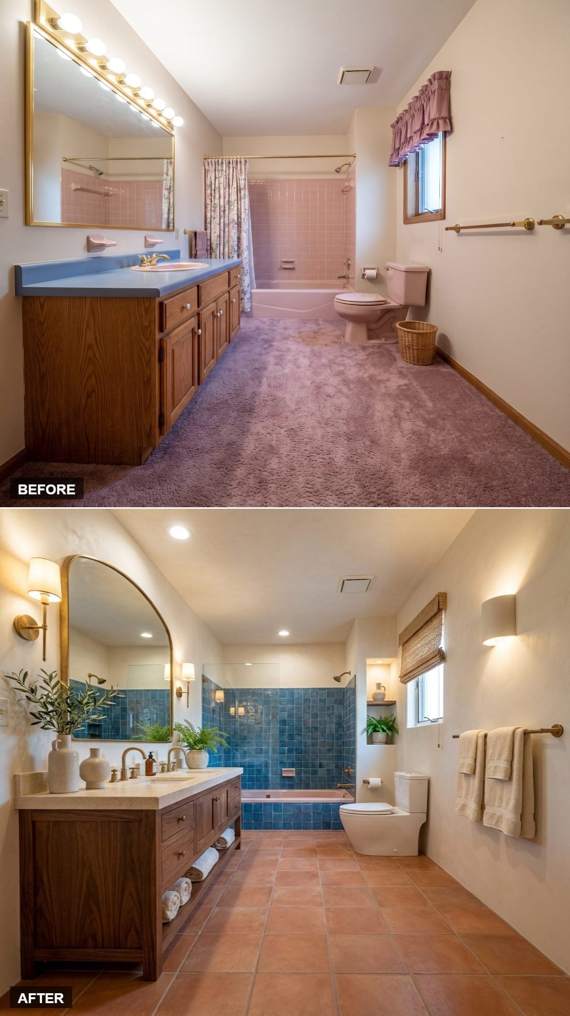
Teal zellige-style tile wraps the tub zone in glossy, irregular color while terra-cotta-toned flooring takes the opposite approach underfoot: matte, earthy, and visually heavy.
A wood-framed arched mirror bridges the two. The materials do not match; they balance. That gives the room more character than a perfectly coordinated palette would.
Worth Knowing: Traditional zellige is handmade, so variation in glaze, surface, and dimensions is part of its character. Terra cotta can also work in bathrooms, but proper waterproofing, sealing, and maintenance matter because the material is naturally porous.
18. Dusty Rose Cabinetry Makes Soft Color Feel Surprisingly Grown-Up
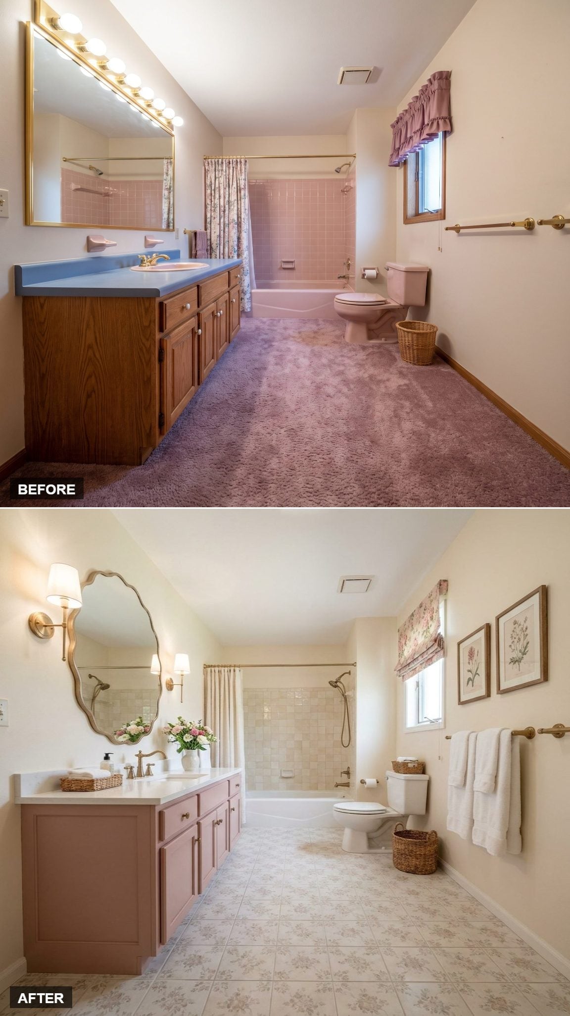
Muted dusty rose covers the vanity cabinetry without turning the bathroom sugary. Brass hardware and a white quartz counter sharpen the color just enough.
Fabric-shaded sconces flank an organically shaped mirror, adding a softer layer of vanity light. Underfoot, warm off-white tile carries a faint floral impression, while the Roman shade repeats the botanical idea at a much smaller scale.
17. Black Cabinetry and Basketweave Tile Give the Room a Tailored Edge
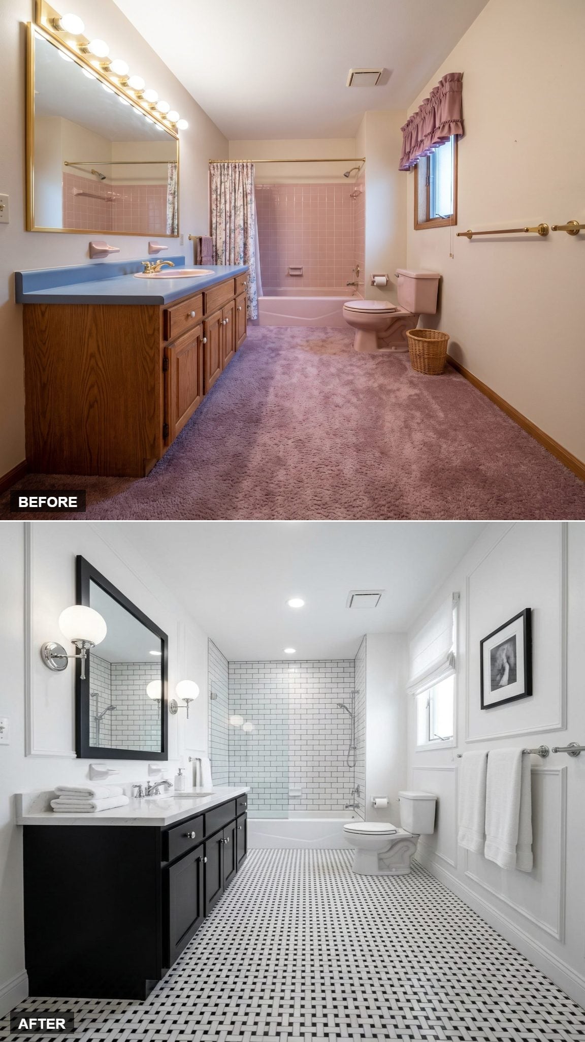
Black cabinetry, polished nickel hardware, a marble countertop, and white subway tile could have become stern very quickly. The basketweave mosaic floor saves it from that fate.
Its black-and-white pattern gives the room an older, more residential character while globe sconces soften the vanity wall. A Roman shade at the window is almost the only textile left—which feels appropriate after starting with a floor covered in one.
16. Sage Green and Wallpaper Take the Traditional Route Without Going Stuffy
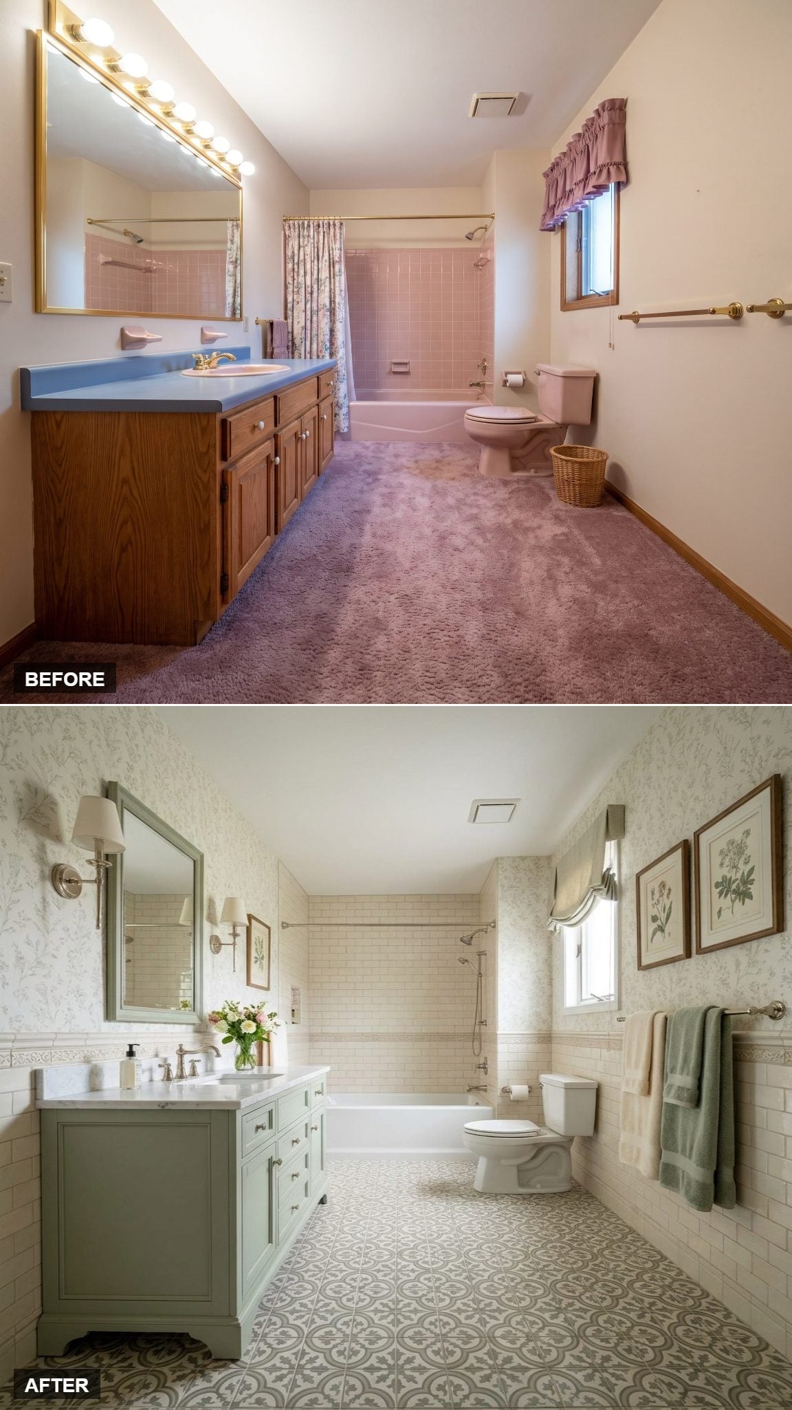
A sage vanity sits over gray-and-white patterned floor tile while wallpaper carries muted green and gray through the walls.
The tub surround stays comparatively restrained in white subway tile, giving the room enough blank surface to handle pattern on both the floor and walls. Brushed nickel keeps the hardware cooler and quieter than brass would.
15. Reeded Travertine Gives a Long Bathroom One Continuous Material Story
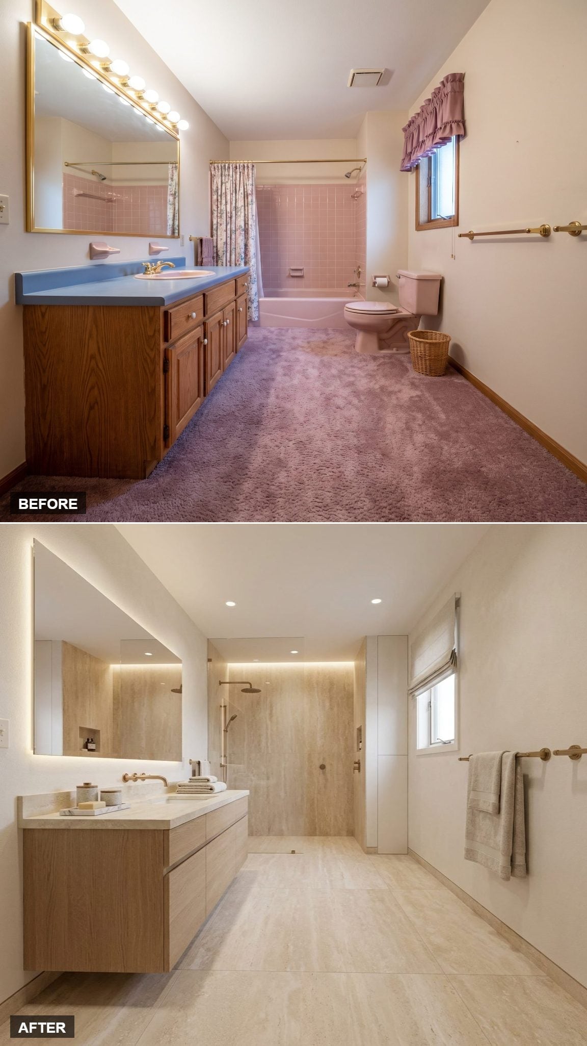
Here the stone treatment does not stop at the floor. Travertine-look surfaces continue into a reeded shower wall, turning texture rather than color into the major visual event.
A long floating oak vanity introduces warmth, while a honed-looking counter and brass fittings keep the material palette narrow. Recessed lights provide general illumination and the backlit mirror adds a softer glow around the vanity.
Stone Note: Travertine is a form of limestone associated with mineral-rich spring environments. Its characteristic pores and banding are part of the stone itself. For bathroom floors, filled and honed finishes are common approaches when a smoother, more practical surface is desired.
14. Open Shelving Works Better When It Looks Like Storage, Not a Display Case
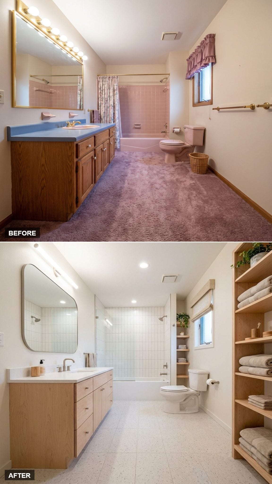
Light oak cabinetry and shelving introduce a distinctly practical note into a room otherwise kept pale and simple. The open shelves are deep enough for stacks of towels and baskets rather than a line of tiny decorative objects nobody is allowed to touch.
White square tile covers the tub surround, while a terrazzo-style floor adds enough speckled movement to prevent all those light surfaces from flattening into one another.
Why Open Shelving Can Work Here
Open storage is at its best when the things on it are things the bathroom actually needs. Towels, baskets, and frequently used items give the shelving a job. The trade-off is obvious: unlike cabinet doors, open shelves make disorder part of the view.
13. Dark Slate and Track Lighting Lean Into the Bathroom’s Long, Narrow Shape
🔥 Would you like to save this?
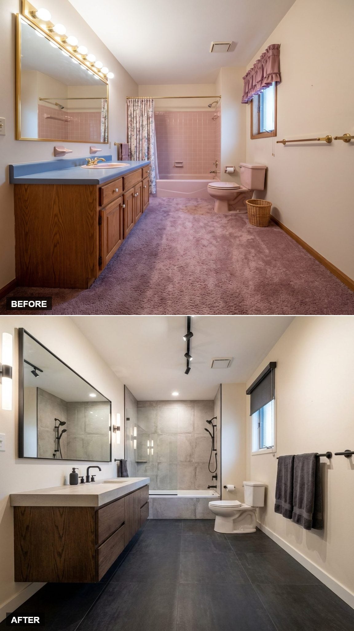
Large charcoal floor tile runs the length of the room beneath a floating walnut vanity and white counter. Matte black fixtures sharpen the contrast without adding another metallic finish.
The unusual piece is overhead. Track lighting follows the room’s long axis and allows multiple fixtures to distribute light along it rather than concentrating everything at one point. Warm gray tile around the tub keeps the back wall calmer than the floor.
12. Navy and Shiplap Give the 1980s Shell a Cleaner Coastal Accent
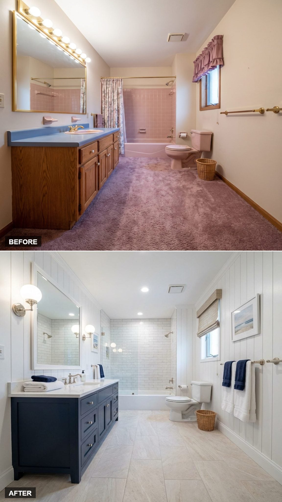
Vertical shiplap runs from floor to ceiling, giving the walls a strong linear rhythm. Against it, a navy vanity with brushed nickel hardware and a white quartz top provides one substantial block of color.
White subway tile in the wet area continues that disciplined geometry without copying the paneling exactly. This is one of the less complicated transformations, and that simplicity is useful among so many statement floors and saturated vanities.
11. Dusty Blue Wainscoting Gives Marble a More Traditional Frame
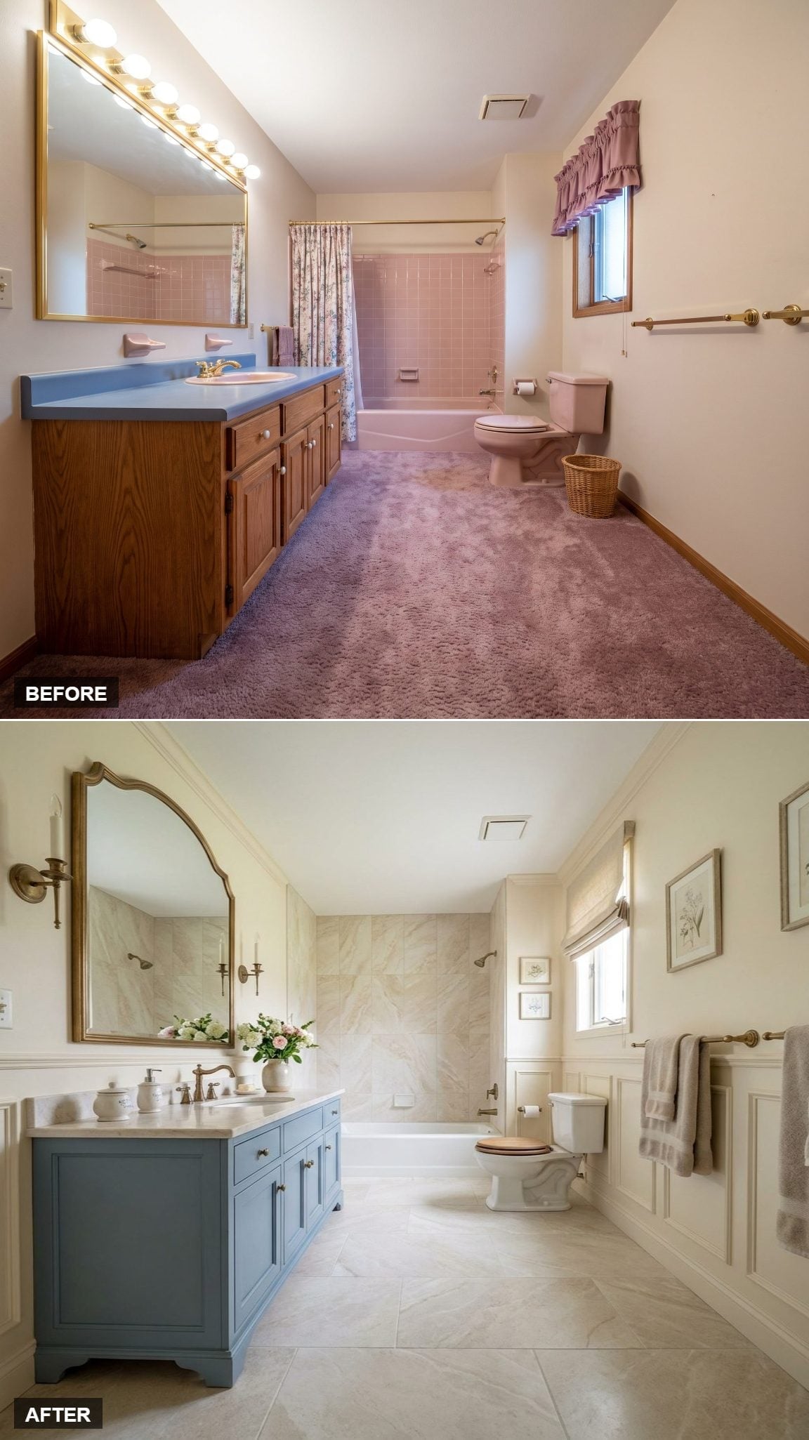
Muted blue cabinetry joins raised-panel wainscoting, crown molding, and an arched gilded mirror in one of the gallery’s most traditional schemes.
Marble-look tile runs from floor to tub surround, giving the detailed millwork a quieter background. Brass sconces introduce another warm note without turning the room into a period reproduction.
10. Terra-Cotta-Toned Tile Gives Oak a Much Better Decade to Live In
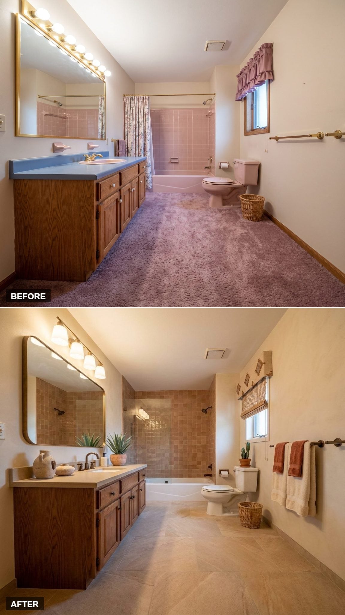
Square tile in a warm terra-cotta tone covers the shower zone and gives the room an earthy palette that makes oak cabinetry feel completely different.
Oil-rubbed bronze hardware adds darker punctuation, while bamboo Roman shades introduce another natural material near the window. A wicker basket and small cactus keep the room relaxed rather than over-finished.
Ceramic and porcelain tile are particularly practical departures from bathroom carpet because properly installed tile surfaces tolerate routine moisture and cleaning far better than textile flooring.
9. Walnut, Basketweave, and Marble Go Quiet Without Going Anonymous
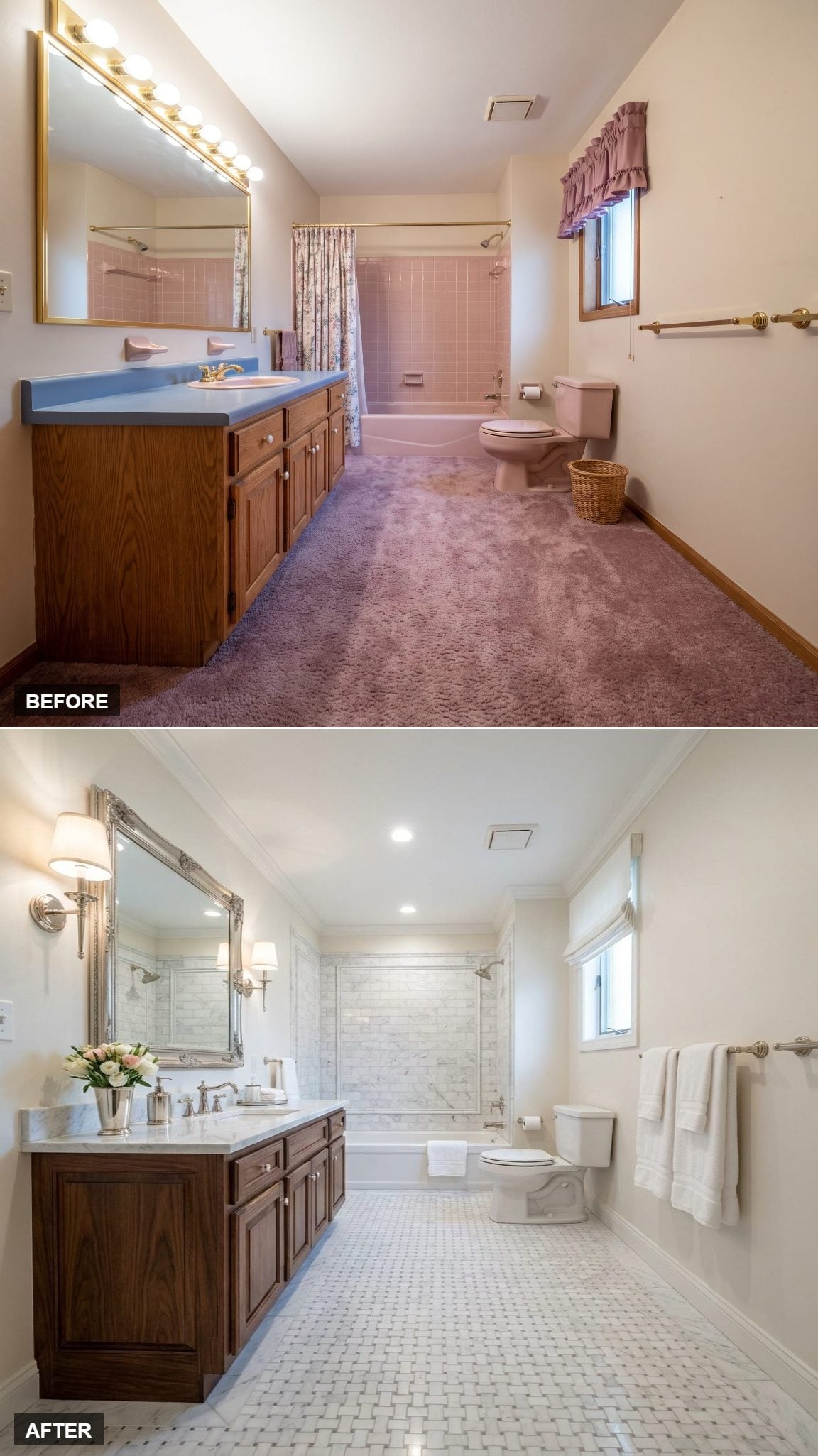
White-and-gray basketweave tile creates a classic floor beneath a warm walnut vanity. Marble-look tile at the shower uses a stacked brick pattern rather than a matching mosaic, keeping the two surfaces related without making them identical.
Crown molding and an ornate silver-framed mirror introduce traditional detail at eye level. Fresh tulips are almost frivolous in a room this restrained, which may be why they look so good there.
8. A Backlit Oval Mirror Makes Lighting the Main Design Move
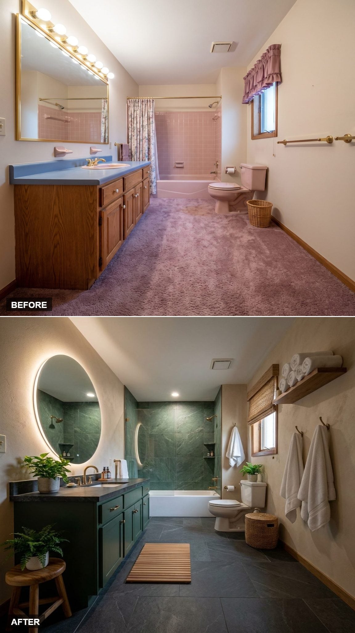
Forest-green cabinetry and brass hardware establish the palette, but the oval mirror is what changes the vanity wall.
Backlighting creates a diffuse halo around its perimeter, adding an ambient layer rather than exposing a row of bulbs. Dark slate below keeps the brighter mirror from floating in a sea of pale finishes.
7. Greige and Large-Format Tile Show What Happens When Nothing Needs to Shout
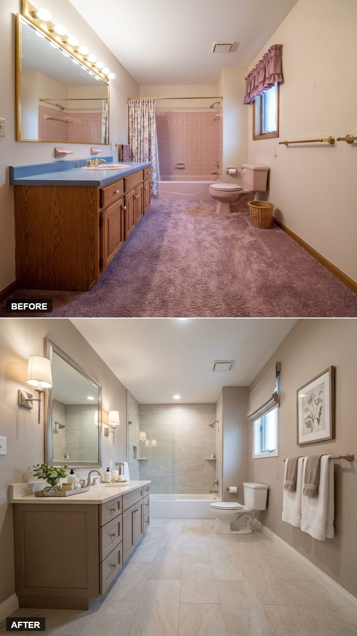
Gray-toned cabinetry, brushed nickel, pale stone-look surfaces, and simple framed mirrors keep this concept deliberately subdued.
Large-format floor tile continues into the shower in a related finish, minimizing visual breaks. Sconces placed beside the mirrors can provide more even facial illumination than relying only on a fixture high above, while ceiling lighting handles the broader room.
6. Walnut and Teal Give a Long Bathroom Color Without Chopping It Up
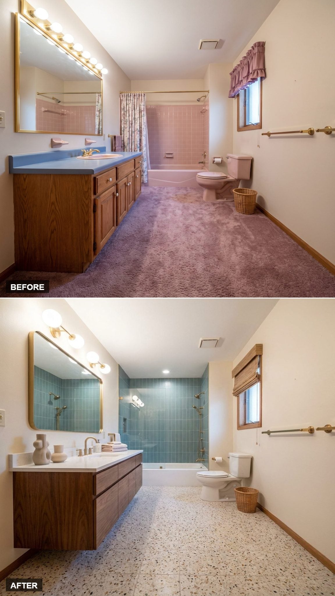
A floating walnut vanity keeps more floor visible in this narrow room, while a speckled terrazzo-style surface runs underneath without stopping at the cabinetry.
Large teal tile defines the tub and shower zone in a simple grid. Rounded mirrors and globe sconces introduce curves on the vanity wall, keeping the long room from becoming a collection of rectangles.
5. Slate Makes an Oak Vanity Look Purposeful Instead of Left Over
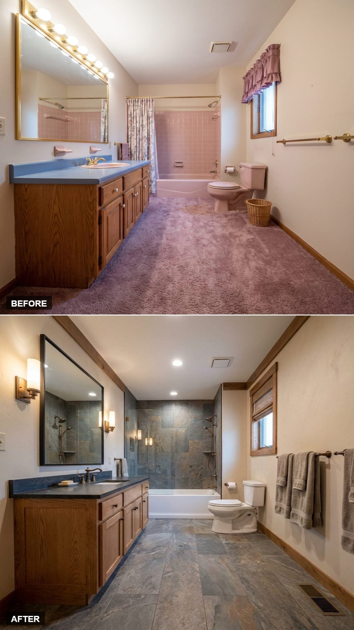
Charcoal slate-look tile covers the floor and shower zone, creating a dark setting that changes how warm oak is perceived.
Instead of looking like another leftover 1980s wood finish, the vanity becomes the warmest material in the room. Brushed nickel keeps the fixtures cool, while sconces and recessed ceiling lights divide vanity lighting from general illumination.
4. Cream Stone and Oak Strip the Bathroom Back to Three Good Decisions
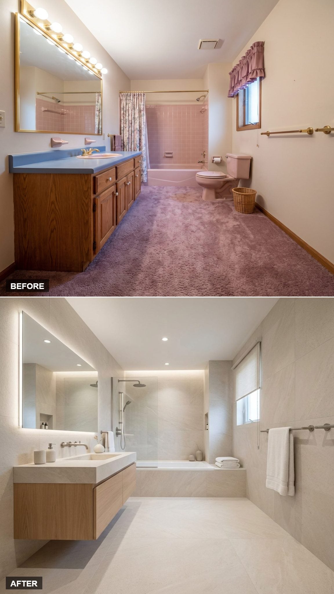
Creamy large-format stone-look tile covers walls, floor, and tub surround, reducing the number of visible transitions in the room.
A floating oak vanity provides the major warm surface, while a backlit mirror supplies a softer lighting layer behind the sinks. Recessed fixtures overhead handle the broader illumination. It is an intentionally narrow material palette, and the restraint is the entire idea.
3. Slate Floors and Beadboard Make Familiar Oak Feel More Cottage Than 1980s
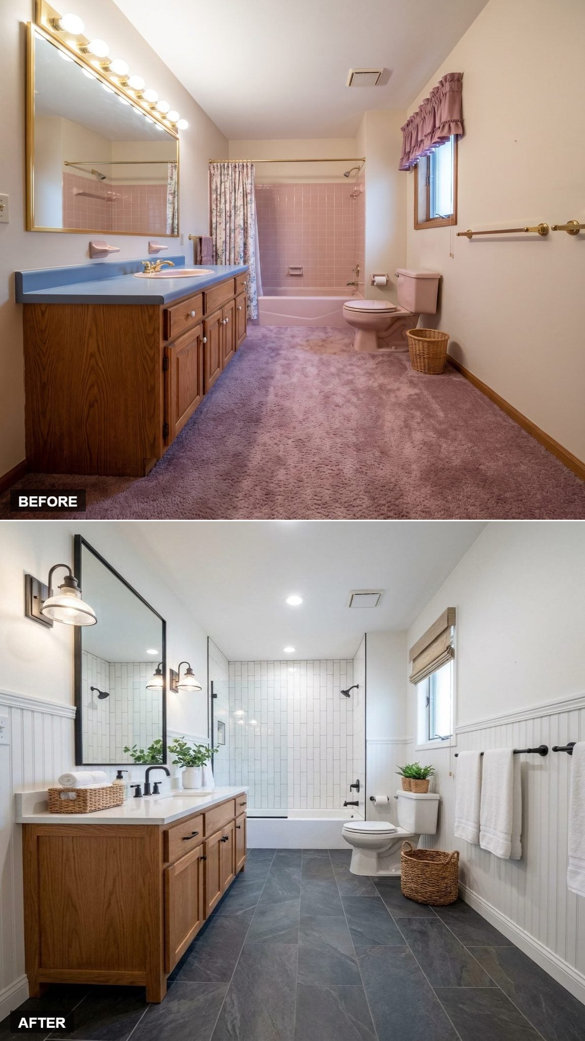
Dark slate-look flooring creates a strong base beneath warm oak cabinetry, while beadboard wraps the lower walls in a completely different texture.
Matte black hardware and sconces sharpen the palette, and white square tile keeps the tub zone straightforward. The materials are familiar; changing their context is what pulls them out of the previous decade.
2. And Then the Pink Toilet Refuses to Leave
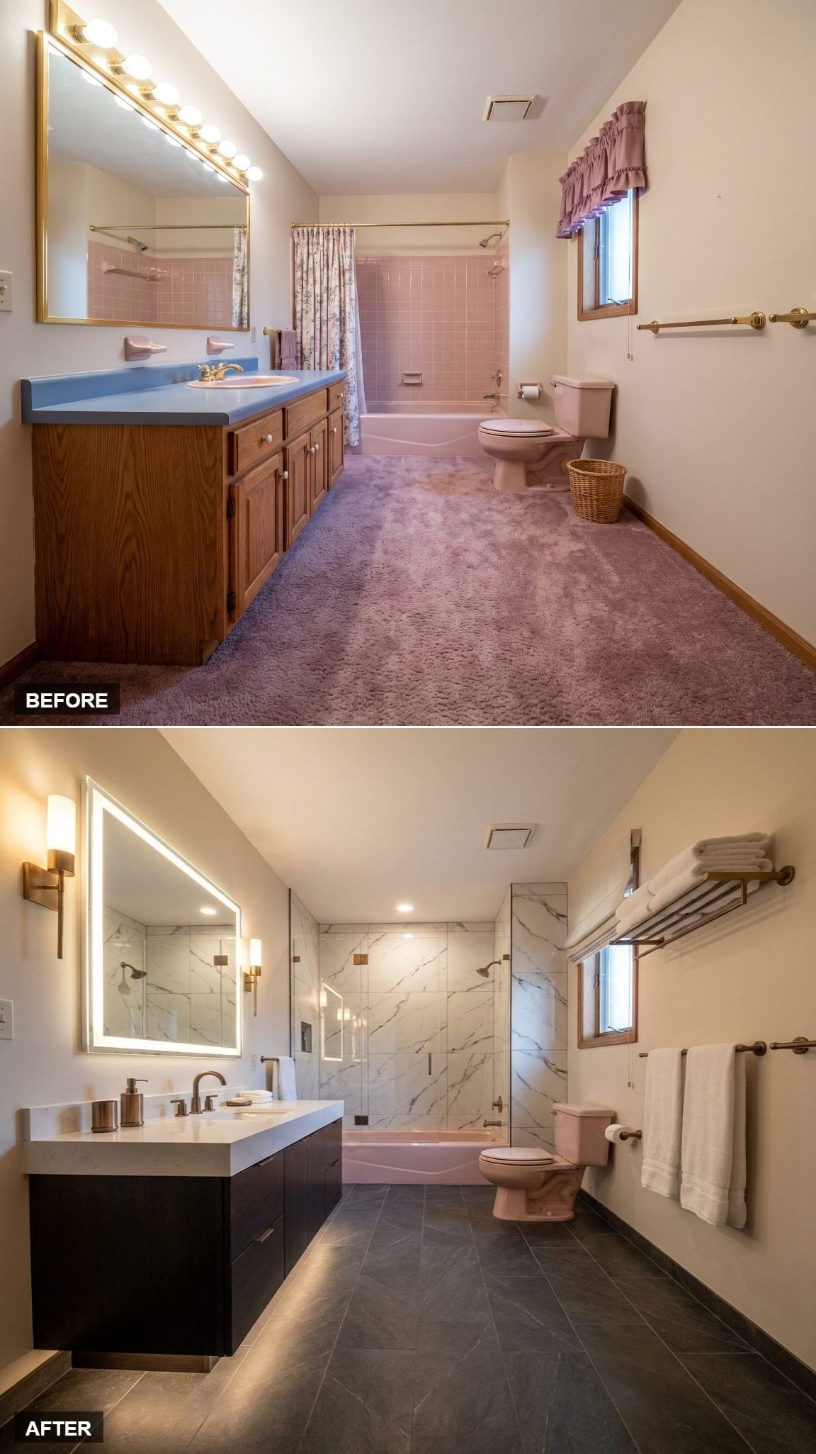
After two dozen arguments for tile, proportion, restraint, and carefully controlled palettes, the gallery arrives at the fixture most renovations would probably send straight to the curb.
The pink toilet sits against charcoal flooring, an espresso-dark vanity, and a wall of boldly veined marble-look tile. Instead of trying to camouflage it, the concept gives it enough contrast to become almost sculptural. A backlit mirror and flanking sconces keep the vanity wall sophisticated enough that the pink reads less like an accident from 1984 and more like somebody refusing to throw away the best joke in the room.
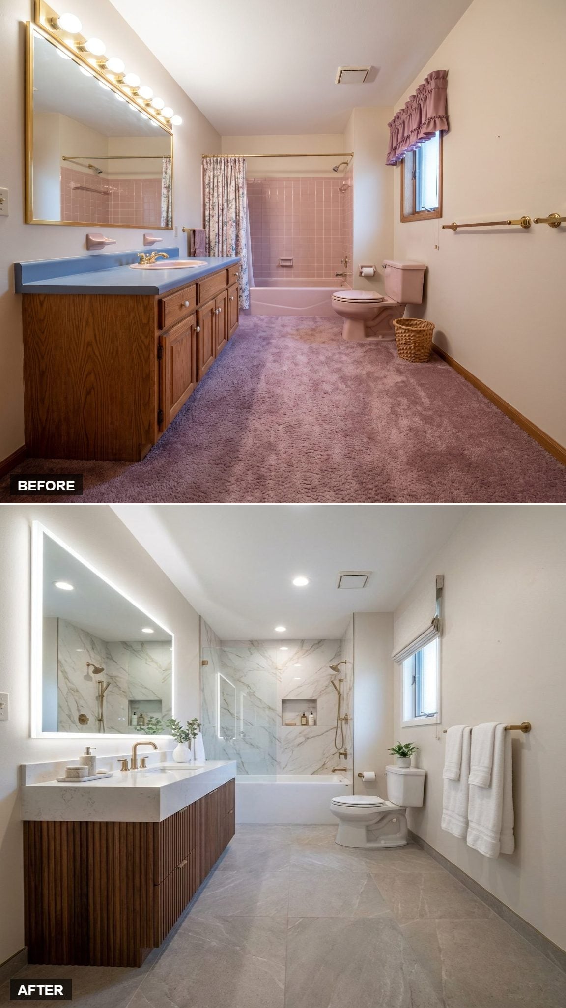
1. Walnut Slats and Chevron Marble Finish With the Biggest Material Reset
🔥 Would you like to save this?
The final concept trades fuzzy floor covering for surfaces that are almost aggressively architectural. Marble-look porcelain climbs the wall behind the tub in a chevron pattern, while a floating walnut vanity introduces narrow vertical slats below the counter.
A backlit mirror adds a clean halo at the vanity and brushed gold hardware warms the stone-and-wood palette. The room still contains pattern, texture, and color; none of it comes from the floor absorbing bathwater.
Across all 25 concepts, the carpet is really only the opening problem. The more interesting transformation happens after it is gone, when the room has to decide what kind of architecture it wants to be. Some schemes build character through color. Others rely on grain, stone, lighting, pattern, or the simple discipline of using fewer materials more deliberately.
The 1980s bathroom was rarely short on personality. The better question is which parts deserve another life. Oak can stay. Brass can come back. A pink toilet may even get its revenge. The carpet has had its chance.












