🔥 Would you like to save this?
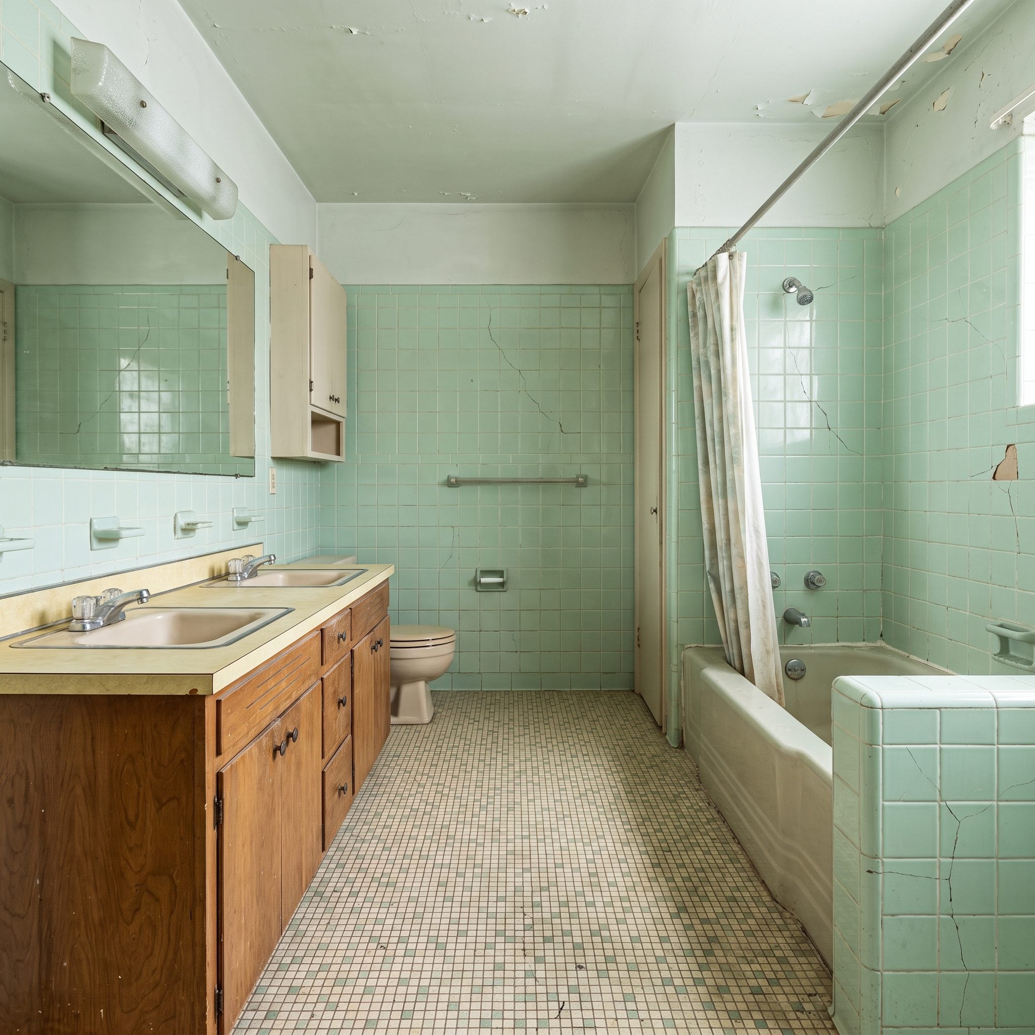
Nothing in this bathroom is spectacularly disastrous. That is almost the problem. Pale mint-green tile, tired grout, a sprawling mirror, aging cabinetry and cracks working their way through both tile and ceiling have settled into the kind of visual background noise that makes a room easy to stop seeing. The footprint is generous. The daylight is there. What is missing is any sense that the room knows what to do with either.
That makes it a much more interesting design experiment than a tiny bath where every renovation has to solve the same space problem. Here, there is room to change the architecture as well as the finishes: widen the sightlines, pull storage off the floor, let stone run uninterrupted across entire walls, turn the shower into a glass enclosure, give the bathtub enough space to become sculpture. The old seafoam tile is not dictating the answer. It is simply giving every redesign something very specific to argue against.
In order to come up with the very specific design ideas, we create most designs with the assistance of state-of-the-art AI interior design software. Also, assume links that take you off the site are affiliate links such as links to Amazon. this means we may earn a commission if you buy something.
Across these 27 transformations, the recognizable shell keeps producing completely different personalities. One version goes dark and architectural. Another turns almost monastic. Marble gets theatrical, walnut gets intimate, black and white goes graphic, and travertine proves it can behave in several entirely different ways. The cracked tile is only the starting point. What follows is less about making an old bathroom “nicer” than discovering how many genuinely sophisticated rooms were hiding inside it.
27. Travertine and Black Oak Turn the Forgotten Room Into a Resort
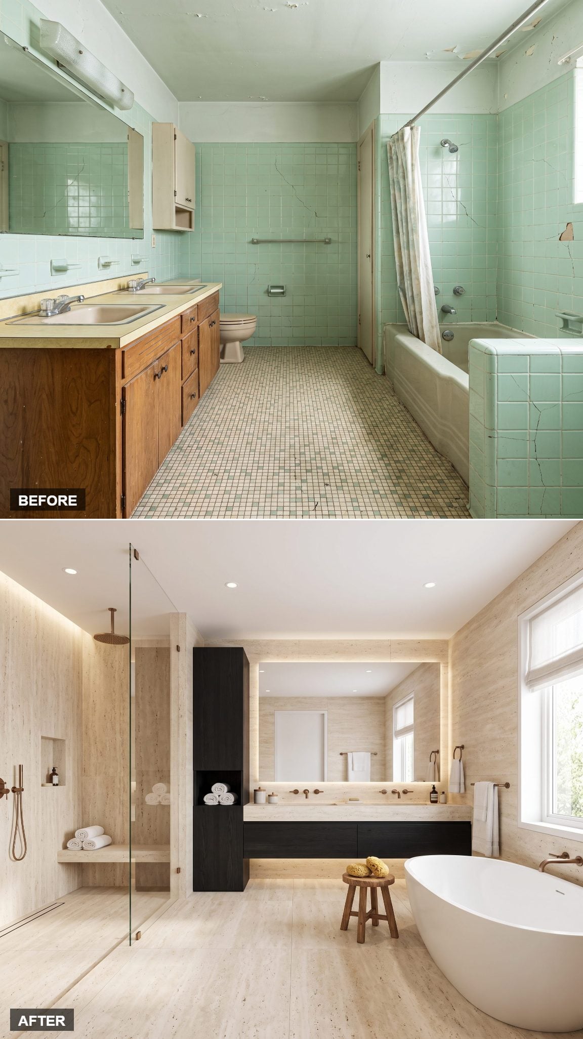
The cracked mint-green tile was doing nobody any favors. Replace all those little grids and grout lines with broad planes of pale travertine, and the room suddenly looks twice as composed.
Stone runs across the floor and climbs the walls, while a long black floating vanity and tall dark storage column cut through all that cream with almost graphic precision. The oversized illuminated mirror makes the back wall feel broader, frameless shower glass keeps the left side visually open, and the freestanding white tub finally gets enough breathing room to become sculpture rather than plumbing. Bronze-toned fixtures warm the pale stone without competing with it. This is less a bathroom refresh than an architectural reset.
26. Deep-Green Marble as the Whole Personality
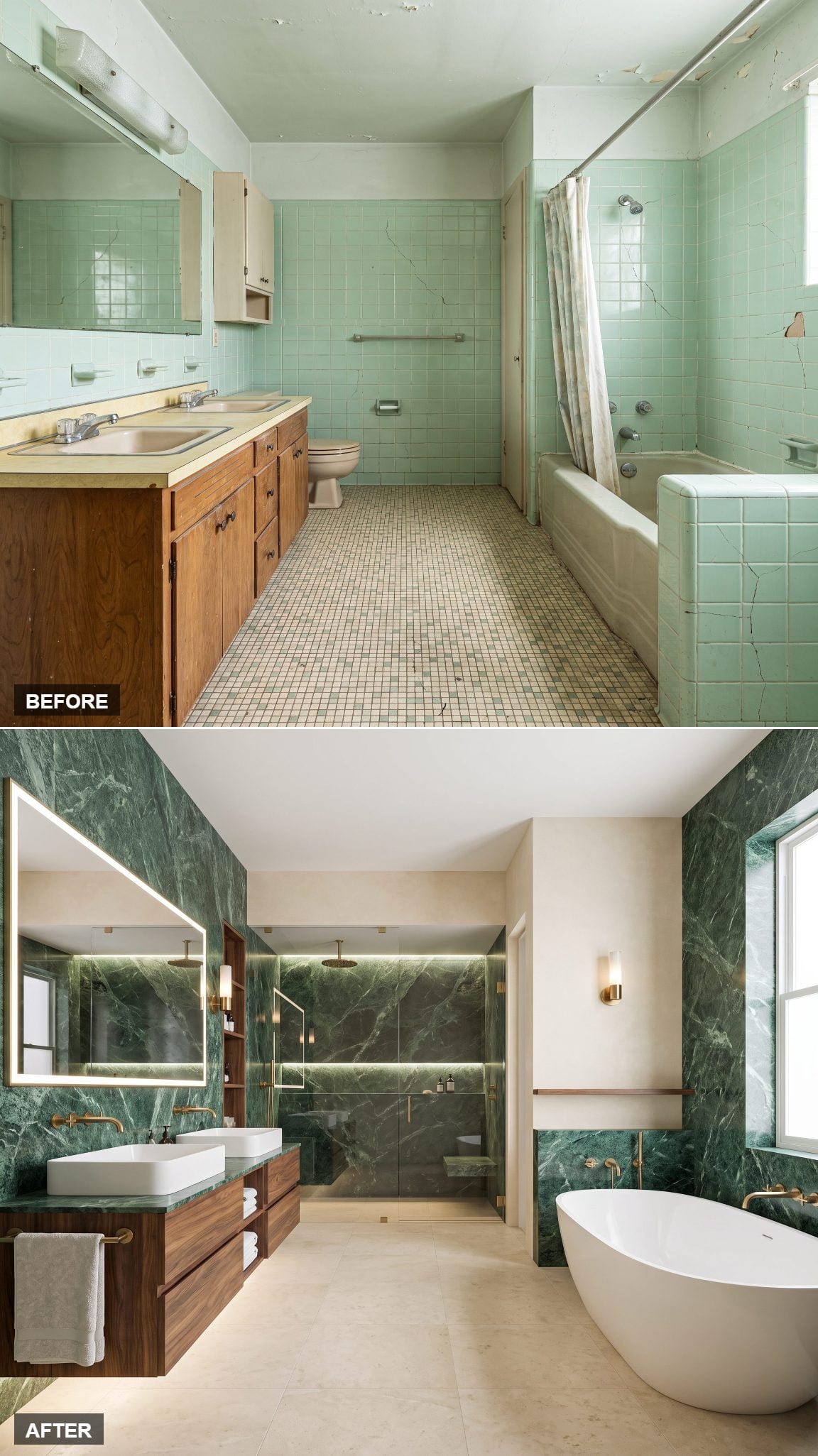
After pale travertine and black oak, deep-green marble feels almost confrontational. Good. This room is large enough to handle a material that arrives before anything else does.
The marble stays concentrated on the vanity wall, where gold and white veining turns the slab into the focal point. Pale plaster and warm oak keep the rest of the room comparatively quiet, while brushed-brass taps and one trailing plant repeat the warmer notes inside the stone. One bold surface. Everything else knows its place.
25. Soft Curves in Every Corner
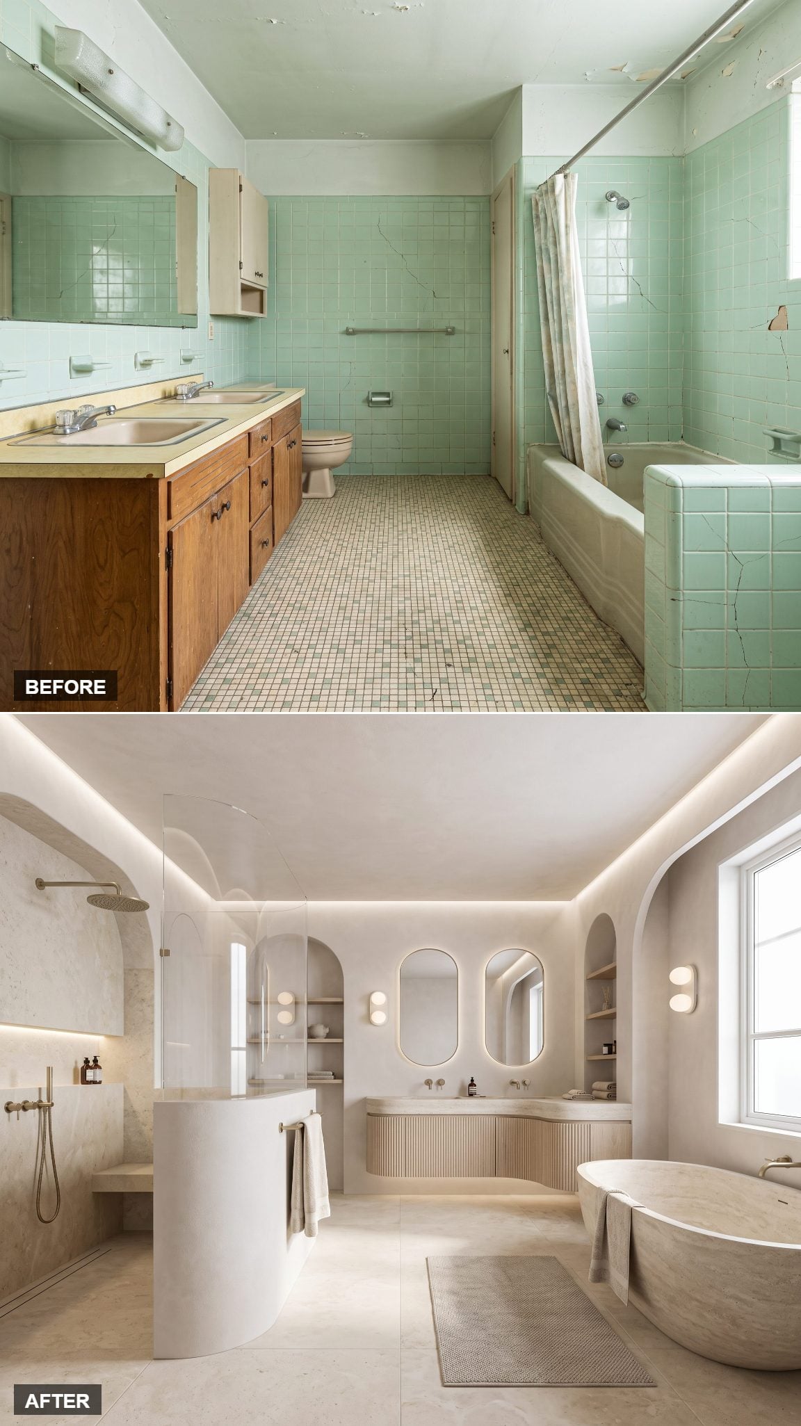
Now take away the veining, the strong color and almost every hard visual stop. This redesign starts rounding the room wherever it can.
A curved plaster shower niche, arched mirror, barrel-vaulted alcove over the tub and vanity with softened edges all pull in the same direction. Sand, oatmeal and cream keep the palette intentionally quiet so the geometry can carry the interest. Nothing needs a loud pattern when the architecture itself has stopped behaving like a box.
24. Charcoal Stone and Real Architectural Drama
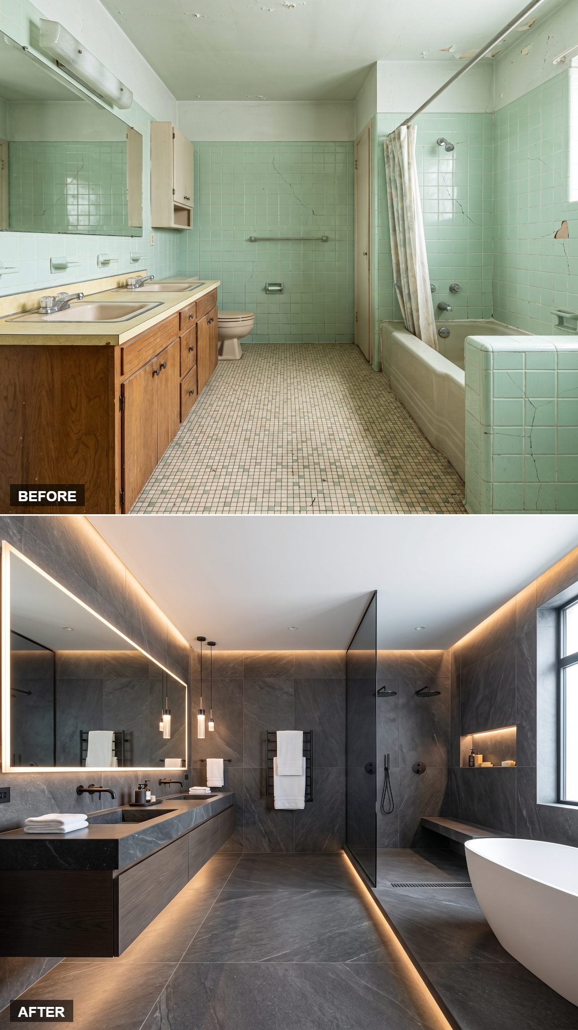
The original bathroom had plenty of floor area and almost no visual weight. This version fixes that by heading straight toward the dark end of the spectrum.
Charcoal stone cladding stretches across the walls, honed and matte enough to catch only restrained highlights. Concealed warm lighting grazes the texture, a stone basin keeps the palette tight, and blackened-metal fixtures nearly disappear into the background. One tall plant breaks the darkness. The window keeps the room connected to daylight, but the atmosphere has shifted completely.
23. Bright Scandinavian Luxury for the Long Haul
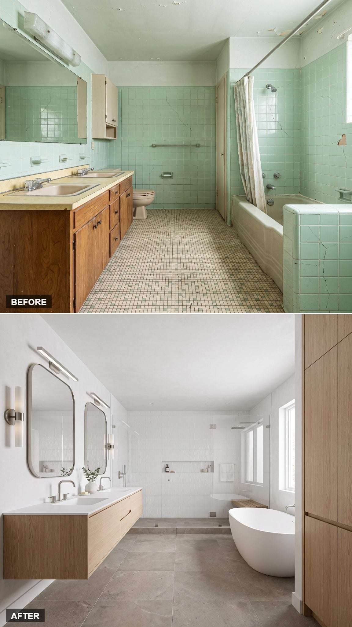
After charcoal stone, this feels like somebody opened every curtain in the house.
Soft-white walls, pale ash-toned flooring, a light-oak vanity and warm brushed-metal hardware give the daylight plenty to work with. A sprig of greenery, chunky stool and neatly stacked towels provide just enough texture to stop the room from becoming anonymous.
The appeal is restraint rather than novelty. Nothing is volunteering to become a feature wall, which leaves proportion, light and material to do the work.
22. Modern Art Deco, No Costume Required
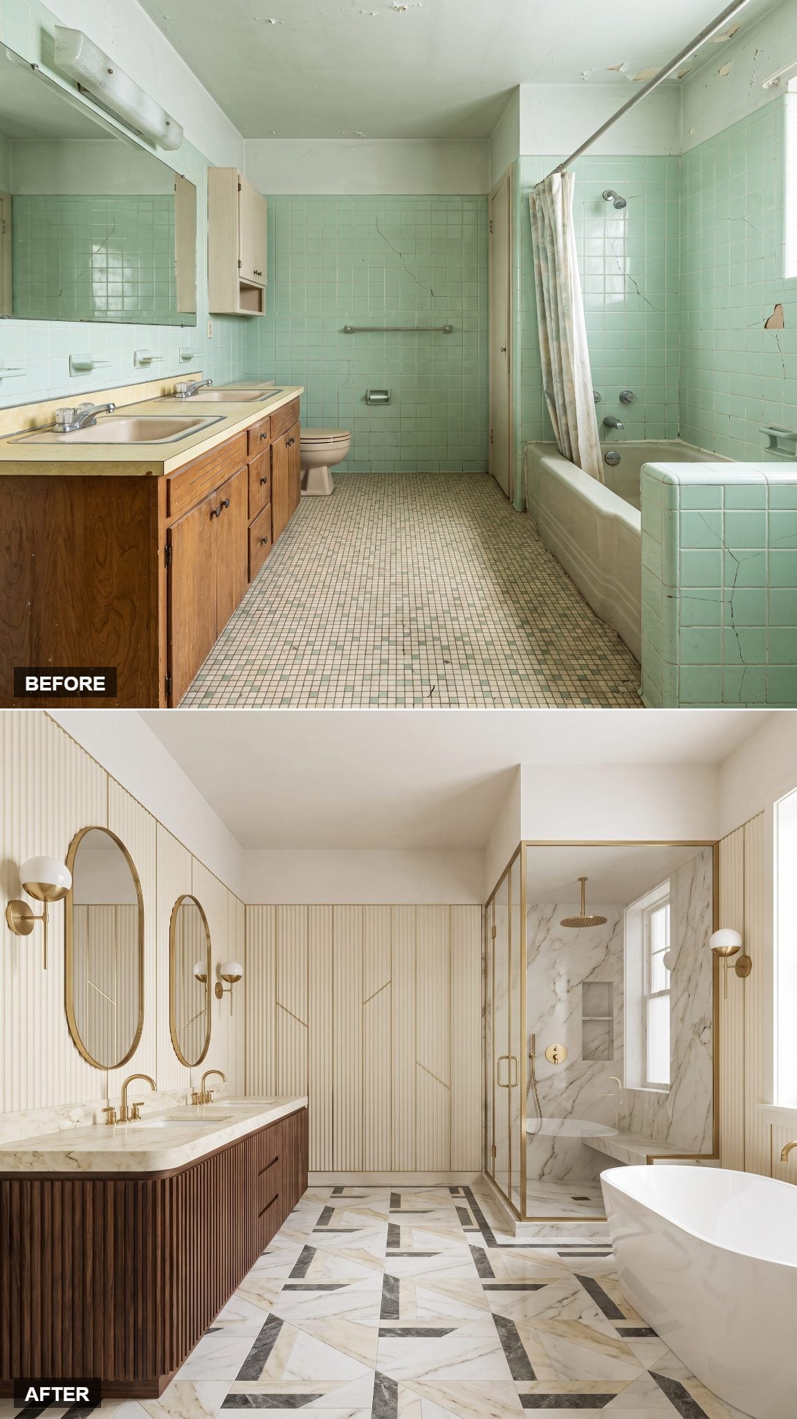
Deco gets shaky when every surface starts auditioning for the 1920s. This version knows when to stop.
Fluted panels, black lacquer and warm brass fixtures establish the vocabulary without turning the bathroom into a theme set. A fan-motif mirror supplies one obvious historical wink, then the palette settles into deep emerald and cream. A velvet stool under the vanity and folded hand towels finish the room without crowding it. Glamour, yes. Costume, no.
21. Seamless Microcement, Zero Grout Lines
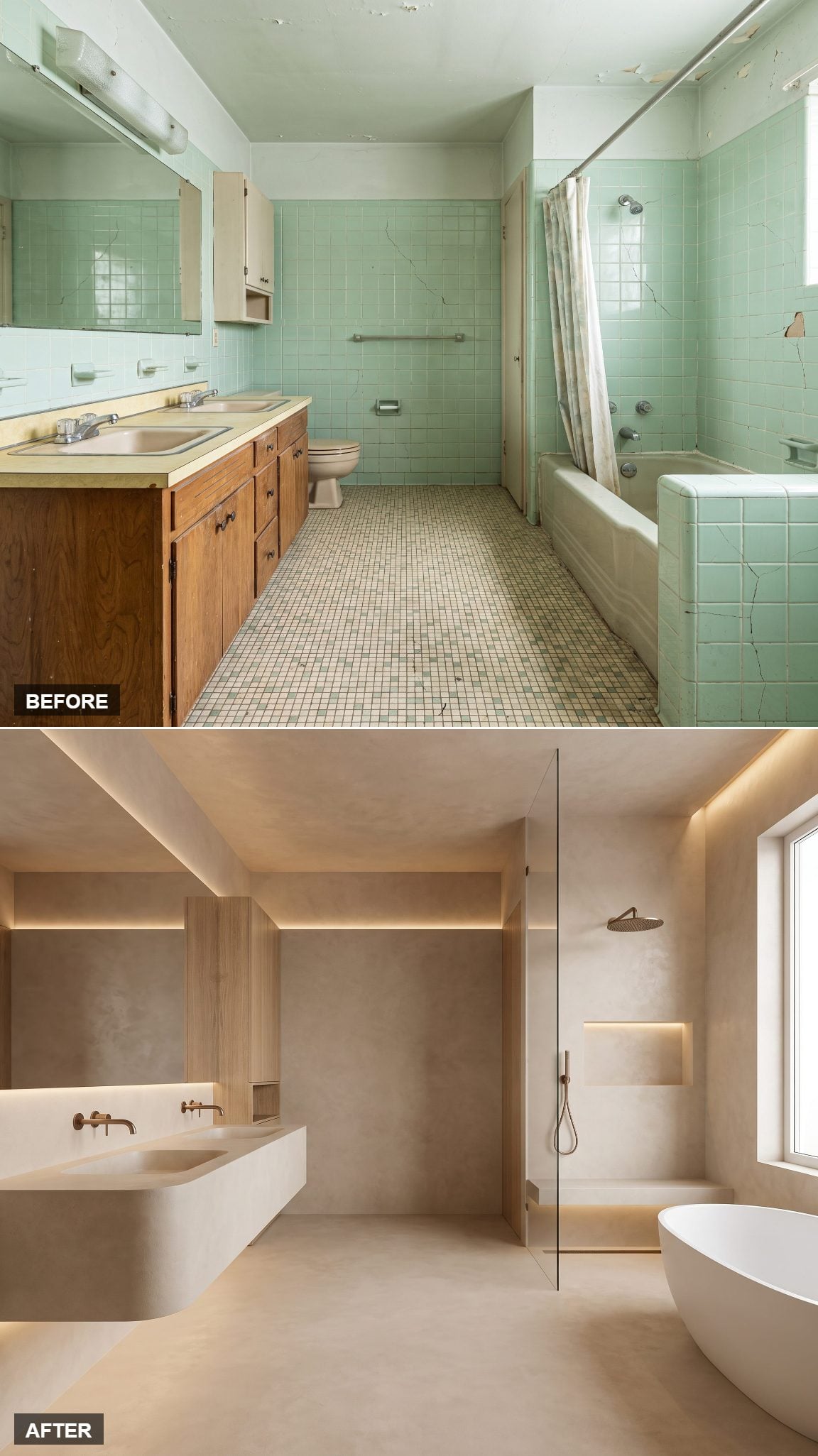
The old bathroom is practically a catalog of little visual interruptions: tile grids, grout joints, trim, fixture edges and changes in surface. Microcement takes the opposite route.
Walls, floor and vanity flow through one continuous warm-taupe finish, leaving no conventional tile grid to divide the room into pieces. The shower has no raised tray, and a low niche keeps storage inside the wall rather than introducing another object. A wooden stool and one dark bottle are almost enough decoration.
Microcement still depends on proper substrate preparation, waterproofing and sealing, but visually its strength is simple: far fewer joints competing for attention.
20. Bronze and Walnut, Boutique-Hotel Intimacy
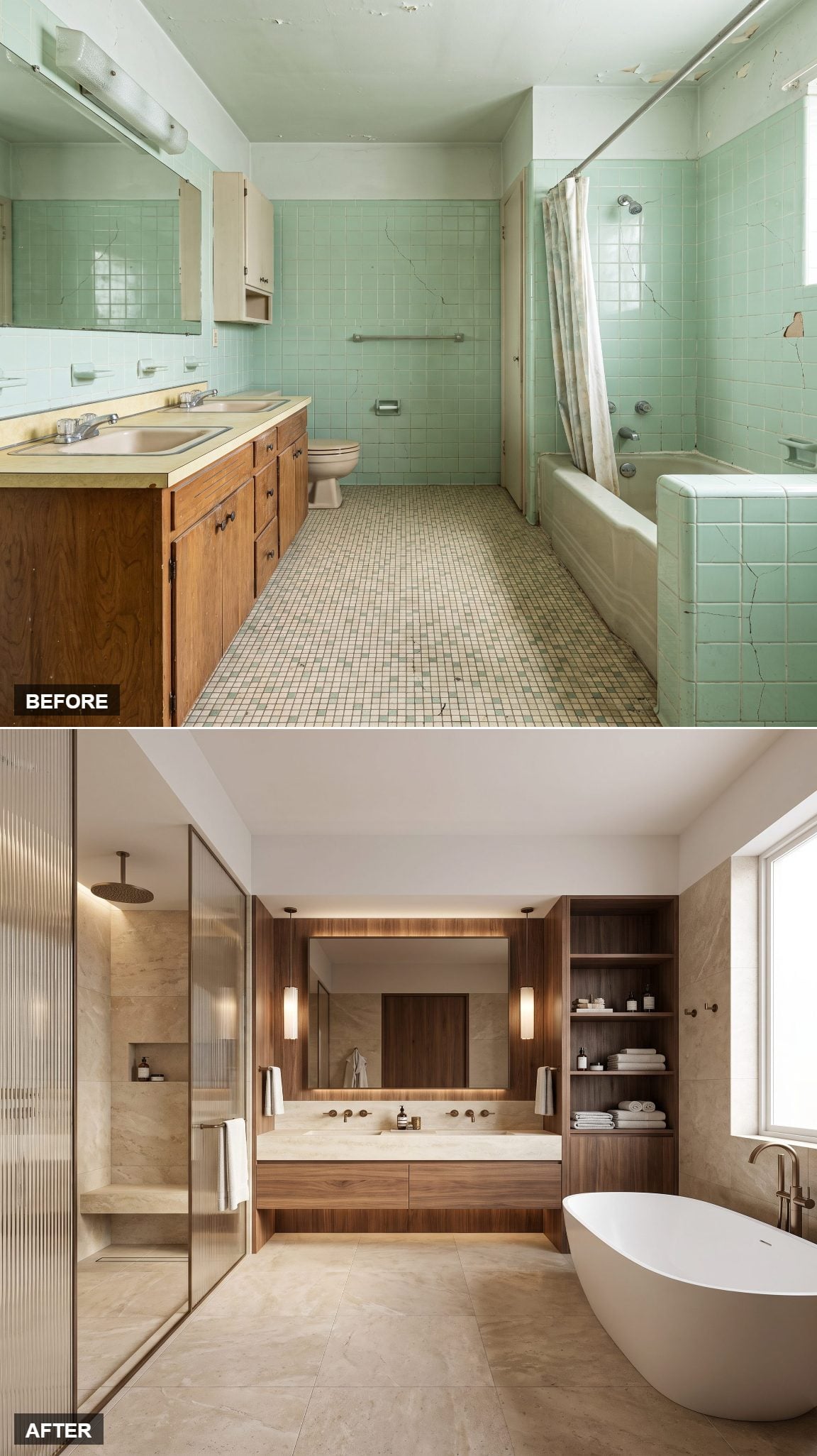
Now the lights go down again. Walnut, charcoal and bronze turn the room almost nocturnal without making it gloomy.
Walnut veneer wraps the vanity, paired with aged-bronze-finish fixtures and deep charcoal walls. A single amber pendant hangs low over the sink while a linen hand towel on a leather loop keeps the styling tactile rather than glossy. Wood grain, metal, linen and low light keep the darkness from becoming flat.
19. Bookmatched Marble Turns It Into a Five-Star Hotel Bath
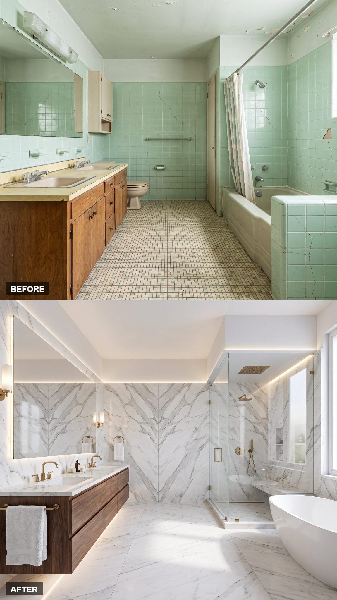
Bookmatching turns stone into an image. Adjacent slabs are opened and arranged so the veining mirrors across a center line, creating a pattern that can look almost drawn rather than quarried.
Here the marble climbs behind the vanity and across the tub surround, dramatic gray-and-white veins set against polished chrome and glass. A floating stone counter, wide backlit mirror and tightly rolled white towels keep everything around the stone crisp. The old utilitarian surfaces never had a chance.
18. A Japandi Wet Room That Slows Everything Down
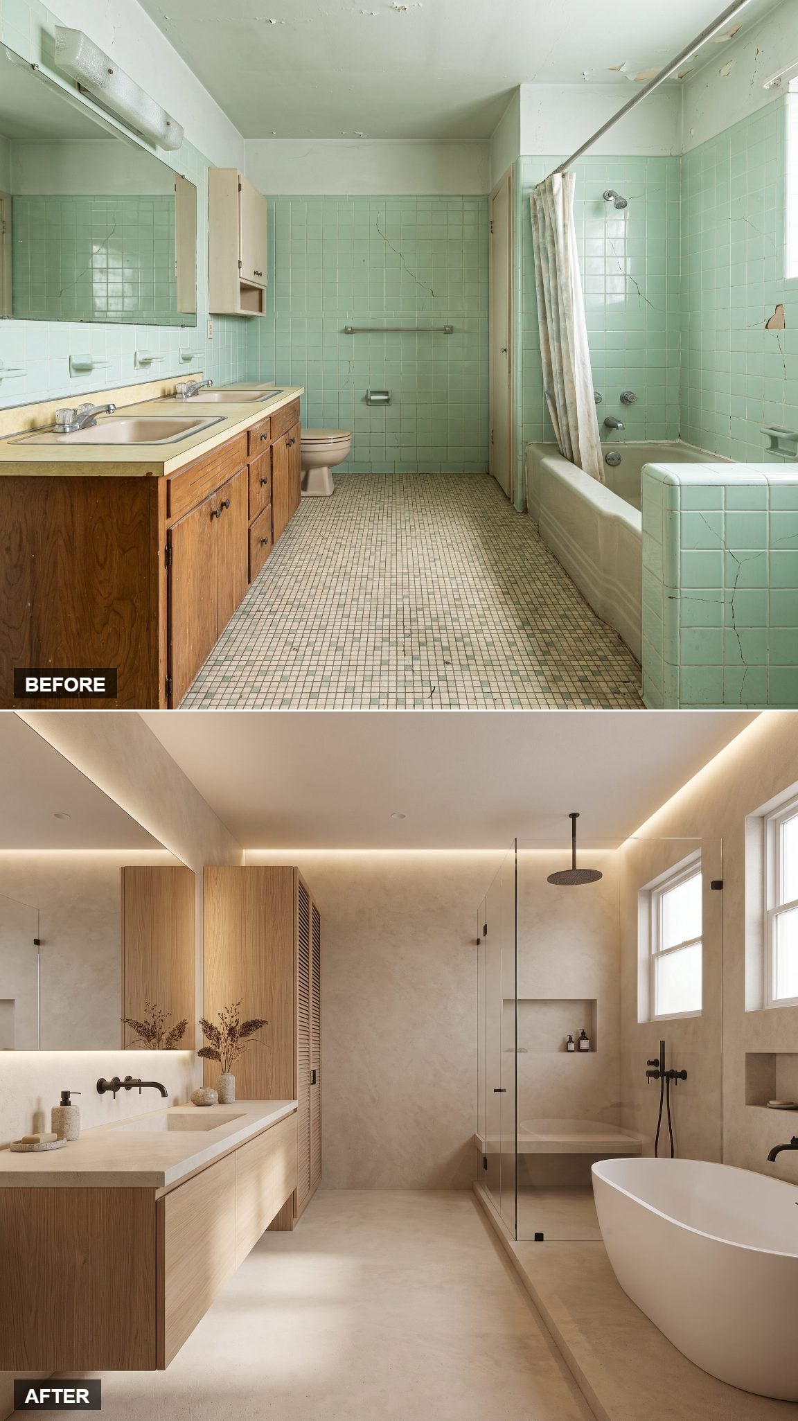
Strip the palette down to warm wood, pale mineral surfaces and a little black metal, and the bathroom becomes almost entirely about proportion and texture.
This one goes full wet room. Microcement wraps the floor and walls in soft oatmeal, joined by a low wooden stool, deep soaking tub, slim black fixtures and one ceramic vase holding a branch. Nothing is glossy enough to dominate. Even the frosted window becomes part of the composition, diffusing the daylight rather than fighting it.
17. Industrial Bones Get the Luxury Treatment
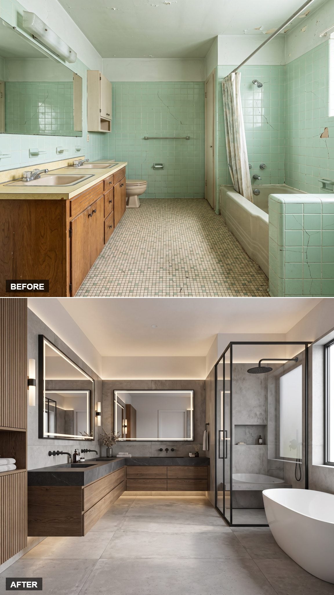
Concrete-look walls, blackened steel and hardware meant to be seen rather than hidden could easily turn severe. The warmer elements are what keep that from happening.
A steel-framed shower enclosure, matte-black taps and a raw-stone basin sit against gray walls, while warm wood and an Edison sconce soften the harder materials. The result suggests converted loft rather than factory floor. Same generous shell, completely different attitude.
16. All-White and Sculptural, Never Sterile
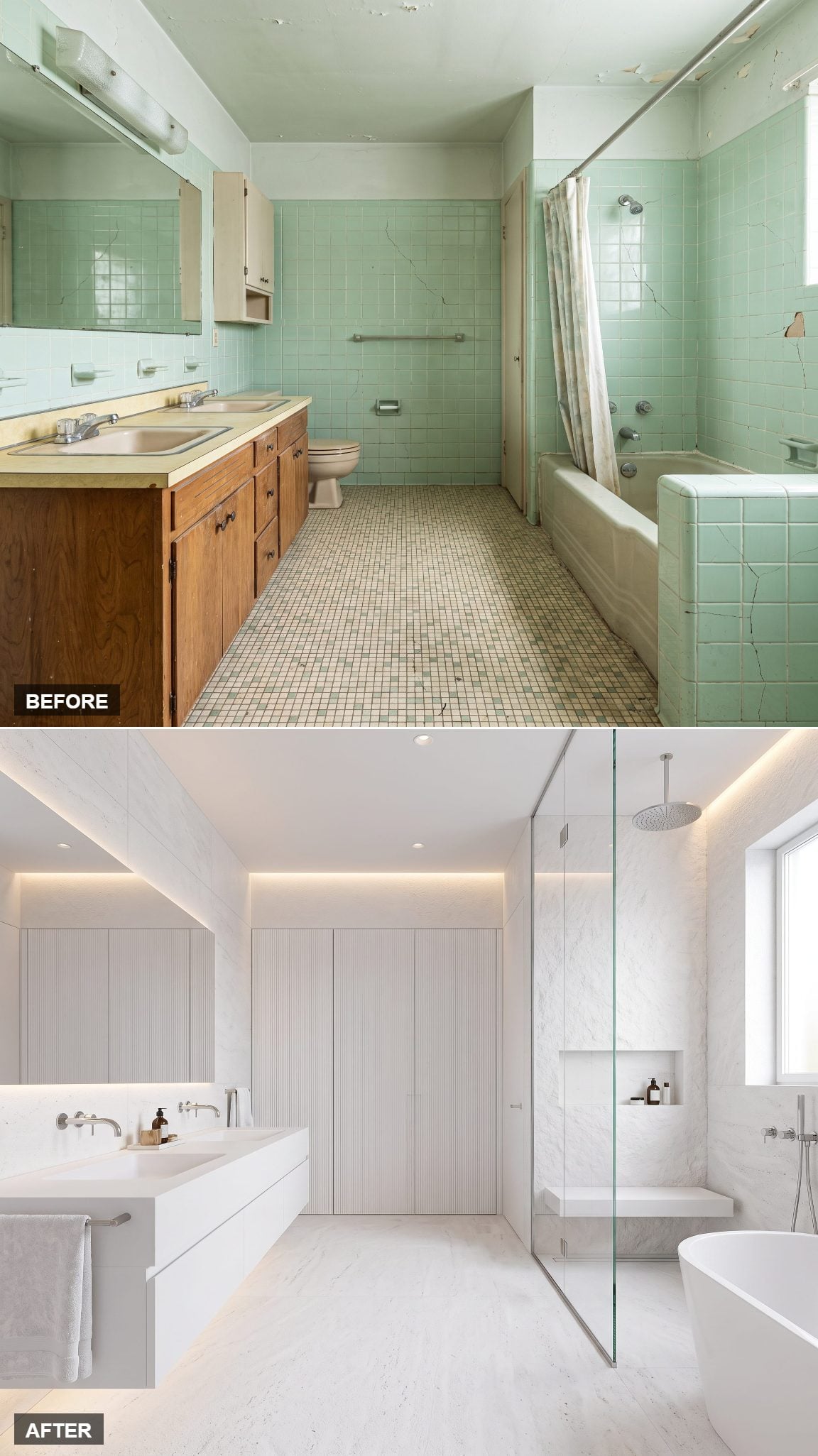
An all-white bathroom does not need another color to keep it alive. It needs surfaces that behave differently in the light.
Matte plaster sits beside polished stone and a fluted vanity front, all within a narrow range of white and bone. A sculptural freestanding tub curves through the middle while sunlight throws long shadows across the ribbing. Linen and ceramic add softer textures. White is still doing everything; it just isn’t doing the same thing everywhere.
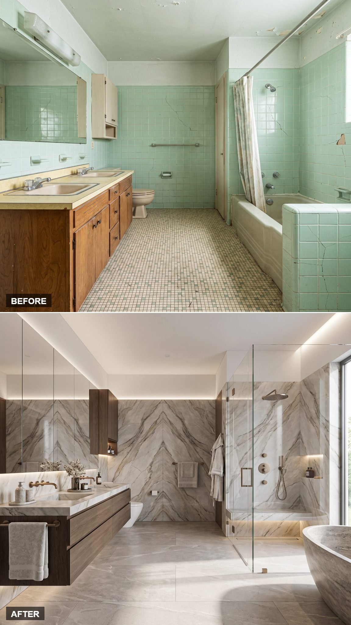
15. From Cracked Tile to Veined Quartzite Showpiece
🔥 Would you like to save this?
If the marble bathroom was polished, this one is theatrical. Bookmatched quartzite runs floor to ceiling, its veining mirrored down the center wall until the stone starts behaving like an enormous abstract artwork.
That symmetry is the sharpest move. Two related slabs meet at the center, and the geological pattern suddenly has a composition rather than simply covering a surface. A freestanding tub takes center stage with a brass tray and rolled towel, while everything else stays quiet. Stone this expressive does not need backup dancers.
14. A Black-and-White Gallery Bathroom With Graphic Bones
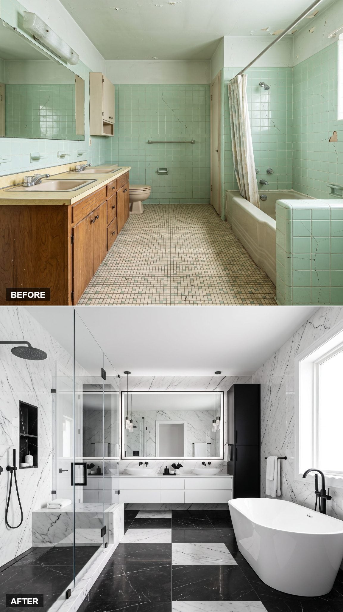
After all that geological drama, black and white feels almost startlingly disciplined. This version treats the bathroom like a drawing: white planes, black outlines, nowhere for weak proportions to hide.
White slab walls meet a black stone floor, a crisp black-framed shower screen and a floating white vanity with a matte-black faucet. One framed print, one black tray, one white towel. The restraint makes every line count. Compared with the cracked seafoam tile and scattered finishes of the original, this feels like an entirely different visual language.
13. Modern-Organic Limestone With Nothing Wasted
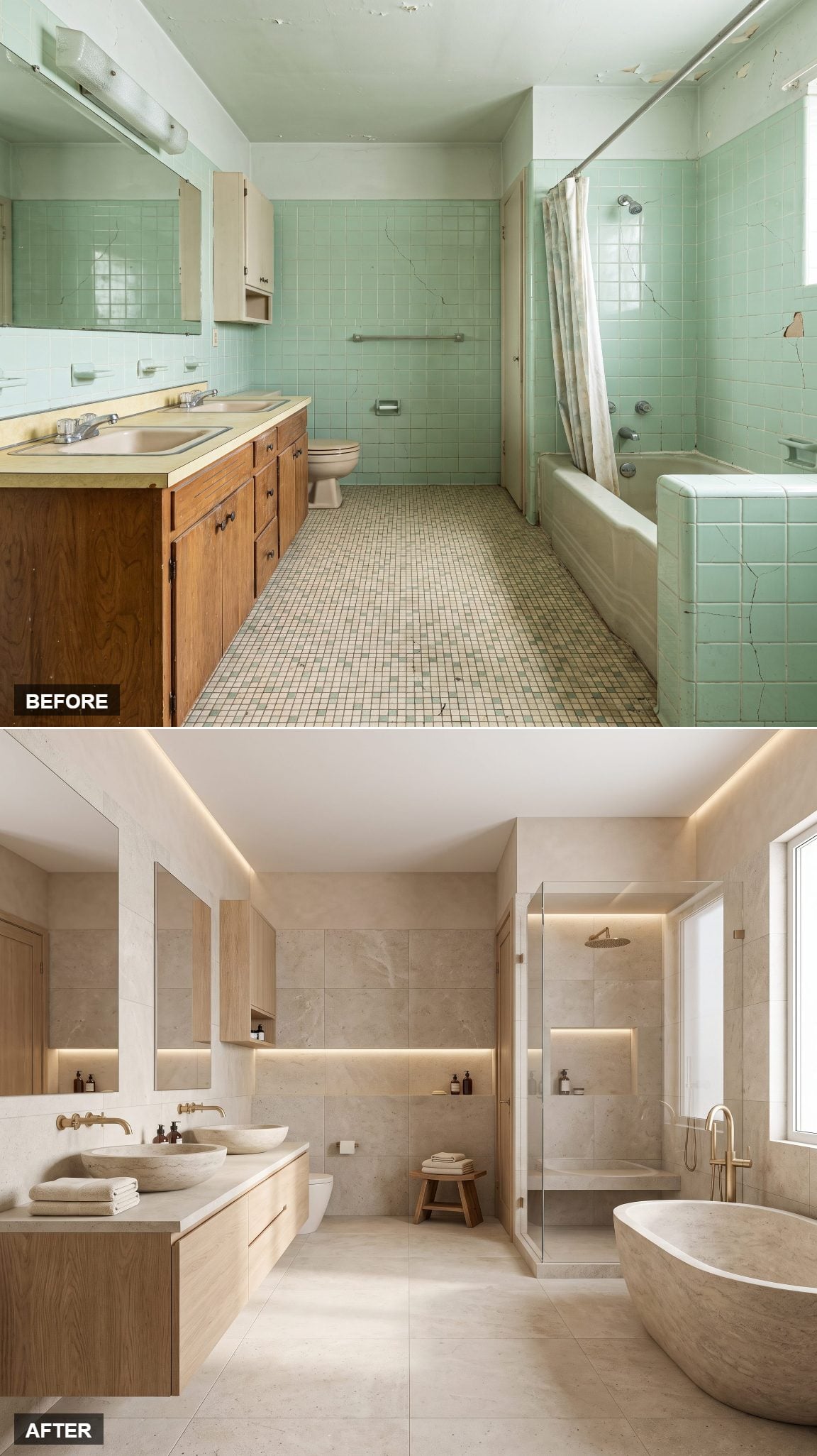
Soft greige limestone, hand-troweled plaster and rounded edges take the room in a quieter direction again.
The tub is a smooth stone monolith. The vanity appears carved from plaster, with an undermount basin and barely visible hardware. A woven mat, coiled towel and pale soap dish supply the only small-scale texture. Everything is matte, tactile and slightly irregular. Rather than decorating the bathroom, this version makes the surfaces themselves the decoration.
12. Mid-Century Modern, Grown Up
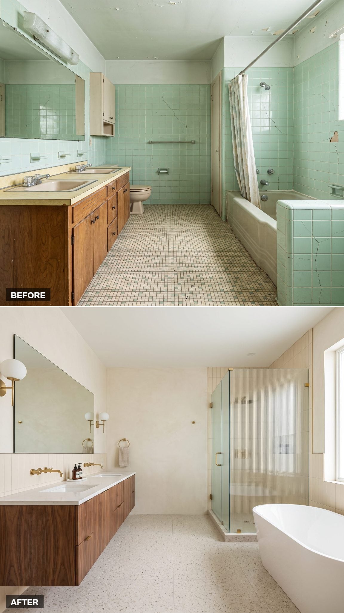
The 1960s bathroom finally gets the mid-century treatment it thought it already had.
Warm teak cladding, a floating vanity on tapered legs, a globe pendant and terrazzo underfoot bring the era back through recognizable materials and silhouettes rather than kitsch. Rust and mustard flecks in the floor give the neutral wood something to play against, while a framed abstract print and trailing plant keep the composition loose. It honors the period without turning the room into a reproduction.
11. Floating Vanity Minimalism That Makes the Room Breathe
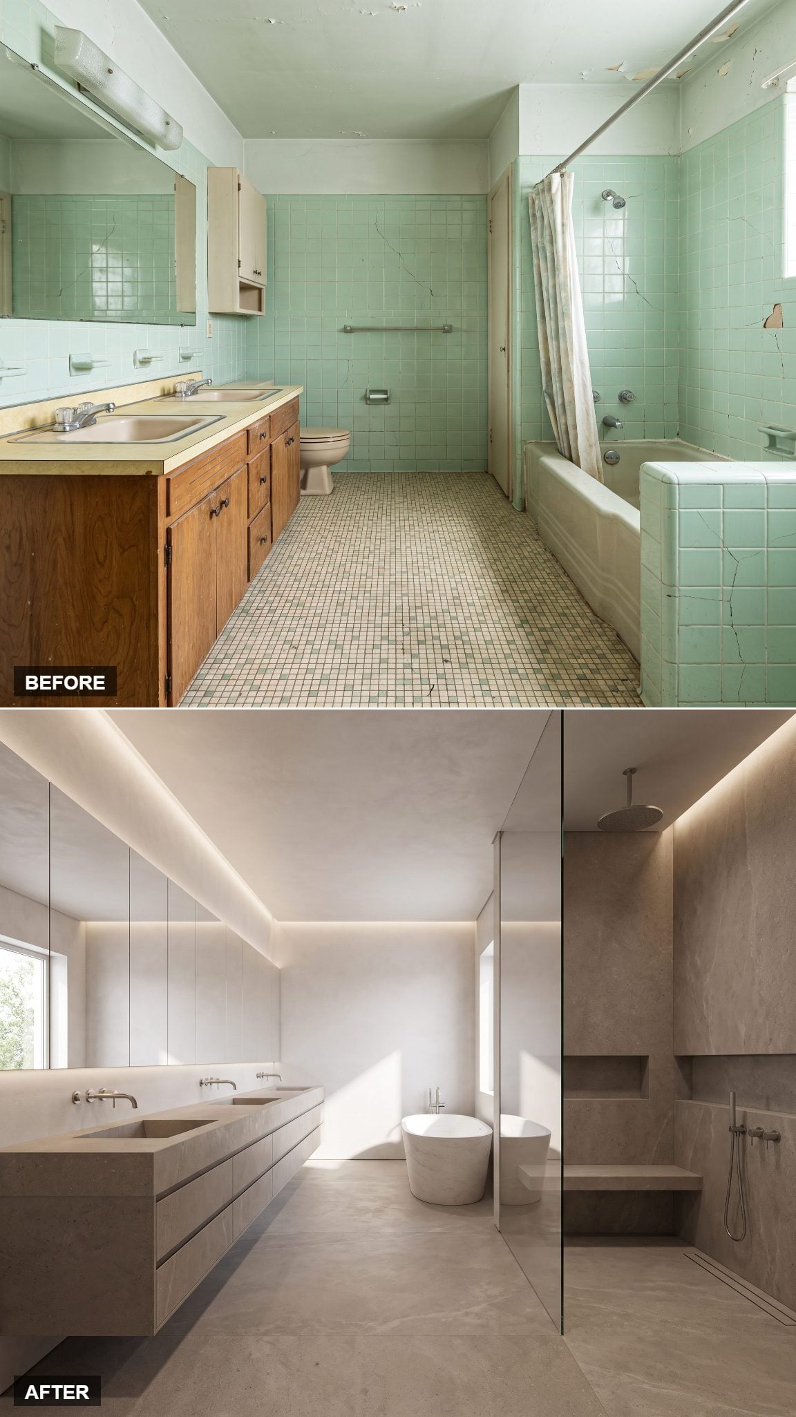
A wall-mounted vanity can alter the visual weight of a bathroom before you have even looked at the cabinet itself. Expose more floor and the furniture immediately feels lighter.
Here, a slim pale-oak cabinet with a stone top hovers above the floor, with a concealed light strip emphasizing the gap beneath it. Large-format warm-gray tile, a frameless mirror and wall-mounted faucet keep other edges to a minimum. One plant, one towel, one ceramic dish. The room is not actually larger. It simply stops advertising every boundary.
10. From Cracked Seafoam Tile to Travertine Spa Sanctuary
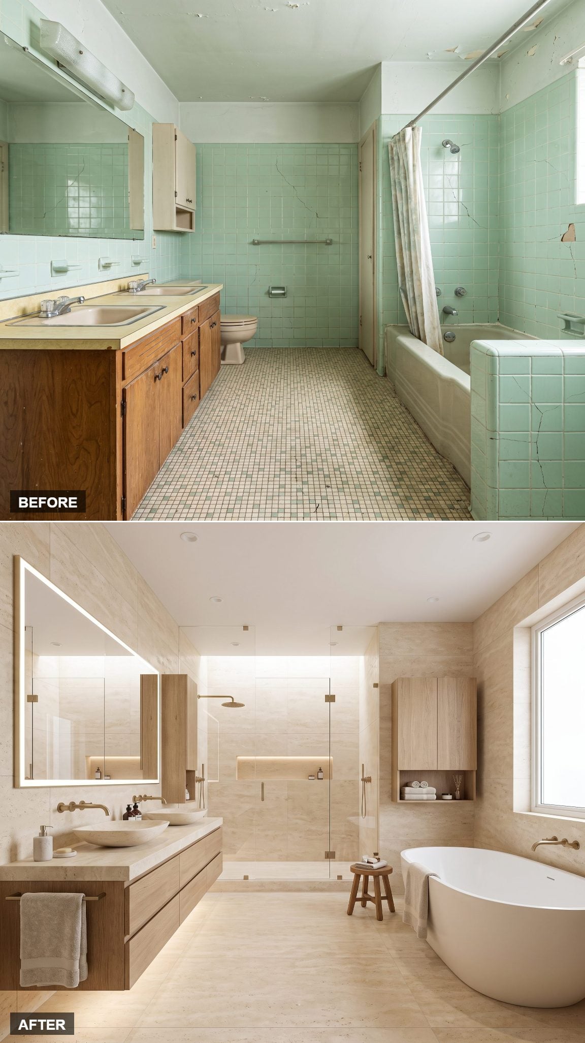
The mint-green tile was not inherently the problem. The larger issue was that every surface seemed to be speaking a different, very tired dialect.
Honey-toned travertine changes that in one sweep. Warm stone runs floor to ceiling behind a sculptural freestanding tub under the window, while matte-brass fixtures add a softer metallic note. Layered lighting replaces flat overhead glare. A folded linen towel, single branch and stone tray are enough. It feels like a spa that someone might actually use on a Tuesday night rather than a room arranged only for the photograph.
9. Cream Stone and Espresso Wood Keep the Palette Grounded
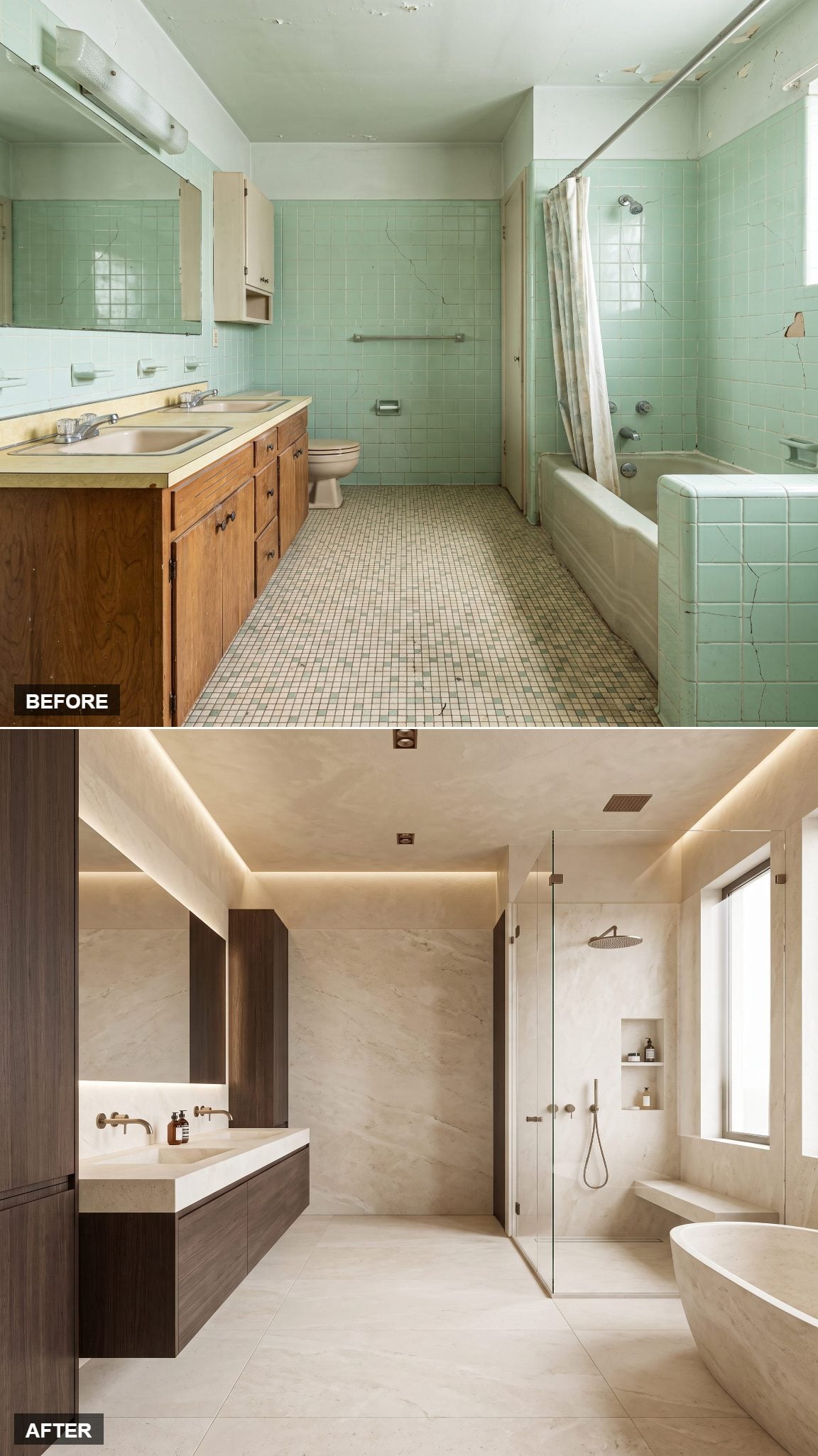
Cream stone and espresso wood. That is essentially the entire palette, and the discipline is what makes it work.
Dark cabinetry anchors the lower half while pale stone lifts the walls and counter, with brushed-metal fixtures bridging the two. The contrast is strong without becoming stark, warm without becoming decorative. Instead of chasing a particular trend, the room lets two familiar materials carry the composition.
8. Sculptural Fluted Stone That Reads Like a Museum Piece
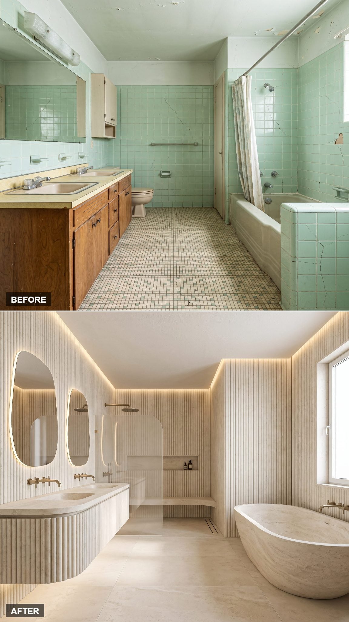
Flat stone is one thing. Cut deep vertical grooves into it and suddenly light becomes part of the material.
The vanity front and tub surround both carry pale sand-toned fluting, throwing narrow bands of shadow across surfaces that would otherwise be almost monochromatic. Bone-colored walls, an integrated basin and warm downlighting stay quiet around it. Even the ribbed vase echoes the architecture without demanding another pattern.
7. Floating Stone Vanity Meets a Double Walk-In Shower
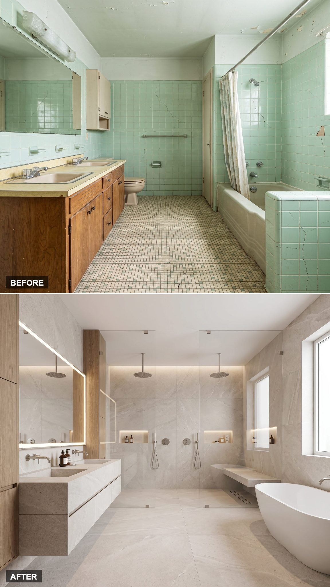
Two showerheads. One glass enclosure. No ambiguity about what the functional upgrade is supposed to be.
The floating stone vanity provides the visual counterpoint, cantilevered from the wall so the floor continues beneath it. Pale limestone carries into the walk-in shower behind frameless glass, where twin rain heads repeat the symmetry overhead. Open shelving holds rolled towels and a plant softens one corner. Practicality is doing a surprisingly good impression of luxury.
6. Ribbed Oak Brings the Spa Home
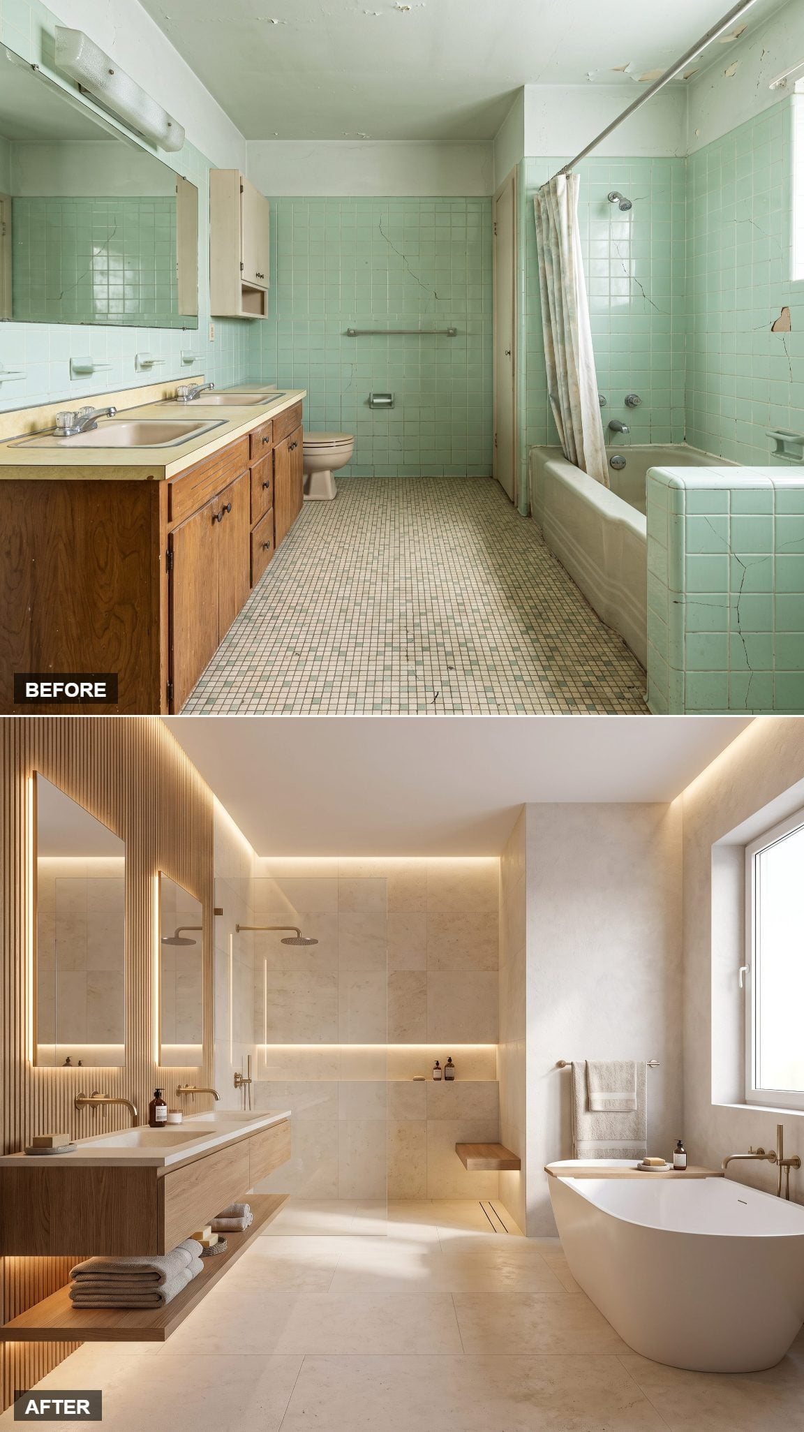
Run your hand across ribbed oak paneling and the design makes sense immediately. This is texture intended to register both visually and physically.
The vertical ribs catch light in narrow bands and give the wall depth without relying on another color or printed pattern. Creamy stone flooring keeps the lower half quiet, while a deep freestanding tub replaces the old built-in bath. Add a waffle towel and a small tray of soaps, and the room has all the spa references it needs.
5. One Stone, Wall to Floor, and the Room Nearly Disappears
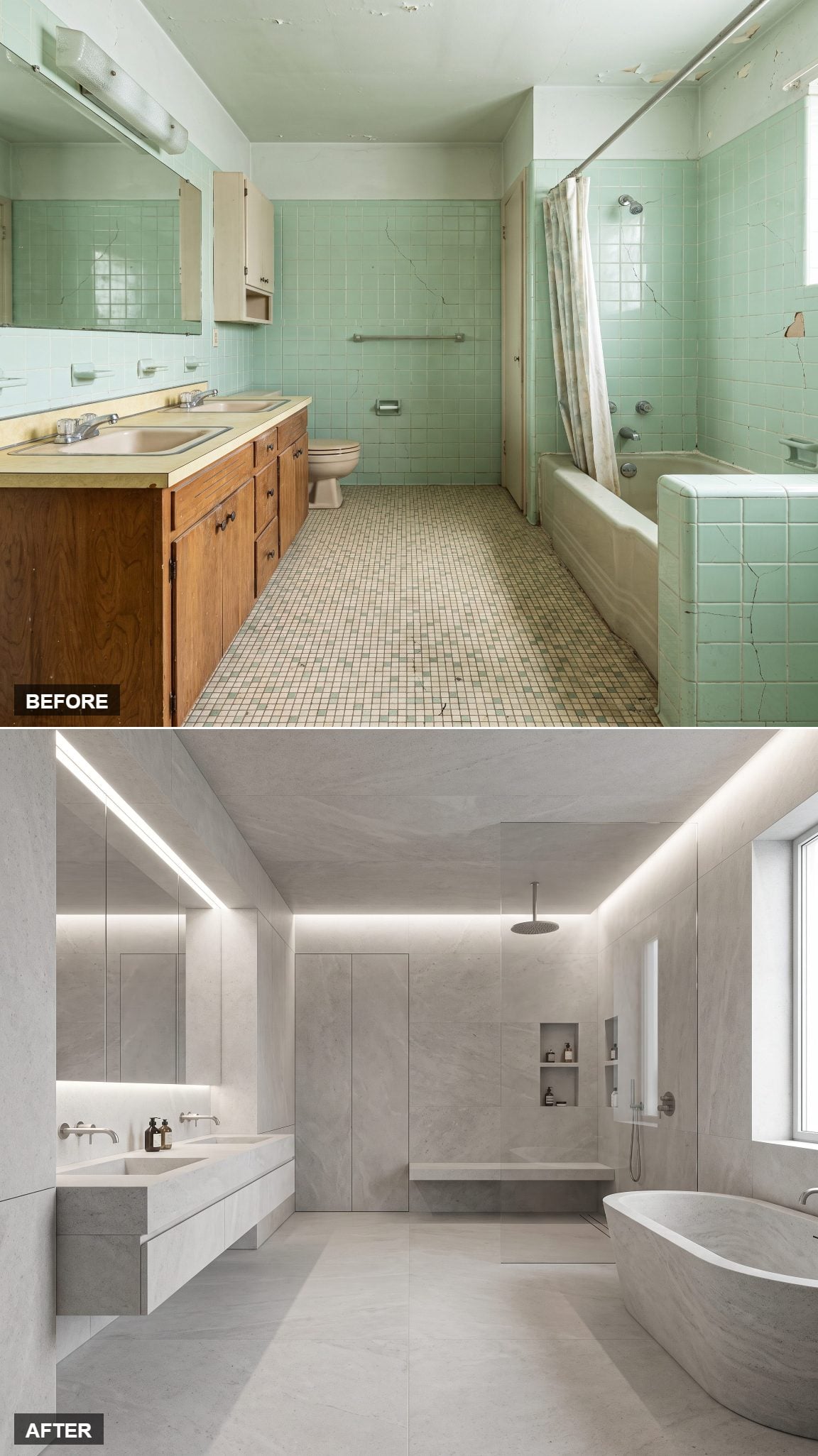
Most bathrooms are assembled from a collection of separate surfaces. This one tries to make those boundaries recede.
Warm-greige stone moves across the floor, walls and vanity in a nearly continuous tone. The joints remain, but visually they retreat because there are so few changes in color or finish to emphasize them. Corners become quieter, the floor no longer announces where the wall begins, and the architecture feels less chopped into pieces. One stem, one folded towel, done.
4. Light Floods In and the Contemporary Retreat Arrives
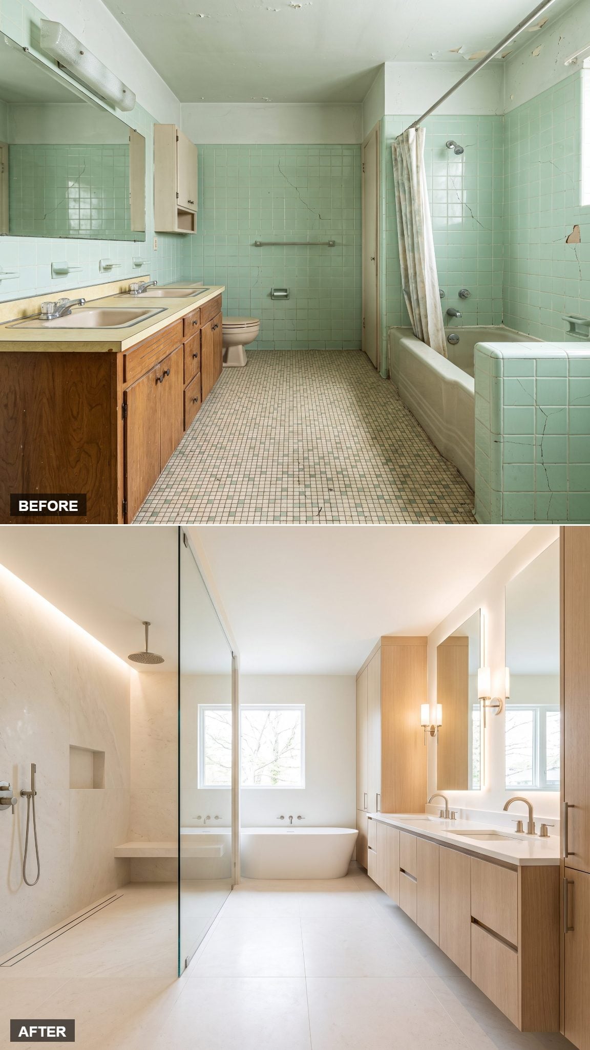
The old bathroom’s frosted window and flat fixture made the room feel like a Tuesday afternoon in February. This version decides daylight deserves better company.
Pale surfaces bounce the available light around, while frameless shower glass keeps the sightline open. Warm-white walls meet a slim floating wood vanity, and a wide backlit mirror adds another layer of softer illumination. One potted olive tree gives the neutral palette a clean interruption.
3. The Floating Tub Wet Room That Erases Every Seam
🔥 Would you like to save this?
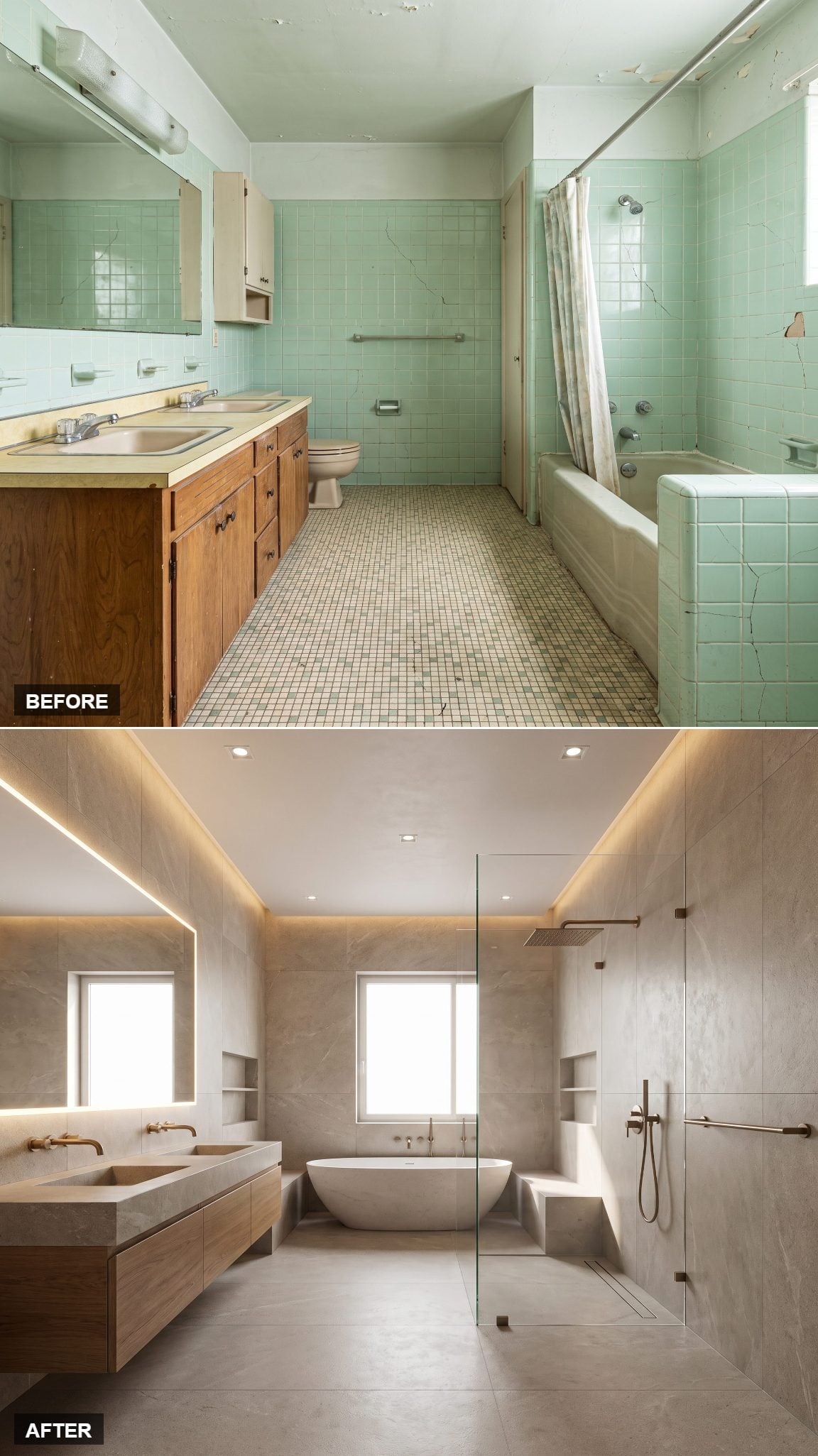
The visual ambition here is simple: make the room feel as though it has been carved from one continuous mineral surface.
Large-format travertine wraps the walls and floor with minimal visible jointing, while the freestanding tub appears to hover above the stone. A linear drain sits low in the composition, and the absence of a conventional shower enclosure keeps the floor plane visually open. Waterproofing may be the invisible technical work in any wet room, but the visible effect is almost effortless: stone, tub, water, very little else.
2. Warm White and Walnut for the People Who Hate Cold Bathrooms
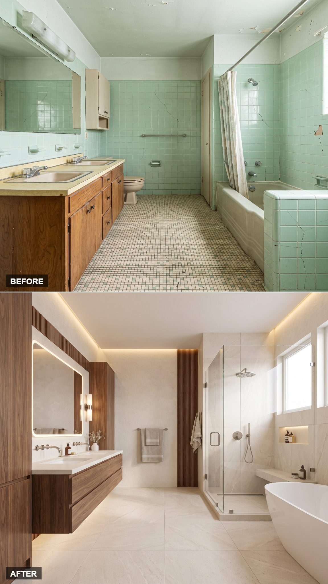
White bathrooms can feel chilly when every surface is hard, pale and reflective. Walnut gives all that brightness something warmer to land against.
A floating walnut vanity grounds soft-white walls and a limestone-look floor, with brushed-brass hardware and a round mirror keeping the shapes simple. Properly finished wood can work beautifully in a bathroom, provided moisture and standing water are managed appropriately. Here the grain is the point: one naturally varied surface against a deliberately quiet background.
1. The Full Architectural Overhaul, No Half Measures
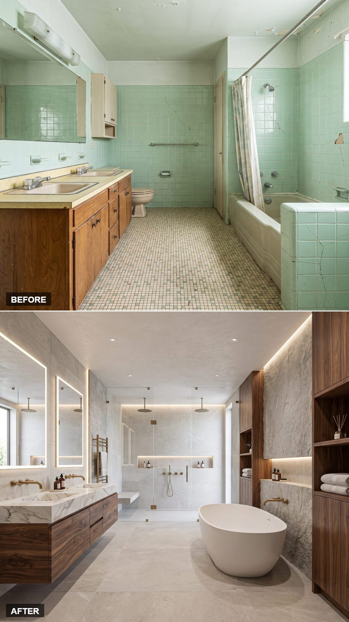
This is the version that refuses to stop at finishes.
The recognizable shell remains, but almost every visible element has been reconsidered: a dramatic stone feature runs the length of the room, lighting is tucked into niches, the vanity becomes a sculptural object and the shower gains a built-in bench. Warm stone, concealed LED strips and one brass towel bar keep the palette controlled despite the architectural changes.
That makes it a fitting place to end. The original bathroom was large enough to promise more than it delivered and dated enough that the cracks had become part of the scenery. Across 27 redesigns, the same shell has gone graphic, dark, pale, earthy, glossy, sculptural, minimal and extravagant. The cracked seafoam tile never dictated what the room had to become. It simply made the starting point impossible to miss.