
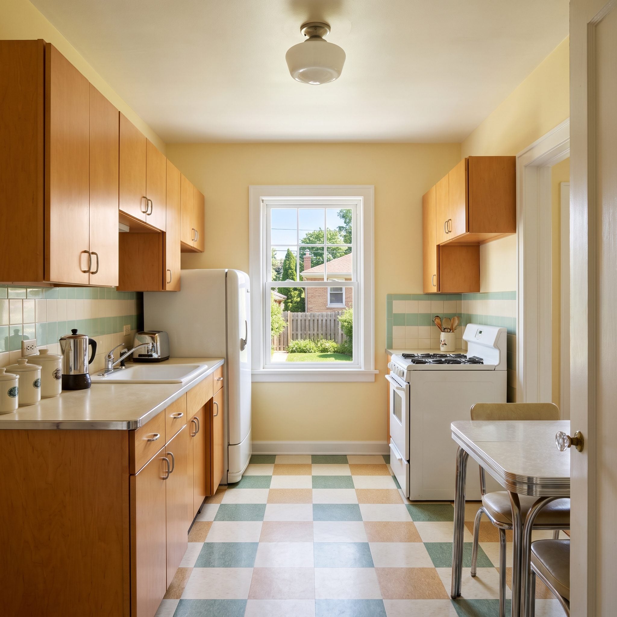
A small kitchen is an unforgiving piece of architecture. Every cabinet has a consequence. Every inch of countertop must earn its place. A poorly judged island can turn the route to the refrigerator into an obstacle course, while the wrong combination of finishes makes a room feel crowded before anyone has opened a cupboard. There is precious little space for design mistakes, which makes getting the details right all the more satisfying.
Forget the tired prescription of white cabinets, pale counters, and an earnest attempt to make everything disappear. Small kitchens can take color with astonishing confidence. Emerald green can turn cabinetry into sculpture. Blackened oak can give a narrow room the authority of a much grander interior. Burgundy, cobalt, terracotta, and aubergine can be every bit as convincing as cream or warm white. The secret isn’t restraint for its own sake. It’s knowing where to put the drama, where to let the materials speak, and when a clean line is worth more than another decorative flourish.
In order to come up with the very specific design ideas, we create most designs with the assistance of state-of-the-art AI interior design software. Also, assume links that take you off the site are affiliate links such as links to Amazon. this means we may earn a commission if you buy something.
These 30 transformations put that thinking to work across a remarkable range of styles, from Parisian bistro glamour and Art Deco richness to contemporary minimalism and quietly luxurious natural stone. Some make their argument in saturated color; others rely on a beautifully judged contrast between timber, metal, and mineral surfaces. All explore the same delicious design proposition: a kitchen doesn’t need generous square footage to have an outsized personality.
30. Cream and Emerald Turn a Small Kitchen Into a Jewel Box
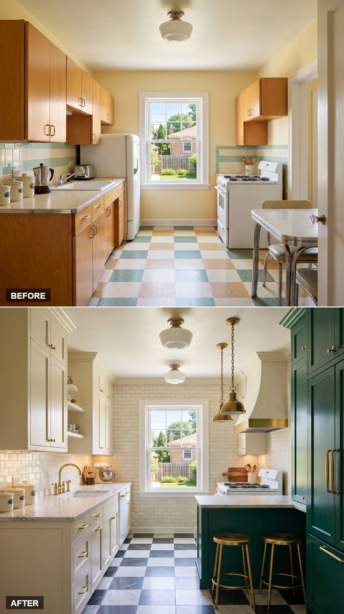
Emerald green makes a magnificent entrance. Against creamy perimeter cabinetry, the saturated island and pantry wall become architectural statements rather than ordinary storage. Richly veined white stone introduces movement, while brass provides the finishing glint.
The smartest decision is where the color stops. Concentrating emerald in selected elements gives the eye somewhere to land, leaving the cream cabinetry to provide breathing room. The result has the polish of a jewel box without requiring every surface to sparkle.
29. Charcoal and Rift-Cut Oak Make Precision Look Effortless
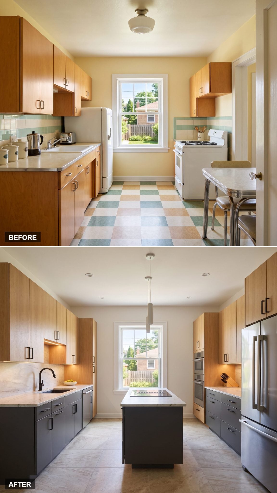
Charcoal base cabinets meet rift-cut white oak, pale quartzite, and blackened-steel hardware in a composition with the precision of fine joinery. Flat-panel doors keep the lines uninterrupted. The contrast is crisp, architectural, and wonderfully free of unnecessary ornament.
Rift-cut oak earns its place through grain rather than color alone. Its relatively straight, consistent figuring gives the upper cabinetry a disciplined appearance, allowing the charcoal to provide the visual weight without making the room feel overly formal.
28. Burgundy and Ivory Bring Parisian Bistro Glamour to the Kitchen
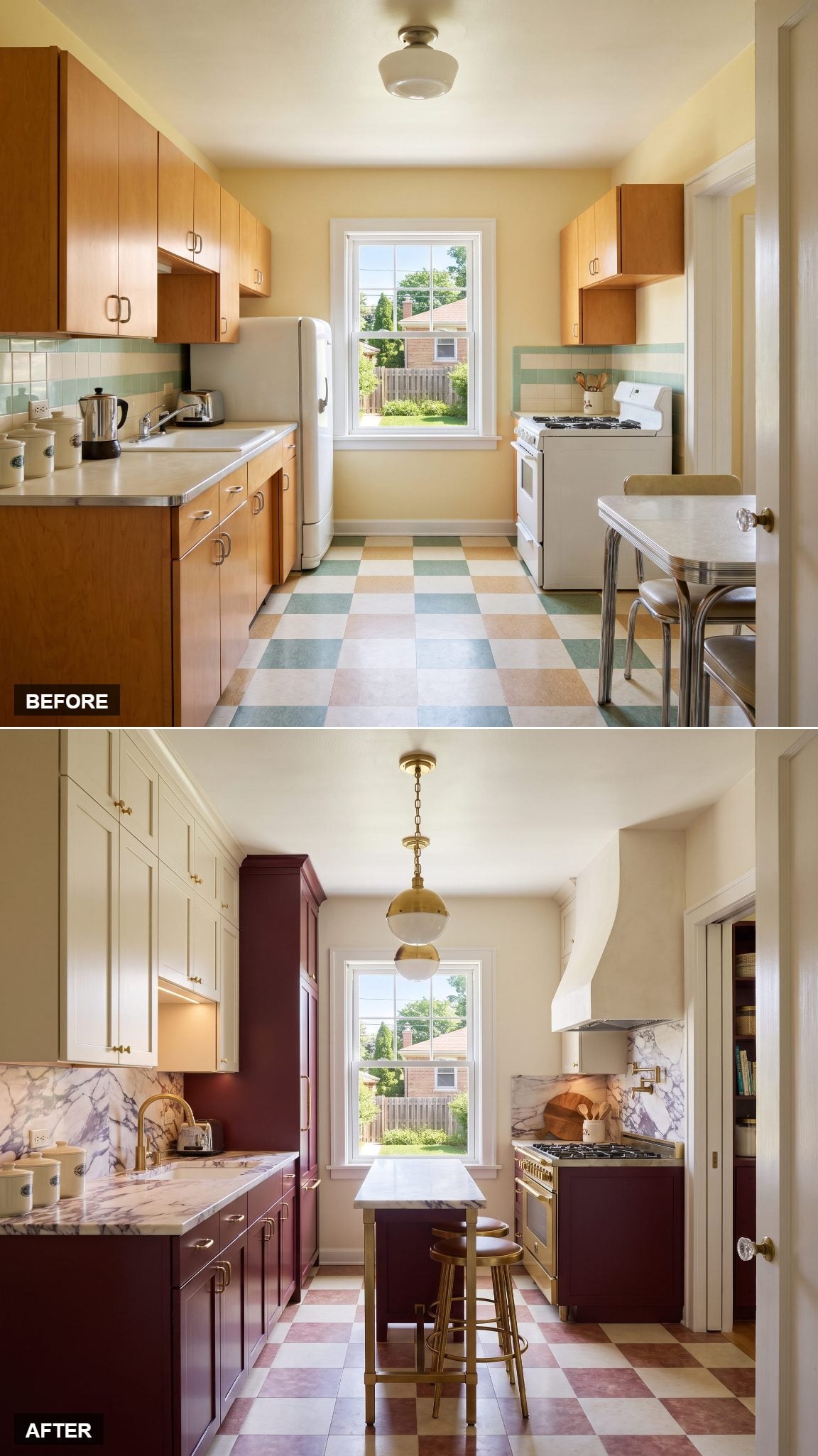
Wine-red lower cabinets, ceiling-height ivory uppers, and hardware with a gently aged finish borrow the elegance of a Parisian bistro without the theatrical clutter. Burgundy has the richness of polished mahogany and the complexity of a well-aged red wine.
Under strong daylight, the color reveals its red undertones. In softer illumination, it becomes deeper and more mysterious. Ivory keeps the architecture composed, allowing the lower cabinetry to supply the personality. A little continental swagger goes a long way in a small kitchen.
What Our Readers Say
- In our Hot or Not photo matchups, kitchens dominated by white won fewer of their head-to-head contests than their position alone would predict, 40% against an expected 47%.
- Sleek contemporary kitchens also won fewer of their head-to-head matchups with Home Stratosphere readers, taking 38% when 46% would be expected from position alone.
From Home Stratosphere reader polls and votes.
27. All Cream, All Texture, and Not a Loud Color in Sight
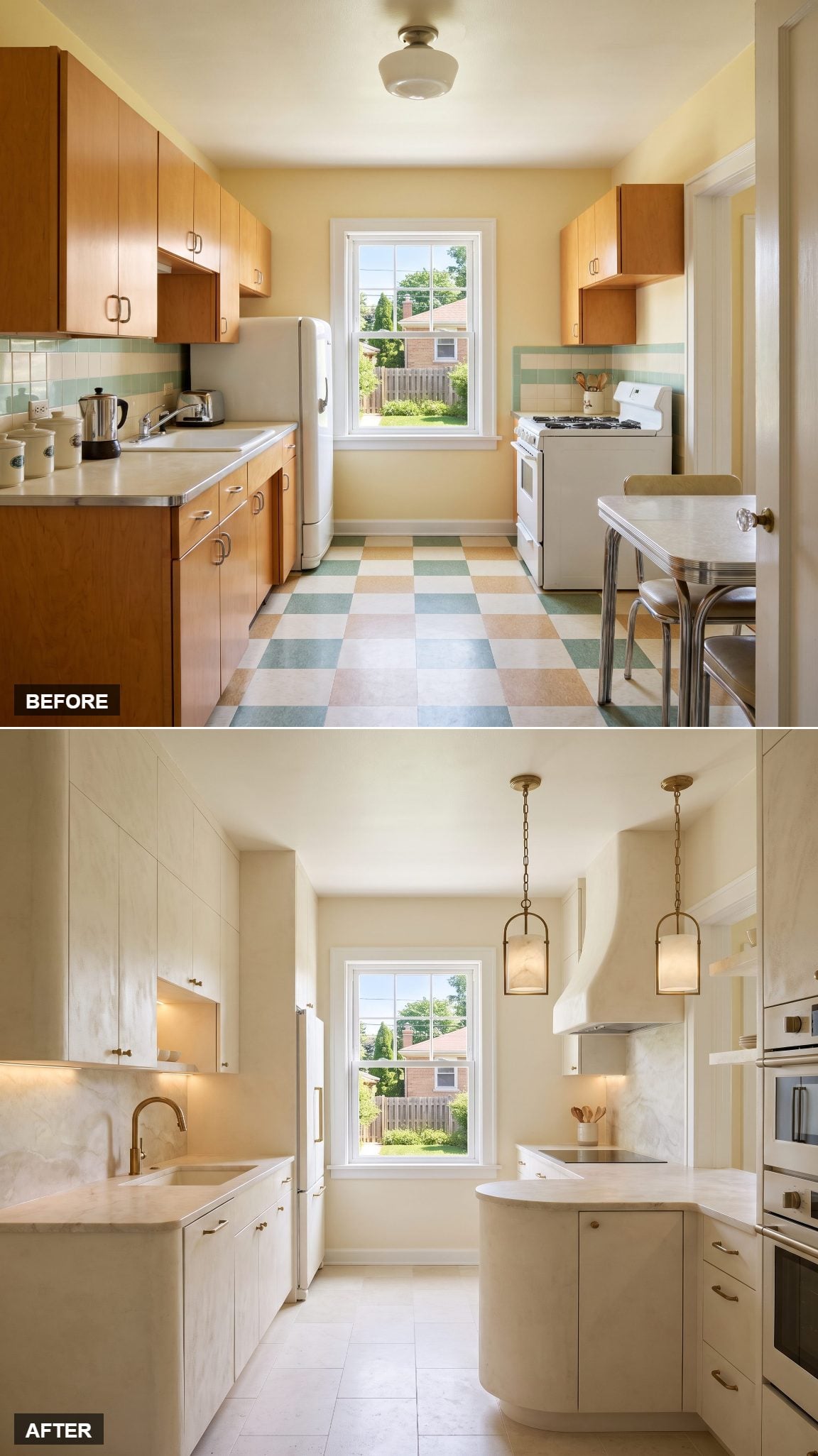
Monochrome design is easy to underestimate. Remove the obvious color contrasts and suddenly every surface has to justify itself. Here, warm cream travels across cabinetry, plaster, limestone, and quartzite, with subtle differences in finish creating the definition.
Matte plaster absorbs light softly. Honed limestone contributes a mineral texture, while delicate quartzite veining adds movement without breaking the palette. The richness lies in these small distinctions, an approach particularly effective in small kitchen design where competing finishes can quickly overwhelm the available space.
Color may command attention, but texture knows how to hold it.
26. Cobalt Blue and Ivory Refuse to Play It Safe
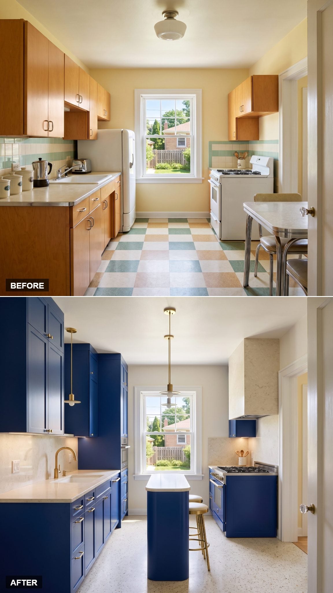
Cobalt is navy’s more outspoken relative. Deep blue cabinetry gives this compact kitchen an immediate identity, while ivory counters and warm-white walls prevent the saturated color from occupying every available surface.
Satin brass introduces a warmer note against the cool blue, adding refinement without diluting the impact. The result is a strong argument against the notion that small rooms must whisper. Sometimes a little volume is exactly what the architecture needs.
25. Mushroom Taupe and Dark Walnut Understand the Value of Understatement
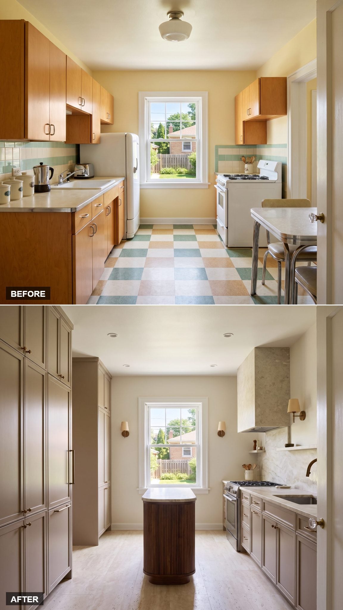
Mushroom taupe is one of those colors that looks unremarkable on a paint card and remarkably sophisticated beside dark walnut. Creamy quartzite and bronze hardware complete a palette built around subtle shifts in warmth and depth.
The full-height walnut cabinetry supplies a handsome vertical counterpoint to the quieter painted surfaces. Nothing depends on a fashionable accent color or an extravagant light fixture. The materials have enough character to carry the room without assistance.
24. Terracotta and Oak Give Desert Modernism a Kitchen Address
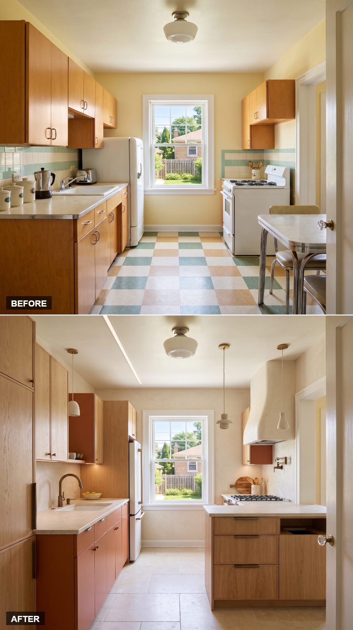
Terracotta cabinetry, pale oak, creamy microcement, and limestone create a palette that looks borrowed from sun-baked architecture. The colors are warm without being sugary, and the mineral finishes give the room an appealing sense of permanence.
Microcement introduces a continuous, lightly textured surface. Limestone offers a different kind of natural variation, while pale oak breaks up the earthy tones with visible grain. The result takes the material honesty of rustic kitchen design in a distinctly contemporary direction.
23. Soft Black and Buttercream Find Common Ground in Marble
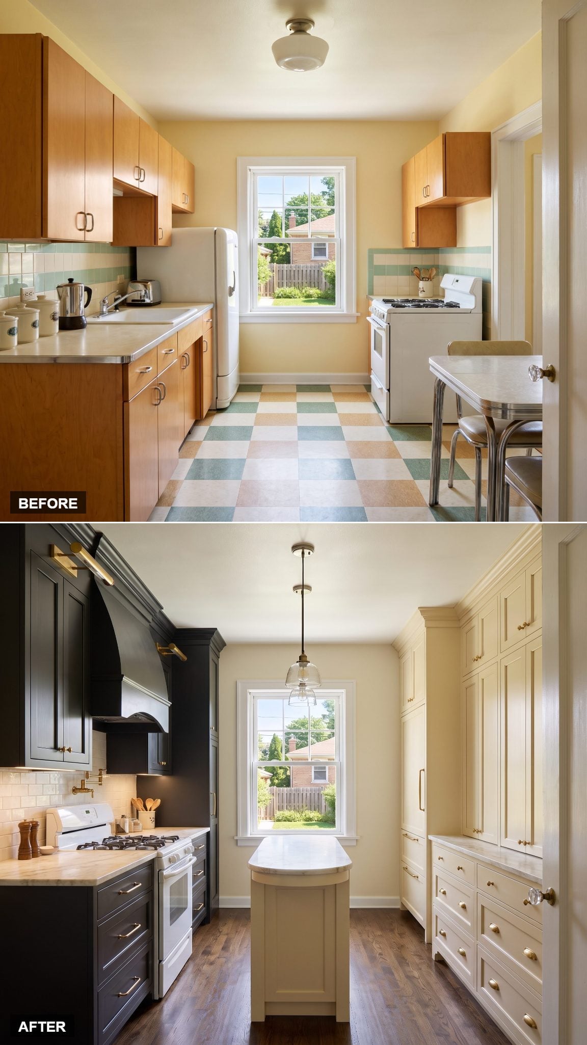
Black and buttercream sound like unlikely companions until marble enters the conversation. Soft-black cabinetry defines the cooking wall, luminous buttercream warms the opposing side, and creamy stone creates a visual connection between them.
The arrangement is striking because the contrast is structural. Each color occupies a distinct architectural plane, giving the compact kitchen definition without additional ornament. It’s an inventive variation on dark kitchen cabinetry, with warmth replacing the predictable black-and-white formula.
22. Pale Moss Green and Quarter-Sawn Oak Revive the Craftsman Spirit
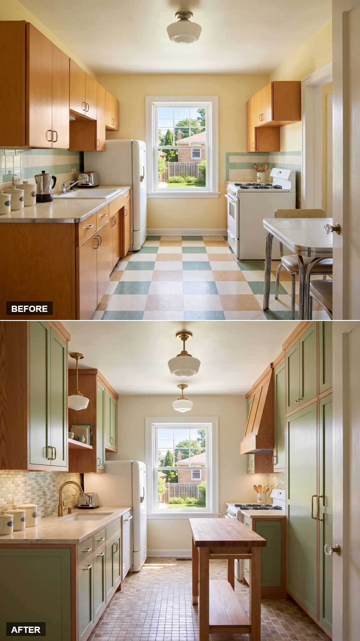
Pale moss-green inset cabinetry, quarter-sawn red-oak trim, open shelving, soapstone, and handcrafted tile draw on the Arts and Crafts tradition. Visible grain, carefully proportioned joinery, and the interplay of handcrafted surfaces give the kitchen its distinctive character.
Oak ray fleck introduces a striking pattern to the trim and shelving. Inset doors lend the cabinetry a furniture-like quality, while the subtle irregularities of handcrafted tile enrich the backsplash. Together, these details evoke the Arts and Crafts movement’s celebration of workmanship, natural materials, and decorative craftsmanship.
21. Plum and Pale Oak Make an Unexpectedly Elegant Partnership
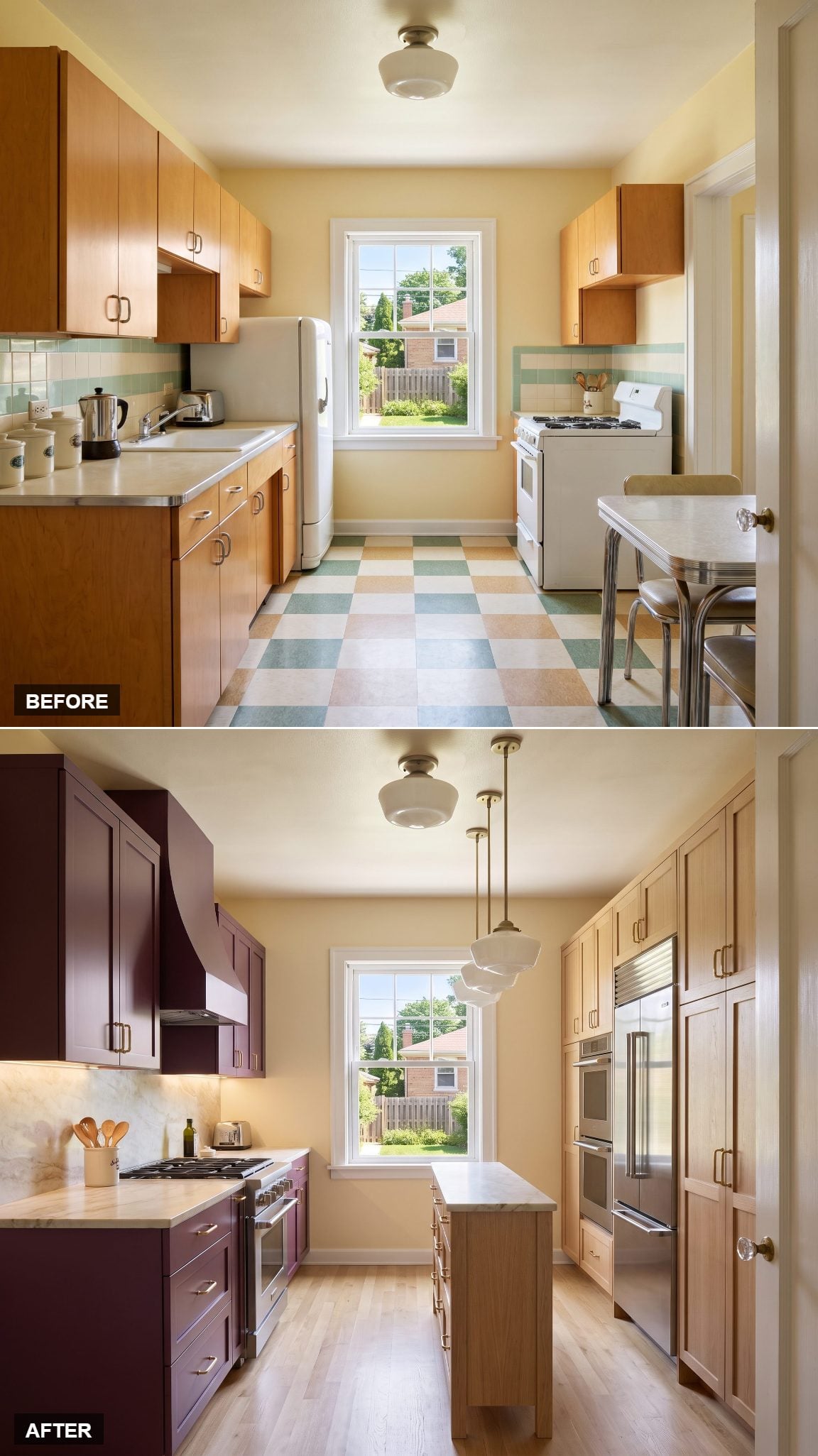
Plum cabinetry is an audacious proposition, particularly when the color covers an entire run of lower cabinets. The deep purple has an almost velvety appearance, while pale oak pantry storage introduces a lighter, distinctly natural finish.
Creamy quartzite provides a quiet transition between the two. The appeal comes from the contrast between an unconventional painted color and the familiarity of timber grain. Plum supplies the surprise; the oak makes the arrangement feel entirely at home.
20. Warm White and Walnut Give the Galley a Slender Centerpiece
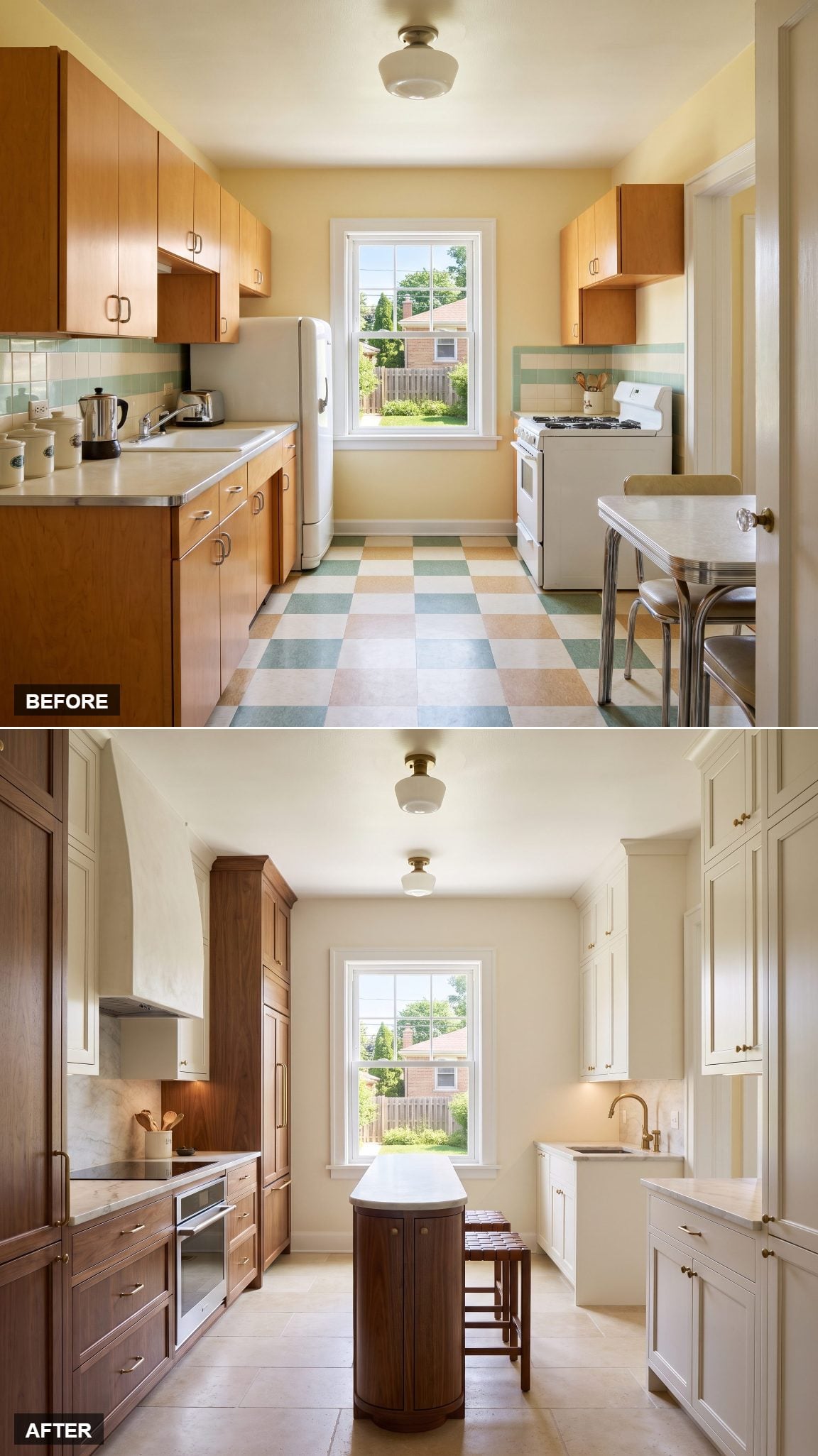
Warm-white perimeter cabinets establish a bright architectural envelope, while a narrow walnut island introduces a richer finish at the center. Honed stone counters, brushed-brass hardware, and undercabinet lighting give the composition a polished, practical character.
The island is the defining gesture, offering the visual presence of a central work surface in a relatively slender form. Its proportions matter enormously: a compact kitchen benefits from an island only when circulation remains comfortable. The design demonstrates the appeal of making a centerpiece elegant rather than enormous.
19. Forest Green and Blackened Oak Take the Dark Side Seriously
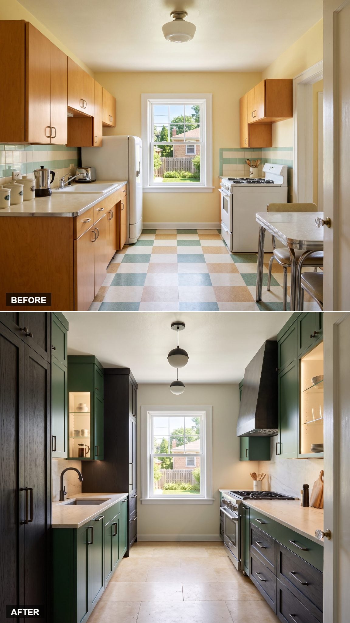
Forest-green cabinetry meets blackened-oak storage in a palette with remarkable depth. Creamy quartzite cuts a pale horizontal line through the darker surfaces, while bronze hardware remains almost deliberately inconspicuous.
Blackened oak contributes something paint cannot: visible grain beneath the dark finish. That subtle texture distinguishes the pantry cabinetry from the green, creating layers of shadow, grain, and saturated color. The pale worktops provide a sharp visual break, making the darker finishes appear richer by contrast.
18. Powder Blue and Walnut Give Midcentury Color a Grown-Up Twist
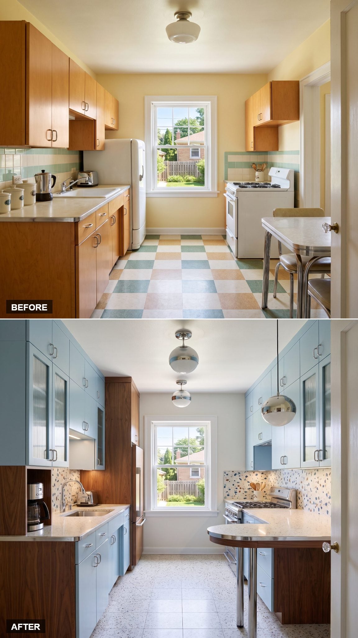
Powder-blue cabinetry brings an unmistakable midcentury playfulness, while walnut panels provide a rich, serious counterpoint. Ivory terrazzo worktops introduce flecks of aggregate, and polished chrome adds a flash of jet-age glamour.
The materials give the pastel color greater depth. Walnut’s pronounced grain sits beautifully against the smooth blue cabinet fronts, while terrazzo connects the palette to the period’s fondness for decorative composite surfaces. Nostalgia gets a remarkably crisp finish.
17. Espresso and Cream Limestone Give a Small Kitchen Architectural Weight
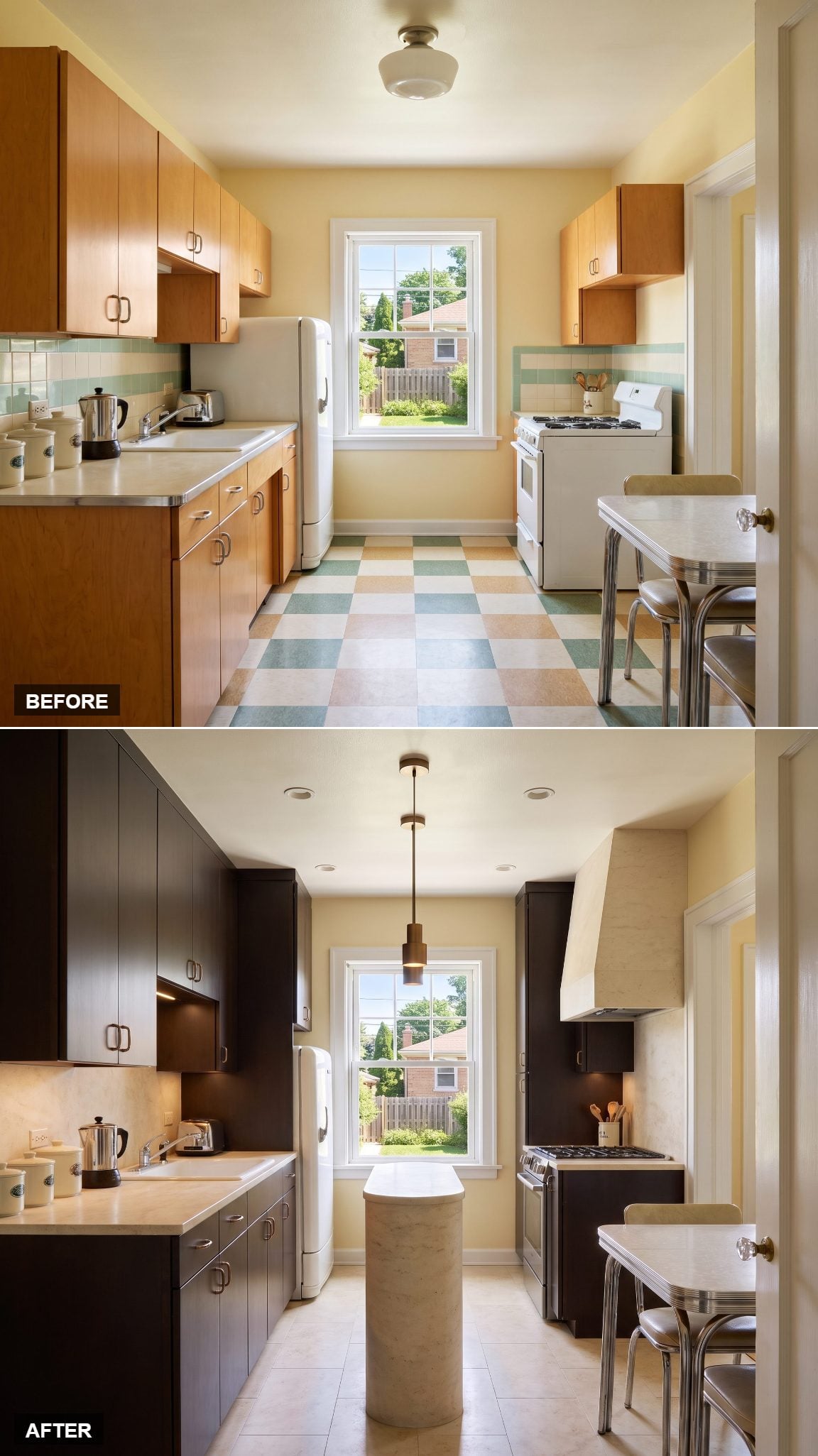
Full-height espresso cabinetry brings a substantial dark element to the refrigerator and pantry wall. Cream limestone defines the working surfaces in a much lighter register, creating a clean distinction between storage and preparation.
The contrast is more interesting than a simple dark-and-light color scheme. Espresso has a warmth that pure black lacks, while limestone carries subtle mineral variation. Together, they give the cabinetry the presence of built-in furniture rather than a collection of separate cupboards.
16. Pistachio and Stainless Steel Give the Fifties a Professional Edge
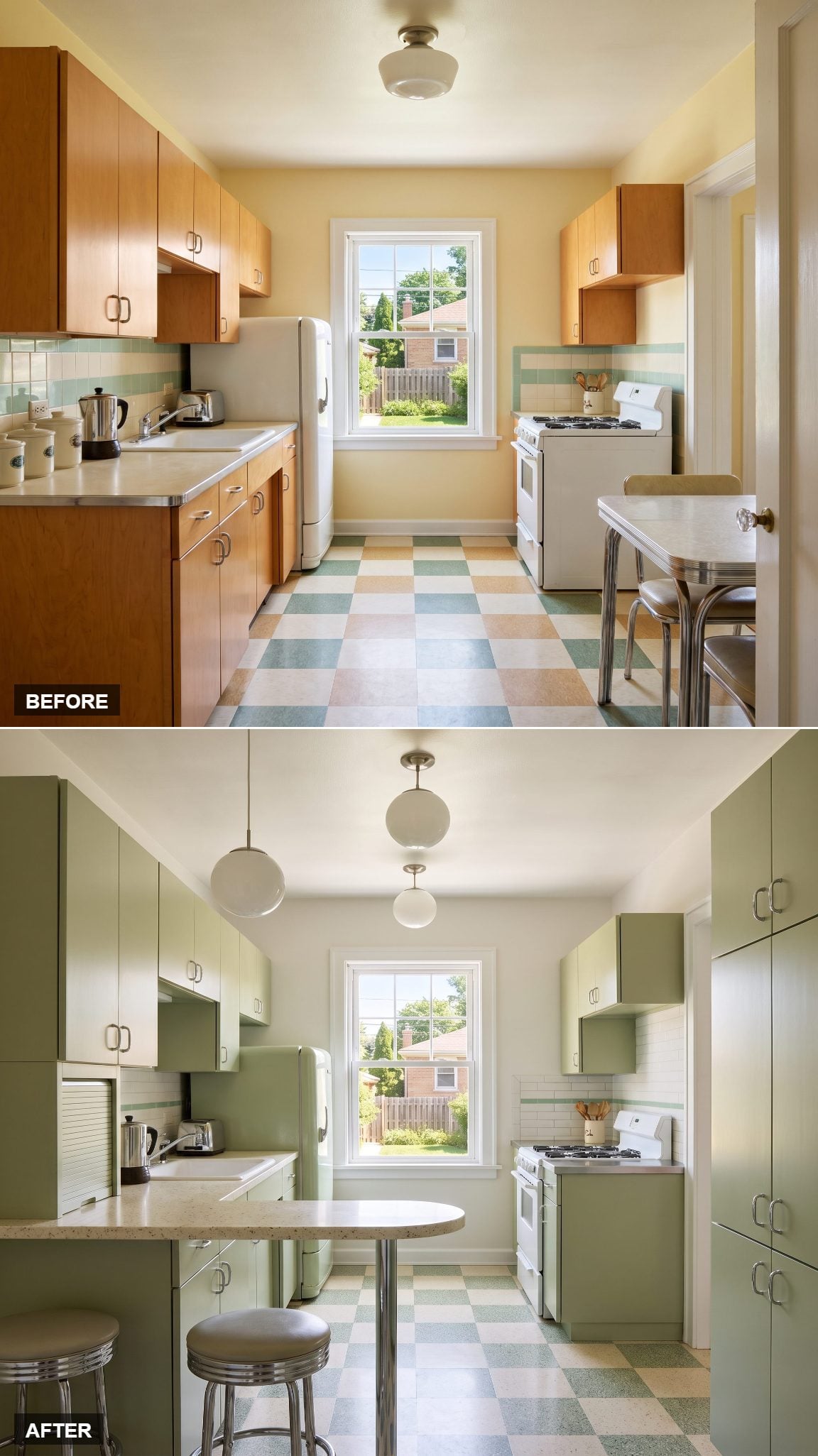
Muted pistachio cabinetry has the cheerful character of midcentury color, while brushed stainless-steel counters introduce a decidedly utilitarian note. The contrast between gentle green and industrial metal gives this kitchen an identity that is both playful and purposeful.
Stainless steel is nonporous, durable, and heat-resistant, making it particularly suitable for demanding preparation areas. Scratches and watermarks are part of its practical considerations, although the brushed finish can make everyday wear less conspicuous than highly polished metal.
15. Ivory and Aubergine Bring Art Deco Glamour Into the Kitchen
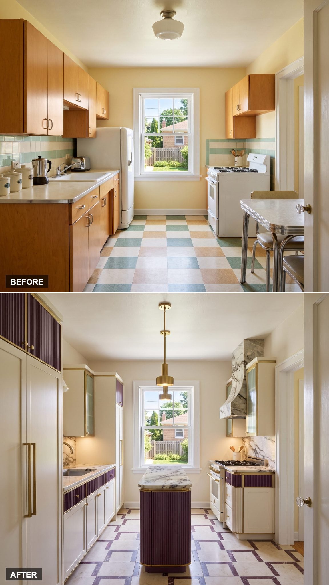
Ivory cabinetry provides a luminous setting for aubergine millwork, dramatically veined stone, and aged brass. The palette has the confidence of Art Deco without requiring a single sunburst motif or zigzag border.
A narrow island reinforces the room’s geometry, while the veining of the stone introduces movement across the worktops. Aubergine supplies the richness, brass provides the glimmer, and ivory prevents the whole affair from becoming excessively theatrical.
14. Sage and Travertine Bring a Softer Kind of Luxury
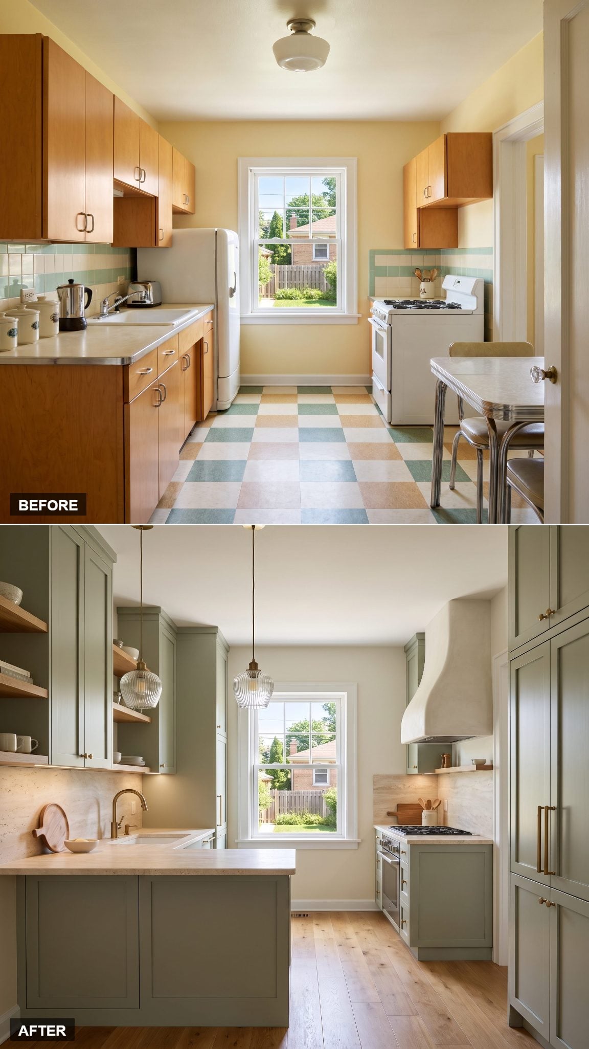
Muted sage cabinetry provides a gentle setting for pale travertine counters and a matching backsplash. The stone’s natural pores and subtle tonal variations introduce an organic quality, while oak accents and aged brass add warmth.
Carrying the travertine from the counter onto the wall gives the work area a continuous mineral surface. The eye follows the stone rather than stopping at a contrasting backsplash, an especially graceful way to handle a compact kitchen.
13. Natural Ash and Brick Red Give the Kitchen an Urban Accent
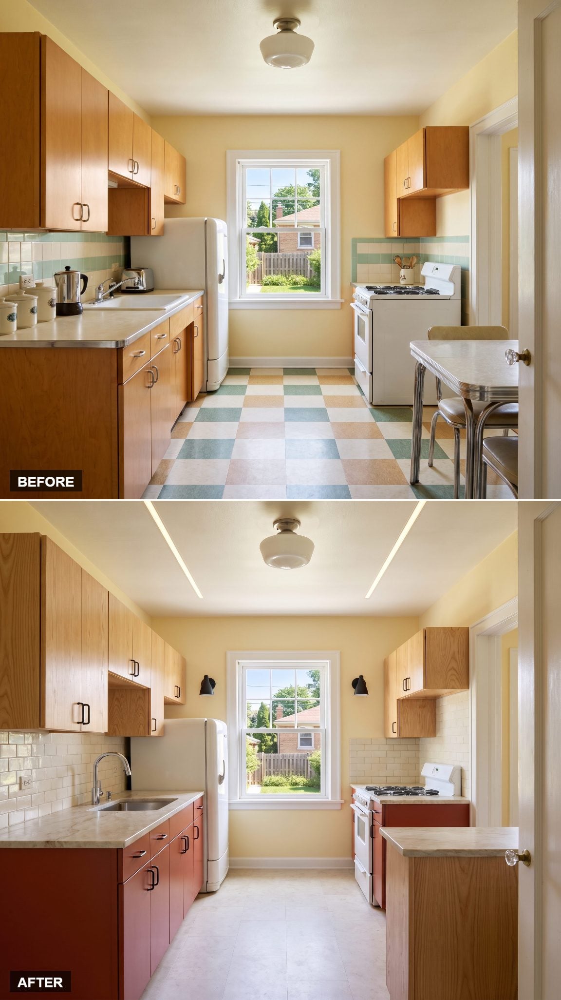
Natural ash cabinetry provides a pale, grain-forward foundation, interrupted by a confident run of brick-red lowers. Creamy quartzite worktops and blackened-metal hardware give the arrangement a tougher, more industrial character.
The red is earthy rather than brilliant, closer to fired clay than lacquered enamel. That distinction matters beside the ash, whose natural grain brings movement without introducing another strong color. The effect recalls contemporary loft interiors, scaled to a smaller kitchen.
12. Warm Gray and Stainless Steel Put the Working Kitchen First
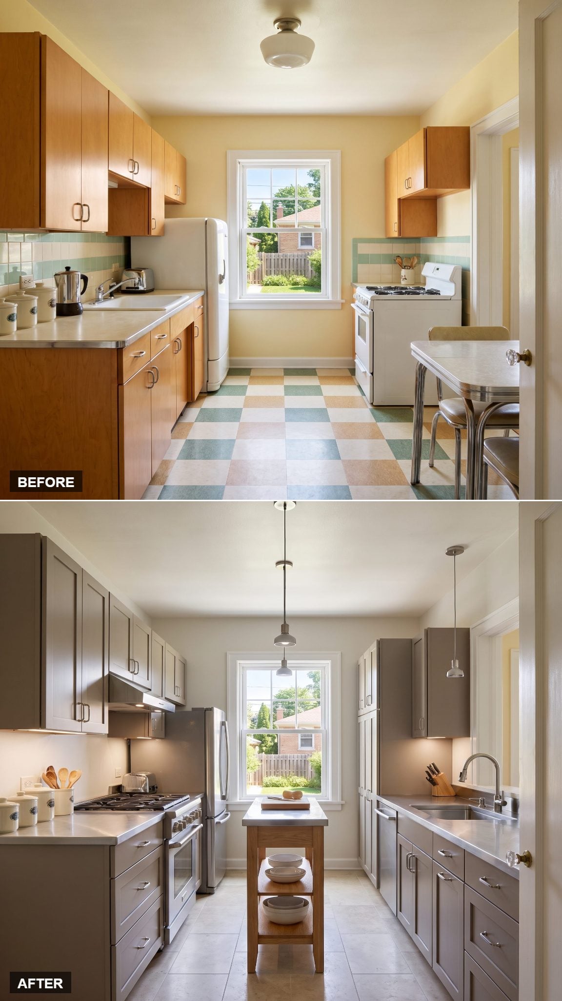
Warm-gray cabinetry gives this kitchen a composed backdrop for brushed stainless-steel work surfaces. The metal makes the preparation and cooking areas unmistakable, while the painted cabinetry softens the industrial character.
There’s a useful distinction between a kitchen that looks professional and one designed around practical working materials. Stainless steel is easy to clean, nonporous, and resistant to heat, making it a sensible choice for frequently used counters. Here, those functional qualities become part of the visual appeal.
11. Chocolate Brown and Powder Blue Find Beauty in an Unlikely Pairing
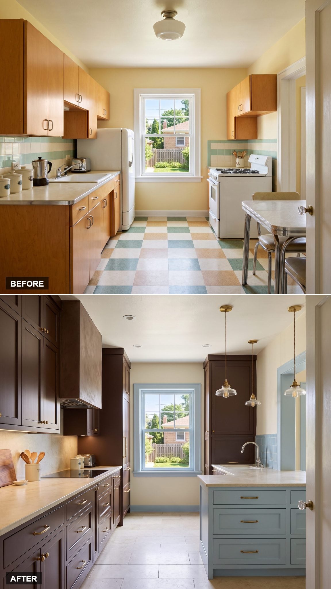
Chocolate-brown cabinetry has a wonderfully substantial presence, particularly when interrupted by powder-blue accents. Creamy stone counters keep the work surfaces bright, while burnished brass introduces a richer metallic note.
Chocolate brown and powder blue create a striking warm-cool contrast. The brown cabinetry has the depth of dark timber, while the blue accents bring an unexpected lightness. Burnished brass bridges the two with a warm metallic finish, giving the unusual palette a polished, cohesive character.
10. Blue-Gray and Cherry Revisit Midcentury Design Without the Nostalgia
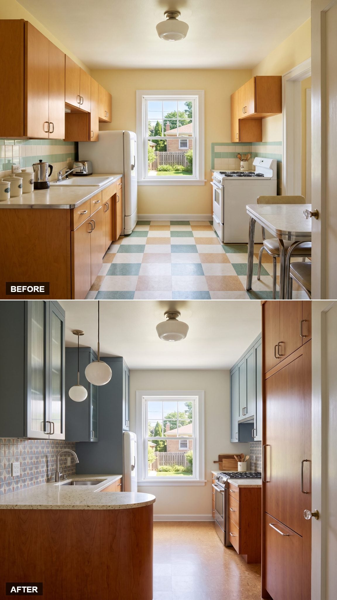
Blue-gray flat-panel cabinetry gives this kitchen a cool, understated character. American cherry brings a contrasting richness through its reddish undertones and distinctive grain, while creamy terrazzo counters introduce a recognizable midcentury material.
The cherry’s warm, reddish grain is particularly effective against the muted blue-gray cabinetry, creating a color relationship with more depth than a conventional white-and-wood scheme. Terrazzo adds a subtle midcentury reference through its scattered aggregate pattern, while the flat-panel doors keep the composition clean and contemporary.
9. Ochre and Cream Plaster Give the Kitchen a Mediterranean Temperament
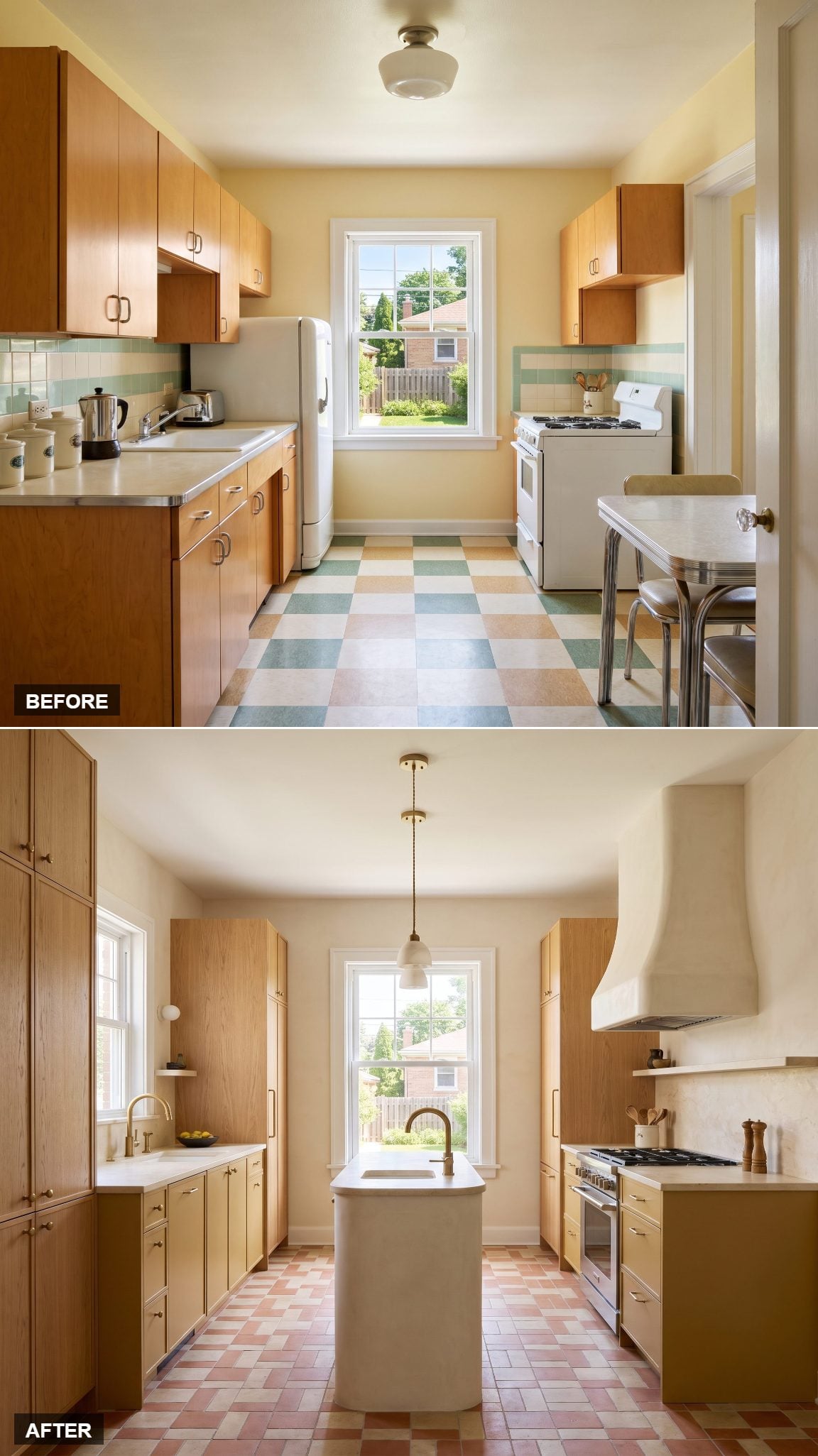
Muted ochre lower cabinets establish an earthy foundation beneath cream plaster walls. Natural oak tall cabinetry introduces a vertical grain pattern, while ivory limestone worktops extend the warm mineral palette.
The plaster gives this design much of its character. Its hand-troweled appearance catches light unevenly, creating subtle shadows and a sense of depth. Ochre adds the glow of a sun-warmed pigment, while the restrained materials keep the Mediterranean influence architectural rather than decorative.
8. Black and Natural Oak Make a Strong Case for Architectural Simplicity
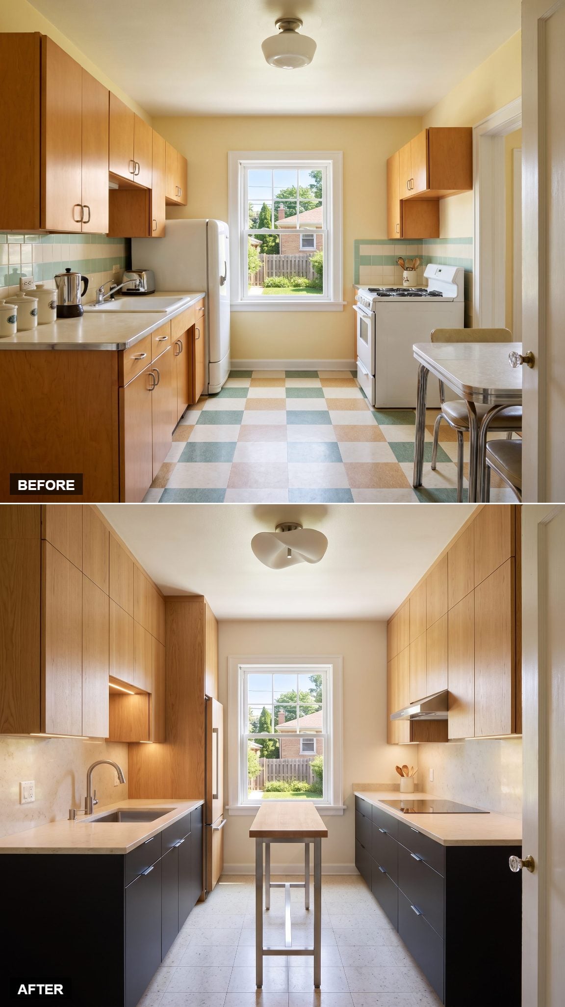
Matte-black base cabinets sit beneath natural-oak storage extending to the ceiling. Creamy stone counters provide a clean horizontal interruption, while restrained stainless-steel details keep the composition disciplined.
The strength lies in the joinery and proportions. Black gives the lower cabinets a precise silhouette, oak introduces grain and variation above, and the pale counters establish a distinct working plane. With so little ornament, every line becomes more important. Minimalism has rarely looked so comfortable.
7. Soft Blue and Warm White Bring English Country Charm to the Kitchen
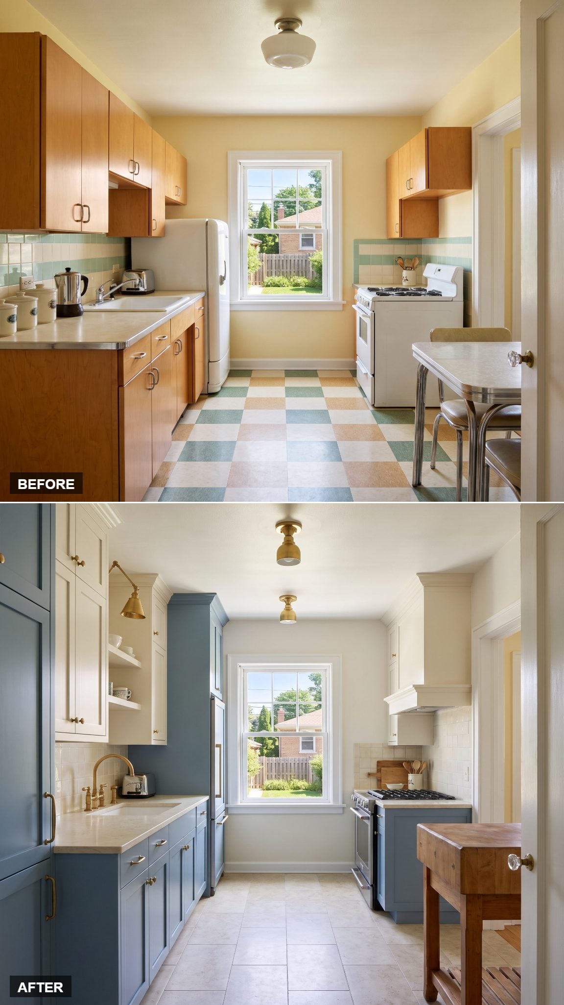
Dusty-blue lower cabinets, warm-white uppers, soapstone-look quartz, and antique-brass hardware create a gentle interpretation of English country style. The blue has enough gray in its undertones to remain understated, while the white cabinetry keeps the upper portion of the room bright.
The darker counter finish supplies a traditional contrast, and the brass introduces a hint of age without making the design feel old-fashioned. It’s a thoughtful variation on traditional kitchen design, with the charm carried by color and material rather than elaborate ornament.
6. Teal and White Oak Bring Color and Vertical Rhythm Together
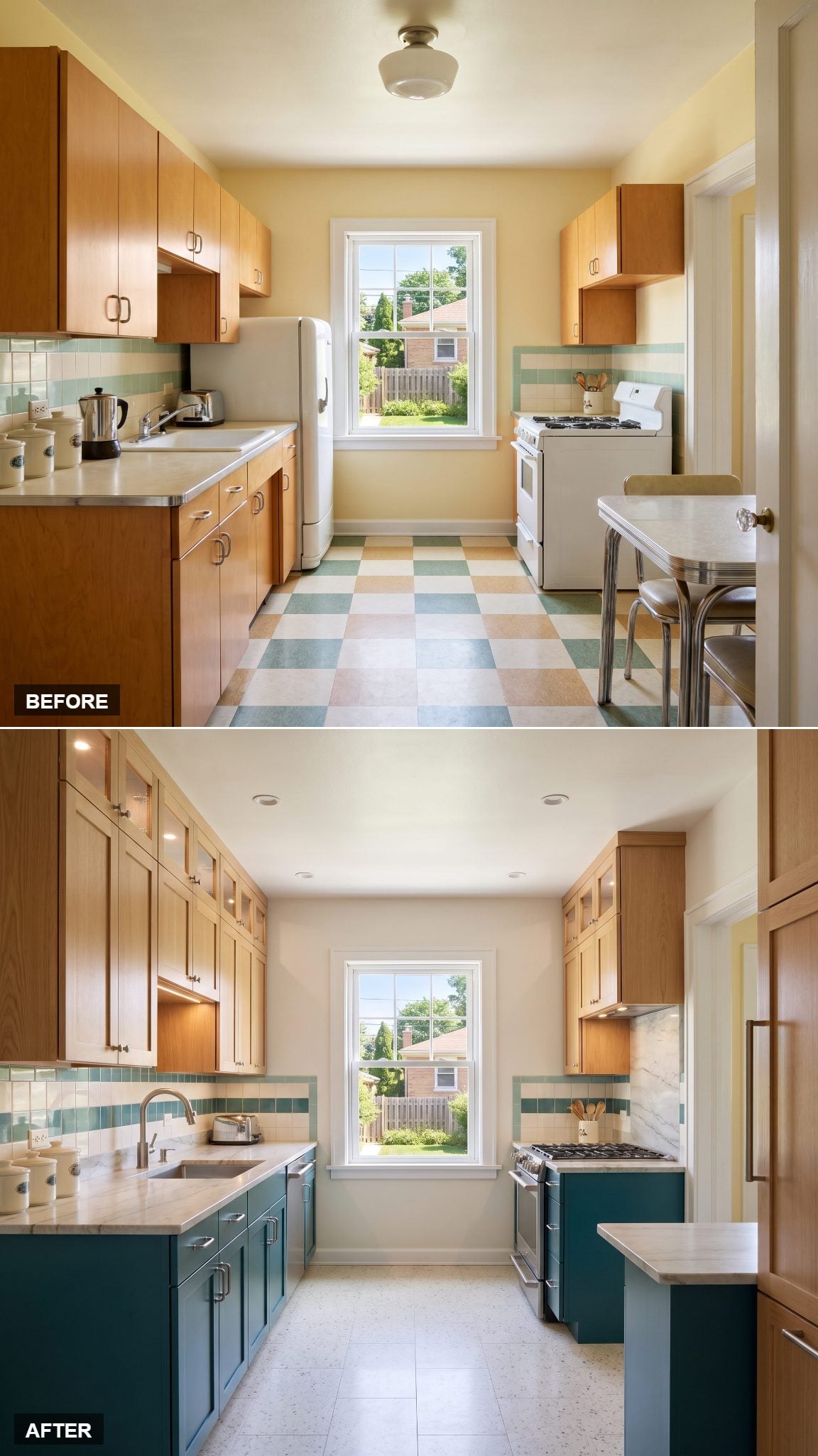
Deep teal base cabinets establish a saturated lower band beneath white-oak storage reaching toward the ceiling. Pale marble-look quartzite brings brightness to the worktops, while brushed nickel contributes a cool, understated finish.
Teal is especially effective against the oak’s pale grain. The color has enough depth to anchor the composition, while the timber introduces a vertical rhythm that draws attention to the cabinetry’s proportions. The arrangement is bold without sacrificing the natural character of the wood.
5. Celadon and Charcoal Soapstone Give Subtle Color Real Substance
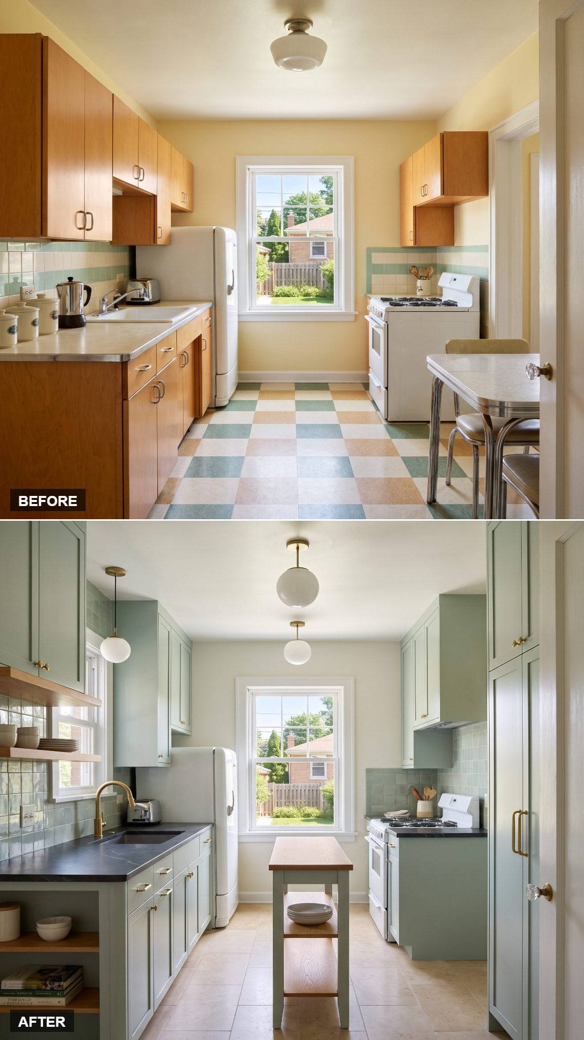
Celadon is green at its most elusive, hovering somewhere between pale sage and soft gray. Against charcoal soapstone counters, the cabinetry takes on a quiet sophistication, with medium-tone oak and brushed brass providing warmer accents.
Soapstone’s dense, matte surface makes a handsome contrast with the delicate cabinet color. Its natural variation and tendency to develop a patina give the counters a character quite different from polished marble. The palette is restrained, although the materials are anything but ordinary.
4. Rust and Walnut Give Earth Tones a Richer Vocabulary
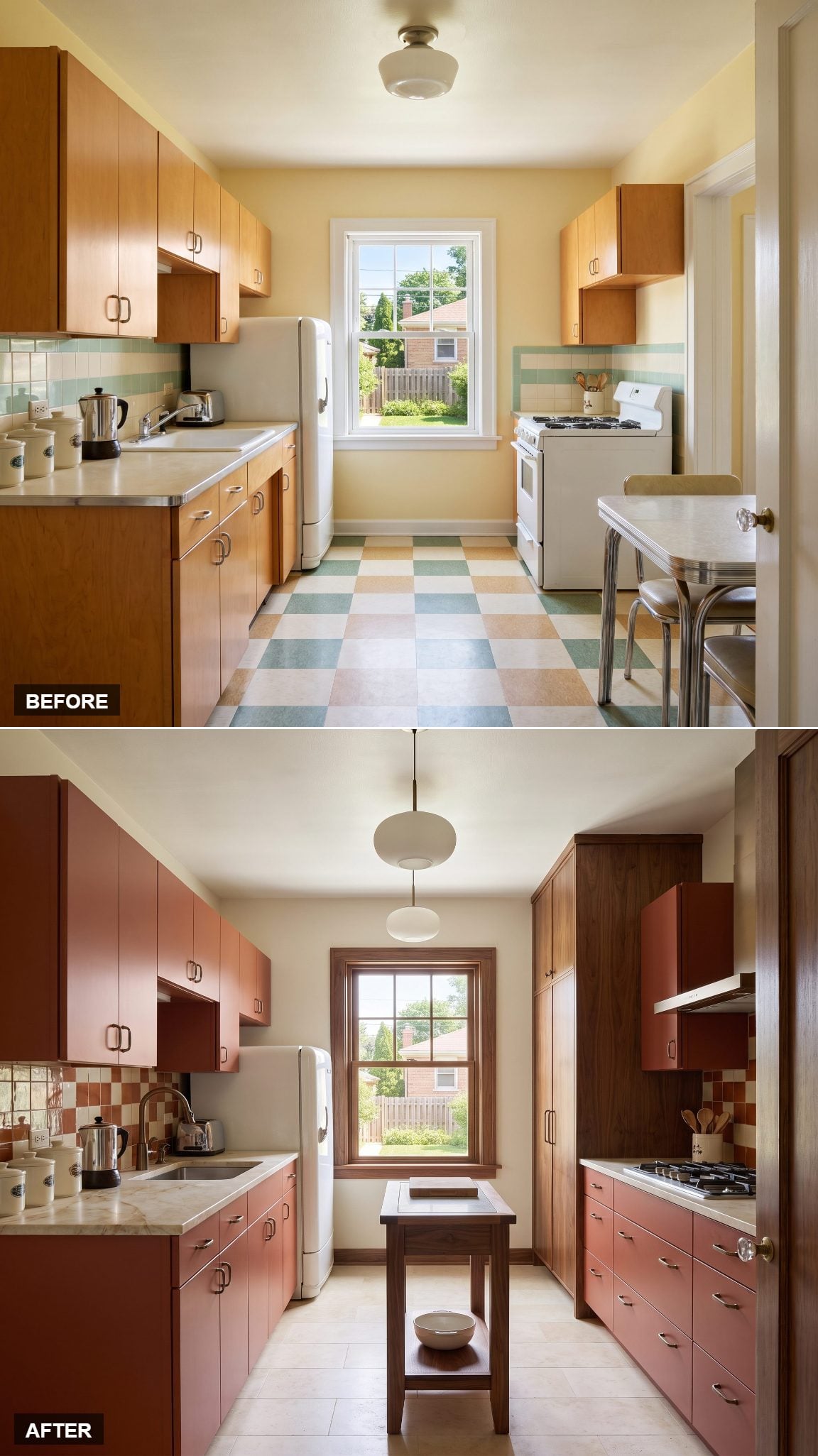
Muted rust cabinetry and rich walnut pantry units create a palette with the warmth of fired clay and aged timber. Ivory quartzite provides a pale working surface, while antique-bronze hardware settles comfortably into the brown and red undertones.
The full-height walnut cabinetry gives the room a substantial architectural element, and the rust finish introduces color without abandoning the natural palette. There’s a pleasing material honesty here, drawing on the warmth associated with rustic kitchen interiors but expressed through clean contemporary lines.
3. Moody Navy and Carrara Marble Give Tradition a Tailored Edge
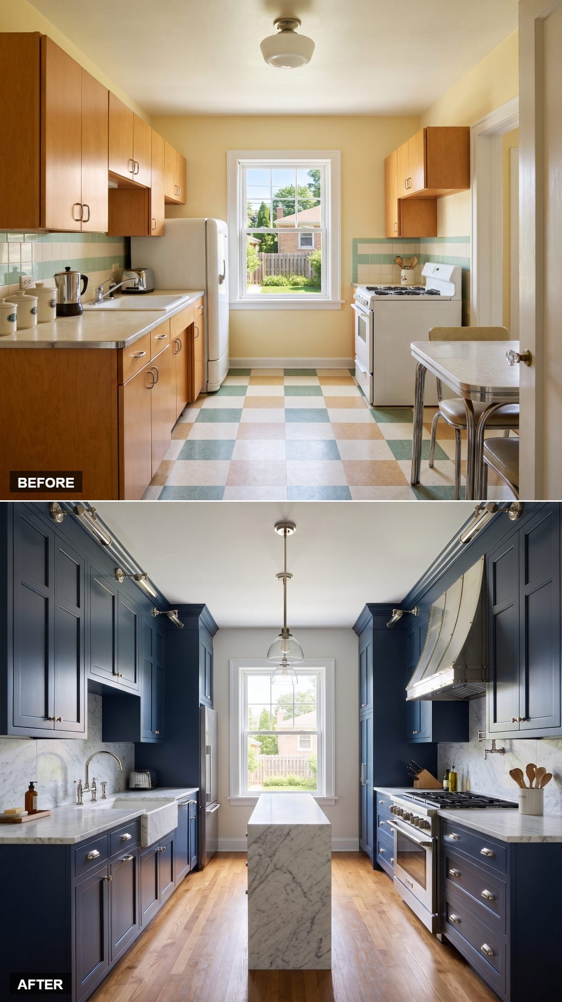
Floor-to-ceiling navy cabinetry and polished-nickel hardware frame pale, gray-veined marble in a combination with the elegance of a beautifully cut suit. The navy provides depth, the stone brings movement and light, and the nickel adds a cool metallic glimmer.
The marble’s fine gray markings give the worktops a distinctive natural-stone character. Marble is composed primarily of calcium-carbonate minerals, which can etch when exposed to acids. Over time, the surface may acquire a patina that adds another layer of character to this classic material.
2. Warm White and Red Oak Put Timeless Materials Ahead of Fashion
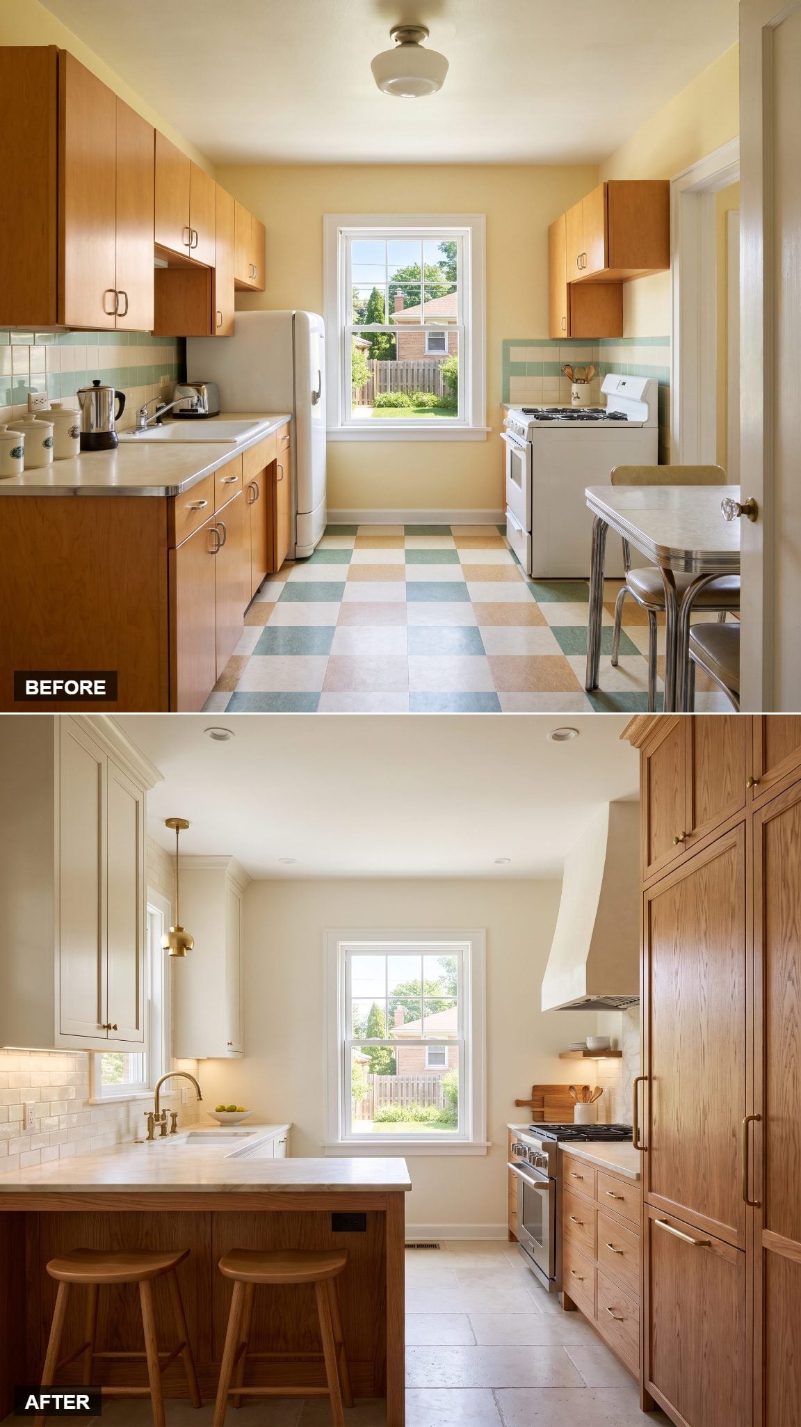
Warm-white inset cabinetry meets richly figured red-oak pantry and island millwork in a composition built around familiar materials and carefully judged proportions. Creamy stone counters connect the painted and natural finishes without introducing another dominant color.
The inset doors give the cabinetry the character of traditional furniture, while the oak’s pronounced grain adds warmth and visual interest. The design has little need for fashionable gestures. Its strongest details are the ones that have made well-crafted kitchens appealing for generations.
1. Deep Olive and White Oak Give the Working Kitchen Its Due
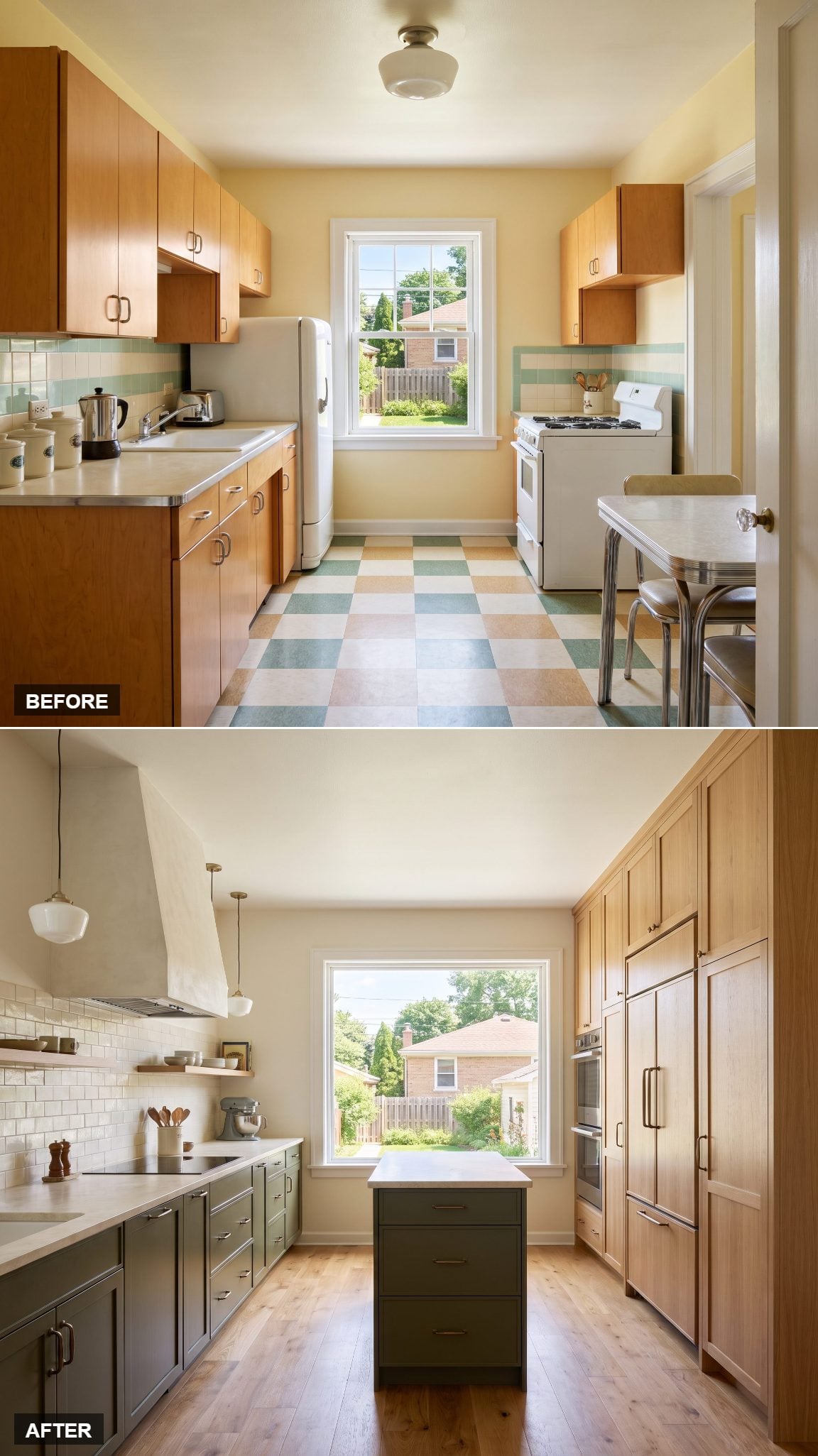
Deep-olive lower cabinets, white-oak tall storage, and creamy honed stone strike an appealing balance between richness and utility. The olive has the depth of a traditional working color, while the oak brings a lighter, more contemporary sensibility to the storage wall.
Concentrating cabinetry into a tall run gives the design a clear organizational structure, and the honed stone provides a quieter alternative to highly polished counters. The deep green lends substance, the oak brings an unmistakable natural character, and the pale stone gives the work surfaces clarity. Three materials, each with a distinct purpose, create a kitchen whose strongest feature is the intelligence of its proportions.