🔥 Would you like to save this?
Most design advice tells you what people like. I've always thought the more useful question is the other one. When somebody looks at a room and decides they don't like it, what's actually wrong with it?
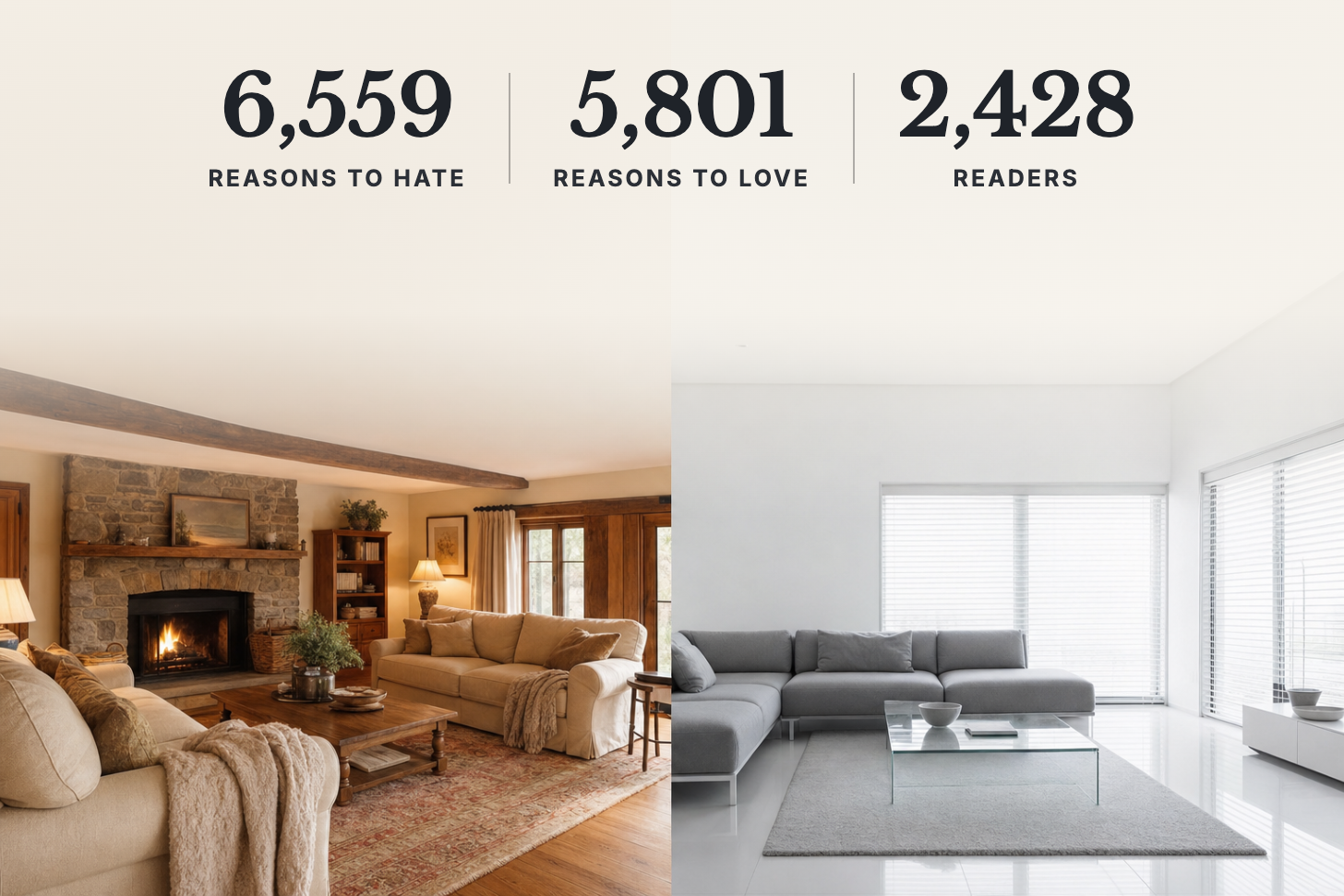
So I asked. Home Stratosphere runs what I call the Reader Preference Lab. When a reader gives an image a thumbs-down, a small question pops up: "What doesn't work for you?" There are eight answers to pick from, from "Not my style" to "Too cold / stark" to "Out of my budget." Readers who heart an image get the reverse question, "What do you like most about it?", with nine answers. From September 8 to October 8, 2026, readers gave 6,559 reasons for disliking a room and 5,801 for liking one. That's 2,428 readers across 5,049 different images. Every image is tagged with its features too, so I can see which features each reason clusters around.
The headline surprised me. "Too cold / stark" came up more often than "Looks dated." And price almost never comes into it.
Why readers thumb a room down
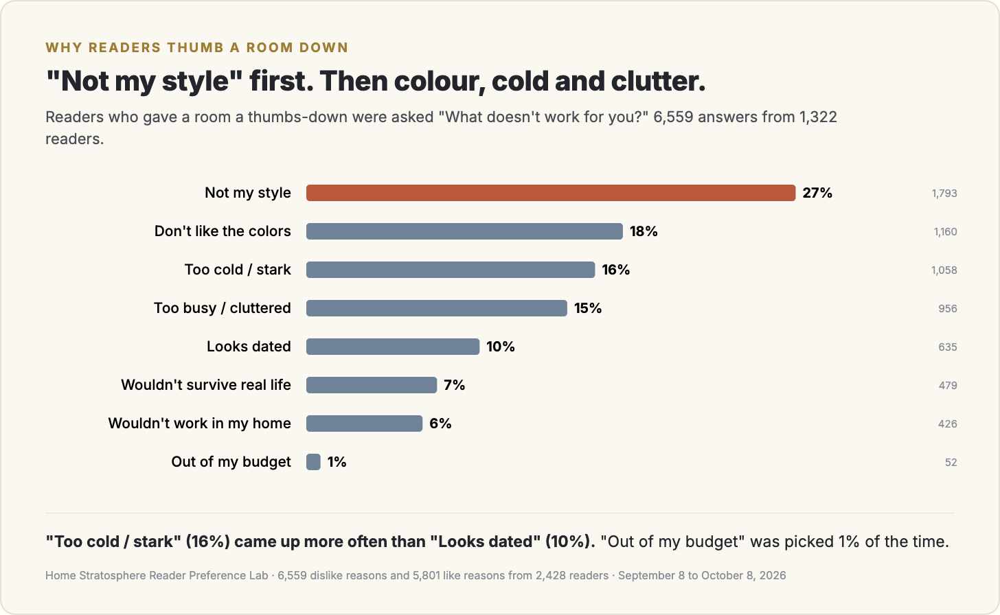
"Not my style" leads at 27%, which is fair enough. Taste is taste. After that it's "Don't like the colors" at 18%, then "Too cold / stark" at 16% and "Too busy / cluttered" at 15%. "Looks dated" comes fifth at 10%.
That ordering matters, because "dated" is the word the industry uses for everything. A lot of renovation content is built around getting rid of the dated thing. These readers are more bothered by rooms that feel cold, or busy, or the wrong colour.
The one at the bottom is the one I find most telling. "Out of my budget" was picked 1% of the time, 52 answers in total. People don't reject rooms because they look expensive. They reject them because they don't feel right.
What makes a room feel cold
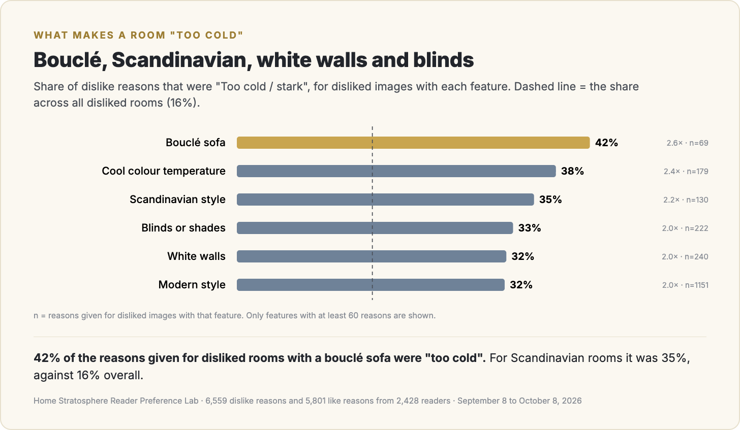
Because every image is tagged, I can look at which features show up when readers say "too cold." This chart shows the share of dislike reasons that were "too cold" for rooms with each feature, against 16% across all disliked rooms.
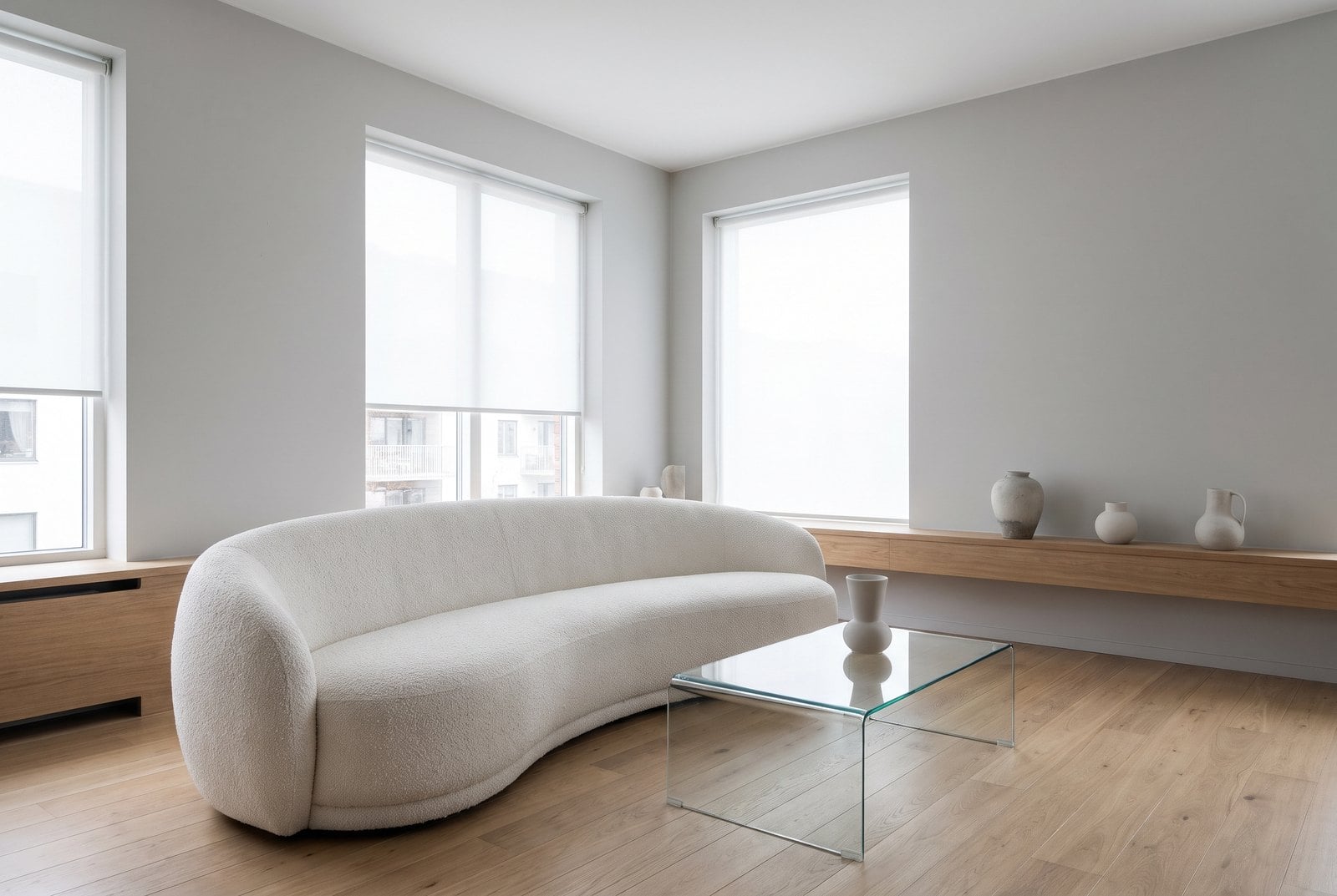
The top of the list is a bouclé sofa, the nubby white sofa from every design feed of the last few years. 42% of the reasons given for disliked rooms with one were "too cold", on 69 reasons. Scandinavian rooms come next at 35%, then cool colour temperatures, blinds, white walls and modern rooms, all around twice the baseline.
It's the same list that loses in the image data. In the living room report, modern and Scandinavian rooms and grey walls were the clearest losers. Here readers are telling you why in their own words.
What makes a room look dated
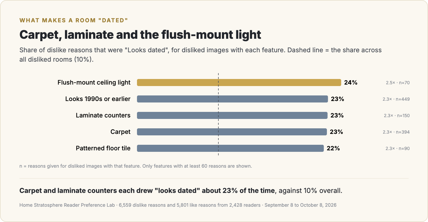
"Looks dated" is less common, but it's specific. Carpet, laminate counters, patterned floor tile and the flush-mount ceiling light all draw it at more than twice the baseline. Carpet and laminate counters each drew it about 23% of the time. If you're choosing what to fix first in an older house, that's a short list.
Colour is a bet
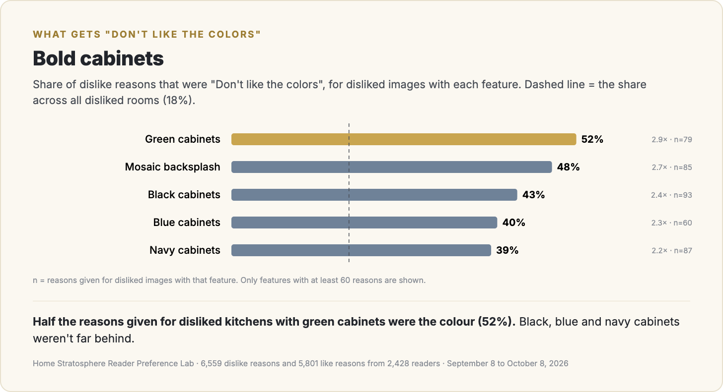
Colour complaints cluster in kitchens, and in kitchens they cluster on the cabinets. Half the reasons given for disliked kitchens with green cabinets were "Don't like the colors." Black, blue and navy cabinets were close behind, and a mosaic backsplash drew it 48% of the time.
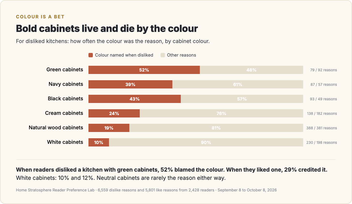
What makes this interesting is that the same colour is also why people like those kitchens. When readers hearted a kitchen with green cabinets, 29% said the colour palette was what they liked most. When they disliked one, 52% blamed the colour. White and wood cabinets are rarely the reason either way. A bold cabinet colour is a bet. It wins some people over and loses others, and it's the colour doing both.
Why readers heart a room
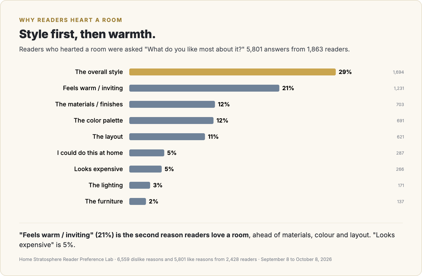
On the positive side, "The overall style" leads at 29%. The second reason, at 21%, is "Feels warm / inviting." That's ahead of the materials, the colour palette and the layout. Warmth is the second-biggest reason people love a room and "too cold" is the third-biggest reason they reject one, so it works from both ends.
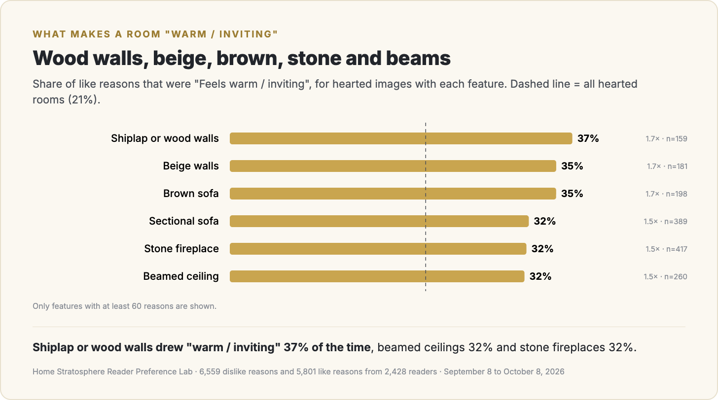
The features that earn "warm / inviting" are what you'd guess, which is reassuring. Shiplap and wood walls, beige walls, brown sofas, sectionals, stone fireplaces and beamed ceilings all draw it at about one and a half times the baseline.
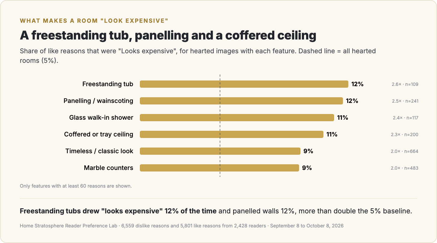
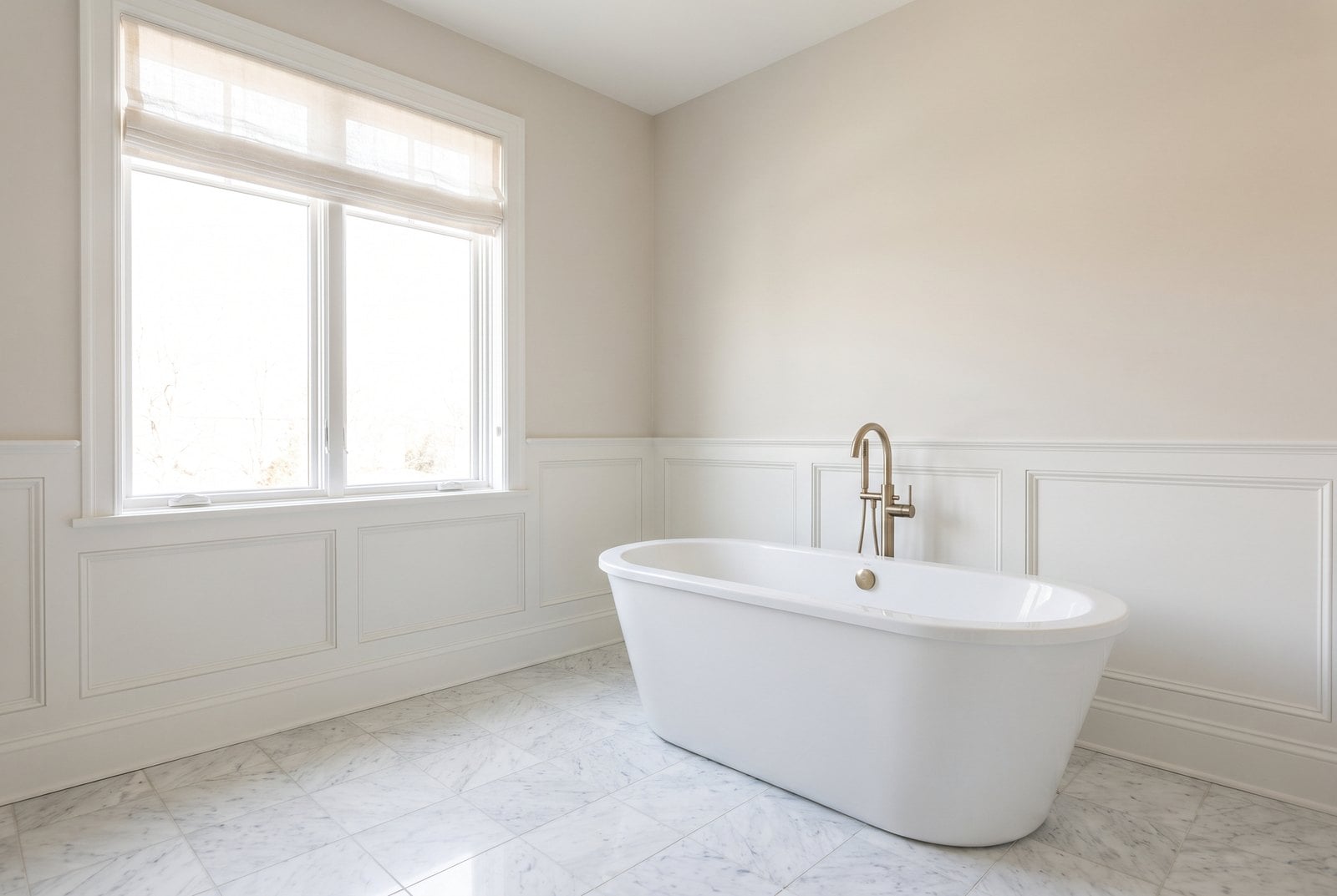
"Looks expensive" is rarer, 5% of like reasons, and it clusters on a short list: freestanding tubs (12%), panelling and wainscoting (12%), glass walk-in showers, coffered ceilings and marble. If you want a room to read as expensive, those are the features readers notice.
By room
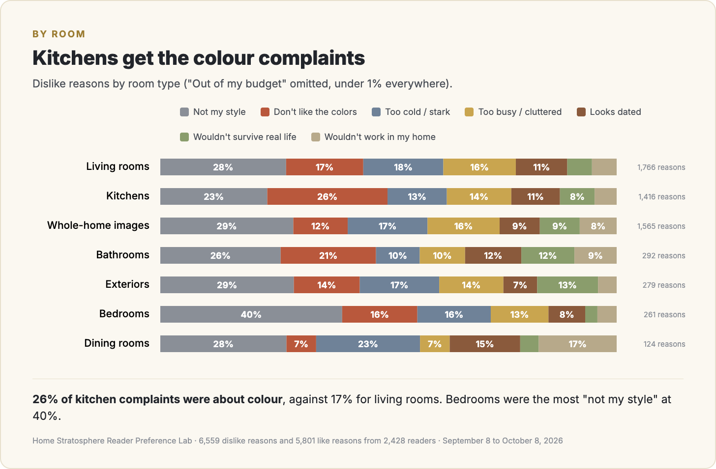
The mix shifts a little by room. Kitchens get the most colour complaints, 26% of reasons. Bedrooms are the most "not my style" at 40%. Living rooms split fairly evenly between cold, busy, colour and style.
What I'd do with this
If I were staging or styling for this audience, I'd spend less energy on looking current and more on looking warm. Swap the cool bulbs, add wood, lose the bouclé and the bare blinds. "Cold" costs you more than "dated" does.
If I sold cabinets or paint, I'd treat bold colours as a segment rather than the mainstream. The people who like a green kitchen really like it, but the people who don't are specific about why.
And I'd stop worrying that a room looks too expensive for the audience. Almost nobody gives that as the reason they didn't like it.
🔥 Would you like to save this?
The caveats
These are the readers who chose to answer the follow-up question, not everyone who reacted, and the reasons are a fixed list, so a reader with some other complaint had to pick the closest one. The feature results come from tags on whole images, so when a reader says "too cold" about a room with a bouclé sofa, I can't be sure the sofa is what they meant. The response is spread across a lot of people: the ten most active readers gave 5% of all dislike reasons, and the typical reader gave 2.
What I can say is narrower. From September 8 to October 8, 2026, when Home Stratosphere readers told me why they didn't like a room, "too cold" came up more often than "dated", price almost never came up, and the cold complaints clustered on bouclé, Scandinavian and modern rooms, white walls and blinds.
This report first appeared in Home Stratosphere on Substack, where Pro members get the full PDF report and the raw data behind it.
Want the Full Report and Raw Data?
Upgrade to Pro and you’ll get:
- The complete 20-page PDF report with every like and dislike reason by room type and device, the feature-by-feature trigger tables for all seventeen reasons (which features draw "too cold", "dated", "too busy", "looks expensive", "warm / inviting" and the rest), and the cabinet colour analysis.
- Instant access to all PDF reports and raw data for archived articles.
- The raw data behind the report in one Excel file (every one of the 12,360 reasons with the image and its tags, the reason-by-feature tables and the room breakdowns) so you can sort it, filter it, run your own analysis and build your own charts.
- Permission to use the research in your own marketing and business materials — including client presentations, blog posts, newsletters, social media, videos, sales materials, branded reports and product research.
The free article gives you the headline findings.
Pro gives you the full report, the data behind it and the right to put it to work.
Get the Full Report on Substack →