🔥 Would you like to save this?
White gets blamed for a lot of bad kitchens it didn’t design.
In order to come up with the very specific design ideas, we create most designs with the assistance of state-of-the-art AI interior design software. Also, assume links that take you off the site are affiliate links such as links to Amazon. this means we may earn a commission if you buy something.
When a white kitchen feels cold, the instinct is usually to question the paint. Too stark. Too bright. Too much. But white can sit quite happily beside burl wood, terracotta, leather, plaster, woven fiber, copper, old brick, garden green and enough oak to build a respectable forest. The trouble starts when every surface is equally smooth, every edge equally crisp and every light source seems determined to interrogate the countertops.
That’s where these kitchens get interesting. One hangs a canoe from the ceiling. Another grows a tree through the island. Wisteria takes over a glass roof, a leather-wrapped island faces grazing horses, and an alpine kitchen puts fire, stone and sheepskin against the snow. Even the quieter rooms have something to say about grain, texture, shadow, patina and the enormous difference between white as a color and white as an atmosphere.
Across these 35 designs, warmth doesn’t arrive through one magic material or a prescribed shade of cream. It comes from contrast. Smooth against rough. Pale against honeyed wood. Marble beside something woven, weathered, leafy, burnished or gloriously imperfect. White is still everywhere. It just isn’t being asked to carry the room alone.
35. Gold, Fluted Oak and a City at Dusk Give White Its Evening Clothes
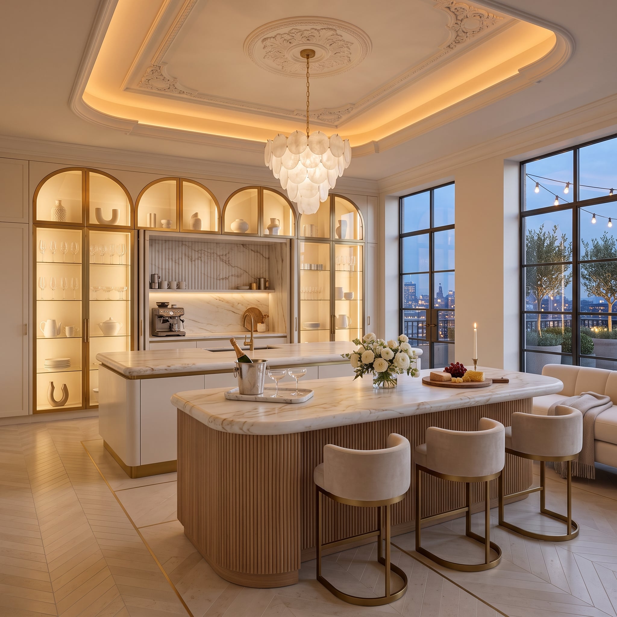
This kitchen opens with metropolitan polish rather than clinical restraint. Ornate coffered plasterwork establishes the formal architecture, but concealed cove lighting softens all those edges before the room can tip into ballroom territory.
A shell-like chandelier, fluted oak island base, brass hardware and brushed-gold stool frames add warmth at several scales rather than relying on one oversized statement. Backlit arched cabinetry turns white ceramics into luminous shapes, while the city at dusk supplies blue-gray contrast beyond the windows.
White can handle considerable formality when wood, low light and warmer metals keep the room from becoming ceremonial.
34. Toile, Roses and a Sink Skirt Take the Hard Edge Off Ivory
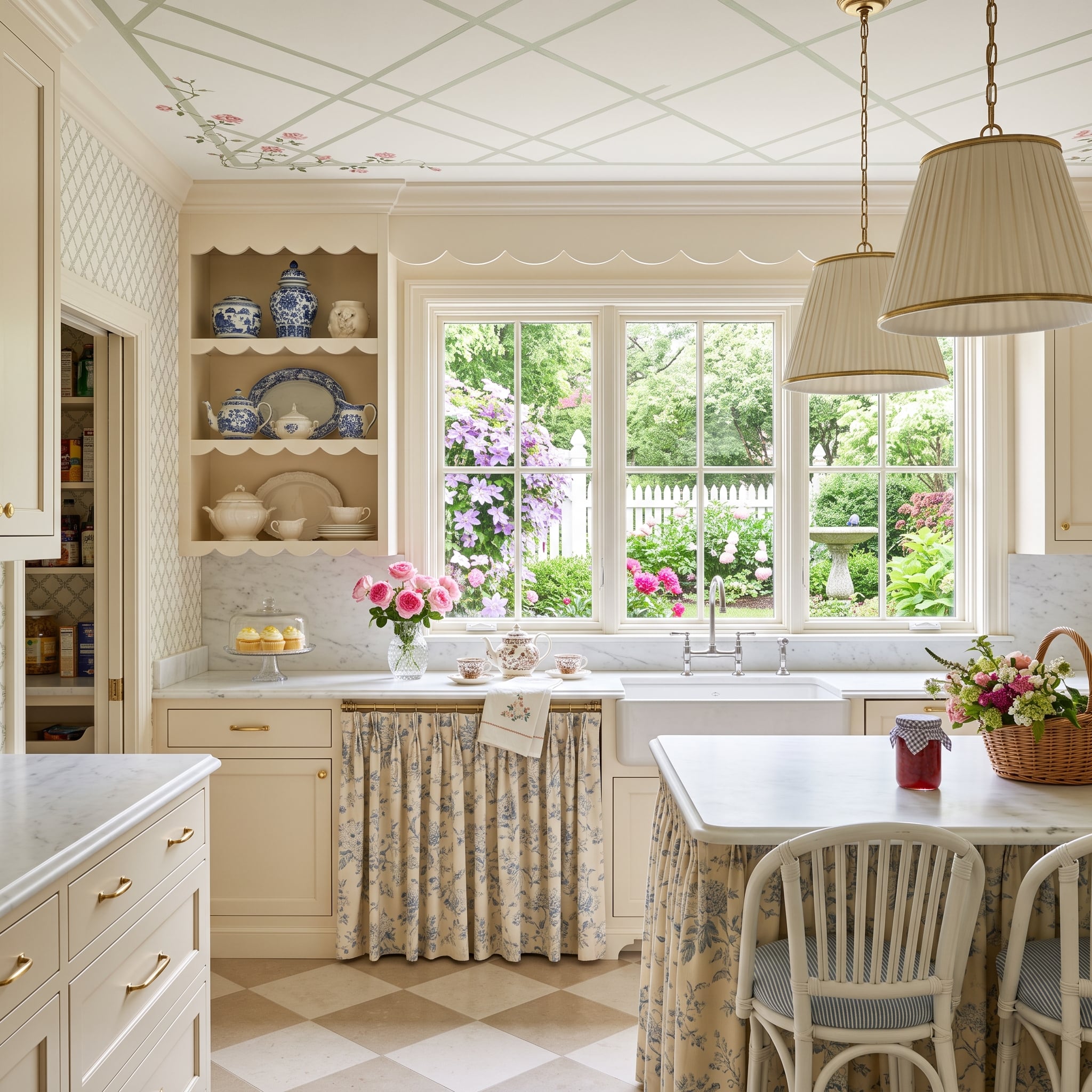
This kitchen answers all that polished city structure with fabric. Blue-and-cream toile replaces a rigid cabinet front beneath the farmhouse sink, scalloped shelving loosens the straight lines, and trailing roses turn the coffered ceiling into part architecture, part garden fantasy.
The checkerboard stone floor prevents the softness from becoming sugary. Gold-toned hardware, transferware and flowers beyond the windows add detail, but the room’s real trick is simpler: not every pale surface is hard.
Why the Sink Skirt Changes the Room
Fabric introduces folds, shadow, pattern and movement into a kitchen dominated by cabinetry and stone. Against all those fixed planes, one draped surface changes the character of the lower cabinets without requiring more color.
33. This Yacht-Inspired Island Refuses to Let White Play Captain
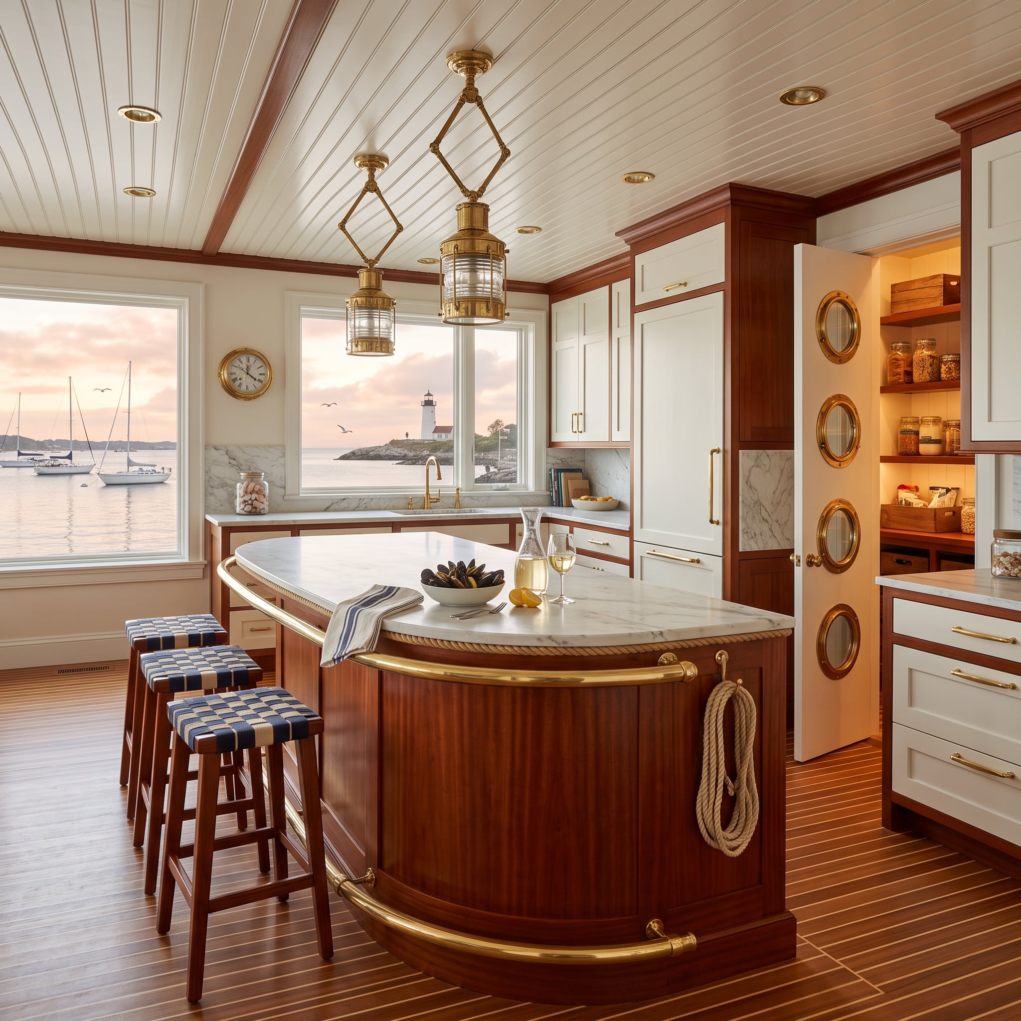
A boat-hull island is not interested in being subtle.
The curved base, finished in richly toned wood, carries brass rail trim beneath a marble top. Ship-lantern pendants repeat the brass overhead, while a pantry door fitted with three porthole windows commits fully to the nautical vocabulary.
White upper cabinets are useful precisely because they don’t compete. Against the darker wood, plank flooring, beadboard ceiling and brass, they become breathing room. The result flirts shamelessly with theme without letting the theme replace the design.
32. A Lake View Lets This Minimal Kitchen Whisper
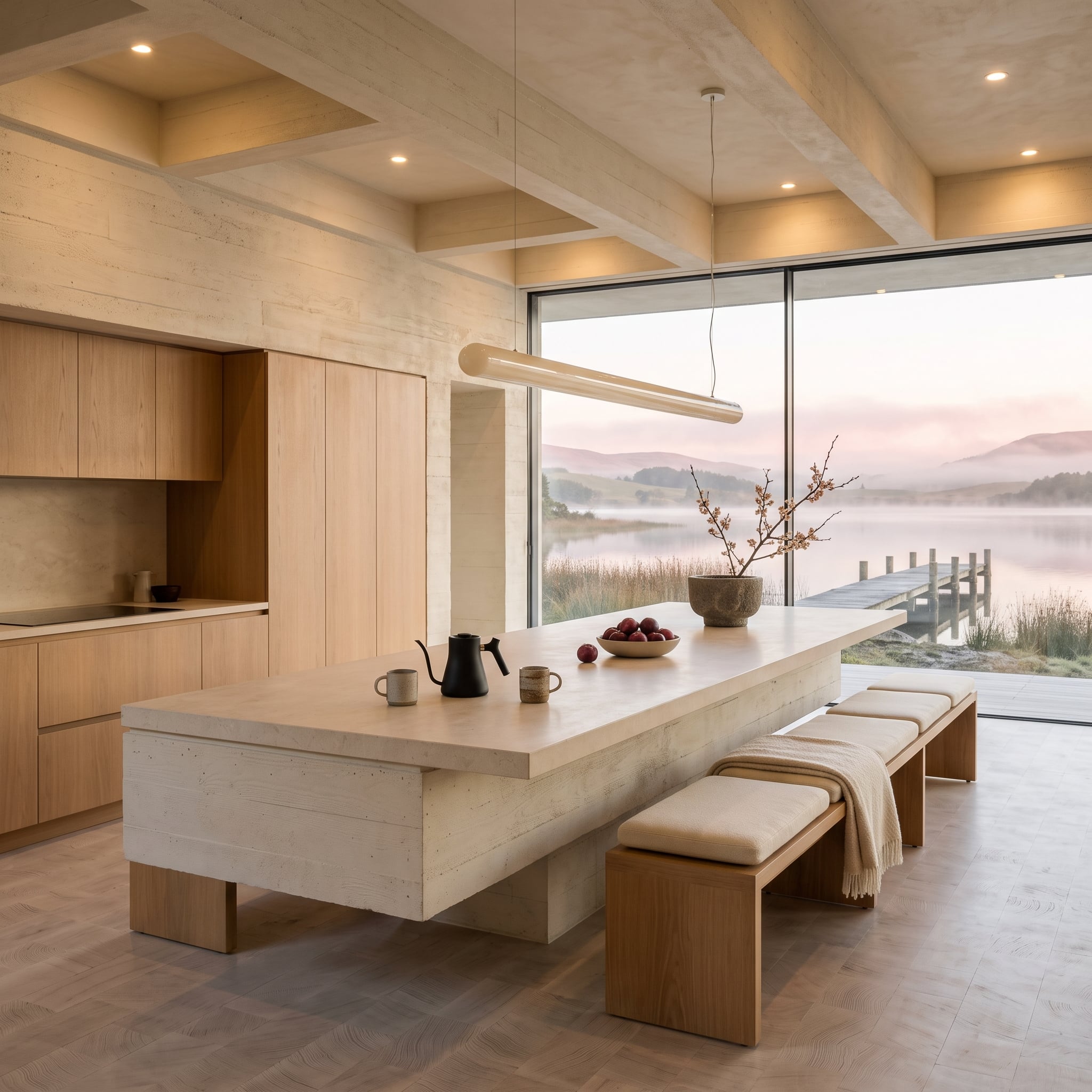
After portholes and brass rails, almost nothing happens here—and that’s the point. Pale wood cabinetry runs across the back wall without visible pulls or knobs. A concrete-toned island base supports a thick limestone-look top, and low upholstered benches keep the center of the room visually open.
Then there is the window. Soft pink light from outside moves across wood, stone and upholstery, giving the pale interior a changing backdrop throughout the day. The linear pendant barely announces itself.
Nothing needs to shout because the room already has depth.
31. Terracotta Underfoot Changes the Entire Temperature of This Desert Kitchen
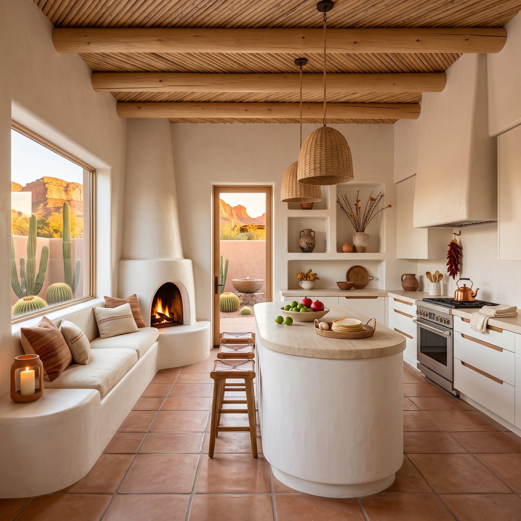
Latilla-style ceiling planks between exposed vigas bring layers of wood overhead while terracotta tile establishes an ochre-colored base below. The white plaster is caught between the two, which is exactly why it never feels stark.
Rounded forms matter just as much. The cylindrical island base, softened counter edge, curved fireplace and built-in seating remove much of the boxiness associated with conventional cabinet layouts. Woven pendants and a copper kettle add smaller points of texture without interrupting the broad plaster surfaces.
Design Detail: Vigas, latillas, plaster and kiva-style forms draw from long Southwestern building traditions. Here their visual strength comes from repetition: wood overhead, earth-colored tile below and rounded plaster forms between them.
30. Wisteria Turns a Glass Roof Into the Best Color in the Kitchen
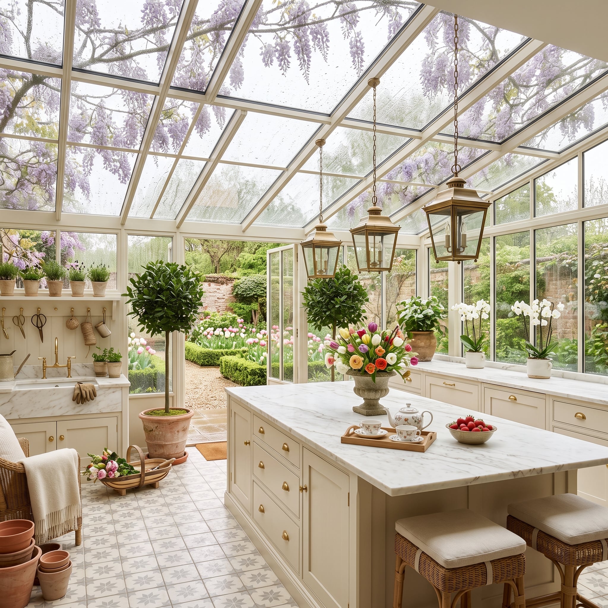
Purple wisteria spilling across a glass ceiling gives this ivory kitchen something paint alone could never provide: color that changes with the garden, weather and light.
Below it, marble with soft gray veining keeps the island pale without making it blank. Patterned floor tile introduces another layer of movement, while aged-looking brass lanterns and cabinet hardware connect the garden exuberance overhead to the more disciplined cabinetry below.
White isn’t disappearing. It’s giving everything else somewhere to happen.
29. Snow Outside, Fire Inside: The Alpine Version of a White Kitchen
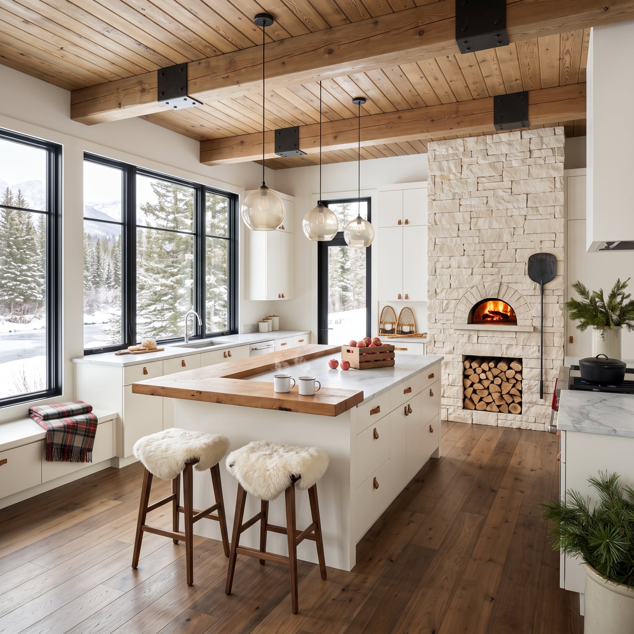
A glowing wood-fired oven set into cream-colored stacked stone gives this room a focal point with actual fire at its center. Beyond the windows, snow makes the contrast even sharper.
Exposed timber beams cross the ceiling with black steel brackets, smoked-glass globes hover over the island, and a butcher-block extension interrupts the marble with a broad strip of wood. Then the sheepskin-covered stools arrive with all that unruly texture.
The palette is restrained. The surfaces aren’t. That’s enough to keep pale stone and cabinetry from feeling remotely austere.
28. A Parisian Café Vocabulary Gives Ivory Cabinets Some Swagger
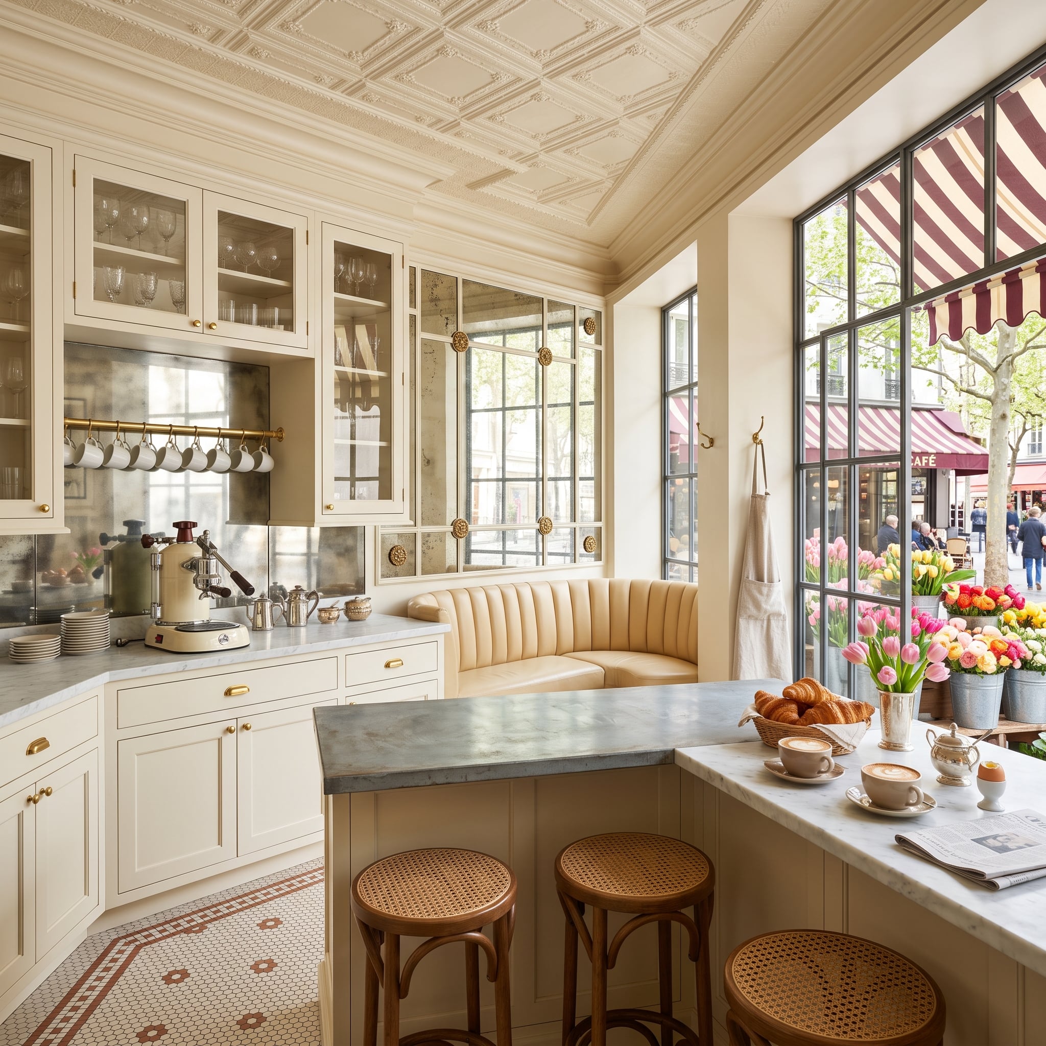
Ivory shaker cabinets meet an ornate pressed-metal ceiling, aged-looking mirror panels, a zinc-toned peninsula, cane stools and a deeply channeled banquette. That’s a lot of personality for a room whose cabinetry is essentially neutral.
The metal finishes don’t all behave the same way. Polished brass flashes. The mirror looks mottled rather than pristine. The zinc surface is comparatively matte. Against those changing textures, the white cabinetry becomes the steady element instead of the sterile one.
Material Mix: Using different counter and metal finishes can give a pale kitchen tonal variation without adding another strong color. Zinc also develops a patina with age, trading a newer metallic sheen for a softer, more mottled surface.
27. The Garden Didn’t Stop at the Door. It Took Over the Island
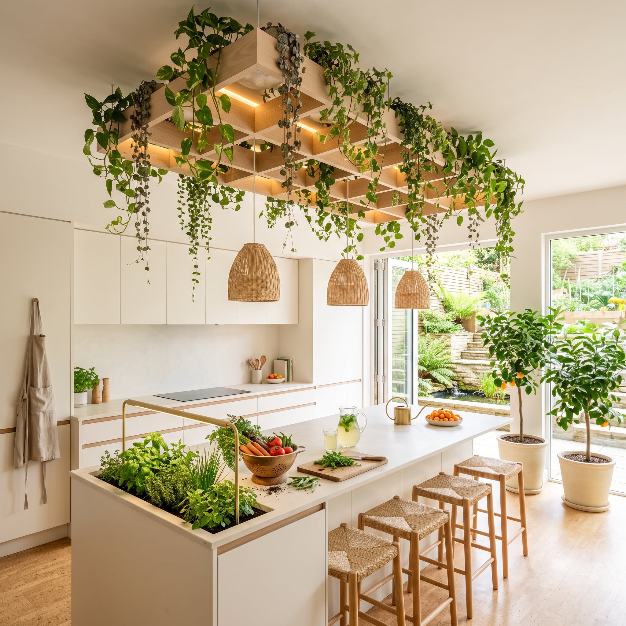
Trailing plants cascade from a latticed wood structure suspended above the island, while another planted section is integrated directly into the island itself. Green isn’t an accent here. It’s practically a building material.
Woven pendants, rush-seat stools and wood latticework keep the vegetation connected to the rest of the room rather than turning it into an isolated novelty. The pale kitchen surfaces provide enough visual quiet for all those leaves to remain the star.
Practical Point: A planter integrated into cabinetry needs deliberate waterproofing, drainage, root containment and access for maintenance. The greenery may look effortless; the construction underneath it cannot be.
26. Dark Coffers Put the White Cabinets in Their Place
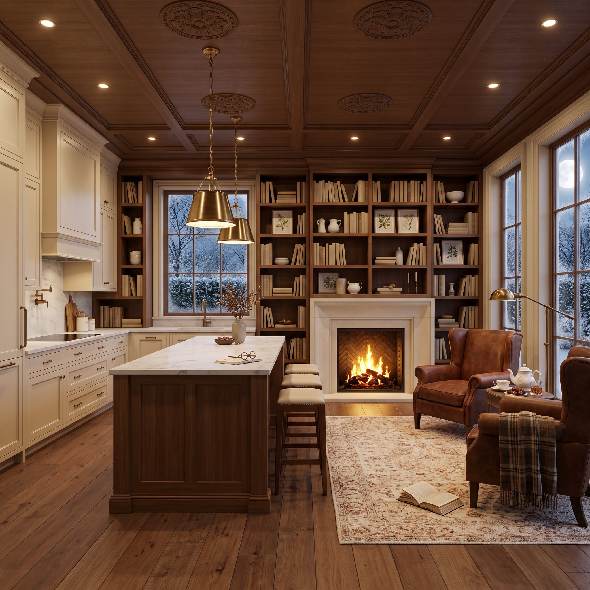
The ceiling owns this kitchen. Dark wood coffers create a strong overhead grid, turning the cream-painted cabinets and marble island into the lighter half of a deliberate contrast rather than the room’s entire identity.
Brass pendants hang low over the island, while a leather wingback chair beside the fireplace pulls the kitchen toward the adjoining sitting area. Even the open book on the rug contributes to the sense that this isn’t a white kitchen staged in isolation. It’s one part of a much richer room.
25. Woven Pendants and an Ocean Horizon Keep the Marble From Getting Too Serious
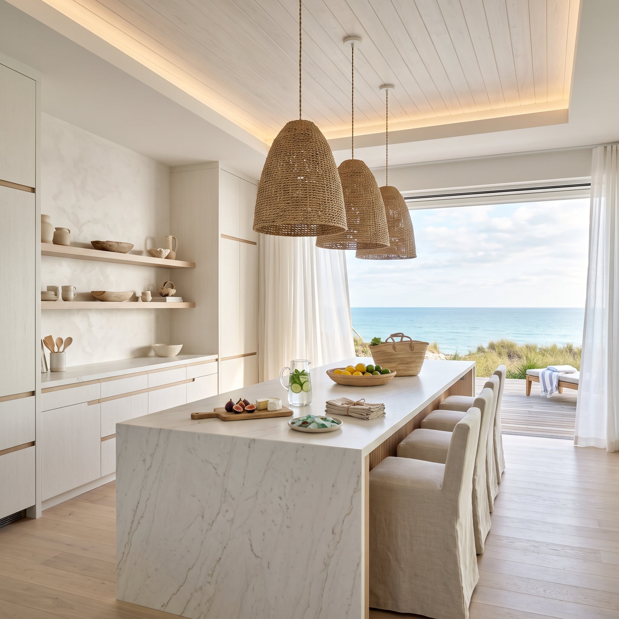
A marble waterfall island could easily become the most formal object in this room. Three oversized woven pendants refuse to let that happen.
Their coarse texture hangs directly against the smooth stone, while pale plank ceilings and linen-covered chairs extend the softer material palette outward. Beyond the glass, blue water adds the only strong color the room really needs.
The lesson isn’t that every white kitchen needs woven lighting. It’s that polished stone becomes much more interesting when something nearby is visibly fibrous, irregular and relaxed.
24. A Painted Sky Makes the Ceiling the Wild Card
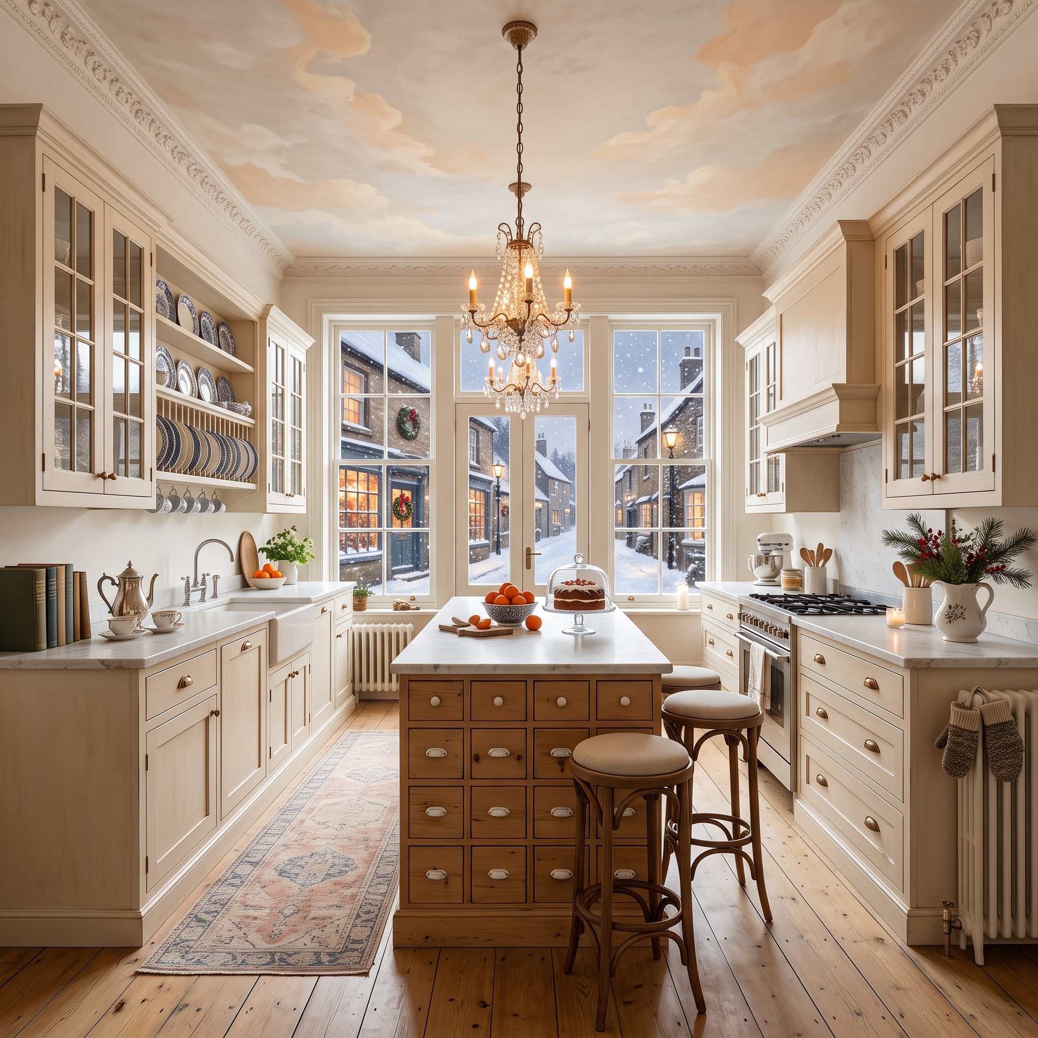
Soft greige cabinetry is almost restrained enough to disappear. Then the ceiling arrives.
A painted sky in peach, cream and cloud white spreads overhead while warm wood flooring runs beneath an island packed with small apothecary-style drawers. Snow beyond the French doors makes the interior colors look even more saturated by comparison.
Look Closer: The island borrows the many-small-drawers appearance associated with old apothecary and specimen cabinets. Cup pulls and natural wood make it read more like freestanding furniture than a conventional block of base cabinetry.
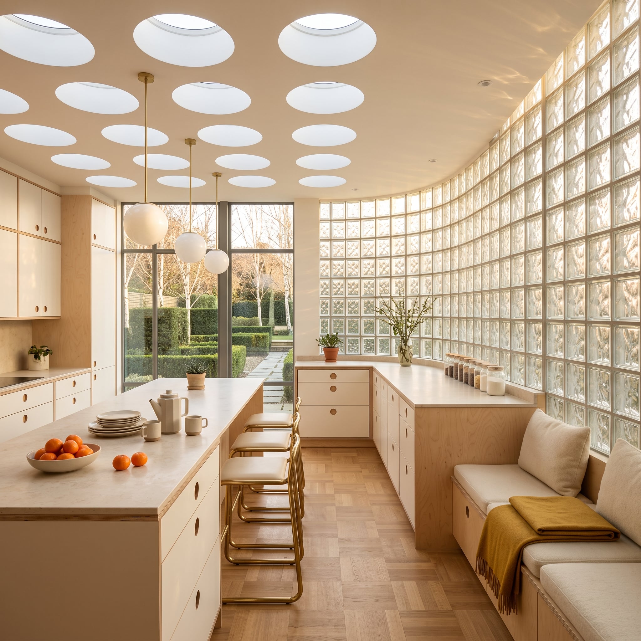
23. Glass Block and Oval Skylights Make Soft Light Part of the Architecture
🔥 Would you like to save this?
Oval skylights scatter openings across the ceiling while a curved glass-block wall diffuses daylight along one side. The room doesn’t rely on one giant window or one decorative pendant to animate all that pale material.
Honey-toned plywood cabinetry with circular cutout pulls introduces visible grain without adding hardware, and parquet flooring supplies another wood pattern underfoot. A mustard throw on the built-in bench is a small move with excellent timing.
Design History: Glass block became especially prominent in early- and mid-20th-century architecture because it could admit daylight while preserving privacy. Curved installations remain one of its most distinctive uses, turning a translucent wall into a sculptural surface rather than a flat partition.
22. Leather, Horses and Brass Push White Straight Into Equestrian Territory
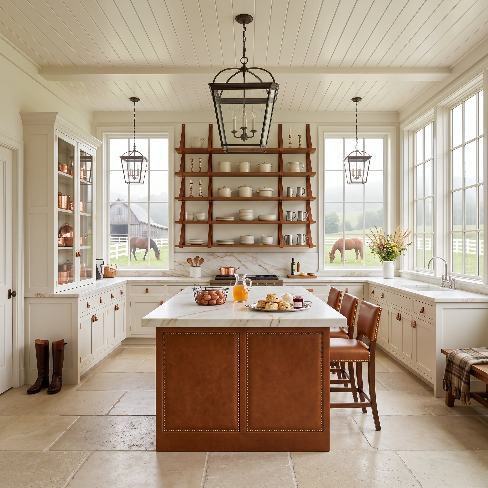
Saddle-brown leather panels wrap the island beneath brass nailhead trim, immediately giving the room a darker, more tactile center. Walnut shelving, copper-toned cookware and leather drawer pulls repeat that brown-to-amber range without turning every surface into wood.
Then the windows open onto horses and a barn landscape. The view reinforces the material story, but the room doesn’t depend on it. Even with the curtains drawn, leather against white cabinetry would still be doing something unusually rich.
Material Note: Leather used on cabinetry or furniture needs a finish and maintenance approach suited to its location, particularly where sunlight, splashes and frequent contact are involved. Here the nailhead trim also gives the island a strongly tailored visual edge.
21. Curves Do What Another Shade of Cream Never Could
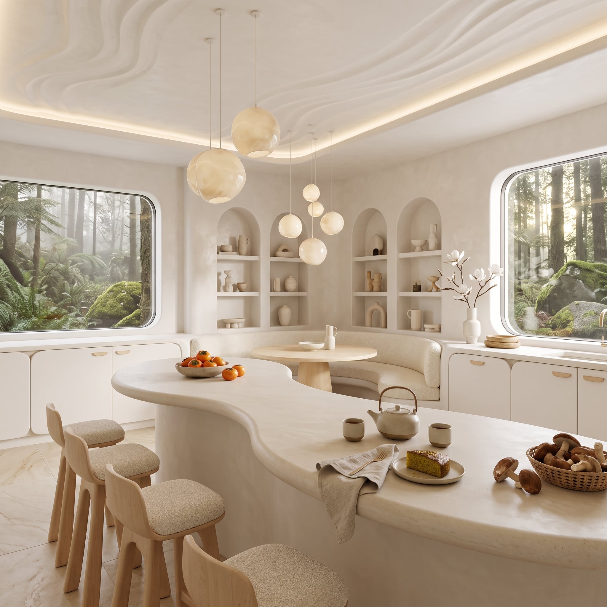
Color barely changes across this kitchen. Shape does.
The island moves in an organic curve rather than a rectangular block. Rounded stools follow it. Globe pendants vary in size overhead, while arched niches repeat the same softened geometry across the back wall. Pale ceramics keep the niches quiet enough that the openings themselves remain the feature.
That’s a useful distinction in an almost monochromatic room. Warmth can come from material, but softness can also come from silhouette.
Design Detail: Arches and rounded cabinetry interrupt the repeated right angles created by cabinet boxes, doors and countertops. Keeping those curves in the same pale palette lets geometry provide the contrast instead of another color.
20. Copper Pots and Hanging Herbs Make This Kitchen Look Ready for Dinner
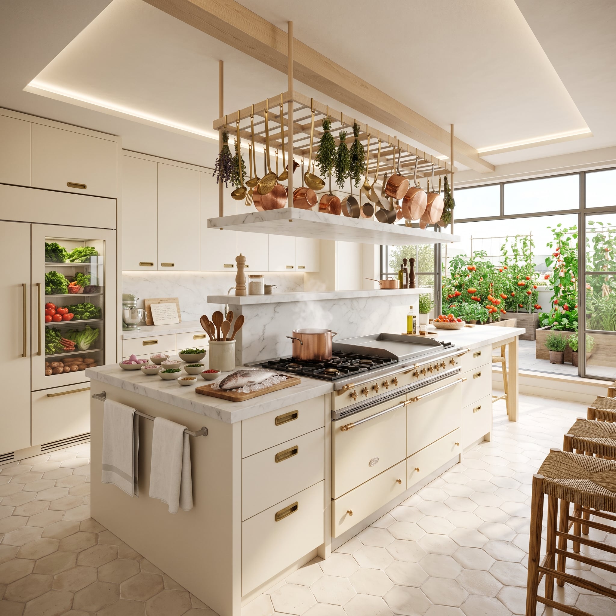
A brass rack above the island carries copper cookware and bundles of drying herbs, replacing the usual pendant-light composition with something more useful and far less polite.
Cooler marble counters sit below, while soft bisque-colored hexagonal floor tile keeps the lower half from becoming equally slick. Beyond the range, glass opens to tomato vines, herbs and dense planting, with a glass-front refrigerator extending the produce-heavy palette indoors.
The copper will change with age. That’s part of its appeal. A kitchen this pale benefits from at least one material that refuses to remain exactly as installed.
19. High Above the City, Wood Grain Keeps the Glass From Winning
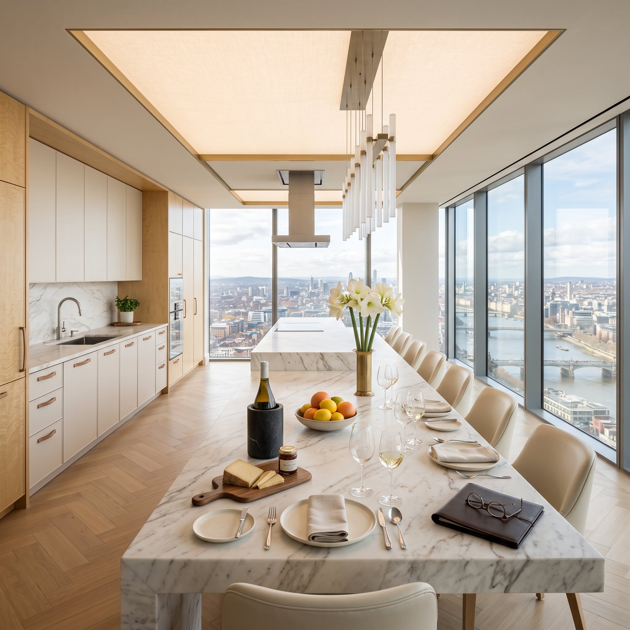
Floor-to-ceiling glass wraps two sides of this high-rise kitchen, putting the river and city into almost every sightline. With that much glass and pale stone, the room could easily become all reflection and horizon.
Light wood cabinetry with copper-toned pulls changes the equation. Grain gives the back wall texture, while the herringbone floor introduces a directional pattern beneath the quieter counters and cabinets.
Why It Works: An expansive view already gives a room enormous visual depth. Keeping the interior palette restrained allows wood grain, flooring and the changing landscape outside to provide variation without competing for attention.
18. A Living Tree Makes White Feel Anything but Sterile
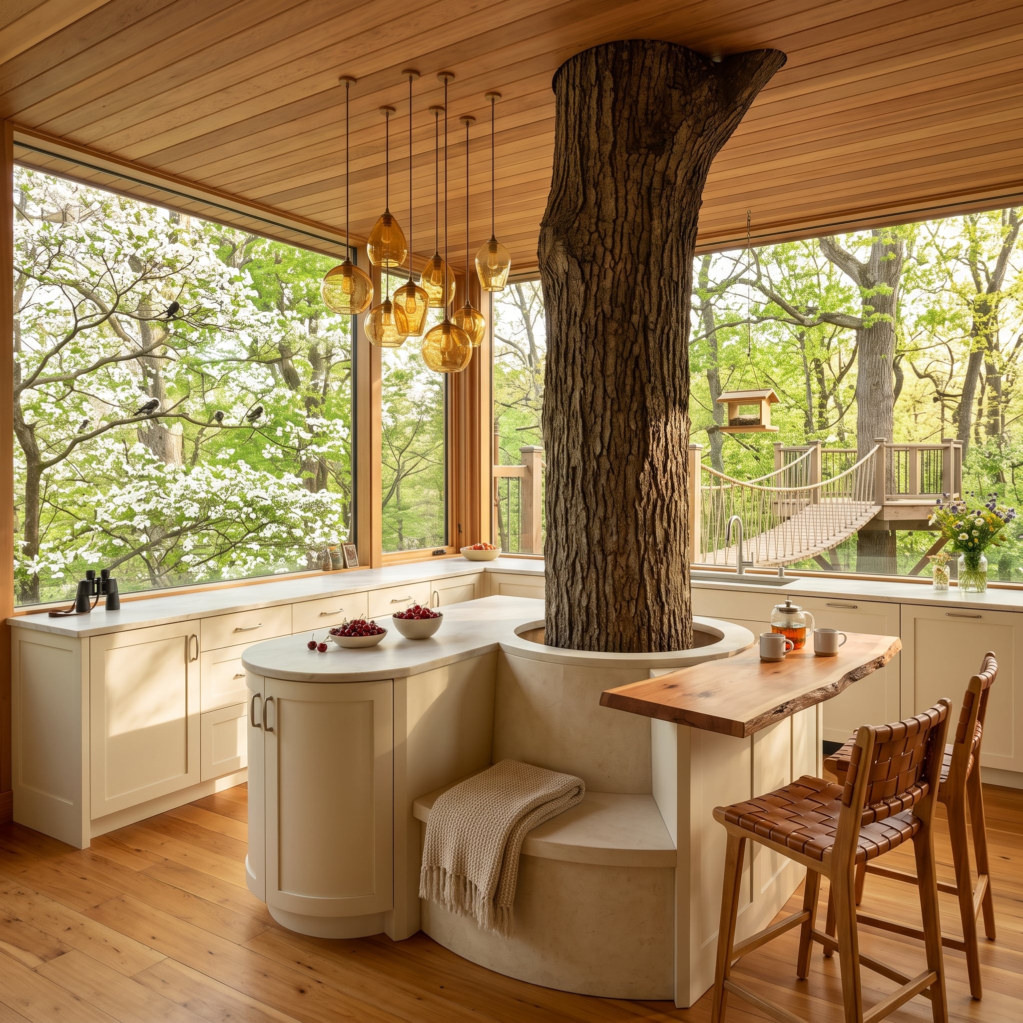
A mature tree trunk rising directly through a curved island makes a fairly decisive argument: white does not have to mean pristine, precious or detached from nature. Here the pale plaster-toned surfaces become background to bark, walnut, cedar and the dense green view beyond the glass.
The island wraps around the trunk with a built-in bench and live-edge breakfast bar, while amber glass pendants bring another honeyed note overhead. Even the white flowering branches outside become part of the palette rather than simply scenery.
Worth Knowing: Building around a living tree requires far more than cutting a neat hole around the trunk. Long-term growth, trunk movement, roots, water management and the junction between tree and structure all need room to change without damaging either one.
17. The Cat Found the Warmest Seat in the House
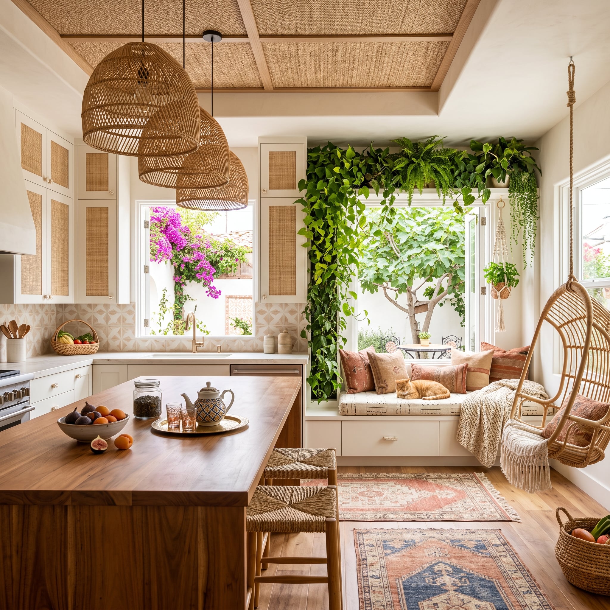
Woven pendants, cane-panel cabinet fronts and a walnut butcher-block island give this white kitchen three very different kinds of texture before the plants even enter the conversation.
Then the window seat takes over. Trailing greenery frames it from above, dusty rose and terracotta appear in the cushions, and a ginger cat occupies the middle with the confidence of someone who has reviewed the upholstery personally.
Greenery Without Clutter: Trailing plants can frame a window while leaving the sill open. Plant choice should match the actual light, temperature and watering conditions of the room rather than the fact that the space happens to be a kitchen.
16. Backlit Stone Overhead Turns the Ceiling Into a Lantern
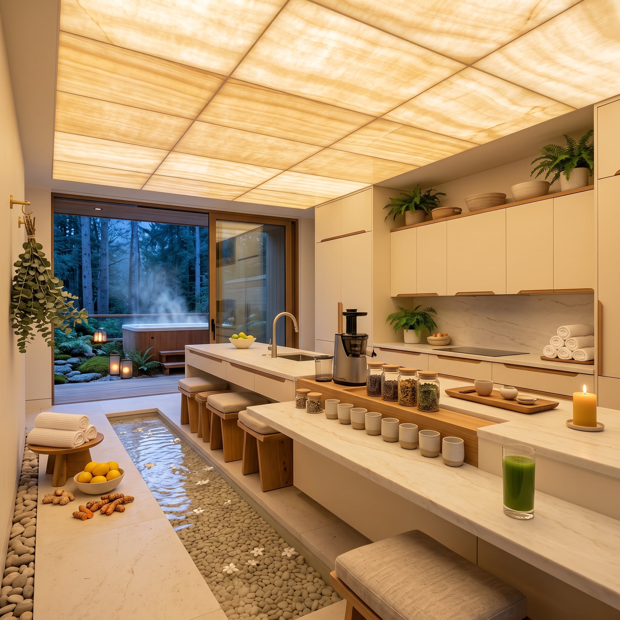
Translucent stone panels glowing amber across the ceiling change the entire character of the ivory cabinetry below. Instead of adding more color to the cabinets, this room changes the light around them.
A pebble-lined channel beneath the island adds another unexpected texture at floor level. Wood stools, dried botanicals and a pillar candle continue the natural-material vocabulary, but none tries to compete with the ceiling.
Look Up: A ceiling can contribute material, texture and light just as strongly as a backsplash or island. Here the illuminated surface gives the palest parts of the room an amber-colored context rather than leaving them under flat white light.
15. Brick Underfoot Gives This Cream Kitchen Some History Without a History Lesson
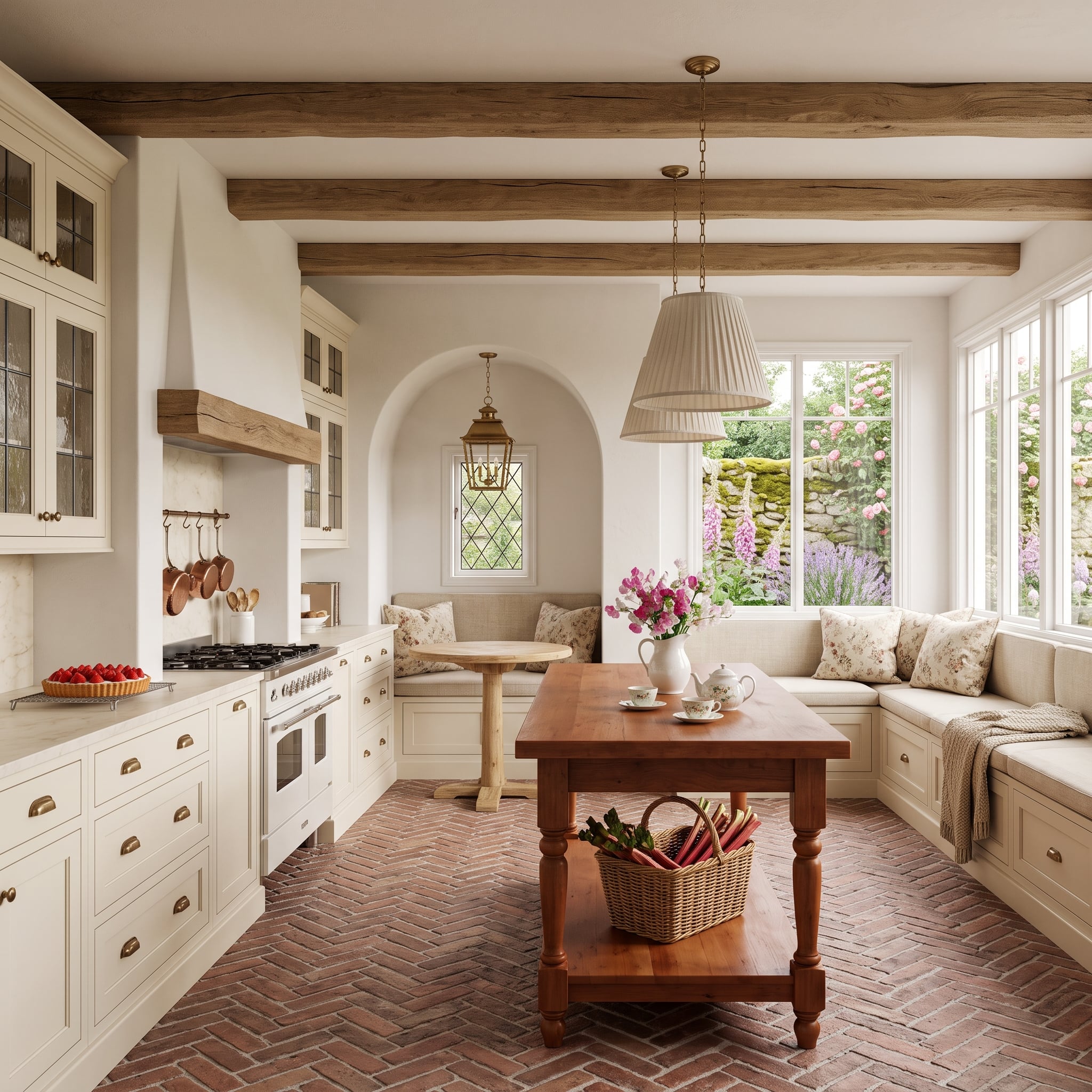
Terracotta-colored brick laid in herringbone creates a strong patterned floor beneath cream cabinetry and exposed wood beams. The room has plenty of pale surfaces, but almost none of them sit beside another equally smooth pale surface.
A linen-covered window seat with floral cushions brings the garden inward without trying to imitate it. Brass cup pulls add small flashes of metal, while the brick supplies the broad field of earthy color.
Pattern Play: Herringbone changes the direction of the floor repeatedly, giving a single material more movement than a straight running pattern. The brick color supplies the warmth; the geometry supplies the energy.
14. Woven Ceiling Panels Make This Coastal Kitchen Feel Almost Thatched
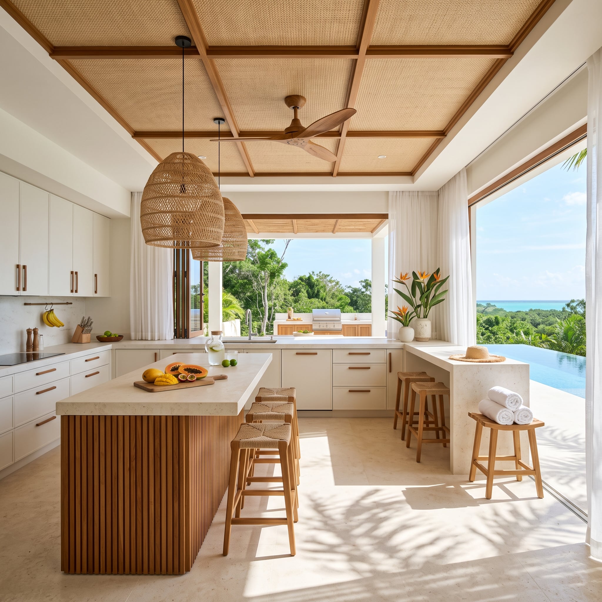
Timber battens divide the ceiling into woven panels, immediately giving the room a dense layer of texture above otherwise pale cabinetry. The island repeats the idea with vertical wood slats, while woven pendants bring the texture down another level.
Papaya and mango on the counter add fleeting color. The turquoise ocean beyond the windows supplies considerably more.
Worth Knowing: Rattan is a plant material; wicker describes a weaving technique and can be made from rattan or other natural and synthetic materials. In a kitchen, the suitability of any woven material depends on its finish, location and exposure to moisture and cooking residue.
13. Nobody Expected the Canoe to Be the Light Fixture
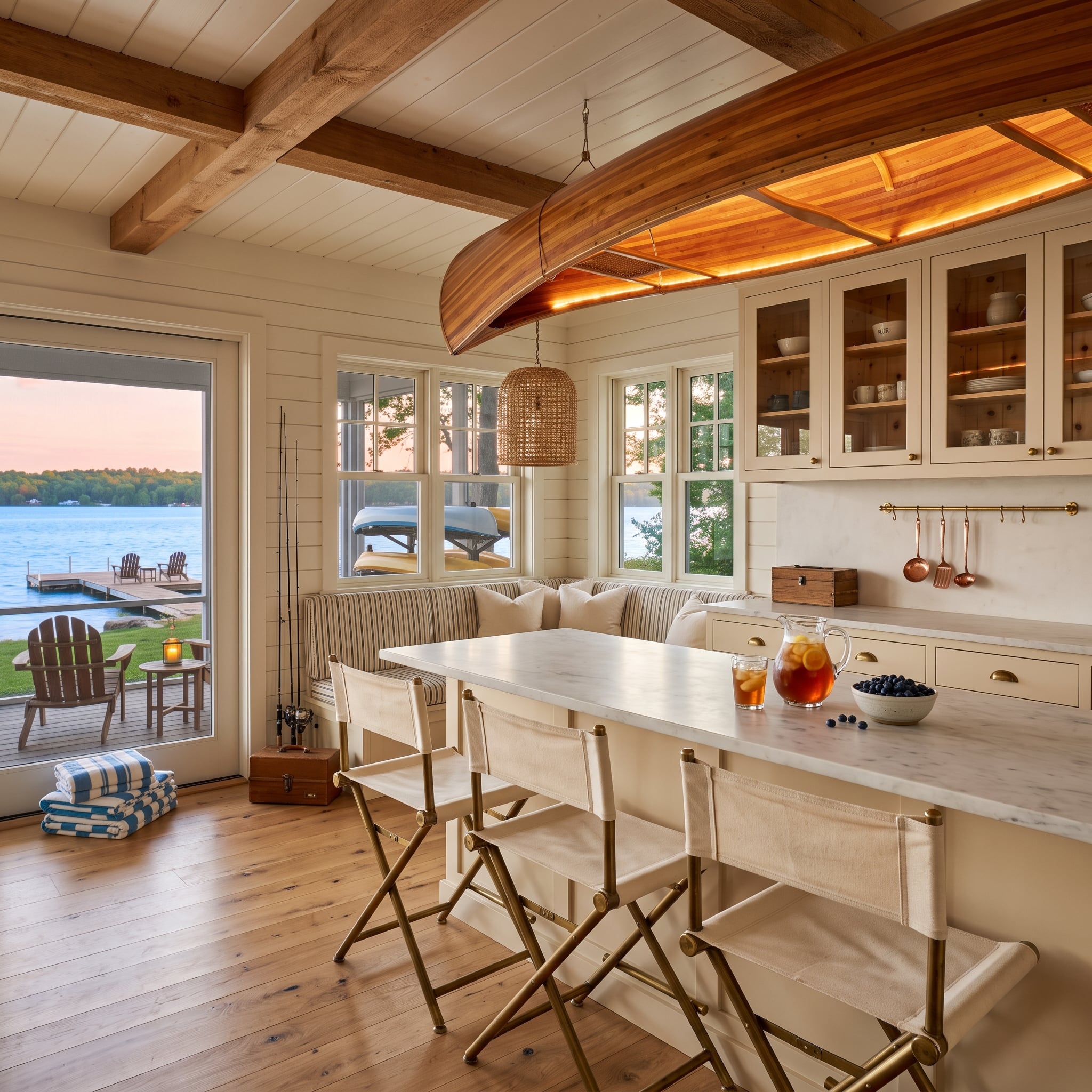
Yet there it is.
A cedar-strip canoe hangs beneath exposed wood beams with warm backlighting tracing its underside. White shiplap and cream cabinetry suddenly become the quiet background to something far more eccentric overhead.
Canvas director’s chairs, wicker lighting, striped upholstery, copper utensils and wide-plank oak flooring continue the lakehouse vocabulary without duplicating the canoe’s theatricality. One extraordinary object is enough. Everything else knows when to behave.
12. Checkerboard Stone Gives This Formal Kitchen a Floor Worth Looking At
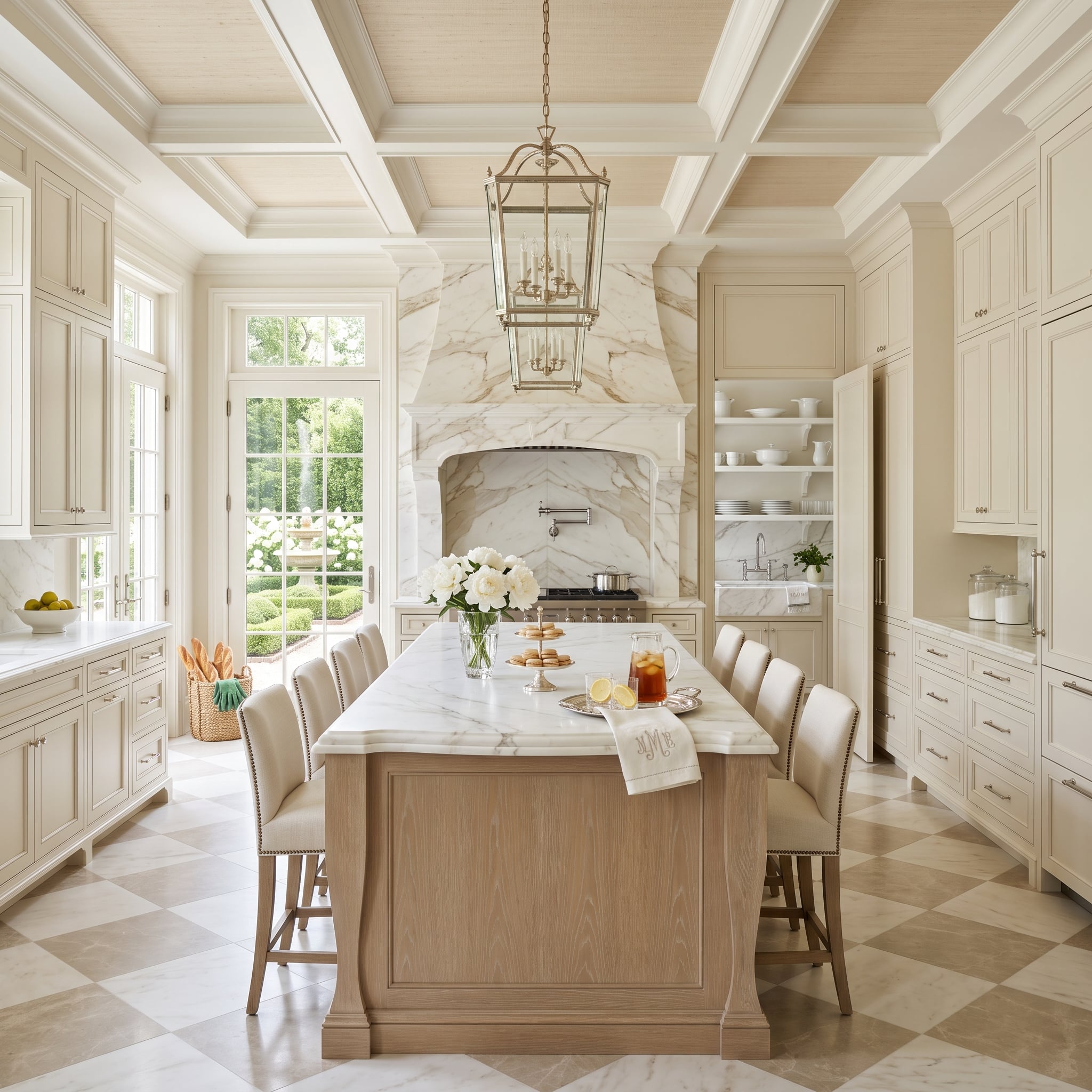
Cream cabinetry, a substantial marble hood and a coffered ceiling establish a formal envelope. The oak island keeps the center from becoming another pale block, but the checkerboard floor is what gives the room its rhythm.
Rather than using stark black and white, the floor stays within warmer stone tones. That lets the geometry register without breaking the room into hard graphic zones.
Why It Works: A checkerboard doesn’t need extreme contrast. Two related stone tones can preserve the pattern while keeping the floor connected to cream cabinetry, natural wood and veined stone elsewhere in the room.
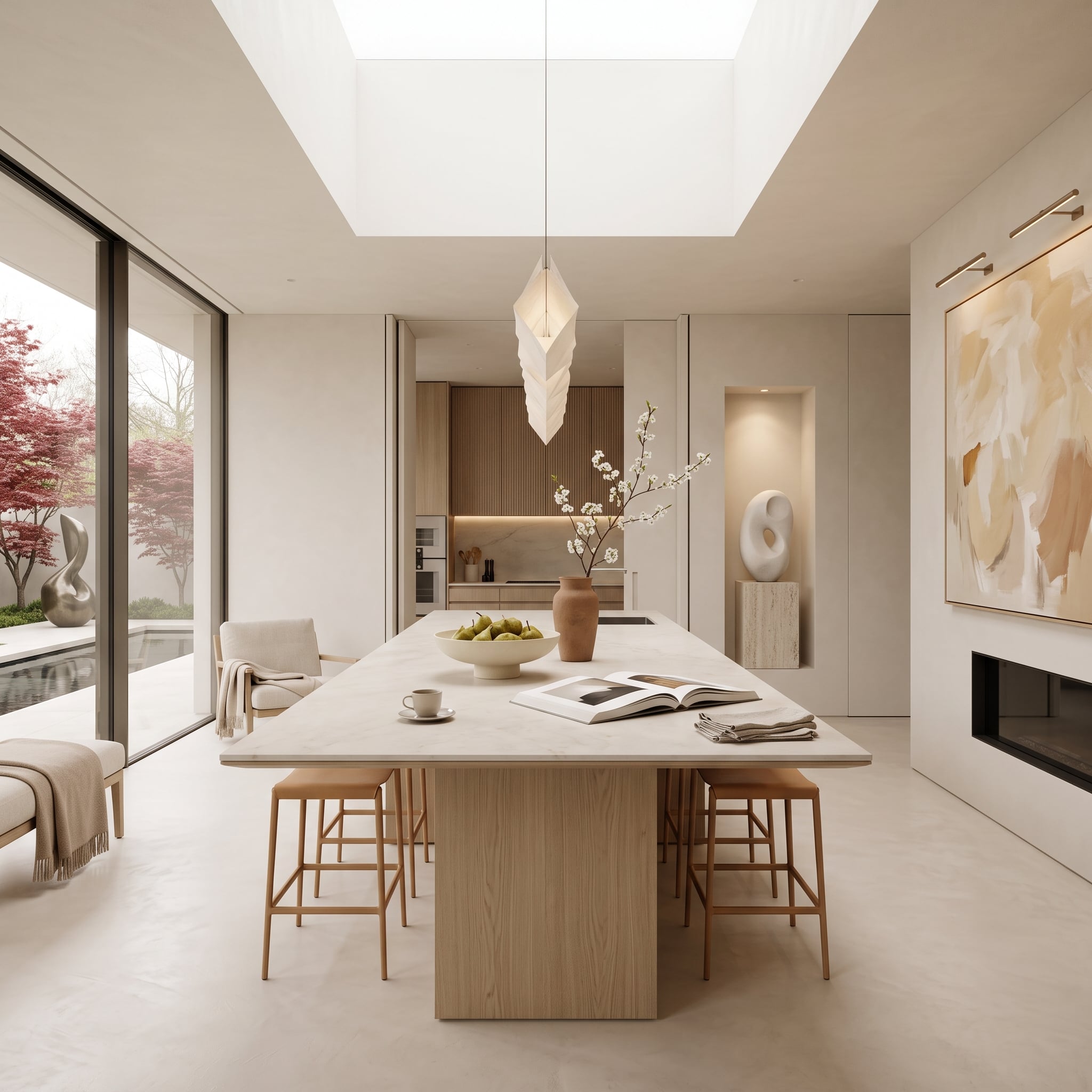
11. A Skylight and a Blushing Maple Give This Pale Kitchen Its Color
🔥 Would you like to save this?
Light enters from above through a broad skylight and from the side through glass framing a Japanese maple in full blush. The architecture remains restrained enough to let those changing exterior colors matter.
A pale wood island and limestone-toned top stay within the quiet mineral palette, while a terracotta vase and flowering branches add smaller warm notes inside. Nothing here requires the cabinetry itself to become colorful.
The strongest color in a white kitchen doesn’t necessarily have to be permanently attached to it.
10. Oak Coffers and Ginkgo Reliefs Give White Something to Push Against
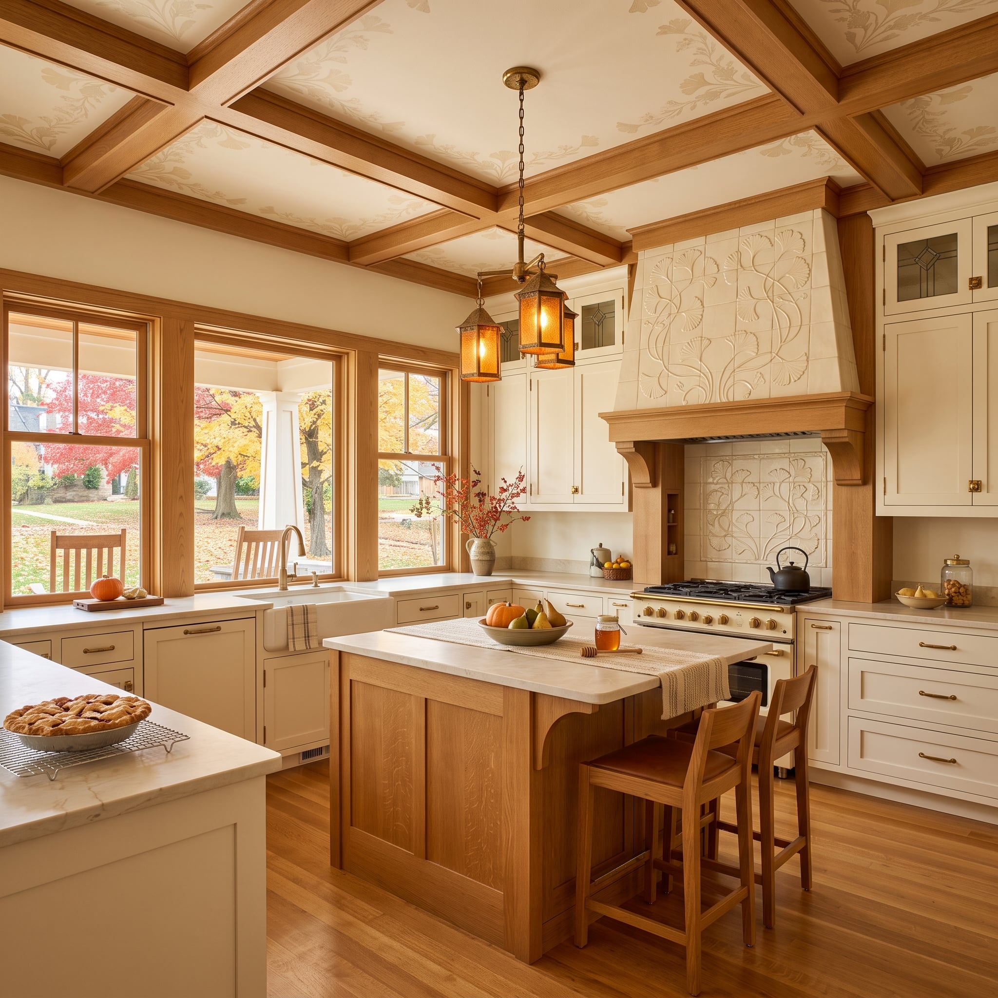
Natural oak coffers establish a warm grid overhead, while botanical relief tile on the hood brings texture down to the cooking zone. The connection isn’t literal matching. One is wood, the other pale tile, but both break large surfaces into smaller areas of shadow and detail.
Aged-brass lanterns and cabinet hardware add another warm-toned material without forcing the room into a strict metal palette.
- Natural wood overhead gives the pale cabinetry a darker, visibly grained counterpoint
- Relief tile prevents the hood surround from becoming another uninterrupted white plane
- Brass adds a warmer metallic note without requiring every fixture in the room to match it exactly
9. Sunflowers Outside, Copper Inside, and Not a Sterile Inch Between Them
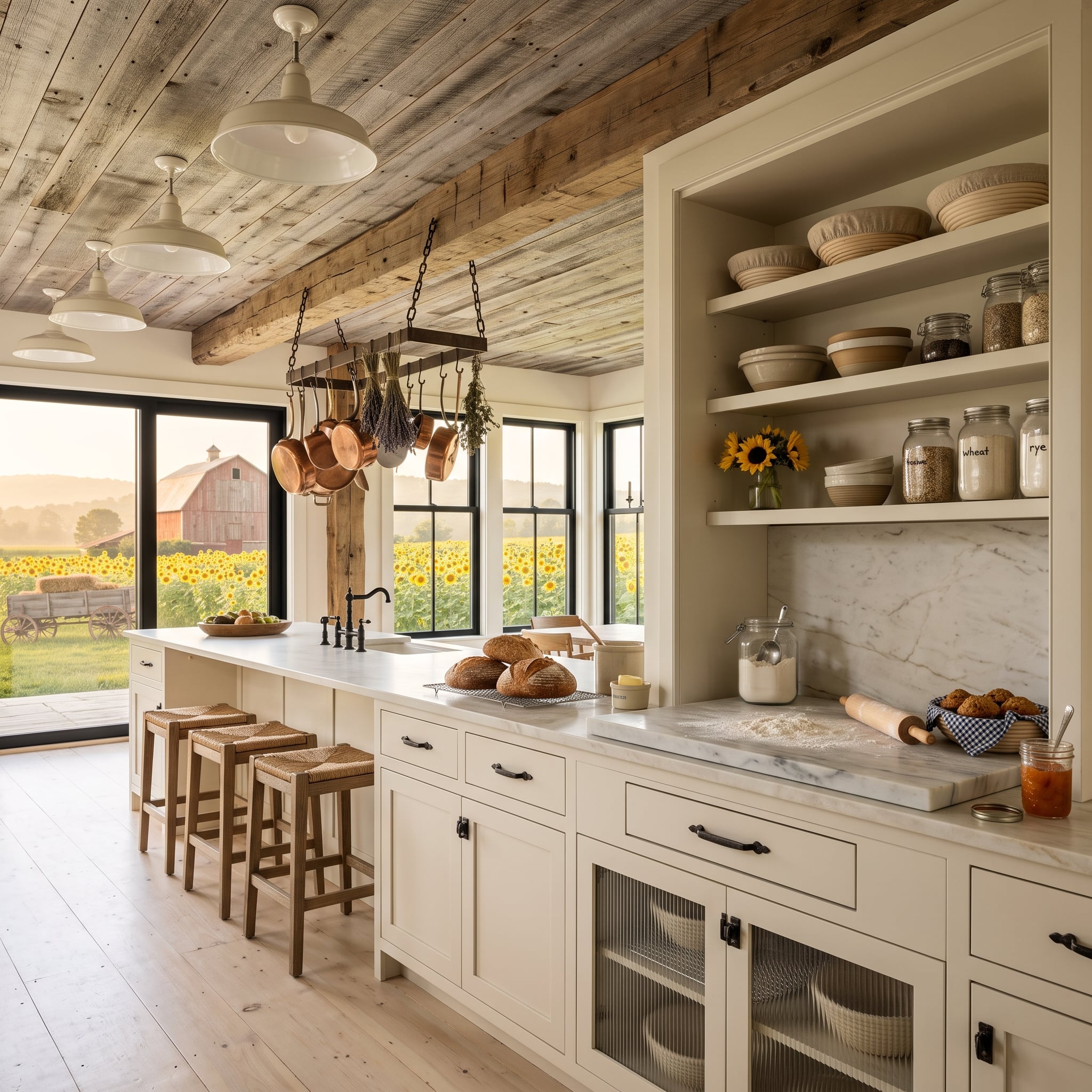
Weathered-looking ceiling planks in gray and brown run above cream shaker cabinets, marble counters and woven rush stools. The contrast between rough-looking wood and polished stone gives the room more range than another cabinet color ever could.
Copper cookware hangs from an iron-supported rack, stoneware and glass jars occupy the open shelves, and a sunflower field beyond the black-framed windows throws yellow and green into the background. Bread, a rolling pin and flour on the counter add another layer of working-kitchen texture.
In the Details: Varied wood tones overhead create texture through knots, grain and color changes. Set against smoother marble and painted cabinetry, that variation becomes more noticeable because the surrounding materials are comparatively controlled.
8. Travertine and a Meadow Make Quiet Look Expensive
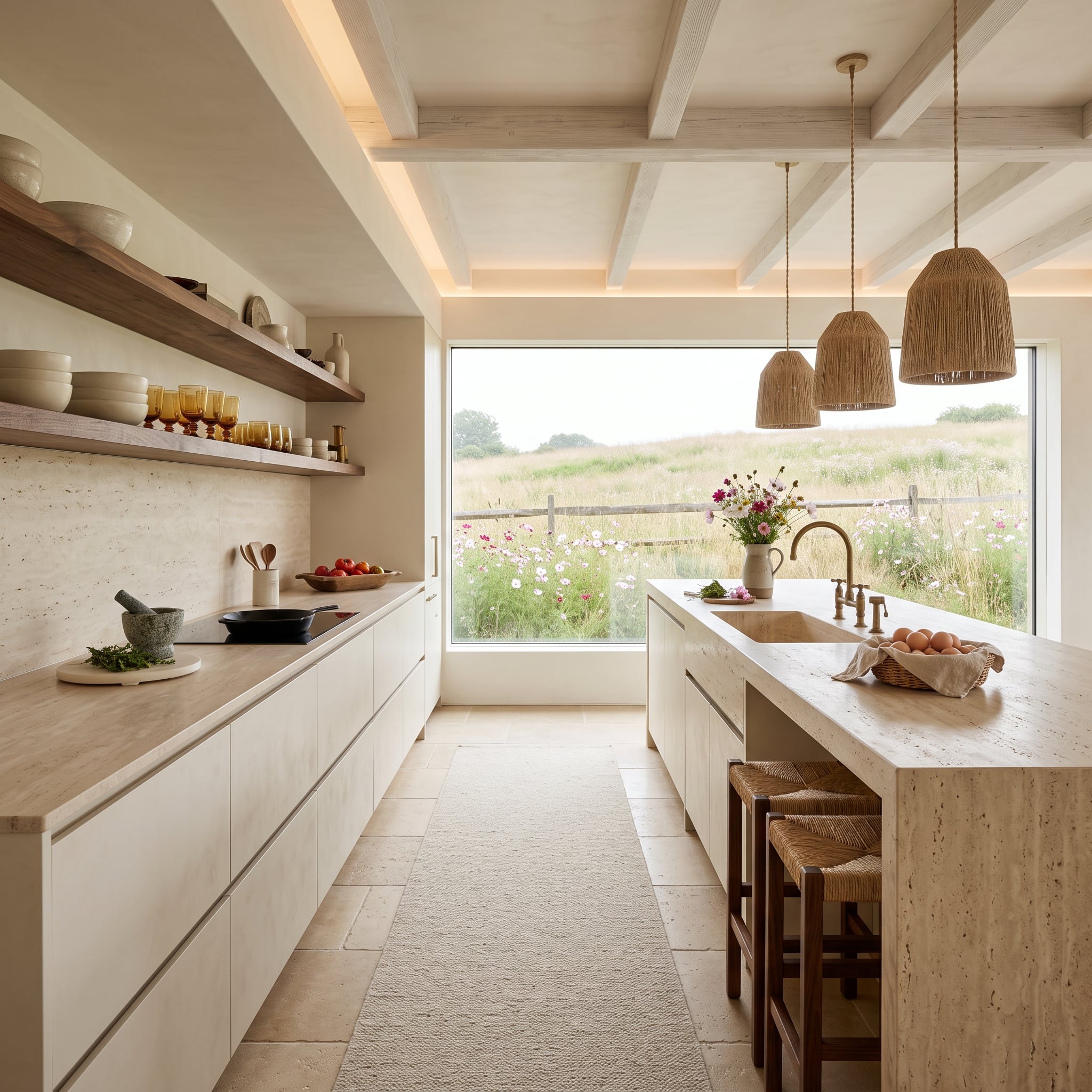
Stone with the softly varied character associated with travertine covers both the island and perimeter counters, giving this room texture without strong color contrast. Flat-front cabinetry stays deliberately restrained so the stone doesn’t have to compete with decorative door profiles.
Walnut shelving adds a darker horizontal line along one wall. Rope-wrapped pendants and rush-seat stools bring in rougher fibers, while the meadow beyond the window supplies a field of green, yellow and white no manufactured finish could reproduce exactly.
This kitchen is quiet without being blank. That’s a harder trick than it looks.
7. Candlelit Niches Turn a White Wall Into Architecture
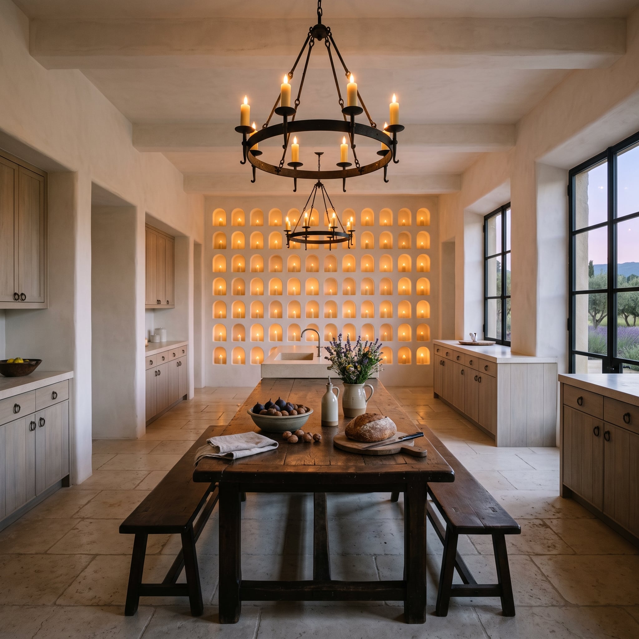
Rows of arched plaster niches cover the back wall, each picked out by warm light. Instead of treating white plaster as one uninterrupted sheet, the design gives it depth, recesses and repeated shadow.
Rough wood benches, a dark farm table, wrought iron and sand-colored stone flooring supply the heavier materials below. Lavender in a ceramic pitcher is almost comically delicate by comparison, which is precisely why it works.
Why It Works: Recesses create their own pattern of highlights and shadow across a pale wall. Iron, wood and textured stone then give the lower half of the room enough visual weight to balance all that plaster.
6. A Rolling Ladder Gives Open Shelves More Than Good Looks
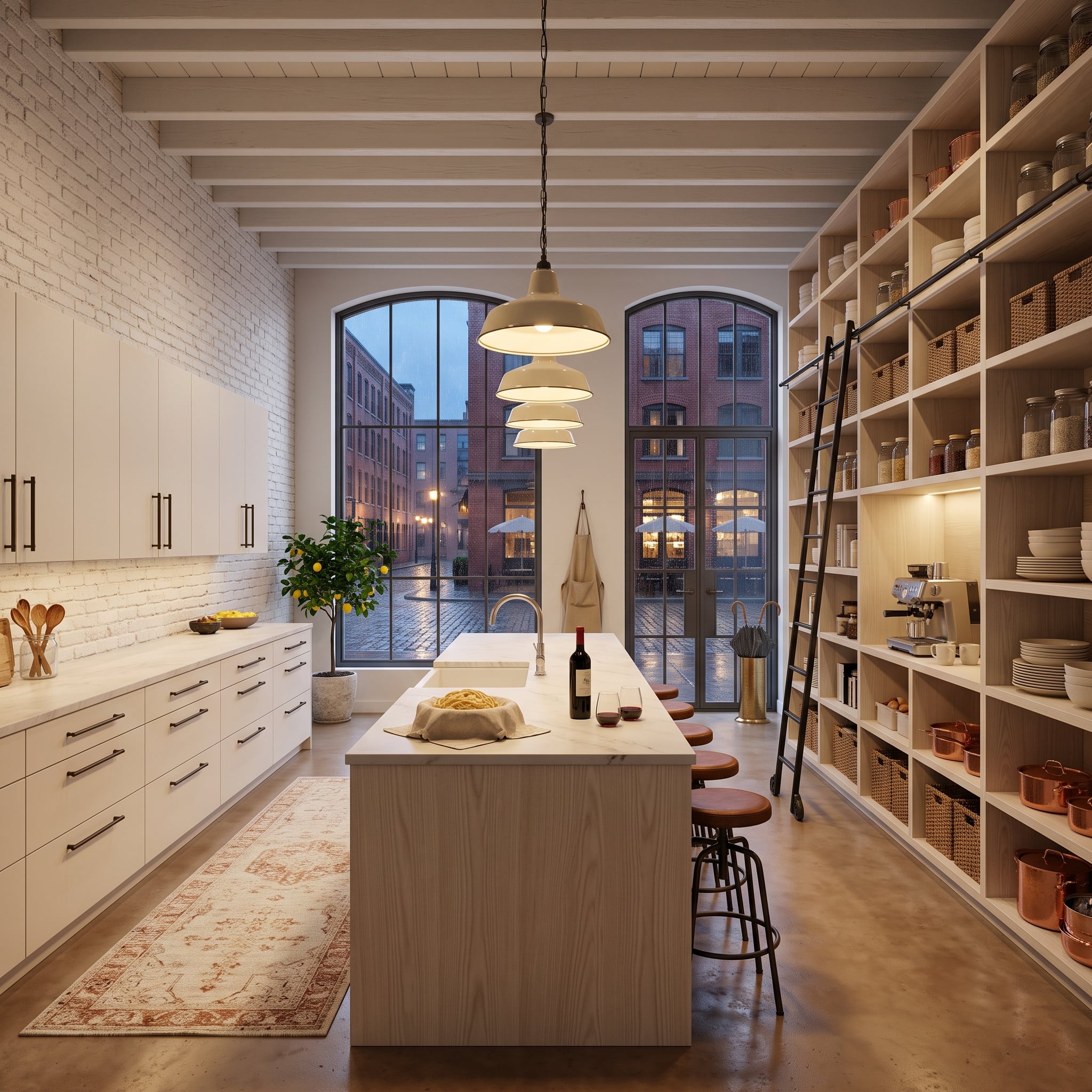
Whitewashed brick, ceiling beams and floor-to-ceiling pale wood shelving turn this loft kitchen into a study in texture before the cookware even enters the picture.
Then the copper pots, woven baskets and stoneware arrive. Their varied shapes prevent the shelving wall from becoming one pale grid, while the rolling ladder gives the vertical storage a functional piece of hardware substantial enough to become part of the composition.
Pro Tip: Tall storage only earns its footprint when the upper levels can be reached safely and practically. A fixed or rolling ladder can become part of that solution when the cabinetry and hardware are designed for it.
5. Sunburst Beams Refuse to Let the Ceiling Sit Quietly
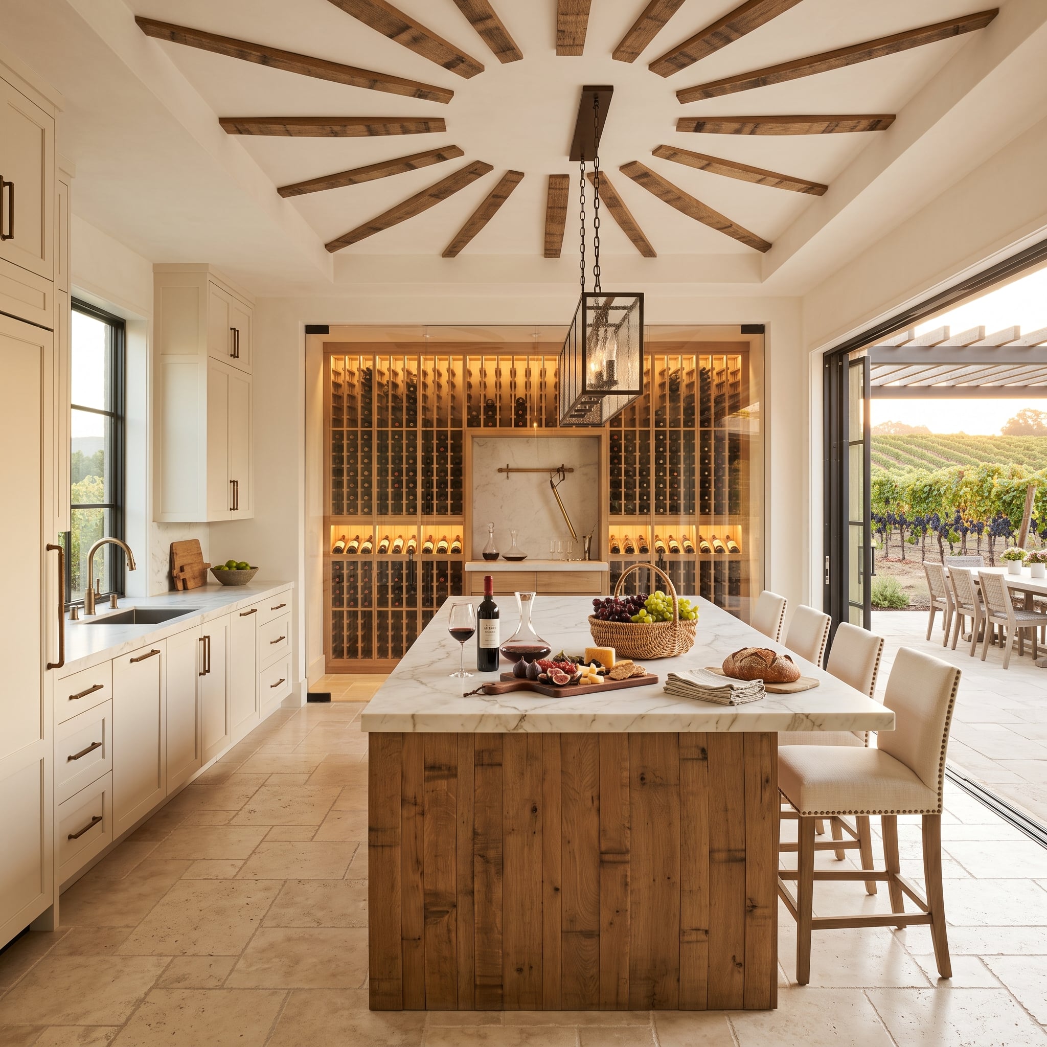
Wood beams radiate from a central ceiling point above a marble-topped island, turning the entire room into a composition with a visible center. Straight cabinet runs below suddenly feel less rigid because the architecture overhead is moving in another direction entirely.
The island base brings in knotty natural wood, while a lit wine wall adds a darker vertical element beyond it. Warm-toned stone flooring completes the room at ground level, so pale cabinetry occupies the middle rather than dominating every plane.
This is white used as connective tissue. The interesting parts are allowed to happen around it.
4. A Brass Window Rail Turns the Garden Side of the Kitchen Into the Good Side
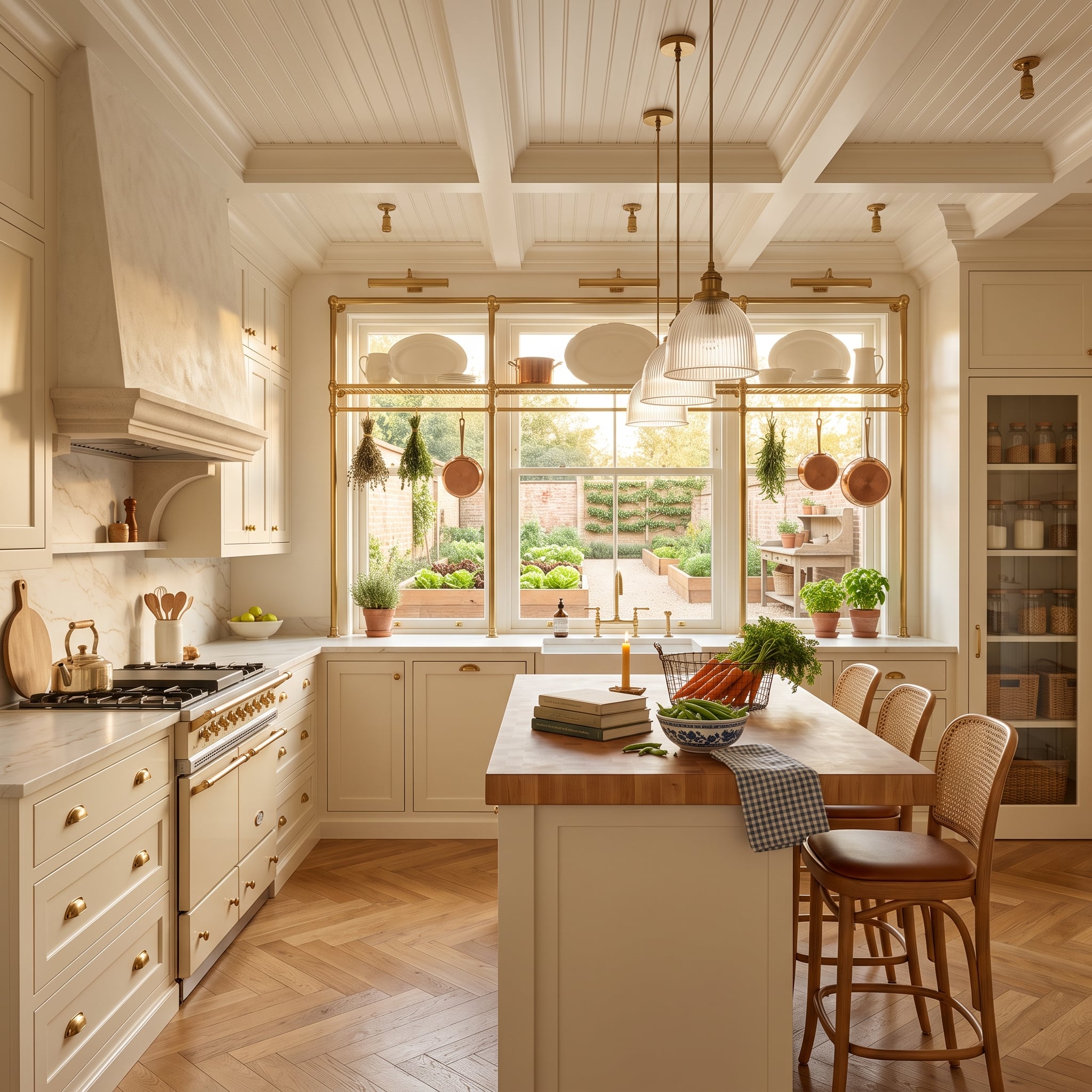
A brass rail across the window holds copper pans and dried herb bundles, placing useful objects directly against the garden view. Butcher block on the island brings wood into the center, while ribbed-glass pendants add another translucent texture overhead.
The herringbone parquet breaks the broad floor into diagonal movement, preventing the lower half of the room from becoming one pale uninterrupted field. Through the sink window, raised garden beds echo the herbs and produce inside without needing any decorative explanation.
And yes, the carrots on the island look as though they have excellent connections.
3. Cedar Overhead Makes the Pool View Feel Like Part of the Room
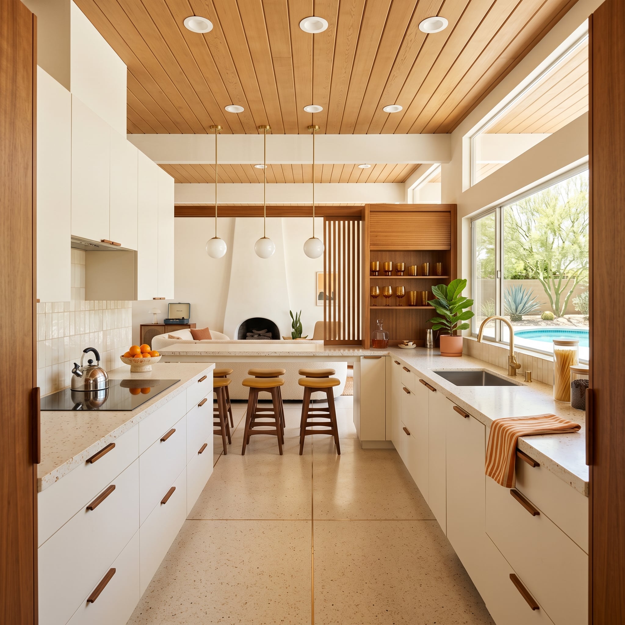
Tongue-and-groove cedar stretches across the entire ceiling, establishing a broad field of natural wood before the eye reaches the white flat-front cabinetry below.
Walnut-toned pulls and wood stool seats repeat smaller notes from above without trying to match the ceiling perfectly. Terrazzo introduces speckled variation underfoot, while brass-stemmed globes hang at staggered heights above the island.
Beyond the glass are agave, desert planting and a blue pool. The interior doesn’t imitate those colors. It gives them a warm frame.
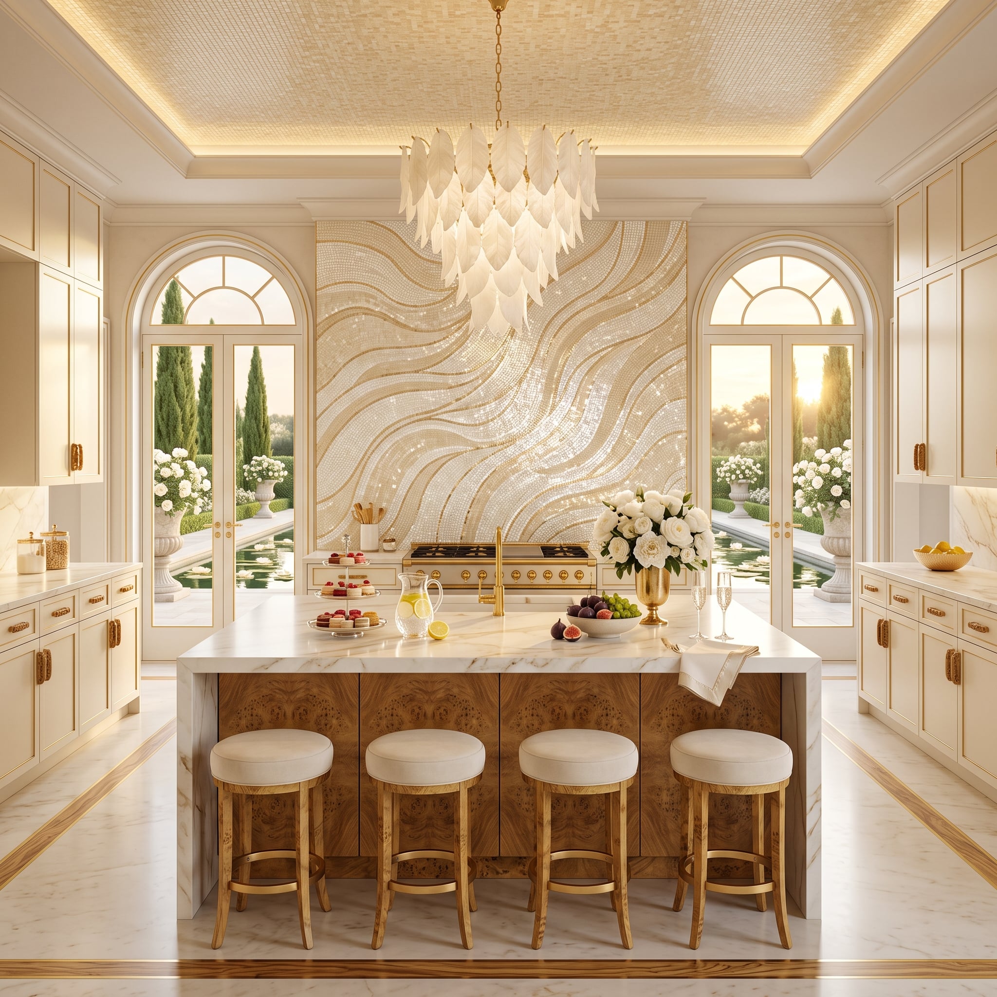
2. Figured Wood Under Marble Is All the Drama This White Kitchen Needs
🔥 Would you like to save this?
The island base is the disruption. Highly figured wood swirls beneath a crisp marble top, putting irregular grain directly against one of the kitchen’s smoothest surfaces.
Cream cabinetry stays deliberately restrained around it. A leaf-like chandelier introduces another organic shape overhead, while gold-toned hardware gives the perimeter a warmer metallic detail without trying to compete with the island.
That’s enough. A white kitchen doesn’t need twelve gestures when one material has this much personality.
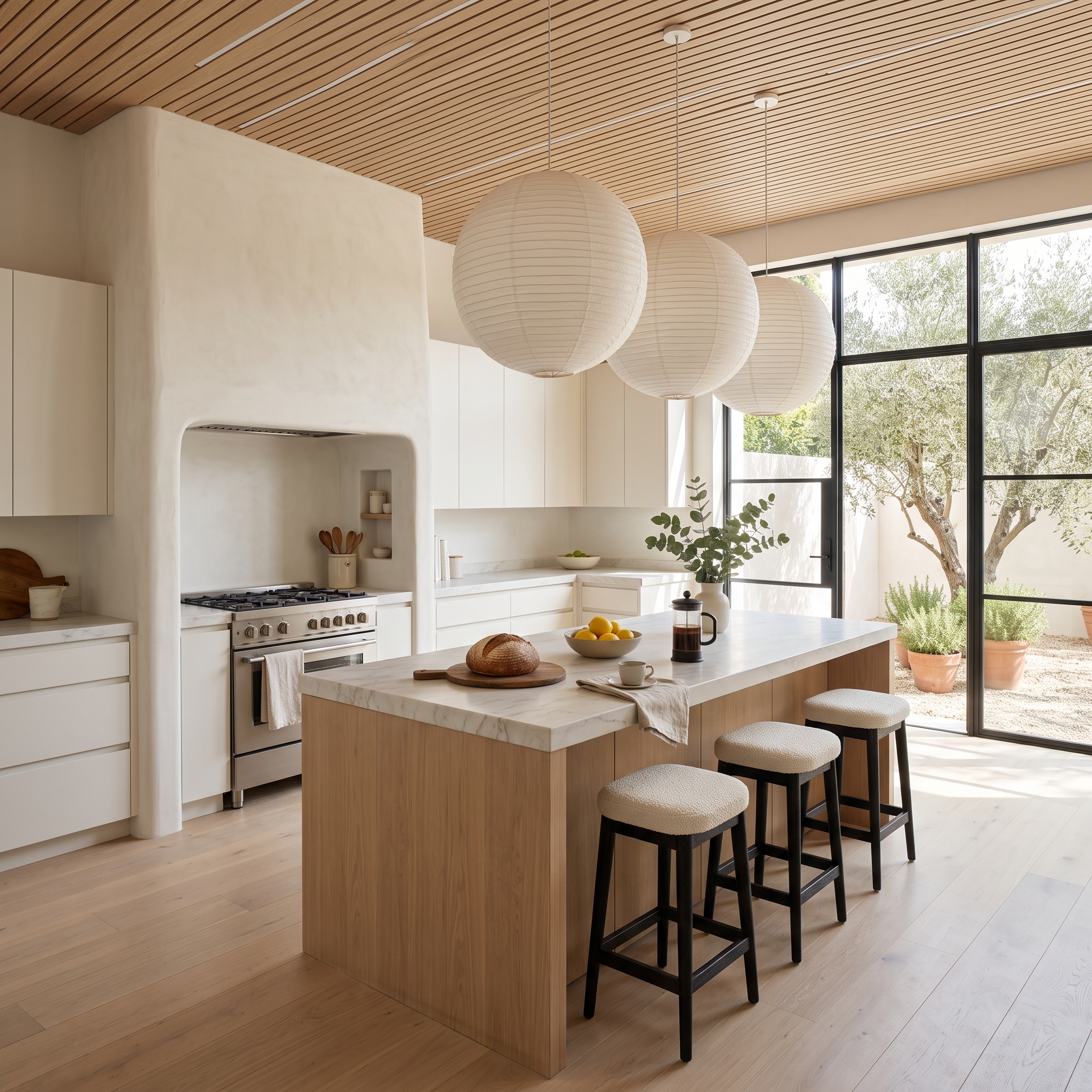
1. Paper Lanterns, Cedar Slats and Olive Trees Show How Little White Actually Needs
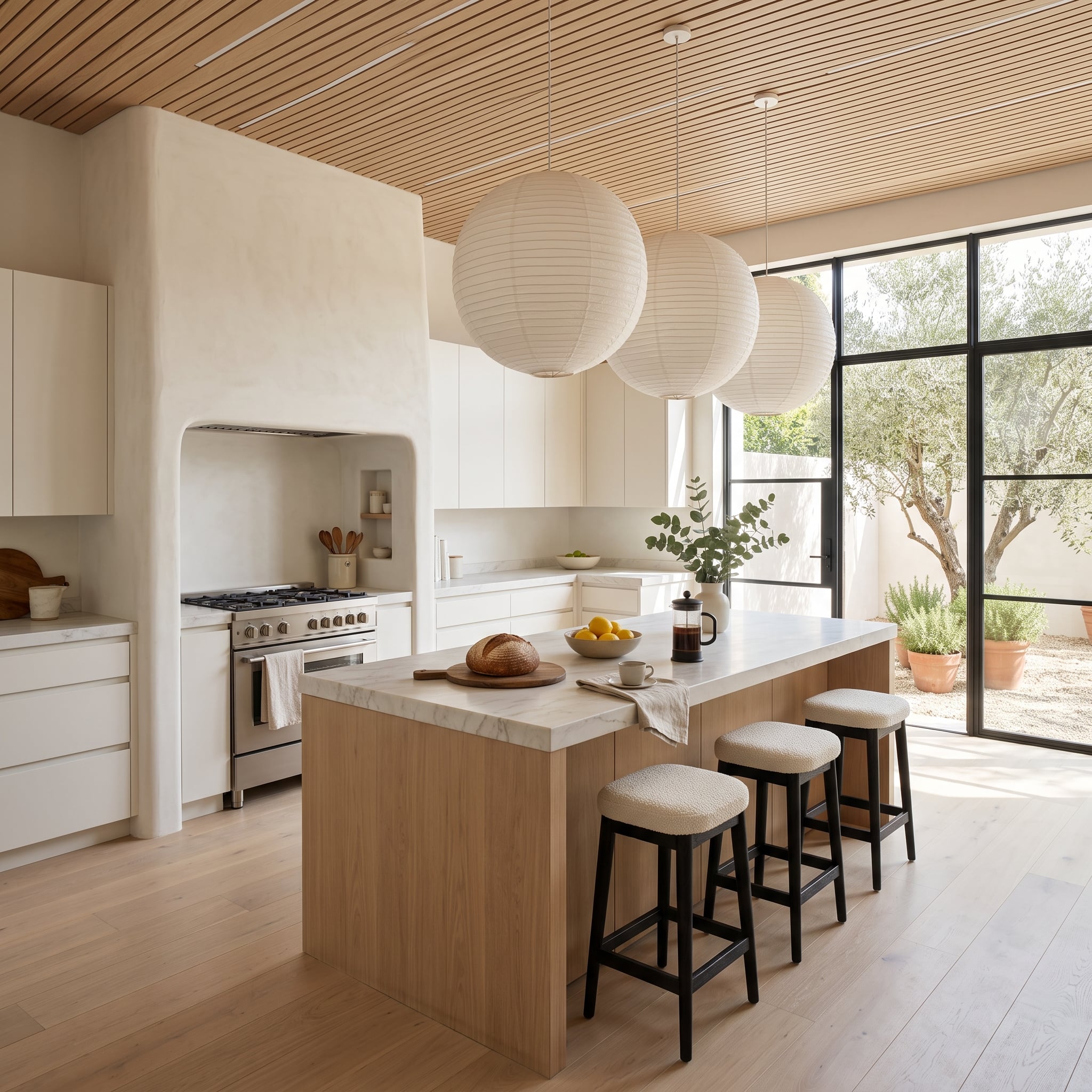
Ribbed paper globe pendants hang low above a pale wood island topped in marble. Cedar slats run overhead. Beyond the windows, olive trees provide the irregular gray-green backdrop that no carefully matched set of accessories could improve.
Nothing here is trying to disguise the white. The walls can stay pale. The marble can stay pale. Even the island can stay pale because woven paper, visible wood grain, ceiling rhythm and landscape give all that restraint something to play against.
That’s where the cold-white problem finally disappears. Not when white gets replaced, and not when every surface gets warmed up until the room turns beige. The best kitchens in this group keep the clarity that made white appealing in the first place, then interrupt it at exactly the right moments: a rough floor, a dark beam, a brass rail, a woven pendant, a ridiculous canoe, a tree growing straight through the island.
White was never the problem. Asking white to be the whole personality was.