
Red has acquired a reputation for making a scene. Designers have spent years treating it like a dangerous guest: one accent wall, perhaps a cushion, and absolutely no encouragement. Meanwhile, burgundy marble has been quietly climbing walls, oxblood lacquer has taken possession of ceilings, and a single scarlet handrail can make an entire staircase look newly considered.
In order to come up with the very specific design ideas, we create most designs with the assistance of state-of-the-art AI interior design software. Also, assume links that take you off the site are affiliate links such as links to Amazon. this means we may earn a commission if you buy something.
The trick isn’t necessarily using less red. It’s knowing where to put it. A wine-colored headboard can give a bedroom more architectural presence than a wall of expensive wallpaper. Rust-red tile can turn a cooking alcove into the kitchen’s most compelling surface. Deep crimson velvet can make a two-story window feel taller, while a red pivot door transforms an ordinary passage into a destination. Scale, texture, light and the company red keeps matter far more than the number of square feet it occupies.
These 29 interiors put that theory through its paces, from a sliver of color threading through limestone to an entire ceiling gleaming above a sunken conversation pit. Some whisper. Others have excellent projection. None needs to shout to be heard.
29. Burgundy Velvet Chairs Keep an Ocean-Blue Dining Room From Drifting Away
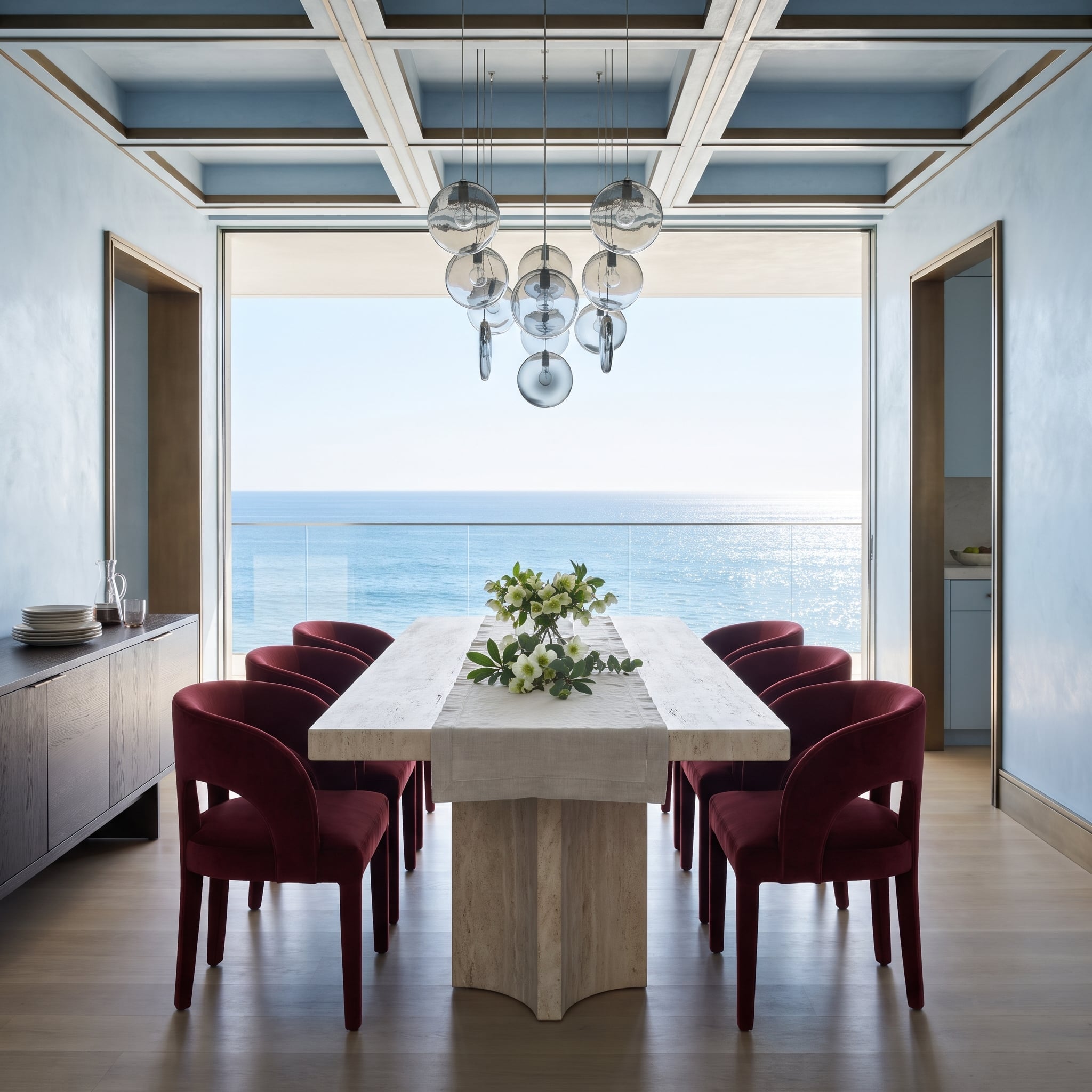
Burgundy velvet chairs give this pale-blue dining room a low, concentrated band of color against the ocean view. The upholstery has enough visual weight to define the table without interrupting the long horizontal sightline through the glass.
Travertine supplies the bridge between cool plaster and warm velvet. Rather than repeating red around the room, the design gathers it in one place, where a change in texture is as important as a change in hue.
28. One Red Pivot Door at the End of a Limestone Hall, Lit by a Slot of Sky
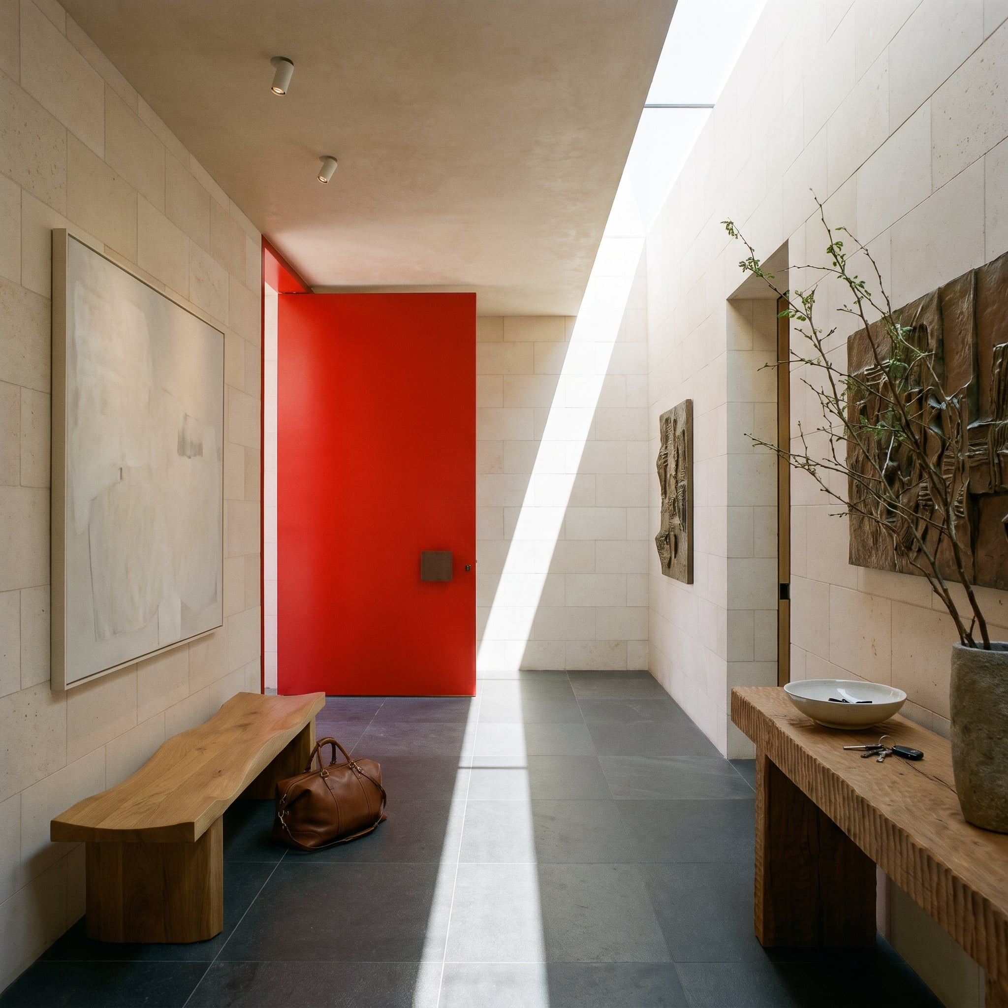
At the end of a limestone entry, a red pivot door gives the long perspective a decisive stopping point. Charcoal floor tiles, honed stone walls and rough timber furniture keep the surrounding surfaces tactile and restrained.
A narrow skylight cuts a diagonal of sunlight across the hall. Painting the door’s jamb and reveal red, too, turns the opening into a colored volume rather than a single flat rectangle. The architecture makes the accent feel inevitable.
27. Stretched Past the Nightstands, a Wine Headboard Warms a Room Full of Fog
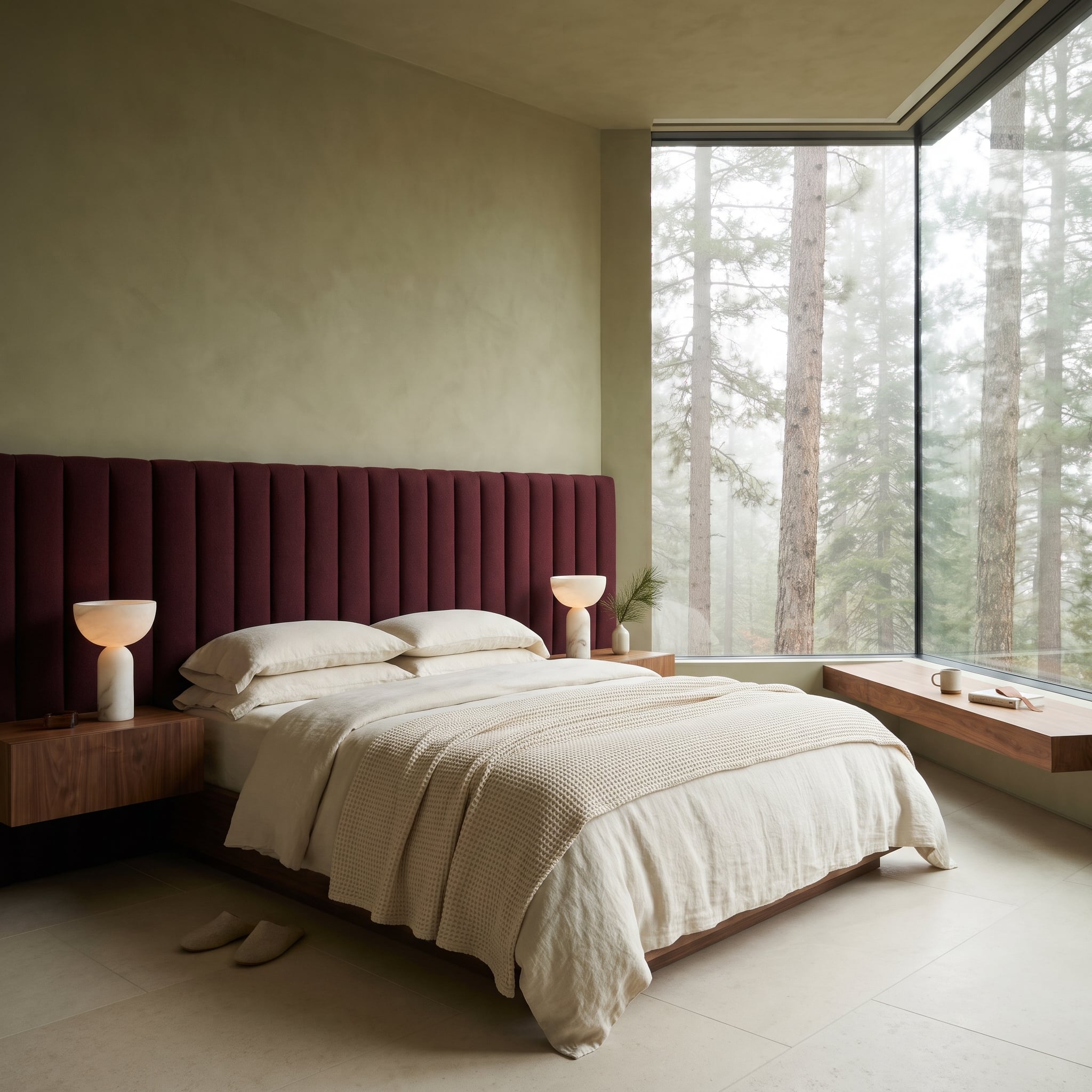
A channel-tufted wine headboard extends beyond both walnut nightstands, turning the bed wall into a broad architectural composition. Its uninterrupted horizontal reach balances the tall glass and the misty woodland outside.
Alabaster lamps illuminate the upholstery’s raised channels, while a floating walnut bench beneath the corner window repeats the nightstand material. The contrast is between something soft and expansive and the sharply drawn timber edges around it.
26. Where the Cooking Happens, Red Tile Glows Like Banked Coals Under a Dark Coffered Ceiling
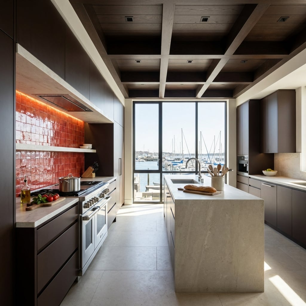
Unevenly glazed red tile is confined to the range backsplash, where light tucked beneath the hood grazes its surface. Each ripple catches a different highlight, giving the compact band of color the depth of banked embers.
Dark flat-panel cabinets and a coffered ceiling frame the cooking zone, while the pale waterfall island directs attention toward the marina. The strongest color sits exactly where the kitchen’s working architecture is most concentrated.
25. Under a Glass Roof of Magnolias, Wine Upholstery Turns a Bay Window Into a Reading Room
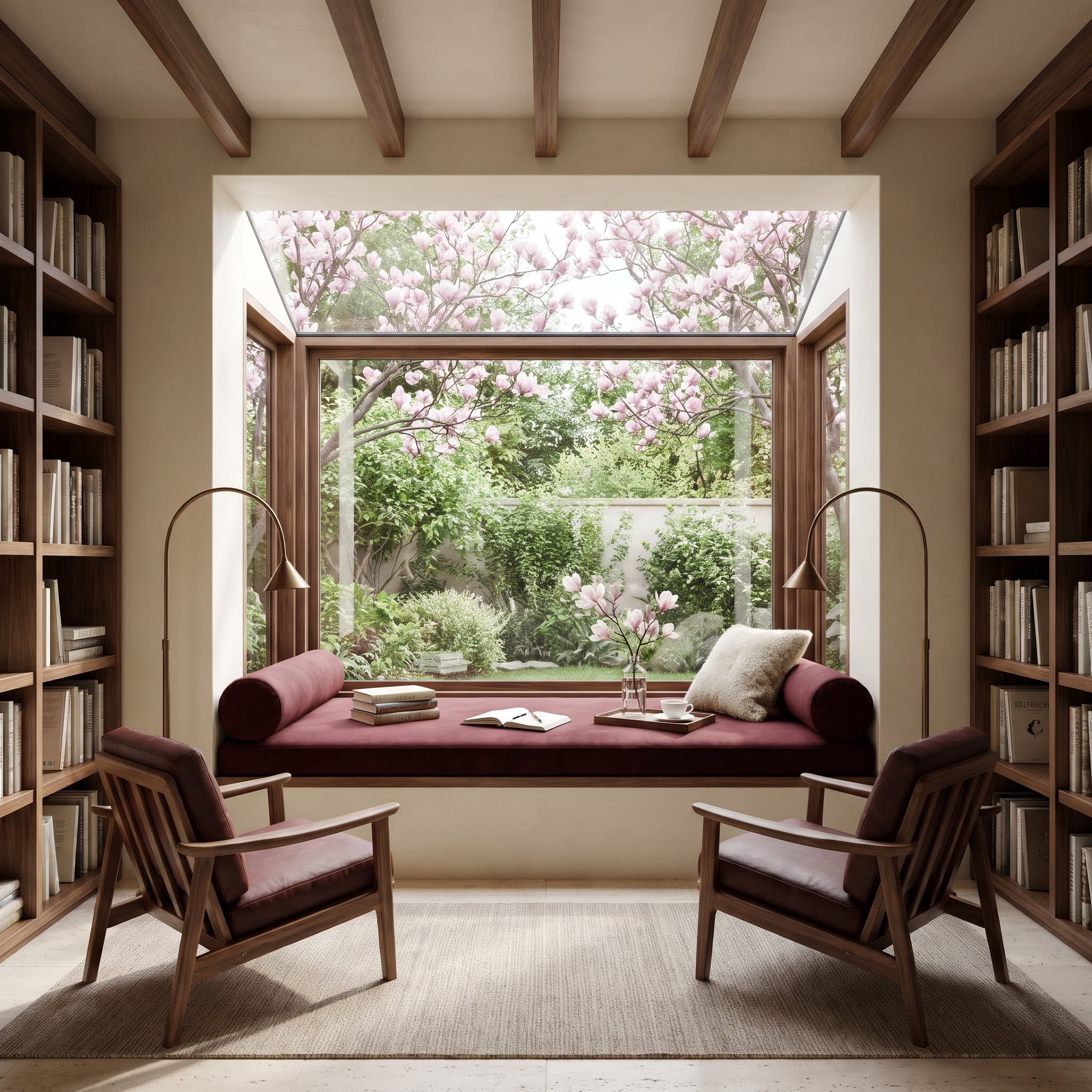
Wine upholstery gives the bay window seat enough definition to hold its own beneath the magnolia blossoms. The glazed roof extends the garden view overhead, allowing the branches and daylight to become part of the enclosure.
Leather chairs repeat the deeper tone across the rug, while brass arc lamps provide focused light after sunset. The red marks a place to sit without visually closing off the garden.
24. Burgundy Marble Runs Floor to Soffit, Then Stretches Sideways Into a Ledge for a Bronze Torso
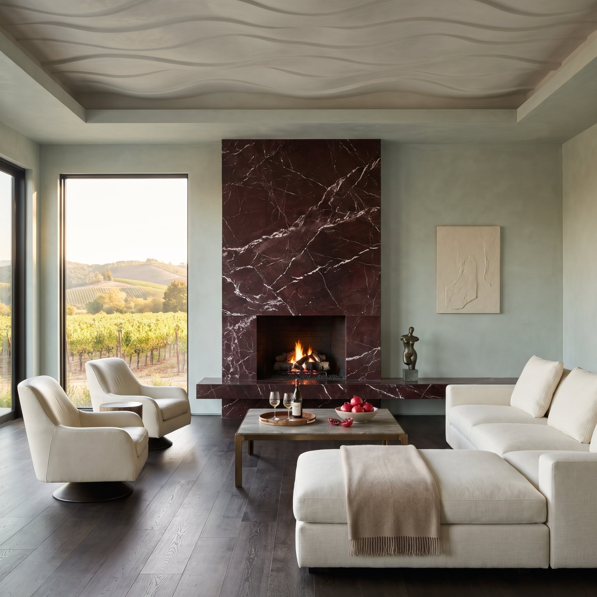
White-veined burgundy marble rises from the floor to the soffit before turning sideways into a long display ledge for a bronze torso. This isn’t a red accessory; the stone is part of the room’s architecture.
Pale plaster on either side gives the dark slab room to register, while the marble’s veining prevents the surface from reading as a solid, featureless block. Its horizontal extension makes the sculptural display feel integral to the wall.
23. Can a Fluted Wine Island Read Quiet? Sage Cabinets and Walnut Trim Say Yes
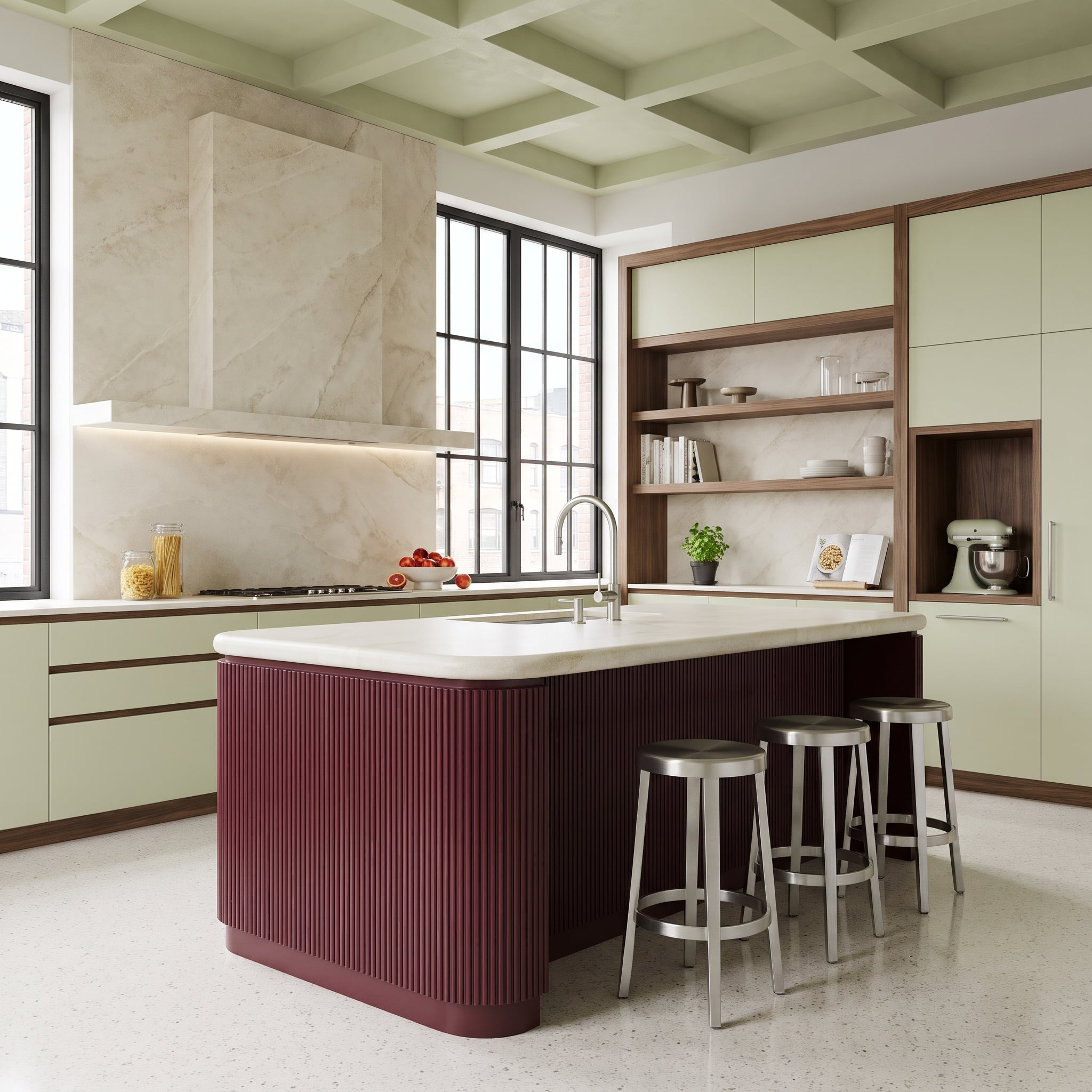
A wine-colored island would be a commanding block in an otherwise pale kitchen. Here, rounded corners and closely spaced fluting break the painted surface into a rhythm of highlights and fine shadows.
Sage cabinet fronts surround it with a muted green, while walnut trim links the island to the rest of the millwork. The color has presence, but its curved profile and textured finish make the cabinetry feel carefully modeled rather than simply painted.
22. Drawn in One Thin Line, a Red Handrail Climbs Past Walnut and Floating Stone Treads
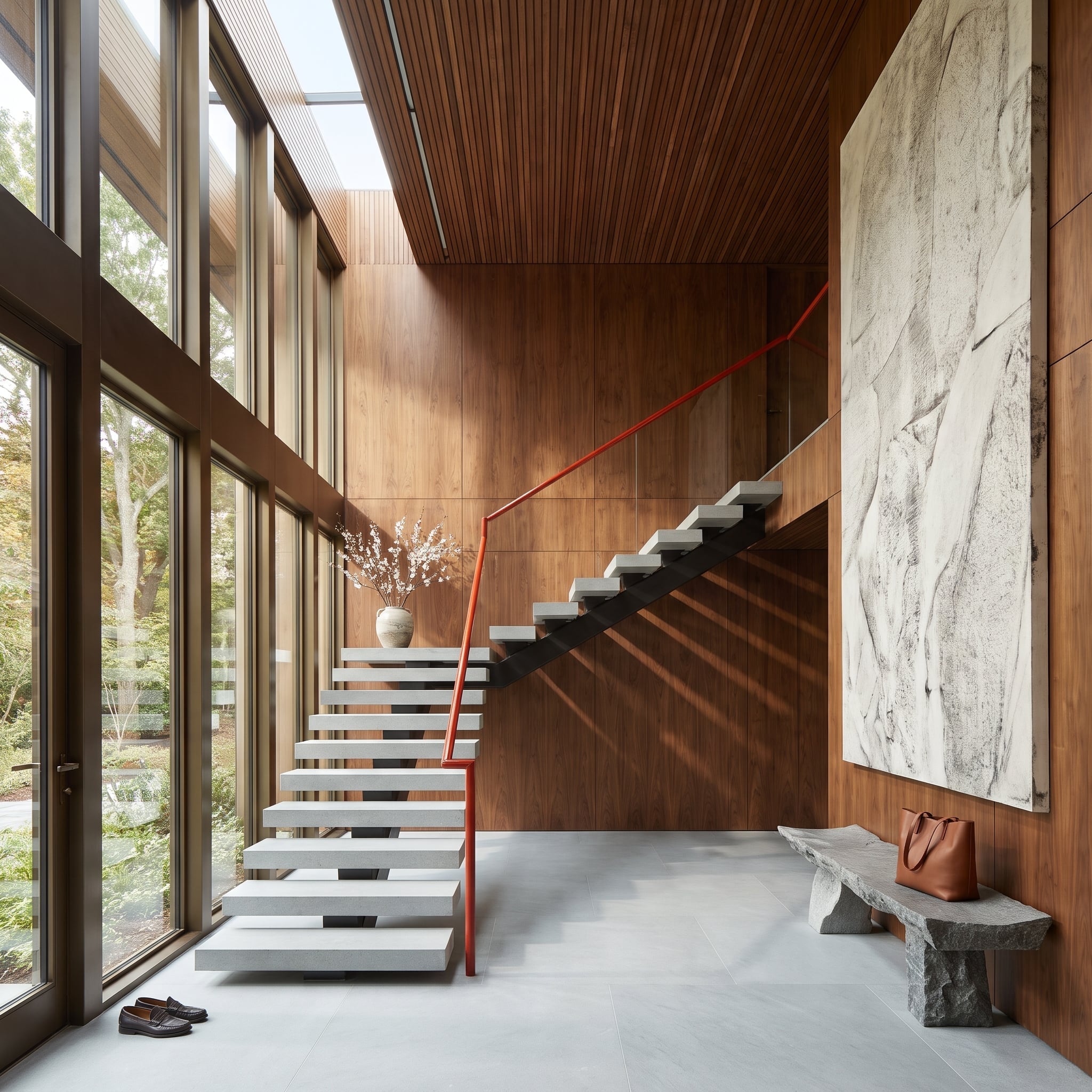
A red handrail draws a continuous line up a staircase of pale cantilevered stone treads and walnut wall panels. The color isn’t attached as decoration: it follows the route people take through the space.
A black steel spine supports the stair, while a rough granite bench adds a contrasting mass at floor level. Against the weight of the stone treads, the slender red line makes the climb legible from one end of the room to the other.
21. Dim the Lights and Wine Leather Becomes the Warmest Thing Under a Starlit Walnut Ceiling
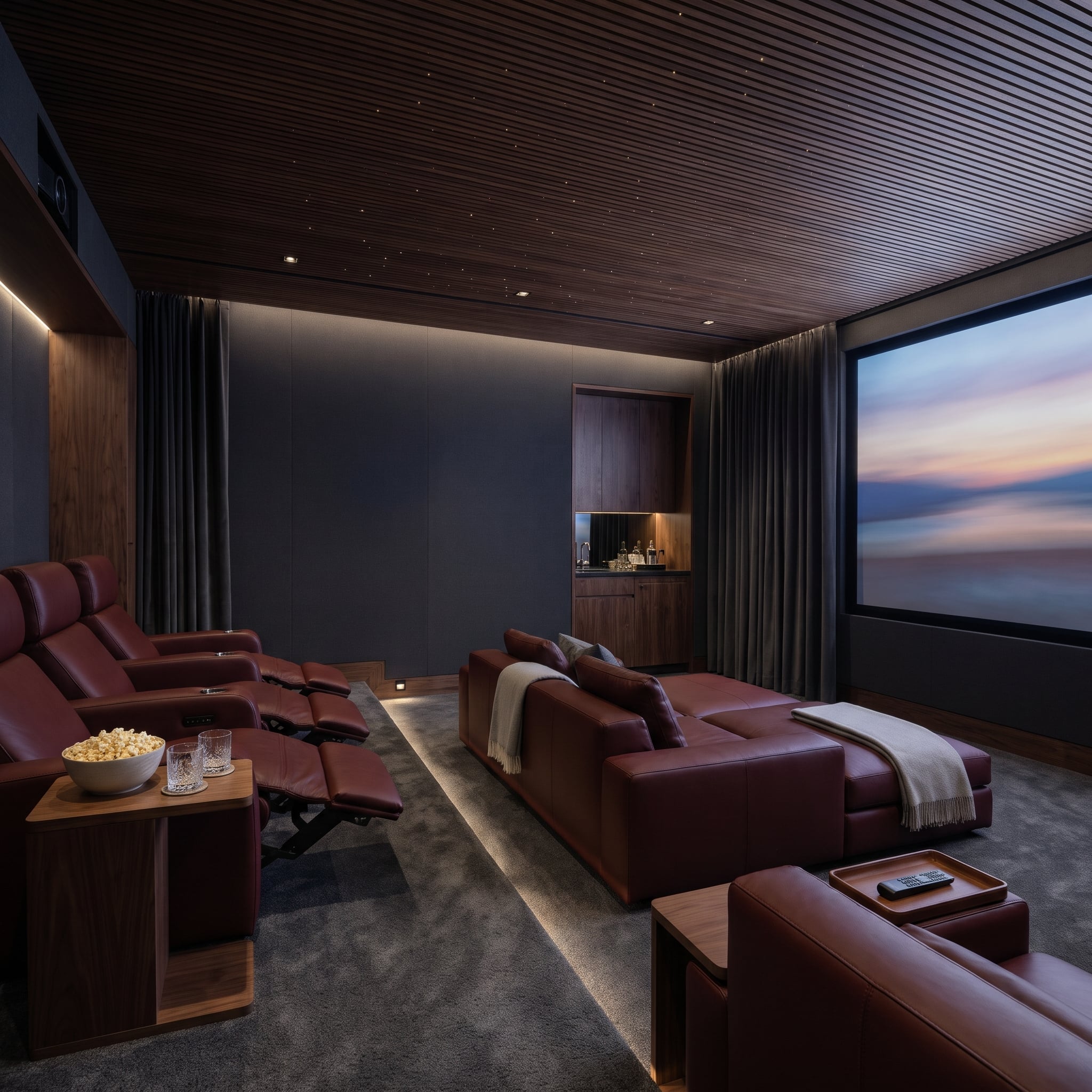
Charcoal fabric walls and drapes absorb much of the stray light in this media room. Wine leather seats supply a warmer note, their restrained sheen avoiding the bright reflections that could distract from the screen.
Pinpoint ceiling lights are set into walnut slats, lending the overhead plane a quiet constellation effect. Low lighting traces the seating riser, although safe circulation also depends on clearly visible step edges. The materials keep the theater intimate without relying on bright decorative accents.
20. Olive Walls Outside, Wine Inside: Glassware Gets a Backdrop and Onyx Handles the Glow
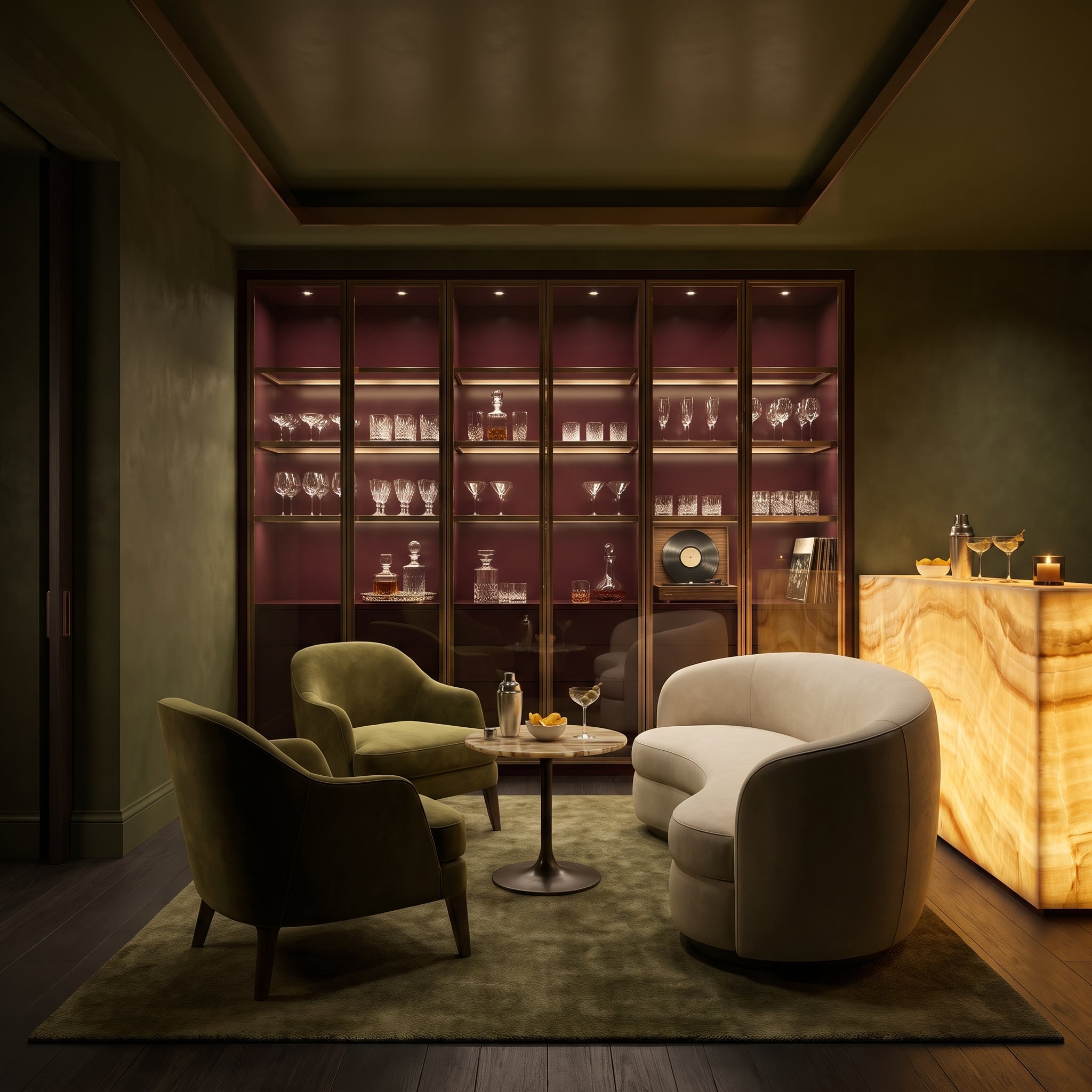
Wine-colored cabinet interiors make clear glassware visible against a deep backdrop, while lighting along the shelves picks out individual stems and bowls. Bronze frames give the glass-front storage a precise outline against olive plaster.
Below, backlit onyx supplies an amber counterpoint to the cooler walls. The red is most effective in the recesses: it gives the cabinets depth without spreading across the room’s main surfaces.
19. Lake View on Stage: Wine Velvet Drapes Climb Two Stories Beside a Limestone Fireplace
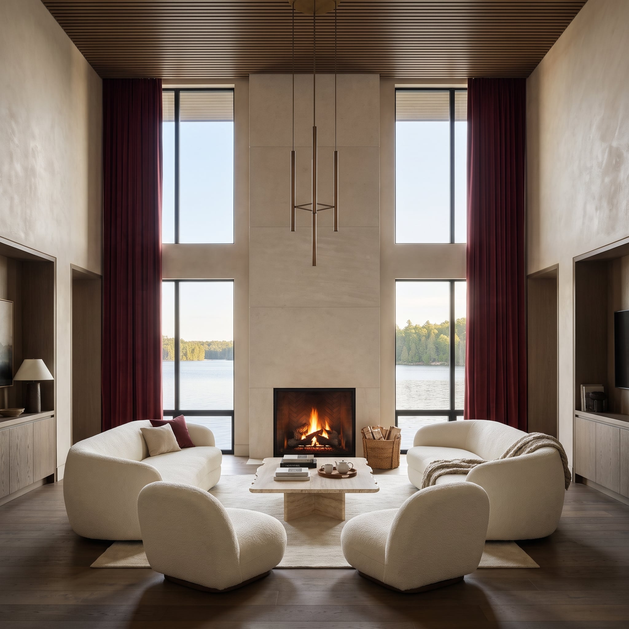
Two-story wine velvet drapes establish the scale of the glass wall as clearly as any column could. Their long folds frame the lake view and run beside the pale limestone chimney breast, introducing softness to a room dominated by stone and timber.
Cream bouclé furniture keeps the foreground light. The contrast between heavy-looking velvet and the open landscape gives the red a precise architectural role: defining the edges of the view.
18. Rust Red Stays Behind Walnut Doors Until Someone Reaches for a Copper Pan
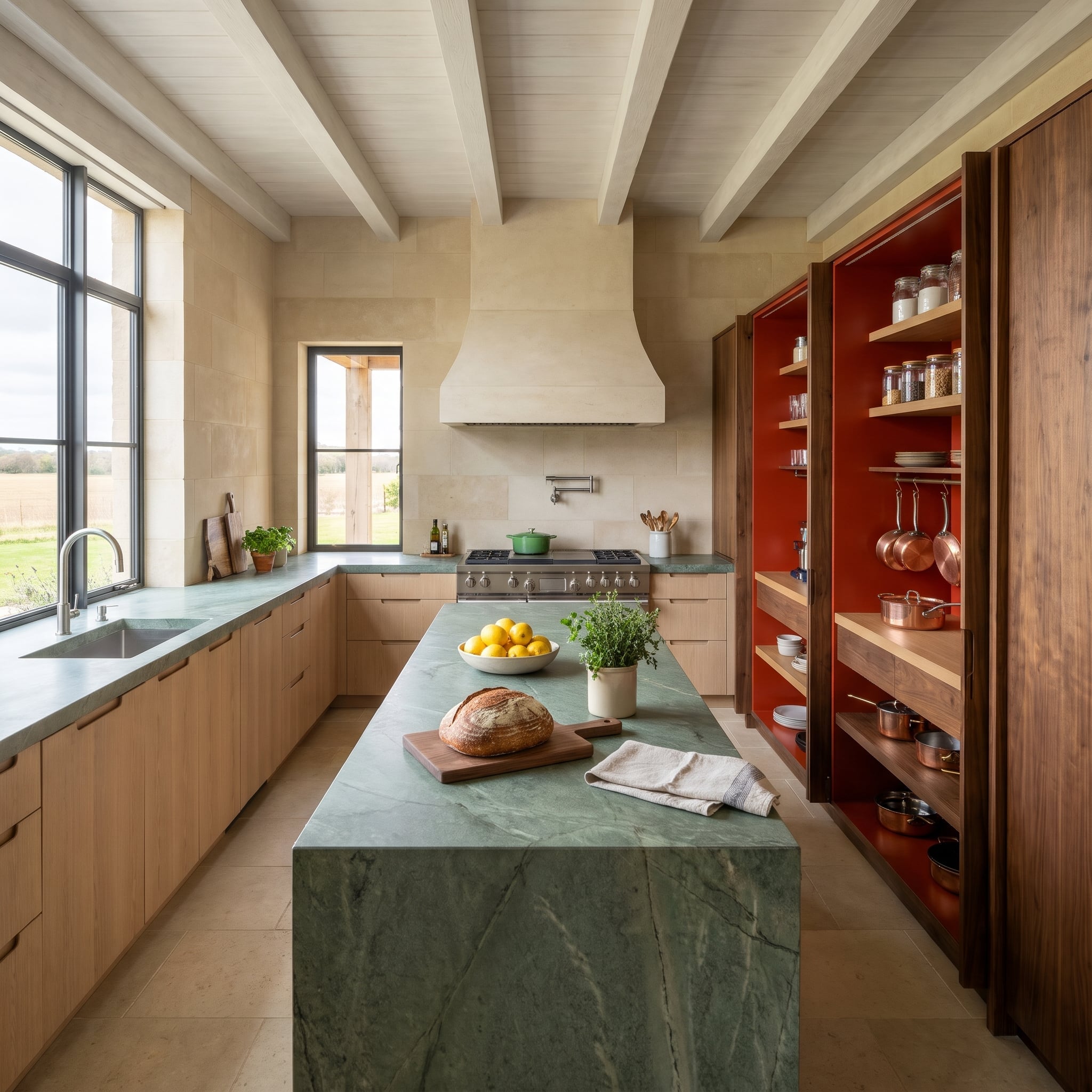
Tall walnut doors conceal a rust-red pantry, turning color into a discovery rather than a permanent wall treatment. Opened, the doors frame copper pans against the saturated interior; closed, the kitchen returns to its timber-dominated palette.
A green waterfall island and pale limestone hood keep the main room distinct from the pantry. The contrast between the copper’s metallic highlights and the matte red enclosure gives the storage its character.
17. Walnut Frames the Nook, Lilac Softens It, and a Red Banquette Simply Sits Down
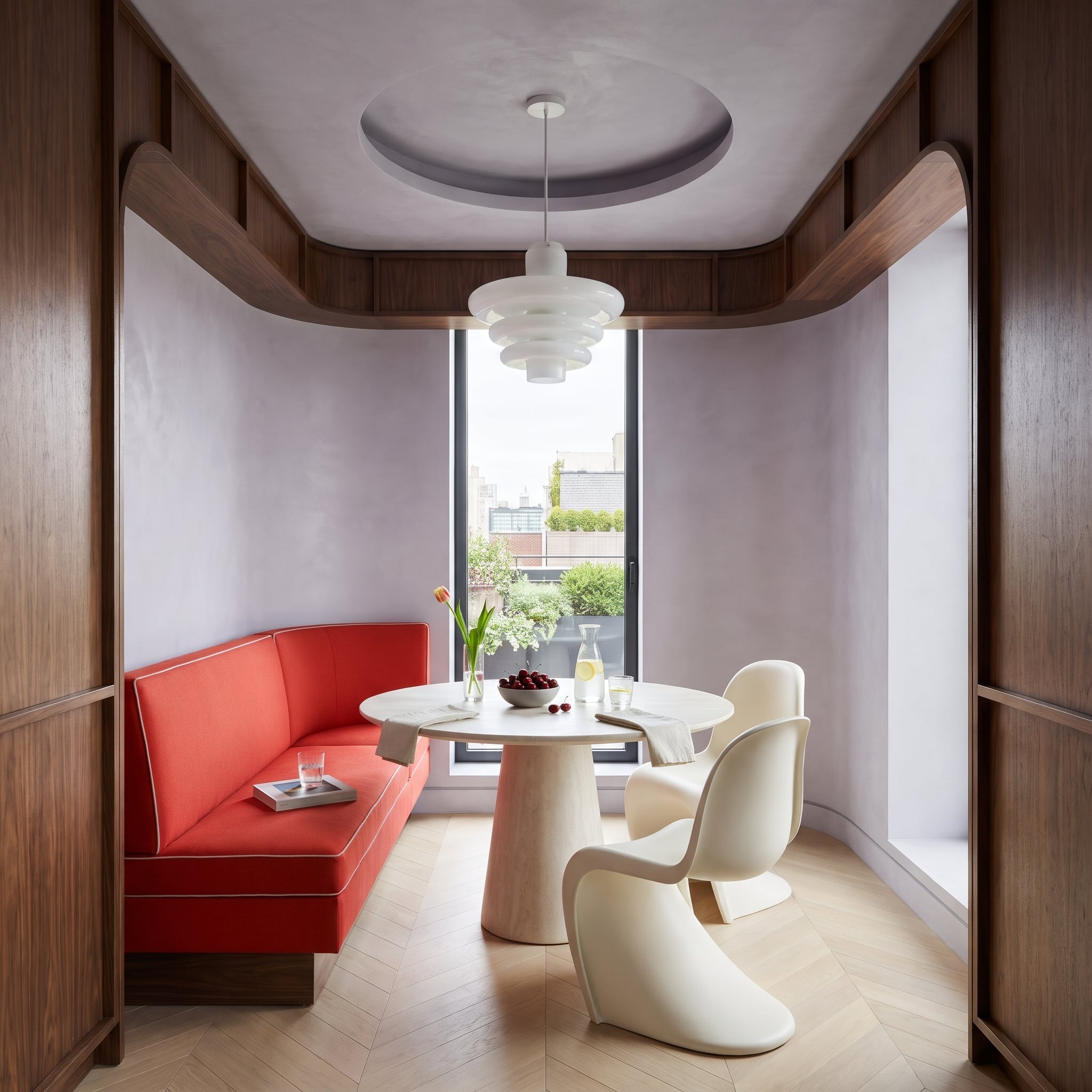
Curved walnut soffits frame a lilac-plaster dining nook, creating the impression of a smaller room tucked inside a larger one. A red banquette follows the wall beneath the window, its white piping sharply outlining the upholstery’s curves.
Cream S-shaped chairs and a travertine pedestal echo those rounded forms. The walnut surround gives the nook architectural depth, while the lilac plaster and pale furniture prevent the red seating from making the enclosure feel heavy.
16. Books First, Red Second: Shelf Backs Glow Like Embers While Snow Piles Up Outside
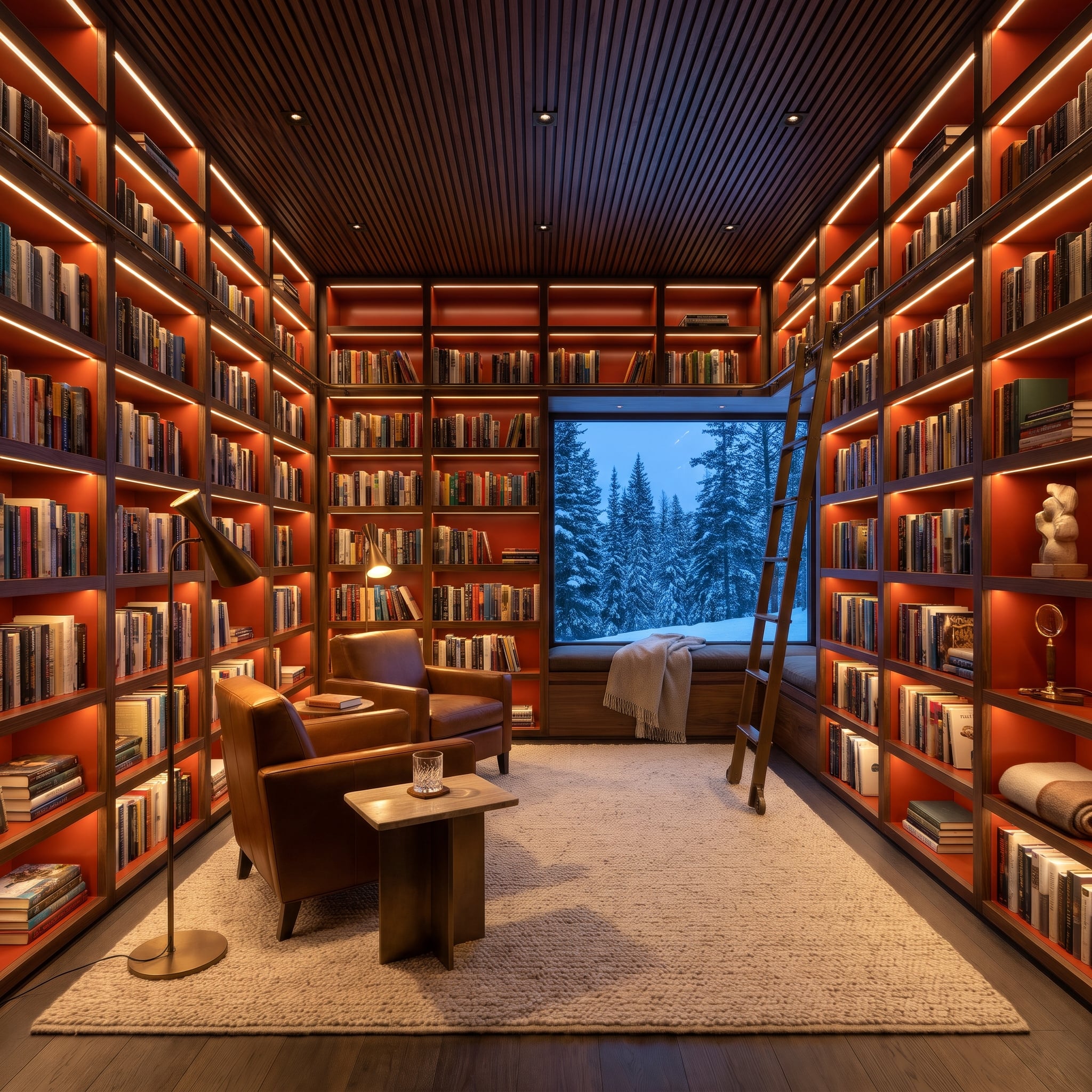
Rust-red shelf backs glow behind the books in this walnut library. Concealed strips illuminate the recesses, so the color appears in narrow intervals between spines and objects rather than across a continuous painted wall.
Snowy pines beyond the window provide a cool contrast to the warm cabinetry. A rolling ladder reinforces the room’s library character, while a separate floor lamp gives the leather reading chairs the focused light the shelves cannot provide.
15. Why Build a Wall When a Sheer Wine Curtain Can Split Dinner From the Sofa?
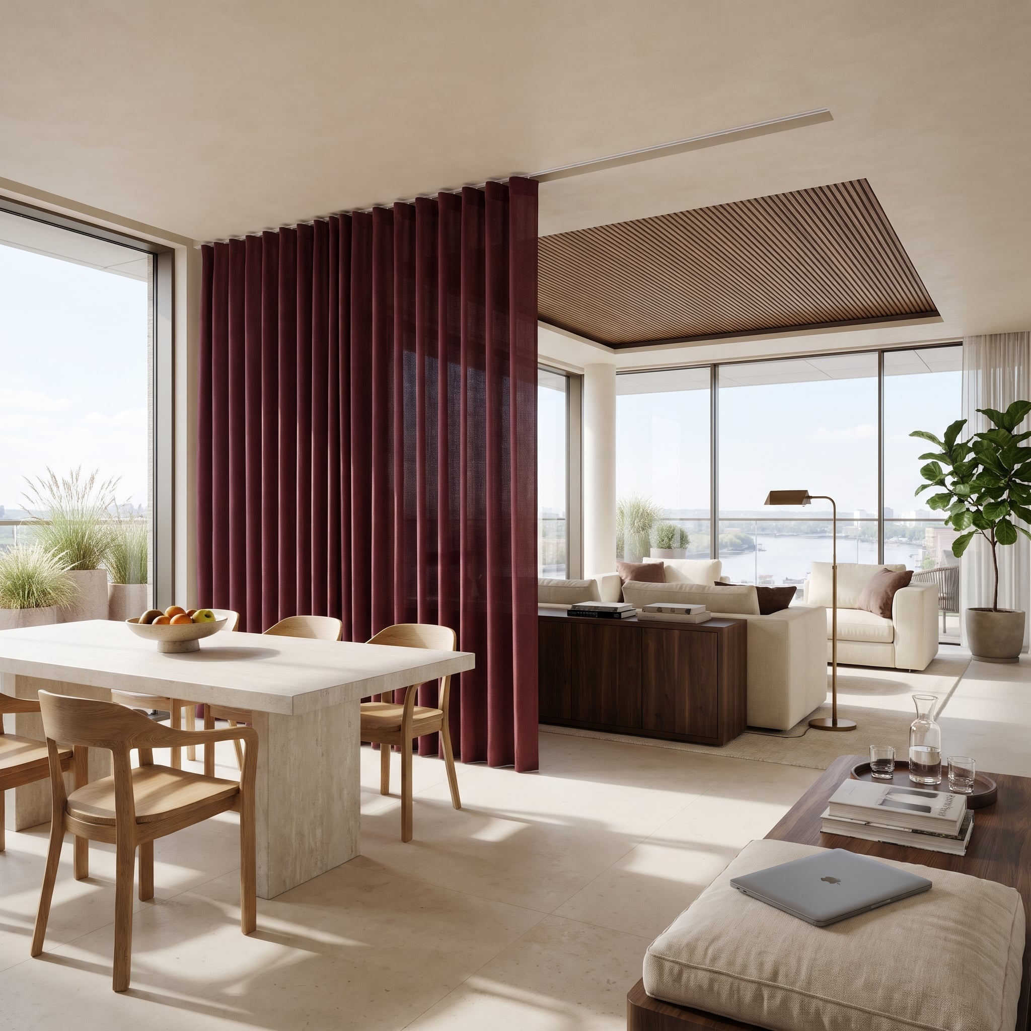
A sheer wine curtain hangs from a recessed ceiling track between the dining area and the lounge. Drawn across, it marks the boundary with color and fabric while allowing daylight and glimpses of the adjoining room to pass through.
Walnut ceiling slats reinforce the lounge’s territory overhead. Unlike a solid partition, the curtain offers a flexible visual division rather than sound isolation or full privacy. Its softness is precisely what makes the separation feel temporary.
14. How an Oxblood Desk Talks Back to the Red Cliffs Beyond the Glass
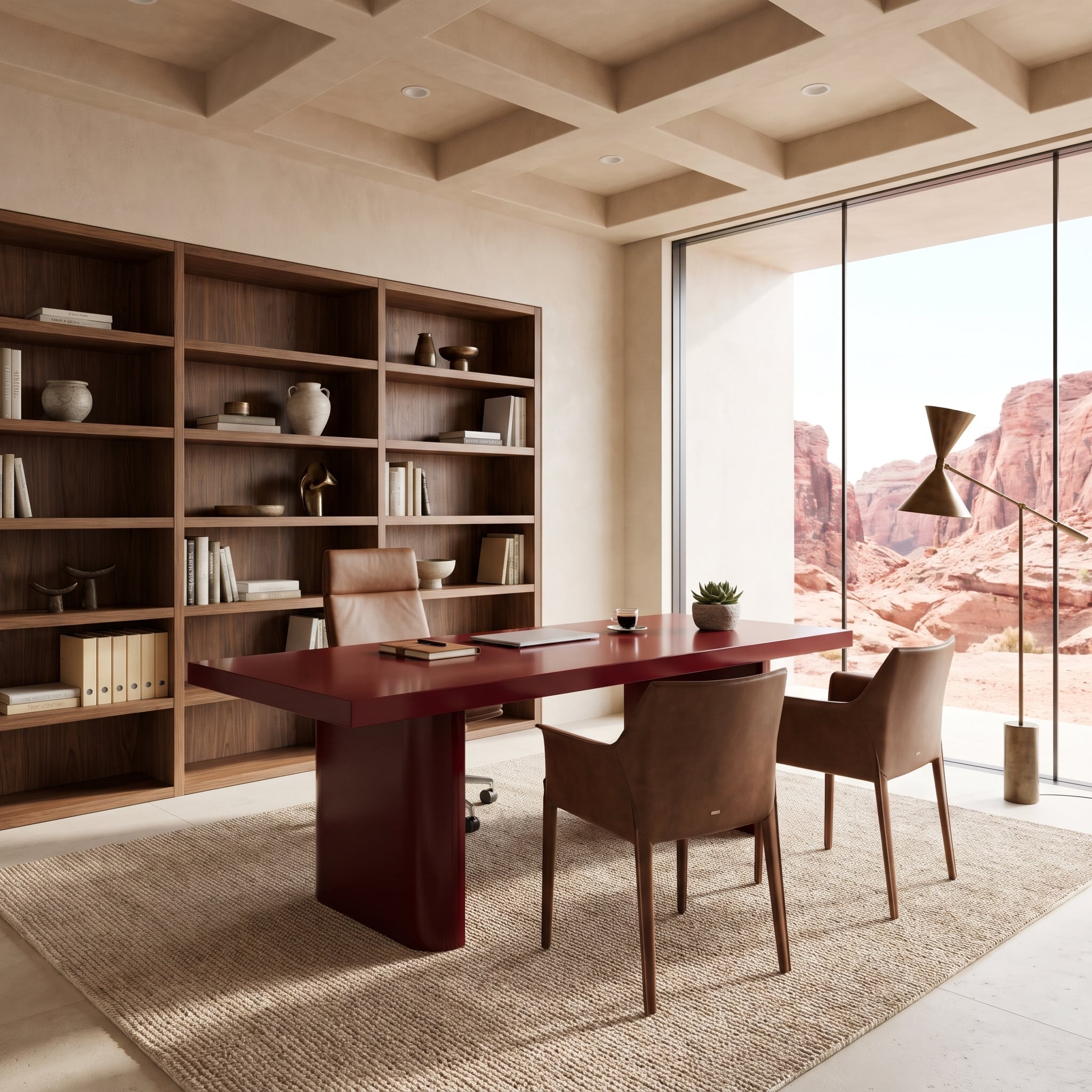
An oxblood lacquer desk picks up the deepest red-brown shadows in the sandstone cliffs beyond the glass, rather than copying their sunlit pink. Its two rounded pedestals and broad slab top have the presence of a small architectural installation.
Walnut shelves and leather guest chairs create a progression of warmer, quieter browns around it. The slender brass lamp introduces a vertical accent against the window mullions, while the desk remains the room’s deliberate link to the landscape.
13. Look Past the Tub and You’ll Find Where the Vanity Got Its Wine Color
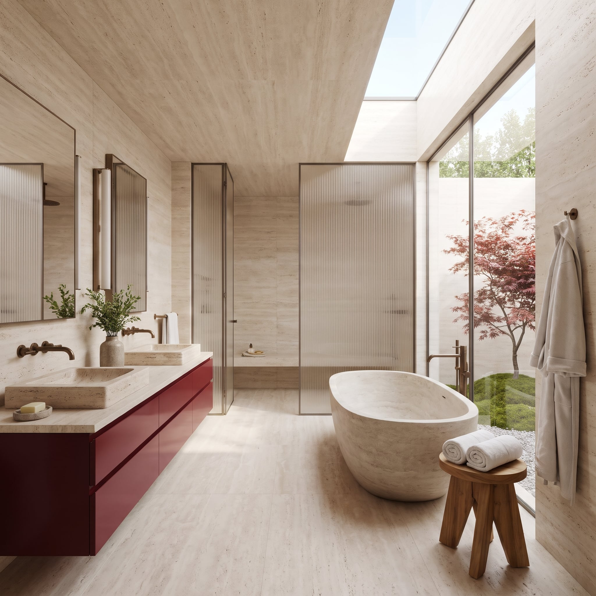
Travertine covers the floor, walls and ceiling and continues into the sinks and oval bathtub. Against that continuous pale stone, a floating wine-lacquer vanity creates a sharp horizontal interruption.
Beyond the tub, the Japanese maple provides a seasonal echo of the cabinet’s color. Bronze fittings carry warmth into the details, while the garden connection makes the red feel related to the view, even as the foliage changes through the year.
12. Let One Canvas Carry the Red While Mint Plaster Wraps Every Wall and Beam
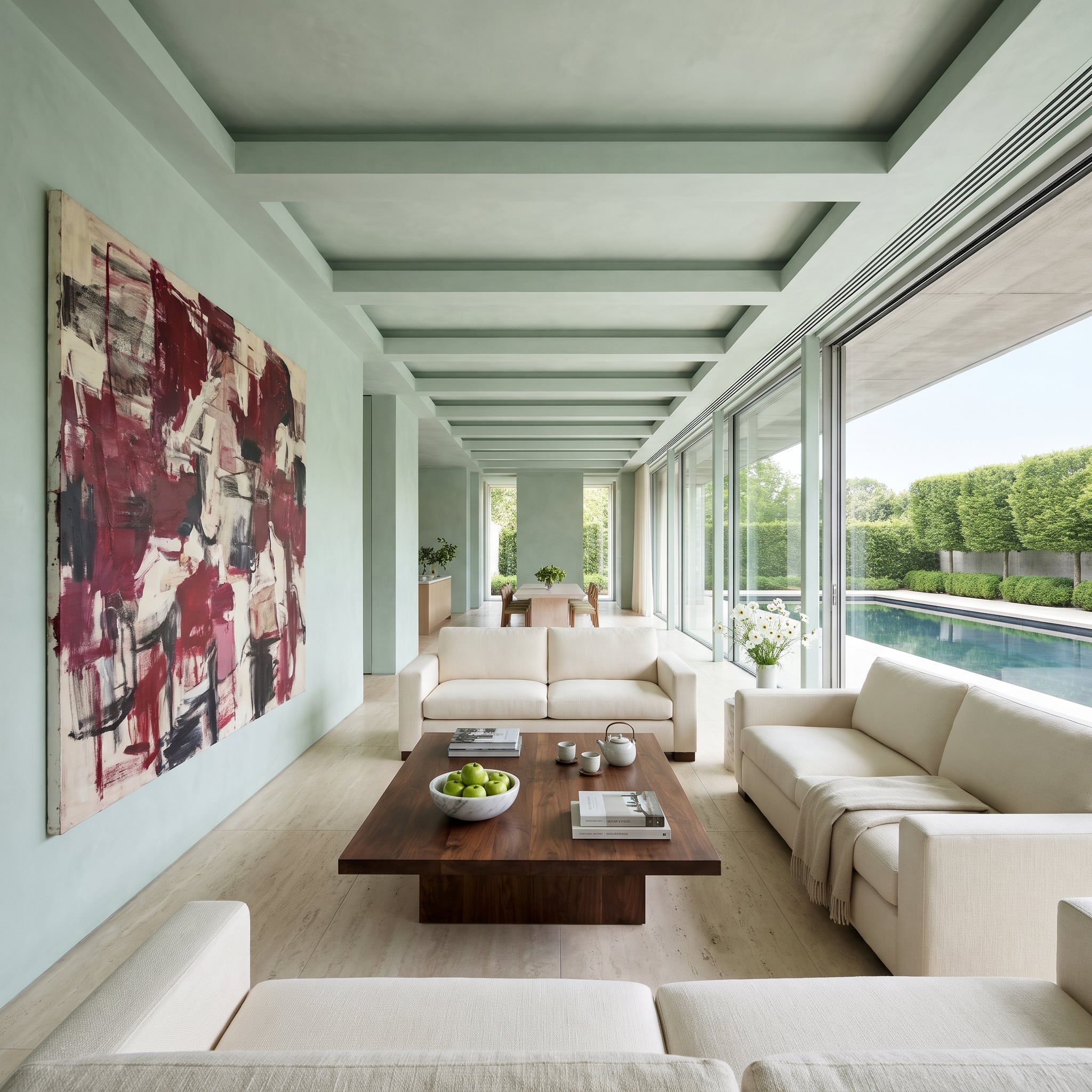
A single abstract canvas carries the room’s wine-red strokes. Mint plaster continues across the walls, beams and coffered ceiling, creating an unusually consistent pale-green envelope around the artwork.
Cream sofas recede against that backdrop, while a walnut table provides the principal dark mass. Because the red is confined to the painting, its irregular marks become the room’s point of visual energy rather than another upholstery color to coordinate.
11. Wrapped in Wine Leather, the Closet Island Keeps Watches Under Glass and Bags Behind Bronze
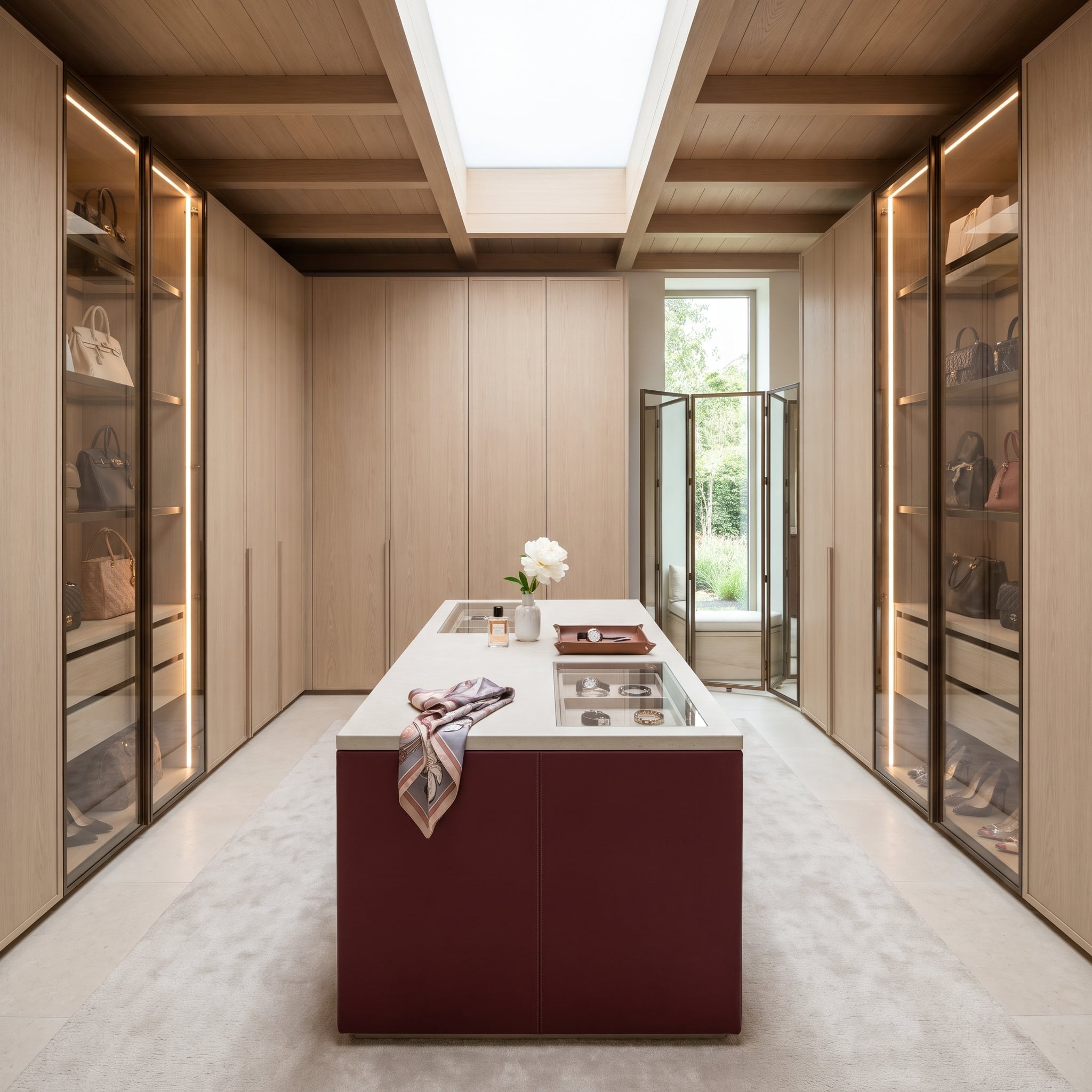
Wine leather wraps the closet island like a beautifully constructed piece of luggage, with a single stitched seam defining each face. Pale oak wardrobes, ceiling boards and skylight beams make the darker central piece stand out without saturating the whole room.
Glass-lidded compartments display watches and bracelets beneath the stone top. Bronze-framed cabinets illuminate the handbags along the walls, while a cognac tray introduces a smaller, related leather tone. The island brings a furniture-maker’s detail to a room built around storage.
10. Low and Glossy, Red Side Tables Anchor Peach Sofas Facing a Framed Hillside
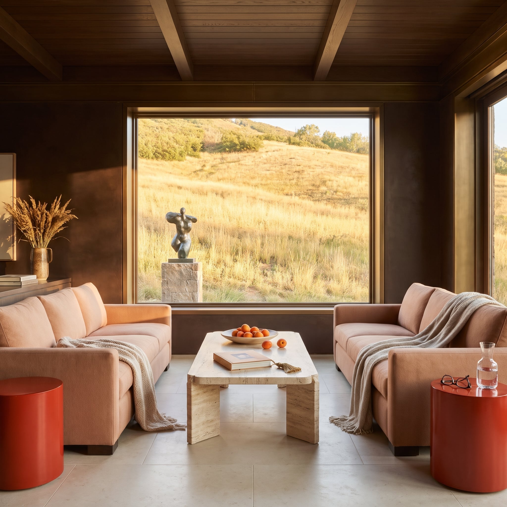
Two glossy red drum tables sit low beside peach sofas, supplying sharp reflections among otherwise matte surfaces. Their small scale matters: the saturated lacquer punctuates the seating arrangement without competing with the broad hillside view.
A travertine table and bronze torso provide weight at the center, while the upholstery keeps the surrounding palette gently warm. The difference in sheen makes the red more noticeable than a larger patch of muted color would be.
9. Why Plant Herbs Behind a Banquette? So Plum Leather Has a Garden at Its Back
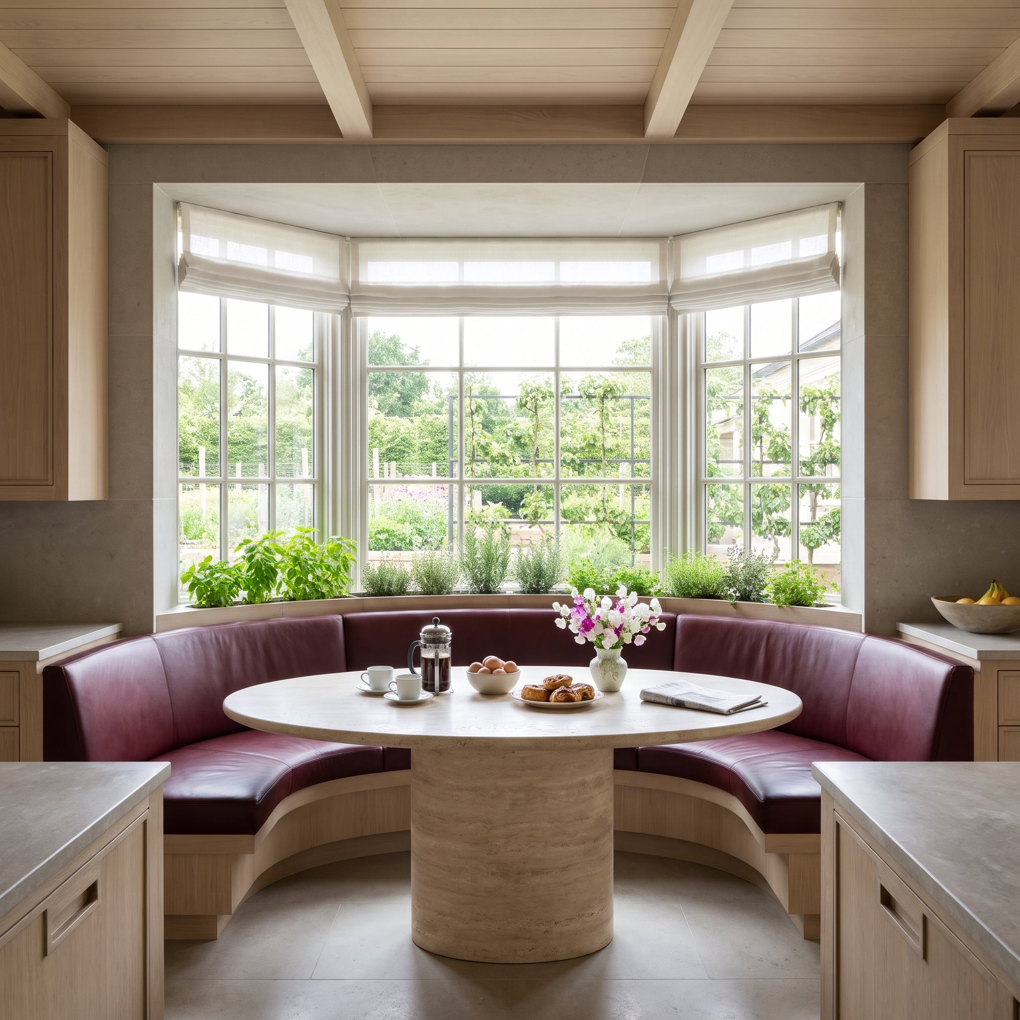
A planter behind the plum leather banquette introduces living green at the boundary between the seat and the garden. The foliage makes a soft transition from the saturated upholstery to the view through the glass.
An oak plinth connects the seating to the surrounding cabinetry, and a round travertine pedestal table leaves generous legroom along the curve. The contrast is less about complementary colors than about leather, foliage and limestone meeting at close range.
8. Red Stays at Sideboard Height While Teal Plaster Climbs to a Lacquered Ceiling
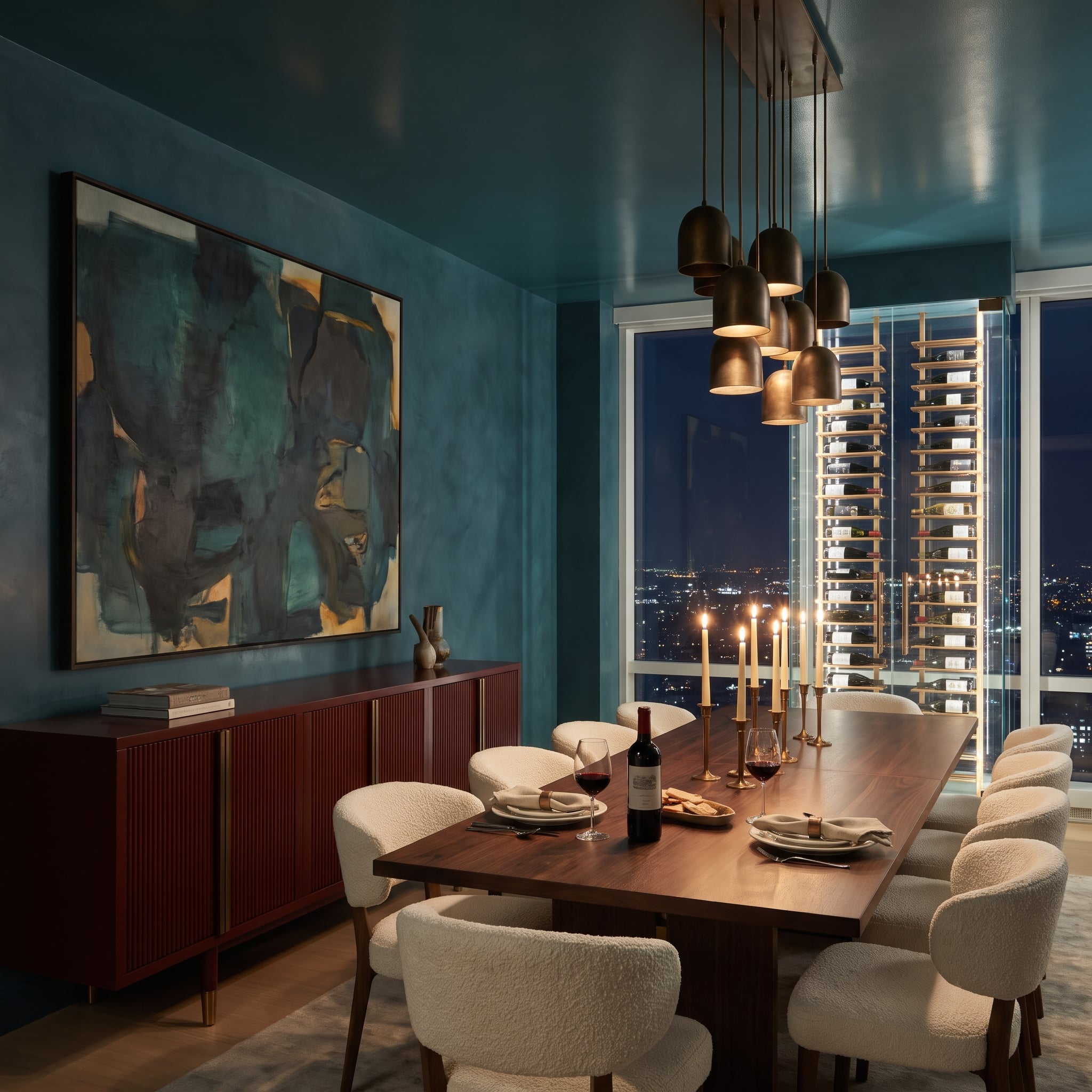
The fluted oxblood sideboard reads as a single low horizontal mass beneath the teal plaster. Its narrow ribs catch alternating bands of light and shadow, making the lacquered color feel richly textured rather than flat.
Brass pulls pick up the candlesticks, while the darker ceiling adds depth above. The sideboard gives the room a visual base without asking the walls to change color.
7. Jungle on One Side, Stitched Wine Leather on the Other, and a Boulder in Between
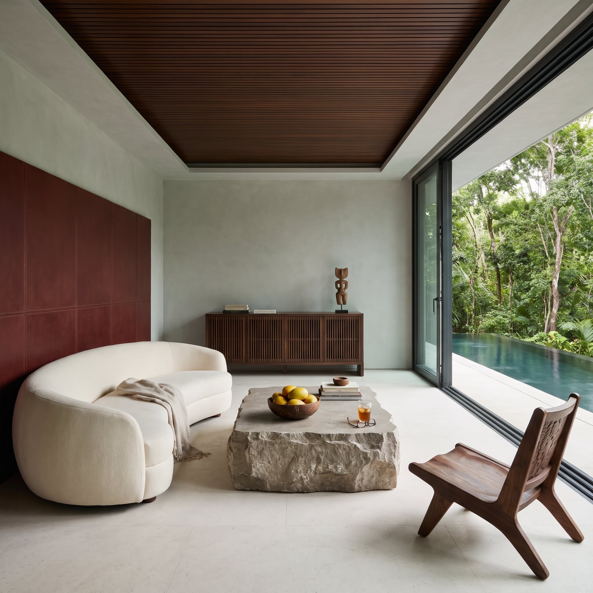
Saddle-stitched wine leather panels form a tailored backdrop to the curved bouclé sofa. The panels stop short of the soffit, leaving a border of pale plaster that defines their edges rather than allowing the color to engulf the wall.
A rough stone table interrupts the smooth leather and upholstery, while the rainforest beyond the glass supplies a vivid green counterpoint. Precision stitching, irregular stone and dense foliage give the room three very different kinds of texture.
6. Between a Floating Black Fireplace and the Skyline, One Red Chair Holds the Corner
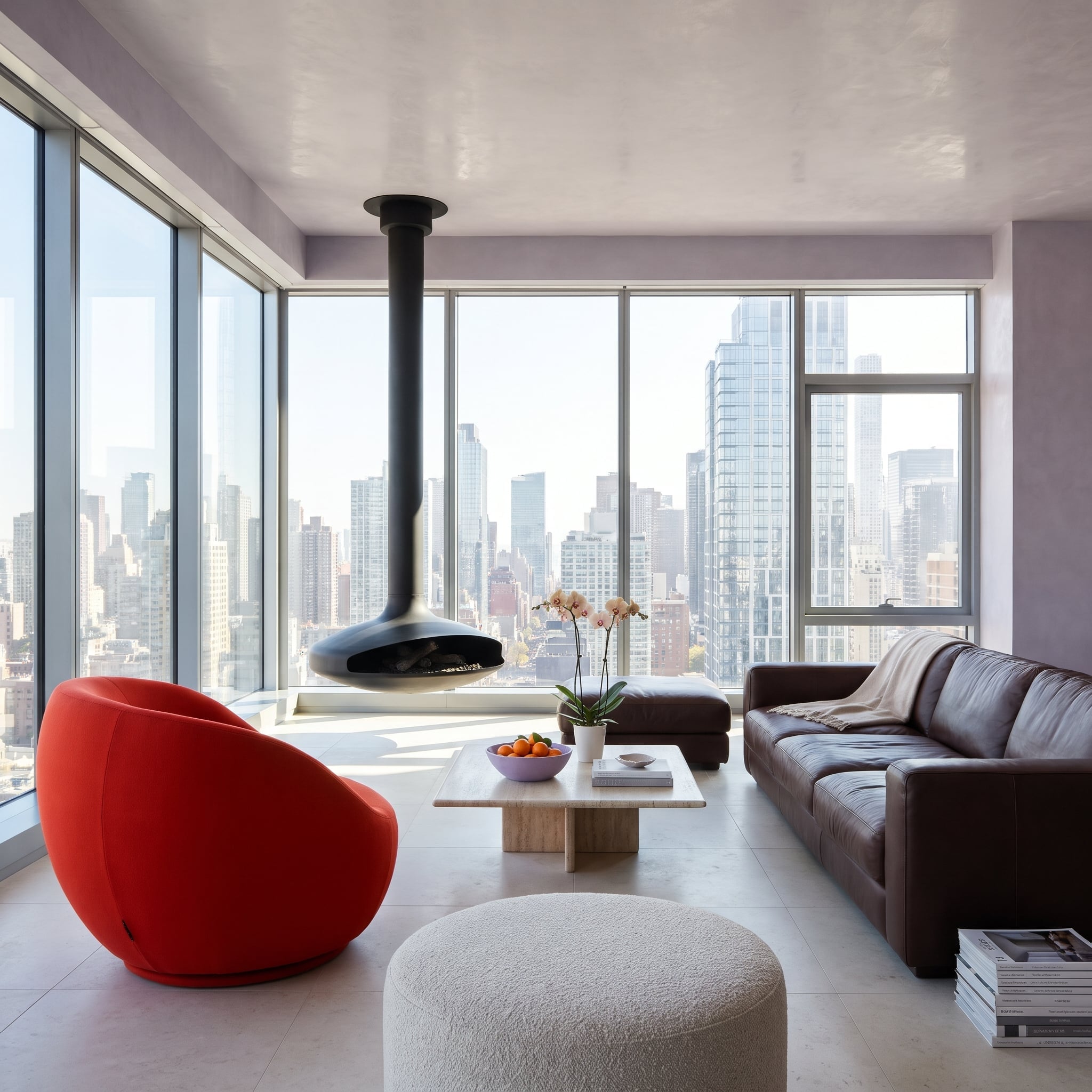
A single red barrel chair punctuates the corner between a suspended black fireplace and the skyline. Its rounded shell answers the fireplace’s sculptural form, while the dark leather sofa supplies a visual counterweight across the room.
Lilac plaster cools the background and a bowl of oranges introduces a smaller, related warm accent. The chair succeeds through placement and shape, not through repeated red accessories.
5. Storage Gets the Wine Paint So the Bouclé and Plaster Can Stay Quiet
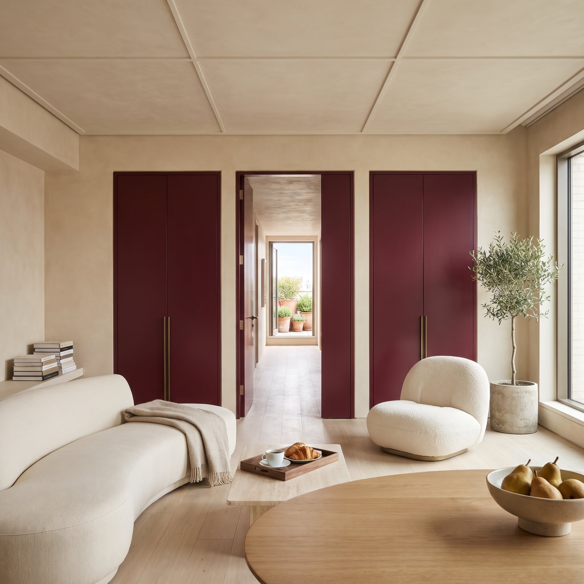
Flush wine-painted closet doors read as one architectural plane rather than a series of freestanding storage units. Their tall bronze pulls introduce slender vertical lines against the broad painted surfaces.
Cream bouclé and pale plaster soften the composition, and an open central door reveals the terrace beyond. The red gives the storage wall definition while the room’s seating and daylight remain visually light.
4. Blue Plaster, Walnut Towers and Just Enough Burgundy to Sit On
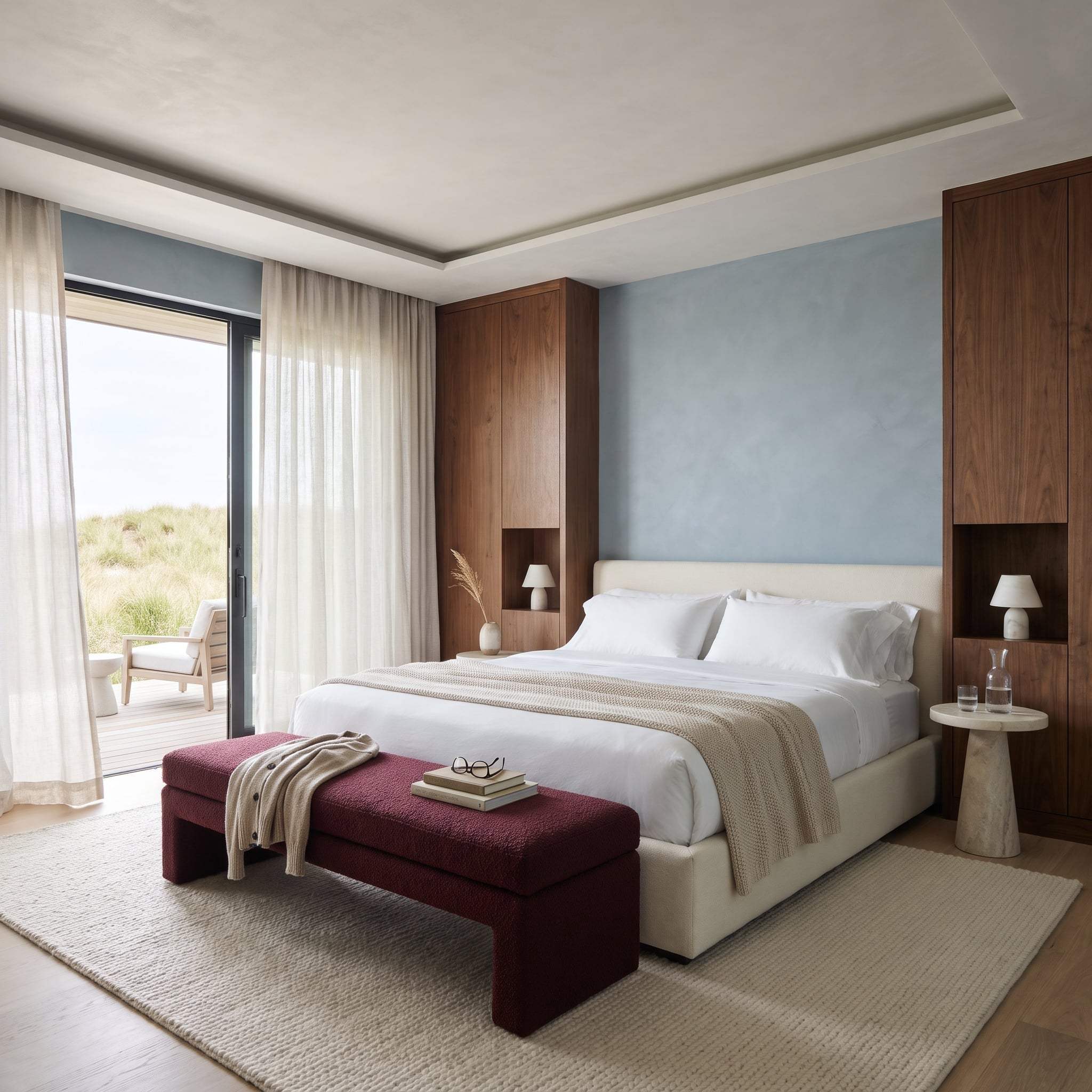
A low burgundy bouclé bench adds a dense, tactile stripe beneath the pale-blue plaster and the tall walnut towers. Its position at the foot of the bed gives the room a clear foreground without interrupting the view of the dunes.
Open niches within the walnut towers accommodate small white lamps, eliminating the need for conventional bedside cabinets. Slim marble pedestals keep the floor open, and the timber’s reddish undertone connects the bench to the room’s warmer materials.
3. Leave the Wall to Ochre and Let Oxblood Leather Hold the Floor
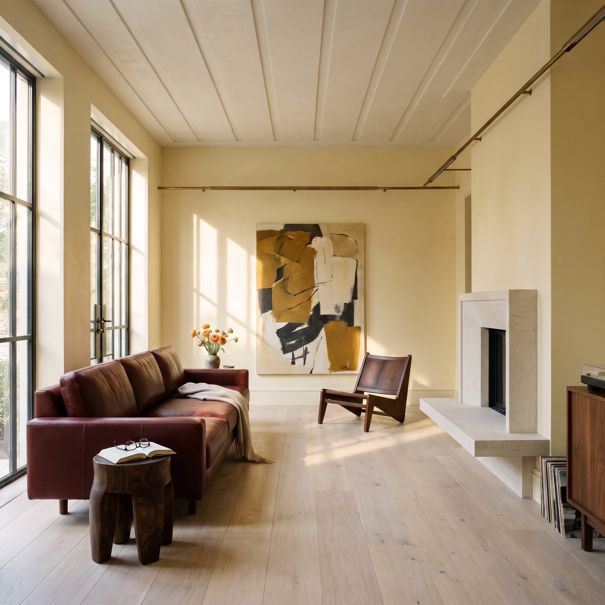
Afternoon sunlight grazes pale oak floorboards before reaching an oxblood leather sofa, bringing out the material’s dark-cherry undertones. The ochre abstract above it shares the warmth without matching the upholstery exactly.
A walnut stump table and low sling chair continue the earth-toned palette beside the limestone hearth. Here, the red’s effectiveness depends on daylight, leather texture and the surrounding art rather than a painted feature wall.
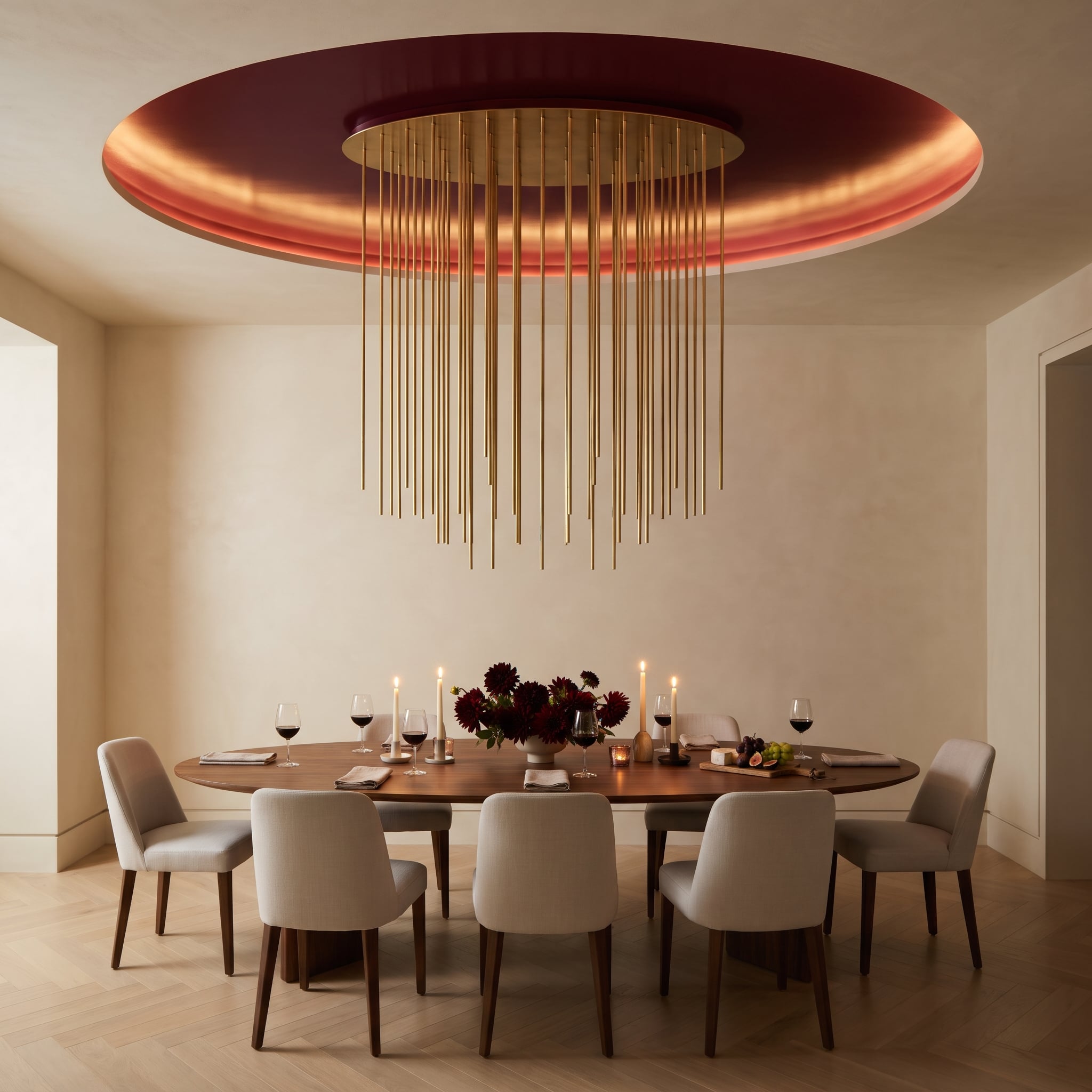
2. Above the Walnut Table, Brass Rods Rain Down From a Wine-Painted Ceiling Dish
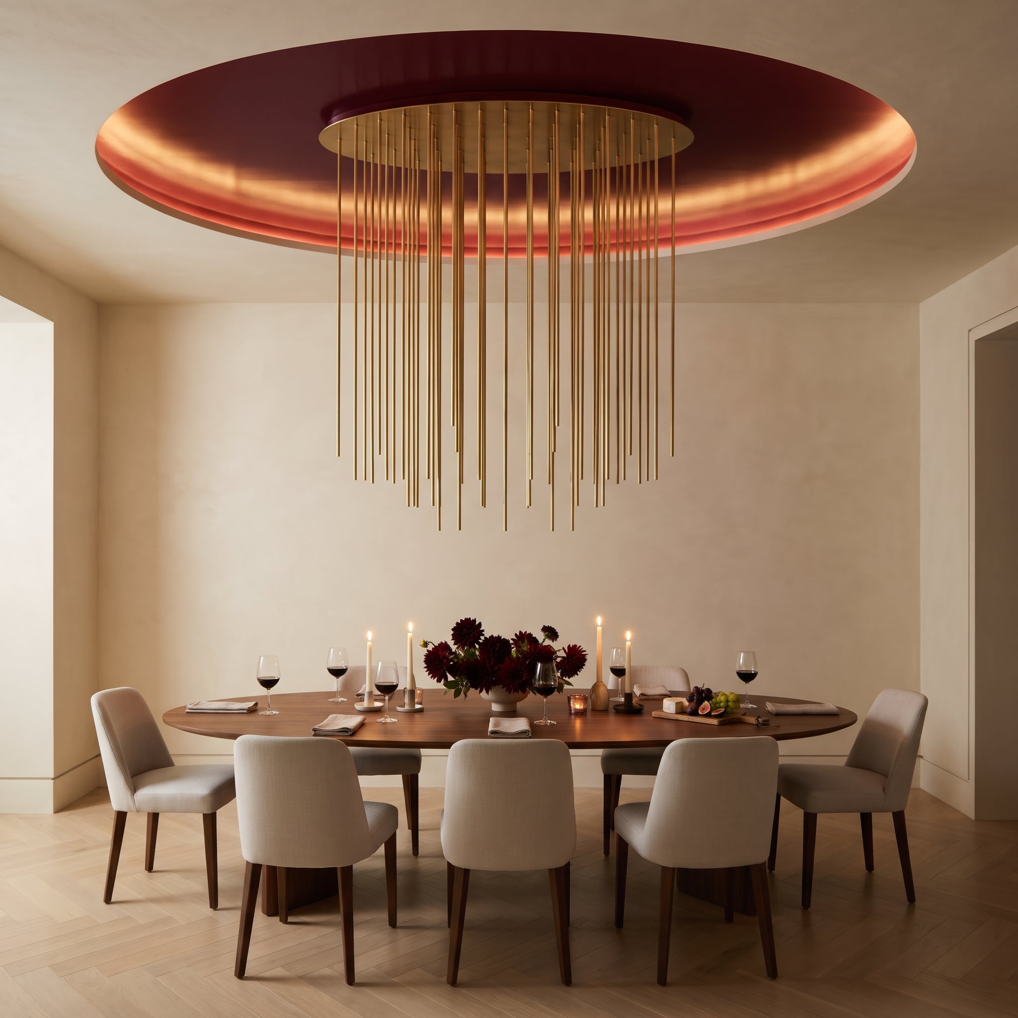
A shallow wine-painted ceiling recess gathers the dining room’s strongest color overhead. Cove lighting traces its rim, revealing the curved edge and keeping the deep finish distinct from the surrounding ceiling.
Suspended at varying lengths, the brass installation gives the circular recess a delicate, almost kinetic center, with the dahlias below adding a looser counterpoint. The design concentrates color and ornament within a defined circular volume rather than spreading either across the walls.
1. Up Goes the Glossy Oxblood, Down Goes a Travertine Conversation Pit
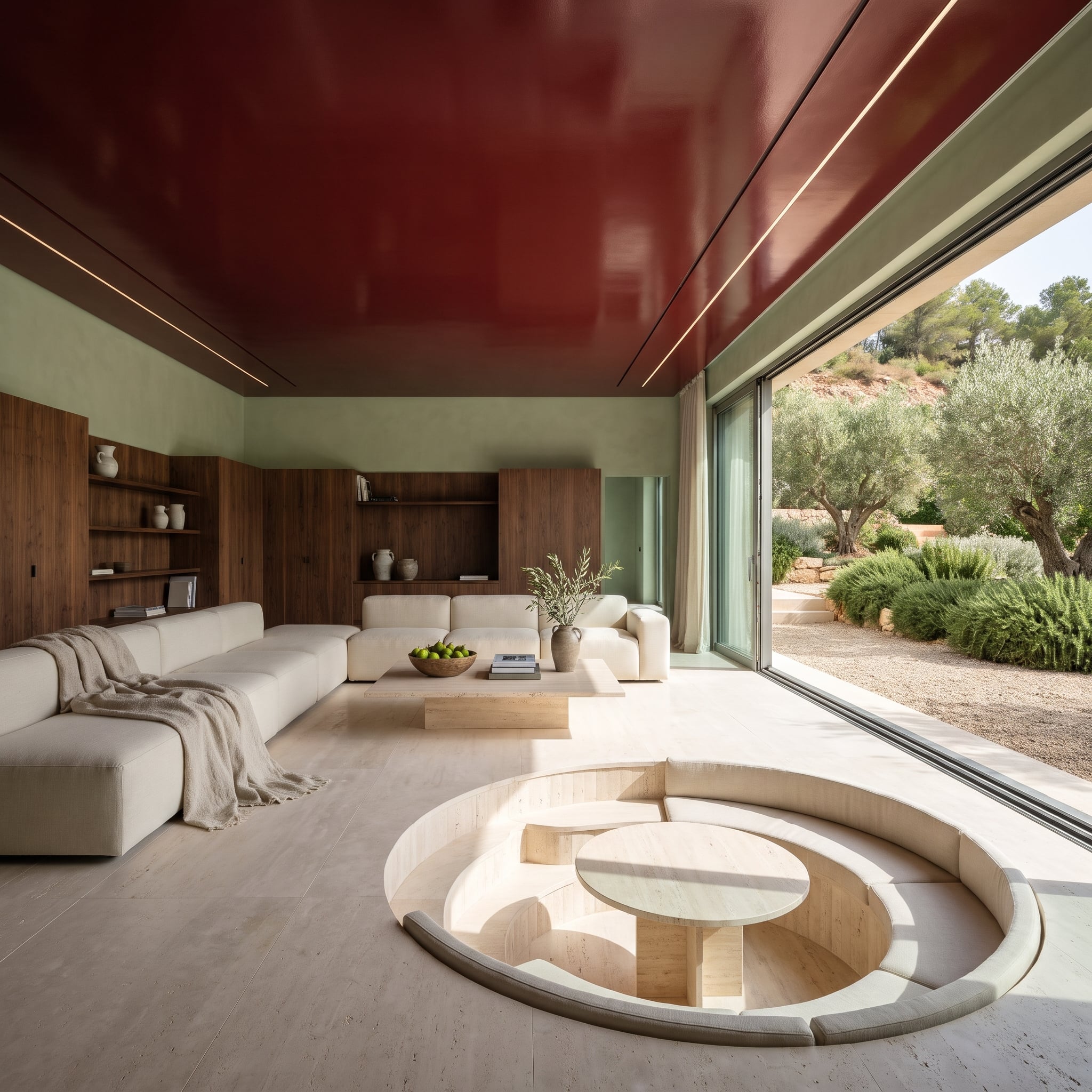
Glossy oxblood lacquer covers the ceiling above a sunken travertine conversation pit. Garden light and the sage walls register as shifting reflections overhead, so the deep red changes character throughout the day.
Below, pale stone and low seating establish a calmer plane. The room reverses the usual accent-wall formula: the boldest surface is overhead, while the architecture of the floor provides the counterweight.