
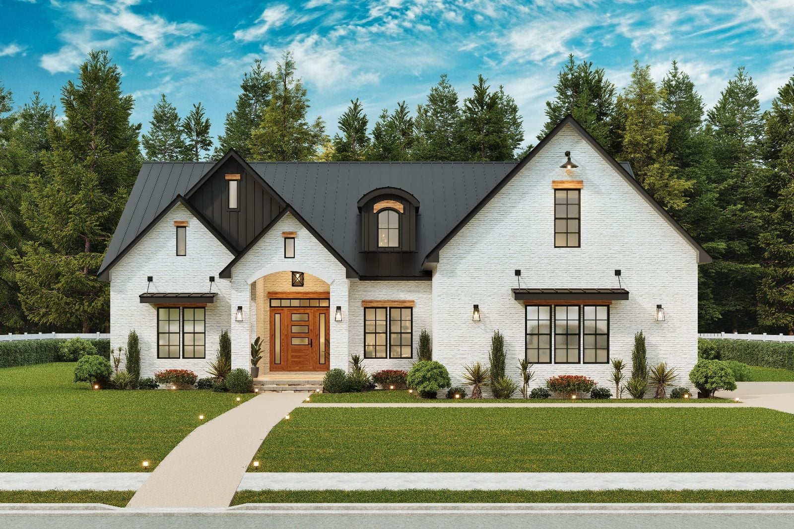
Anyone who has watched their kids do homework on the kitchen counter because the dining table is buried under a week of backpacks knows exactly how fast a starter home stops working. The Whitemoore B is built around the version of family life you are actually living: a bonus room that absorbs the noise when dinner is still an hour out, a single-story layout that keeps everyone on the same floor, and a kitchen with enough counter space to survive the third school drop-off of the day.
Specifications
- Sq. Ft.: 2,351
- Bedrooms: 3
- Bathrooms: 3
Floor Plan – Main Floor
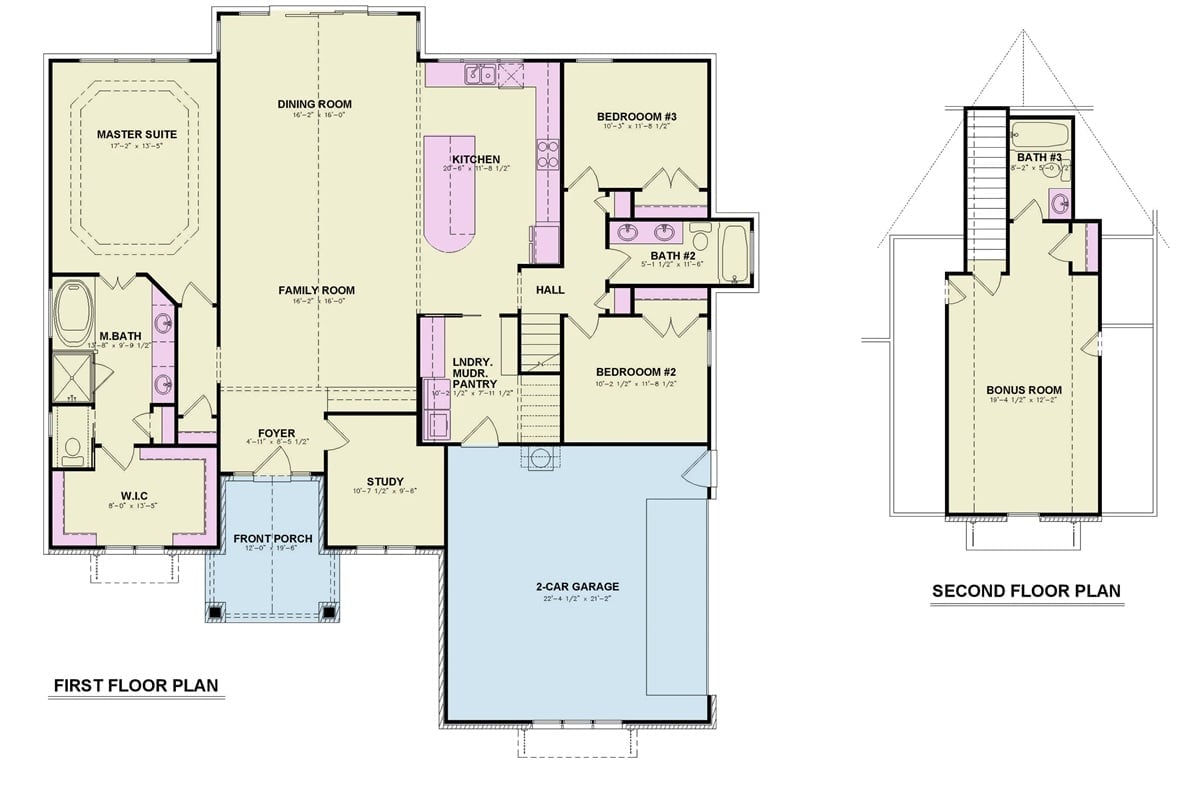
The master suite and walk-in closet sit on the left wing, well separated from the two additional bedrooms sharing Bath #2 on the right. Kitchen, dining, and family room flow together through the center of the plan, with a laundry/mudroom/pantry combo anchoring the garage entry. Upstairs, a bonus room with Bath #3 handles whatever the main floor can’t.
Board-and-Batten White Exterior with a Natural Wood Entry That Actually Earns Attention
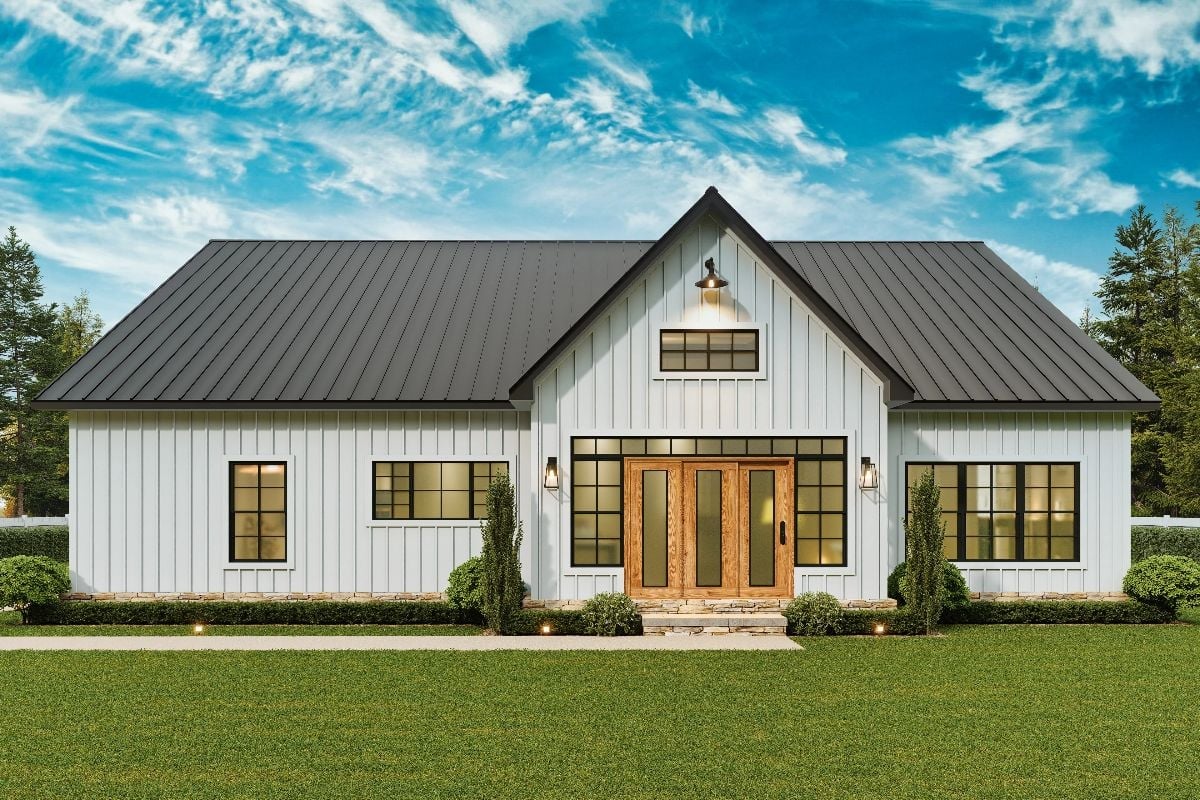
A standing seam metal roof in near-black anchors the facade without overwhelming it. The warm wood double doors do something white exteriors rarely manage on their own — they make the entry feel genuinely inviting rather than just clean. Casement windows with dark frames keep the whole composition grounded.
Vaulted Ceilings and a Wagon-Wheel Chandelier Do the Heavy Lifting Here
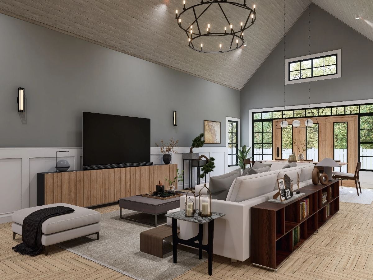
Herringbone hardwood floors, white wainscoting, and a wood-slat media cabinet give this great room its layered, grounded character — nothing in here is doing just one job.
In The Details: That bookcase running along the back of the sofa divides the seating area from the rest of the room without needing a wall to do it. Wood planking on the vaulted ceiling keeps the space from going cold despite the gray walls, and black-framed windows and doors carry the same finish throughout so nothing reads as an afterthought.
French Doors, a Live-Edge Table, and Natural Light That Does All the Work
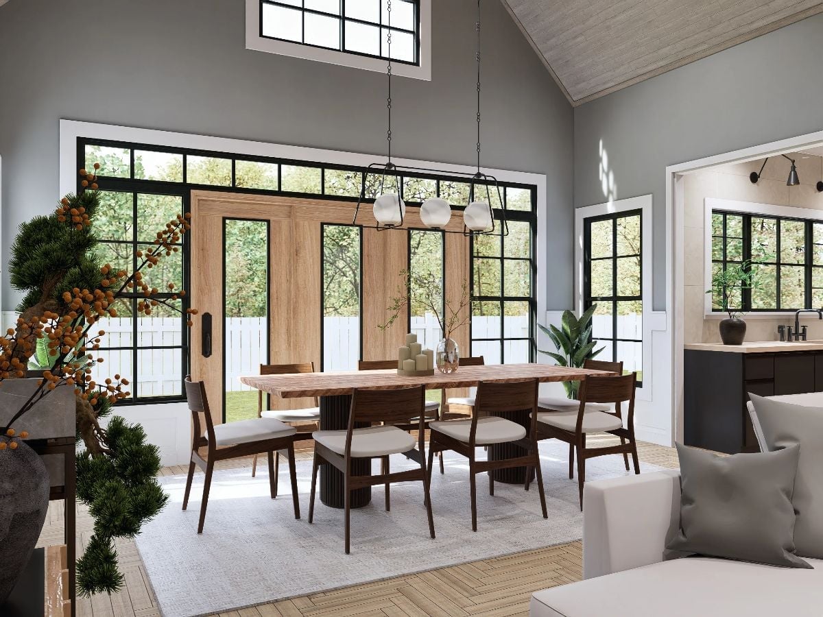
Midcentury dining chairs with cream upholstery pull up to a live-edge wood table on a fluted pedestal base. Four globe pendants hang low enough to actually light the table rather than just decorate the ceiling above it.
Why It Works: Black-framed French doors read as a considered choice here, not a trend grab. They frame the backyard like a picture without competing with the warm wood tones that dominate the room — enough contrast to have an opinion, not so much that it argues with itself.
Matte Black Cabinets, Brass Pendants, and a Kitchen Island That Earns Its Square Footage
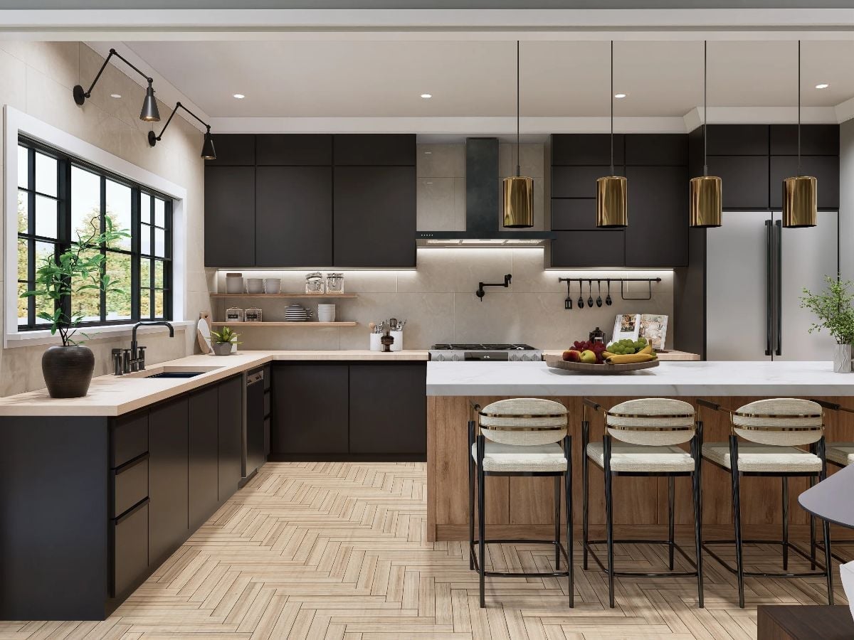
Warm wood tones on the island base keep the matte black cabinetry from reading too heavy. Gold cylinder pendants pull brass into the palette without overcrowding it. Open shelving between the uppers breaks the visual monotony of solid cabinet fronts — a small move that makes the whole kitchen feel less like a bunker.
Trend Alert: Two-tone kitchen islands are everywhere right now, and this one illustrates exactly why they keep showing up. Matching the island base to a warmer wood finish gives a large kitchen visual breathing room without touching a single upper cabinet — low commitment, real payoff.
Folded Towels and a Folding Counter That Finally Have Enough Room
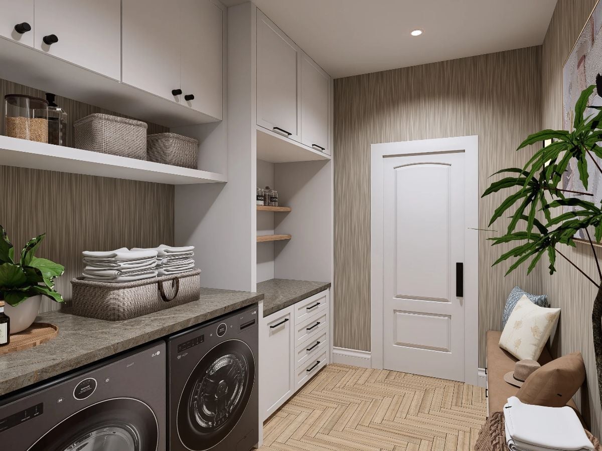
LG front-loaders sit flush under a granite-topped counter built for actual folding, not staging for a photo shoot. Open shelving keeps baskets within reach without cabinet doors swinging into the aisle. And that herringbone tile floor is doing more for this utility room than any utility room has a right to expect.
Style Math: Stacked upper cabinets running floor-to-ceiling pull real storage out of a narrow room without borrowing square footage from anywhere else. Pairing them with open wood shelves in the middle breaks up the visual weight so the whole wall doesn’t read like a solid slab of white.
Dark Walls, a Tray Ceiling, and a Bench at the Foot of the Bed That Actually Gets Used
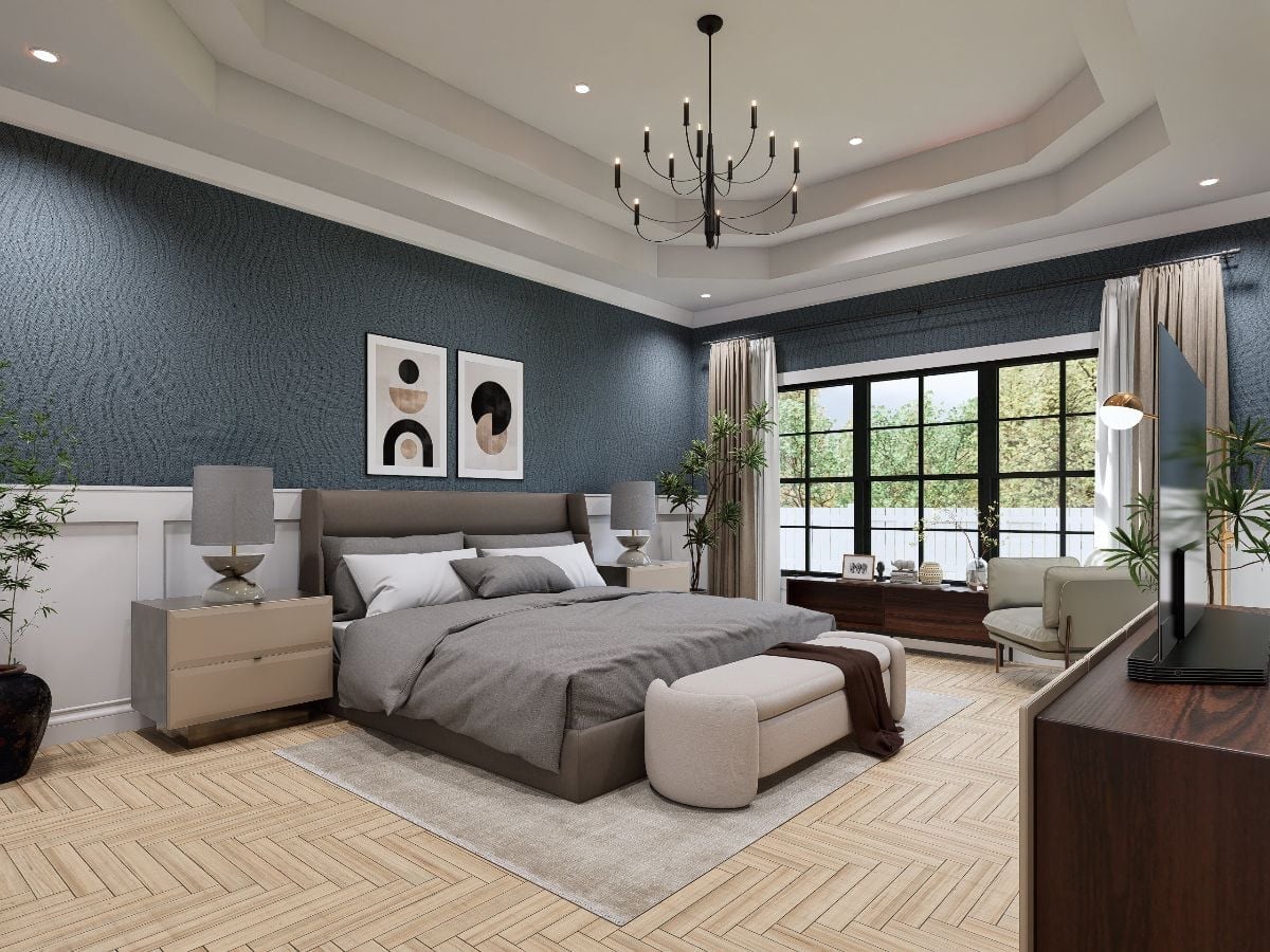
Navy grasscloth wallcovering above white board-and-batten paneling keeps the room grounded without tipping into oppressive. Gray upholstered bed, parquet floors, linen bench — it holds together without looking like it was assembled from a mood board.
Why the Wainscoting Pulls Double Duty Here
Running the board-and-batten paneling to roughly chair-rail height creates a visual break that lets the dark wallcovering read as deliberate rather than suffocating. It gives the eye a natural place to rest before traveling up to the tray ceiling. That layering of trim detail is what separates a dark bedroom from a cave.
Marble Walls, a Freestanding Tub, and Glass That Earns Every Square Foot
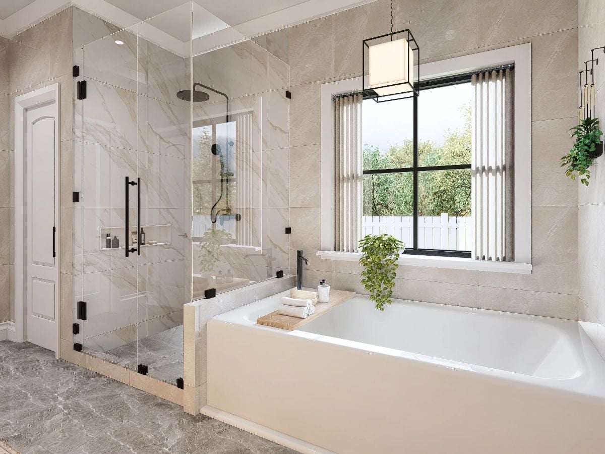
Frameless glass and matte black hardware keep the shower from boxing in the room while giving it a clear visual anchor. The tub sits close enough to the window to catch natural light without feeling exposed. Plants on the ledge are the only thing standing between this and a showroom — which is a good thing.
- Floor-to-ceiling marble tile in the shower visually extends the wall height without adding square footage
- A rain showerhead centered above rather than wall-mounted frees up elbow room inside the enclosure
- Pendant lighting over the tub adds task-level light where a ceiling fixture would miss entirely
Pin It
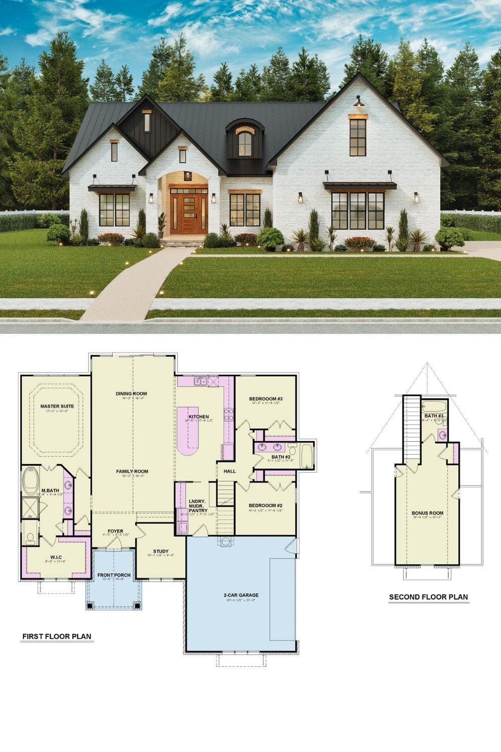
Exterior rendering shows a white brick transitional home with black roof; floor plans below detail three bedrooms, bonus room, and two-car garage.
