
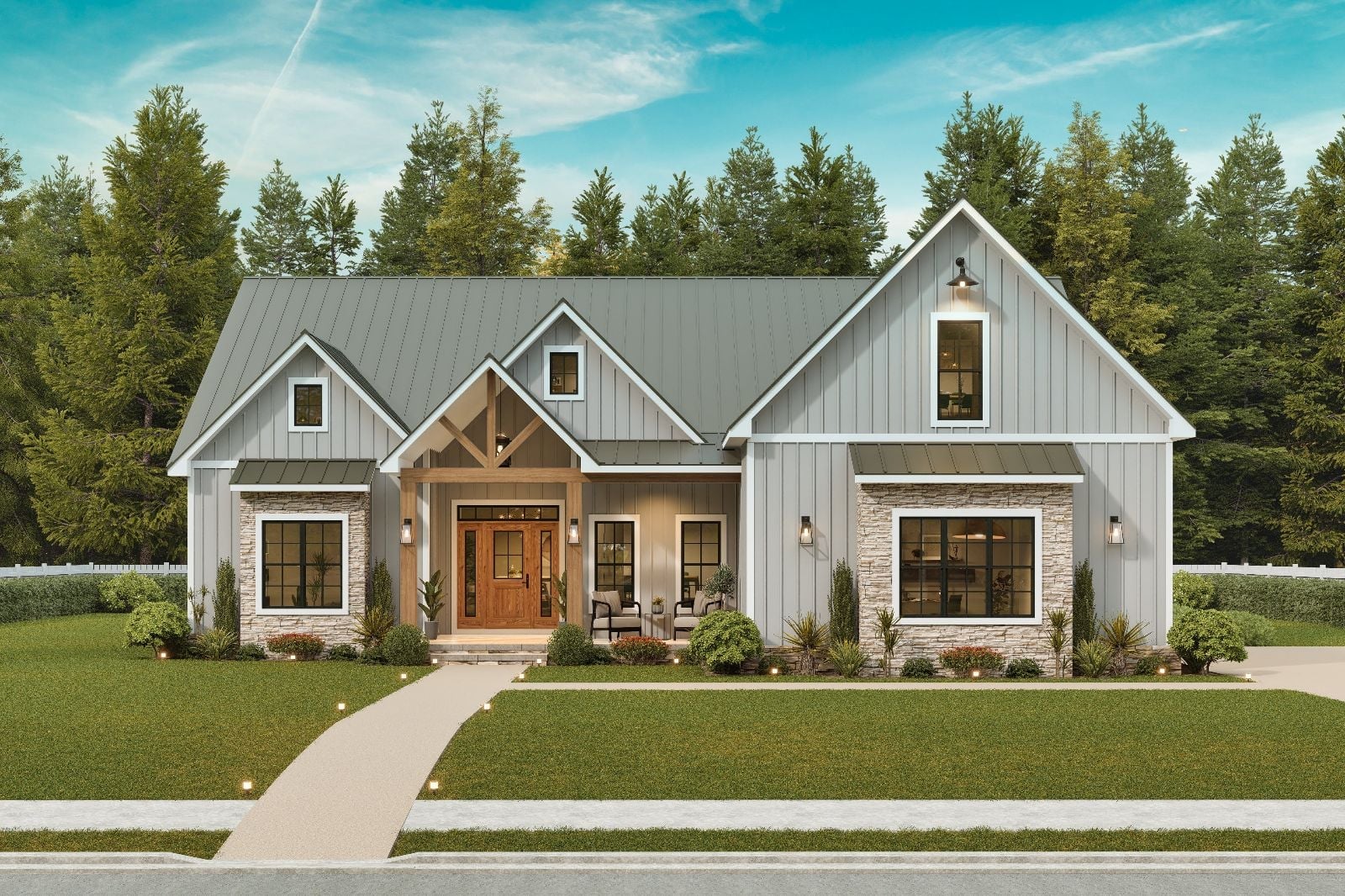
The front porch is the tell. Families who have spent three years eating dinner at a table pushed against the wall don’t add a front porch because it photographs well — they add it because they want somewhere to sit at seven in the evening and not be inside, and the Whitemoore A is built around exactly that shift: a bonus room that absorbs the homework and the noise, an open main living area where dinner conversations stretch past the dishes, and a layout that finally matches how this family actually lives.
Specifications
- Sq. Ft.: 2,361
- Bedrooms: 3
- Bathrooms: 3
Floor Plan – Main Floor
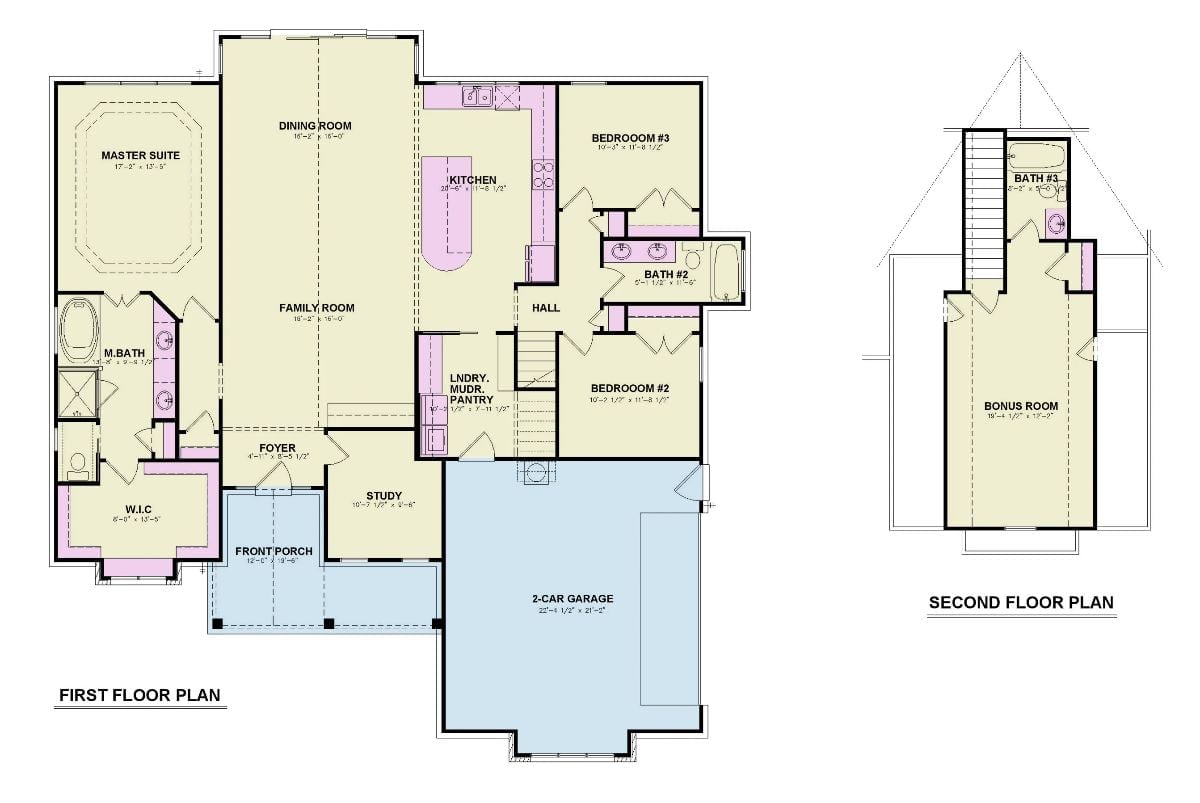
Single-story layout hosts master suite, two bedrooms, open kitchen and family room, plus a second-floor bonus room with bath.
Board-and-Batten Gray Siding That Actually Earns the “Modern Farmhouse” Label
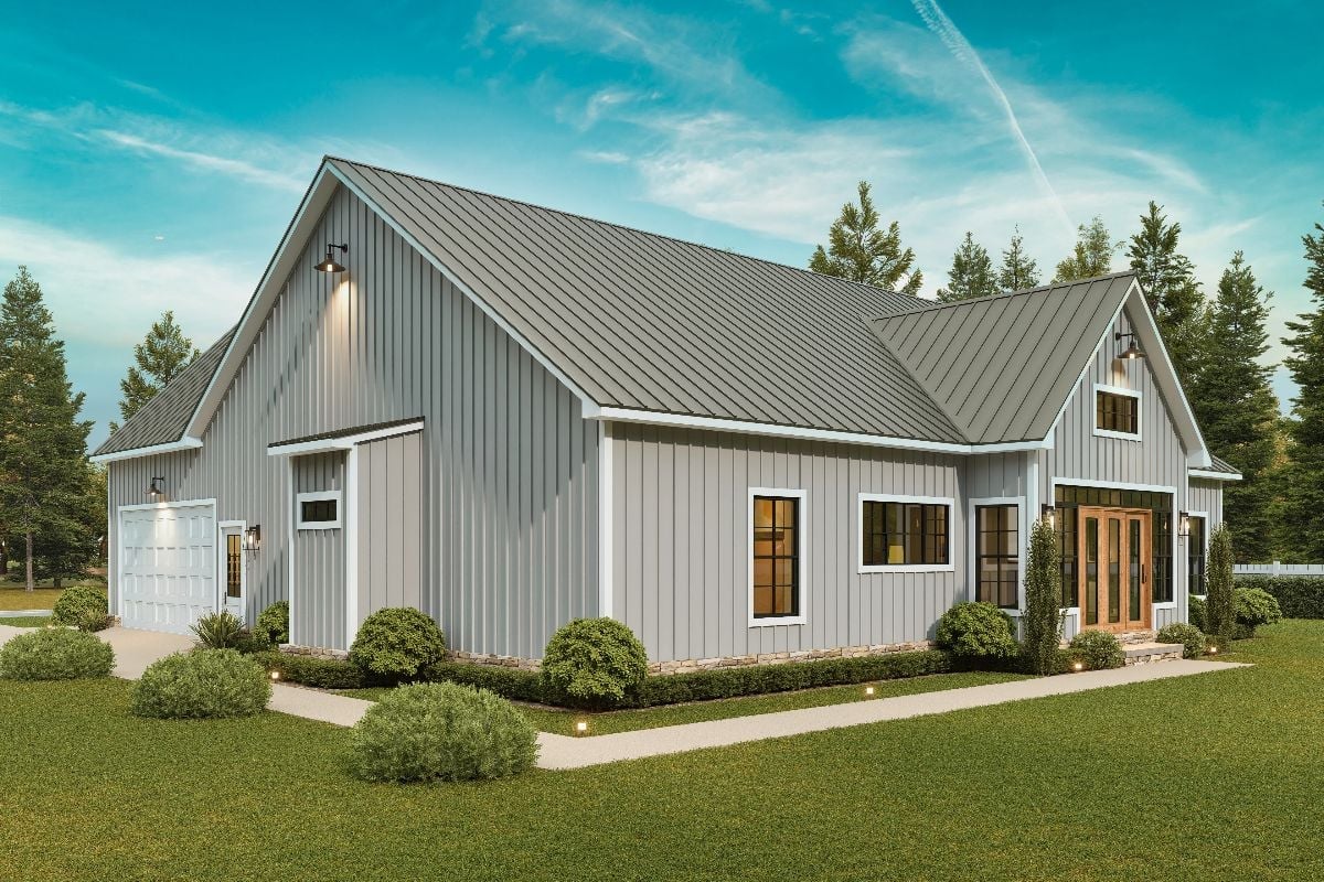
Vertical board-and-batten in soft gray keeps the exterior grounded, and the standing-seam metal roof adds genuine barn credibility rather than the decorative kind. Wood-framed French doors anchor the entry. Wall-mount gooseneck fixtures handle the after-dark shift without a lot of fuss.
Editor’s Note: The garage integration is smarter than it first appears. Most farmhouse-style plans push the garage awkwardly to the rear or let it swallow the front facade, but Whitemoore brings it flush with the street-facing elevation without letting it take over. Families who need the storage won’t have to give up the curb presence to get it.
Vaulted Ceilings and a Wagon-Wheel Chandelier That Know Exactly What They’re Doing
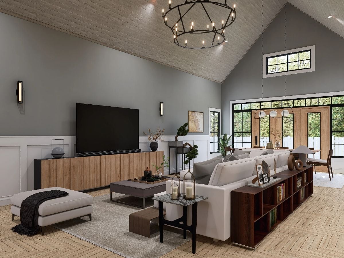
Gray shiplap walls stop at a white wainscot rail, grounding the room without boxing it in. The herringbone wood floor reads light against the dark coffee table and walnut media console, and with a candle-style chandelier overhead and wall sconces flanking the TV, nothing in the room is competing for attention. That’s a harder balance to pull off than it looks.
Common Mistake: Homeowners upgrading from a starter home often overbuy sectional sofas for their new great room, then discover the sofa dominates the space and cuts off natural traffic flow to adjacent rooms. Measure your primary walking paths before you order, not after. A smaller sofa with a well-placed ottoman gives you more usable square footage than one oversized piece ever will.
Fluted Pedestal Base, French Doors, and a Chandelier That Doesn’t Apologize
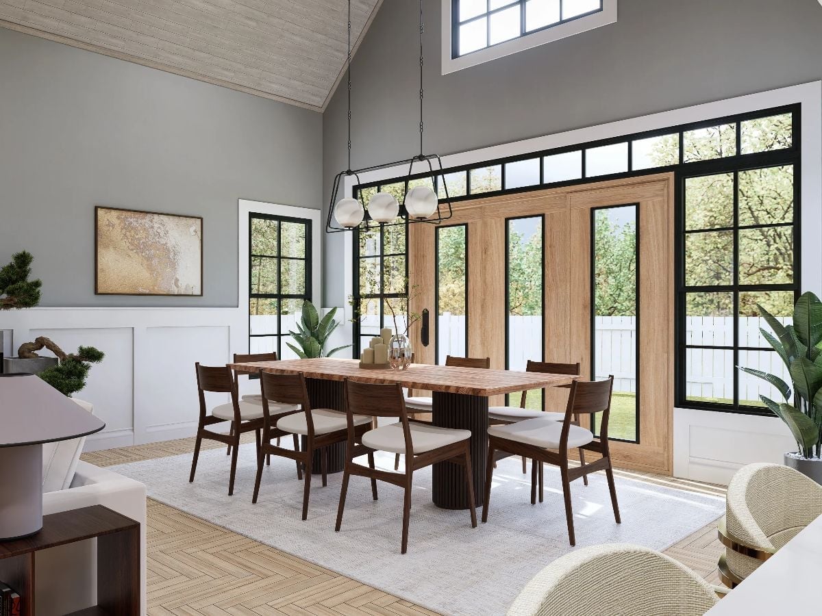
Black-framed French doors push enough natural light into the dining room that the walnut table’s fluted pedestal base becomes the obvious focal point rather than something you have to work to notice.
Black-framed French doors flood the dining room with natural light, making the walnut table’s fluted pedestal base the natural focal point.
Matte Black Cabinets, Brass Pendants, and a Herringbone Floor That Holds It Together
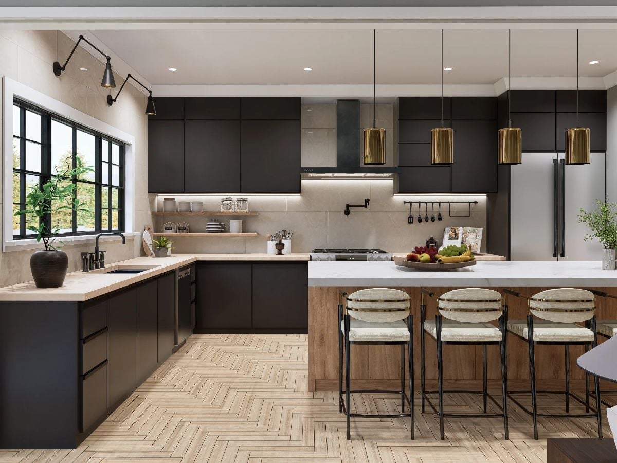
Warm wood tones on the island base keep the matte black cabinetry from feeling heavy — three brass cylinder pendants reinforce that warmth without going precious about it. The white marble island surface gives you a clean visual break, and the herringbone floor runs underneath both sides of the kitchen, connecting them without drawing attention to itself.
Why the Island Base Material Matters More Than the Countertop
Designers often treat the island base as an afterthought. Here, the natural wood cladding is doing more work than anything else in the room: it softens what would otherwise read as an all-dark kitchen and echoes the open shelving across the way. Matching finishes at two different heights creates visual rhythm without requiring a single additional decorative accessory to pull it off.
Dark Wallcovering, Herringbone Floor, and a Tray Ceiling That Pulls Its Weight
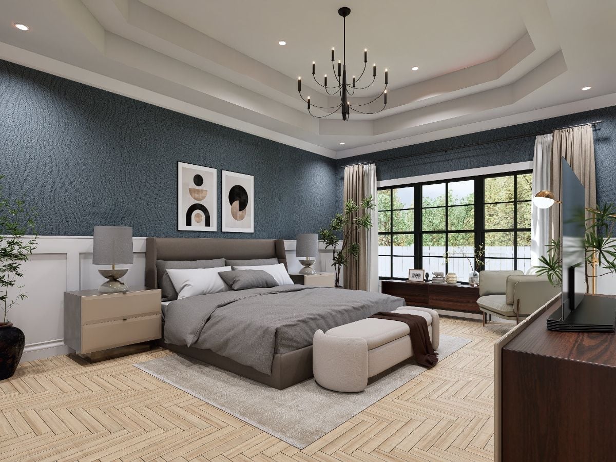
Slate-blue textured wallcovering above board-and-batten wainscoting anchors the room while the parquet floor carries its share of the visual weight below.
Why It Works: Tray ceilings earn their place when the lighting inside them does real work, and the recessed fixtures here keep the chandelier from having to carry the entire room on its own. Running a dark upper wall against white wainscoting below is a reliable way to get depth without sacrificing the sense of height. The bench at the foot of the bed is worth noting too — it’s usually the first piece families cut when a room starts to feel crowded, and keeping it here signals the room has enough breathing room to stay functional rather than just decorative.
Marble Walls, a Freestanding Tub, and Black Hardware That Keeps Everything Honest
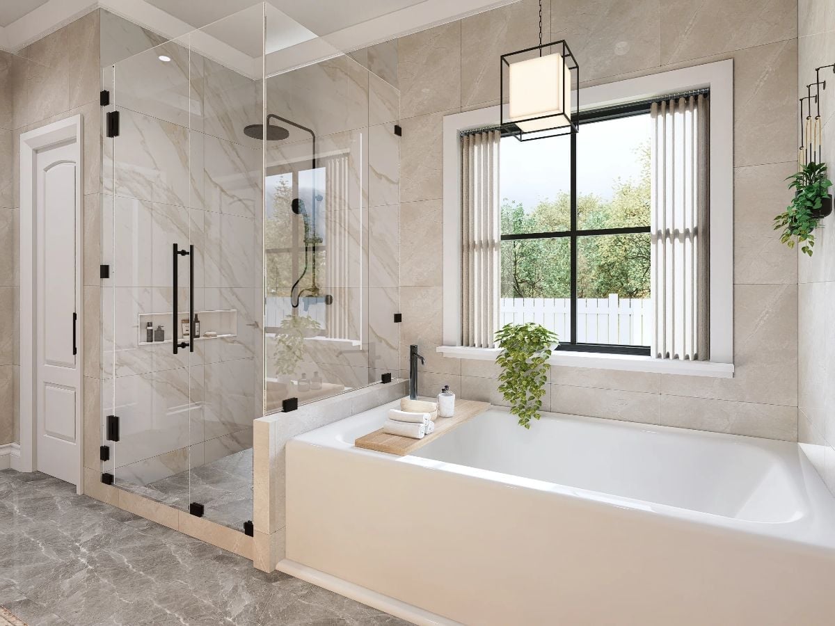
Frameless glass panels and matte black fixtures handle a lot of the visual work, but it’s the marble-look tile running floor-to-ceiling that makes the shower feel larger than its footprint. The soaking tub sits close enough to the window to catch natural light without giving up privacy. And that geometric pendant is an unexpected call. It works anyway.
Pin It
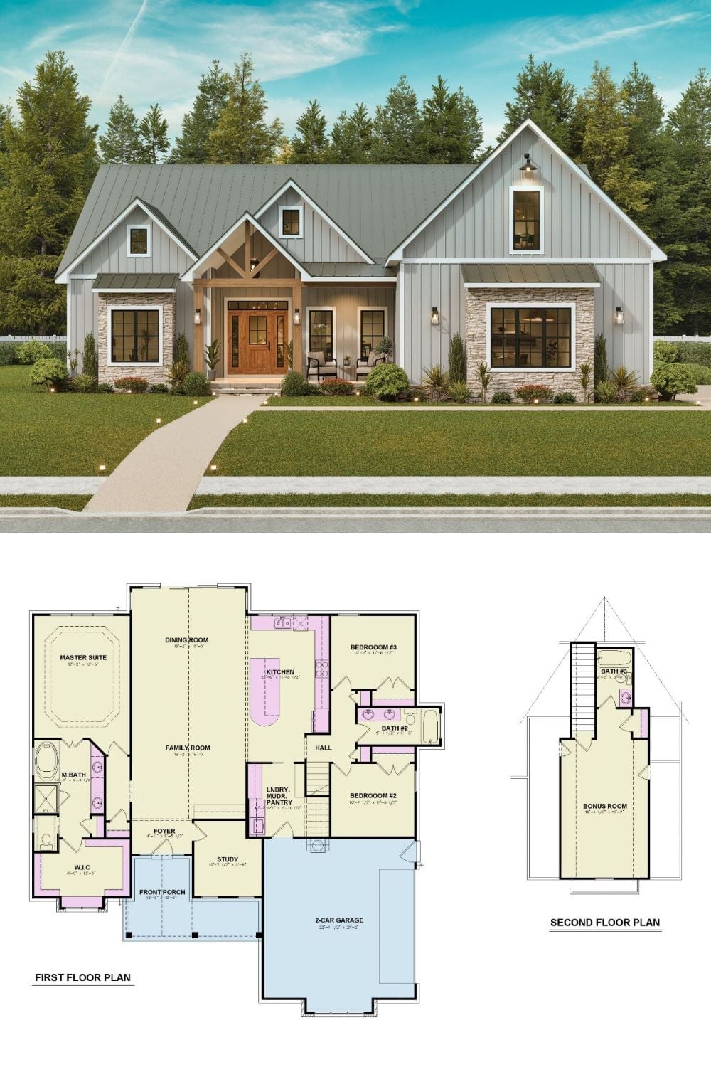
The exterior rendering shows a board-and-batten farmhouse with stone accents, a covered entry, and a metal roof. Below it, the first-floor plan lays out a master suite, family room, kitchen, two additional bedrooms, and a laundry-mud-pantry zone. A smaller second-floor inset shows the bonus room and Bath #3.
