
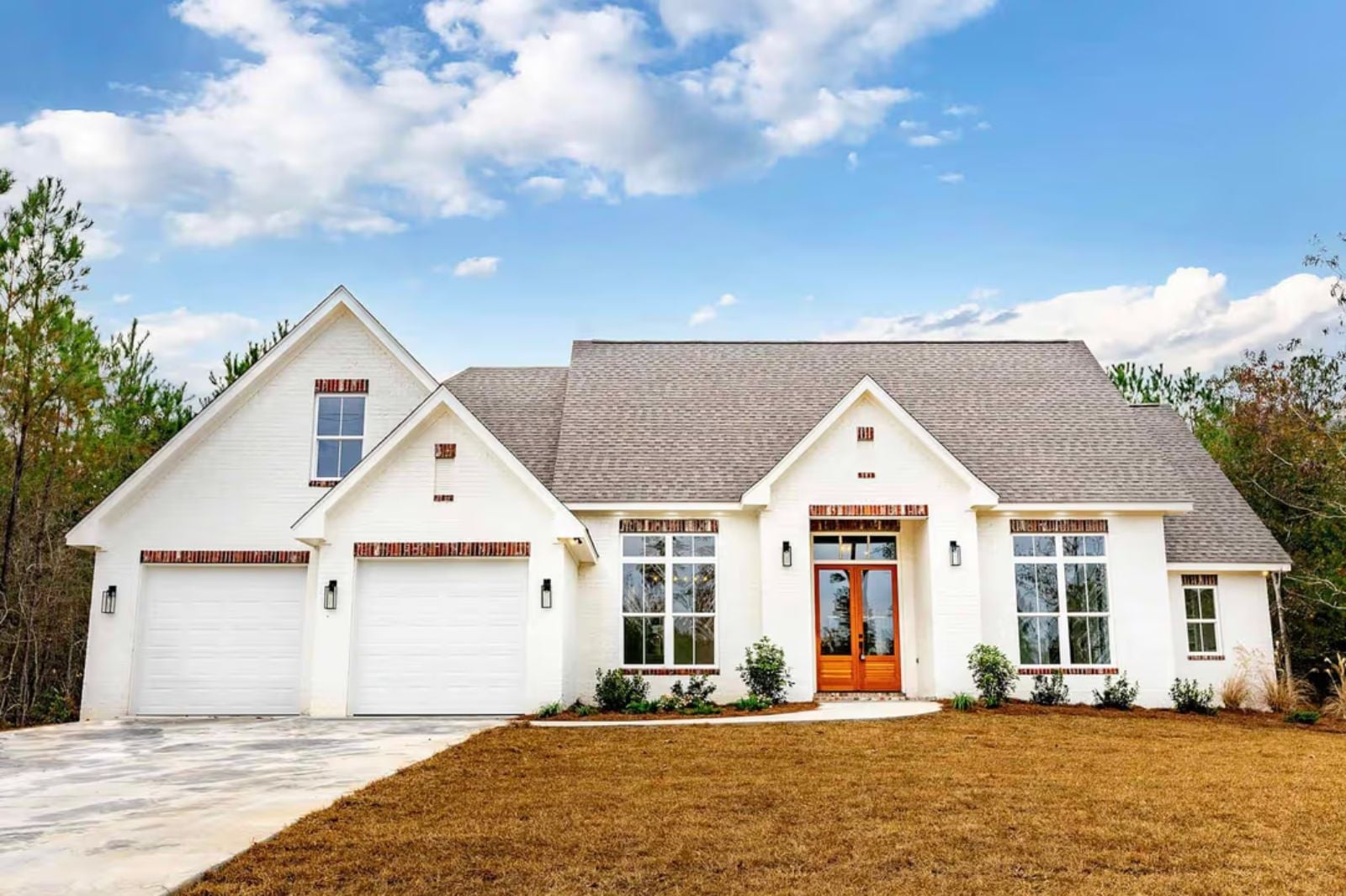
Everyone had a bonus room growing up, even if nobody called it that — the room above the garage, or off the back hallway, where homework got abandoned, and sleepovers happened, and the noise could drift away from the adults. The Whitebrick is built around that idea: an open main living area that pulls the family together, a kitchen island that holds three conversations at once, a primary suite set apart from the rest, and a bonus room that finally gives the oldest kid somewhere to go.
Specifications
- Sq. Ft.: 2,199
- Bedrooms: 3
- Bathrooms: 2
Floor Plan – Main Floor
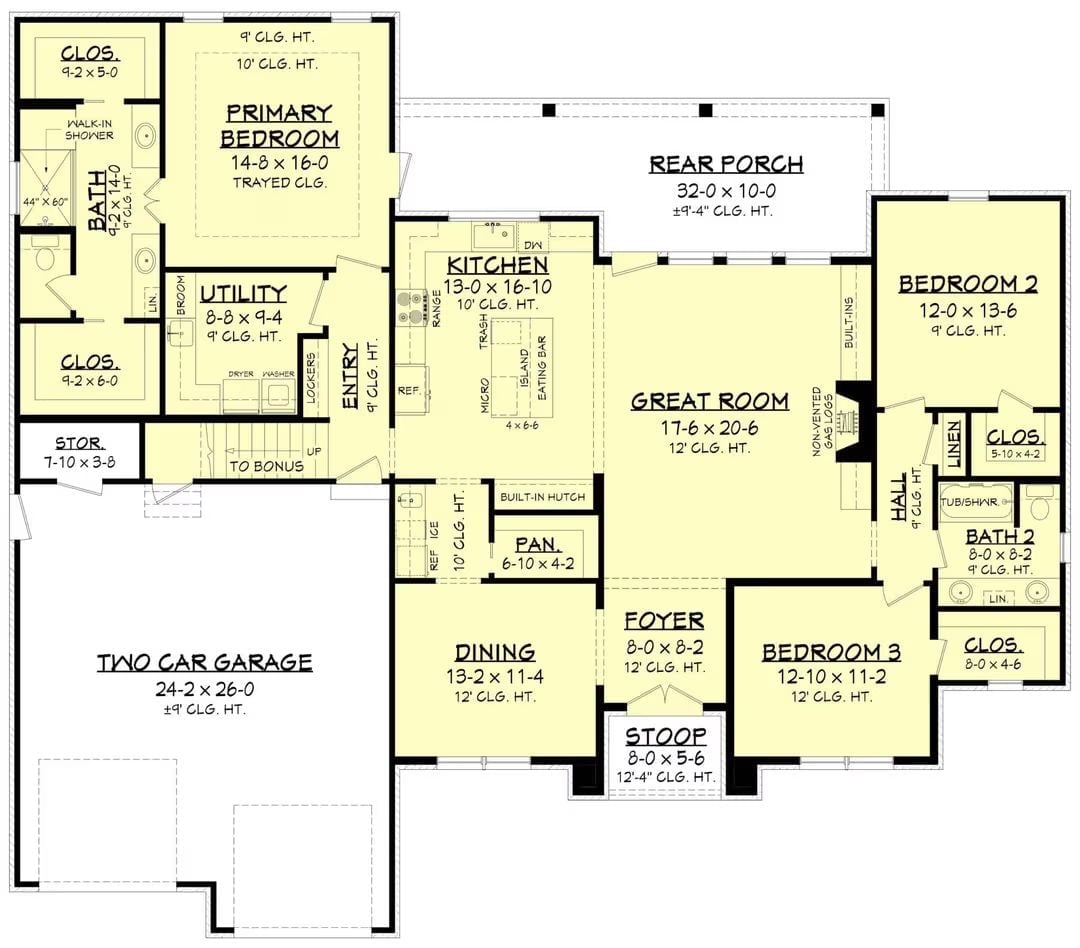
Three bedrooms, two full baths, open great room, kitchen with island, rear porch, utility room, and bonus room above garage.
Floor Plan – Bonus Room
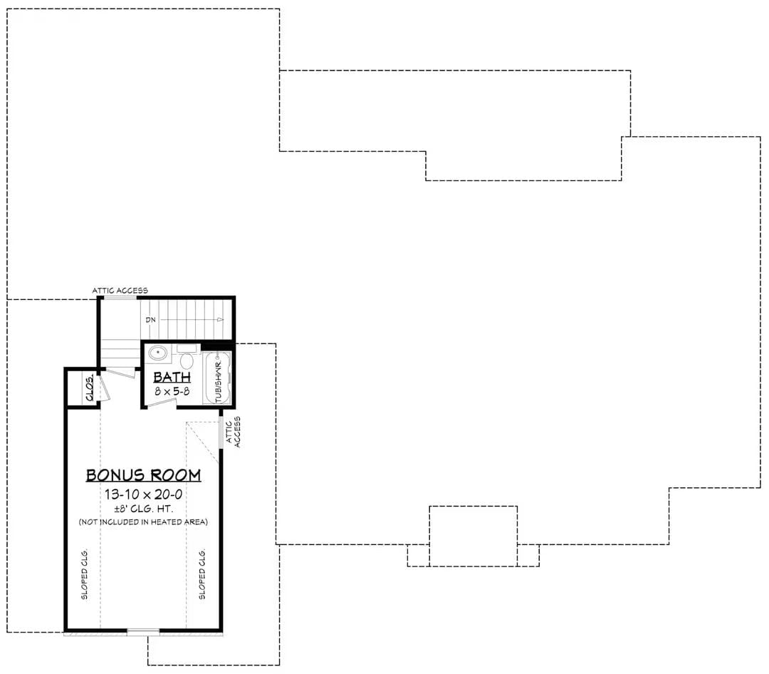
The bonus room runs 13-10 x 20-0 with sloped ceilings on both sides and attic access at two points. A compact bath and closet sit near the stair landing. Worth knowing: it’s not counted in the heated square footage.
Painted Brick and Cedar Posts Make a Case for Farmhouse Done Right
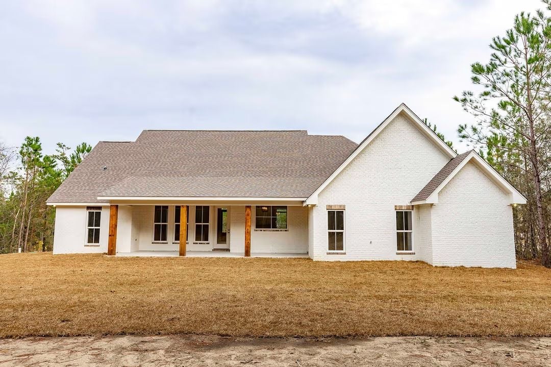
White painted brick holds its own without trying too hard.
The cedar porch columns are the real story. Raw and warm against all that bright white, they give the front elevation a texture you don’t usually get on a house this size — the kind of thing that reads as intentional rather than just picked from a catalog. The roofline pulls the whole structure together cleanly, and the dormant grass is winter, not neglect.
Built-In Mudroom Bench Earns Its Keep Right Off the Staircase
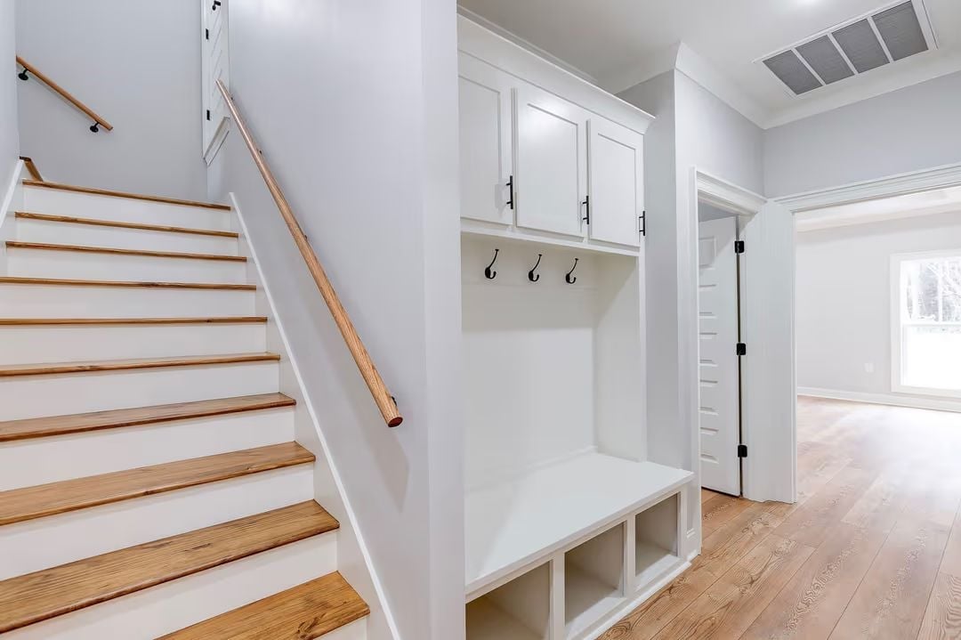
Shaker cabinets with black hardware sit above coat hooks and a bench with open cubbies below.
- 1. Black double-prong hooks keep coats from piling on the bench
- 2. Open cubbies at the base hold shoes without a door to fumble with
- 3. Upper cabinet doors with inset panels add storage without crowding the space
Lantern Pendants and Matte Black Hardware Keep White Kitchens from Going Soft
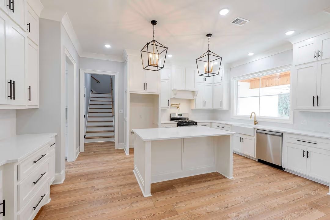
Quartz counters run across the island and perimeter without a seam in sight. The pot filler above the range is a small addition that earns its place every single morning. Two cage pendants anchor the upper space without competing with each other, and light hardwood floors stop the whole room from tipping into sterile territory.
Worth Knowing: White shaker cabinets paired with matte black hardware read as intentional rather than default because the contrast is sharp enough to look chosen. If you’re going this route, pull the hardware finish into at least one other fixture — the faucet is the easiest call — so it doesn’t feel isolated. The cage-style pendant here is doing similar work: tying the upper zone to the cabinet pulls without matching them exactly.
Walk-In Pantry Off the Kitchen Proves Square Footage Spent Here Pays Off
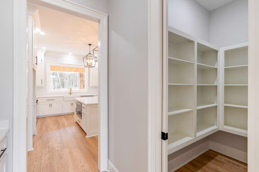
Built-in shelving wraps two walls, with darker flooring grounding the space against all the white paint beyond the door. Simple, and it works.
Editor’s Note: Pantry flooring that breaks from the main kitchen floor is a practical call, not just a stylistic one. Darker wood or tile hides spills and constant foot traffic far better in a space that gets used this hard. Budget the pantry floor separately — it’s a small line item that quietly prevents a lot of regret.
Tray Ceiling and Ceiling Fan Signal That This Primary Bedroom Means Business
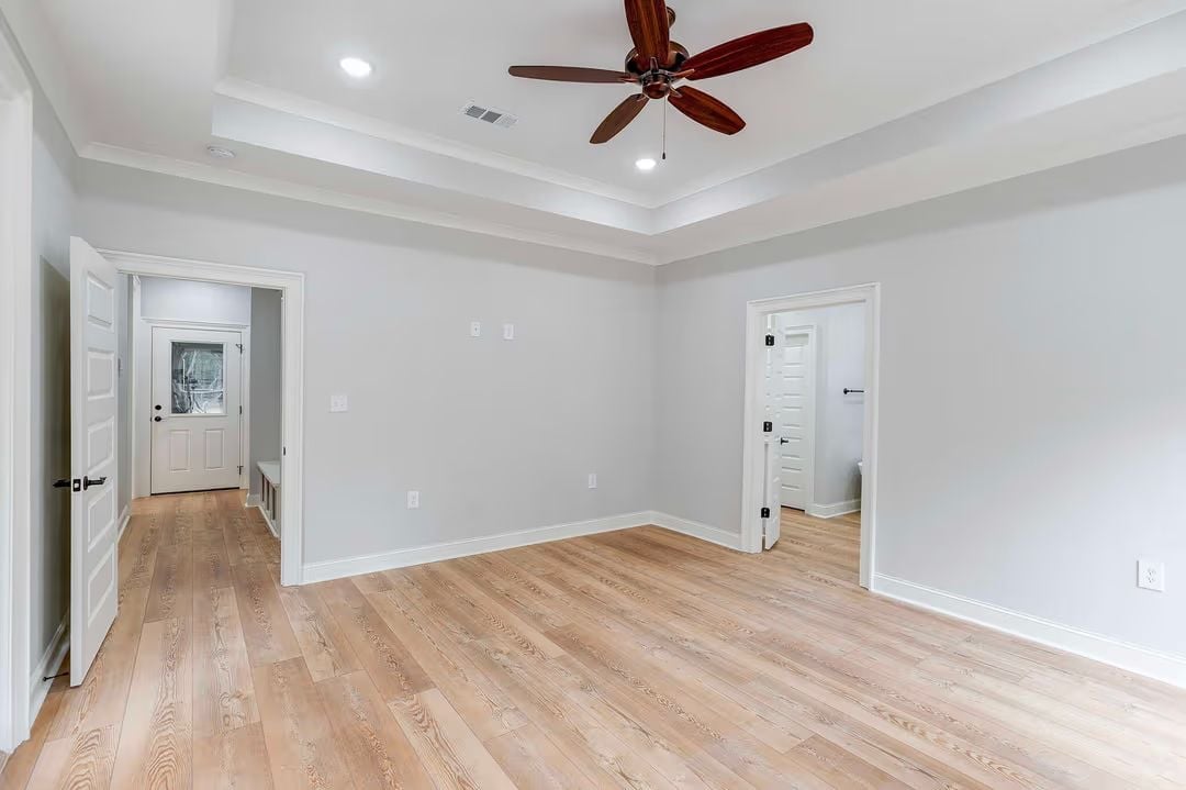
Light oak floors, soft gray walls, recessed lighting tucked into the tray. None of it shouts. The tray ceiling adds real height to what would otherwise be a standard box of a room, and the ceiling fan keeps things grounded — which, in a bedroom, matters more than people admit.
Style Math: Tray ceilings cost more to frame than flat ones, but they make standard ceiling heights feel taller than they actually are — useful in a primary suite where the proportions need to feel generous. Pairing one with a ceiling fan rather than a chandelier keeps the room functional day-to-day rather than dressed up for a photo. Bedrooms benefit from that tradeoff more than most spaces do.
Dual Vanities and Gold Fixtures Make Separate Sinks Feel Like the Only Option
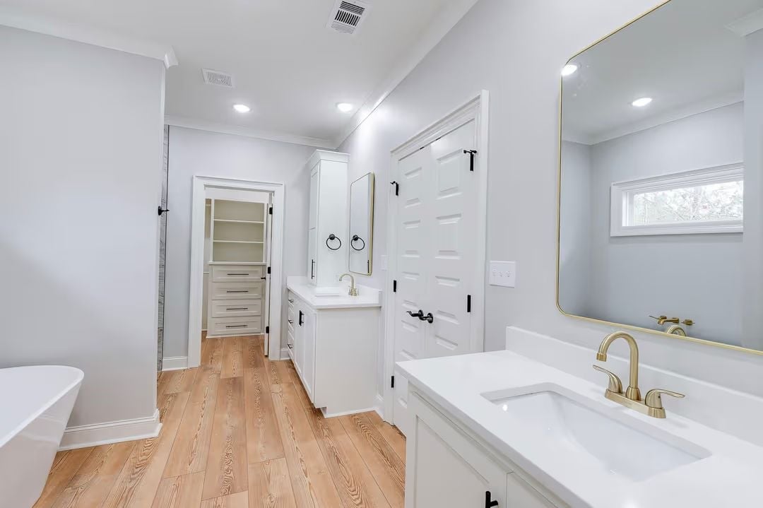
Warm wood-look floors do a lot of lifting here, softening the crisp white cabinetry so the room doesn’t read as a showroom. Brushed gold faucets pull the palette somewhere warmer without overcrowding the color story.
Try This: Dual vanities only work if two people can actually use them at the same time. Aim for at least 18 inches of counter space between the two sinks rather than splitting one continuous run straight down the middle — that gap is where the soap dispenser, the hand towel, and the one decorative thing you actually like all end up living. Skimp on it and the whole point of having two sinks starts to collapse.
Pin It
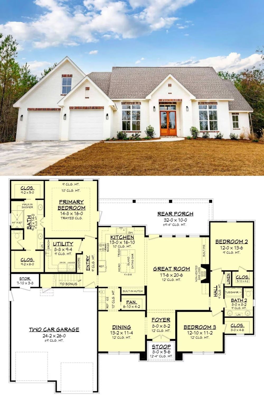
Exterior photo shows a white brick modern farmhouse with a three-car garage and wood front doors. The floor plan below details three bedrooms, a great room, rear porch, and a bonus room accessed from the utility area near the primary suite.
