
🔥 Would you like to save this?
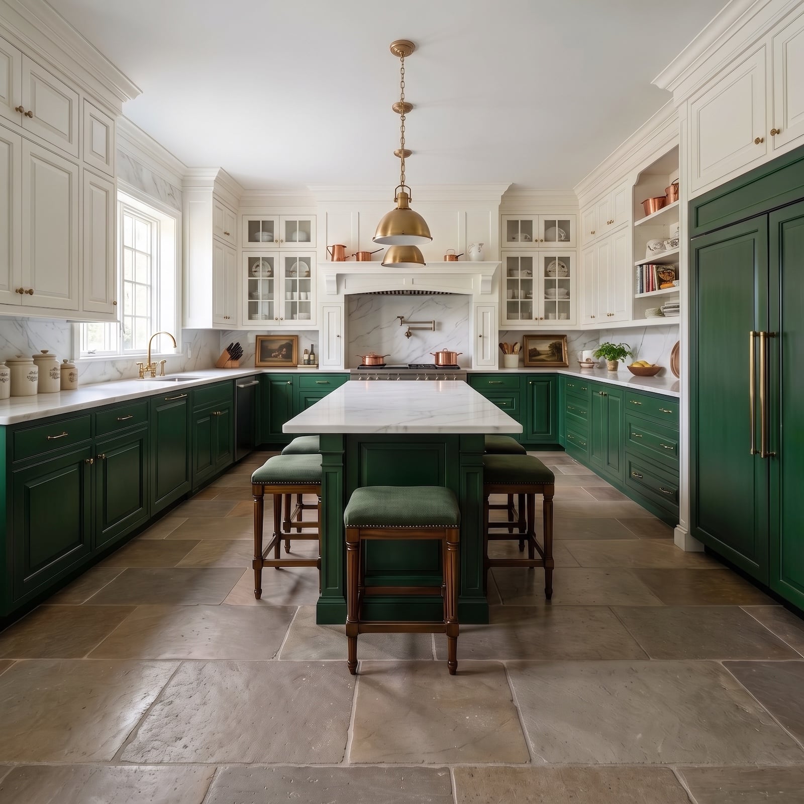
British Racing Green looks like the big decision. Give it a few minutes. The real drama starts afterward, when white cabinetry, oak floors, marble, beadboard, glass doors, copper cookware, velvet seating, chandeliers, and an occasional wall of uninterrupted green start changing what that color means.
In order to come up with the very specific design ideas, we create most designs with the assistance of state-of-the-art AI interior design software. Also, assume links that take you off the site are affiliate links such as links to Amazon. this means we may earn a commission if you buy something.
These 32 AI transformations all begin with the same dated kitchen, but they do not end in the same place. Some make one disciplined move and stop. Others push the room toward richer, darker, more architectural territory. A few barely seem related once the materials and proportions start shifting. That is where this gets interesting: not whether green works, but how many completely different kitchens can grow out of the same green.
Planning a renovation? Check today’s home equity line of credit rates as you explore financing options.
32. Hunter Green Lowers, White Glass Uppers, and Lighting That Breaks the Symmetry
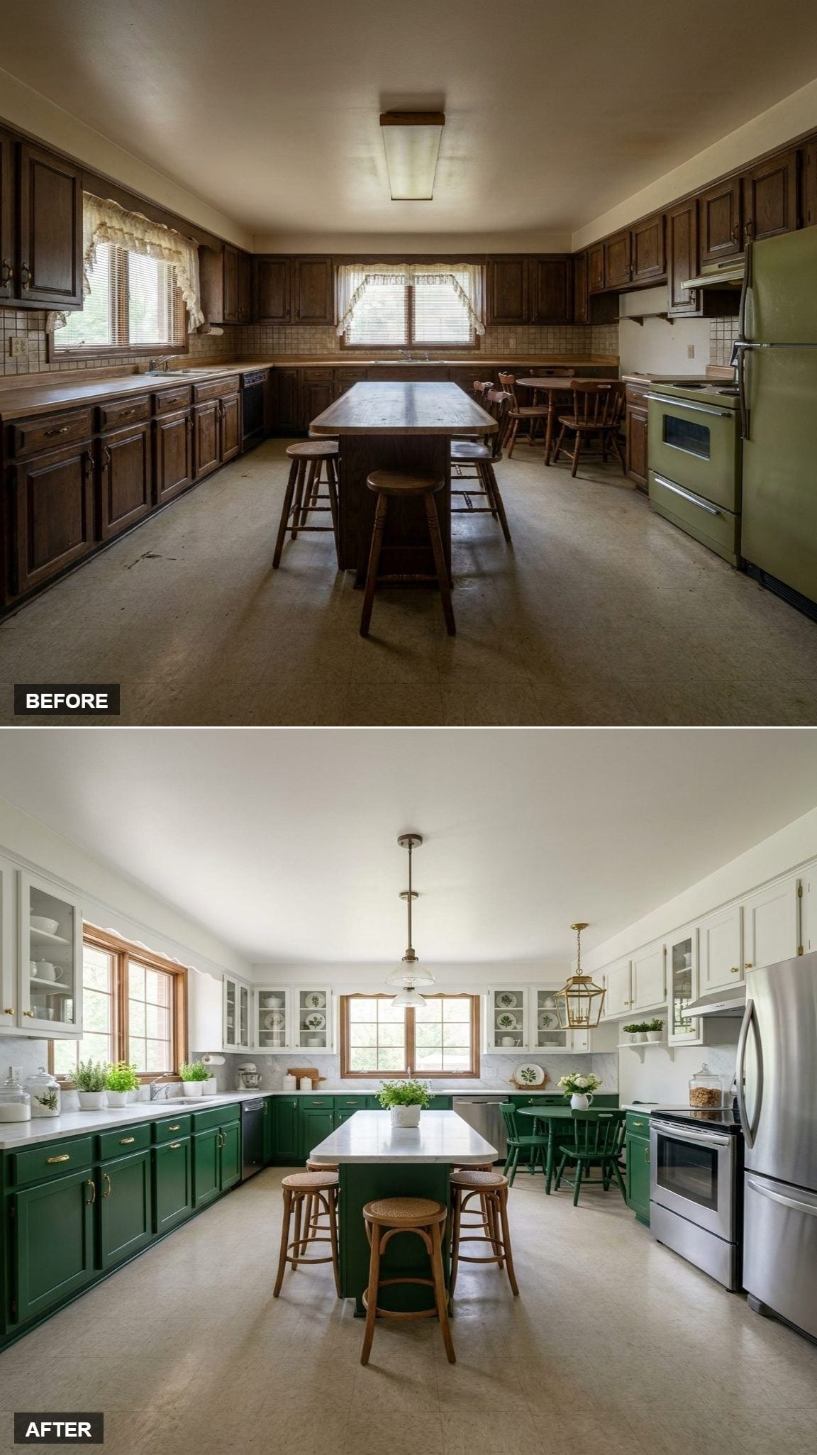
This is the clearest introduction to the basic idea: dark color below, white above, warm metal connecting the two. Then the lighting refuses to behave. A milk-glass globe and brass lantern hang at different heights, knocking just enough formality out of the composition to keep it from feeling showroom-perfect.
The bentwood stools are doing quieter work. Their warm grain takes the edge off the white quartz and painted cabinetry without demanding another color.
31. Forest Green Lower Cabinets and White Uppers Set the Basic Two-Tone Formula
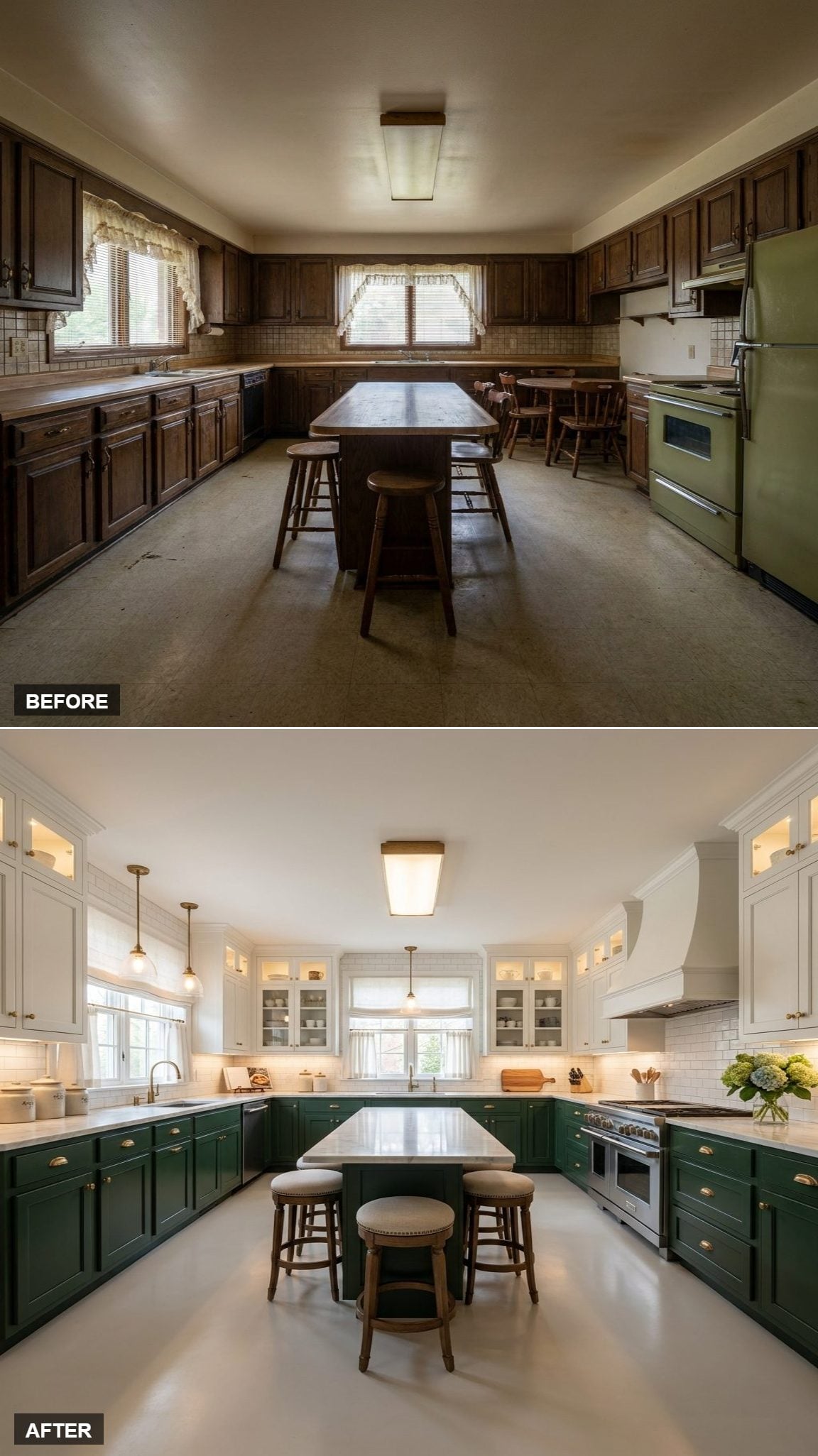
Dark green settles into the base cabinets and island while white glass-front uppers lift the visual weight off the walls. Instead of spreading one saturated color everywhere, the room keeps its depth concentrated below the work surface.
Brass bin pulls provide a warm seam between the two halves. This is the uncomplicated version, useful because almost every transformation that follows starts bending one of these rules.
30. Inset Green Cabinets Took the Palette Nearly Monochromatic
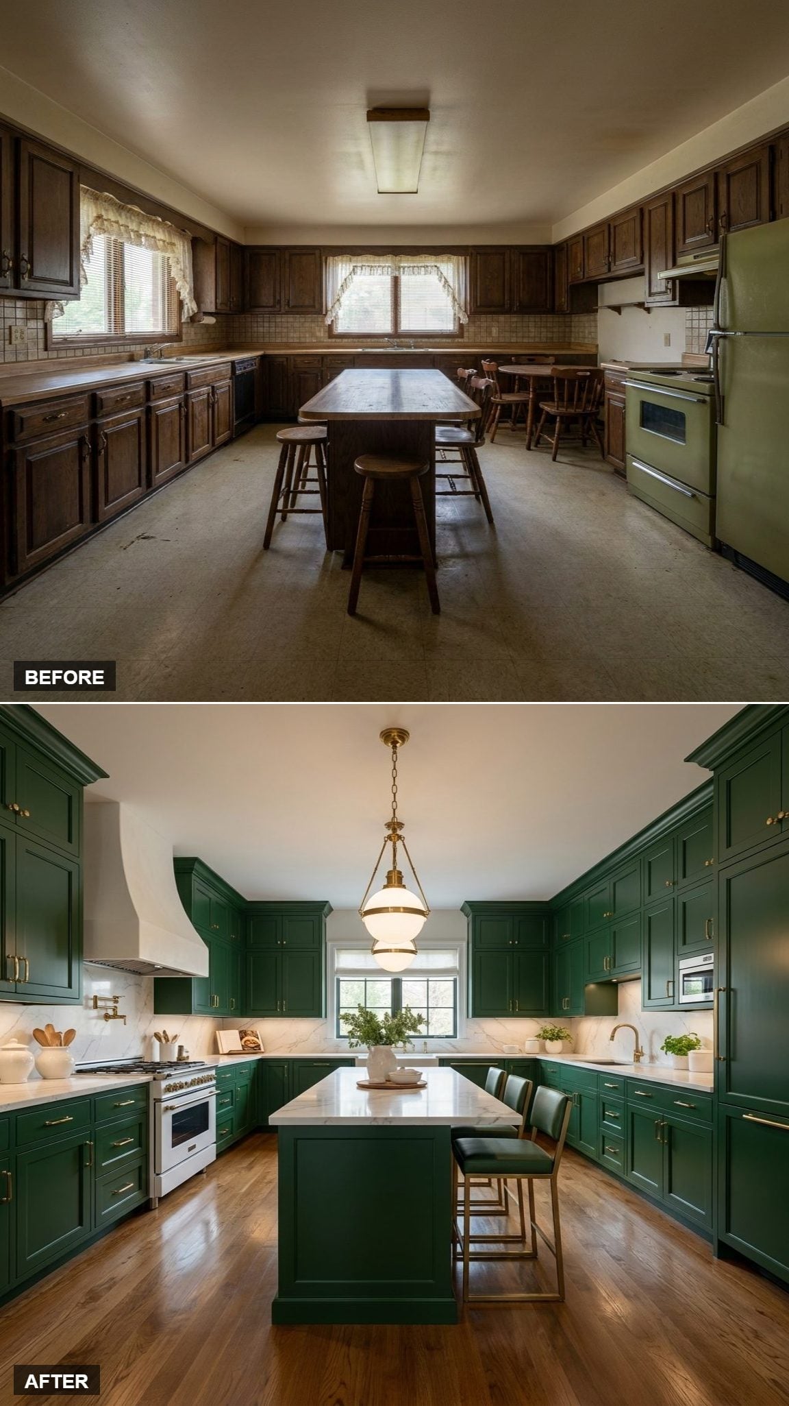
Then white stops being the escape route. Green inset cabinetry climbs higher and wraps more of the room, leaving pale stone rather than white cabinet doors to provide the contrast.
The change is dramatic. The room feels less like a two-tone renovation and more like built-in architecture. Oak flooring prevents all that green from turning cavernous, while small brass details flash against it rather than competing for attention.
29. A British Racing Green Island Moved the Color Into the Center of the Room
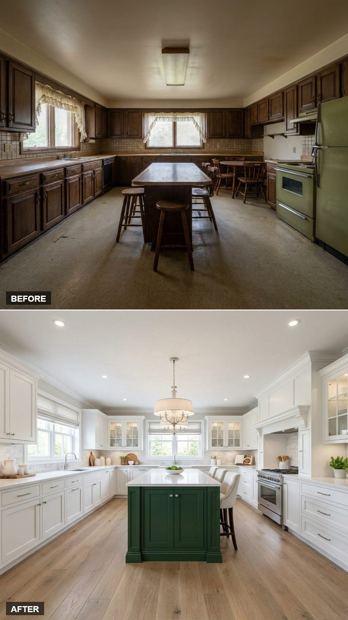
Instead of wrapping the perimeter in green, this design puts the strongest color exactly where the room converges. The island reads almost like a piece of furniture dropped into a much quieter white kitchen.
Recessed lighting handles the practical work. The drum chandelier handles everything else, giving the island the presence of a table rather than another stretch of counter.
28. Green Tall Cabinets on One Wall Broke the Two-Tone Kitchen Out of Its Horizontal Rut
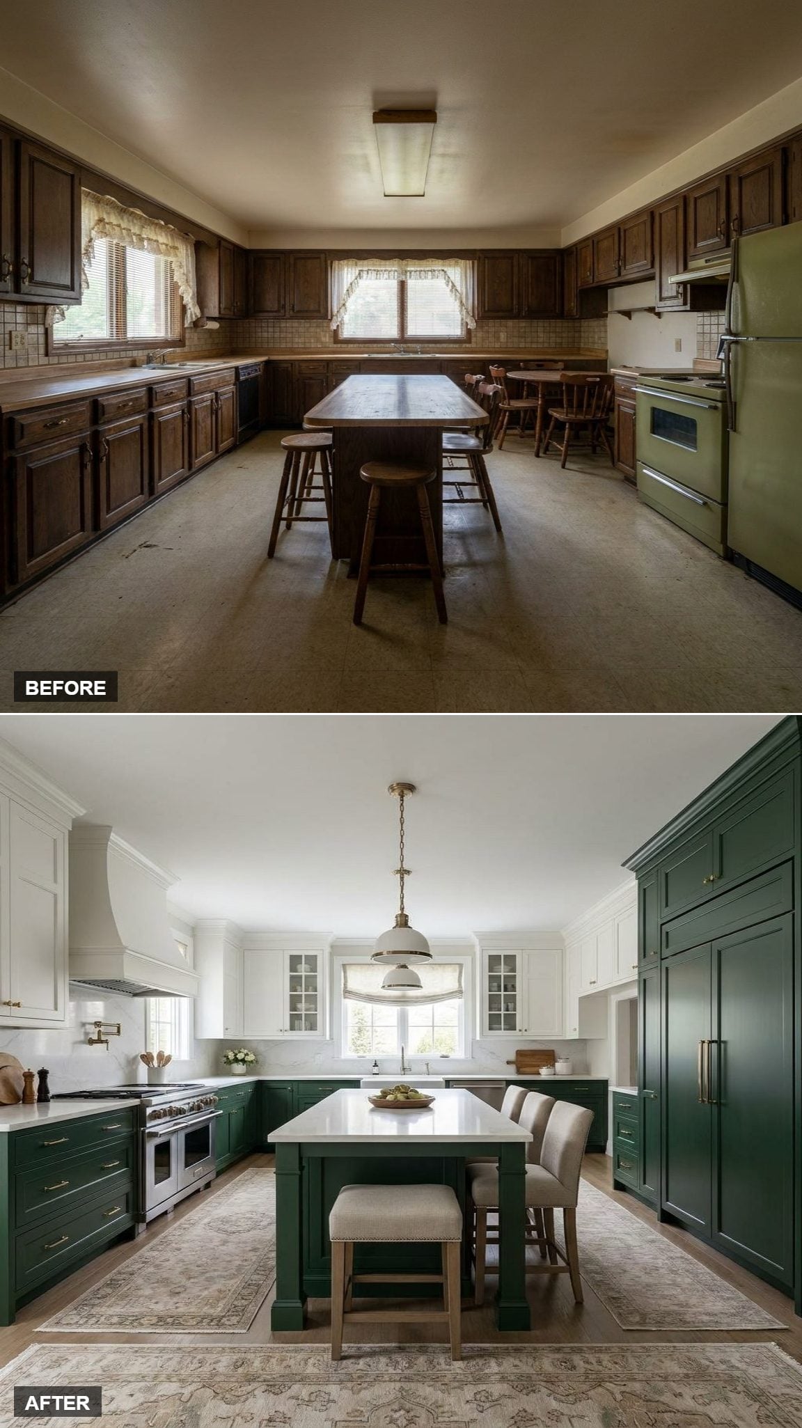
This time the green refuses to stay below the counter. Tall cabinets rise along the right wall while the rear cabinetry stays light, creating an asymmetrical block of color that changes the room more decisively than another shade adjustment ever could.
The marble-topped island sits between the two zones rather than fully belonging to either one. That tension is exactly what gives this version some bite.
27. Chrome Lighting Snapped the Kitchen Out of Its Long Brass Habit
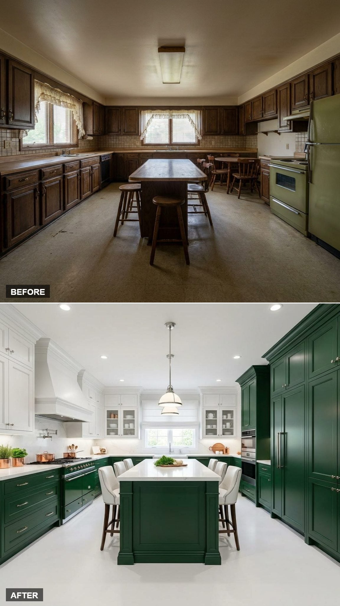
After enough warm brass, one cool metal finish can reset the whole palette. The chrome pendant makes the green and white look crisper and less traditionally dressed without requiring a single cabinet to change color.
Green towers on the right provide density while glass-front white uppers keep the opposite wall lighter. Upholstered stools take some of the chill back out again.
26. A Marble Slab Backsplash and Butcher-Block Island Changed the Material Story
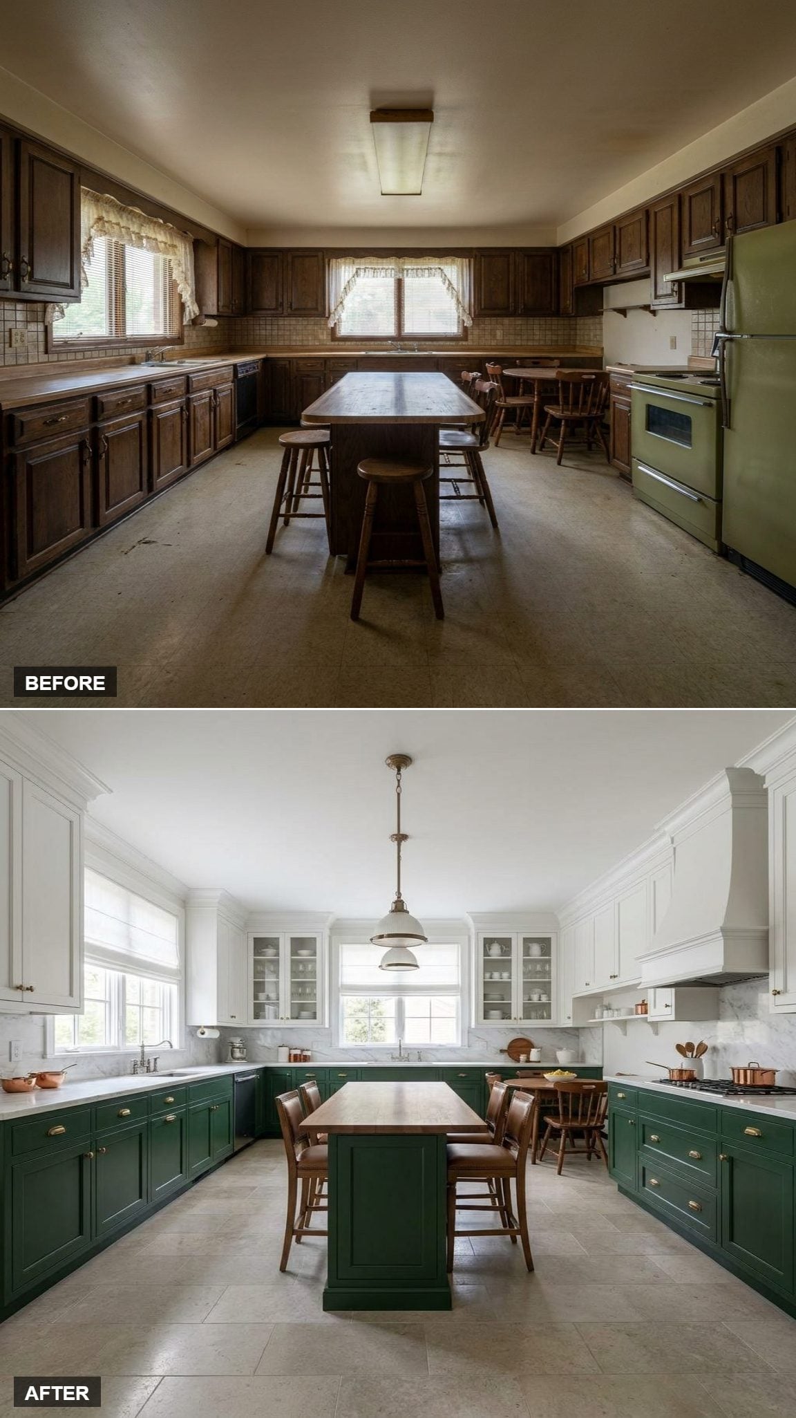
The cabinet colors are familiar. The surfaces are not. Marble rises behind the range while the island shifts to butcher block, bringing grain and warmth into the center instead of repeating polished stone everywhere.
Carved molding along the ceiling adds another layer of detail, making the white upper cabinetry feel built into the room rather than simply painted a different color.
Style Tip: Stone on the perimeter and wood on the island let the two surfaces play different roles. One reads crisp and durable; the other introduces warmth and grain exactly where the room needs relief.
25. White Beadboard Gave the Green Cabinets a Softer Counterpoint
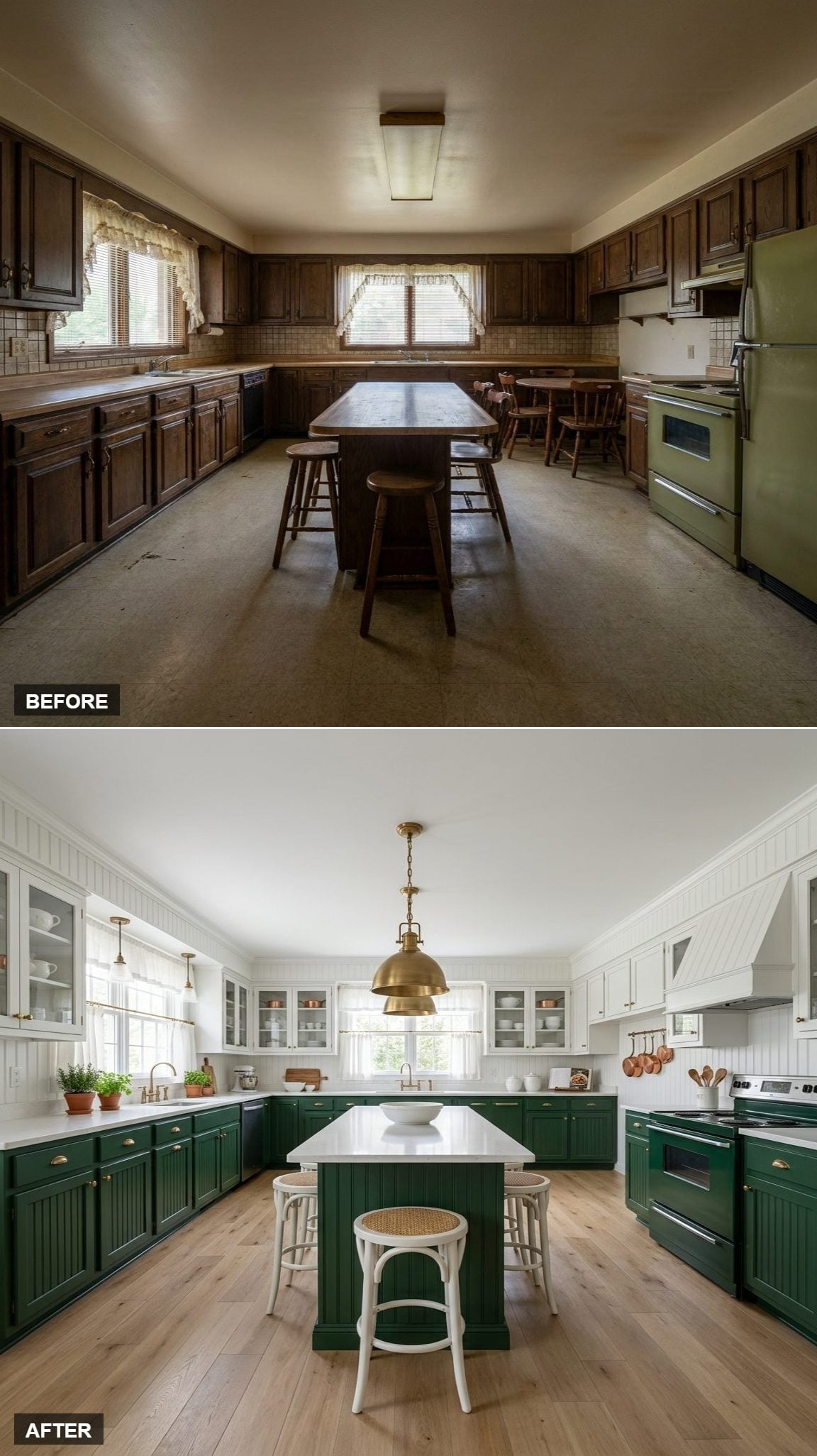
Beadboard changes the white surfaces without changing their color. Fine vertical grooves interrupt the broad painted planes and immediately make the room feel less formal.
Light oak underfoot continues that softer direction. The green stays deep, but nothing around it feels particularly precious.
24. A Herringbone Backsplash Added Movement Without Adding Another Color

White tile does not have to disappear. Turn it on an angle and suddenly the backsplash introduces movement while leaving the restrained palette untouched.
Leather stools add another texture at the island, making the room feel less like an exercise in green paint and white surfaces and more like an interior assembled from several materials.
23. Forest Green and White Took on a More Formal Mood Under a Brass Chandelier
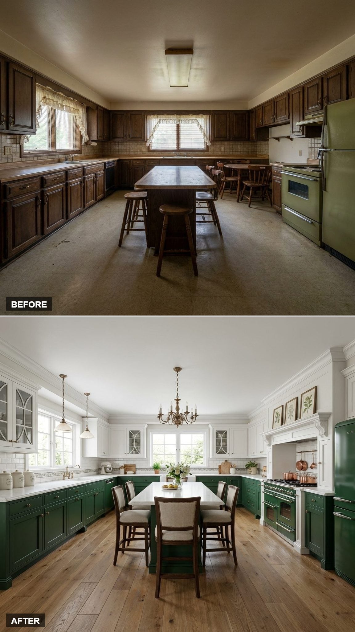
The green-below, white-above split is familiar by now. The chandelier changes its manners. A brass candelabra over the island makes the center feel less like a work surface and more like a proper room within the room.
Copper cookware, oak flooring, and subway tile stop the fixture from becoming an isolated piece of jewelry hanging in midair.
22. Recessed Lighting Let the Cabinet Color Become the Main Event
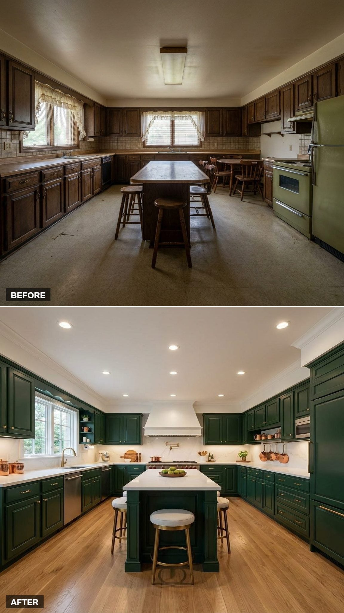
No oversized decorative fixture is competing for attention here. Recessed lighting spreads illumination across the work surfaces and lets the dark cabinetry occupy more visual territory without another large object hanging overhead.
A pale hood surround, herringbone backsplash, and white quartz carve bright openings through the green. Copper cookware adds warmth along the perimeter without becoming another design theme.
21. Hardwood Floors Took the Edge Off a Green-and-Stone Kitchen
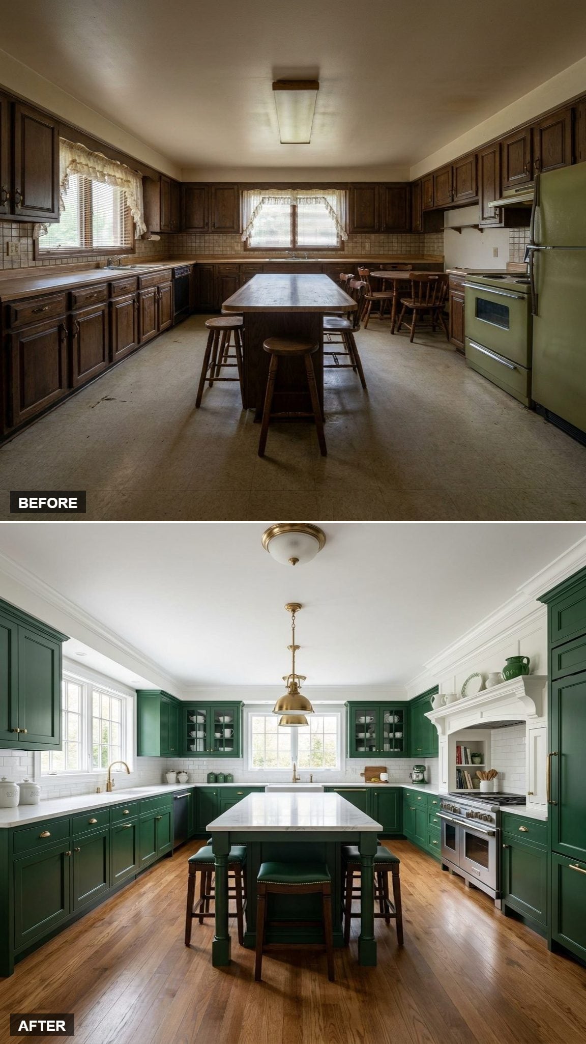
Deep painted cabinets and pale stone can become polished almost to the point of stiffness. Wood prevents that. Grain, tonal variation, and a warmer surface underfoot give the room something imperfect to push against all those clean cabinet lines.
The brass hardware reinforces that warmth while the pale island keeps the center from becoming one more slab of saturated green.
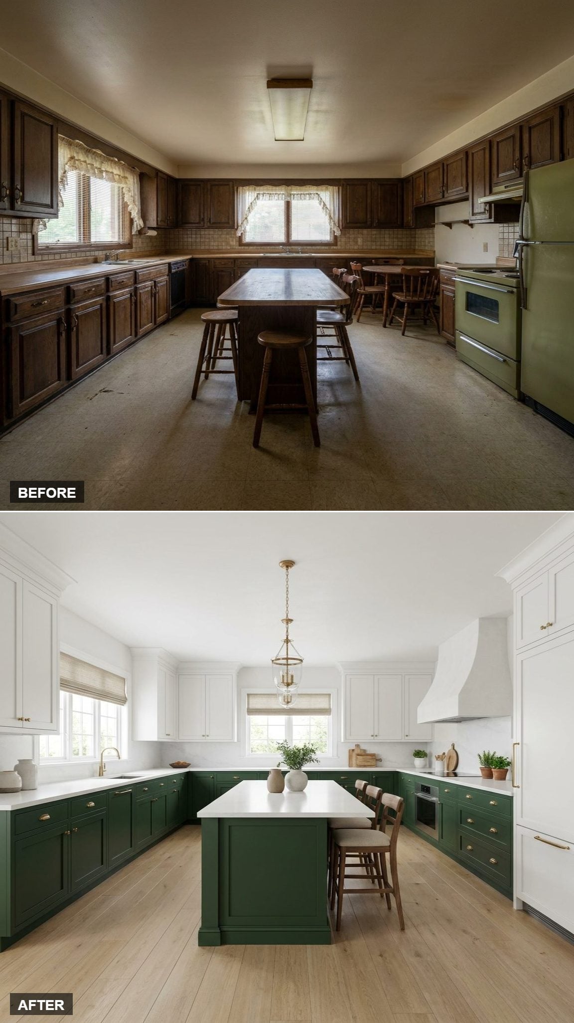
20. Oak Flooring Added a Third Temperature to the Green-and-White Split
🔥 Would you like to save this?
The cabinets divide cleanly: green below, white above. Oak prevents that split from feeling diagrammatic.
The floor sits between the cool depth of the green and the brightness of the white, while brass repeats the warmer note higher in the room. A simple cabinet palette suddenly has more than two temperatures.
Color Story: Here the green reads cooler beside brass and oak. That warm-cool tension gives the room more depth than green and white could manage alone.
19. A Brass Globe Pendant Kept This Version Deliberately Quiet
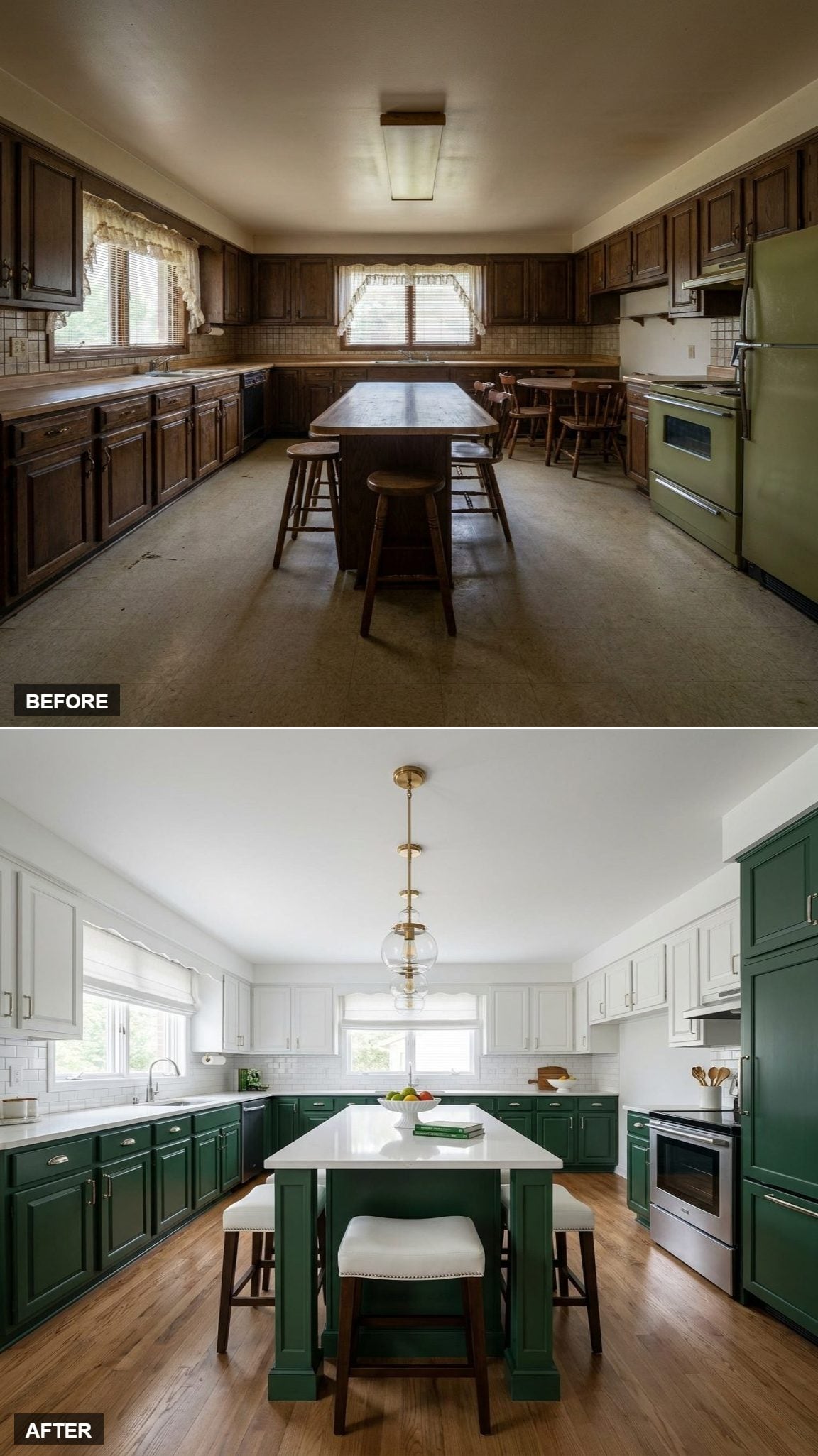
No chandelier, no sculptural installation, no ceiling drama. One globe pendant repeats the cabinet hardware and stops there.
That restraint suits a room already carrying green lowers, white uppers, oak flooring, and a bright quartz island. Another statement would have been one decision too many.
18. Six Dining Chairs Turned the Island Into Something Closer to a Table
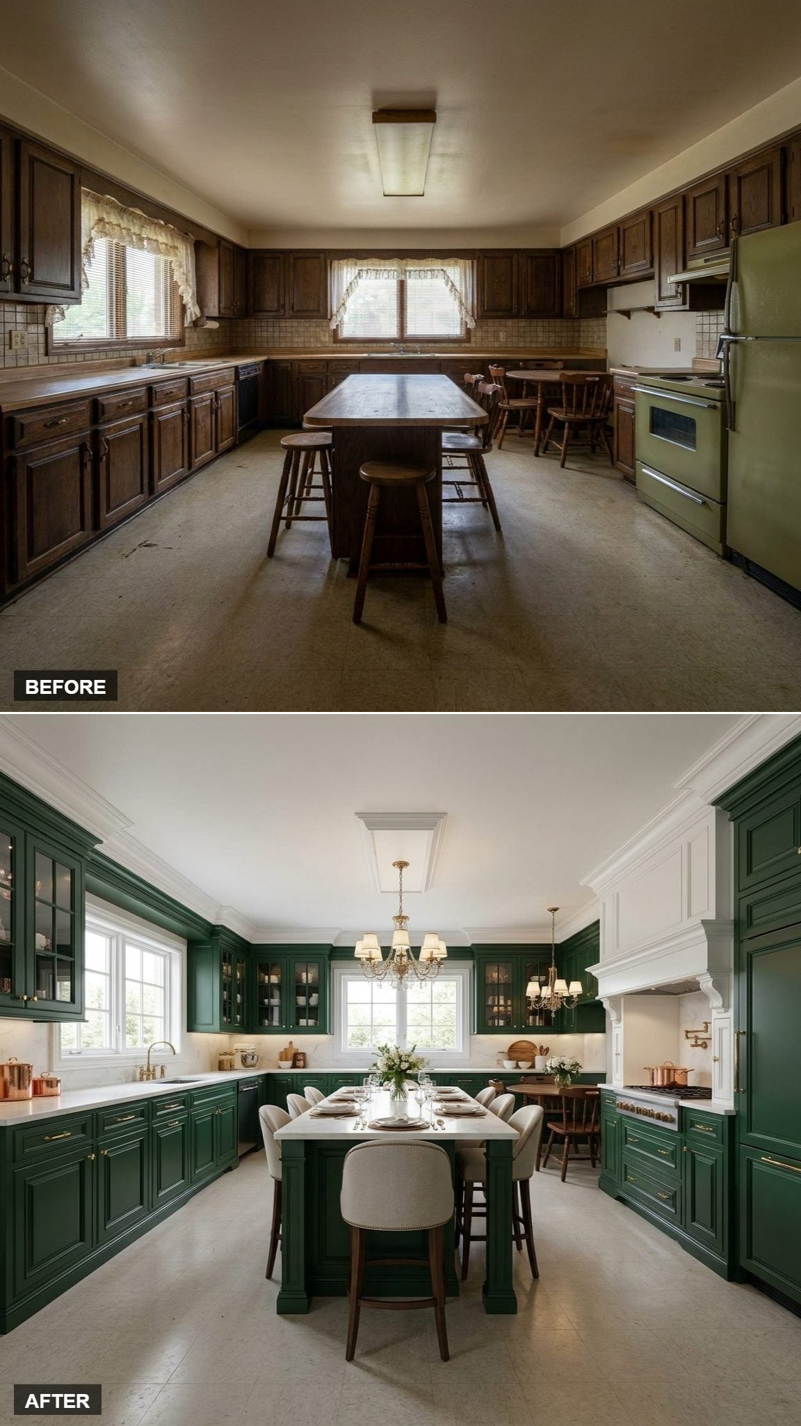
The standout move here has almost nothing to do with paint. Six upholstered dining chairs gather around the island, pushing it well beyond the usual breakfast-bar role.
That changes the center of the kitchen from a place people face in one direction to something much closer to a communal table. The green cabinetry becomes background architecture while the island becomes the social plan.
17. A Pale Tile Floor Made the Dark Cabinets Look Sharper
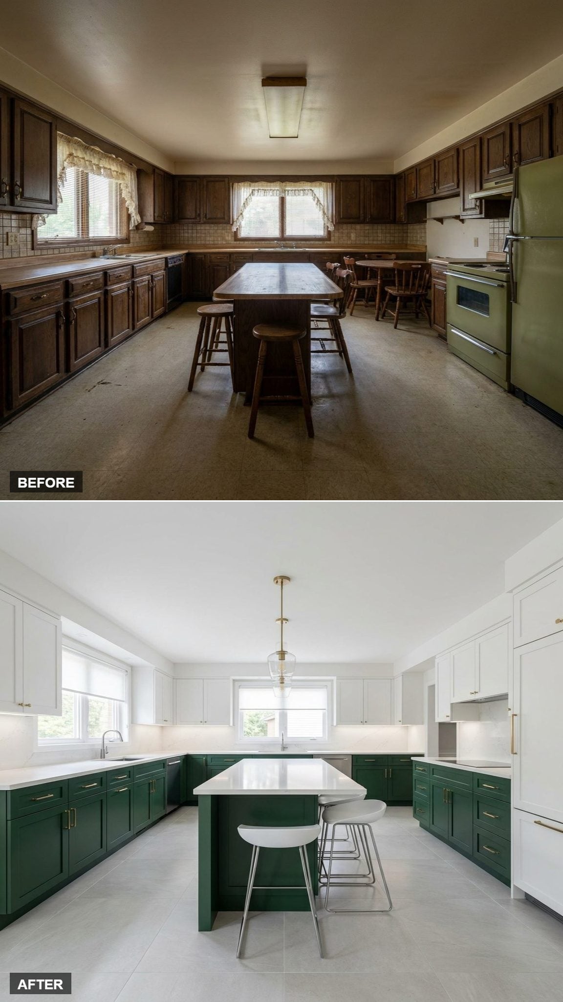
Take away the warm wood floor and the palette changes immediately. Pale gray-white tile makes the green look darker, cleaner, and more graphic.
The matching island keeps the lower color continuous, while the light floor creates such a broad bright plane that the ceiling lighting can stay comparatively simple.
16. A Chandelier Made This Version Feel More Like a Room Than a Work Zone
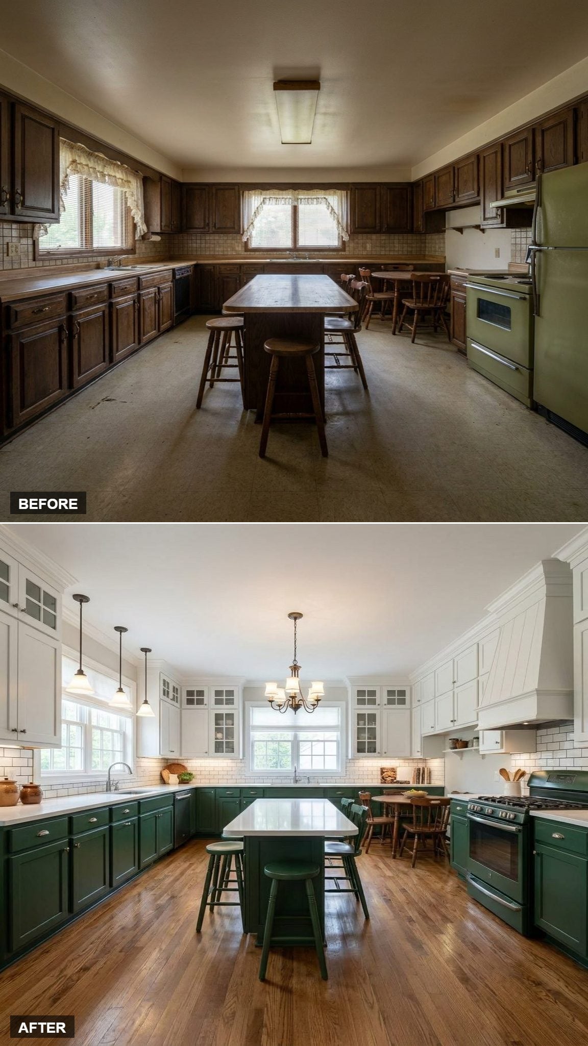
The cabinets stay familiar, but the fixture changes the atmosphere. Suspended above the island, the chandelier borrows more from a dining room than a task-lighting plan.
Hardwood reinforces that residential softness while the subway backsplash stays deliberately unremarkable behind everything else.
15. A Custom White Hood Gave the Range Wall Its Own Architecture
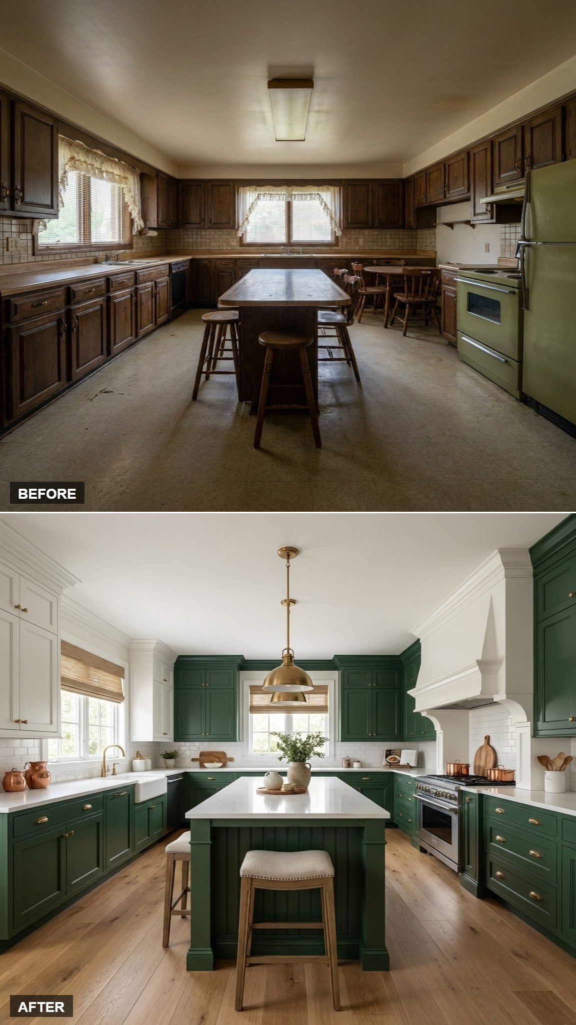
The hood is the move. Its pale surround cuts into the darker cabinetry and gives the range a clear frame rather than letting appliances dissolve into a long run of doors and drawers.
Across the room, the farmhouse sink beneath the window provides another architectural pause. The island can stay quieter because the perimeter already has somewhere for the eye to stop.
14. A Painted White Floor and Jute Runner Changed the Kitchen From the Ground Up
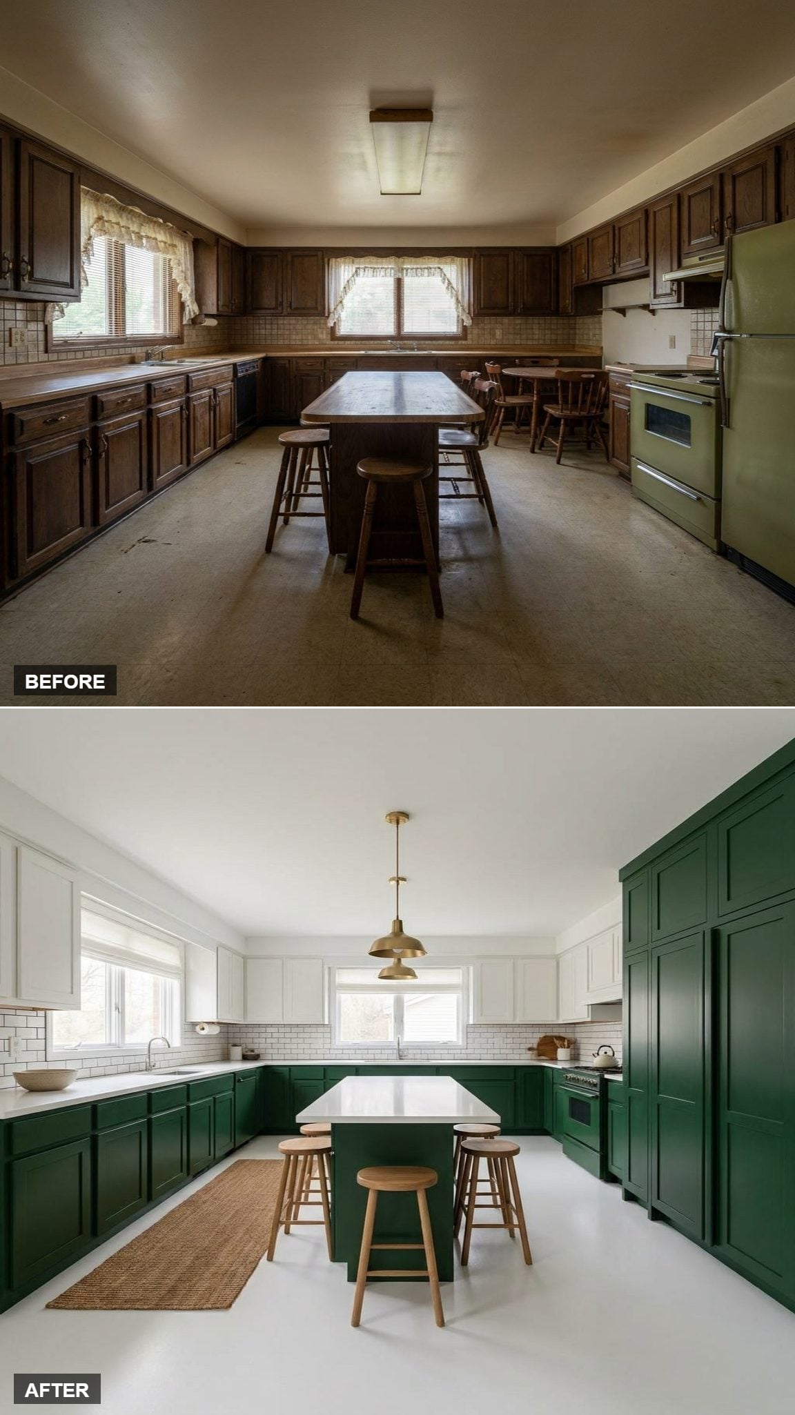
The cabinets are still green and white, but the floor changes their relationship completely. Painted white pushes the entire room brighter, then a jute runner puts back some of the warmth and texture the paint removed.
Raw wood stools continue that casual note at the island. The result feels lighter and less polished than the marble-and-hardwood versions.
Proportion Check: A pale floor exaggerates the difference between the light shell of the room and the darker cabinetry, making the green read almost like a band running through the space.
13. Glass-Front Uppers Broke Up a Long Wall of White Cabinetry
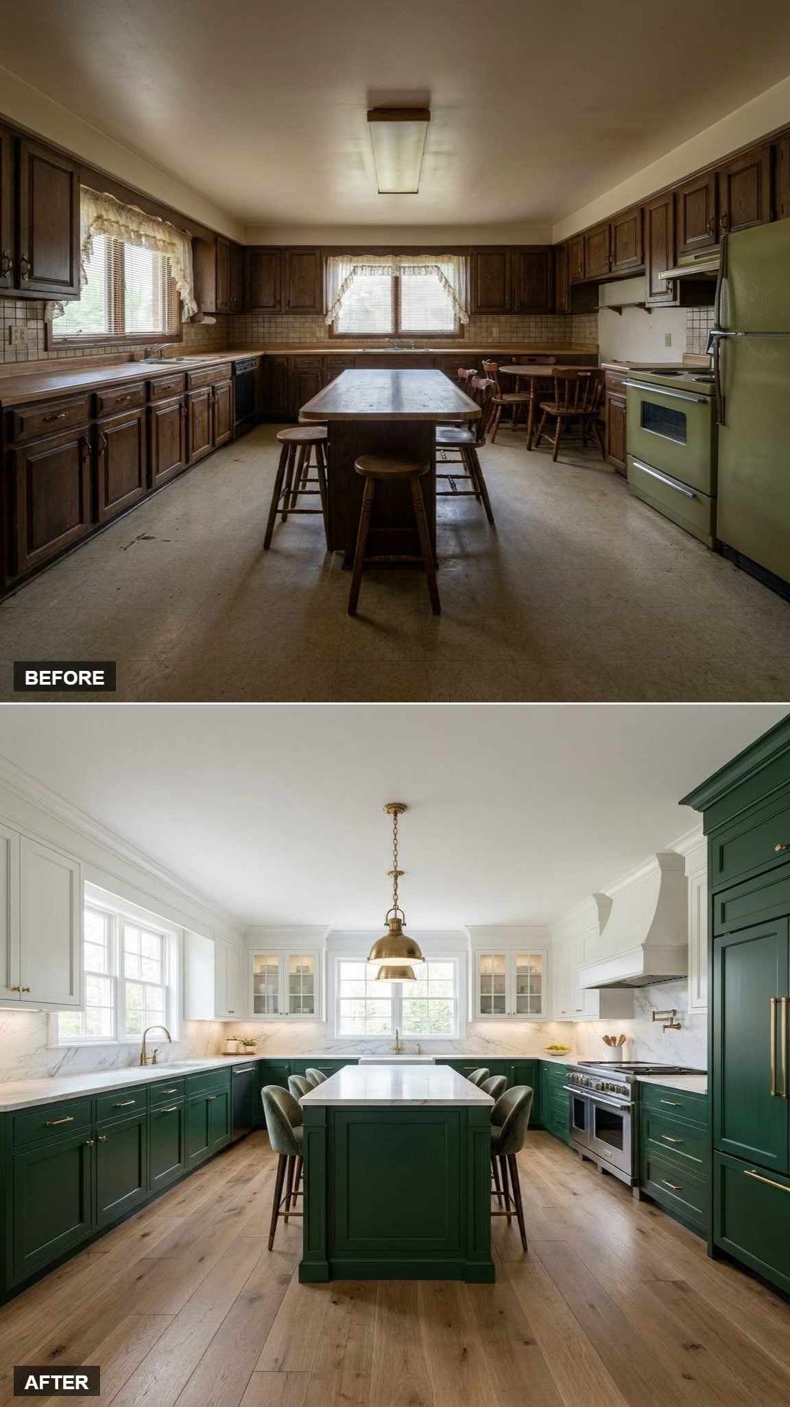
White cabinets can become visually solid too. Glass doors interrupt that run and introduce shadows, objects, and depth behind what would otherwise be one flat painted wall.
The custom hood on the right provides an asymmetrical counterweight to the sink side. Wide-plank flooring keeps the room from floating away into paint, glass, and stone.
Worth Knowing: Island lighting has to answer to the island dimensions, ceiling height, fixture shape, sightlines, and actual task-light needs. Sometimes one larger fixture is cleaner than three small ones. Sometimes it is not. Proportion matters more than a formula.
12. A Single Brass Pendant Let the Glass-Front Cabinets Carry More of the Detail
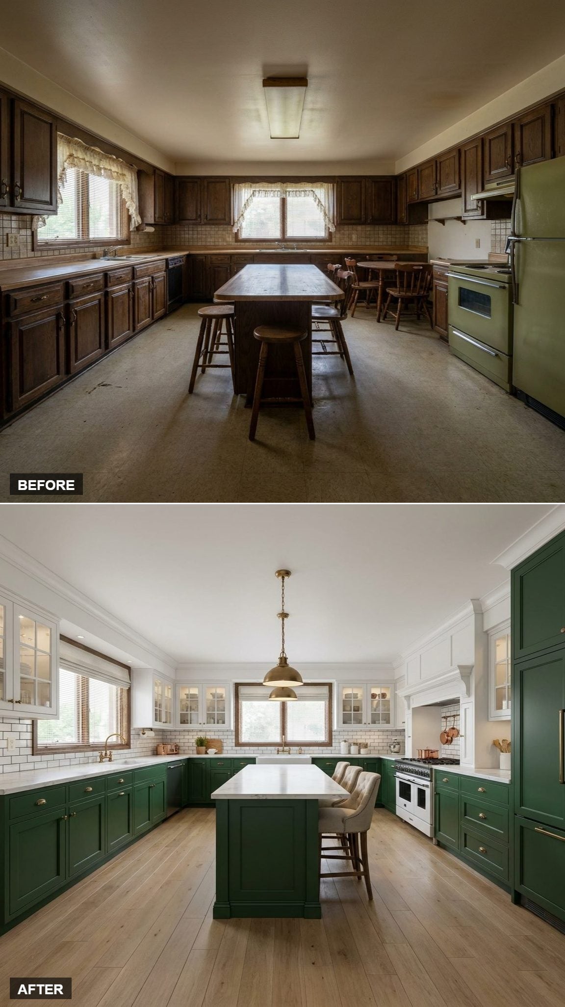
The white glass-front uppers already bring reflection, depth, and display to the back wall. Lighting does not need to compete with all of that.
One brass pendant stays restrained above the island. Subway tile and pale oak finish the room without introducing another visual argument.
11. A Green Island Repeated the Lower Cabinets Without Inventing Another Color
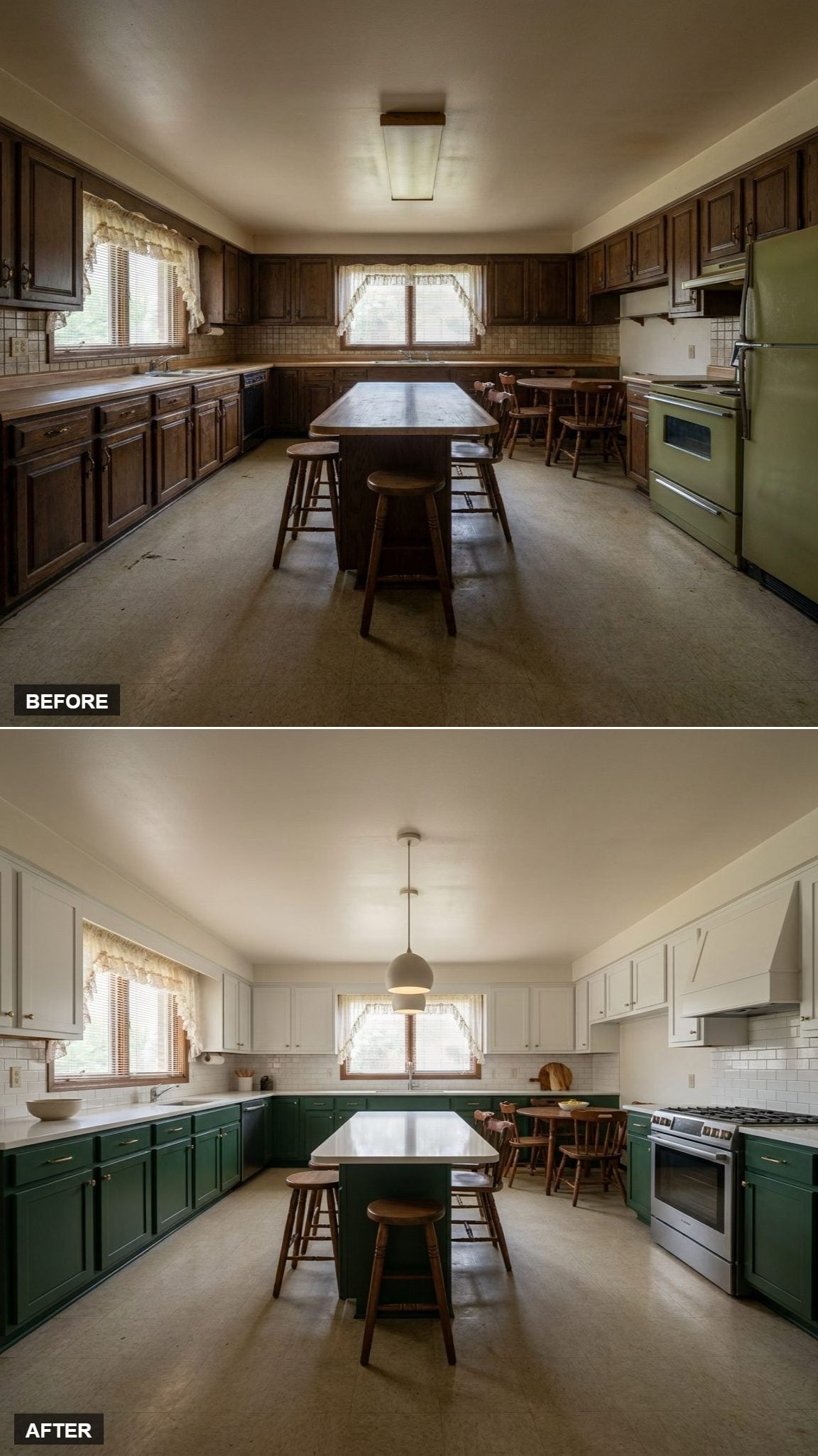
The island repeats the dark lower cabinetry, which makes the center feel connected rather than treated as a separate furniture piece.
White Shaker uppers and pale counters pull in the opposite direction overhead. Stainless steel at the range adds a cooler industrial interruption to a palette otherwise dominated by warm brass and painted wood.
10. A Drum Pendant Put More Visual Weight Over the Island
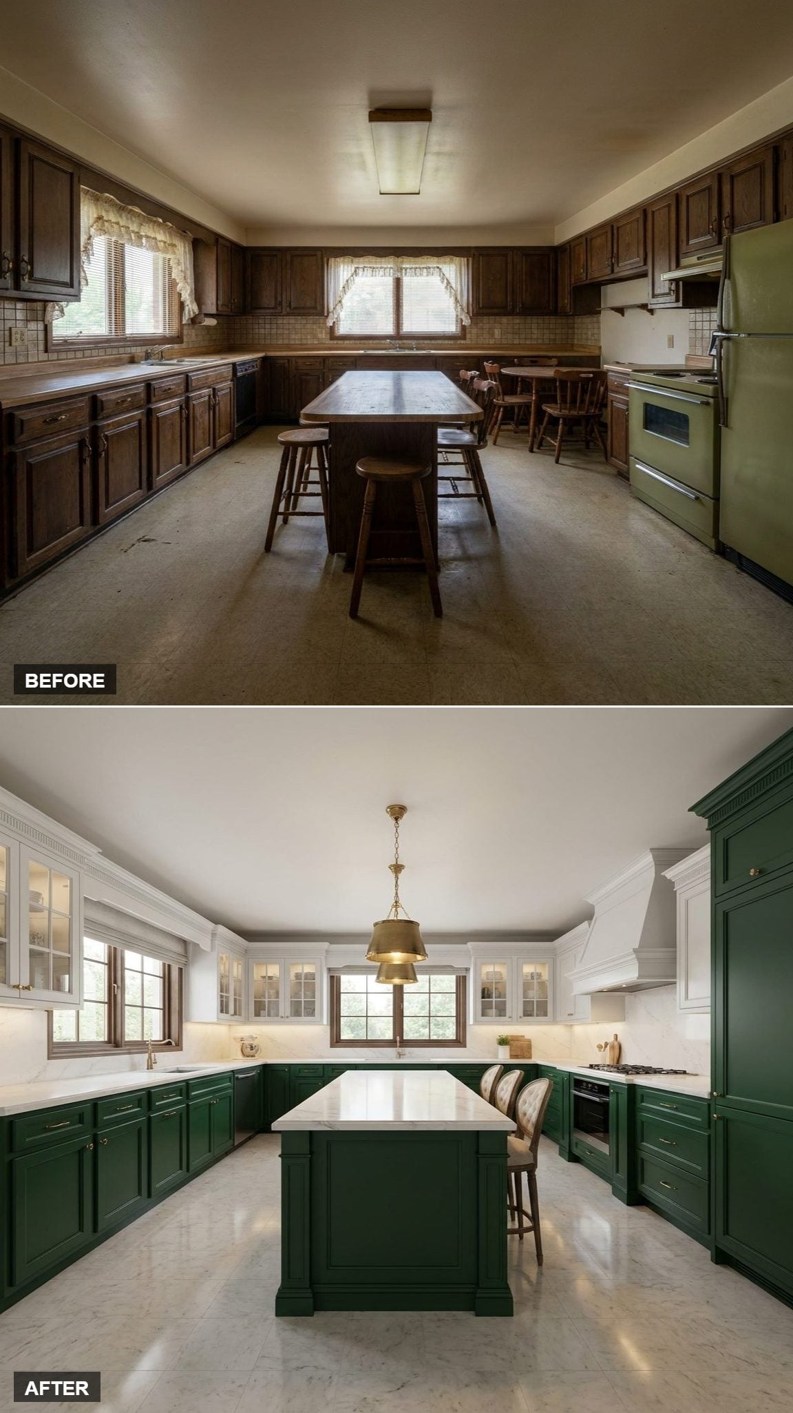
The broader drum shape changes the island more than another small globe would. It occupies enough space overhead to make the center feel substantial even though the cabinet arrangement remains familiar.
That rounded mass plays nicely against the crisp white hood at the right, giving the ceiling and cooking wall two very different silhouettes.
9. A Stone Island Shifted Attention Away From the Cabinet Split
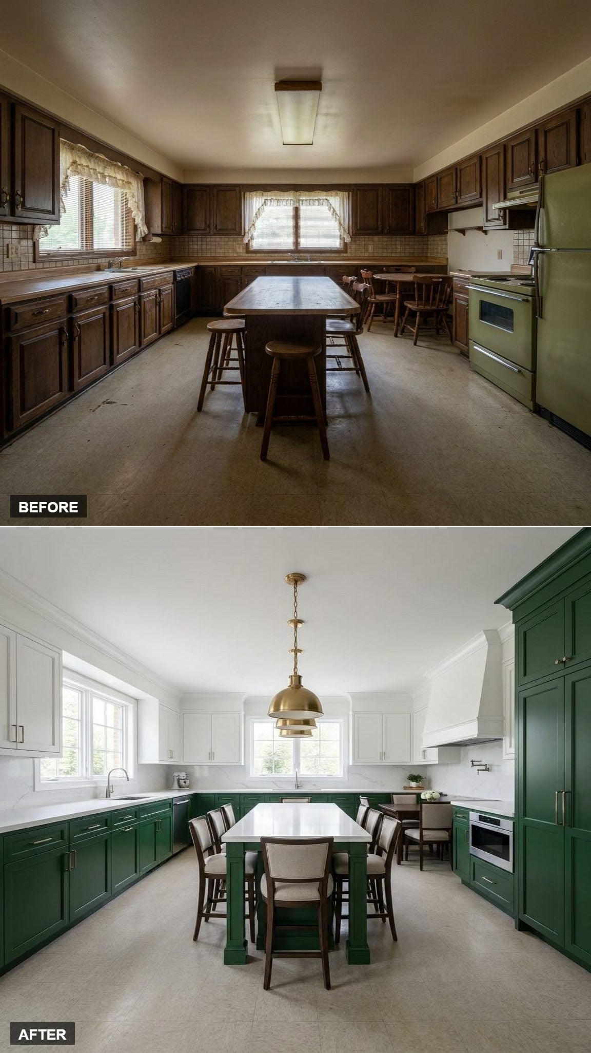
The broad pale stone surface becomes the strongest horizontal in the room. Instead of reading green lowers and white uppers first, the eye hits that bright center plane.
Brass repeats above and below, but this version is really about three stacked bands: dark cabinetry, pale stone, then light cabinetry overhead.
8. Leather Nailhead Stools Pushed the Island Toward a More Traditional Look
🔥 Would you like to save this?
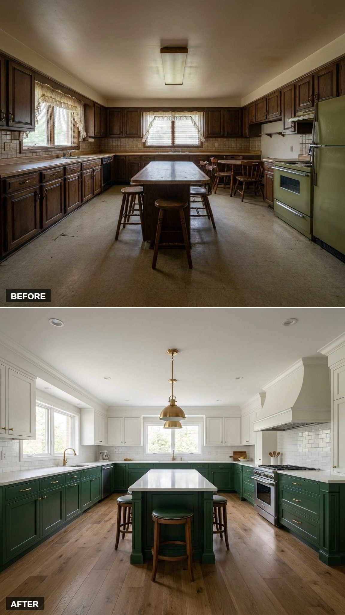
The seating changes the personality faster than another paint adjustment would. Leather seats with nailhead trim give the island a heavier, more traditional character against the green-and-white cabinetry.
Warm oak supports that direction while the subway backsplash sensibly stays out of the argument.
7. Copper Cookware Warmed the Green Without Painting Another Surface
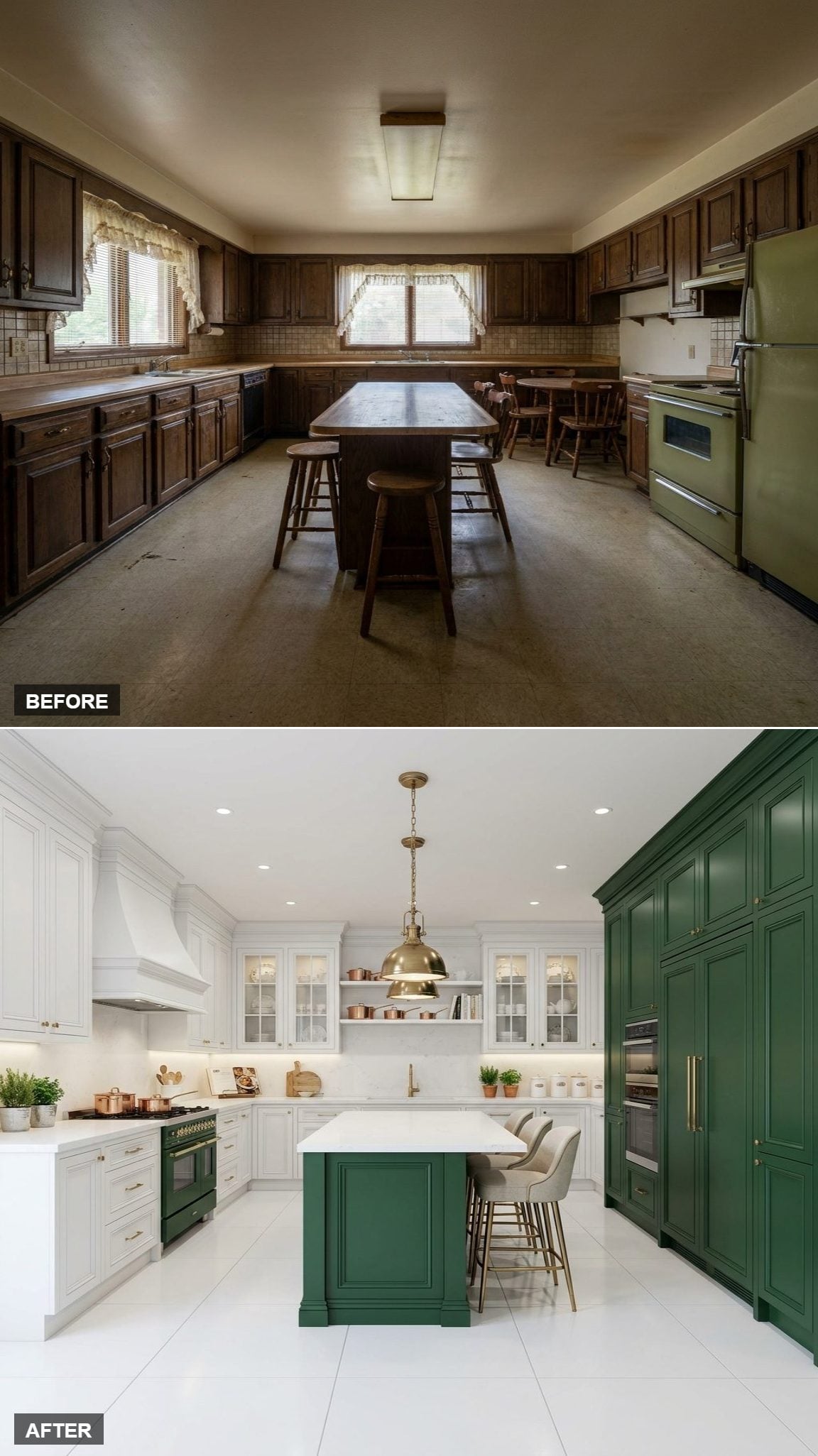
Copper brings a redder, richer warmth than brass, and that shift is immediately visible against deep green. Displayed between glass-front uppers, the cookware becomes part of the material palette whether it is used every night or never leaves the shelf.
Inset detailing adds shadow to the island base while continuous quartz prevents the room from splintering into too many competing surfaces.
6. Inset Glass Uppers Gave the Kitchen a Lighter Background
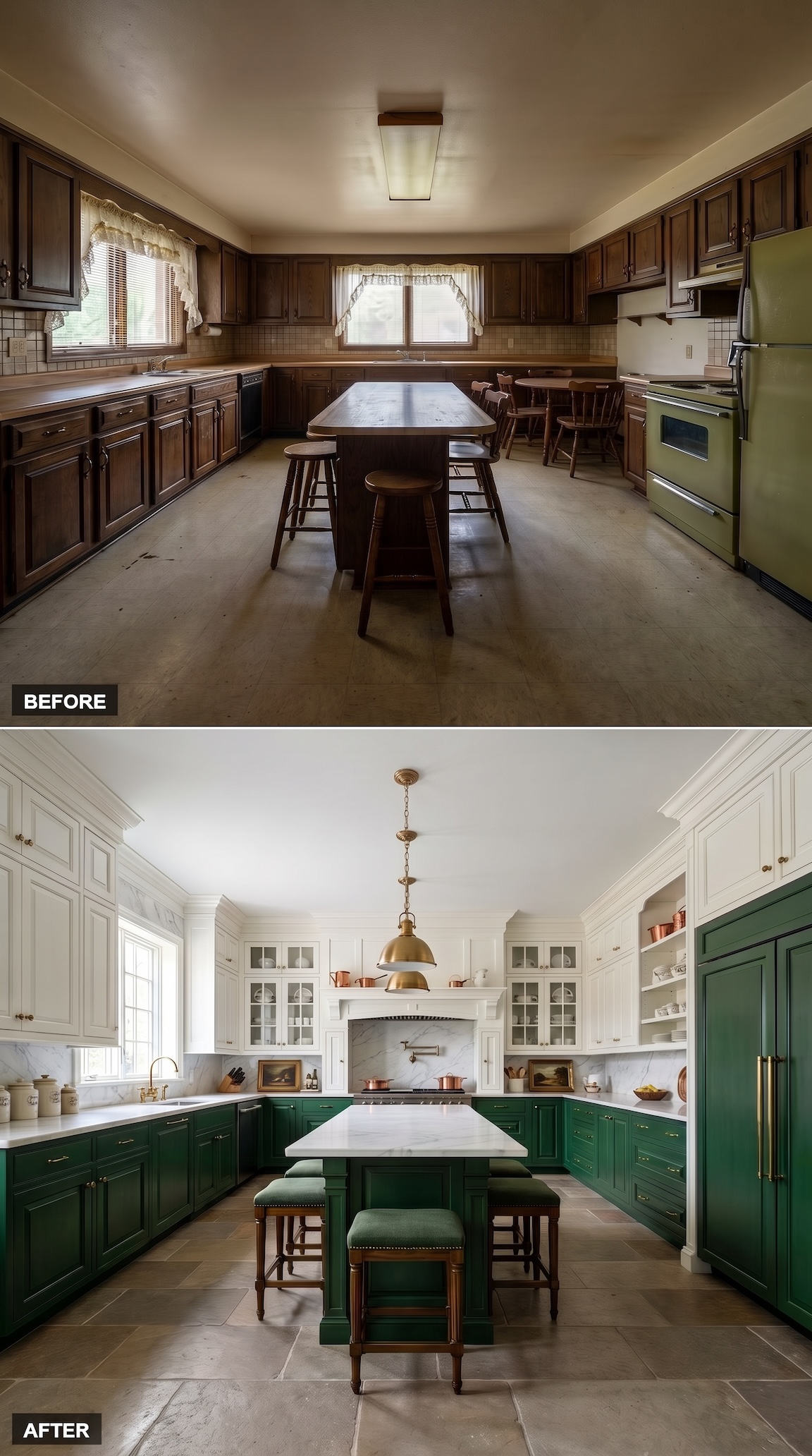
Glass doors prevent the white upper cabinetry from becoming one solid mass. That extra depth makes the space feel less crowded because the upper half of the room already contains some transparency.
Green remains concentrated below while marble turns the island into a lighter plane through the center.
5. Oak Floors Made Restraint the Point
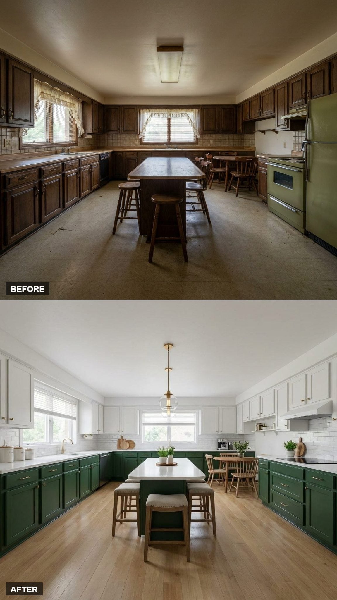
This one does less and benefits from it. Dark lowers, white uppers, one globe pendant, pale oak below. Nobody is trying to turn the backsplash or light fixture into a subplot.
The floor becomes the mediator, keeping the white from going sterile and the green from becoming too formal.
4. Craftsman-Style Pendants Pulled the Palette Into a Different Era
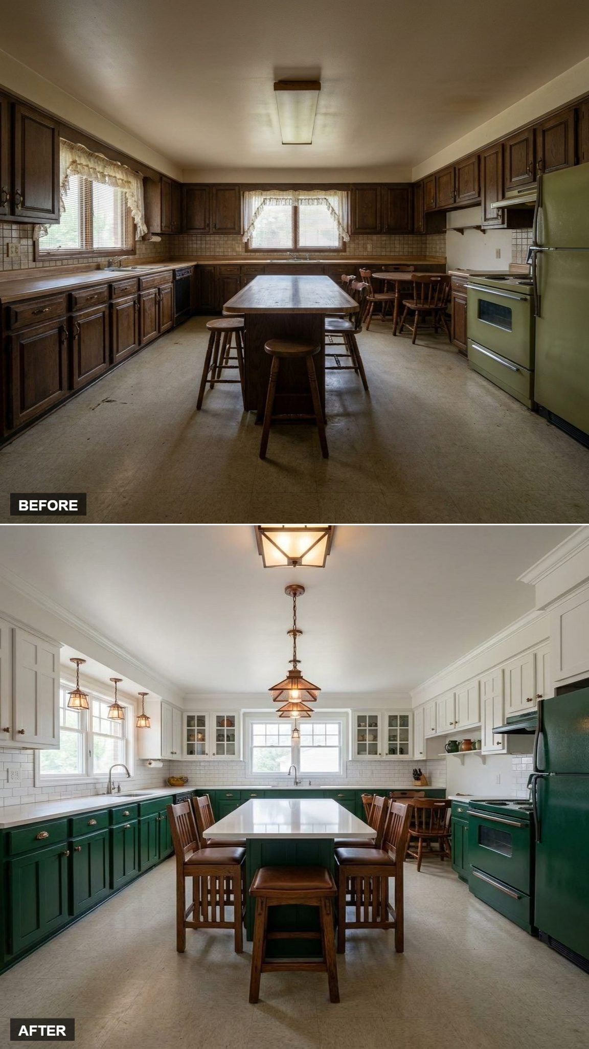
The Arts and Crafts influence changes the reading immediately. Chain-hung fixtures replace sleek globes and polished domes, giving the island a more handcrafted architectural character.
Crown molding and glass-front uppers reinforce that traditional direction. Suddenly the green feels less like a current trend and more like a color that might have been part of the house for decades.
3. Green Velvet Chairs Made the Island Softer Without Introducing Another Hue
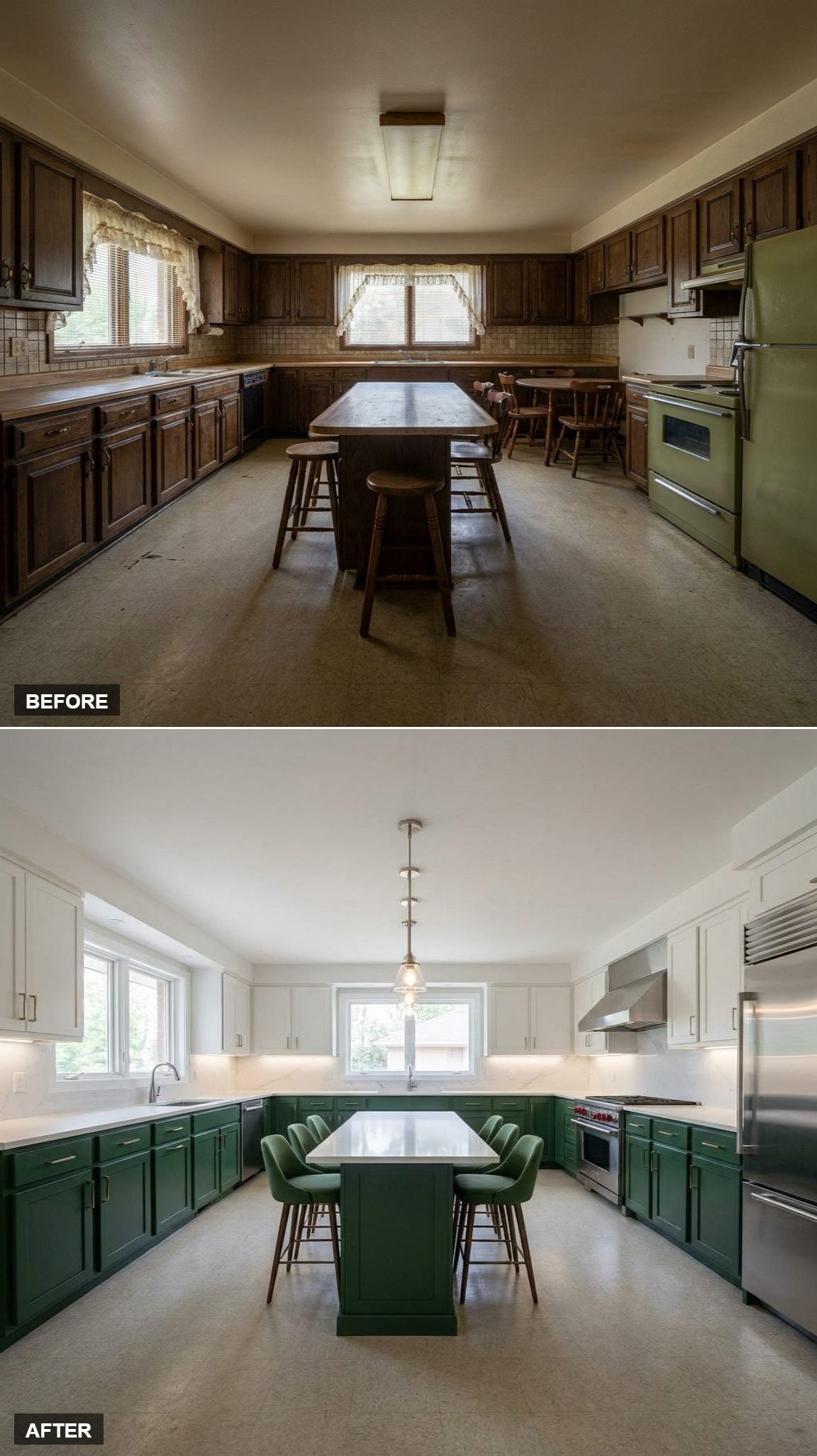
The chairs stay inside the green family but change the texture completely. Velvet absorbs light where painted cabinetry reflects it, so the seating feels softer despite repeating essentially the same color.
White stone, glass-front uppers, and a slender globe pendant keep everything around them comparatively crisp. This room made a lot of decisions and stuck with them.
2. One Brass Pendant Was Enough Against All That Glass and Green
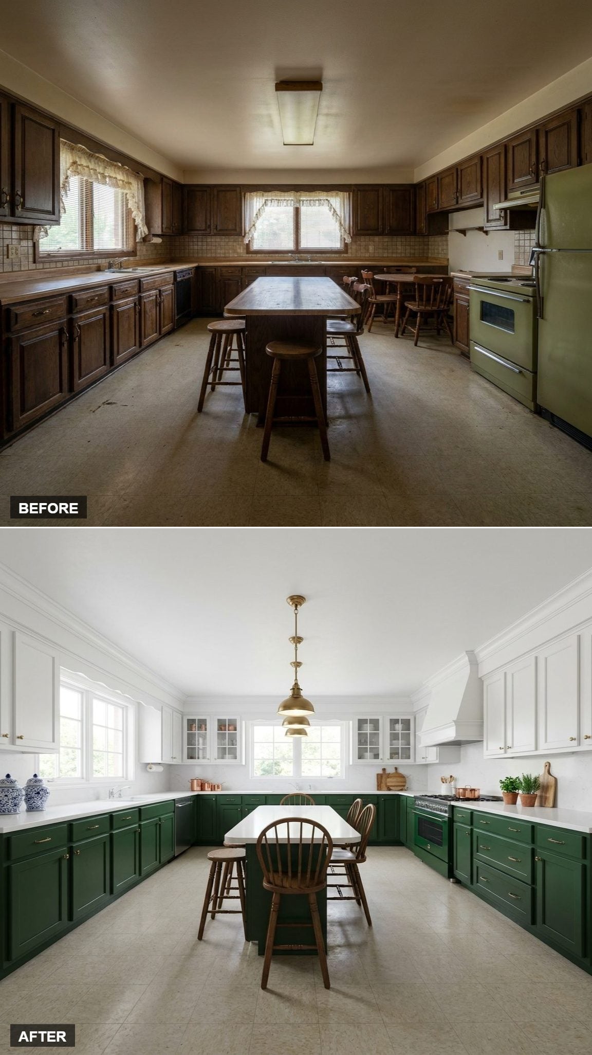
Glass-front uppers already provide reflection, display, and depth across the wall. A row of decorative fixtures would only add more information to a room that has plenty.
So the lighting stays simple: one brass pendant over the island, repeating the warm hardware below. That’s enough.
1. British Racing Green, Brass, Oak, and White Quartz Brought the Experiment Back to the Classic Formula
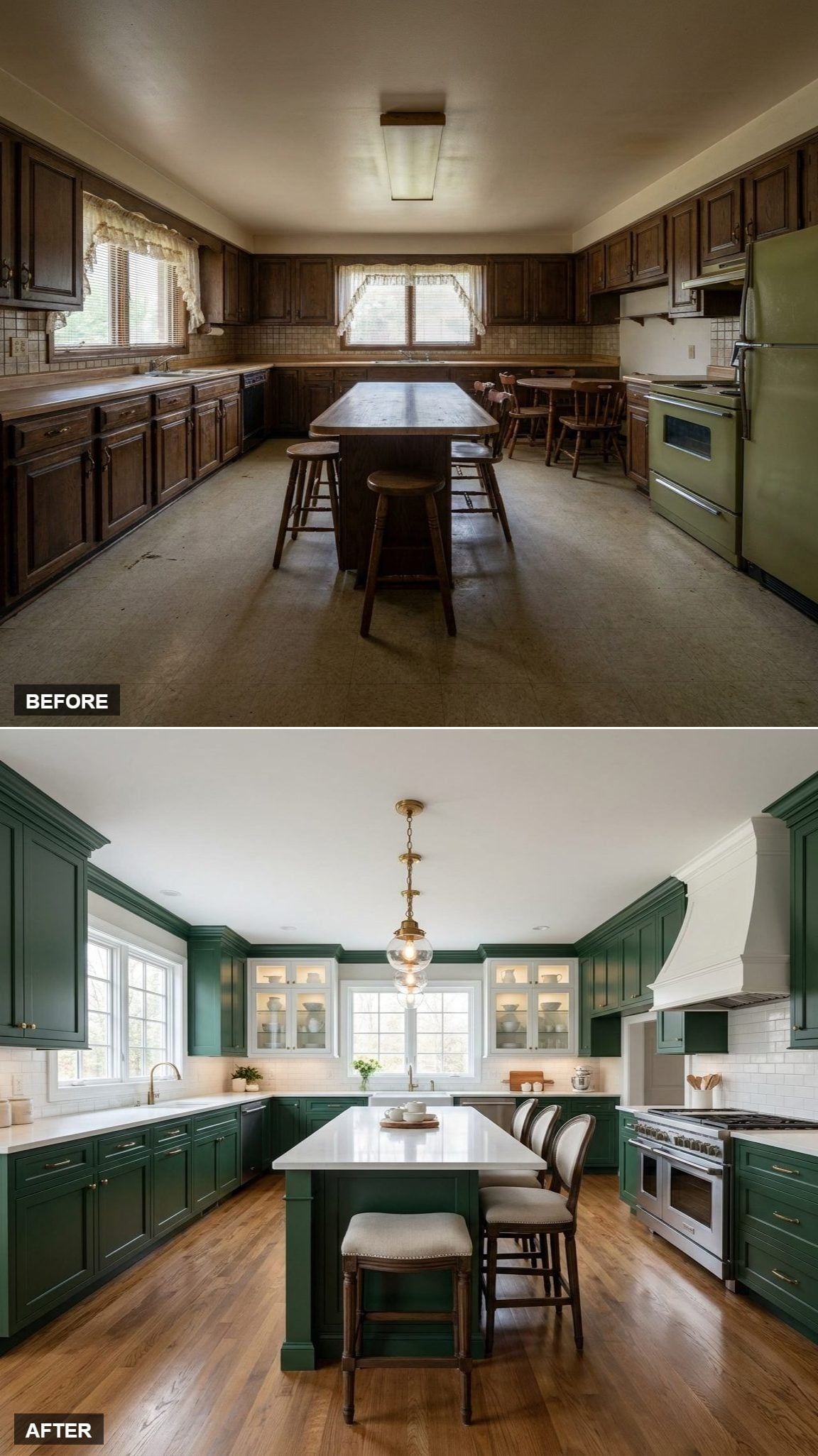
After glass, chrome, copper, beadboard, herringbone, chandeliers, painted floors, tall green towers, and nearly monochromatic cabinetry, this combination feels almost restrained.
Deep green Shaker fronts meet brass hardware, white quartz, and warm oak. No trick finish is doing the heavy lifting. The palette works because each material pulls in a different direction: cool color, warm metal, pale stone, natural wood. Thirty-two transformations later, the straightforward version no longer looks quite so straightforward.












