
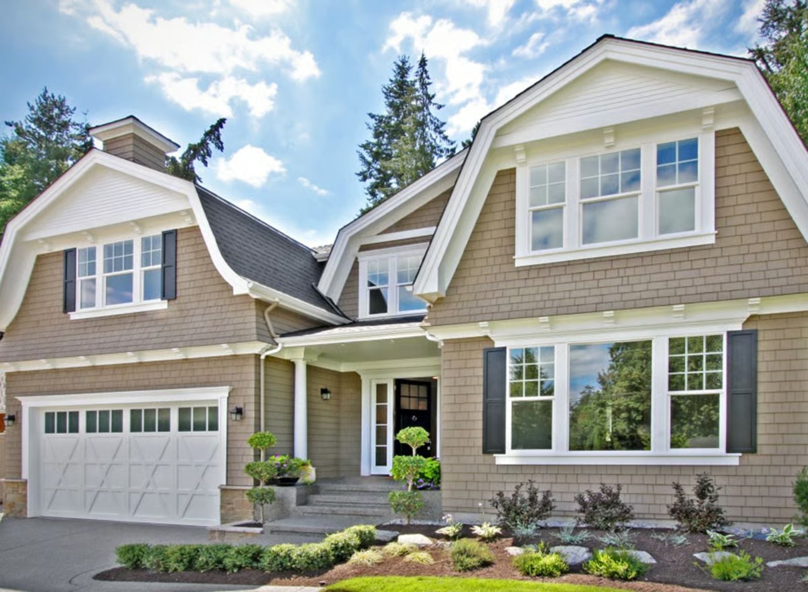
Families who make their house the one everyone wants to visit have already done the math: the right layout does more hosting work than any amount of decorating. The Wellington Grove is built around exactly that — a rotunda entry that lands guests properly, a balcony for the adults who need five minutes, shingle exteriors that age into the neighborhood, and a floor plan that keeps people moving without crowding the cook.
Specifications
- Sq. Ft.: 4,038
- Bedrooms: 4
- Bathrooms: 3.5
Floor Plan – Main Floor
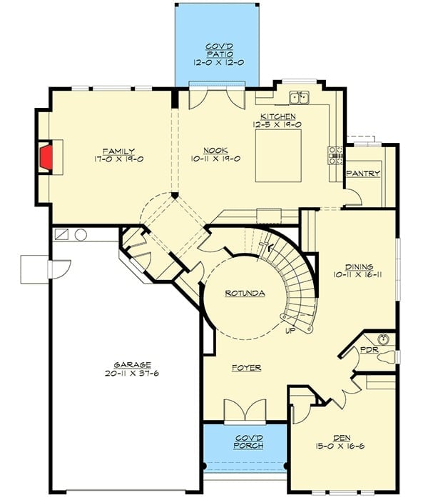
The rotunda entry anchors everything on the main floor, connecting the foyer to the family room, nook, kitchen, and dining room in a circular flow that actually makes sense to walk through. A covered patio sits off the kitchen, the den and powder room flank the front entry, and the garage runs a generous 37 feet 6 inches deep. Stairs up are tucked into the rotunda itself.
Floor Plan – Second Floor
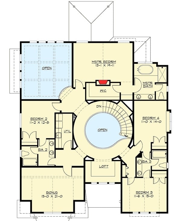
Upstairs, the circular rotunda staircase opens to below and organizes the whole floor around it. Four bedrooms branch off the landing, with the master suite taking a walk-in closet and private bath. A bonus room and loft handle whatever else the family needs them to be.
Curved Balcony, Dark Treads, and a Front Door That Means Business
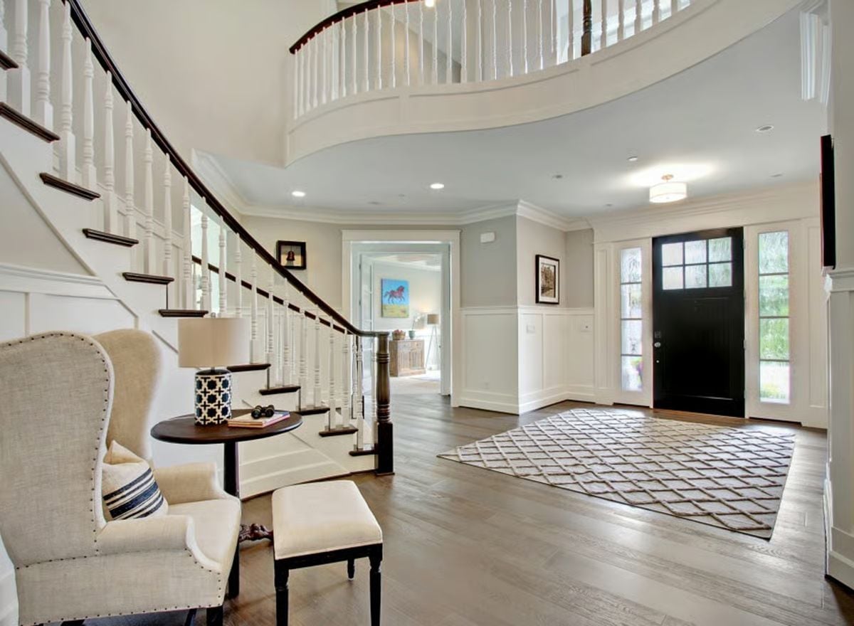
Wainscoting wraps the entry walls in crisp white while gray paint keeps the upper register calm. Dark-stained stair treads draw the eye upward toward the curved second-floor balcony, and a nail-head wingback chair grounds the sitting nook below. It’s an entry that does a lot of work before a single word gets said.
The Psychology Behind This: Grand two-story entries trigger a specific social response — guests feel welcomed before a single word is spoken. That rotunda balcony overhead registers as a stage, and anyone who walks in feels like they’ve arrived somewhere worth arriving. It’s why families who entertain keep gravitating toward this layout.
Clerestory Windows, Leather Chairs, and a Fireplace That’s Actually Burning
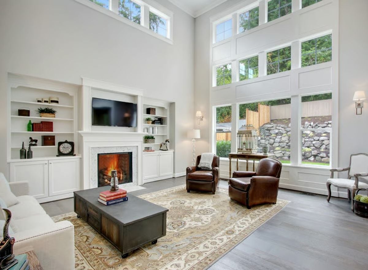
Two-story clerestory windows flood this room with light that no lamp could replicate.
Built-ins flank the fireplace on both sides, giving the TV a home that doesn’t fight with the architecture. Brown leather recliners face a trunk-style coffee table on casters. Short version: this room gets used.
Dark Beams, White Cabinets, and an Island That Earns Every Square Foot
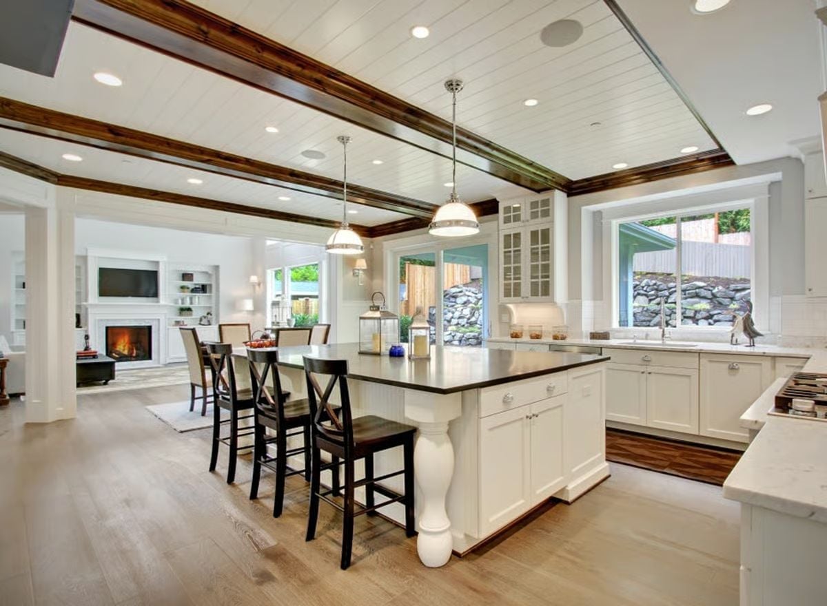
Exposed wood beams painted dark against a white shiplap ceiling do the heavy lifting here. Pendant lights drop low over a black-topped island with turned legs, seating four on cross-back stools, and hardwood floors run the full length into the living room where a fire is already going. The whole room reads as one connected space rather than a kitchen with a living room attached.
Style Math: White cabinetry with a dark countertop on the island has been around long enough to prove it works — the contrast keeps the kitchen from reading flat without demanding accent colors anywhere else. Carrying that same dark tone from the island top up into the ceiling beams is what holds the room together rather than letting it split in two.
Round Table, Dark Wood, and a Pendant That Actually Fits the Room
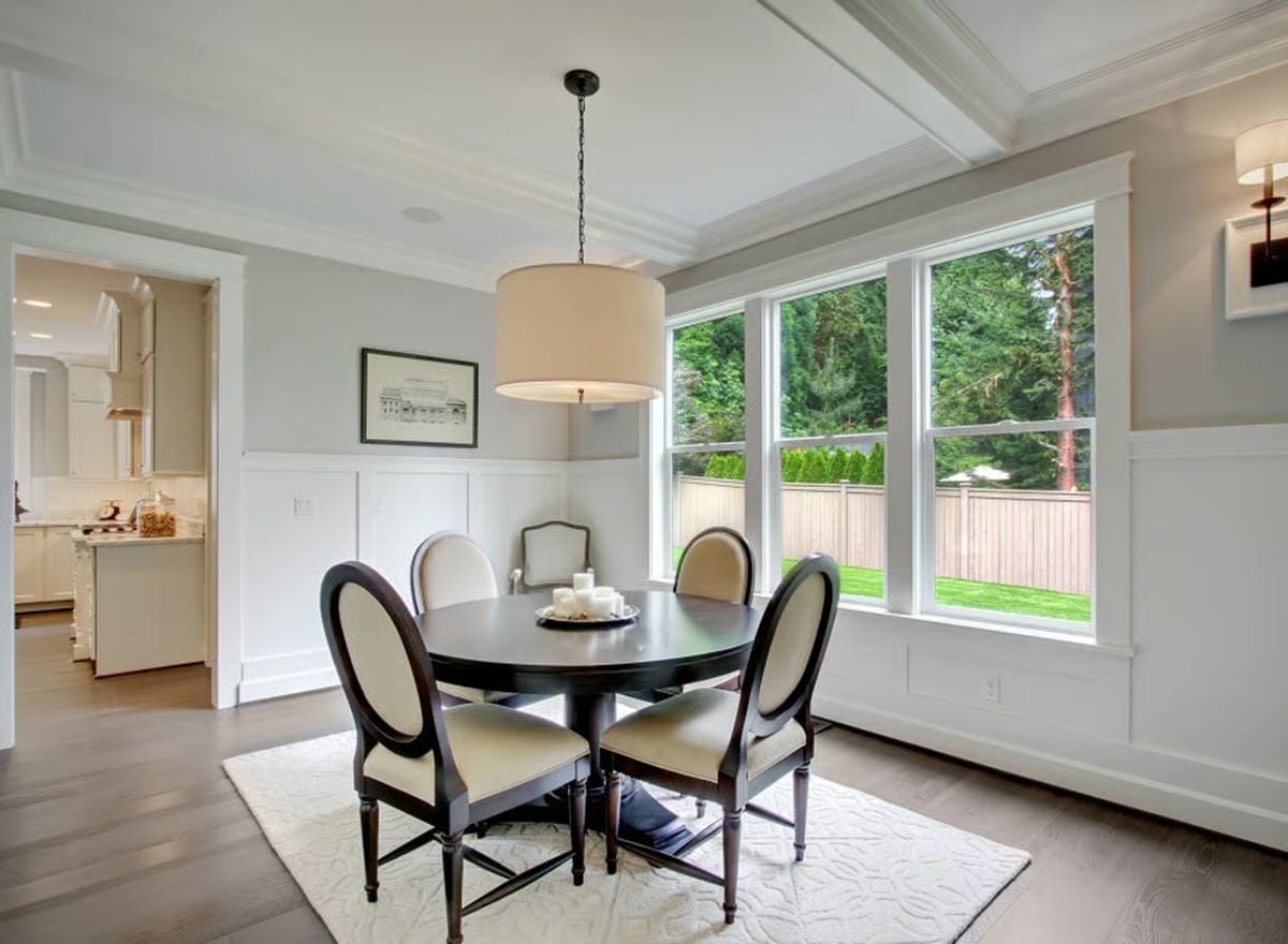
Oval-back chairs with cream upholstery pull up to a dark round pedestal table sized right for the space. Natural light comes in from three large windows overlooking a green yard, and a coffered ceiling with crown molding adds depth overhead without demanding anything else from the room. Board-and-batten trim anchors the lower walls. Nothing here is competing with anything else.
Style Tip: Round dining tables do something rectangular ones can’t: every seat feels like a good seat. In a smaller dining room, a round pedestal table with no center leg also opens up considerably more legroom than you’d expect. Practical, and it photographs well.
Coffered Ceiling, Twin Globes, and Wall Art That Spells Something
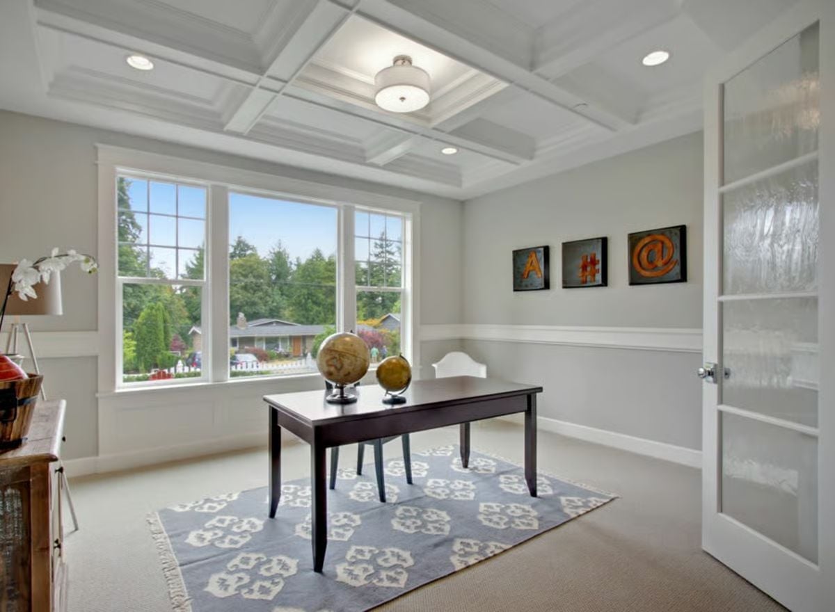
Coffered ceilings tend to get praised for their look, but what they actually do is absorb sound and add depth without requiring anything else on the ceiling. Worth remembering. Three framed metal characters hang on the wall like punctuation marks mid-sentence, and the globe pair on the desk isn’t decorative filler — it anchors the table and gives the room a sense of purpose that a plant or a candle wouldn’t.
Three framed metal characters hang on the wall like punctuation marks mid-sentence.
Navy Florals, a Tufted Bench, and an Oval Window Nobody Expects
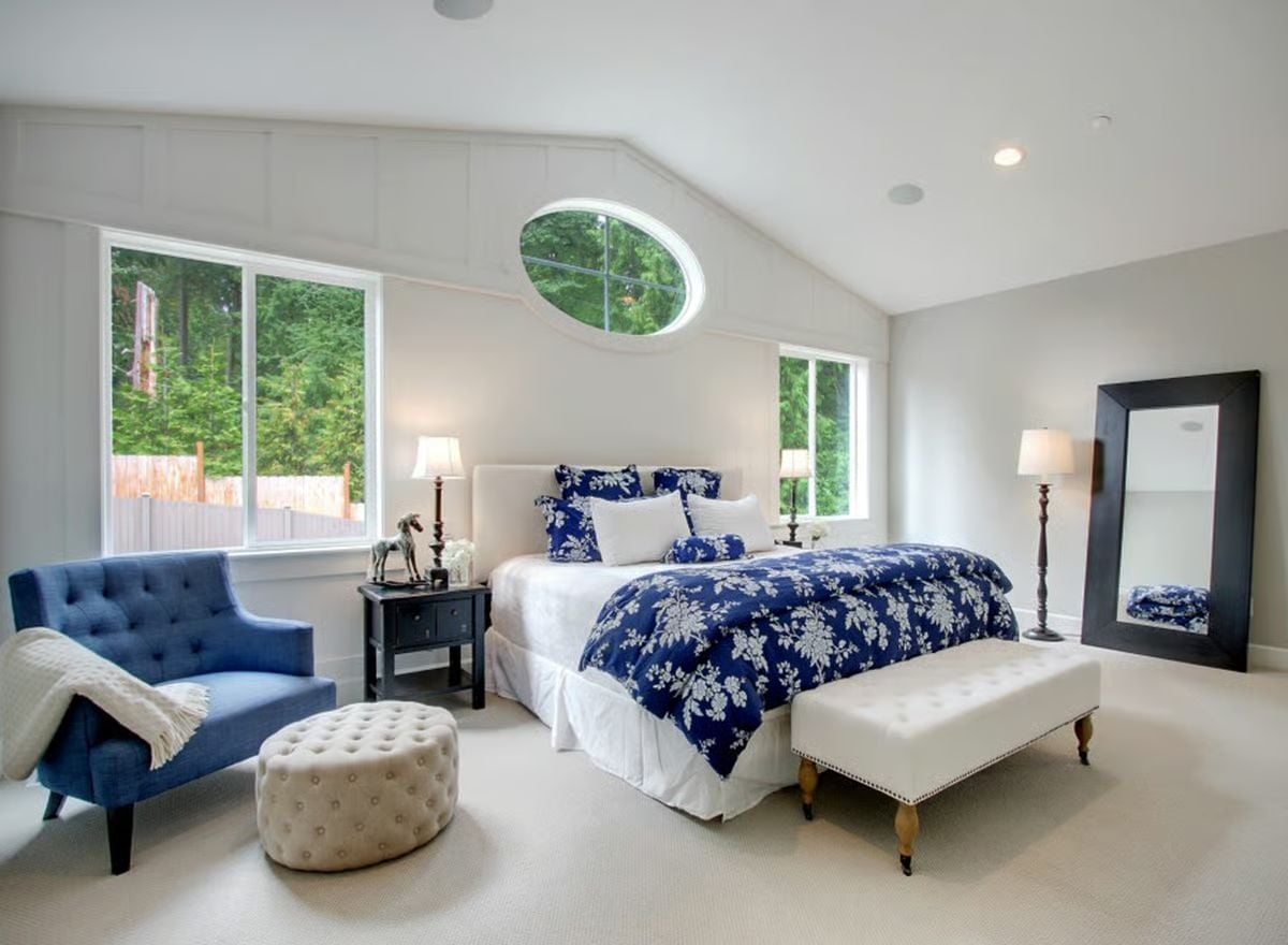
The blue sofa and floral bedding pull the same navy twice, which ties the room without matching it to death. That oval window, though — it’s the detail that stops you.
Quick Fix: Tufted upholstery on both the ottoman and the bench at the foot of the bed could easily tip into too much, but it works here because the fabrics differ in color and scale. Repeat a texture like this and vary at least one other variable — it stays intentional rather than looking like you just bought everything from the same catalog page.
Taupe Siding, White Trim, and a Covered Patio Built for Year-Round Use
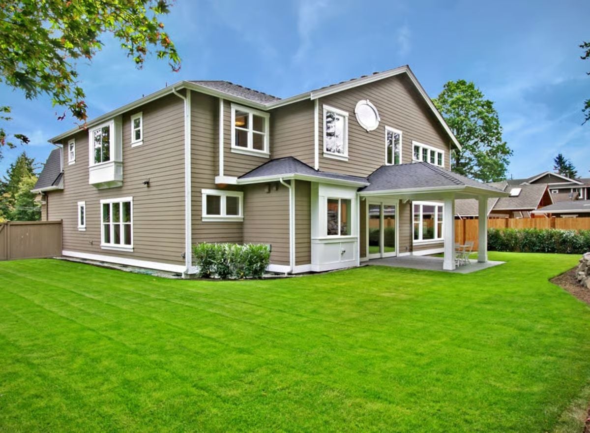
A hip-roofed covered patio extends the living space out back, with a lush lawn anchoring the yard beyond it.
Color Story: Taupe with white trim reads as neutral without disappearing into the landscape — it holds up in overcast light, which matters in climates where cloudy days are the default. If you’re picking exterior paint, test your swatch on a north-facing wall before you commit. A color that looks warm in the store can look cold and muddy on a gray afternoon.
Pin It
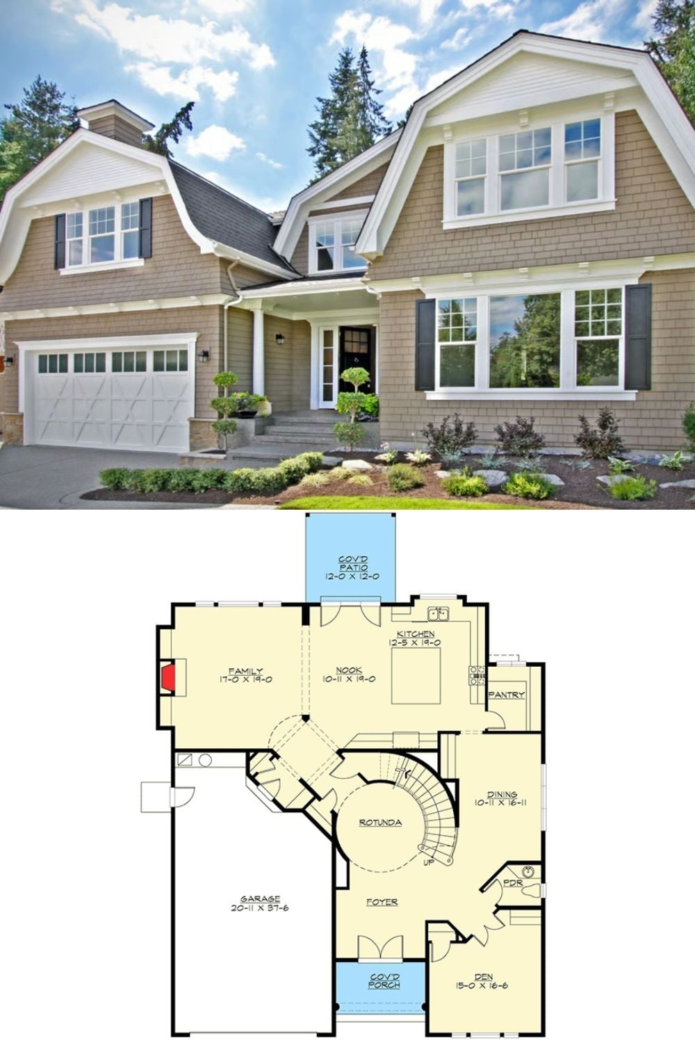
Shingle siding and a covered porch entry on the exterior; inside, the floor plan shows the rotunda foyer, family room, and rear covered patio laid out exactly as described.
