
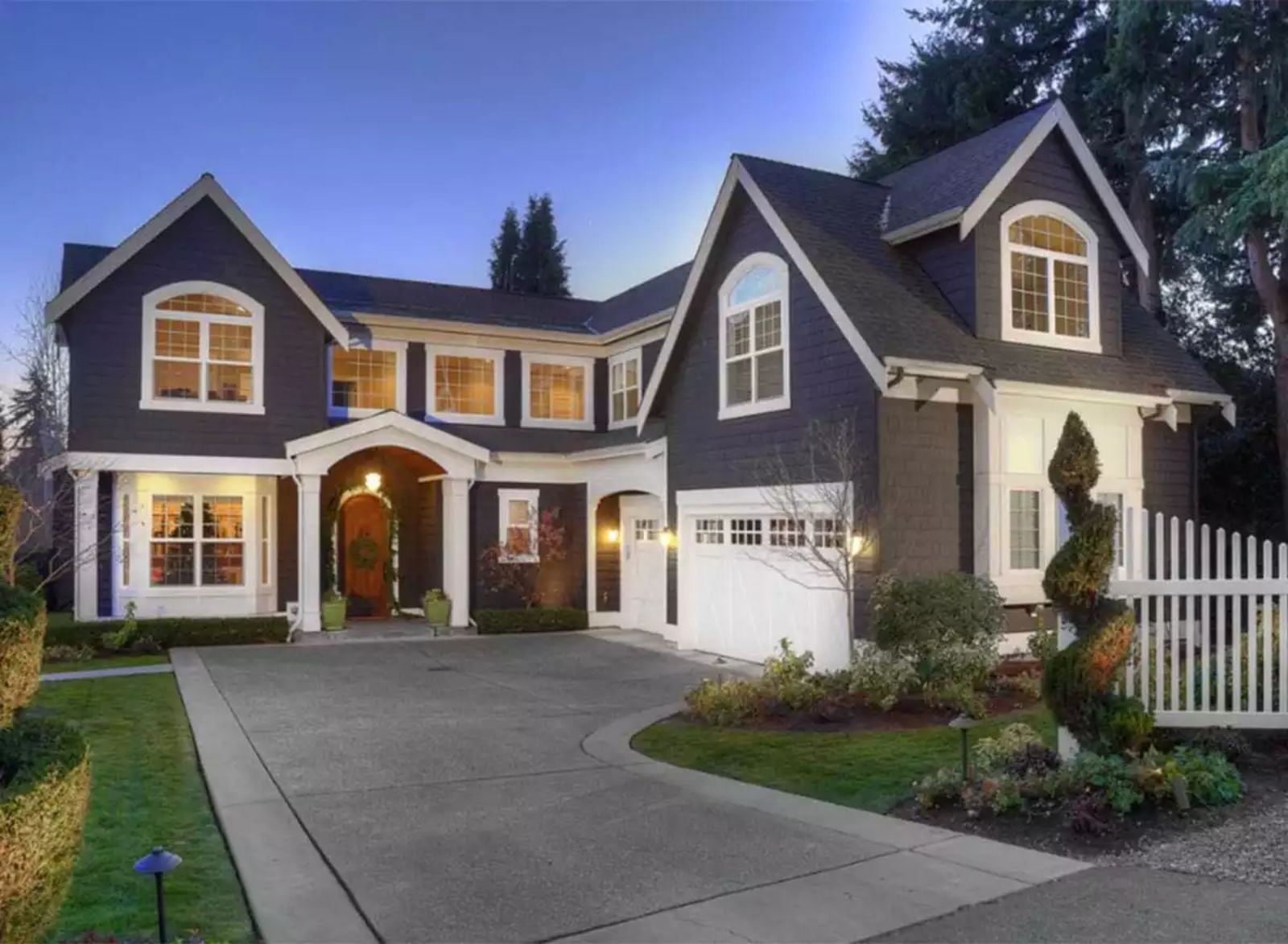
Friday night, junior year, and three of your teenager’s friends just materialized in the kitchen while you are trying to get dinner on the table. The Waltham is built around exactly that reality: a bonus room upstairs that becomes their territory, a traditional layout that keeps the main floor yours, and formal and casual living spaces that absorb the noise without sacrificing the conversation you actually want to have.
Specifications
- Sq. Ft.: 3,945
- Bedrooms: 4
- Bathrooms: 3.5
Floor Plan – Main Floor
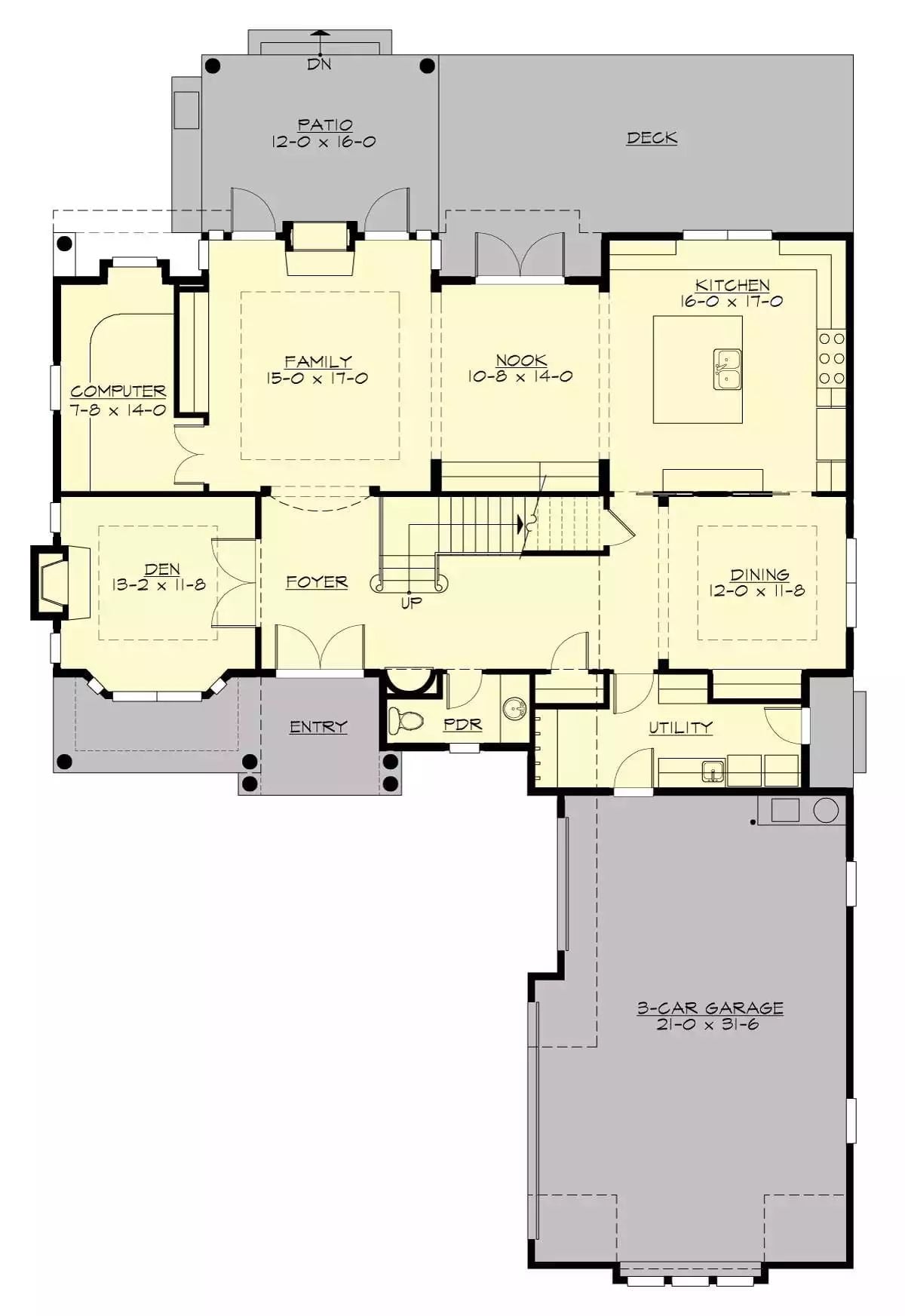
The main level groups the family room, nook, and kitchen in an open rear zone that connects to both a patio and deck. Up front, a separate den, computer room, and foyer hold down the formal half of the floor, with a powder room, utility space, and a 3-car garage rounding out the rest.
Floor Plan – Second Floor
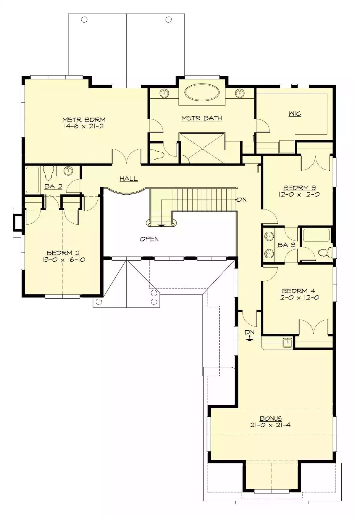
The four bedrooms split into two distinct zones upstairs, putting real distance between the master suite and the kids. Bedrooms 3 and 4 share Bath 3 on the right wing, and a bonus room sits below with its own stair access — which, if you have teenagers, you will appreciate more than you expect.
Built-Ins, a Fireplace, and Two Chairs That Invite You to Stay Awhile
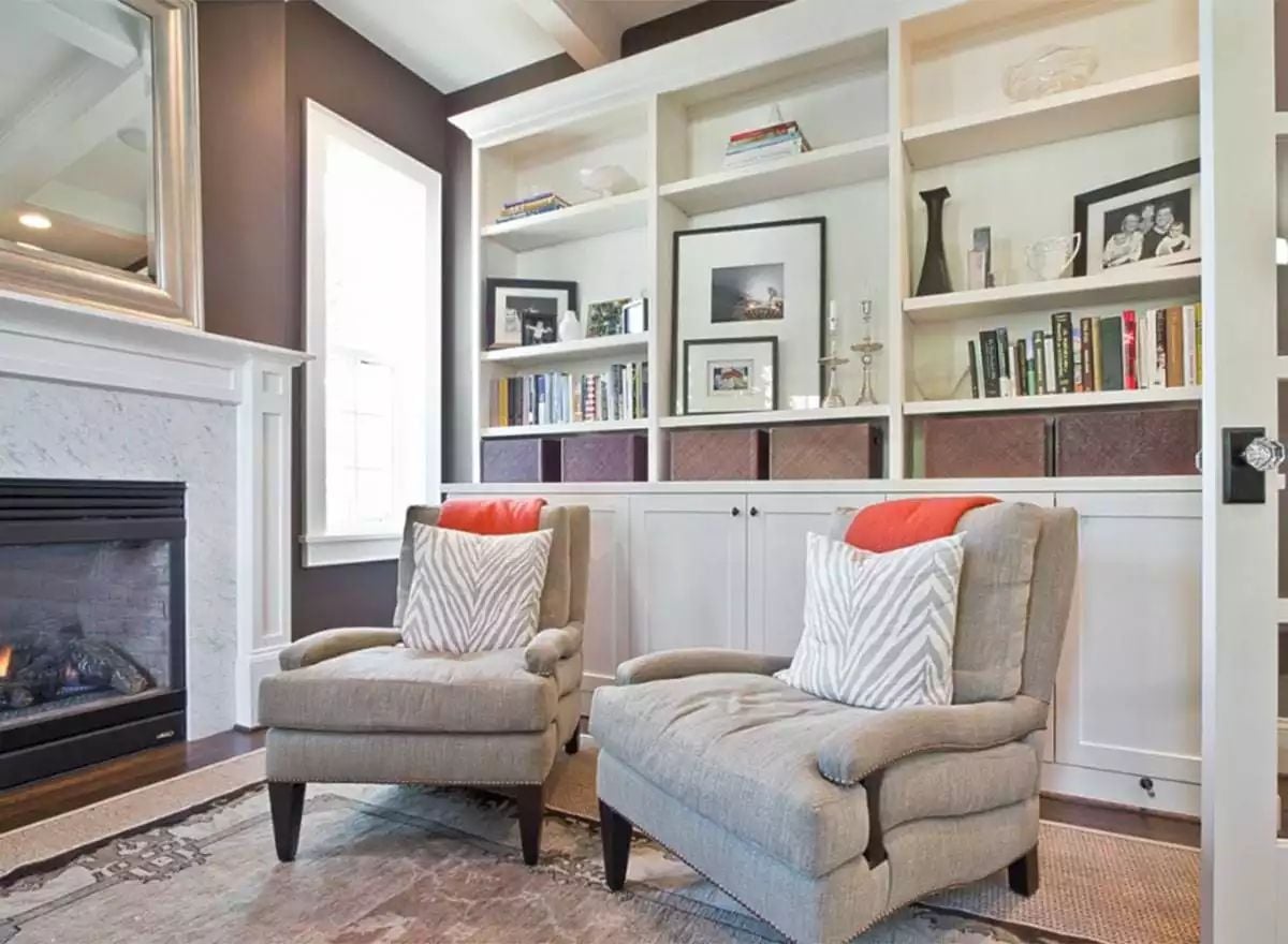
Paired wingback chairs in warm greige face a gas fireplace framed by marble tile and white millwork, with matching zebra-print pillows that keep the look cohesive without tipping into matchy. Behind the seating, floor-to-ceiling built-ins hold books, framed photos, and fabric storage boxes. Dark plum walls make the white shelving pop sharply.
Color Story: Plum walls read rich without going dark and moody because the white built-ins and trim hold enough brightness to keep the room from closing in. The coral pillow accents are doing more than their share here, pulling warmth into a palette that might otherwise skew cool. Add more accent colors and it falls apart, so the restraint is the whole point.
Dark Cabinetry Wall Does the Heavy Lifting So Nothing Else Has To
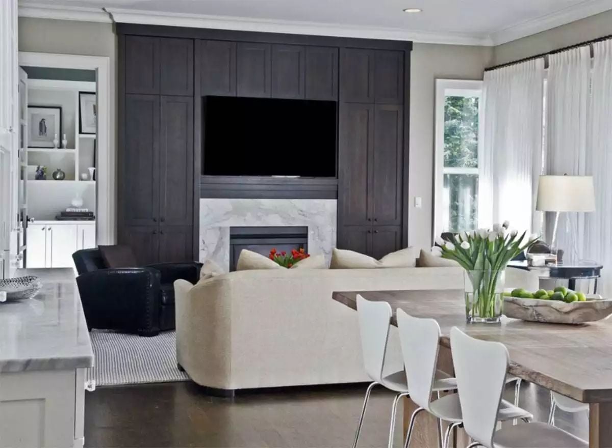
Floor-to-ceiling cabinetry in a deep espresso finish anchors the entire room without a single piece of art required. The marble fireplace surround earns its place by breaking up all that dark wood, and cream sofas keep the space from tipping too somber. Smart storage. Zero clutter.
Worth Knowing: Mounting a TV directly into a built-in wall unit eliminates the need for a separate media console, which frees up floor space in rooms where a sofa already has to face both a fireplace and a screen. If you’re planning a similar installation, run conduit inside the cabinetry during construction so cables stay completely hidden without requiring wall fishing later.
Black Countertops Against White Cabinets Keep This Kitchen Honest
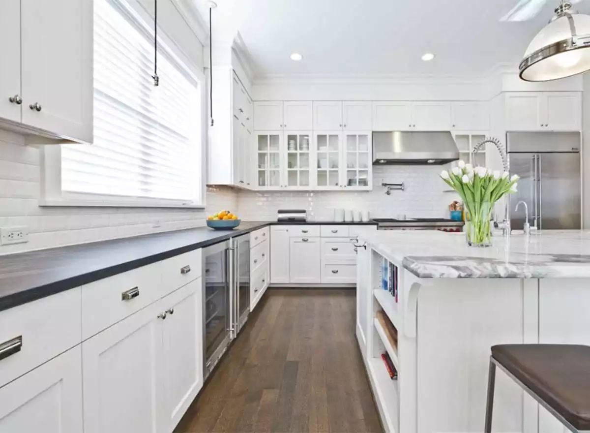
Dark slab counters on the perimeter contrast with a lighter marble island top, giving each surface a distinct visual job. White tulips on the island are the only soft thing in the room, and somehow that’s enough.
Editor’s Note: Black countertops show water spots and fingerprints more readily than lighter surfaces, so they work best in kitchens where wiping down after cooking is already part of the routine. Pairing them with white cabinetry keeps the contrast intentional rather than oppressive. Using a lighter stone on the island breaks up what could otherwise feel like a very long, very dark perimeter.
Chartreuse Chairs Against a Marble Tulip Table Are a Midcentury Power Move
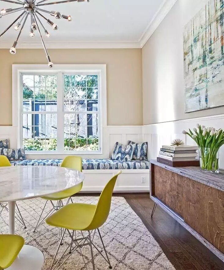
A Sputnik chandelier, window bench with ikat cushions, and a sideboard on hairpin legs all pull from the same era. Nothing here is straining to make its point.
- Repeating a single accent color across multiple seats reads as intentional rather than mismatched
- A bench under a window doubles seating without eating into the room’s center
- Hairpin legs on case furniture keep visual weight low, which helps smaller dining rooms breathe
Yellow Pillows and a Persian Runner Earn Their Keep Against All That Taupe
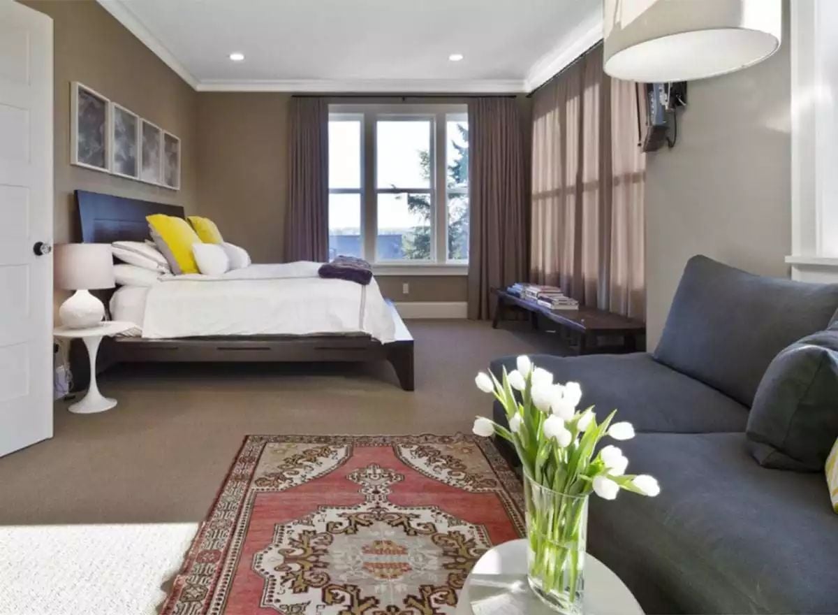
Warm taupe walls could easily flatten a room this size, but two yellow pillows and a faded red runner pull enough color to keep things alive. The low-profile bed and Tulip side table feel considered next to each other. Small move with the white tulips on the side table. Lands anyway.
Why That Runner Works So Hard Here
Vintage Persian runners carry visual weight without consuming much floor space, which matters in a bedroom where a full-area rug would fight with the carpet underneath. The worn, faded quality of this particular one is doing something a new rug simply couldn’t: it reads collected rather than coordinated. Neutral walls need that kind of imperfection. Without it, the room risks feeling like a floor model.
Marble Tub Surround and Glass Shower Wall Split This Bathroom Into Two Worlds
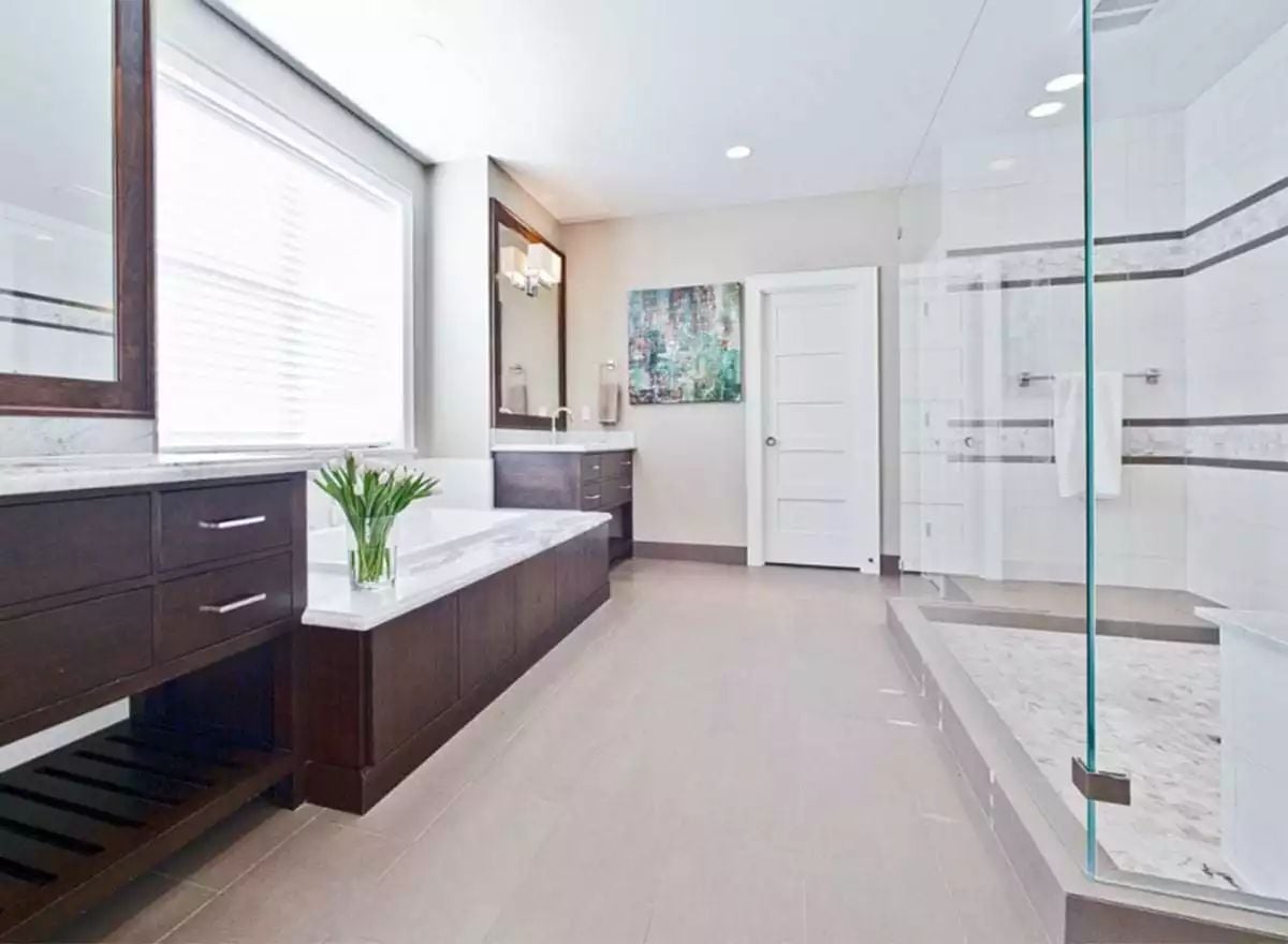
White flowers on the tub deck are working harder than they look. Rich espresso cabinetry runs the full length of one wall, grounding a room that could have felt cold given all the marble and frameless glass pressing against each other.
The Psychology Behind This: Bathrooms with two distinct zones, one for soaking and one for showering, tend to reduce morning conflict in shared master suites because both people can get ready simultaneously without negotiating space. Designers often place the shower near the entry and the tub deeper in the room, which naturally slows the experience down and makes bathing feel less like a task.
Covered Patio with an Outdoor Kitchen Pulls the Living Room Outside
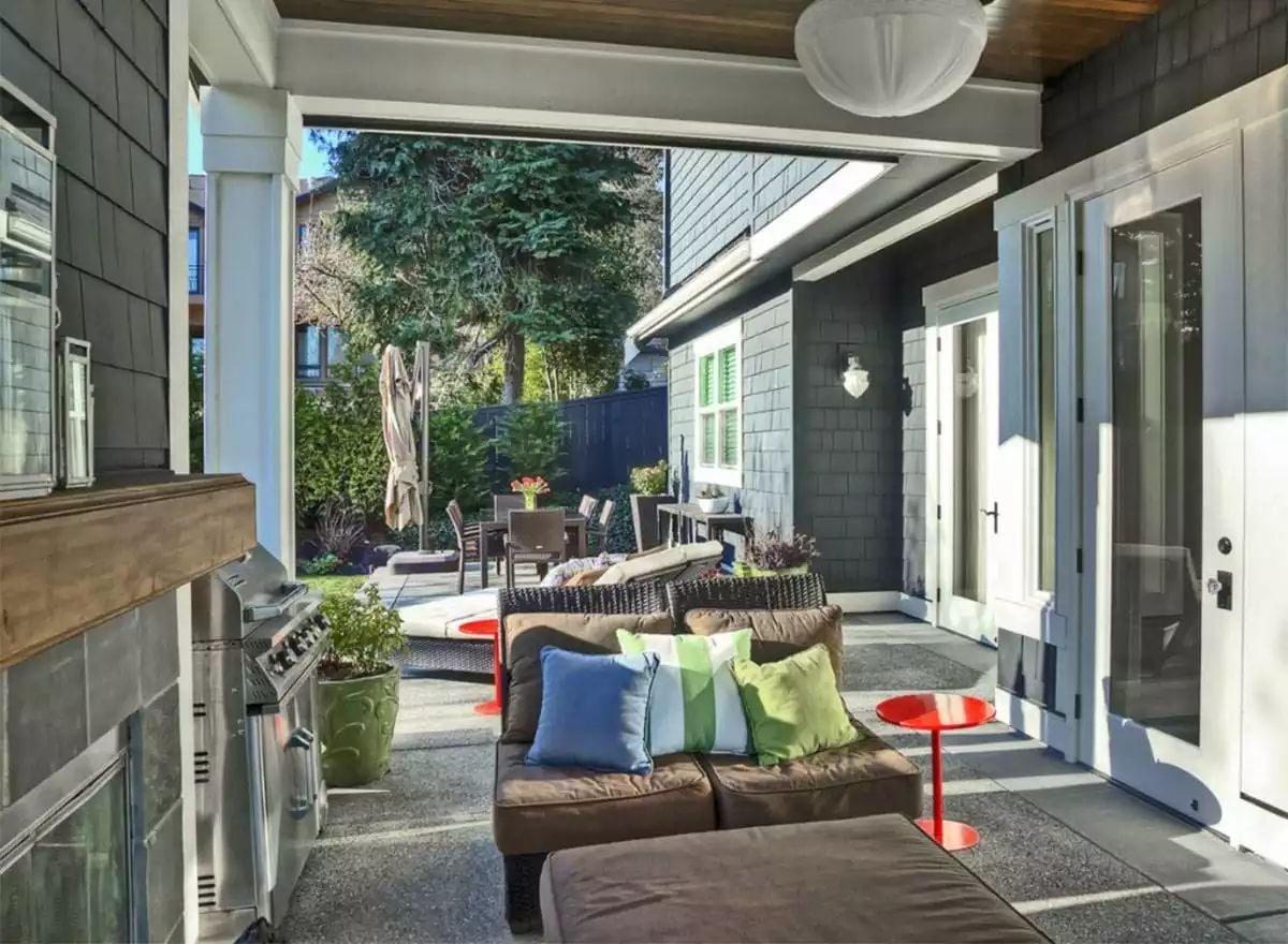
Red side tables hit differently against the brown sectional than you’d expect until you’re actually standing in it. Colorful throw pillows keep the vibe loose. Behind the sofa, a gas grill sits flush against the exterior wall, and the whole covered porch stops functioning like a patio and starts functioning like a second living room.
Pin It
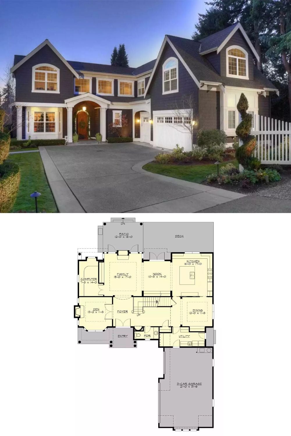
The exterior shows a dark gray craftsman-style home with an arched entry and dormer windows. Below it, the first-floor plan lays out the family room, nook, kitchen, den, computer room, dining room, utility space, and 3-car garage.
