
🔥 Would you like to save this?
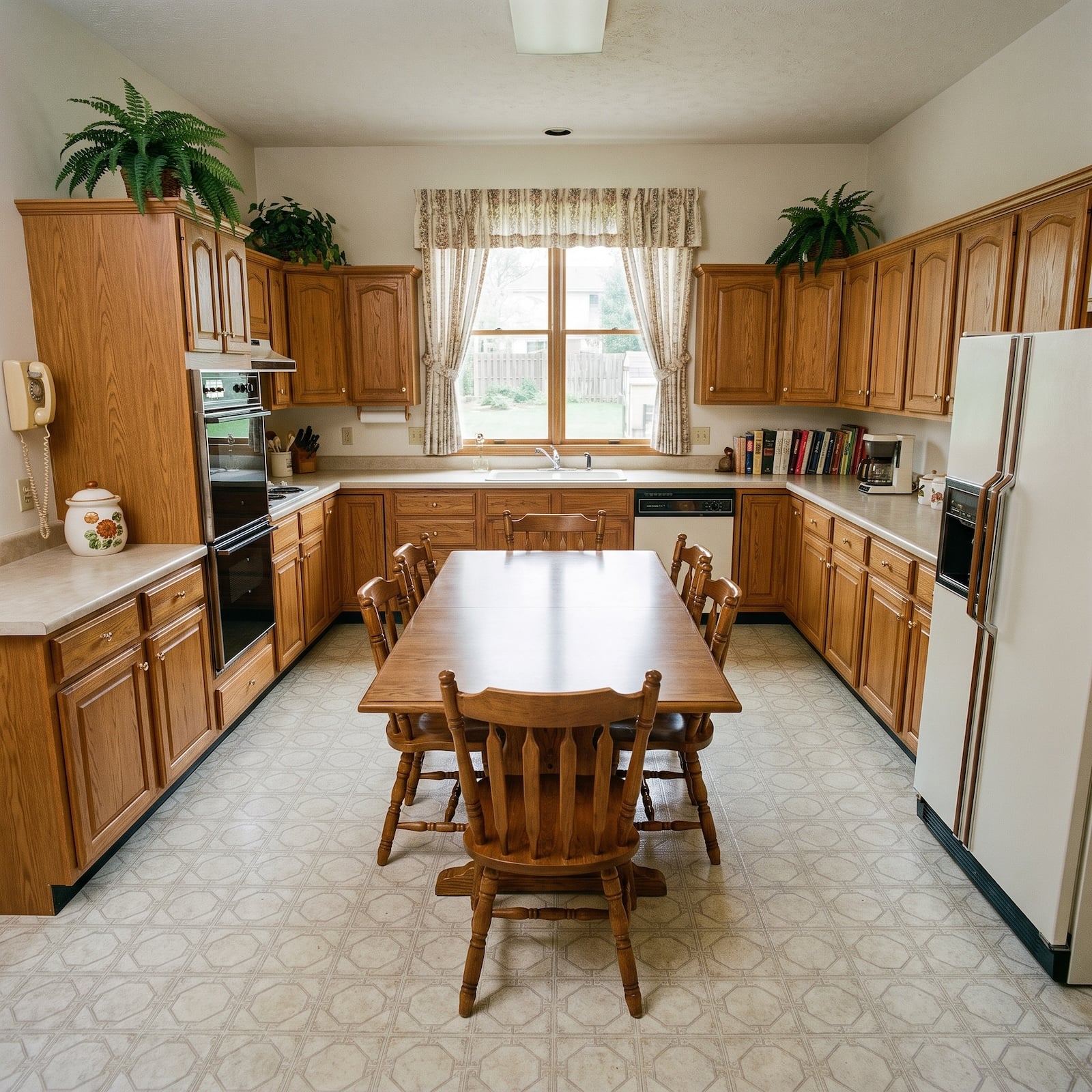
The problem with an old kitchen is rarely one spectacularly bad decision. It is accumulation. The vinyl floor that once looked practical. The oak or laminate cabinetry that belonged perfectly to its moment. Fluorescent light flattening every surface. A window in exactly the wrong place for the renovation you imagine and exactly the right place to make moving it absurdly expensive. After enough years, the room stops looking designed and starts looking inherited.
In order to come up with the very specific design ideas, we create most designs with the assistance of state-of-the-art AI interior design software. Also, assume links that take you off the site are affiliate links such as links to Amazon. this means we may earn a commission if you buy something.
That is what makes this exercise interesting. The starting point is one vinyl-floored 1980s kitchen with stubborn proportions and familiar limitations. Everything after that is up for grabs. One redesign goes for marble and pale oak. Another heads straight toward cobalt lacquer and terrazzo. There is walnut dark enough to turn the kitchen into a library, pink marble that refuses to apologize, leather wrapped around an island, backlit stone, limewash, stained glass, concrete, fluting, copper, travertine and enough ceiling ideas to make the old fluorescent box seem like a personal insult.
These 32 transformations are not trying to identify one correct way to renovate an eighties kitchen. Quite the opposite. They show what happens when color, proportion, texture, lighting and materials are allowed to pull the design in completely different directions. Some are restrained enough to disappear into daily life. Some would announce themselves before breakfast. A few are gloriously unreasonable. That is where this gets good.
If borrowing is part of your home improvement plan, compare today’s home equity rates here.
32. White Oak and a Marble Waterfall Give the Old Kitchen a Sharper Edge
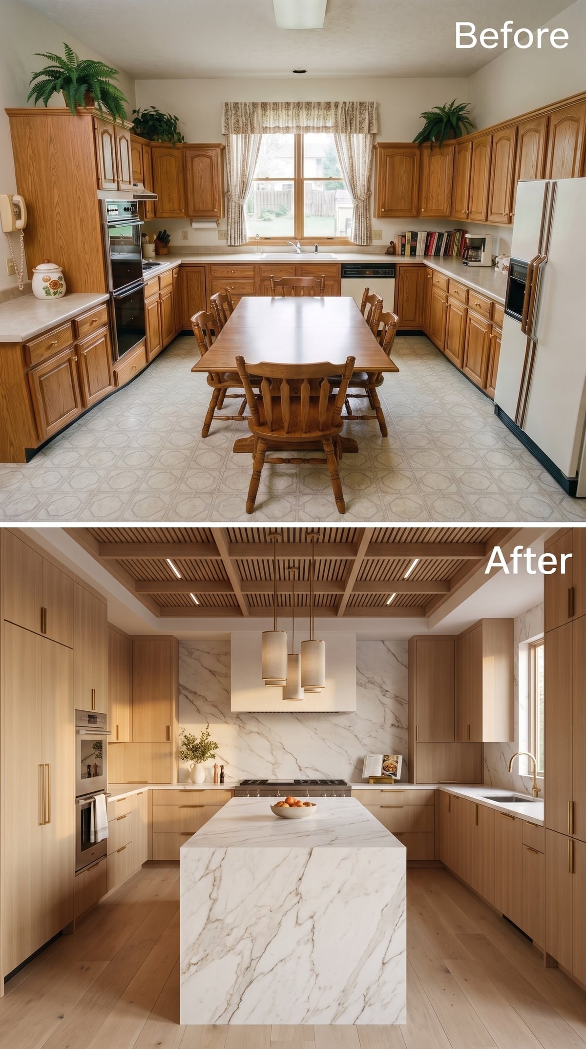
The bones are quiet, but marble changes the stakes immediately. Soft white oak establishes the background; a full-height stone backsplash and waterfall island provide the interruption. Gray veining travels vertically and horizontally, giving a restrained kitchen exactly one thing worth staring at.
Brass pulls introduce warmth without requiring another wood tone. Above, the slatted ceiling is confined to the kitchen zone rather than covering everything, which makes it function almost like an architectural canopy. Pale hardwood underfoot keeps the whole arrangement luminous.
31. Plum Lacquer and Black Marble Decide Subtlety Can Take the Night Off
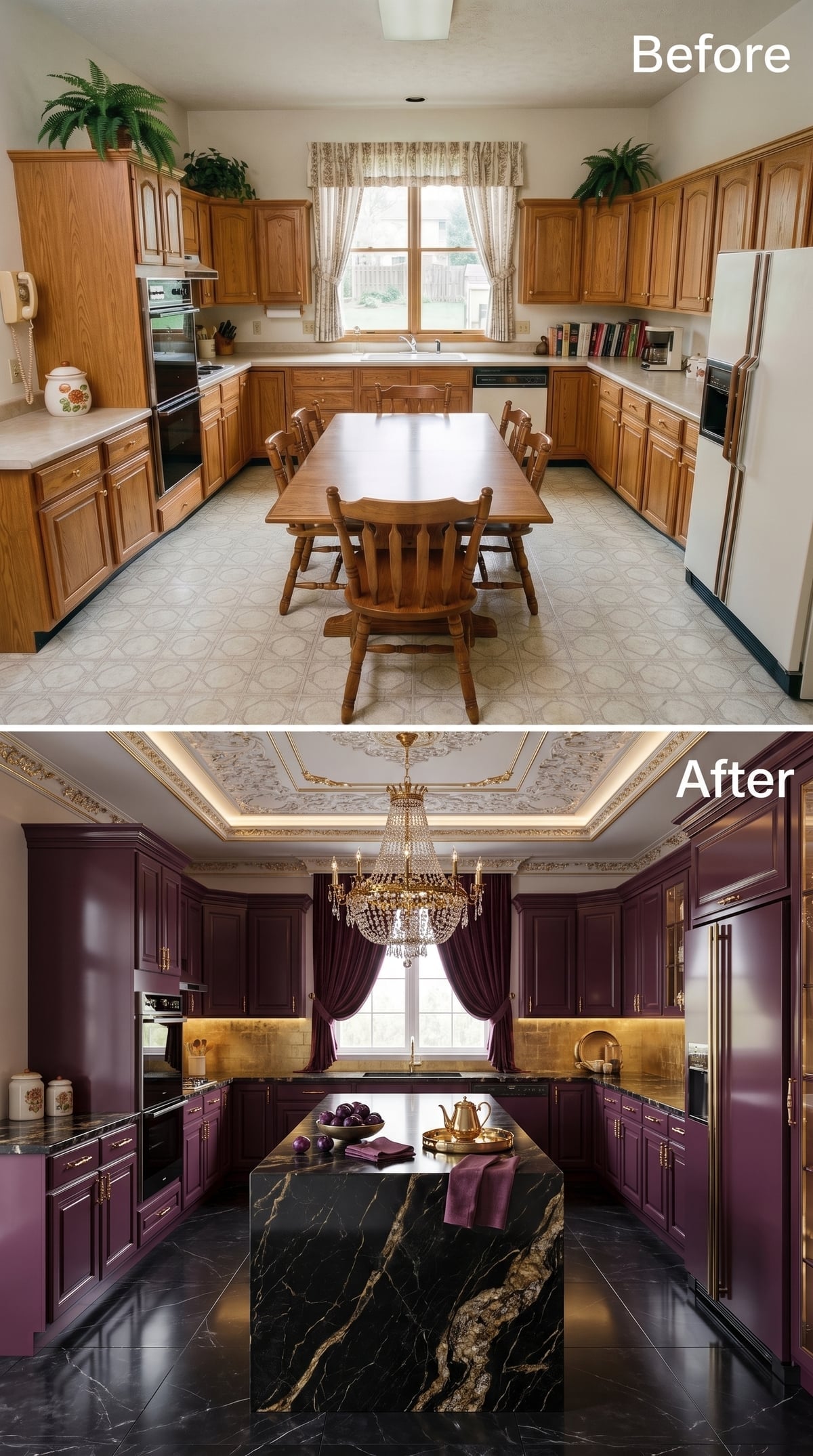
So much for restraint. Deep plum cabinetry, brass hardware, black marble threaded with gold, silk drapes and a crystal chandelier turn the kitchen into something that knows exactly what it signed up for.
The surprise is how controlled the color relationships remain. Burgundy drapery stays inside the same family as the cabinetry but changes sheen and depth. Gold resurfaces in hardware, stone and lighting. Black gives the island enough gravity to keep the purple from becoming theatrical scenery.
30. Whitewashed Oak Makes Open Shelving Look Like Part of the Architecture
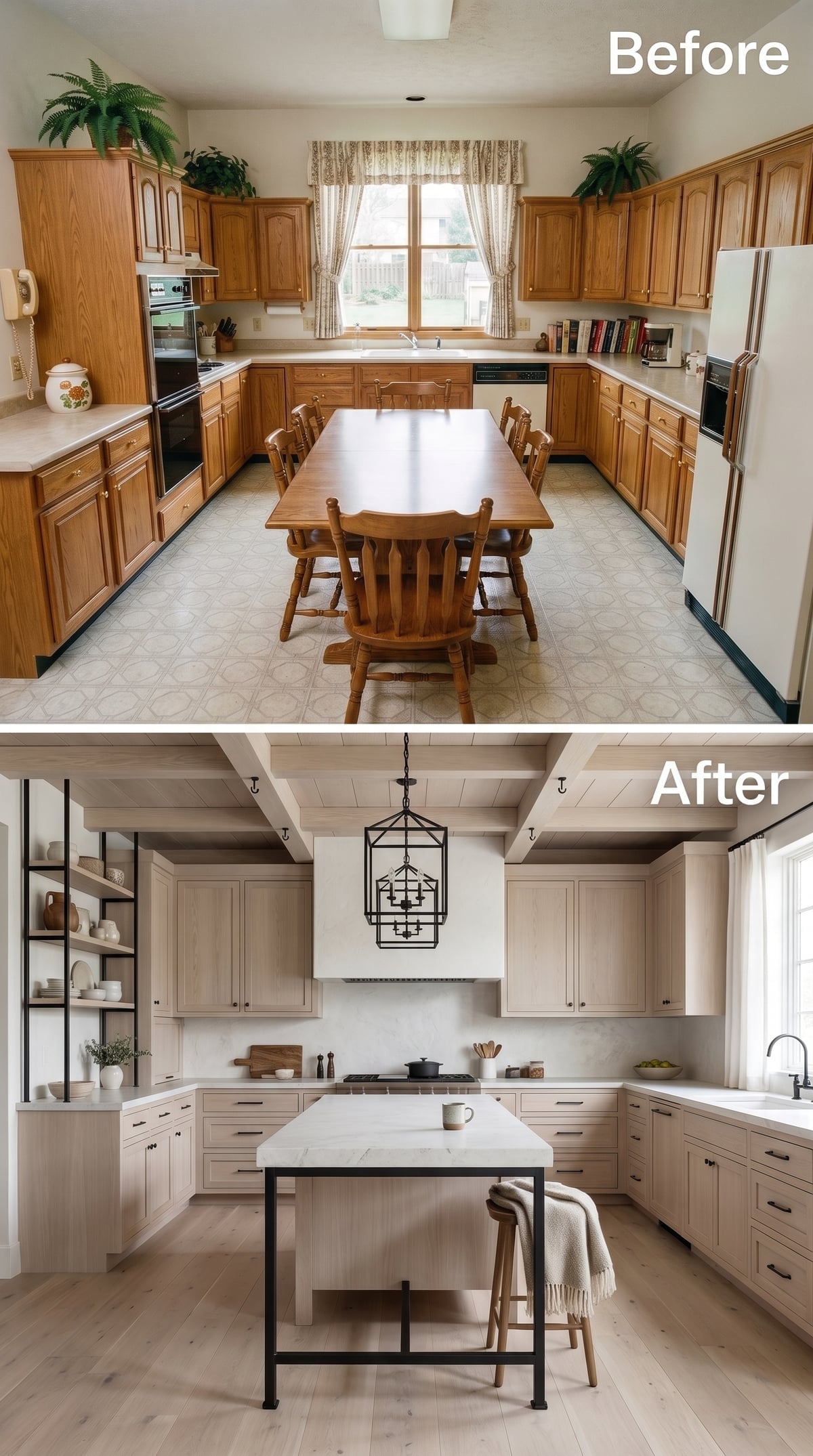
After all that plum and black marble, this feels almost like opening a window. Bleached oak shifts cool, leaving enough grain visible to keep the room from becoming clinical. Black iron pulls and a substantial lantern pendant draw crisp lines through the pale wood.
The shelving is useful precisely because it is not overloaded. Ceramics, boards and a few everyday pieces break up the cabinetry without turning the wall into display theater. White quartz keeps the center bright, while exposed ceiling beams give the lantern enough architectural company to make sense.
29. Cobalt Goes Maximalist With a Botanical Ceiling and Stained Glass
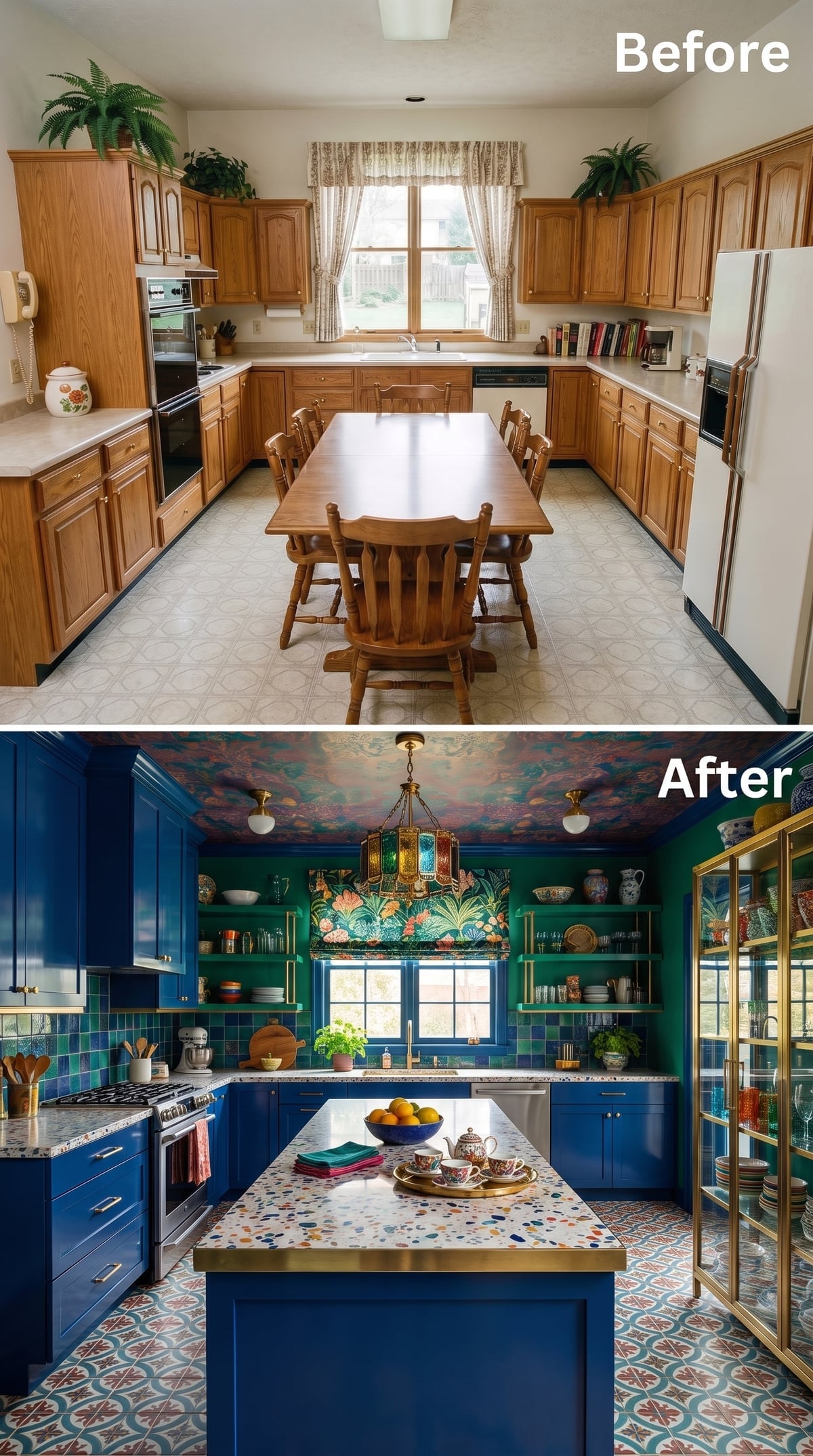
Then the volume goes straight back up. Cobalt cabinetry meets brass hardware, forest-green shelving, a terrazzo island, patterned encaustic-style flooring and a botanical ceiling. Any two of those could carry a conventional kitchen. Here they stack deliberately.
The stained-glass pendant gives the eye another dose of color rather than relief, yet the room holds together because its hues keep recurring. Green reappears. Rust reappears. Blue reappears. The eye finds familiar notes inside unfamiliar surfaces, preventing the composition from breaking into unrelated pieces.
28. Weathered Oak and Stacked Stone Give the Kitchen Some Rough Edges
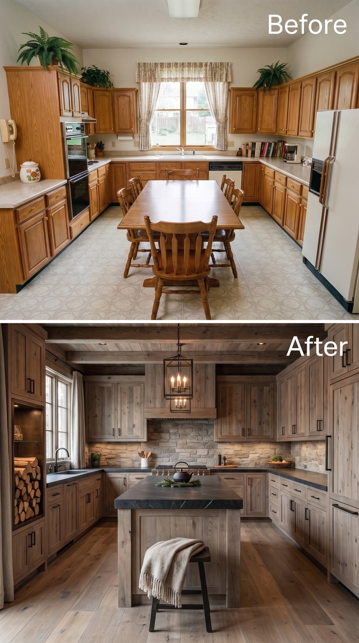
Silvery oak changes the familiar wood-kitchen formula by removing the honey color that dates so many older rooms. Black pulls sharpen the grain, while a full cooking wall of stacked stone brings in exactly the kind of roughness the cobalt kitchen avoided.
The dark soapstone-style island top is the right counterpoint. Polished white stone would make this feel too pristine. A candle-style lantern, wide-plank floor and linen-draped stool keep the room tactile from top to bottom.
27. Blush Cabinets and Rose Marble Make Pink Look Surprisingly Grown Up
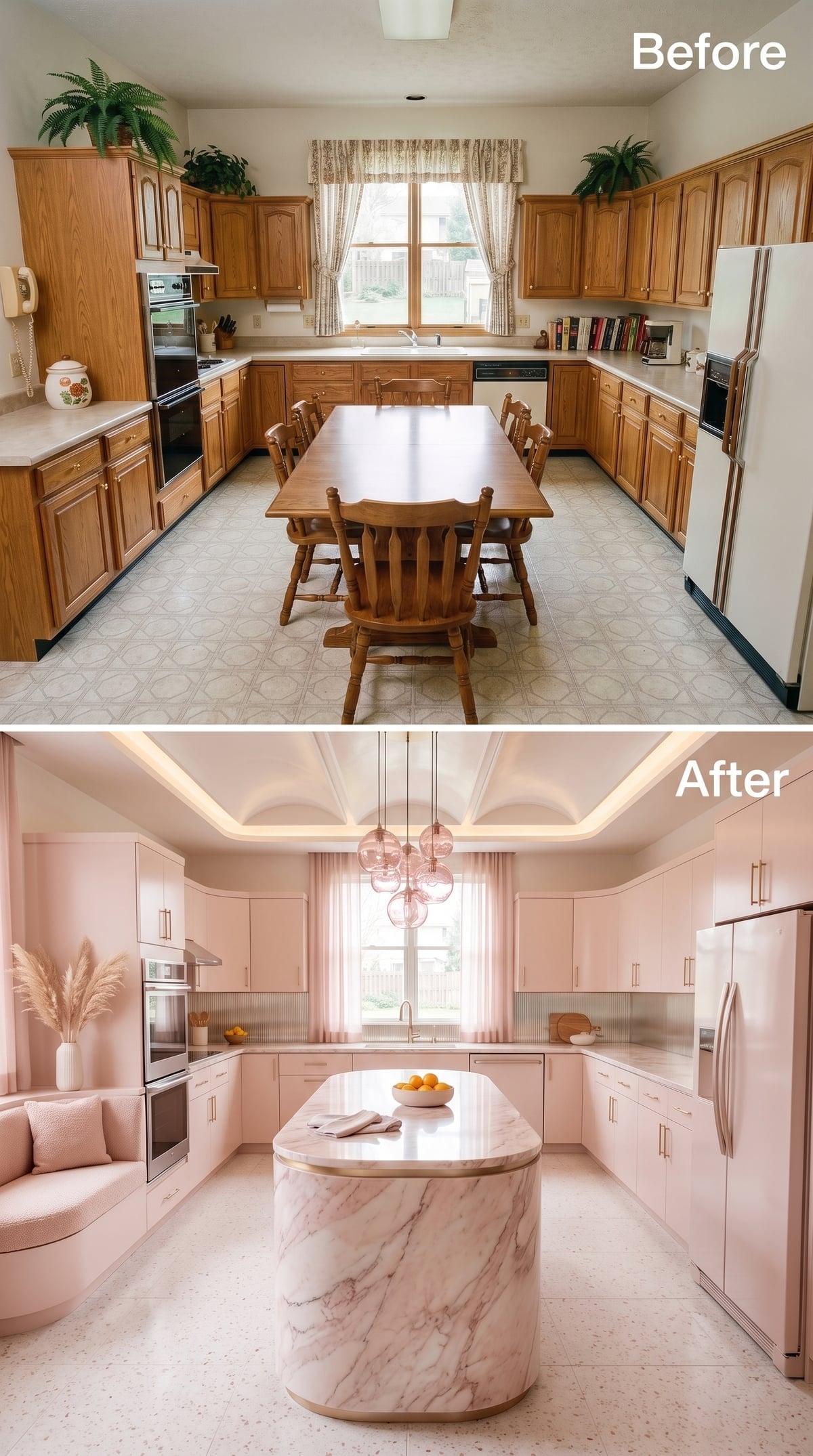
This is not a pink kitchen trying to be cute. The color is too dusty for that, and the stone is doing too much serious work. Soft blush cabinetry forms the perimeter while a curved rose-and-white marble island turns the center into something closer to sculpture.
Gold appears as a narrow outline rather than a flood: pulls, island trim, small details. Rose glass pendants deepen the palette overhead, and warm cove lighting keeps the pink surfaces from going gray after dark.
26. Concrete Above and Below Makes Walnut Look Almost Luxurious
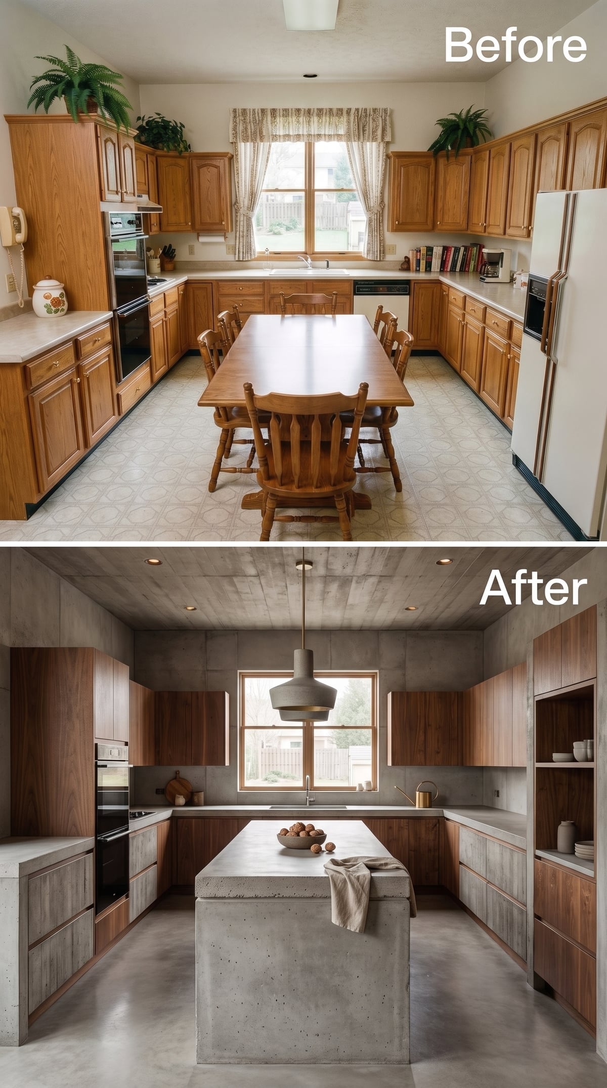
From rose marble to poured concrete is exactly the kind of turn this gallery needs. Concrete stretches across ceiling and floor, with dark walnut interrupting what could otherwise feel like an underground garage.
The island stays brutally simple: thick concrete, substantial proportions, almost no decorative relief. Open shelving removes upper cabinetry from two walls, allowing the darker palette to breathe. Even the pendant keeps to the material brief with a matte concrete finish.
The linen towel draped over the island may be the softest object in the room. That is exactly why you notice it.
25. Aqua Lacquer and Brass Turn Color Into the Architecture
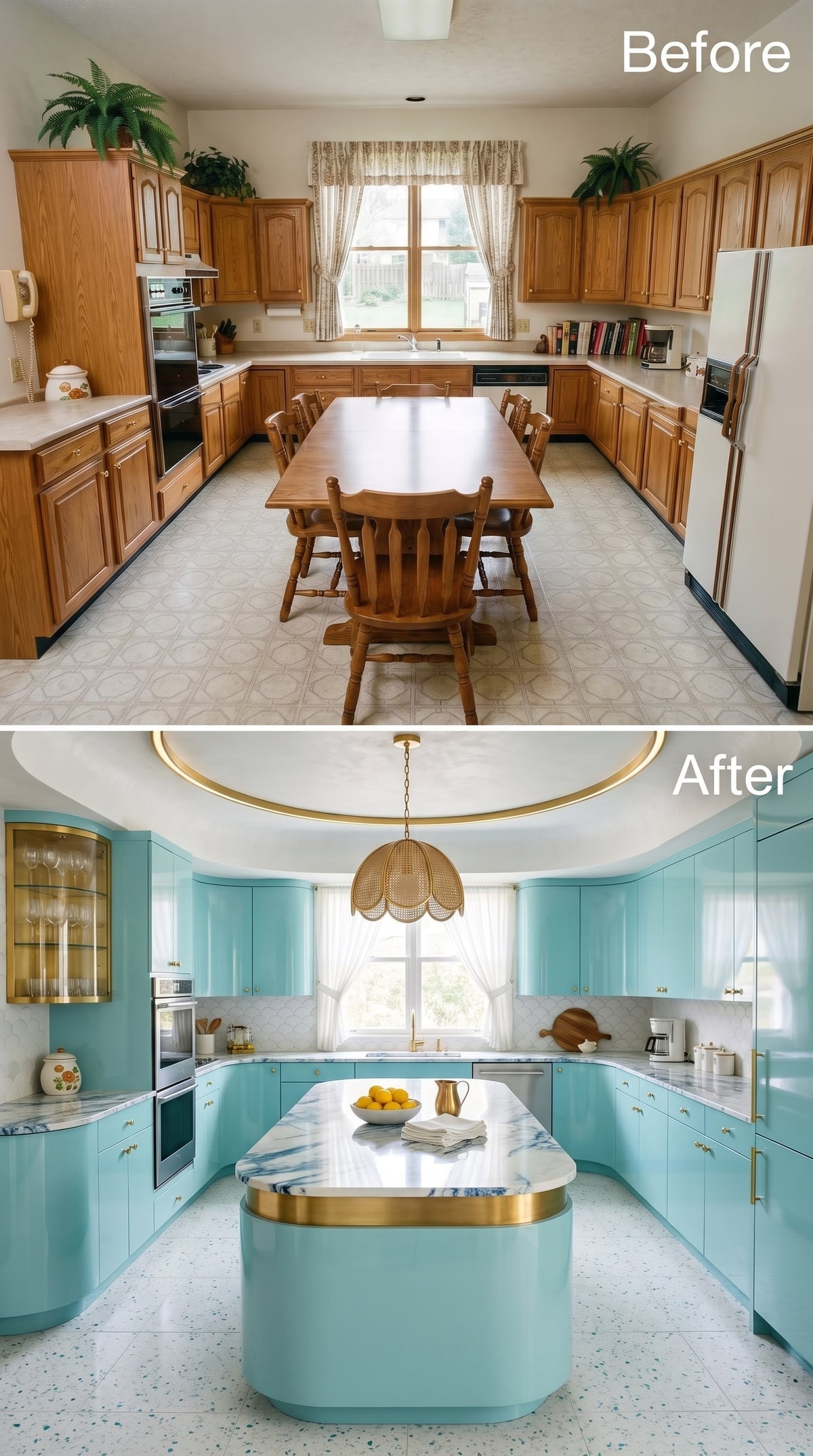
Somewhere between robin’s egg and pale turquoise, these cabinets are too specific to hide behind the word blue. Their glossy finish lets the color shift as daylight moves, while restrained brass pulls keep every door edge legible.
The curved island repeats the aqua at its base but introduces blue-veined marble above, edged with a thin metallic band. Terrazzo underfoot prevents the room from becoming precious, and the woven pendant inside a circular ceiling recess is just unexpected enough to loosen the whole composition.
24. A Beam Ceiling Gives Warm Maple the Structure It Was Missing
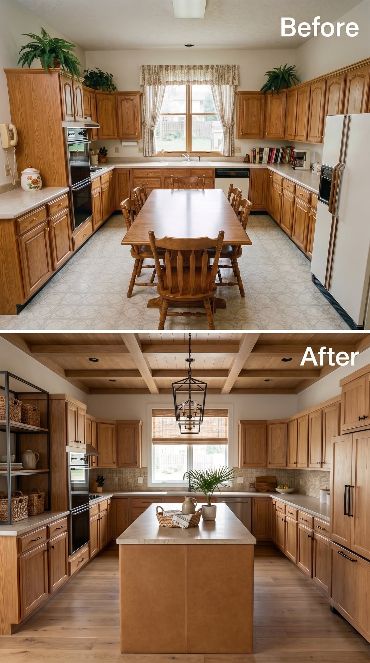
Now the warmth comes from wood instead of saturated color. Coffered beams turn a formerly anonymous ceiling into part of the room’s architecture, giving the central lantern pendant something substantial to hang from.
Honey-toned maple cabinets stay recognizably traditional, but matte black hardware cuts through the sweetness. The white island counter provides enough visual relief that the room never becomes one uninterrupted field of wood.
Why the Black Hardware Changes the Mood
Brass would reinforce the warmth. Brushed nickel would cool it. Matte black does something different: it creates a hard graphic outline against the wood grain, making traditional cabinetry feel sharper without pretending it is modernist.
23. Hunter Green, Black Marble, and Deco Geometry Refuse to Behave Quietly
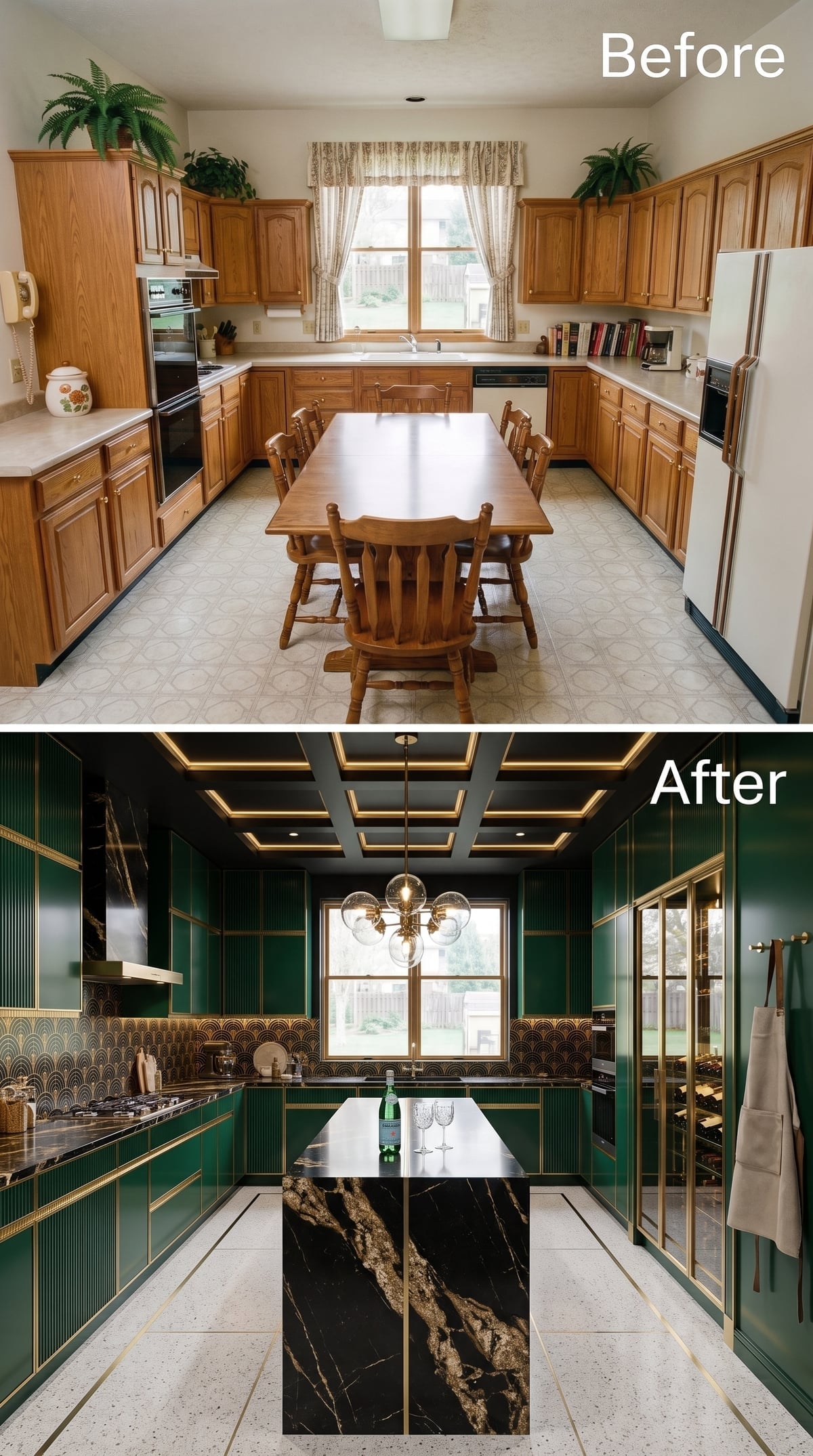
Hunter green lacquer covers the cabinetry, but brass channel inlay keeps each horizontal plane sharply defined. Behind it, a gold-and-green fan-pattern backsplash evokes Art Deco geometry without requiring the entire room to become a period reproduction.
The black marble island, shot through with gold veining, gives the room a darker center. Above, black coffers traced with light make the ceiling part of the graphic composition. A globe chandelier hangs inside all that structure like jewelry.
22. Bleached Oak Meets Marble, Then Rattan Takes the Edge Off
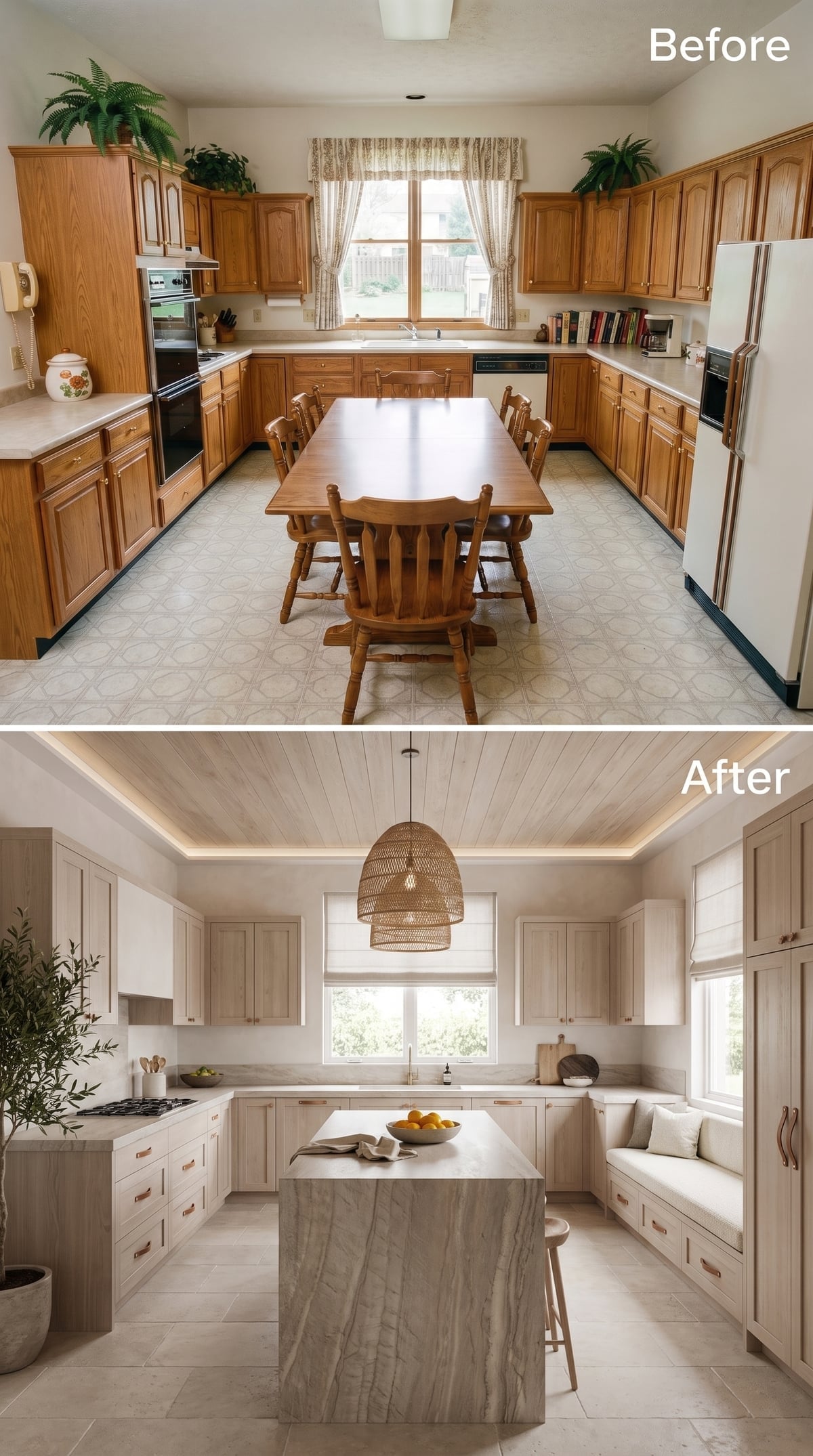
Pale wire-brushed oak and a marble waterfall island could easily slide into showroom territory. The woven pendant prevents that. Its irregular fibers sit against all those hard, polished planes like a deliberate refusal to make every surface behave.
Cove lighting softens the tray ceiling after dark, while copper bar pulls put a warmer note into the pale cabinetry. The built-in bench along the right wall is an especially smart intervention: instead of filling an awkward corner with another bank of cabinetry, the design turns it into somewhere to sit.
Why the Rattan Matters
Rattan does not need to compete with stone for attention. Its matte, fibrous texture is enough. Marble already supplies polish, veining and visual weight; the woven shade introduces something porous and tactile, keeping the room from feeling overly finished.
21. Terracotta and Travertine Make Warmth the Entire Point
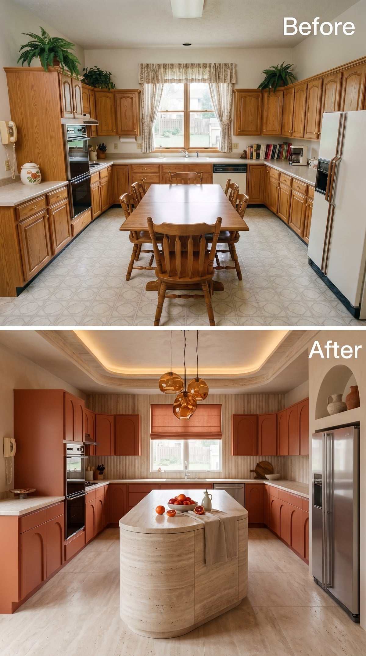
Rust-toned cabinetry surrounds this kitchen with color, but the finish stays earthy rather than glossy. Arched panel details reinforce the softness while a rounded travertine island gives the center a pale, mineral counterweight.
Amber pendants make the palette even warmer after dark. Instead of neutralizing all that terracotta with cool gray or stark white, the design commits to the temperature and lets subtle differences in stone, wood and glass provide the contrast.
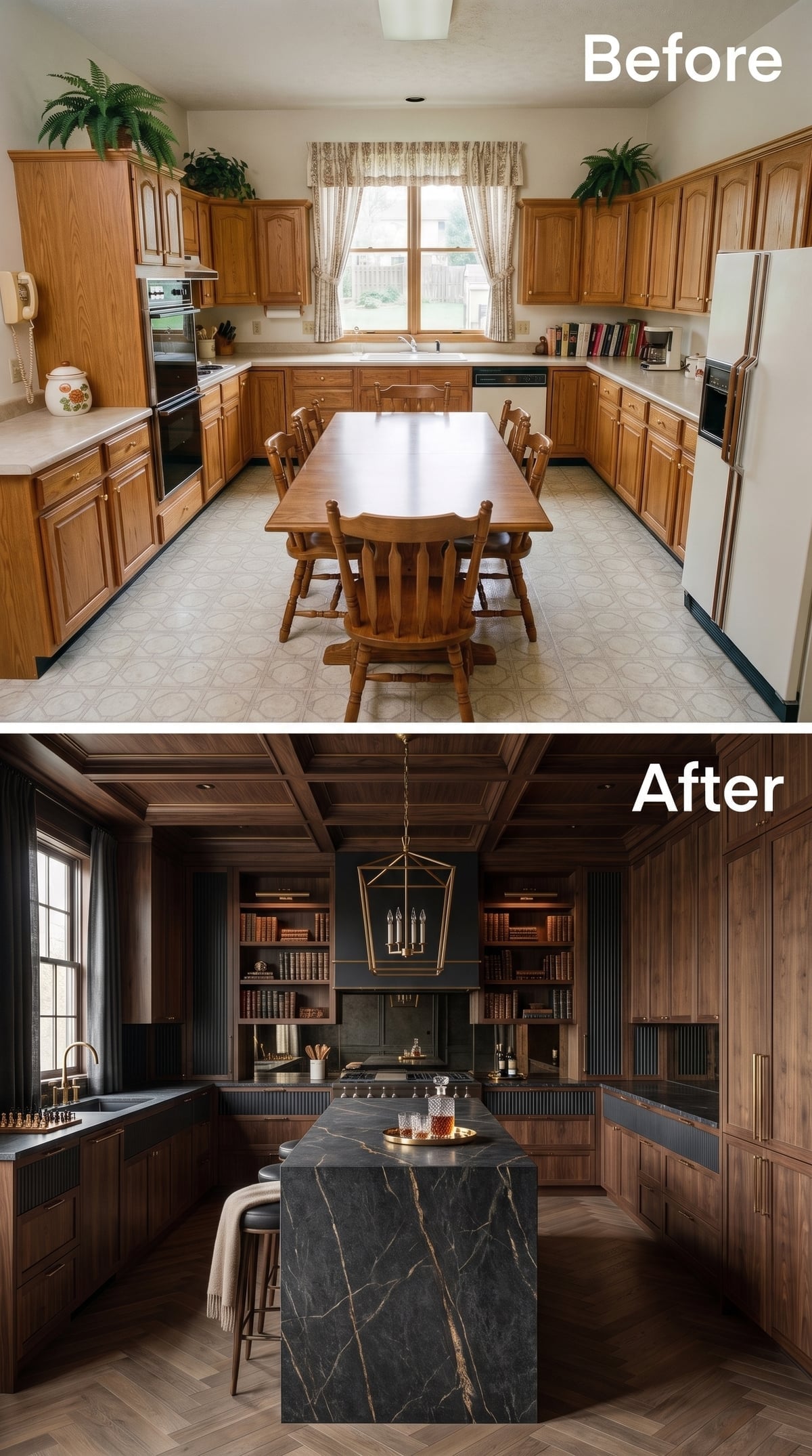
20. Dark Walnut and Soapstone Make the Kitchen Feel Almost Like a Library
🔥 Would you like to save this?
This is what happens when kitchen millwork borrows its manners from a study. Walnut climbs the walls and continues across the coffered ceiling, visually wrapping the room rather than simply furnishing its perimeter.
Open shelves flanking the range hold books and objects alongside kitchen pieces, changing the atmosphere immediately. A thick soapstone island brings a quieter surface into the center, while brass lighting picks up warmer streaks in the wood.
19. Sage Shaker Cabinets and Copper Put Tradition on Warmer Footing
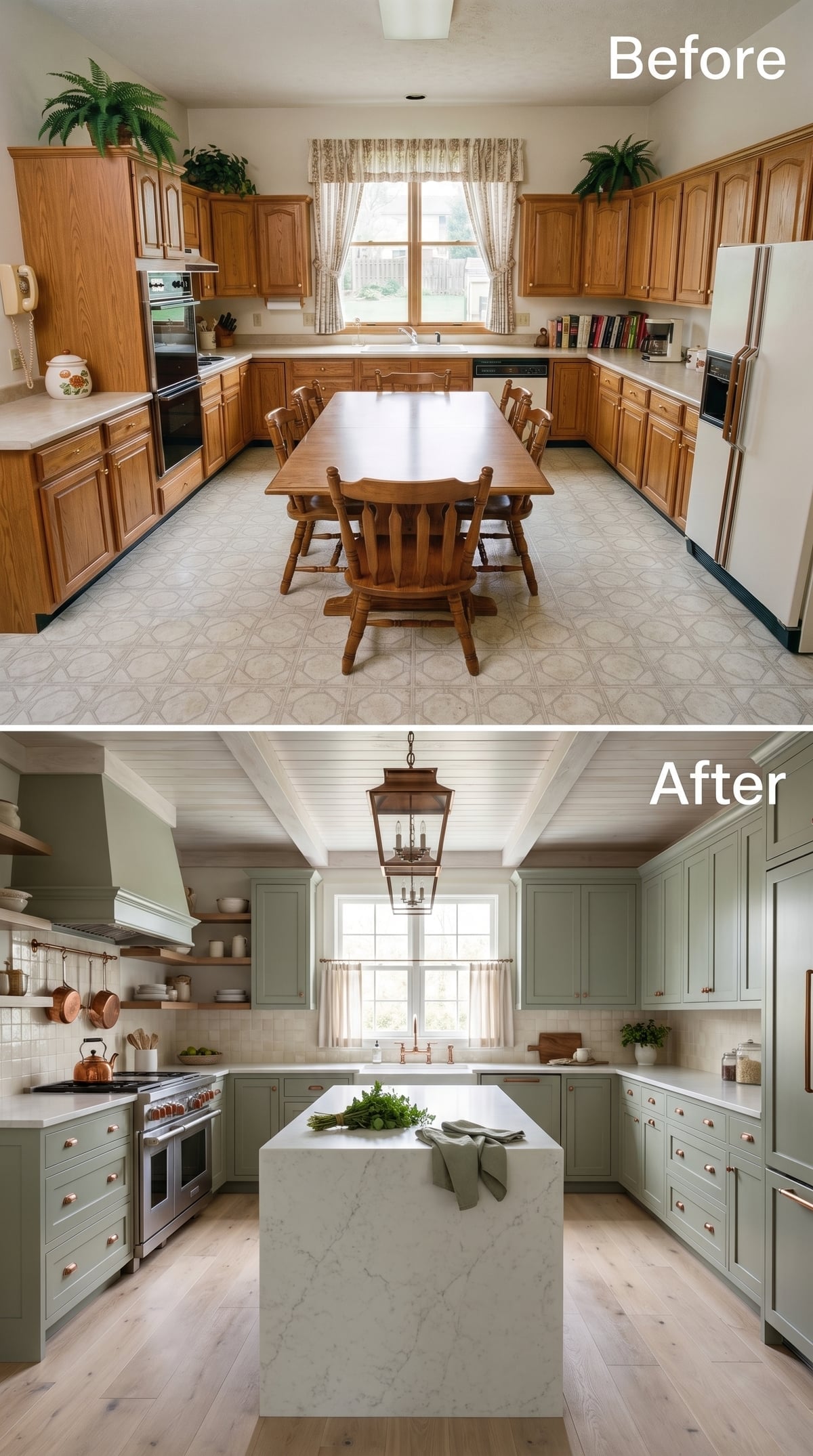
Sage and copper are doing more together here than either would manage alone.
The cabinetry stays traditional with Shaker fronts, but copper pulls and visible cookware keep the palette from drifting into polite farmhouse territory. A white waterfall island provides a cleaner modern gesture at center, while light oak flooring and a shiplap ceiling keep the room warm.
Cafe curtains are a small but useful choice at the window. They preserve privacy low down while leaving the upper glass open to daylight.
18. Gloss Navy and Backlit Onyx Turn the Kitchen Into Evening Wear
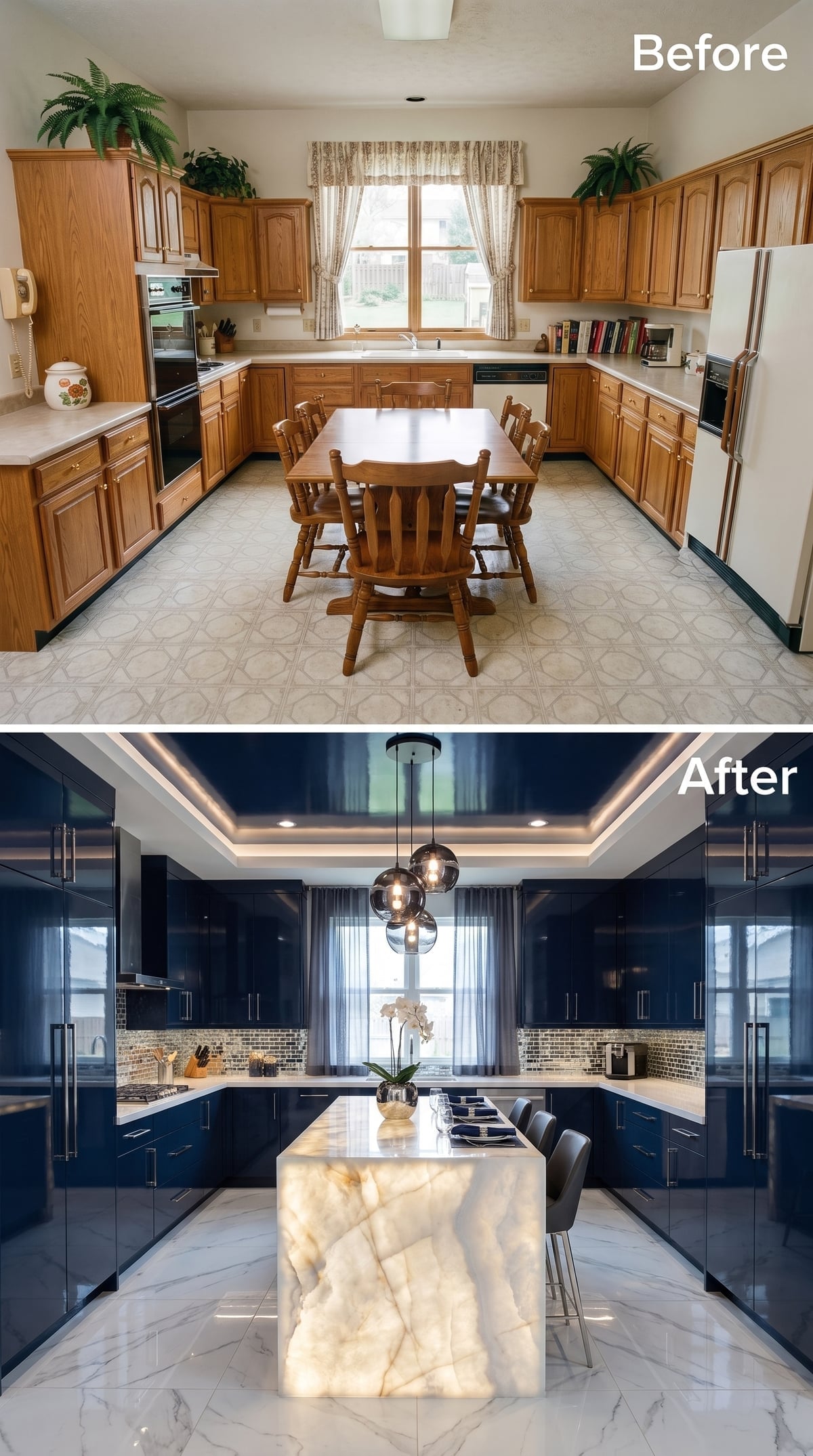
High-gloss navy reflects the room around it, brushed nickel keeps the hardware cool, and mosaic tile introduces just enough surface variation to stop all that lacquer from becoming monolithic.
Then there is the island. Translucent stone with dramatic veining appears to glow from within, making the countertop itself part of the lighting scheme. A tray ceiling traced with cove light repeats the effect overhead, while globe pendants keep the center from becoming too architectural to feel inhabited.
17. Limewash and Arched Niches Make the Kitchen Feel Older Than the House
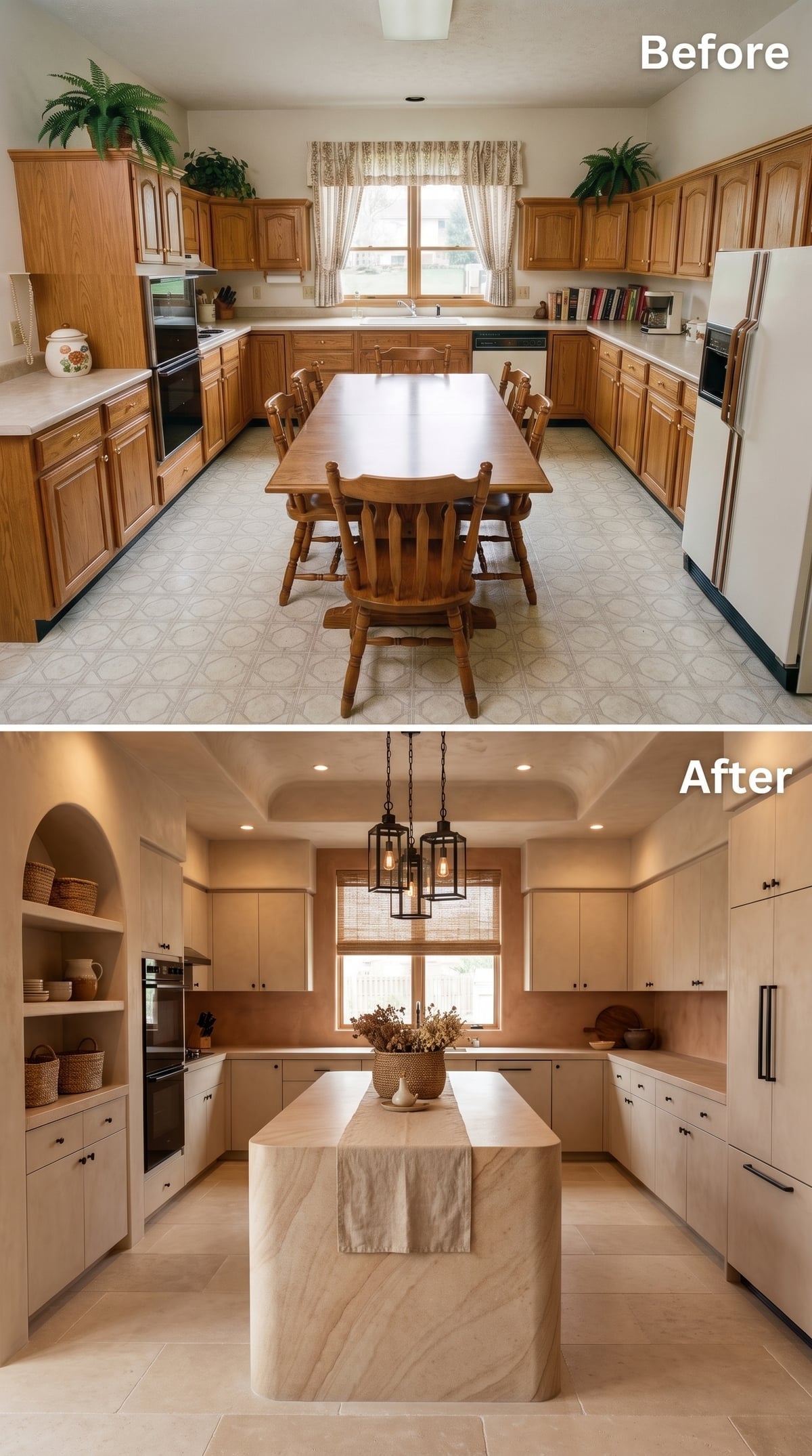
This transformation backs away from lacquer, gloss and hard geometry. Limewashed walls introduce subtle tonal variation, pale linen-colored cabinets almost recede into them, and arched niches make the room feel as though some of its architecture might have been there long before the renovation.
The island uses a warmer veined stone rather than icy white marble, while black hardware and lantern-style pendants provide just enough outline to keep the pale surfaces from dissolving into one another.
16. Walnut and Leather Turn the Island Into Furniture
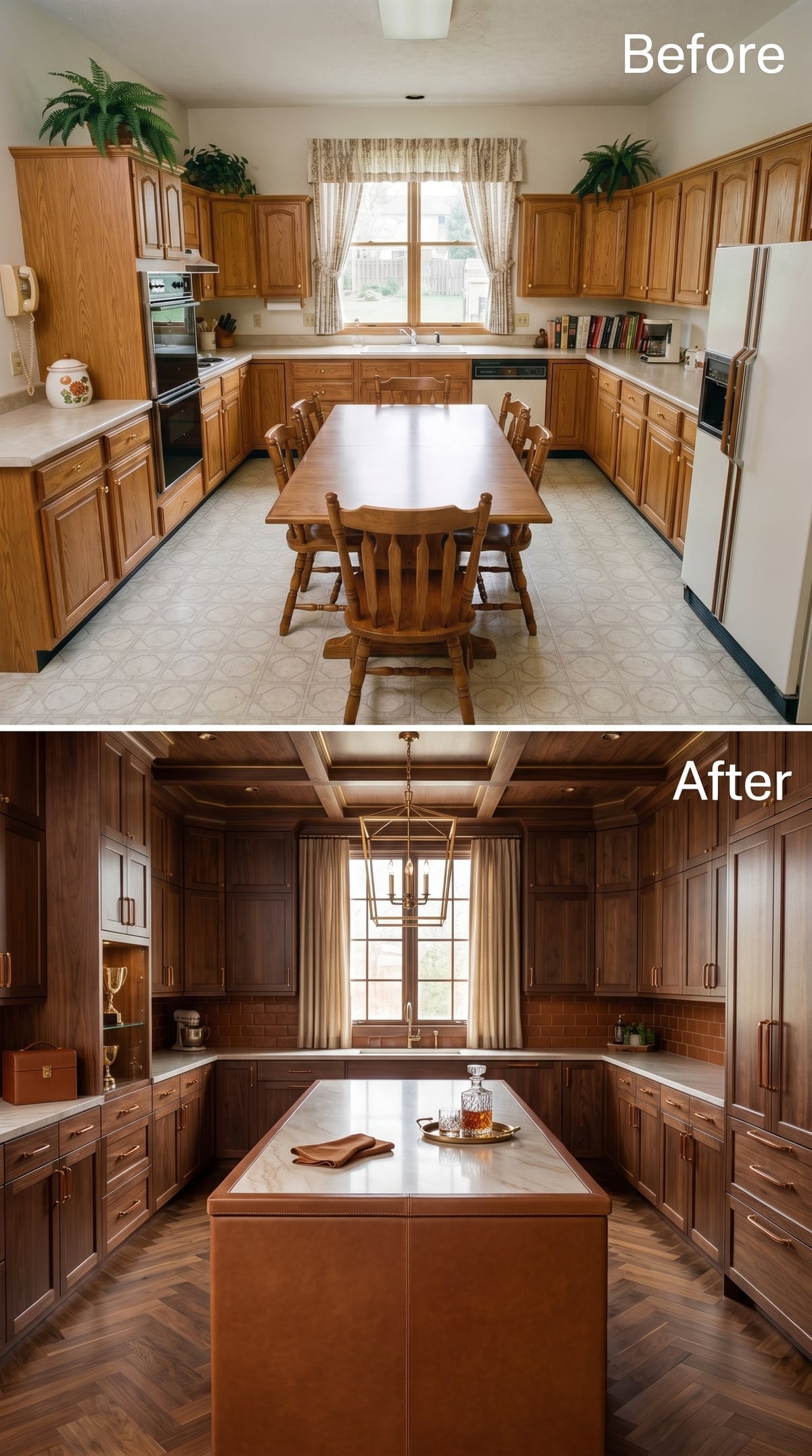
Dark walnut already brings enough character to carry a room. Wrapping the island base in leather takes the material story somewhere less expected, giving the center of the kitchen the presence of a tailored piece of furniture rather than another cabinet box.
Herringbone flooring keeps the wood-on-wood composition from becoming flat, while brass hardware catches just enough light to define the cabinet fronts. Nothing here depends on color for drama. Texture does it instead.
15. Cobalt Lacquer and Terrazzo Make Restraint Completely Optional
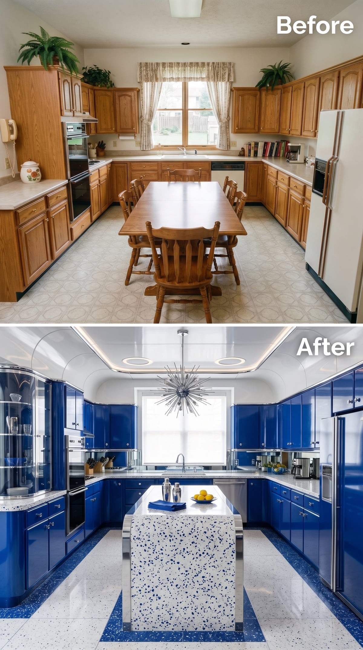
Cobalt cabinetry does not sit politely at the edge of a room. It takes possession. High gloss intensifies the color further, while white terrazzo on the island and striped terrazzo underfoot scatter enough pale aggregate through the composition to stop the blue from becoming oppressive.
The Sputnik chandelier is exactly as assertive as the cabinetry. A timid fixture would disappear here. This one meets the room at full volume.
That Sputnik chandelier isn’t decorating. It is part of the architecture of the composition.
14. Bleached Ash and Sage Stone Push Minimalism in a Softer Direction
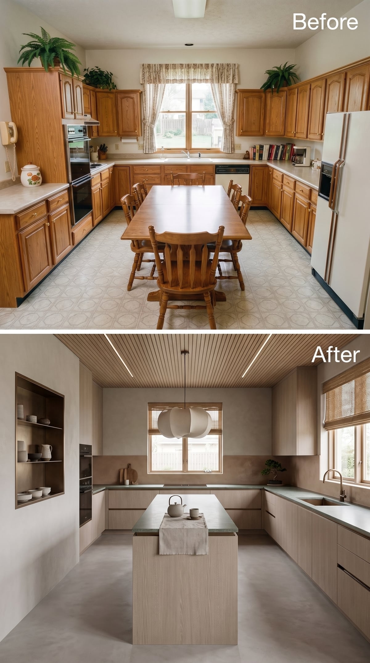
After cobalt at full volume, this almost whispers. Flat-front bleached ash cabinetry keeps the perimeter pale, but sage-toned stone gives the counters enough color to stop the room from disappearing.
The wood-slat ceiling carries integrated linear lighting across the room, which means the island does not need a decorative pendant fighting for attention. The architecture itself has taken over the lighting job.
Sage-toned stone is just dark enough to hold the center of an otherwise pale room.
13. Cherry Wood and Amber Glass Reclaim the Warm Kitchen
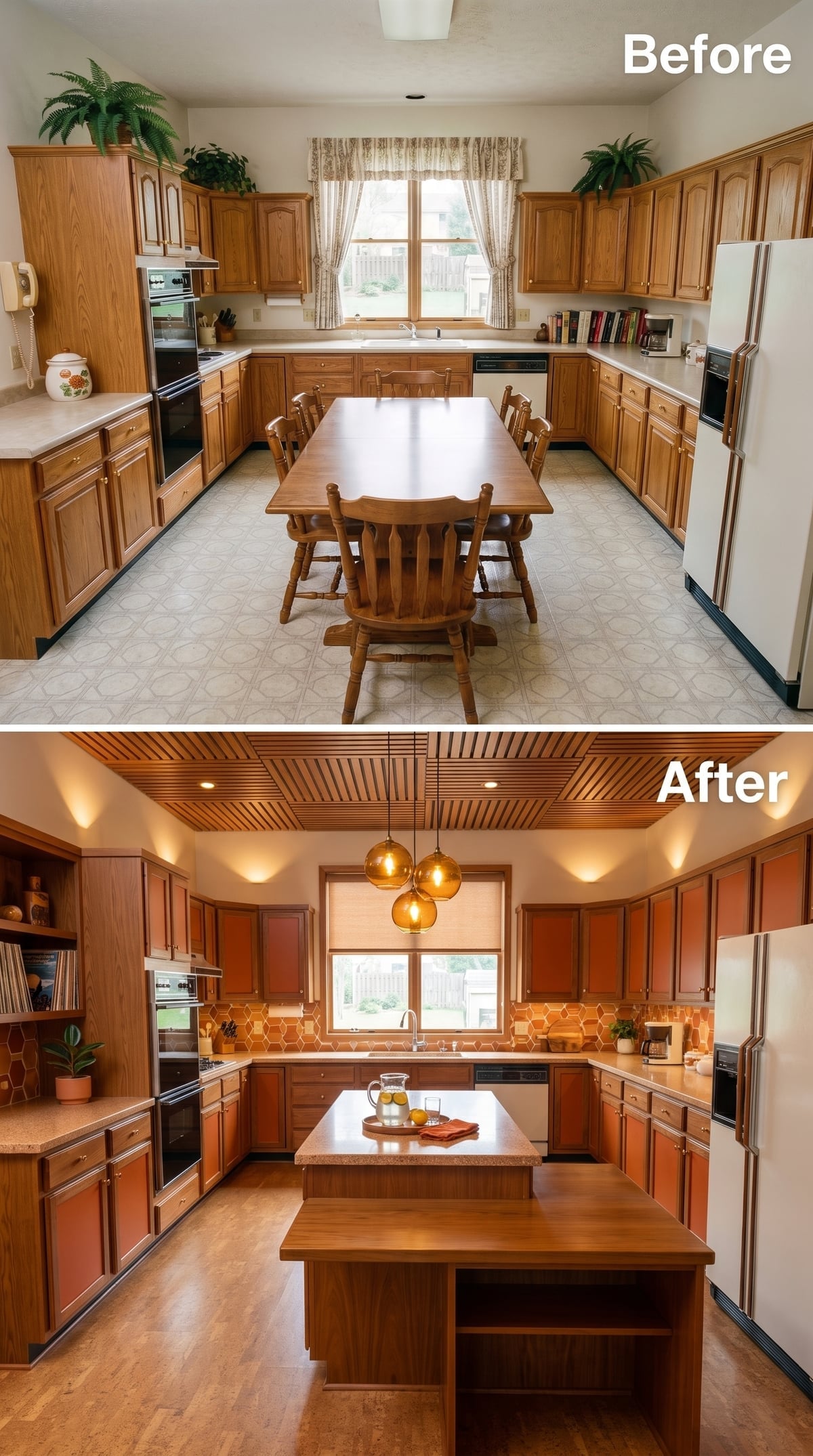
Cherry cabinetry spent years on renovation hit lists, which makes this version interesting. Instead of bleaching the warmth out of the room, it doubles down. Burnt-orange honeycomb tile, amber pendant globes and a slatted wood ceiling make the cabinet color look purposeful rather than leftover.
The light countertop is crucial. It interrupts the warm palette before it becomes muddy and gives the eye a clean horizontal plane between all that saturated wood and tile.
12. Pure White Cabinetry Turns the Old Kitchen Into a Study in Precision
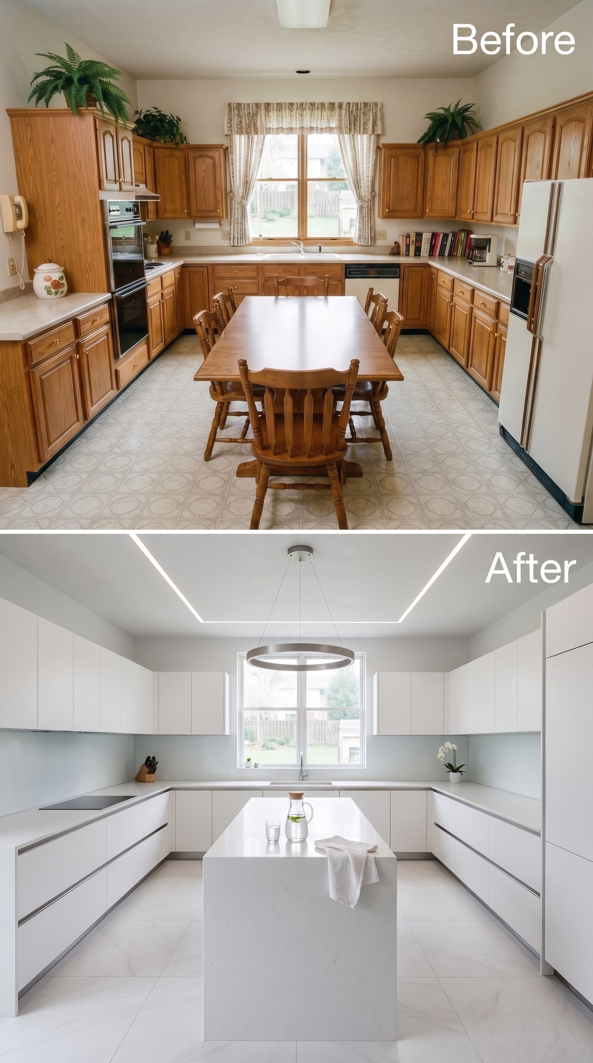
After all that cherry and amber, this clears the visual palate completely. Handles disappear. Cabinet faces flatten. Color retreats. White on white could become sterile, but the details have moved into shadow lines, proportions and carefully placed light.
Linear LEDs carve across the ceiling instead of dangling into the center of the room. The waterfall island stays low and monolithic, allowing the window and cabinetry to dominate the geometry. Engineered quartz is a natural fit because the surface can remain visually quiet while still giving the island enough mass to register.
11. Walnut, Concrete, and a Wine Wall Give the Room a Clubby Edge
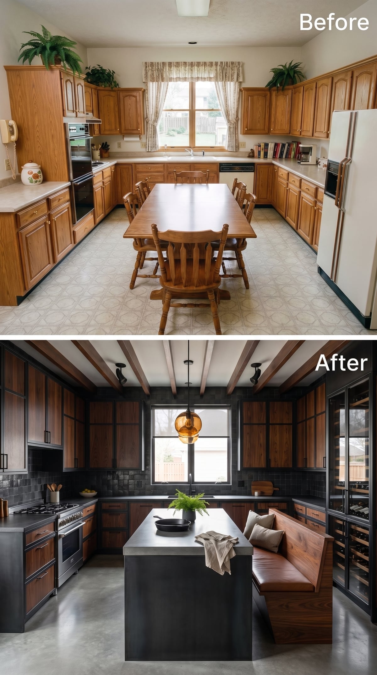
The pendulum swings straight back toward darkness. Black-trimmed walnut cabinetry pushes this kitchen into moodier territory, but polished concrete keeps it from becoming overly luxurious. The materials belong to different worlds: tailored millwork on one side, utilitarian floor and island surfaces on the other.
The wine wall and built-in banquette give the room another identity beyond food prep. An amber pendant softens the concrete without trying to disguise it. This is the kind of kitchen that looks as comfortable after dinner as it does while dinner is being made.
10. Cream Fluting and Gold-Veined Marble Go Straight for Glamour
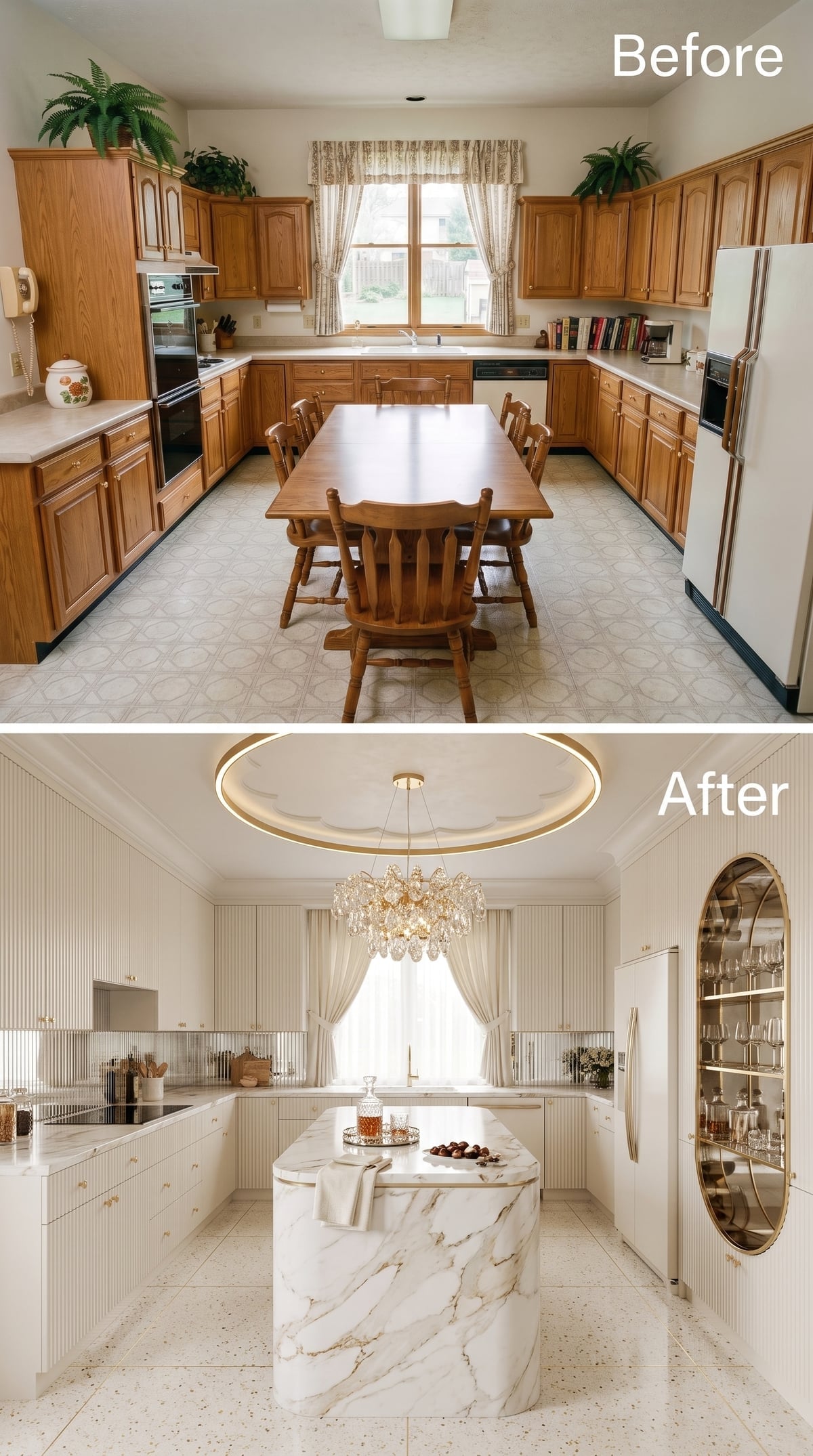
Dark walnut disappears and glamour returns. Vertical fluting gives the cream cabinetry enough shadow to keep an almost monochromatic room interesting. Brass hardware follows those vertical lines, but the island refuses to stay in the background: white marble streaked with gold wraps from counter to floor in one continuous gesture.
Then the ceiling joins in. A crystal chandelier descends from a circular tray edged in warm light, while an oval brass mirror turns built-in glassware storage into something closer to a bar. This could have become bridal-suite territory. The restrained base color saves it.
9. Inky Navy Shaker Cabinets Prove Traditional Details Can Still Look Sharp
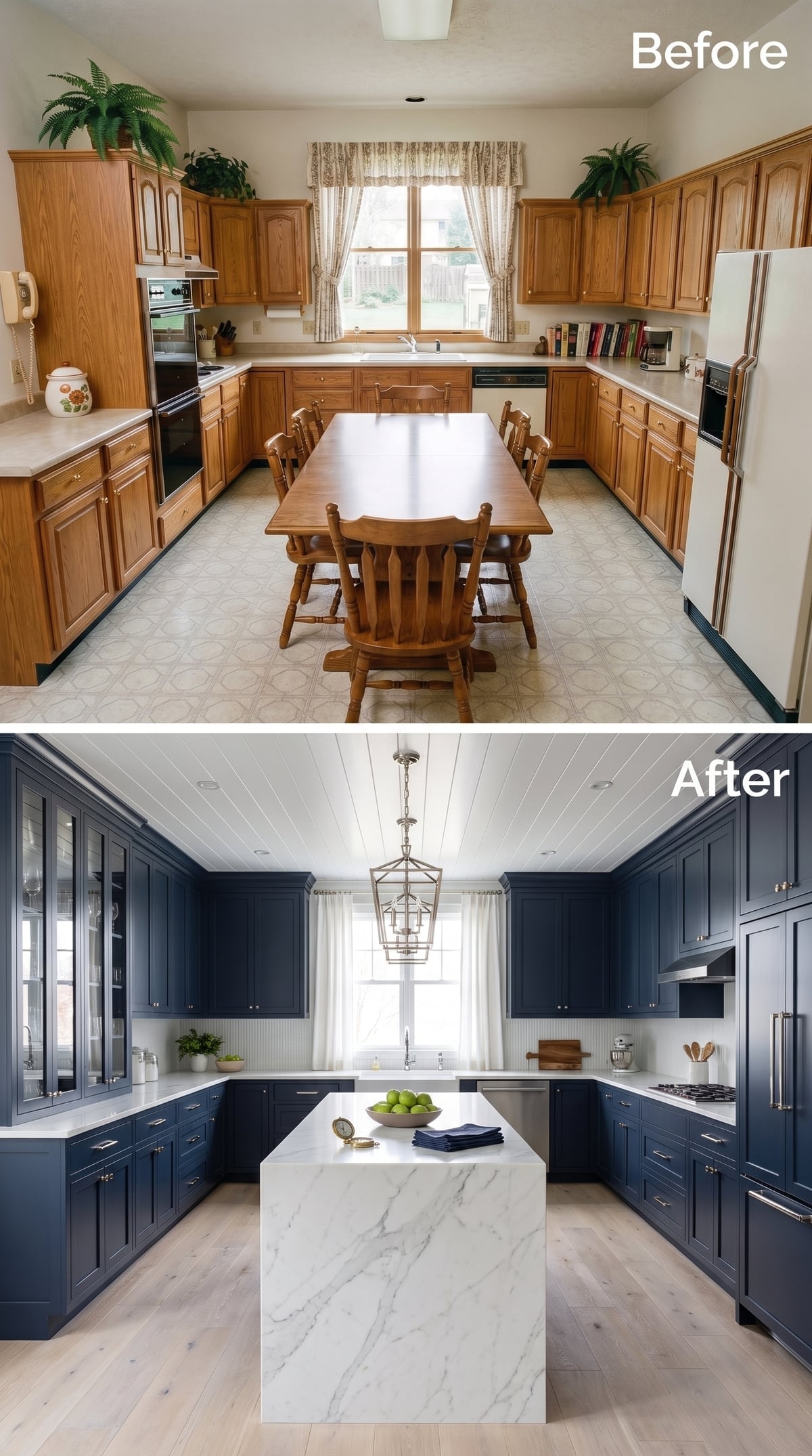
This kitchen keeps the familiar Shaker profile and changes everything around it. Deep navy replaces white or wood, pale flooring lifts the lower half of the room, and a white waterfall island gives the eye somewhere bright to land.
A lantern pendant works because its open frame has presence without becoming a visual barrier. Glass-front cabinets interrupt the navy just enough to keep the perimeter from reading as one continuous dark wall.
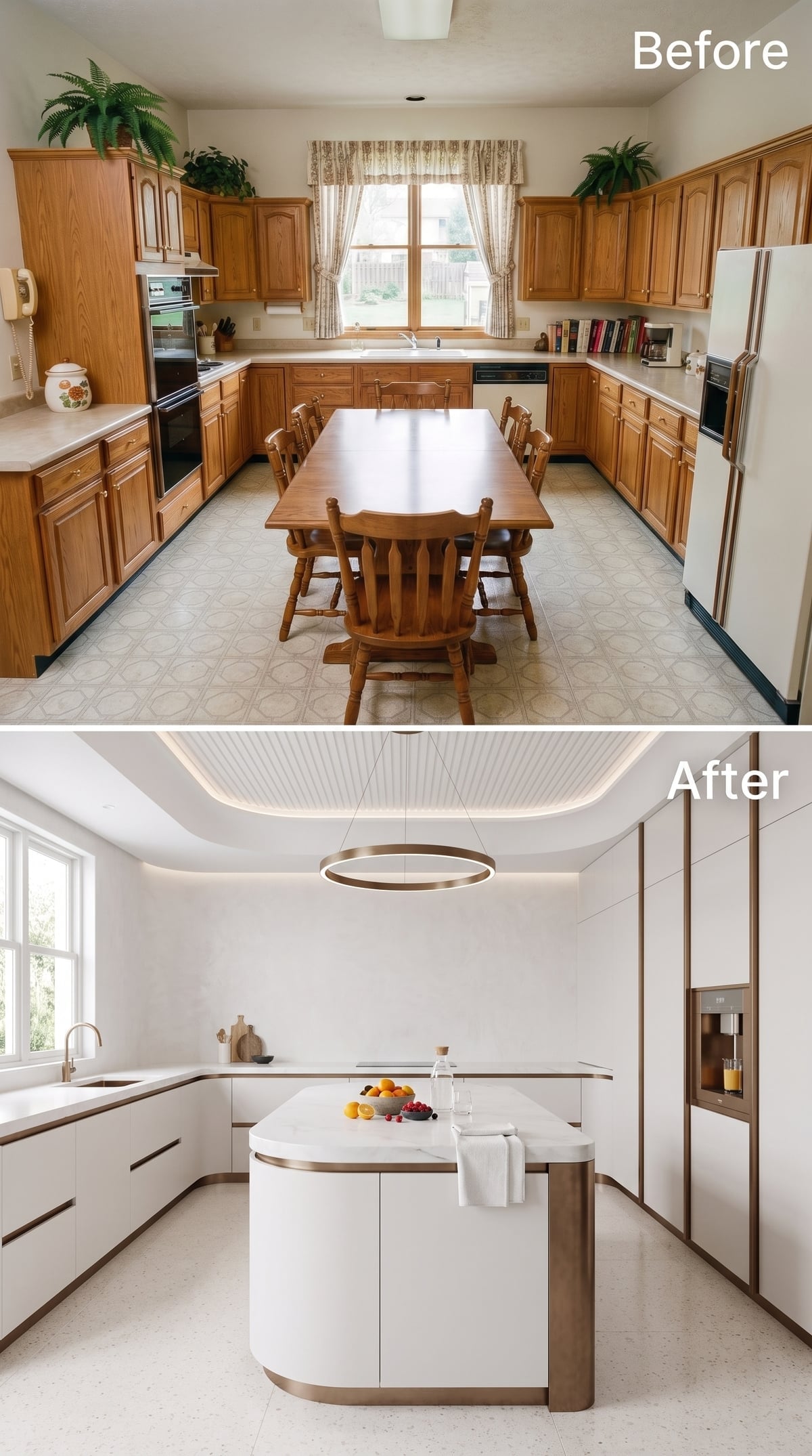
8. Ivory Lacquer and Bronze Make Curves Feel Architectural
🔥 Would you like to save this?
Rounded island corners immediately change the body language of this kitchen. Instead of sharp dark planes, the room moves in softer arcs, with warm ivory cabinetry and bronze trim defining the edges.
The ceiling treatment is especially disciplined. A dropped coffer hides integrated lighting around its perimeter, creating ambient illumination without filling the field with visible fixtures. The ring pendant at center repeats the bronze below and gives the curve language one more place to appear.
7. Sage Green and Gold Take Luxury Down Several Decibels
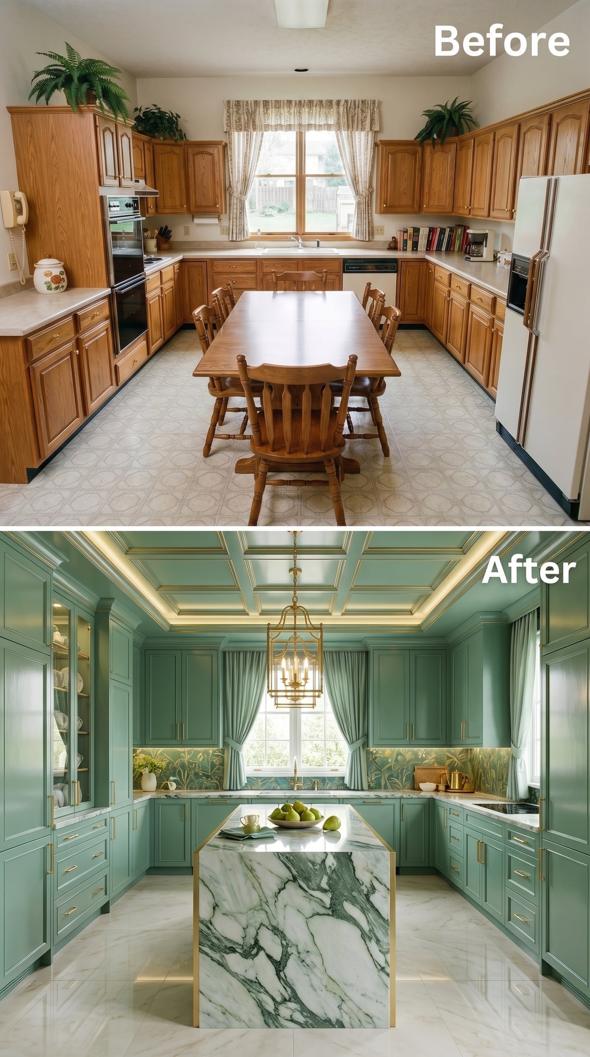
Sage green cabinetry covers a lot of territory, but the soft hue keeps the room luminous rather than enveloping. White marble veined in green echoes the cabinets without matching them exactly.
Gold trim works its way through the coffered ceiling, cabinet hardware and central lantern, while botanical wallpaper adds a quieter pattern at backsplash height. There are plenty of layers here. None needs to shout because the palette keeps them in conversation.
6. Light Oak and a Slatted Ceiling Put Warmth Back Into Modernism
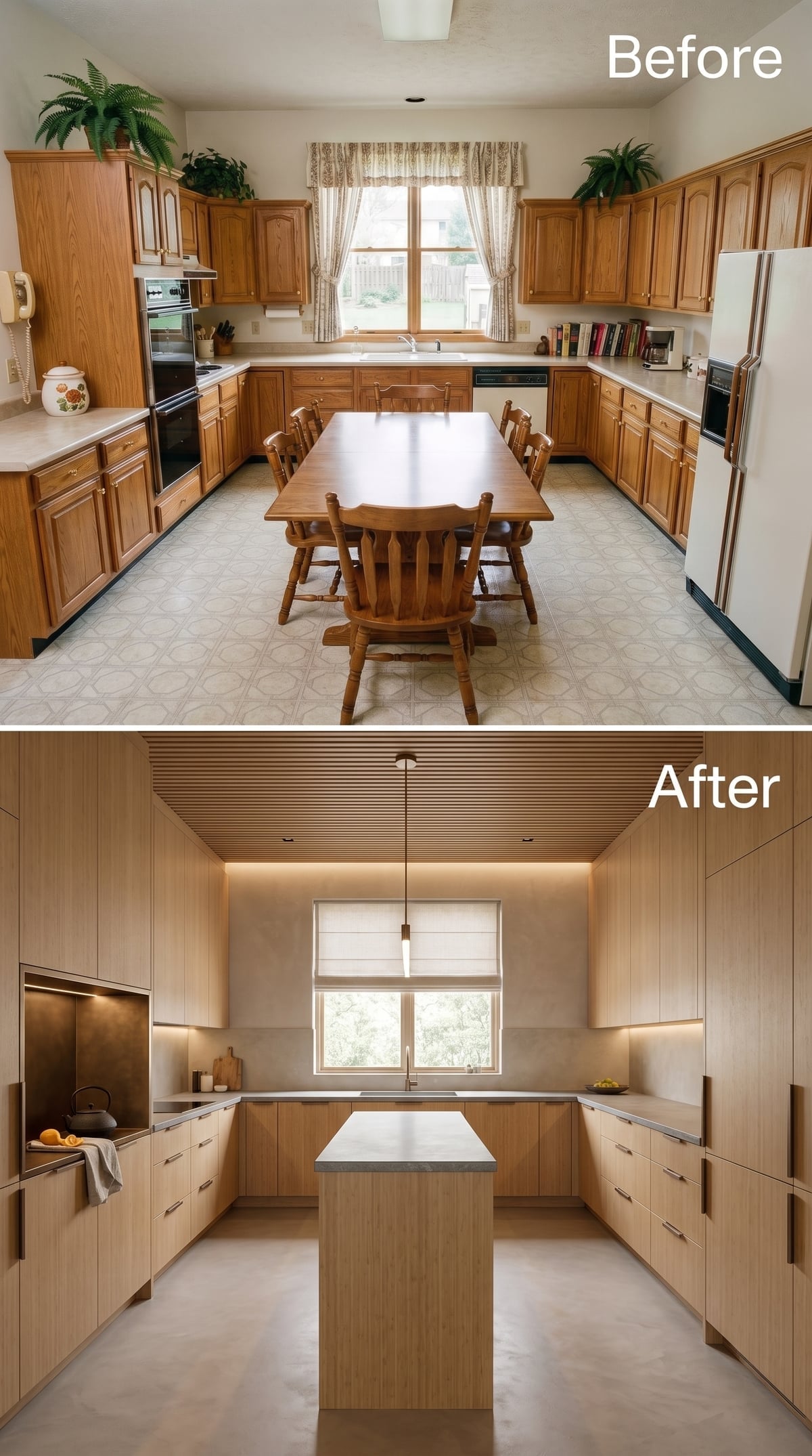
After gold-trimmed sage, this one lowers its voice. Pale oak keeps the long cabinet runs from becoming visually heavy, while the slats overhead draw warmth across the ceiling and make the room feel composed rather than cavernous.
The gray concrete-look island deliberately refuses to become another showpiece. Once wood grain is moving across this much of the room, a highly figured stone in the center would turn the composition into a contest. Soft Roman shades and concealed task lighting finish the room without introducing another personality.
5. More Cream, More Marble, but This Time the Stone Does the Connecting
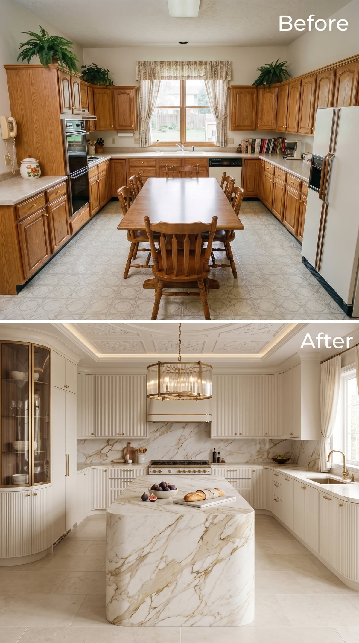
Cream returns, but the strategy has changed. The island is not an isolated centerpiece. Calacatta-style stone continues onto the backsplash, carrying the same veining from the center of the room to the cooking wall.
Reeded cabinetry adds a smaller-scale texture beneath all that movement. Brass hardware warms the cream, while a tray ceiling with cove lighting supplies depth overhead without competing with the chandelier.
4. Black Tile Makes Pale Wood Look Warmer Than It Really Is
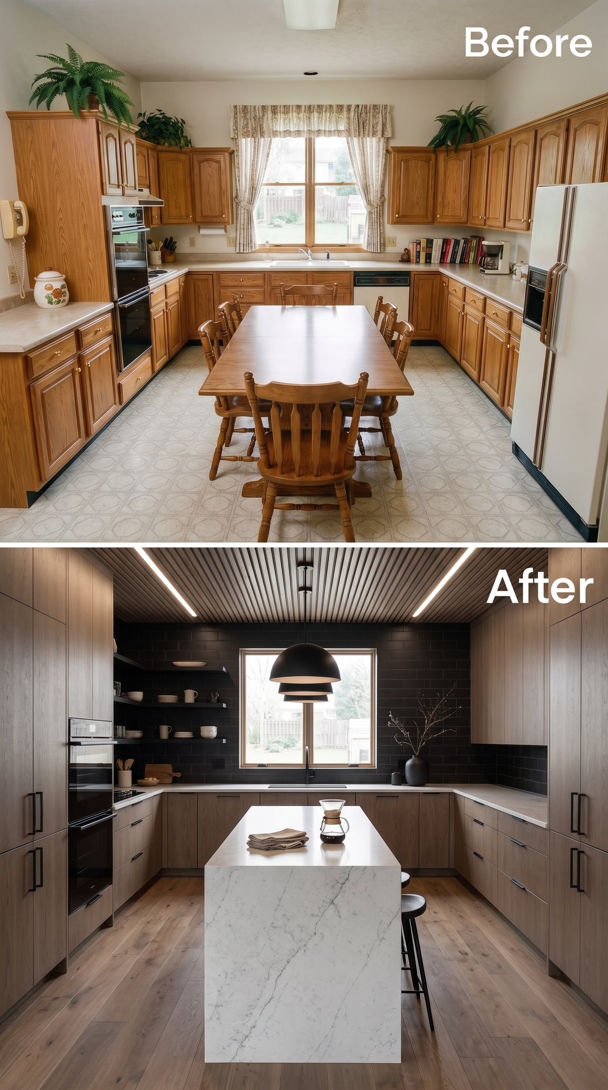
A wall of matte black subway tile gives the pale oak cabinetry an entirely different kind of backdrop. Grain that might disappear against white suddenly looks warmer and more dimensional, while the dark surface adds enough weight to stop the room from drifting into another pale-wood composition.
The white waterfall island becomes the bridge between those extremes. Open shelving on one side prevents the dark wall from becoming a sealed block, while a low black dome pendant repeats the backsplash color without adding another finish.
3. Sage Below, Walnut Above, and Fresh Herbs Right in the Island
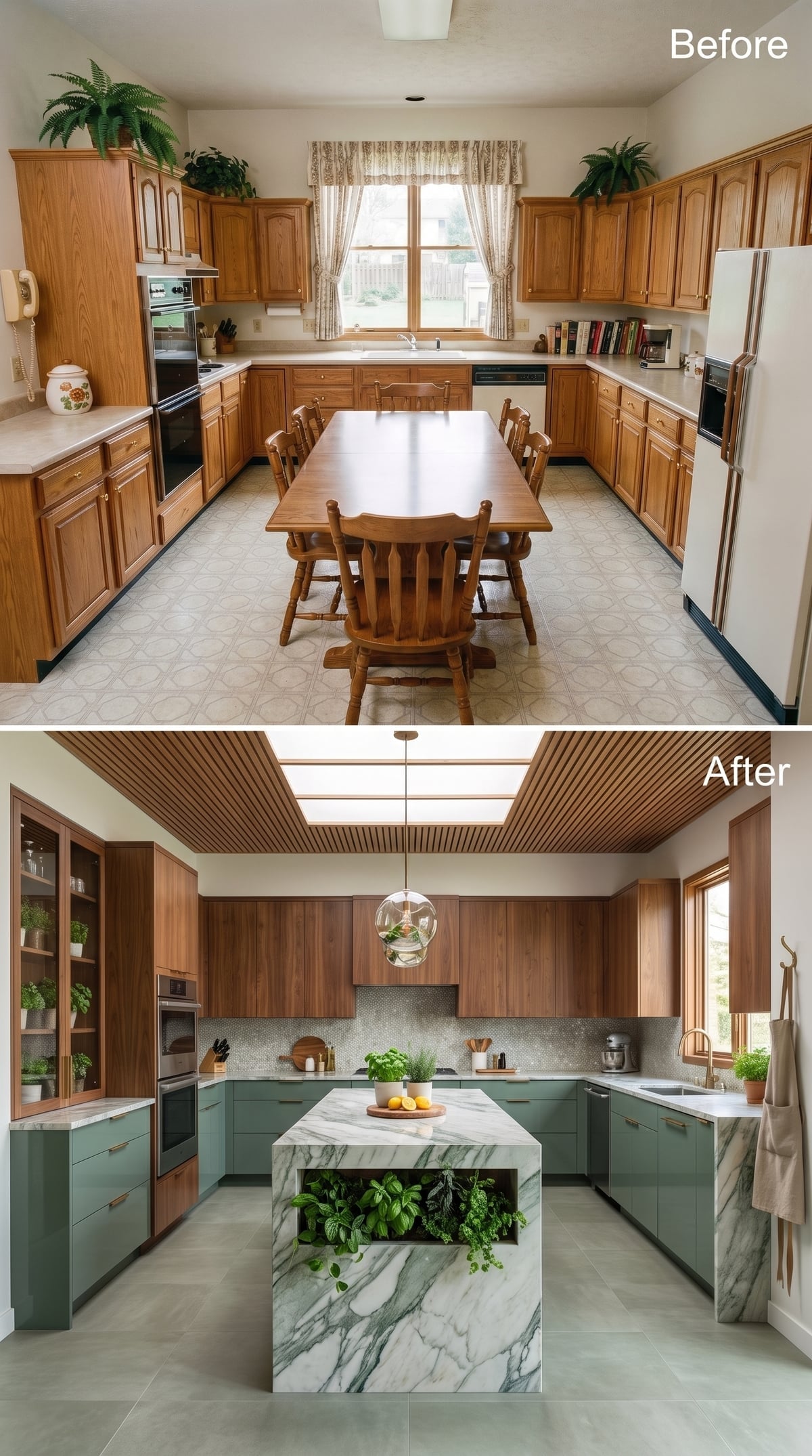
Two-tone cabinetry is strongest when the split looks architectural rather than arbitrary. Here, sage stays low and grounded while walnut occupies the upper level, creating a clear horizontal division instead of a random checkerboard of finishes.
The marble island adds the smartest eccentricity: a recessed pocket filled with living herbs. It is part planter, part garnish station, part visual relief from all the stone. Slatted ceiling panels wrap the skylight zone, while penny tile adds a much smaller pattern behind the counters.
This is one of the few designs in the gallery where greenery is not merely something placed on the counter afterward. It is built into the room’s logic.
2. Charcoal Cabinets and a Wood Ceiling Find the Middle Ground
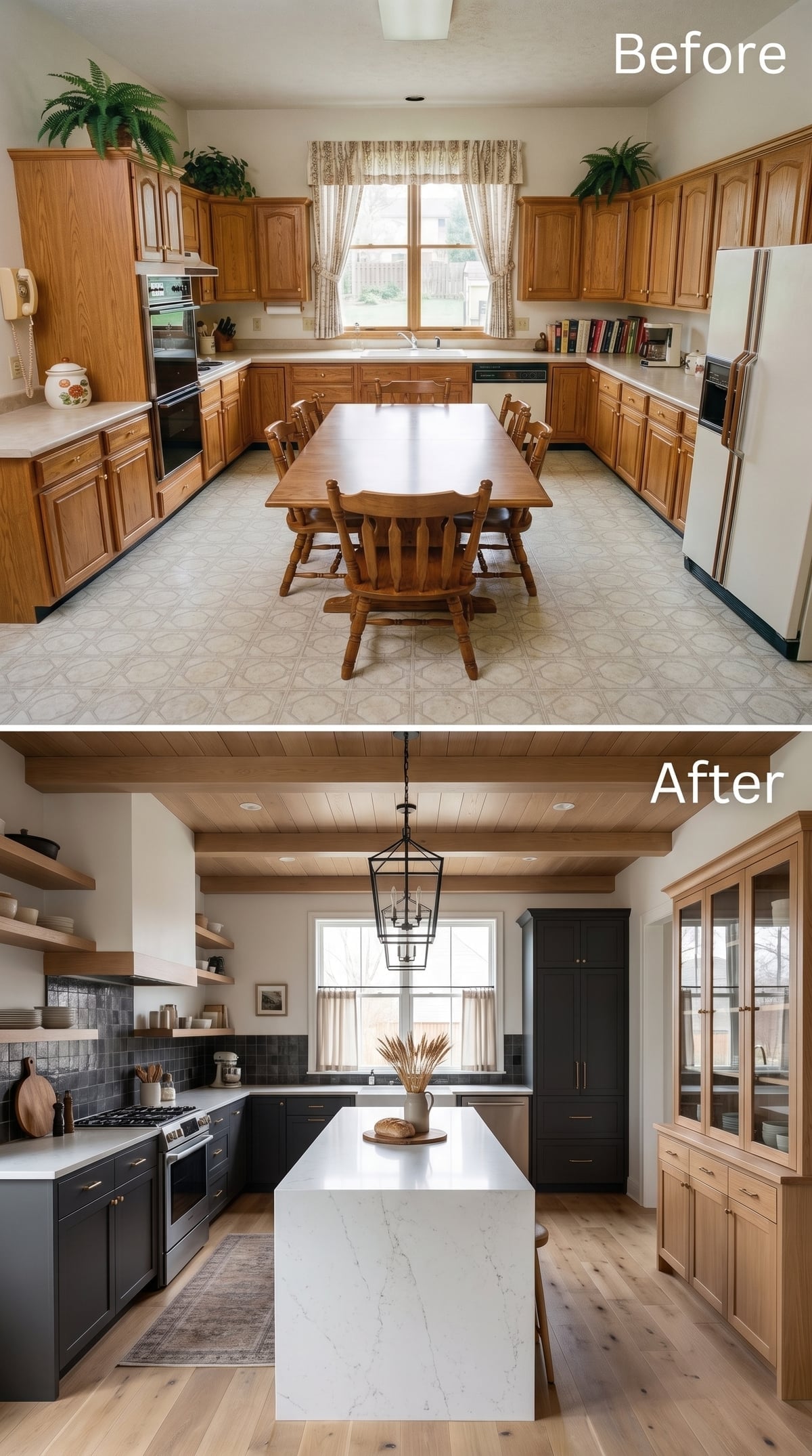
Charcoal lower cabinets beside natural wood shelving should feel heavier than this. They don’t.
The reason is distribution. Dark color stays low, white quartz occupies the center, and open oak shelving gives the upper wall some air. Slate-toned tile behind the range deepens the cooking zone without extending darkness across every surface.
Then the wood ceiling arrives and warms everything from above. The result is neither industrial nor rustic. It sits in the useful territory between the two.
1. Sage Green Meets Stained Glass in an Art Nouveau Finale
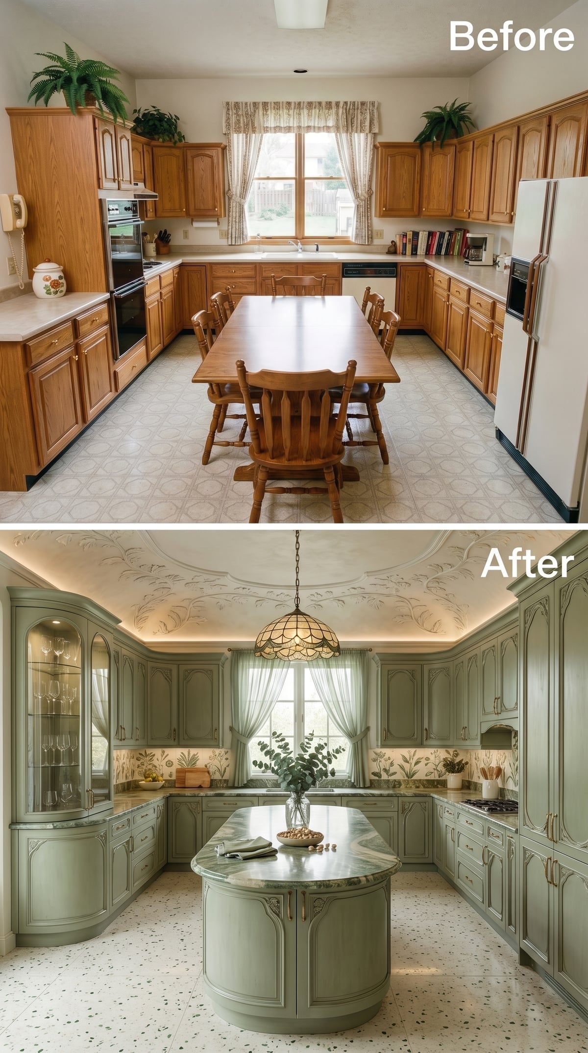
Finish with the kitchen least interested in looking conventionally new. Soft sage cabinetry gets carved panel detailing closer to furniture than standard millwork. The island abandons the expected rectangle for an oval form wrapped in green-veined marble. Terrazzo underfoot scatters color rather than laying down a uniform field.
The Art Nouveau reference comes through in the curves, botanical feeling and stained-glass pendant rather than in literal period reproduction. Straight lines soften. Decorative craft returns. Even the island feels less fabricated than drawn.
That makes it a fitting end to the experiment. Thirty-two redesigns began with one stubbornly dated kitchen, but the strongest results are memorable for everything they became afterward. White box, walnut library, pink marble, concrete bunker, cobalt fever dream, sage-green stained glass: once a room develops a point of view, the old vinyl floor does not stand a chance.












