

Ask any serious reader what they actually need and the answer is never a reading nook — it’s a door that closes, a wall of shelves, and somewhere worth going. The Victoria Row delivers all three, wrapping a proper library balcony, a Southern porch built for October afternoons, and wide interior hallways around a floor plan that keeps single-story living intact while the books get the upper level they deserve.
Specifications
- Sq. Ft.: 2,150
- Bedrooms: 3
- Bathrooms: 2.5
Floor Plan – Main Floor
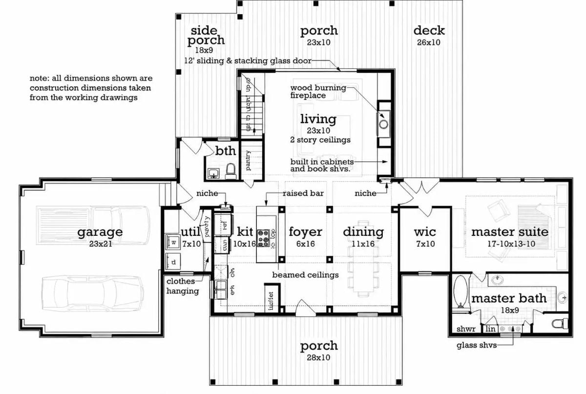
The single-story layout centers on a 23×10 living room with two-story ceilings and a wood-burning fireplace, with the master suite tucked to the right along with its own bath and walk-in closet. A foyer ties together the dining, kitchen, and utility zones. Three porches wrap the exterior — front, side, and rear — so there’s always somewhere to be outside without going anywhere.
Floor Plan – Second Floor
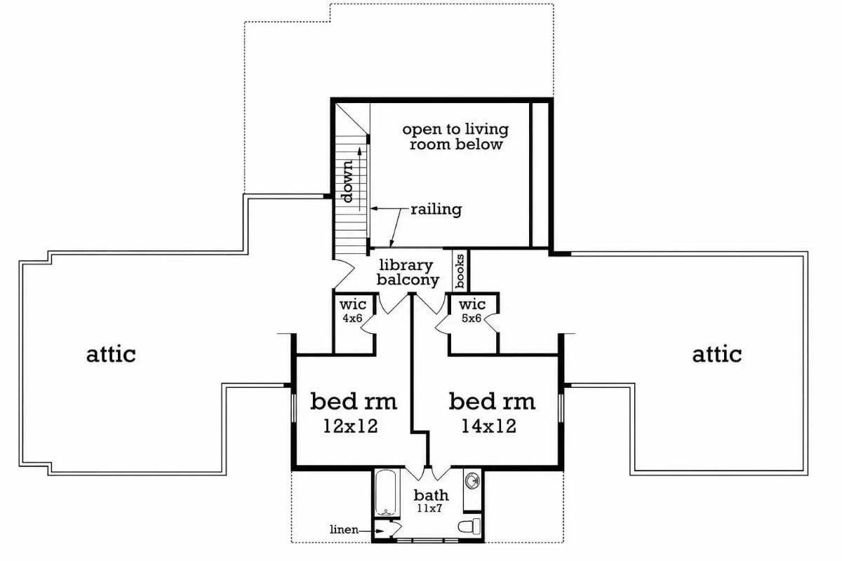
Upstairs, two bedrooms share a jack-and-jill bath, each with its own walk-in closet. The library balcony sits between them, open to the living room below with a railing and built-in book storage along the back wall. Attic access flanks both sides. What the plan gives up in hallway square footage, it hands back in the balcony — which is exactly the right trade.
Ornate Iron Balcony Railing Steals the Show in This Two-Story Great Room

Scrollwork iron stair railing pairs with gold-framed equestrian art climbing toward a mezzanine overlook. The ironwork does a lot of the heavy lifting here — decorative enough to register from across a two-story room, open enough that the great room below doesn’t feel caged.
Trend Alert: Library balconies with decorative iron railings are having a serious moment in traditional home design. Homeowners want the visual drama of an open upper level without sacrificing the enclosed feeling a solid wall would provide. Scrollwork patterns like these pull double duty — adding architectural detail while keeping sightlines open across the great room below.
Cream Chesterfields and a Carved Mantel Make This Fireplace Wall Hard to Walk Past
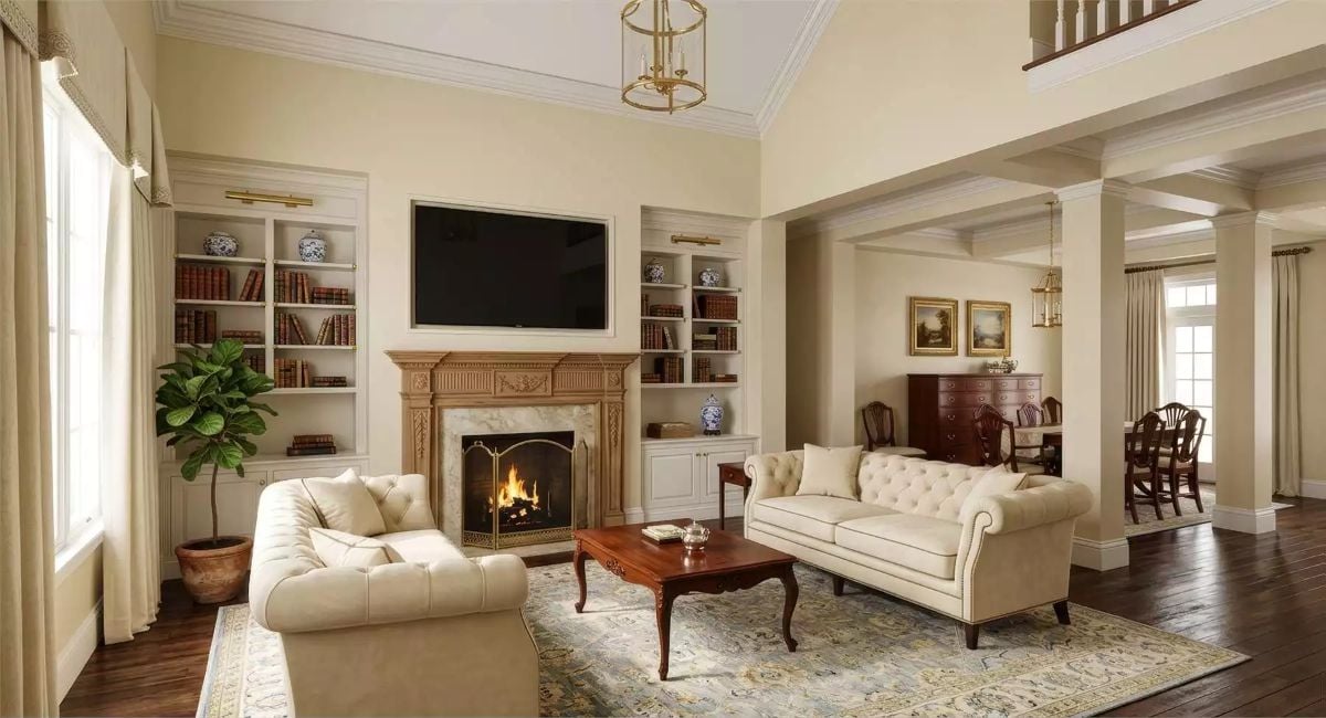
Flanking built-ins loaded with leather-bound books frame a carved wood mantel that earns its place as the room’s focal point. Two tufted cream sofas face each other across a cherry coffee table, and the fiddle-leaf fig near the window is doing real work — without it, the whole arrangement tips a little too stiff.
What Makes That Mantel Worth a Second Look
The surround combines a natural wood overmantel with carved floral and pilaster details above a marble firebox surround — a classic Georgian pairing. Most builders default to painted millwork here, and honestly, you lose the carving when you do that. Keeping the wood in its natural finish lets the detail read clearly instead of disappearing into a coat of Benjamin Moore White Dove. The brass fire screen holds its own against all that ornament without turning into a competition.
Crystal Chandelier and Dark Wood Table Set the Tone for Formal Dining Done Right
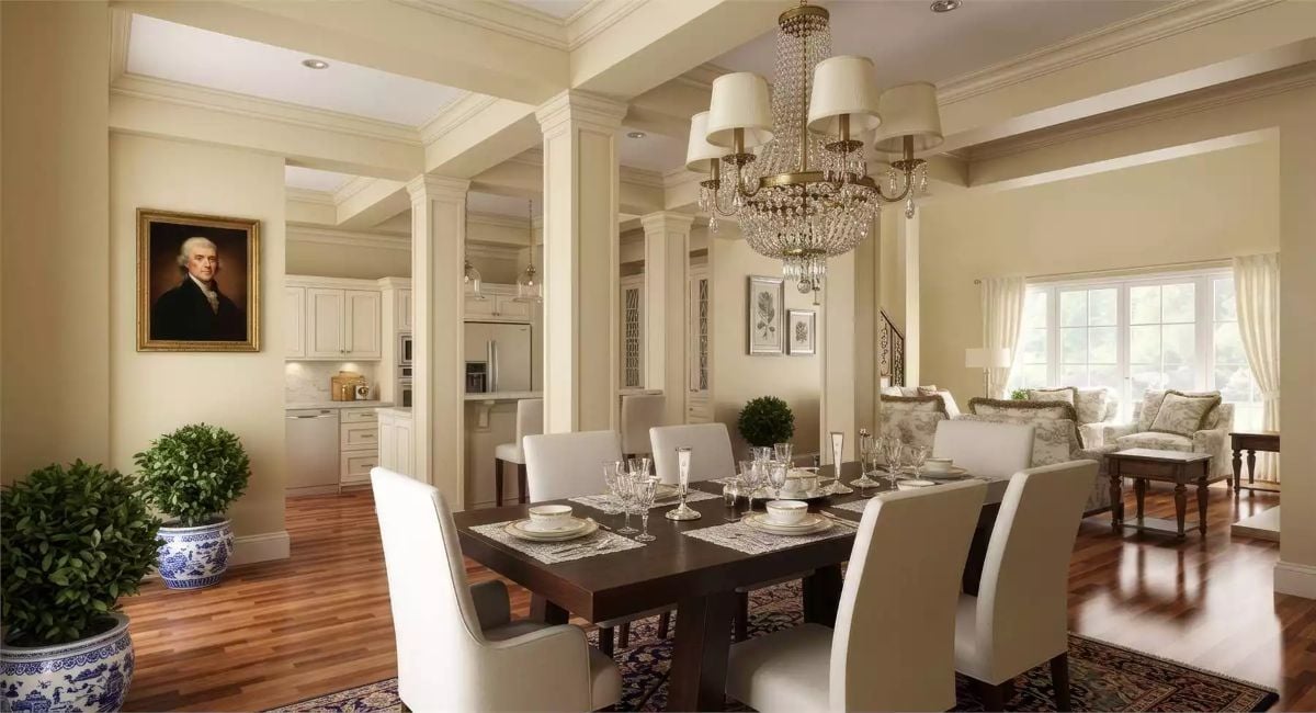
Coffered columns frame the dining space without closing it off from the kitchen. White upholstered chairs pull up to a dark espresso table set with crystal stemware and layered placemats, while a portrait hung in the adjacent hall adds unexpected gravitas. That blue-and-white porcelain planter in the corner grounds the whole room — pull it and things start floating.
Style Math: Traditional dining rooms borrow their most recognizable details from Georgian and Federal-era interiors, where columns weren’t just structural but social signals. Crystal chandeliers with candelabra arms became shorthand for formal entertaining and haven’t lost that read. Pairing them with a dark wood table keeps the room from tipping too light or casual — the contrast does the work.
Brass Pendants and Blue-and-White China Turn a Kitchen Pass-Through Into a Focal Point
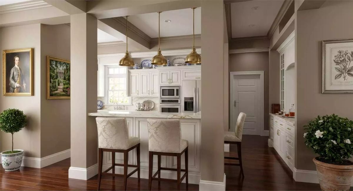
Gold pendant lights echo the brass hardware on white raised-panel cabinets, and blue transferware displayed above ties the whole composition together. Simple moves, but the repetition of metal and ceramic across two levels of the kitchen gives it more visual weight than the square footage would suggest.
Pro Tip: Displaying transferware or ceramic collections above kitchen cabinets is one of the few decorating moves that actually improves with ceiling height. Collections that feel cluttered at eye level read as intentional from a distance — the scale demands it, and tall ceilings finally give you room to prove the point.
Pin It
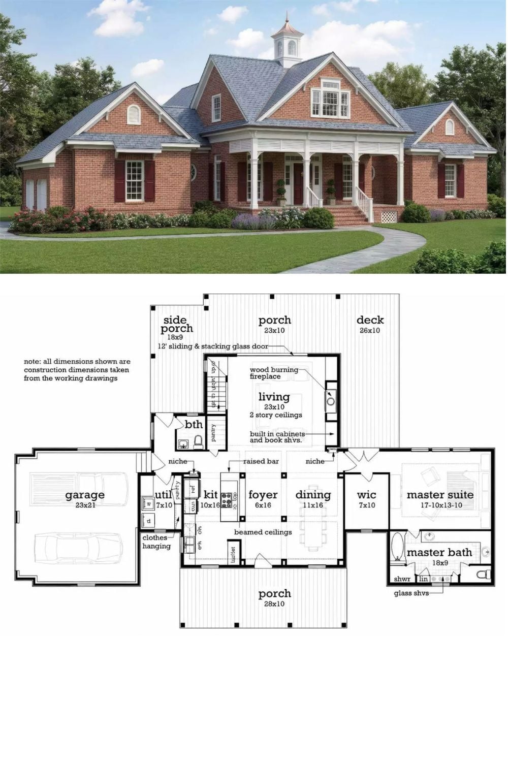
Brick exterior rendering pairs with a detailed first-floor plan showing the 23×10 living room, master suite, wraparound porches, and attached garage.
