
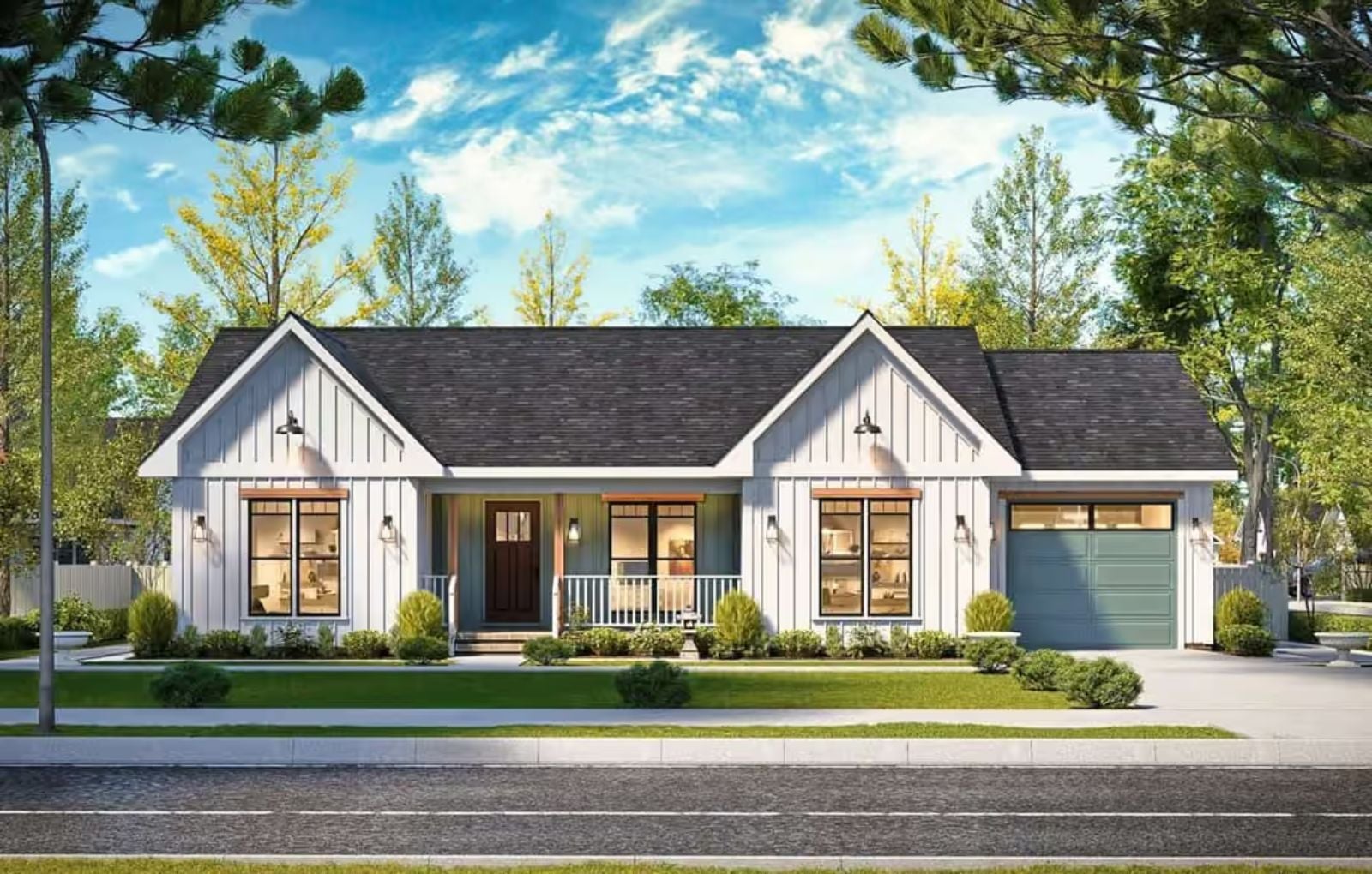
Some families remember the house where everyone ended up in the kitchen anyway, where the living room and the dining room blurred into one long conversation that lasted until the dishes were cold. The Verdea is built around that instinct: an open-concept main living area where homework spreads across the island while dinner finishes on the stove, a traditional roofline that reads like a house kids will remember, and a layout scaled for the family that has needed more room for longer than they want to admit.
Specifications
- Sq. Ft.: 1,150
- Bedrooms: 3
- Bathrooms: 2
Floor Plan – Main Floor
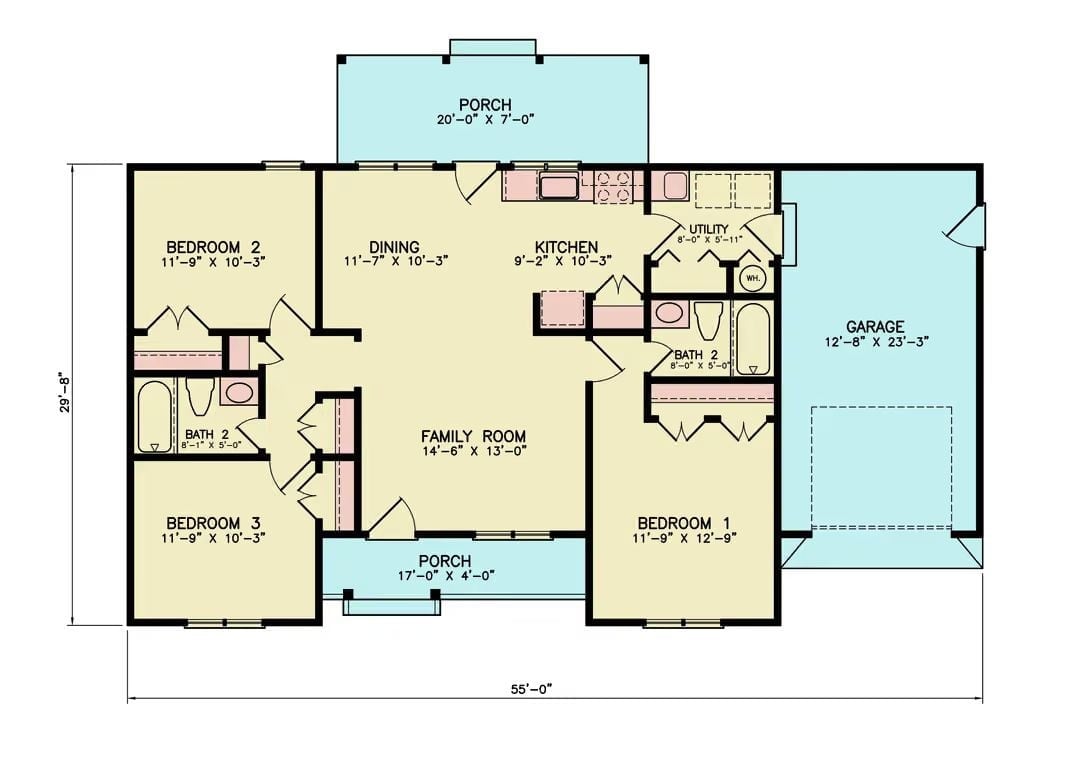
The owner’s suite sits near the garage while the two secondary bedrooms share a bath on the opposite end of the plan — a split arrangement that gives parents actual separation from the kids’ side of the house. Between them, the family room opens directly to the kitchen and dining without a wall interrupting the view. Front and rear porches bookend the footprint, and the utility room tucks off the kitchen where it belongs.
Warm Wood Credenza, Globe Floor Lamp, and a Sofa That Finally Has Room to Breathe
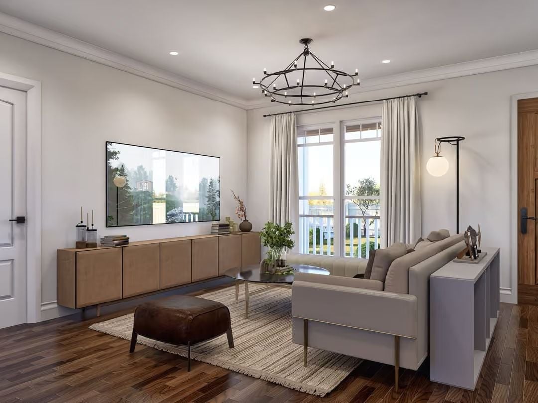
Dark hardwood floors anchor the room, and the floating wood credenza keeps the TV wall from collapsing under its own weight. That globe floor lamp is doing more for this corner than it has any right to.
Open-Plan Living Where the Console Table Does the Heavy Lifting
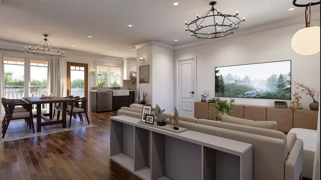
A beige sectional and warm credenza face a flat-screen anchored to a crisp white wall, and the whole arrangement reads as settled rather than staged. The low bookshelf behind the sofa is the quiet workhorse here — it marks where the living space ends without blocking a single sightline.
Designer’s Secret: A low, open bookshelf behind a sofa is one of the smartest ways to define zones in an open floor plan without sacrificing sightlines. Each area gets its own identity while the whole space stays connected. And you get display surface you’d otherwise have to steal from a side table.
Four Arched Mirrors and a Chandelier That Knows Exactly What It’s Doing
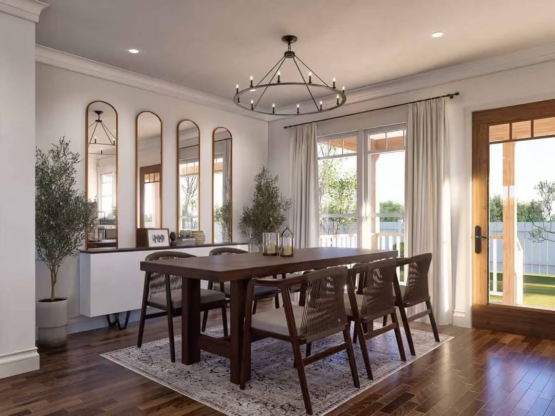
Gold-framed arch mirrors lined along the wall pull window light deeper into the room than you’d expect from a space this size. The dark walnut table and slatted chairs ground everything without crowding it, and the candle-style chandelier overhead ties the whole composition together without demanding attention.
Common Mistake: Hanging multiple mirrors in a row on a dining room wall only works if they’re scaled to the furniture below them. Mirrors that are too narrow for a long credenza end up looking like an afterthought. As a rule, the total width of the grouping should land at roughly two-thirds the width of whatever piece sits beneath it.
Farmhouse Sink, Marble Counters, and Cabinet Colors That Actually Commit
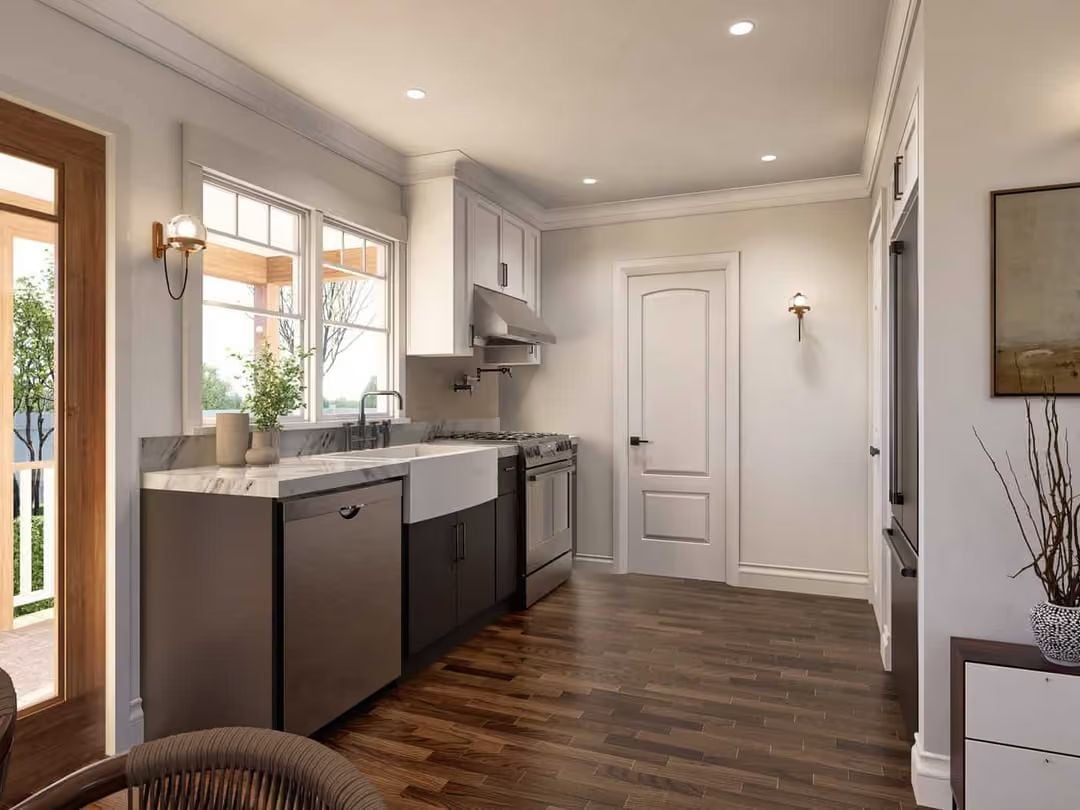
Two-tone cabinets only work when the contrast is confident enough to hold the room.
White uppers against near-black lowers pull it off here because neither color flinches. The apron-front sink sits slightly off-center from the window above it — you’d clock that immediately while cooking, and it matters more than it should. Wall sconces flanking the window keep the counter lit without adding another layer of overhead clutter to manage.
Gray Linen, Walnut Headboard, and Natural Light Doing Most of the Work
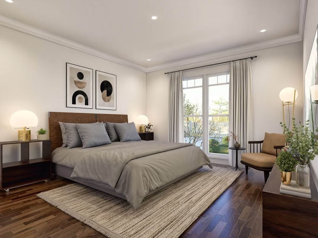
Warm wood floors, gray bedding, a walnut headboard, and abstract geometric art above the bed — it’s a short list of elements that happens to add up to a room that feels genuinely restful.
By The Numbers: Recessed lighting over a bed instead of a ceiling fan is a real trade-off: cleaner ceiling line, but you lose the airflow that keeps sleeping comfortable without running the AC harder. The approach here — recessed fixtures plus a bedside lamp on each side — compensates with layered light that’s actually useful after dark, even if it doesn’t move any air.
Marble Counters, Dark Faucets, and a Wood Vanity That Earns Its Keep
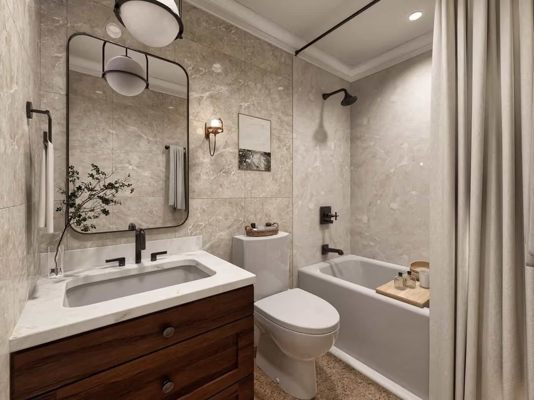
Walnut vanity cabinet, white marble countertop, matte black fixtures, large-format stone tile climbing floor to ceiling behind. Each material is doing something specific, and none of them are competing.
History Corner: Skirted toilet bases had been largely phased out in favor of minimal profiles, but they’ve made a quiet return in traditional bathrooms over the last several years. The skirted silhouette hides the trapway and gives the fixture a cleaner, column-like form that suits marble-heavy spaces like this one. Small hardware choice, outsized effect on the room’s overall tone.
Storage rarely gets its own design moment, but this laundry room makes a convincing case for why it should.
Blue Cabinetry, Open Shelving, and Side-by-Side Machines That Pull Their Weight
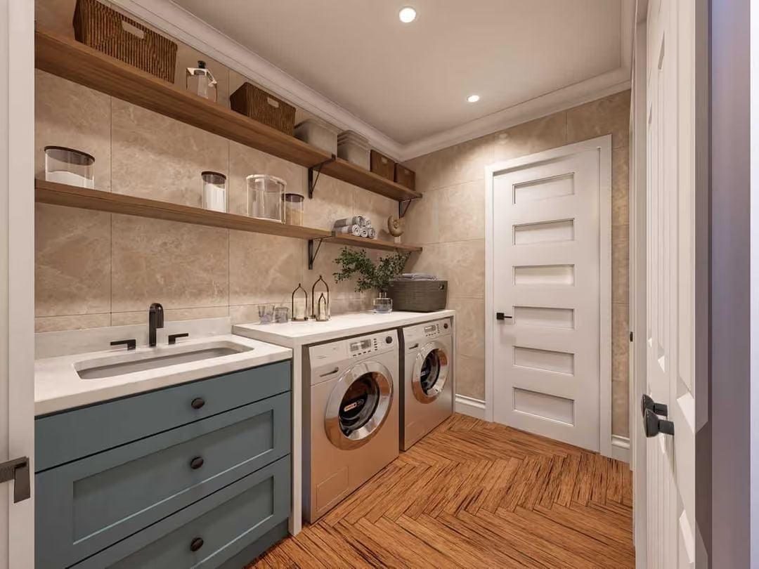
Slate-blue drawers with dark hardware anchor the left wall, and herringbone wood flooring keeps the room from reading as purely functional. Open shelving handles storage without the visual mass of upper cabinets — accessible, lighter, and honestly better-looking in a narrow room like this one.
Transition: Front-loading washers and dryers set into a countertop surround give you a folding surface without hauling in a separate piece of furniture. It’s a planning decision that most people skip and then immediately regret.
Pin It
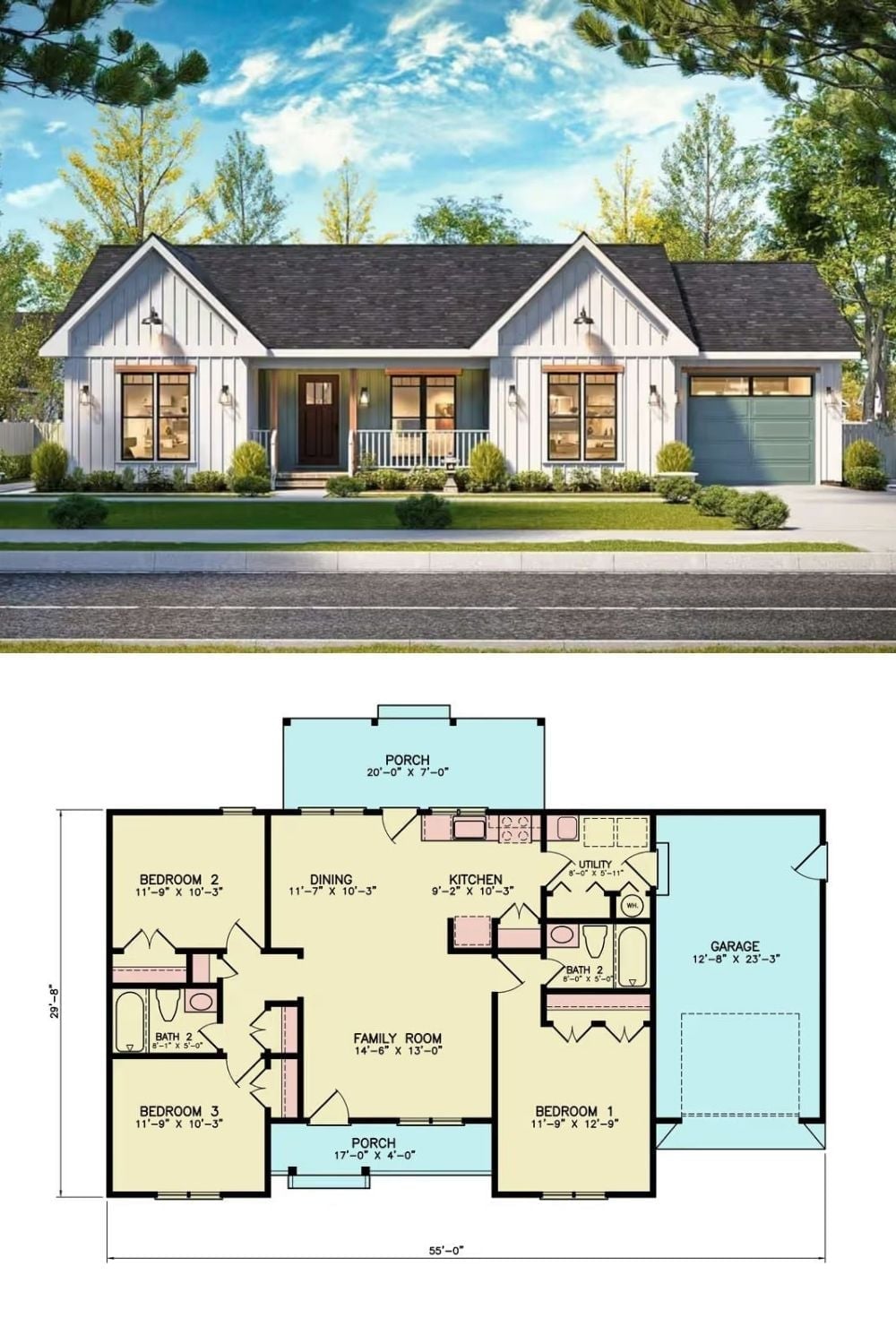
The exterior rendering shows board-and-batten siding, a covered front porch, and an attached garage under a traditional roofline. The floor plan below it lays out three bedrooms, two baths, an open kitchen and dining area, a central family room, utility room, and both front and rear porches across a 55-foot footprint.
