
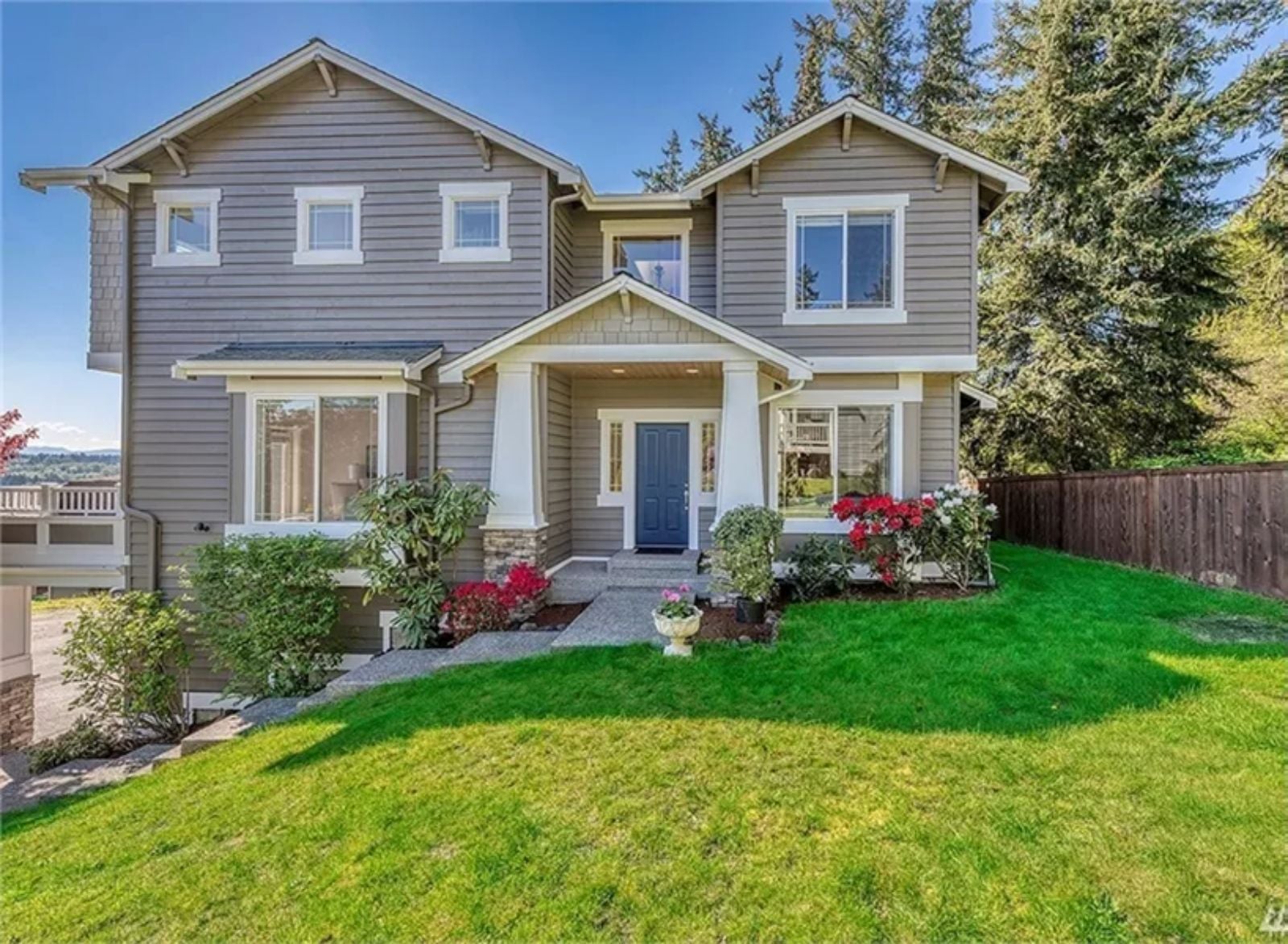
Outgrowing a house has almost nothing to do with square footage — it’s the third backpack dropped in the hallway, the car left out because the garage is already a storage unit, the Sunday afternoon when every room feels like it belongs to someone else. The Touchstone is built around reclaiming that ground, with a drive-under garage that stops the clutter before it gets inside, an open main floor where dinner conversations stretch past dessert, and a Craftsman exterior that finally looks like a place you meant to land.
Specifications
- Sq. Ft.: 2,675
- Bedrooms: 3
- Bathrooms: 2.5
Floor Plan – Main Floor
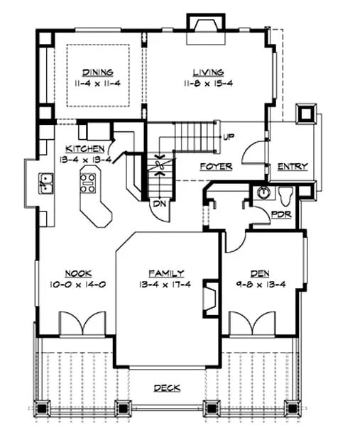
The main floor keeps formal and casual living from stepping on each other. Dining and living rooms anchor the front of the plan, while the family room, breakfast nook, and den cluster toward the rear — the kitchen sits squarely between them, connecting both halves without forcing a choice. A foyer with a powder room handles the entry, and the stair rises to the upper level from there.
Floor Plan – Second Floor
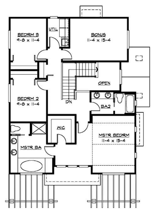
Upstairs, three bedrooms share the level with a bonus room. The master suite has its own bath and walk-in closet, BA2 serves Bedrooms 2 and 3, and the utility is tucked near the stair landing where it’s actually useful rather than exiled to the basement.
Floor Plan – Basement
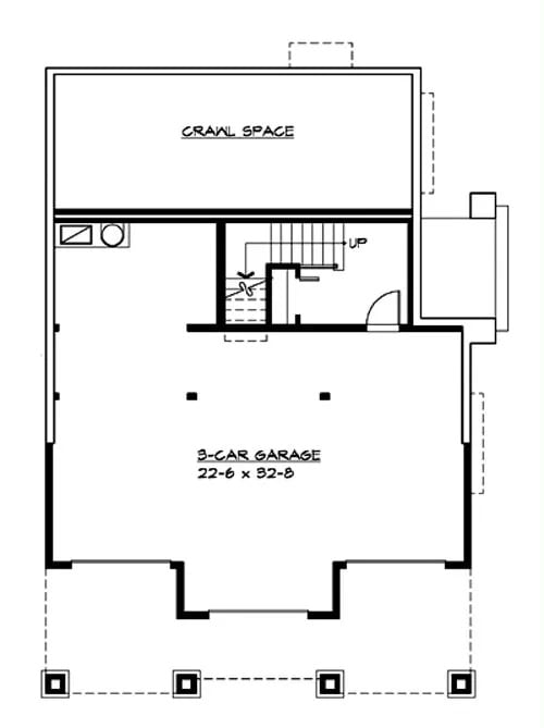
The ground level is largely given over to a three-car garage measuring 22-6 x 32-8, with a staircase climbing to the main living area. A crawl space occupies the rear section, and utility and mechanical space sit beside the stair landing.
Material Matters: Drive-under garages put the foundation and parking structure below the living floors, which keeps the main level closer to grade on sloped lots. Concrete is the standard choice for the garage slab — usually brushed for traction — and it holds up well under the kind of daily abuse a working garage sees. Families who need both storage and parking without eating into square footage above tend to find the tradeoff straightforward.
Moving inside, the living room shows how the floor plan translates into actual livable space.
Fireplace With Flanking Columns Anchors the Open Living Area
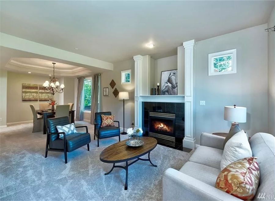
Teal accent chairs face a lit fireplace framed by white columns and a dark tile surround. It’s a confident pairing — the columns give it structure, the tile keeps it from reading as precious, and the chairs are the kind of color choice that looks considered without being loud.
Tray Ceiling and Chandelier Give This Dining Room Its Formal Backbone
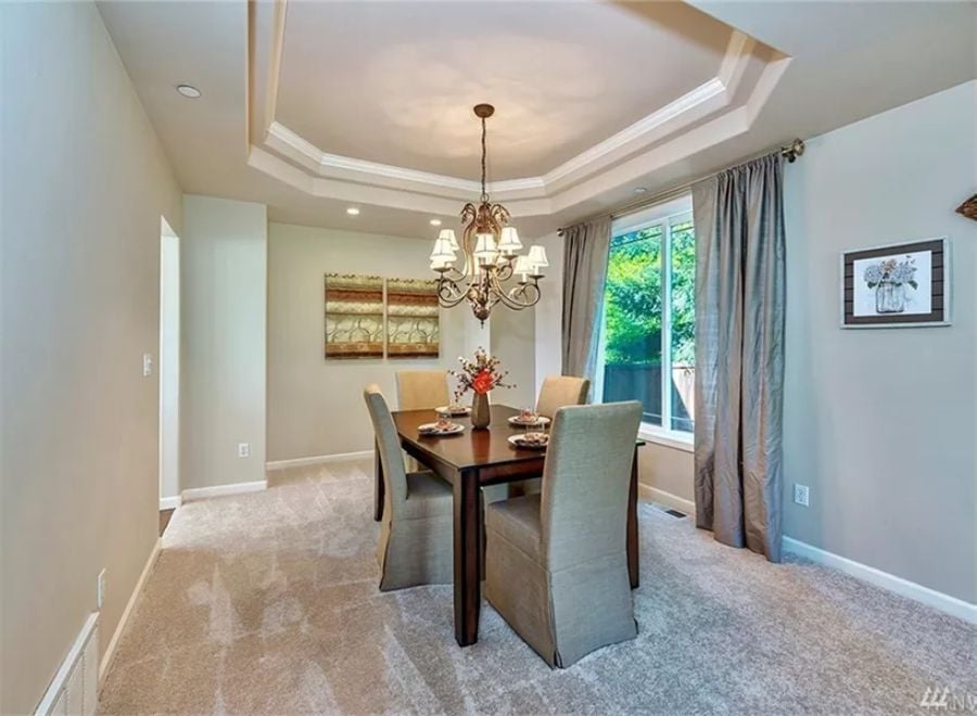
A coffered tray ceiling with crown molding frames a bronze chandelier above a dark wood table ringed by slipcovered parson chairs. The combination reads formal without being stiff — largely because the slipcovers soften everything enough that you don’t feel like you need to warn guests before they sit down.
Budget Tip: Slipcovered dining chairs cost a fraction of reupholstering, and you can pull the covers off and wash them when life with kids gets messy. If the slipcovers wear out before the chair frames do, replacement covers are sold separately online for most standard chair sizes.
Quartz Island With Gas Cooktop Keeps the Cook in the Conversation
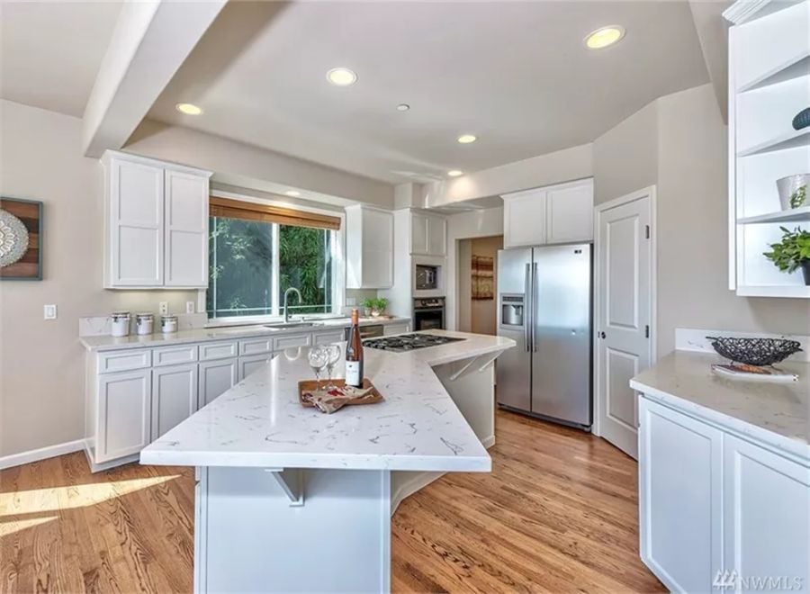
The island’s L-shape is the thing that actually earns its keep here — prep space on one side, seating on the other, and a gas cooktop built into the surface so whoever is cooking isn’t staring at a wall. White cabinets do a lot of heavy lifting in a kitchen this size, and the waterfall-edge quartz ties the island together without trying too hard.
- An L-shaped island handles cooktop duty and bar seating without crowding the perimeter run of cabinets.
- Recessed lighting keeps the ceiling clean on vaulted or angled soffits where pendants won’t hang level.
- Stainless French-door refrigerators hold their resale value better than panel-ready units if you ever sell before replacing appliances.
Mini List: That cooktop placement is worth locking in before you remodel. Moving a gas line mid-island costs more than most people expect, so confirm the location before countertops are templated. The material pairing underfoot and overhead is practical, too — hardwood hides chair scuffs, and quartz won’t etch if someone sets a lemon wedge down and forgets it.
Vaulted Master Suite Frames a Panoramic View You’d Expect From a Much Pricier Zip Code
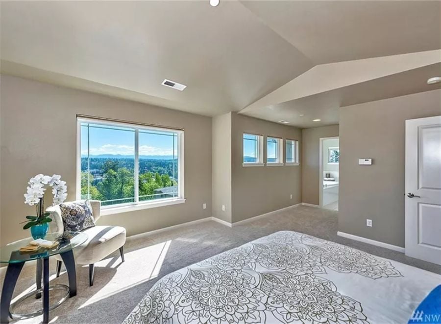
Carpet runs wall to wall, the tray ceiling adds height without making the room feel like it’s performing, and that picture window pulls in treetop and mountain views worth waking up for.
Style Tip: Carpet in a master suite is genuinely underrated. It’s warmer underfoot on cold mornings than hardwood or tile, and it absorbs sound in a way that matters when kids are still learning to walk quietly down the hall. If you’re torn, consider a low-pile wool blend — it holds up better than synthetic options over time and still feels good barefoot at six in the morning.
Soaking Tub With a Treetop View Makes the Case for Skipping the Spa Membership
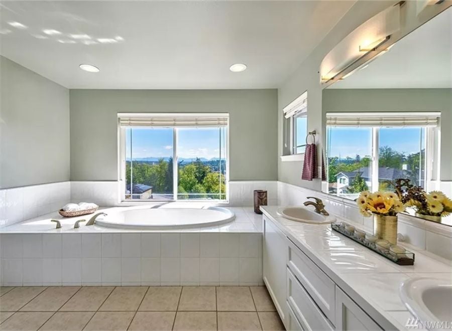
White subway tile wraps the tub surround floor to ceiling, and whoever positioned that oval soaker beneath the window knew exactly what they were doing. Yellow gerbera daisies on the vanity earn their keep — small detail, but it keeps the room from reading like a hotel bathroom.
Whoever positioned that oval soaker beneath the window knew exactly what they were doing.
Balcony Access and Treetop Views Turn a Home Office Into a Place You’ll Actually Want to Work
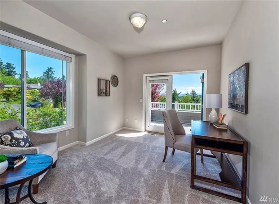
Sliding glass doors open directly onto a covered balcony, and that single feature changes how the whole room functions. Natural light comes from two directions, the view through both openings is pure greenery and sky, and gray carpet keeps things quiet underfoot. The desk sits close enough to the door that you can crack it open on a cool morning and work with fresh air coming in. Most home offices don’t offer that.
Designer’s Secret: Positioning a desk near a door or operable window rather than against a solid wall gives you control over ventilation and light without any renovation cost. If you’re configuring a home office from scratch, that placement decision matters more than most furniture choices — it’s one of those things that’s obvious once you’ve worked in a room that gets it right.
Folding Laundry Next to a Utility Sink Is a Small Luxury That Adds Up Fast
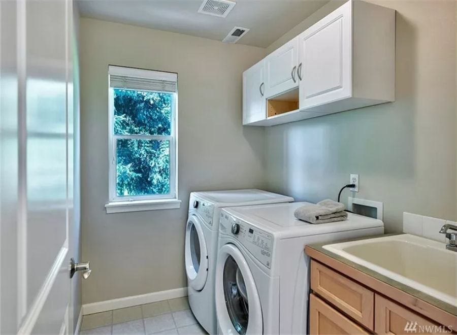
Front-load washer and dryer sit side by side with enough counter space on the dryer to actually fold a load before it wrinkles. A double-hung window brings in natural light, which goes a long way toward making this feel like a room rather than a closet with appliances in it. Upper cabinets and a deep utility sink handle the overflow.
Editor’s Note: A dedicated utility sink is more useful than it sounds on paper. Hand-washing delicates, rinsing muddy cleats, soaking a stained tablecloth — all of it goes here instead of in your kitchen or main bathroom. If you’re planning a laundry room from scratch, it’s one of the easier plumbing additions to incorporate before the walls are closed.
Pin It
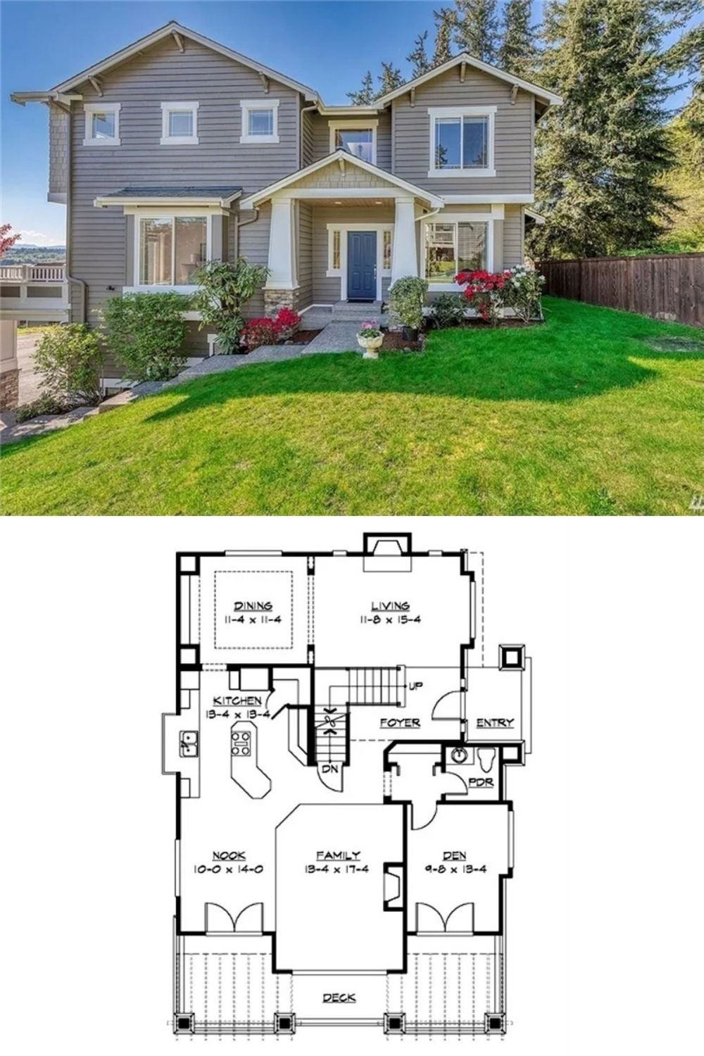
Gray Craftsman exterior with stone accents and a blue front door pairs with a main-floor plan showing a family room, den, nook, kitchen, and separate living and dining rooms toward the front.
