
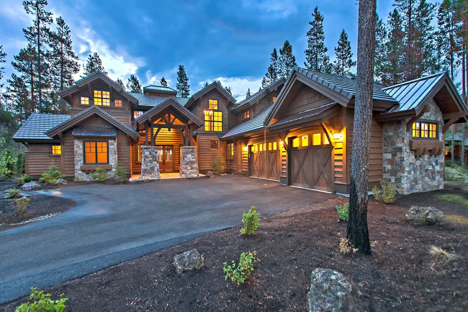
Saturday morning in ski season, and both sets of grandparents are already in the kitchen before the kids wake up — coffee going on two sides of the house, someone’s grandmother settled into the good chair by the window, and nobody remotely in anyone else’s way. The Timberwyn is built around exactly that kind of morning: dual main-floor primary suites, a bonus room that swallows the grandkids by nine, and a mountain layout that fits three generations under one roof without crowding a single hallway.
Specifications
- Sq. Ft.: 4,208
- Bedrooms: 4
- Bathrooms: 4.5
Floor Plan – Main Floor
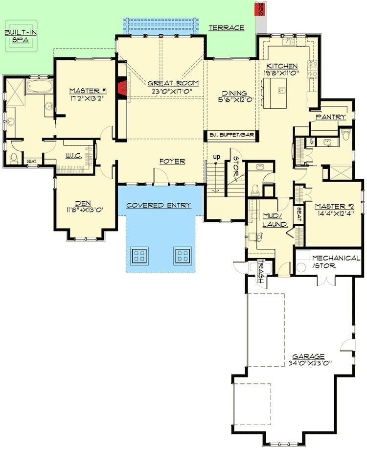
Two primary suites sit on opposite ends of the main floor — a deliberate separation that makes multi-generational living actually work. Between them, a central great room opens to the kitchen, dining area, and terrace, while a covered entry, mud/laundry room, and walk-in pantry handle the unglamorous daily logistics that most floor plans forget about until it’s too late.
Floor Plan – Second Floor
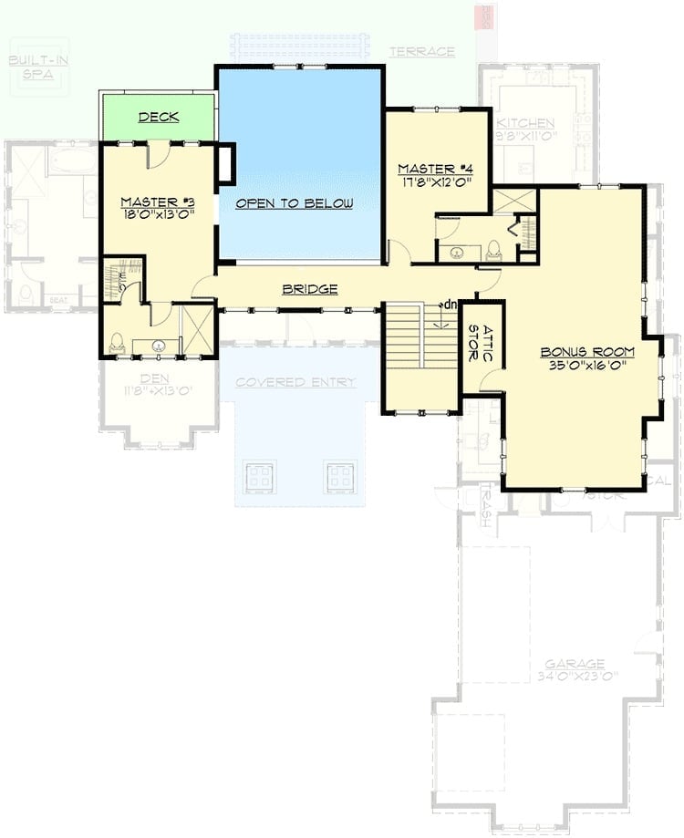
Upstairs, two more master suites flank an open-to-below void and connect across a bridge — Master #3 with deck access, Master #4 positioned near a kitchenette. The bonus room stretches a full 35 feet wide, with a den and attic storage tucked nearby for everything that doesn’t have an obvious home.
Common Mistake: Families often look at a bridge on the floor plan and see wasted square footage — something to shorten or cut to save money. In a layout like this one, that’s the wrong call. The corridor keeps two private suites connected without either occupant having to pass through the other’s space, and that separation is exactly what makes sharing a roof with family sustainable past the first holiday visit.
Step inside and the living room makes the design philosophy impossible to miss.
Marble Fireplace Wall That Earns Every Square Inch of Attention
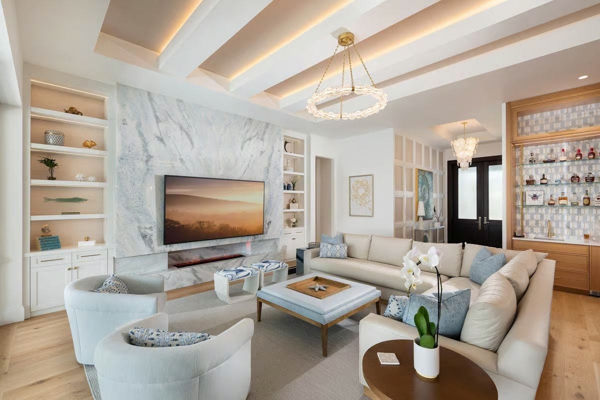
Quartzite with dramatic grey veining runs floor to ceiling around the fireplace, anchoring the room without competing with the cream sectional. Blue accent pillows thread through both seating zones, keeping the palette coherent across a large open space. That circular chandelier with its brass chain reads more sculptural than functional — honestly, it works better that way. The bar alcove tucked right of the entry is the kind of thing you don’t notice on the floor plan and immediately appreciate in person.
Warm Oak Cabinetry and Waterfall Marble Make a Strong Case for Restraint
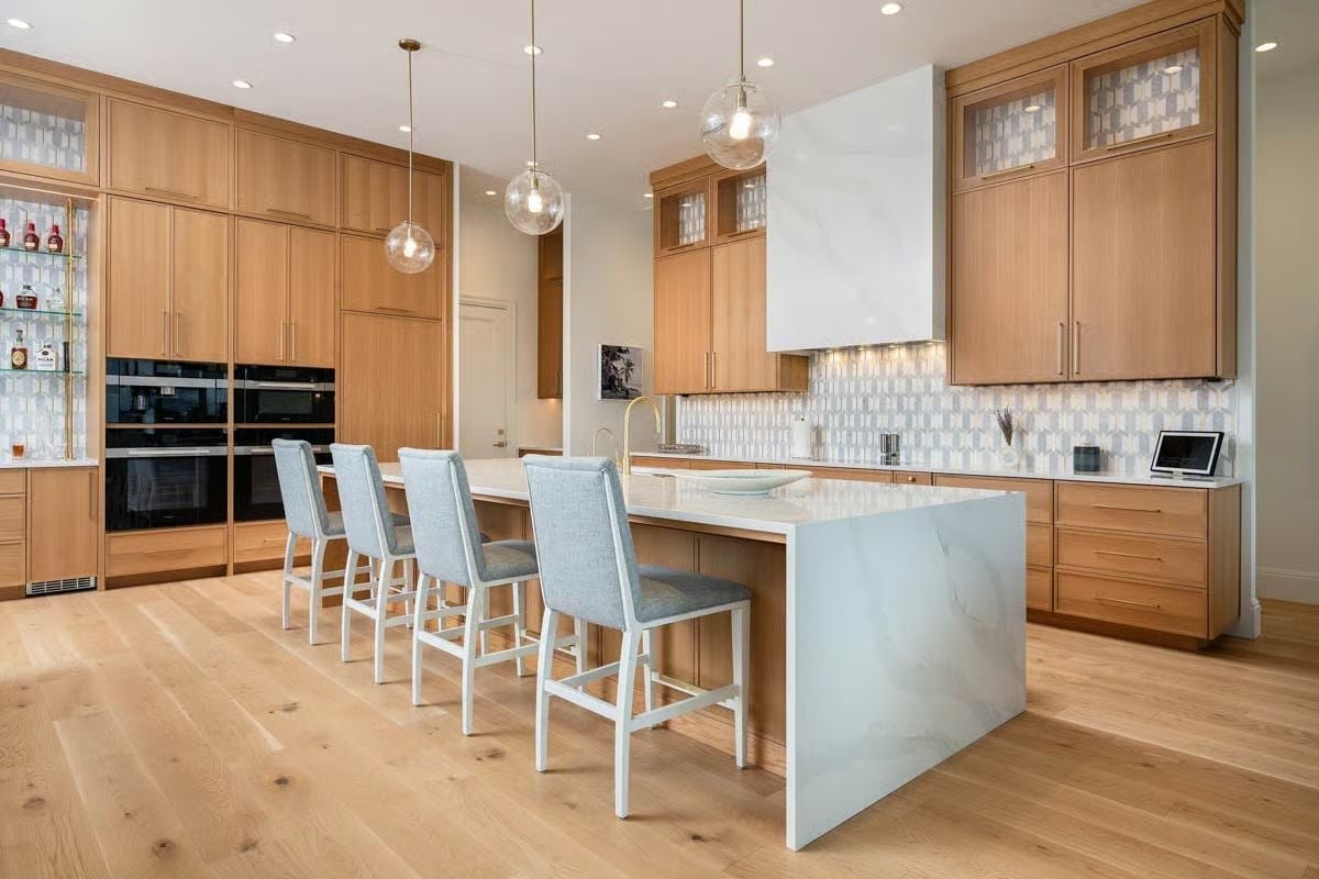
Rift-cut oak cabinets climb two full walls, grounding a kitchen that could easily feel cold at this scale. The island’s waterfall edge in veined white stone does the heavy visual lifting. Globe pendants in smoked glass add warmth without crowding the palette, and four upholstered barstools in muted blue soften the hard surfaces just enough to make the space feel like somewhere people actually sit.
Pro Tip: Island overhangs are easy to underestimate during the planning phase. For households where someone may use a wheelchair or walker, a deeper overhang on one end gives seated users comfortable clearance without disrupting counter prep space on the working side — a small adjustment that costs almost nothing at the design stage and matters enormously later.
Gold Chandelier, Bird Art, and a Desk That Actually Has Room to Think
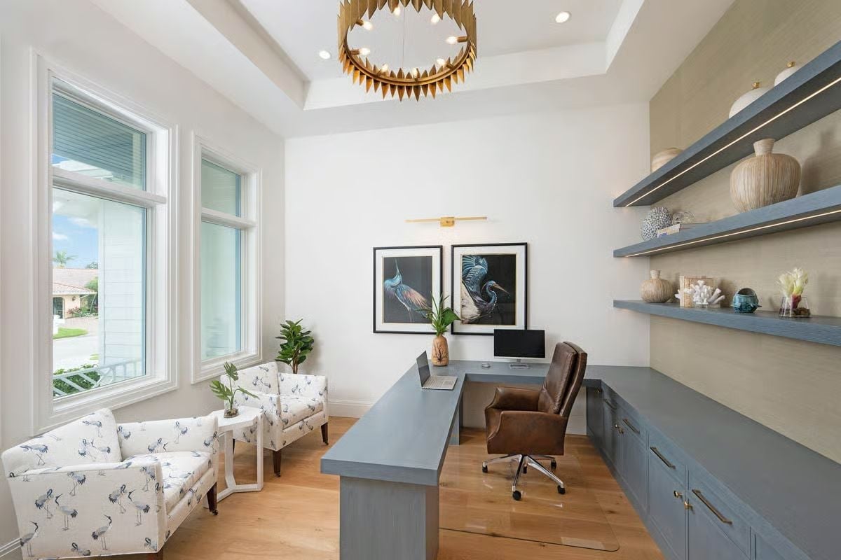
Floating shelves in slate blue keep the built-ins from feeling heavy, and two framed heron paintings anchor the back wall with more personality than most home offices manage on their best day. The leather task chair earns its place here.
Why the Upholstery Pattern Is Doing Real Work
Those accent chairs aren’t decorative seating pulled from a coastal catalog. The crane-print fabric directly echoes the heron paintings on the back wall, creating a visual thread between the seating area and the desk zone without introducing more color to an already tight palette. It’s a disciplined move — the room could easily read as two separate spaces sharing a floor plan, and this is what prevents that.
Canopy Bed, Blue Grasscloth, and Palm Trees Just Outside the Glass
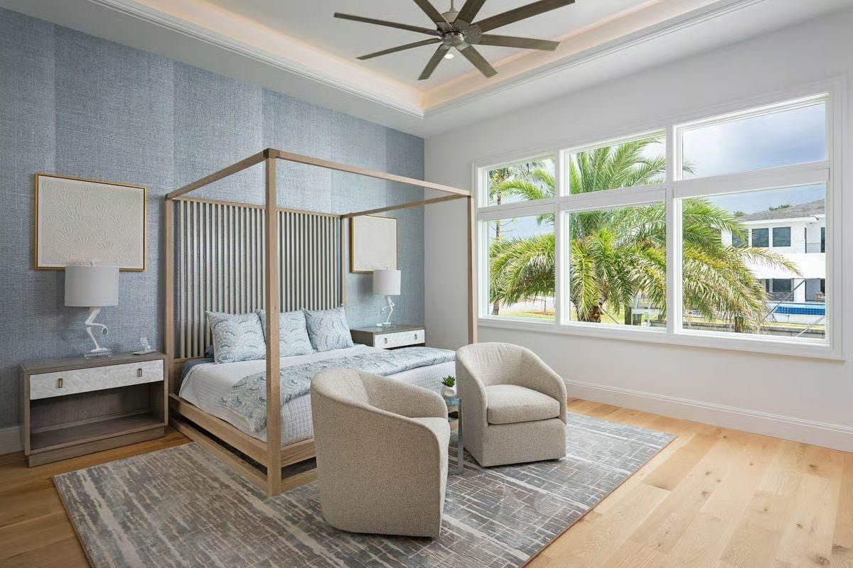
Fluted wood panels on the headboard wall add texture without competing with the grasscloth behind them — two materials that could easily fight each other, but don’t. Two barrel chairs at the foot of the bed give the room a sitting-room feel without demanding a separate space for it. Light oak floors keep the blue palette from reading too cool, which at this square footage is the difference between a serene primary suite and a very expensive hotel room that nobody wants to linger in.
Style Math: Grasscloth wallcovering absorbs sound better than painted drywall, which matters in a multi-generational home where schedules rarely align. It’s also far easier to swap out than tile or millwork if taste shifts in five years, making it one of the more practical splurges in a primary suite.
Zebra-Print Mosaic Tile and a Soaking Tub With a View Worth Waking Up For
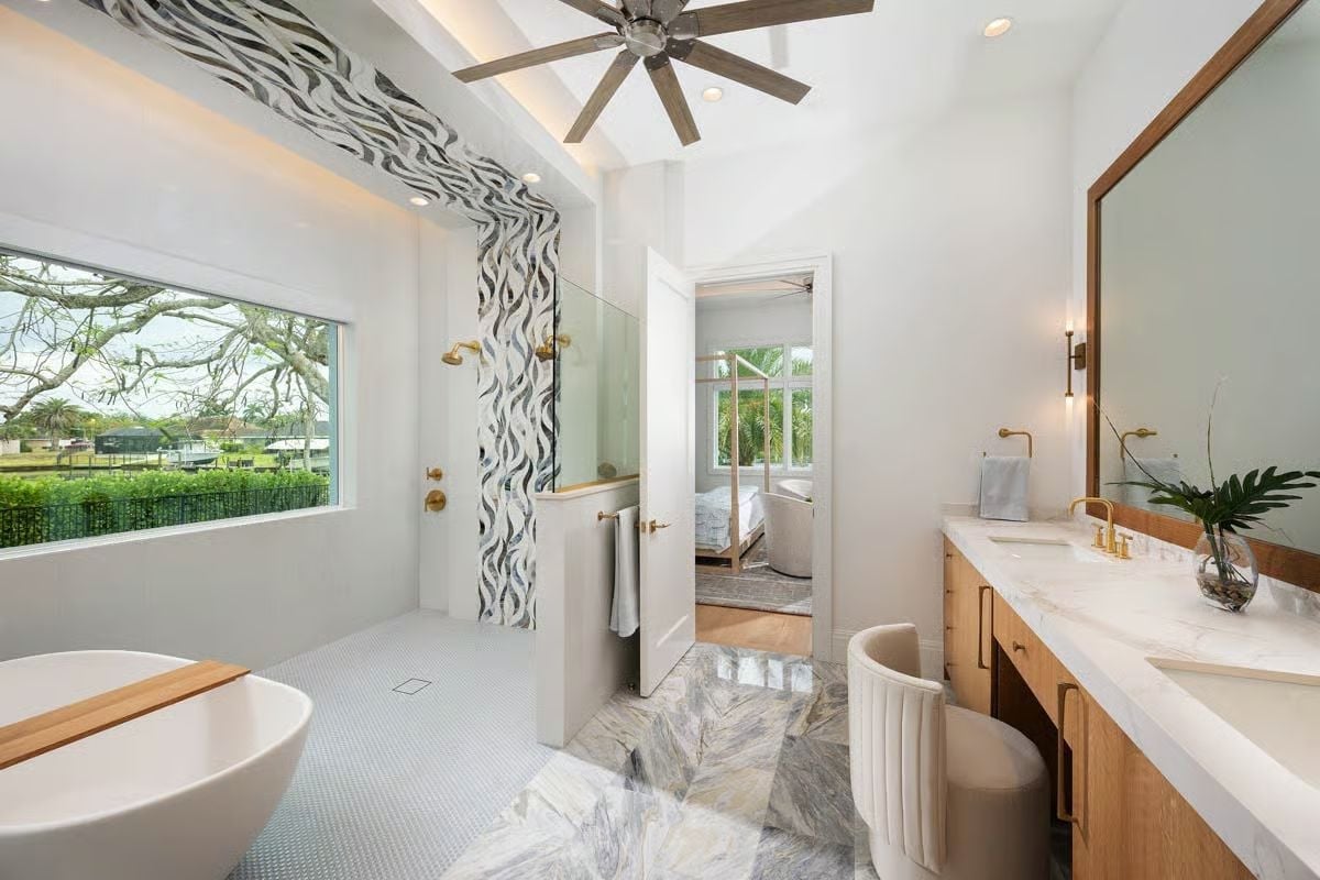
Penny-round tile floors the shower while large-format marble carries the main floor — two different scales that manage to coexist because the gold fixtures pull both zones into the same finish family. The patterned mosaic accent column is a genuinely bold call, and it lands.
Quick Fix: Open showers without glass enclosures look clean but need careful drain placement to keep water where it belongs. If your shower shares a floor plane with a dry zone, a linear drain along the threshold works far better than a center drain alone.
Geometric Pool Layout and a Spa Ledge That Gets the Outdoor Living Logic Right
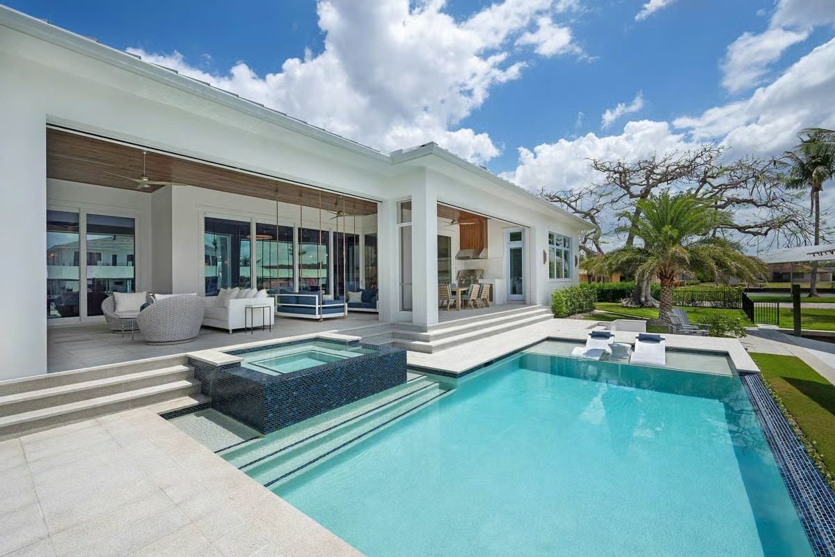
Dark mosaic tile lines the raised spa while the pool sits lower and longer, keeping sight lines clear from the covered lounge area. Sliding glass walls pull the indoor seating almost flush with the deck, and the wood-paneled ceiling inside adds warmth the white exterior doesn’t try to provide. The two zones read as one continuous space without pretending the threshold isn’t there.
Pin It
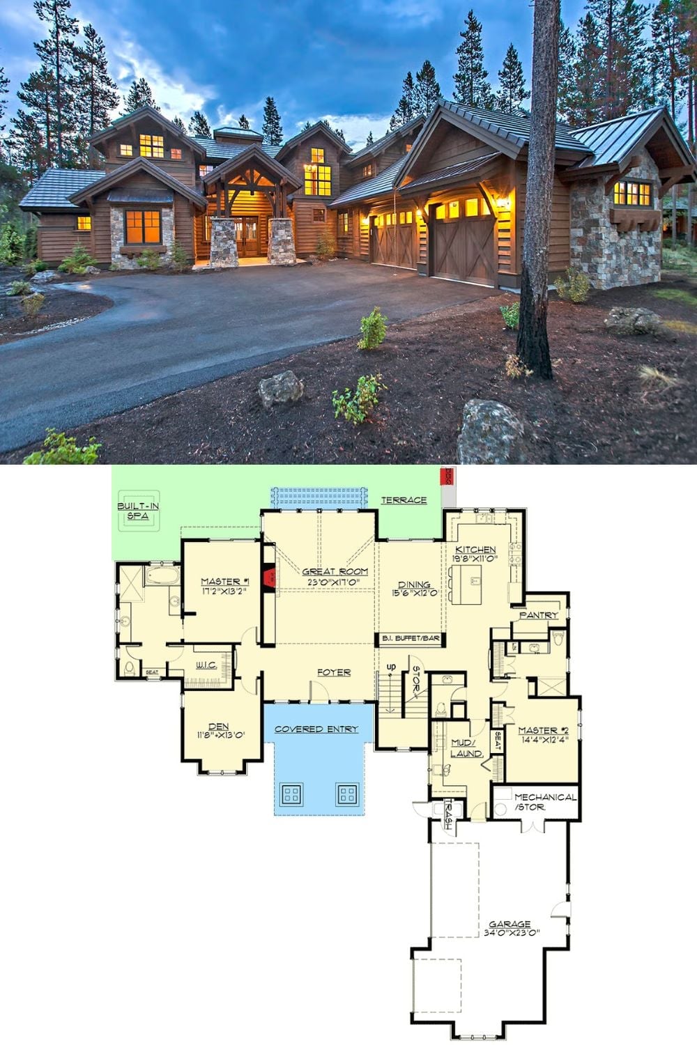
Exterior photo shows a timber-and-stone mountain home at dusk; floor plan below reveals dual main-floor primary suites and a built-in spa.
