
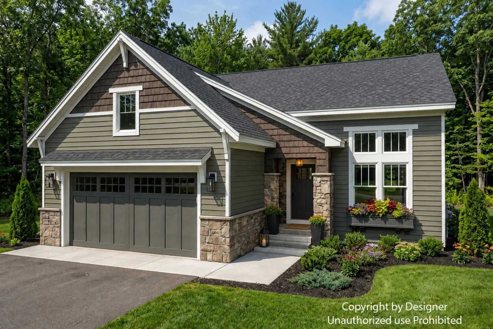
Craftsman done right is rarer than it should be. The Timbercreek earns it: homework spread across the kitchen island at five, dinner finishing on the stove behind you, the front porch holding the last twenty minutes of a Tuesday before everyone needs something again — and a layout that keeps the family together without collapsing on itself, anchored by an open-concept main floor and a primary suite that stays on the ground level.
Specifications
- Sq. Ft.: 2,083
- Bedrooms: 3
- Bathrooms: 2.5
Floor Plan – Main Floor
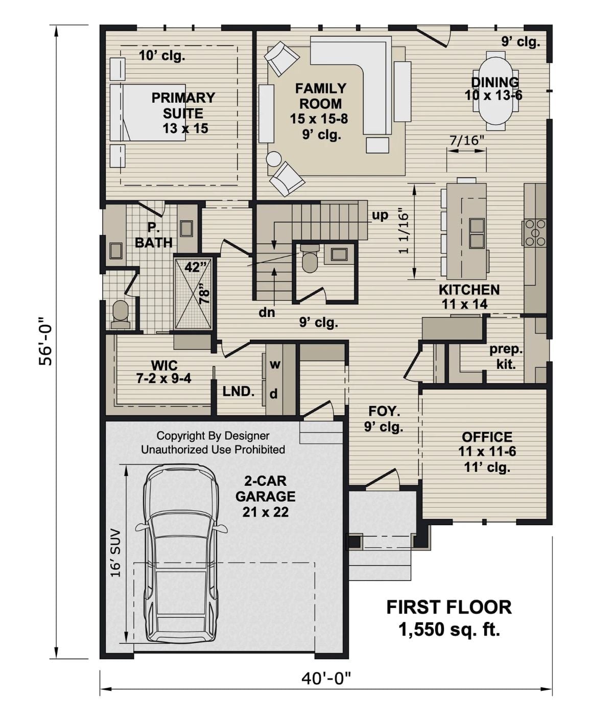
The primary suite sits at the back left, well clear of the foyer and front office where guests land first. A central staircase draws the line between the kitchen and family room on one side and the private spaces on the other. The prep kitchen is a genuine bonus rather than a marketing word. At 1,550 square feet, not much is wasted.
Floor Plan – Second Floor
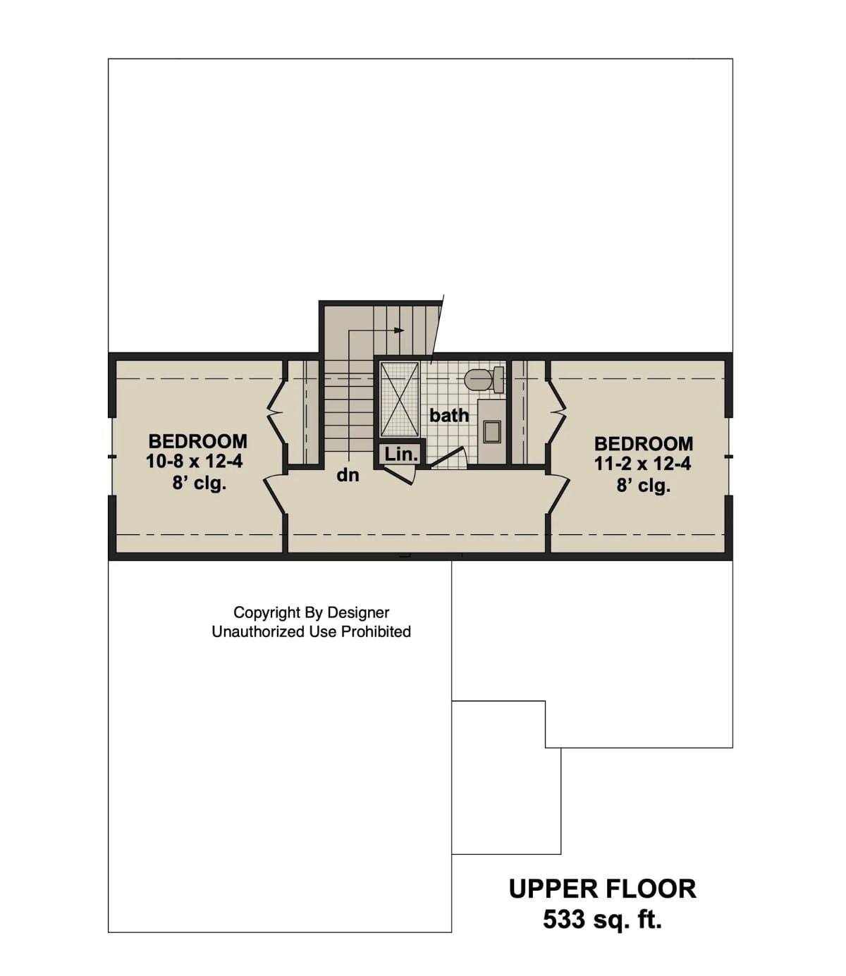
Upstairs, two bedrooms sit at opposite ends of the floor with a central bath, linen closet, and stair landing between them — enough separation that kids aren’t constantly in each other’s space. Ceiling height holds at 8 feet throughout. Compact, but it works.
Gray Siding and a Concrete Patio That Actually Invites You to Sit Down
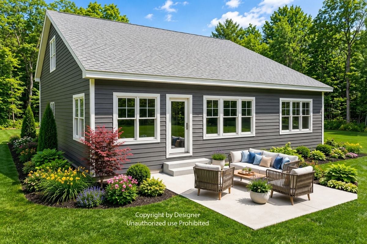
Charcoal lap siding with white trim keeps the exterior clean without tipping into cold. Out back, a concrete patio holds a rattan sectional with blue-accented cushions and a coffee table just wide enough to be useful — not the oversized kind that eats all the legroom. Colorful perennial beds and a Japanese maple soften the edge between house and lawn without asking for much maintenance in return.
Fun Fact: Poured concrete typically costs considerably less per square foot than pavers or natural stone, which is why families prioritizing interior square footage often end up here. It’s also flat, so furniture legs don’t wobble or shift — a small thing that matters more than you’d think once you’ve lived with an uneven patio.
Geometric Pendant, Dark Hardwood, and Three Black-and-White Frames That Hold the Wall Together
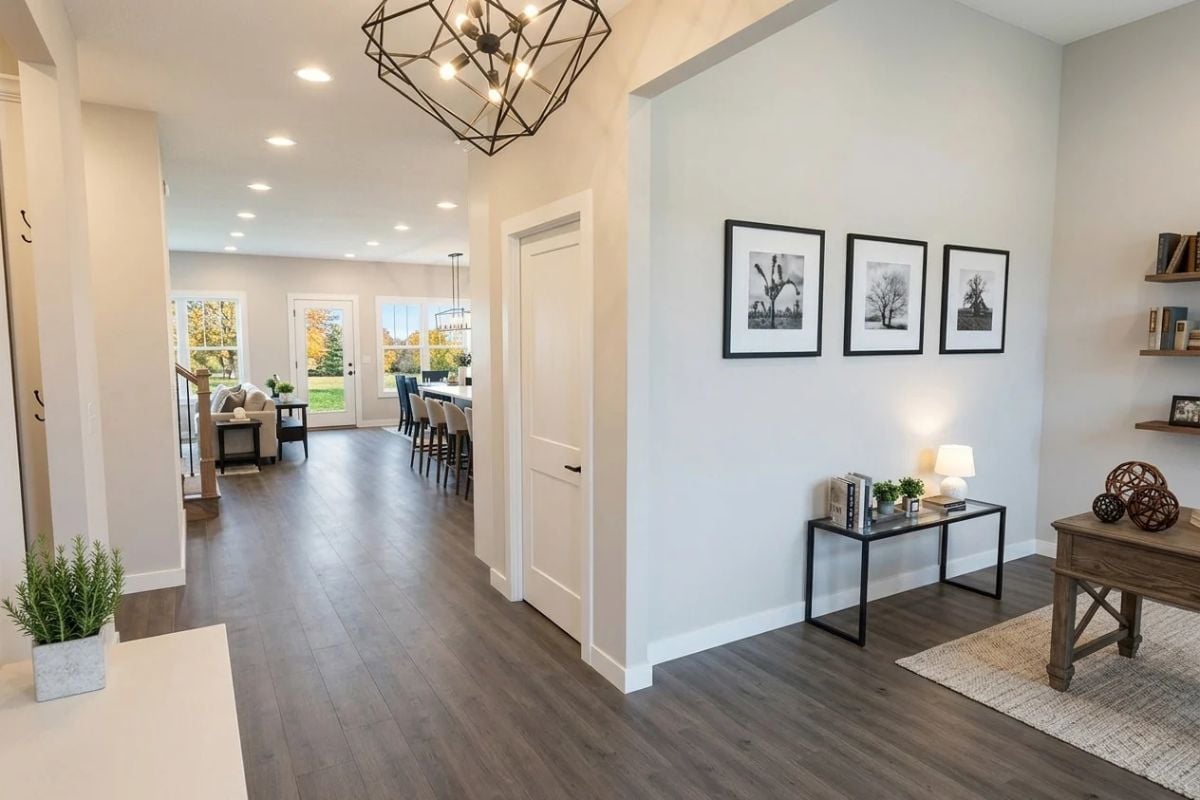
Dark hardwood floors run the full length of the entry hall, pulling your eye straight through to the French doors and fall foliage beyond. Three identically framed landscape photos anchor the right wall without overcrowding it, and a simple console table with a lamp keeps the foyer grounded. Small decisions, outsized return.
Why That Geometric Pendant Works Harder Than It Looks
Open-cage pendants solve a real problem in tall foyers: they fill vertical space without blocking sightlines. Light spills out from every angle rather than casting the harsh downward cone you get from a drum shade. The shape is industrial, but paired with warm wood tones it reads closer to farmhouse than factory.
Floating Shelves, a Dark Wood Desk, and Natural Light Doing All the Work
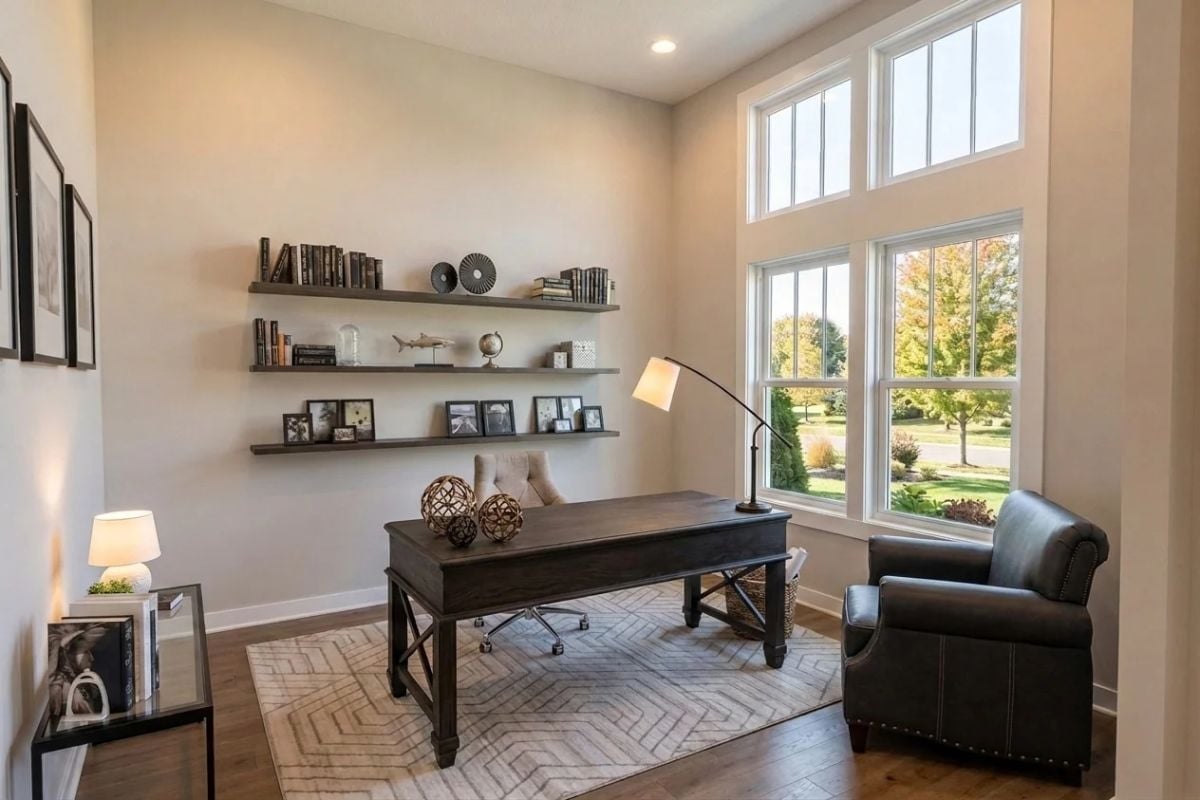
Layered shelves display books, a globe, and a shark figurine above a leather armchair that means business.
Pro Tip: Floating shelves are anchored directly into wall studs, which is what keeps the bracket hardware hidden. That clean look only holds long-term if the shelves are actually rated for what you’re putting on them. Books are heavier than they look — check the load rating before stacking a full library on a single shelf.
Warm Beige Walls and a Black Coffee Table That Anchor Without Competing
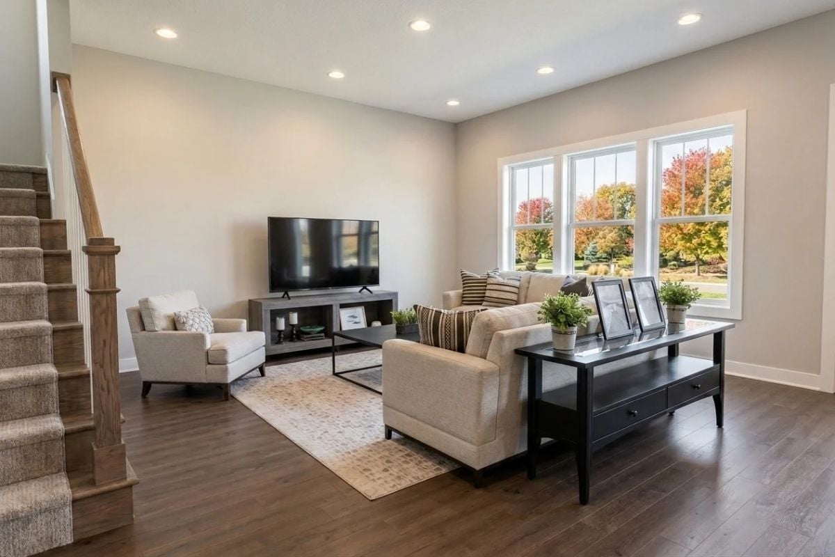
Recessed lighting keeps the ceiling clean and lets the wood floors carry the visual weight instead. The small potted plants on the coffee table are doing more than decoration — they bring the palette down to earth in a room that could easily go flat. And that window placement is genuinely good, pulling fall color directly into the room without a single piece of art on that wall.
- Recessed can lights work best spaced evenly to avoid hot spots on the ceiling
- Dark-stained hardwood hides everyday scuffs far better than lighter finishes
- Positioning a sofa to face both the TV and a window keeps the room from feeling one-directional
Blue Island Base and White Marble Top — One Decision That Makes the Whole Kitchen
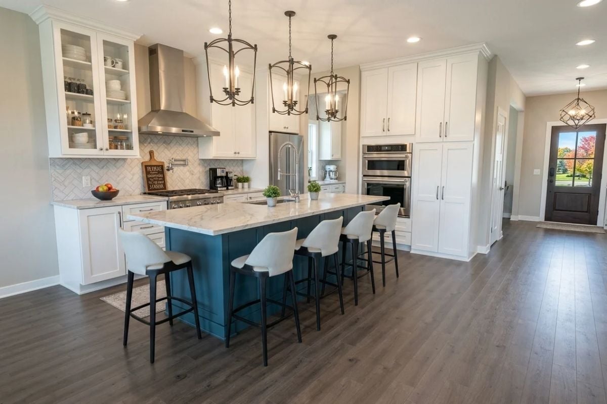
Painting an island a completely different color than the cabinets takes nerve, and it paid off here.
White shaker cabinets wrap the perimeter while the teal island holds its own under a marble waterfall-edge countertop. Four bar stools tuck underneath without crowding the seating. The pot filler above the range is one of those features that sounds like a luxury until you’ve hauled a full stockpot across a kitchen — after that, it just sounds like sense.
Candle-Style Chandelier and an Open Layout That Lets Three Rooms Breathe Together
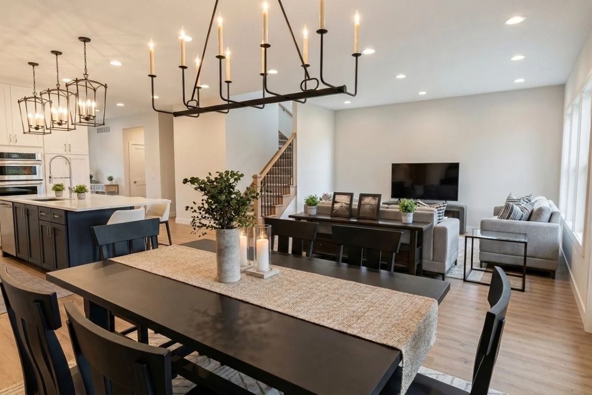
A wrought iron candle-style chandelier pulls visual weight downward over the dark dining table, giving the zone definition without walls to do it. Light hardwood floors run through all three areas uninterrupted. That navy kitchen island visible in the background earns its place without shouting for attention.
In The Details: In an open floor plan, the dining table lives in a transitional zone between kitchen and living room — which means the chandelier has to anchor the space rather than just illuminate it. An elongated rectangular fixture handles that job better than a round drum shade would. Proportion matters more than wattage here.
Carpet, Gray Walls, and a Walk-In Closet That Earns Its Place in a Primary Suite
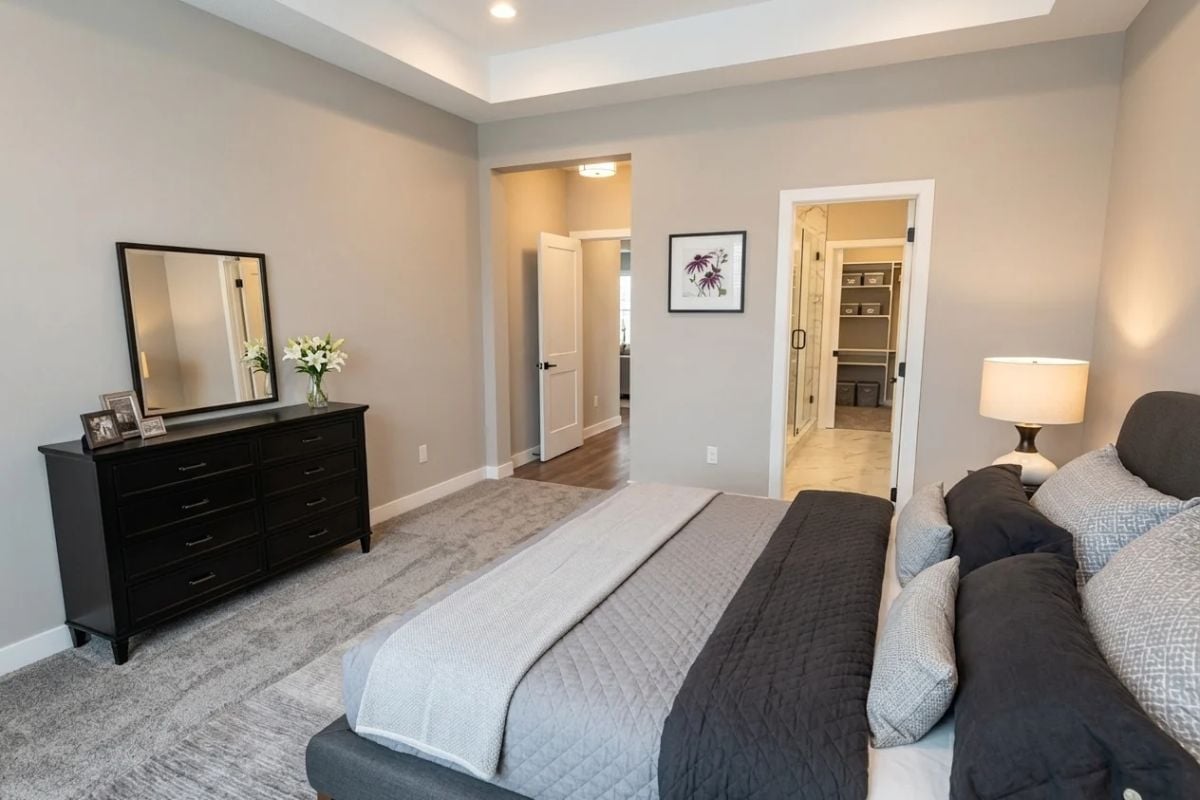
Soft gray carpet and greige walls keep the palette quiet enough that the dark dresser reads clearly against them. Fresh lilies on the dresser pull more weight than flowers usually do. Through the open door, the walk-in closet shelving is already organized — which is either aspirational or a mild taunt, depending on your current closet situation.
Style Math: Carpet in a primary bedroom muffles sound in a way hard flooring simply can’t, and that matters more once kids are in the house. A gray-on-gray room like this one stays flexible because accent colors can shift with a new duvet or throw without touching the walls. The tray ceiling adds perceived height without cathedral-style framing, so the room reads bigger than the square footage.
Marble Countertop Over the Washer and Dryer Is the Detail That Changes Everything
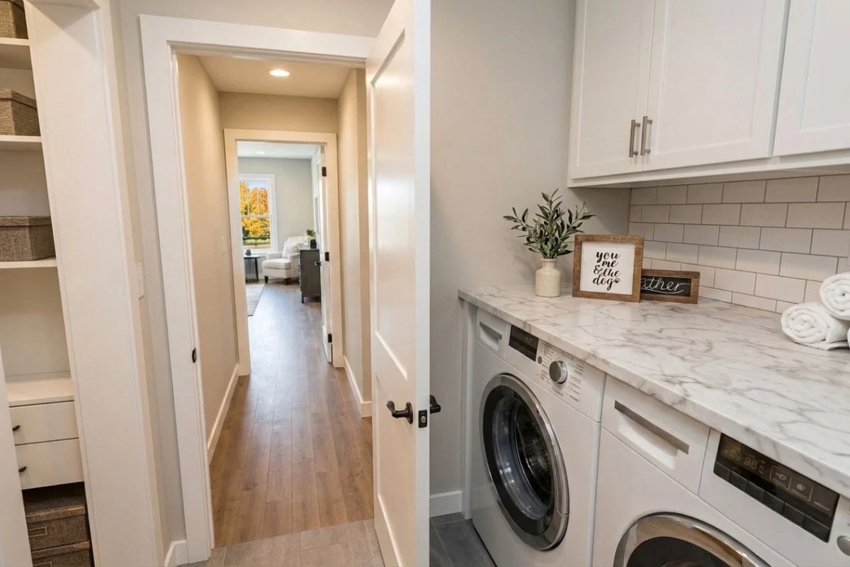
A quartz or marble-look countertop over front-load machines turns dead space into a folding surface you’ll actually use. Subway tile keeps the backsplash simple behind it. Small touches carry the room from there: a potted olive branch, rolled towels, a wood-framed “you me & the dog” sign that makes the space feel lived-in rather than staged for photography.
Style Tip: Countertops over washer-dryer pairs need a cutout or open front for machine access, so confirm the overhang depth with your installer before ordering stone. A standard depth of around 25 inches usually clears the machines without blocking the door swing — but verify that with your specific units before you commit.
Pin It
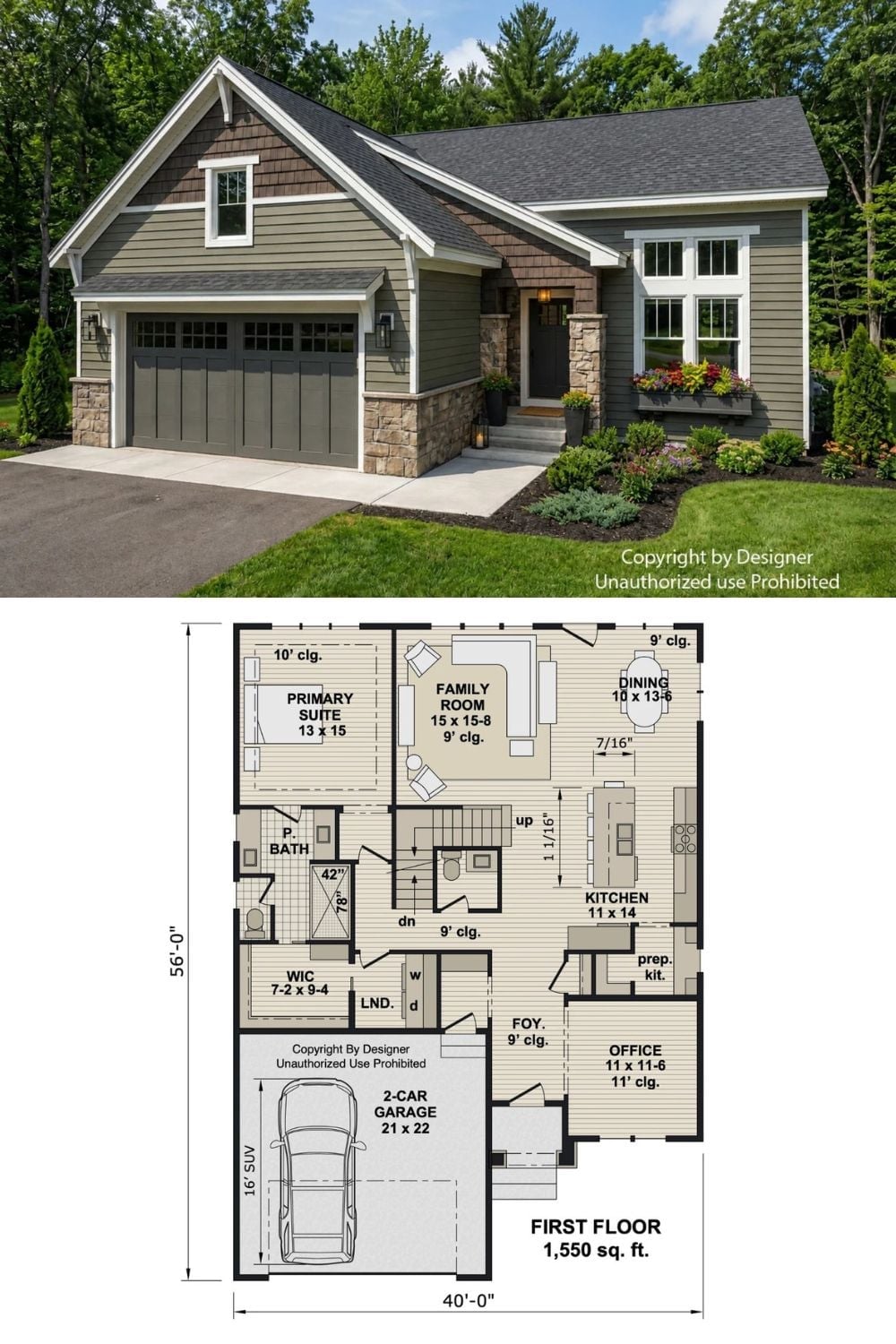
The exterior photo shows craftsman curb appeal with stone accents and board-and-batten garage doors. Below it, the 1,550-square-foot floor plan lays out the main-floor primary suite, open family room, kitchen with prep kitchen, and two-car garage.
