
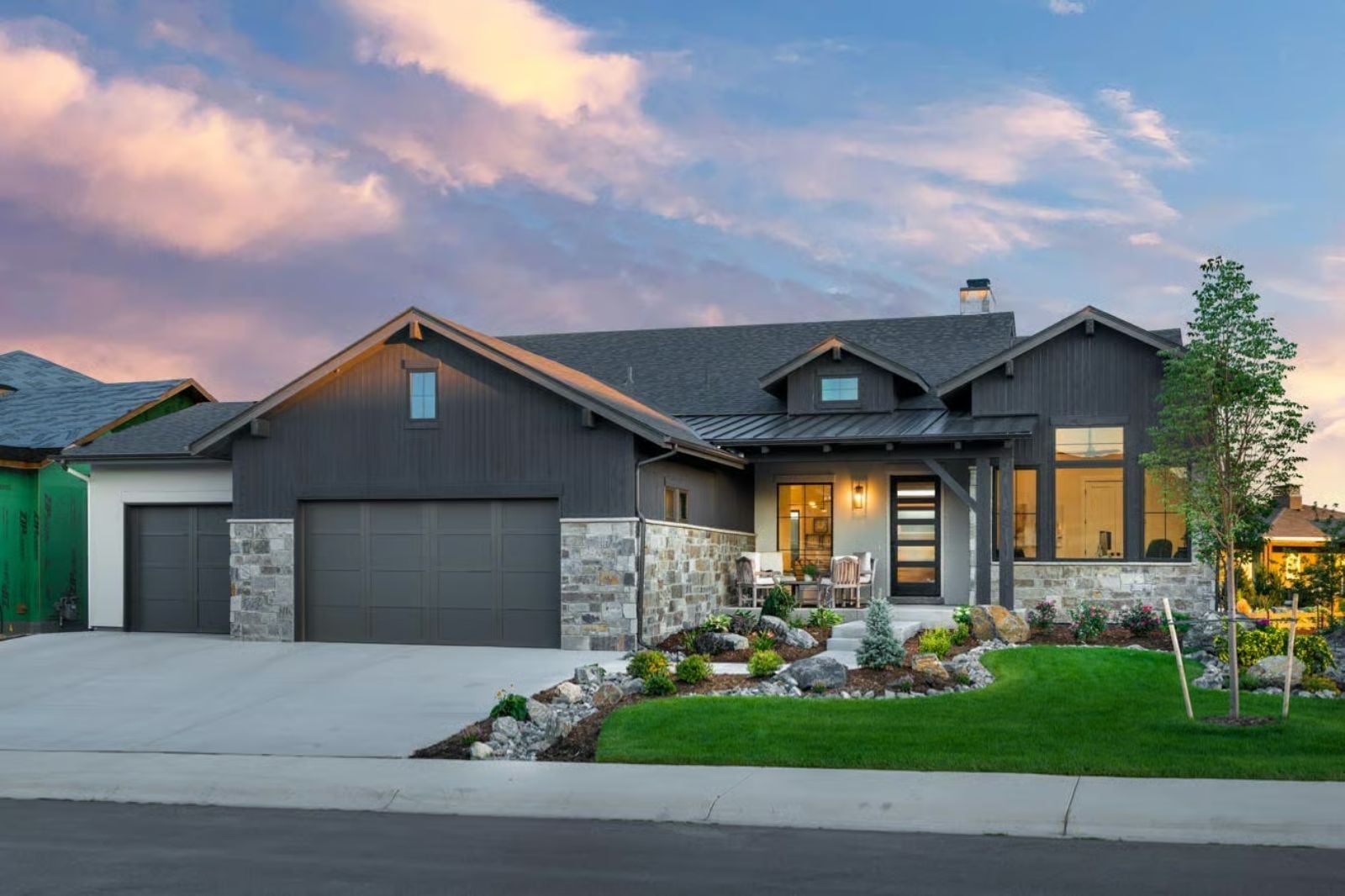
Empty nesters do not need a smaller house; they need a better one. The Winona Reed delivers exactly that: a finished basement that converts into its own self-contained level the moment the kids reappear, stone-and-timber construction that actually holds the cold out, a main-floor primary suite that keeps the stairs optional, and enough covered deck to drink coffee on while October burns through the ridge.
Specifications
- Sq. Ft.: 2,515
- Bedrooms: 2-4
- Bathrooms: 2.5-4.5
Floor Plan – Main Floor
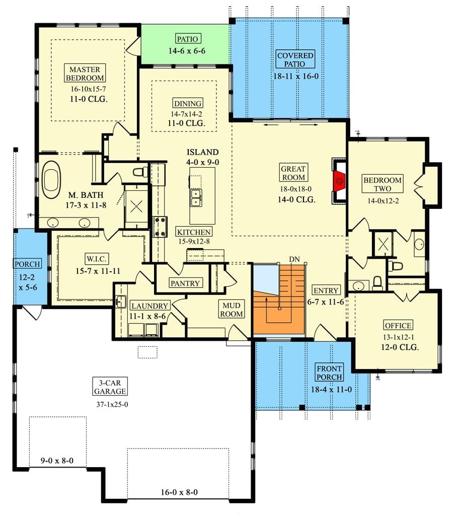
The main floor puts the master suite and its walk-in closet hard to the left, well clear of Bedroom Two and an office on the right side of the plan. A kitchen with a 4×9 island opens toward the great room and dining area, with covered patio access off the great room and stairs dropping down to the walkout basement below.
Floor Plan – Basement
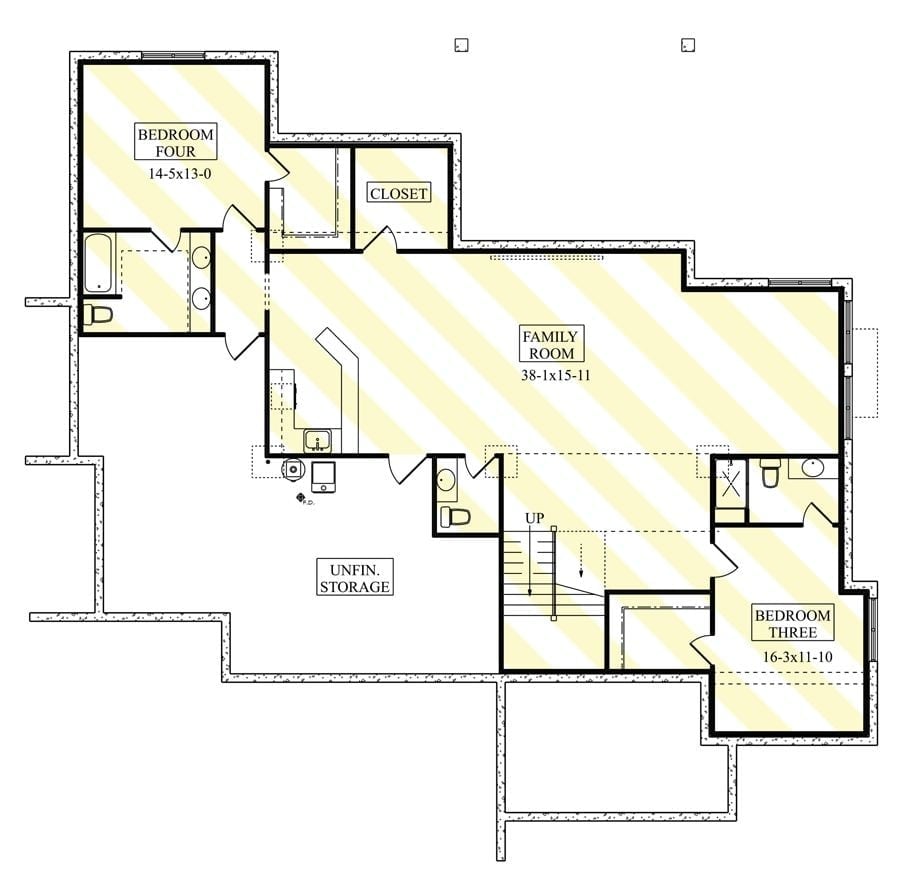
The basement level spreads a wide family room across the center, flanked by two bedrooms each with its own bath, plus a closet, laundry area, and unfinished storage. It actually earns the word functional — which, honestly, not every basement plan does.
Warm Light Spills Across Stone Columns and an Expansive Deck Built for Lingering
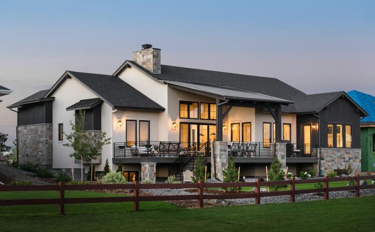
Stone pillar bases anchor the deck at both ends, and wall sconces throw that amber glow you simply cannot replicate with overhead cans. Timber brackets frame the covered outdoor section, and the whole composition holds together the way a lot of rustic exteriors try and fail to.
Sunflowers on a Glass Table Say Everything About This Room’s Mood
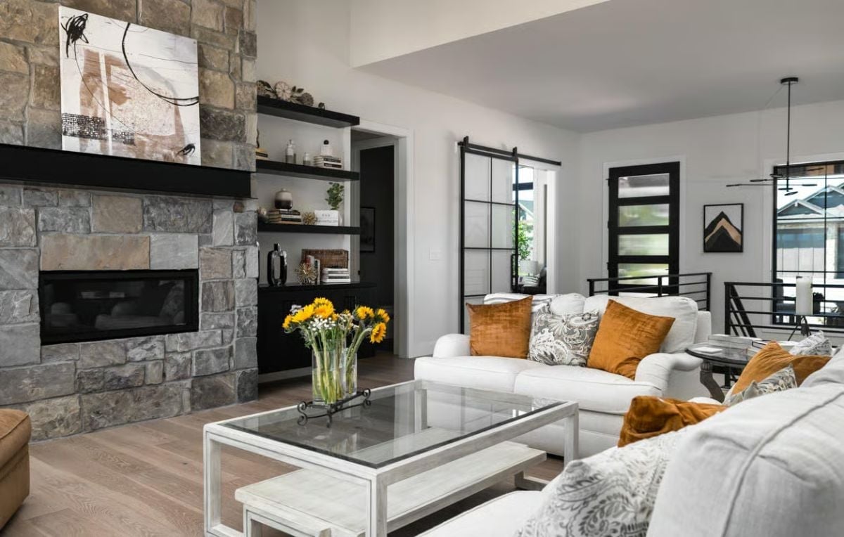
Rough-cut fieldstone runs floor to ceiling beside a linear gas fireplace with a matte black surround. White sofas wear burnt orange velvet cushions well, and a glass-top coffee table keeps the center of the room from feeling heavy. Fresh sunflowers in the corner are doing more decorating than most people’s entire accessory budgets combined.
Trend Alert: Barn-style steel sliding doors keep showing up inside homes with no barn anywhere nearby, and this room is a good illustration of why they catch on. Industrial enough to feel deliberate, they don’t eat floor space the way a swinging door would, and paired with black-framed windows they pull the whole room into a coherent palette rather than reading as a random hardware choice.
Black Island, Gold Pendant Interiors, and a Faucet That Means Business
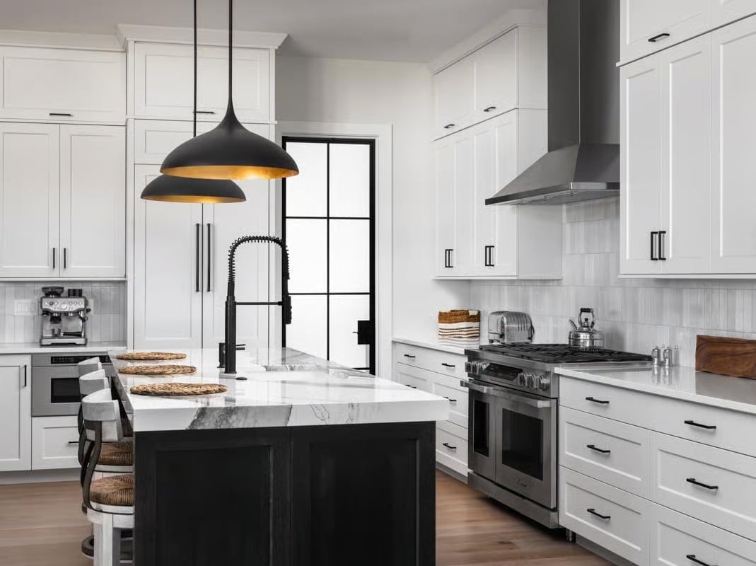
That spring faucet mounted dead-center on the island isn’t subtle, and it’s not trying to be. Dark-stained cabinetry on the island base grounds the white shaker perimeter without competing with it, marble-veined countertops carry the visual interest, and woven seat backs at the island add the one soft texture in a space that’s otherwise all hard edges and flat surfaces.
- Black hardware unifies the pendants, faucet, and cabinet pulls without matching exactly
- Gold interiors on dome pendants warm up a palette that could otherwise read cold
- Range hoods with straight lines read cleaner against shaker-style cabinetry than curved profiles do
Black Ceiling Inset, Ring Pendant, and Three Tree Prints Walk Into a Dining Room
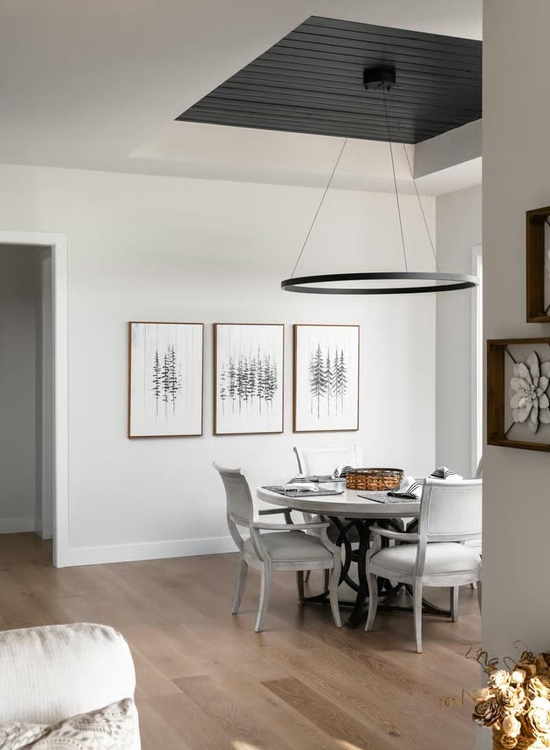
Shiplap painted black on a recessed ceiling section grounds the ring pendant so the fixture doesn’t float aimlessly overhead. White chairs and a pedestal table pull it back from the edge — just enough brightness to keep the room from going full cave.
By The Numbers: Ring-style pendants have become a go-to for dining rooms because they spread light evenly across a round table without the visual bulk of a drum shade. Mounting a matte black fixture against a dark ceiling like this lets the hardware recede into the recess, so the light itself becomes the focus. And round tables seat guests more flexibly than rectangular ones — no head-of-table politics at family dinners.
Exposed Ceiling Beams, White Bedding, and a Ceiling Fan That Actually Fits the Room
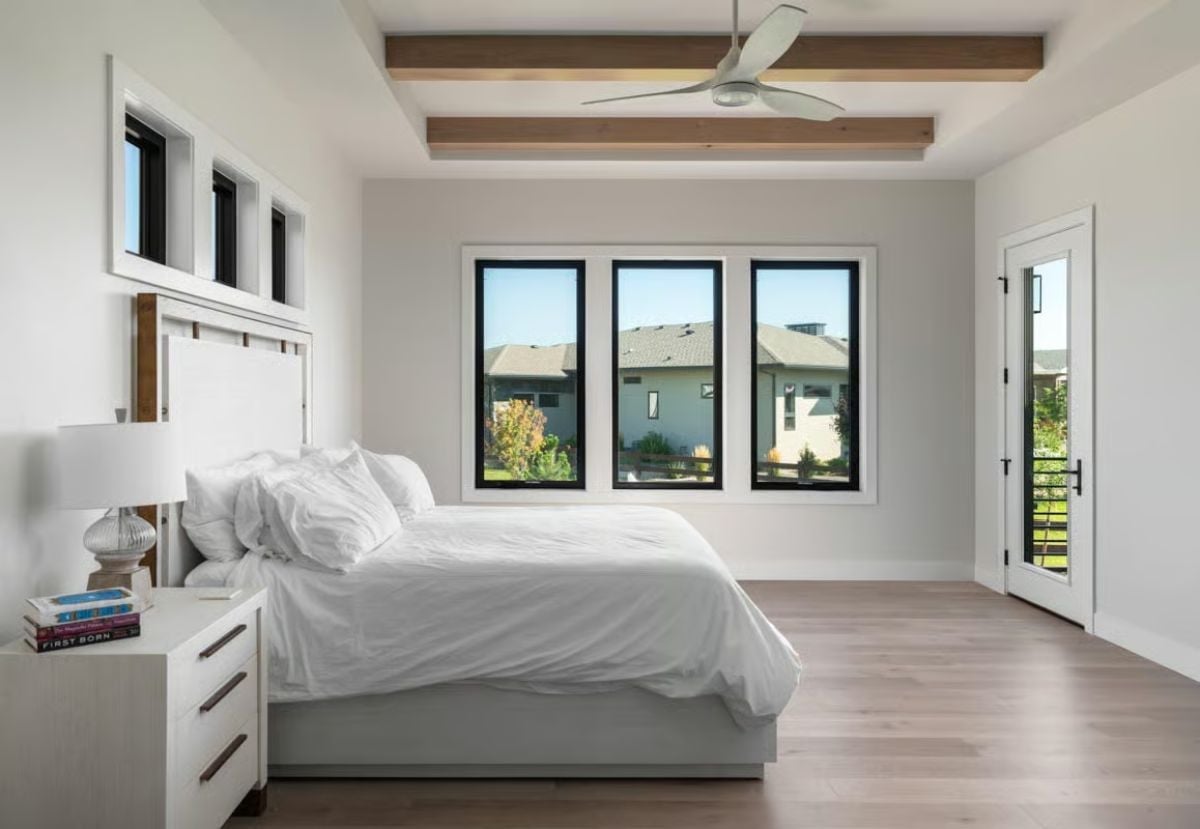
Wood beams frame the tray ceiling without overwhelming it. The ceiling fan’s scale is matched to the room rather than fighting it — a small thing that most people get wrong. Crisp white bedding keeps things calm, and black window frames do real structural work here, grounding three tall windows that pull in a full view of the roofline and yard beyond.
Designer’s Secret: Tray ceilings with exposed wood beams are one of the few design moves that translate across both rustic and contemporary spaces without fully committing to either. Adding beams to an existing tray? Stain them two shades darker than your floor so they read as deliberate rather than leftover lumber. The contrast carries itself from there.
Floating Vanity, Dark Slate Floor, and Open Shelves That Actually Do Their Job
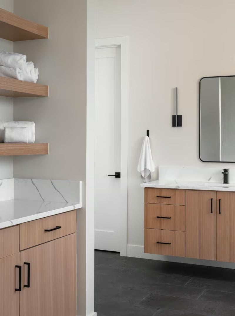
Floating vanities make a bathroom feel bigger without touching a single wall.
Open shelves stacked with rolled towels pull more weight here than any basket ever could. Wood cabinetry runs warm against the dark slate tile, black hardware ties the contrast together without hammering it home, and marble countertops keep things from skewing too casual. That wall sconce above the mirror is earning its place — not just decorating, actually lighting.
Gold Bar Stools and Glass Pendants Turn a Basement Bar Into the Best Seat in the House
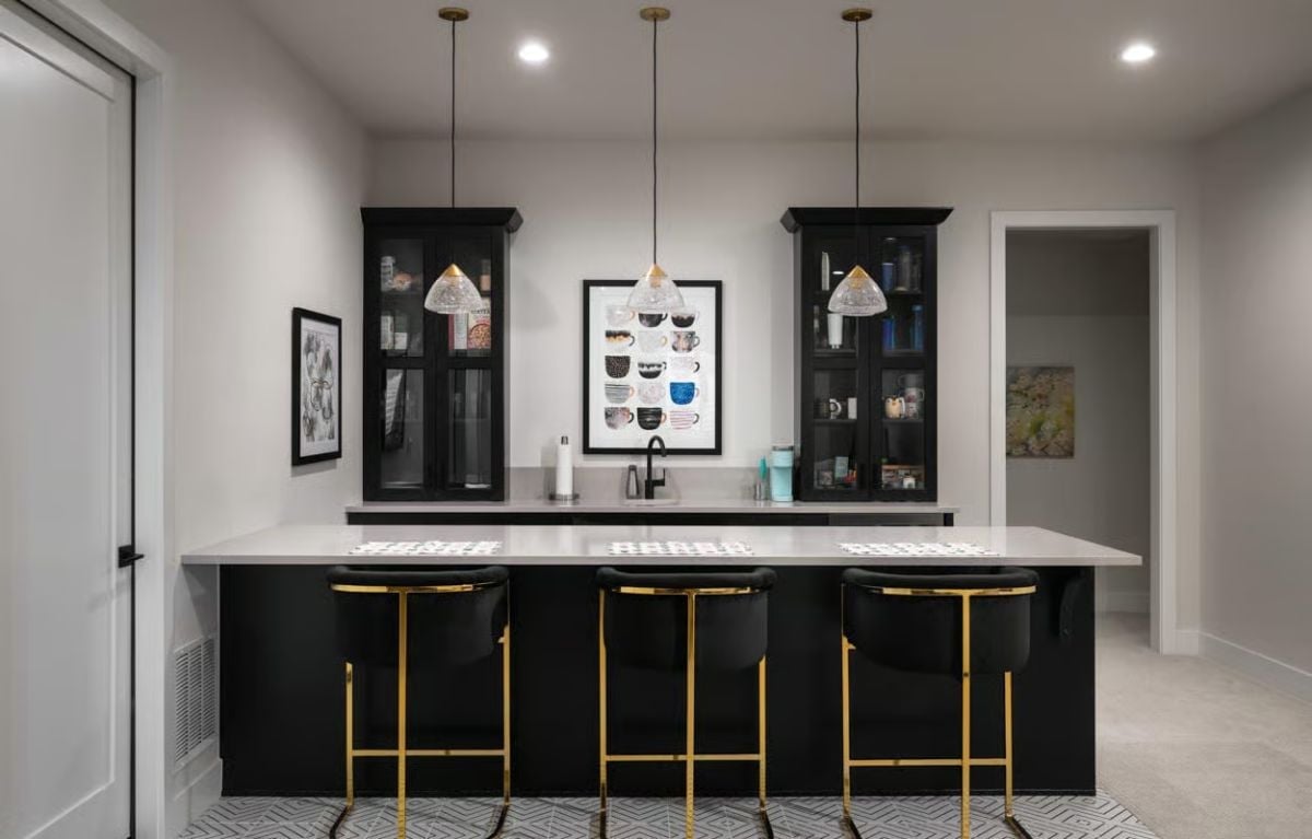
Black cabinetry with glass fronts flanks a sink counter that actually has room to work. Gold frames on the bar stools pull directly from the pendant hardware above — three stools, three lights, someone clearly thought this through. The framed mug print centered on the back wall is a fun touch that stops the whole thing from taking itself too seriously.
Pro Tip: Clear glass pendant shades work especially well over dark counters because the transparency keeps the visual load light even when the fixture itself is substantial. Hanging three in a row? Space them evenly over each seat position rather than centering them over the counter as a cluster — it reads cleaner and actually lights what it’s supposed to.
Pin It
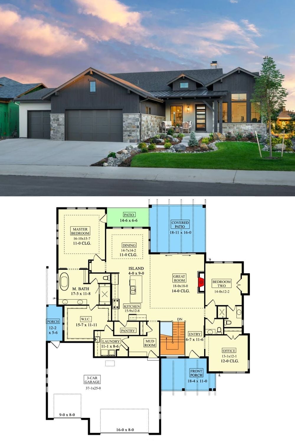
Exterior photo shows a craftsman ranch with stone accents and three-car garage; floor plan below reveals a single-level layout with master suite, great room, and covered patio.
Color Story: Gray and warm beige run through both the exterior palette and the interior material choices implied by the floor plan. Together they read as calm rather than cold — which suits a house designed for people who have genuinely earned some quiet.