
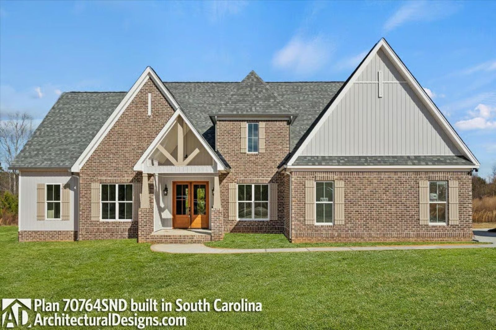
Anyone who has watched their family drift to separate corners of the house by seven on a Saturday knows exactly what most floor plans are missing. The Wickerly is built around the opposite: a screened porch where dinner lingers past dark, an open common area that keeps conversations alive through homework and dishwashing, and a bonus expansion upstairs for the room your family will need before they know to ask for it.
Specifications
- Sq. Ft.: 2,570
- Bedrooms: 4
- Bathrooms: 4.5
Floor Plan – Main Floor
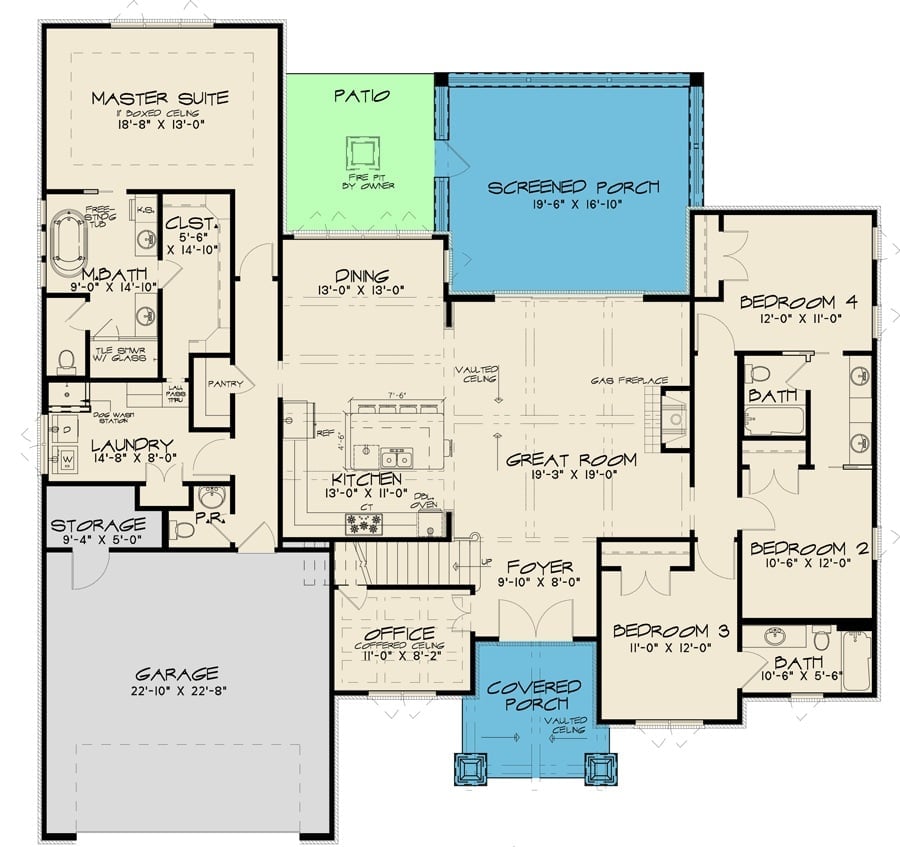
The master suite anchors the left wing with a walk-in closet, full bath, and laundry close by. A central great room with a vaulted ceiling bridges the kitchen, dining area, and screened porch in one connected sweep, while three bedrooms occupy the right side of the plan. Up front, the foyer, office, and covered entry porch create a genuine buffer between the public face of the house and the spaces where the family actually lives.
Floor Plan – Bonus Room
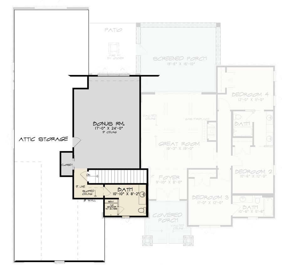
The upper level holds a bonus room, full bath, closet, and attic storage — all reached by staircase from the main floor.
Common Mistake: Homeowners skip the bonus room during construction and assume they can circle back. They usually can’t — not cheaply, anyway. Roughing in the bathroom plumbing and electrical while the walls are still open costs a fraction of what it runs once everything is closed up, and a finished bonus room with a full bath adds genuine resale value rather than just extra square footage on paper.
Step inside and the foyer sets the tone before you’ve even reached the living room.
Double Wood Doors With Glass Panels Make an Entry Worth Walking Through
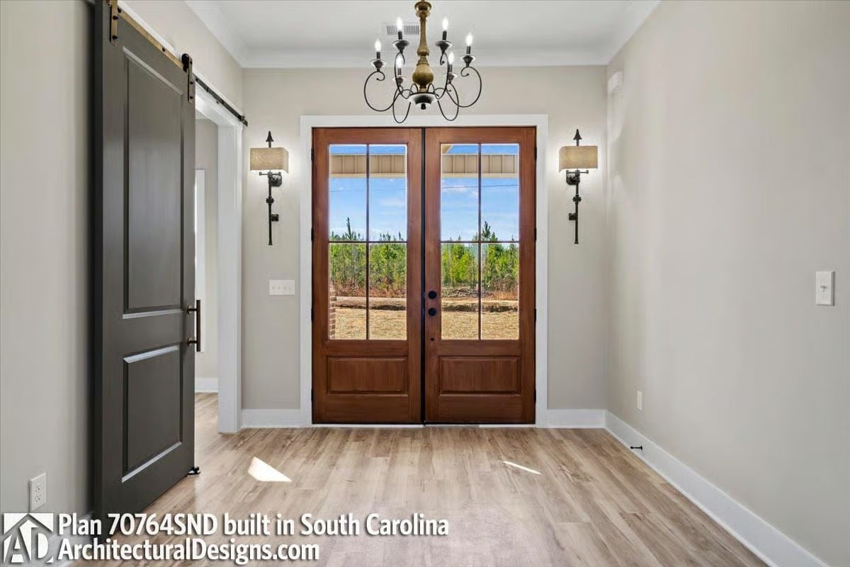
Warm-stained double doors with divided glass panels pull natural light deep into the foyer, and flanking sconces with linen shades add soft fill light without competing for attention. What earns a second look is the gray sliding barn door to the left — a clean way to close off interior spaces without a swinging door eating into foot traffic. Small detail, but in a foyer this size, it matters.
Coffered Ceiling Does the Heavy Lifting So the Walls Don’t Have To
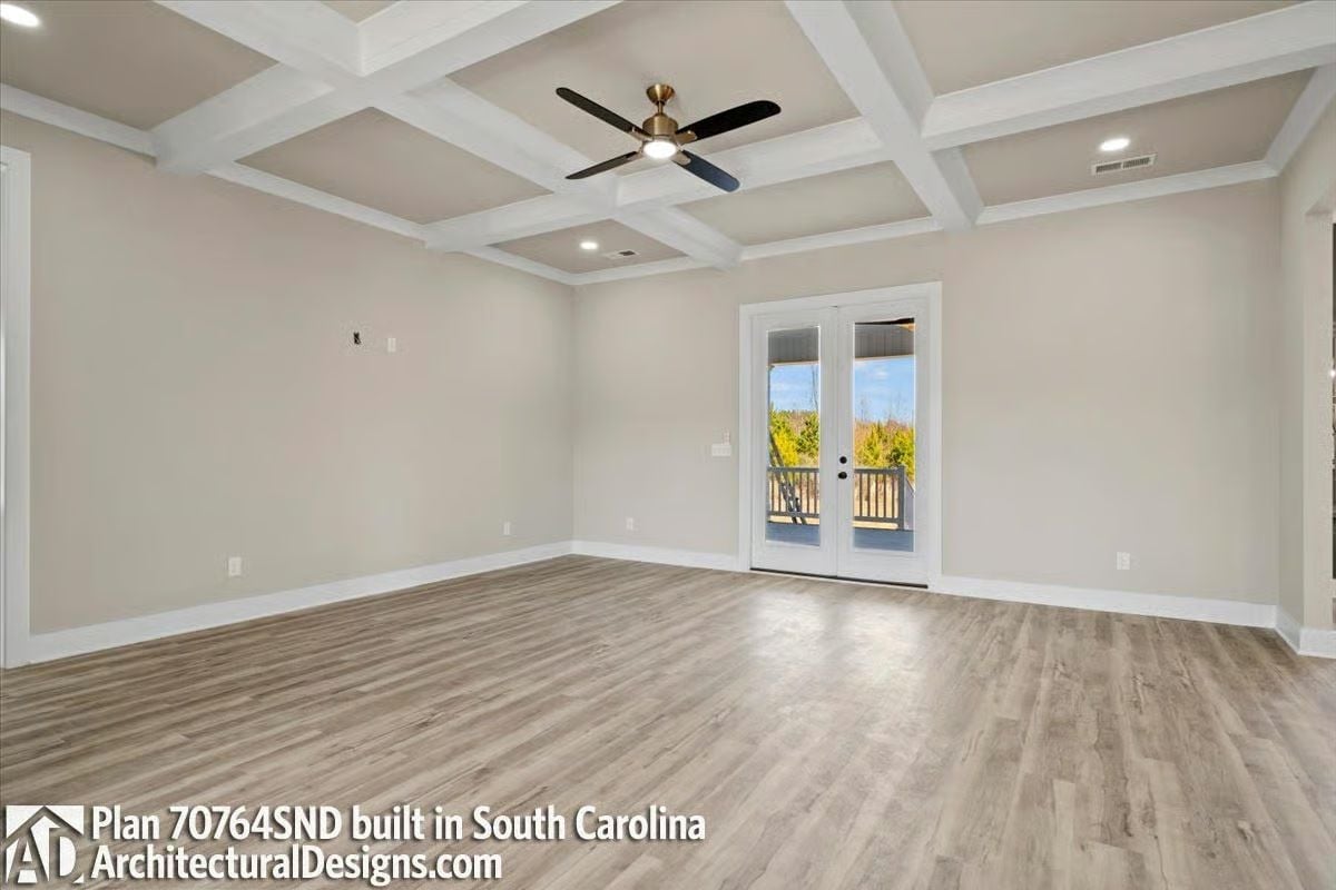
Brass ceiling fan, white coffered grid, French doors to a deck — this empty room has more character than most furnished ones.
In The Details: Coffered ceilings add visual weight without requiring any furniture to carry the room. If you’re building new, get the beam depth specified in writing before framing starts — shallow coffers end up looking like surface decoration rather than architecture, and that’s genuinely difficult to fix after the fact.
Shiplap Island Sides and a Black Faucet Offset From Center Change the Kitchen Math
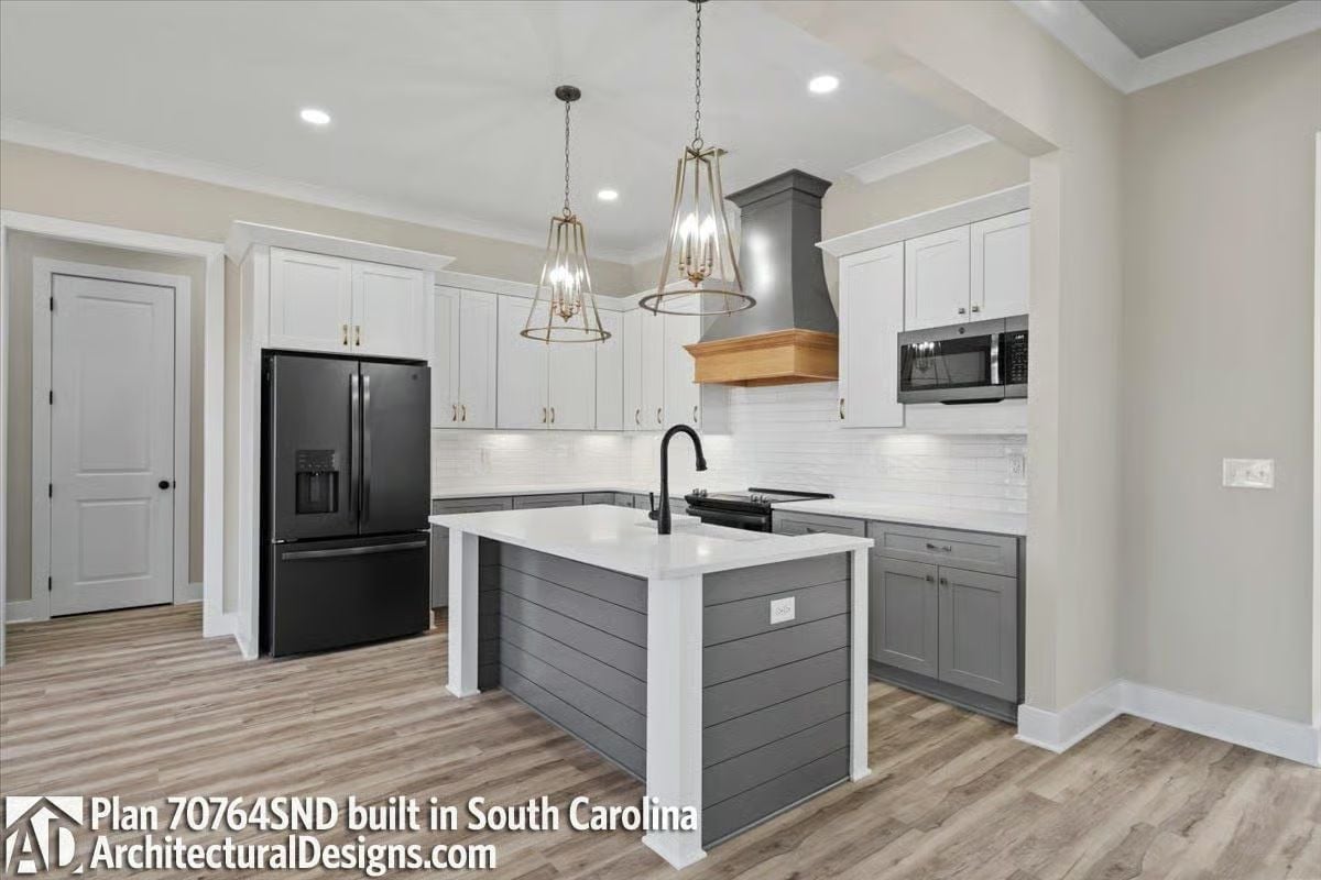
Gray lower cabinets pair with white uppers in a combination that’s familiar enough, but the shiplap-clad island sides pull focus in a way that plain painted panels never would. The black matte faucet sitting noticeably off-center on the quartz surface is a small choice that keeps the whole layout from feeling too composed. Above the range, a wood-trimmed gray hood ties the upper cabinets together without blending into them.
History Corner: Range hoods became standard in American kitchens largely because of mid-20th century building codes responding to growing concerns about indoor grease fires. Before that, many home cooks relied on open windows or nothing at all. The wood-trimmed gray hood in builds like this one is a nod to that functional history, dressed up for modern tastes.
Dark Accent Wall Behind a Chandelier Earns Its Place in an Empty Room
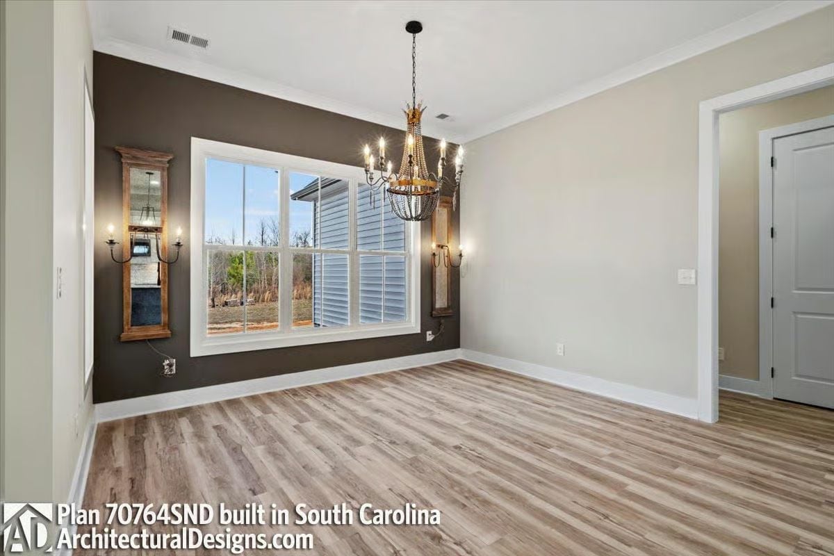
Chocolate brown paint on one wall pulls the window and flanking sconces into a composition that reads finished even without a stick of furniture in the room. The beaded chandelier does its job overhead. Crown molding wraps every corner, giving the greige walls enough structure that they don’t drift toward bland.
Color Story: Dark accent walls pair best with trim colors that read as pure white rather than off-white. That contrast is what gives the window frame its crispness here. Soft whites tend to muddy against deep browns and make the wall look dirty rather than dramatic.
Soaking Tub Against Subway Tile Wainscoting Earns Every Square Foot
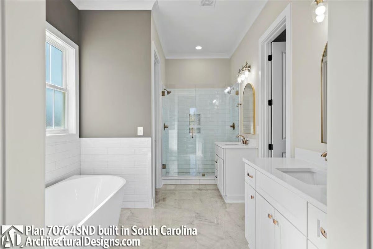
The freestanding soaking tub sits low against half-wall subway tile, letting the upper wall breathe instead of closing the room in. Gold fixtures run throughout without overwhelming — a restraint that’s harder to pull off than it looks. Behind frameless glass at the far end, the walk-in shower keeps sight lines open across the full length of a primary bath that’s actually well-proportioned for the square footage.
The Psychology Behind This: Separate vanities in a shared primary bathroom reduce more morning conflict than most couples expect. Giving each person distinct counter space and mirror placement creates a sense of individual ownership within a shared room, which makes the space feel less like a compromise.
Mudroom Built-ins That Actually Have a Job to Do
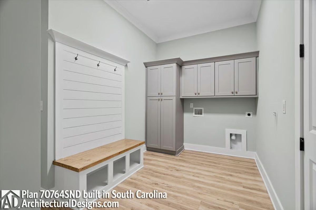
Shiplap paneling isn’t just decorative here — it’s load-bearing for the whole room’s logic.
Open cubbies below a wood-topped bench give bags and shoes a place to land without piling on the floor, while upper cabinets in a soft greige finish handle the off-season storage that most mudrooms simply ignore. Worth a closer look: that small access panel at baseboard height is almost certainly a pet door rough-in, which means whoever drew this plan was thinking about the whole household, not just the humans.
Covered Rear Porch With Ceiling Fan Proves Outdoor Living Doesn’t Need Furniture to Function
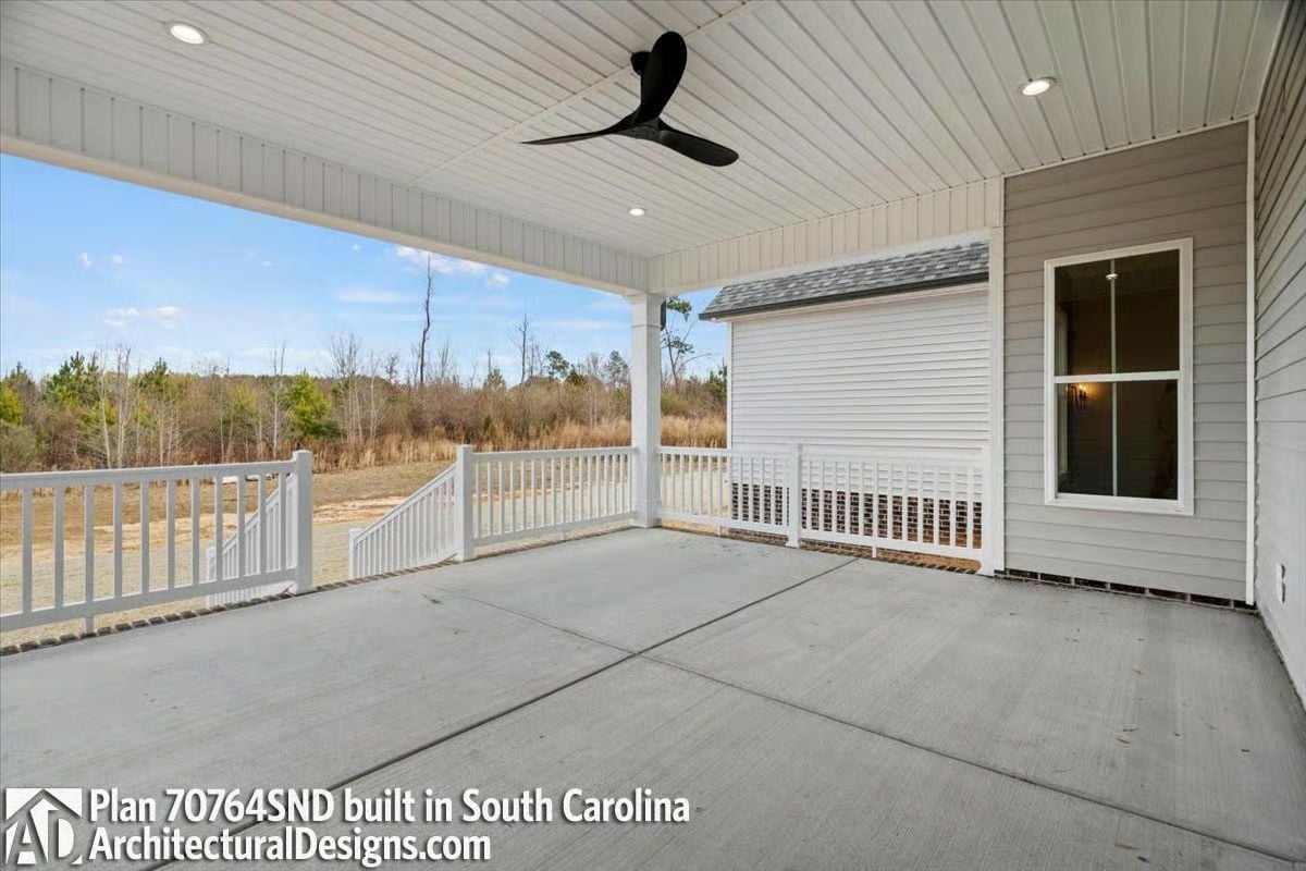
Concrete slab, white rail, recessed lights, and a black ceiling fan with no light kit. Already useful. The combination keeps the porch livable on hot afternoons before a single chair arrives, which is exactly what a good bones porch should do.
Pin It
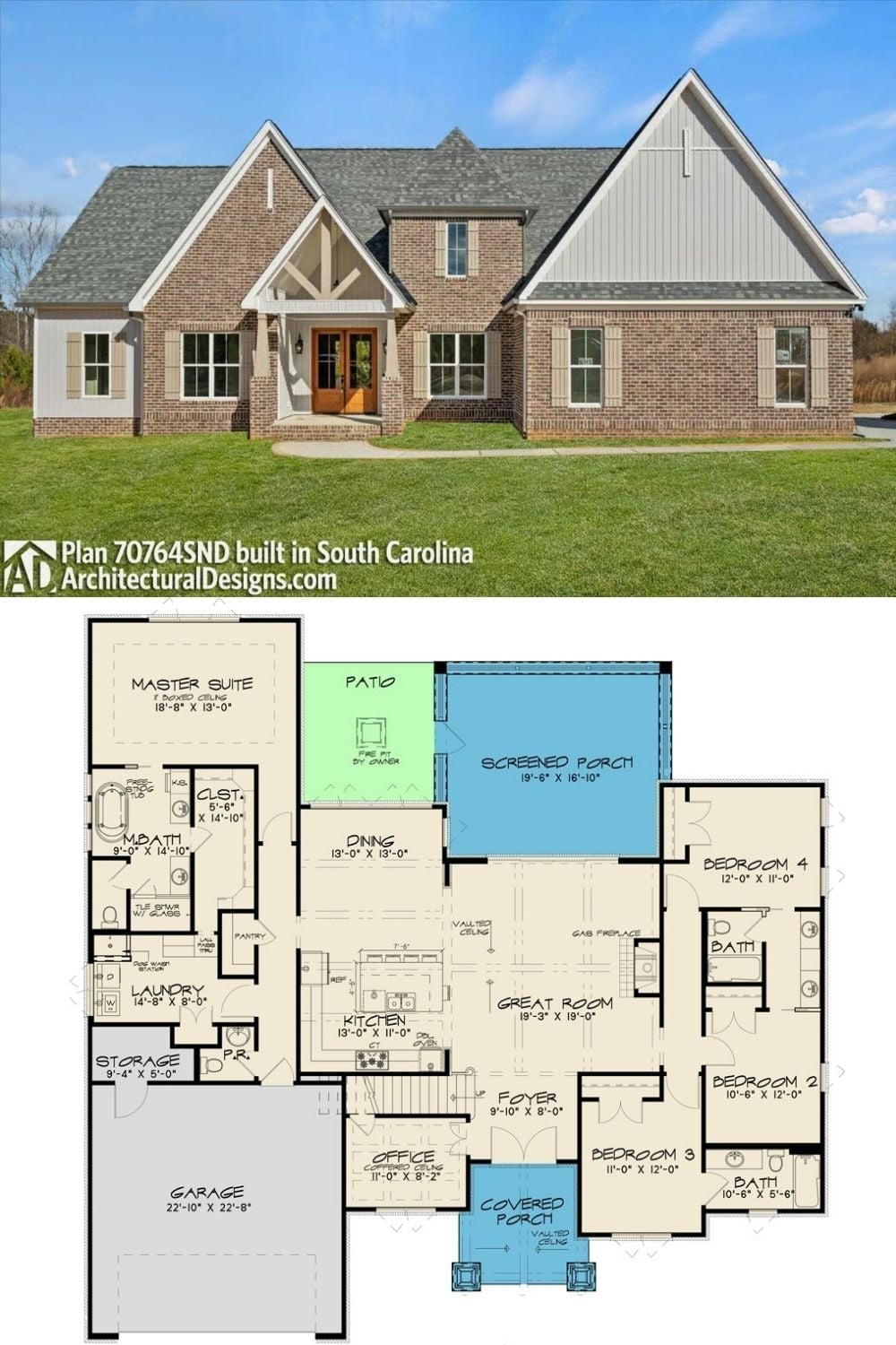
The exterior photo shows a brick and board-and-batten home with a covered entry porch and wood front doors. Below it, the floor plan lays out four bedrooms, a vaulted great room with gas fireplace, screened porch, kitchen with pantry, dedicated office, laundry with dog wash station, and an oversized two-car garage.
