
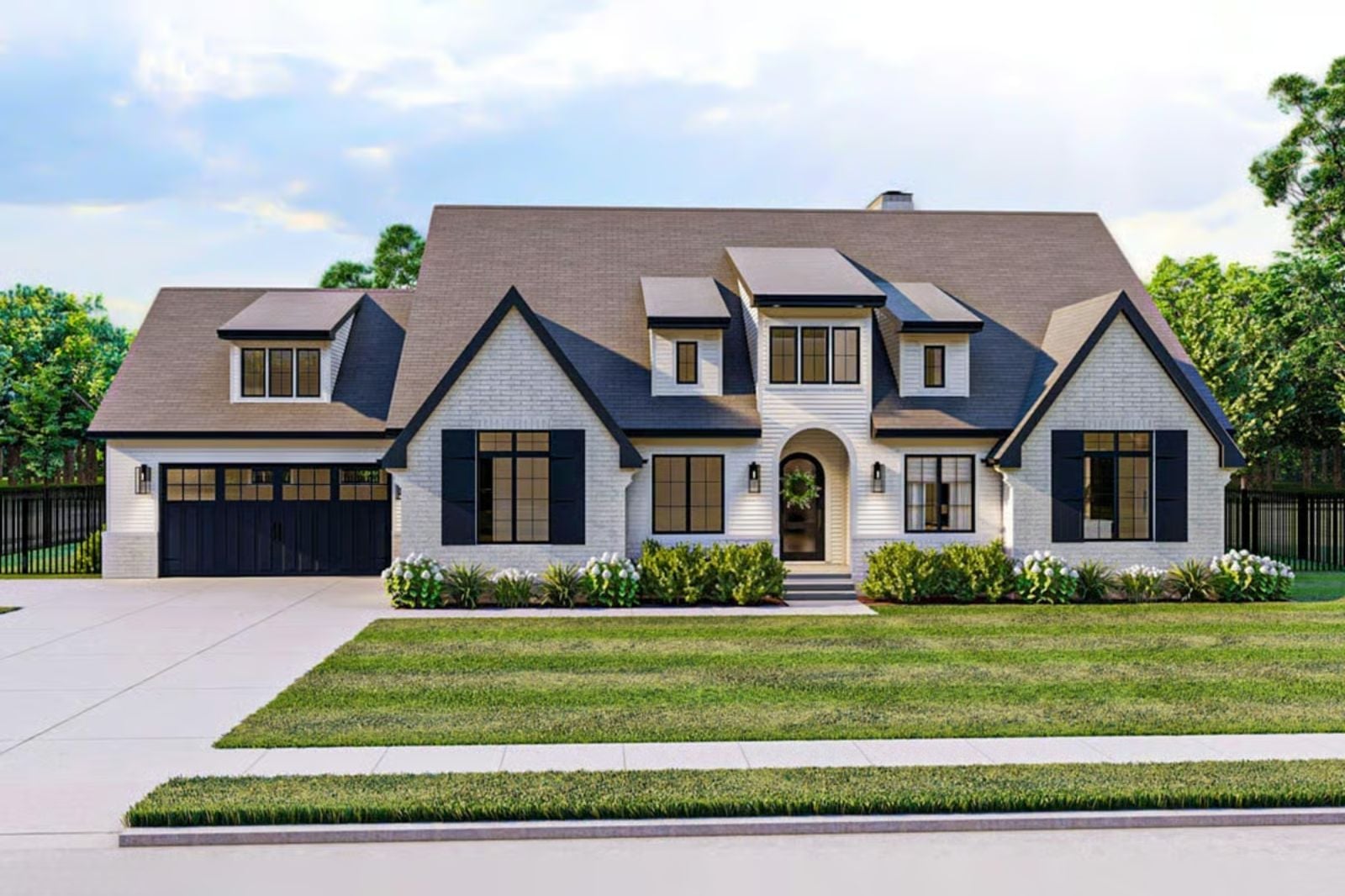
If you have ever watched your last sliver of alone time vanish the moment you sat down, you already understand why a loft with a door outranks any countertop upgrade. The Rosalind is built around exactly that logic: main-floor living absorbs the dinner chaos, cottage-scaled rooms keep the noise where it belongs, and the upstairs loft gives parents somewhere the kids simply do not go.
Specifications
- Sq. Ft.: 3,058
- Bedrooms: 3
- Bathrooms: 2.5
Floor Plan – Main Floor
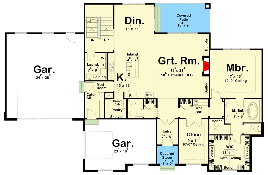
Main floor features open great room, master suite, office, two garages, kitchen with island, and covered patio.
Floor Plan – Second Floor
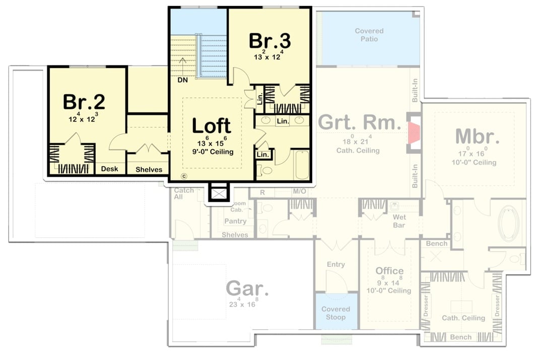
Upper level holds two bedrooms, a loft, and linen storage. The master suite sits tucked away downstairs.
Crisp White Siding, Dark Trim, and a Fire Pit That Actually Gets Used
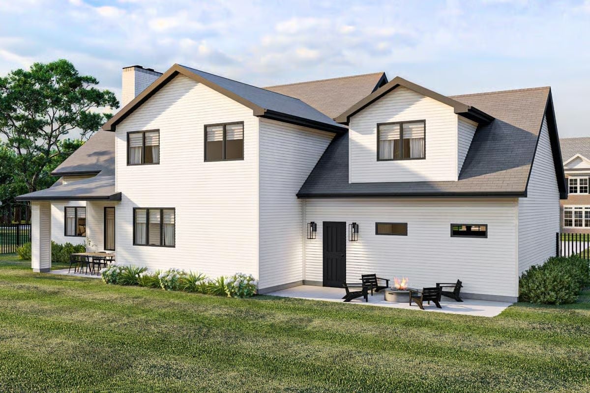
Board-and-batten siding in white pairs with black window frames and a charcoal roof that saves the palette from feeling washed out. Out back, four black Adirondack chairs ring a small fire bowl on a concrete pad, with low-maintenance landscaping running along the foundation so the whole thing stays manageable.
By The Numbers: Modern cottage plans like this typically place the loft above the main living area, putting a full floor between parents and the kids’ bedrooms. That vertical separation is the whole point — it’s one of the more quietly practical things a floor plan can do for a family that actually wants a functioning grown-up space.
Stacked Firewood Built Into the Wall Is a Flex Move That Actually Works
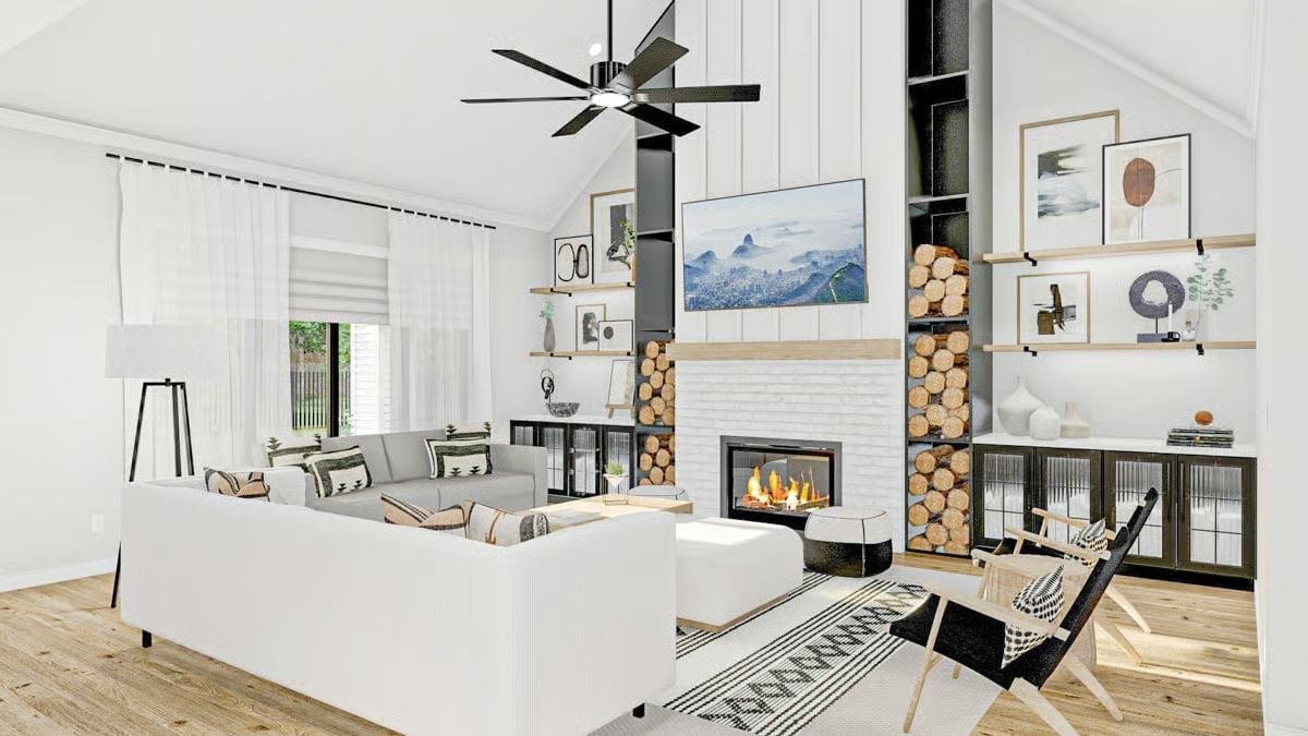
Two vertical storage columns flank the fireplace, packed floor-to-ceiling with split logs — decorative, yes, but also genuinely useful. The shiplap surround stays white so the wood grain does the talking, while black shelving brackets and a ceiling fan keep the palette from going too soft.
- Built-in log storage keeps firewood off the floor and out of a basket by the door
- Stacking wood inside a climate-controlled space helps it stay drier and ready to burn
- Vertical columns draw the eye upward, making the ceiling height feel earned rather than accidental
Black Windsor Chairs Against White Upholstered Ones Is a Contrast Worth Stealing
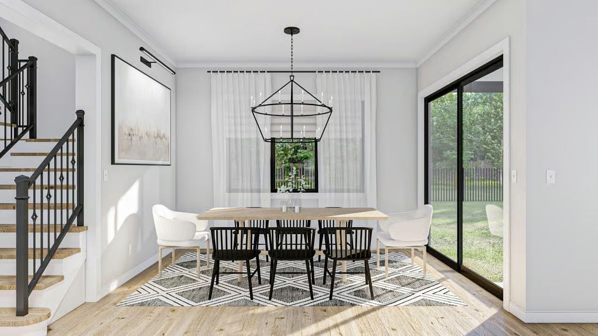
Four black Windsor chairs anchor the middle seats while white upholstered chairs claim the ends — an intentional mix that reads as a decision rather than an accident. A geometric rug grounds everything underneath, sheer curtains soften the black window frames without blocking the backyard view, and that cage chandelier earns its scale.
Style Tip: Mixing chair styles at one table works when there’s a clear logic behind it — alternating by position rather than scattering randomly. Here, the upholstered chairs at the heads signal “host seats” without a word spoken. Small move. Makes the whole room feel like someone actually thought it through.
Pendant Lights Over a Kitchen Island That Earns Every Inch of Counter Space
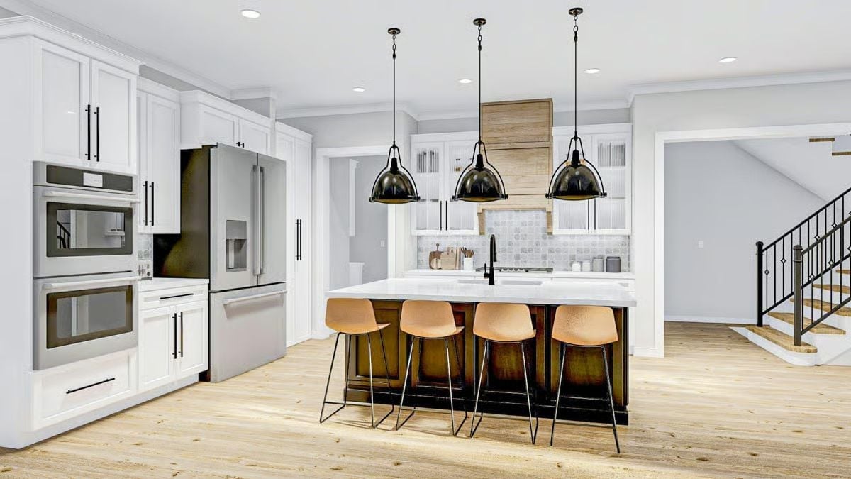
Three black dome pendants hanging over a dark wood island is a combination that shouldn’t work this well, but it does.
White perimeter cabinets keep the walls from competing with the island’s warm, aged wood base. Four people at those bar stools don’t feel cramped. And that wood range hood pulls the whole thing into focus in a way a stainless hood never would.
Sage Green Above the Wainscoting Is the Detail That Makes This Office Feel Grown-Up
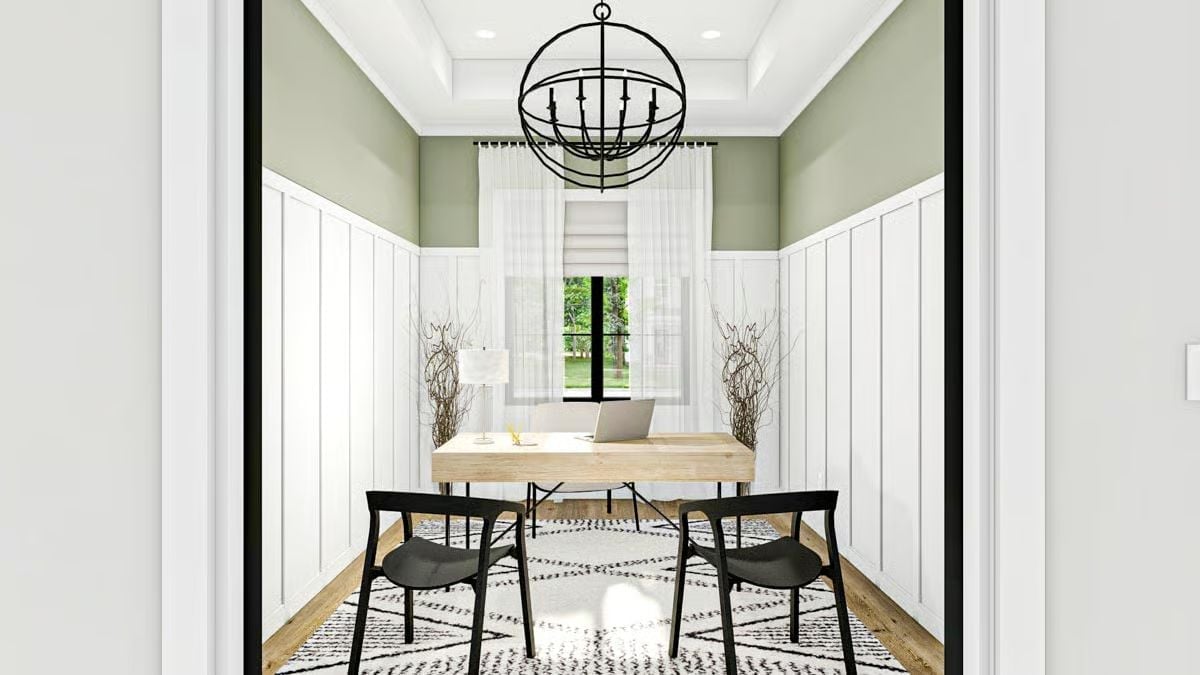
Vertical shiplap wainscoting painted crisp white anchors the lower walls, with sage green taking over above the chair rail. The orb chandelier and natural wood desk keep the room grounded without tipping into precious.
Quick Fix: Sage paired with white wainscoting reads calm without feeling cold — exactly what you want in a room meant for focus. Paint only above the chair rail and you’ll use far less than a full-room color change, which makes it a low-commitment way to test a deeper hue before committing to all four walls.
Black Canopy Frame, Tufted Bench, and Pendant Lights That Know Their Place
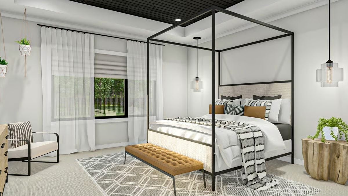
Pendant lights drop inside the canopy frame rather than flanking it, which keeps the ceiling from feeling cluttered and anchors the lighting to the bed itself. The tufted caramel bench at the footboard gives you somewhere to sit that isn’t the mattress. Sheers layer over a roman shade for light control without losing the softness.
Designer’s Secret: Hanging pendants inside the four-poster frame ties the lighting to the bed rather than the ceiling, so the room reads as one cohesive zone instead of furniture scattered under overhead fixtures. Bonus: the nightstand is finally free from lamp duty, which means more room for the book you’re actually going to read this time.
Herringbone Tile, a Double Vanity, and Hardware That Commits to Black
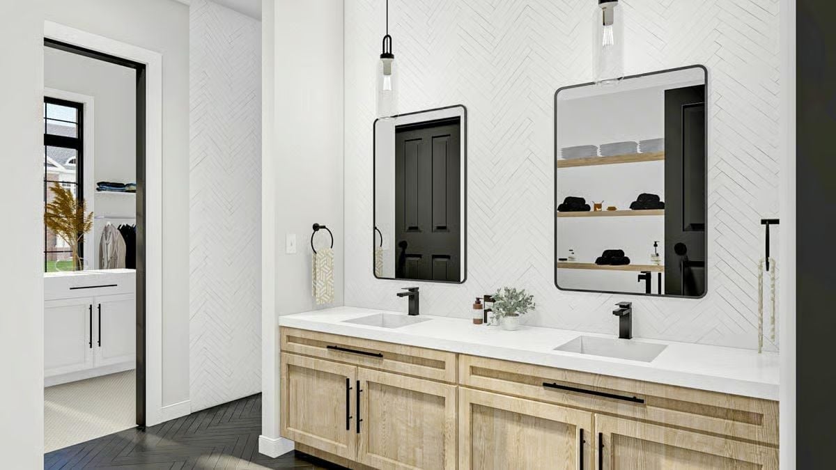
Light oak cabinetry paired with matte black faucets and cabinet pulls keeps the contrast sharp without getting busy. The herringbone wall tile runs floor-to-ceiling, doing more for the room’s perceived height than any mirror trick could. Pendant lights drop low enough to actually matter.
Common Mistake: Centering a pendant directly over each sink sounds logical, but it often lands the fixture too close to the mirror and sends glare right where you need clear light. Position pendants slightly forward of the mirror plane instead — it pushes the light onto your face rather than into the glass, and that small shift changes how usable the vanity actually is.
Pin It
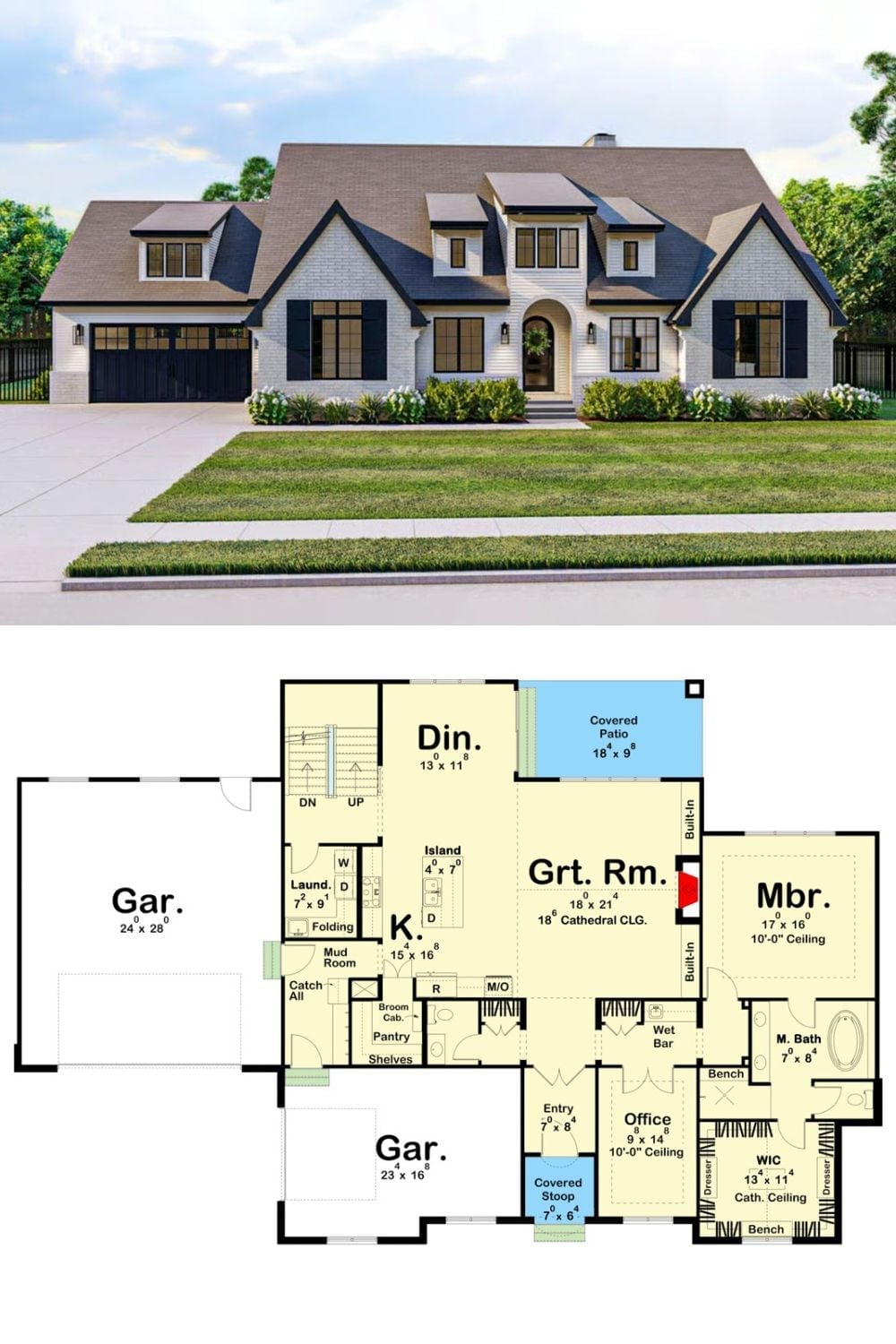
Exterior rendering shows a modern cottage with white brick, dark trim, and a steeply pitched roof. Below, the floor plan reveals a cathedral-ceiling great room, main-floor master suite, dual garages, and a covered patio off the dining area.