
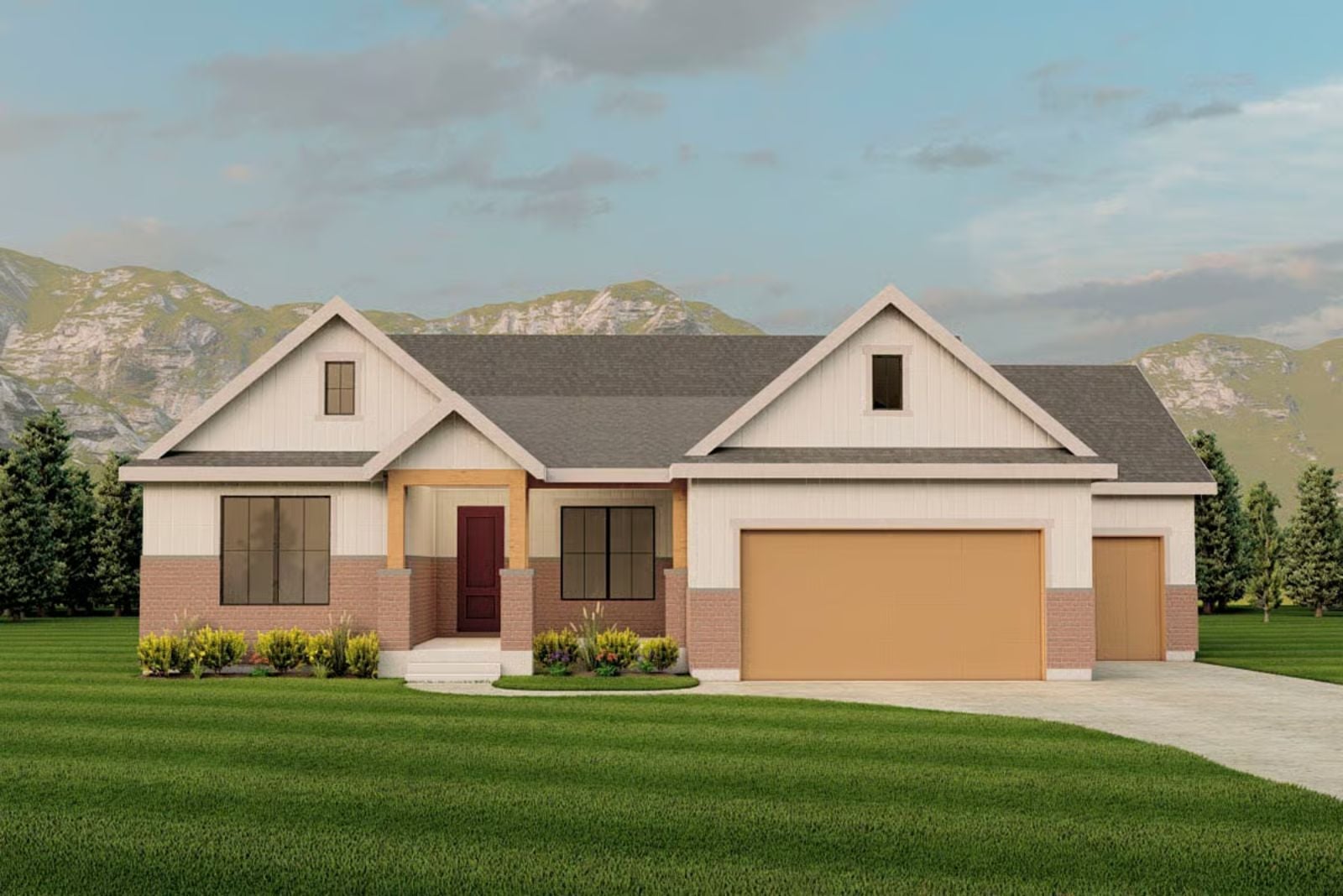
More households are quietly restructuring around aging parents than at any point in recent memory, and most builders are still designing homes where that conversation ends in an awkward guest room. The Kaysville takes a different position: a finished basement that gives in-laws genuine distance, a flex room that shifts with whoever needs it most, and a traditional layout that stays functional when three generations are all home at once.
Specifications
- Sq. Ft.: 2,394
- Bedrooms: 3-6
- Bathrooms: 2.5-3.5
Floor Plan – Main Floor
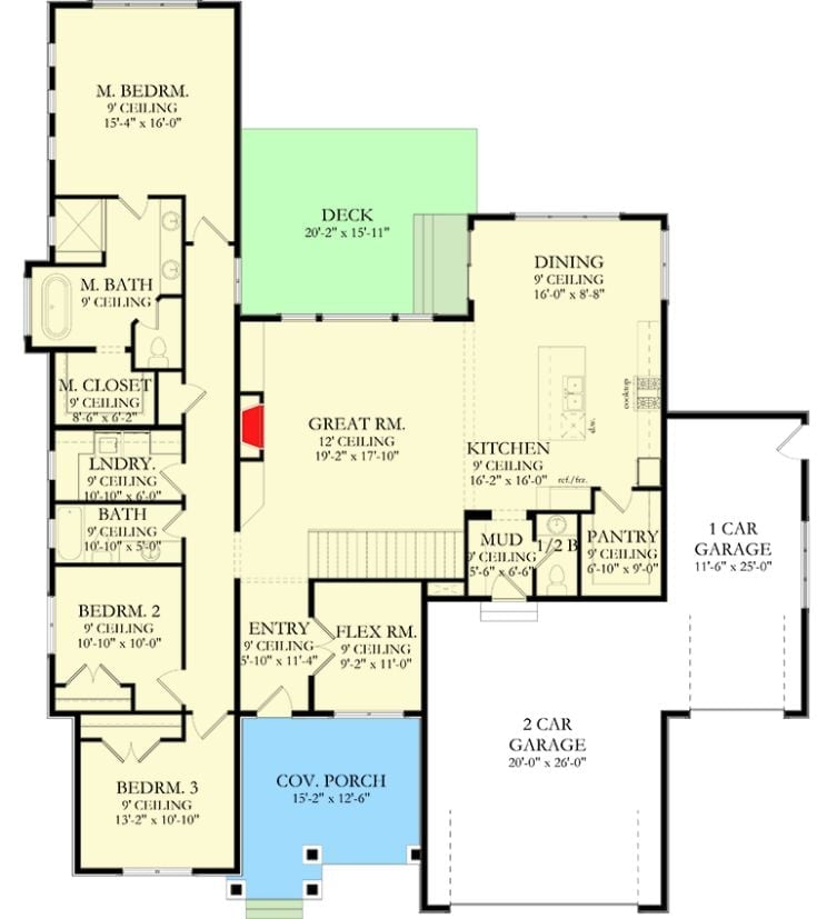
The main floor puts the Great Room at its center under a 12-foot ceiling, with the kitchen and dining area to one side and the bedroom wing to the other. The master suite anchors the far end of that wing with its own bath and closet. A flex room near the entry, mud room, pantry, and two garages round out a layout built for actual daily life rather than a showroom walkthrough.
Floor Plan – Basement
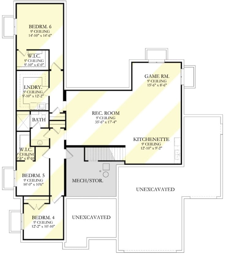
Bedroom 6 anchors the far end of the finished basement with its own walk-in closet and easy access to a shared bath, while Bedrooms 4 and 5 sit closer to the stair core, each with WIC space nearby. The rec room stretches to 35’6″ x 17’4″ and opens into a kitchenette and game room. Laundry is tucked in without making a fuss about it.
Floor Plan – Walkout Basement
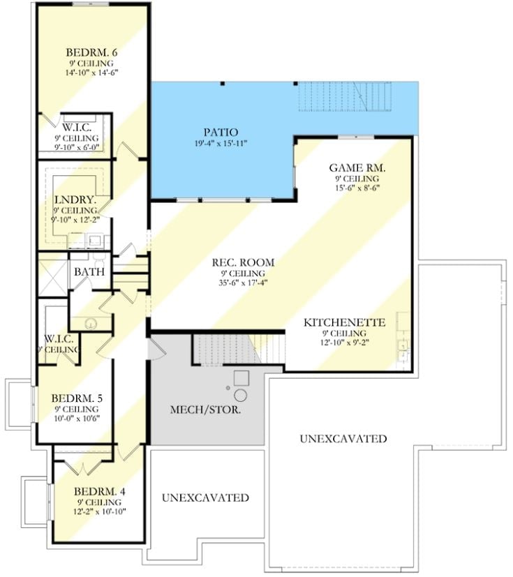
Three bedrooms, a rec room stretching past 35 feet, a kitchenette, game room, and patio all fit within the finished basement footprint. The upper bedroom claims two walk-in closets. Laundry lands mid-hall, and unexcavated sections flank the mechanical storage core on either side.
Crisp White Stucco and Oversized Windows Pull Every Room Toward the Backyard
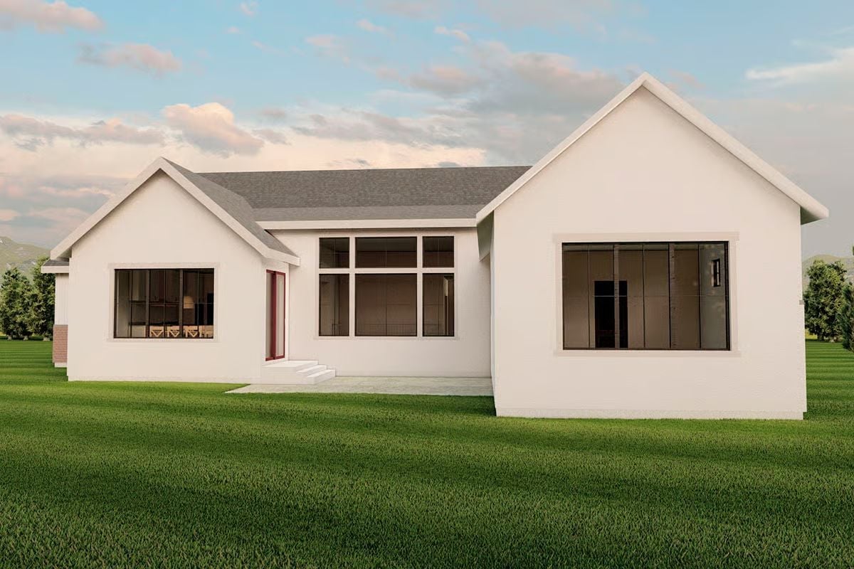
Rear-facing gable ends flank a wide bank of grid-pane windows that push natural light deep into the main living space. That burgundy door is an unexpected pop against all the white — good unexpected, not trying-too-hard unexpected. Low steps drop to a simple patio slab, keeping the indoor-outdoor connection practical rather than precious.
Editor’s Note: Those oversized rear windows aren’t just about views. In a basement plan like this one, they’re doing real work pulling light down into lower-level spaces that would otherwise feel like a cave. Worth factoring that into any furniture layout decisions before construction wraps.
Built-In Shelves, Dark Cabinets, and a Fireplace That Actually Anchors the Room
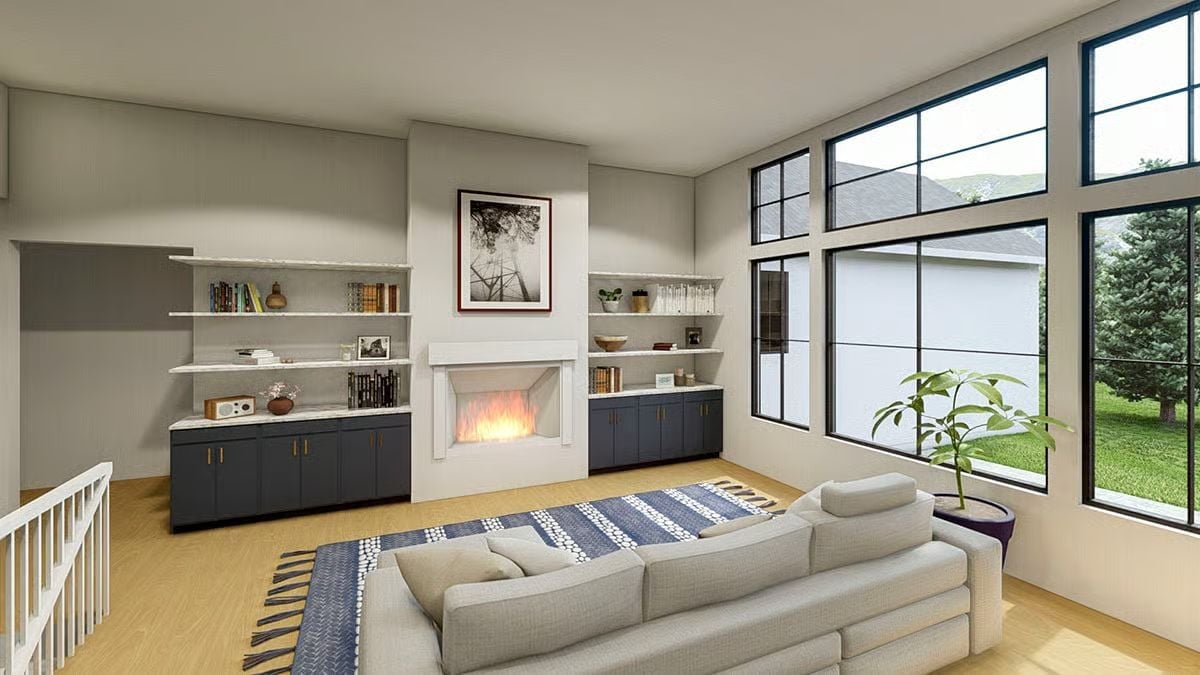
Built-in shelving and dark navy cabinetry flank the fireplace to give this living room a focal wall that earns its keep. Light wood floors keep things from going too heavy. Floor-to-ceiling corner windows pull the yard in close, and the potted plant near the glass is doing more compositional work than it probably gets credit for.
Common Mistake: Homeowners often center furniture on the fireplace wall without accounting for how a corner window bank shifts the room’s visual weight. In a layout like this one, angling the sofa slightly toward both the fireplace and the windows balances the pull between the two. Ignoring that tension leaves the seating arrangement feeling like it’s fighting itself.
Dark Cabinets, White Counters, and Four Barstools That Mean Business
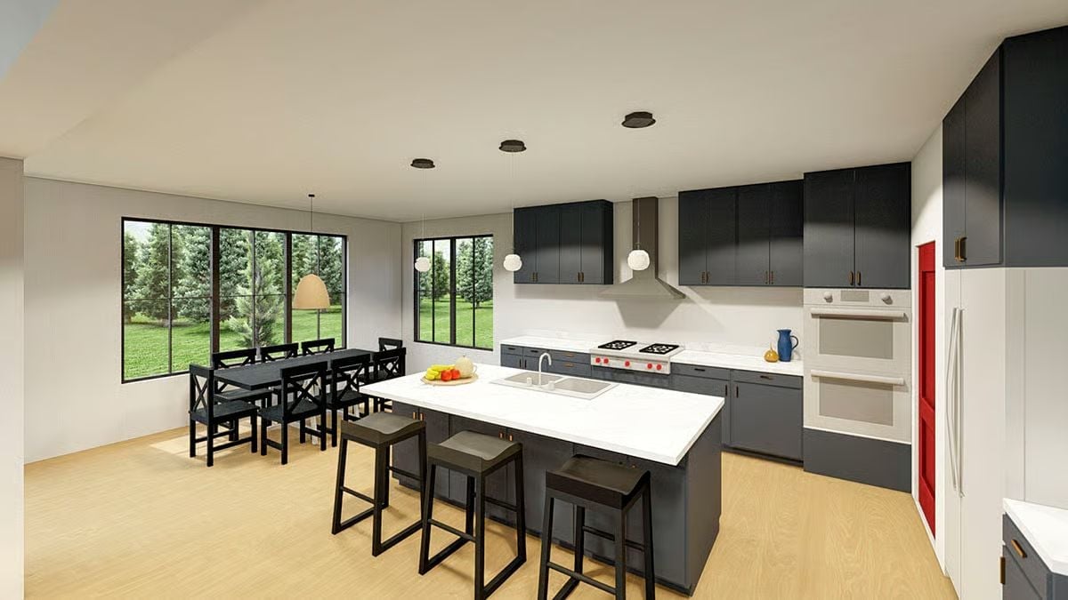
Slate-blue cabinetry, a white island sink, pendant lights, four barstools. It’s a combination that photographs well and holds up harder in daily use than most kitchen palettes this fashionable.
The Psychology Behind This: Open kitchens with a long island and adjacent dining table create a subtle social hierarchy, where some seats feel like the main event and others feel like overflow. People gravitate toward island seating even when the table is closer, because the island puts them facing the action. Designers call it prospect positioning, and it’s why barstool counts matter more than most buyers realize.
Soaring Ceilings, a Sectional With Room to Spare, and Kitchen Views That Keep Everyone Connected
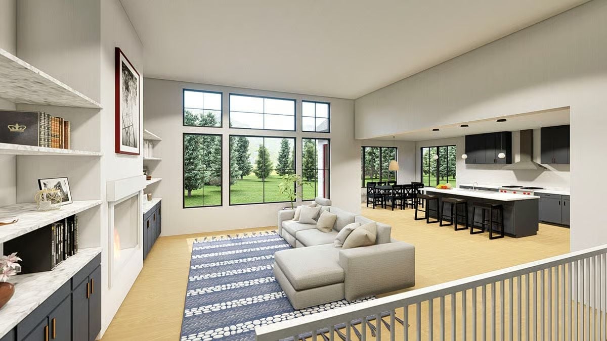
A gray sectional anchors the living space on a blue-and-white rug, with dark cabinetry running the full length of the kitchen behind it. Built-in shelving with marble surfaces lines the left wall. High clerestory windows flood the upper volume with light, which is exactly why the 12-foot ceiling spec matters beyond the wow factor on a first walkthrough.
Style Math: Pairing dark lower cabinets with white counters across both the kitchen and built-ins creates visual consistency through a long open floor plan without leaning on color repetition. It reads as cohesive without feeling coordinated to death.
Freestanding Tub, Herringbone Tile, and a Walk-In Closet Hiding in Plain Sight
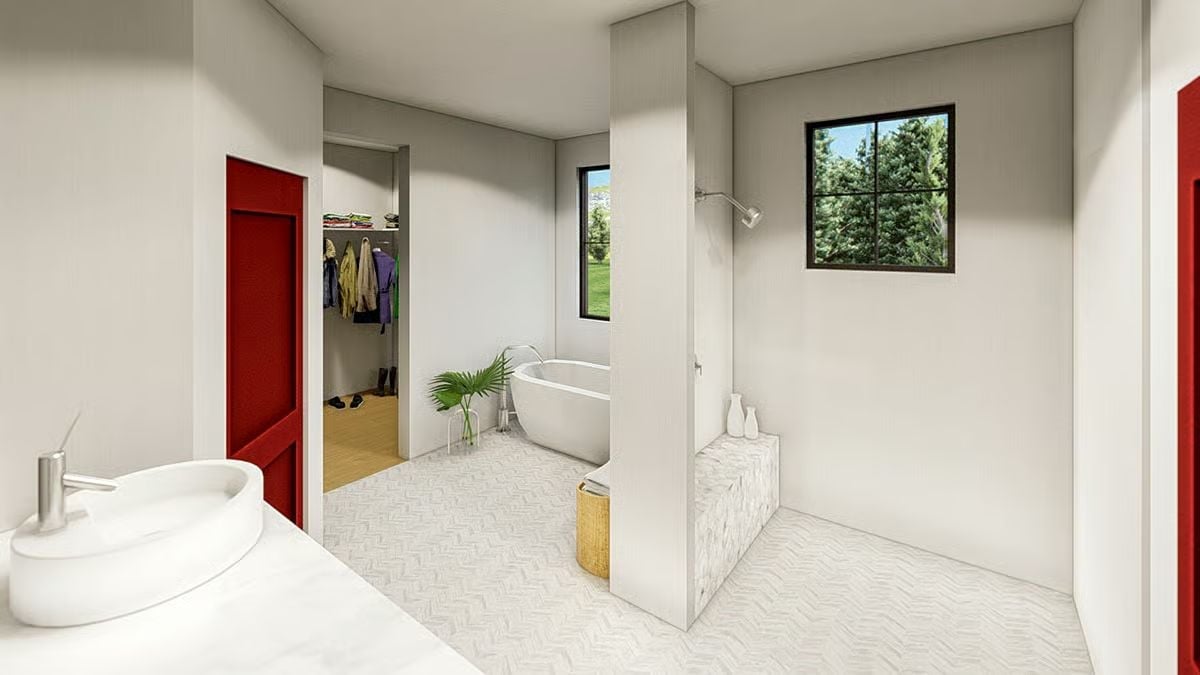
Herringbone tile floors and a freestanding soaking tub anchor this primary bath, with a half-wall separating the shower zone from the rest of the space. It’s a lot of material in a room this size, and it works because the palette stays tight.
Try This: Freestanding tubs look best when they’re not pushed against a wall. Centering one below a window, the way this layout does, keeps plumbing connections clean and gives the tub visual breathing room from every angle. It’s a small placement decision that photographers and future buyers both notice.
Moving deeper into the private wing, the primary bedroom does something the rest of the house doesn’t.
Clerestory Windows, a Wood Bench, and Views That Earn Their Keep
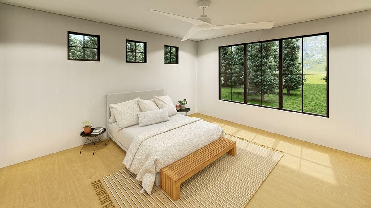
Natural light hits from two directions: clerestory windows on the left wall and a floor-to-ceiling window bank facing the tree line. The wood slat bench at the foot of the bed pulls the warm flooring upward, and small tables on wire legs keep the corners from closing in. Quiet room. The kind that earns its square footage.
Pin It
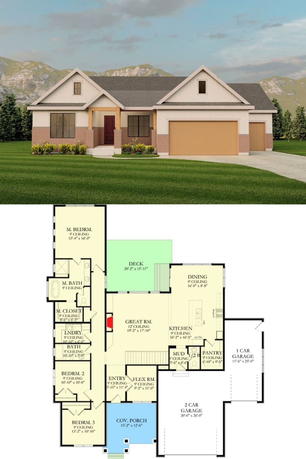
On top, a craftsman-style ranch with board-and-batten siding, a covered entry porch, and a three-car garage setup. Below, the floor plan lays out the master suite wing, great room with 12-foot ceilings, open kitchen and dining, flex room, mud room, and a deck that runs nearly the full width of the living space.