
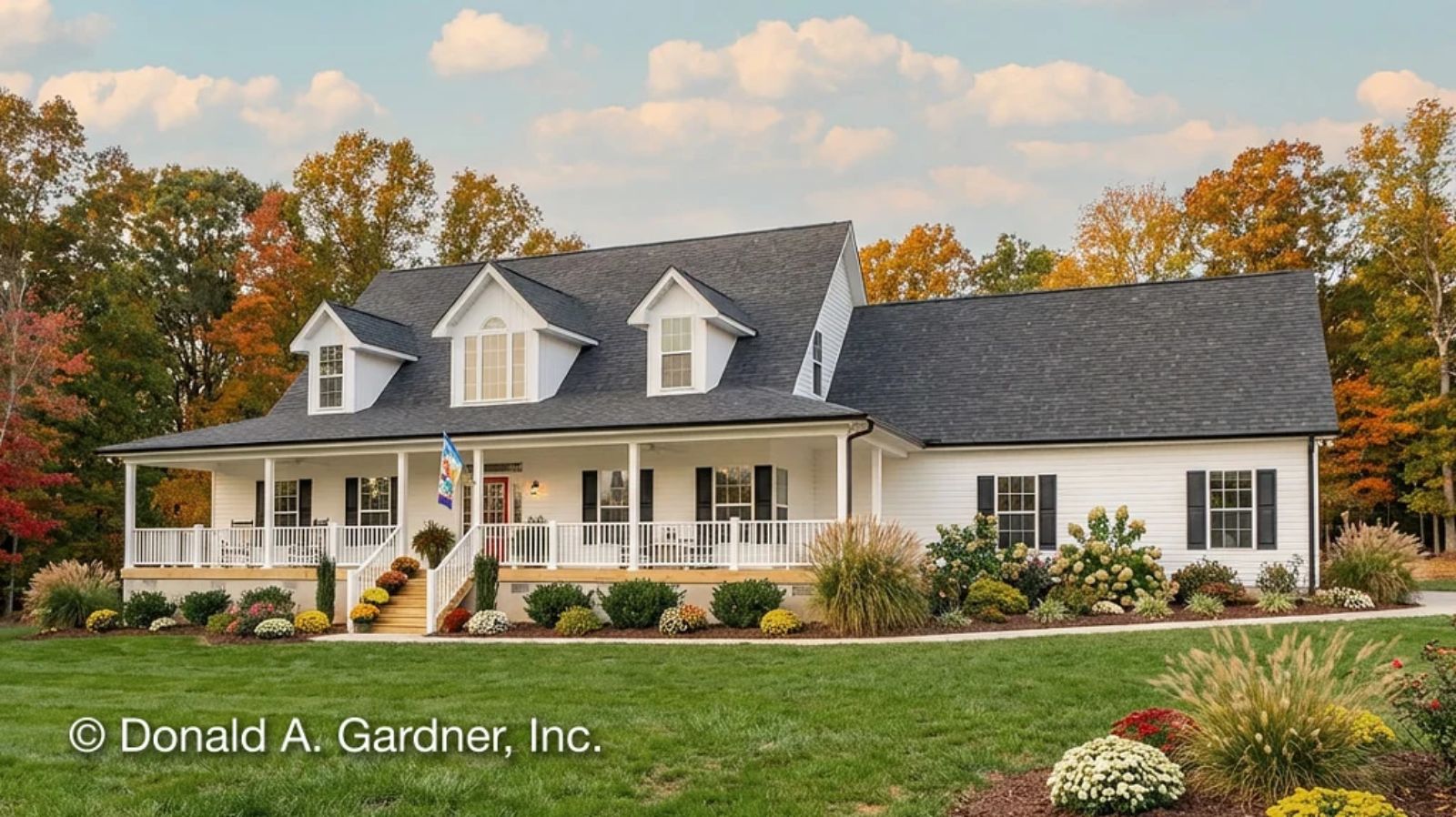
Wrap-around porches either earn their keep or they become expensive decorating — the Hollandale earns its: kids thundering down the stairs before breakfast, homework spread across the kitchen island at six, the screen door slapping shut for the fourteenth time on a Saturday. It’s built around exactly that kind of household, with a porch sized for actual furniture, an open main floor that absorbs the chaos, and enough bedroom space upstairs to put everyone somewhere.
Specifications
- Sq. Ft.: 2,551
- Bedrooms: 4
- Bathrooms: 4
Floor Plan – Main Floor
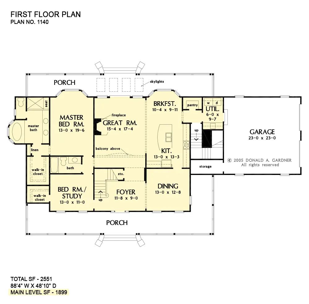
The main level puts the master suite in the left wing with two walk-in closets and a private bath, while a second bedroom pulls double duty as a study. A fireplace and balcony above anchor the great room at center. Kitchen, breakfast nook, and dining flow together on the right side, and wrap-around porches front and back close out the footprint.
Floor Plan – Second Floor
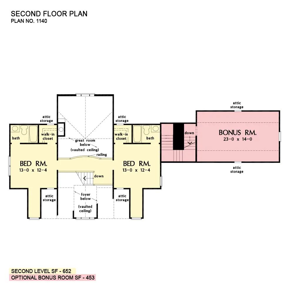
Upstairs, two bedrooms each get a walk-in closet and a private bath. An optional bonus room — likely above the garage — adds a meaningful chunk of flexible space if you need it.
Wrap-Around Porch Living, Where the Backyard Does the Work
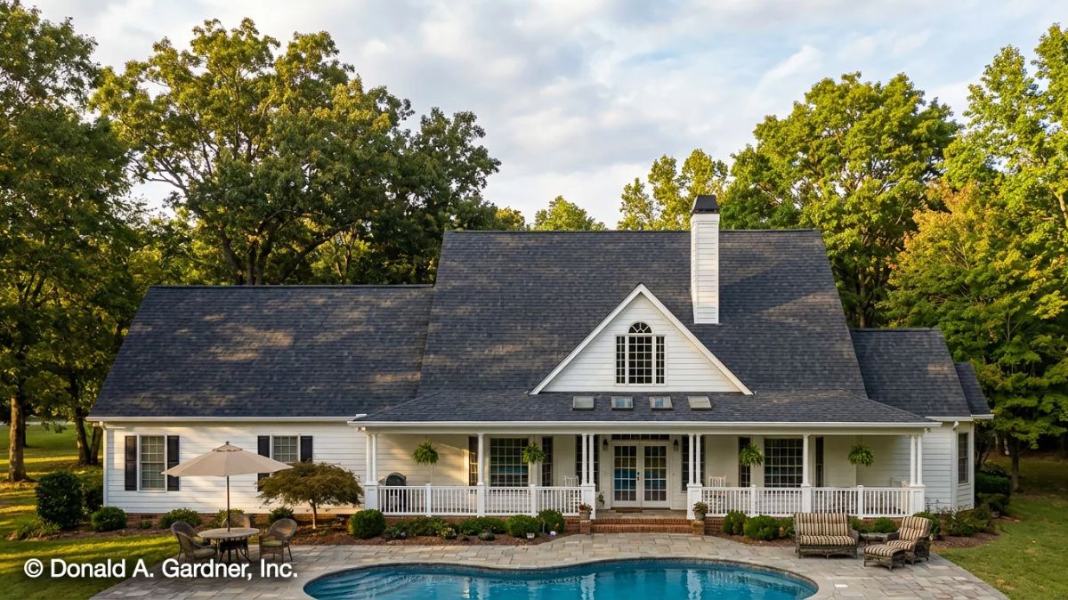
Dark charcoal shingles against white siding and black shutters make a strong first impression without working too hard at it. The covered porch runs wide enough to hold real furniture, not just a pair of chairs you squeeze past. Out back, a kidney-shaped pool sits just steps from the brick stairs, with a patio umbrella throwing shade over wicker seating — the kind of backyard setup that makes the porch feel like a bonus rather than the whole show.
Sidelights and a Transom Turn This Entry Into Something Worth Coming Home To
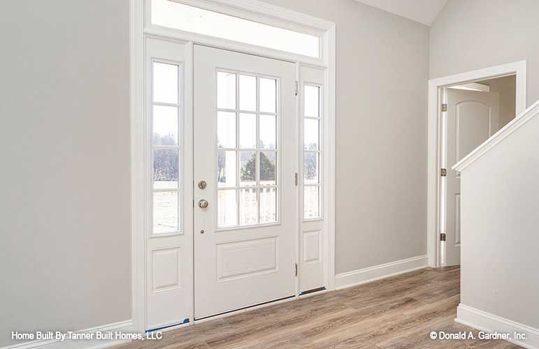
White millwork does a lot of heavy lifting here. Grid-pane sidelights flank the front door on both sides, and a transom window above pulls natural light deep into the foyer without sacrificing wall height. Wide-plank flooring runs straight back toward the staircase. Clean, unfussy, and it reads as intentional rather than default.
- Transom window adds light without sacrificing wall height
- Matching sidelights frame the door symmetrically for a balanced entry
- Baseboards carry through to the adjoining room, keeping the trim language consistent
Stacked Stone Reaches the Ceiling and Earns Every Inch of It
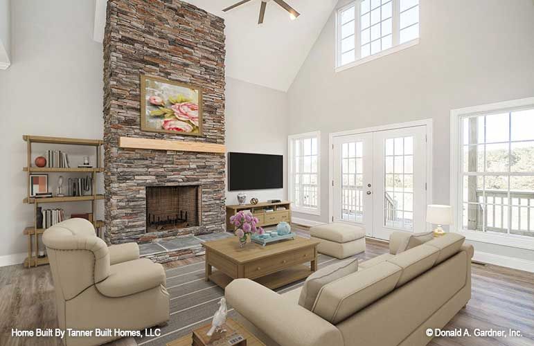
Ledgestone runs floor to cathedral ceiling without interruption, which in a room this size is the right call — a shorter surround would look like an afterthought. Cream upholstery keeps things calm against all that texture. A wood mantel shelf and matching coffee table pull warmth from the stone, and French doors opening to a covered deck give the whole space somewhere to breathe.
Worth Knowing: Stacked ledgestone works the way it does because the irregular horizontal layers catch light differently as the day moves, so the wall shifts rather than sitting flat. The wood mantel shelf earns its place too, giving the eye somewhere to rest before the stone keeps climbing. If you’re planning a two-story surround like this one, lock in the ceiling height early — adding it later isn’t a renovation, it’s a rebuild.
Gray Cabinets and Granite Pull Off Casual Without Trying Too Hard
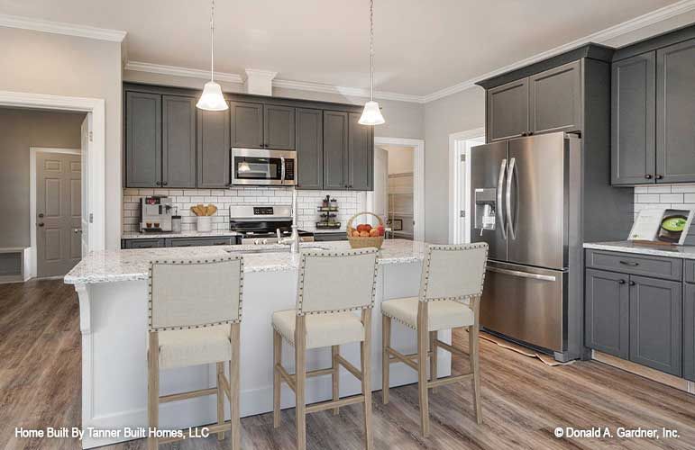
Subway tile backsplash, granite counters, and upholstered barstools with nailhead trim anchor this kitchen.
Why Nailhead Trim Works on Kitchen Seating
Upholstered barstools in a kitchen always carry some risk — fabric near food prep sounds like a maintenance problem in waiting. The nailhead trim here earns its keep by reinforcing the seam where fabric meets frame, and it gives the stool enough visual weight to hold its own against the gray cabinetry. It’s a detail borrowed from traditional furniture making. Reads as deliberate, not decorative.
Farmhouse Dining Rooms That Seat Six Without Feeling Crowded
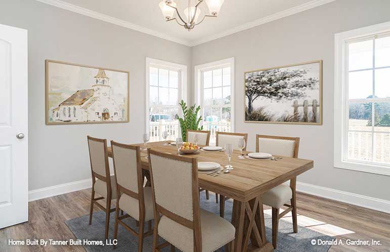
Linen-upholstered chairs with nailhead trim surround a wide-plank wood table set for dinner. Watercolor art flanks the windows, which is the right move — it keeps the gray walls from reading cold without cluttering a room that’s already doing a lot of seating work.
History Corner: Farmhouse dining rooms historically anchored the home’s social life — harvests celebrated, neighbors fed, long tables that stayed full. The communal table wasn’t a style choice so much as a practical response to large households and working farm culture. That history is why farmhouse dining furniture still skews big, and why it still feels right when the table is actually full.
Soaking Tub Positioned for Natural Light and Nothing Else
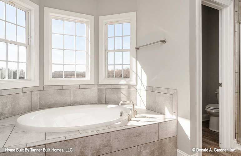
Corner placement beneath two gridded windows floods this drop-in tub with daylight. Gray tile surrounds and a brushed nickel deck-mount faucet keep the space unpretentious — no statement fixtures, no drama. Clean geometry, good light. That’s enough.
Editor’s Note: Drop-in tubs set into tiled surrounds tend to age better than freestanding options because there’s no exposed base to scuff, stain, or start looking dated. Building new also gives you a surround ledge wide enough to set a book or a glass on without reaching for a separate tray. Small thing, but you’ll notice it every single use.
Pin It
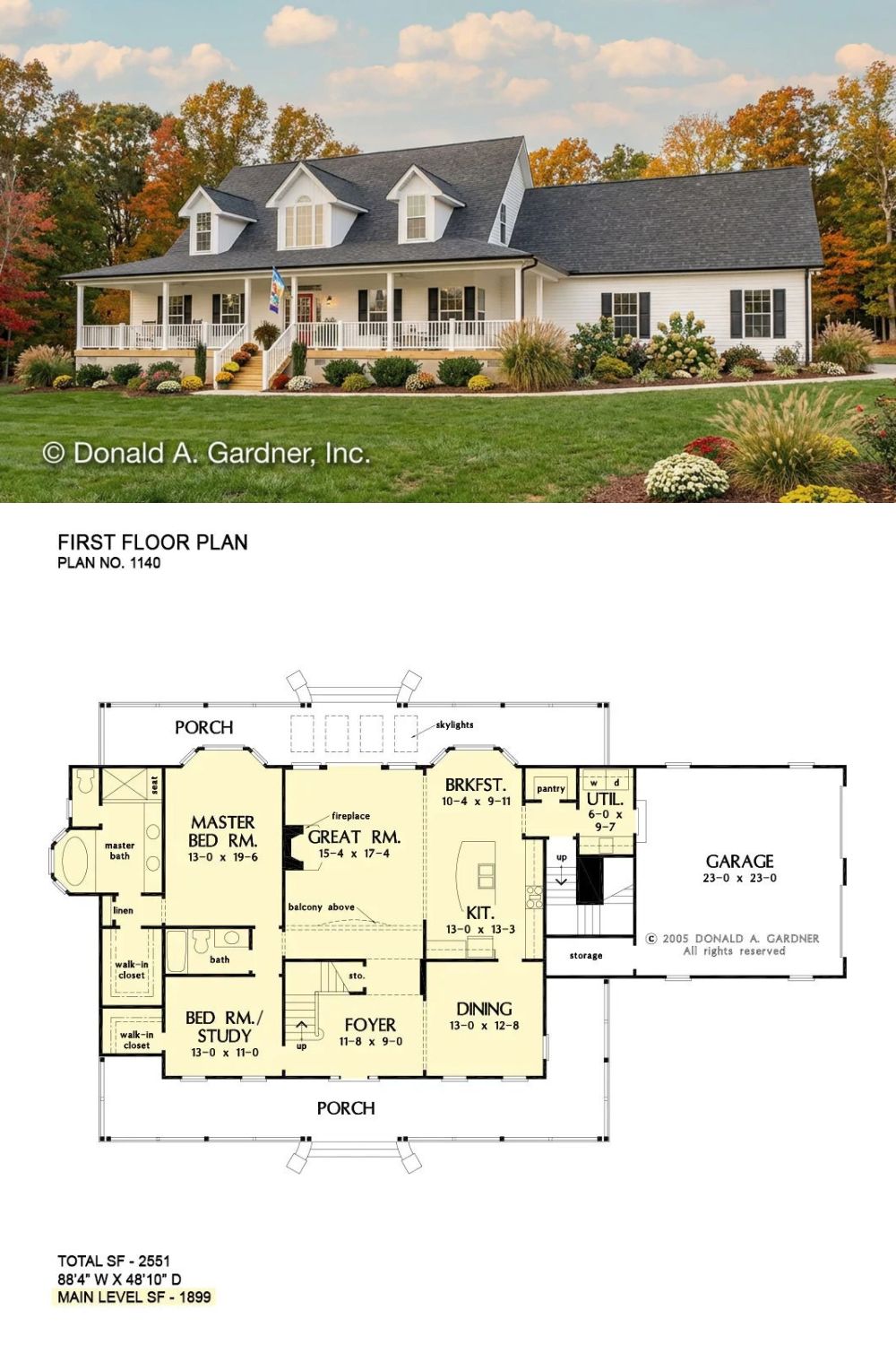
A white Cape Cod farmhouse with a wrap-around porch sits beneath autumn trees, paired with its first-floor plan below. The layout shows a master suite, great room with fireplace, kitchen, dining, breakfast nook, and attached garage spanning 1,899 main-level square feet.
Ask Yourself: Before falling for a floor plan, count how many rooms share a wall with the garage. A bedroom or study directly adjacent to a two-car garage picks up noise and temperature swings that no amount of insulation fully solves.
