
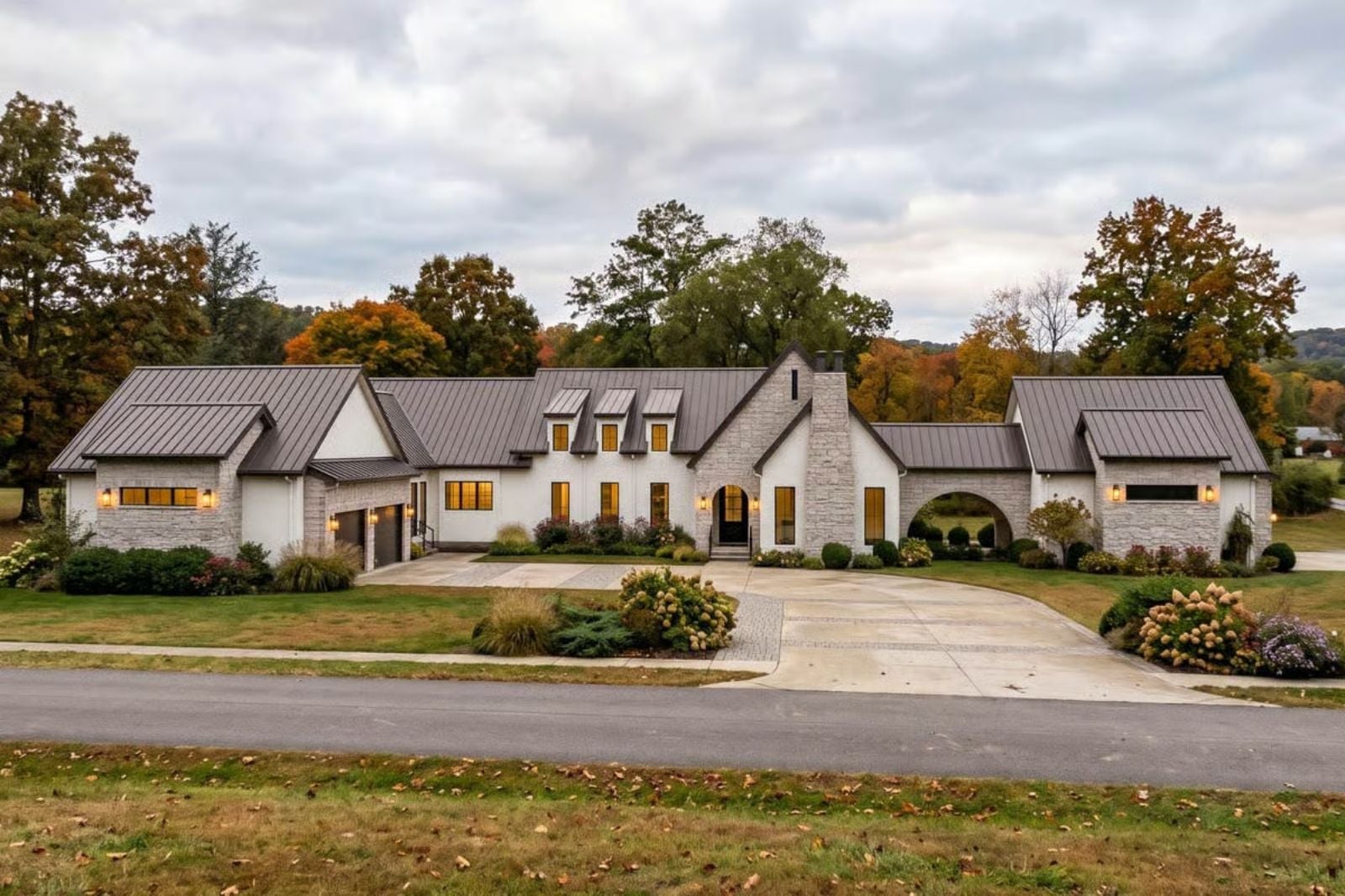
Six garage bays, a wine cellar stocked before the first dinner party, a theater dialed in before the first screening, and a European Modern exterior that announces what took twenty years to earn. The Beaumarchais is built for exactly that kind of homeowner — the one who knows precisely what they want and finally has the budget to stop compromising.
Specifications
- Sq. Ft.: 4,335
- Bedrooms: 3
- Bathrooms: 2.5
Floor Plan – Main Floor
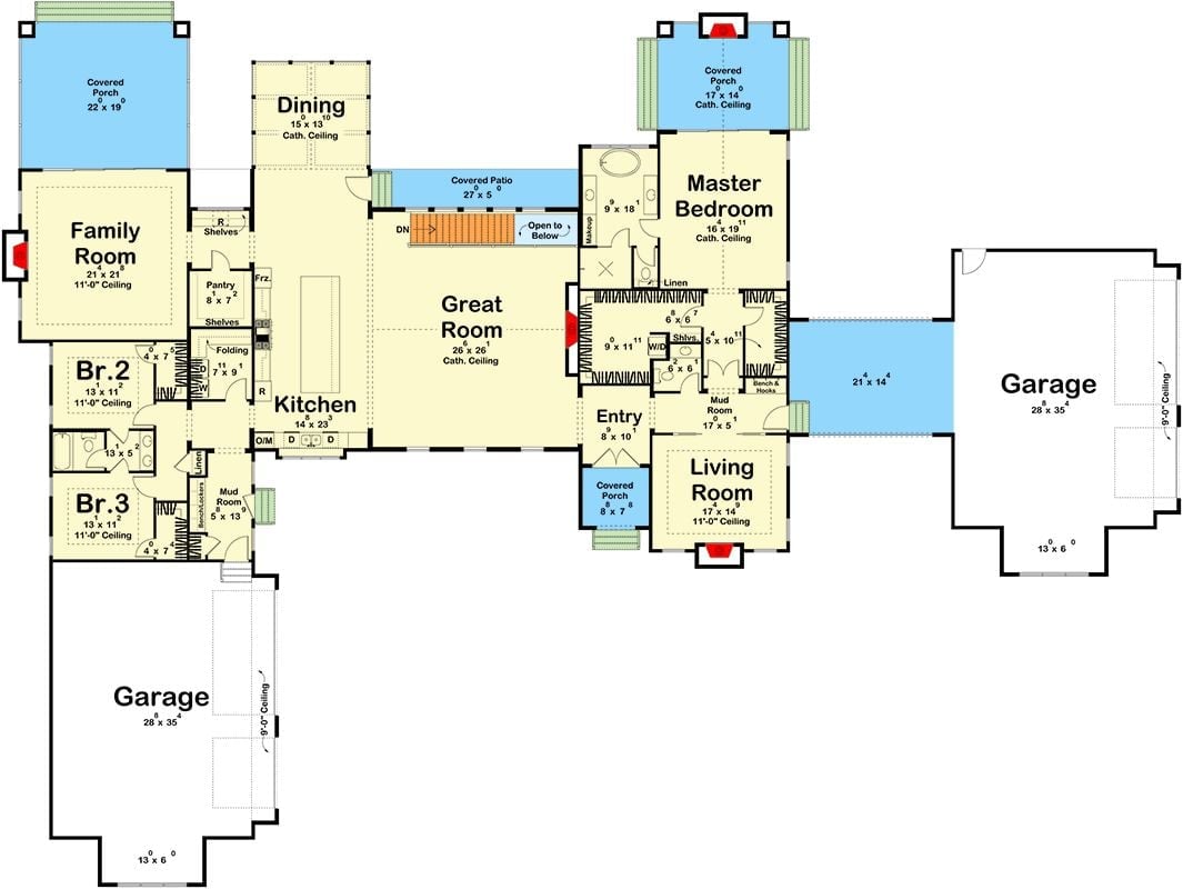
Single-story layout with a central great room connecting the kitchen, dining, master suite, and two separate garages. Cathedral ceilings throughout.
Floor Plan – Basement
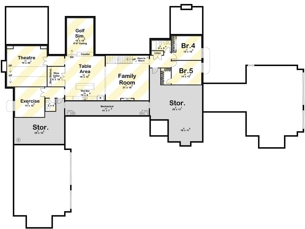
The lower level packs serious amenity density into one footprint. A golf simulator, theater, wine cellar, and wet bar anchor the entertainment wing, while the family room opens to a table area for overflow seating. Bedrooms 4 and 5 sit tucked to the right with shared bath access, and two storage zones plus a mechanical corridor handle the less glamorous load.
Pro Tip: The wine cellar sits right next to the theater for a reason — guests move naturally between the two without cutting through the main living corridor. If you’re finishing a basement with both, lock in that adjacency before concrete gets poured, because mechanical rough-ins are brutal to relocate after the fact.
Covered Rear Porch Built Wide Enough to Actually Use Year-Round
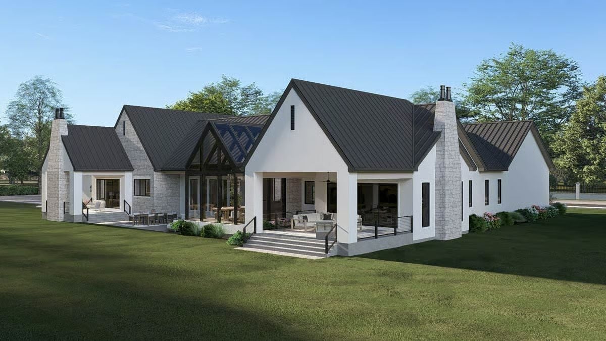
Dark metal roof, stone chimney columns, and a glass gable connect the outdoor living area back to the interior without making the transition feel abrupt.
Try This: Size a covered porch around furniture first, square footage second. A space that fits a full sofa grouping plus a dining table becomes a genuine third room — one people actually use. Most covered porches fall flat because they were designed around the structure rather than around how people actually sit in them.
Fluted Wood Panels and an Arched Passage That Earns Every Square Foot of the Entry
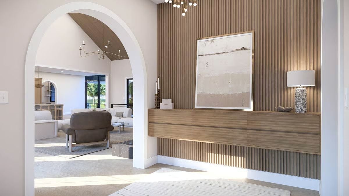
Vertical wood slat panels run floor to ceiling beside a floating credenza with underlighting, and the arched doorway pulls your eye straight through to the living room beyond. Both spaces feel connected without losing their distinct purpose.
The arched doorway pulls your eye straight through to the living room beyond.
Stone Fireplace Hood Tall Enough to Command a Cathedral Ceiling
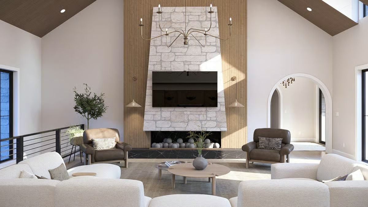
Limestone-look stone climbs floor to ceiling, flanked by slat wood panels. Two leather chairs anchor the hearth without crowding it. The brass chandelier earns every inch of its height up there.
Style Math: Warm wood on the ceiling and cool stone at the fireplace pull in opposite directions, and that tension is what keeps the room from reading as one uniform material. Rough-cut stone against smooth plaster walls follows the same logic — one surface does the texture work so the other doesn’t have to compete.
Fluted Cabinetry and a Double-Wide Island That Rewrites What a Kitchen Can Do
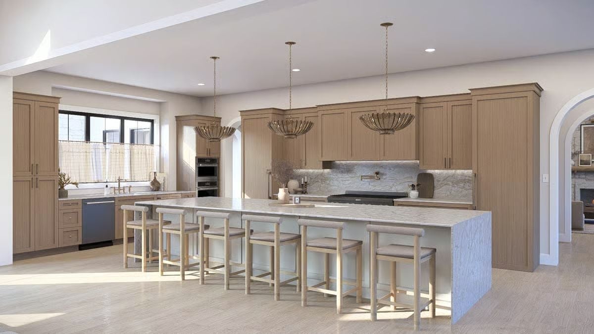
Reeded cabinet fronts give the perimeter walls texture without leaning on color contrast to do the job. Seven barstools line the island, which reads more like a gathering counter than a prep surface — and honestly that’s the point at this scale. Brass chain pendants and a marble slab backsplash draw the eye toward the range wall, while the arched passage on the right keeps the whole room from feeling boxed in.
Worth Knowing: Fluted and reeded cabinet fronts add visual depth without requiring two-tone finishes or glass inserts. If you’re specifying them for a kitchen this size, ask your cabinet maker specifically how the fluting wraps at corners. Mitered corners hold the detail cleanly; butted corners tend to look unfinished once you see them in person, and that’s not something you catch on a rendering.
Glass Walls on All Sides and a Chandelier That Holds Its Own Against the Trees
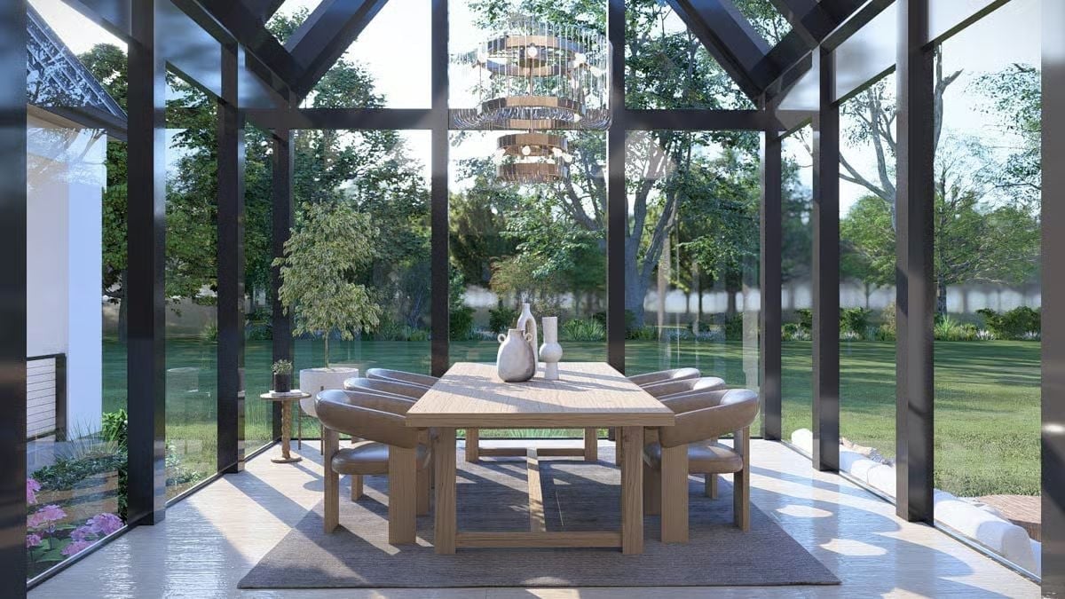
Wrapped in floor-to-ceiling glass with dark steel framing, this dining pavilion keeps the garden as the permanent backdrop. The chunky wood table and curved upholstered chairs ground the space without competing with it.
Why Steel-Frame Glass Enclosures Work Better Than You’d Expect for Dining
Dark steel mullions read as furniture-scale lines rather than architecture, so the room feels finished rather than exposed — which matters a lot in a space with no solid walls to anchor artwork or a buffet. The tiered chandelier picks up on the metal framing and gives the eye somewhere to land before it drifts out to the garden. Without it, the ceiling would just disappear.
Curved Bouclé Footboard and a Muted Accent Wall That Know Exactly What They’re Doing
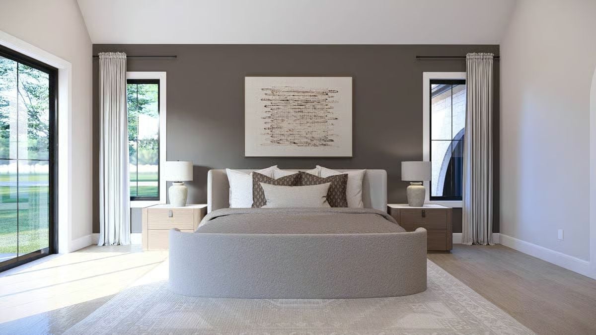
Bouclé wrapping a curved bed frame is a tactile choice that photographs well and holds up in person. Warm wood nightstands keep the gray accent wall from reading cold, which is the whole game with a palette this restrained.
Style Tip: Curved bed frames work best in rooms with strong rectilinear bones. The contrast gives each element something to push against, so neither the furniture nor the architecture fades into the background. If you’re drawn to this look, commit fully — a half-rounded frame just reads like an afterthought.
Dual Vanities on Opposite Walls and a Glass Shower That Earns Its Square Footage
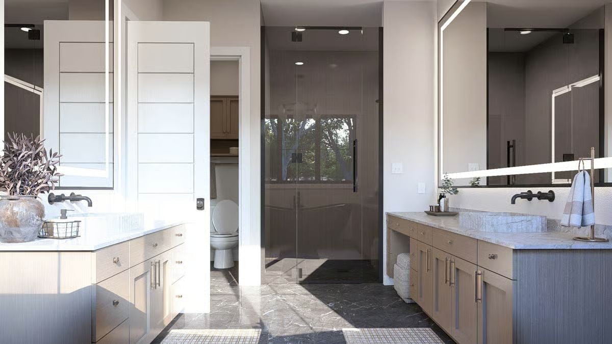
Two separate vanity stations face each other across dark marble floors, keeping morning routines from colliding. Wall-mount faucets and stone vessel sinks carry most of the visual weight — the kind of fixtures that look stripped-down until you price them out.
Pin It
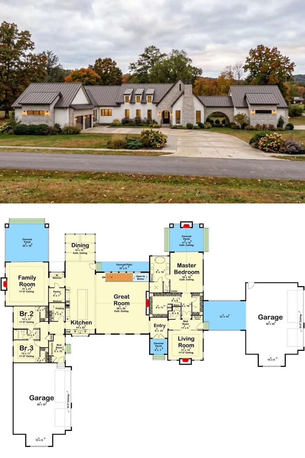
Exterior photo shows a sprawling one-story European farmhouse with metal roofing and stone accents. The floor plan below reveals three bedrooms, a great room, dual garages, and a master suite with cathedral ceiling.