
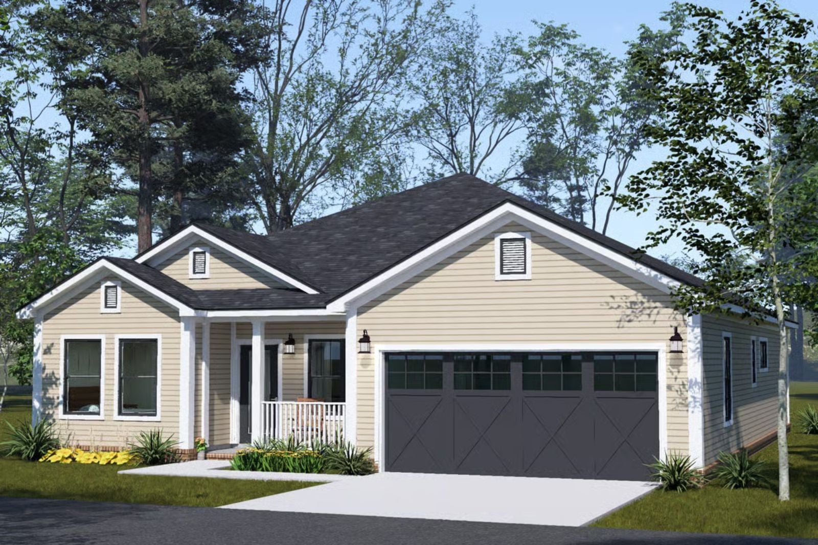
Most “age-in-place” floor plans look exactly like what they are: a hospital room that learned to use shiplap. The Tanglewood does not, with a main-floor primary that reads as a retreat, an open layout where coffee happens at the same counter as conversation, and Craftsman bones that give the whole thing actual character. This is a plan built for two people who are done with stairs and done apologizing for it.
Specifications
- Sq. Ft.: 1,556
- Bedrooms: 3
- Bathrooms: 3
Floor Plan – Main Floor
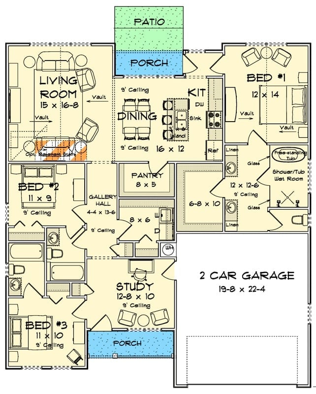
Three bedrooms spread across a single floor, with the primary suite tucked to the right and fitted with a wet room, freestanding tub, and vault ceiling. The kitchen opens to dining on one side and a porch on the other. A study, gallery hall, and pantry keep daily function out of the living spaces.
Cream Siding and a Dark Roof That Actually Work Together
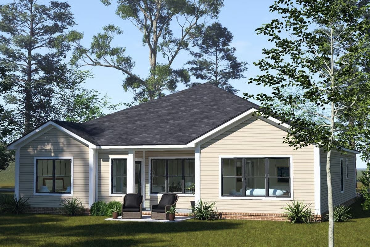
Pale lap siding keeps the exterior light without feeling cold, and the contrast against a dark roof gives the whole facade more definition than most cottages bother with. Two oversized windows flank the front entry so the living spaces get real light rather than token windows punched through for code. A small covered stoop with wicker chairs makes the front feel lived-in, and mature trees frame it without crowding.
Cream Walls and Two Club Chairs That Make Aging in Place Feel Like a Choice
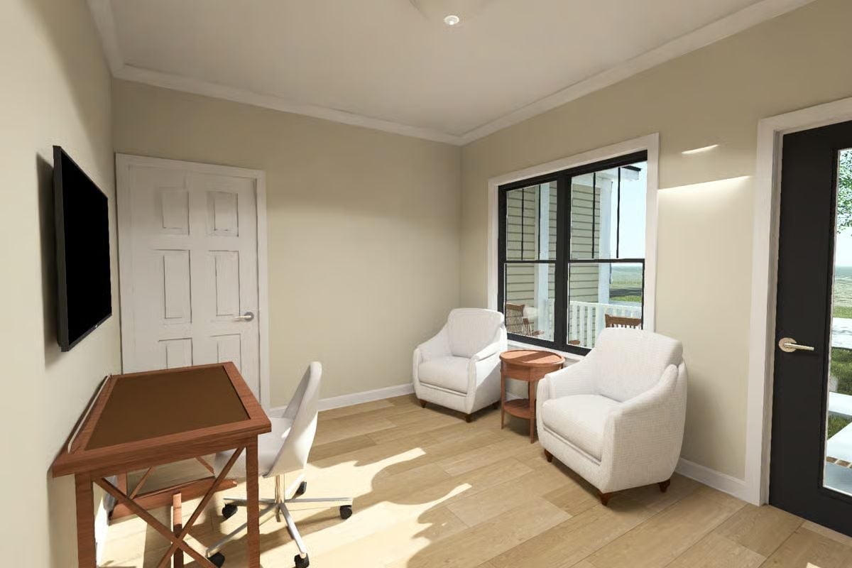
White upholstered club chairs flank a round side table near black-framed windows — the kind of setup that looks like a sitting room decision and functions like an accessibility one. The wood-toned drafting desk and wall-mounted TV pull the room into double duty without making it feel like a compromise.
Warm Wood and White Upholstery Doing the Heavy Lifting

Flanking bookcases frame the TV without the permanence of built-ins, and natural light from the picture window lands directly on the patterned rug. It’s a room that manages to feel furnished without feeling finished, which is harder to pull off than it sounds.
Designer’s Secret: Two open bookcases flanking a TV console pull off something a full built-in wall unit never quite manages: the room stays flexible. You can reconfigure, remove, or replace without a contractor. For a household planning to be in a space long-term, that kind of adaptability quietly matters more than the aesthetic does.
Sunlight Does the Decorating in This Kitchen-Dining Combo
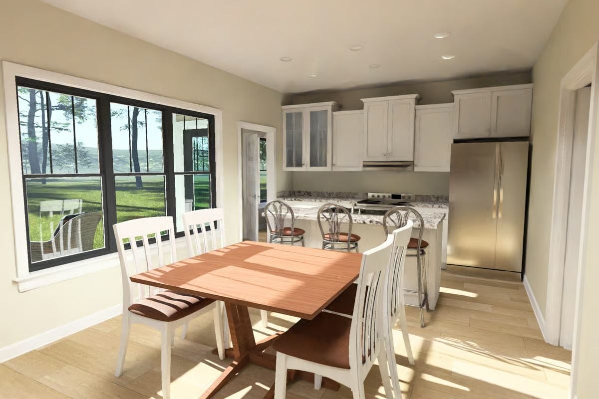
Bar stools with wire backs pull up to a granite-topped island that separates the kitchen from the dining area without closing it off. Afternoon sun through the oversized windows lands on the wood dining table and does most of the decorating. Stainless appliances and white cabinetry keep the kitchen end grounded so the warmth doesn’t tip into clutter.
Color Story: Warm beige walls read almost neutral until sunlight hits them, at which point they shift toward honey — the kind of color that works harder than it looks. White cabinetry keeps the palette from tipping into dated territory, and the two tones together stay out of each other’s way in a way that most warmer palettes don’t manage.
Dark Hex Tile and Granite Counters Remind You Aging in Place Has No Aesthetic Rules
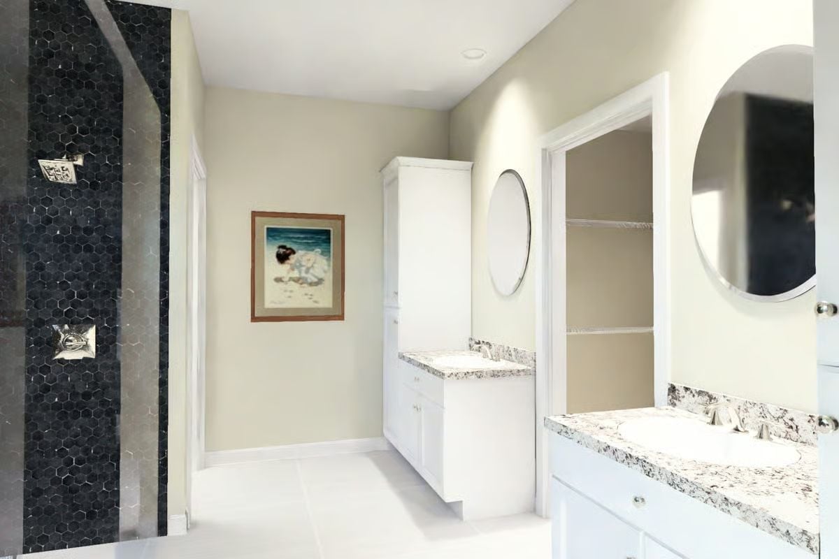
Dark hexagonal marble tile lines the shower wall, grounding a bathroom that otherwise runs bright and clean. Granite counters carry enough variation to absorb daily wear without showing it, and the round mirror keeps the vanity side from going stiff. None of it looks like a bathroom designed around limitations. That’s the whole point.
Ask Yourself: Round mirrors read softer than rectangular ones, which matters in a bathroom meant for long-term daily use. Before you finalize hardware finishes, consider whether your fixtures are carrying their weight on both function and visual mass — because in a smaller bathroom, those decisions compound.
Mid-Century Wood Tones and a Low Platform Frame That Age Gracefully

Storage drawers built into the platform base mean you don’t need an extra dresser just to manage a bedroom.
Warm walnut finishes run across the nightstand, dresser, and bed frame, holding the room together without matching too precisely — cohesive rather than coordinated. The upholstered headboard keeps things soft without going fussy, and light wood flooring pulls everything toward airy. A low platform sits easy to get in and out of. Practical, sure, but it also just looks like good furniture.
Pin It
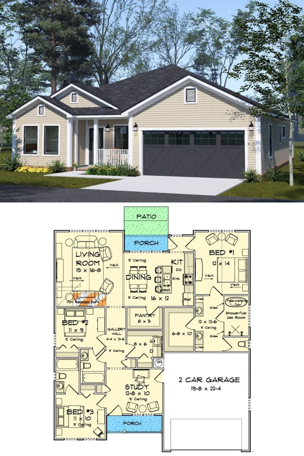
The exterior rendering shows a single-story Craftsman with cream siding and a two-car garage. Below it, the floor plan lays out three bedrooms, a primary suite with wet room, open kitchen-dining, study, and rear patio access.
