
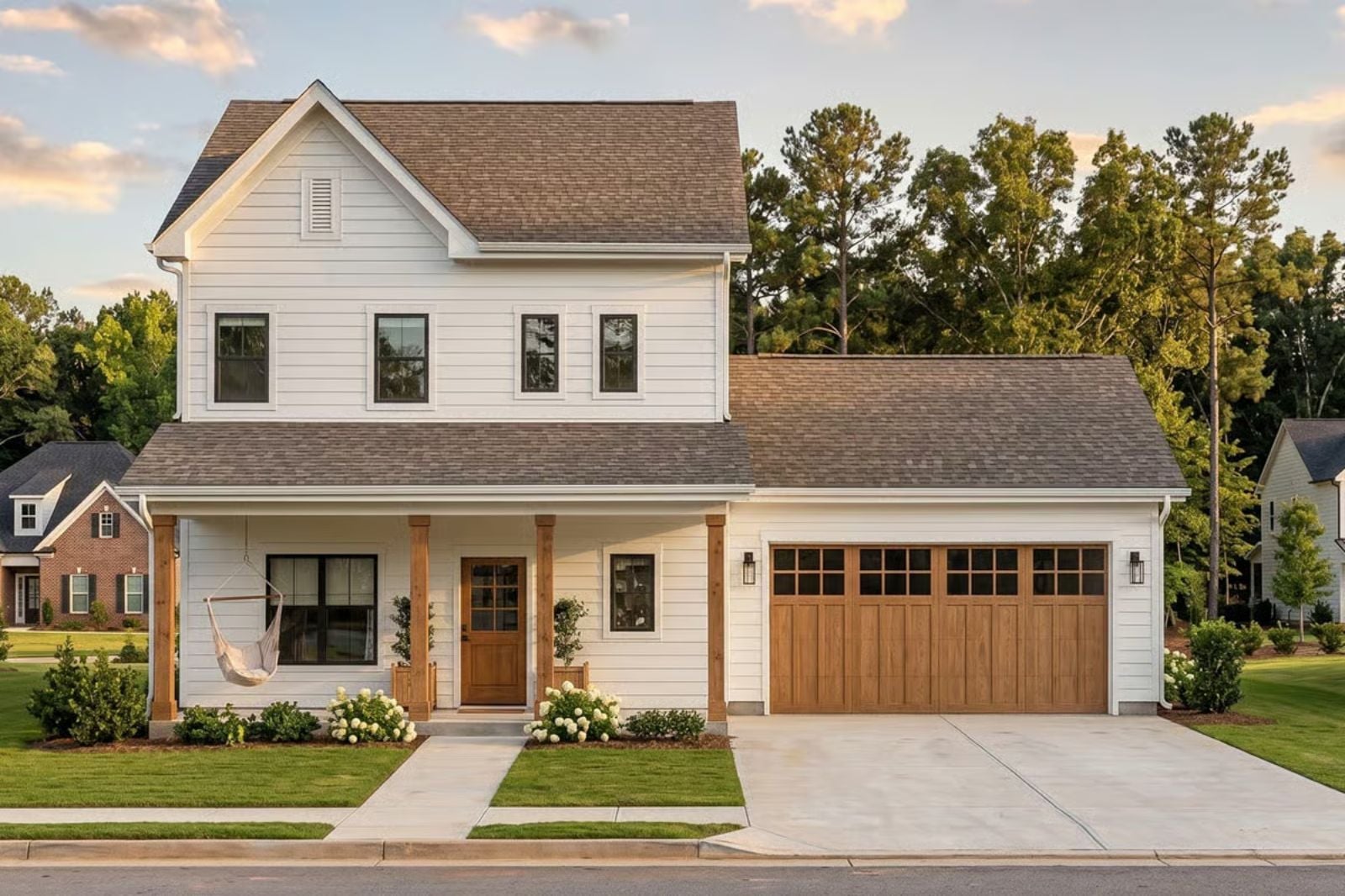
Families who outgrew their starter home already know exactly which wall they’re hanging the growth chart on. The Sycamore Lane is built around that certainty — covered front porch wide enough for two chairs and a disagreement about dinner, an open kitchen where homework happens at the counter while someone stirs the pot, and a layout that finally gives everyone a place to land at the end of the third drop-off of the day.
Specifications
- Sq. Ft.: 1,581
- Bedrooms: 3
- Bathrooms: 2.5
Floor Plan – Main Floor
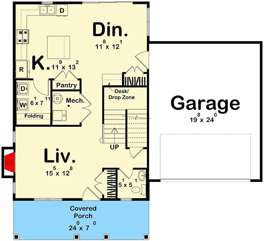
The main floor runs kitchen, dining, and living as one connected space, with a pantry, drop zone, half bath, and attached two-car garage tucked in around the edges.
Floor Plan – Second Floor
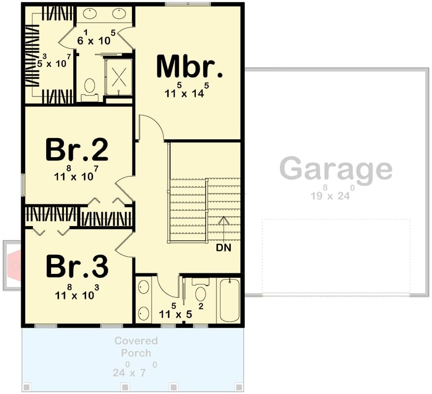
Upstairs: a master suite with private bath, two additional bedrooms, and a shared hall bath. The stairs land centrally, so nobody is hiking to the far end of the house to reach their room.
Crisp White Siding and a Backyard Patio Built for Slow Mornings
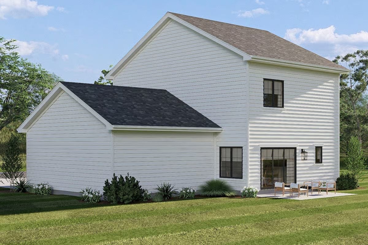
White horizontal siding wraps the entire rear elevation without interruption, and the black-framed windows cut sharply against it. Two chairs sit on the concrete patio just outside the sliding doors — close enough to the kitchen that the indoor-outdoor connection feels natural rather than aspirational.
Shiplap Walls and a Front Entry That Earns Its Keep
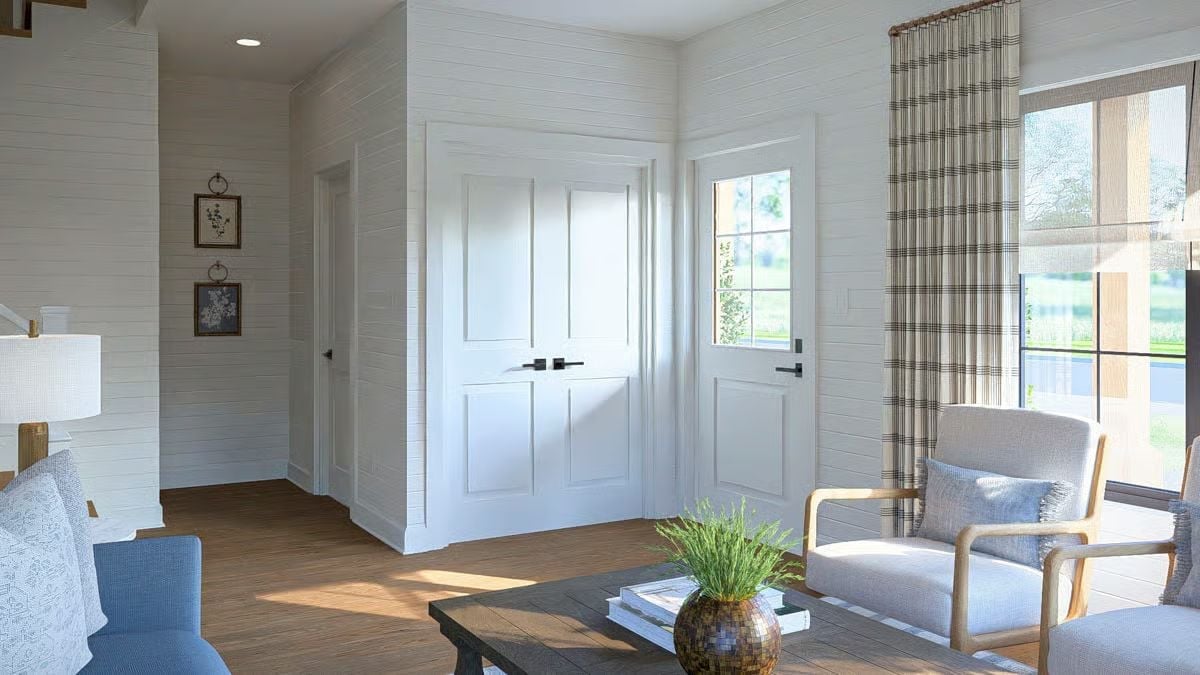
Horizontal shiplap runs floor to ceiling throughout, and black hardware on the paneled double doors keeps the all-white entry from feeling sterile. Plaid curtains and a wood-framed chair pull the living area toward something warmer without overcrowding it.
Editor’s Note: Shiplap works harder than most wall treatments because it adds texture without requiring color. Painted the same white as the trim, it reads as clean rather than rustic — which means the room stays flexible as furniture tastes shift over the years.
Blue Sofas, a Wood-Framed TV, and a Fireplace That Actually Gets Used
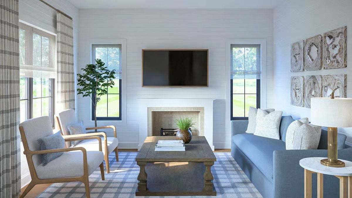
Dusty blue upholstery anchors the seating, and the plaid area rug bridges it to the natural wood tones in the coffee table and chair frames. Nothing is fighting for attention. It’s the kind of room that looks put-together without anyone trying too hard.
Why the TV Placement Works Here
Mounting a television directly above the fireplace is a genuinely controversial move in design circles. But the proportions here make a reasonable case for it. The wide shiplap wall gives each element enough breathing room that neither crowds the other, and the TV frame picks up the warm wood tones already running through the furniture — so it reads as a choice rather than an accident.
Round Table, Plaid Curtains, and a View That Does Most of the Work
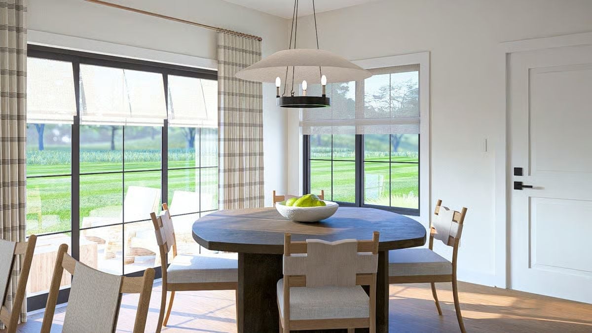
Dark walnut table, woven chairs, plaid linen curtains, pears in a bowl, green fields beyond the glass. Some rooms just don’t need much explaining.
The Psychology Behind This: Round tables shift the social dynamic at meals. Without a head seat, nobody’s presiding over anything, and conversations tend to move more freely. Families who eat together regularly often gravitate toward this shape without quite knowing why — and round tables have been shown to reduce the sense of hierarchy at group settings.
Marble Island, Gold Hardware, and Barstools That Invite You to Stay Awhile
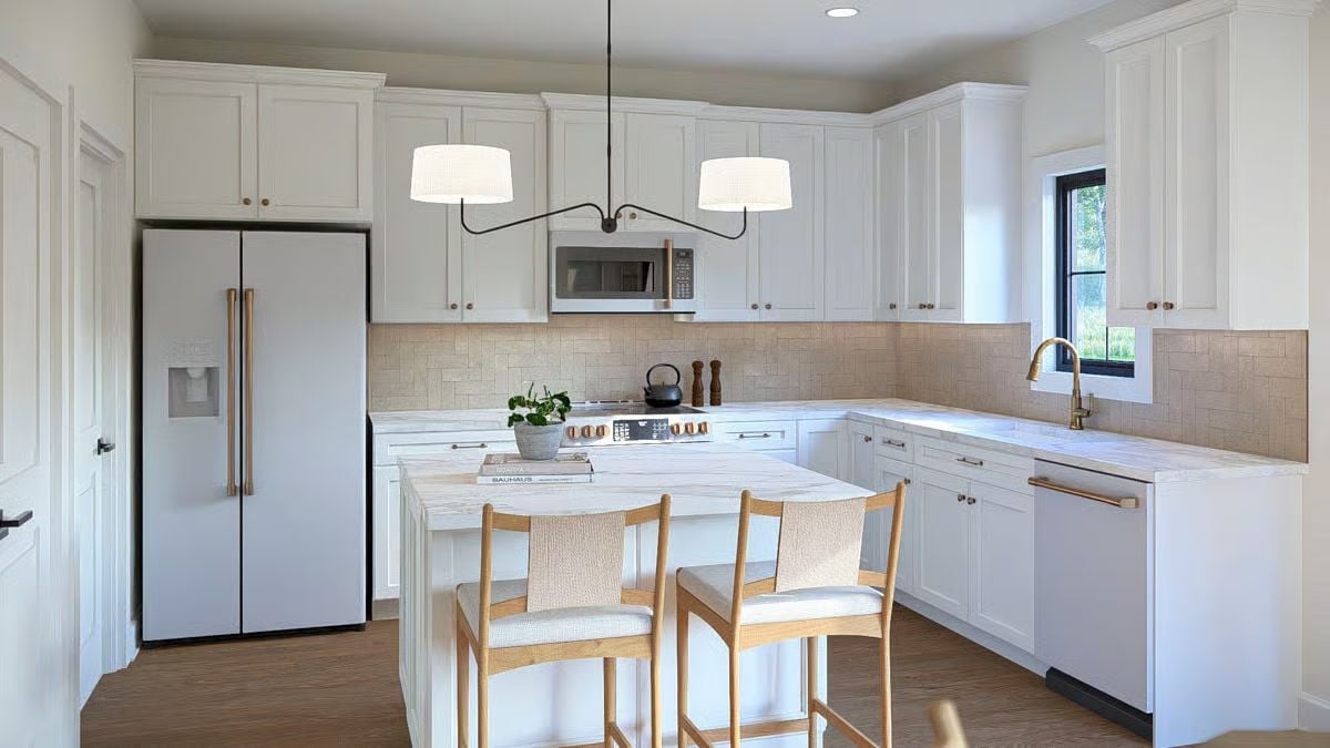
Brass cabinet pulls and a gold faucet keep the hardware consistent without tipping into matchy territory. Two drum pendants hang low over the island, which is pulling double duty as prep space and casual seating. The tile backsplash adds texture quietly, without demanding you notice it.
Quick Fix: Pendant lights hung too high lose their intimacy and stop feeling connected to the surface below. For kitchen islands, the bottom of the shade generally looks right around 30 to 36 inches above the countertop. Lower feels deliberate. Higher just feels like someone measured wrong and moved on.
Shiplap, Brass Lamps, and Bedding That Makes You Want to Call in Sick
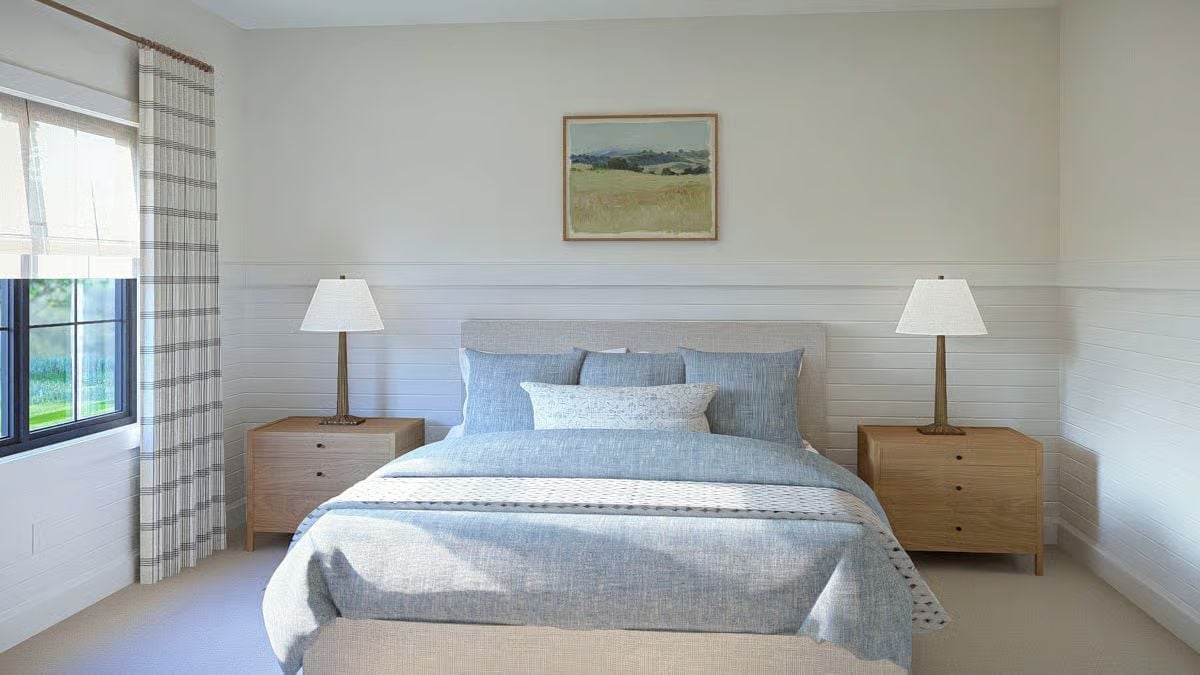
Blue linen bedding anchors the room without picking a fight with the wall treatment behind it. Matching oak nightstands hold the symmetry in place — grounded, unpretentious, easy to live with.
In The Details: Fabric shades cast softer, more diffused light than bare bulbs or metal shades, and that distinction matters more in a bedroom than almost anywhere else in the house. The brass base on each lamp here reads warm against the pale wall without adding visual weight. If you’re choosing lamps for a similar space, pay attention to shade size relative to the nightstand — you want them to look like they belong together, not like one was grabbed from a different room.
Gold Faucets, Marble Counters, and Two Sinks Nobody Has to Fight Over
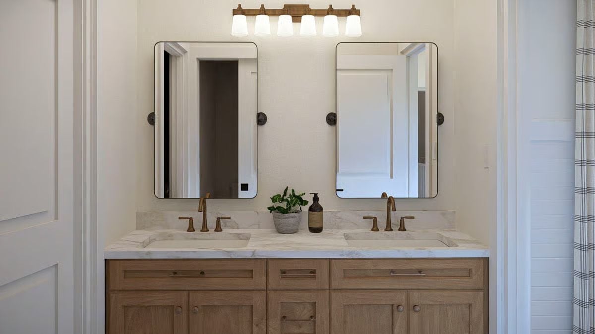
Brushed gold faucets over integrated marble sinks give the countertop a custom look without custom pricing. The wood vanity cabinet keeps things warm. Between the mirrors, a small potted plant and a soap dispenser do exactly enough — and nothing more.
- Pivot-style mirrors on wall brackets adjust to different heights, which matters considerably more in a shared bathroom than a fixed mirror ever could.
- A five-bulb vanity bar spreads light evenly across the face, cutting the shadowing that a single overhead fixture tends to create.
- Integrated sink basins cut flush into the marble surface eliminate the seam between bowl and countertop, making the whole thing easier to wipe down at the end of the day.
Pin It
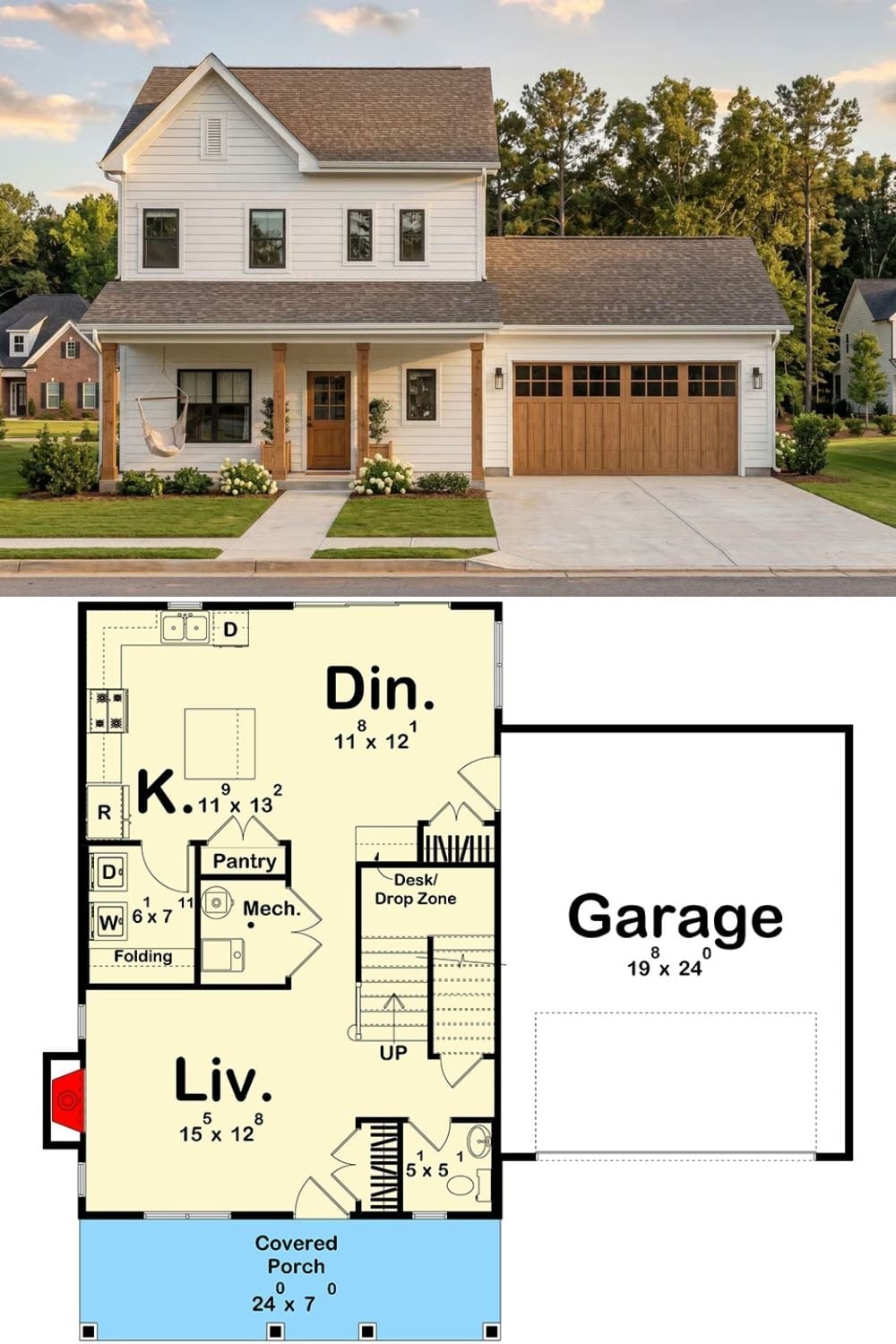
The exterior photo shows a two-story farmhouse with white board-and-batten siding, a covered front porch with wood columns, and a two-car garage. The first-floor plan below it lays out a kitchen, dining room, living room, pantry, laundry closet, half bath, desk and drop zone, and a 24×7 covered porch running along the front.
History Corner: The term “drop zone” only entered residential design vocabulary widely in the early 2000s, as open floor plans eliminated the traditional mudroom. Builders started carving out small dedicated landing spots near garage entries to handle the daily chaos of backpacks, keys, and shoes that open layouts had nowhere to put.
