
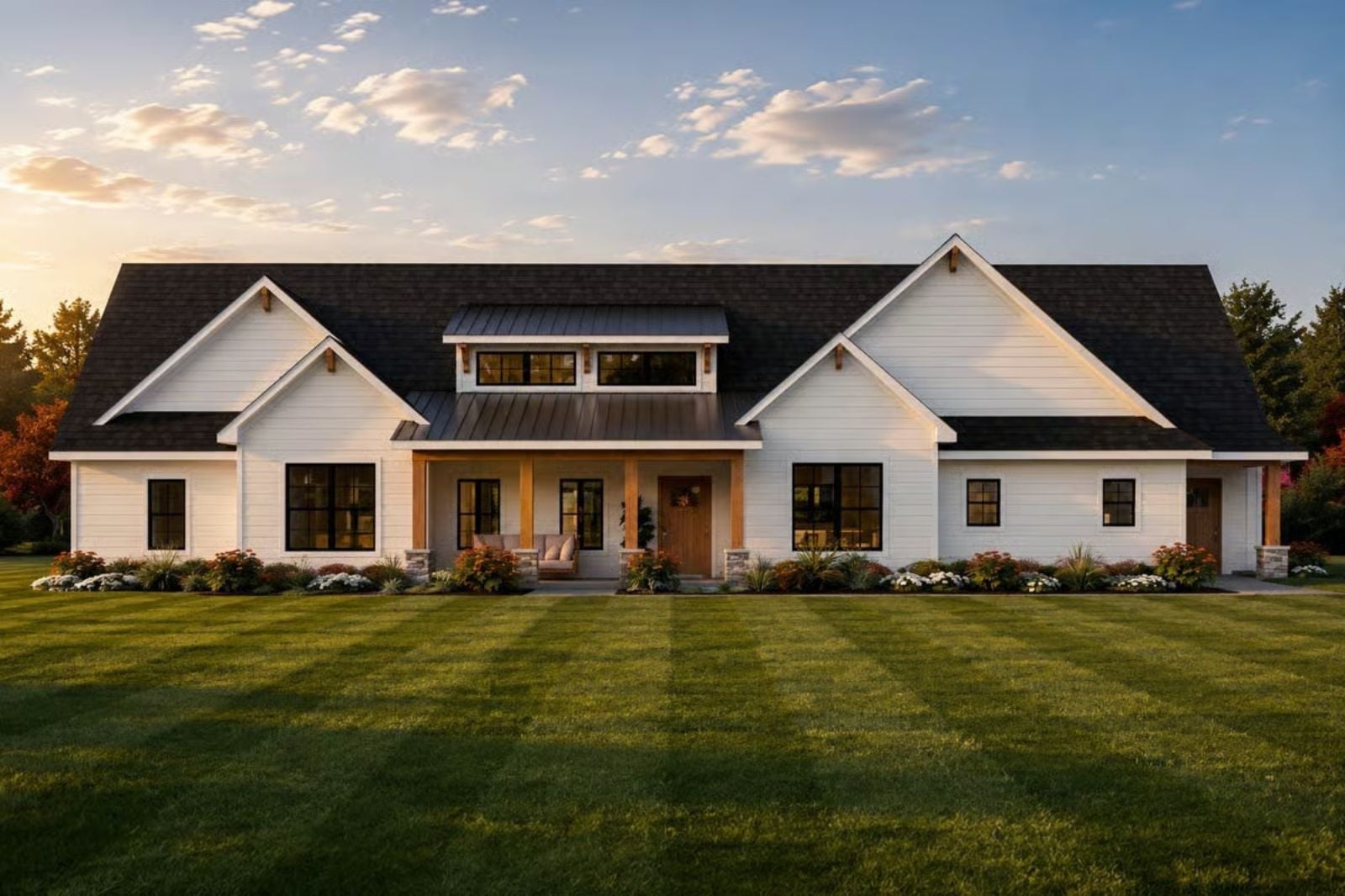
Anyone who has spent three years telling themselves the starter home just needs one more reorganization knows the feeling that hits on a Tuesday night when there is no room to put the groceries down. The Sunhaven is built around the moment you stop compromising: a walk-in pantry that actually holds a Costco run, an open kitchen where someone can help with homework while dinner is going, a mudroom that catches the backpacks, and a three-car garage that fits the bikes without sacrificing a parking spot.
Specifications
- Sq. Ft.: 2,911
- Bedrooms: 3
- Bathrooms: 2.5
Floor Plan – Main Floor
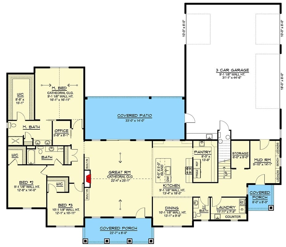
Three bedrooms anchor the left wing, with the primary suite getting its own WIC and bath. The great room opens toward a 33-foot covered patio, the walk-in pantry sits just off the kitchen, and a mudroom with lockers connects directly to the three-car garage.
Floor Plan – Bonus Room
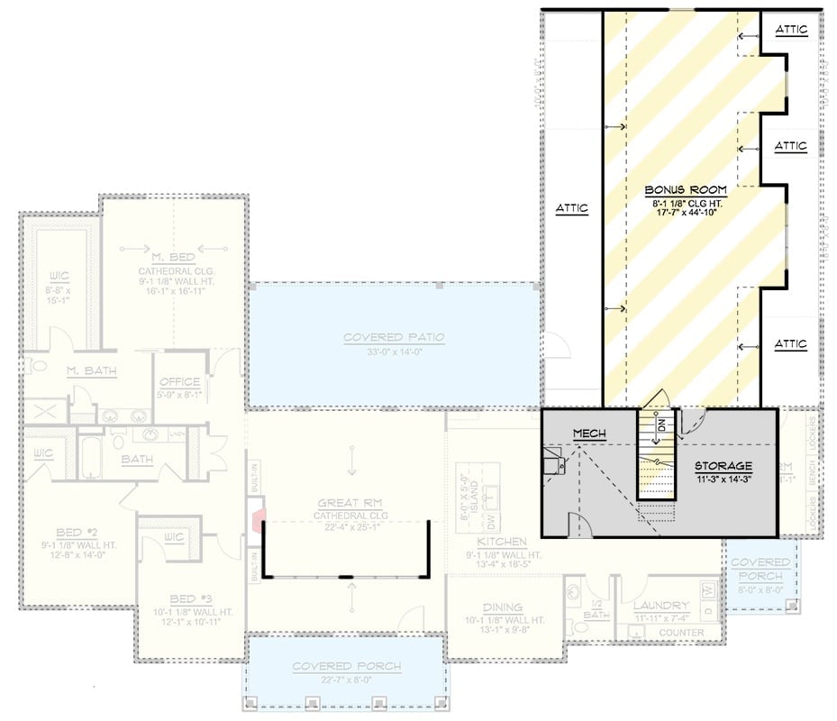
The layout splits across two levels, with the master suite and two secondary bedrooms holding down the left wing while the great room anchors the center. Just off the kitchen, the walk-in pantry island keeps the cooking zone from swallowing itself. Upstairs, a bonus room at 17′-7″ x 44′-10″ gives growing families the kind of flex space that actually gets used — a playroom one year, a homework zone the next. Storage and mechanical rooms occupy a practical garage-adjacent zone that keeps the clutter out of sight.
White Lap Siding and a Dark Roof That Actually Work Together
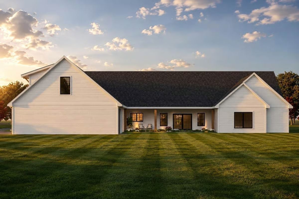
Horizontal lap siding keeps the exterior clean and unfussy — no ornamentation competing for attention, just good proportions doing the work. That covered rear porch with wood columns gives the back of the house somewhere worth actually sitting at golden hour, which is more than most rear elevations can say.
Globe Pendants Over Marble That Earn Every Square Inch of Counter Space
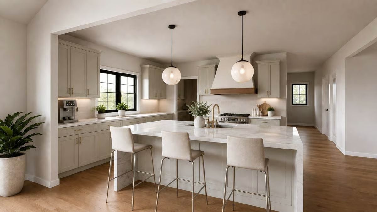
Matte globe pendants on black stems anchor the island without competing with the brass faucet below. Shaker cabinets in warm greige keep the palette grounded, and the barstools bring in a linen-look fabric that reads lived-in rather than showroom.
Did You Know: Quartz countertops that mimic marble have become the go-to for family kitchens because they skip the annual sealing that natural stone demands. The veining here is printed into the surface during manufacturing, not pulled from a quarry slab — which matters a lot more once you have kids who treat every counter like a cutting board.
Vaulted Ceilings and a Floor-to-Ceiling Fireplace That Pull All the Weight
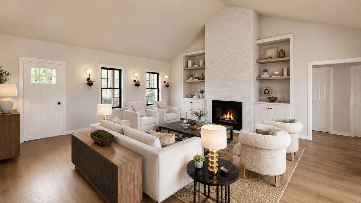
That chimney stack doesn’t stop until it hits the peak of the vault.
Built-in shelving flanks both sides of the fireplace with enough depth for actual books, not just decorative stacks of them. The boucle chairs by the hearth are doing real seating work. Good ones usually are.
Fiddle-Leaf Figs and a Chandelier That Know Exactly What Room They’re In
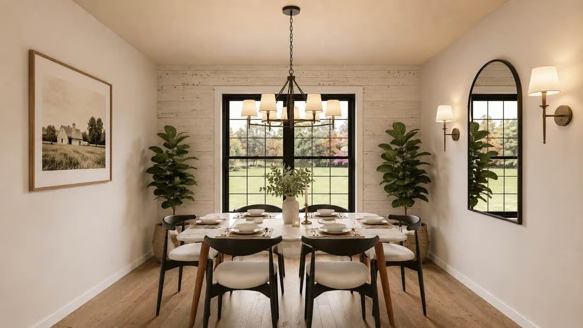
Shiplap on the accent wall keeps the room grounded without tipping into farmhouse cliché — it reads more coastal-contemporary at this scale. Eight linen shades on the chandelier pull enough light down to the table that the brass sconces on the right wall are supporting players, not load-bearing fixtures. Wood-legged chairs with upholstered seats handle a table for eight without the room feeling crowded.
Common Mistake: Hanging a chandelier too high is one of the most reliable ways to ruin a dining room. Over a table, the bottom of the fixture should sit roughly 30 to 36 inches above the tabletop so light actually reaches the place settings instead of floating up toward the ceiling where no one needs it.
Utility rooms don’t have to feel utilitarian, and this laundry space makes that case clearly.
Warm Wood Cabinets and a Marble Counter That Make Laundry Day Less Miserable
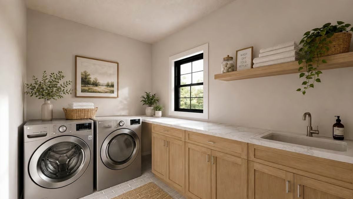
LG front-loaders sit flush against the wall, leaving the marble-look counter open for folding. Light oak cabinetry keeps the space from feeling clinical, and a window does more heavy lifting here than any pendant fixture could. An open shelf above the sink holds folded towels and a trailing pothos — lower-effort greenery than it looks, higher-return than you’d expect in a laundry room.
Shiplap Done Right Starts With Knowing When to Stop
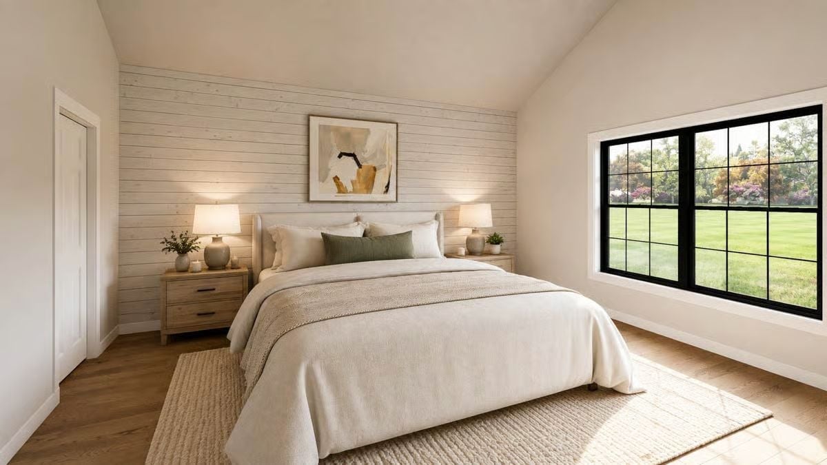
Painted white and running wall to wall behind the bed, the wood-plank accent wall earns its keep without competing with anything else in the room. Warm lamp glow does more work here than overhead lighting ever could — the vault gives it room to breathe, and that black-framed window pulls in enough green to make the whole palette feel considered rather than assembled.
The Psychology Behind This: Rooms with a single dominant texture on one wall tend to feel more restful than rooms with pattern distributed everywhere. Your eye gets one place to land and stops searching — which, in a bedroom, is exactly what you want. That’s not a happy accident. It’s the whole approach.
Double Vanity Layout That Finally Gives Both People Enough Room
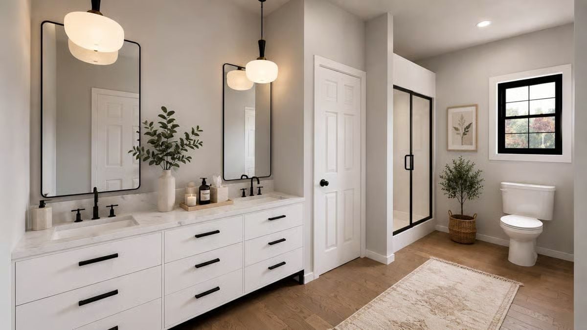
Black faucets and pendant lights anchor a white vanity with marble countertops and warm wood floors. Simple combination. Harder to pull off than it looks.
Editor’s Note: Pendant lights hung beside mirrors instead of above them cast light more evenly across your face — which matters more than most people realize until they’ve tried both. If you’re planning a vanity lighting update, position the bottom of the pendant roughly at eye level when you’re standing at the sink. Wall-mounted sconces follow the same rule and are often easier to retrofit.
Pin It
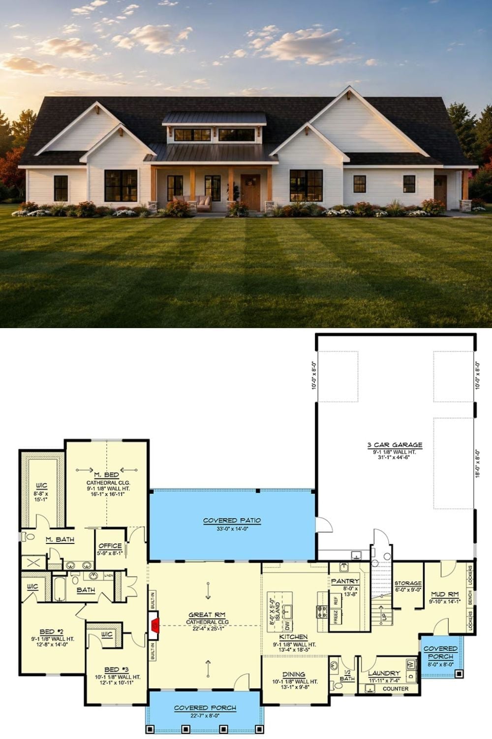
Exterior rendering of a modern farmhouse paired with its single-story floor plan showing three bedrooms, great room, and a walk-in pantry.
Designer’s Secret: Walk-in pantries work best when they share a wall with the refrigerator, cutting the steps between unloading groceries and putting them away. Most families don’t register how much that proximity matters until they’ve spent a few years without it. Before you fall in love with any plan, check where the fridge lands relative to pantry access — everything else can be adjusted more easily than that.
