
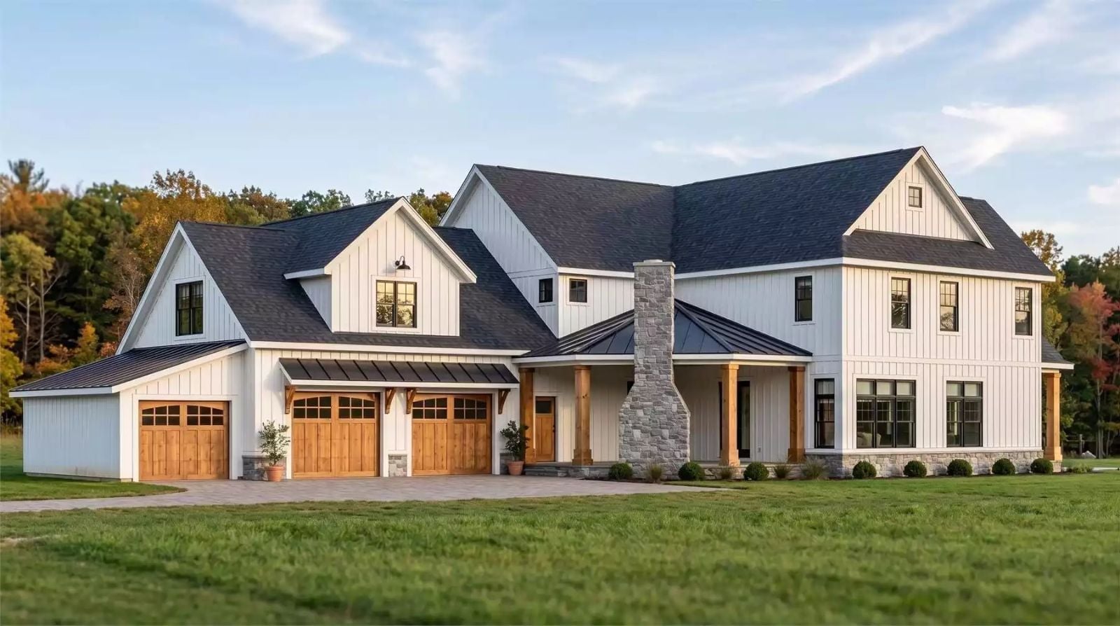
Contractors who build modern farmhouses for a living will tell you the walkout basement is the feature families fight over after the fact — the one that turns a good holiday into a great one. The Sheringham is built around that instinct: a lower level that seats the overflow crowd, a main floor where two ovens and a wide island keep Thanksgiving moving, and a great room that holds a twelve-person table without anyone pulling their chair into the hallway.
Specifications
- Sq. Ft.: 4,647
- Bedrooms: 3-4
- Bathrooms: 4.5
Floor Plan – Main Floor
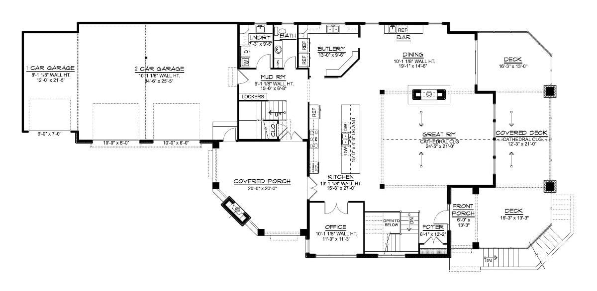
The main floor centers on a great room with cathedral ceilings, flanked by a kitchen with an island and a dining area that opens to a deck. A buttery and bar sit between dining and kitchen — a detail that matters more than it looks on paper. Garages for three cars anchor the left wing alongside a mud room with lockers, and an office and foyer face the covered porch out front.
Floor Plan – Second Floor
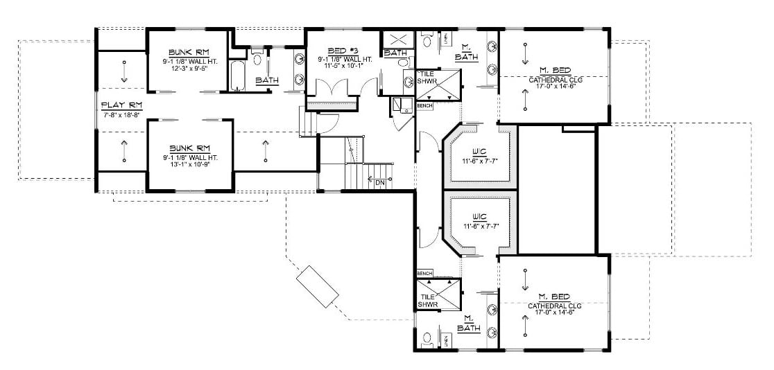
The upper level splits its work cleanly. On one side: two bunk rooms sharing a bath and a play room, which makes this plan genuinely usable for families with kids rather than just theoretically so. Bed #3 sits near a full bath at the stair landing. On the right wing, two primary suites each get a private bath, tile shower with bench, and two walk-in closets, with cathedral ceilings keeping both rooms from feeling like they’re tucked under the roof rather than part of it.
Floor Plan – Basement
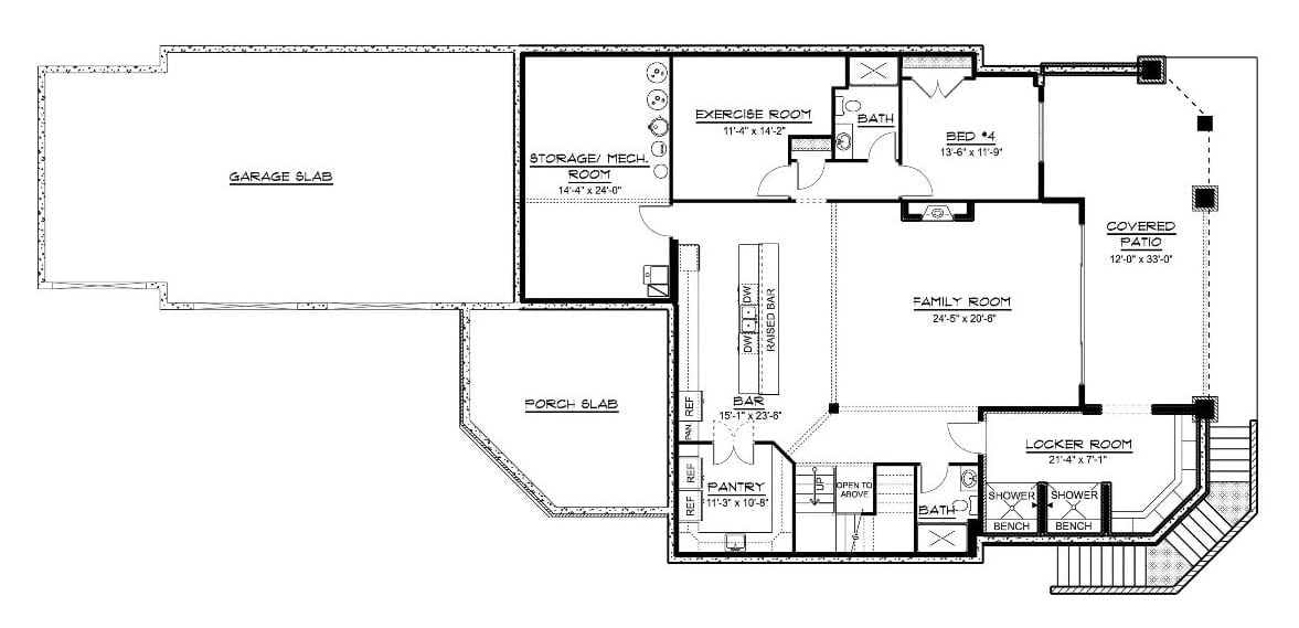
The walkout basement earns its square footage: bar, pantry, family room, exercise room, fourth bedroom, locker room with dual showers, and direct access to a covered patio. That’s a lot of program for one level, and it shows.
Gabled Timber Entry Gives This Farmhouse Its Backbone
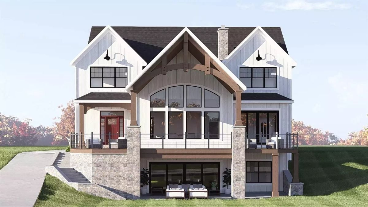
Stone columns anchor the mid-level deck while an arched window assembly draws the eye straight up through the gable. Board-and-batten siding keeps things crisp above, and below, sliding glass doors open the lower-level living space directly to grade. Three distinct points of outdoor access — lower patio, mid-level deck, gabled entry — mean guests can spread out rather than stack up in one spot, which is the whole point of a plan this size.
Why It Works: The stone base does double duty: it grounds the white siding visually so the exterior doesn’t read as too stark in winter light, and it ties the lower level to the upper facade so the whole thing reads as one composition rather than a house sitting on top of a basement.
Floor-to-Ceiling Fieldstone Makes Every Other Fireplace Feel Inadequate
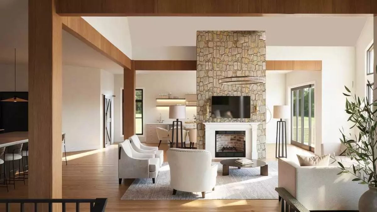
Irregular fieldstone climbs past the TV mount all the way to the roofline, anchoring cream upholstered seating arranged around a low round coffee table. It’s a lot of stone. It works.
In The Details: Mounting the TV directly into the stone face keeps the surround clean without adding a built-in shelf or mantel cabinet — a practical call that works especially well when the fireplace is already doing most of the visual heavy lifting. Natural light from the sliding doors pulls the eye back into the room, so nothing feels too closed-in despite all that fieldstone.
Brass Pendants and a Waterfall Island That Actually Earn the Open Plan
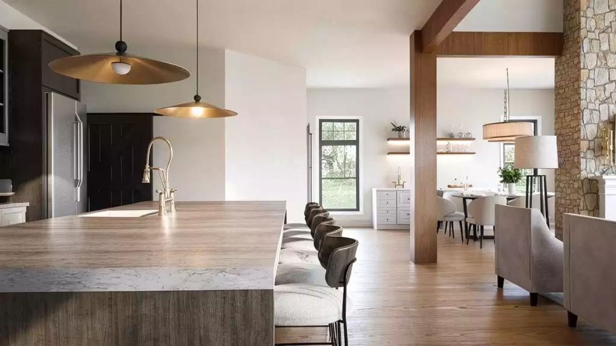
Gold-toned pendants pull warmth from the dark cabinetry, and the island’s thick stone edge gives the kitchen a physical center of gravity that open plans often lack.
Color Story: Dark cabinetry grounds the kitchen without competing with the natural wood tones on the beams and island face. Nothing here is fighting for attention, which is why the palette reads as cohesive rather than carefully coordinated — there’s a difference, and you can usually tell.
Drum Shade, Dark Table, Stone Wall — Three Decisions That Somehow Agree
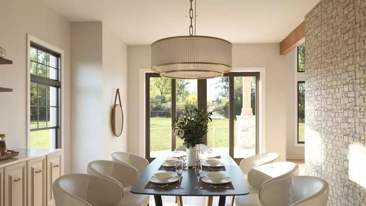
Cream barrel chairs against a near-black dining table create contrast that doesn’t feel manufactured. The pleated drum pendant pulls the eye up without competing with the natural light coming through the French doors — and that’s a harder balance to get right than it looks.
Style Math: Pairing a dark table with light upholstered seating keeps a room from tipping too heavy in either direction. Fair warning: cream fabric absorbs staining risk, so performance upholstery is worth specifying here rather than finding that out later. The stone accent wall adds texture without introducing another color, which gives the neutral palette somewhere to breathe.
Layered Neutrals and a Round Mirror That Anchor Without Overcrowding
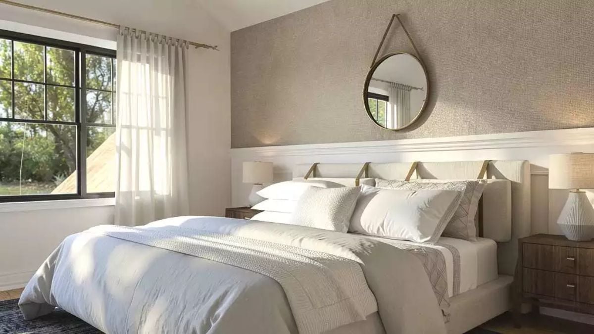
The leather straps on the upholstered headboard are a small detail that earns a second look. Warm linen wallpaper runs above the wainscoting, a rope-hung mirror sits centered above the bed, and ribbed ceramic lamps on both nightstands keep the material story consistent without being fussy about it. Natural light from the black-framed window stops the palette from going flat.
Material Matters: Linen wallpaper above wainscoting is a practical pairing — wallpaper handles the visual work on the upper wall while painted board below takes the daily knocks. Running wallpaper floor to ceiling looks great until it doesn’t, and this approach holds up considerably better over time.
Brass Hardware and a Concrete Sink That Don’t Try Too Hard
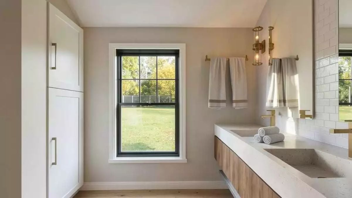
The integrated concrete countertop flows directly into the sink basin without a seam, and warm brass hardware ties the whole vanity together. Rolled hand towels on the counter beat a decorative tray every time.
- Wall-mounted sconces flanking the mirror free up counter space for actual use
- Wood-front vanity cabinetry softens what could’ve been a cold, hard surface pairing
- White subway tile backsplash behind the sink reflects light toward the window without adding visual noise
Pin It
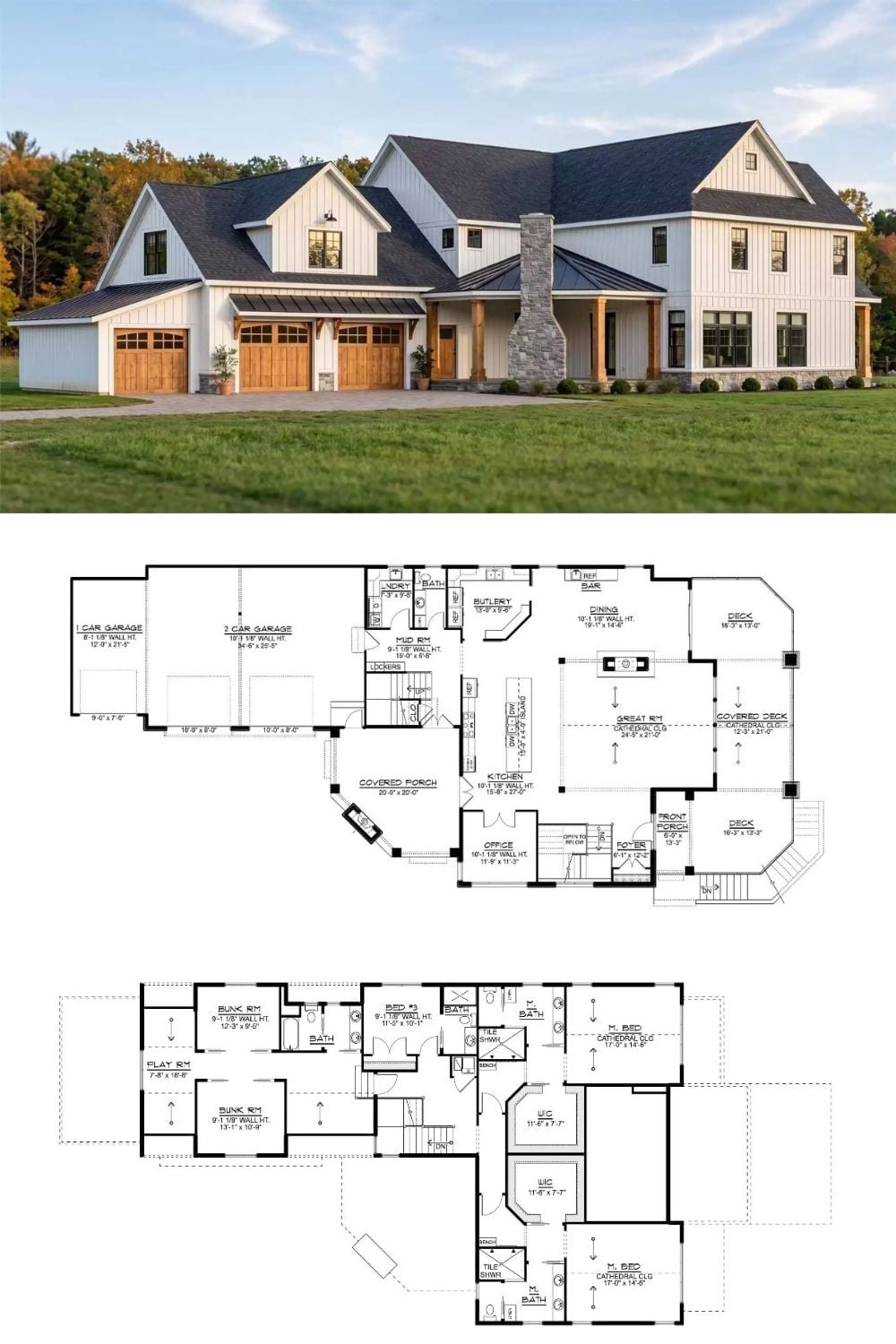
Board-and-batten siding, wood garage doors, and a stone chimney define the exterior, with two detailed floor plans below showing how the square footage actually gets used: a main floor built around gathering, with a great room, buttery, and covered deck, and an upper level that handles two primary suites alongside bunk rooms for the kids.
