
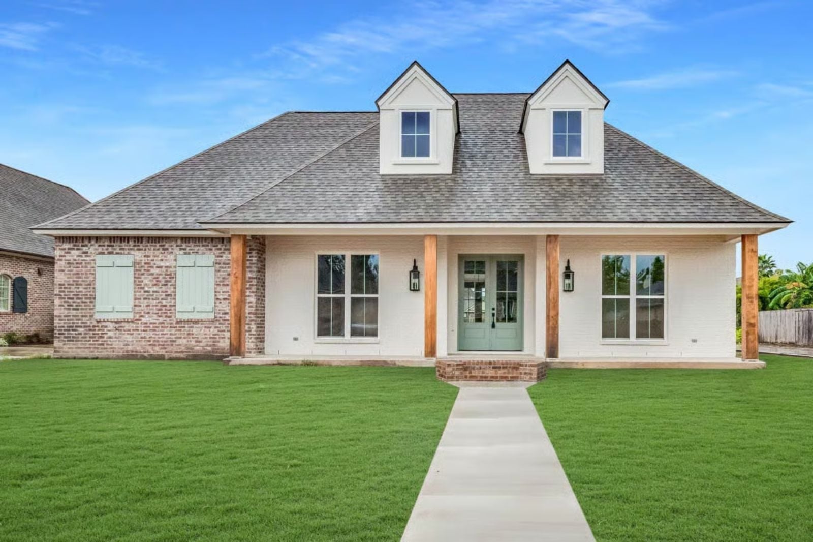
The bonus room is the tell — families who build around one aren’t buying square footage, they’re buying somewhere for the noise to go so dinner can actually happen. The Rousseau delivers on that logic with a dedicated bonus room for homework and movie nights, a dining room wide enough for the holiday leaf, a kitchen open enough to referee from, and a French Country exterior that makes coming home feel like arriving somewhere worth arriving.
Specifications
- Sq. Ft.: 3,990
- Bedrooms: 5
- Bathrooms: 4
Floor Plan – Main Floor
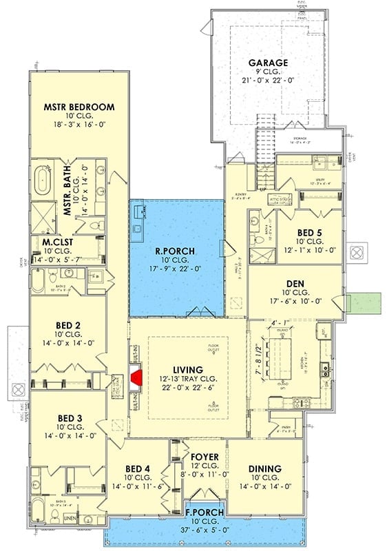
Five bedrooms fan out from a central living room with a tray ceiling, and the rear porch sits just off that living space so the transition outside is immediate. The den offers a quieter retreat near Bed 5. A dedicated dining room, foyer, and double-door master suite round out this sprawling single-story layout.
Floor Plan – Bonus Room
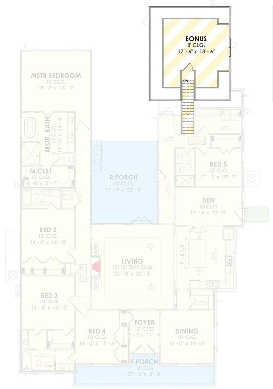
Four secondary bedrooms cluster on the left wing while the master anchors the far end. Living, dining, and the rear porch form the social core, and the bonus room sits above all of it.
Why It Works: The rear porch connects directly off the living room, so guests spill outside without cutting through bedrooms or utility spaces. That placement sounds simple, but it’s the reason the indoor-outdoor flow actually gets used instead of admired in photos.
Sage Barn Doors and French Entry Make a Foyer Worth Arriving Into
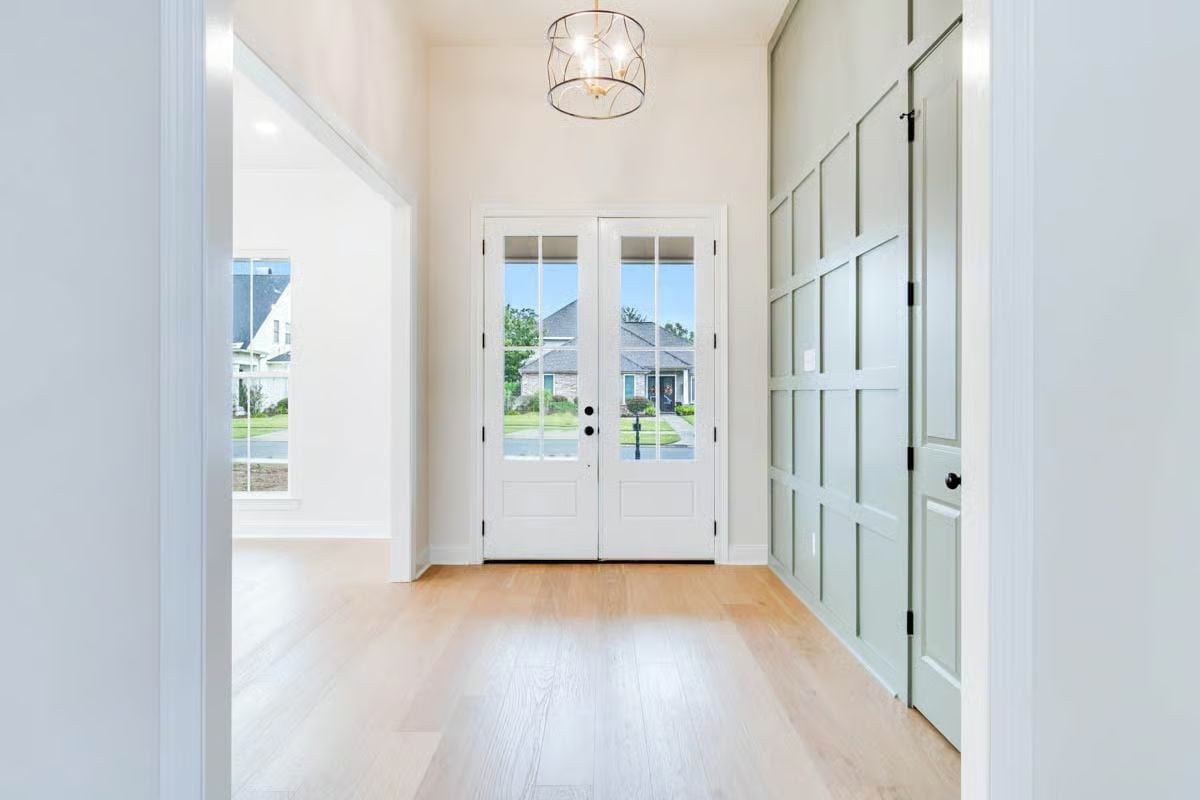
Light washes across pale hardwood floors from the glass-panel front doors, and those sage green barn doors on the right are doing real work — hiding storage without pinching the entry’s sense of space.
- French doors with divided-lite glass keep the foyer visually connected to the neighborhood outside.
- The drum chandelier in aged brass anchors the ceiling without competing with the architectural doors below it.
- Black hardware ties the barn door hinges back to the door knobs, so the mix of styles reads as deliberate rather than accidental.
Brick That Earns Its Place in a Room This Quiet
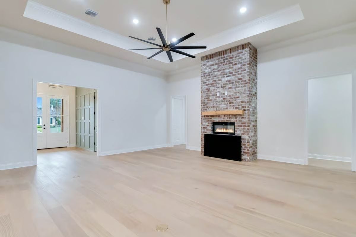
Floor-to-ceiling brick on the fireplace column does the heavy lifting. The wood mantel keeps it from reading as purely industrial, and pale hardwood floors with white walls leave the fireplace as the only thing competing for attention. It wins without trying.
Why the Linear Firebox Works Here
A traditional arched firebox would fight the brick’s rough texture and the room’s clean horizontal lines. The slot design keeps the eye moving left to right rather than pulling it upward, which makes the column feel considered rather than oversized. That black surround grounds the opening without adding visual clutter — a small call that matters more than it looks like it should.
Gold Lanterns and a Gray Island That Pulls the Whole Kitchen Together
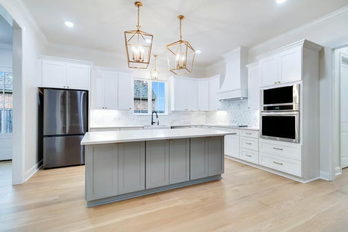
Brass cage pendants hang over a gray shaker island with white quartz counters and a marble-look backsplash behind. Simple combination. Hard to mess up, which is probably why it keeps showing up in kitchens that photograph well.
History Corner: Kitchen islands painted in a contrasting color became popular in American homes in the early 2000s, borrowing from European farmhouse traditions where a central worktable was often a different material than the surrounding cabinetry. The gray-on-white pairing seen here is a direct descendant of that idea — practical thinking with a longer history than the trend cycle suggests.
Gold Chandelier, Empty Room, and Every Reason to Buy a Long Table
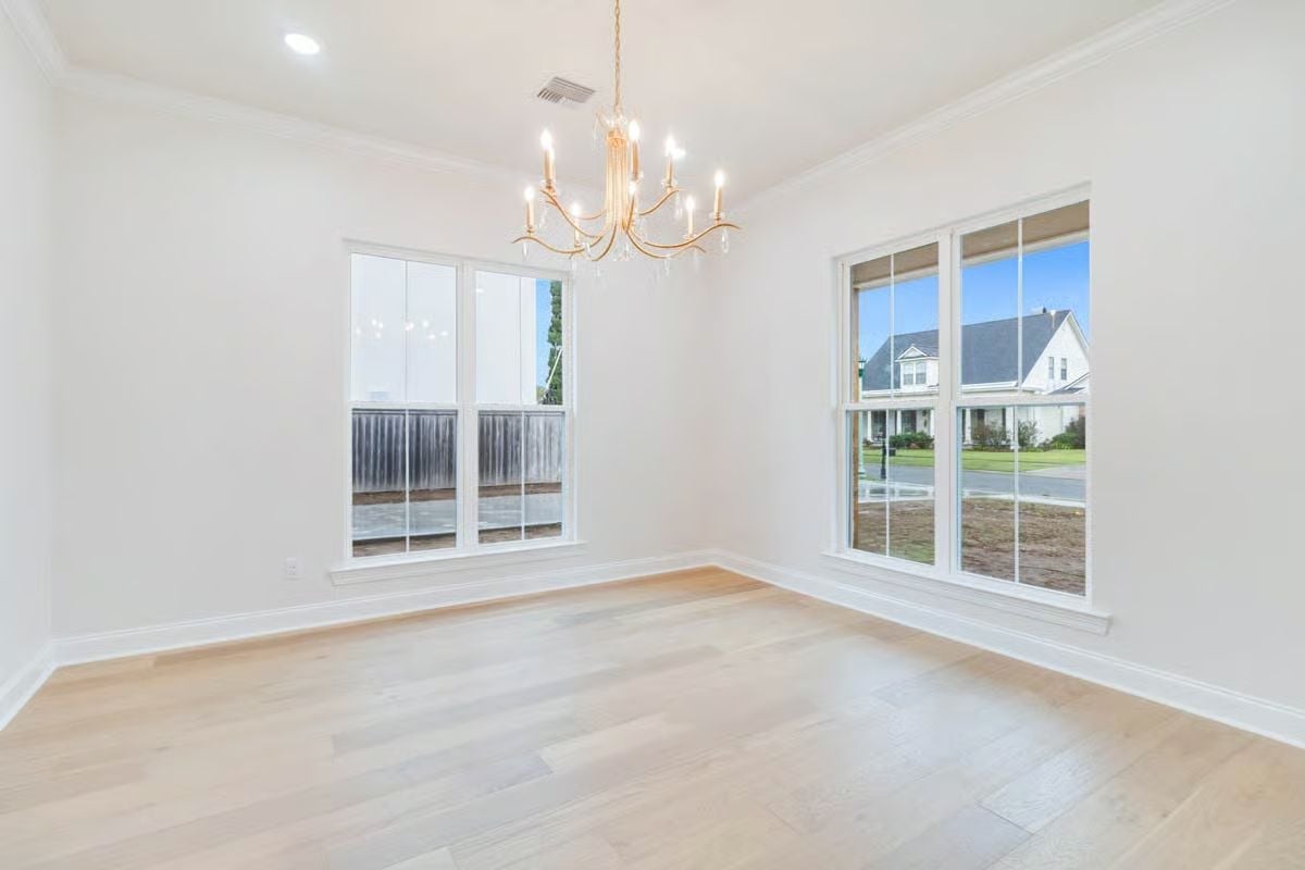
Bare rooms tell the truth about good bones. The light hardwood floors run clean to the baseboard, crown molding sits crisp at every corner, and a gold candle-style chandelier anchors the center without overreaching. Two windows on perpendicular walls deliver cross-light that most dining rooms never get.
Fun Fact: Dining rooms positioned at the corner of a home naturally pick up morning light from one direction and afternoon light from another. That shift through the day changes how the room feels without changing a single finish — which is one of the quieter arguments for putting the dining room at the front corner rather than tucking it toward the interior.
Dual Vanity with Black Hardware That Knows Exactly What It’s Doing
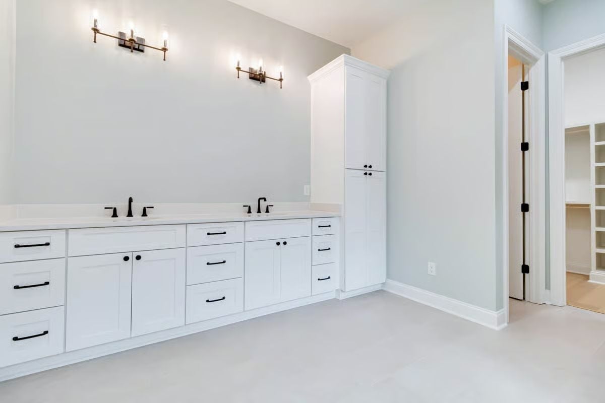
Matte black faucets and cabinet pulls carry a lot of weight in this otherwise all-white vanity run. Two sinks sit evenly spaced across a long quartz counter with matching bronze sconces overhead, and that tall linen tower at the end is a genuinely smart call — the kind of storage that looks intentional because someone actually thought about where the towels go.
Common Mistake: Homeowners often plan for mirror space above a double vanity but forget about lighting placement until drywall is already up. Sconces mounted too high or too close together throw shadows on the face instead of even light. Rough in your electrical before the walls close, and center each fixture above its corresponding sink.
Mudroom Cubbies in Sage Green Earn Their Spot Right by the Front Door
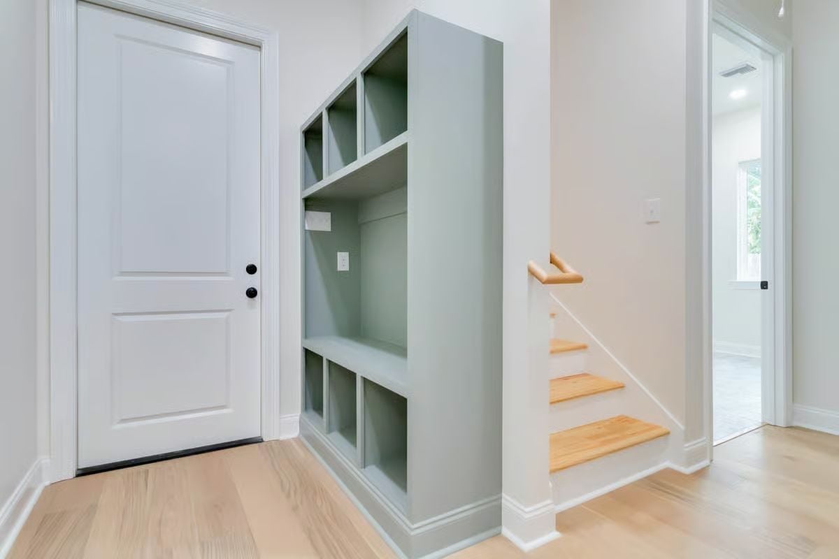
Built-in shelving painted in muted sage sits flush against the wall beside the entry, with open cubbies sized for shoes at the bottom and gear higher up. Natural wood stair treads nearby keep the palette grounded. Nothing migrates past this point — or at least, that’s the plan.
Pro Tip: Built-ins painted the same color as the wall behind them read as architecture rather than furniture, which keeps a small entryway from feeling like a storage showroom. If you’re planning a mudroom wall like this one, run an outlet inside the lower section so charging stays out of sight from the front door.
Tongue-and-Groove Ceiling with Two Big Fans Does the Heavy Lifting Out Here
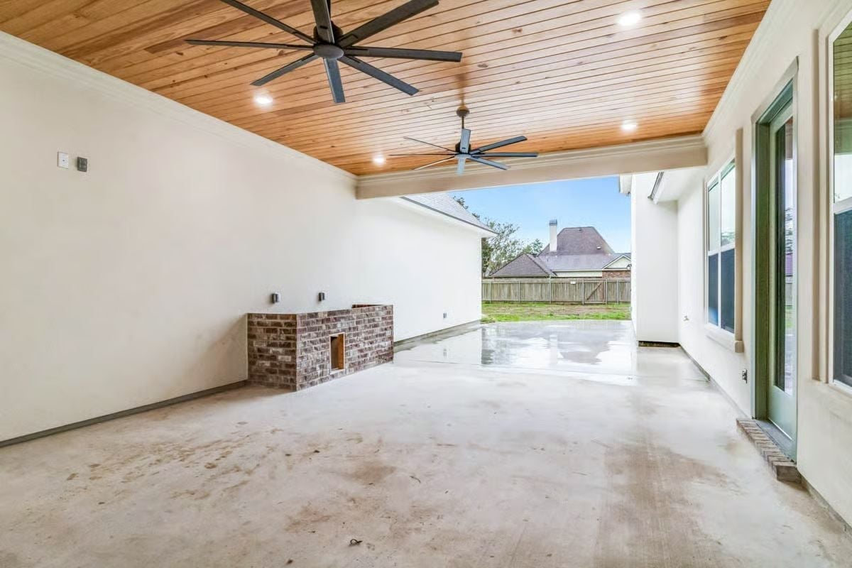
Cedar plank ceiling, recessed lights, and a partial brick grill base. This covered patio was built for actual use, not just the listing photos.
Pin It
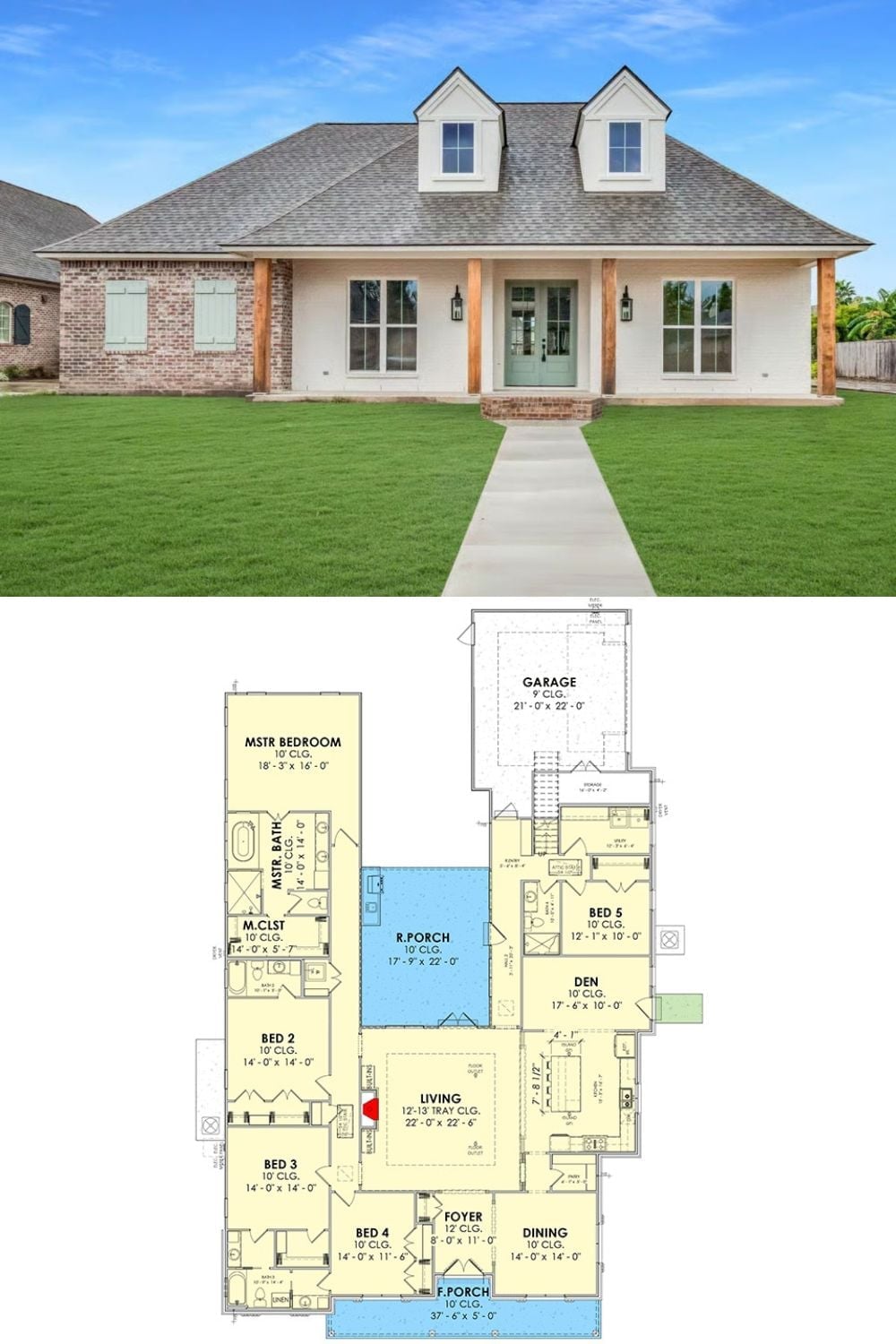
The exterior shows a French Country home with white-painted brick, wood columns, and sage shutters framing a covered front porch. The floor plan below lays out five bedrooms, a 22-by-22 living room, rear porch, den, and an attached two-car garage across a single level.
