🔥 Would you like to save this?
White trim has had a remarkably easy ride. Baseboards, door casings, crown molding: paint them white, declare the room finished, and leave the architecture to fend for itself. But the details we treat as background can change the entire room. Black casings give pale walls the precision of a drawing. Plum molding makes peach plaster look unexpectedly sophisticated. Dark walnut turns an ordinary doorway into a substantial architectural feature.
In order to come up with the very specific design ideas, we create most designs with the assistance of state-of-the-art AI interior design software. Also, assume links that take you off the site are affiliate links such as links to Amazon. this means we may earn a commission if you buy something.
And paint is only half the story. Natural oak can carry a line from door to ceiling; stained wood can make a pale kitchen feel grounded; lacquer can pull reflections into a room that would otherwise absorb the light. Sometimes the boldest move is to remove the contrast altogether, letting coffered ceilings, paneled walls, and built-in shelves emerge from a single continuous color. What matters is not whether the trim is dark, bright, stained, or barely distinguishable from the wall. What matters is what those choices do to the architecture.
Across these 34 rooms, window frames, baseboards, ceiling details, cabinetry, and millwork take on roles far beyond finishing the edges. Some sharpen the geometry. Others soften it, extend it, or turn it into the principal decoration. White is still an option. It is simply no longer the automatic answer.
34. Black Trim Gives a Cream Entry Hall the Precision of a Drawing
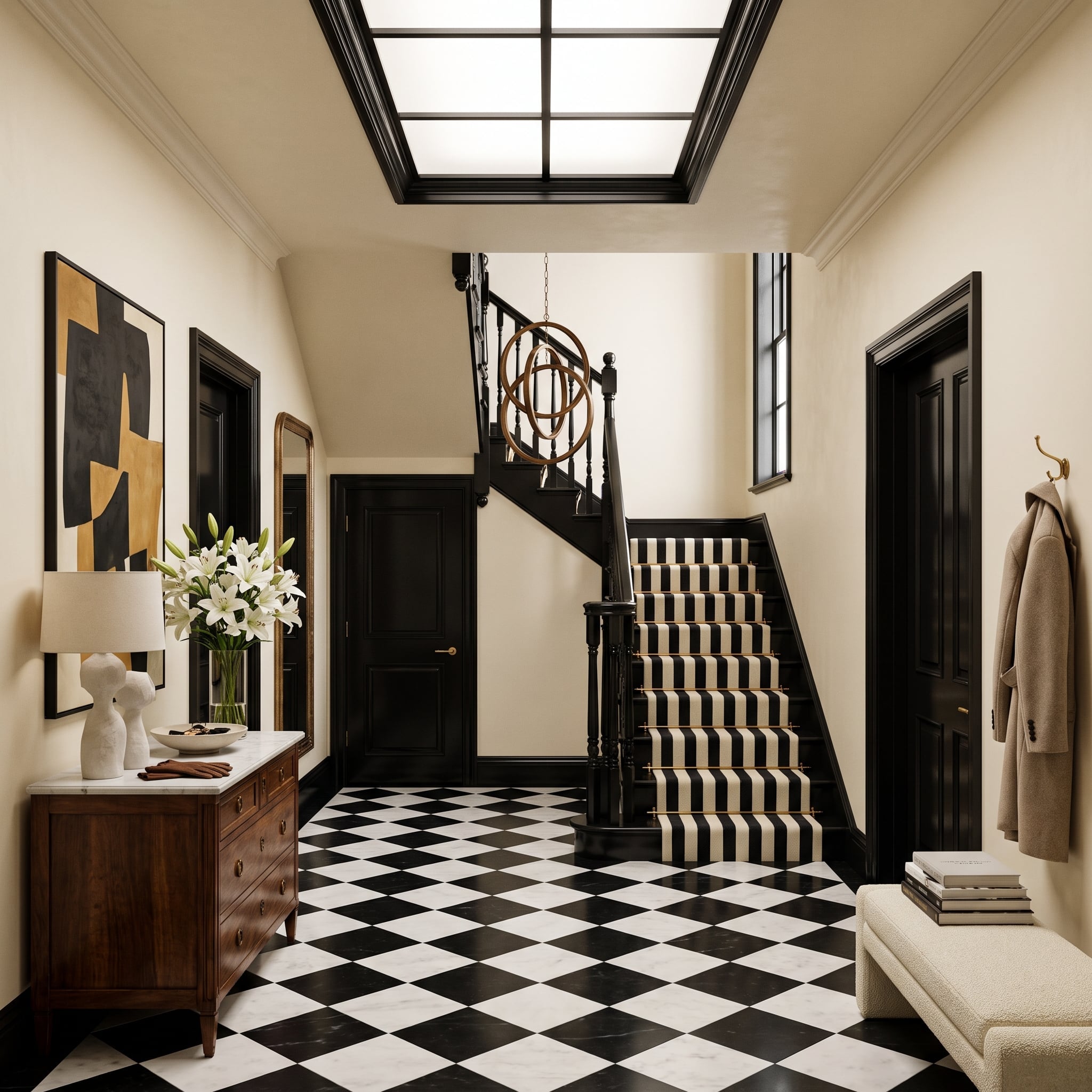
Black door casings, baseboards, stair details, and skylight framing draw an uncompromising architectural framework around cream plaster. The diagonal checkerboard marble floor picks up the contrast underfoot, turning the entry into a composition of intersecting lines rather than a collection of decorative objects.
A striped stair runner carries that graphic rhythm upward. Brass stair rods and a walnut console provide warmer interruptions, while abstract artwork introduces ochre without upsetting the scheme. The black succeeds because every painted line has an architectural purpose. Nothing appears arbitrarily outlined.
33. Natural Oak Turns a Bedroom Ceiling Into Part of the Architecture
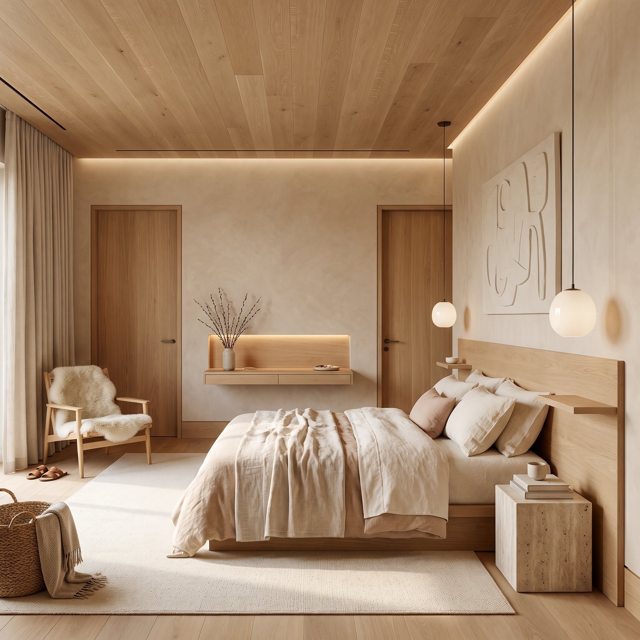
Here, conventional contrasting trim gives way to a continuous treatment of natural oak. Ceiling planks, flush doors, and integrated shelving establish a sequence of clean planes, with the wood grain supplying movement that paint would conceal. The architecture reads through precise joints and changes of direction rather than applied molding.
Travertine, linen, and matte white globe pendants keep the surroundings deliberately quiet. Their restrained finishes allow the oak to dominate without becoming visually heavy. The result makes a different argument from painted trim: architectural definition can come from material continuity rather than contrast.
32. Plum Trim Makes Peach Walls Look Deliberate, Not Delicate
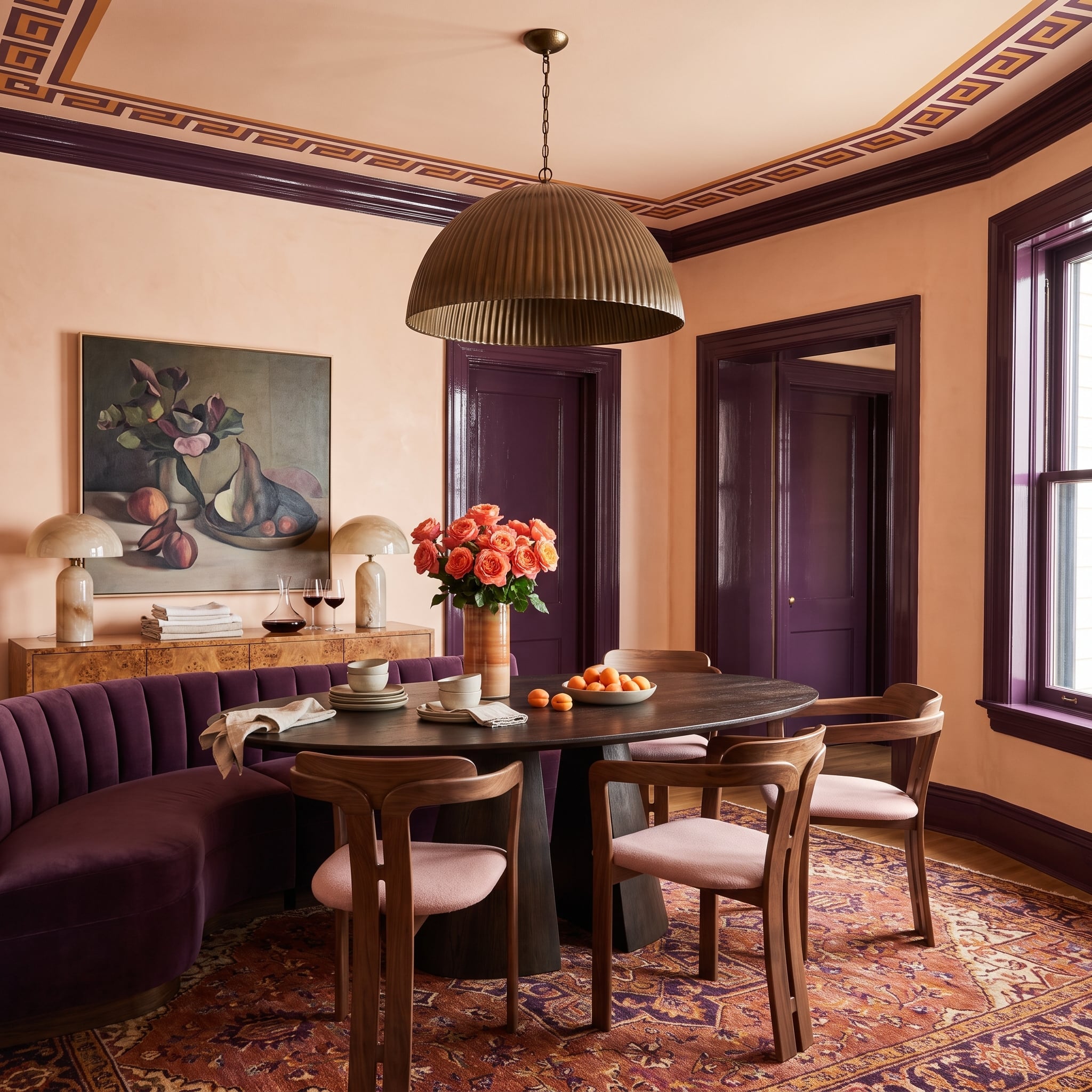
Deep plum door casings and crown molding give peach-colored walls a far more assertive character than white trim would. The combination has tension, but both colors share enough warmth to feel related. A plum velvet banquette repeats the darker shade at seating level, turning the architectural choice into part of the furniture palette.
The Greek key ceiling border extends that relationship overhead. Its repeated geometry adds discipline to the expressive colors, while a dark oval table and coral-toned rug anchor the room. Peach becomes sophisticated precisely because the surrounding woodwork refuses to be timid.
31. Walnut Millwork and an Acoustic Ceiling Redraw the Media Room
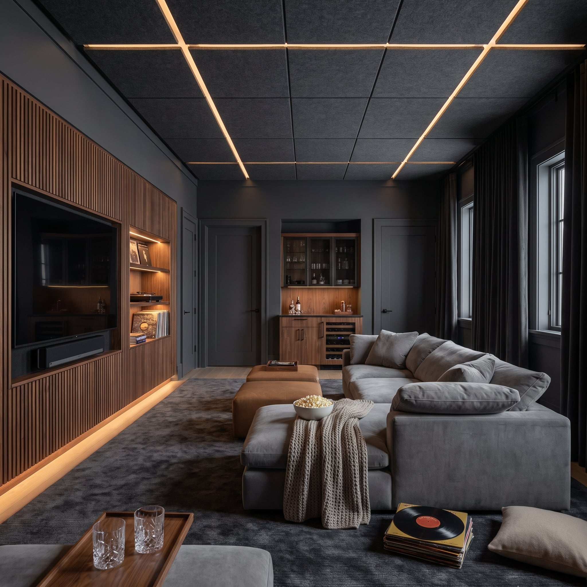
A geometric ceiling grid establishes the room’s upper structure, with integrated LED strips tracing the joints between gray acoustic panels. Below, fluted walnut millwork creates a warmer, more tactile counterpoint across the media wall and illuminated shelving. Neither treatment behaves like conventional crown molding, yet both organize the interior through clearly defined architectural lines.
The generous sectional and darker furnishings remain visually subordinate to the ceiling and wall treatments. Here, architectural detailing is tied to the room’s function: the ceiling panels address acoustics while their geometry and lighting contribute to the design.
30. Burgundy Trim Gives a Walk-In Closet the Drama of a Private Boutique
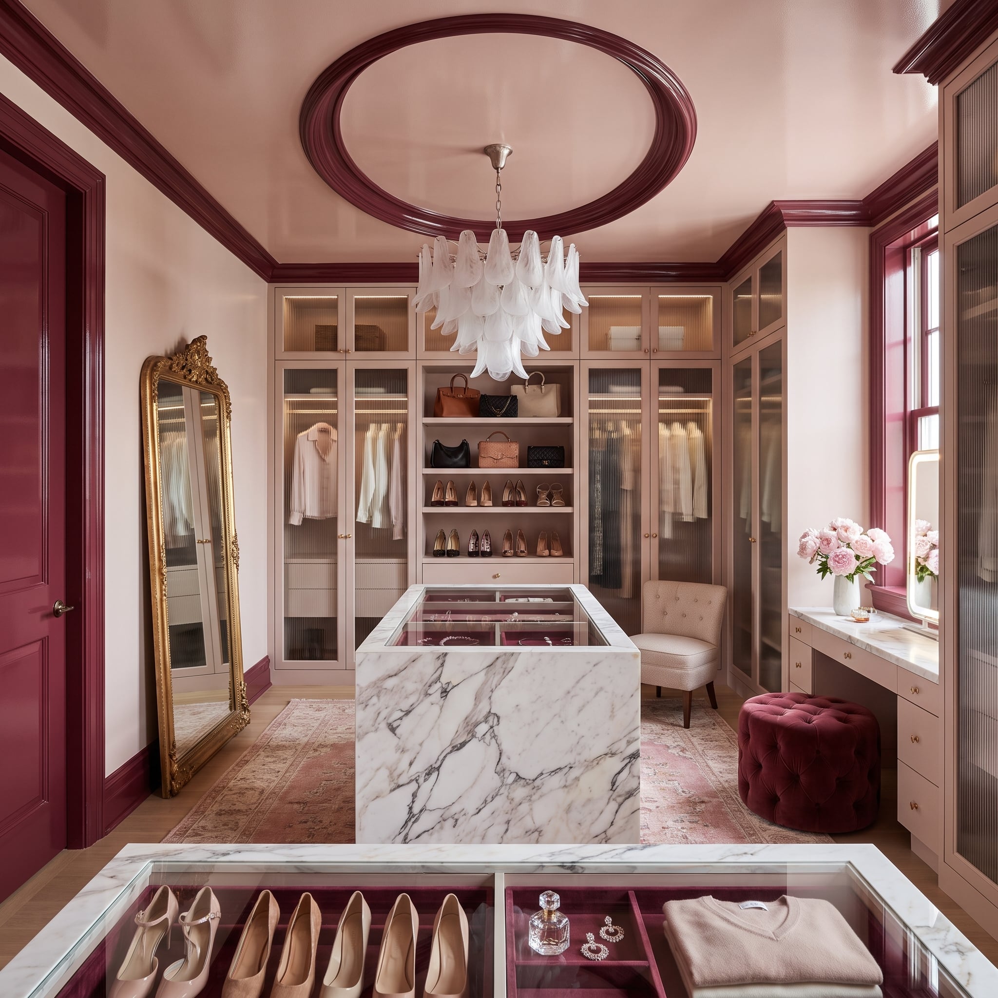
Burgundy outlines the doorways, crown molding, and circular ceiling medallion, giving blush cabinetry a surprisingly theatrical setting. The wine-colored architectural details are strong enough to define the space without requiring every storage surface to share the same finish.
A marble island with a glass-topped jewelry display occupies the center. Above, the painted medallion connects the chandelier to the broader decorative scheme. Rather than leaving the light fixture isolated against a pale ceiling, the trim gives it a richly colored architectural setting.
29. Chocolate-Stained Casings Give a Canopy Bedroom Its Architectural Backbone
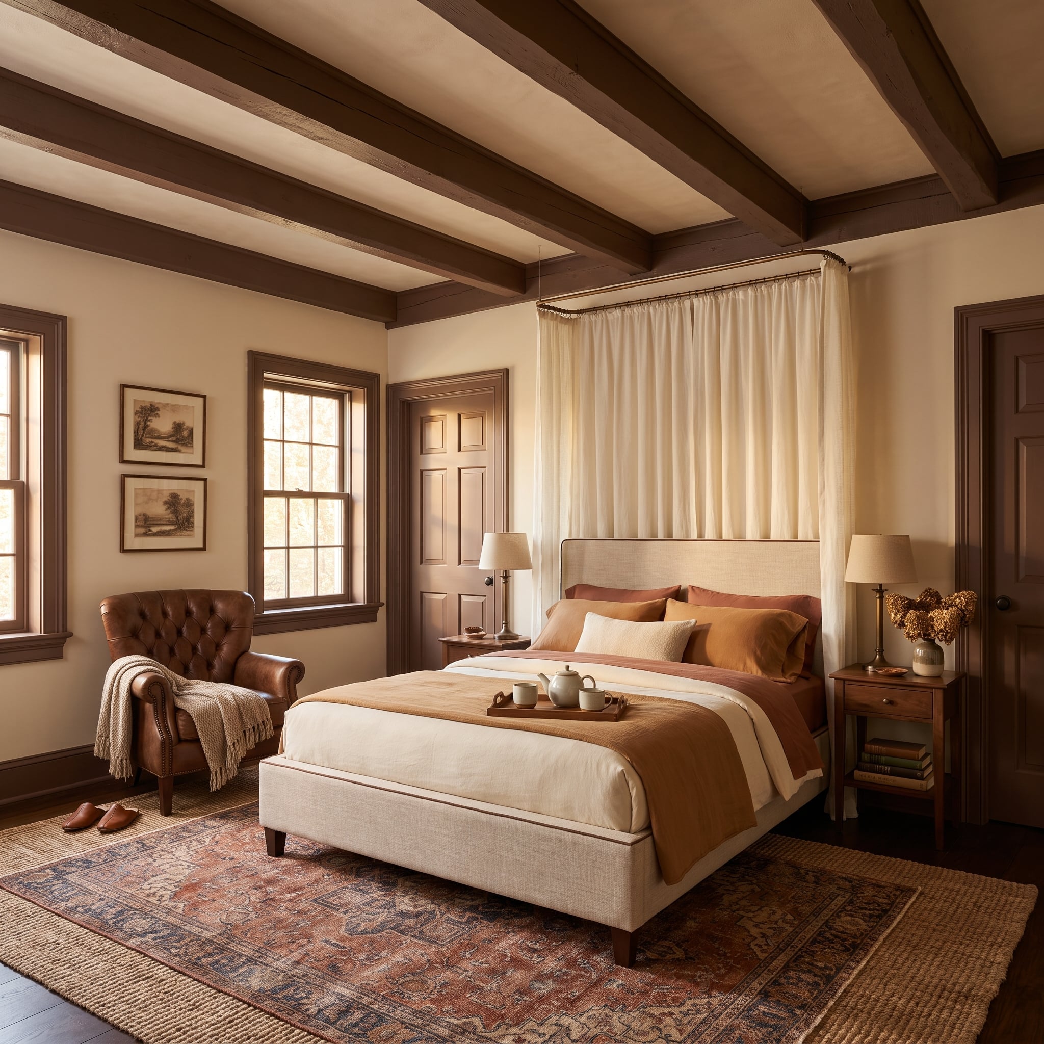
Dark walnut-stained window and door casings establish a substantial brown framework against cream plaster. Exposed ceiling beams reinforce the contrast, giving the bedroom a sense of architectural permanence without relying on elaborate applied ornament. The visible grain is important: opaque chocolate paint would create a very different effect.
Linen canopy curtains soften the bed’s outline, while rust bedding introduces warmth between the pale walls and dark timber. The woodwork supplies the room’s strongest edges; the fabrics keep those edges from becoming severe.
28. Teal Lacquer Turns an Entryway’s Door Frames Into Architecture
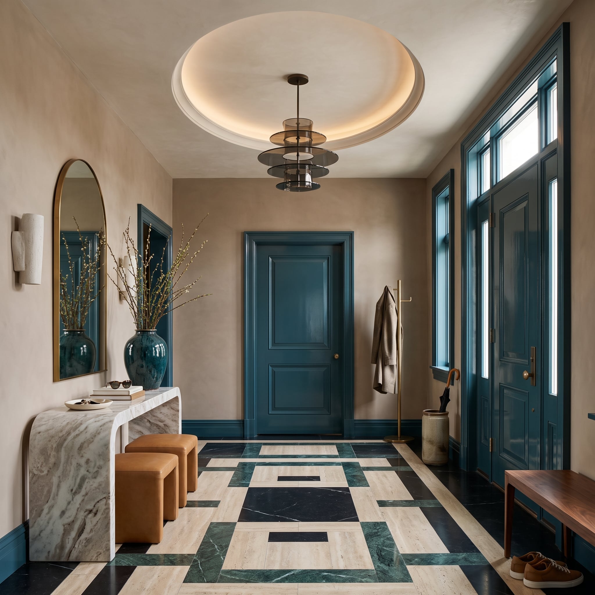
Teal-painted door casings, window frames, and baseboards bring saturated color to the perimeter of this foyer. Their reflective finish emphasizes the profiles against pale walls, while a geometric marble floor introduces black, cream, and green in a more intricate arrangement.
The teal draws from the floor’s cooler tones without copying its pattern. That distinction allows two emphatic treatments to coexist. Gloss contributes another layer: reflected light reveals the contours of the painted woodwork, giving the door frames a presence that flat paint would not produce in quite the same way.
Material Matters: Gloss and semi-gloss finishes reflect more light than matte paint, making molding profiles and surface imperfections more visible. Test both color and sheen on the actual trim before committing, particularly where strong daylight reaches the woodwork.
27. Warm Oak Cabinetry Turns a Modern Kitchen Into a Study in Millwork
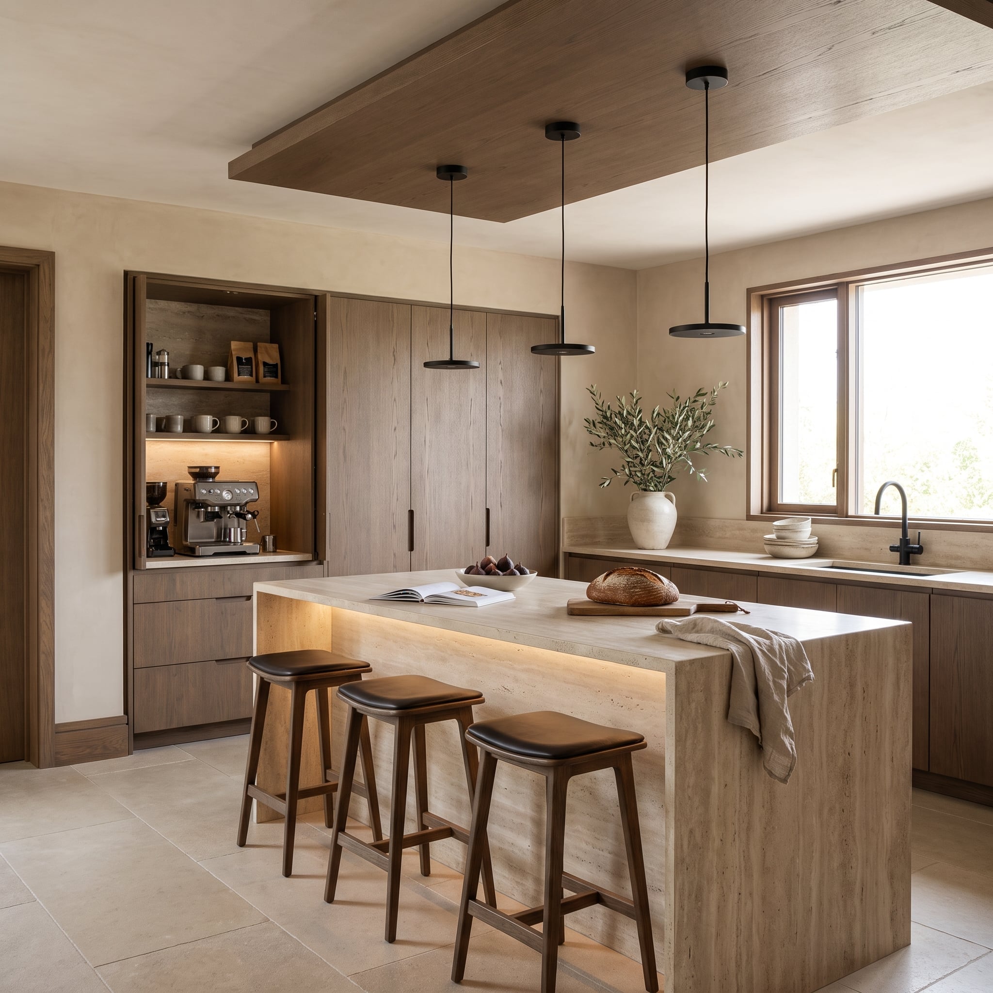
Floor-to-ceiling oak millwork gives this kitchen a strong architectural backdrop. Cabinet doors, recessed storage, and a dedicated coffee niche form a continuous wood surface, with grain and carefully aligned joints supplying the detail. A pale travertine island stands out against the timber without needing another painted accent.
Softly illuminated shelving and a wood ceiling detail strengthen the impression of an integrated interior. Matte black pendants add a sharper note above the island. The design is more about cabinetry than conventional trim, but the architectural lesson is clear: carefully composed joinery can organize an entire room.
26. Dusty Blue Woodwork Gives a Dining Room Its Own Architectural Rhythm
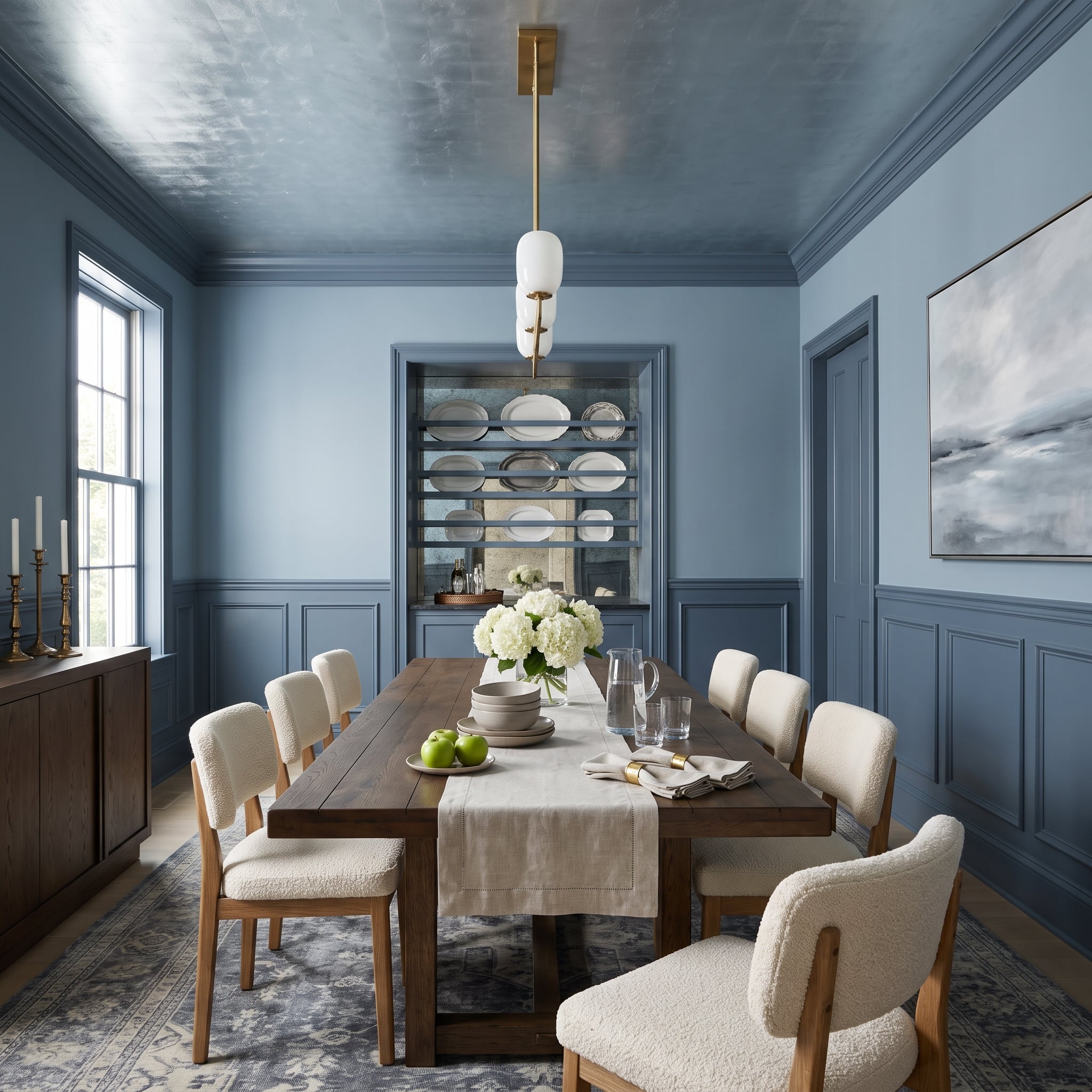
Muted slate blue unites the wainscoting, crown molding, door casings, and built-in display niche. The repeated color makes the room’s architectural features unmistakable, even though the shade is neither especially dark nor particularly vivid. A reflective ceiling introduces a different quality of light overhead.
Warm oak furniture and pale upholstered chairs provide contrast through material. The brass-and-alabaster pendant adds a softer focal point, leaving the blue woodwork to establish the room’s visual rhythm. The effect is formal without becoming stiff.
25. A Seamless Plaster Fireplace Makes a Case for Less Trim
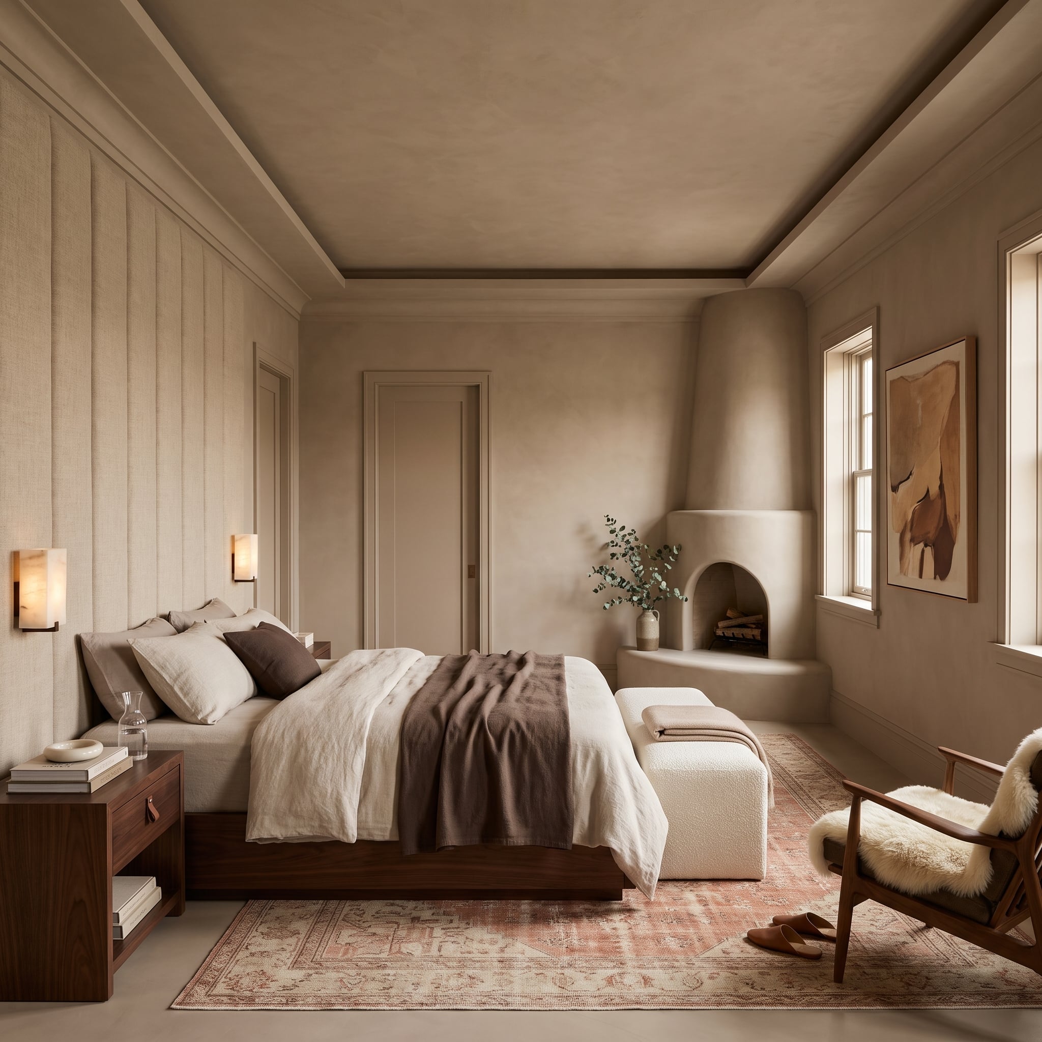
A rounded kiva-style fireplace rises from the same taupe plaster as the surrounding walls. With no contrasting casing to interrupt its outline, the curved form emerges through light and shadow. The fireplace feels shaped from the room’s architecture rather than attached to a finished wall.
Dark walnut furniture provides a necessary counterweight to the pale, continuous plaster. This bedroom offers a useful exception to the gallery’s more graphic examples: architectural character can become stronger when a conventional trim line disappears altogether.
24. Olive Trim Gives a Formal Living Room Its Color Without Dominating the Furniture
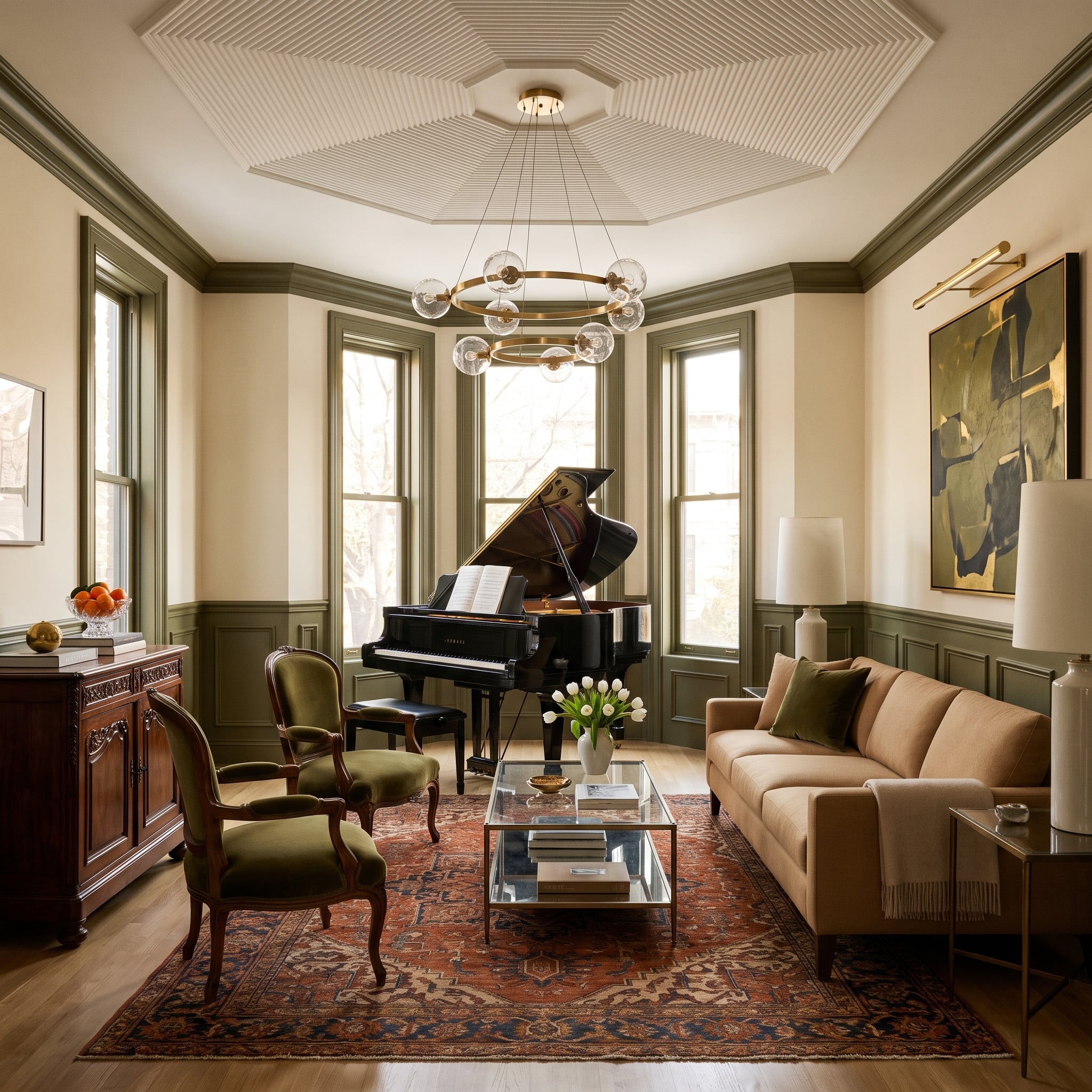
Sage-olive wainscoting and crown molding establish a colored framework around cream walls. An octagonal coffered ceiling adds complexity overhead, while the lower painted panels give the room a clear architectural foundation.
Olive velvet chairs repeat the trim color in a softer material. A camel sofa, rust-and-navy Persian rug, and grand piano introduce a broader range of tones and shapes. The painted woodwork holds the composition together without demanding that the furniture conform to a single decorative style.
23. Honey-Colored Woodwork Meets a Cane Ceiling in a Warmly Layered Kitchen
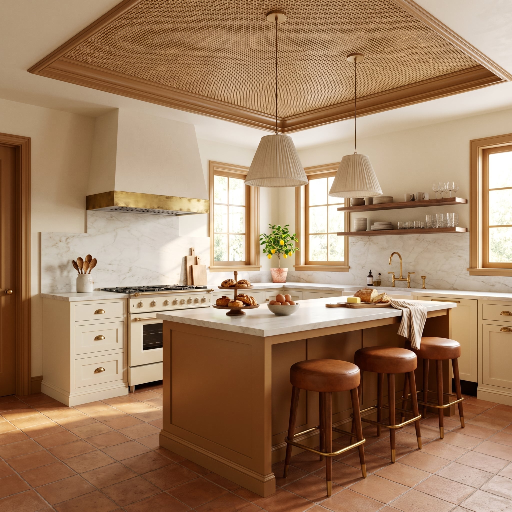
Caramel-stained window and door trim establishes the kitchen’s warm architectural outline, then reappears around a cane ceiling insert. The wood and woven material share a similar color temperature, but their textures are distinctly different. Smooth casings give the more intricate ceiling treatment a defined perimeter.
Terracotta flooring, cognac leather stools, and the island base extend those earthy tones through the room. Rather than using white to separate every surface, the design allows the materials to relate through color while remaining distinguishable through grain and texture.
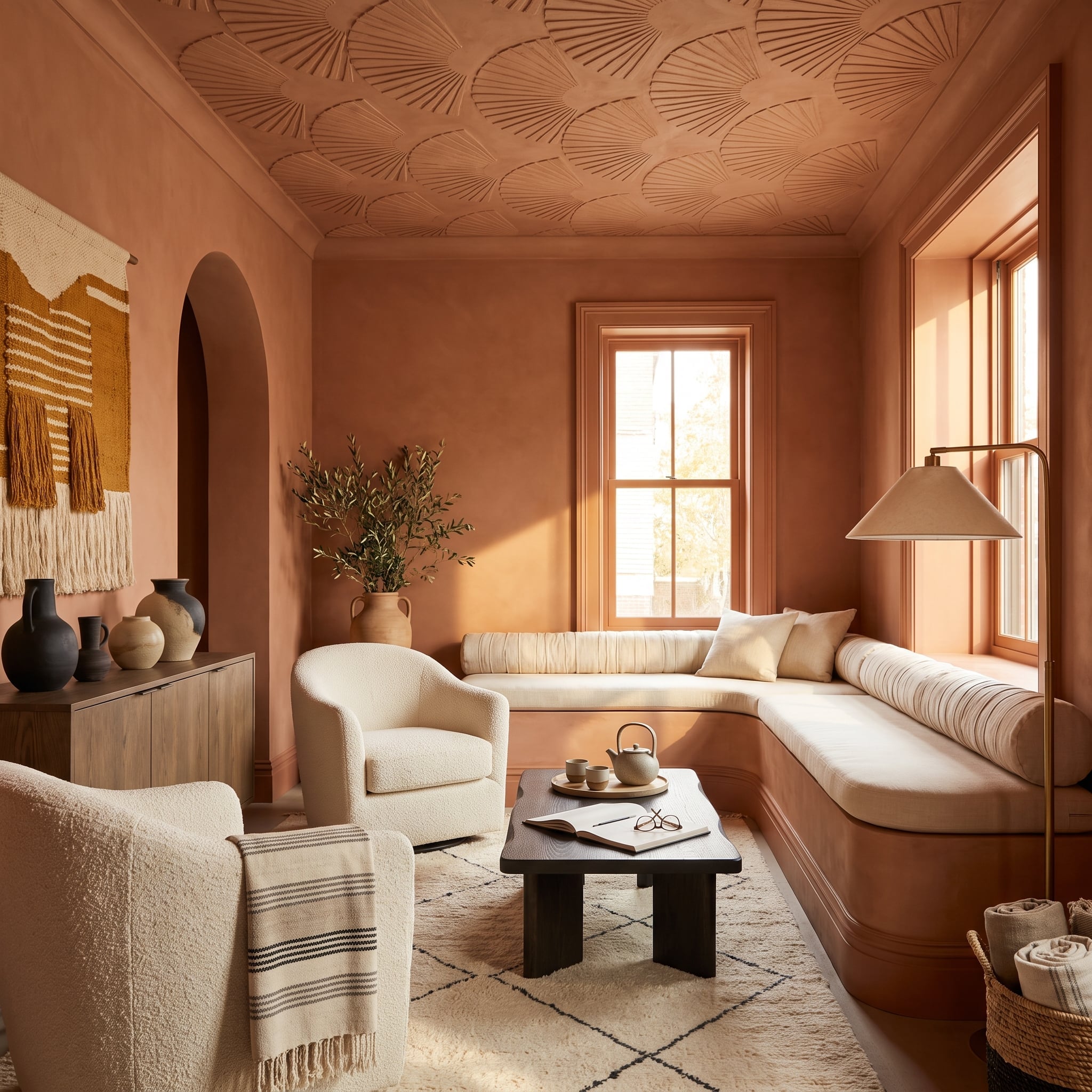
22. Terracotta Color Drenching Lets a Sculptural Ceiling Do the Talking
🔥 Would you like to save this?
Terracotta covers the walls, window trim, ceiling, and built-in banquette base, producing a remarkably unified interior. The coffered ceiling contains fan-shaped plaster details whose relief becomes visible through changes in light rather than contrasting paint. The monochromatic treatment makes their sculptural form more important than their outline.
Cream bouclé chairs provide a substantial visual interruption, while a dark espresso table anchors the center. Daylight reveals the profiles of the matching window casings. The room’s complexity lies in its architecture, not in the number of colors used.
21. Walnut Trim Gives a Curved Cream Sofa a Sharper Architectural Setting
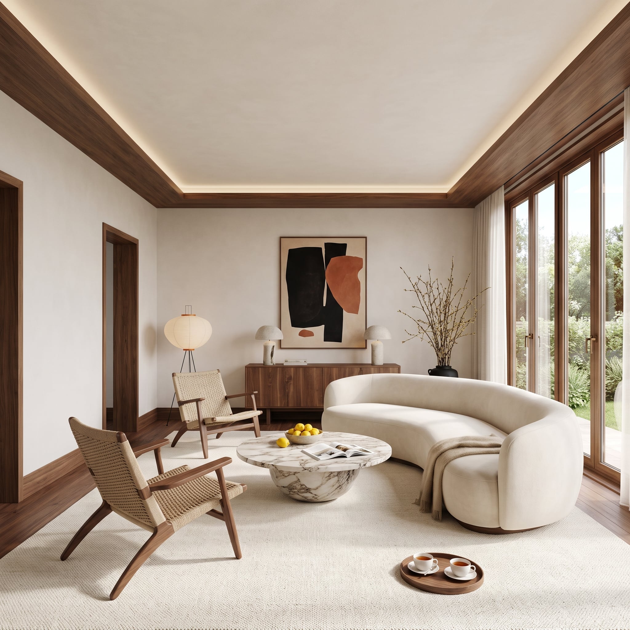
Walnut crown molding and baseboards draw warm, straight lines around pale walls. Against that orderly framework, a curved cream bouclé sofa appears even more sculptural. The woodwork contributes definition without the severity of black or the assertiveness of a saturated paint color.
Rattan chairs, a walnut credenza, and abstract artwork in terracotta and black reinforce the material palette. A marble coffee table introduces a cooler surface at the center. The result demonstrates how natural wood trim can give a minimalist interior structure without making the architecture feel austere.
20. Mauve Walls and Plum Woodwork Give a Bedroom Two Degrees of Color
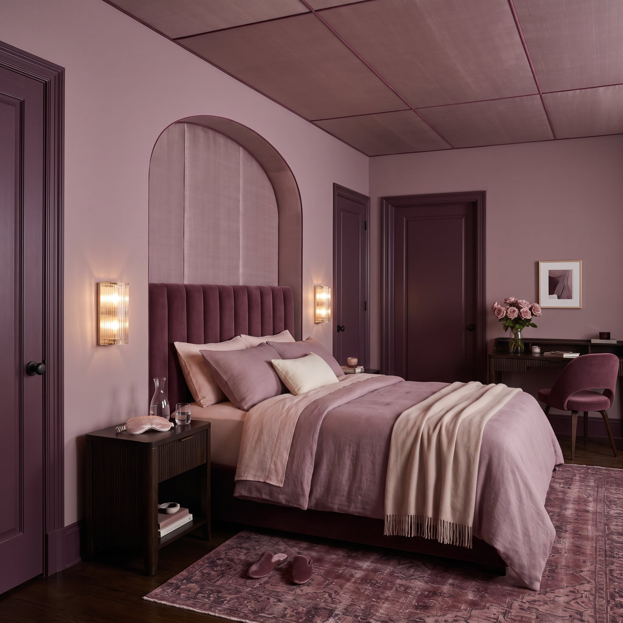
Dusty mauve covers the bedroom walls and coffered ceiling, while deeper plum on the door frames and baseboards provides definition. The shades are closely related, but the darker woodwork gives the room’s openings and lower edges enough distinction to remain visible.
A channeled velvet headboard, brass sconces, blush textiles, and faded floral rug extend the tonal approach. Their contrasting textures prevent the palette from becoming flat. Rather than abandoning color coordination, the design uses small differences in value to reveal the millwork.
19. Navy Trim Turns Chinoiserie Displays Into Part of the Dining Room Architecture
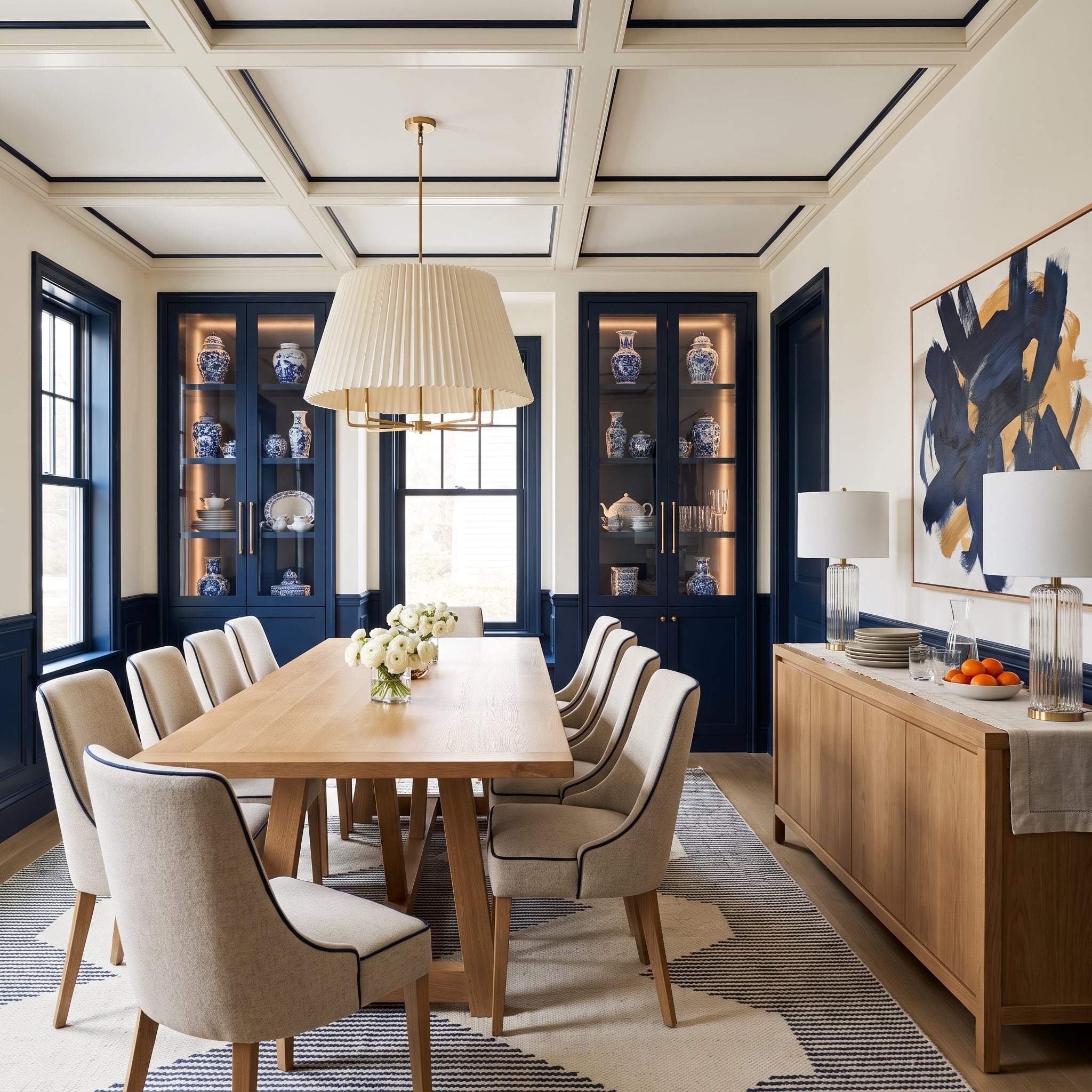
Navy paint links built-in cabinetry, window casings, door frames, and the coffered ceiling grid. Blue-and-white ceramics inside illuminated display cabinets become part of a larger architectural composition rather than a series of unrelated decorative pieces.
Cream upholstered chairs and a pale pendant soften the dark blue, while navy piping repeats the color on a smaller scale. The cabinetry is substantial, but the matching trim prevents it from appearing isolated. The room treats blue as an organizing architectural finish rather than a scattered accent.
18. Sage Cabinetry and an Oak Ceiling Give a Marble Kitchen Two Different Kinds of Warmth
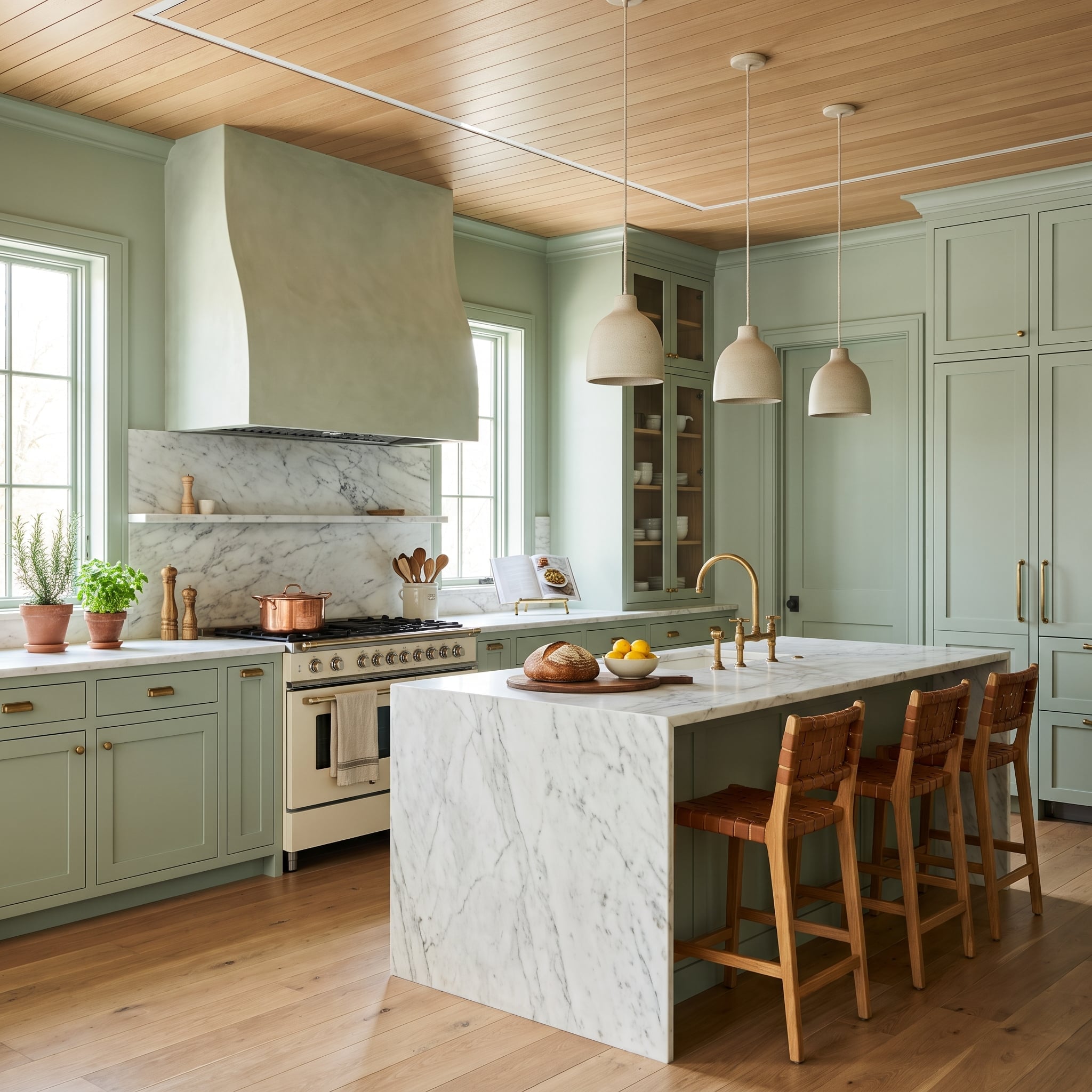
Soft sage cabinetry and adjoining wall surfaces create a muted setting for pale marble countertops. Above, natural oak ceiling planks introduce a warmer, more linear treatment, making the overhead plane a distinct part of the kitchen’s architectural composition.
Woven leather stools and brass hardware echo the oak’s warmth without reproducing its texture. This room’s strongest details come from cabinetry and ceiling finishes rather than traditional casings or crown molding. Their contrast demonstrates how architectural surfaces can be differentiated without relying on white.
17. Steel-Blue Trim Gives a Marble Bathroom a Cooler, Sharper Edge
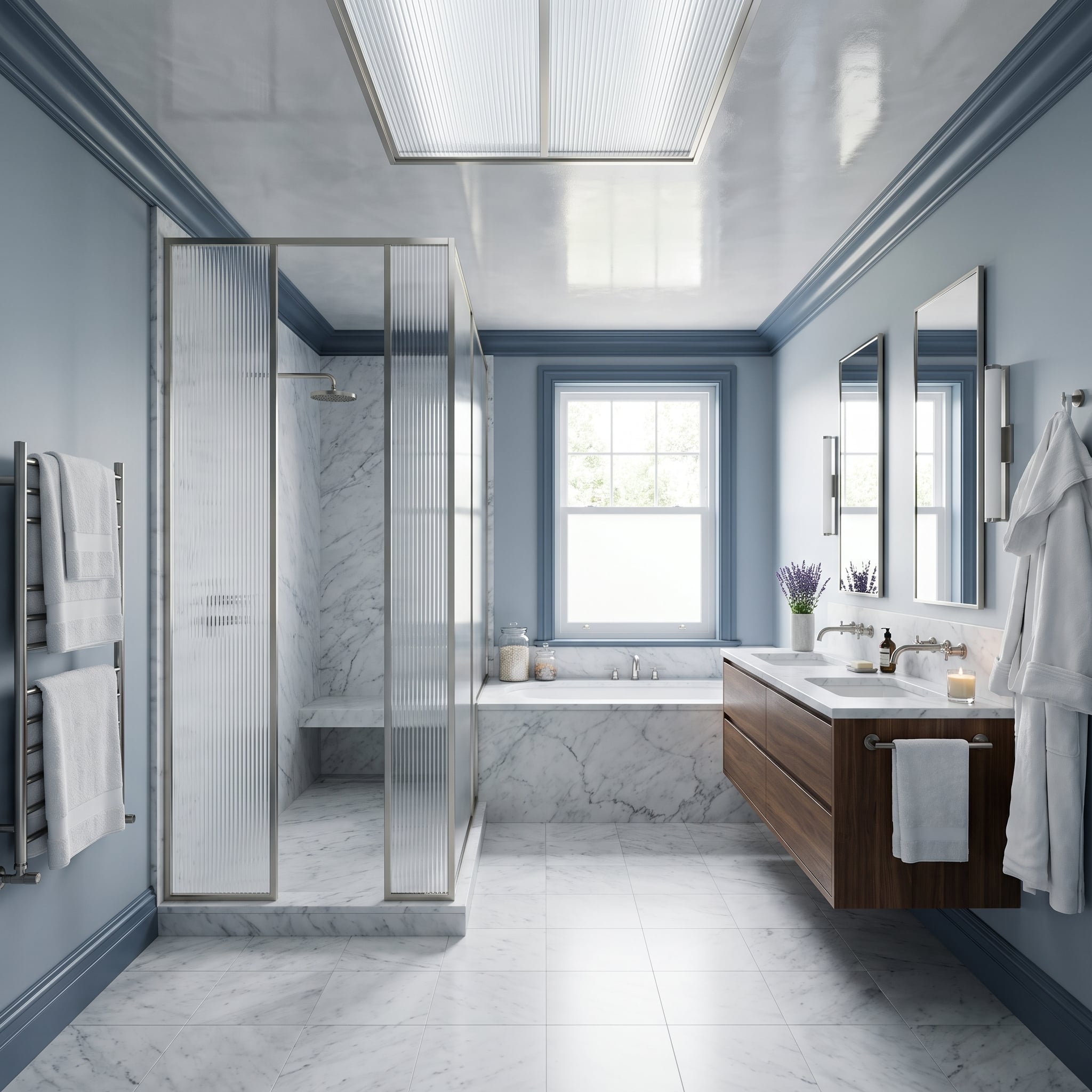
Steel-blue crown molding and baseboards introduce a cool architectural outline around pale marble. The color relates to the stone’s gray veining, while walnut cabinetry prevents the bathroom from becoming overly austere.
Reeded shower glass adds texture without visually closing off the bathing area. Brushed-metal framing, a freestanding tub, and a heated towel rail contribute their own linear details. The blue trim provides a consistent perimeter for a room assembled from several very different materials.
16. Dark Espresso Trim Connects a Living Room’s Windows, Ceiling, and Furniture
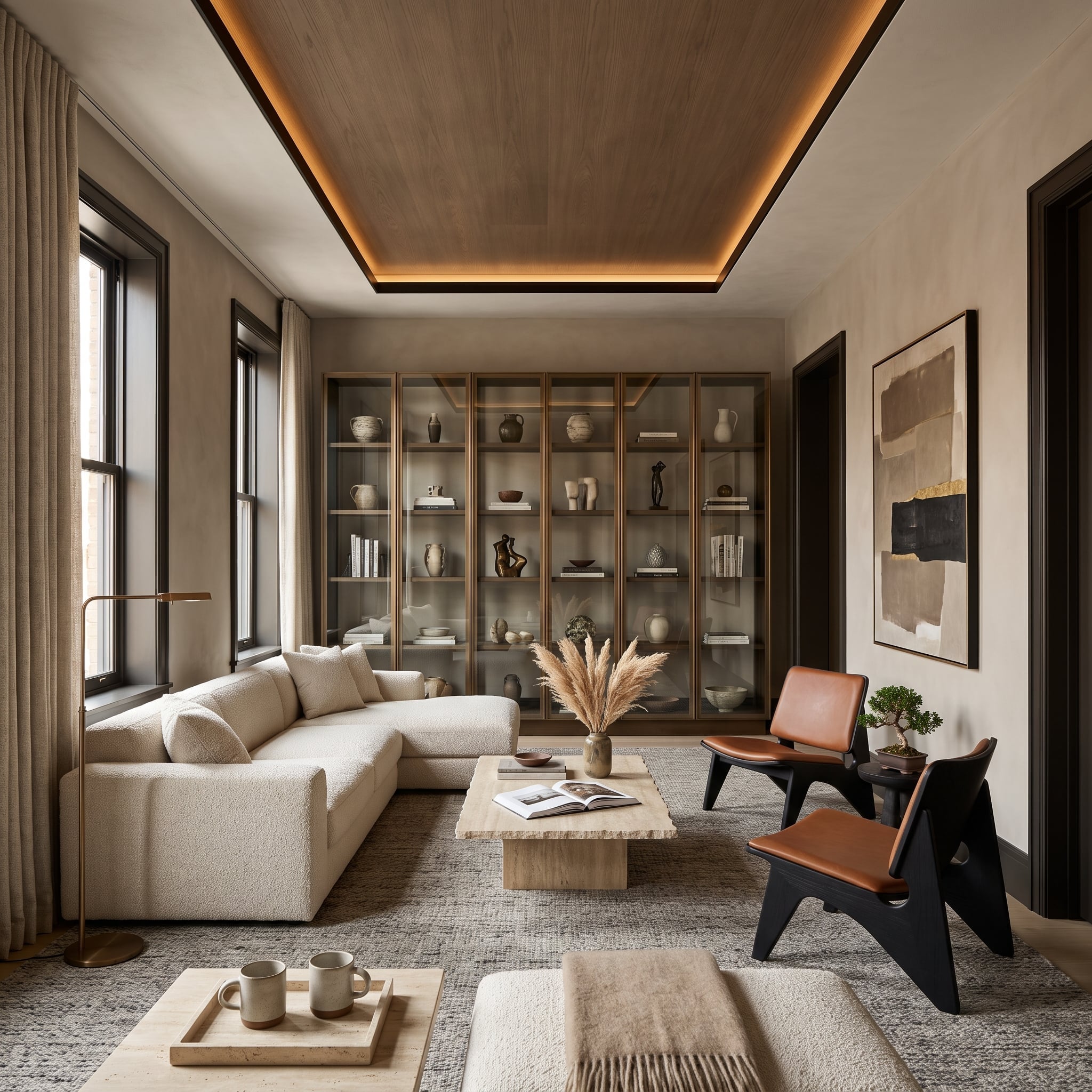
Espresso-stained casings frame the windows and doorways, while a wood ceiling insert carries a related finish overhead. The repeated dark material establishes a connection between the room’s vertical openings and its upper architectural plane.
Cognac leather chairs, a cream bouclé sectional, and a live-edge coffee table balance warm and pale materials. The trim provides definition without introducing an unrelated color. Its role is connective: separate architectural elements become part of one composition through a consistent wood tone.
15. Terracotta Trim Meets a Herringbone Brick Ceiling — and Neither Backs Down
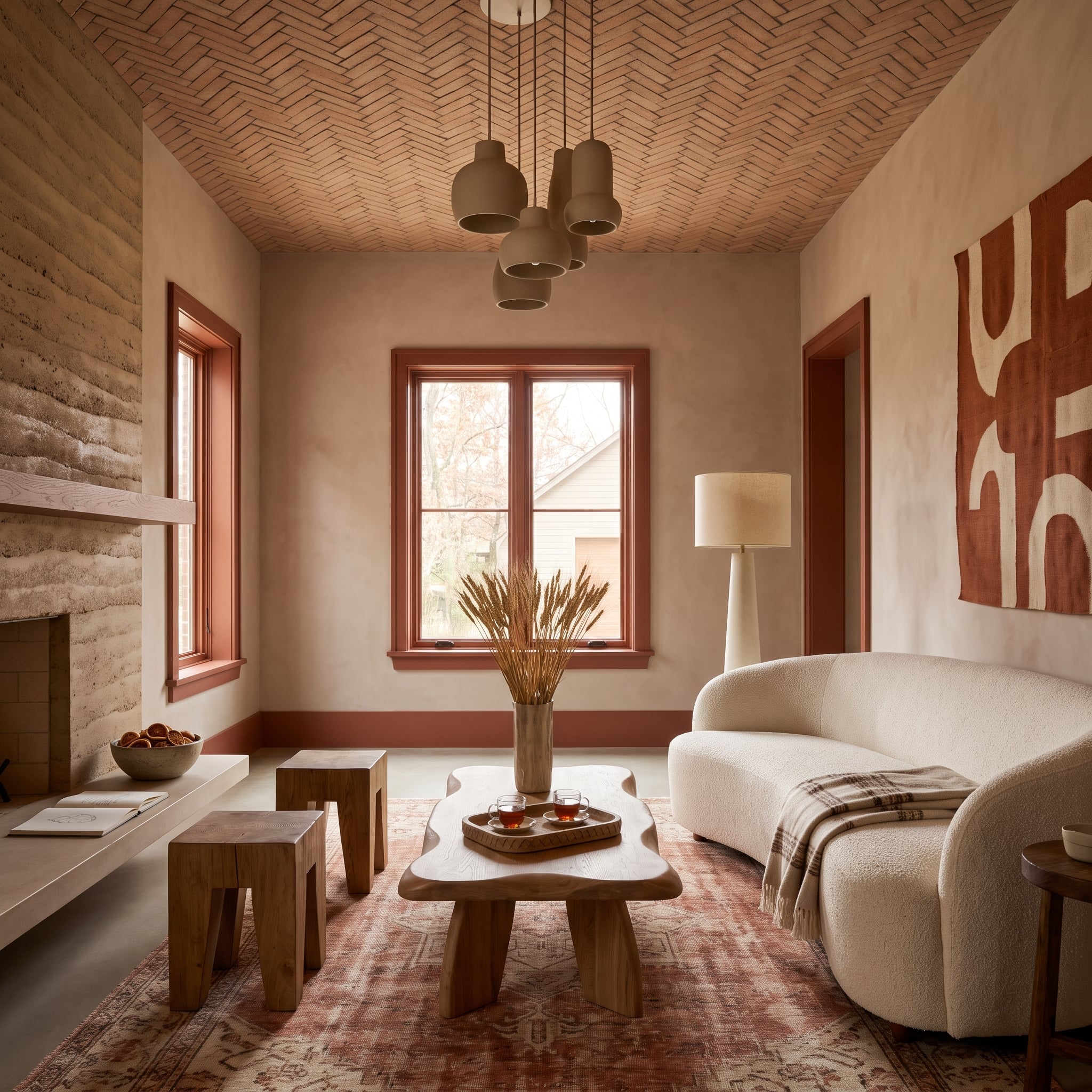
Terracotta-painted window frames and baseboards echo the warmth of a herringbone brick ceiling. The relationship matters because the brick already supplies considerable pattern and texture. Rather than competing with that overhead feature, the painted trim carries its earthy color down the walls.
A cream bouclé sofa offers visual relief, while a sculptural wood table and faded rose rug reinforce the warm material palette. Clay-colored pendants introduce another terracotta note. Related colors expressed through paint, brick, fabric, and wood give the room its layered character.
14. Chocolate Built-Ins Give a Home Office Architectural Weight
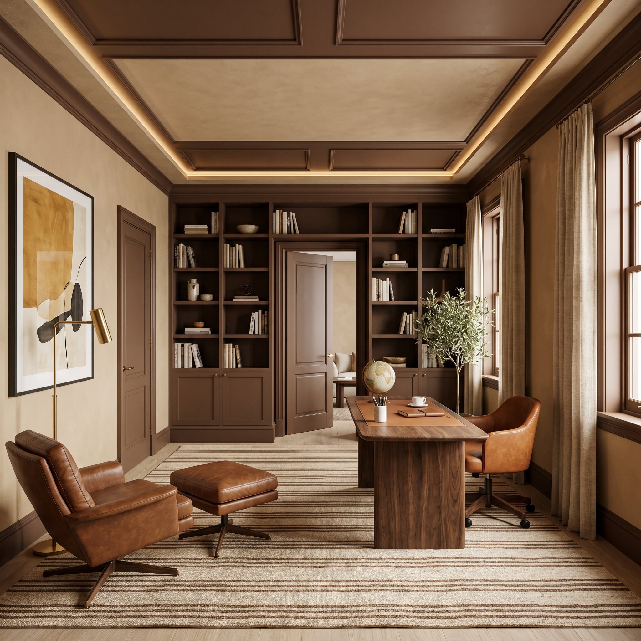
Chocolate-brown built-ins occupy the back wall, while matching door casings, baseboards, and ceiling beams extend the finish across the office. The shelving feels integrated into the architecture rather than installed against an unrelated background.
Cognac leather chairs introduce a lighter brown, and a striped rug carries those tones across the floor. Cove lighting reveals the ceiling’s depth without demanding contrasting paint. The room gains richness from differences among lacquered surfaces, wood, and leather rather than from a large assortment of colors.
13. Forest-Green Trim Turns a Hallway Into a Sequence of Framed Views
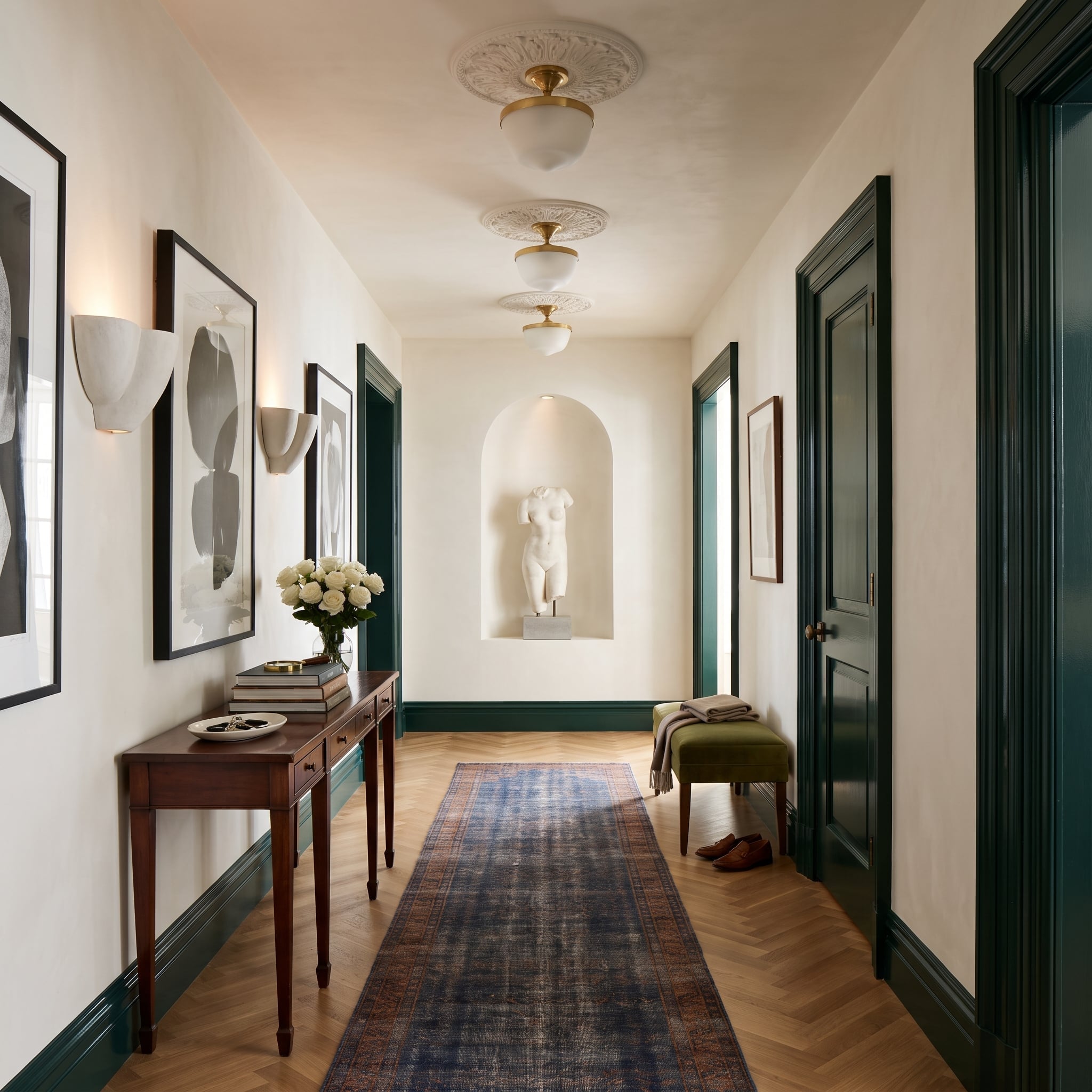
Hunter-green door casings and baseboards create a repeating sequence along a cream-colored corridor. Each opening becomes a distinct frame, while the continuous lower trim leads the eye toward an arched sculpture niche at the far end.
Herringbone oak flooring adds movement beneath the formal wall treatment. The green provides enough contrast to reveal the architecture without the starkness of black. Repetition, which can make a hallway visually monotonous, becomes the source of its rhythm.
12. Beige Walls and Matching Trim Reveal the Quiet Power of Sheen
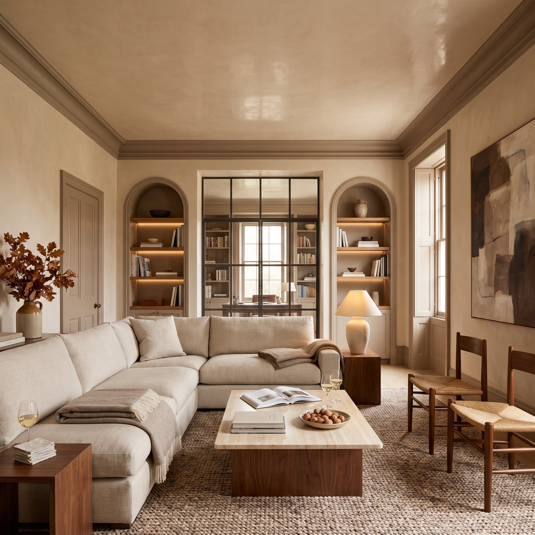
Warm greige covers the walls, crown molding, and door casings, eliminating the usual white interruptions. Arched shelving niches become part of a continuous architectural envelope, while the lacquered ceiling introduces a subtle difference in reflectivity.
An oatmeal sofa, travertine table, and dark walnut chairs provide material contrast. Matching trim doesn’t necessarily conceal molding; under changing light, profiles and surface finishes can become more noticeable. The room demonstrates how sheen and shadow can replace contrasting color as the primary means of definition.
Why It Works: Using the same color on walls and trim with different sheens can create subtle definition. Satin or semi-gloss molding against matte walls catches light differently, revealing architectural profiles without introducing another color.
11. Espresso-Stained Casings Bring Definition to a Pale Stone Bathroom
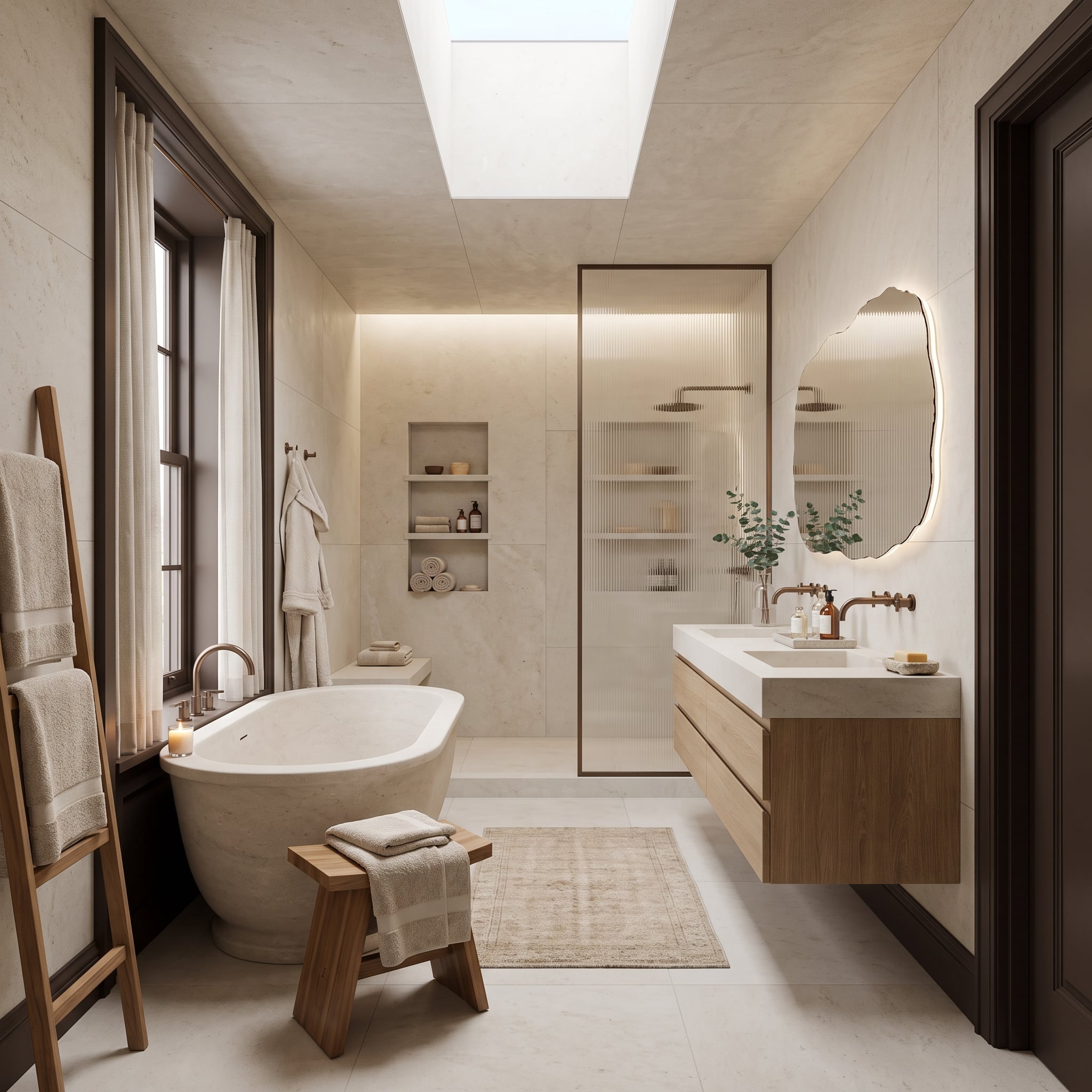
Espresso-stained trim outlines the bathroom’s openings against pale stone surfaces. The dark wood creates a clear boundary, but its warm undertones relate comfortably to the creamy tile. Rather than making the room look colder, the contrast emphasizes the stone’s softness.
A floating vanity repeats the espresso finish, while a backlit, organically shaped mirror introduces a gentler form among the straight architectural lines. Brushed bronze fittings and a freestanding tub complete the palette. Daylight from the skylight keeps the dark casings sharply defined.
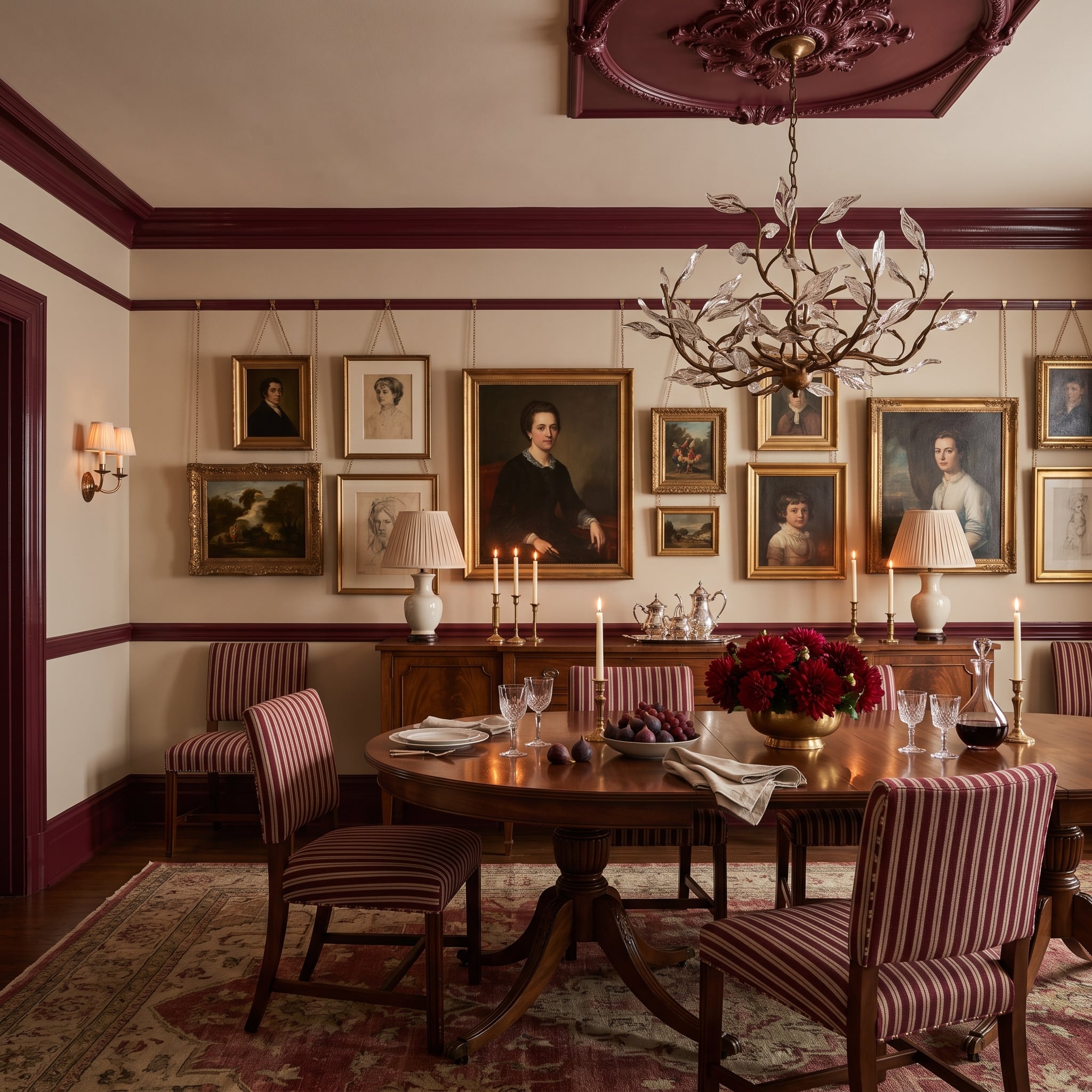
10. Crimson Moldings Give a Gallery Wall a More Sophisticated Frame
🔥 Would you like to save this?
Burgundy moldings, picture rail, and ceiling medallion create a rich architectural setting for a collection of framed artwork. The deeper trim establishes boundaries around the gallery wall without relying on the familiar white outline.
Striped dining chairs repeat the wine-colored tone, while gold frames contribute warmth and variation. The strongest relationship is between the room’s fixed details and its movable furnishings. The architectural color gives the eclectic artwork structure without demanding that every frame match.
Practical Tip: Before repainting existing trim, clean the surface, lightly abrade glossy finishes where appropriate, repair damage, and use a compatible primer when required. Adhesion depends on the previous coating, surface condition, and chosen paint. A small test area is more reliable than assuming any decorative paint will bond successfully.
9. Charcoal Ceiling Lines Give a Neutral Bedroom Architectural Tension
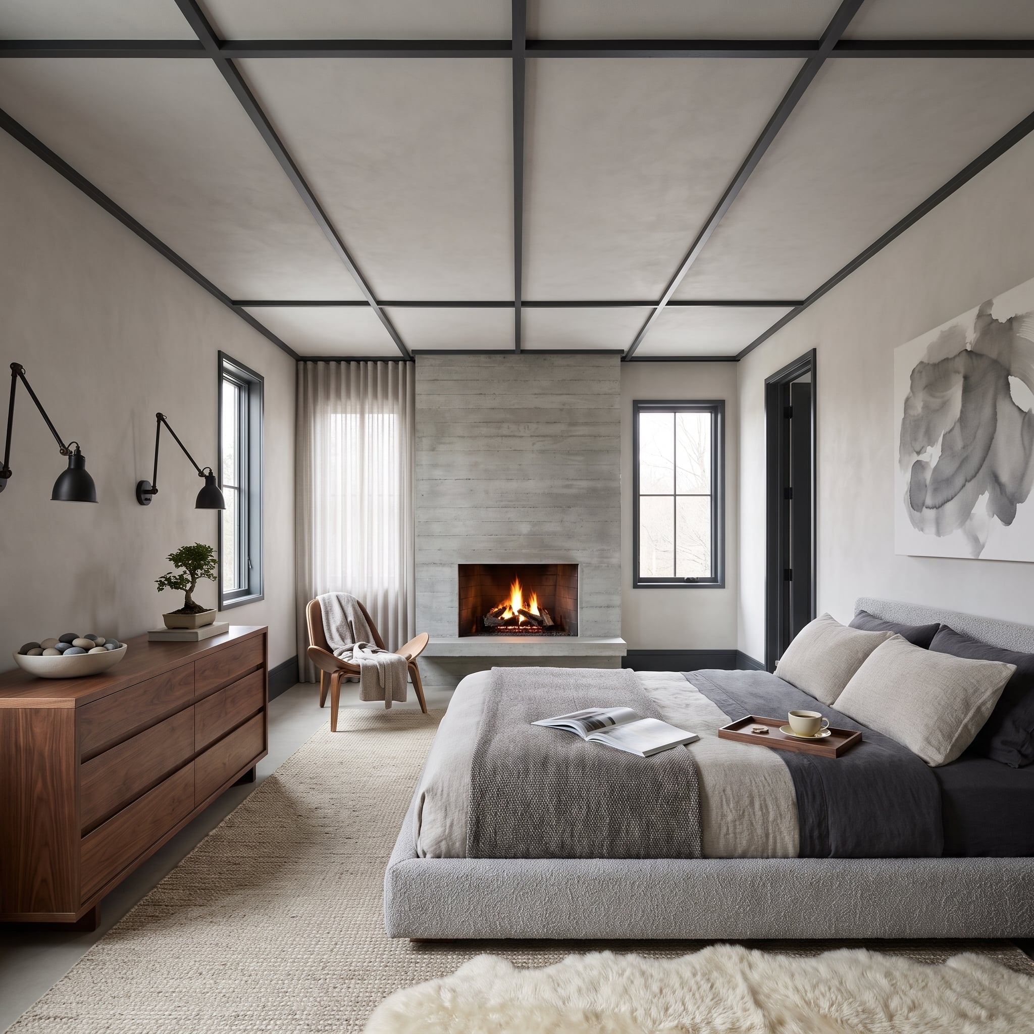
Charcoal ceiling members establish a pronounced grid against pale plaster, while black window casings repeat the linear treatment below. The architecture supplies a graphic counterpoint to the room’s quiet furniture and finishes.
A low platform bed and concrete fireplace surround reinforce the restrained palette. The ceiling framework is more substantial than conventional decorative molding, but its relationship to the window trim demonstrates how repeated dark lines can organize a room vertically as well as horizontally.
8. Dark Walnut Casings Give a Cream Kitchen a Stronger Outline
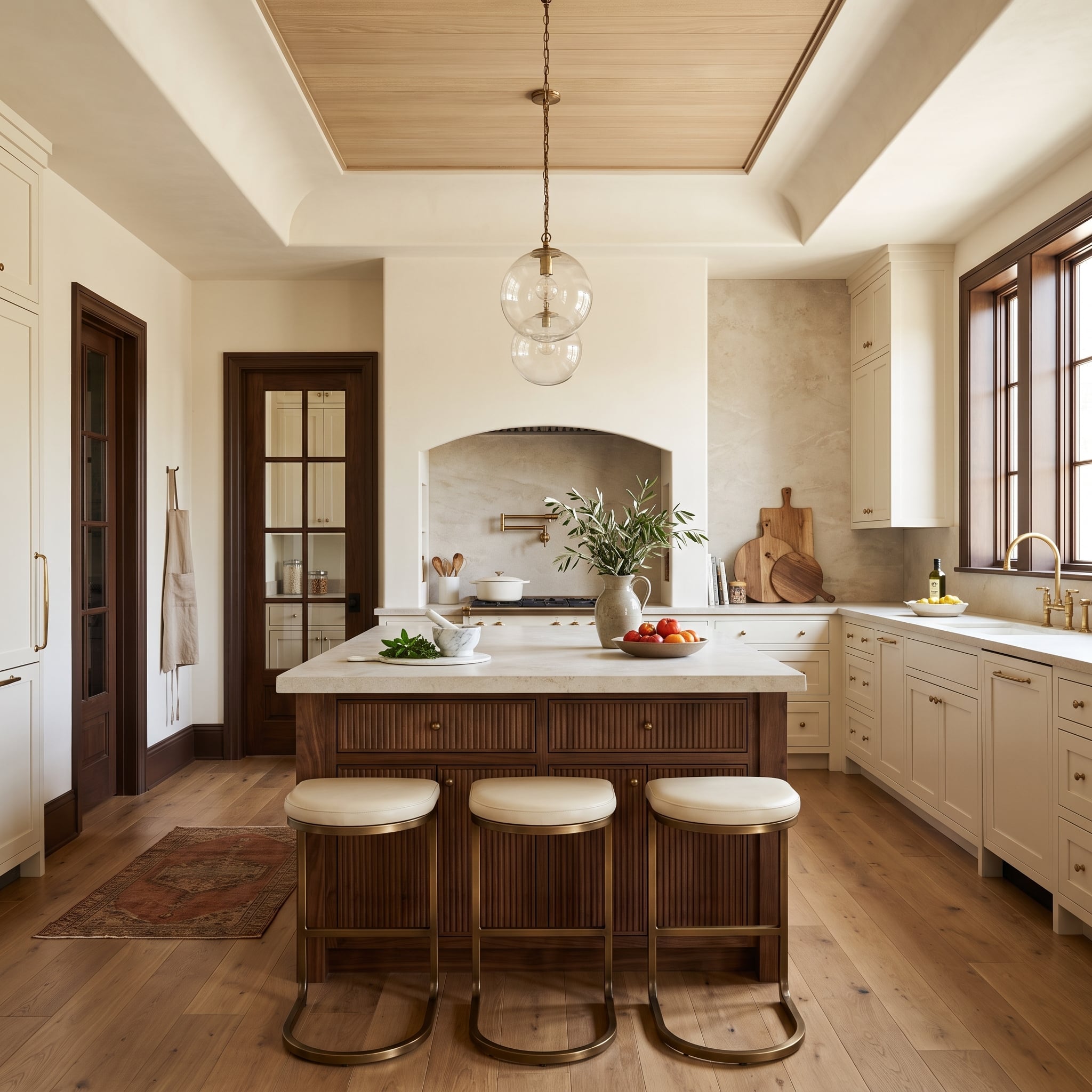
Dark walnut window and door casings give cream cabinetry a clear architectural boundary. The island base repeats the deeper wood tone, drawing that contrast into the center of the kitchen rather than leaving it around the room’s perimeter.
A tray ceiling with a lighter oak inset introduces a second timber finish overhead. Brass hardware and a pendant connect the warm materials without requiring an exact match. The combination is more nuanced than a simple light-versus-dark scheme, allowing different wood tones to perform distinct architectural roles.
7. Chocolate Lacquer Turns a Dining Room Ceiling Into a Reflective Surface
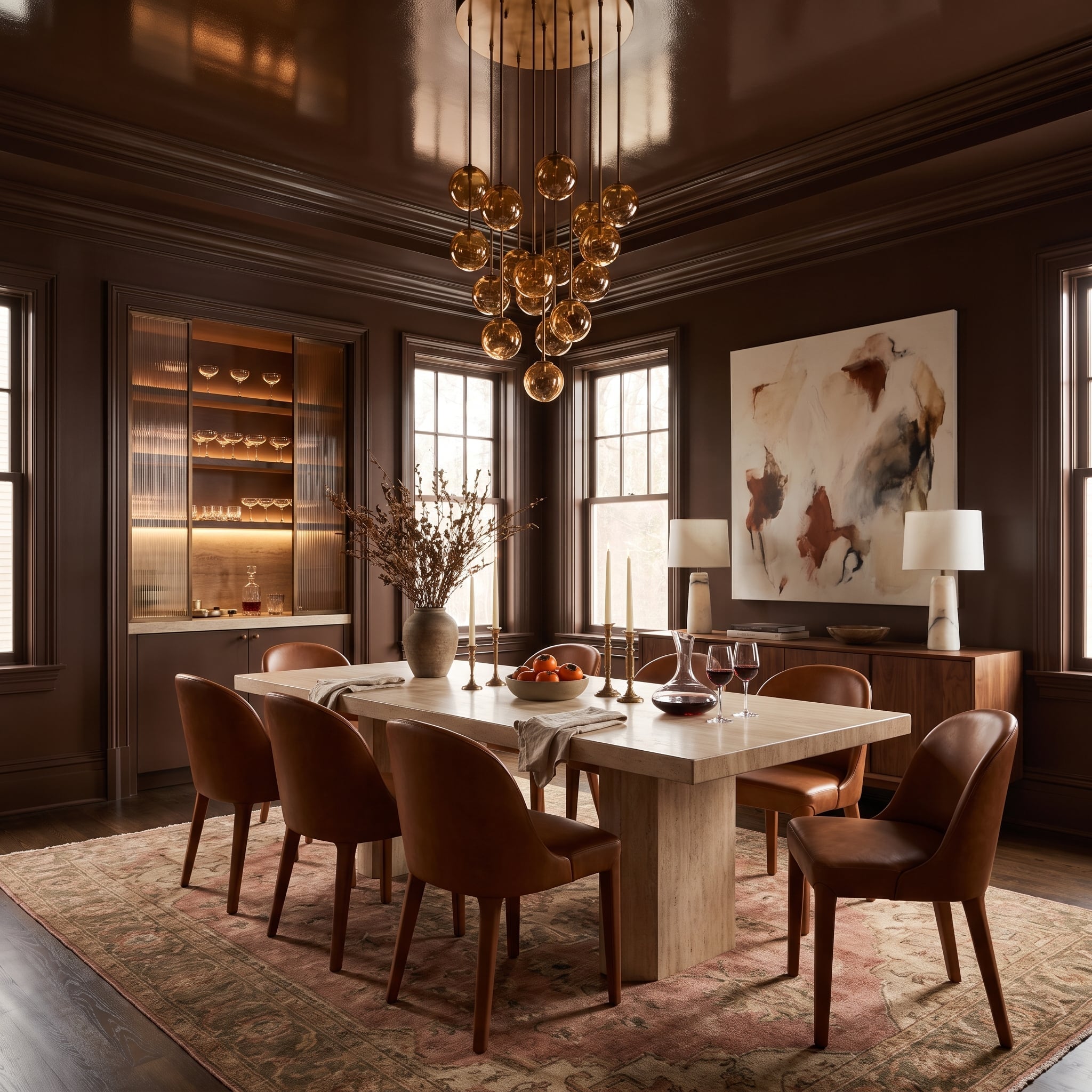
Deep chocolate paint covers the walls, window casings, and crown molding, while a high-gloss ceiling reflects light from clustered globe pendants. The ceiling becomes visually distinct through sheen rather than color, bringing movement to an otherwise enveloping brown interior.
A pale travertine dining table provides a substantial interruption to the dark surfaces. Cognac leather chairs contribute warmth, and a ribbed-glass bar cabinet adds another reflective texture. The room’s richness comes from the interplay of lacquer, stone, leather, and light rather than contrasting painted moldings.
6. Sage Molding Climbs Onto the Ceiling and Changes the Bedroom’s Proportions
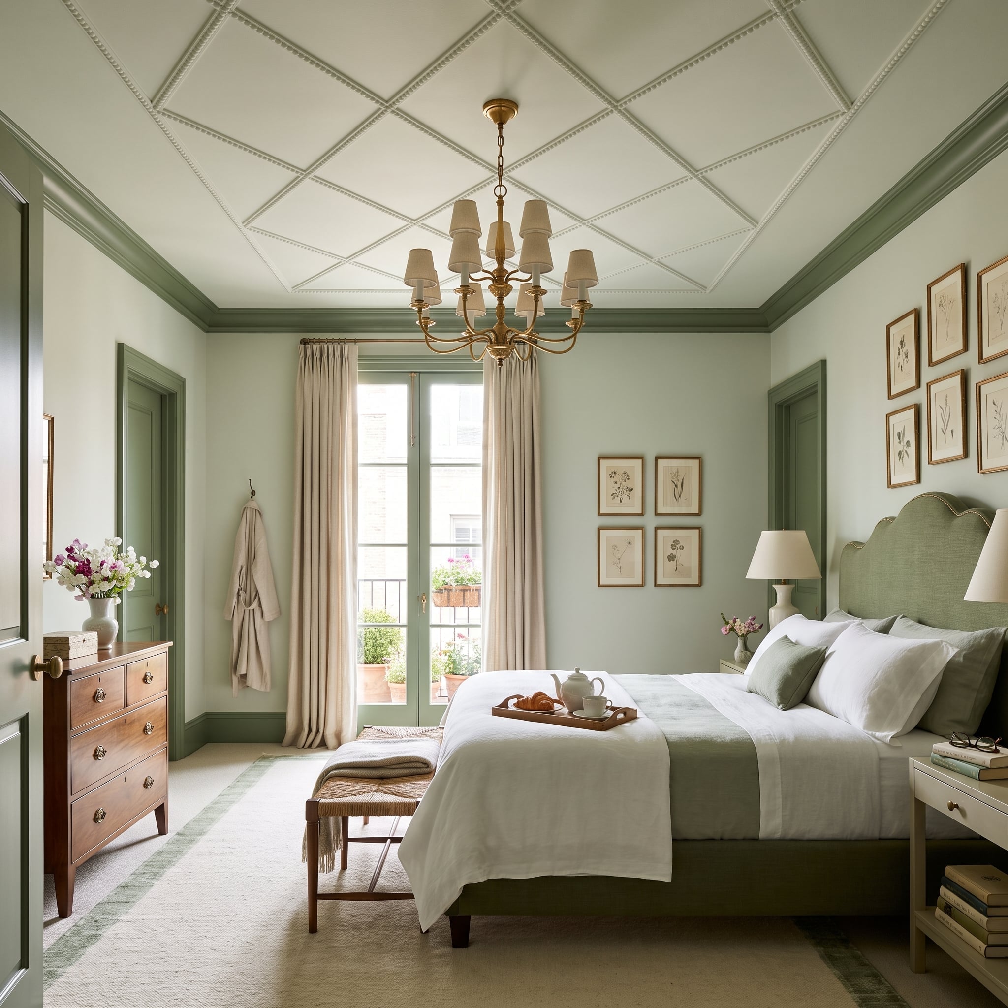
Sage-green trim begins at the baseboards and door casings, then continues around the ceiling coffers. Pale overhead panels remain visible between the colored borders, producing a rhythm that makes the ceiling feel more deliberately composed. What might otherwise be an unremarkable upper surface becomes an essential part of the room.
The upholstered headboard repeats the muted green, while botanical prints, brass accents, and neutral bedding keep the palette relaxed. The shade itself is restrained. Its movement across the architecture provides the interest.
5. Navy Color Drenching Gives a Home Office the Gravity of a Library
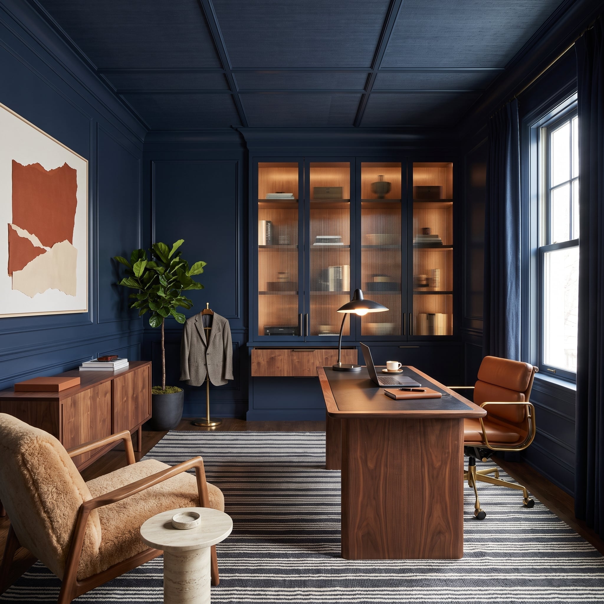
Navy extends across the office walls, trim, and ceiling coffers, creating a continuous dark setting. The ceiling’s divisions remain visible through their depth, while the saturated finish provides a rich background for the furniture and illuminated cabinetry.
Walnut, cognac leather, and warm cabinet lighting introduce amber tones against the blue. A striped rug contributes movement at floor level. Rather than using white molding to emphasize the coffers, the design relies on their physical depth and the way light catches their edges.
4. Olive-Green Millwork Gives a Mudroom More Than Utility
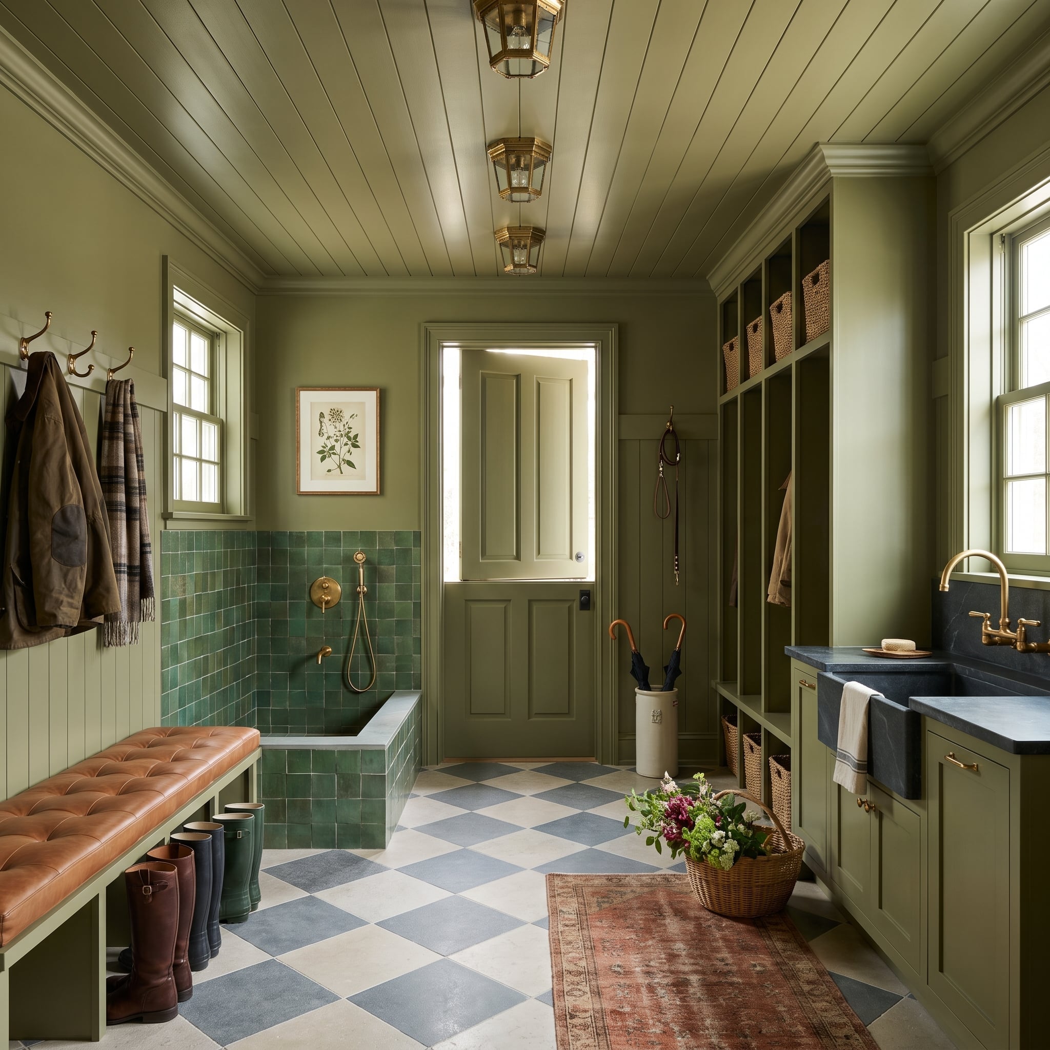
Olive-green paint extends across cabinetry, wall trim, window casings, and the shiplap ceiling. The continuous finish gives this practical room a unified architectural character, while the ceiling boards introduce a narrow linear texture that distinguishes the overhead surface.
A tiled dog-wash station, wicker baskets, leather bench, and checkerboard floor break up the green through changes in material. Brass lanterns bring warmth to the ceiling. The room’s utility remains obvious, but the coordinated millwork gives it considerably more presence than a conventional storage area.
Design Consideration: Coordinating trim, cabinetry, and ceilings in one color does not mean using the same paint formulation everywhere. Cabinet doors, woodwork, and moisture-prone areas may require different products or finishes to withstand regular cleaning and wear.
3. Forest Green From Baseboard to Coffered Ceiling Makes the Architecture the Main Event
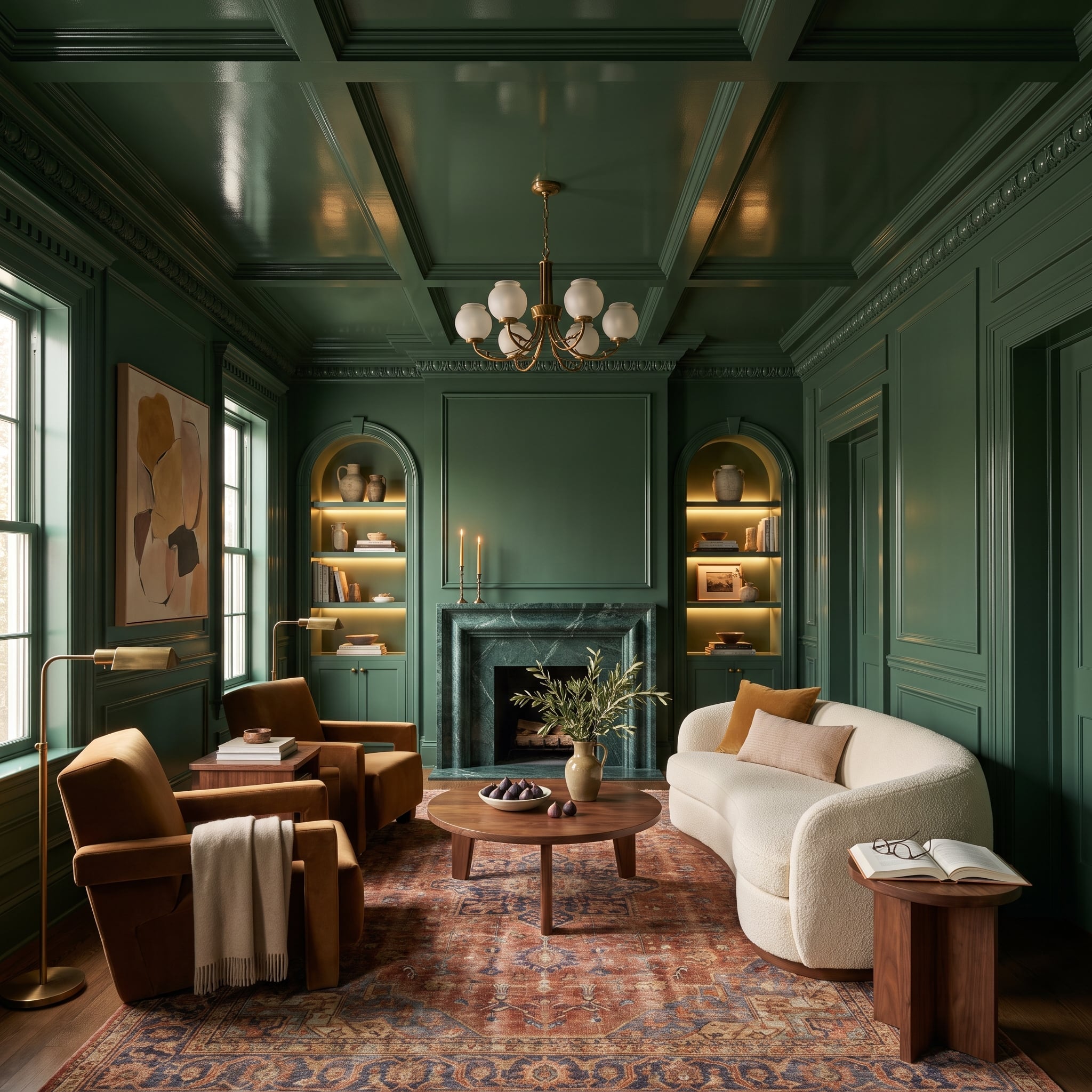
Forest green covers the paneled walls, door casings, window surrounds, crown molding, and elaborate coffered ceiling. The uninterrupted color produces an enveloping interior, but the abundance of architectural relief keeps the dark finish from becoming flat. Moldings cast their own shadows, allowing carved details to remain legible without white outlines.
The green marble fireplace belongs to the same tonal family, while a curved cream bouclé sofa and cognac velvet armchairs introduce softness and warmth. Brass lighting and illuminated arched alcoves provide highlights. The architecture is no longer merely the setting for the furniture; its carved and paneled surfaces are among the room’s most prominent decorative features.
2. Mauve Bookcases Disappear Into the Walls — but Their Profiles Don’t
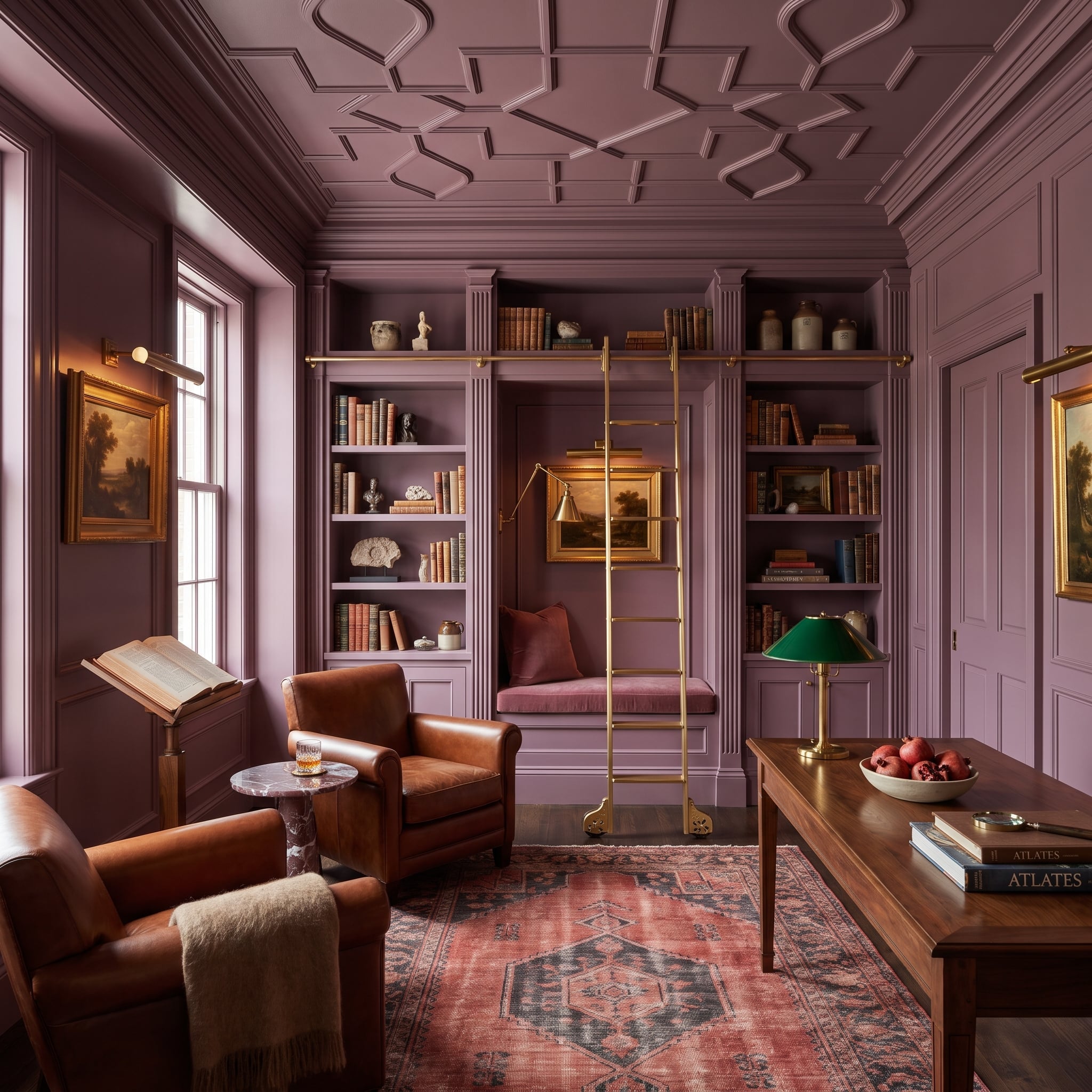
Dusty mauve extends from the walls to the trim, ceiling, and built-in bookshelves. The bookcase profiles remain visible through shadow, while the matching finish prevents the storage from appearing separate from the surrounding architecture.
A brass rolling-ladder rail cuts a bright horizontal line across the shelving. A green-shaded banker’s lamp introduces a contrasting accent, and walnut furniture provides a deeper material note. The room’s sense of enclosure comes from color continuity, but its visual interest depends on the shelves, rails, and architectural relief.
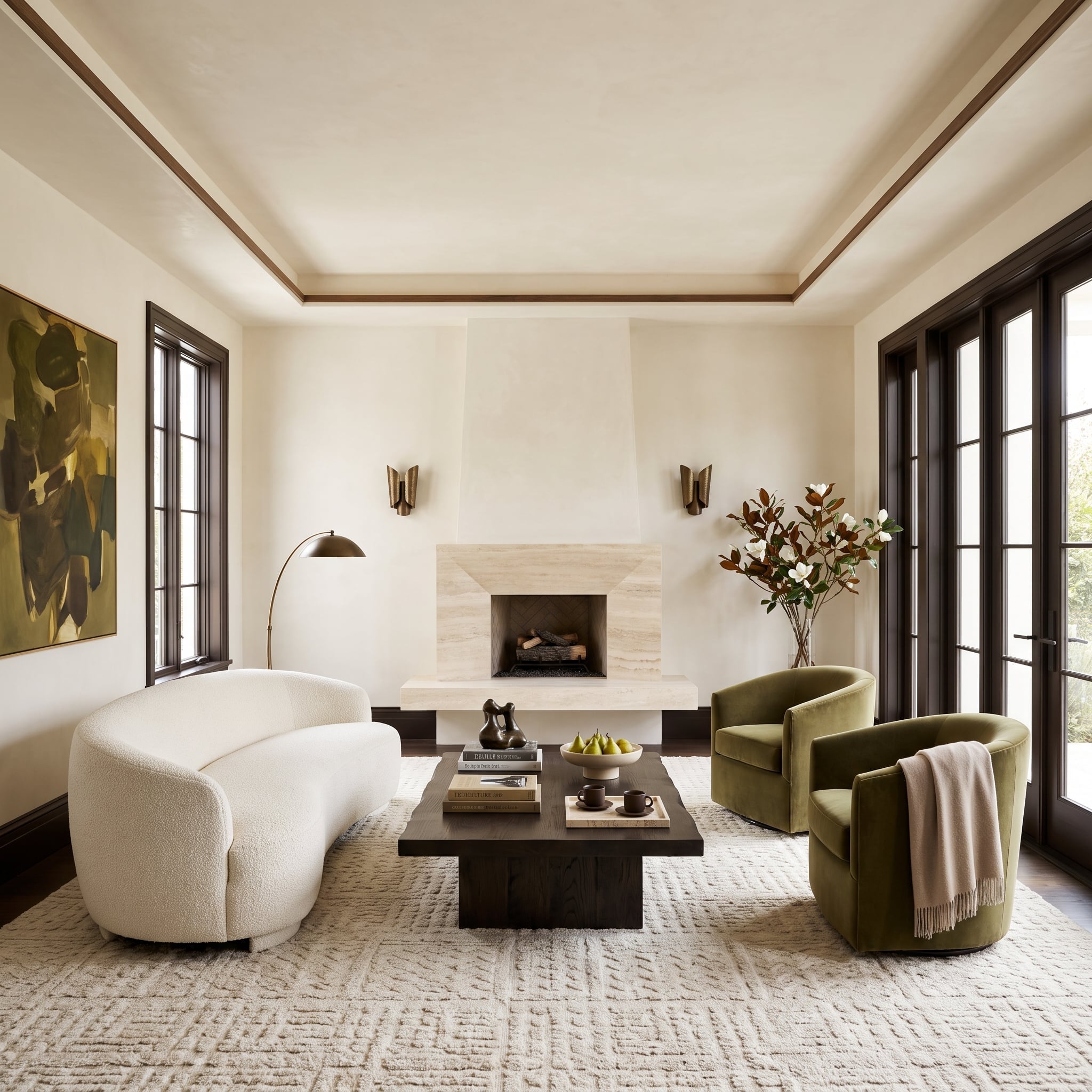
1. Dark Wood Casings Give a Travertine Fireplace a Stronger Architectural Setting
🔥 Would you like to save this?
Espresso-colored window and door casings frame the pale walls of this living room, giving the travertine fireplace a stronger architectural setting. The dark wood establishes clear boundaries around the space, while the stone’s natural variation supplies texture at its center.
A curved bouclé sofa and olive velvet swivel chairs soften the geometry. Their upholstery contrasts with the more rigid casings, while the rug brings the materials together without repeating the dark wood finish. The trim remains a supporting architectural element, but the room’s balance would be noticeably different without its strong outline.