🔥 Would you like to save this?
Accent walls have been pronounced dead so many times they ought to have their own cemetery. Somewhere between the chocolate-brown living rooms of the 1970s and the obligatory teal wall of the early 2000s, a perfectly good design idea acquired a terrible reputation. One wall painted a different color became shorthand for a room that had run out of ideas. The trouble wasn’t the accent wall. It was what people were asking it to do.
In order to come up with the very specific design ideas, we create most designs with the assistance of state-of-the-art AI interior design software. Also, assume links that take you off the site are affiliate links such as links to Amazon. this means we may earn a commission if you buy something.
Now consider a dining room with an entire wall of bookmatched marble, a bedroom framed by sculptural plaster, or a living room where dark timber conceals a fully stocked bar. These aren’t ordinary rooms rescued by a last-minute splash of color. They’re carefully composed interiors in which one surface takes command, sometimes through color, sometimes through texture, and occasionally through an architectural surprise that changes the room altogether.
The most interesting accent walls don’t merely provide contrast. They change how furniture sits in a room, how daylight behaves, where the eye settles, and which materials suddenly make sense together. A pale oak wall can have more authority than burgundy paint. A rough limestone fireplace can make a spacious living room feel intimate. A strip of fluted plaster can turn afternoon sunlight into part of the decoration.
These 33 rooms make the case in dramatically different ways. Some are extravagant, some barely raise their voices, and a few challenge the very definition of an accent wall. What matters is the relationship between the wall and everything around it. Get that right, and the rest of the room has a remarkably good chance of falling into place.
33. Chinoiserie Wallpaper Gives This Dining Room a Garden of Its Own
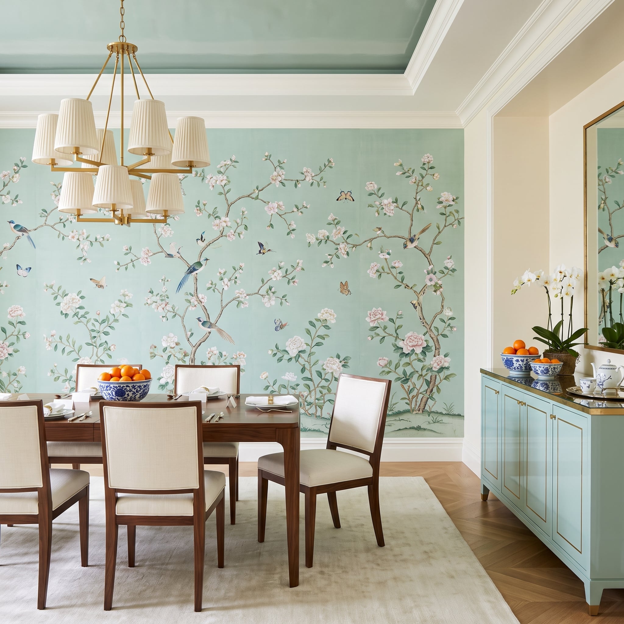
A garden has taken possession of the dining room’s back wall, and the furniture seems perfectly content with the arrangement. Sage-green chinoiserie wallpaper carries birds and flowering branches across the surface, introducing a delicacy of line that contrasts with the substantial walnut dining table and chairs.
The cream upholstered seats lighten the composition, while a brass chandelier with pleated linen shades introduces another layer of refinement without repeating the wallpaper’s elaborate pattern. The restraint elsewhere is essential. A second patterned surface or an aggressively ornate dining set would turn this botanical scene into visual competition. Instead, the wall supplies the decoration and the furniture supplies the architecture.
32. A Charcoal Fireplace Wall Gives This Living Room a Darker Center of Gravity
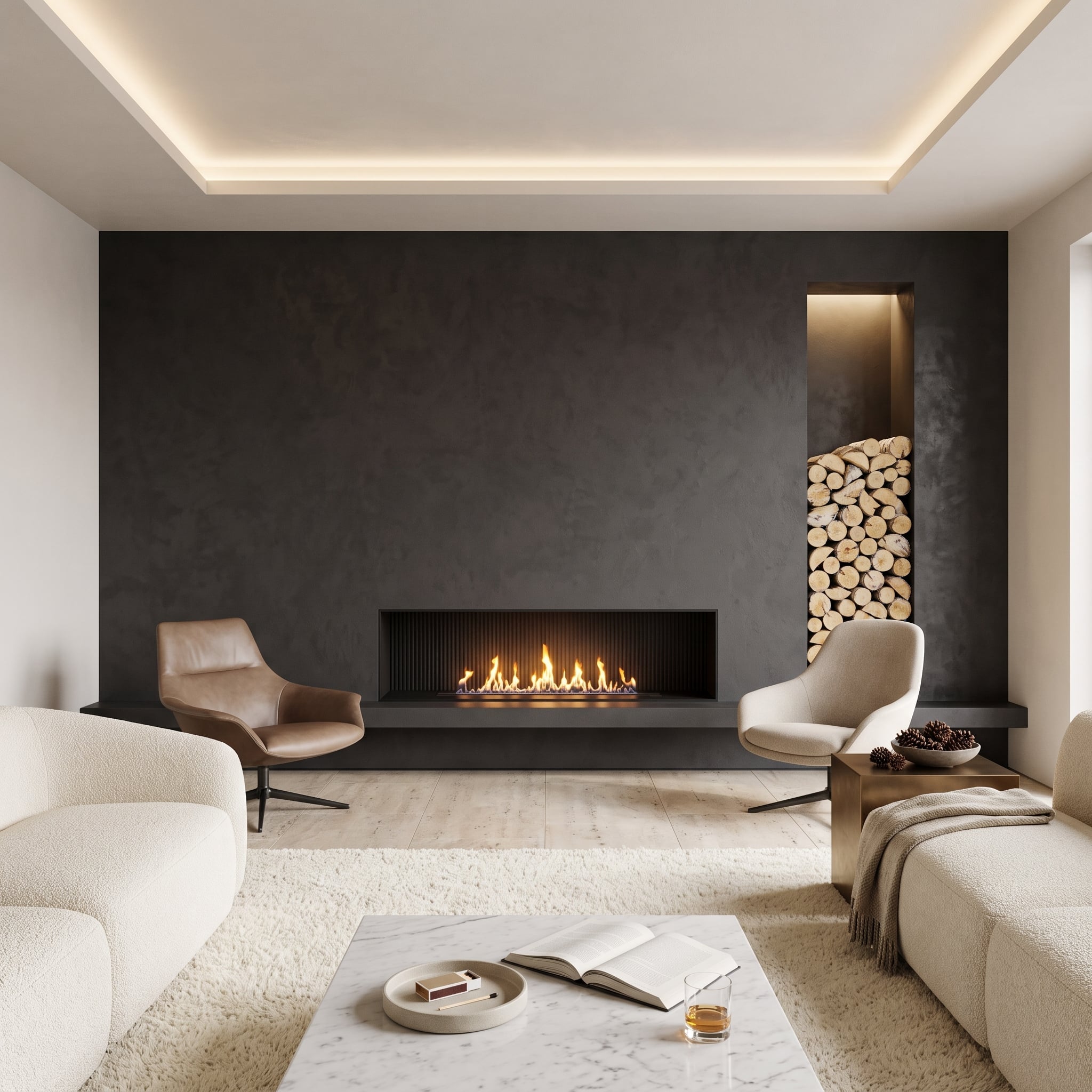
Charcoal plaster rises from floor to ceiling around a linear gas fireplace, giving this living room a strong architectural center. The surface has enough variation to keep the dark color from appearing flat, while concealed lighting above introduces a warmer note at the ceiling.
A recessed wood-storage niche on the right breaks the broad expanse of charcoal with stacked logs and amber illumination. Across the room, cognac leather and cream bouclé chairs provide two very different textures, both more inviting against the dark background. Light oak flooring, a marble-topped coffee table, and a layered rug keep the room from becoming visually top-heavy.
The fireplace, recess, and lighting operate as one composition. That integration makes the wall more convincing than a dark painted surface with an unrelated fireplace placed in front of it.
31. Terracotta Turns a Small Breakfast Nook Into the Warmest Corner of the House
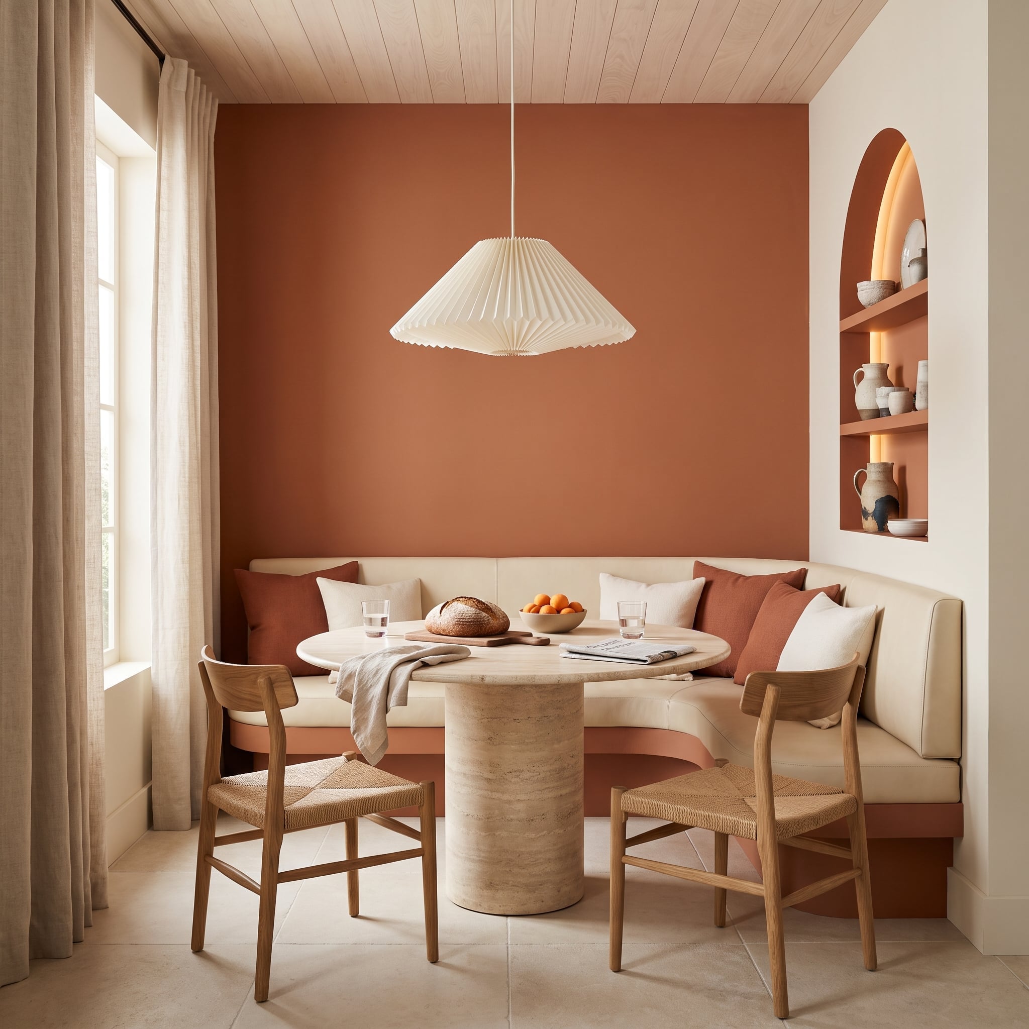
Burnt sienna is doing something more interesting here than simply making the breakfast nook colorful. The saturated wall gives the curved cream leather banquette a distinct outline, while rust-colored pillows repeat the wall’s warmth on a smaller scale.
A travertine pedestal table introduces a pale mineral surface, and woven-rush chairs contribute a looser, more tactile texture. Above, a pleated paper pendant keeps the lighting soft rather than architectural. The arched niche in the adjoining wall provides a second focal point, its softly illuminated ceramics connecting the two surfaces without duplicating the main color treatment.
The combination works because the terracotta has several companions, but none tries to match it exactly. Stone, leather, woven fiber, and plaster give this compact room a surprising amount of depth, with each material bringing its own character to the warm palette.
30. Walnut Slats Bring Architectural Precision to a Bedroom That Could Have Been Ordinary
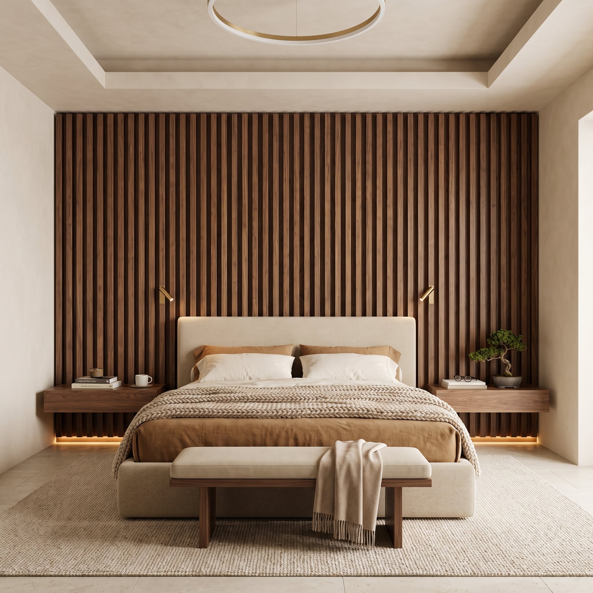
The vertical walnut slats behind this bed create a rhythm of narrow highlights and shadow lines that changes as the room’s lighting changes. Their repetition gives the wall a tailored quality, quite different from the broad, continuous grain of conventional wood paneling.
Floating walnut nightstands are integrated into the composition, with concealed lighting beneath them adding a low amber glow. Brass pivot sconces provide practical reading light, while the cream upholstered headboard interrupts the dark wood with a softer, broader shape.
The construction is unusually disciplined. Even the nightstands appear to belong to the wall rather than having been selected afterward. A knit throw and a small bonsai introduce enough irregular texture to prevent all those precisely spaced slats from making the bedroom feel overly controlled.
29. Calacatta Viola Marble Makes This Dining Wall Almost Impossible to Ignore
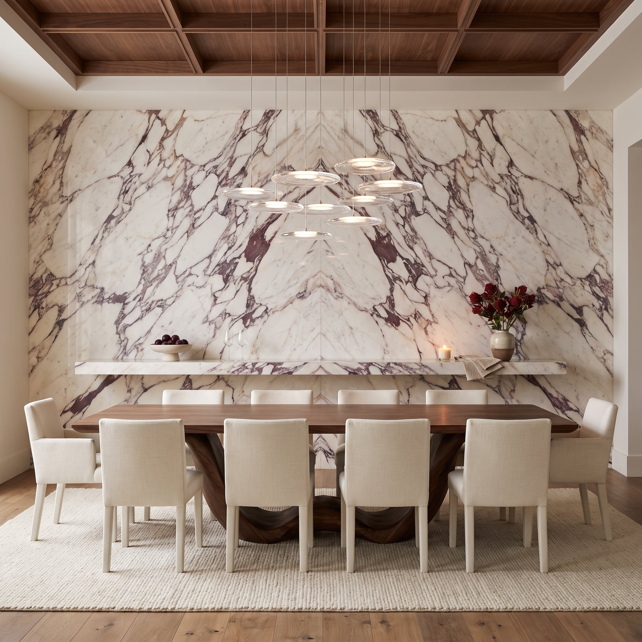
There are accent walls, and then there are entire geological events. Calacatta Viola marble covers this dining room’s feature wall from floor to ceiling, its burgundy veining spreading across an ivory background in a dramatic mirrored arrangement. The central seam becomes the axis of the composition, with the stone’s branching veins spreading outward in opposing directions.
The bookmatching is the crucial decision. Carefully selected adjoining slabs create a near-symmetrical pattern without sacrificing the irregularity that makes natural stone compelling. A long projecting marble shelf crosses the lower portion of the wall, introducing a strong horizontal line beneath the restless veining. Its substantial span would require carefully concealed structural support in a real installation.
The walnut dining table and deeply coffered ceiling introduce a warmer, more disciplined geometry. Between them, a cluster of suspended circular pendants brings a delicate metallic counterpoint to the enormous stone surface. Cream upholstered chairs provide visual relief, allowing the marble to remain the unmistakable centerpiece.
Artwork would interrupt the veining, and elaborate wall fixtures could compete with the natural pattern. Here, the stone provides the spectacle. Everything else has been chosen to give that spectacle room.
Material Detail: Bookmatching uses adjacent stone slabs arranged so their veining forms a mirrored pattern. The result depends on careful slab selection, layout, and fabrication. Large-format marble cladding also requires appropriate structural support and installation detailing. Before ordering, inspect the proposed slab arrangement as a whole rather than judging each piece individually.
28. Olive Green and Walnut Give This Home Office Some Serious Character
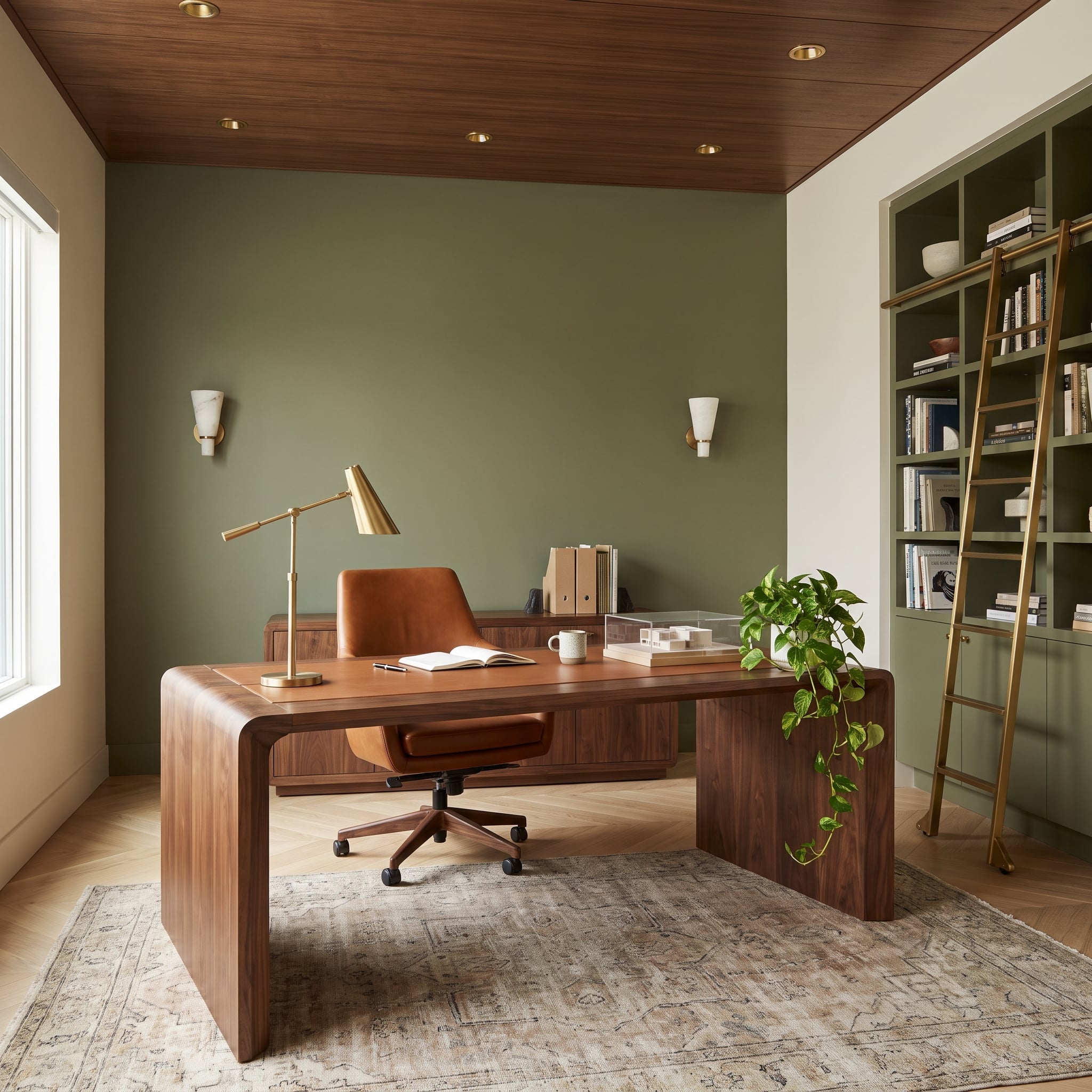
Not every compelling accent wall needs an exotic finish. Muted olive paint gives this home office its color identity, setting off the walnut desk, cognac leather chair, and brass task lamp with a depth that feels considered rather than theatrical.
The wood-paneled ceiling reinforces the room’s warm palette, while olive-finished built-in shelving along the side extends the color into the millwork. A brass rolling ladder adds a distinctive functional detail, breaking up the shelving with a slim metallic line.
This is a useful example of an accent color working beyond a single flat rectangle. The principal green wall establishes the tone, but the adjoining cabinetry makes the scheme feel integrated with the room’s architecture. The wood and brass prevent the result from becoming a monotonous field of olive.
27. Terracotta Brick Tile Gives This Bedroom an Earthy Architectural Warmth
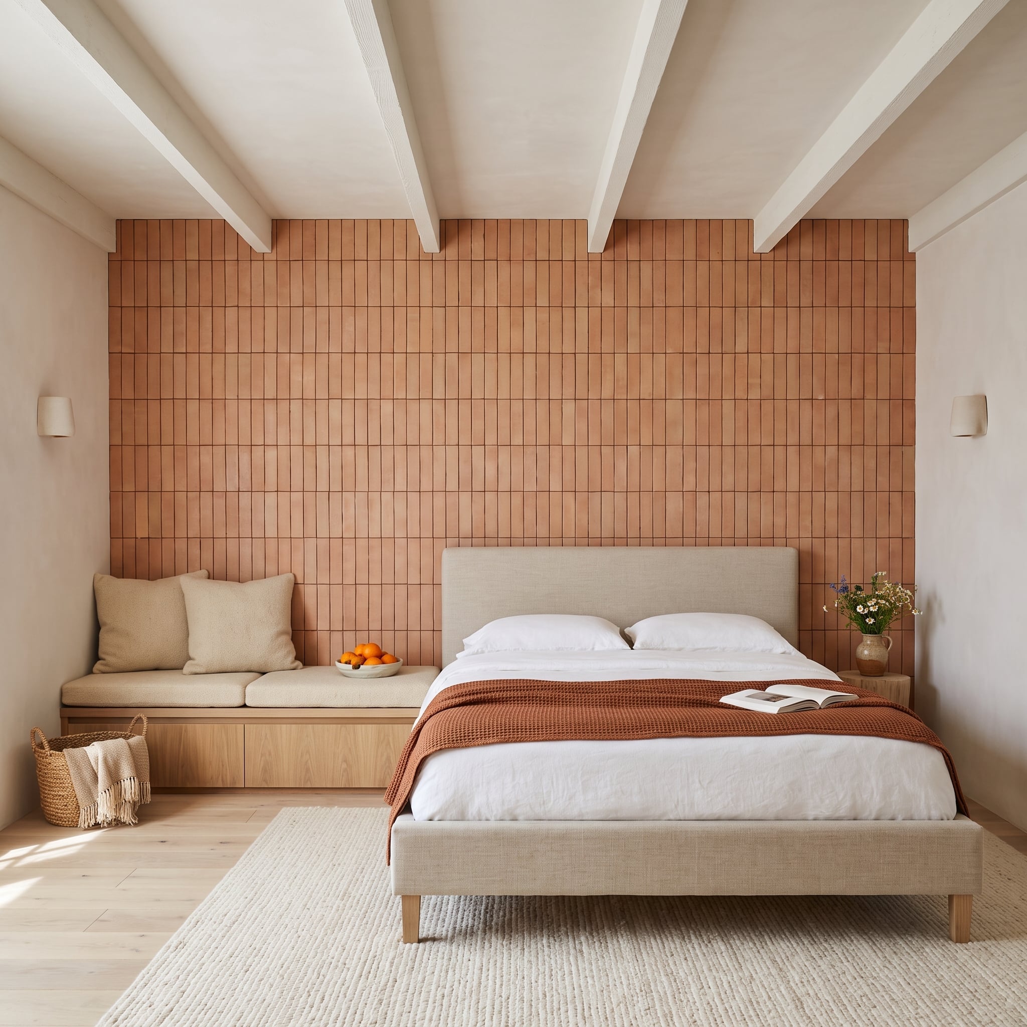
Terracotta brick tile rises in a vertical stacked pattern behind the upholstered bed, bringing the earthy warmth of fired clay into a bedroom otherwise dominated by linen, pale wood, and white bedding.
The orientation is worth noticing. Rather than using a conventional horizontal brick bond, the vertical arrangement emphasizes height and establishes a visual connection with the exposed ceiling beams. The tile’s small variations in tone keep the broad wall from looking manufactured or monotonous.
An oak storage bench adds another practical element on the left, while the rust-colored waffle-knit throw repeats the wall’s palette without trying to match its surface. The contrast between rough tile and soft upholstery is the real attraction. One material has a rugged, permanent quality; the other makes the room comfortable enough to sleep in.
26. Chocolate Lacquer Turns a Dining Room Into an Exercise in Reflected Light
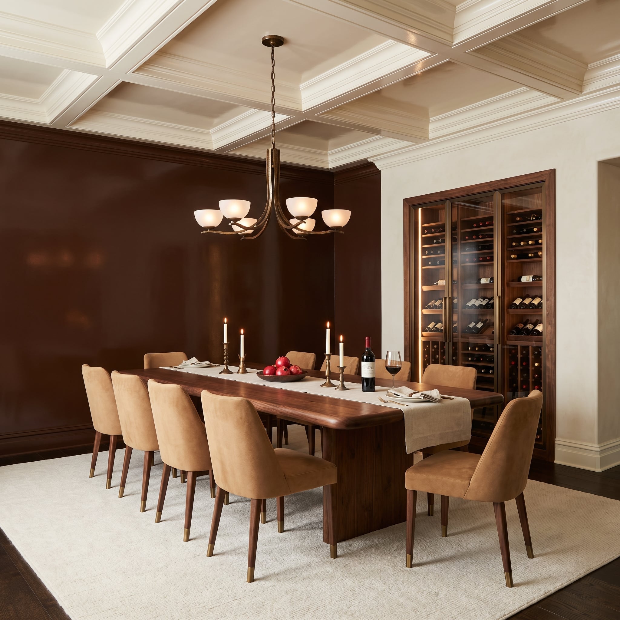
Chocolate-brown lacquer has an entirely different personality from matte brown paint. Its glossy surface catches highlights from the room’s lighting, giving the wall a shifting appearance as the viewing angle changes.
A live-edge walnut table introduces natural irregularity against that polished backdrop, while caramel suede chairs bring a softer finish into the composition. Above, the cream coffered ceiling provides a welcome visual release from the deep brown surfaces.
The built-in wine cabinet occupies the adjoining wall, framed in walnut and glass. Its cabinetry belongs to the same material family as the dining table, making the room feel coordinated without repeating every finish. The contrast between reflective lacquer, natural wood grain, and suede is what gives this scheme its sophistication.
25. Misty Mountains Turn a Neutral Living Room Into a Landscape
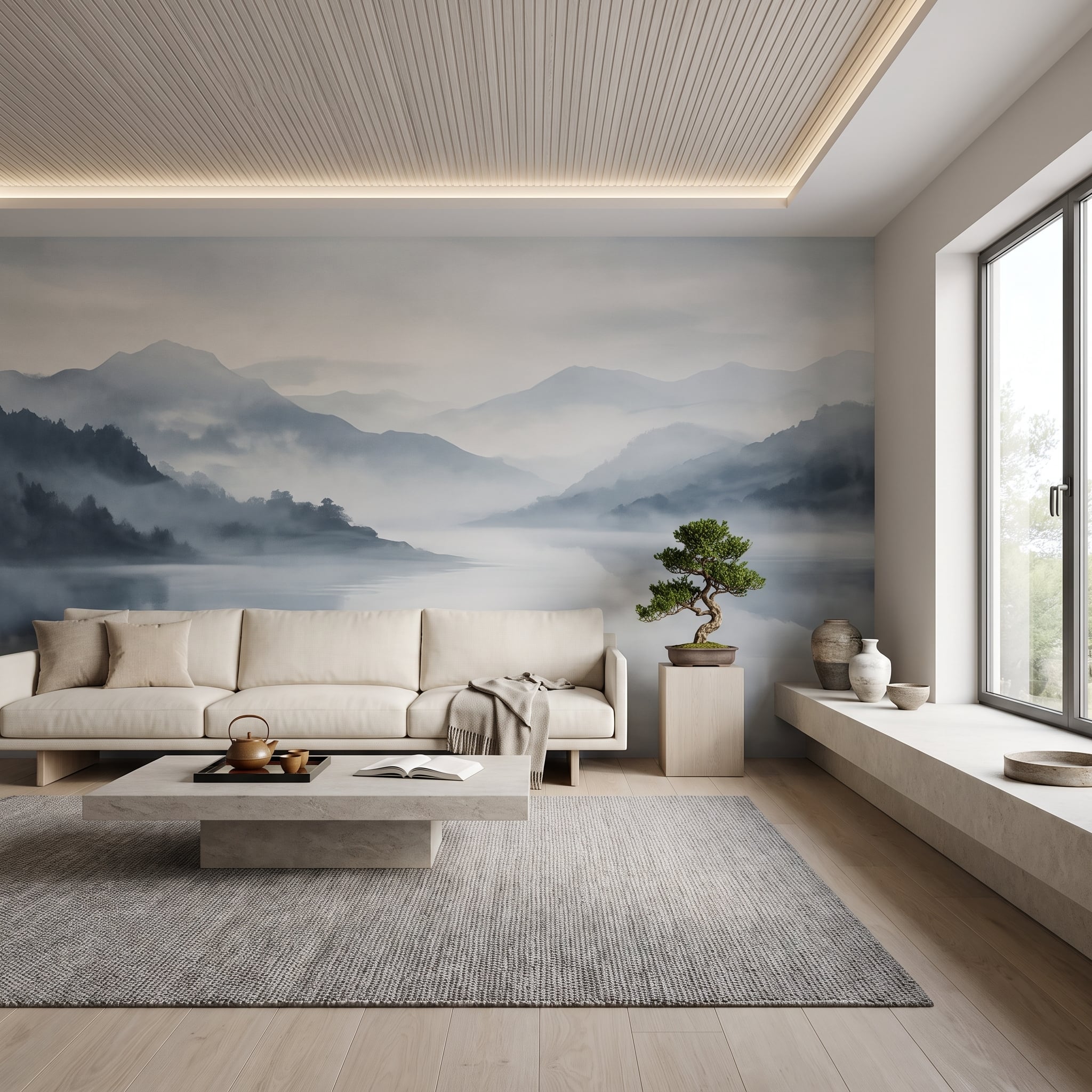
An ink-wash mountain mural transforms the back wall into a sequence of receding ridgelines. Instead of relying on saturated color, the design creates depth through variations of gray, charcoal, and soft beige, giving the room a sense of distance that an ordinary painted wall would not provide.
The surrounding furnishings remain deliberately restrained. Linen upholstery and pale neutral surfaces pick up the mural’s quieter tones, while a bonsai on a concrete pedestal introduces a sculptural connection to the East Asian influences in the artwork.
The mural’s scale is important. Small framed landscapes would become individual objects on the wall. This treatment turns the wall itself into the landscape, allowing the room to borrow the apparent depth of the scene.
24. Board-Formed Concrete Gives This Walnut Office a More Interesting Edge
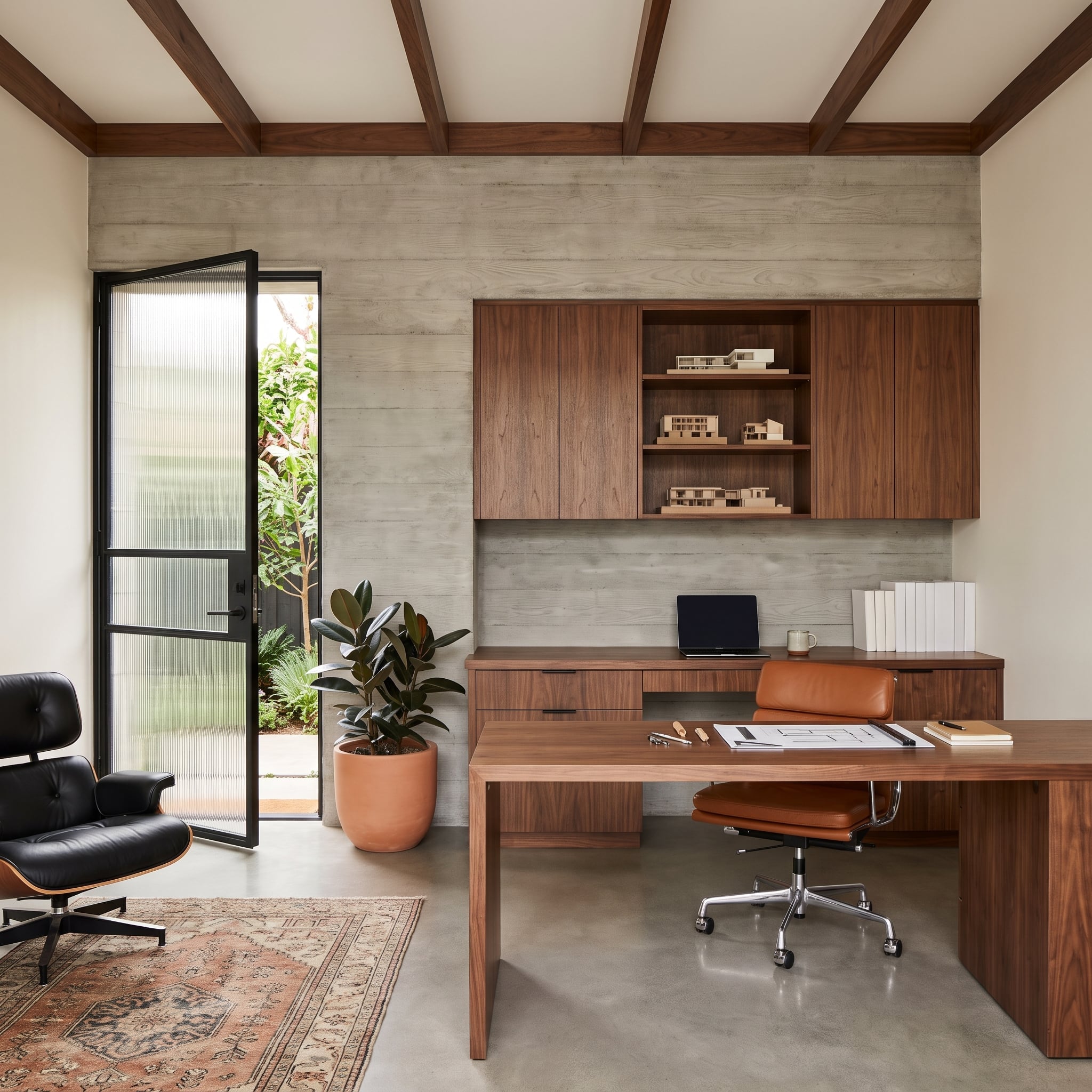
Board-formed concrete brings the imprint of timber formwork into this home office, leaving horizontal grain and subtle irregularities across the back wall. The material has an unmistakably architectural character, but the surrounding walnut millwork prevents the room from drifting into industrial severity.
The desk and cabinetry establish a warmer, more refined foreground. Architectural models occupy the open shelving, a rubber plant softens one corner, and a black leather Eames lounge chair gives the opposite side of the room a substantial presence.
Concrete is often paired with steel and stark white surfaces. Here, its relationship with richly colored wood is more interesting. The cool mineral wall makes the walnut appear warmer, while the cabinetry gives the concrete a degree of domestic comfort it might otherwise lack.
23. Jewel-Toned Floral Wallpaper Finds an Unexpected Partner in Olive Velvet
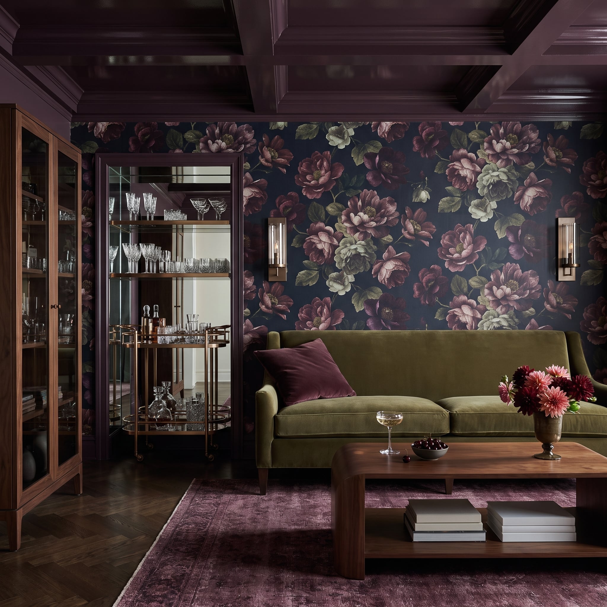
Large floral patterns in navy, burgundy, and dusty rose cover the back wall, with blooms big enough to feel painterly rather than delicate. The olive velvet sofa is an unexpectedly confident companion, introducing a substantial block of green against the darker botanical palette.
That choice matters. A sofa upholstered in one of the wallpaper’s dominant colors would create a more coordinated scheme, but the olive introduces a little friction and keeps the room from looking overly arranged. Walnut furniture and herringbone flooring supply warm natural tones below the pattern.
The wallpaper carries most of the visual complexity. Solid upholstery, simple furniture shapes, and restrained accessories give the eye enough quieter surfaces to appreciate the floral design rather than become overwhelmed by it.
22. Slate-Blue Paneling Makes Traditional Bedroom Details Feel Sharper
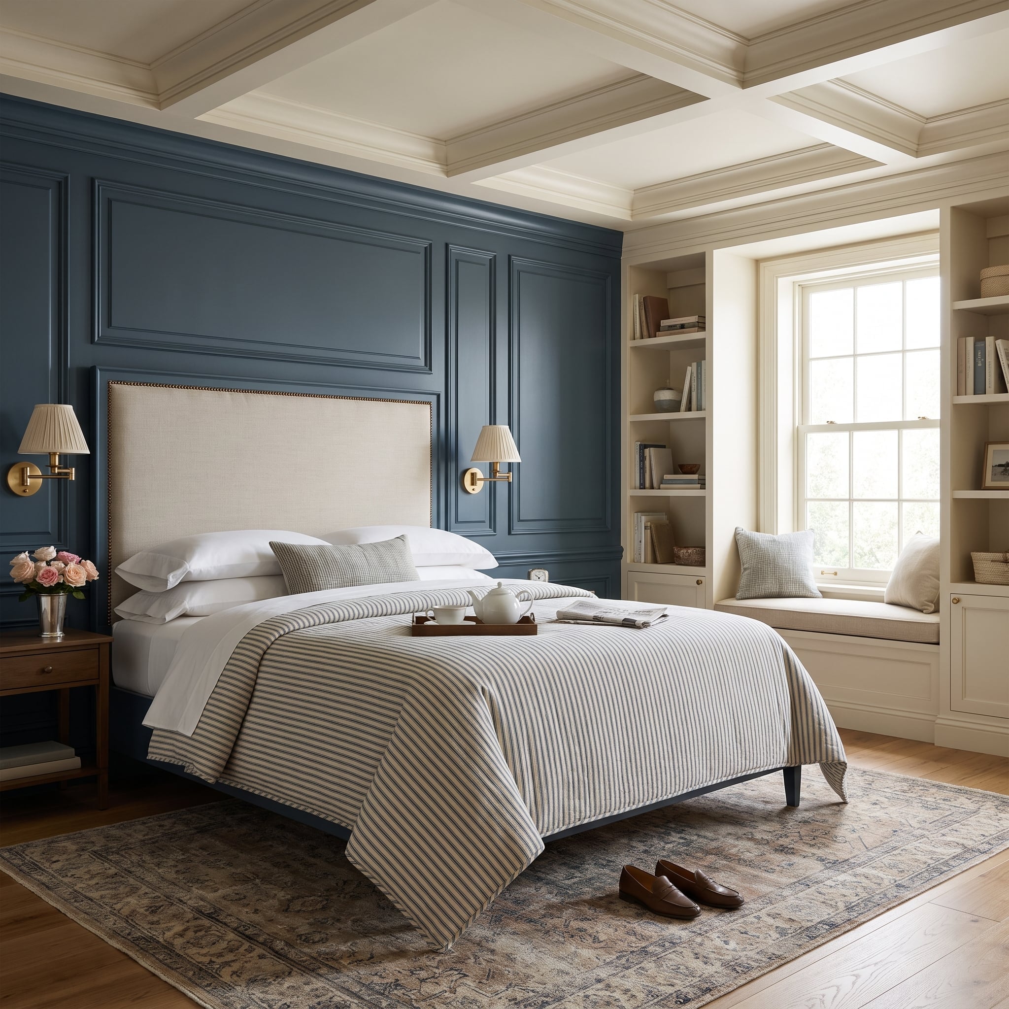
Slate-blue paneling gives this bedroom a traditional foundation, but the saturated color keeps the detailing from feeling overly formal. Molded sections introduce measured divisions across the wall, providing a structured backdrop for the linen upholstered headboard.
Brass nailhead trim outlines the headboard without overwhelming its relatively quiet fabric. The coffered ceiling repeats the room’s architectural discipline overhead, creating a relationship between the horizontal ceiling divisions and the wall’s molded framework.
Neither surface needs an elaborate pattern. The interest comes from depth, shadow, and the contrast between painted woodwork and upholstery. The blue is strong enough to establish character, while the traditional detailing gives the color somewhere appropriate to live.
21. Limewash, Amber Glass, and Caramel Velvet Create a Dining Room With Real Depth
🔥 Would you like to save this?
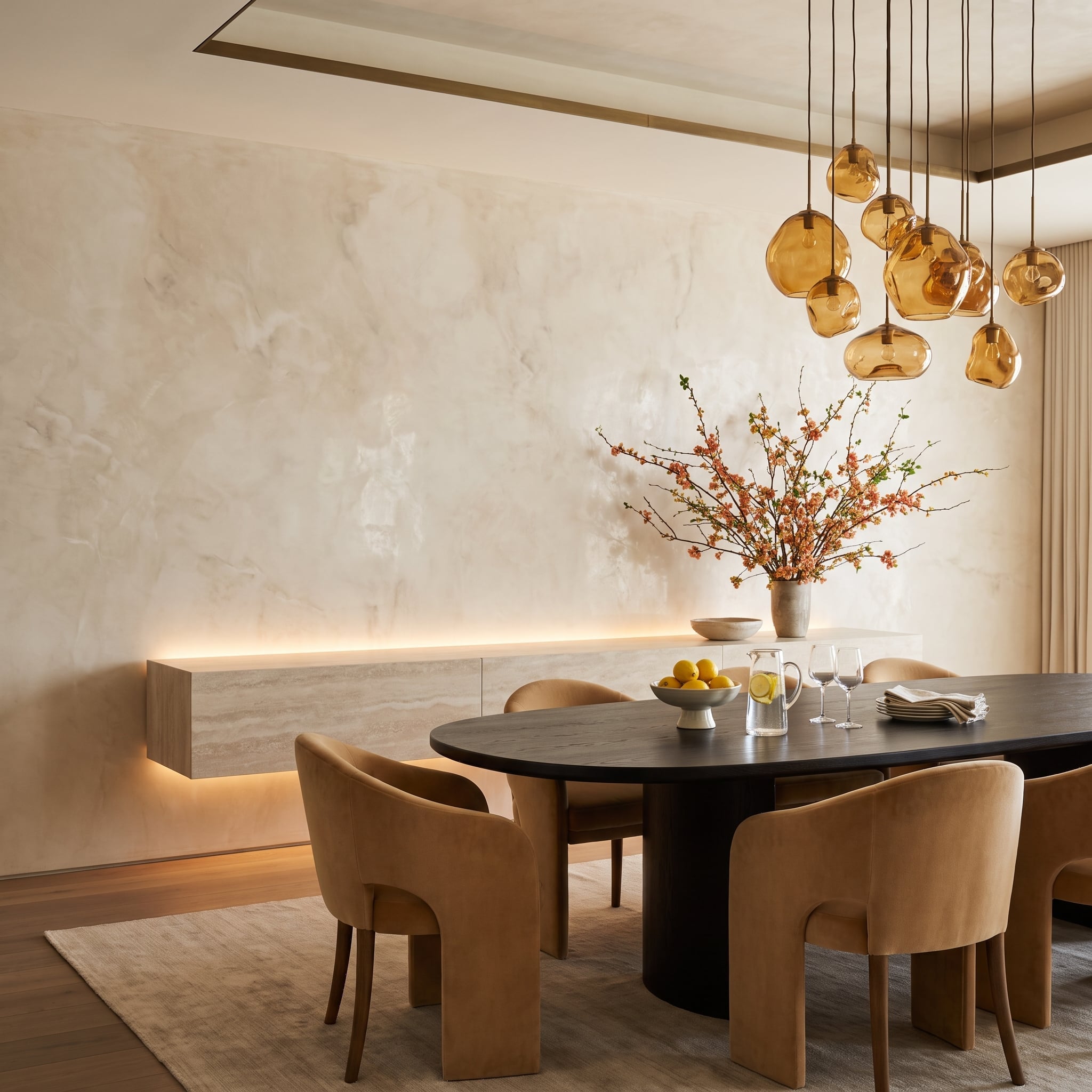
Cloudy variations across the limewashed back wall give this dining room a softly weathered appearance. The finish is subtle enough to let the furnishings remain prominent, yet textured enough to keep the large wall from looking empty.
Amber glass pendants hang at staggered heights above the dark oval dining table, introducing irregular shapes that contrast with the furniture’s more controlled geometry. Caramel velvet chairs with sculpted open arms continue the warm palette, while cherry blossom branches add height and movement at the center of the composition.
A floating sideboard keeps the lower portion of the wall uncluttered, with concealed lighting adding a soft glow beneath it. The strongest decision is the refusal to introduce another dramatic color. Instead, the room builds interest through variations of amber, caramel, cream, and brown.
Design Consideration: Limewash and other decorative plaster finishes can change noticeably under different lighting conditions. Sample the actual finish on the intended wall and examine it in morning, afternoon, and artificial light before committing to the full surface.
20. Wide Blue Stripes Give a Traditional Study an Unexpected Sense of Height
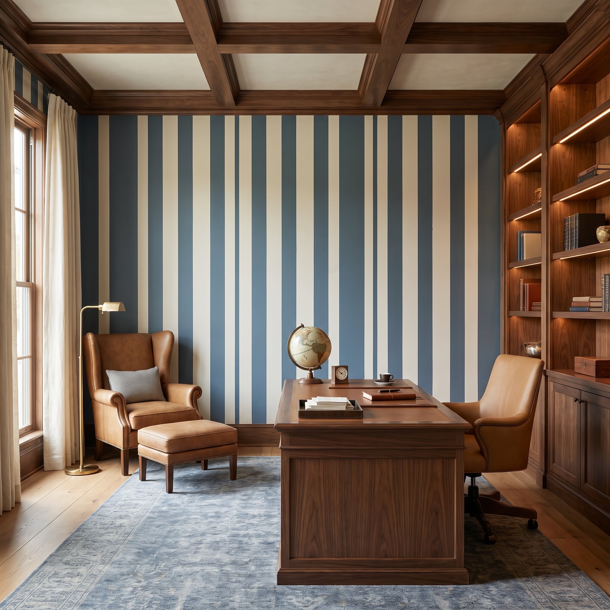
Wide slate-blue and cream stripes run from floor to ceiling behind the furniture, introducing a bold graphic element into a room otherwise dominated by traditional woodwork. Their vertical orientation emphasizes the wall’s height, while the broad repeat gives the pattern more architectural presence than a fine stripe would achieve.
A coffered walnut ceiling and substantial executive desk establish the study’s formal character. The cognac leather wingback chair and matching ottoman bring warmth against the cool blue, while brass lighting and a desktop globe reinforce the room’s collected, traditional atmosphere.
The striped wall is effective precisely because the other elements are so established. Against plain painted surfaces, the study might feel conventional. Against these strong vertical bands, its familiar furniture acquires a more distinctive setting.
19. Burgundy Plaster and a Suspended Fireplace Give This Bedroom an Unusual Edge
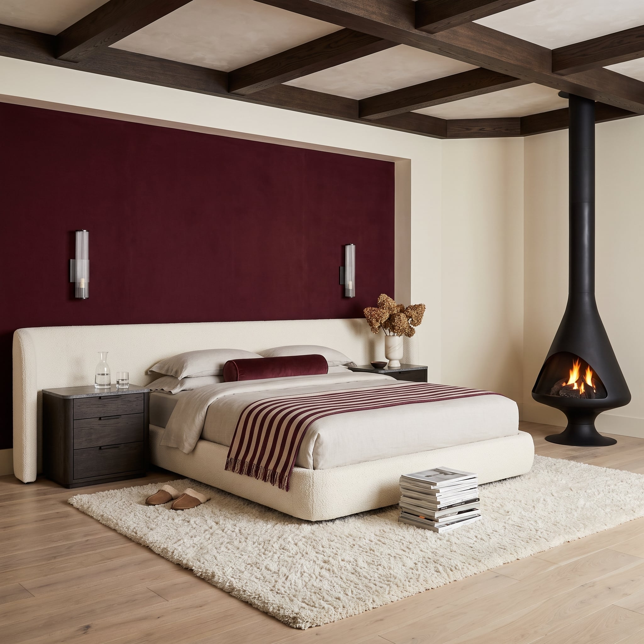
A recessed wall finished in deep burgundy gives this bedroom a rich, enveloping backdrop. Against it, the cream bouclé platform bed appears especially soft, its rounded upholstery providing a strong contrast to the wall’s saturated color.
The most unexpected element is the matte-black conical fireplace. Its suspended form introduces a sculptural shape that interrupts the otherwise horizontal arrangement of bed and wall. The black finish makes it a distinct architectural object rather than another decorative accessory.
The room demonstrates how an accent wall can establish the atmosphere while allowing one dramatic object to remain independent of it. A real suspended fireplace installation would also require suitable structural support, ventilation, and appropriate clearances, particularly in a bedroom.
18. Pale Oak Paneling Takes Command Without Raising Its Voice
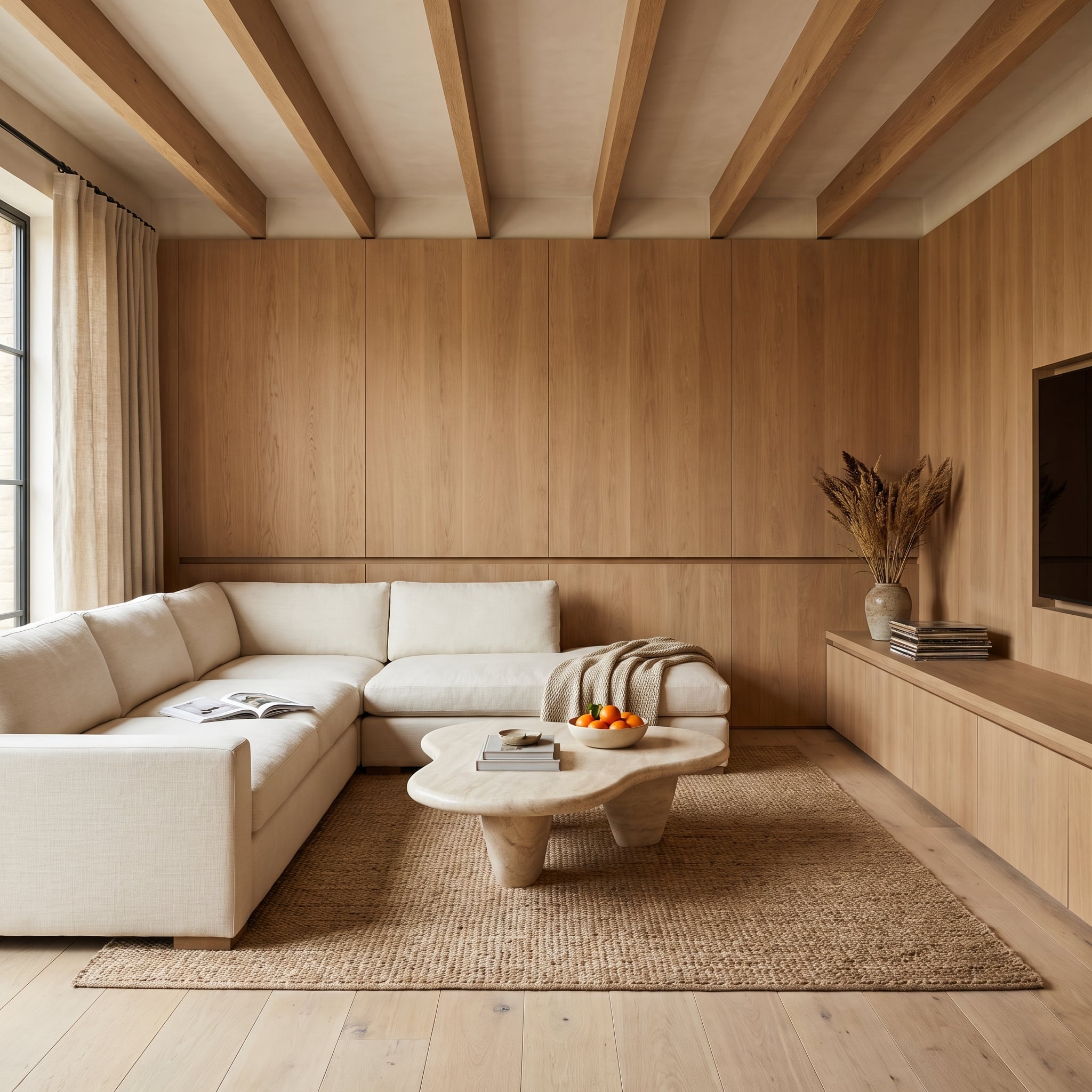
There is nothing especially dramatic about pale oak until an entire wall is treated as one continuous surface. Here, the consistent grain creates a broad, calm backdrop that gives the living room architectural definition without introducing a strong paint color.
The cream linen sectional sits almost tonally against the wood, allowing the oak’s natural variation to become more apparent. An organically shaped travertine coffee table breaks the paneling’s straight lines, adding a softer, irregular form at the center of the seating area.
What makes this wall successful is the careful relationship between similar tones and different textures. Wood, linen, and stone occupy a restrained palette, but each material responds to light differently. The room has plenty of visual interest without needing an obvious color contrast.
17. Zellige Tile Turns an Arched Breakfast-Nook Window Into a Jewel
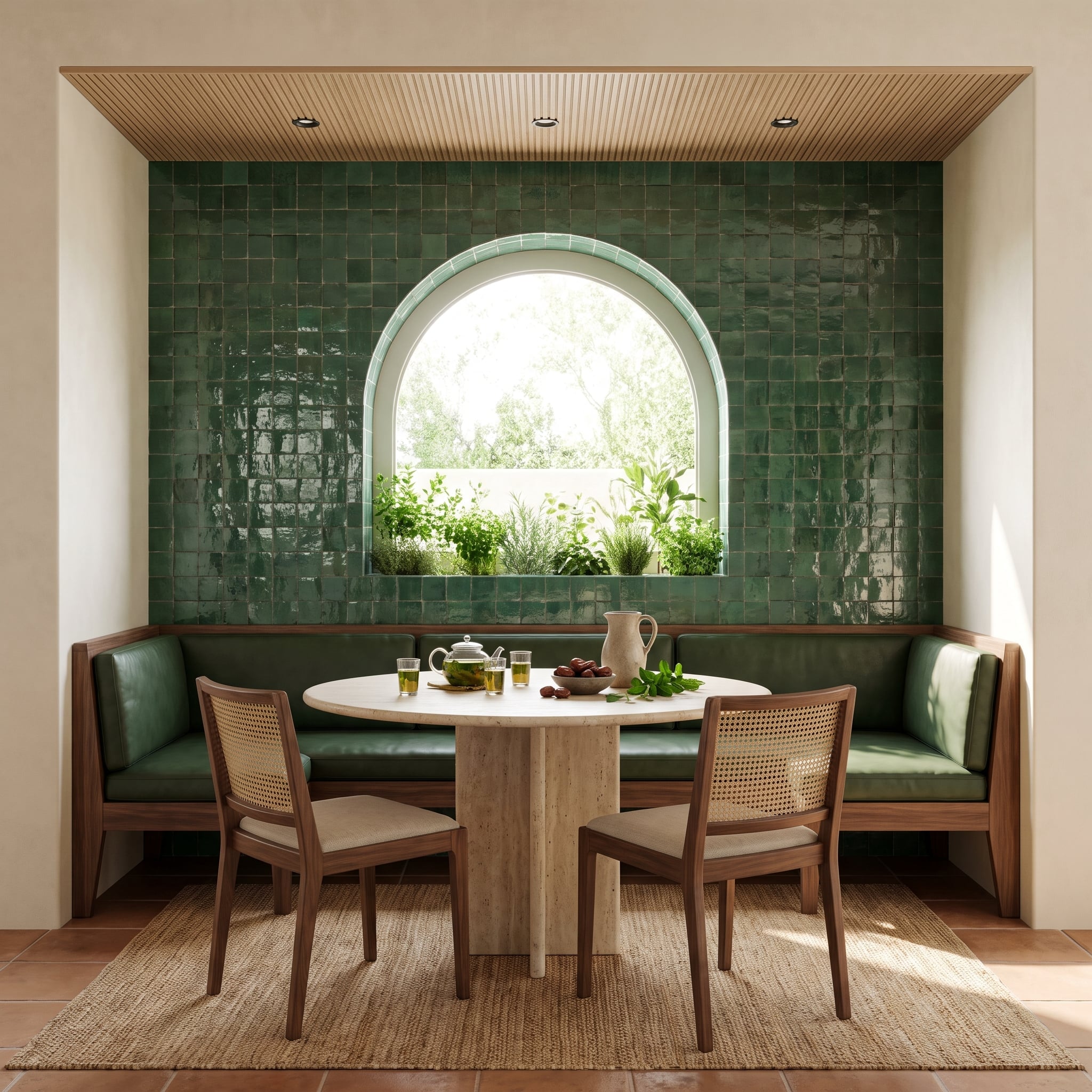
Forest-green zellige tile surrounds the arched window in this breakfast nook, its irregular glazed surfaces creating a patchwork of highlights across the wall. The handmade character of the tiles gives the saturated green far more variation than a uniform glossy finish would produce.
The arched opening interrupts the tiled surface with daylight and a view toward a small herb garden. A forest-green leather banquette continues the color below the window, while the travertine pedestal table introduces a pale, solid centerpiece. Walnut cane-back chairs add a lighter, more open texture around the table.
What could have become an overwhelmingly green corner instead feels layered. The tile, leather, plants, and natural wood all interpret the color differently, while the window gives the composition a clear point of relief.
16. Venetian Plaster Makes This Terracotta Home Office Feel Almost Sculpted
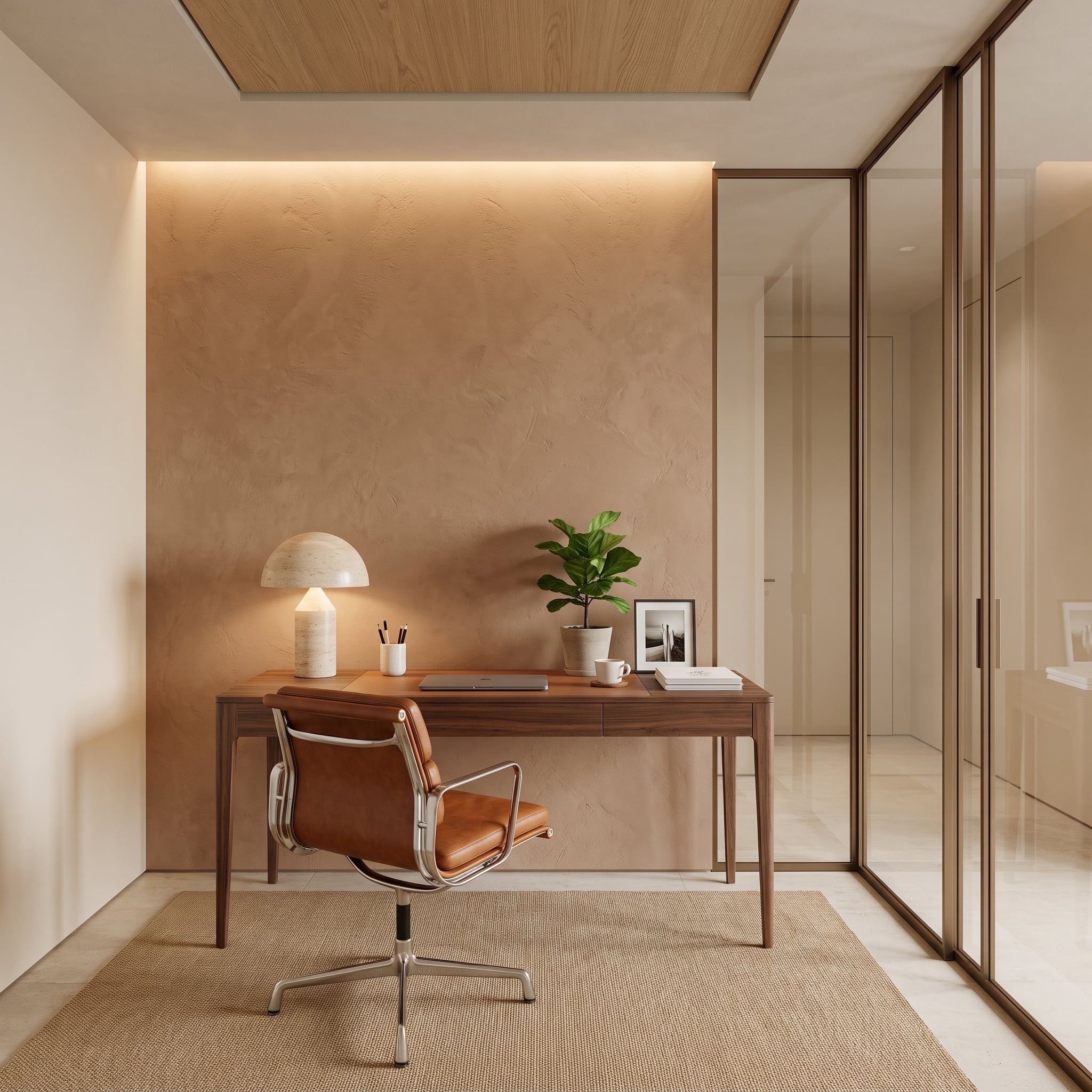
A dusty terracotta plaster finish gives the office’s back wall the appearance of a surface shaped gradually by hand rather than covered in a single uniform color. Subtle trowel variations become more apparent under the concealed cove lighting above, which emphasizes the finish’s depth.
The walnut desk and cognac leather chair extend the warm palette into the furnishings. Their darker, smoother surfaces distinguish them from the plaster without introducing a competing color scheme. The restrained arrangement allows the wall’s texture to remain the principal decorative feature.
This is a useful alternative to a heavily patterned home office. The wall provides interest at close range, while the overall composition remains quiet enough for a working environment. The appeal lies in material variation rather than visual clutter.
15. Olive Plaster and Exposed Walnut Beams Give This Living Room a Stronger Backbone
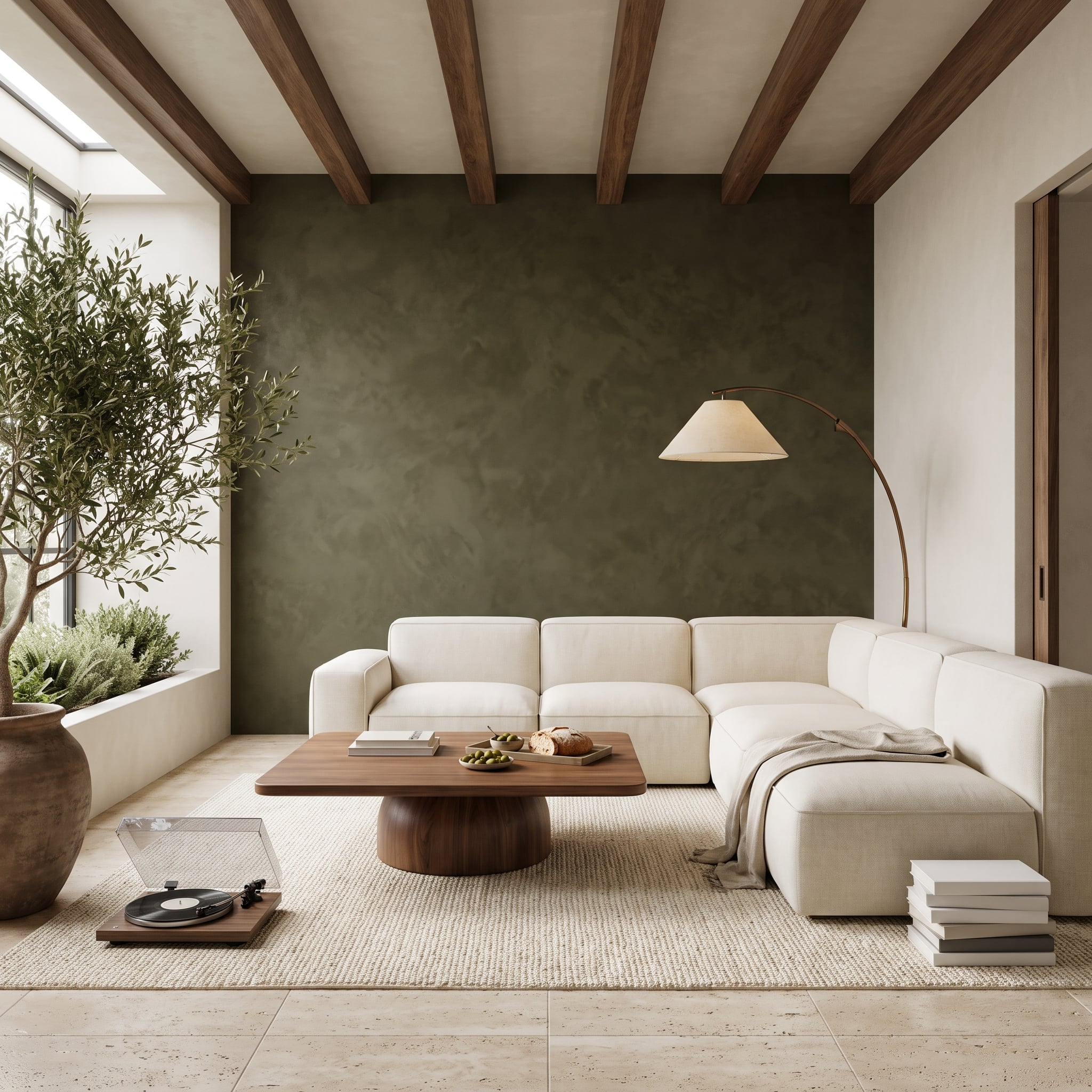
Deep olive-brown plaster covers the back wall, introducing a rich earth tone that connects naturally with the dark walnut ceiling beams. The beams run perpendicular to the wall, creating a clear architectural relationship between the vertical surface and the overhead structure.
A cream bouclé sectional lightens the foreground, while a jute rug and cylindrical-base walnut coffee table introduce different natural textures. The aged-bronze arc lamp curves above the seating area, its slender form contrasting with the beams’ strong straight lines.
An olive tree in the corner reinforces the wall’s color without making the palette overly coordinated. The room works because the dark surfaces have enough pale upholstery and flooring around them to remain substantial rather than oppressive.
14. Travertine Cladding Turns a Living Room Wall Into a Piece of Stone Architecture
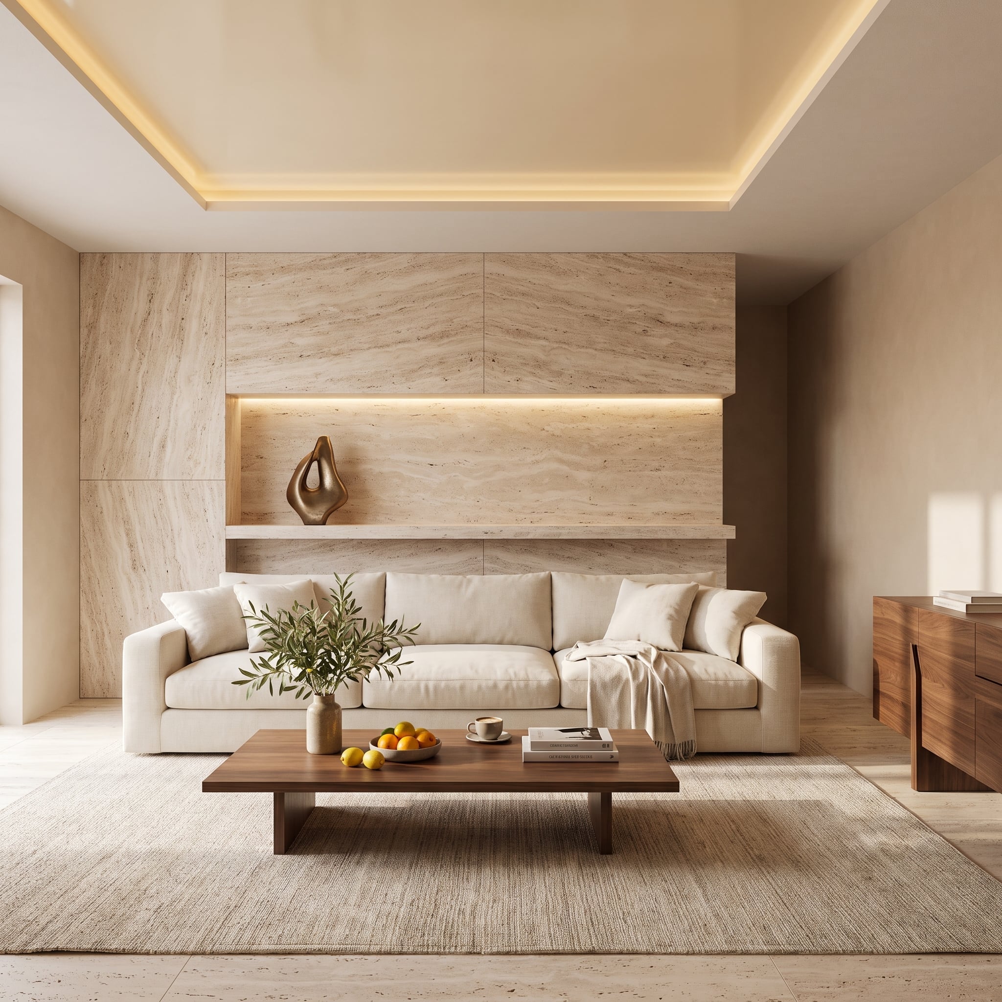
Floor-to-ceiling travertine gives this living room an architectural backdrop with more character than a conventional painted surface. The panels are arranged to create a strong, symmetrical veining pattern, their pale mineral tones keeping the large wall visually light despite the substantial material.
An illuminated niche interrupts the stone with a carefully framed bronze sculpture. Its recessed position gives the object depth, while concealed lighting brings out warmer tones in the surrounding travertine. Positioned high enough to draw attention above the furniture, the niche introduces a deliberate focal point without interrupting the wall’s overall scale.
The cream linen sofa remains understated in front of the stone. Walnut furniture adds warmth and a more familiar domestic texture, ensuring the room feels furnished rather than simply clad in an impressive material.
13. Abstract Brushwork Gives This Bedroom an Entire Wall of Movement
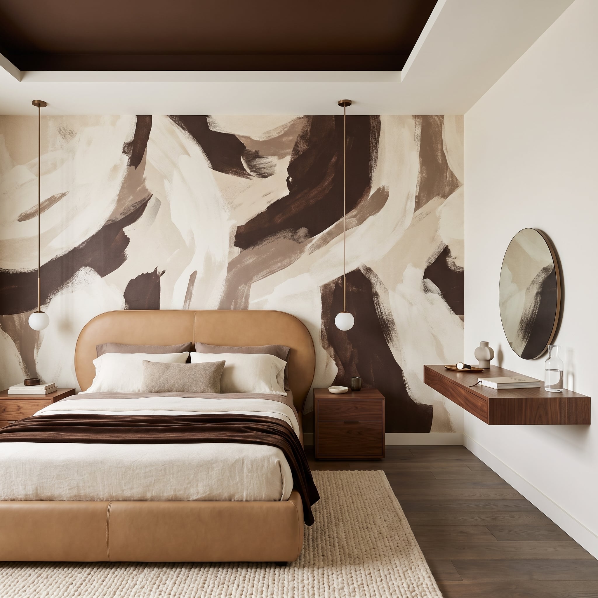
Broad swirls of dark chocolate and warm cream spread across the headboard wall, creating a composition somewhere between an abstract painting and a large decorative mural. The irregular brushwork introduces movement into a room otherwise organized around relatively simple furniture shapes.
A caramel leather bed frame gives the foreground enough color and substance to stand against the dramatic wall. Walnut nightstands continue the warm brown palette, while milky-glass globe pendants soften the contrast with diffused light.
On the side wall, a floating walnut shelf becomes a compact vanity beneath a round brass-framed mirror. Its simplicity is important. The mural already supplies the room’s visual energy, leaving the other surfaces free to concentrate on function, texture, and a few carefully chosen curves.
12. Fluted Cream Plaster Lets Daylight Become Part of the Dining Room Design
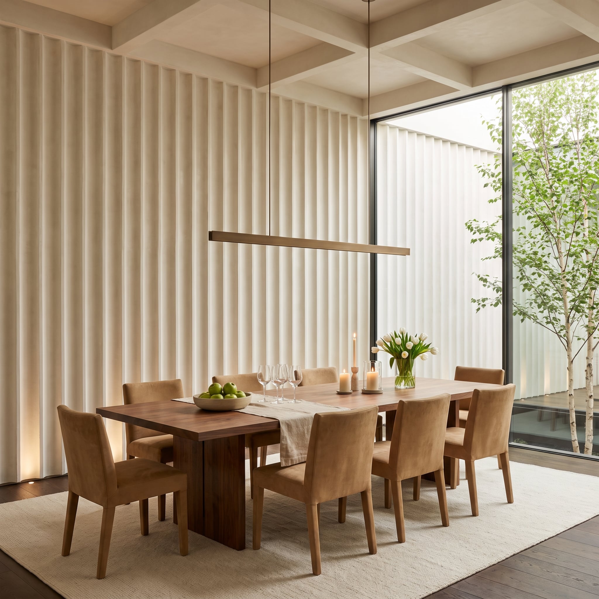
Fluted plaster covers the dining room’s feature wall in closely spaced vertical ribs. Unlike a printed stripe, the pattern has physical depth, creating narrow shadows that change as daylight enters through the large window beside it.
The cream finish keeps the wall bright, allowing the relief to provide the interest without a contrasting paint color. Against it, the walnut dining table introduces a darker horizontal plane, establishing a useful counterpoint to the repeated vertical grooves.
This is a particularly effective approach when a room needs architectural character but not another dominant color. The texture is most apparent in angled light, while the wall can appear comparatively calm under more diffuse illumination. The surface changes throughout the day without requiring anything to move.
11. Slate Blue and Warm Linen Give This Bedroom a More Sophisticated Kind of Contrast
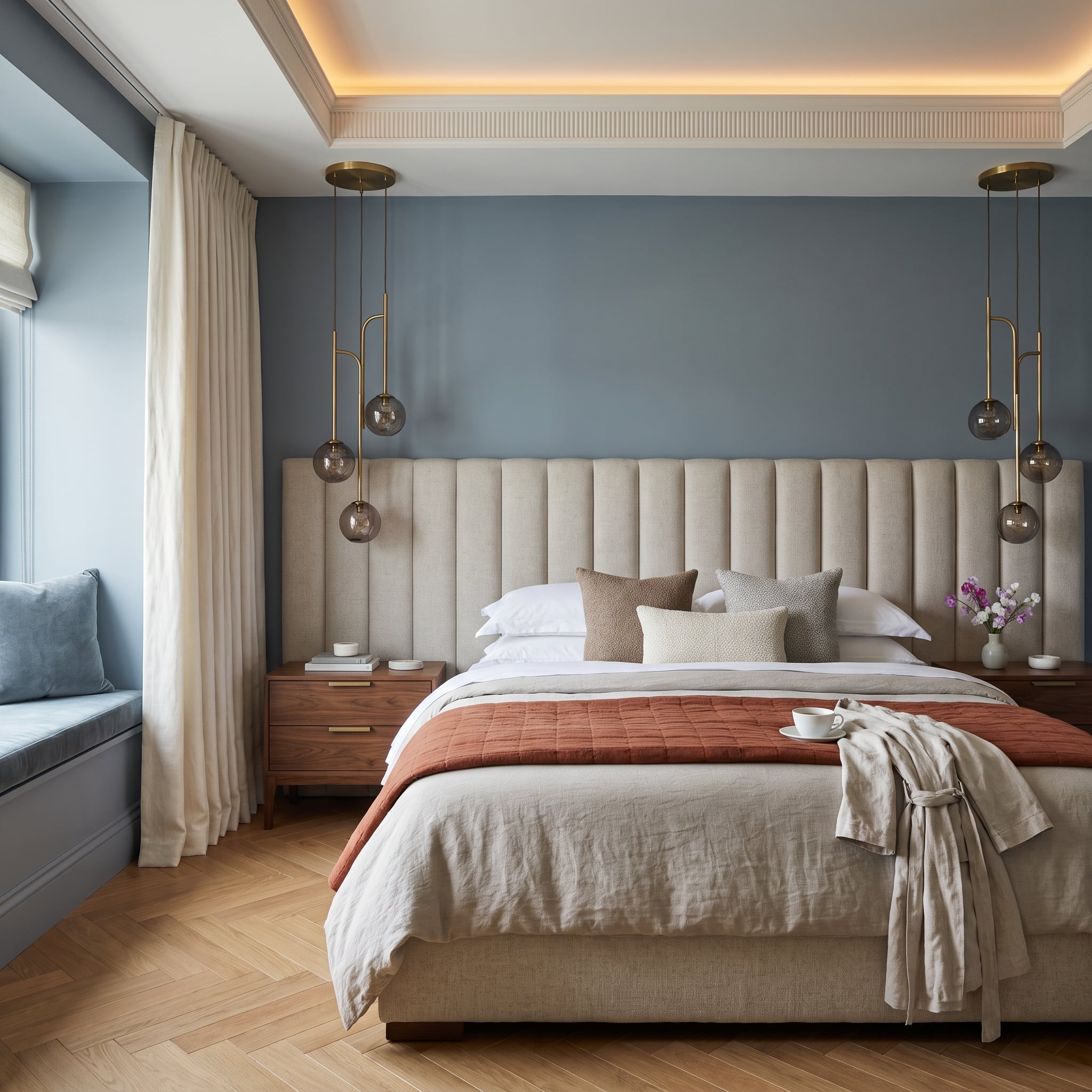
Slate blue establishes a cool, substantial backdrop for a tall channeled headboard upholstered in oatmeal linen. The headboard’s vertical divisions add texture and height, while its pale fabric prevents the dark wall from becoming too dominant.
Brass pendant clusters with smoked-glass shades hang on either side of the bed, introducing warm metallic accents against the blue. A terracotta quilt runner provides a more unexpected note of color, linking the room’s cooler upper surfaces with the warmer tones of the herringbone oak floor.
Walnut nightstands add another layer of natural warmth. The combination is carefully balanced: cool paint, pale upholstery, warm wood, and restrained metalwork. No single element needs to imitate the others for the room to feel cohesive.
10. Limestone and a Slatted Ceiling Give This Fireplace Wall Its Own Architecture
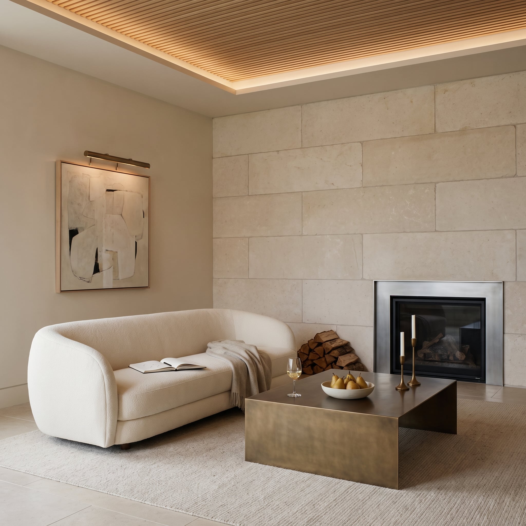
Rough-cut limestone blocks give the fireplace wall a rugged, substantial texture that contrasts with the smoother surfaces elsewhere in the room. The pale, warm-toned stone introduces visual weight without requiring a dark finish.
Above, the slatted ceiling adds a different kind of repetition, its narrow linear divisions contrasting with the irregular stone blocks. The cream bouclé sofa occupies a similar tonal range to the limestone, but its soft upholstery provides an entirely different tactile character.
A patinated metal coffee table introduces a darker accent near the floor. The room’s strength comes from combining materials with very different surface qualities while keeping the overall palette restrained. Stone supplies permanence, wood adds rhythm, and upholstery makes the composition inviting.
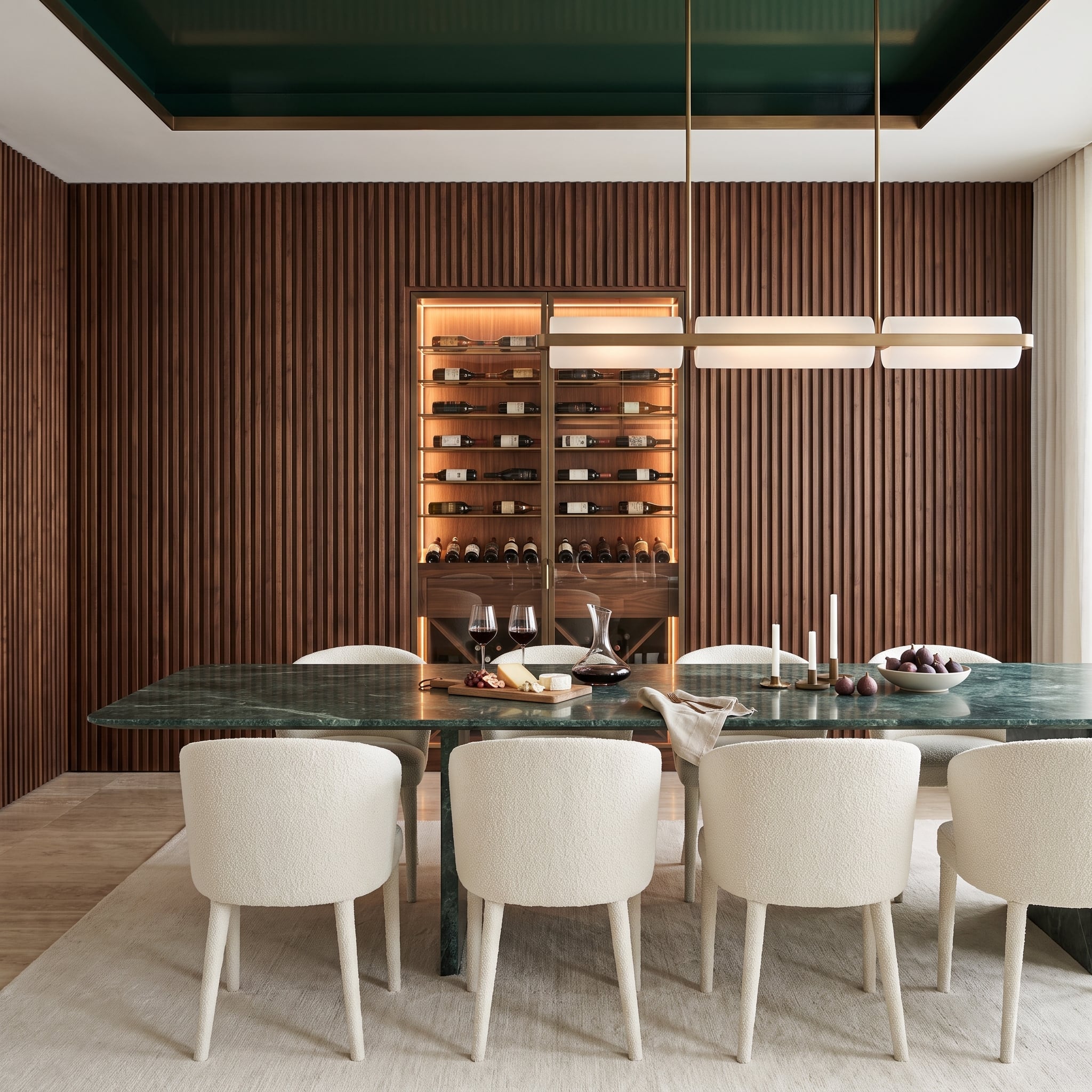
9. Dark Walnut Slats and a Glowing Wine Cabinet Give This Dining Room a Dramatic Backdrop
🔥 Would you like to save this?
Dark walnut slats cover the back wall from floor to ceiling, establishing a dense vertical rhythm behind the dining area. At the center, an illuminated wine cabinet interrupts the timber with glass, brass framing, and a warm amber glow.
The green marble dining table is the room’s most confident counterpoint. Its polished stone surface introduces color and natural veining against the repeated wood slats, while the green lacquered tray ceiling creates a second connection to that saturated hue.
Cream bouclé dining chairs prevent the combination of dark wood and green marble from becoming too heavy. Above the table, a linear pendant with frosted tubes and brass details echoes the cabinet’s metalwork without duplicating its shape.
The feature wall succeeds because its practical storage is treated as part of the architecture. The wine cabinet doesn’t appear to have been placed against a decorative wall; the wall seems to have been designed around it.
8. Warm Plaster and a Floating Bed Make This Bedroom Feel Remarkably Light
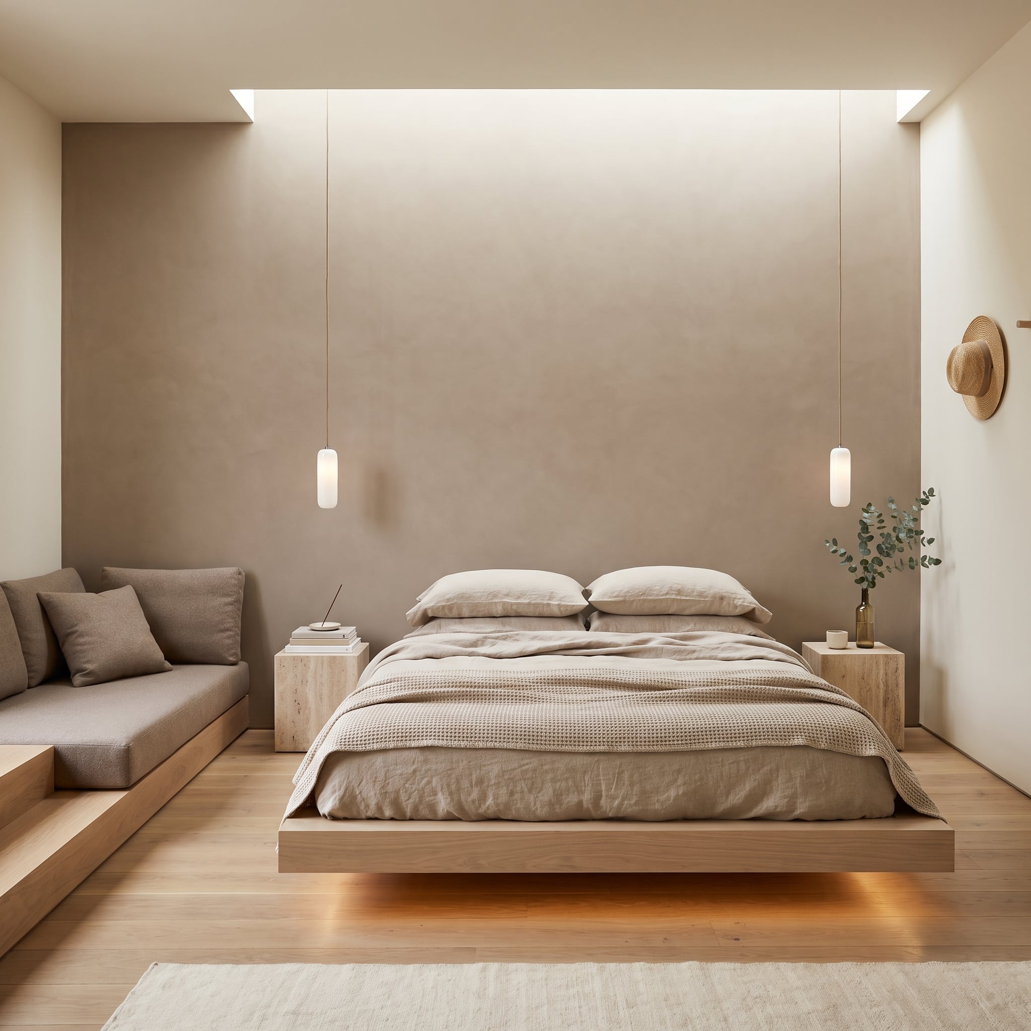
Earth-toned plaster creates a soft, mineral backdrop for a low platform bed that appears to hover above the pale oak floor. Concealed lighting beneath the platform strengthens that impression, introducing a warm amber glow at floor level.
Frosted cylindrical pendants hang on either side of the bed, providing bedside illumination without occupying the surfaces of the travertine cube nightstands. The rougher stone adds a useful contrast to the smooth bedding and carefully finished platform.
Oatmeal linen, greige textiles, and pale timber keep the palette closely related, allowing the plaster’s subtle variation to become more noticeable. The room has very little strong color contrast, yet the interplay of floating forms, solid stone, and softly textured walls gives it considerable depth.
7. Charcoal Plaster Makes a Single Abstract Painting Look Almost Illuminated
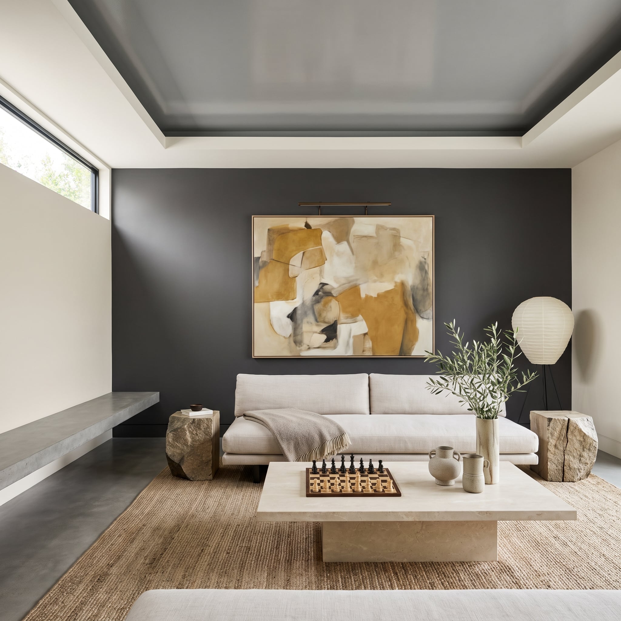
A deep charcoal wall provides the setting for an oversized abstract painting in ochre and warm white. The contrast is striking: the artwork’s pale passages appear especially bright against the dark plaster, an effect strengthened by the brass picture light mounted above it.
The low linen sofa keeps the foreground light, while raw boulder side tables introduce irregular mineral forms. A travertine coffee table and jute rug add more texture without introducing additional strong colors.
The paper lantern floor lamp offers a softer, diffused source of light in the corner. The composition demonstrates how a dark accent wall can serve artwork rather than compete with it. The wall recedes visually, allowing the painting and its carefully directed illumination to become the principal event.
6. Forest-Green Walls Turn This Living Room Into a Color-Drenched Retreat
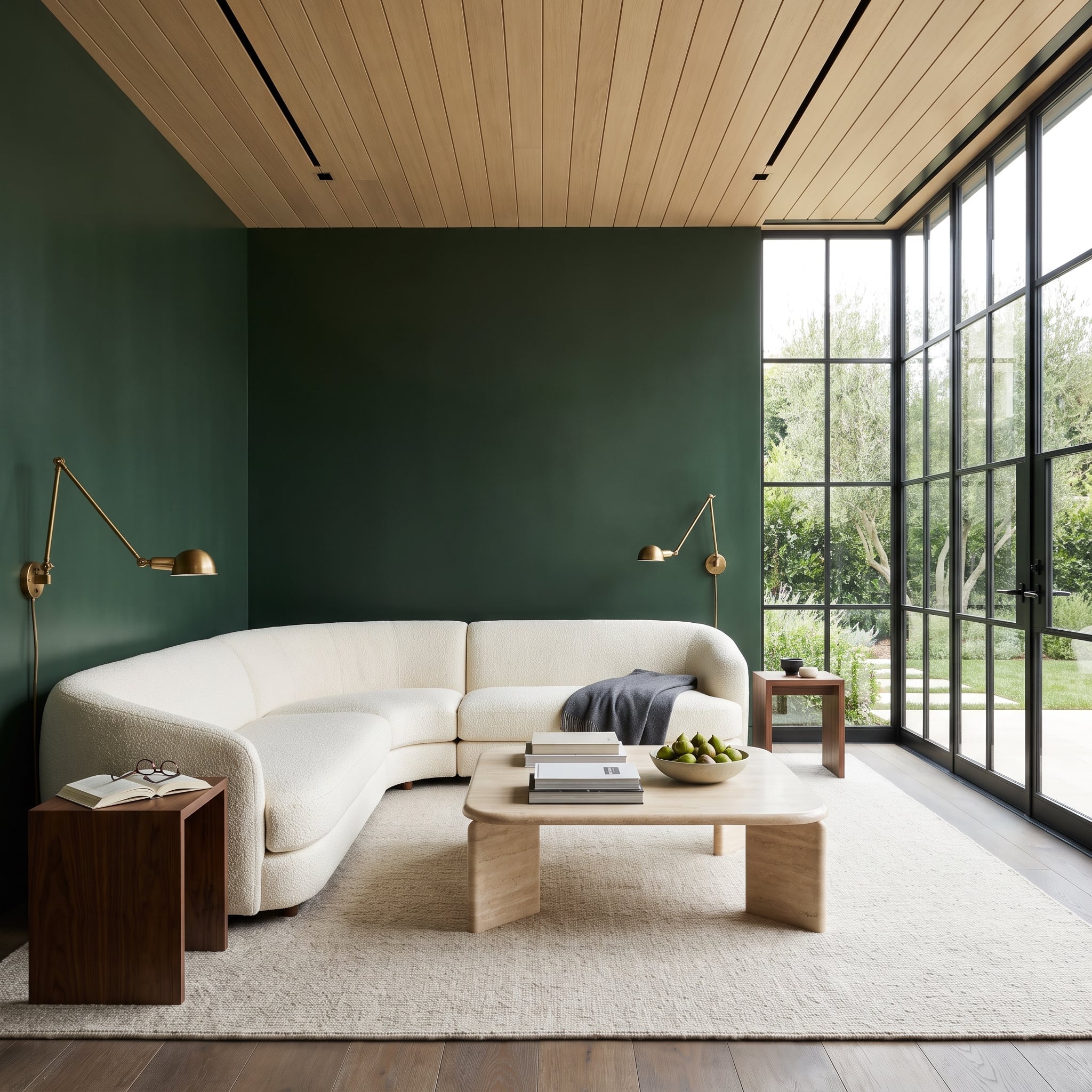
This living room takes the accent-wall principle a little further. Rather than stopping the forest green at a single surface, the color wraps the room, creating an immersive backdrop for the curved off-white bouclé sectional.
The sofa’s pale upholstery becomes particularly prominent against the saturated walls, while the wood-slat ceiling introduces a warmer natural tone overhead. Brass swing-arm sconces add functional lighting and small metallic highlights without disrupting the broad green surfaces.
Large steel-framed windows bring daylight into the room and provide an important visual opening. The effect is more enveloping than a conventional accent wall, but the underlying principle is similar: one decisive color treatment organizes the furniture and establishes the room’s character.
5. Dusty Rose Plaster Meets a Sunburst Ceiling in a Bedroom Full of Quiet Surprises
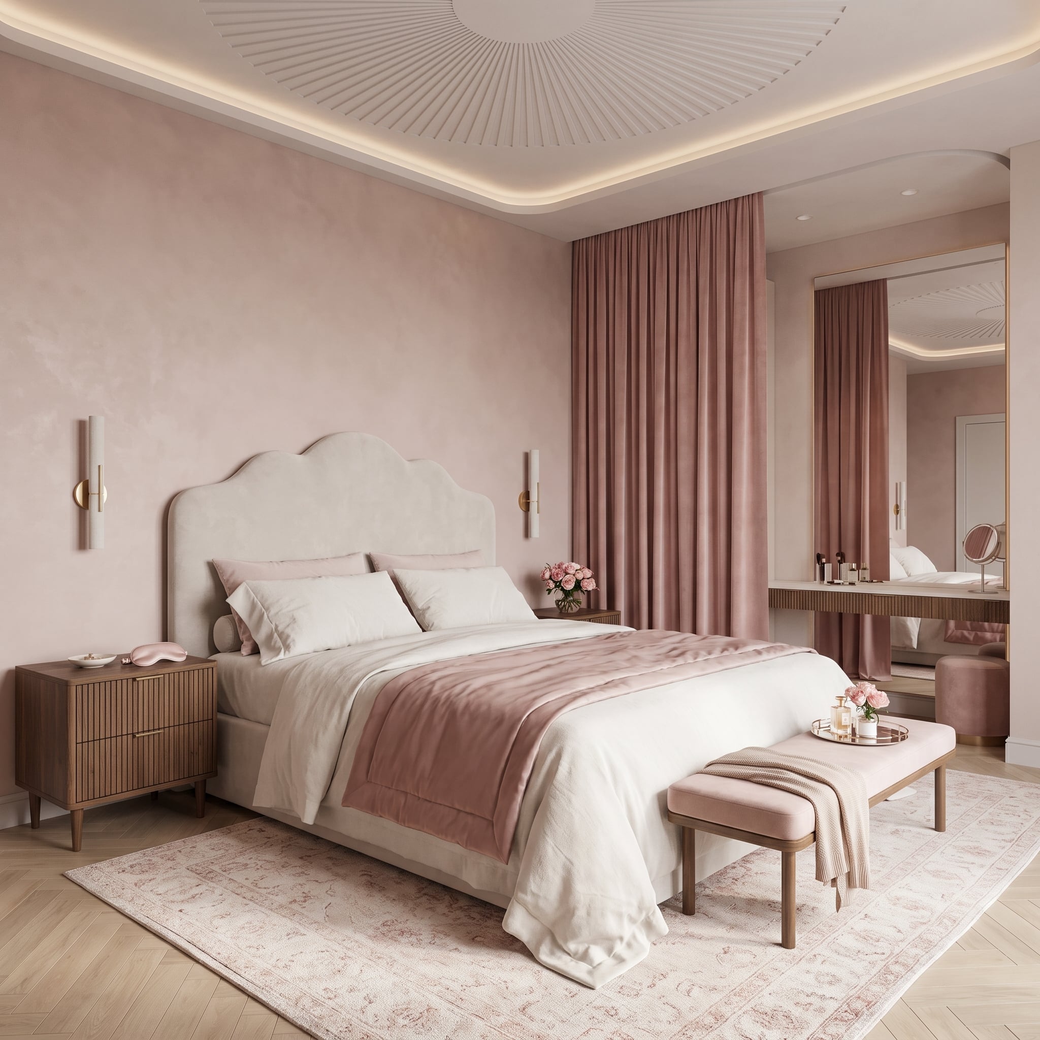
Dusty rose plaster gives this bedroom a gentle warmth, but the wall’s subtle texture prevents the color from looking flat or overly decorative. Soft illumination from above brings out variations in the finish, creating a backdrop that changes character as the lighting shifts.
A cream upholstered headboard establishes the center of the composition, while a fluted walnut nightstand introduces darker wood grain on the left. At the foot of the bed, a blush velvet bench repeats the wall’s pink undertones in a softer material.
The real surprise is overhead. Sunburst plasterwork spreads across the recessed ceiling, giving the room a second sculptural feature without introducing another strong color. The wall provides the warmth; the ceiling supplies the flourish.
4. Burgundy Paneling Gives Three Abstract Canvases a Gallery-Worthy Setting
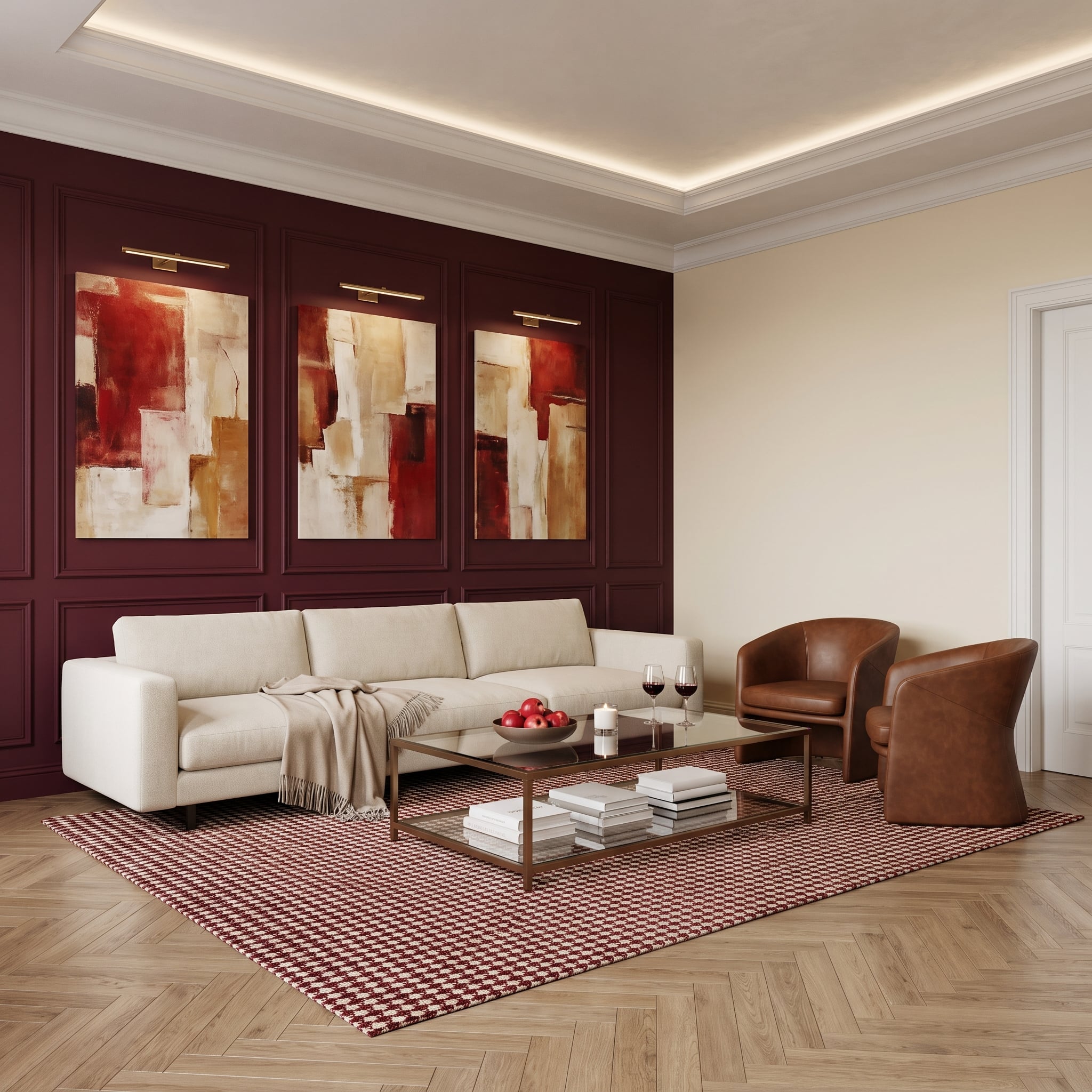
Deep burgundy paneling transforms the end wall into a richly colored backdrop for three abstract canvases. Each painting receives its own brass picture light, creating a measured rhythm across the surface and giving the artwork the formality of a small gallery installation.
The paintings draw on red, cream, and ochre, colors repeated elsewhere in the room through a geometric rug and warm upholstery. A cream linen sofa and cognac leather tub chairs provide contrasting textures, while the glass-and-brass coffee table keeps the center of the seating arrangement visually open.
Herringbone oak flooring introduces another patterned element, but its natural tone prevents it from competing with the art. The paneled wall has enough depth and color to remain compelling even without the paintings; with them, it becomes the room’s defining composition.
3. An Arched Sage-Plaster Recess Gives This Bed a Room Within a Room
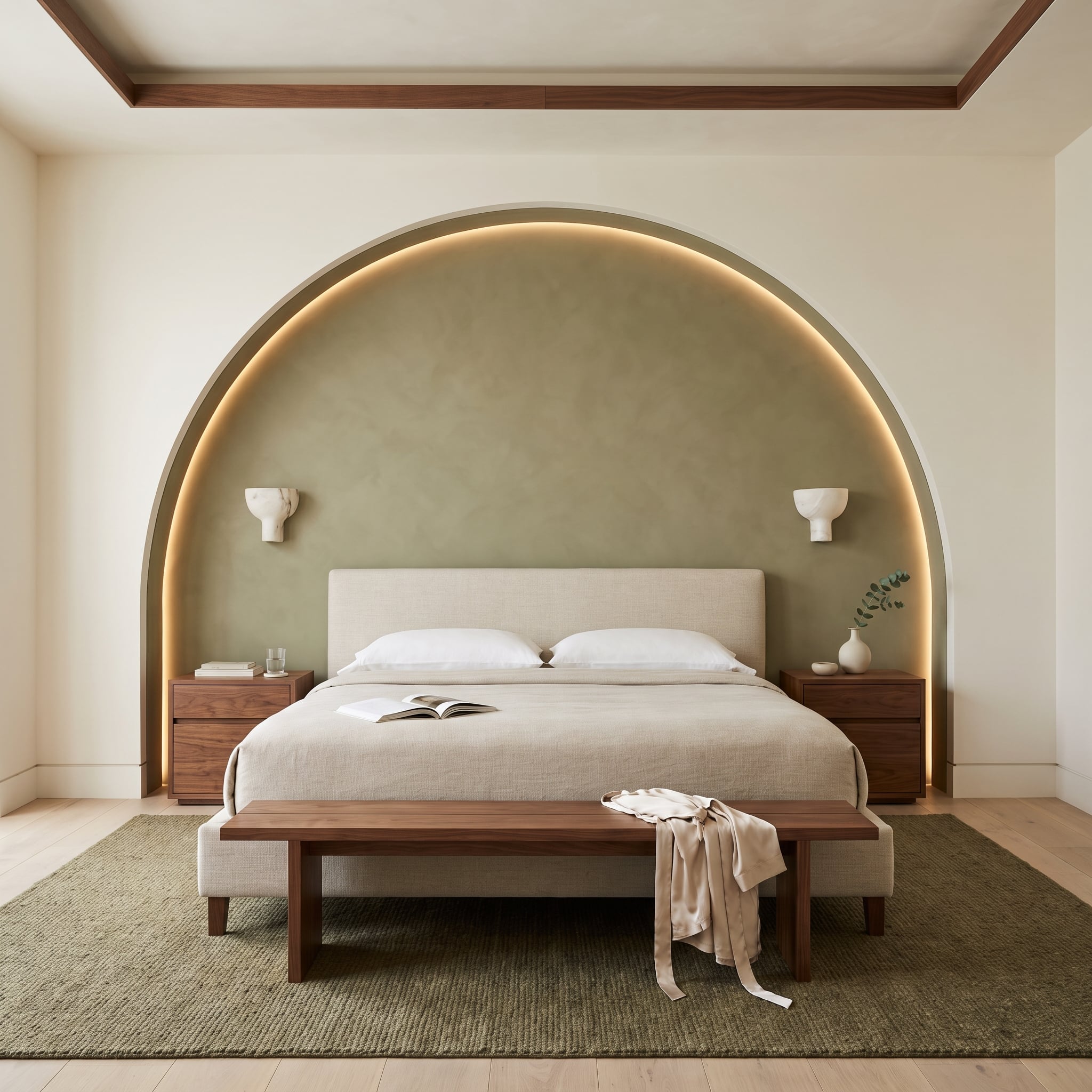
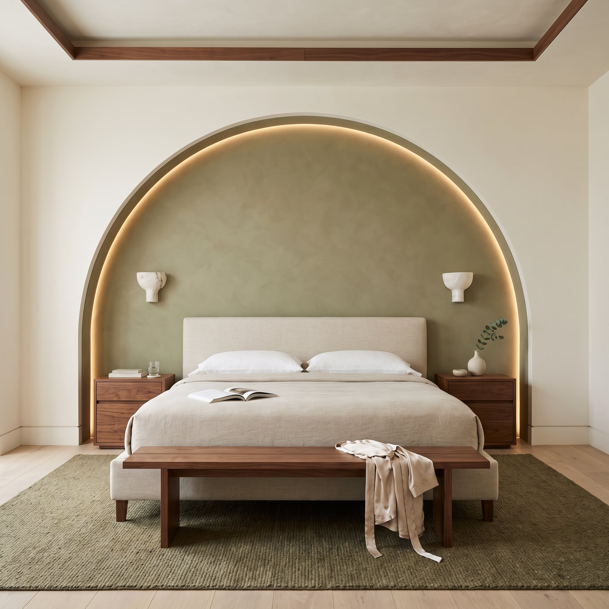
Instead of placing a bed against a conventional flat wall, this bedroom creates an architectural recess around it. The broad sage-plaster arch frames the upholstered headboard, giving the sleeping area a distinct sense of enclosure without introducing a physical partition.
Concealed warm LED lighting follows the curved edge, emphasizing the depth of the recess and making the arch appear almost sculptural. The light is especially effective because it traces the architecture rather than introducing a separate decorative fixture.
Walnut nightstands anchor the bed on either side, while an olive-toned jute rug reinforces the earthy palette below. The combination of muted color, curved plaster, and warm timber gives the room a calm, cohesive character.
The most successful decision is the scale of the arch. Large enough to encompass the bed rather than merely decorate the space above the headboard, the recess changes the proportions of the entire wall. The bed becomes part of the architecture instead of simply standing in front of it.
2. Tropical Wallpaper and Olive Velvet Give This Bedroom a Dramatic Botanical Backdrop
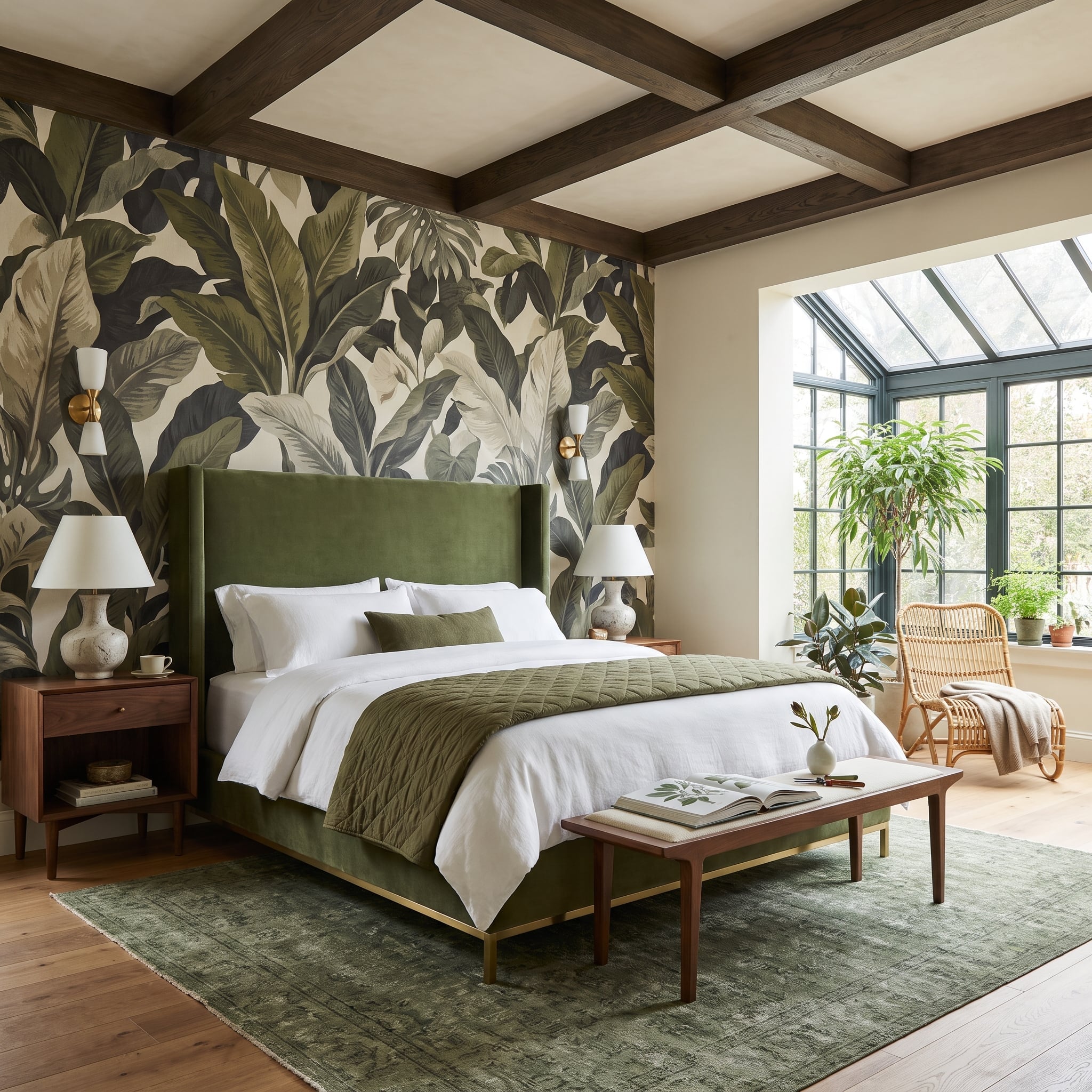
Banana-leaf wallpaper spreads across the headboard wall in forest green, charcoal, and cream, introducing a dense botanical pattern beneath the dark wood beams of the coffered ceiling. The combination is dramatic, but the room avoids becoming visually chaotic by keeping the principal furniture colors closely related.
The wingback bed is upholstered in olive velvet, with a matching quilted throw at the foot. Those repeated greens establish a connection between the furniture and the wallpaper without attempting to imitate the leaf pattern.
Brass wall sconces add warm highlights on either side of the bed, their finish echoed by a small metallic detail at the bed frame. Cream bedding provides a much-needed break between the saturated upholstery and the heavily patterned wall.
The wallpaper supplies the room’s exuberance. The bed’s generous proportions and restrained accessories give that exuberance enough structure to remain sophisticated.
1. A Wall of Dark Timber Conceals a Full Bar Behind an Almost Invisible Facade
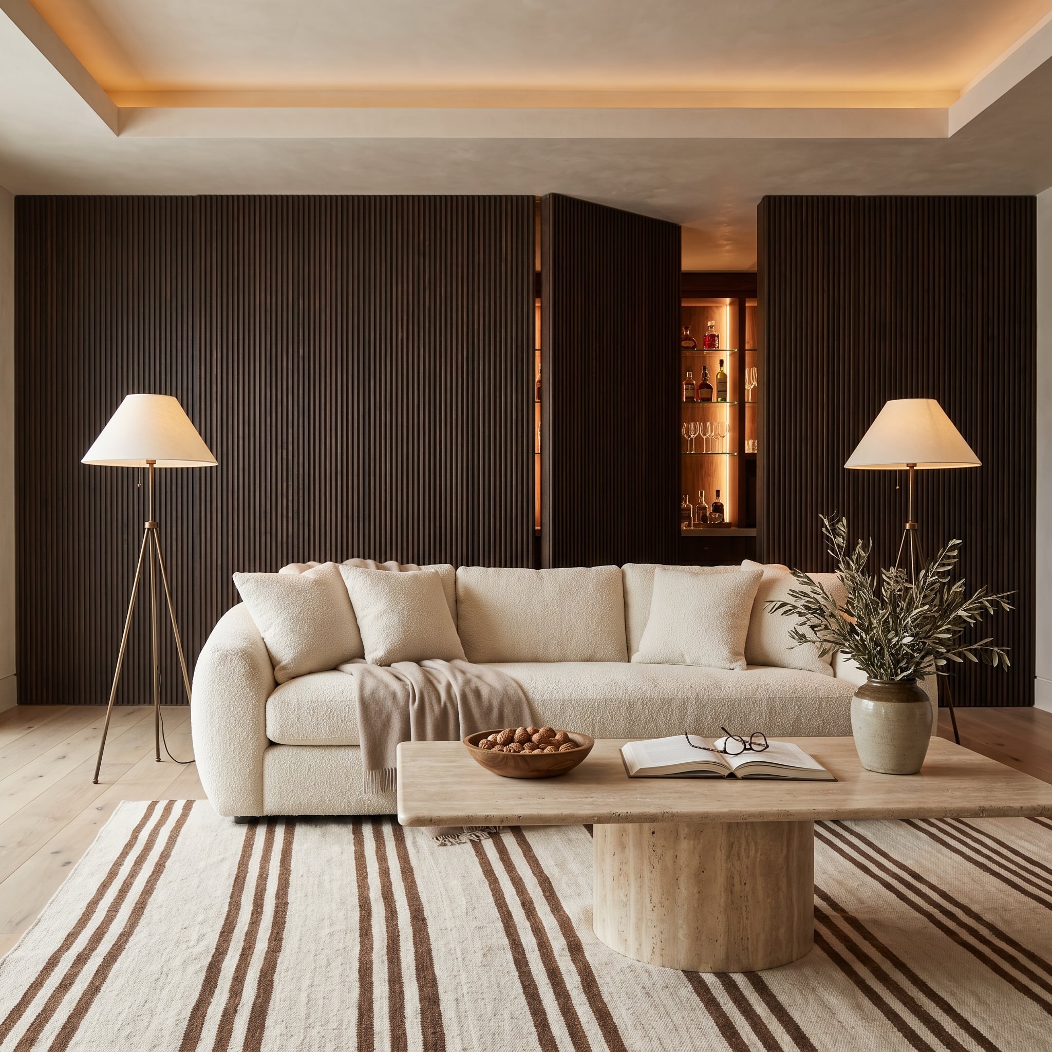
At first glance, the wall appears to be an uninterrupted expanse of dark-stained vertical timber slats. The closely spaced ribs establish a strong architectural rhythm, while the near-black finish gives the living room a sophisticated, almost theatrical backdrop.
Then the doors open.
Concealed within the paneling is a full bar cabinet, its illuminated interior introducing a warm glow against the dark exterior. The transformation changes the purpose of the wall without disturbing the room’s overall composition. Closed, the cabinetry reads as architecture. Open, it becomes a functional centerpiece.
The cream bouclé sofa provides a pale counterweight to the substantial timber surface, its curved upholstery softening the wall’s strict vertical pattern. That contrast is important even when the bar is concealed. The room needs the wall to look convincing in both configurations, not merely to provide a surprise when the doors fold back.
Most accent walls announce themselves through color, texture, or pattern. This one adds another possibility: a wall can be visually commanding while keeping its most interesting feature completely out of sight.