
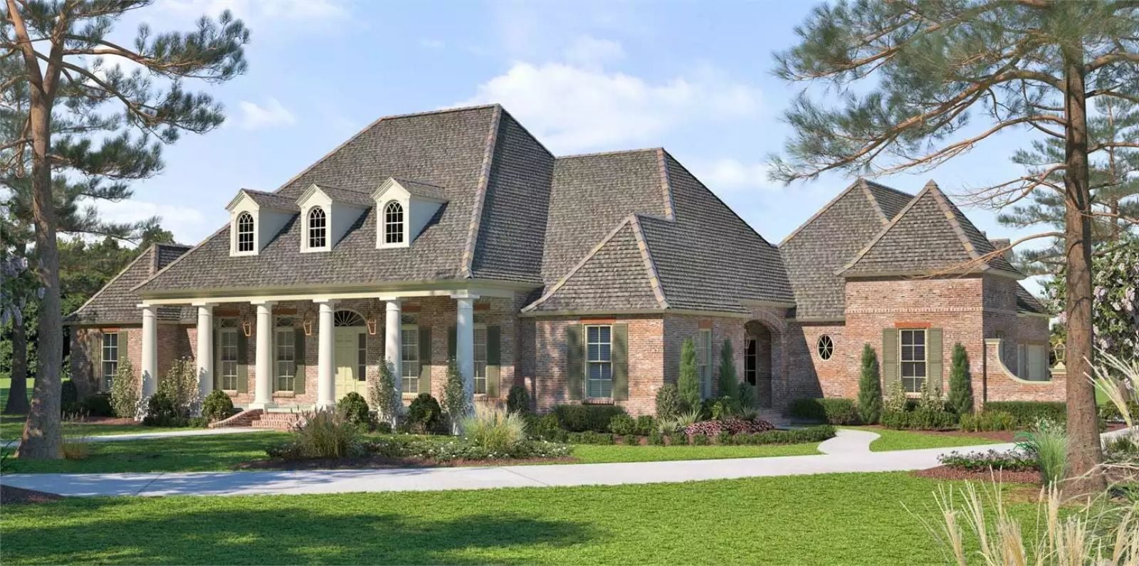
Saturday in September, and the bonus room is already claimed before the movers are done downstairs. Stone exterior catching the afternoon light, a front porch wide enough to hold two chairs and a long exhale, a kitchen that finally matches the cooking you actually do — the Reserve is built around exactly that: a bonus room that flexes between home office and weekend retreat, a primary suite set well apart from the rest, and a layout that fits the life you spent twenty years earning.
Specifications
- Sq. Ft.: 3,851
- Bedrooms: 4
- Bathrooms: 3.5
Floor Plan – Main Floor
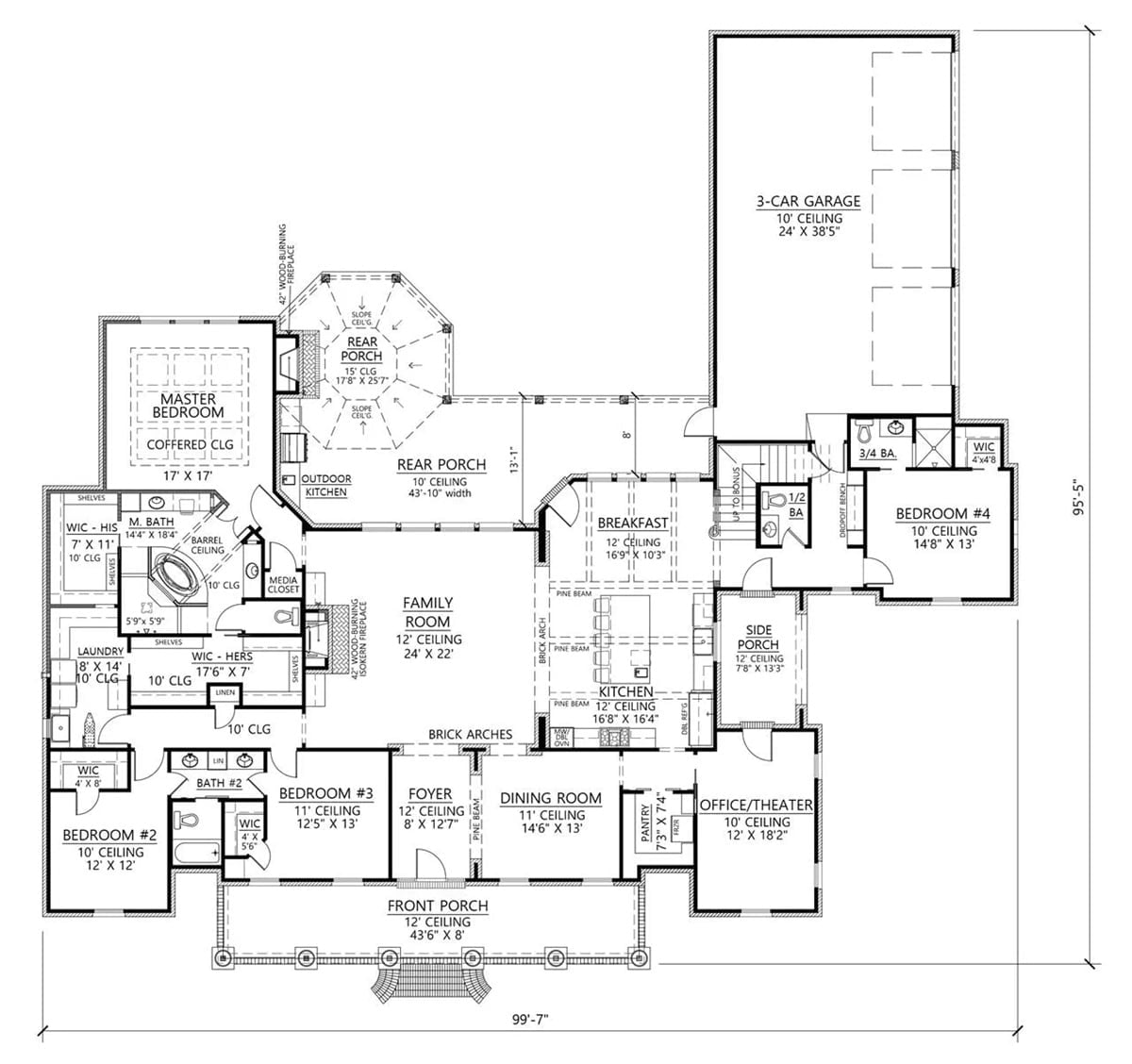
Single-story layout with four bedrooms plus a bonus room above the garage. The master suite anchors the left wing with his-and-hers walk-in closets, while the family room, kitchen, and breakfast area open into each other through the center of the plan.
Floor Plan – Bonus Room
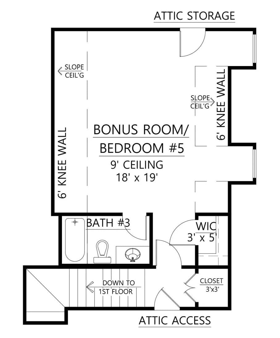
Bedroom #5 doubles as a bonus room with 9-foot ceilings and an 18×19 footprint — generous enough to fit a proper desk setup, a sectional, or both depending on the week. It connects directly to Bath #3 and a walk-in closet, with a smaller secondary closet alongside it. Knee walls on both sides follow the roofline, and attic storage wraps around the upper perimeter, which is a detail that sounds minor until you’re actually living in the space. Stairs descend to the first floor.
Distressed Sideboard and Gilt Mirror Set the Tone Before You Cross the Room
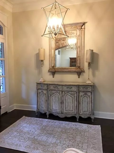
That sideboard has earned its worn finish. Beneath the chalky gray-blue paint, layers of earlier color show through, and the carved cabinet doors read French provincial without straining for it. A gilt mirror with ornate molding anchors the wall above, flanked by two sconce lamps. The geometric lantern chandelier overhead is what keeps the whole arrangement from tipping into fussy territory — just enough industrial geometry to cut the sweetness.
Exposed Brick Arch and French Wingbacks Share the Same Room Without Competing
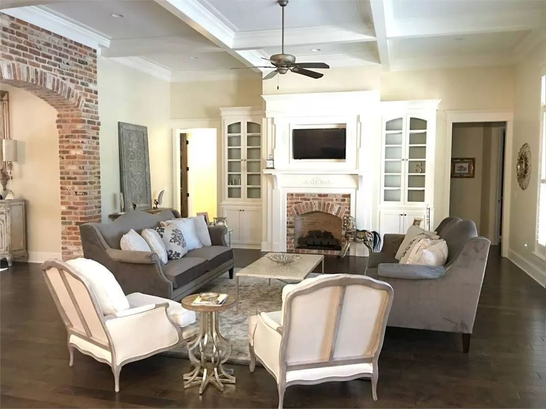
Gray velvet sofas anchor the seating group, with cream bergère chairs pulled in for contrast. Dark hardwood underfoot, a brick fireplace surround, and a coffered ceiling overhead give the room its bones — everything else is just furniture making good decisions.
Worth Knowing: Mixing upholstered pieces in two distinct styles — streamlined sofas alongside carved bergère frames — holds together when the wood tones and fabrics stay in the same muted family. The exposed brick arch earns its place twice over: it frames the adjacent space and breaks up what would otherwise be a flat, uninterrupted wall. Built-in cabinetry flanking the fireplace quietly absorbs the TV so it doesn’t run the room.
Cross-Back Chairs and Candlestick Chandelier Pull Off a French Country Hybrid
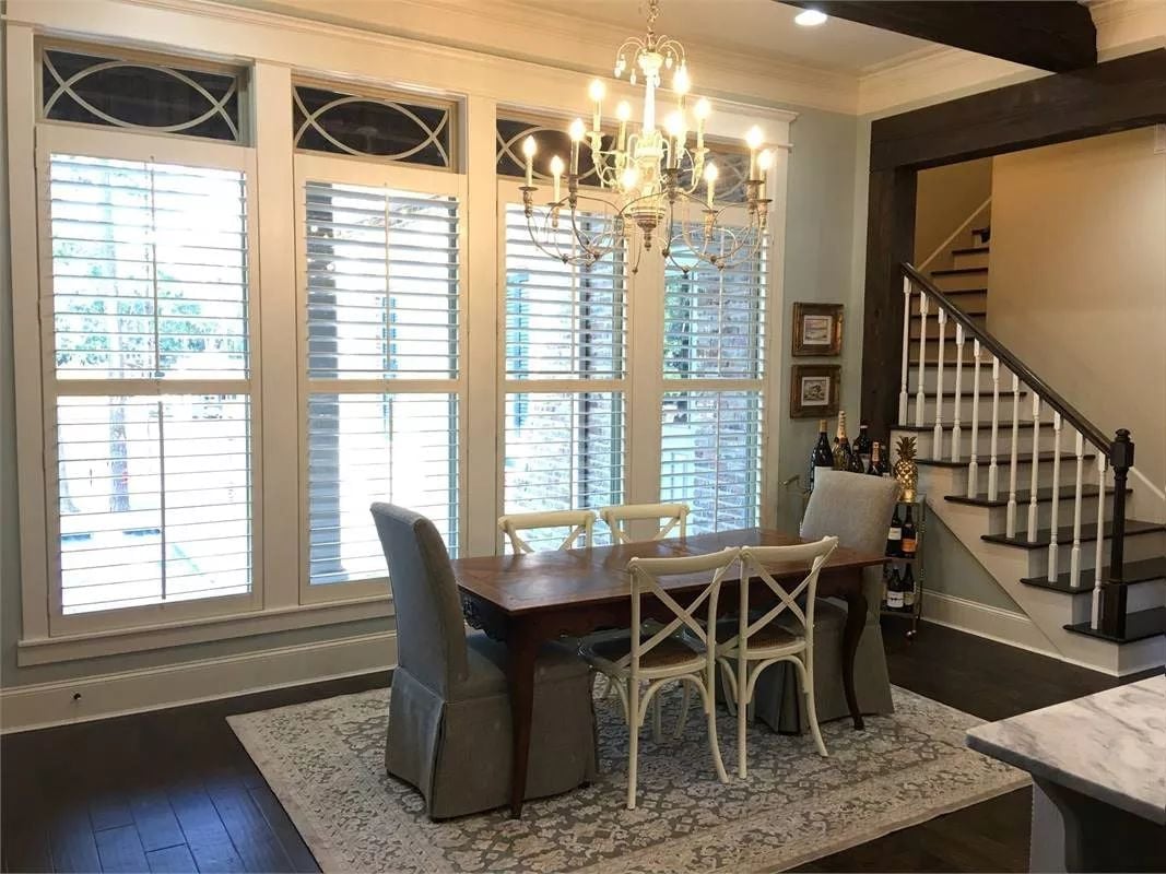
White-painted cross-back chairs pull up to a wood farmhouse table, and the chandelier’s bare bulbs keep the whole setup from reading too formal. Honest materials, no fuss.
White-painted cross-back chairs anchor the wood farmhouse table while the chandelier’s bare bulbs keep it from reading too precious.
French Wingback Chairs and a Glass-Front Cabinet Make the Home Office Worth Staying In
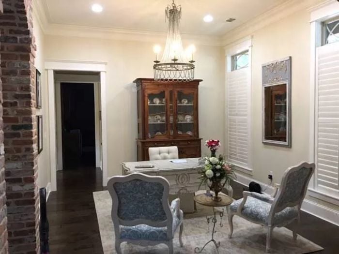
Plantation shutters handle the light without fighting the chandelier overhead, which has an open cage frame that keeps the ceiling from feeling heavy. The blue damask on the wingbacks holds its own against the creamy paintwork — a combination that could easily go wrong and somehow doesn’t. The glass-front cabinet anchors the far wall and gives the room a reason to have depth.
Did You Know: China cabinets with glass doors were traditionally dining room fixtures, but French country design has long treated the line between utility and display as optional — which is why they turn up just as often in sitting rooms and studies. An interior light inside the cabinet draws the eye upward and gives even a modest collection real presence on the wall.
Copper Range Hood and Marble Island Make a Case for Going All In
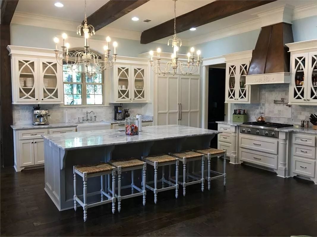
Rush-seat barstools line a gray island topped with thick marble, and that copper hood commands the wall behind the range — warm and unapologetic against all the painted white cabinetry surrounding it. Some kitchens have a focal point. This one has a statement.
Pro Tip: Copper hoods develop a natural patina over time, so skip the sealant if you want that aged warmth to keep deepening. Pairing copper with cool stone countertops keeps the palette from reading too warm — the contrast does that work without any extra effort on your part.
Makeup Counter Built Into the Vanity Proves Storage Doesn’t Have to Look Like Storage
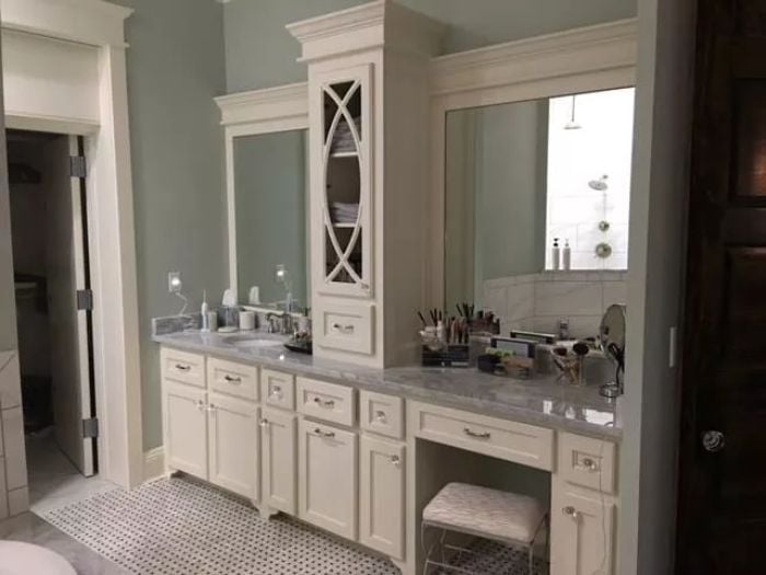
Built-in vanity seating on one side and double sinks on the other lets two people use this bathroom at the same time without any negotiating. Marble countertops run the full length without a seam to interrupt them. The tall center cabinet with X-pattern glazed doors handles vertical storage without crowding anything overhead, and the whole thing reads more like a piece of furniture than a bathroom fixture — which is the point.
Why the Center Tower Works Harder Than It Looks
Most double vanities ignore the obvious question: where does anything actually go? Stacking a tall cabinet between two mirrors answers it without cluttering the countertop. The X-mullion glass doors let you see what’s inside at a glance, which speeds up the morning routine more than you’d expect. Centering it also breaks the long horizontal run of cabinetry into something with actual visual rhythm rather than a flat wall of drawers.
Pin It
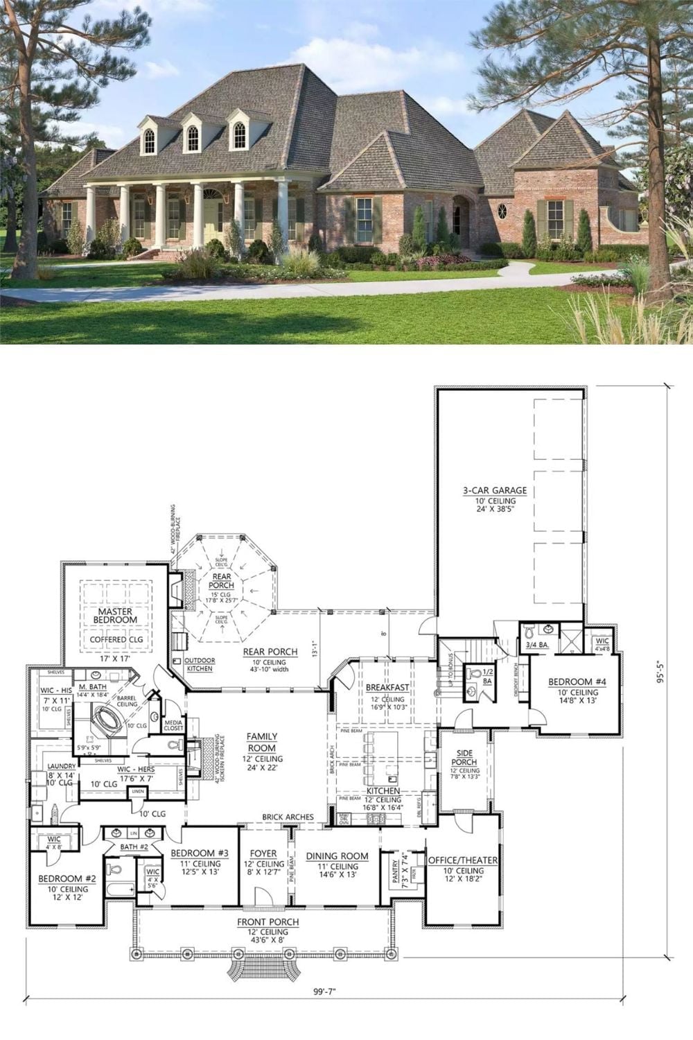
The top half shows the French country brick exterior: columned front porch, steep roofline, the kind of curb presence that reads from the end of the driveway. Below it, the floor plan spreads out across nearly 100 feet of width — five bedrooms, a family room, kitchen with breakfast area, office/theater, and a three-car garage, all on a single level.
