Walk into a house built or renovated around 2015 and you can almost date it on sight. Not from the paint — from the hardware baked into the walls. The panel nobody can update, the cable run that assumed one standard would last forever. These were the smart, forward-looking choices back then, the ones that cost extra and felt like the future. Now they’re the tell. We pulled together the installed upgrades that have aged hardest, the ones that tie an interior or exterior straight to a specific stretch of the mid-2010s.
43. The HDMI Run Buried in Drywall With No Conduit Behind It
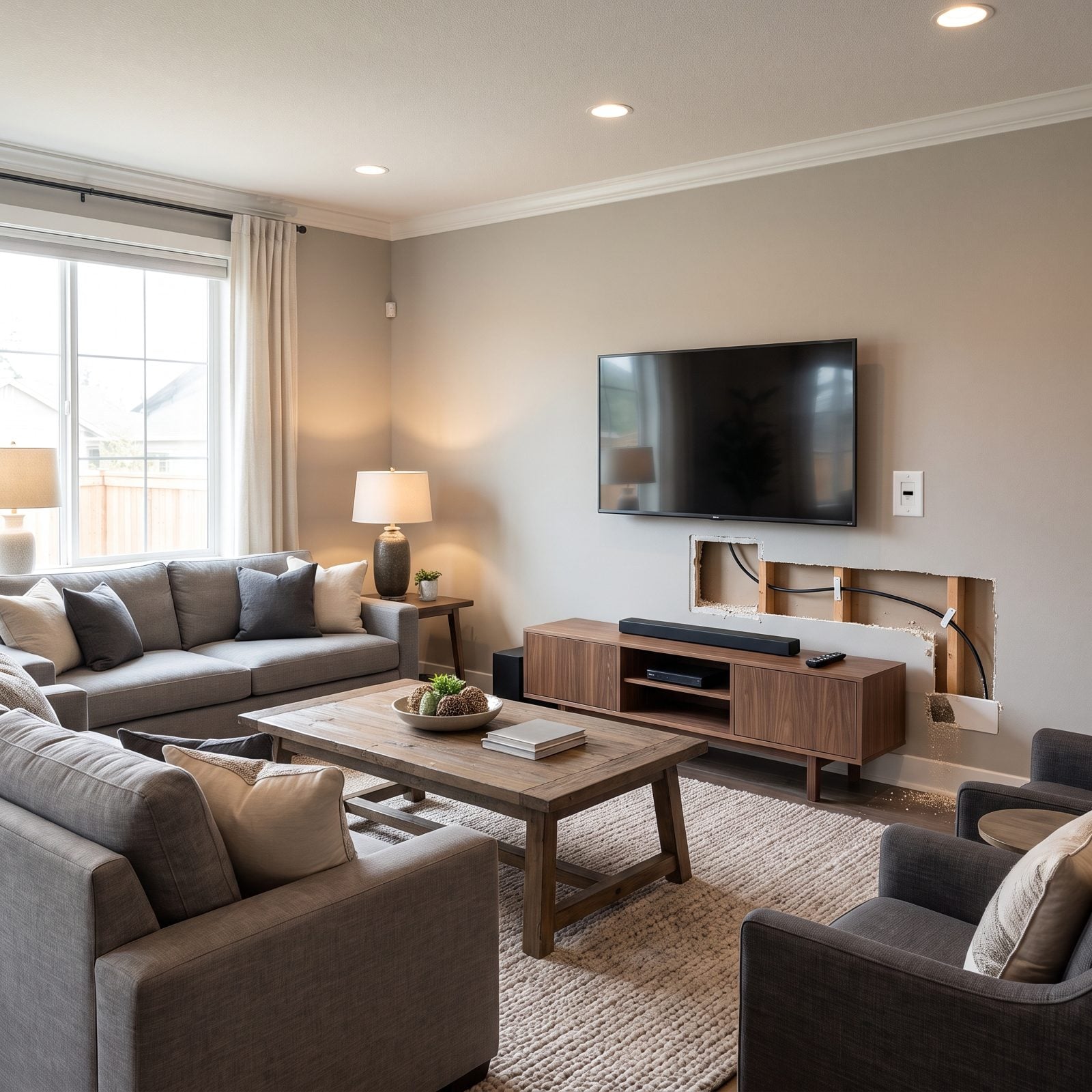
Hiding a cable in the wall felt like the pro move in 2015, but no conduit meant no future. When the standard jumped, so did the problem.
In order to come up with the very specific design ideas, we create most designs with the assistance of state-of-the-art AI interior design software. Also, assume links that take you off the site are affiliate links such as links to Amazon. this means we may earn a commission if you buy something.
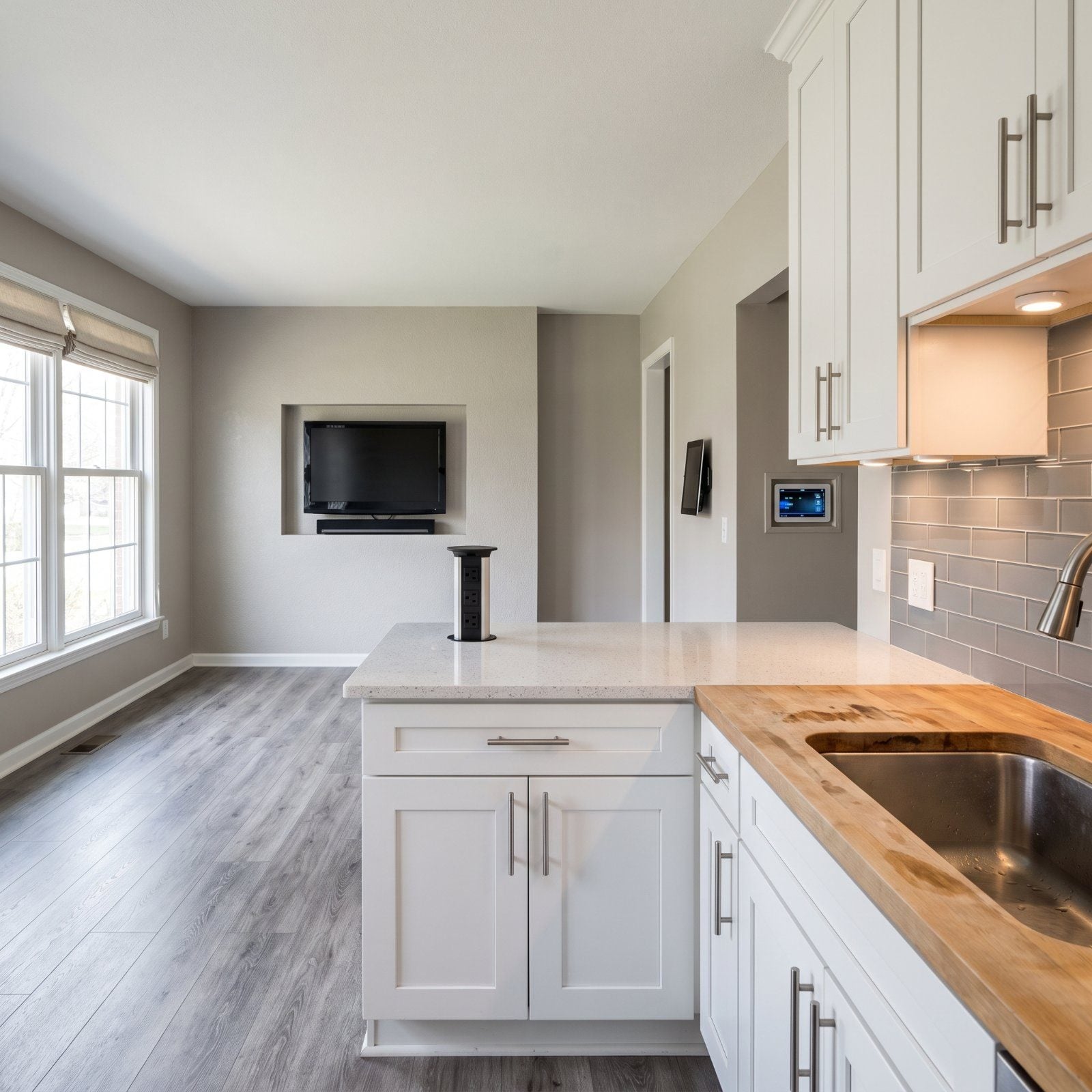
That single HDMI line fished bare through the stud bay only pulls one cable, and only in one direction. Want to run a newer, thicker one? You’re opening drywall, not swapping a wire. A pull string left in at install time would have solved it for a couple of bucks. Almost nobody left one.
42. Built-In Tablet Docks Sized for a Tablet That No Longer Exists
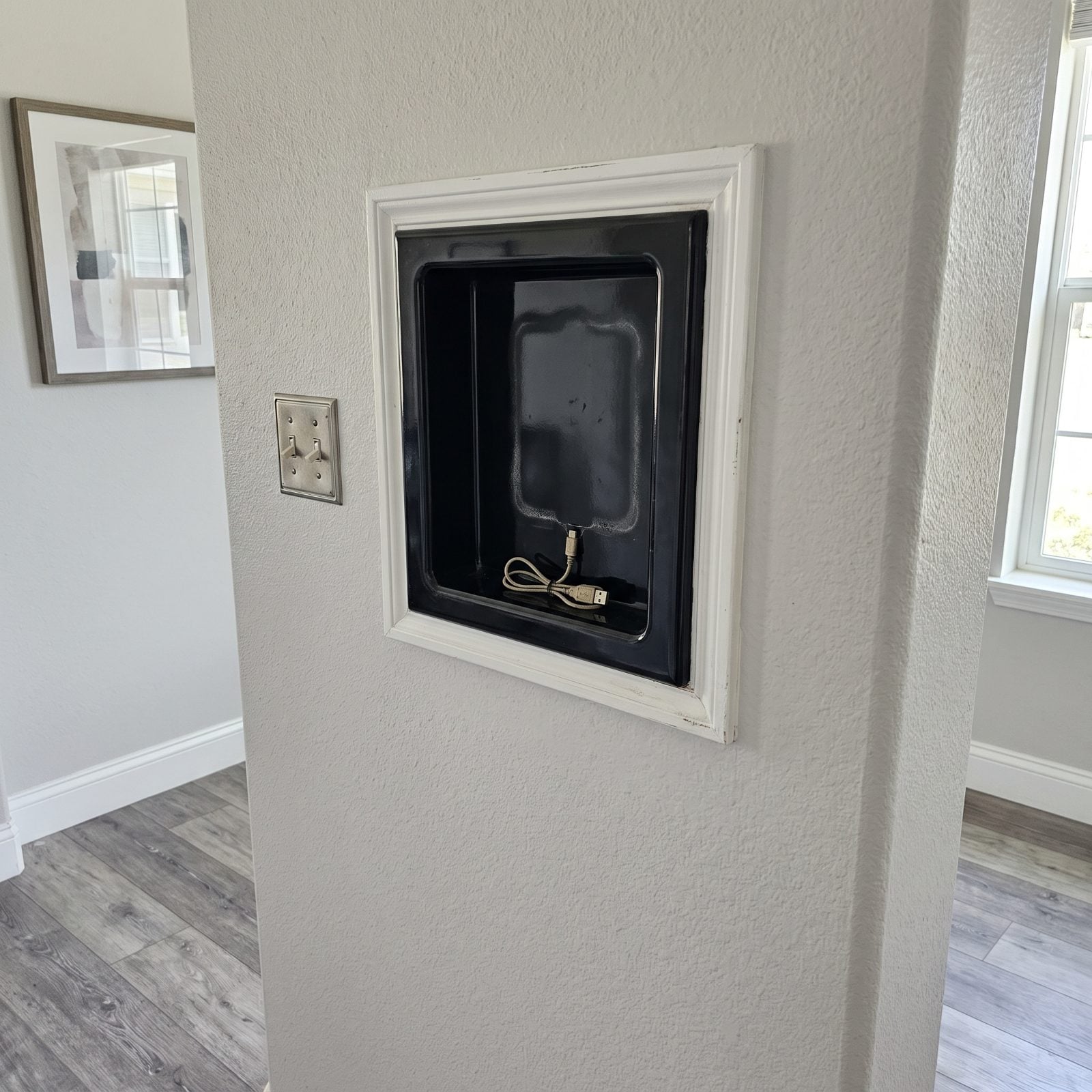
You’ve seen the empty rectangle by the kitchen doorway, framed and finished like it mattered. It did, once.
Someone built the dock to one device’s exact dimensions, bezel and all. Then tablets got thinner, ports changed, and the cavity stayed put. Now it’s a hole in the wall shaped like a discontinued product — too specific to repurpose, too finished to ignore.
41. The Proprietary Smart-Home Touchscreen Stuck in the Wall
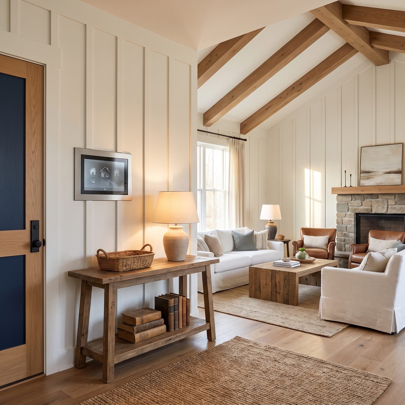
Nothing dates a hallway faster than a wall panel that looks like it belongs in an office lobby.
These proprietary touchscreens were the centerpiece of the smart home — lighting, music, thermostat, all routed through one flush rectangle. Then the company pivoted, or the servers went quiet, and the panel became a glowing grid of buttons that control less every year. Phones took over the job. The wall never got the memo.
40. Whole-House Audio That Lives and Dies by an App
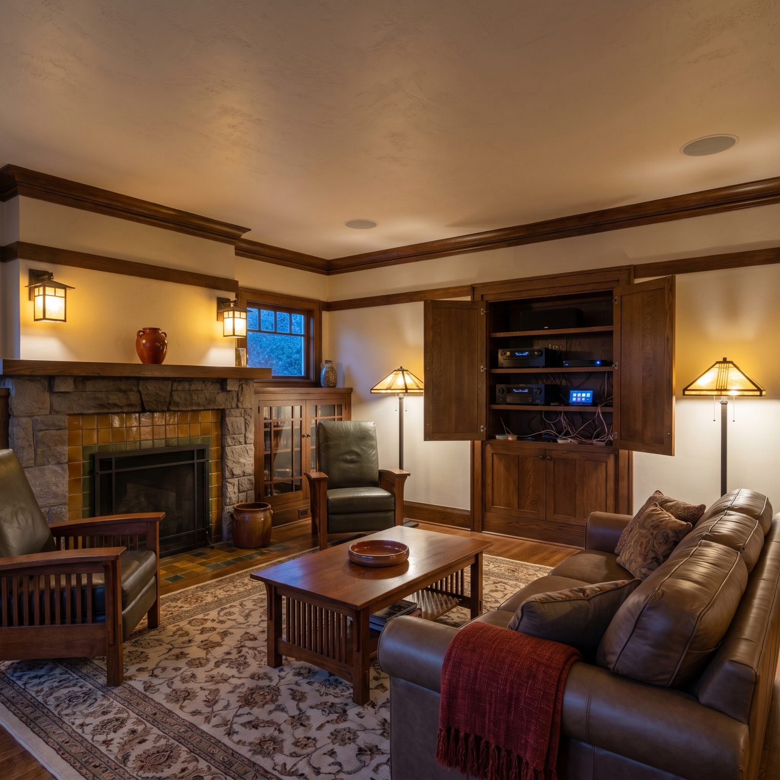
Say you wired the whole house for sound in 2015 — speakers flush in every ceiling, one slick app running the lot. For a while it felt like the future had arrived early.
Then the app stopped getting updates and the receiver dropped off the new network standard. The ceiling speakers still work fine, but the brain that talks to them is orphaned software on a box nobody supports. Great hardware, barely controllable. An ivory home bar can hide the rack, but it can’t revive the firmware.
39. Integrated LED Fixtures You Can’t Re-Bulb
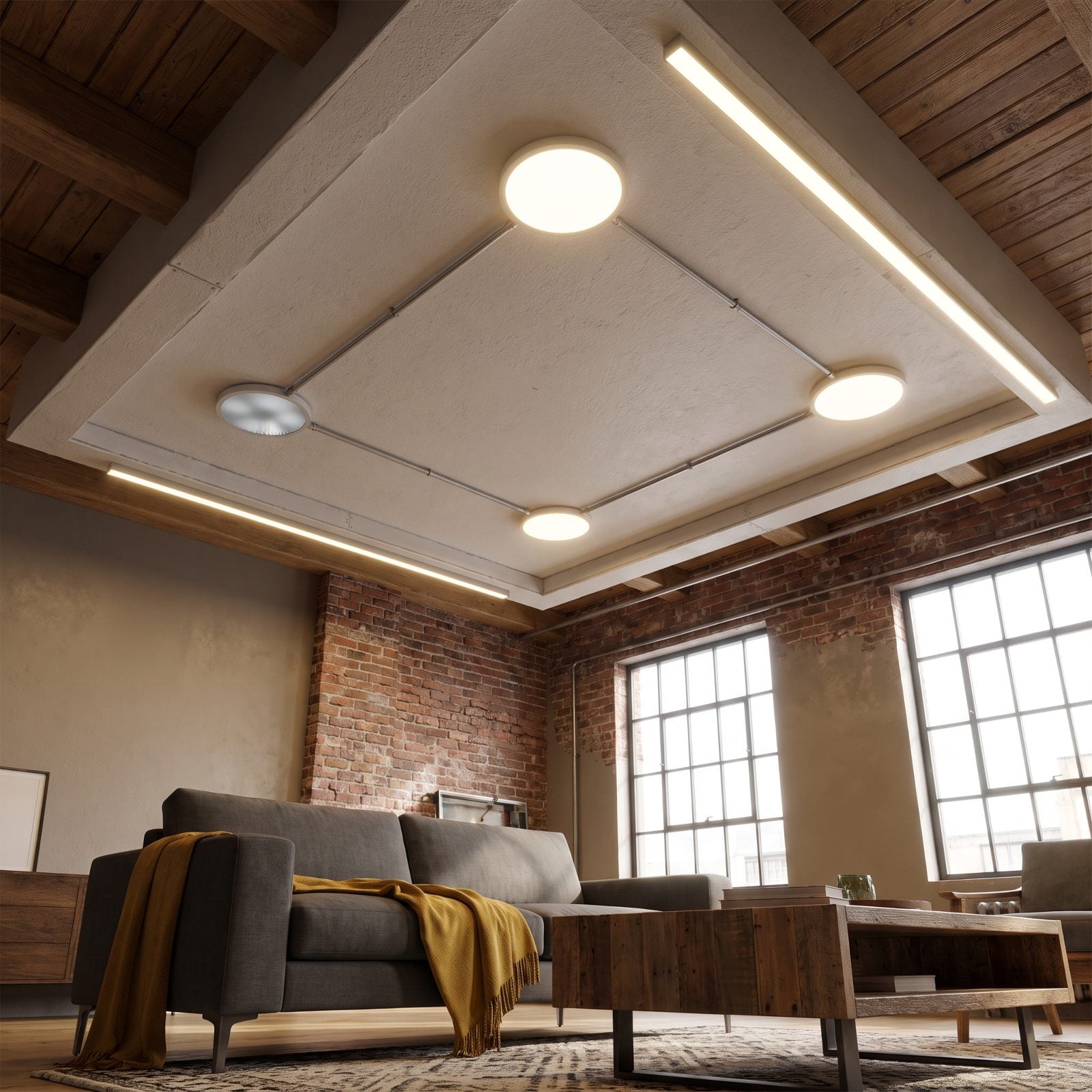
Sealed LED fixtures sold a clean promise: no bulbs to swap, no sockets to see, just a smooth disc of light. Beautiful on day one.
The catch shows up years later. When the LED module or driver inside gives out, there’s no bulb to change — you replace the entire fitting, which usually means calling an electrician and hunting for a fixture that’s long been discontinued. The old screw-in socket was ugly and immortal. This is the opposite trade.
38. The Media Recess Cut to the Exact Size of a 2015 TV
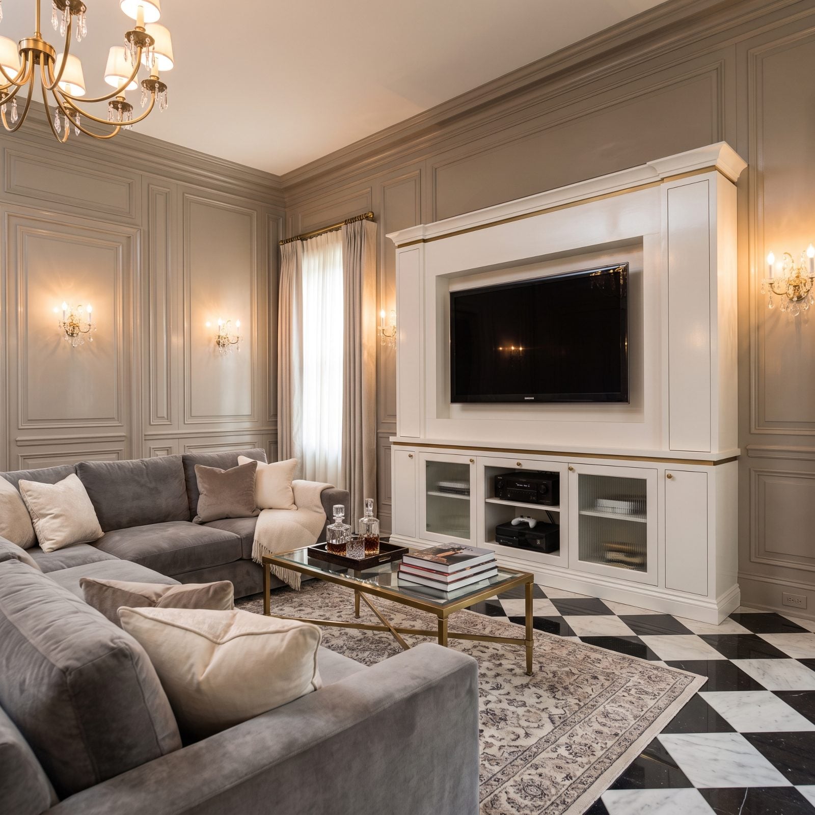
A recess built to fit one television is a recess built to fight the next one.
These custom openings were framed to the exact height and depth of a mid-2010s screen, bezels and all. Then screens got wider, thinner, nearly borderless. Now the new TV either swims in the hole or won’t clear the depth, and the component niches below were sized for gear that’s been retired. Precision was the selling point. It’s also the cage.
37. USB-A Wall Outlets Wired Into Every Bedroom
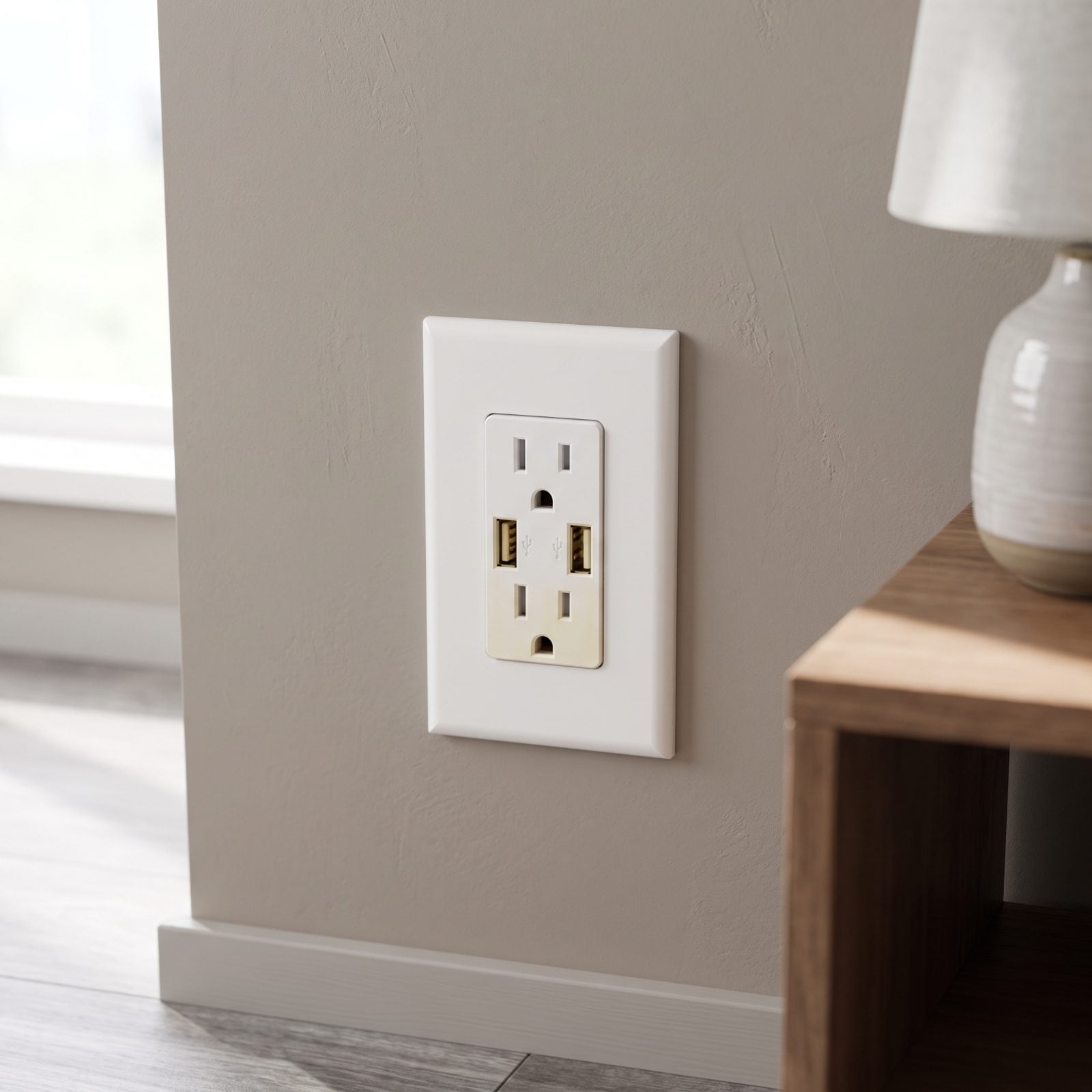
Remember when a USB port in the wall felt genuinely clever? No wall wart, just plug and charge. People paid extra to have these put in every room.
They’re all USB-A — flat, slow, the connector every new device is leaving behind for USB-C. Unlike a phone charger you toss in a drawer, these are wired into the wall. Replacing them means a trip to the panel, not a trip to the store. A convenient upgrade quietly turned into a permanent reminder of 2015.
36. Pop-Up Power Towers That Rise Out of the Countertop
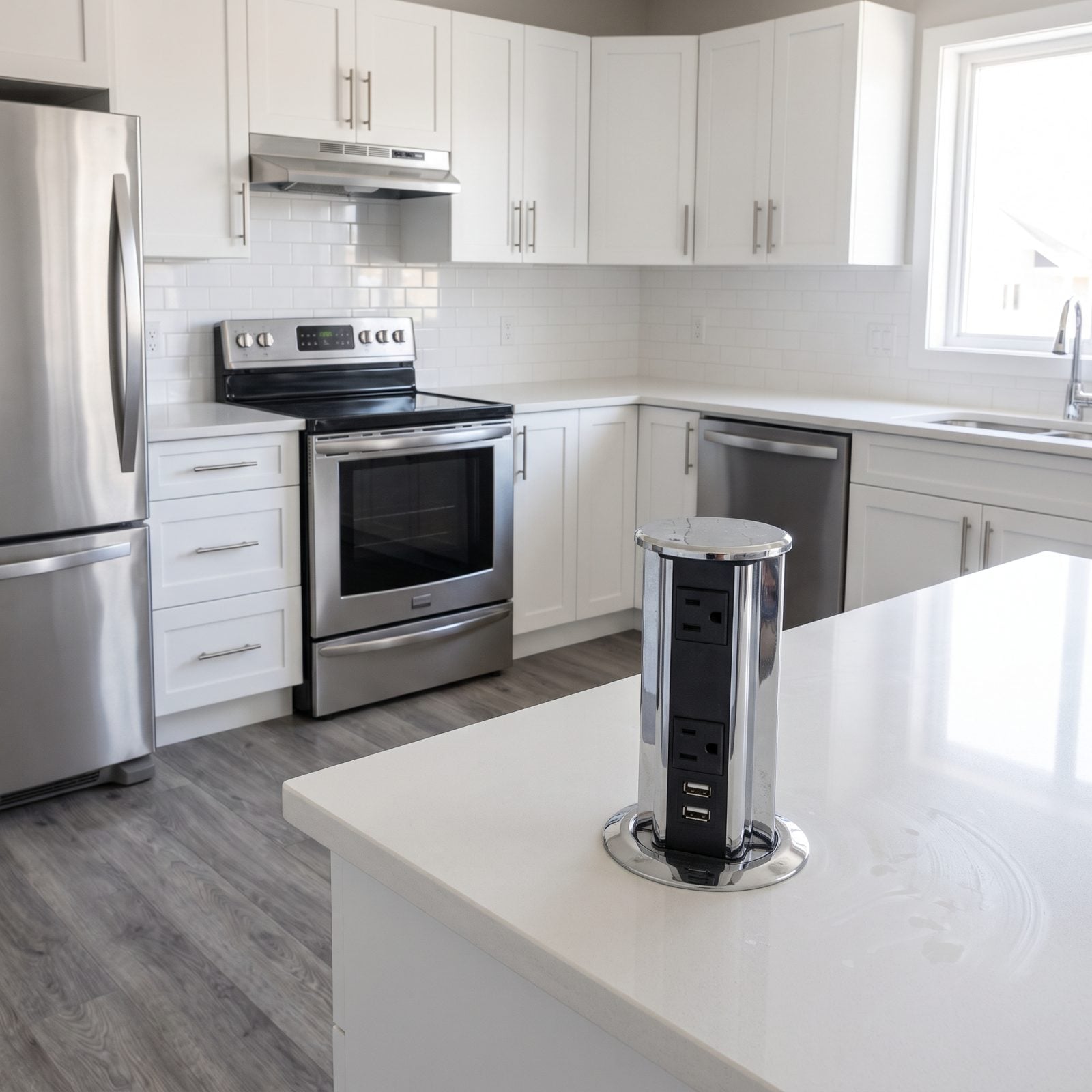
The pop-up power tower was the party trick of the 2015 kitchen island. Press it down, hidden outlets. Pop it up, instant charging station. Buyers loved the reveal.
In daily use, though, it’s a bulky chrome column interrupting your prep space, and it still runs those aging USB-A ports. Newer solutions sit flush in the counter or wireless-charge right through the stone, with no mechanism to jam or clean around. The tower that wowed on the showroom island now reads like a gadget that outstayed its welcome.
35. Undercabinet Puck Lights With Those Telltale Dots
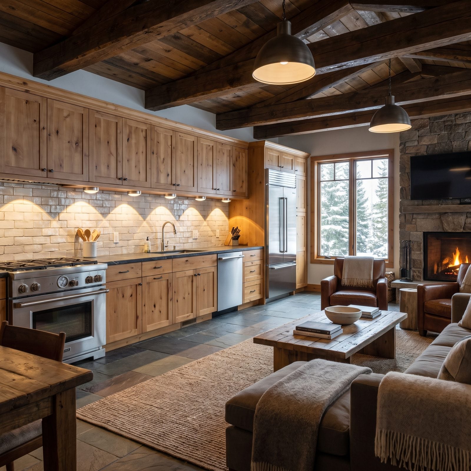
Look at the counter under the cabinets. See the scallops? Bright circle, dim gap, bright circle. That’s the tell.
Puck lights were the undercabinet standard a decade back — individual discs throwing individual pools. Continuous LED tape replaced them with an even wash and no visible source. Once you’ve seen a seamless strip, the spotlight-and-shadow pattern of pucks reads instantly older. Same cabinets, same quartz, dated by the lighting alone.
34. Butcher Block Wrapped Around the Kitchen Sink
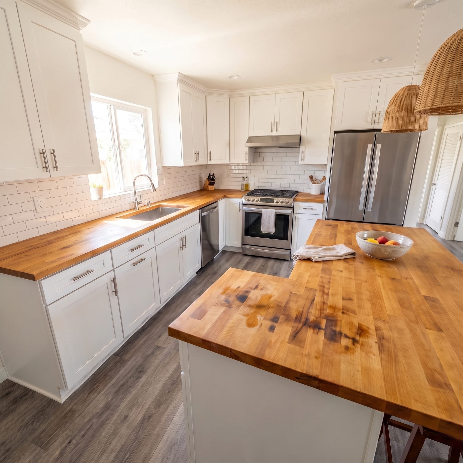
Butcher block around the sink was the warm, organic counterpoint to all that grey quartz. On a mood board it looked honest and handmade.
Wood and water were never going to be friends, but the damage doesn’t always land where you’d expect. Here the block around the basin is still clean. It’s the island that has soaked up heavy, dark water-type stains from spills, wet glasses and damp towels left to sit, and no amount of sealing fully stops it. The sink run can look great. The island gives it away.
33. Black-Stainless Appliance Suites: The Finish That Couldn’t Hide a Thing
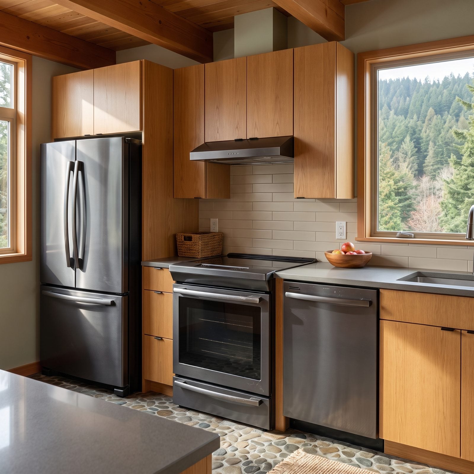
The black-stainless rollout of the mid-2010s promised a softer, more upscale look than regular stainless. Reality showed up within a week of ownership.
Every fingerprint read like a confession, and the scratches near the handles couldn’t be buffed out because the dark coating sat on top of the steel rather than in it. Then one appliance died and the replacement never quite matched the sheen of the other two. You can spot the suite from across the room now — three pieces pretending to be a set.
32. High-Gloss Handleless Cabinets and the Reflective Minimalism of a Decade Ago
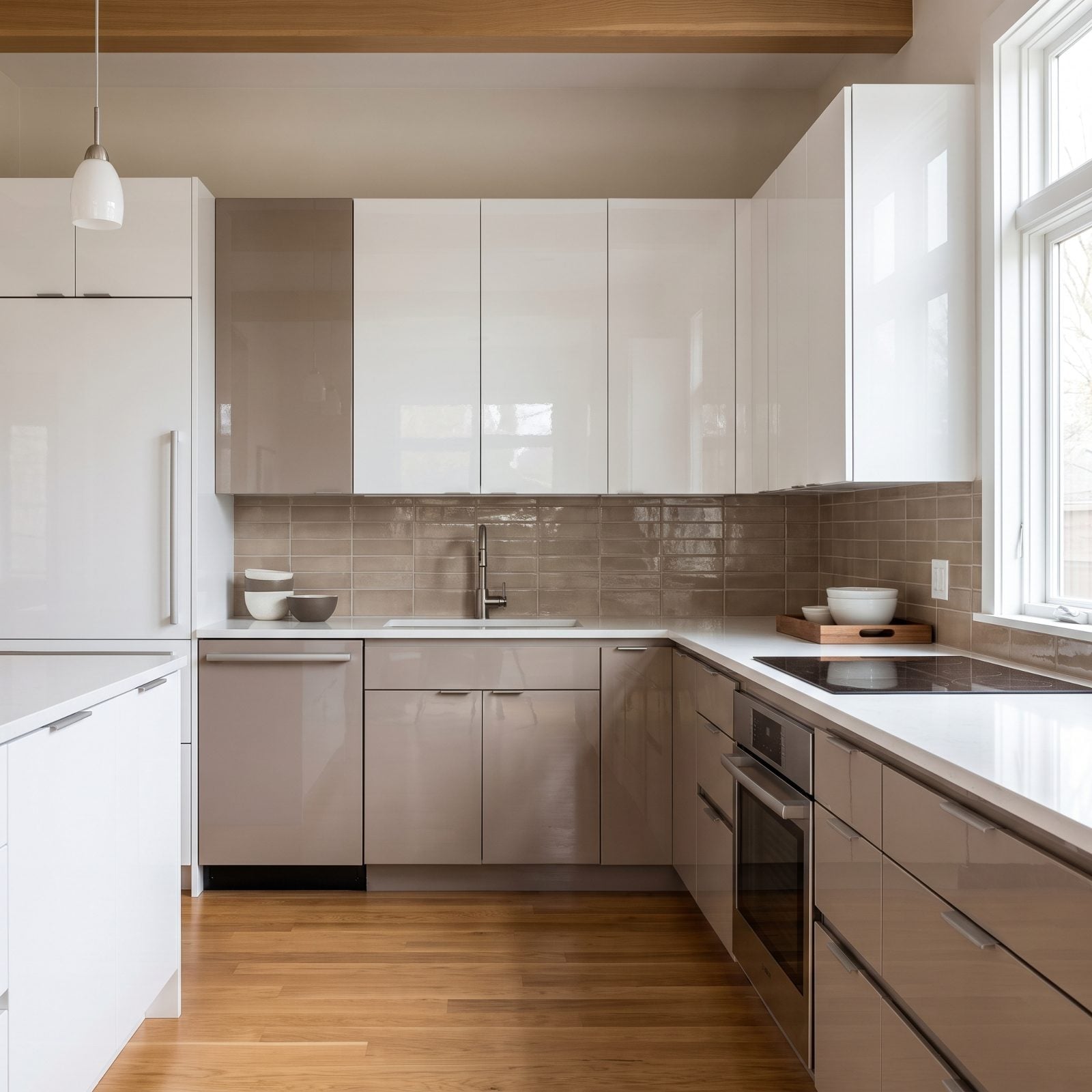
Handleless slab doors felt like the future in 2014. No hardware, little visual noise, just a wall of light-catching lacquer.
Those reflective slab fronts are the tell now. Gloss shows every smudge, and the lacquer along those finger-pull edges that looked so clean in the brochure collects grease right where your fingers land. The whole look reads as one specific slice of time — back when minimalism meant shiny rather than warm.
31. Open Shelving That Looked Great in Photos and Lost the War With Daily Life
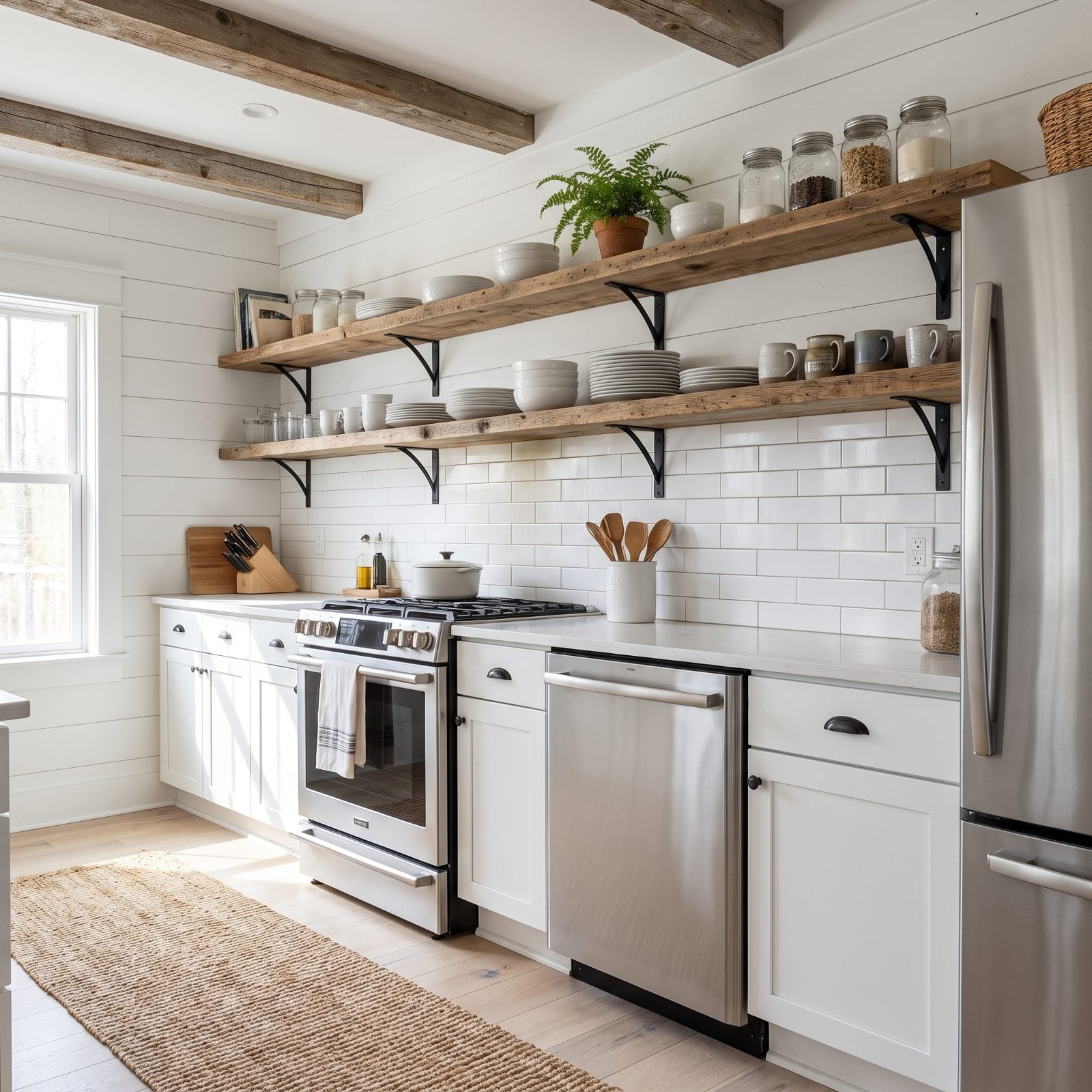
Open shelving was catnip for a certain era of kitchen photography. Styled dishes, a trailing plant, a row of clear glass mason jars catching the light.
Then came the dusting, the grease film near the stove, and the slow realization that concealed storage existed for a reason. Keeping two open shelves “magazine ready” turns out to be a part-time job nobody signed up for. The look dates a kitchen fast because it screams 2015 Pinterest board.
30. Chunky Waterfall Island Ends: When the Mitered Slab Became a Period Statement
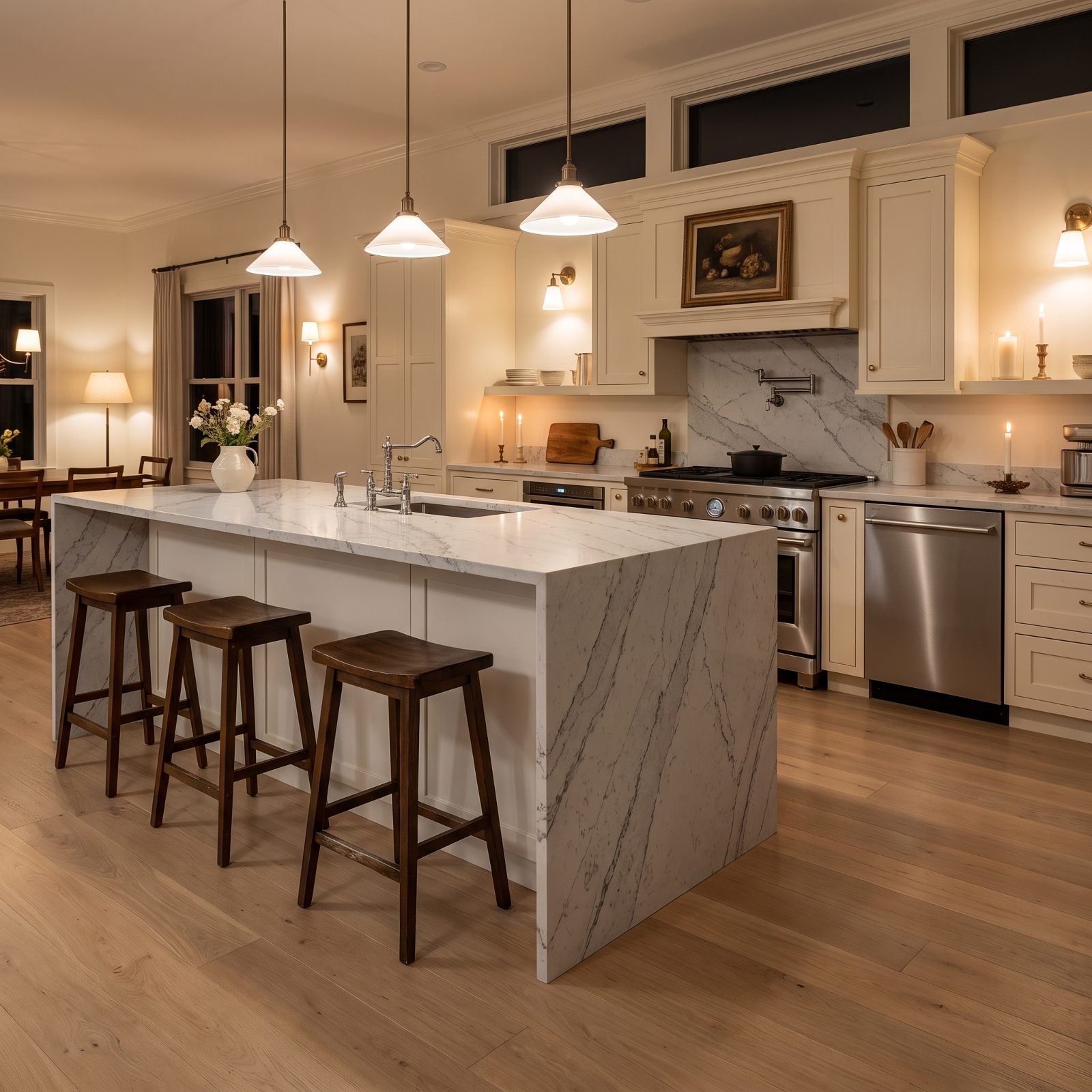
That slab of quartz pouring over the island end was the flex of the decade. Thick mitered corners, a waterfall down both sides, the whole thing built to look like a solid block of stone.
It still signals money. It just signals a very specific year of money, and the chunkier the miter and the busier the gray veining, the more precisely it pins the room to its install date.
29. White Shaker Cabinets With Gray-Veined Quartz, the Default Package Everyone Bought
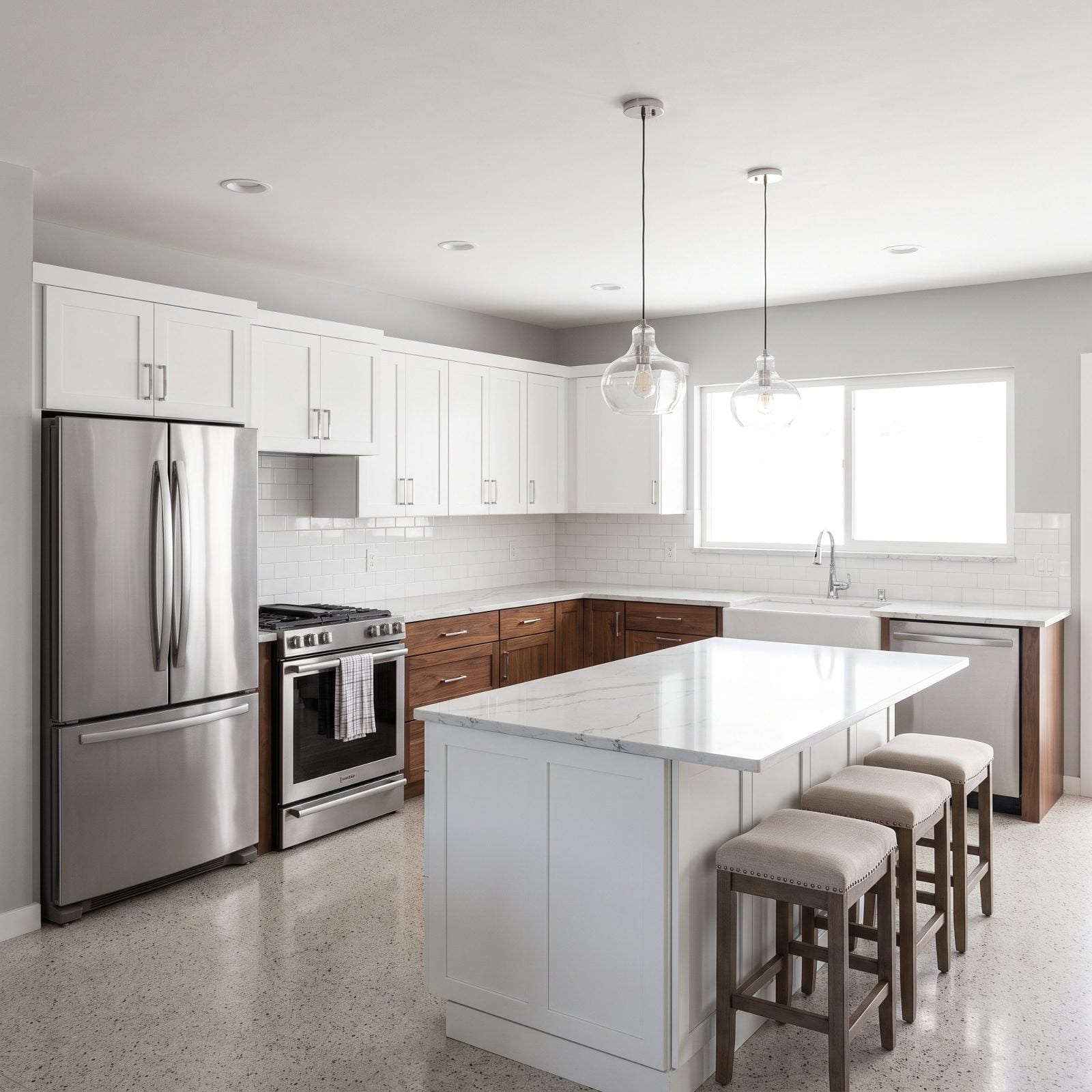
You know this kitchen. You’ve stood in a dozen of them at open houses, each one convinced it was the first to think of white shakers over gray quartz.
It was the safe choice, and safe choices age by sheer repetition. Nothing here is wrong. It’s just the house equivalent of a song that played on every station in 2016 — recognizable the second you walk in, impossible to date any later.
28. Reclaimed-Wood Range Hoods and the Farmhouse-Industrial Moment
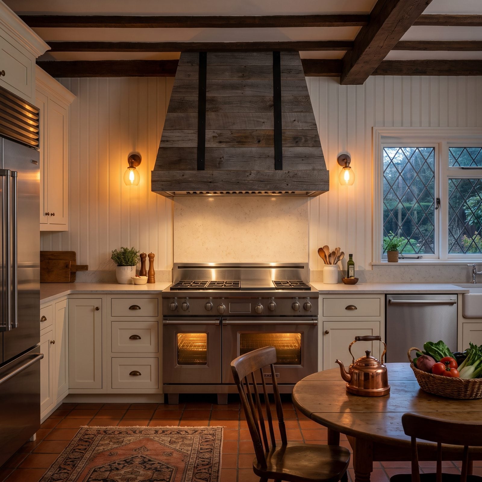
Wrap a modern vent in salvaged barn boards and you had the centerpiece of every farmhouse kitchen from about 2013 onward.
The hood pulled double duty — half appliance, half statement. Black straps, visible knots, that calculated roughness set against clean white cabinets. It worked beautifully, and then it worked everywhere, which is exactly how it became a date stamp.
27. Aqua Glass Subway Tile and the Spa Palette It Can’t Shake
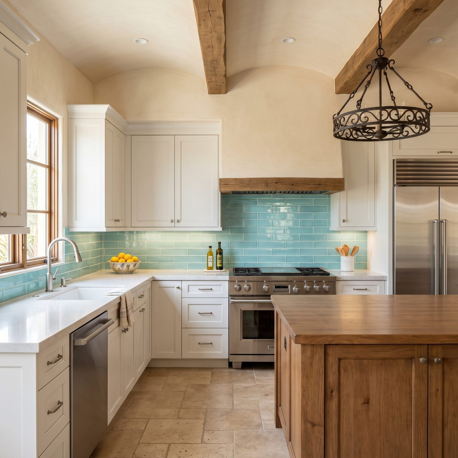
Blue-green glass tile had a glow to it. Light passed through the glass and bounced back, giving backsplashes a watery shimmer that felt fresh and vaguely spa-like.
That shimmer is the problem now. Aqua reads as a very particular wellness moment — the years when every kitchen wanted to feel like a day at the resort. Few other materials here lock a room to its decade this hard.
26. Skinny Mosaic Backsplash Bands: The Showroom Upgrade Everyone Added
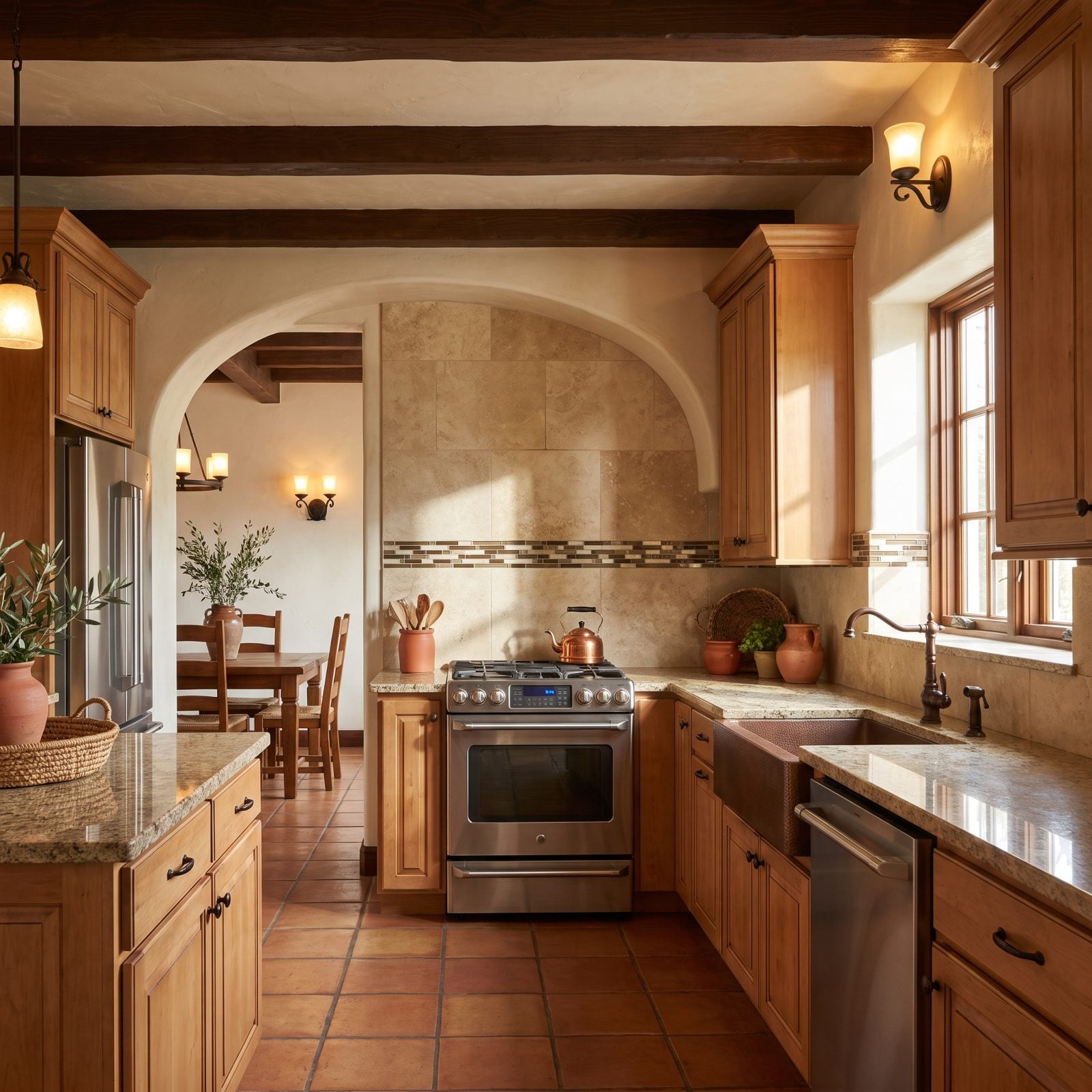
A field of plain tile, then a single thin ribbon of tiny mosaic running across the middle. That band was the “upgrade” box you checked at the tile showroom.
It aged the fastest of the bunch. The skinny accent strip — usually bronze and glass — interrupts the wall for no functional reason, and nothing says builder-grade add-on from one narrow window of years quite like it.
25. Arabesque Backsplashes and the Lantern Shape That Marked the Mid-Decade
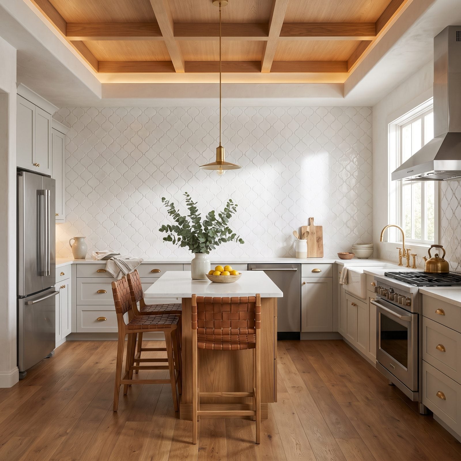
The lantern shape was unmistakable. Those curvy, interlocking tiles turned a flat wall into a repeating pattern that felt custom and a little glamorous.
It had a good run. The arabesque backsplash became shorthand for a put-together kitchen somewhere around the middle of the decade, which is precisely why it now plants the room in that exact window. Too distinctive a shape to read as timeless.
24. Gray Luxury Vinyl Plank Everywhere, and the Flatness It Left Behind
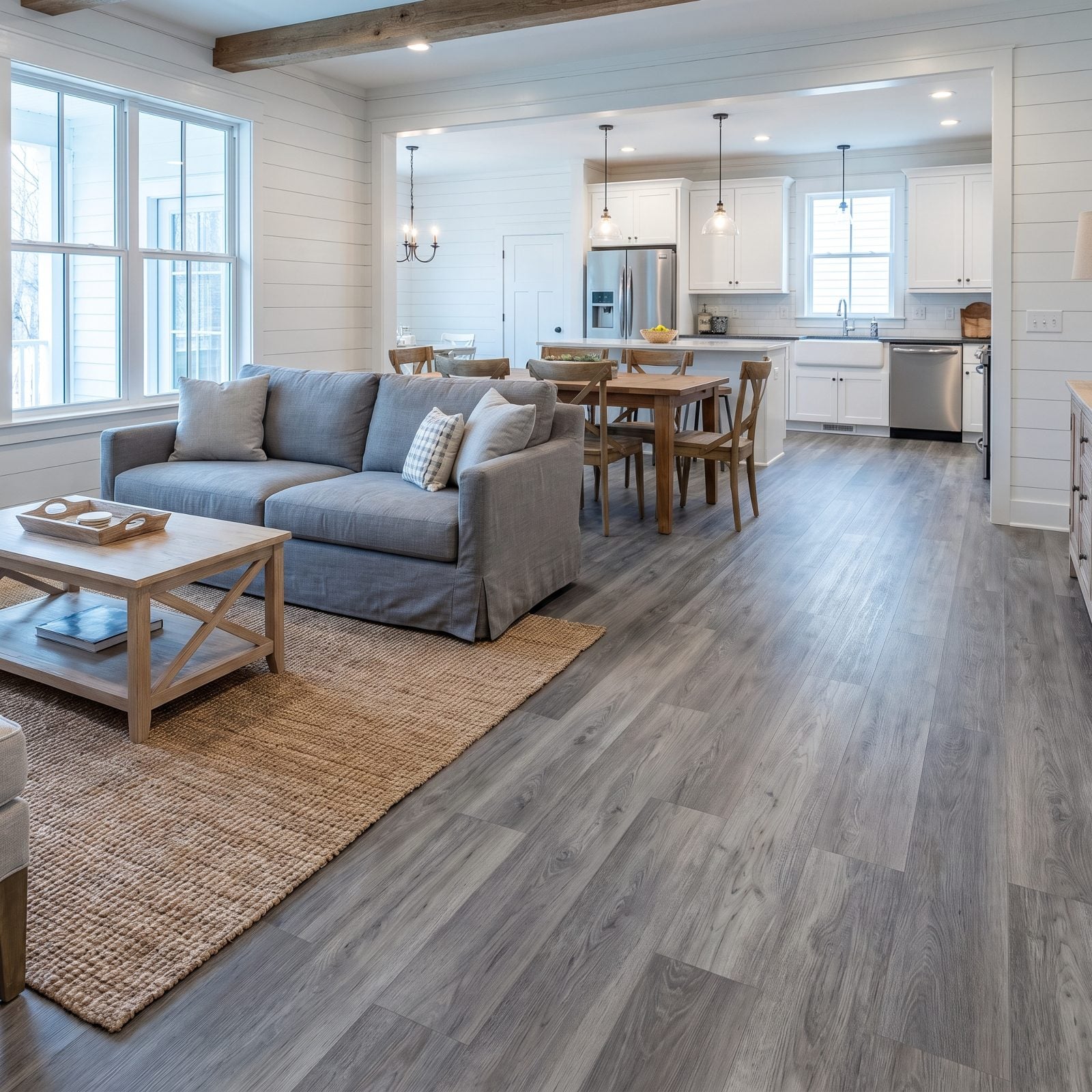
Gray luxury vinyl plank solved real problems. Waterproof, cheap, and easy to click into place across a whole house in a weekend — hard to argue with that on paper.
Here’s what it did to a room, though. Run cool gray faux-grain through every connected space and the pattern starts repeating visibly, flattening the floor into one uniform sheet. Adjoining rooms lose their individual character, and the whole level reads as the budget default of its moment rather than a real floor.
23. Espresso Hand-Scraped Floors That Shout 2015 in a Transitional Entry
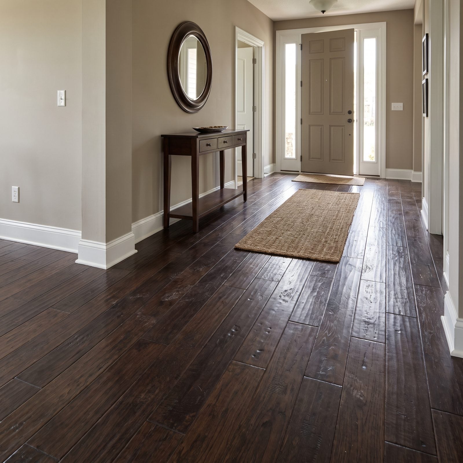
That dark hand-scraped floor was the whole personality of a 2015 renovation. The dents were fake, pressed into engineered planks at the factory, and the espresso stain ran so deep it swallowed every bit of light in the room.
Nobody mentioned the catch back then. Dark floors show absolutely everything — dust, pet hair, one footprint after you mop. The scraped texture that once read as rustic character now reads as a showroom from a very specific year.
22. One Greige for Every Room, and the Muted Cast It Left Behind
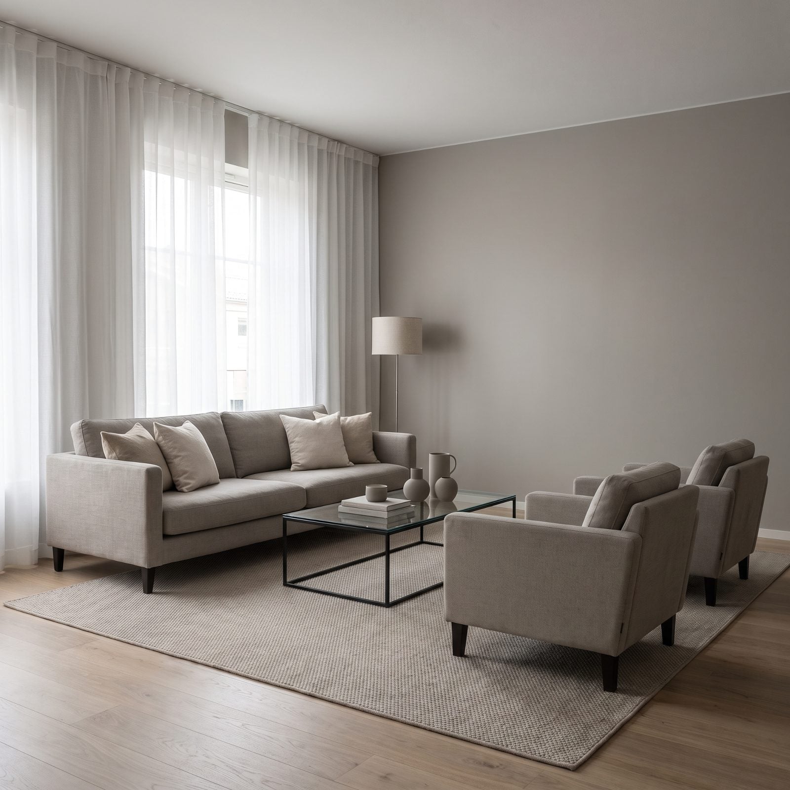
Greige was the safe choice. Not grey enough to feel cold, not beige enough to feel dated, so people rolled the same shade through every room and called it a day.
Here’s the flat truth: when one muted neutral runs wall to wall through an entire house, the rooms stop breathing. Nothing has a mood of its own — the dining room feels like the hallway feels like the bedroom. It’s a color with no opinion, and a whole house of it reads like a model home nobody ever moved into.
21. The Great Wall Removal, and What Got Lost With the Separation
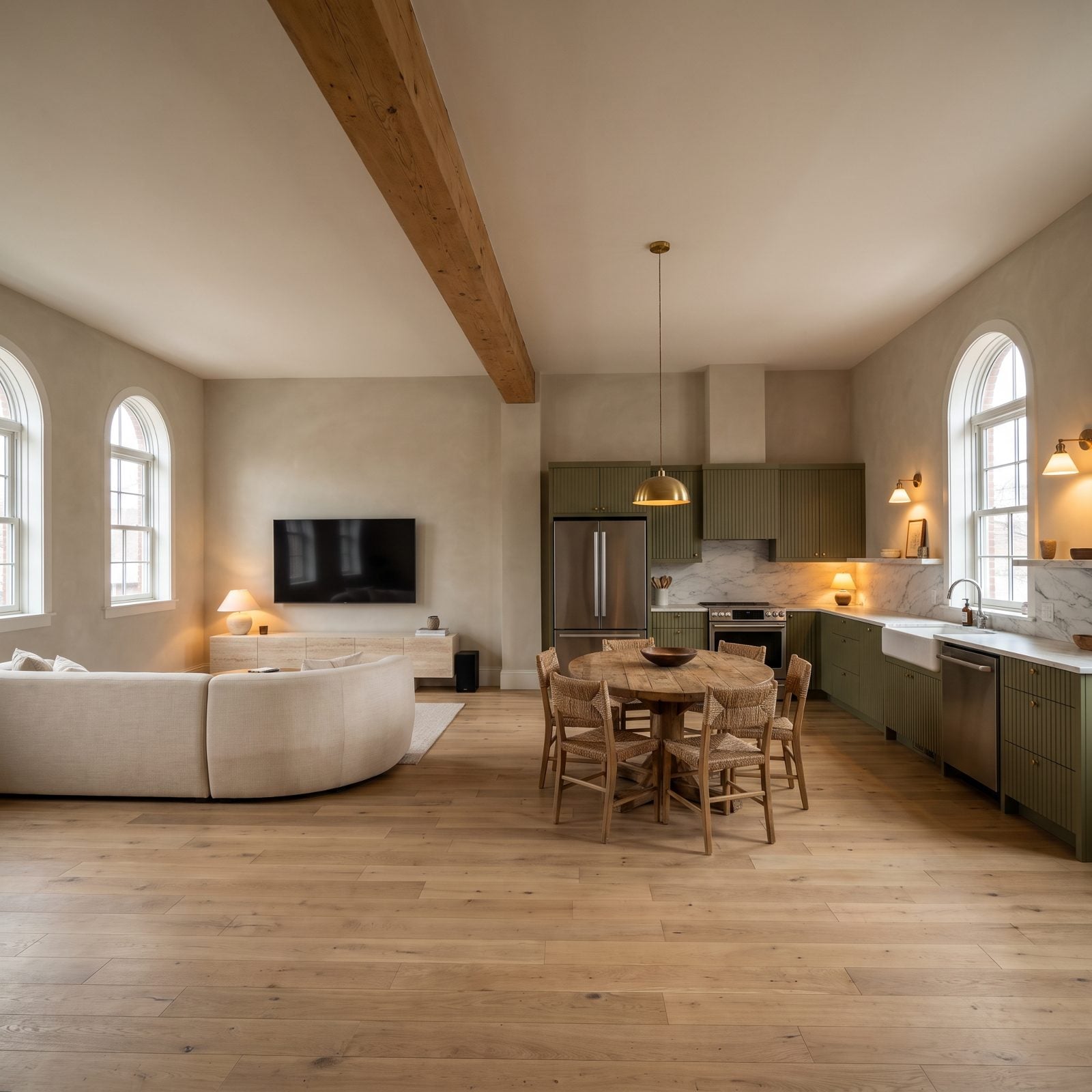
Knock down every wall. That was the dream for a solid decade.
Then dinner burned on the stove and the smell settled into sofa cushions ten feet away. The kids’ show competed with a phone call competed with the dishwasher, sound bouncing off every hard surface with nothing to break it. And where do you even put a couch when there’s no wall to anchor it against?
20. Horizontal Grooves Everywhere: The Shiplap That Dated the Farmhouse
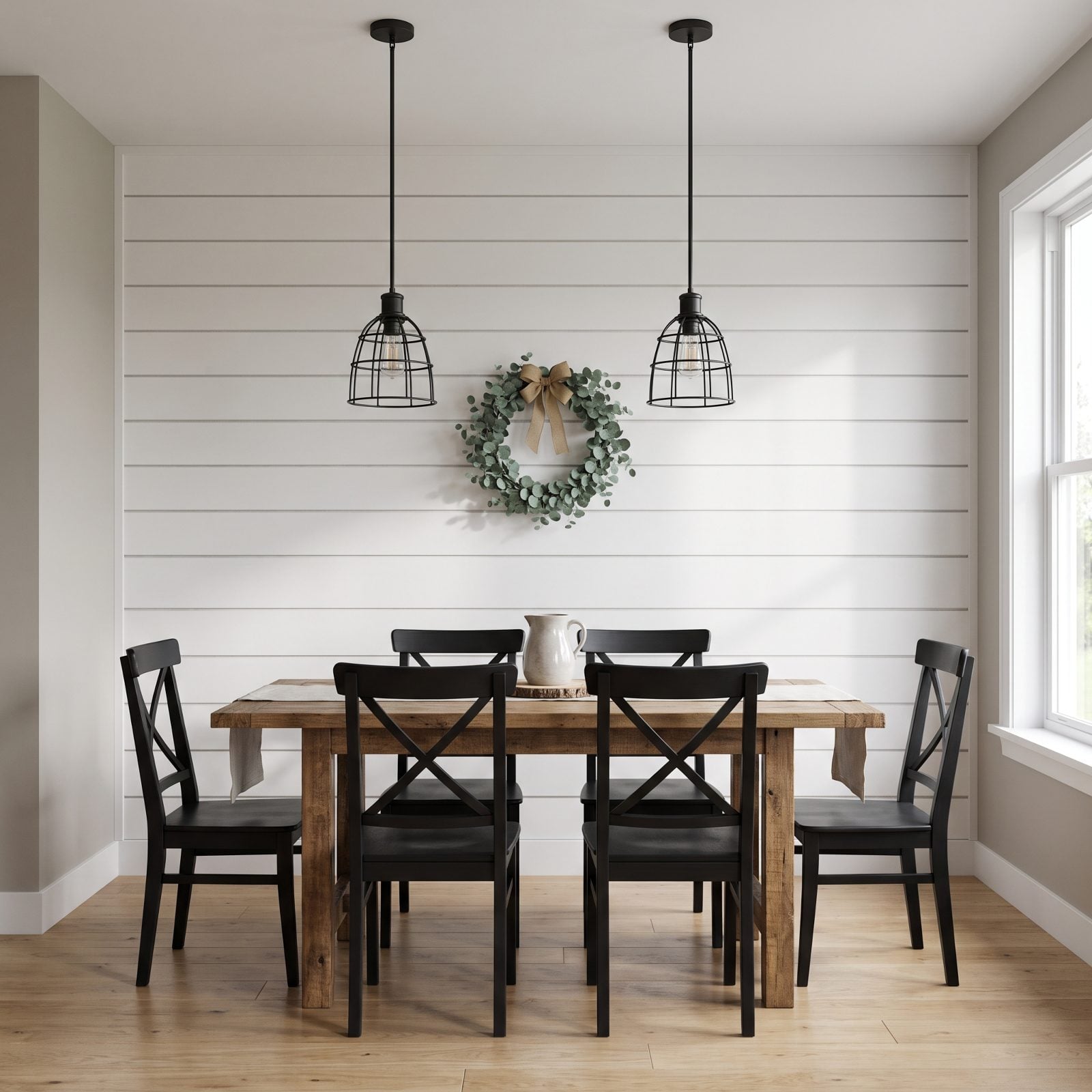
Shiplap ate everything. Living rooms, bathrooms, kitchen islands, the backs of bookcases — if it had a flat surface, somebody nailed horizontal boards across it.
The grooves are the tell. Those tidy parallel lines became shorthand for one era of renovation, so a shiplap wall announces its year the second you walk in. And the dust that settles into every seam doesn’t exactly help its case.
19. Pallet-Wood Walls: Reclaimed Clutter You Can Never Quite Dust
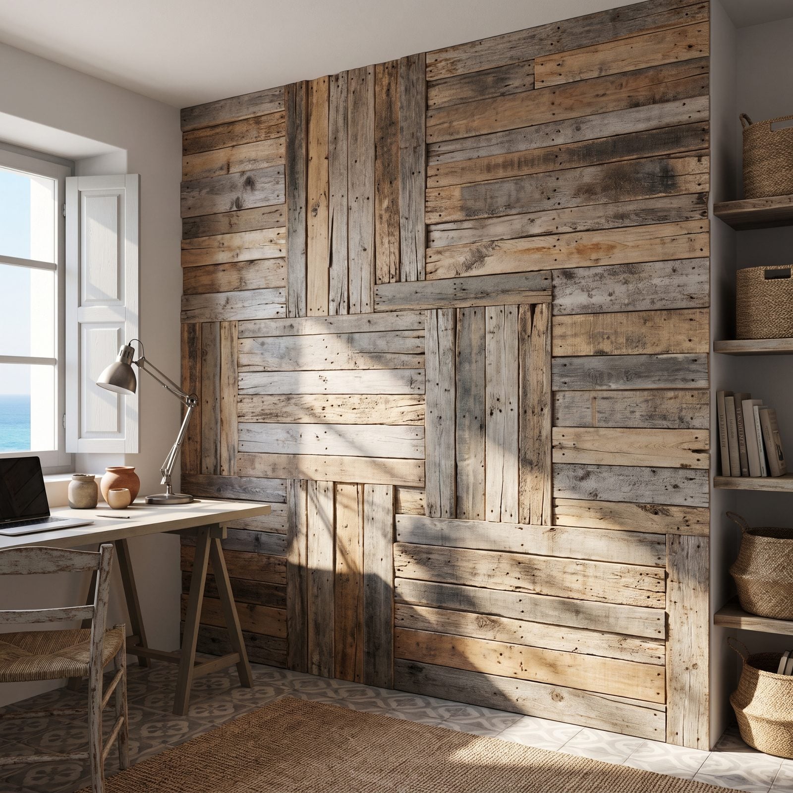
Everyone had a cousin who built one of these from a weekend of free pallets.
The patchwork of mismatched boards looked resourceful in photos. In person it’s visual noise, every plank a different tone yanking your eye somewhere new, and the rough grain traps dust, cobwebs, and the odd splinter you don’t find until it’s lodged in your palm. A clean matte wall would make that bright home office read far calmer.
18. The Sliding Barn Door That Turned a Pantry Into a Centerpiece
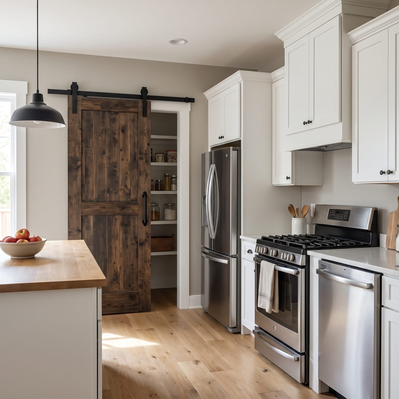
A pantry is a door you open twice an hour. Somebody decided it should be a focal point instead.
Barn doors showed up on oversized black rails that spanned half the wall, turning a plain utility opening into the loudest thing in the kitchen. They don’t seal, so smells drift. They can’t lock, which rules them out for bathrooms. And that heavy farmhouse hardware now stamps the whole room with a single trend cycle.
17. Black Pipe and Stained Boards: Industrial Shelving That Overstayed
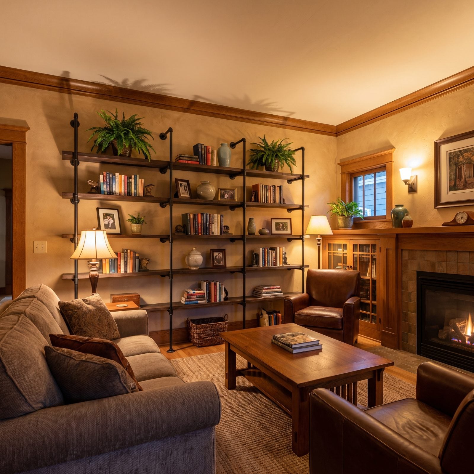
Black plumbing pipe, stained two-by-tens, a handful of threaded flanges straight off the hardware store shelf. For a few years that was the look.
The workshop aesthetic made sense in a converted warehouse. Drop it into a suburban living room and it always read as costume, plus the pipe collects a greasy film of dust that a cloth just smears around. You can give a rust home bar real industrial character without reaching for the pipe-shelf kit.
16. The Trend Trifecta: Linear Fireplace, Mounted TV, Stacked Ledgestone
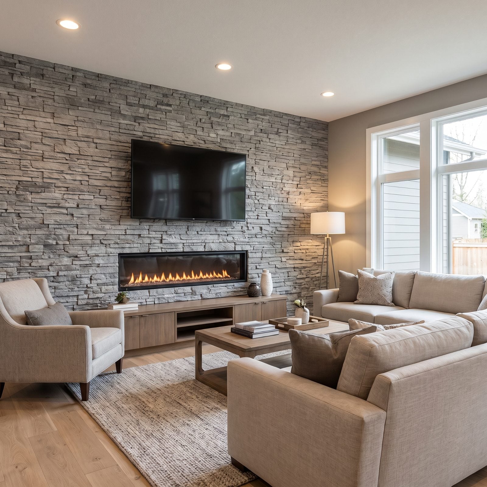
Three trends, one wall, same year. The linear fireplace, the TV bracketed right above it, and floor-to-ceiling stacked ledgestone behind both.
Each piece dated fast on its own. Pile them together and the room locks to a single moment with surgical precision. The dry-stack stone hoards dust in every crevice, the heat rising off the fireplace is rough on the electronics perched above it, and the whole setup forces your furniture to stare at a wall of grey rock whether you asked for that or not.
15. Whitewashed Brick, Stuck Between Painted and Naturally Aged
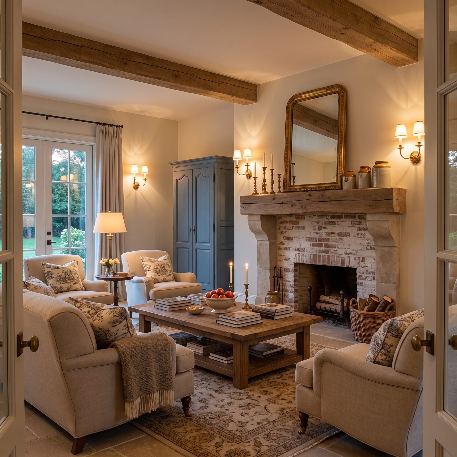
Whitewashing brick was supposed to split the difference — softer than solid paint, cleaner than raw brick.
Done well, it’s lovely. Done the way most of these were, the thin coat goes patchy and streaky, pooling in the mortar lines and skipping across the brick faces, so the whole thing looks neither painted nor genuinely weathered. It just looks unfinished, like the painter wandered off at lunch and never came back.
14. The Reclaimed Beam Mantel That Swallowed a Standard-Size Room
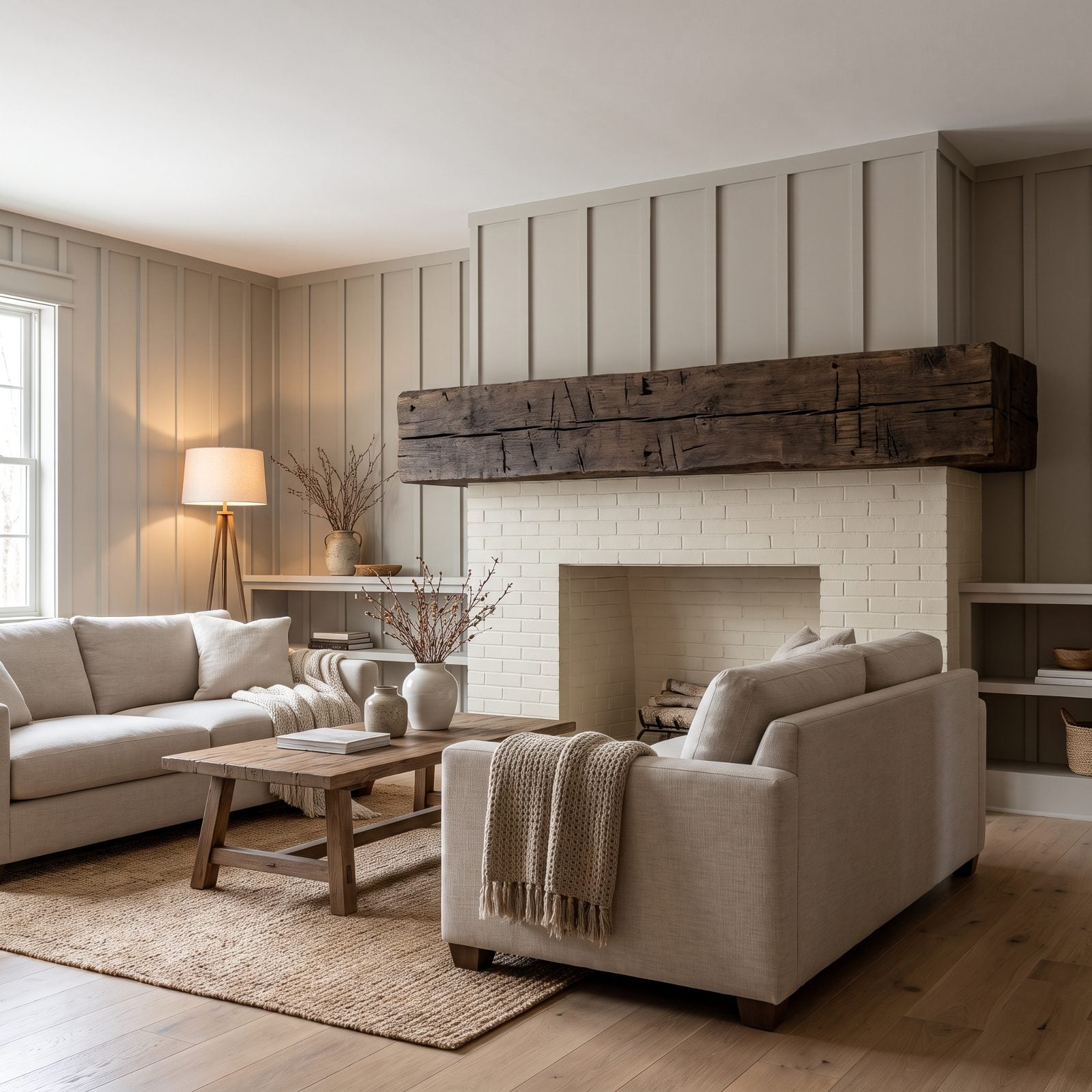
Bigger beam, better. Or so the thinking went.
A twelve-inch slab of reclaimed timber looks right in a lodge with sixteen-foot ceilings. Bolt that same hunk to a standard eight-foot wall and it crushes the proportions, a heavy dark bar hovering over a modest firebox with no room to breathe around it. Scale is the whole problem here. A mantel should hold a conversation with the room, not barge in and run the place.
13. Coffered Ceilings Dropped Onto Rooms That Had No Height to Lose
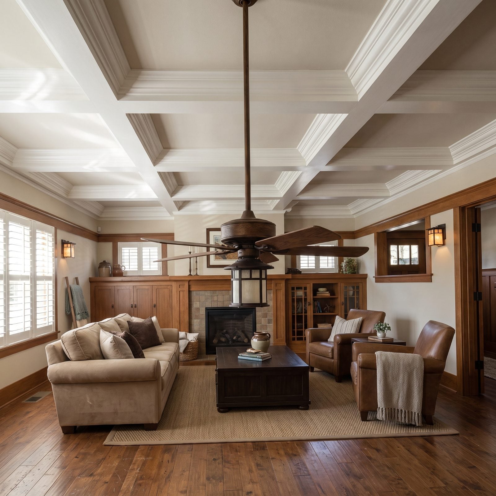
A coffered ceiling needs air above it to work. Pack a deep grid into an eight-foot room and the beams march straight toward your forehead, reading as weight instead of architecture, and the whole room loses a few inches it couldn’t spare.
Around 2015 this was the builder upgrade worth paying for. Now? The white-painted grid and ogee crown date the space on sight, because grand ceiling millwork belongs to rooms tall enough to carry it.
12. The Glowing Perimeter: Tray Ceilings Wrapped in LED Rope
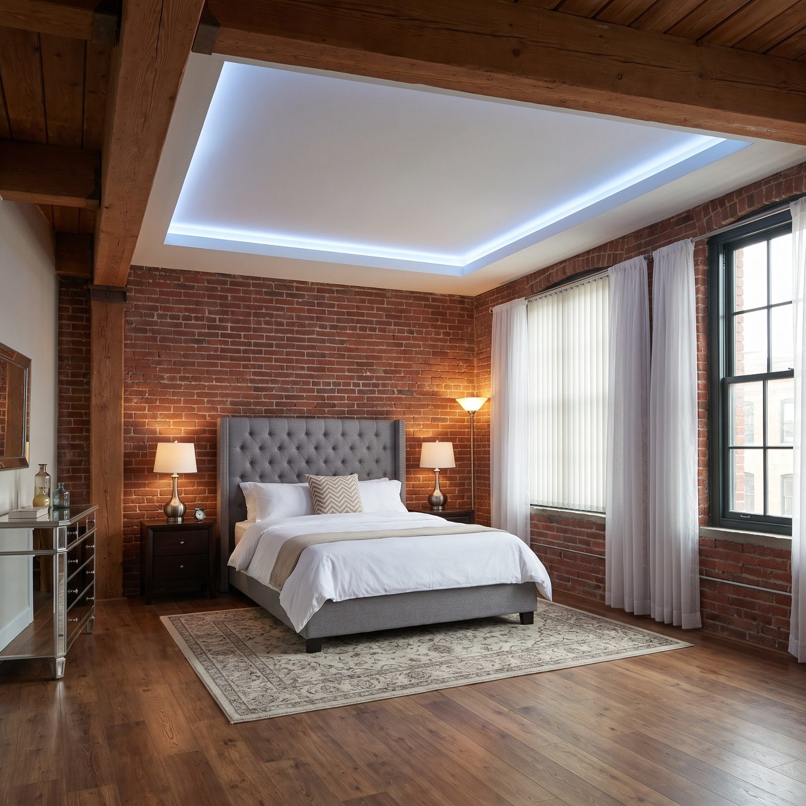
That halo of light around the ceiling edge told you the builder went the extra mile. A tray ceiling, a hidden channel, a loop of LED rope, and suddenly the room had a nightclub shimmer at the push of a dimmer.
It hasn’t aged well. The cool blue cast dates the room the moment it switches on, and the rope shows uneven hot spots where the strip bunches up. Honestly, a brushed-nickel table lamp does more for a bedroom than a glowing outline ever did.
11. Intersecting Hoops Overhead: The Metal Orb Chandelier
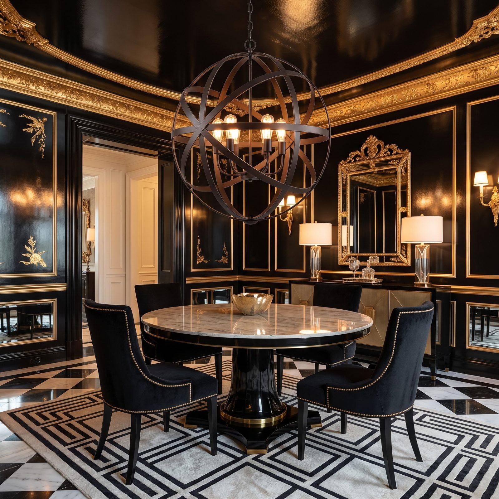
You saw this chandelier everywhere for about five years — intersecting iron hoops wrapped around a few bare bulbs, hung over every transitional dining table in the catalog. It was shorthand for tasteful-but-current.
And shorthand ages as a group. The orb chandelier now carries a date stamp, and those bands throw a busy web of shadow across the table every time the sun catches them. Repetition killed it, not the design.
10. Cage Pendants and Edison Bulbs Over the Island
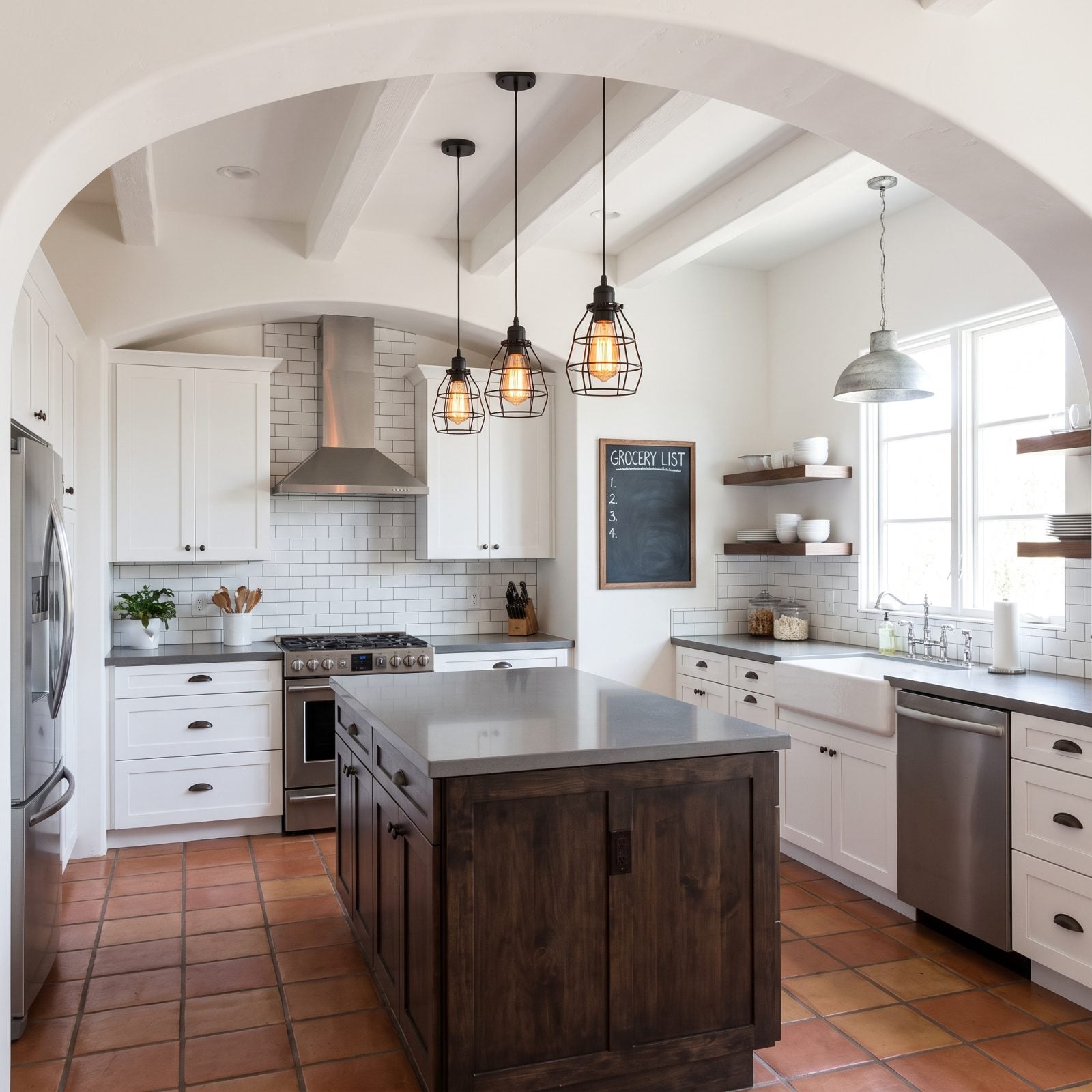
Black wire cages. Visible filaments. A warm amber glow that read like a reclaimed factory even though the house went up in a subdivision in 2014.
Those cage pendants name the decade before anyone flips the switch. In daylight the Edison bulbs look dim and orange, and the open frames are dust magnets you’ll be cleaning with a cotton swab. The look promised grit and delivered a chore.
9. Pebble-Tile Shower Floors and the Grout That Never Stays Clean
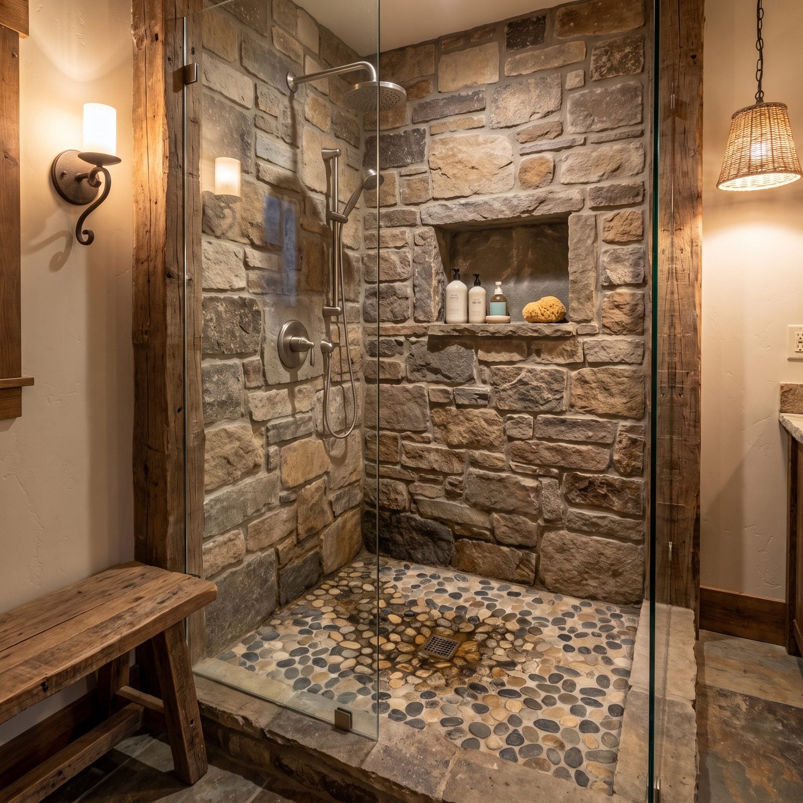
Barefoot on smooth river stones, a little spa underfoot. That was the pitch, and it’s genuinely pleasant — for about a week.
Then reality sets in. Pebble floors are mostly grout, which means mostly surface for soap scum, mineral residue, and discoloration to settle into, and every rounded stone traps a little pool of whatever didn’t rinse away. The organic look that sold you is the exact thing that makes it miserable to keep clean.
8. Multi-Jet Shower Towers With a Nozzle for Every Occasion
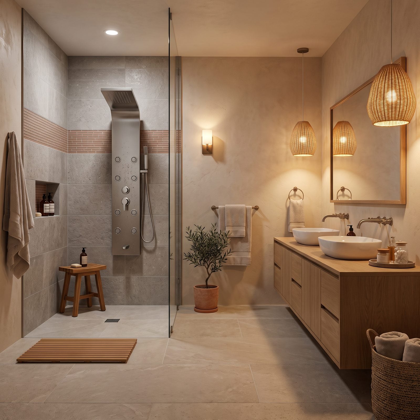
Eight body-spray nozzles, a rainfall head, a handheld, and a tub spout on one stainless panel. It looked like a control console and promised a car wash for the human body.
In practice the tower piles visual noise onto a wall that wanted calm, and every one of those jets collects limescale you’ll be scrubbing forever. The water demand is no joke either — fire all the nozzles at once and a standard water heater taps out fast. Most of those jets get used twice before they turn into permanent clutter.
7. A Freestanding Tub, a Chandelier, and Not Much Else
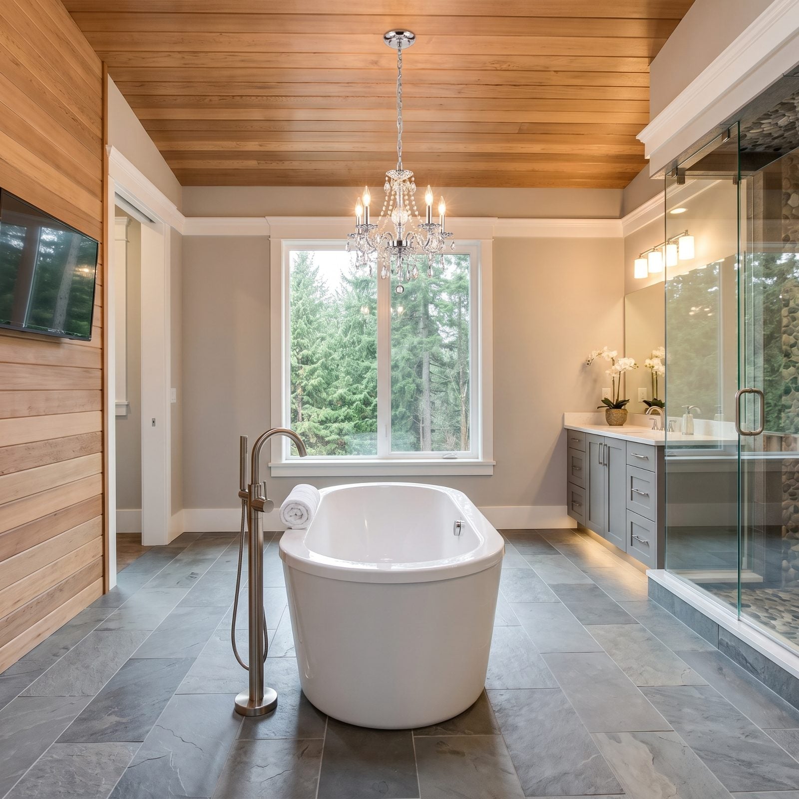
The listing-photo money shot: a sculptural tub floating in the middle of the room with a little crystal chandelier dangling overhead. It sold houses.
Then you move in. The tub eats the entire center of the bathroom while offering zero storage, and a chandelier over a water-filled tub is a conversation you’d rather not have with an electrician. These setups photographed better than they lived. Give a freestanding tub a big room and it earns its keep; drop it into an average master bath and it just hogs the floor.
6. Vessel Sinks Perched on a Floating Vanity
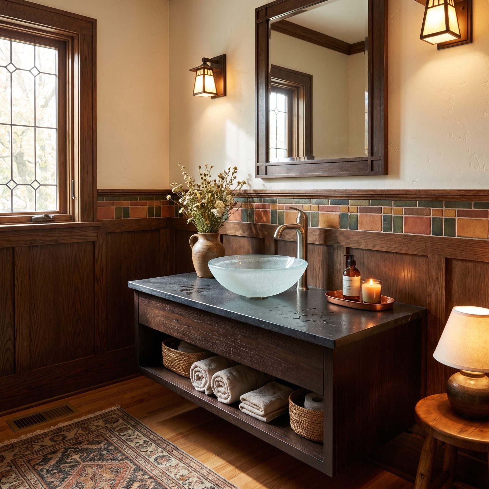
The bowl-on-top sink looked like a hotel spa and felt like progress. Raise the basin, float the cabinet, call it modern.
Living with it tells another story entirely. The bowl steals the counter space you’d normally give a toothbrush or a soap dish, water pools around the base where glass meets stone, and the faucet has to stand tall and awkward just to clear the rim. Cleaning behind the thing is its own small chore. Pretty from across the room, fussy up close.
5. Waterfall Faucets and the Mineral Streaks They Put on Display
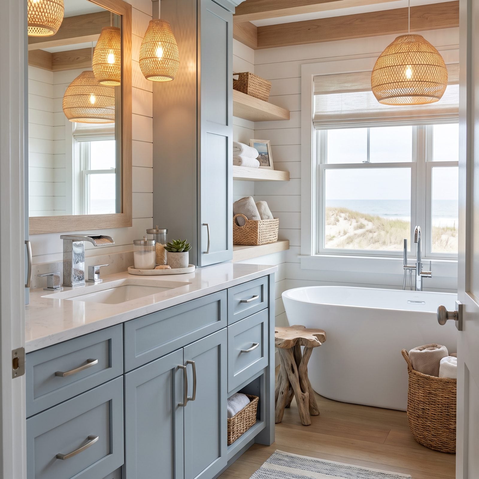
A flat open spout pouring a sheet of water felt like a small luxury the first time you turned it on, and the faucet became the main event on the vanity.
That flat spout is also the perfect stage for hard water. Every mineral deposit shows up on the wide polished surface, and the sheet of water leaves streaks you’ll wipe down again and again. In a soft-water house, fine. Anywhere else, the waterfall faucet broadcasts its own limescale.
4. Charcoal-Painted Brick: The Coating You Can’t Take Back
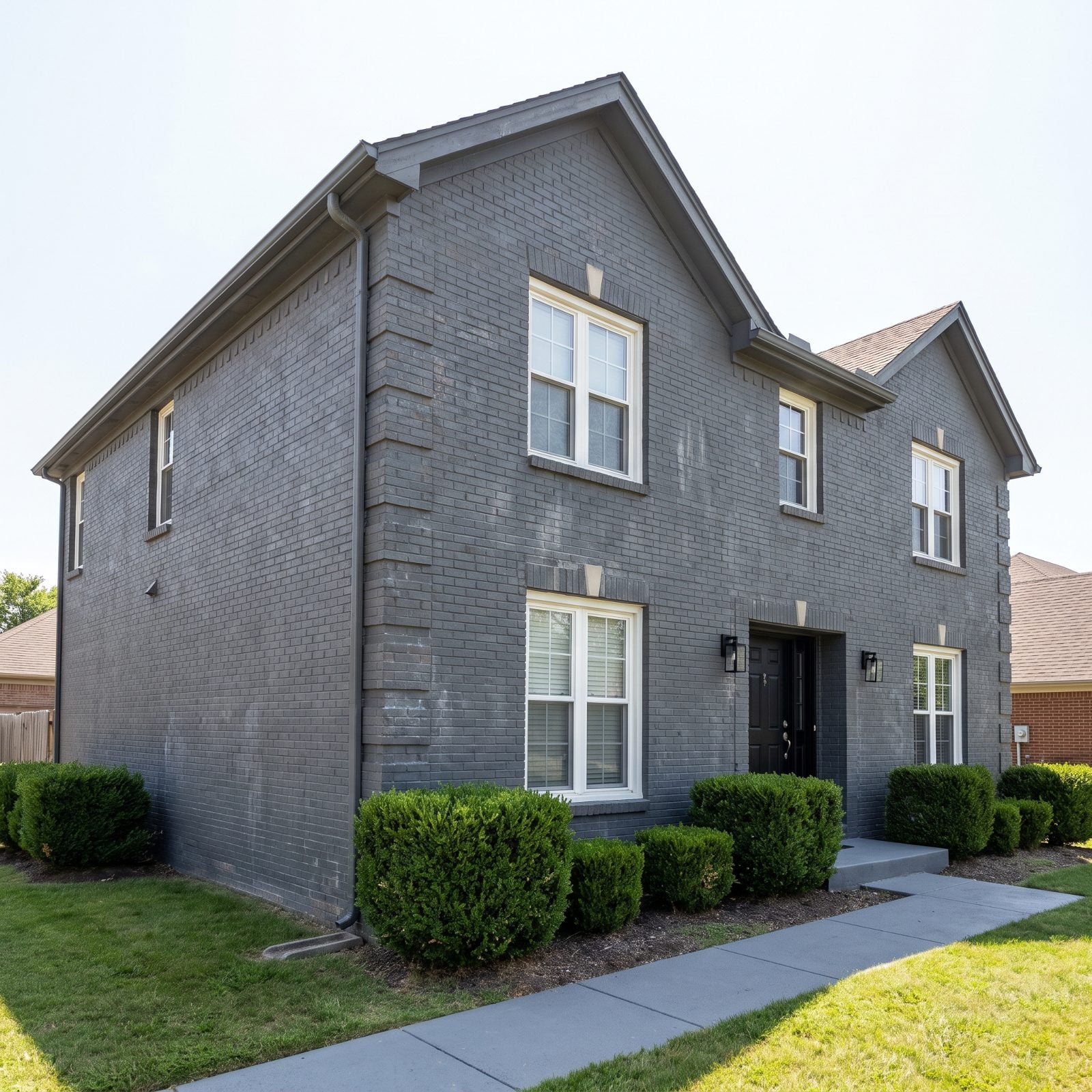
Charcoal brick was the look everyone wanted around 2015, because it made a tired red ranch read modern overnight. The catch nobody mentioned: paint on brick is a one-way door, and if you strip it later you risk pulling the face right off the masonry.
What dates it now is less the color and more the upkeep it demands. Charcoal shows everything — pollen settles into the texture, hard-water streaks run down below the sills, and the sun-facing wall fades a half-shade lighter than the rest. Raw red brick weathered on its own for a century without anyone lifting a finger. This surface wants a pressure washer twice a year just to hold the line.
3. Thin Stone Skirts Wrapped Around the Porch Posts
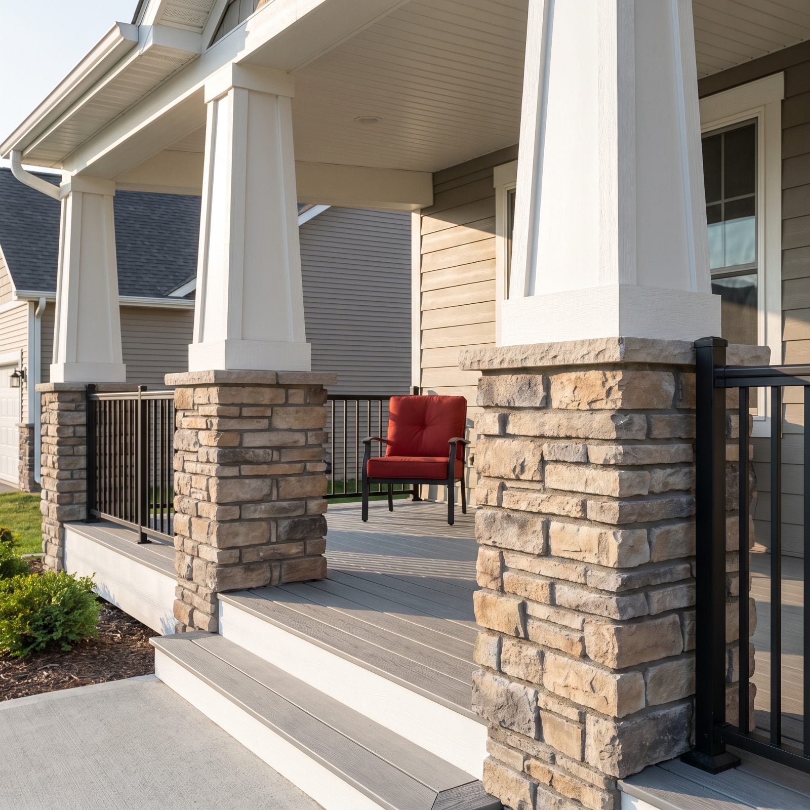
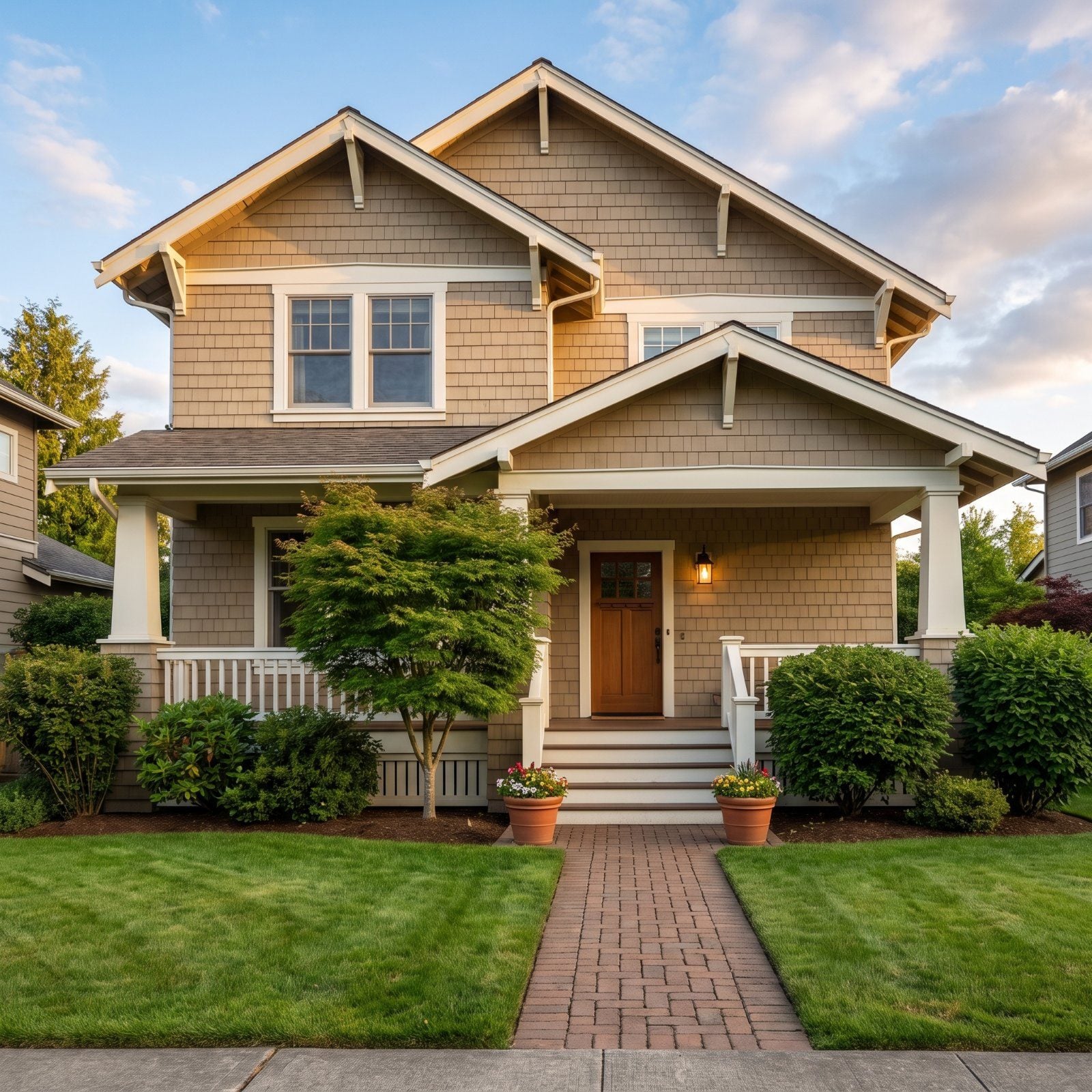
You’ve seen it on a hundred front porches. A tapered porch column gets a stone skirt wrapped around its base, and the proportions tell you right away whether it works. Real stone reads as big, quiet slabs. This is thin, rough tan-and-grey ledgestone wrapped around the post bases in short stacked courses, and the eye reads it as veneer in about a second.
That rough, chunky stone — the stacked tan and grey ledges — is exactly the tumbled ledgestone builders pushed hard in the mid-2010s, which aged a house the moment it went on. If you inherit the busier stuff, paint the stone and the surround the same soft off-white so the bulge stops announcing itself. One of these red fabric armchair designs out on the deck pulls the eye off the base entirely. Honestly? That’s the cheaper fix.
2. Faux Carriage Hardware on the Garage Door
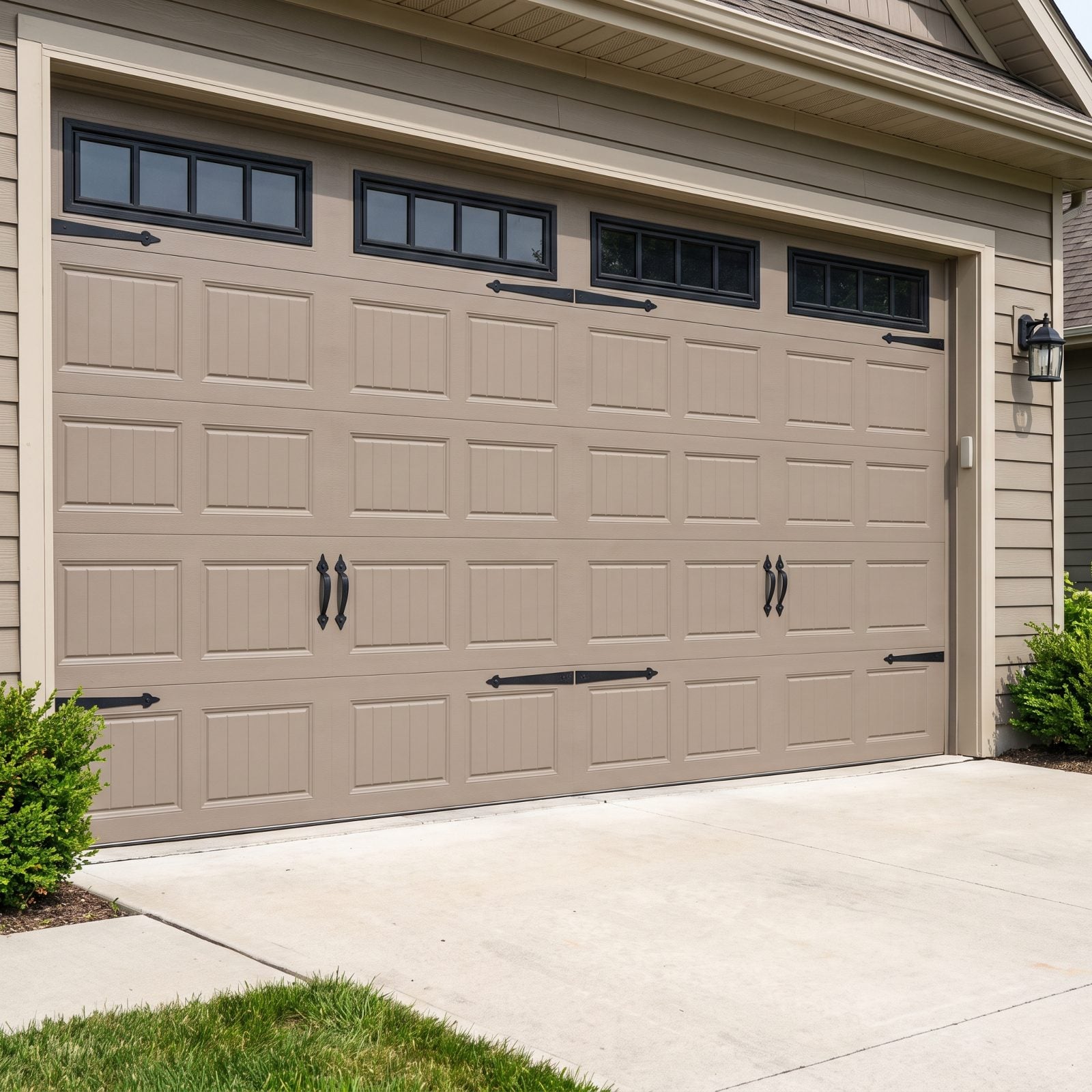
Consider the quiet contradiction bolted to millions of garages. The black strap hinges and heavy handles say this door swings open like a barn. The door says otherwise, because it rolls straight up in four sections like every other garage door made since 1960.
The hardware imitates construction that simply isn’t there. Around 2015 it was the budget way to fake a custom carriage-house look, and for a few years it genuinely sold on the showroom floor. Now the brain registers the lie — hinges on a thing that doesn’t hinge. Pull the decorative pieces off, and a plain modern door often looks cleaner and newer than the costume ever did.
1. Cool-Gray Composite Decking, the Backyard Time Capsule
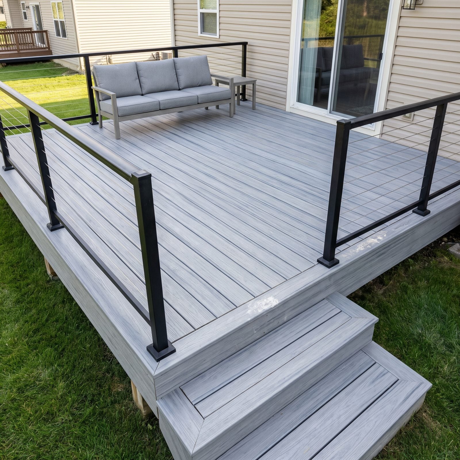
Gray everything ran the decade, and even the backyard deck got it too.
Cool-toned composite boards were the smart buy in 2015: no staining, no splinters, no annual sealing. All true. What nobody saw coming was how hard that flat silvery gray would lock a deck to its moment, especially one right outside a sliding glass door and seen from every seat in the room. Warm browns and the brown-gray blends that came after made the pure cool version look dated fast, and composite doesn’t fade gracefully anyway — it scuffs near the rail posts and holds every mark you give it.
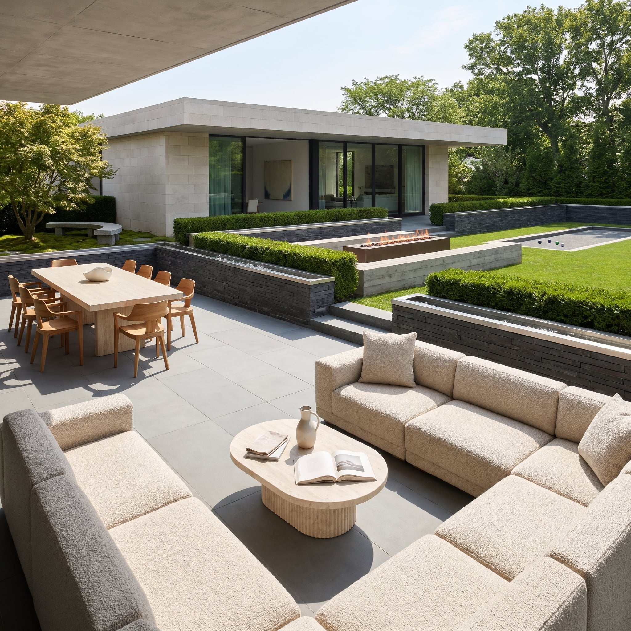
The fix isn’t ripping it out. Swap the hardware and the soft goods. A rust or terracotta cushion on that gray outdoor sofa warms the whole thing up, and suddenly the gray reads as a neutral backdrop instead of the main event. One warm-toned rust home bar cart by the railing does more for this deck than a fresh coat of anything.