
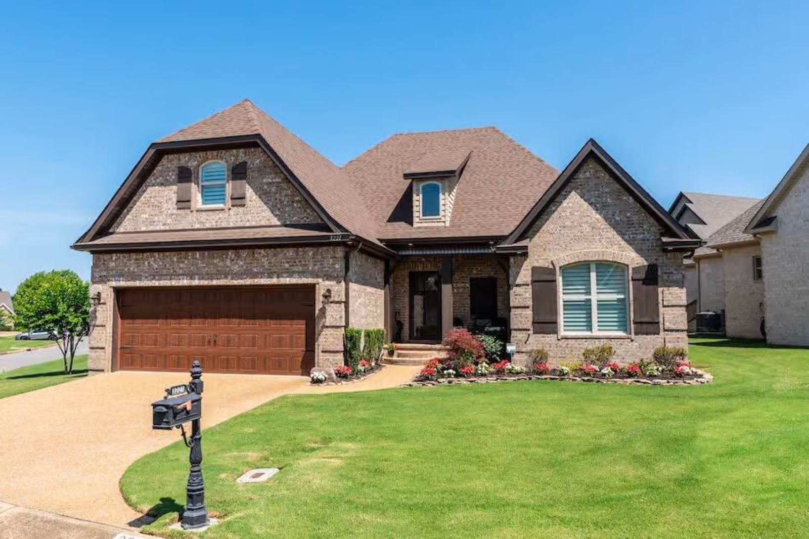
Outgrowing a house isn’t really about square footage — it’s about rooms that can’t hold their function anymore, where the kitchen doubles as a hallway and the living room is everyone’s living room at once. The Preston fixes that with a bonus room that absorbs the chaos upstairs, a country kitchen wide enough to actually cook in, a primary suite that shuts out the rest of the house, and enough separation throughout that people can be home without being on top of each other.
Comparing homes in different neighborhoods? See today’s mortgage rate options alongside the asking prices.
Specifications
- Sq. Ft.: 1,572
- Bedrooms: 3
- Bathrooms: 2
Floor Plan – Main Floor
Gathering contractor quotes? Check current home equity rates alongside your other financing options.
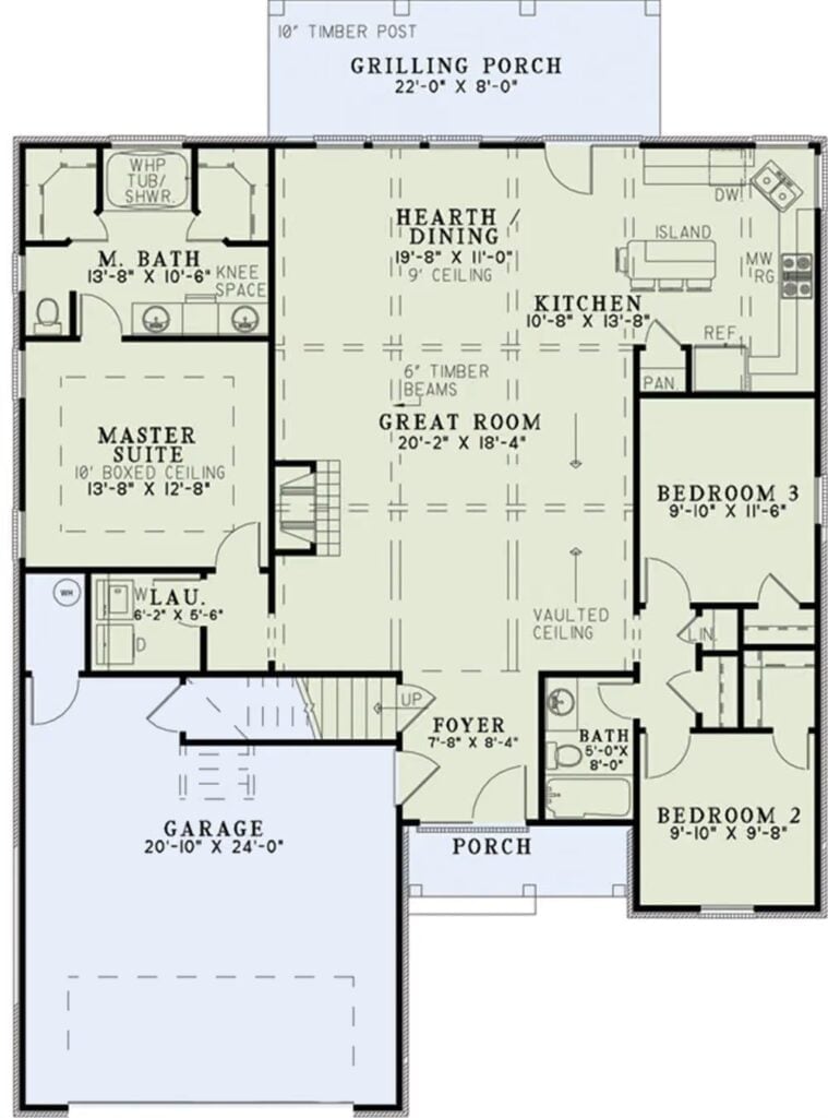
The master suite sits privately on the left side of the single-story layout, while two secondary bedrooms share a bath on the right — a split that actually means something on a school morning. A vaulted great room anchors the center, opening toward the hearth, dining, and kitchen zones in one connected sweep.
Floor Plan – Bonus Room
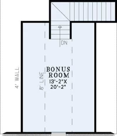
The bonus room above the garage is accessed by stairs and runs 13 feet wide under low knee walls — tight at the edges but generous where it counts.
Quick Fix: A built-in desk along the longer wall turns this into a dedicated homework and reading space without burning through floor area — and because it’s already separated from the bedrooms by a flight of stairs, late-night studying won’t filter down to the kids.
Covered Patio Built for Shade-Seekers Who Actually Use Their Backyard
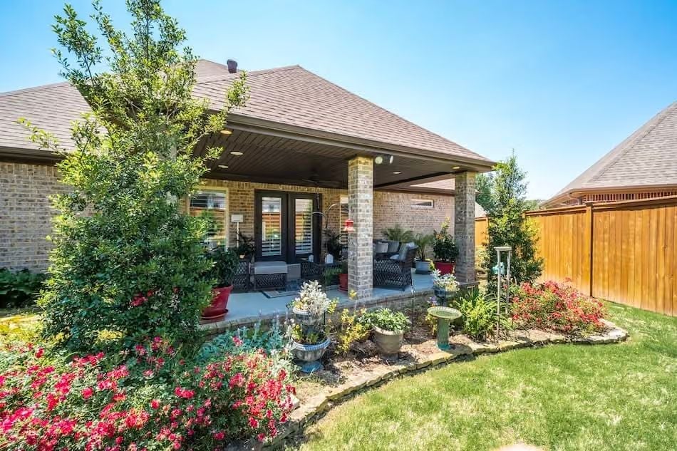
Brick columns anchor the covered patio, where wicker seating sits beneath recessed lighting. Red knockout roses and a birdbath give the garden bed genuine character rather than the generic mulch-and-shrubs look most builders default to.
Try This: Line a few potted herbs along the patio’s edge near the French doors — close enough to grab mid-recipe. Containers mean you can bring them inside before the first frost without losing the whole season’s growth.
Woven Metal Wall Art That Actually Earns Its Spot in the Entryway
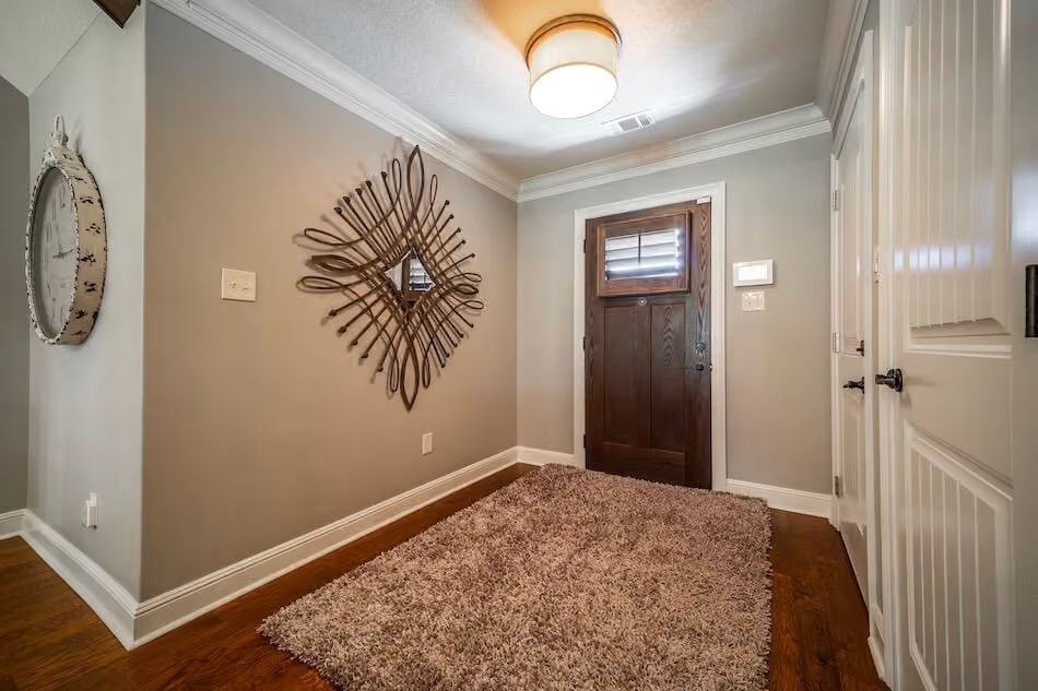
Dark wood door, shag rug, and a sculptural sunburst mirror give this foyer real personality without crowding it.
- Hang a hook strip beside the door so bags don’t land on the rug
- A flush-mount fixture works here because ceiling height won’t accommodate a pendant
- Keep the wall on the left clear so the woven art reads as a focal point, not part of a cluster
Vaulted Beams and a Stone Fireplace That Pull the Whole Room Together
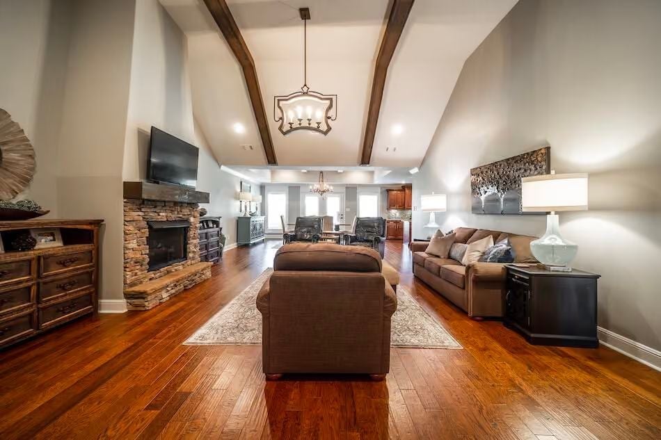
Exposed wood beams arc across the vaulted ceiling and anchor the room without overwhelming it. Rich hardwood flooring runs the full length of the space, pulling the eye toward the dining area in the background, and the stacked stone fireplace surround adds the kind of texture a flat painted wall never could. Big room. Good bones.
Common Mistake: A sofa with its back to the main entry looks wrong at first glance, but it’s actually what defines the seating zone without needing walls to do the job. What doesn’t work — and what people default to anyway — is pushing all the furniture to the perimeter, which hollows out the center and makes a generous room feel like a waiting area.
Coffered Ceiling and Rich Wood Cabinets That Make the Open Plan Feel Intentional
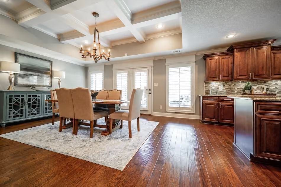
Coffered ceilings are doing real structural work here, not just looking pretty.
The box beams overhead visually separate the dining area from the kitchen without a single wall between them. Cherry cabinets run floor to ceiling on the right, grounding the space with warmth that the stone tile backsplash keeps from tipping into heavy. Upholstered dining chairs in a neutral linen tone soften all that wood grain without competing with it — a small choice that keeps the whole room from feeling like a furniture showroom.
Cherry Cabinets and Granite Counters That Mean Business in the Kitchen
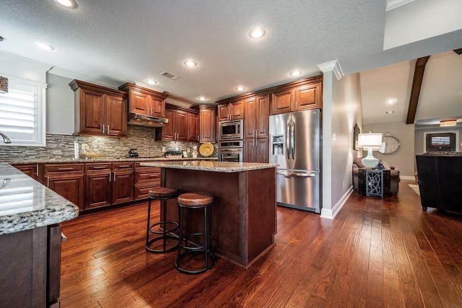
Rich cherry cabinetry paired with speckled granite offers warmth without sacrificing workspace. Behind the range hood, a stone-tile backsplash adds texture without competing. Two barstools at the island keep conversation in the room while someone cooks, and the stainless appliances — including double wall ovens — make clear this kitchen is built for actual use, not staging photos.
Color Story: Cherry and stainless don’t always play well together, but the warm undertones in this granite keep the palette from reading cold. The backsplash’s earthy stone tones bridge the wood and metal without leaning hard on either one.
Carved Walnut Headboard and Footboard That Justify the Square Footage
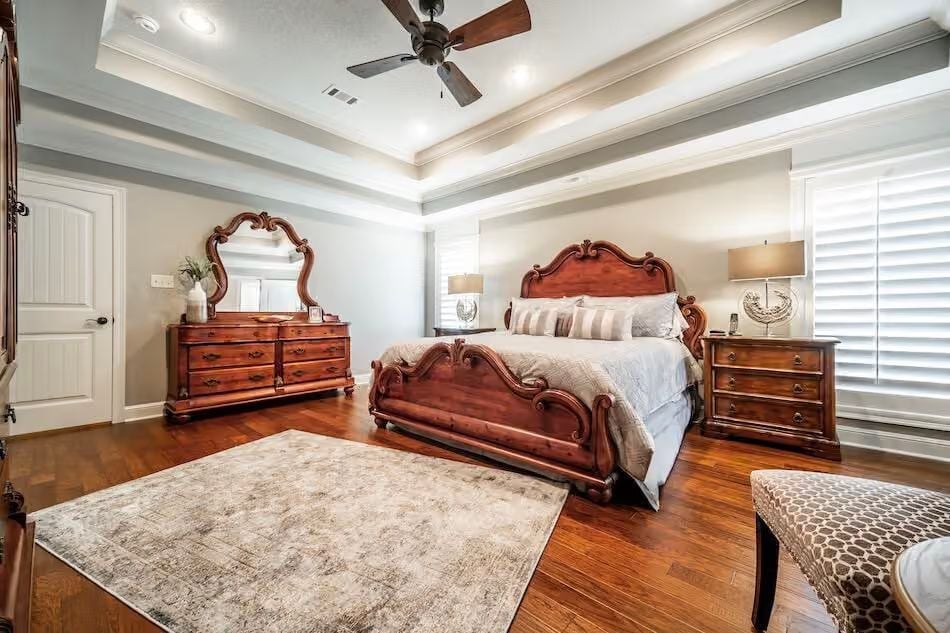
Matching nightstands and dresser keep the ornate bed from reading as furniture-store overflow — the kind of coordination that’s easy to overlook and immediately obvious when it’s missing.
Walk-In Shower With No Door and No Apologies
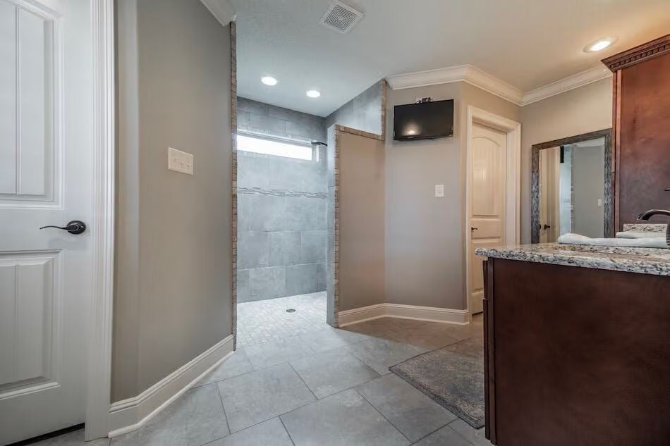
Gray tile runs floor to wall inside the doorless shower, with a mosaic strip at ankle level that adds texture without making a production of it. Crown molding and a wall-mounted TV round out a bathroom that’s punching well above what the square footage suggests.
Sloped Ceiling Bonus Room That Pulls Double Duty Without Feeling Cramped
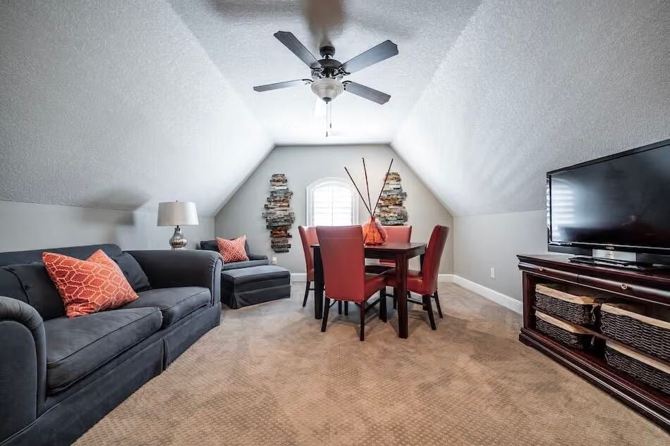
Carpet underfoot, red dining chairs pulled around a table, a ceiling fan overhead — this attic-style bonus room is casual in a way that actually invites people to use it.
Pin It
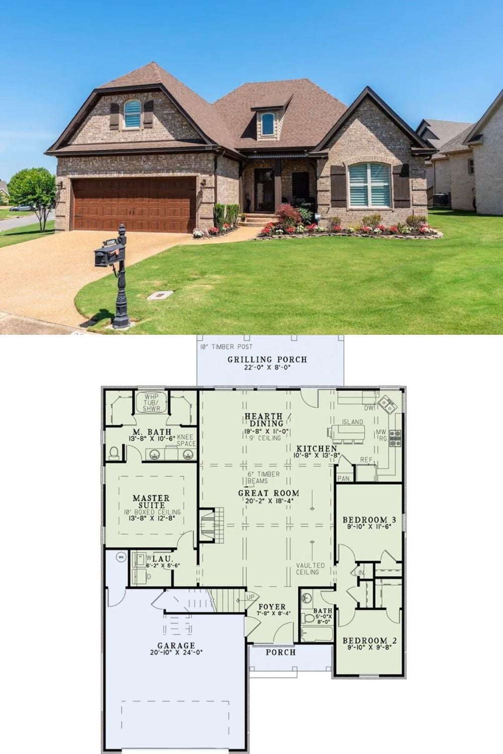
The French Country exterior pairs natural stone with a steep roofline and arched upper windows. Inside, the floor plan keeps everything on one level: three bedrooms, a hearth room off the kitchen, a vaulted great room, and a rear grilling porch that stretches 22 feet wide behind the main living area.
