🔥 Would you like to save this?
A countertop looks finished the day it goes in. Six months later it tells on everybody who touched it: the fabricator who cut too close to an edge, the person who picked granite without ever holding the backsplash sample next to it, the one who set a hot pan down on laminate because the trivet was in the other room.
Most of these failures weren’t bad taste. They were one small call nobody thought through. Here are the ones that keep showing up.
In order to come up with the very specific design ideas, we create most designs with the assistance of state-of-the-art AI interior design software. Also, assume links that take you off the site are affiliate links such as links to Amazon. this means we may earn a commission if you buy something.
47. The Sink Cutout Cut So Close to the Edge the Stone Split
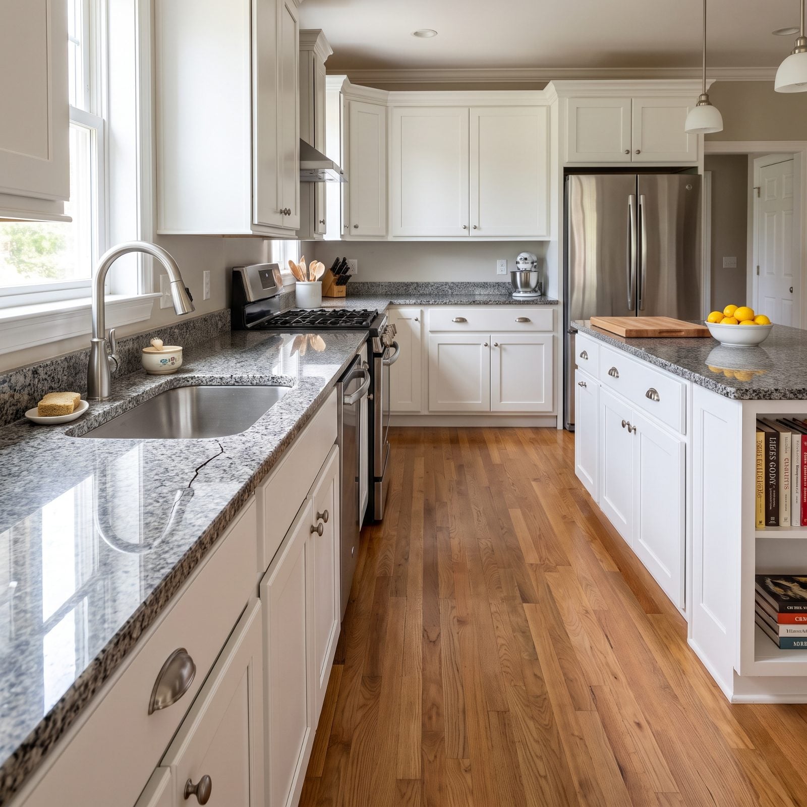
That thin strip of stone in front of the sink is the weakest point on the entire slab, and someone asked it to hold up a whole run of granite. Cut the cutout too close to the front edge and you leave maybe an inch of material carrying all the stress. One firm lean, one dropped pot, one season of the sink expanding and contracting, and it goes.
Why it doesn’t work: stone has almost no tensile strength. A narrow band spanning a cutout behaves like a bridge with nothing holding it up from below. There’s nothing tying the two sides together.
The fix is boring and permanent. A fabricator leaves at least three to four inches of material in front of the bowl, and a good one glues a steel or fiberglass rod into a channel under the span. You never see it. You also never see the crack.
46. Busy Granite Going to War with a Patterned Backsplash
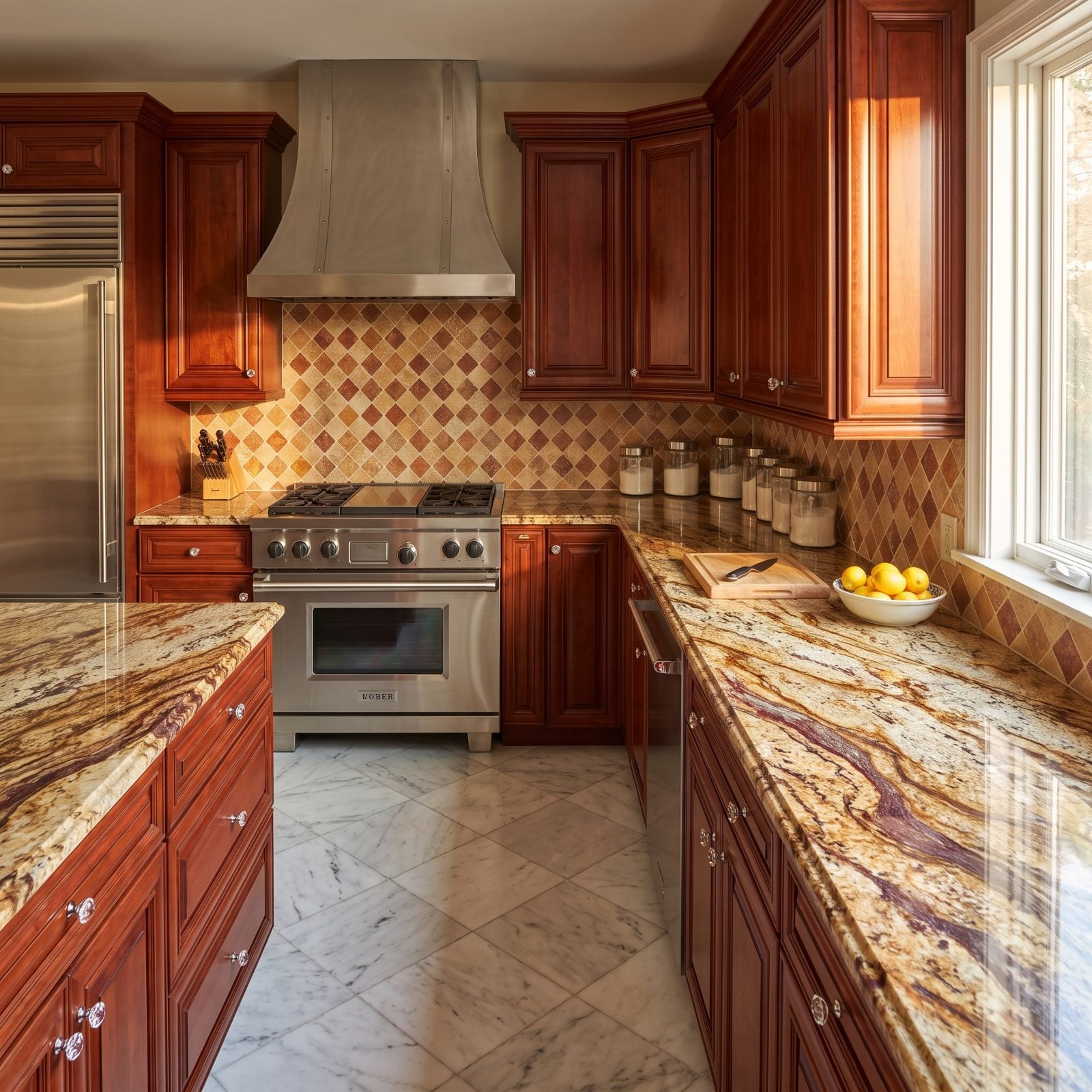
Two loud patterns stacked on top of each other, and neither one wins. The granite is already doing cartwheels with gold and burgundy veining when a busy mosaic tile starts its own show right above it. Your eye has nowhere to land.
Why it doesn’t work: a space can carry one hero pattern. Two competing ones cancel each other out, and the room reads busy without reading rich.
If the stone is the star, the backsplash plays backup. A plain white subway tile or a single flat color pulled from the quietest tone in the granite lets the counter do what you paid it to do. We’ve seen kitchens where the tile got ripped out within two years while the granite stayed.
45. The White Quartz That Slowly Turned Yellow
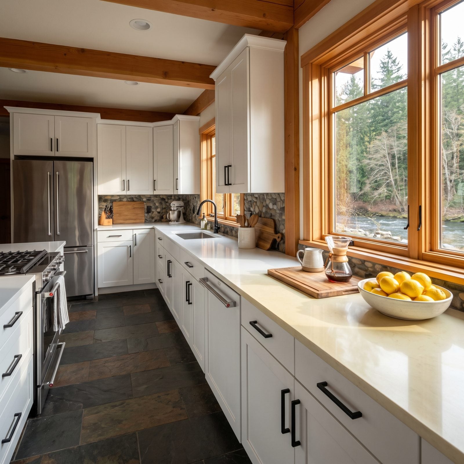
White quartz near a sunny window can drift from cool bright white to a tired cream, while the part sitting in shadow holds the color you actually bought. Now there’s a line across your counter that traces the path of the afternoon sun.
Blame the resin. Quartz is ground stone bound with polymer resin, and cheaper resins yellow under UV the way old plastic does. The stone doesn’t fail. The glue holding it together does.
For a window-flooded kitchen, UV-stable quartz brands exist, or you go natural with granite or quartzite, which don’t care about sunlight. Ask specifically. Not all quartz is built for a south wall.
44. Marble Freckled with Etch Marks You Can’t Polish Out
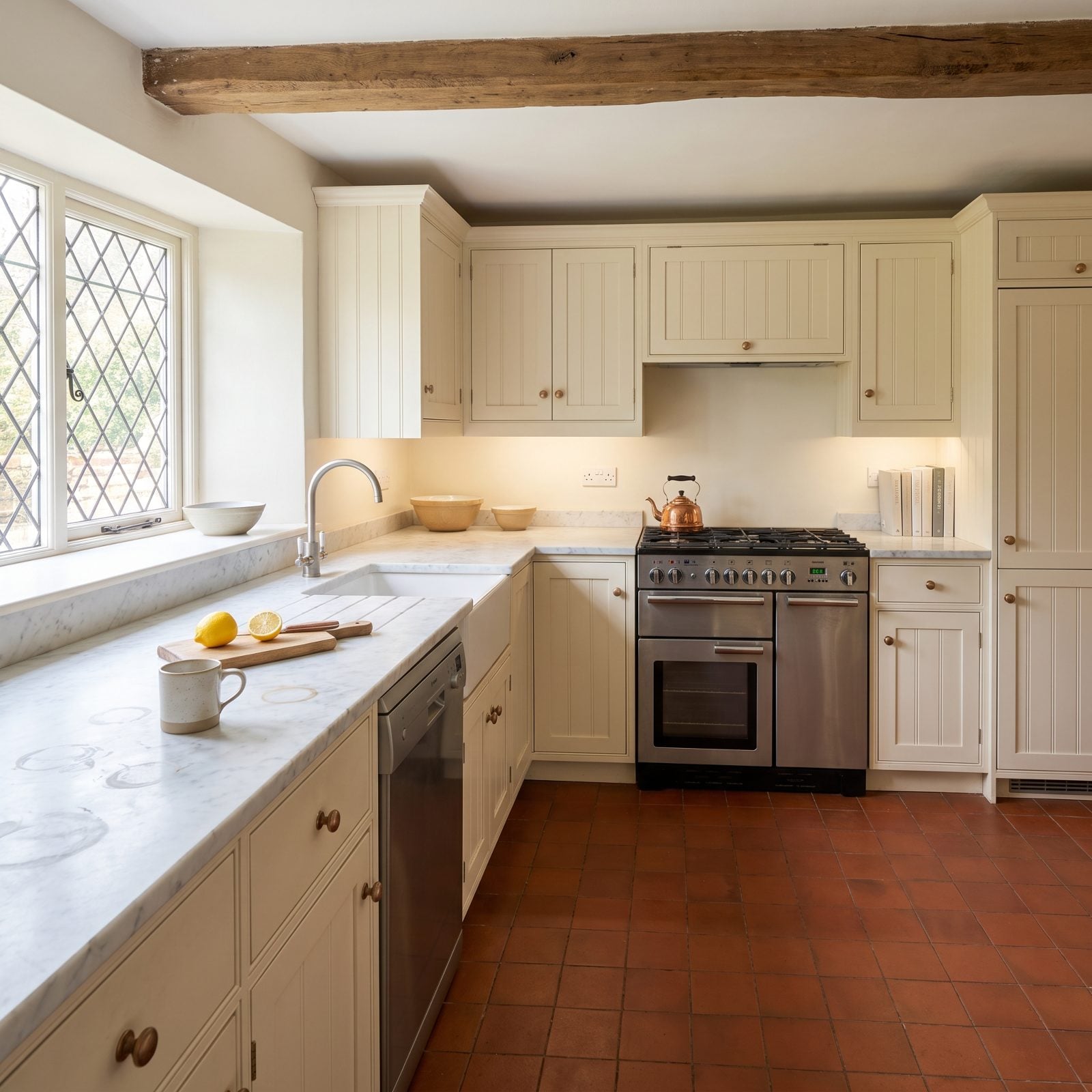
Those cloudy rings aren’t stains. They’re etches. Lemon juice, wine, tomato, even a splash of vinegar reacts with the calcium in marble and eats the polish right off, leaving a dull matte ghost where the shine used to be. No amount of scrubbing brings it back.
Marble is gorgeous and chemically soft. If your kitchen is the kind where real cooking happens and someone cuts citrus on the counter without thinking, polished marble will record every slip.
Go honed rather than polished so etches blend in. Or pick quartzite, which looks like marble and shrugs off acid. Marble belongs where it gets babied, and a working kitchen rarely babies anything.
43. Butcher Block Gone Black and Soft Around the Sink
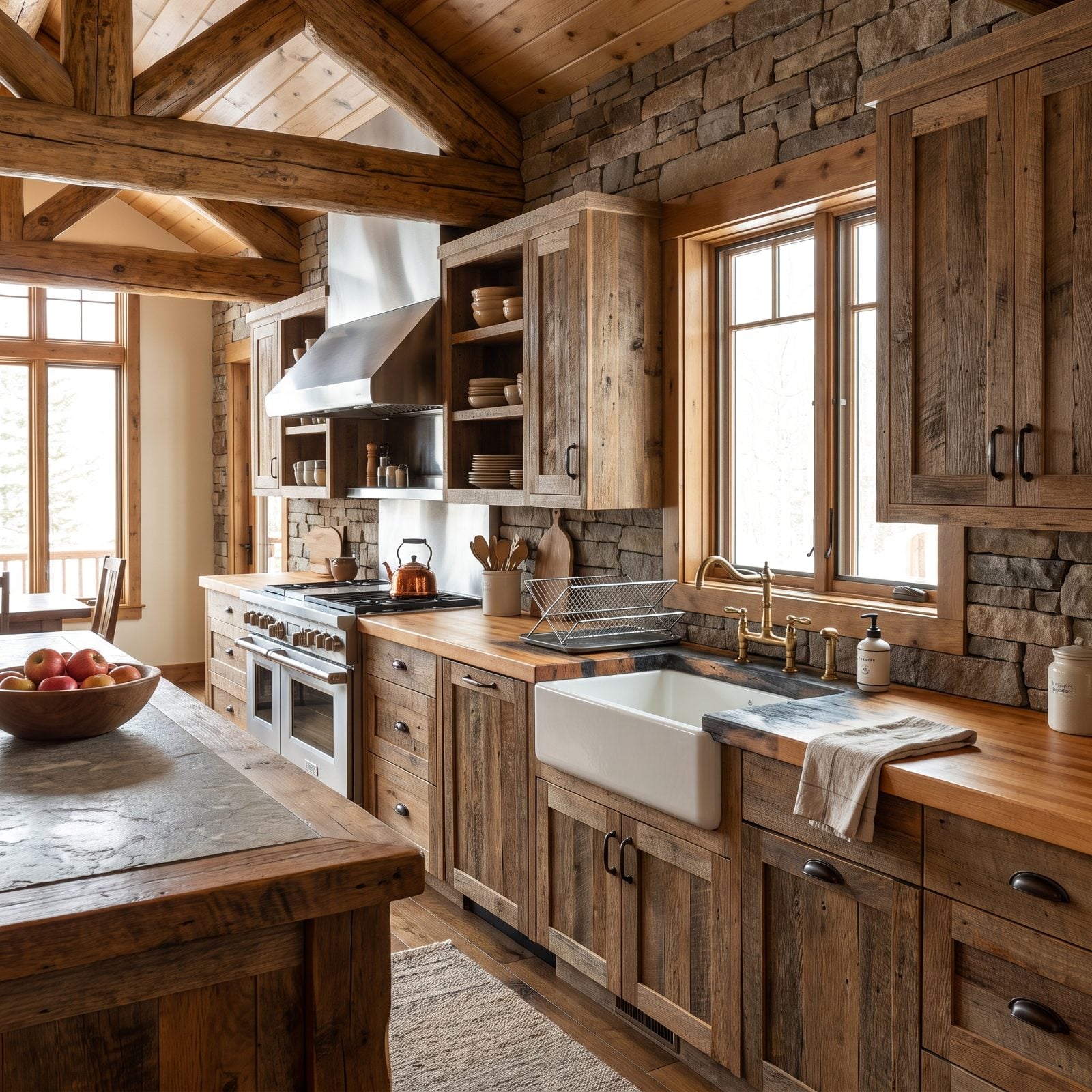
Wood and standing water are a slow argument the water always wins. The butcher block looks warm and honey-toned everywhere except the two inches hugging the sink, where it’s gone gray-black and spongy. That’s water wicking into the end grain over and over, with no oil barrier left to stop it.
Why it doesn’t work: an undermount sink keeps raw wood in constant contact with drips. Oiled wood holds water off for a while, then stops holding it off at all.
Butcher block earns its keep as a prep island or a dry stretch of counter. Put it around a sink and you’ve signed up for monthly oiling and the kind of vigilance most of us don’t have. I love the look. I wouldn’t put it where the dishes get done.
42. Concrete Split Clean Through by a Structural Crack
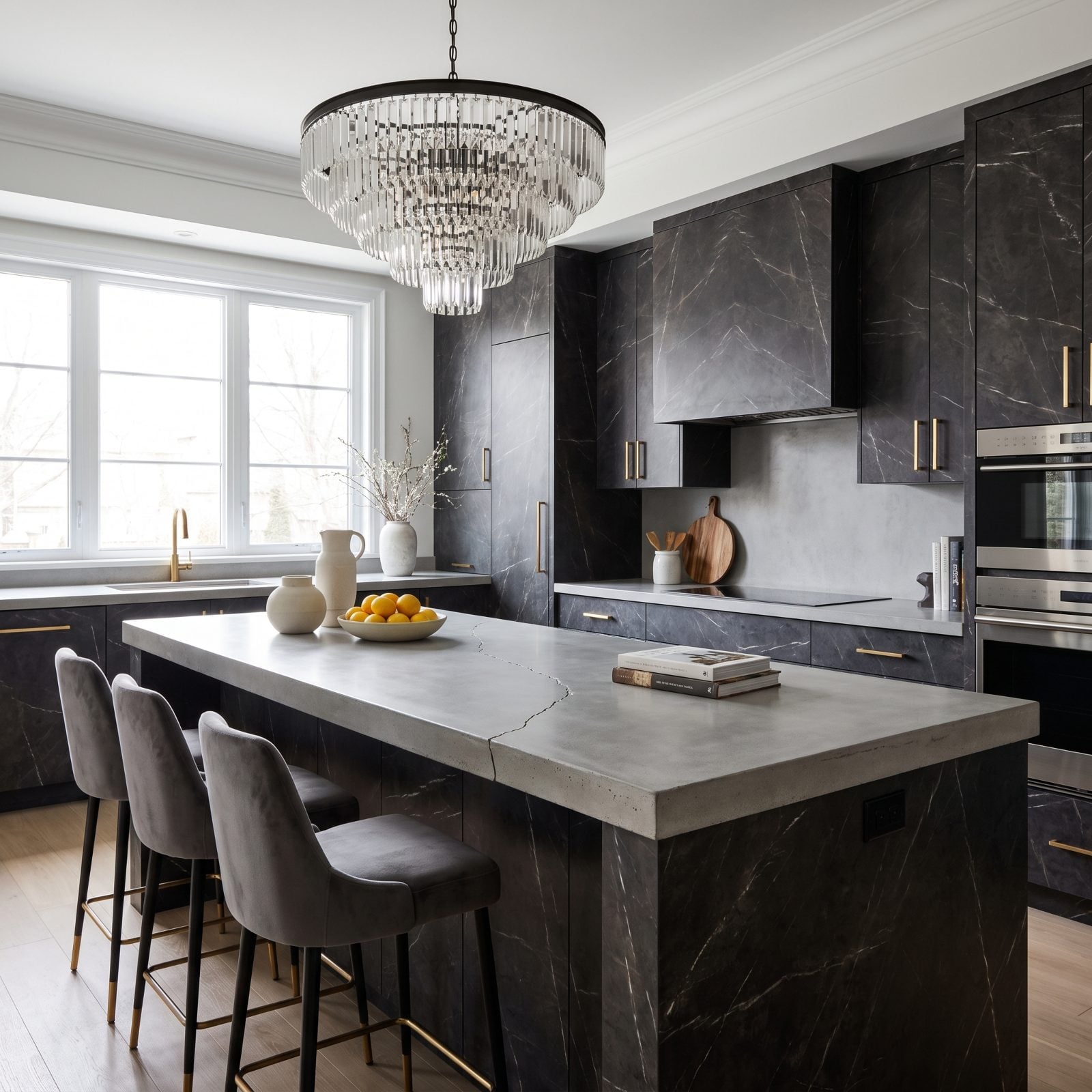
A hairline in concrete is character. A crack running the full span with the two sides sitting at different heights is a failure. This one opened right over an unsupported gap between cabinets, which is exactly where the load had nothing to rest on.
Concrete cracks. That’s its nature, and hairline crazing is part of the charm. But a structural crack means the slab wasn’t reinforced enough, wasn’t cured right, or wasn’t supported underneath. Big difference.
Want the industrial look without the gamble? Then the install matters more than the material. Hire someone who’s poured dozens, not someone trying it for the first time on your kitchen.
41. Laminate Scorched Brown Right Beside the Range
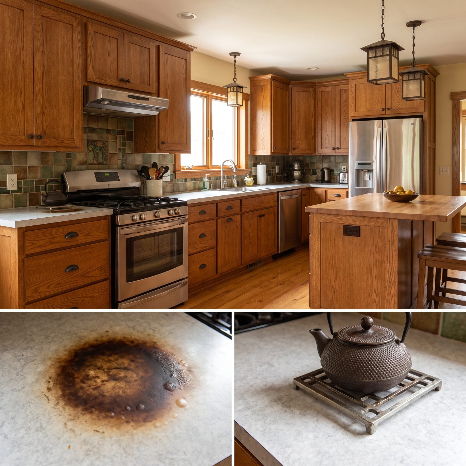
One hot pan set down for ten seconds and the laminate kept the receipt forever. That flat brown burn ring next to the range is a scorched plastic surface, and there’s no sanding it out. Laminate is a thin decorative layer over particleboard, and heat destroys both.
Laminate is a smart budget pick in plenty of ways. Beside a range is not one of them. The trivet lives in the drawer and the pan comes off the stove hot and in a hurry. You will forget. Everyone forgets.
If laminate is the call, build in a strip of butcher block or a stone insert beside the cooktop as a landing zone. Give yourself a place to set the hot thing before you give yourself a scorch mark.
40. Tile Countertops with Grout Lines Stained for Good
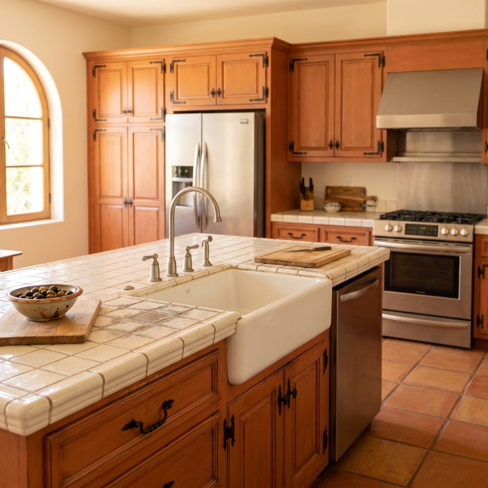
The tiles are fine. The grout is the problem, and the grout is everywhere. Those recessed lines catch coffee, oil, red sauce, and wine, and once the color soaks past the sealer it doesn’t come back out with a sponge.
Tile countertops promise charm and a low price. What they deliver is a hundred tiny gutters that collect everything you spill and refuse to let go.
For a fresh build, a solid-surface slab gives you the clean look with no grout to lose the battle in.
39. Stainless Steel Clouded with Swirl Scratches
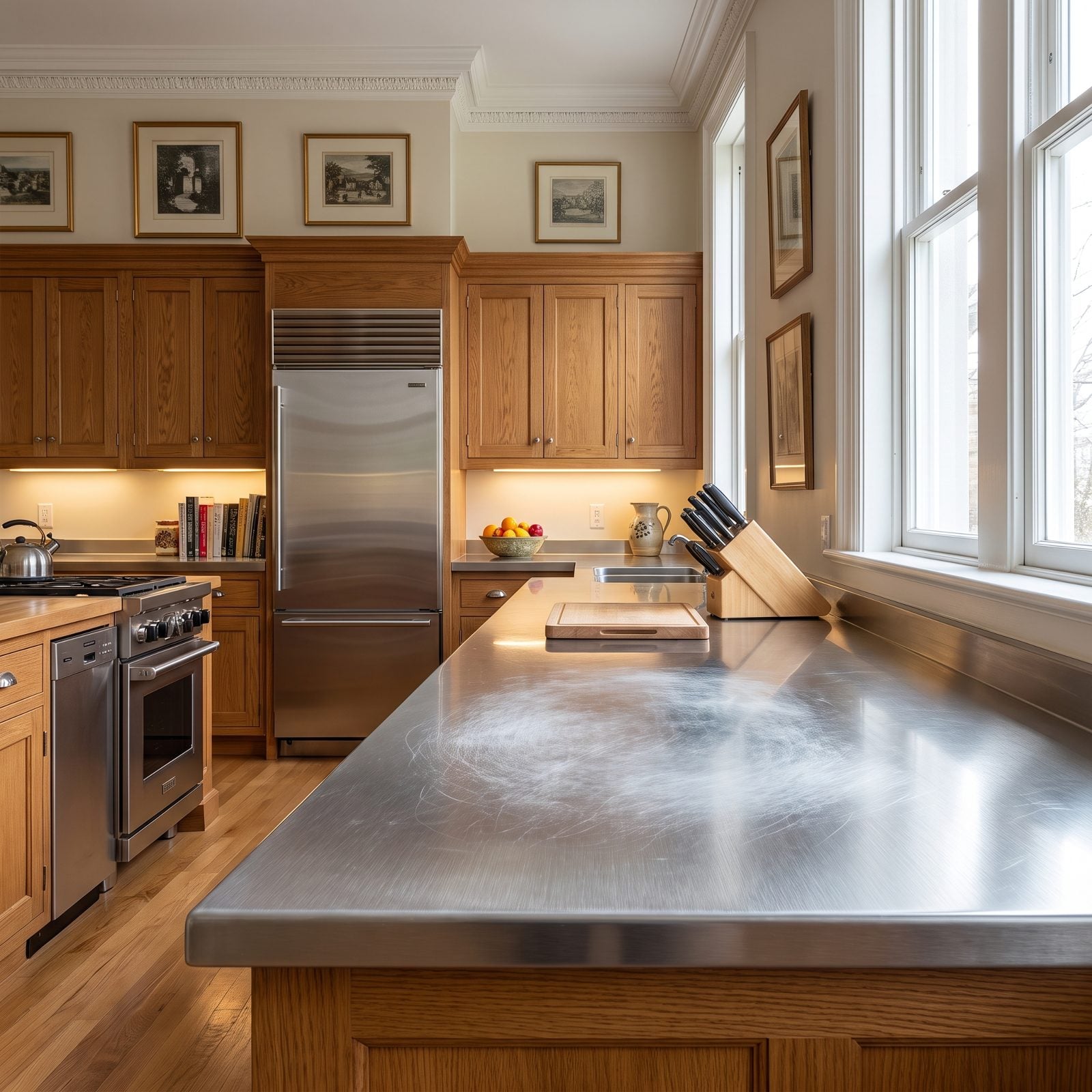
Stainless looks indestructible until the light hits it sideways. Then you catch the halo of fine circular scratches where years of wiping in little circles and dragging pans across have dulled the finish into a cloudy patch. Commercial kitchens live with this. Home cooks usually don’t see it coming.
The scratches aren’t damage so much as patina, and some people love how it ages. But if you wanted the showroom gleam forever, stainless won’t give it to you.
Wipe with the grain, never in circles, and keep a cutting board down. A pro can also re-brush a bad patch. Choose stainless for how it works, not for how it photographs on day one.
38. A Porcelain Slab with a Razor-Sharp Edge Chip
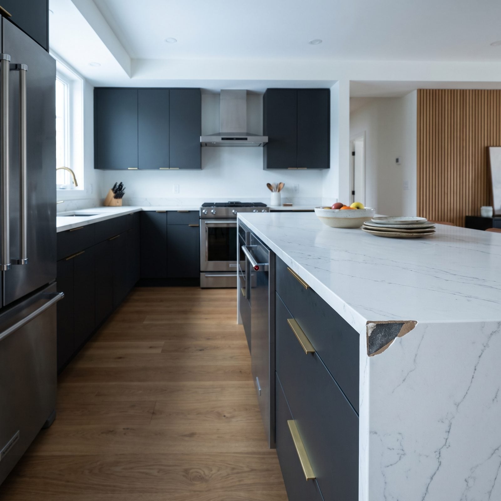
Porcelain slabs run harder than granite and shrug off scratches from almost anything, which lulls you right into forgetting their one weakness: the edge. The pattern is a thin printed layer fired onto the surface, and the body underneath is a different, darker color. Chip a corner and you expose that core, and the break leaves an edge sharp enough to catch a knuckle.
The slab itself is tough as nails on the flat. It’s the thin squared edge that’s brittle, and a hard knock from a dropped pot or a passing hip takes a bite out of it.
A softer eased or rounded edge profile survives impacts far better than a crisp square one. On an island corner where people brush past all day, that edge choice is the whole game.
37. A Solid-Surface Counter Melted by a Hot Pan
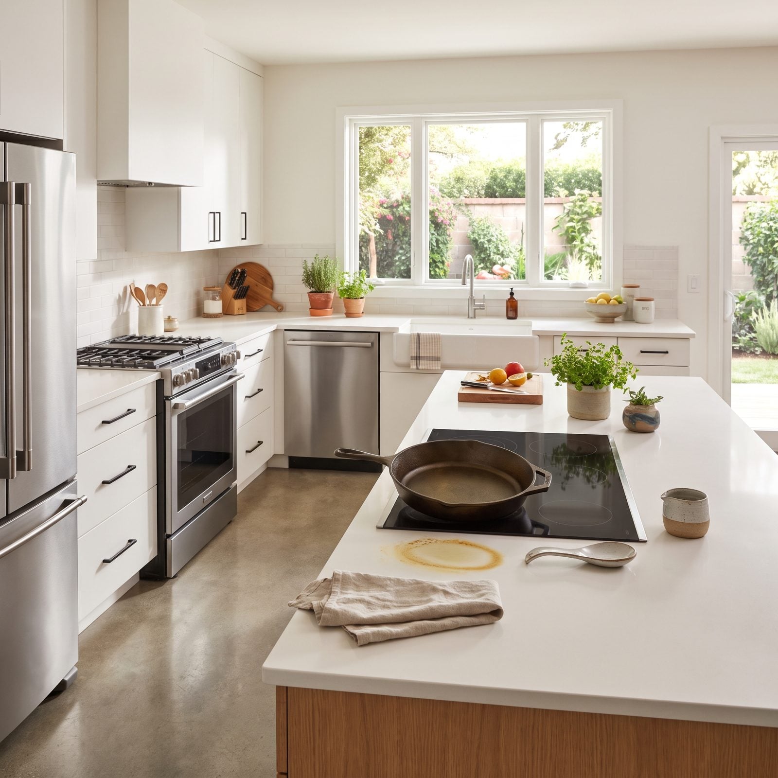
Solid surface is lovely right up until the day you set a pan down straight off the burner. Acrylic and polyester blends start to soften around 250 degrees, and cast iron comes off the flame a lot hotter than that. The counter remembers. You get a dull, slumped oval that no amount of scrubbing will ever bring back.
Here’s the trap. The thermoplastic resin that makes solid surface so easy to repair is the exact thing that gives up under heat. You end up with a counter that behaves like a nice cutting board when you really needed it to behave like stone.
So put quartz or granite near the cooktop, or at the very least build in a trivet zone. Save the solid surface for the island and the baking stretch, where no hot pan ever lands.
36. Bright White Counters Making Off-White Cabinets Look Yellow
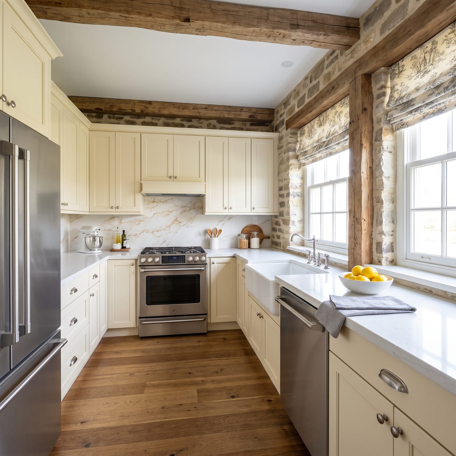
Everyone agonizes over picking the right white and then forgets that white is a relationship, not a color. A cool bright quartz next to a warm antique-white cabinet throws that cabinet right under the bus. Suddenly the doors you fell for in the showroom read as aged ivory, and nothing else in the room explains why.
Whites carry undertones, and undertones only show their hand next to each other. A blue-gray counter looks perfectly clean on its own, then it cranks the yellow in your cabinet paint up to full volume the second the two surfaces touch.
The kitchen is where this ambushes people, because the counter sits right at eye level against the doors. Match the undertone family and you’re fine. Warm cabinet, warm counter. Or choose a counter with a little cream running through it so both whites are reading from the same page.
35. Dark Stone Turning a Windowless Kitchen into a Cave
🔥 Would you like to save this?
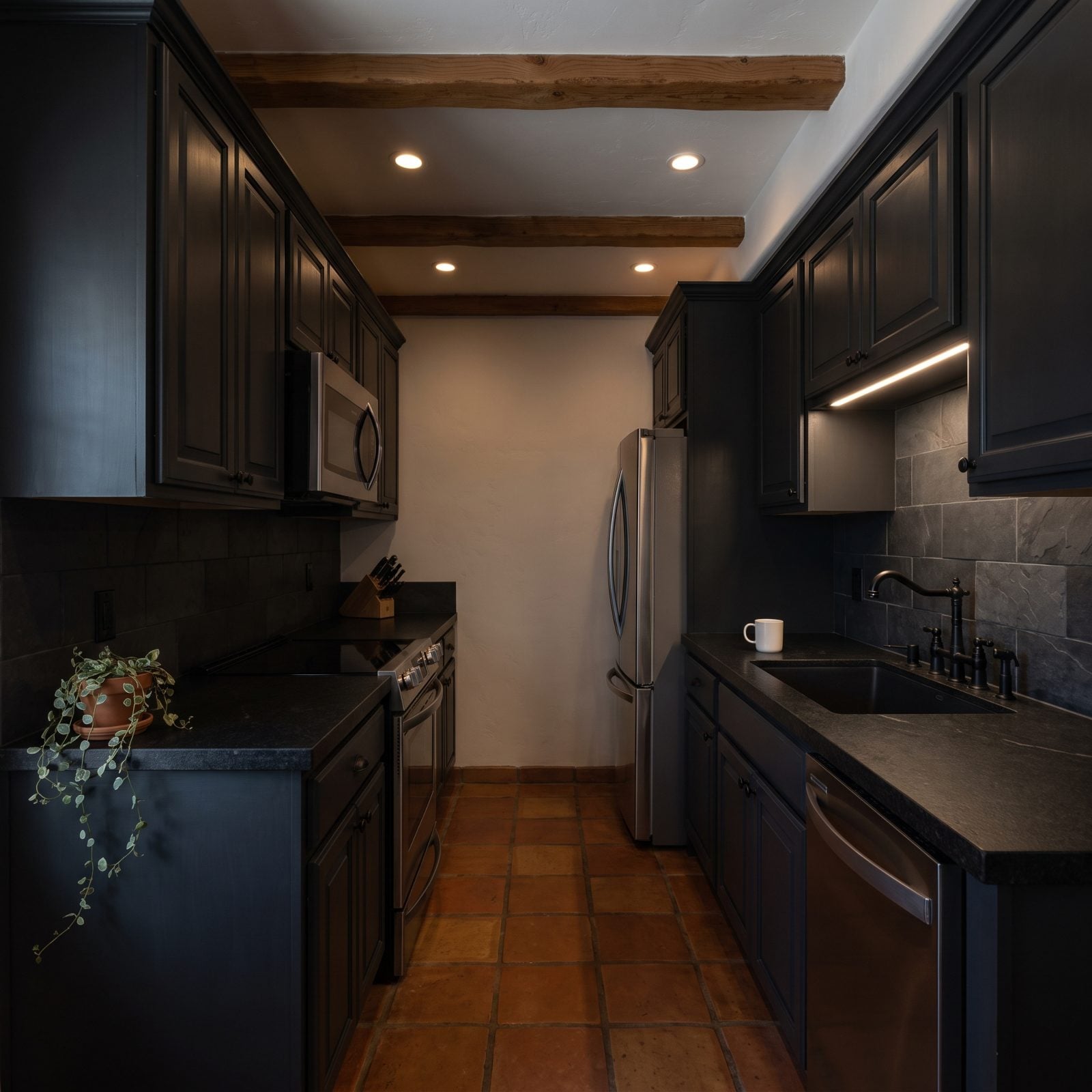
Dark stone photographs like a dream. Then you live with it in a windowless room and watch it drink every lumen you feed it. Black granite and soapstone look rich under real sun, but in an interior galley lit by nothing but recessed cans, they turn the counters to shadow and the whole space shrinks around you.
Dark surfaces bounce almost nothing back into the room, so you end up fighting your own counters for brightness. No lighting budget wins that fight.
34. Island and Perimeter Countertops with Clashing Undertones
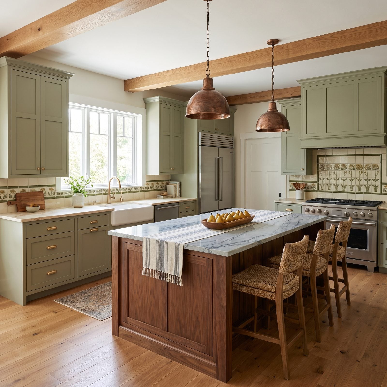
Two-tone counters are a great idea right up until the two tones come from different families. A warm cream perimeter and a cool gray island don’t contrast. They squabble. Your eye keeps trying to reconcile them and never can, which is the design version of a slightly flat note held a beat too long.
Deliberate contrast needs a shared thread, usually a common undertone or a repeated vein color. Without it, the two slabs just read as a mistake nobody caught.
So in this exact room, pull one counter’s undertone toward the other. Keep the cream perimeter, then give the island a warm gray or a honed black flecked with cream, so the surfaces are having a conversation instead of staring each other down.
33. A Tiny Sample That Hid the Slab’s Giant Veining
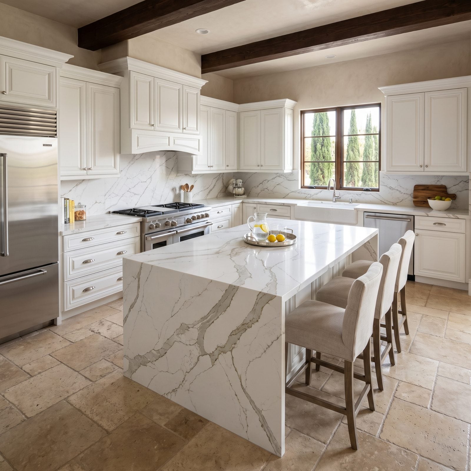
A four-inch sample is a tiny window into a huge slab, and veining does not scale down politely. A subtle wisp on the chip can land as a river across a seven-foot island. You approve the sample, the slab shows up, and your delicate little kitchen has a weather system running across it.
Pattern scale matters as much as color here. Veins sized to make a bold statement will bulldoze the fine cabinet detailing you chose for restraint.
32. A Natural Blemish Positioned in the Center of the Island
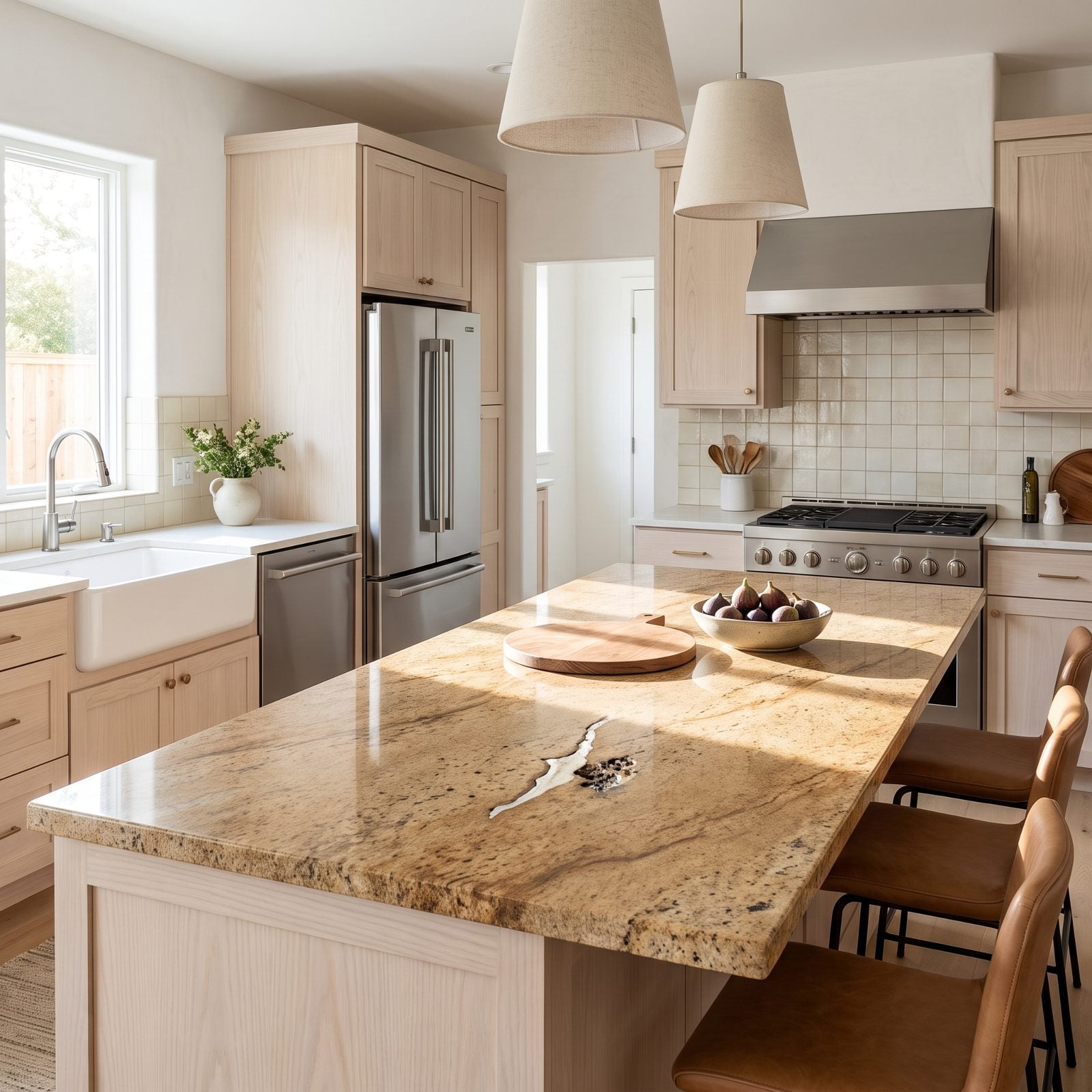
Natural stone has character, and character includes the odd fissure, pit, or pale patch. None of that is a defect. But where it lands is a choice somebody has to make, and when nobody does, the flaw ends up smack in the middle of the island, exactly where your eye goes first and your plate goes second.
A blemish reads as an accident when it’s centered and as intentional charm when it’s placed with care. Same mark, completely different story, decided entirely by position.
During slab layout, a good fabricator rotates and shifts the template so the natural marks fall at the edges or hide under a cutout. On a real slab you get to be picky about this. Ask to be there when they lay it out, and don’t feel shy about it.
31. Statement Veining Chopped Apart by the Cooktop
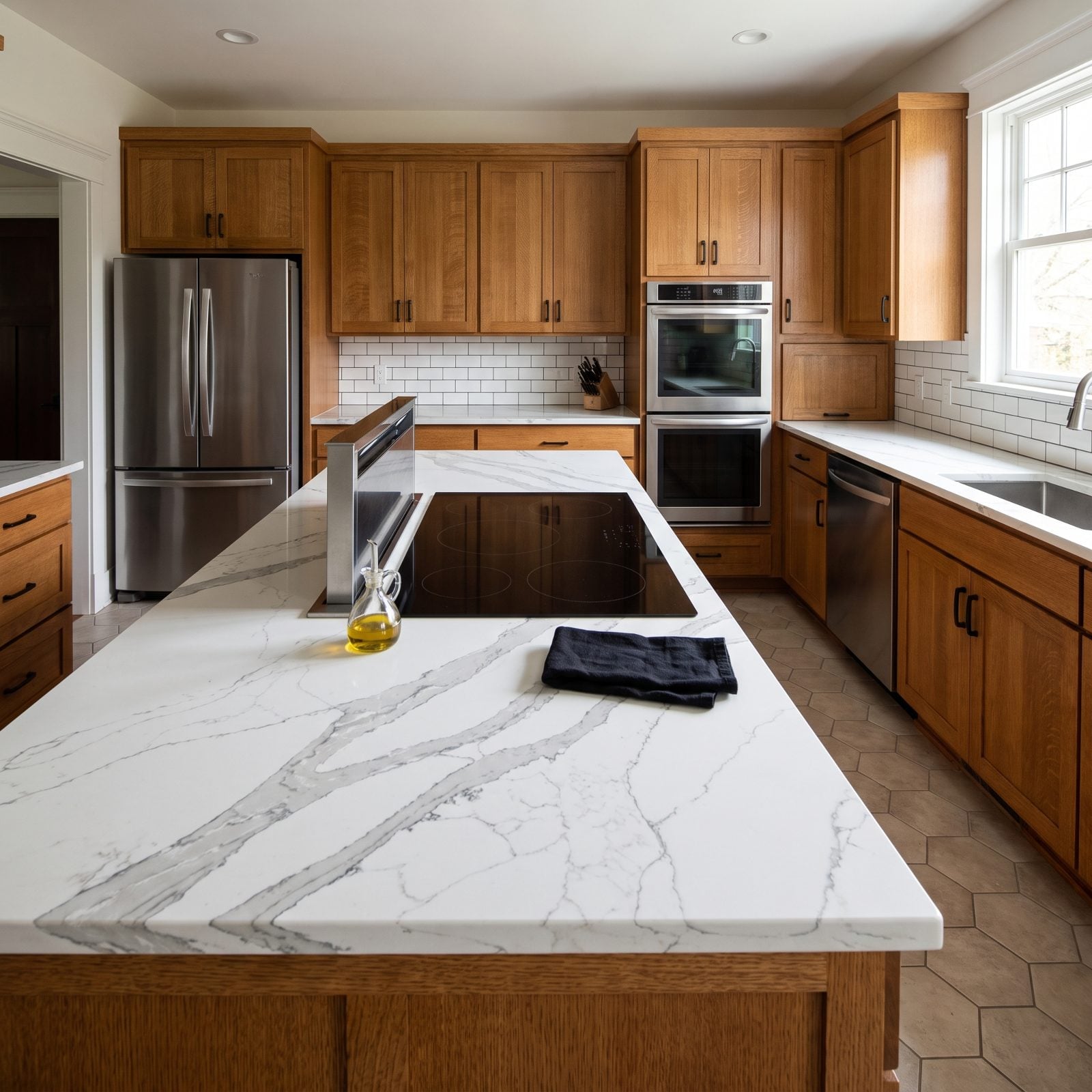
You paid extra for the dramatic slab, and then the cooktop got dropped right through its best line. The vein that was meant to sweep across the counter now dead-ends at a black rectangle and picks up again on the far side, like a sentence with three words missing from the middle.
Statement veining is a composition, and a thoughtless cutout amputates the focal point. Your eye follows the line, hits the appliance, and loses the thread entirely.
This gets solved at templating. A careful fabricator positions the cutouts so they fall in the quieter stretches of the pattern and lets the hero vein run clear. On a bold slab, where you drop the hole matters as much as the slab you bought.
30. Bookmatched Slabs That Do Not Align

Bookmatching is the showstopper: two mirrored slabs opening like butterfly wings. When it lands, it’s the best thing in the room. Miss the seam by an inch and a half and the whole illusion caves in, so all anyone sees is the flaw.
The entire effect rides on the mirror being exact. Misalign the seam and the brain, wired to catch broken symmetry in an instant, flags it before you’ve even gone looking.
29. Waterfall Grain Running in the Wrong Direction
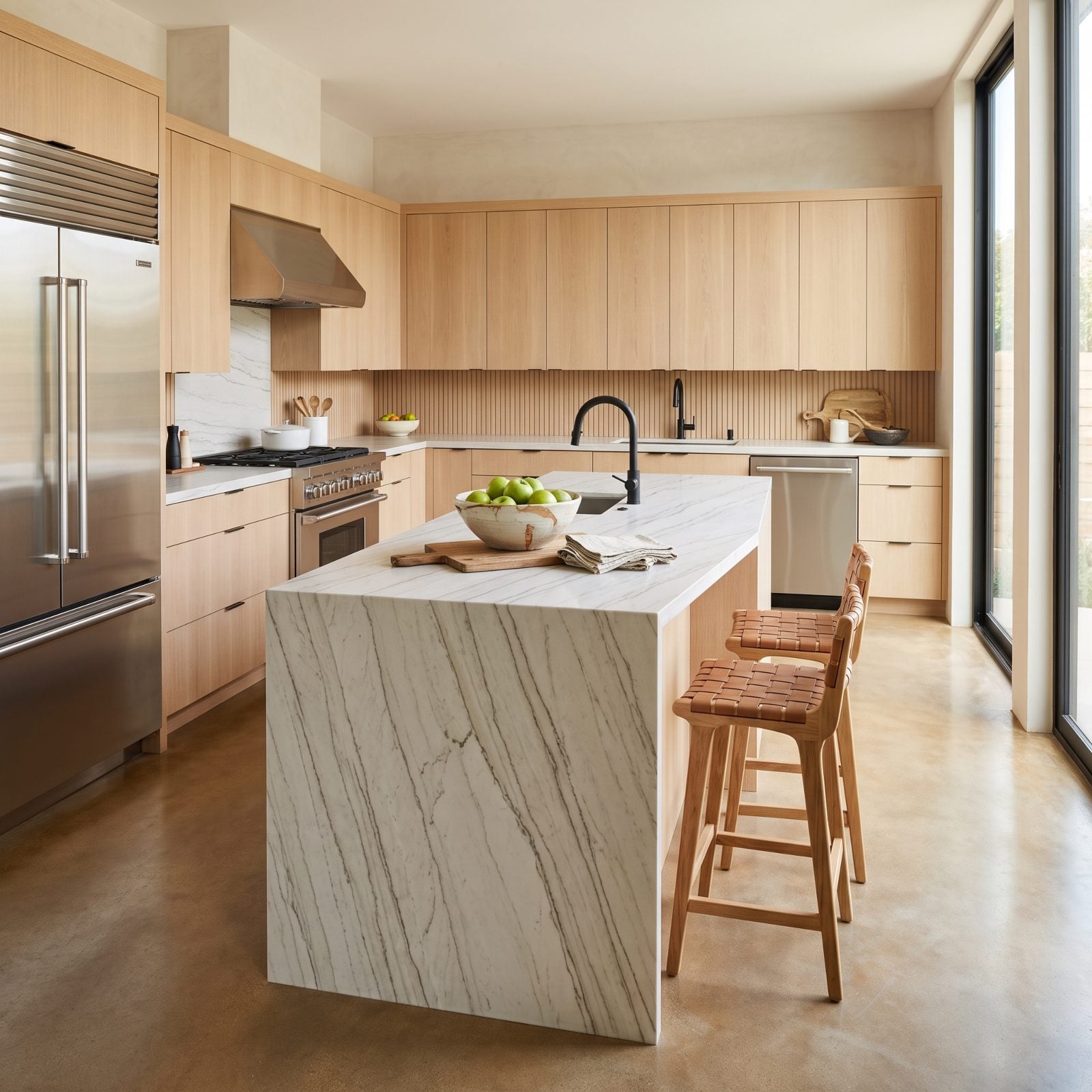
A waterfall edge should look like the stone poured over the side of the island in one unbroken sheet. Get the grain direction wrong and it looks like someone glued a different slab to the end instead. The veins run one way across the top, turn ninety degrees at the corner, and the magic just evaporates.
The waterfall is selling continuity, nothing else. When the grain breaks at the edge, you’re reminded that it’s three separate pieces meeting at a joint, which is the one thing the whole move exists to hide.
The answer is to cut the vertical panel so the vein flows over the corner and keeps going down, holding the one-slab illusion together. On directional patterns this isn’t optional. Spell it out in the shop drawing and don’t assume anyone will infer it.
28. A Waterfall Miter Opening at the Corner
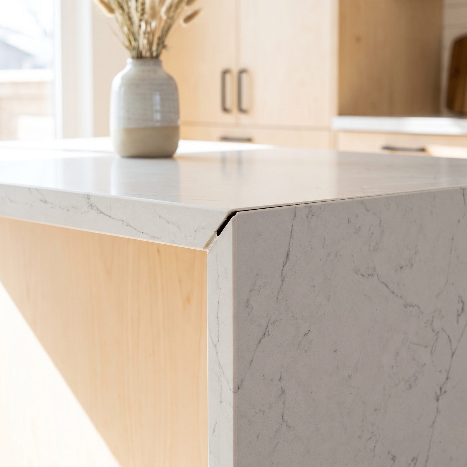
A waterfall miter is where two pieces of stone meet at 45 degrees to fake a solid, folded corner. It’s a demanding cut. Done well, you can’t find the seam at all. Rushed, the joint opens along the outer edge into a thin dark line that catches dust, catches light, and snags your eye every single time you walk past it.
The whole point of the miter is that illusion of one continuous mass. A gap, even an eighth of an inch, breaks it and reads as sloppy fabrication. Because that’s what it is.
You want a fabricator who dry-fits the miter, color-matches the seam adhesive to the stone, then clamps it tight so the corner closes flush. This is a craftsmanship line item. Hire for it, and look hard at that corner before you sign off on anything.
27. Two Seamed Slabs That Don’t Quite Match
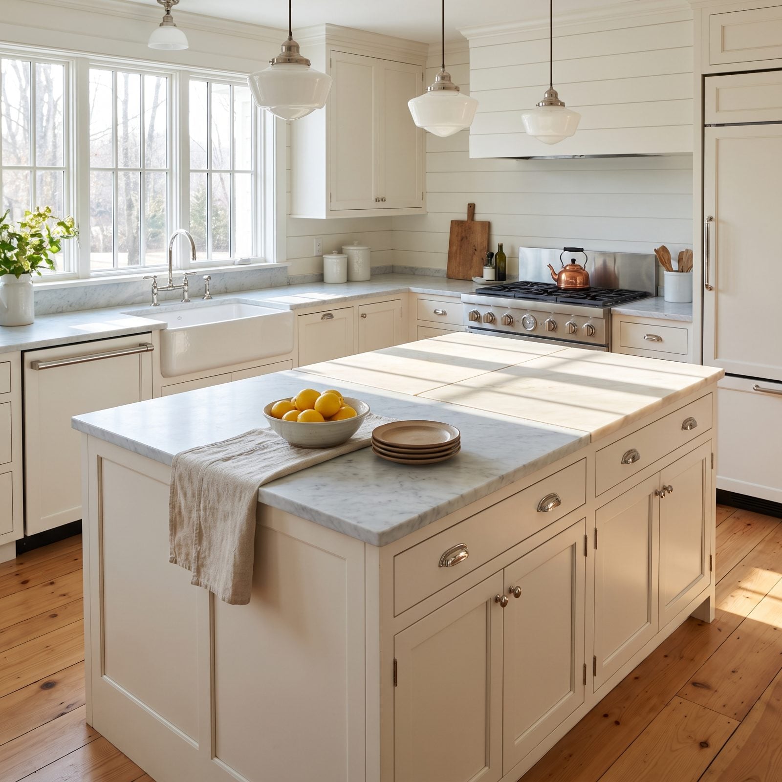
Natural stone comes out of the ground in blocks, and no two blocks are twins. Buy enough slab for a big island and you’ll likely need two pieces. The mistake isn’t the seam — it’s failing to lay the slabs side by side in the yard and pick two that read the same temperature.
Here the left half is cool and blue, the right warm and cream, and the seam turns into a color border nobody wanted.
Why it doesn’t work: your eye reads the whole counter as one surface, so the temperature shift breaks the illusion. Looks like a patch, not a plan.
26. An Ornate Ogee Edge Bolted to Flat Modern Cabinets
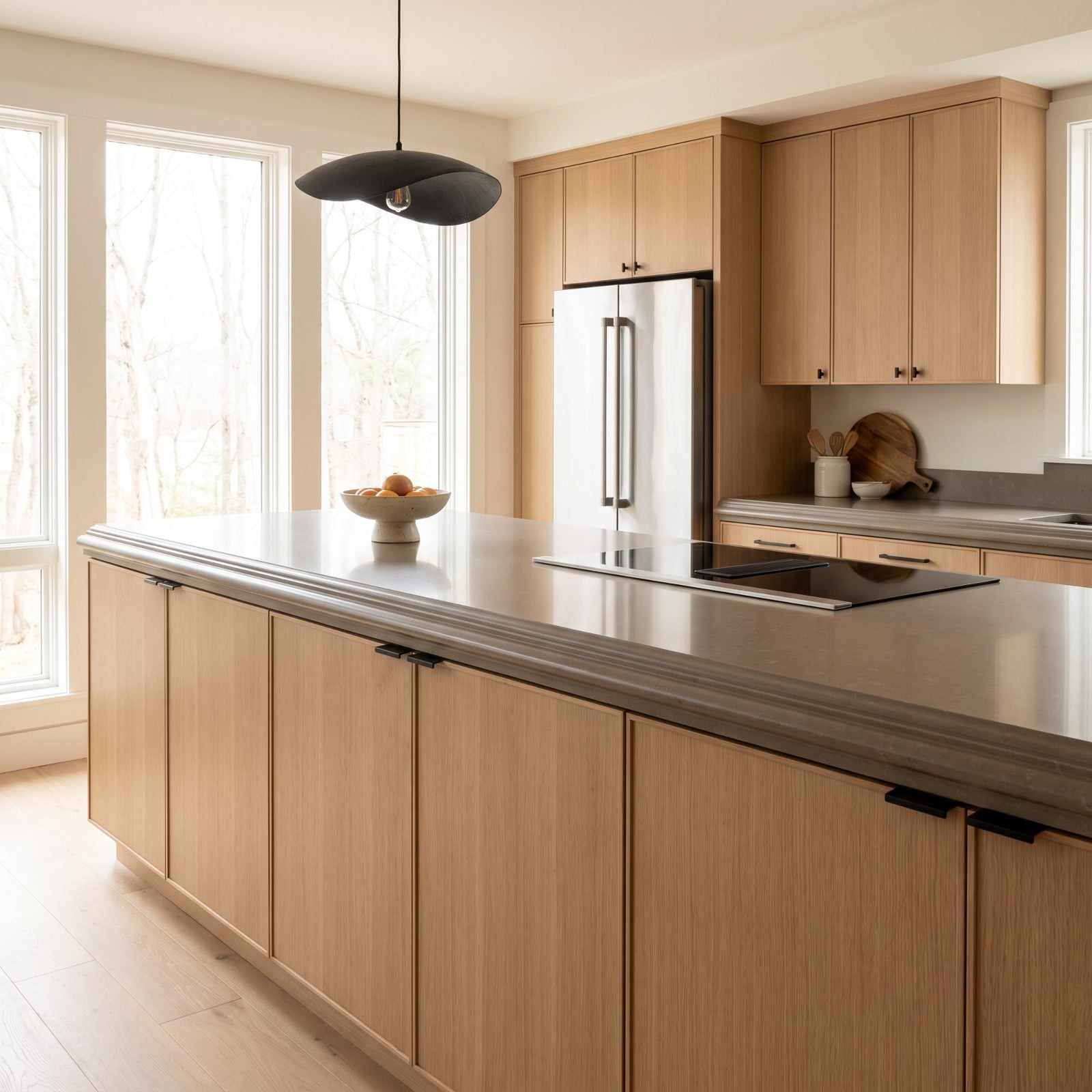
Edge profiles have a dialect. An ogee, with its carved double curve, speaks fluent traditional — raised-panel cabinets, furniture-style islands, rooms with crown molding.
Put it on flat-slab oak and matte black pulls and you’ve got a sentence in two languages. The cabinets say one thing while the counter edge argues back.
For a modern kitchen, go eased, square, or mitered — a pencil-round at most. The edge should disappear and let the material do the talking.
25. An Ultra-Thick Mitered Edge That Overpowers Slim Cabinets
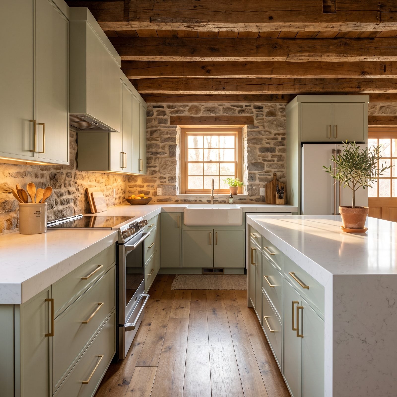
Thick counters had a real moment. A chunky mitered edge looks confident, like the stone is one solid block. Trouble starts when the edge gets thicker than the cabinet drawers underneath can carry.
Here a six-inch apron sits on top of slim shaker fronts, so the counter looks like it’s wearing a weight belt and the proportions tip over.
A built-up edge needs beefy cabinetry below it to balance the load. On delicate, narrow doors, keep the edge standard thickness — around an inch and a quarter — and let the cabinets breathe. Proportion is quiet until it’s broken. Then it’s all you can see.
24. A Sharp Square Edge Right Where Everyone Turns the Corner
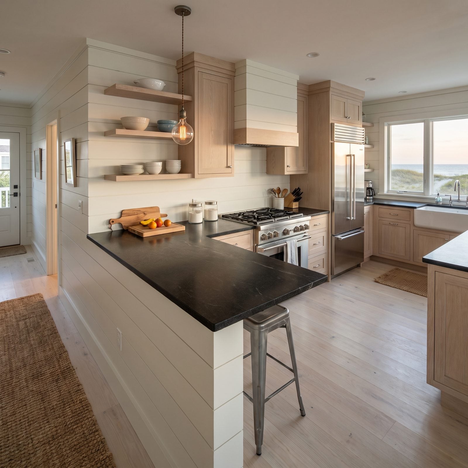
A knife-sharp square edge photographs beautifully. It’s also the detail that bites you in real life.
Put that hard corner at the mouth of a walkway, at hip height, where people pivot carrying laundry baskets and sleepy toddlers, and you’ve installed a bruise dispenser. I caught a square granite corner with my hipbone once and I remember it to this day.
Why it doesn’t work: edges at traffic pinch points take constant human impact, and when stone meets hip, something loses. Soften any corner that lands in a path. A small radius, a clipped corner, or a bullnose at that one spot keeps the look mostly square while taking the teeth out of it. Your shins will send a thank-you note.
23. An Oversized Island That Chokes Every Aisle Around It
🔥 Would you like to save this?
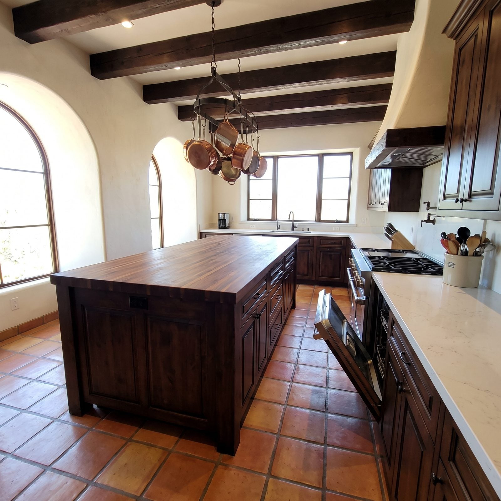
Bigger island, better kitchen. That’s the instinct, and it’s wrong more often than people think.
A kitchen is only as usable as the space you can move through. Pack in a big island and the aisles shrink to where two people can’t pass and an open oven door clips the island edge.
The fix is humbling: a smaller island. Or a slim prep cart you can roll out of the way. Give the floor room to breathe and a modest island beats a monster every time.
22. An Island Overhang Too Shallow to Fit Your Knees
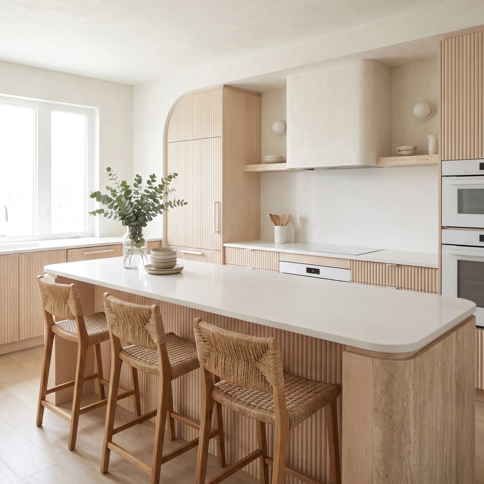
An island with stools promises a place to sit. A stingy overhang makes that a lie.
Here the counter extends roughly a foot past the fluted island panel, so all three woven stools tuck well underneath and there’s room for your knees. Shave that down to six inches and there’d be nowhere to tuck them; you’d perch at the edge like you’re waiting for a bus. Nobody lingers. The seating becomes decorative.
For a comfortable seat you want at least a foot of overhang, and a little more is better. Build it in from the start, because retrofitting more overhang usually means brackets or a wider slab you didn’t buy. Measure for a real human sitting down, not a stool standing alone.
21. A Deep Unsupported Overhang Starting to Sag
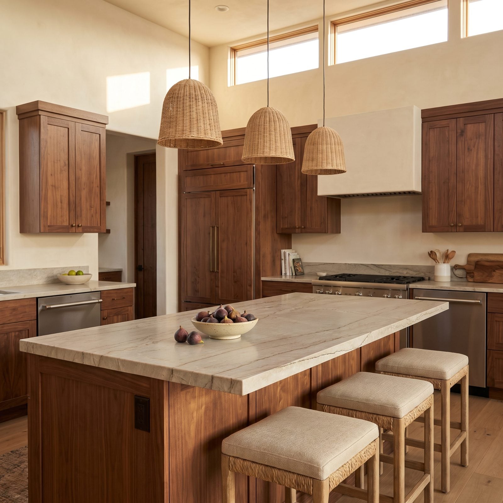
Stone is strong until you ask it to float. A deep overhang with nothing under it is cantilevered weight, and gravity is patient.
This island keeps its overhang shallow, and the leading edge runs straight and level, with no dip and no sag. Push it much deeper with no steel, no corbels, nothing, and a lean or a kid sitting on it can turn a hairline into a crack.
Any deep overhang needs hidden steel plates or support, built into the cabinet before the stone goes down. It’s invisible, and it’s the difference between a counter and a countdown.
20. Bulky Corbels That Clip Everyone’s Knees

Corbels can solve the support problem and look handsome doing it. Then they create a new problem one foot lower.
These heavy carved brackets hold the stone up fine. They also sit right where your shins want to be, so when you sit down your knees meet the corbel before they meet the cabinet.
If you need visible support under a seating overhang, keep the corbels shallow and set them at the ends of the run, not in the middle of the legroom. Better yet, hide flat steel plates inside the counter and skip the brackets entirely. Decorative support that attacks the seated guest isn’t support. It’s an obstacle with good taste.
19. A Built-Up Counter Lip That Jams the Top Drawers
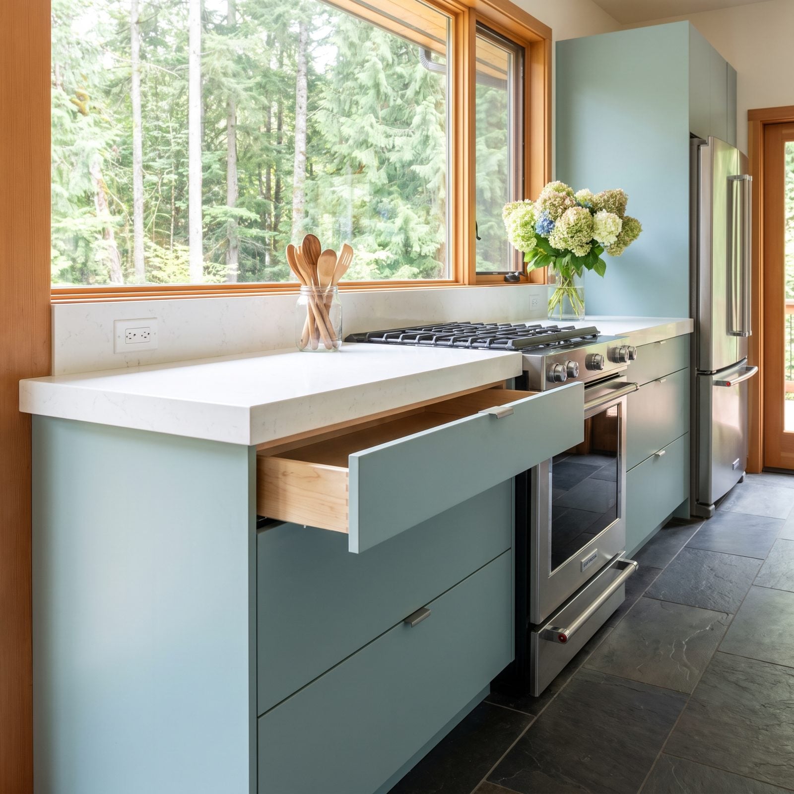
This one hides until the day you move in and open a drawer. Then it’s with you forever.
A built-up edge adds thickness below the counter. Set it too low over a deep drawer and the drawer face catches on the lip, opening three inches and stopping, every single time, several times a day. Here it was done right: the drawer face sits just below the thick edge and slides all the way open.
Why it works here: the drawer and the counter overhang are both claiming the same vertical space, and somebody settled that argument at the planning stage. The clearance gap was left on purpose. Coordinate the counter edge thickness with the drawer-box clearance before anything gets ordered. A quarter inch of planning saves a lifetime of the little jam, the little curse, the little reach around. Fix it later and you’re refacing drawers or recutting stone. Nobody wants that call.
18. A Counter That Quits Before the Cabinets Do
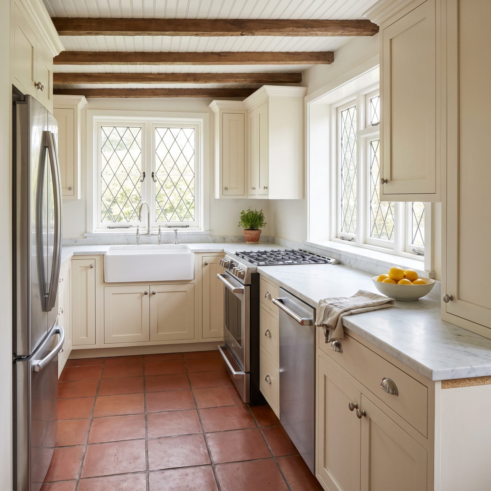
Look at the right end. The stone just gives up, and the last stretch of cabinet sits there with its particleboard top showing like a shirt that didn’t get tucked in. It happens when the slab is measured to the wrong cabinet, or the fabricator runs out of material and nobody catches it until install day.
Your eye reads a countertop as one continuous surface. Break that line and the whole run looks unfinished, even though everything else here is honest work. The kitchen is otherwise lovely, which somehow makes the gap sting worse.
The fix is dull and correct. Template the full run, order one extra inch, hold the fabricator to it. A counter should die flush with the cabinet below it or not at all.
17. Two Slabs Meeting at a Lip You Can Feel With Your Thumb
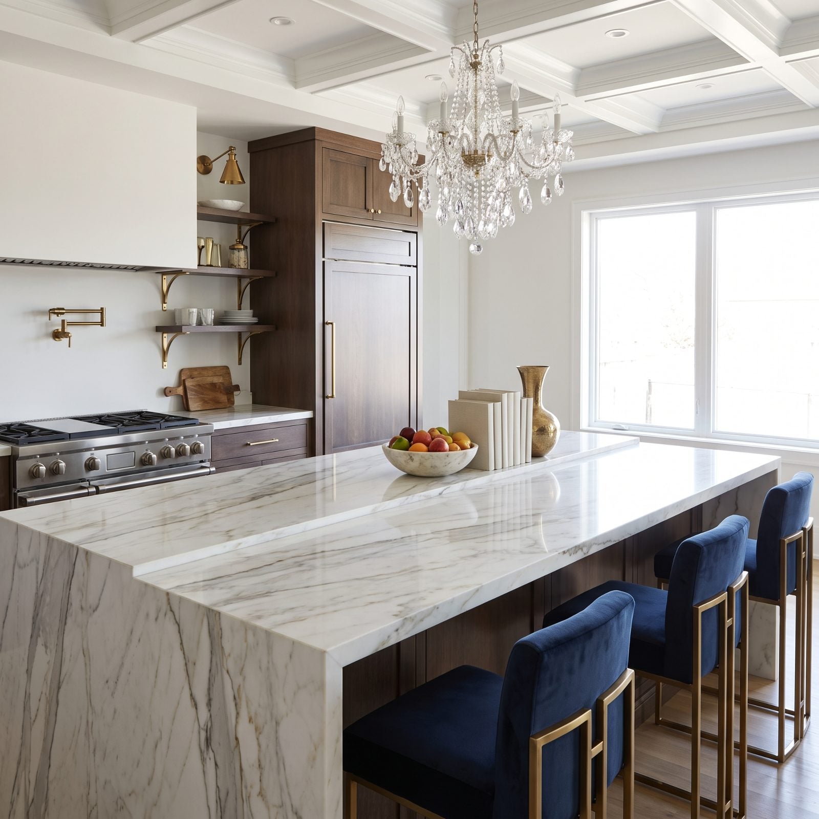
Run your thumb across the seam and you couldn’t miss it. One slab sits nearly a full slab thickness proud of its neighbor, with a crisp, square-edged step running the whole length of the joint, and that raking side light is doing you the favor of showing the big stepped offset nobody wants to live with.
A seam is supposed to vanish. When the two pieces aren’t shimmed dead level during install, you get a step that catches crumbs, sponges, and your knuckles every single day. On quartz and quartzite it’s brutal, because the surface is so flat everywhere else that the one bad joint becomes all you can feel.
16. A Wall Gap Filled With a Fat Rope of Caulk
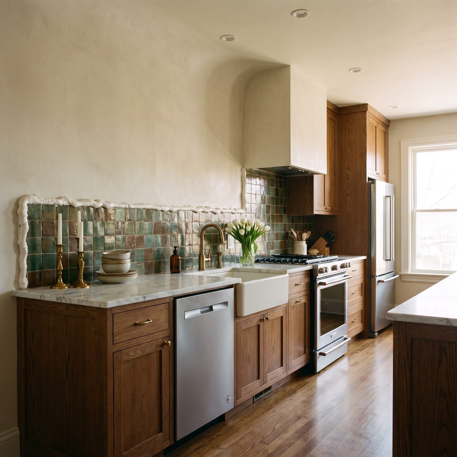
See that wobbly white rope running along the top and left edges of the green tile, where it meets the plaster wall? The wall isn’t straight — few of them are — so instead of cutting the tile to fit, somebody squeezed half an inch of caulk into the gap and called it done.
A thick caulk bead ages badly. It yellows, cracks, collects grime, and broadcasts the shortcut in a kitchen this polished. Caulk is meant to be a thin hairline seal, never a structural filler.
The right answer was to cut the edge tiles to the wall’s contour, or float the plaster out to meet them, so the tile backsplash could finish against the wall with a tight, hairline joint. A bead of caulk should be invisible from standing height. If you can read it across the room, something upstream went wrong.
15. A Range Wedged Into a Cutout That’s Too Tight
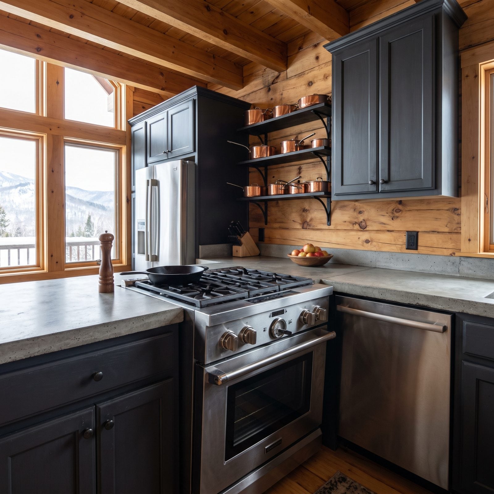
The range is in there, but barely. The cutout came up short, so the appliance is shoved in on a slight angle with the stone edges pressing right against the steel. The gaps left and right don’t match, which is the tell.
A too-tight cutout isn’t just ugly. It traps heat against the stone, makes the range nearly impossible to pull out for cleaning or repair, and can chip the countertop edge over time. Every appliance has a required rough opening, and it’s not a suggestion.
14. A Crumb Trap Running Down the Side of the Range
🔥 Would you like to save this?
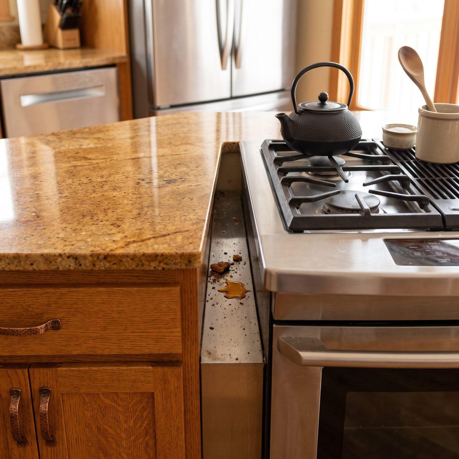
A wide open gap down the side of the range, and look what’s already living in it. Crumbs. Dried spill. The stuff that falls into that slot and never, ever comes back out.
This is a layout and leveling miss — either the counter wasn’t cut tight to the range, or the appliance drifted during install. Narrow enough and a trim strip closes it. This one’s wide enough to swallow your dinner.
13. A Countertop Standing Taller Than the Range Beside It
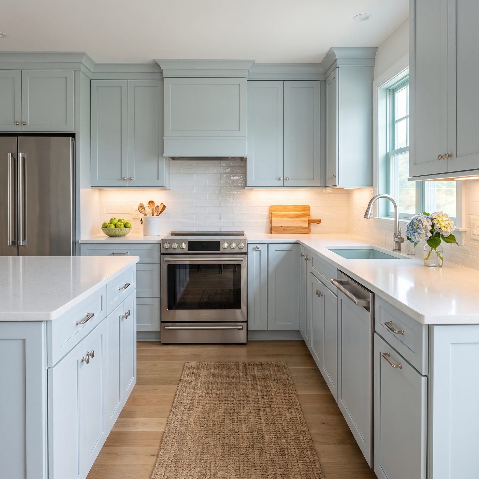
Check the seam where the range meets the counters. Here the cooktop sits roughly flush with the white tops on both sides, if anything a touch above them, so the appliance doesn’t read as recessed. This seam is exactly where a countertop standing taller than the range would give itself away.
Part looks, part function. When a range ends up sunk below its counters, it’s awkward to slide a hot pan sideways onto the counter, and whatever boils over collects against the raised counter edges. Here someone reconciled the cabinet height and the range height before the counters were set, and it shows.
In a room this bright and calm, any misalignment would nag at you without your knowing why. The cure is cabinet-height shims — or, if you’re early enough in the process, picking a range and base cabinets whose finished heights actually agree with each other.
12. A Dishwasher Pinned Shut Under a Low Counter
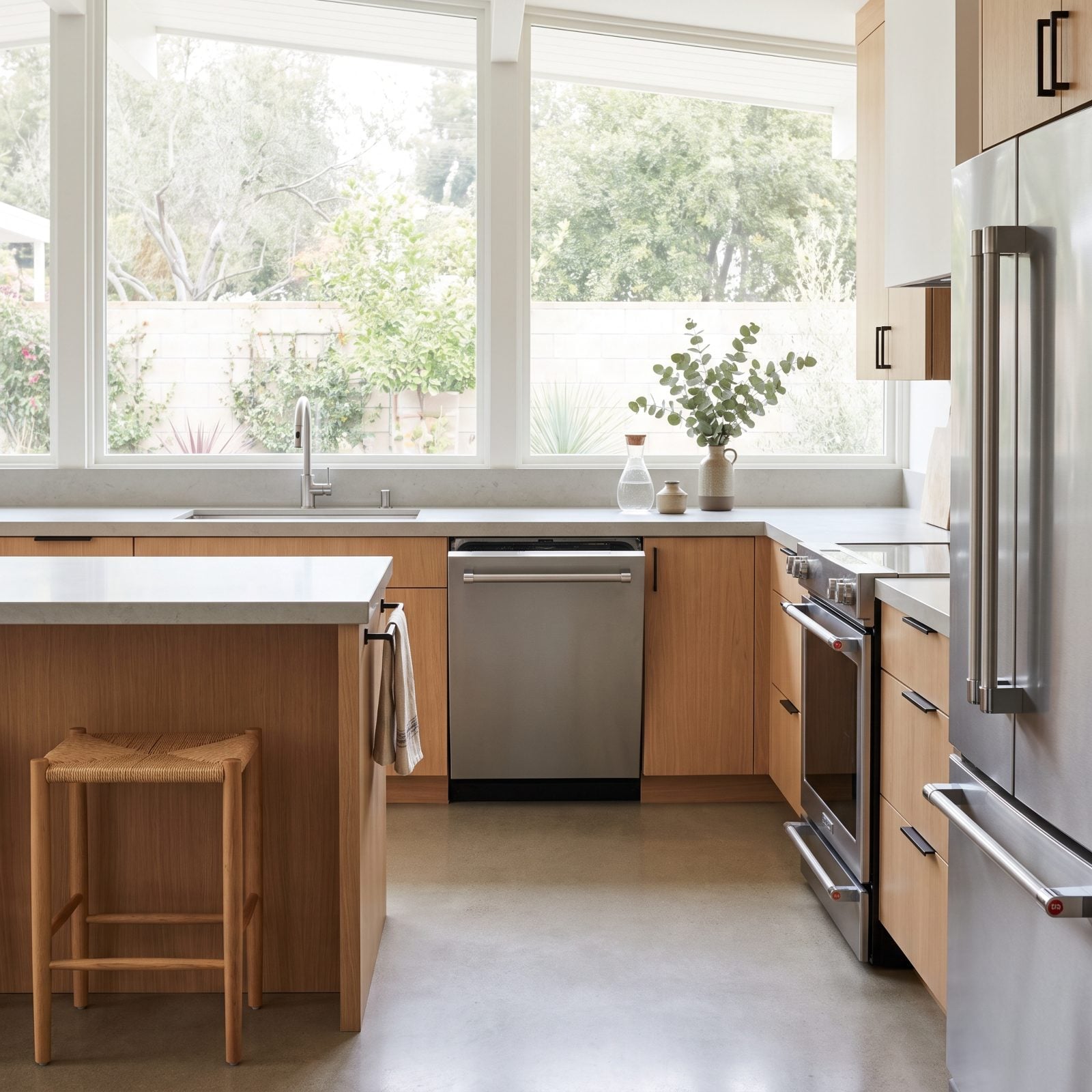
That dishwasher looks easy to live with. It sits in a proper opening with a little breathing room under the counter, and nothing stands in front of it, so the door can drop all the way down without catching on the stone lip. No fighting it every load.
Dishwashers need a specific opening height, and if the base cabinets or the counter sit too low, the appliance gets squeezed. You end up with a door that scrapes, a top rack you can’t pull, and a hinge that gives out years early.
So measure the appliance’s required opening before the counters go on, not after. In a kitchen this spare and quiet, every element has to earn its spot — and an appliance you can’t fully open is just a cabinet pretending to be useful.
11. A Seam Cutting Straight Through the Sink
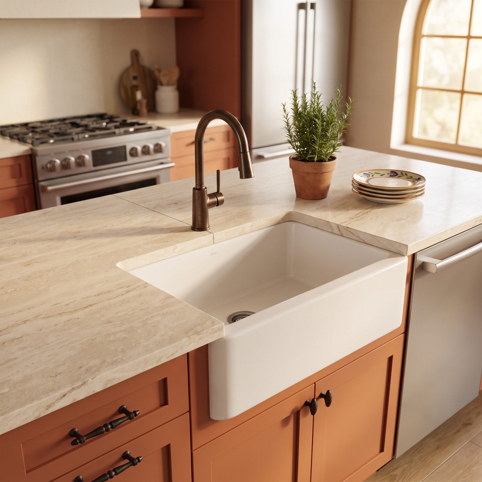
Follow the seam and watch where it lands. Straight into the sink cutout and down the white porcelain apron front, splitting the bowl right where the stone meets the sink. This is the worst possible place for a joint to sit.
A seam landing at a sink opening is structurally weak, because the stone edges around the cutout are already the most fragile part of the whole counter, and here the line runs on down the face of the sink itself. Water works into the joint, the adhesive fatigues, and cracks crawl out from the cutout. Fabricators plan seams at the back of a sink or well clear of it for exactly this reason.
10. A Faucet Mounted So Tight to the Wall the Handle Won’t Turn

Swing the lever on this brass pull-down faucet and it moves freely. The faucet sits close to the plaster wall, but its side-mounted lever swings sideways instead of back toward the wall, so nothing runs out of travel before the water’s fully on. It’s the kind of planning nobody notices, because the plumber hooks it up and it simply works.
Every faucet needs clearance behind it for the handle to swing, and on a single-lever design that need is bigger than people expect. Drill the hole without checking the spec and you’ve built a faucet that physically can’t do its one job.
The fix afterward is maddening. Redrill the countertop and risk the top, or swap to a faucet with a side-mounted lever like this one and start over. Better to choose that style up front. Measure the handle’s full arc before the hole exists. A faucet that fights you every morning wears out your patience long before it wears out the valve.
9. The Faucet Hole Drilled in the Wrong Spot, Now Capped in Chrome
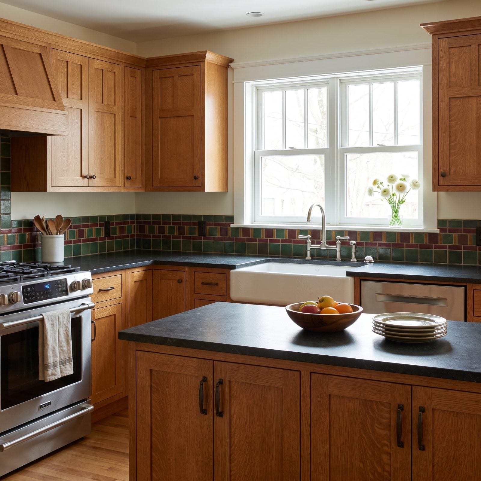
You can cap a hole, but you can’t hide that you capped it. That little chrome button sitting next to a brushed nickel faucet is the tell, and once you see it you can’t unsee it. Measure-twice-drill-once isn’t a cliché with stone. It’s a thousand-dollar slab you don’t get a second shot at.
The eye snaps to anything that breaks a pattern, and a mismatched metal in a row of matched metals breaks it hard. The cap also reads as an afterthought, which it was.
Here’s what would have saved the day in this same kitchen: a soap dispenser or a filtered-water tap in a brushed nickel faucet finish, something that turns the orphan hole into a deliberate feature instead of a scar. No function to fill it? A cap in the exact faucet finish at least lets the thing disappear.
8. A Pop-Up Outlet Planted Right in the Sink’s Splash Zone
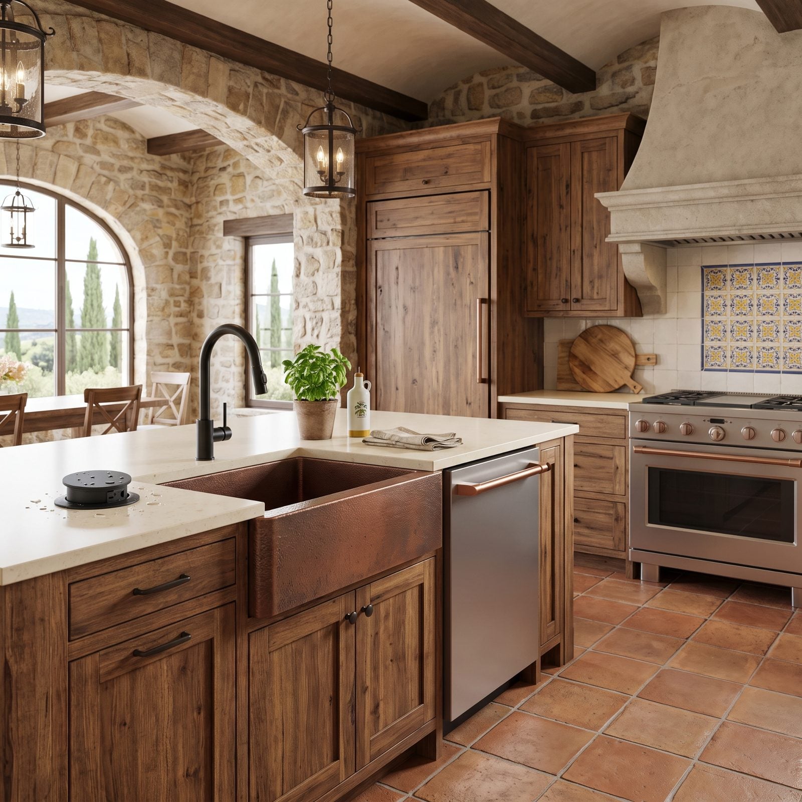
Pop-up outlets are brilliant until you put one where the water lives. Eight inches from a working sink means that lid takes a splash every time you rinse a pot, and electricity plus standing water is not a combination you want to test your luck on.
Beyond the obvious safety question, water pooling around the gasket corrodes the mechanism. Pop-ups that get wet stop popping. Then you’re prying the thing open with a butter knife.
Put it on the far run of counter instead. The spot beside the black gooseneck faucet looks tidy, sure, but keep the power well clear of the rinse arc. Code wants outlets out of the splash zone for a reason, and your electrician should have caught this one.
7. The Grime-Trapping Gap Where Counter Meets Backsplash
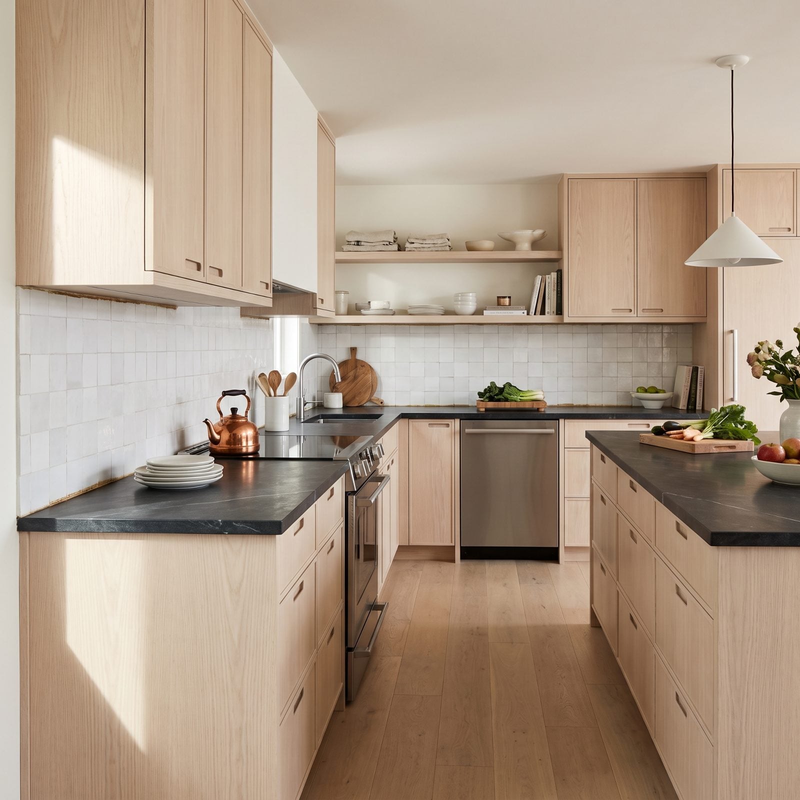
That dark line along the bottom of your backsplash isn’t a shadow. It’s months of kitchen life collecting in a gap nobody sealed properly, and a kitchen is judged as much by its invisible junctions as its showpieces.
Counter and wall move at slightly different rates with heat and humidity, so a rigid grout line cracks. Leftover caulk from a rushed install pulls away, and the void becomes a crumb trap your sponge will never fully reach.
The fix is unglamorous and permanent: a bead of color-matched flexible silicone, tooled smooth, renewed every couple of years. It flexes with seasonal movement instead of fighting it. Ten dollars and twenty minutes versus scrubbing a grime line forever — not a hard call.
6. A Sink Deck That Pitches Water Back Toward the Wall
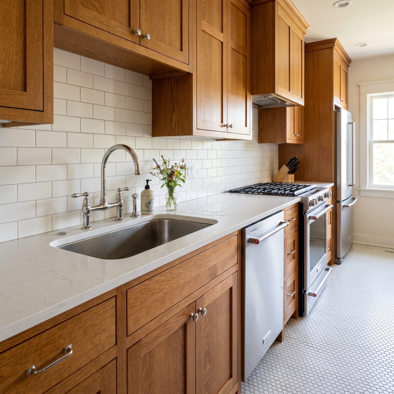
Water is honest. It tells you exactly how level your counter is, whether you asked or not. When the deck behind the sink pitches a hair toward the wall instead of the basin, every splash heads straight for the backsplash and settles in.
And standing water finds the backsplash seam, soaks the grout, and over months works its way behind the tile. You get swelling, mildew, and eventually a repair that costs far more than the original install did.
A competent fabricator shims the substrate so the whole deck slopes a whisper toward the sink. You shouldn’t be able to see the pitch. All you should ever notice is the water disappearing where it belongs.
5. Porous Marble That Drank a Glass of Red Wine and Kept It
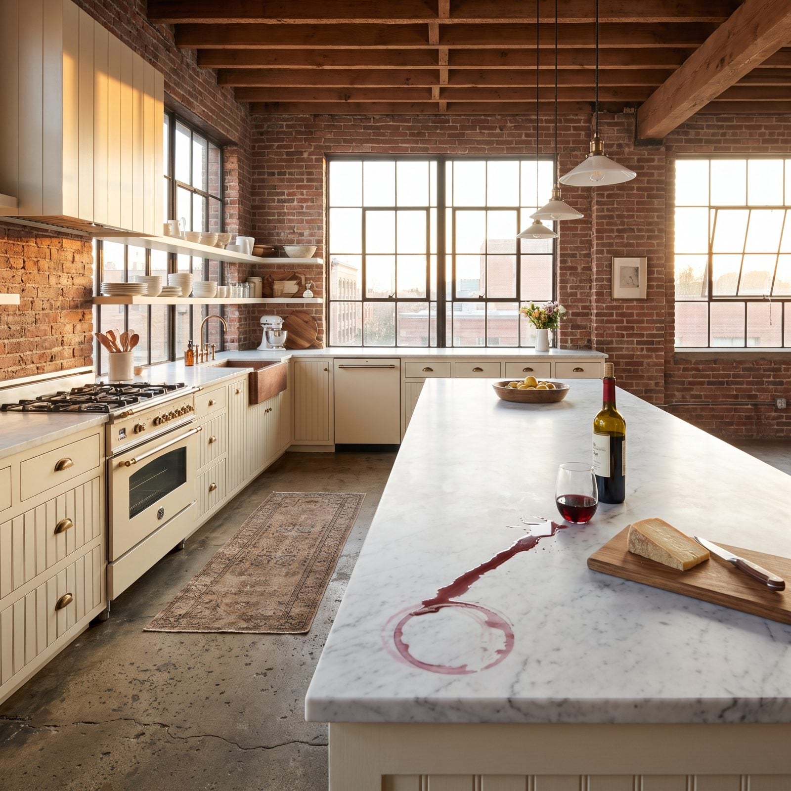
I love marble and I’ll defend it, but I say this as someone who watched a single glass of Syrah leave a ghost that never left. Honed, porous stone is a sponge with a pretty face. Red wine, lemon, tomato — they all find their way in.
Acidic and deeply pigmented liquids penetrate the calcite before you can blot them. Sealer slows absorption; it doesn’t stop it. And honed marble has no polish to resist the etch in the first place.
Want the look without the heartbreak? Quartzite reads like marble and shrugs off wine. Or commit to marble knowing the patina is the point. Some people frame the stains as character. I’m honestly not sure I’m one of them.
4. The Cloudy Bleach Halo Burned Into Quartz
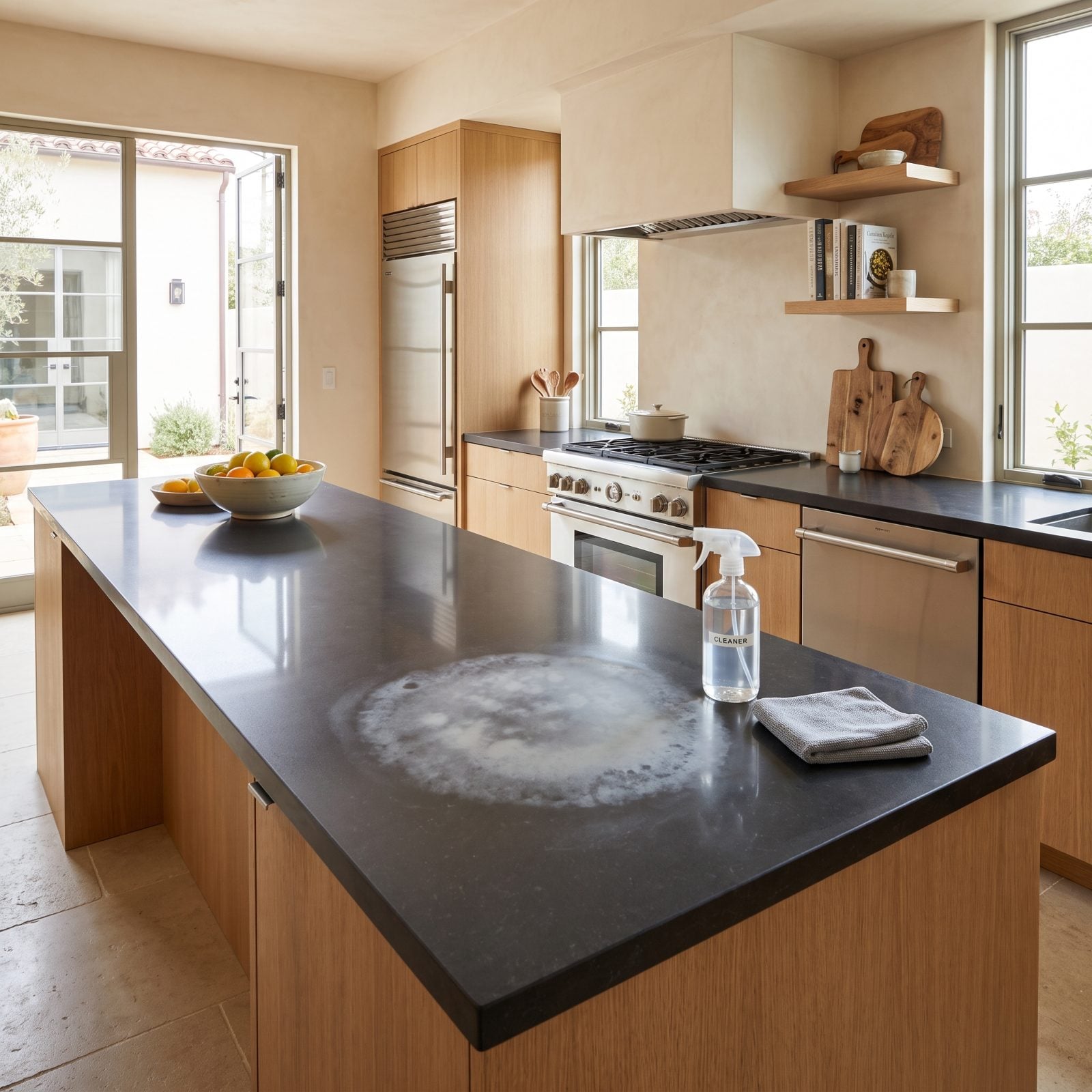
Quartz has a cruel irony. It’s nearly bulletproof against stains, which lulls you into cleaning it with anything under the sink. Then bleach or a harsh degreaser attacks the resin binder, and that cloudy patch is forever. No sealer brings it back.
Engineered quartz is ground stone held in polymer resin. Bleach goes after the resin, not the quartz, lightening the color and dulling the sheen in a halo you’ll clock every single morning.
Warm water, mild dish soap, soft cloth. That’s the entire approved regimen, and it’s genuinely all quartz needs. I know it feels like under-cleaning something that cost this much. It isn’t.
3. A Thermal Crack Creeping Out From Behind the Cooktop
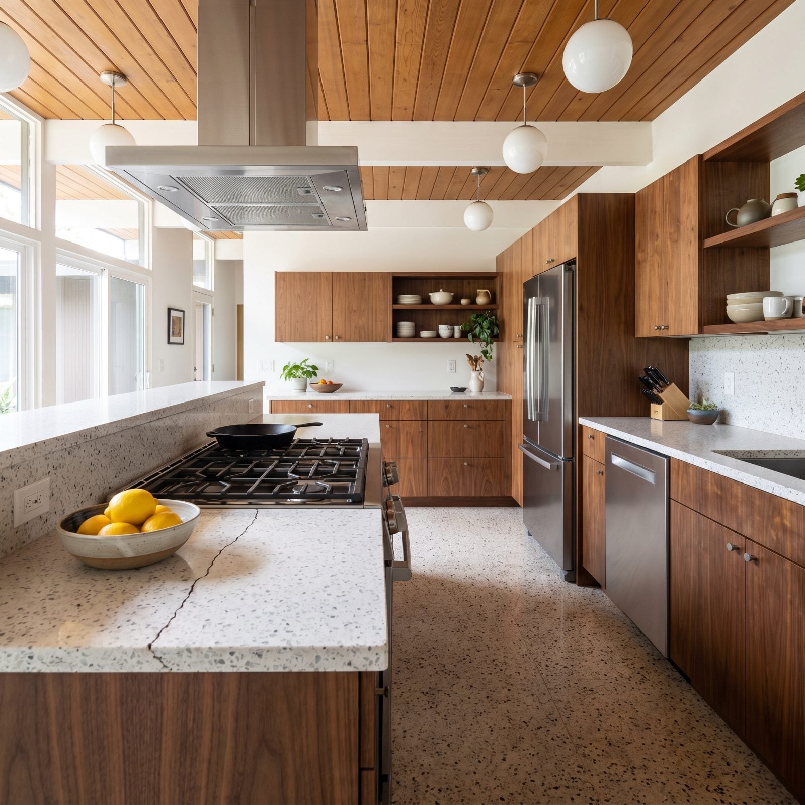
Cracks that start at a cooktop corner are almost never random. They’re the counter telling you the cutout had a sharp inside corner and no heat buffer, and thermal stress finally found the weak point.
Every inside corner of a cutout is a stress concentrator. Add repeated heating and cooling from the burners, and a square corner becomes a crack origin. Quartz especially hates sudden heat, despite what people assume about how tough it is.
Done right, the fabricator radiuses every inside corner and leaves the manufacturer’s required clearance around the cutout. This crack isn’t bad luck. It’s a corner that should have been rounded and wasn’t.
2. Seam Adhesive That Yellowed Into a Visible Stripe
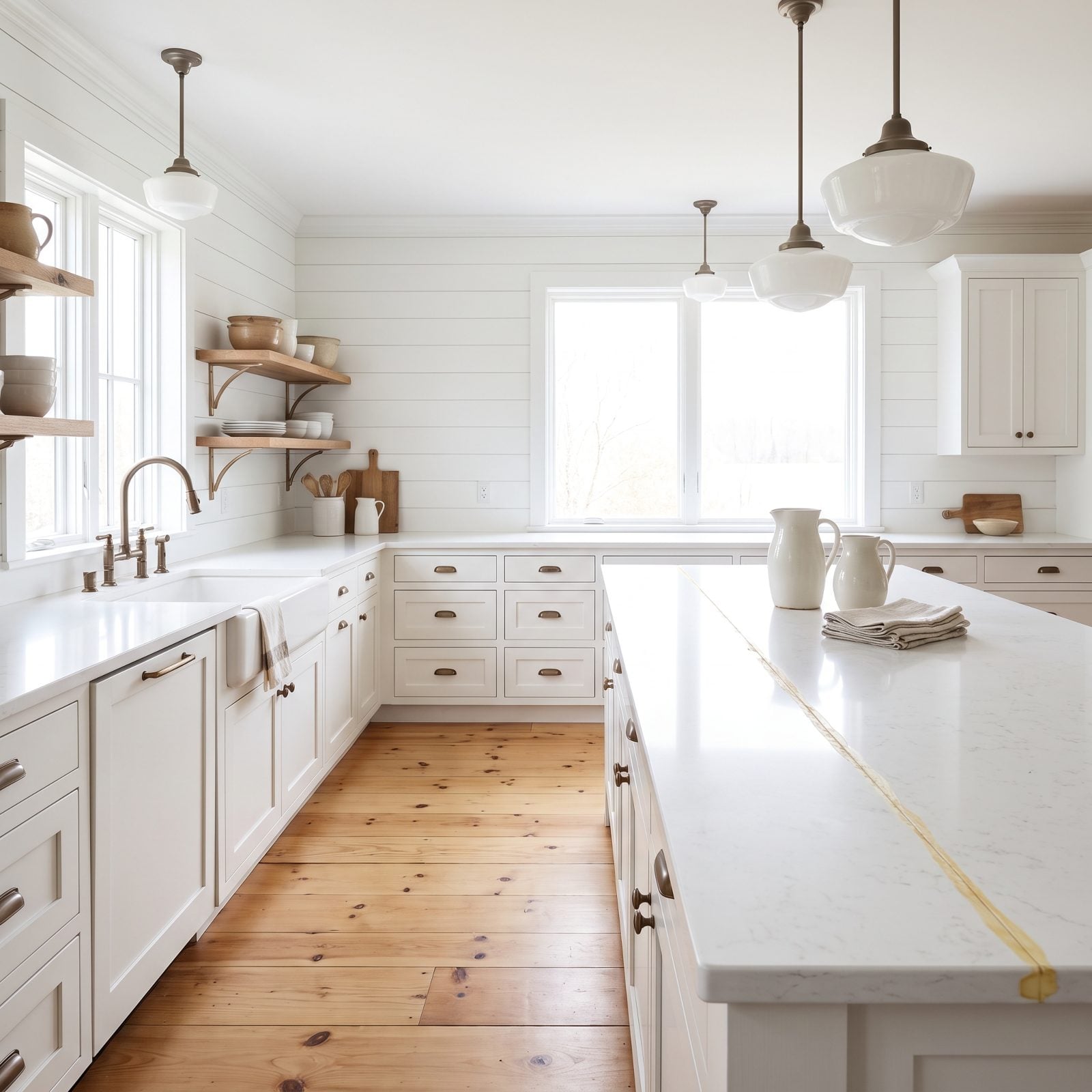
A good seam on white stone should vanish. This one did the opposite. The epoxy went in roughly color-matched, then UV light and time turned it amber, and now a warm yellow stripe runs clean across the coolest white in the room.
Cheap or wrongly tinted seam adhesive ages. On dark stone you’d never notice. On bright white, a yellowed line draws the eye like a crack in a windshield.
Prevention here is skill, not luck. A fabricator who custom-tints UV-stable epoxy to the slab, sets the seam over a cabinet support, and aligns the pattern can make a joint you’ll struggle to find with your own fingertips. That’s the job, start to finish.
1. An Undermount Sink Pulling Loose From the Stone Above It
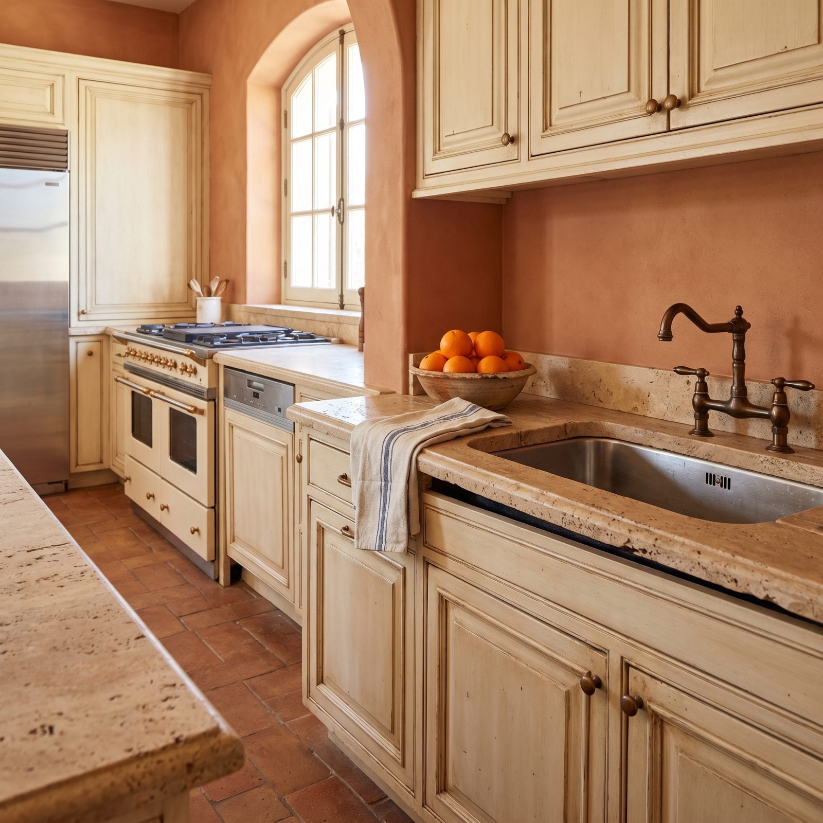
Nothing announces a failed install quite like a sink that’s quietly trying to leave. An undermount hangs entirely on the bond between its rim and the underside of the stone, plus a bracket or two. When that bond lets go, you get a sag, a gap, and water sneaking into the cabinet below. The stainless undermount sink pictured here shows exactly that: set into the perimeter counter, it has dropped away from the stone above, leaving a dark gap open along the front edge.
A full basin of water and dishes is heavy, and epoxy alone on an unprepared surface won’t hold it. Skip the mechanical support clips and gravity does the rest, slowly.
The right way pairs a clean, sanded bond with a proper clip-and-rail support system rated for the sink’s loaded weight. Caught early, this is a re-set. Caught late, it’s a cabinet rebuild and a mold problem you didn’t budget for. Check yours now, honestly. Go push gently up on the rim.