🔥 Would you like to save this?
White cabinets are the safe choice. They’re also the choice most likely to leave you standing in your finished kitchen wondering why it feels like a dentist’s waiting room. White isn’t one color, it’s a hundred, and the wrong one next to the wrong floor, the wrong tile, the wrong light bulb turns a fresh renovation flat and cold overnight.
We pulled real kitchens where white went sideways. Look before you commit. You’ll never see the shade the same way again.
In order to come up with the very specific design ideas, we create most designs with the assistance of state-of-the-art AI interior design software. Also, assume links that take you off the site are affiliate links such as links to Amazon. this means we may earn a commission if you buy something.
22. Cool White Cabinets Clashing With Honey Oak Floors
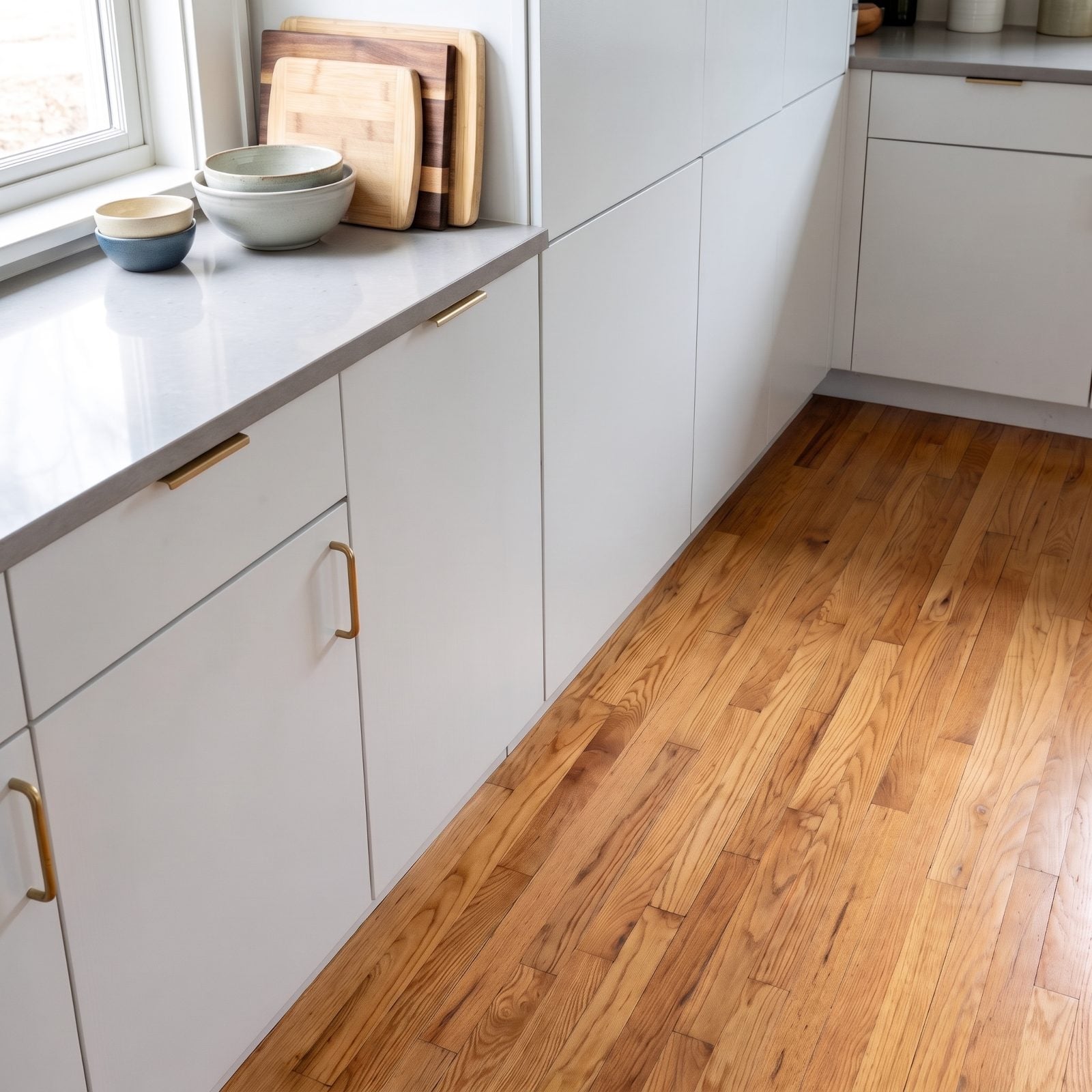
Cool white and honey oak is the pairing we see wreck more kitchens than any other. The cabinets carry a blue-gray undertone while the floor glows orange, and they pull against each other all day so the eye never settles.
Match the undertone, not the shade. Warm oak wants a warm white, something with a creamy base like Benjamin Moore White Dove. Put a stark, cool white above golden wood and both finishes look cheaper than they are.
21. Yellowed White Cabinets Beside a Bright White Refrigerator
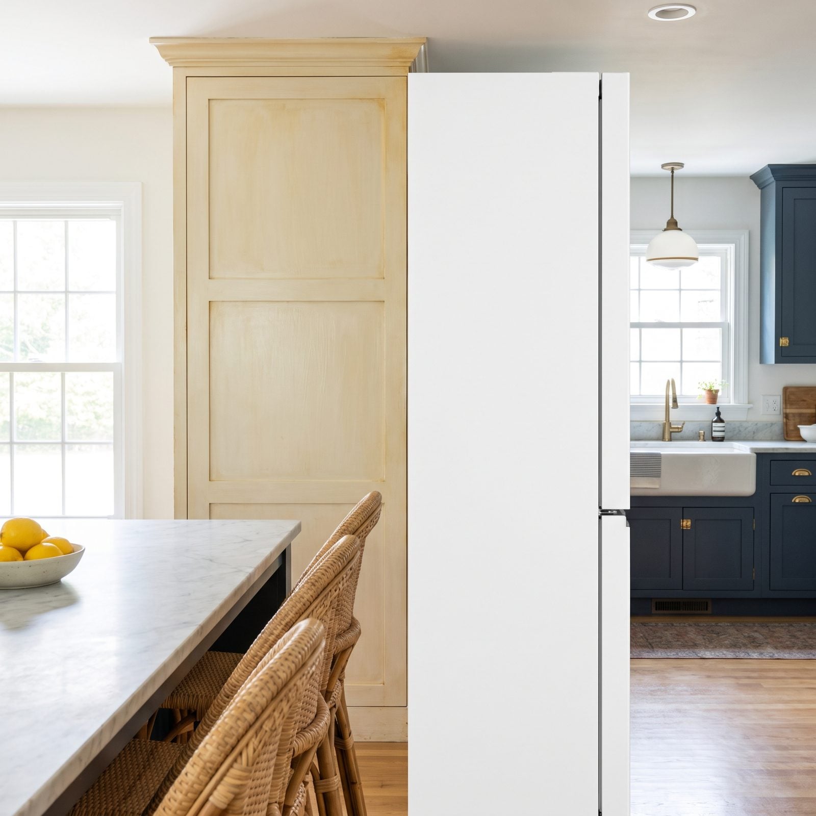
White plays a cruel trick: it yellows. Oil-based paint ambers over the years, and older cabinets drift toward ivory without anyone noticing. Then you buy a new refrigerator in crisp modern white, and suddenly the cabinets look like they’ve been chain-smoking for a decade.
The appliance didn’t cause the problem. It just told the truth. If your cabinets have gone creamy, either lean into it fully or repaint before the new white anything moves in.
20. White Cabinets Disappearing Into an All-White Room
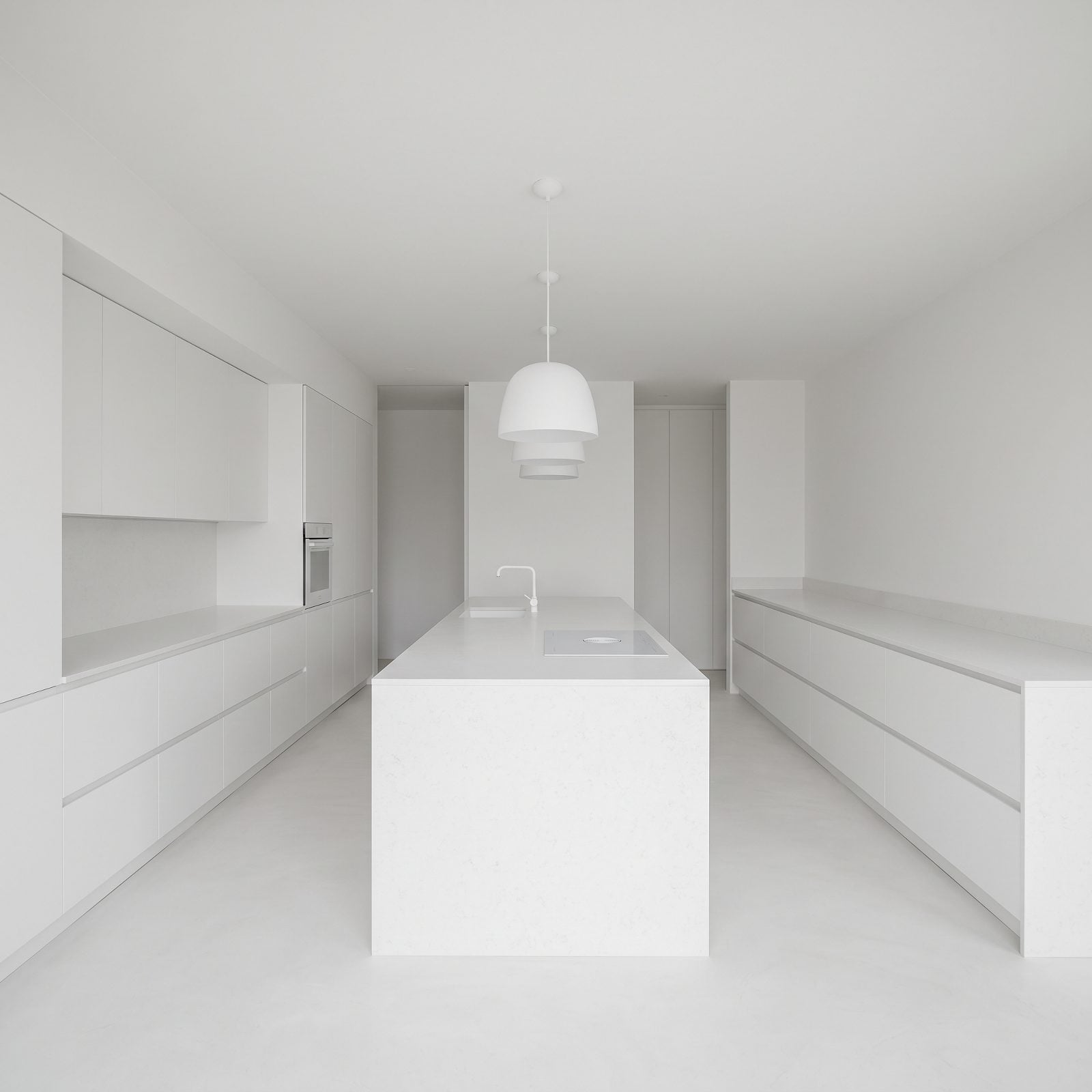
All-white sounds serene, but in practice it can read as a room that forgot to finish getting dressed. When cabinets, walls, counter, and backsplash all land on the same white, the eye has nothing to grab and the whole kitchen flattens into one pale blur.
You need contrast somewhere. A matte black faucet, walnut open shelving, a soapstone island — something with weight to give the white a job. Look at any real white workshop makeover and you’ll notice the good ones always break the white with texture or tone.
19. Flat White Slab Cabinets With No Texture or Shadow
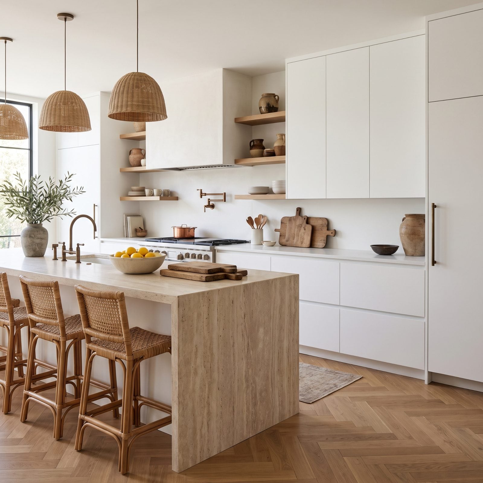
Flat slab doors in white can look like a rendering that never quite finished loading. Without a shaker frame, a bevel, or any grain, there’s nothing for light to catch, so the surfaces go dead flat and read as cheap laminate even when they’re not.
Slab fronts can be sharp, but white slab needs help. Add a natural wood-grain melamine, a fluted panel, or at minimum a satin finish that grabs light. Perfectly smooth and perfectly white is a whole lot of nothing.
18. Chalky White Paint Making New Cabinets Look Unfinished
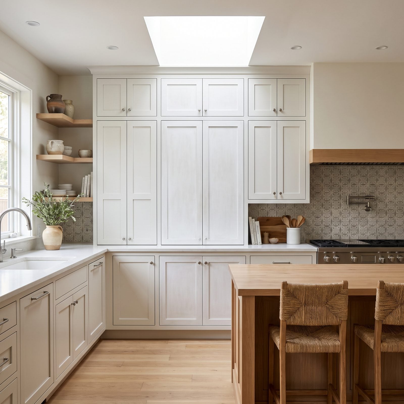
Dead-flat paint on cabinets is a mistake we made once and only once. It photographs like velvet in the store. On real cabinet doors it looks like primer somebody forgot to topcoat, and every fingerprint sinks straight in.
Cabinets take abuse. They want a satin or semi-gloss enamel that reflects a little light and wipes clean. Chalky matte belongs on a bedroom wall, not on the door you open forty times a day with greasy hands.
17. Glossy White Cabinets Creating a Clinical Showroom Effect
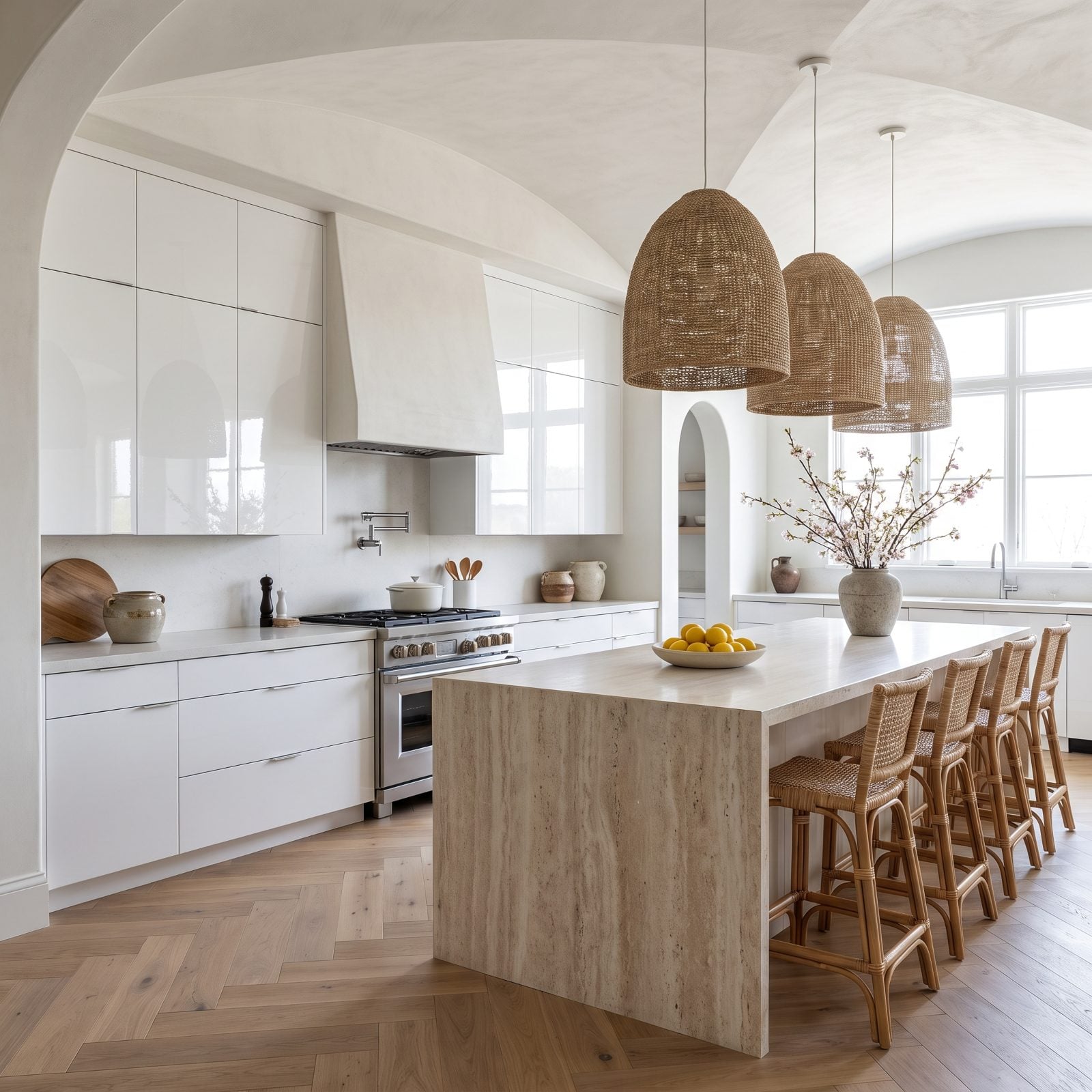
High-gloss white bounces every light source in the room straight back at you. It can look futuristic in a catalog and clinical in a home, more operating room than kitchen. And the reflections show every smudge, so you’re polishing constantly.
If you want gloss, warm it. A brass fixture, a wood island, a colored backsplash — something organic to cut the lab-coat vibe. Pure gloss white with chrome and glass is how you end up cooking in a science exhibit.
16. White Shaker Cabinets With Generic Subway Tile Everywhere
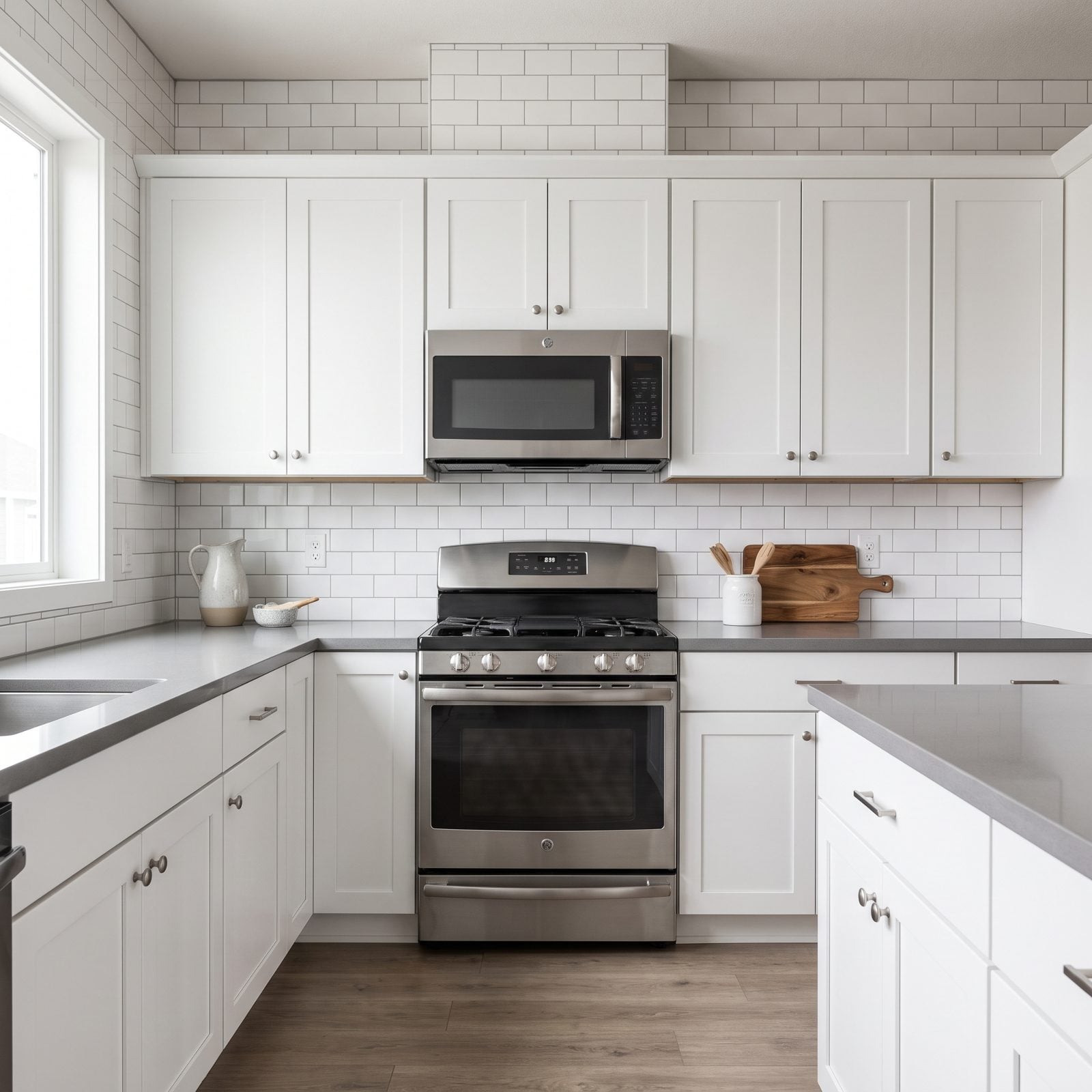
White shaker plus white subway tile plus gray counter. You’ve seen this kitchen a thousand times because half the internet built it between 2015 and 2020. It’s not offensive. It’s just invisible.
The problem isn’t any single piece. It’s the total absence of a decision. Swap the subway for a zellige with movement, run the tile vertical, or pick a colored grout. One small risk pulls the whole room out of the beige middle of the road.
15. White Cabinets Paired With a Colorless Gray Countertop
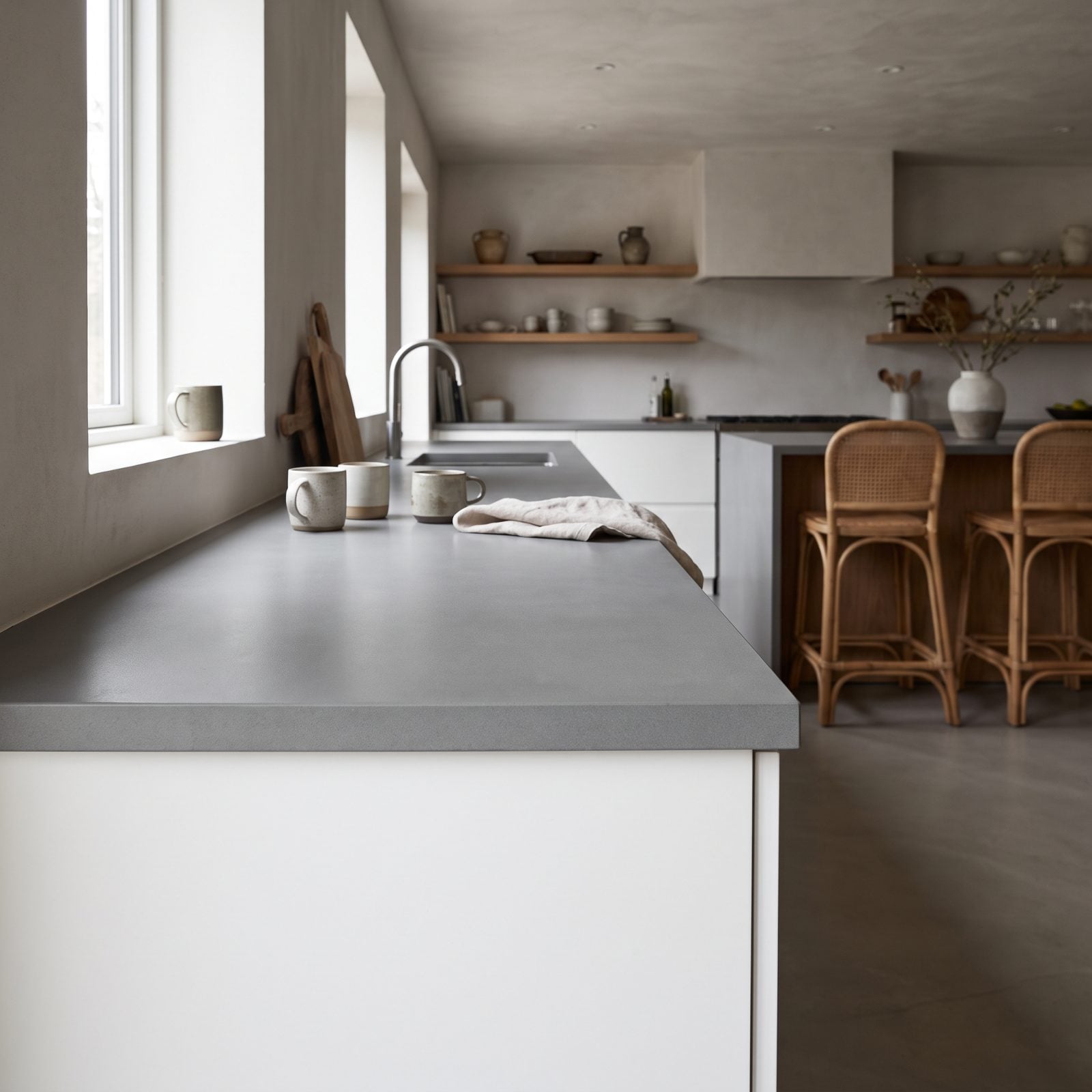
A flat gray countertop with no veining and no undertone is the color equivalent of unseasoned rice. It sits there between the white cabinets and the white backsplash contributing nothing, a gray zone in the literal sense.
Stone earns its keep through movement. A marble with real veining, a warm-toned quartzite, even a honed soapstone gives the eye somewhere to travel. Dead gray just makes the whole kitchen feel like it’s waiting for something more interesting to happen.
14. White Upper Cabinets Floating Above Dark, Unbalanced Bases
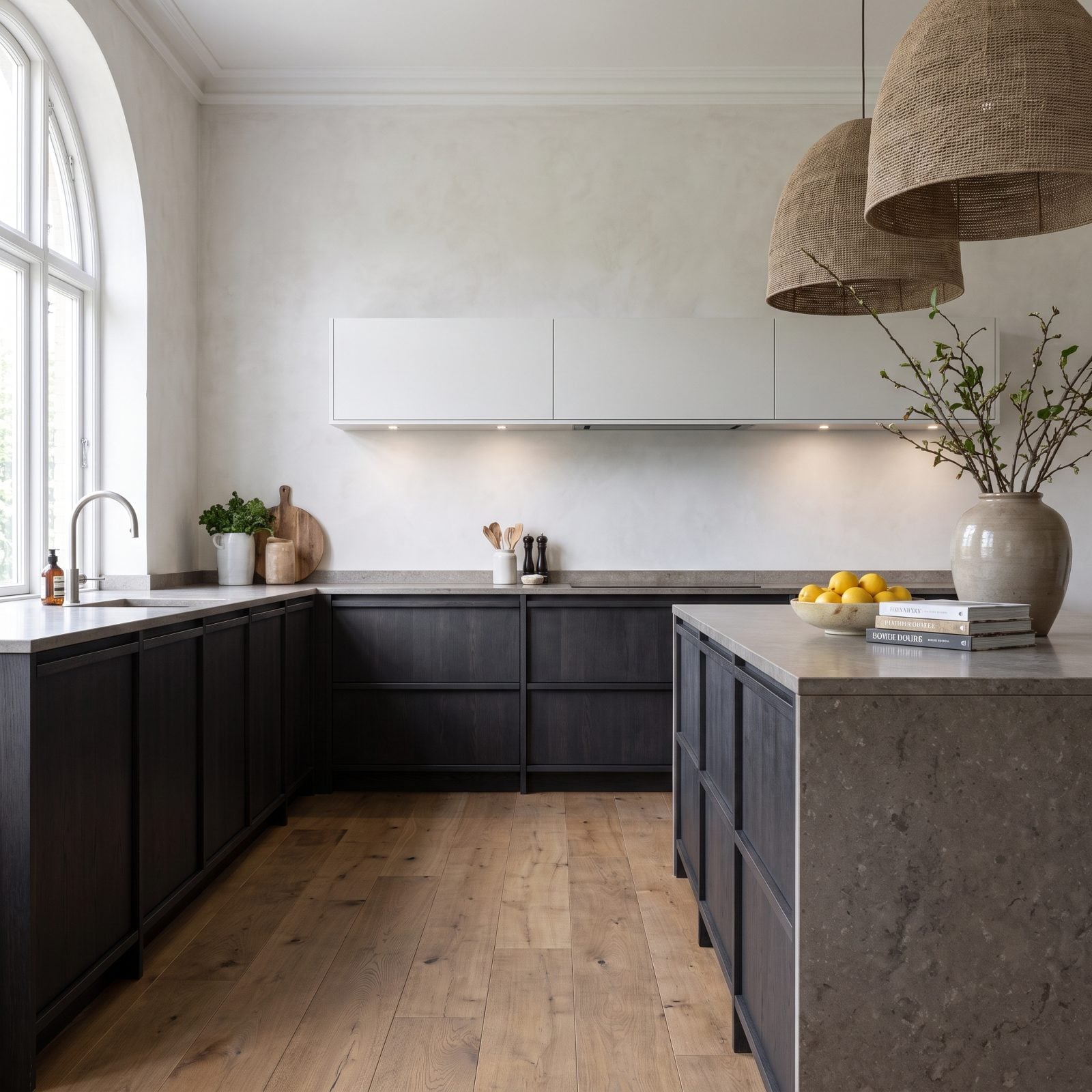
Two-tone kitchens work when the weight is distributed right. This one isn’t. The dark bases anchor hard at the bottom while the white uppers seem to float away, and the room reads top-light and bottom-heavy, like it might tip.
Balance is the whole game. Repeat the dark tone up high in a hood, a shelf bracket, or the hardware so the eye connects top to bottom. If you love the drama of a dark lower, some serious dark kitchen inspiration shows how the best ones carry that tone through the whole room instead of stranding it at the floor.
13. White Cabinets Under Cold Blue LED Lighting
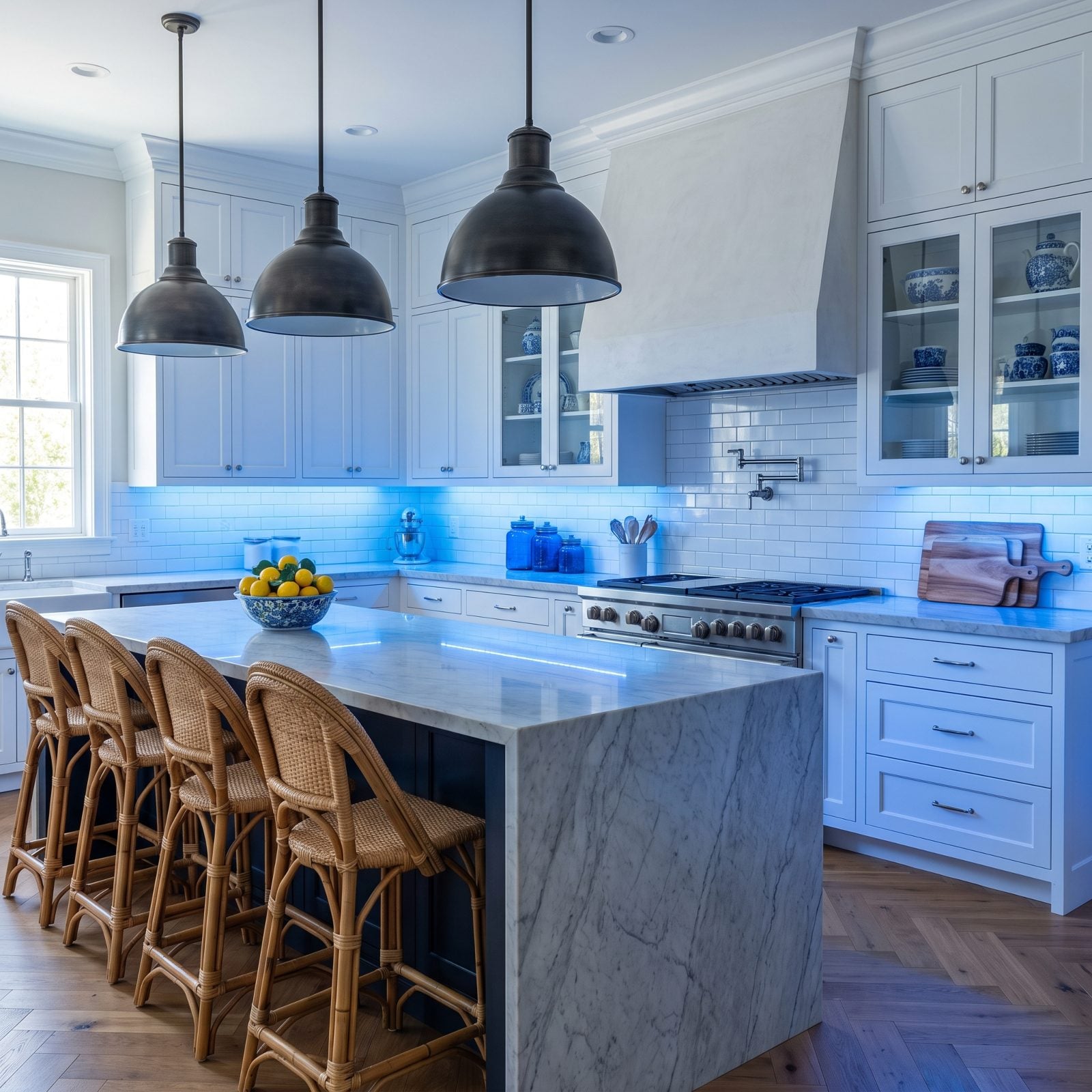
You can pick the perfect warm white paint and then torch the whole thing with a 6000K bulb. Cold blue LEDs turn a lovely creamy white into something that belongs in a walk-in freezer. Skin looks bad, food looks worse, and the cabinets read grayish and clinical.
Kitchens want warm light, somewhere around 2700K to 3000K. It’s the single cheapest fix on this entire list. Swap the bulbs before you blame the paint. We’ve watched a whole kitchen come back to life with a cheap box of the right temperature.
12. White Cabinetry Washed Out by Harsh Southern Sun
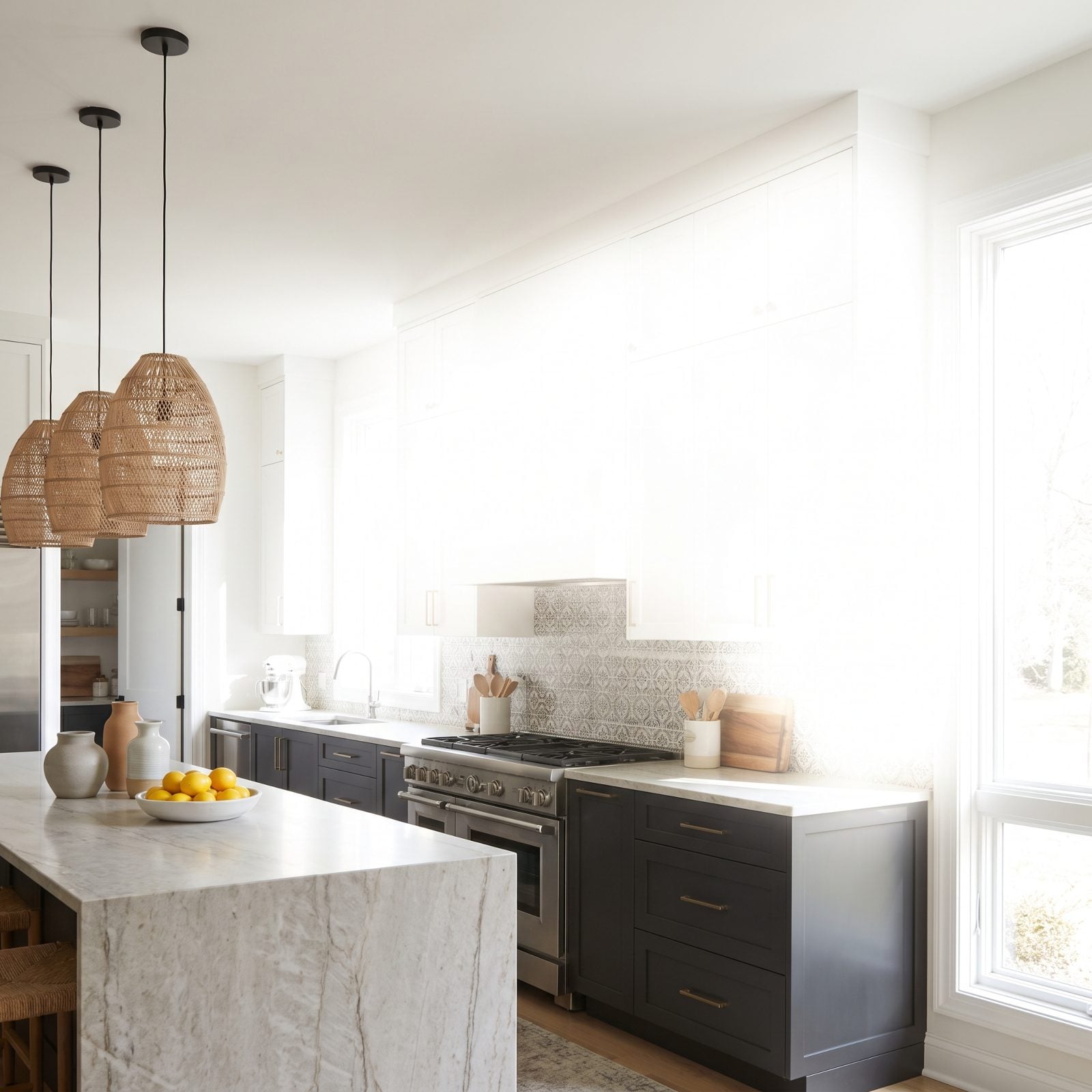
That wall of upper cabinets isn’t white anymore. By noon it’s just glare. South light is relentless, and a flat pure-white door with no grain, no bevel, nothing to catch a shadow simply goes blank under it.
Notice how the doors near the window read paper-white while the corner stays cool and grey. Same paint, two whites. Your eye clocks the mismatch before your brain can explain it, and suddenly the whole run feels cheap.
11. White Cabinets Looking Dingy in a Windowless Kitchen
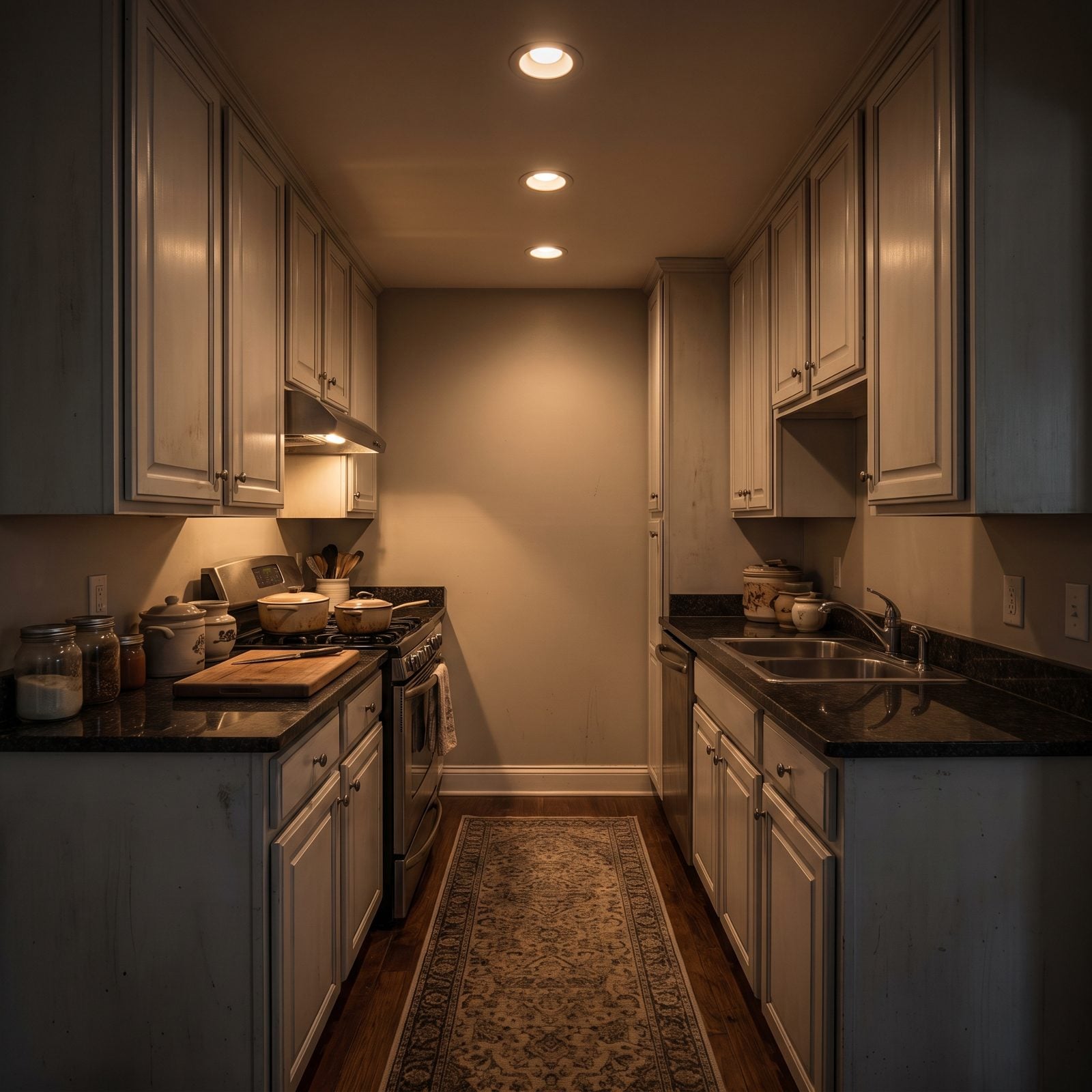
White needs light to stay white. Strip out the daylight, hand the room to a few warm 2700K cans, and the cabinets drink up that amber and hold onto it. What was crisp goes yellow. What was clean goes tired.
Windowless kitchens are a genuine design problem, and white makes it worse. The color you picked to feel bright is the one bad light punishes hardest. Stuck in an interior box? Warmer cabinets and a mix of light temperatures beat white every time. A dark kitchen design would forgive this lighting instead of exposing it.
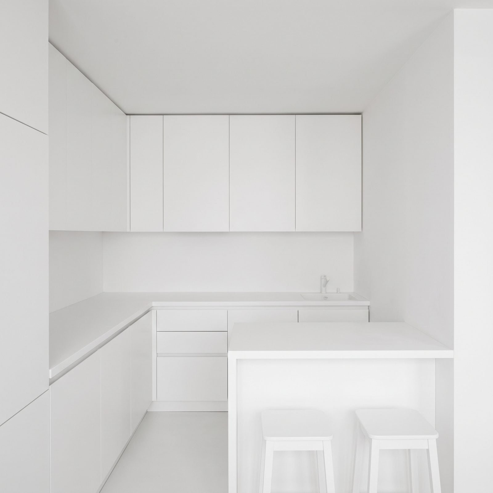
10. White Cabinets Making a Tiny Kitchen Feel Like a Blank Box
🔥 Would you like to save this?
Small kitchens don’t need more white. They need somewhere for the eye to rest. Cabinets, counters, backsplash, and walls all reading the same pale tone, and the room loses its edges and collapses into a box. No depth, no focal point, no relief anywhere.
Designers push white on tiny spaces because it “opens them up.” Sometimes it does. More often it flattens. A little contrast, a wood floor, a colored lower cabinet, does more for a cramped room than another coat of white ever could.
9. Bulky Black Hardware Turning White Cabinets Into Polka-Dot Clutter
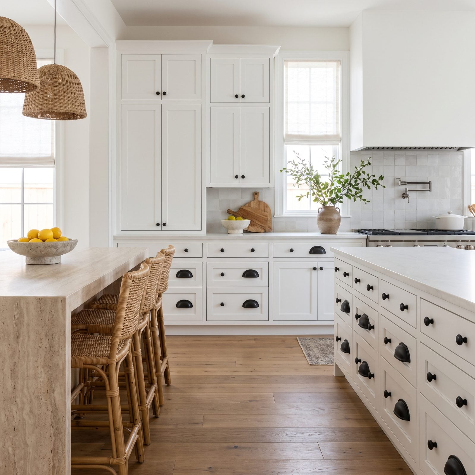
Big black pulls on white cabinets sound like a safe modern move. In practice, they scatter. Against all that white, every knob and bar reads as a hard black dot, and forty of them across a run turns into visual static rather than a clean line.
Too much contrast, too much scale. Slimmer hardware, or a finish that sits closer to the cabinet tone, lets the eye glide instead of stutter. Want the hardware to be the statement? Give it fewer chances to shout. Shop slim brass cabinet pulls instead and the whole run calms down.
8. White Cabinets Blending Into a White Backsplash Without Relief
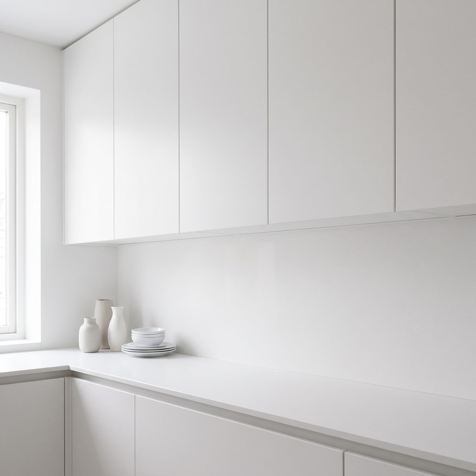
Match your backsplash to your cabinets and the counter run vanishes. There’s no line where the wall ends and the cabinet begins. A backsplash is supposed to be the break between the two, the horizon your eye rides along. Paint it the same white and you’ve deleted it.
A backsplash earns its keep through contrast. Some texture, a warmer tone, a bit of pattern. Anything that says this is the wall, that is the cabinet. Skip it and the whole zone reads as one blank plane, and the kitchen loses its middle.
7. White Cabinetry Making Busy Granite Look Even Busier
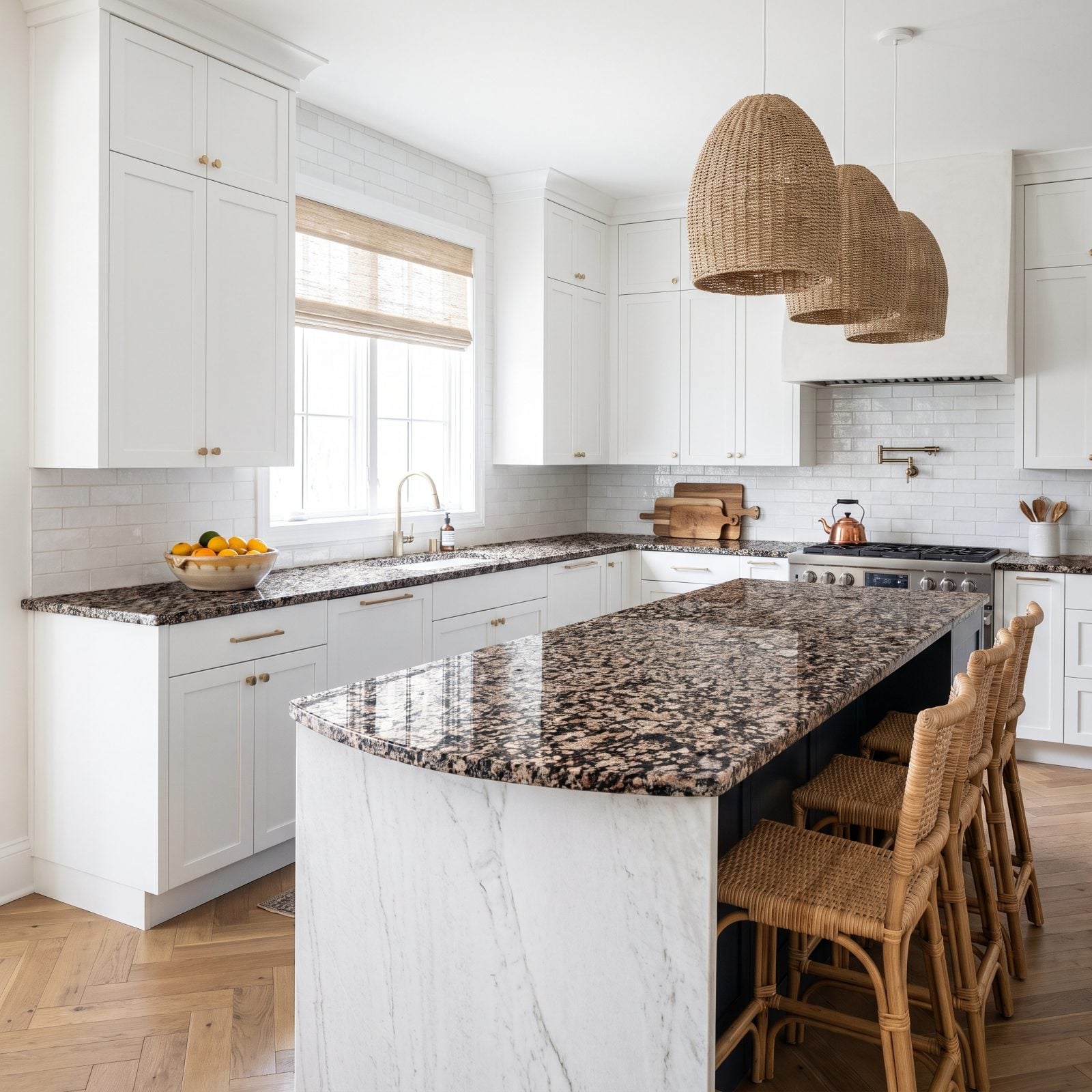
Busy granite needs a friend, not a spotlight. Frame all that movement with flat white cabinets and the stone gets louder, every fleck and vein cranked up by the blank around it. Instead of calming the pattern, white puts it under glass.
Warm or mid-tone cabinets would absorb some of that energy and let the counter settle into the room. This is the pairing that ages a kitchen fast. If your counters are doing a lot, your cabinets should do less than pure white asks them to. Sometimes a bold kitchen makeover with color is the answer, not another neutral.
6. White Cabinets Exposing Every Gap Around Inset Doors
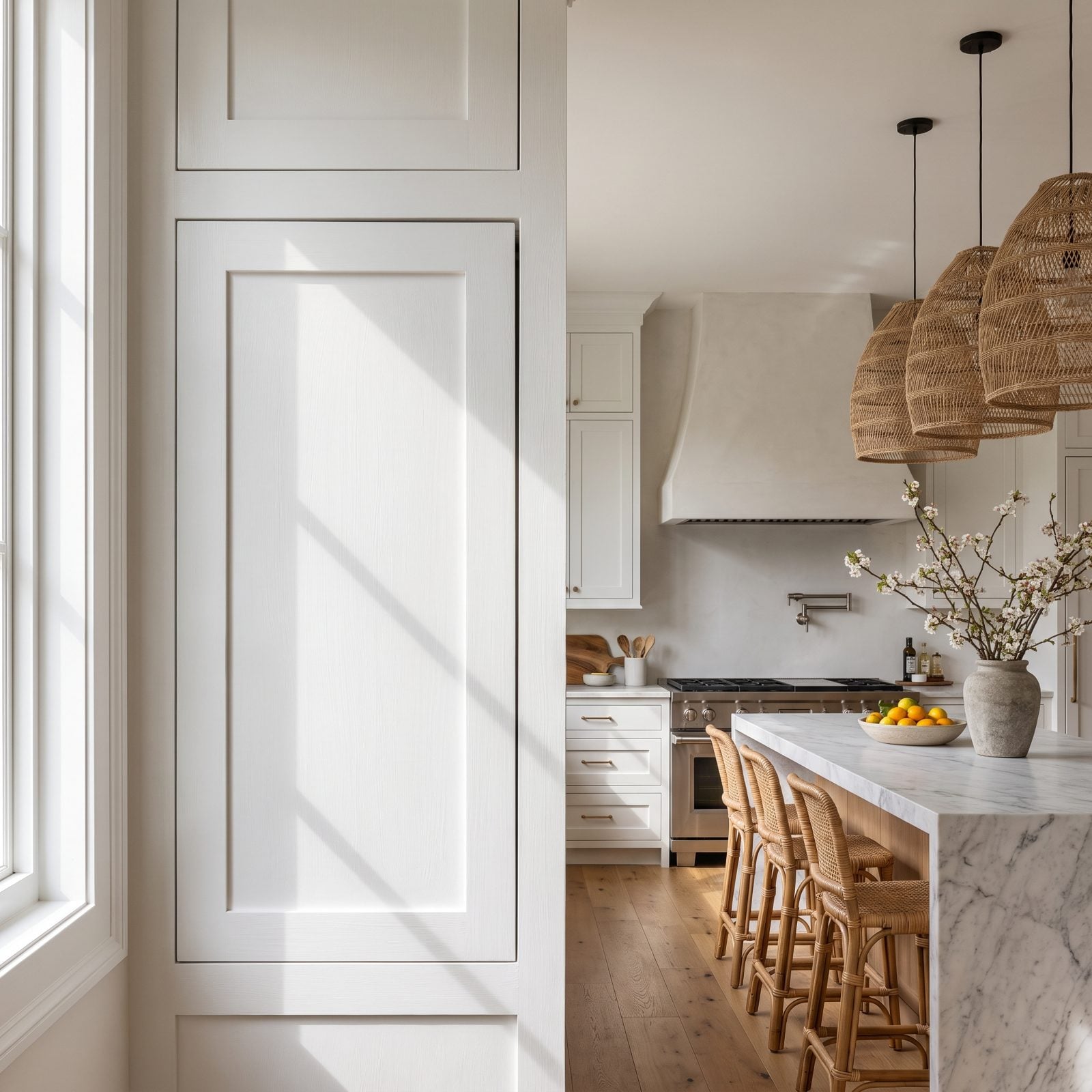
Inset doors are gorgeous when they’re perfect and cruel when they’re not. White shows every reveal, and once one gap runs wider at the top than the bottom, you can’t unsee it. Raking light turns each shadow line into a little grey ruler measuring the flaws.
Call it white’s honesty problem. A wood grain or a mid-tone hides small inconsistencies; flat white publishes them. If your cabinet install isn’t dead-on, white is the finish least likely to let it slide.
5. White Paint Highlighting Uneven DIY Brush Marks
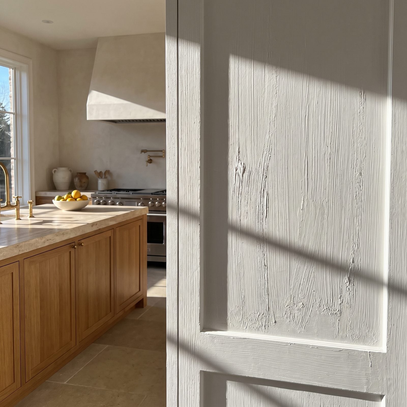
We’ve painted cabinets by hand and told ourselves the brush marks would settle out. They don’t. White in raking light shows every stroke, every ridge, every drip near the bottom rail. A sprayed finish reads like skin. A brushed one reads like effort.
Darker paint hides this. White broadcasts it. Repainting cabinets yourself and set on white? Spray them, or hire the spray. The stroke lines you can’t see today become the only thing you see once the afternoon sun comes in.
4. White Cabinetry Showing Grease Around Every Pull
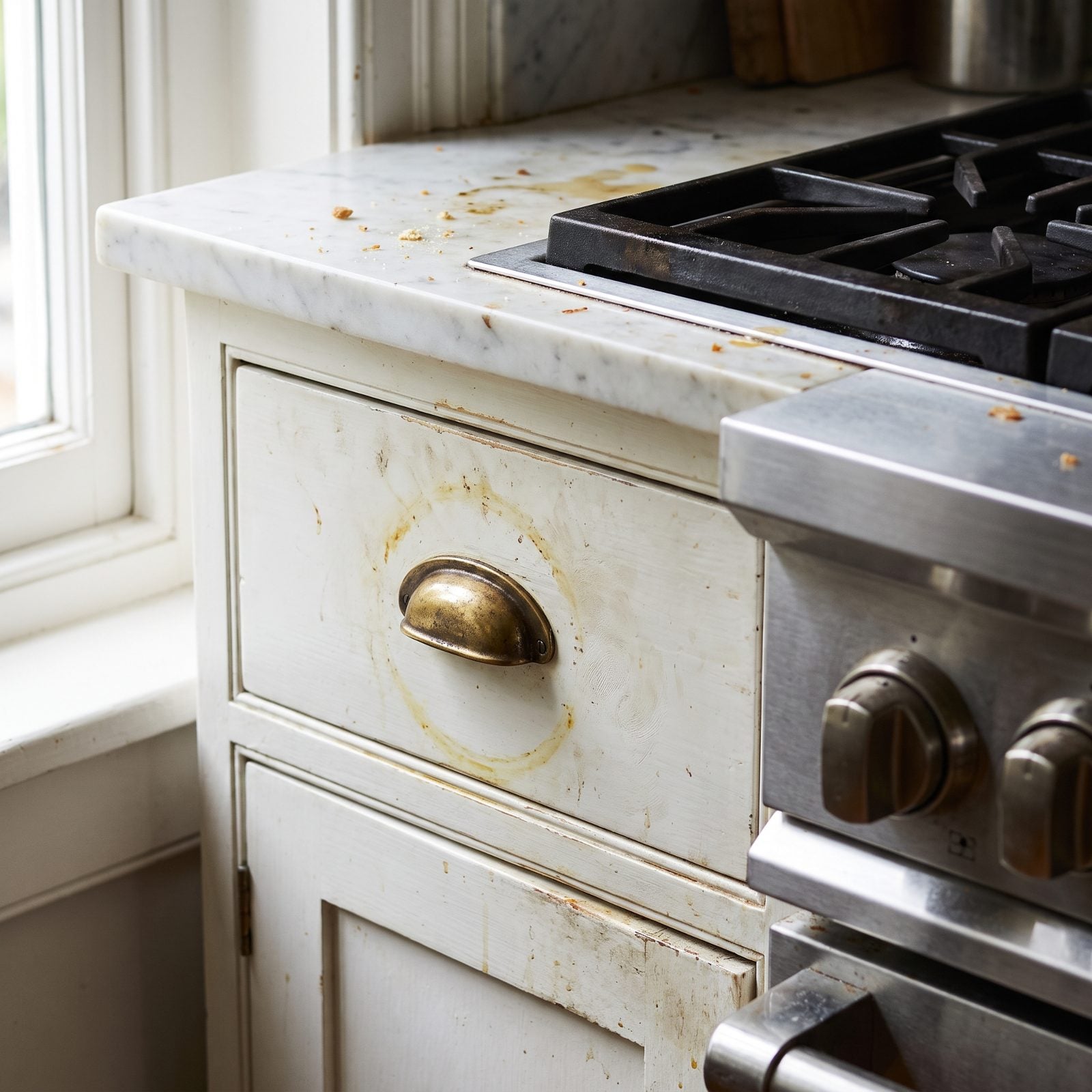
Nobody warns you about the halos. Around every pull, along the drawer edges by the range, white cabinets collect a faint grey-yellow film from hands and cooking oil. In a kitchen you actually cook in, it shows up within months, worst on the two drawers flanking the stove.
White is a magnet for exactly the marks a kitchen makes, which means you’ll wipe the fronts far more than you signed up for. A satin or semi-gloss cleans easier than a flat, and a warmer tone hides the shadows a pure white puts on display.
3. White Cabinets Stripping Warmth From an Industrial Kitchen
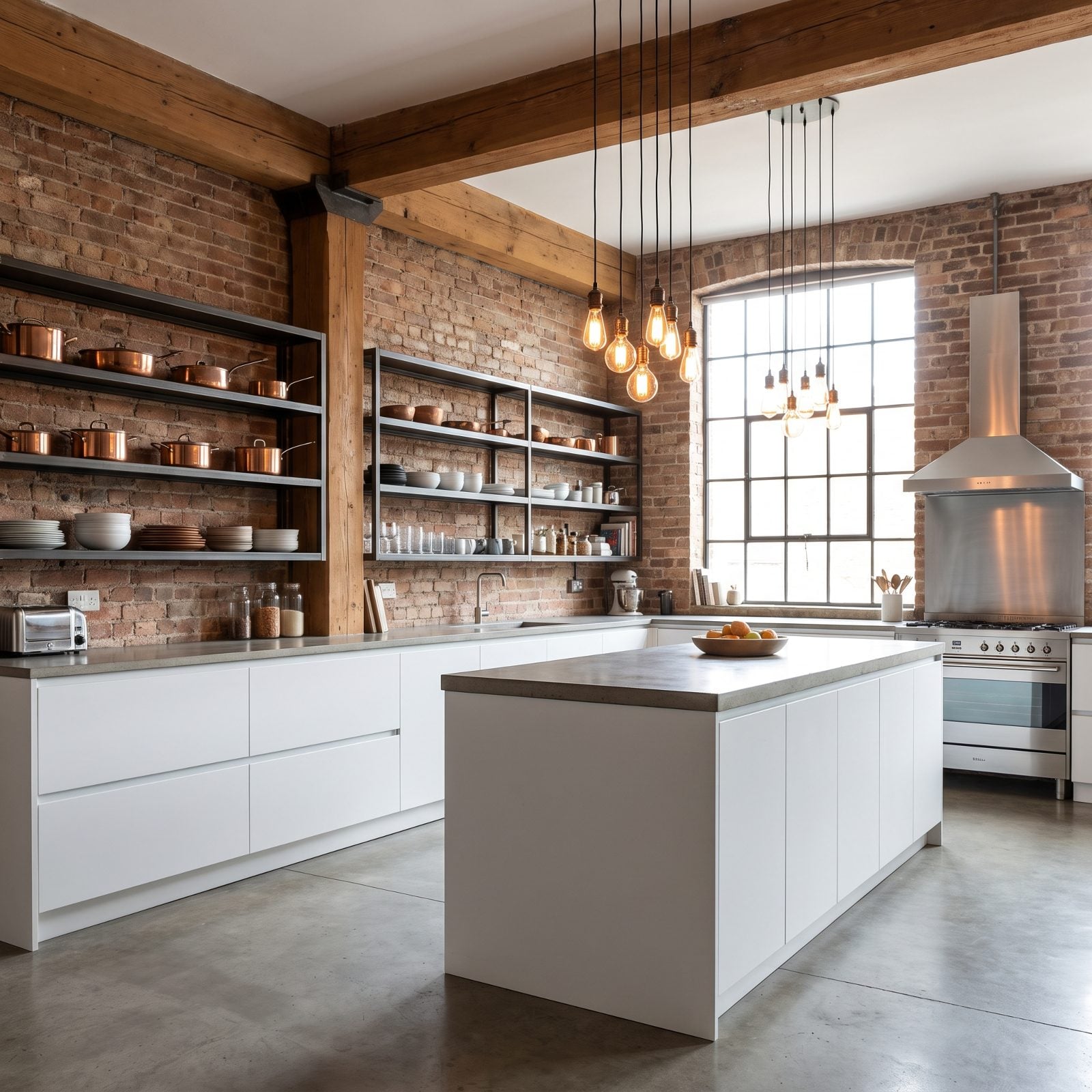
Brick, steel, concrete, warm bulbs, and then flat white cabinets that fight all of it. Industrial spaces run on warmth and rawness. Drop in cold pure-white slabs and the room reads like a builder-grade kitchen got airlifted into a loft it doesn’t belong in.
White doesn’t lighten this room. It hollows it out. Warm wood, a deep charcoal, even a moody green would talk to the brick instead of talking over it. Here’s where a contemporary cabinet in a darker tone earns its place, and where white is simply the wrong voice.
2. White Cabinets Flattening a Kitchen With Low Ceilings
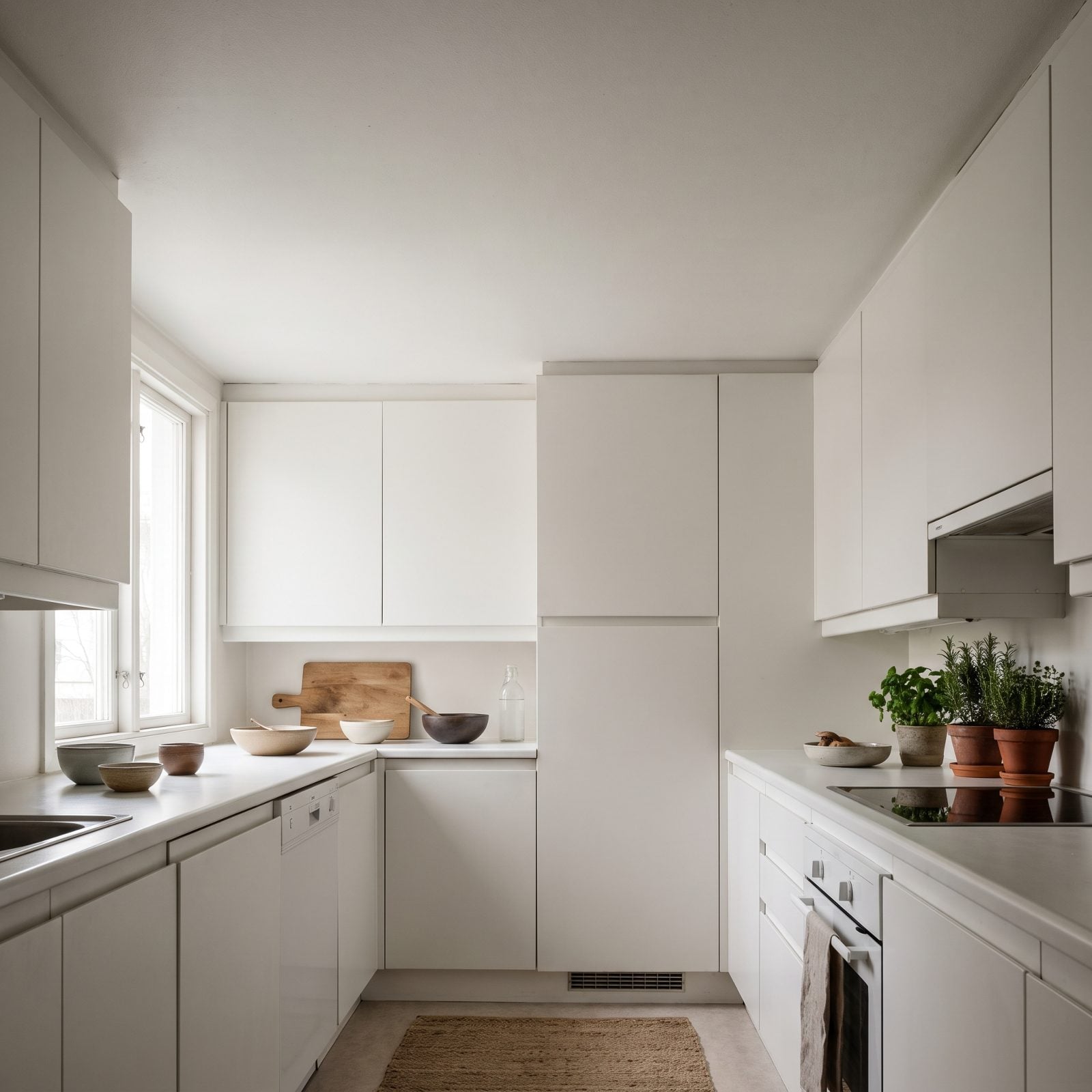
Here’s the trap. You’ve got a low ceiling, so you go all-white to open it up, and the white turns around and does the exact opposite. The uppers run the same value as the ceiling. No crown, no shadow gap, no break anywhere. Your eye has nothing to climb, so it reads wall and ceiling as one flat sheet and decides the room is shorter than it actually measures. Frustrating, because you were trying to help.
The fix isn’t more white. It’s a horizontal break — drop the uppers a few inches and add crown, or paint the ceiling a half-shade cooler than the cabinets so the two planes finally separate. A whisper of contrast gives the eye a rung to grab.
Those recessed cans aren’t helping. Flush lighting flattens everything it touches. A slim brass picture light over the range, or an undercounter strip in a warmer temperature, throws shadow — and shadow is what gives a squat room its depth. Want proof white can go the other direction? This white workshop makeover shows the value shifts that keep it from going flat.
1. White Cabinets Flattening Ornate Historic Millwork
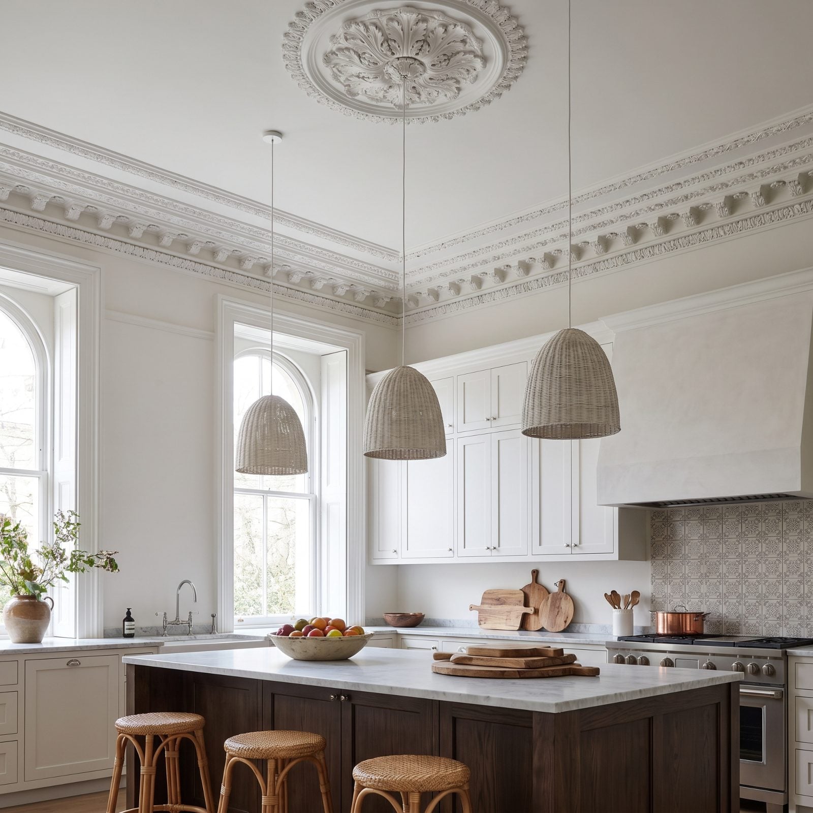
Carved crown, dentil trim, a plaster medallion someone shaped by hand a century ago. Then somebody paints the new cabinets a bright blue-white, and the old millwork was always a warmer cream, so now a seam runs straight through the room where the two whites flatly refuse to agree with each other.
Worse, both get the same flat matte. Ornate trim lives on shadow. The whole reason dentil molding and beadwork exist is the little pockets of dark the carving throws — coat all of it in one shadowless white and you’ve flattened a hundred years of handwork into a blank panel. You paid good money to hide the best thing in the room.
Match the undertone first. Pull the new cabinets toward the aged cream, or repaint the trim so both whites land in the same family. Then let the millwork keep a hair more sheen than the flat cabinet fronts, so raking light still catches the carving.
If your bones are this good, quit fighting them with white. Going darker usually flatters old trim more, and this dark kitchen inspiration shows how deeper cabinet color lets carved millwork read as the feature it actually is.