
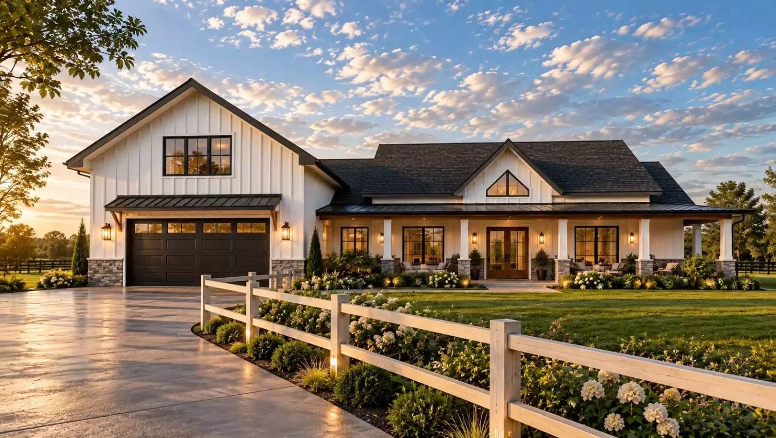
It is Saturday morning in March, the kids are already loud, and the old house ran out of walls about three years ago. The Oakridge Way is built around exactly that moment: a bonus room that absorbs the noise and the clutter, an open main living area where dinner conversations stretch past eight o’clock, a craftsman exterior with the kind of covered porch that makes the neighbors slow down, and a layout that finally gives everyone enough room to stop negotiating for it.
Specifications
- Sq. Ft.: 2,849
- Bedrooms: 3
- Bathrooms: 2.5
Floor Plan – Main Floor
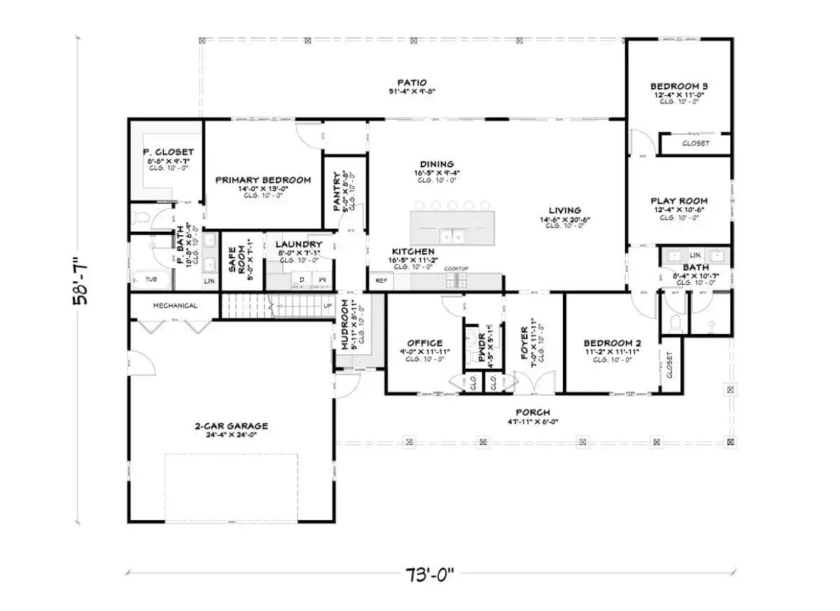
Single-story living with three bedrooms, a playroom, and a dedicated office — plus a safe room and mudroom off the garage for the stuff real daily life actually generates. The kitchen opens directly into the dining area and living room, and a covered porch and rear patio round out the everyday utility without requiring any creative interpretation of the plan.
Floor Plan – Bonus Room
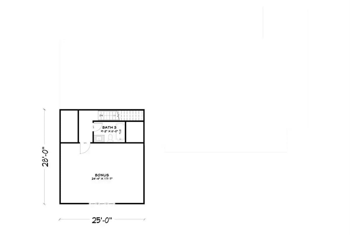
The upper level is essentially the bonus room’s domain: 24’4″ x 17’7″ of usable space with Bath 3 (9’2″ x 6′) tucked alongside it and connected by its own door. Stairs drop back down to the main floor, keeping the whole arrangement self-contained enough that whatever happens up there stays up there.
Board-and-Batten White Exterior Built for Florida Sun and Open Skies
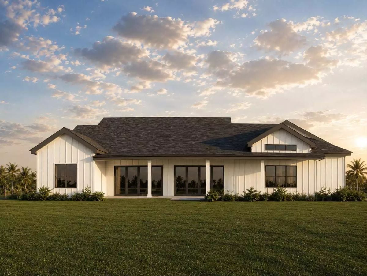
Vertical board-and-batten siding in crisp white keeps the facade clean without tipping into cold or clinical. Black-framed glass doors span the rear, pulling light across what reads as a great room, and the palm trees visible through the glass make clear this design had a warm climate in mind from the start.
Designer’s Secret: White vertical siding reflects heat rather than absorbing it, which matters a lot in sun-heavy climates. Pairing it with dark-framed windows creates contrast that reads as deliberate rather than default — and it photographs well, which never hurts.
Step inside and the exterior palette gives way to something moodier and more considered.
Navy Walls and Curved Seating That Make Recessed Lighting Work Harder
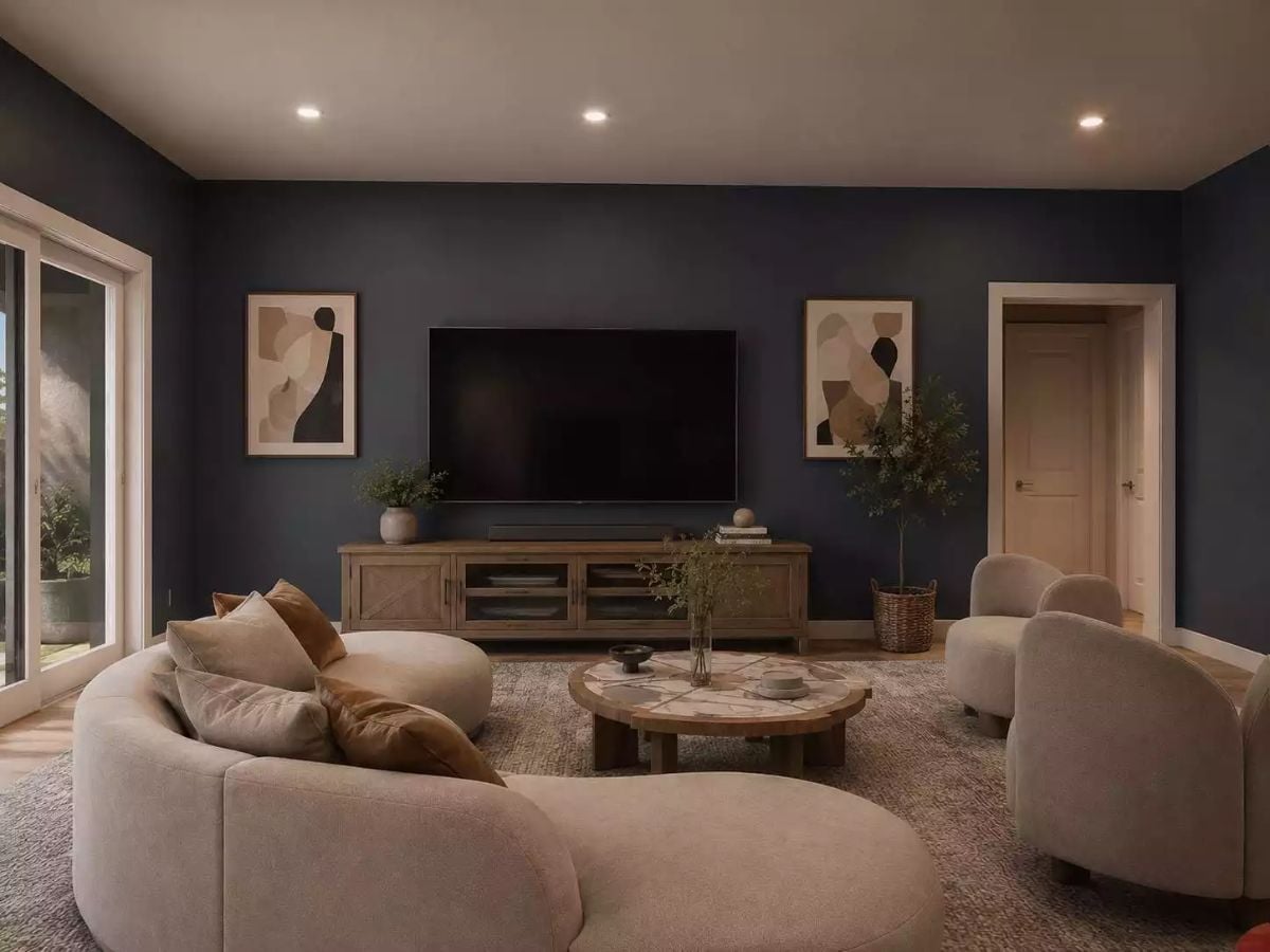
Dark navy on every wall earns its keep here because the cream bouclé sectional pulls the light back into the room. Warm wood on the media console grounds the TV wall without drawing attention away from it. That round stone-top coffee table sits low enough to stay out of the curved sofa’s silhouette entirely — a small decision that makes the whole arrangement feel less crowded than it has any right to.
Navy Walls Do the Heavy Lifting When Furniture Stays Soft
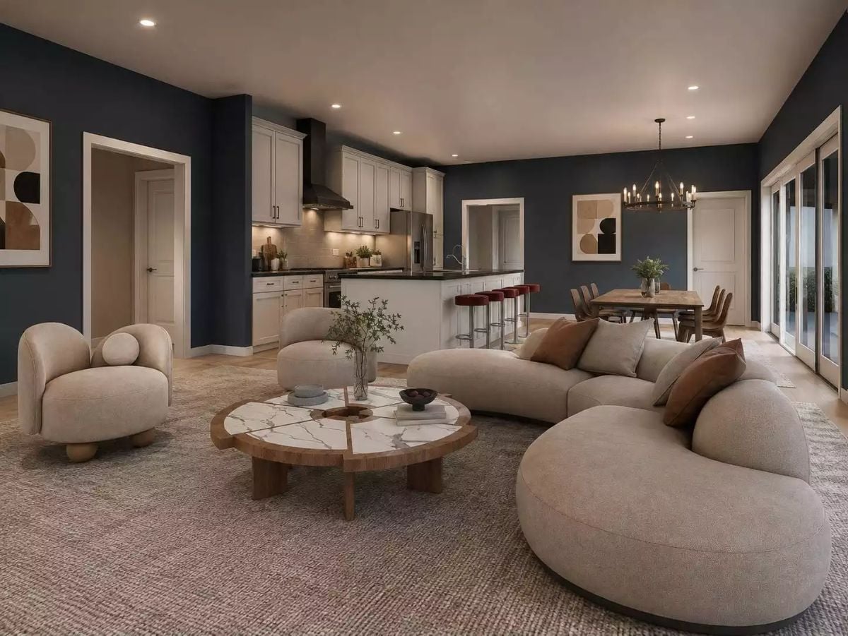
The bouclé curved sectional and marble-topped coffee table with sculpted wood base anchor the room without overcomplicating it. Recessed cans handle the ambient load quietly, leaving the chandelier above the dining area to claim its own moment rather than compete for one.
In The Details: Curved sectional silhouettes work well in open-concept layouts because they avoid creating hard visual barriers between zones — the rounded profile keeps sightlines to the kitchen and dining area open while still defining where the living space lives. A round coffee table reinforces that geometry rather than fighting it, which is worth remembering before you default to rectangular.
Red Barstools Against White Cabinetry Is a Bolder Move Than It Looks
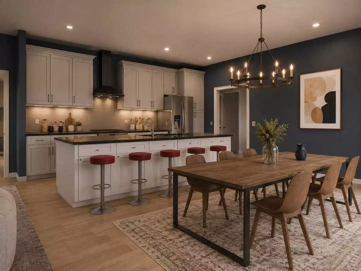
The red barstools earn their place precisely because they echo nothing else in the room. Everything else — white cabinetry, dark granite countertops, wood dining table on a metal base — stays in its lane, which is exactly what gives the barstools room to land without looking like a mistake.
Why the chandelier scale actually works here
Candle-style chandeliers often read as too delicate in open-concept spaces, but the wrought iron ring frame here carries enough visual weight to hold its own above a large dining table. Keeping the bulbs exposed rather than shaded lets the warm filament glow register even with recessed lighting running nearby — that layering of sources is what stops the dining zone from feeling like a forgotten corner of a much bigger room.
Mauve Walls and a Zebra Throw That Somehow Agree With Each Other
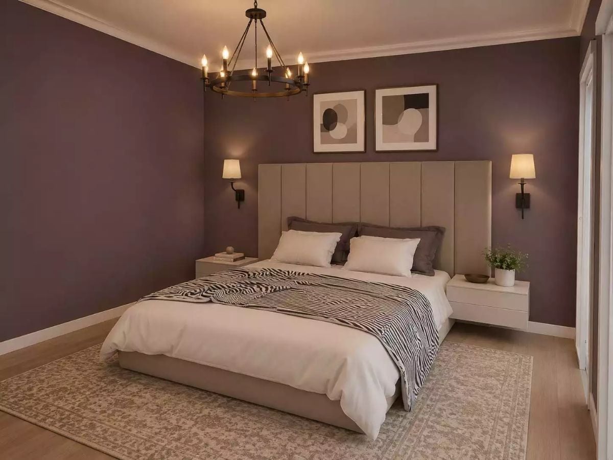
Plum-toned walls could have made this room feel like a cave, but the upholstered headboard in warm linen keeps things from tipping that direction. Wall sconces mounted low on either side do more work than a pair of table lamps ever would — better light angle, cleaner nightstands, less visual noise. The zebra-print throw is the one real risk in the room. It pays off.
Ask Yourself: Sconces mounted directly to the wall rather than sitting on nightstands free up surface space and keep the light closer to eye level when you’re sitting up in bed. If your nightstands always feel cluttered, swapping table lamps for hardwired or plug-in sconces is worth trying before you buy more storage.
Pin It
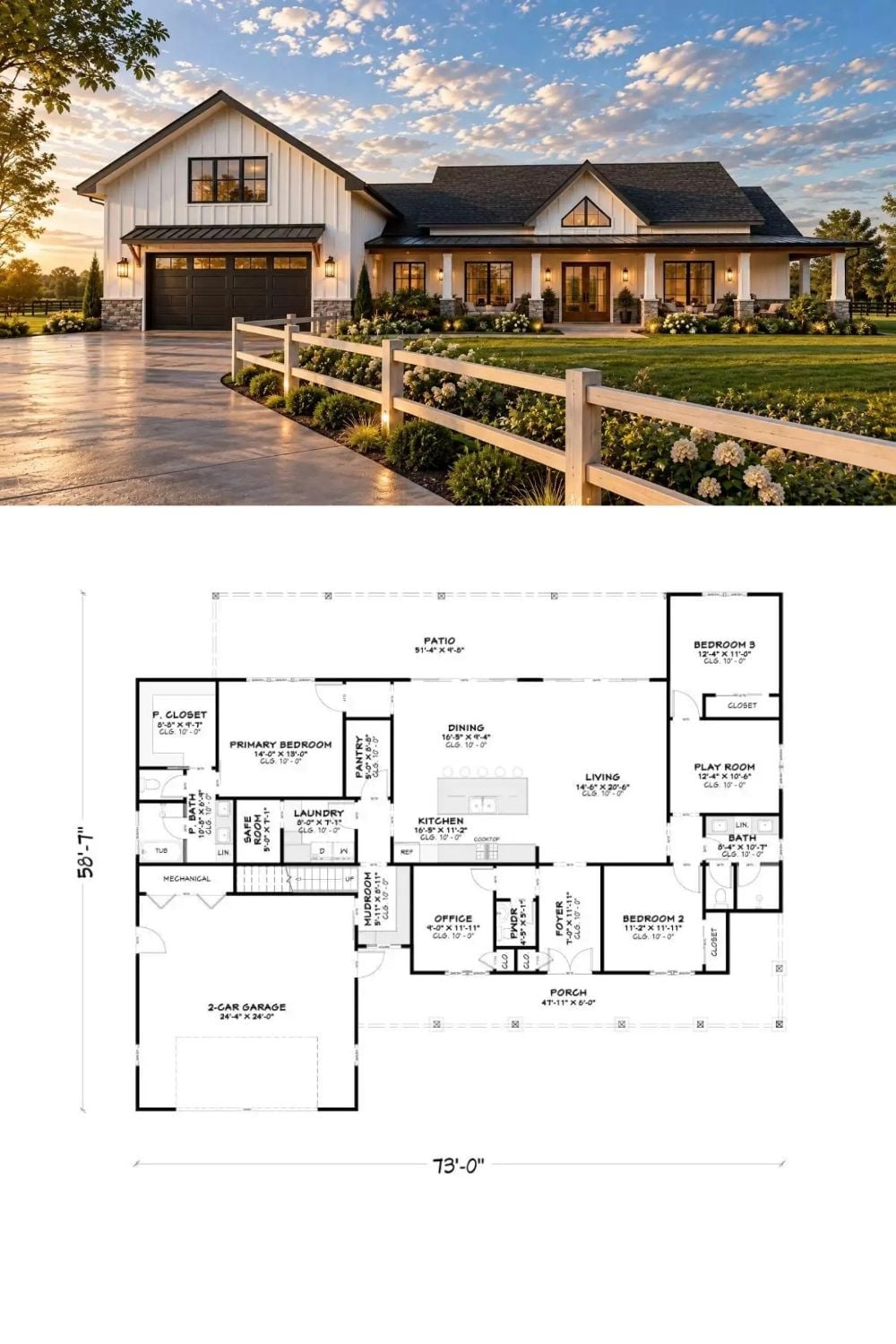
The exterior rendering shows a modern farmhouse with board-and-batten siding, a covered front porch, and an attached two-car garage. Below it, the floor plan lays out a single-story footprint spanning 73 feet wide — three bedrooms, a playroom, a dedicated office, mudroom, and a rear patio stretching over 51 feet.
`