
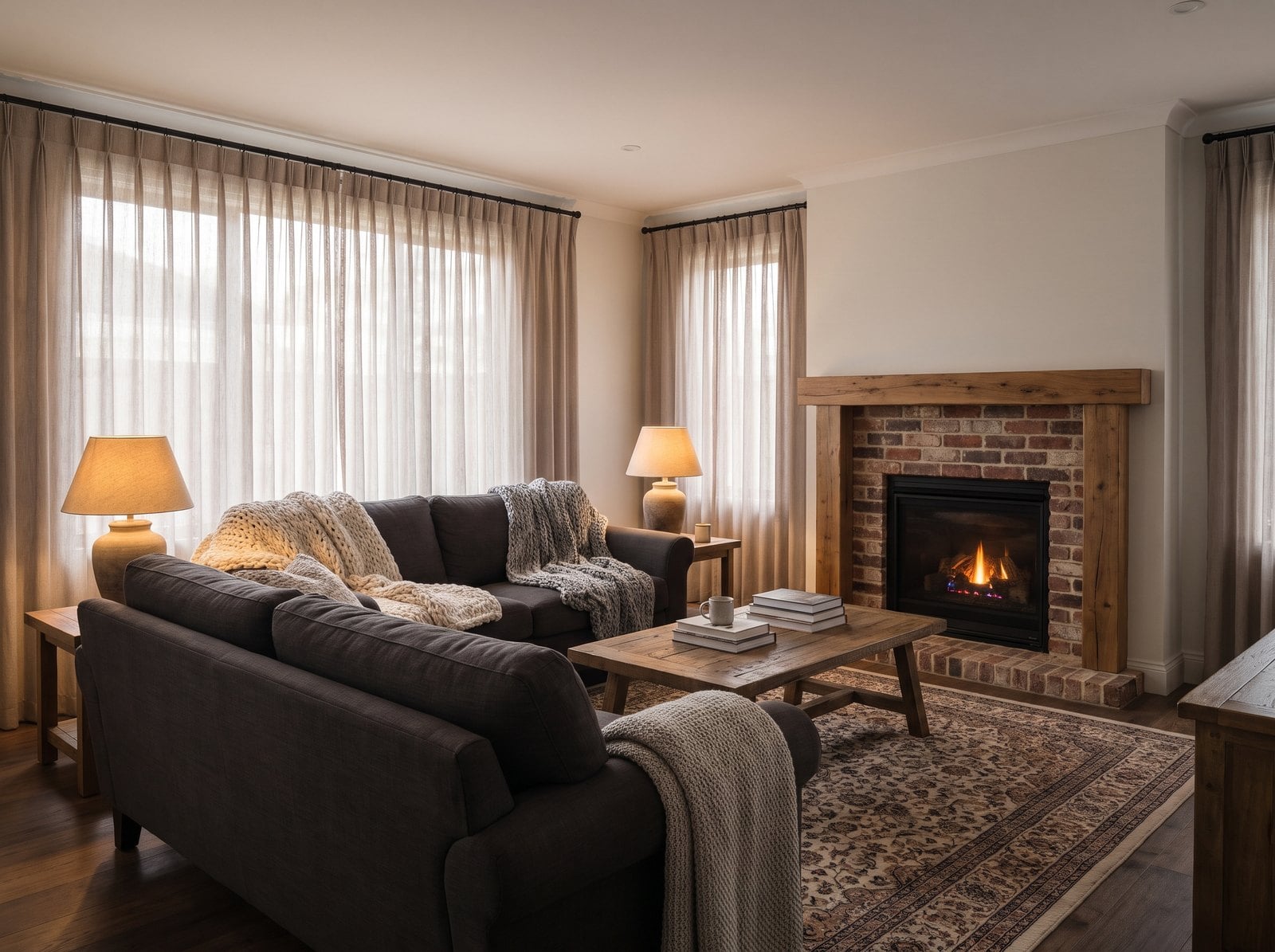
I thought I knew what people hated in living rooms.
Dated furniture.
Bad colors.
Too much clutter.
Maybe the giant sectional that eats half the room.
Nope.
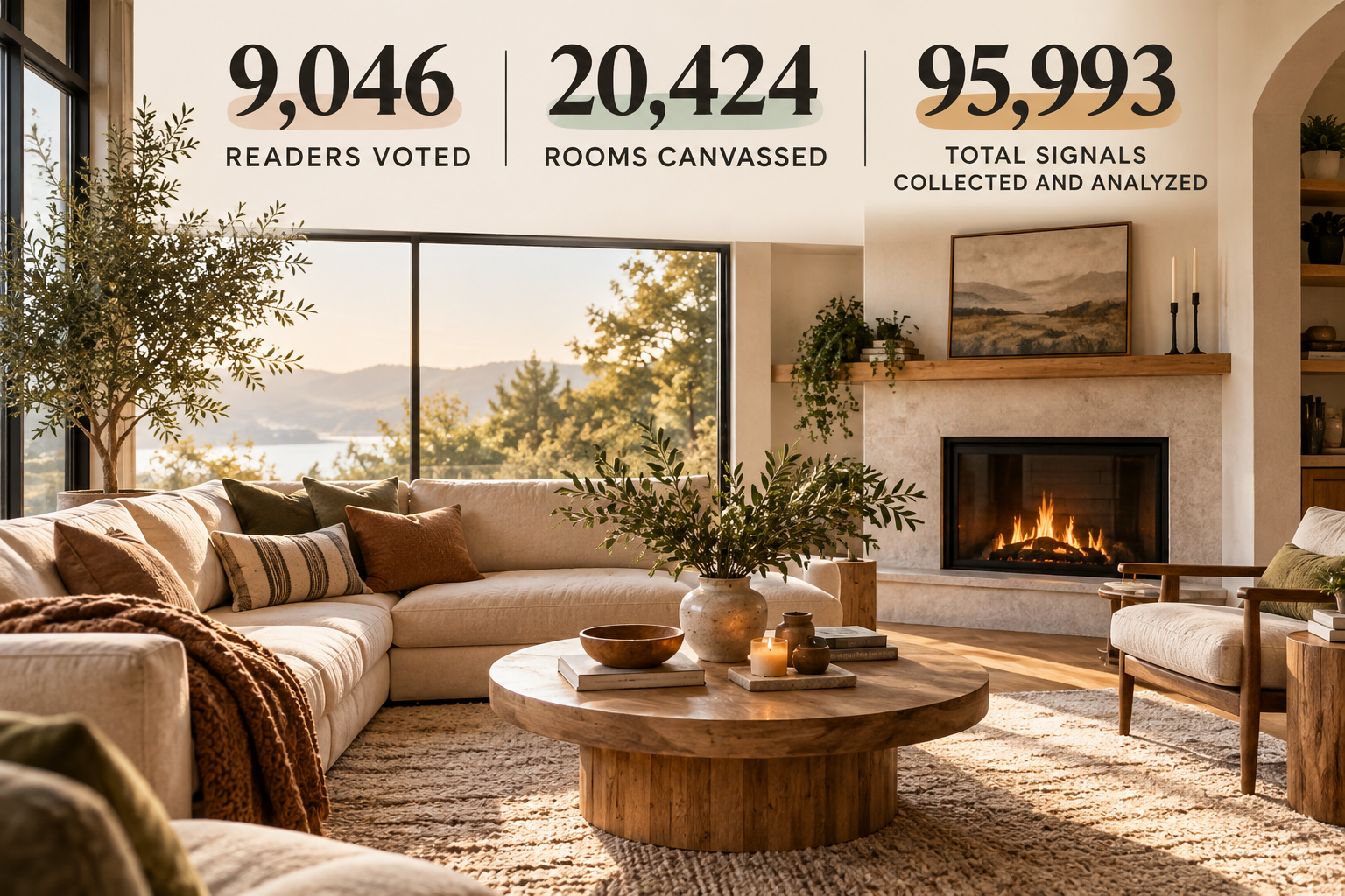
After collecting 95,993 reader signals from 9,046 people across 20,424 room images, the biggest specific complaint was something much simpler:
Too cold.
That surprised me.
Even more surprising?
The most common positive response was the exact opposite:
Cosy.
Not expensive-looking.
Not “I could copy this.”
Not beautiful materials.
Cosy.
Apparently, when people look at a room, one of the first things they’re asking is not:
Is this trendy?
Is this luxurious?
Is this modern?
It’s more like:
Would I actually want to sit down in here?
That sent me down a rabbit hole.
Because once I started digging into what readers were calling cold, the same ingredients kept showing up over and over.
Cool light.
Gray.
Black metal.
Flat surfaces.
Minimal visible wood.
Linear fireplaces.
Hard finishes.
The stuff we’ve spent the last decade calling clean, current and sophisticated.
Interesting.
The Big Finding Wasn’t “Dated”
When readers reacted strongly to a room, we asked why.
On the negative side, there were plenty of expected answers.
Not my style.
Color.
Too busy.
Dated.
But “too cold” stood out as the biggest specific outcome complaint.
And on the positive side, “cosy” stood out as the biggest specific piece of praise.
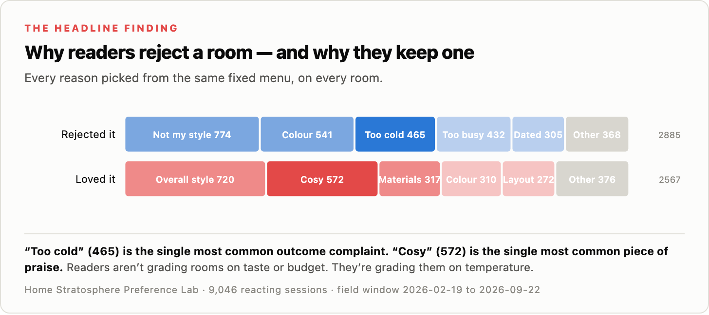
That’s the whole article in one image.
Readers aren’t just reacting to style.
They’re reacting to temperature.
Not actual thermostat temperature.
Visual temperature.
How warm, inviting, lived-in and comfortable a room feels.
That distinction matters because a room can be beautifully designed and still somehow feel like nobody is allowed to touch anything.
You know the type.
Everything is perfect.
Everything is beige.
There’s one sculptural chair that looks like it costs $8,000.
And somehow you’d rather sit in the kitchen.
Cool Light Got Absolutely Hammered
I expected warm lighting to do better.
I did not expect cool lighting to get this badly smoked.
Cool-lit rooms received:
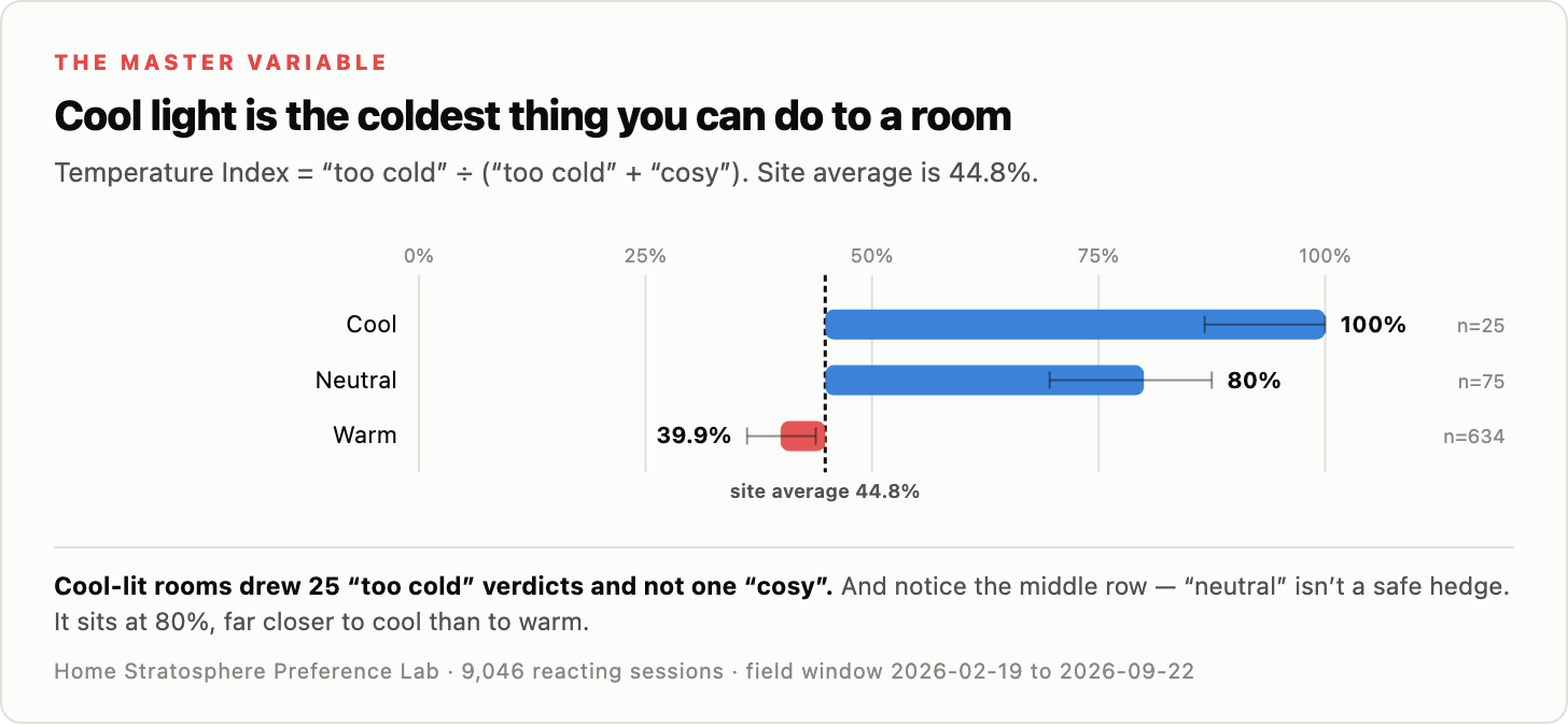
25 “too cold” verdicts.
Zero “cosy” verdicts.
Temperature Index:
100%.
Warm-lit rooms came in at 39.9%.
That is a massive gap.
And then there’s neutral lighting.
You’d think neutral would split the difference.
It didn’t.
Neutral scored 80%.
That puts it much closer to cool than warm.
This is one of those findings that makes me want to walk around the house unscrewing bulbs.
Because lighting is cheap.
Very cheap compared with most of the things people change when a room feels “off.”
You can spend $12,000 on furniture.
Or you can spend $60 on warmer bulbs and see what happens first.
I know which experiment I’d run.
We also asked readers directly which lighting temperature they preferred.
74.4% chose warm.
So this isn’t just buried in reaction data.
People actively say they want warmer light too.
Here’s the thing.
Cool light doesn’t just make the light look cold.
It appears to make everything else in the room look colder too.
And that’s where this gets really interesting.
Dark Wood Isn’t Necessarily the Problem
Dark wood gets blamed for everything.
Too heavy.
Too dated.
Too brown.
Too old-fashioned.
And sometimes, sure.
But one of my favorite findings in the whole dataset is what happens when you hold the wood constant and change the lighting.
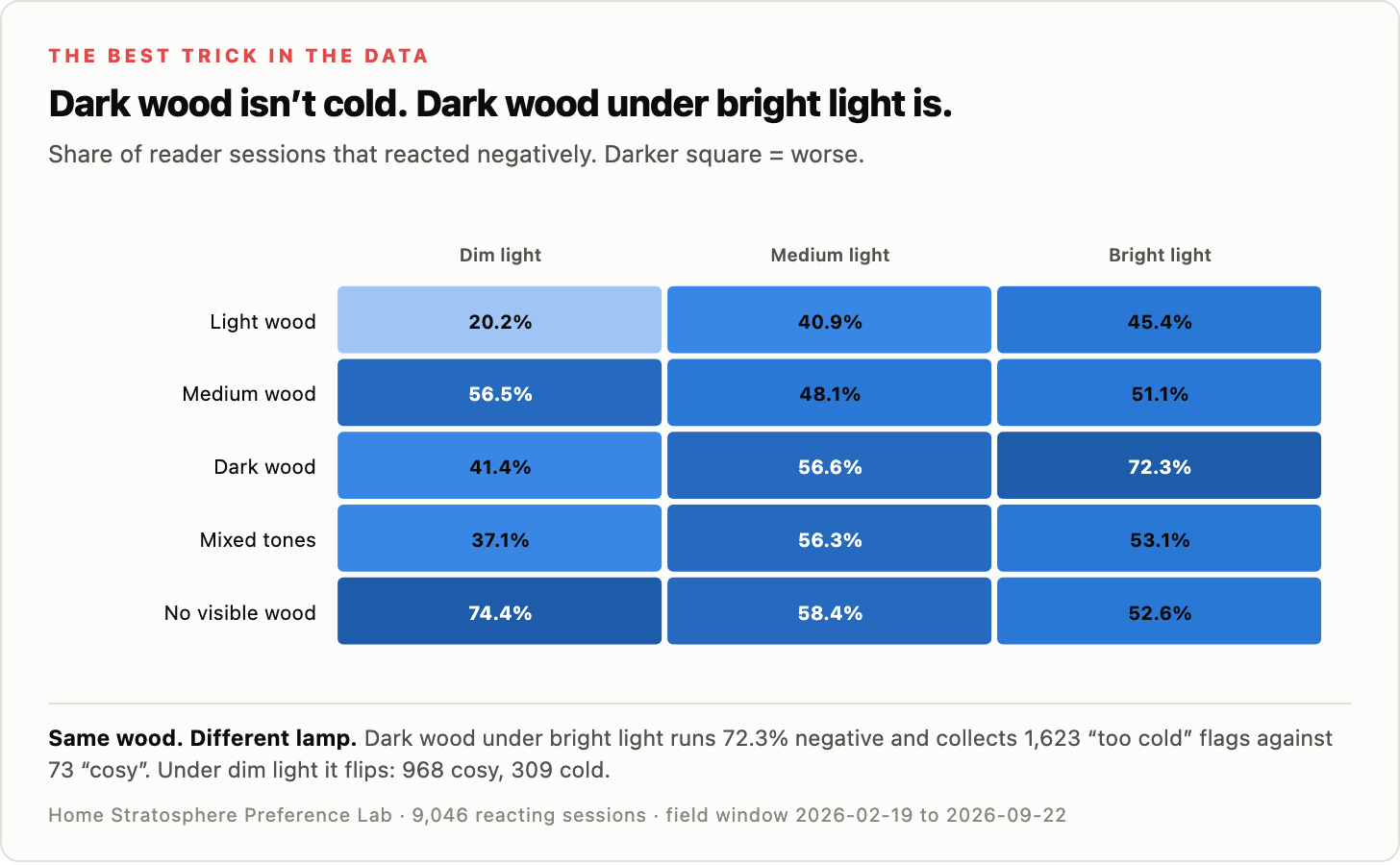
Dark wood under bright light produced 72.3% negative sessions.
Under dim light?
41.4%.
Same wood.
Different light.
It gets even more dramatic when you look at the temperature reactions.
Dark wood under bright light:
1,623 cold flags vs. 73 cosy.
Dark wood under dim light:
309 cold vs. 968 cosy.
That’s wild.
The wood did not change.
The lamp did.
Which is why I’d be very careful about ripping out a dark floor, walnut built-in or brown wood wall because it “feels too heavy.”
Maybe it does.
Or maybe you’ve got six icy-white recessed lights blasting down on it like a car dealership.
Turn those down first.
This also explains why some older rooms can feel surprisingly warm even when they contain materials designers now consider dated.
They weren’t necessarily using better materials.
They were using them in a warmer environment.
Here’s What Cold and Cosy Actually Look Like
Numbers are useful.
But at some point you want to see the thing.
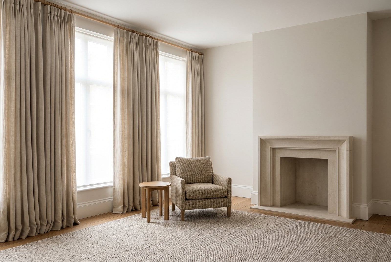
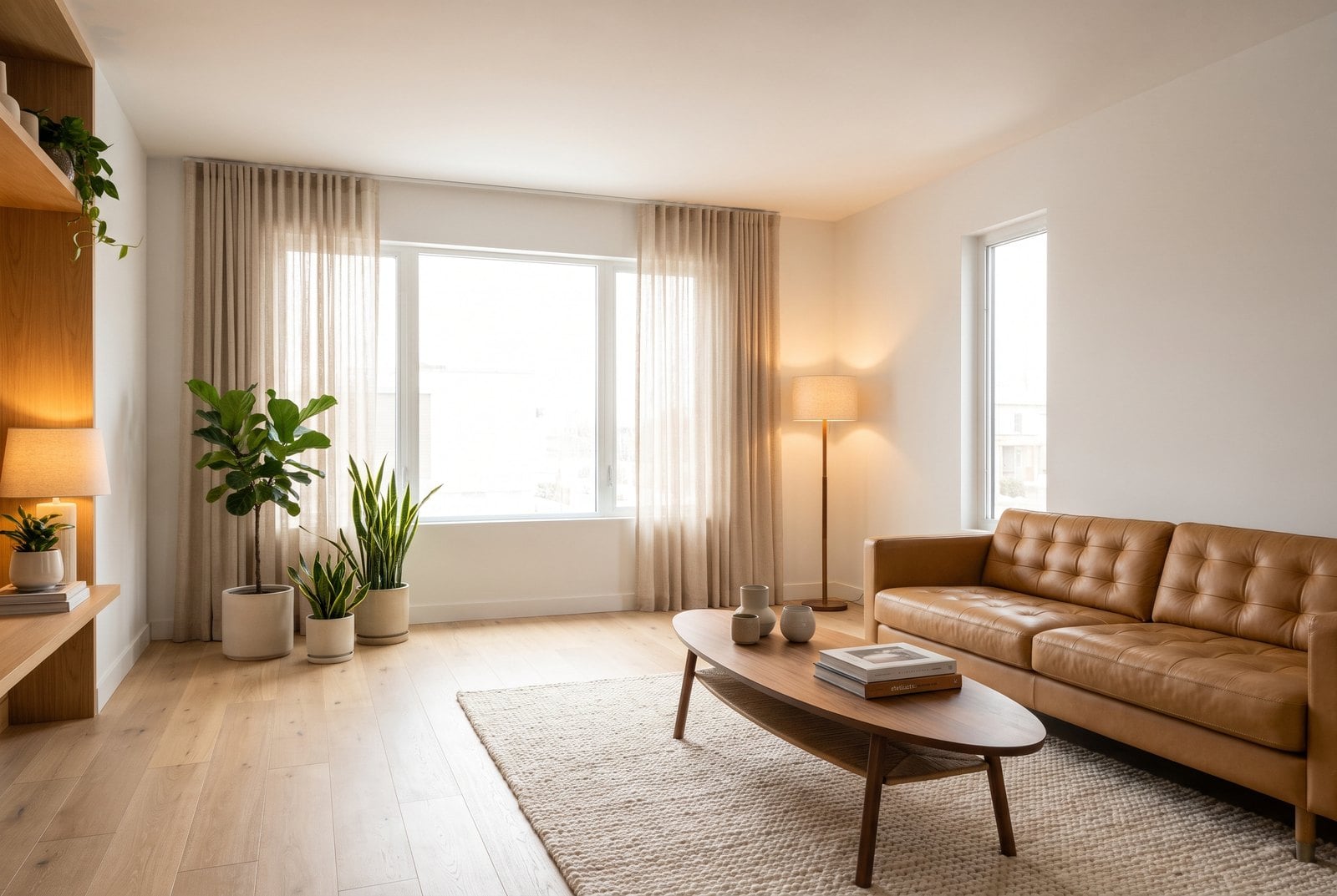
So here are two real rooms from the site that readers reacted to very differently.
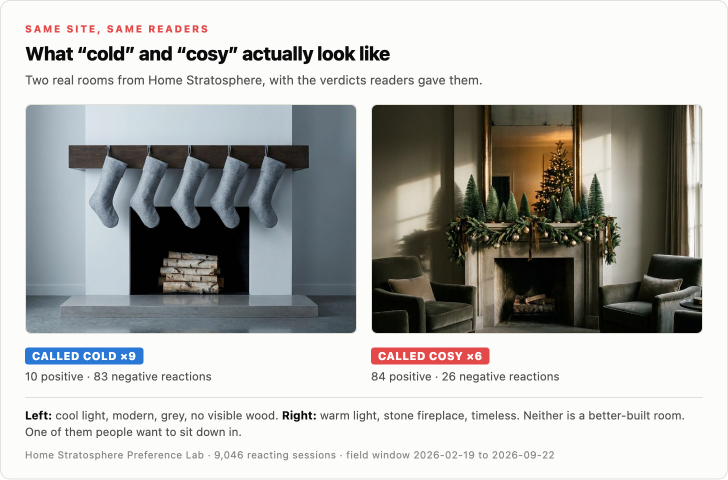
The room on the left collected nine cold calls.
The room on the right collected six cosy calls.
Look at them side by side.
Left:
Cool light.
Gray.
Modern lines.
No visible wood.
Hard surfaces.
Right:
Warm light.
Stone fireplace.
Timeless styling.
More depth.
More softness.
More visual warmth.
Neither room is badly built.
Neither room is some disaster.
That’s what makes this interesting.
The cold room isn’t ugly.
It’s just… cold.
That may be the mistake we make when talking about design.
We collapse everything into good or bad.
Liked or disliked.
Trendy or dated.
But “would I want to sit here?” is its own question.
And readers seem to answer it very clearly.
A Fireplace That Makes a Room Feel Colder
This might be the funniest finding.
A fireplace is literally a heat source.
Its historical purpose is warmth.
So naturally modern design figured out how to make one feel cold.
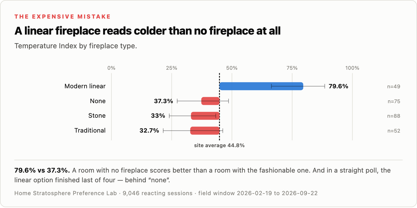
Modern linear fireplace:
79.6% cold.
No fireplace at all:
37.3%.
Stone fireplace:
33%.
Traditional fireplace:
32.7%.
Read that again.
A room with a modern linear fireplace scored more than twice as cold as a room with no fireplace at all.
That is spectacular.
And it gets worse.
Linear fireplaces also had the worst negative reaction rate of any fireplace type.
Then we simply asked readers what kind of fireplace they wanted.
The linear option finished last.
Behind none.
Imagine spending several thousand dollars adding a fireplace and discovering people slightly prefer that you had left the wall blank.
Brutal.
Stone fireplaces did much better.
Traditional fireplaces did much better.
Apparently people like fireplaces that actually look like fire belongs in them.
Who knew.
This is one of those trends I can imagine looking back on in ten years and wondering why we spent so much money installing long black rectangles into every wall.
Modern Design Keeps Stacking the Same Cold Ingredients
The fireplace result would be one thing if it stood alone.
It doesn’t.
Modern rooms in the dataset tend to stack a bunch of cold-reading features together.
Cool light.
Gray.
Black.
Flat-panel cabinets.
Matte-black hardware.
Linear fireplaces.
Hard surfaces.
Less visible wood.
Fewer curtains.
Fewer rugs.
Recessed-only lighting.
Each choice on its own can look great.
That’s important.
I’m not saying:
Black hardware = bad.
Or:
Gray = bad.
Or:
Modern = bad.
The problem seems to be cumulative.
Take six or seven visually cool ingredients and put them in the same room and suddenly you’ve designed something that photographs beautifully but feels like you should be waiting for your dentist.
That may be the bigger story here.
Wood Keeps Showing Up on the Warm Side
Visible wood performed very well across a bunch of categories.
Medium wood tone in particular came in very warm.
Wood coffee tables beat stone.
Natural wood surfaces repeatedly showed up on the warmer end.
This makes sense.
Wood adds color without screaming color.
It adds grain.
Variation.
Imperfection.
It breaks up smooth surfaces.
It also has something modern rooms often lack:
Visual history.
A marble slab looks finished.
A wood surface looks like it has lived a little.
That might be why even one wood element can change the feel of an otherwise cool room.
A coffee table.
A sideboard.
A shelf.
A beam.
A floor.
You don’t need to turn the house into a ski lodge.
Just stop removing every natural surface from the frame.
Stone Coffee Tables Got Crushed
This one made me laugh.
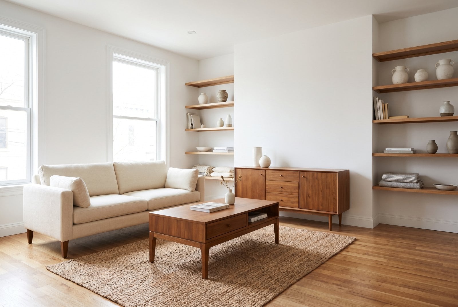
Stone and marble coffee tables received eight cold verdicts and zero cosy ones.
Wood coffee tables came in far warmer.
And honestly, once you think about it, this is not shocking.
The coffee table sits dead center in the room.
If it’s a giant slab of pale stone, that’s a lot of hard, cool surface right in your line of sight.
Meanwhile wood adds texture and warmth in exactly the same footprint.
This is one of those changes that doesn’t require renovating anything.
Swap one object.
Done.
Of course, if you paid $4,000 for the stone coffee table last month, maybe ignore me.
Matte Black Isn’t Doing the Room Any Favors Either
Matte black has been absolutely everywhere.
Faucets.
Cabinet pulls.
Light fixtures.
Door handles.
Shower frames.
Table legs.
If a piece of metal exists, somebody has tried to make it matte black.
In the data, matte black landed way out on the cold side.
Brass was much warmer.
Bronze and nickel were warmer still in the temperature sample.
Again, this does not mean matte black is ugly.
I like matte black.
But combine matte-black hardware with cool lighting, gray walls, slab stone, no curtains and a linear fireplace?
Now we’re cooking with ice.
Curtains Beat Blinds
This one is wonderfully practical.
Blinds and shades came in cold.
Curtains and drapes came in warm.
Not complicated.
Curtains add fabric.
They soften edges.
They absorb sound.
They frame the window.
They move.
They create visual weight.
Blinds are functional.
Curtains are functional and decorative.
If a room feels hard or unfinished, this is probably one of the first places I’d look.
No contractor needed.
No permits.
No six-month wait.
Buy fabric.
Hang fabric.
See what happens.
Rugs Matter More Than Pattern
Rugs showed the same kind of thing.
No rug was much colder than having a rug.
But patterned versus solid mattered far less.
That’s useful.
Because people overthink rugs.
Should it be Persian?
Geometric?
Neutral?
Colorful?
Maybe the bigger question is:
Is there one at all?
A big exposed floor adds hardness.
A rug breaks that up.
Simple.
Not sexy.
Useful.
The 1990s Result Is Bonkers
Now for the weird one.
We looked at the apparent era of the room.
Then we looked at temperature.
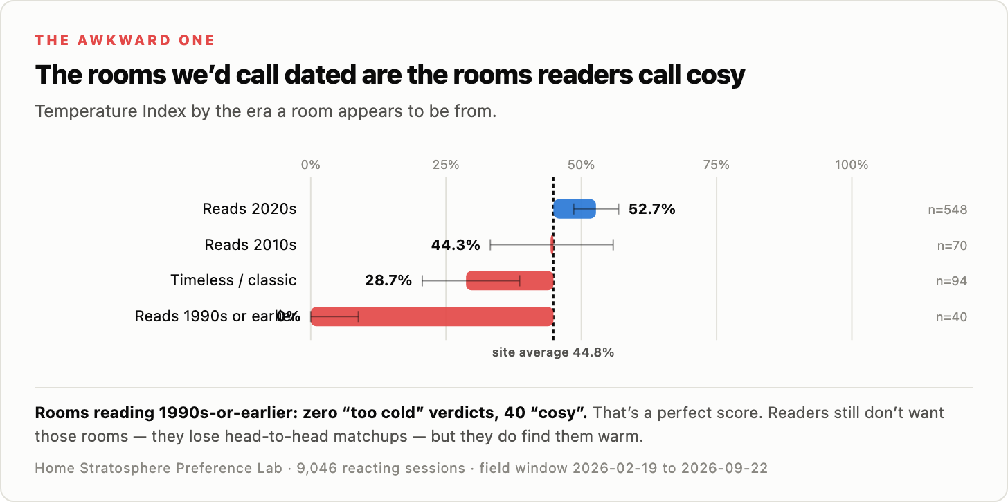
Reads 2020s:
52.7% cold.
Reads 2010s:
44.3%.
Timeless/classic:
28.7%.
Reads 1990s or earlier:
0%.
Zero.
Not one cold verdict.
Forty cosy verdicts.
That is absurdly clean.
Now, before anyone starts reinstalling honey-oak cabinets and floral valances, this does not mean people want 1990s rooms back.
They don’t.
The other data makes that clear.
What it tells us is that older rooms contained a bunch of things that modern interiors have systematically removed.
Visible wood.
Warmer lighting.
More fabric.
More pattern.
More brown.
More trim.
More visual layers.
More stuff.
Some of that stuff absolutely deserved to go.
But maybe we threw out a few things that were doing useful emotional work.
The answer is not:
Let’s go back to 1994.
The answer is:
How do we make a room look current without making it feel sterile?
That is a much better design problem.
Timeless May Be the Sweet Spot
The most interesting category in that era chart may not even be the 1990s.
It may be timeless/classic.
Those rooms came in at 28.7% on the Temperature Index.
Warm.
But not dated.
That’s probably where a lot of people actually want to land.
Not trendy.
Not old.
Not aggressively modern.
Just good.
The kind of room that looks right now and still looks right seven years from now.
That’s difficult.
But it’s also commercially interesting.
Because builders, designers and furniture brands love anything that reduces the risk of looking dated.
And readers seem to be saying they’d rather have “timeless” than “current 2020s.”
That is worth paying attention to.
Cold Does Not Mean Ugly
One important point before we go too far:
Cold is not the same as disliked.
A room can feel cold and still be attractive.
White cabinets are a good example.
They lean cold in the temperature data.
But readers do not broadly reject them.
So the conclusion is not:
White kitchens are bad.
It’s:
White kitchens don’t automatically feel cosy.
Different thing.
Velvet shows the opposite problem.
It reads warm.
But it can still be divisive.
And then there are elements like the modern linear fireplace that manage to be cold and disliked.
Overachiever.
The reason this distinction matters is that you may not care whether a room feels cosy.
A luxury showroom may want crisp.
A gallery may want sparse.
A modern condo may deliberately want a cooler look.
Fine.
But if the goal is:
I want people to walk in and immediately feel comfortable
then this data gives you some pretty obvious levers to pull.
So What Should You Actually Do?
Enough diagnosis.
Here’s the useful part.
We ranked six changes by how far they moved the Temperature Index.
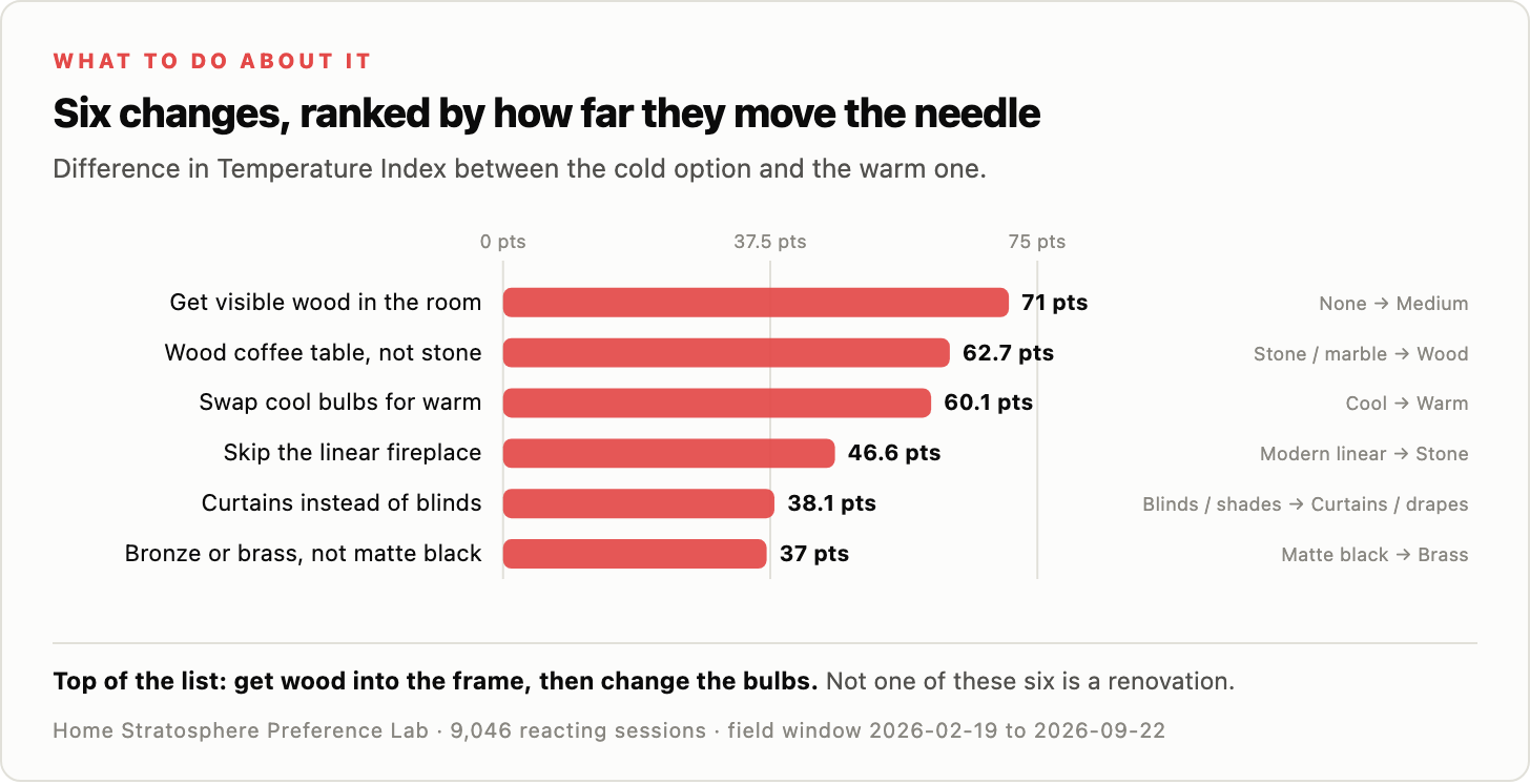
The biggest swing:
Get visible wood into the room: 71 points
Then:
Wood coffee table instead of stone: 62.7 points
Swap cool bulbs for warm: 60.1 points
Skip the linear fireplace: 46.6 points
Curtains instead of blinds: 38.1 points
Bronze or brass instead of matte black: 37 points
That’s a pretty great list because not one of those requires a full renovation.
You can make a room feel much warmer without ripping out the kitchen.
No demolition.
No architect.
No dumpster in the driveway.
Just change a few ingredients.
If I had a room that felt cold, I’d probably do this:
Change the bulbs.
Add a lamp or two.
Put down a rug.
Hang curtains.
Bring in one decent-sized wood element.
Then stop.
Live with it.
See what happens.
You may discover the room didn’t need a $25,000 makeover.
It needed softer light and a coffee table.
The Bigger Thing I Think Is Going On
Design trends rarely arrive one at a time.
They arrive in packages.
Cool lighting showed up with gray.
Gray showed up with black accents.
Black accents showed up with flat cabinetry.
Flat cabinetry showed up with slab stone.
Slab stone showed up with linear fireplaces.
Linear fireplaces showed up in rooms with fewer soft furnishings and less visible wood.
Each decision makes sense by itself.
Together, they can create a very specific feeling.
Clean.
Sharp.
Current.
And cold.
That may be what readers are reacting to.
Not “modern design” as some giant philosophical category.
The accumulated effect of a dozen small choices.
Which is good news.
Because it means you don’t have to abandon modern design.
You can keep the clean lines.
Keep the simple furniture.
Keep the contemporary architecture.
Just warm up the recipe.
Use warmer light.
Bring in wood.
Add fabric.
Add a rug.
Use curtains.
Layer lighting.
Maybe skip the long black fireplace slit.
You don’t need to turn the room into Grandma’s house.
You just need to stop designing it like an Apple Store.
The Real Opportunity Is Modern + Warm
That’s the part I find most interesting.
The data does not say people want old rooms.
It says people want rooms that feel good.
There’s a difference.
A modern room can still feel warm.
A traditional room can still feel cold.
But the modern palette has made it surprisingly easy to pile up cold signals without realizing it.
So the sweet spot may be:
Current without sterile.
Clean without empty.
Sophisticated without untouchable.
Warm without dated.
That’s a harder target.
But it’s probably the better one.
Thanks for reading.
Jon
This report first appeared in Home Stratosphere on Substack, where Pro members get the full PDF report and the raw data behind it.
Prefer a one-time purchase, no subscription? Buy the full report and data at Statwren.
Want the full research behind this?
Upgrade to Home Stratosphere Pro and get the complete 46-page report plus the underlying CSV data.
The free article gives you the headline findings. The Pro report gives you the full analysis, rankings, methodology and data behind them.
Inside the full report:
- The complete Temperature Index — 172 design elements ranked from coldest to cosiest, with sample sizes and confidence intervals
- Detailed breakdowns of floors, countertops, cabinets, backsplashes, coffee tables, upholstery, hardware, lighting, ceilings, window treatments and rugs
- The cross-instrument master table showing how each element performs across reactions, head-to-head matchups, saves and direct polls
- The complete interaction analysis, including how lighting, wood tone and other variables work together
- The state-by-state analysis — including why some of the most dramatic-looking regional results shouldn’t be trusted
- The underlying dataset in CSV format so you can inspect, filter and analyze the numbers yourself
And you can actually use the data
This isn’t just something to read.
Your Pro access includes permission to use the research in your own marketing and content.
If you’re an interior designer, builder, remodeler, realtor, home brand or publisher, you could:
- Turn the findings into client presentations
- Create your own branded reports
- Use individual statistics in sales materials
- Publish data-backed blog posts and newsletters
- Create Instagram posts, reels, carousels and videos
- Share findings with prospects to demonstrate expertise
- Build your own analysis from the raw CSV files
In other words: don’t just read the research. Use it.